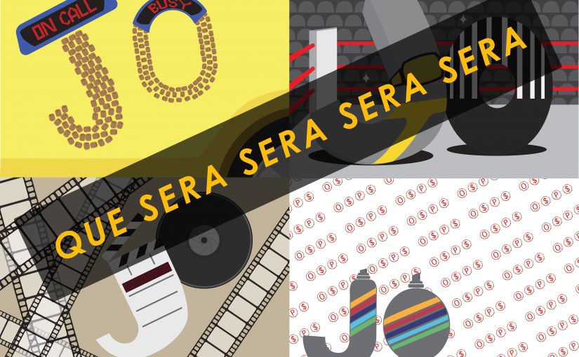
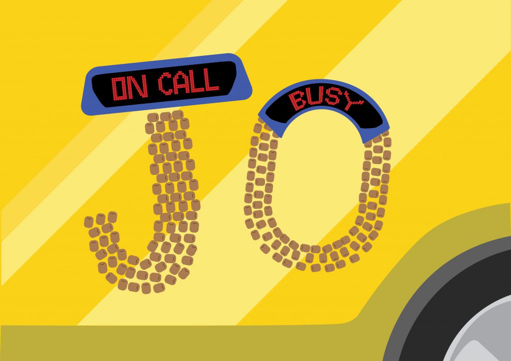
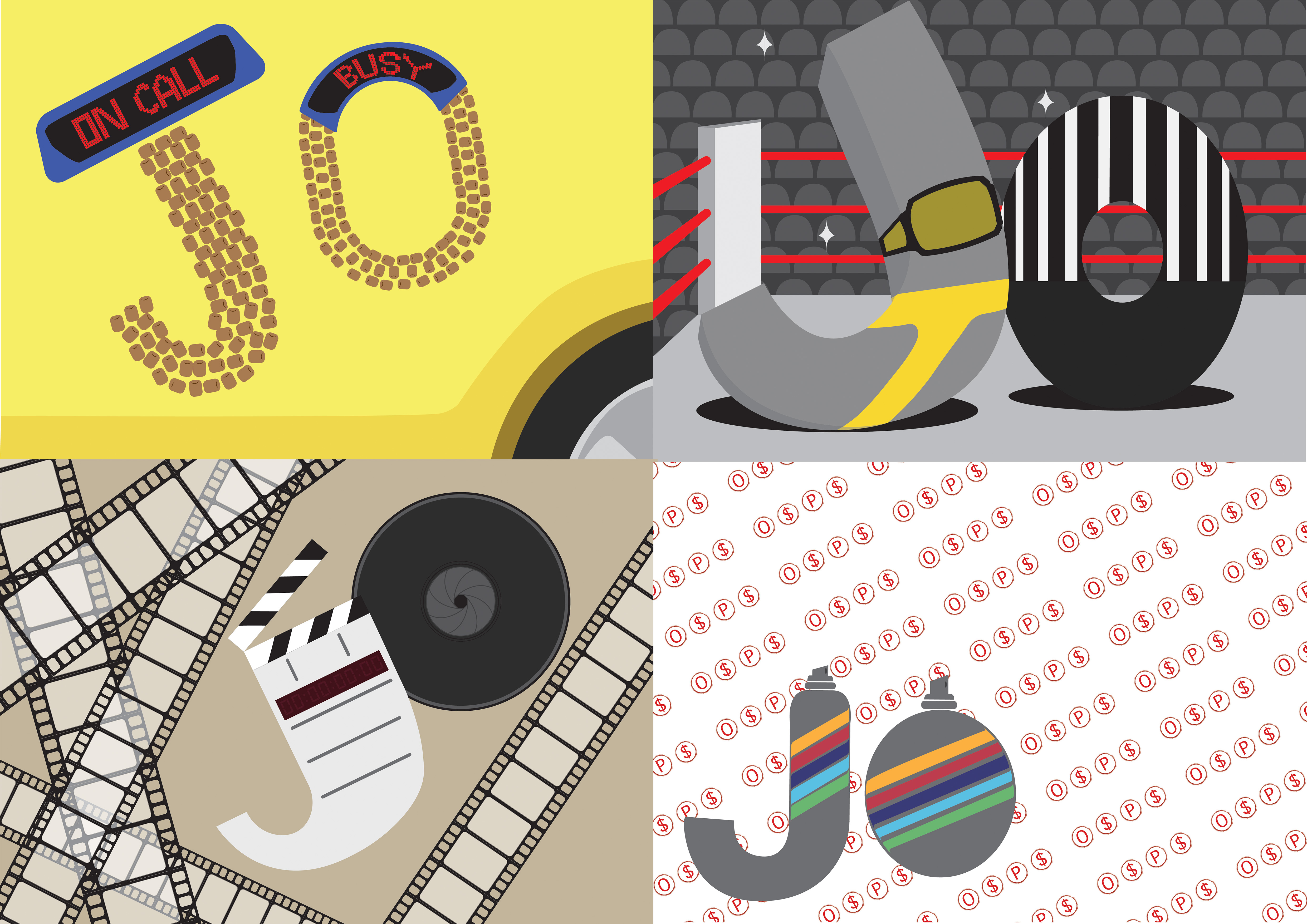
The main elements of being a taxi driver that I wanted to highlight were the cab signs of Singapore, the car itself, and the beaded seats that all cab drivers seem to use.
I am a Professional Wrestler
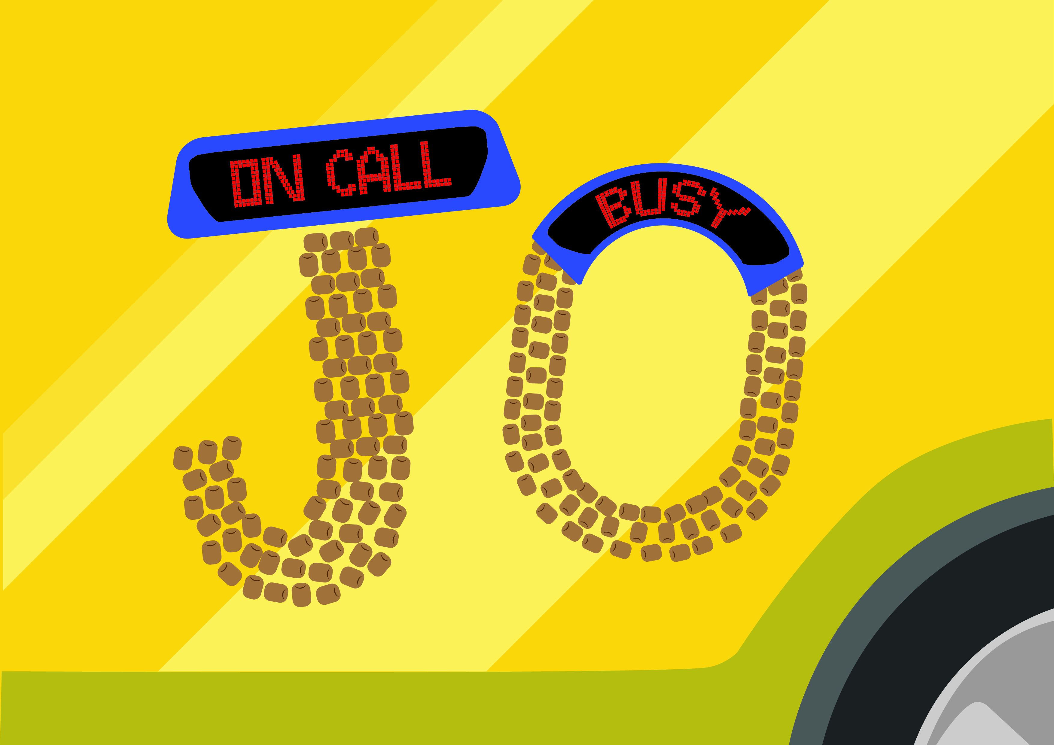
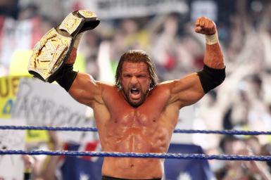
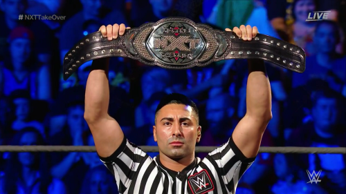
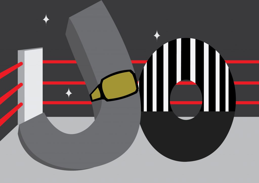
The main elements of being a professional wrestler that I wanted to highlight were the ring, the championship belt, the tights, the referee, and the fans. Additionally, to remove the confusion of professional wrestling to real wrestling, I wanted to make the type less gritty and more playful.
I am a Filmmaker
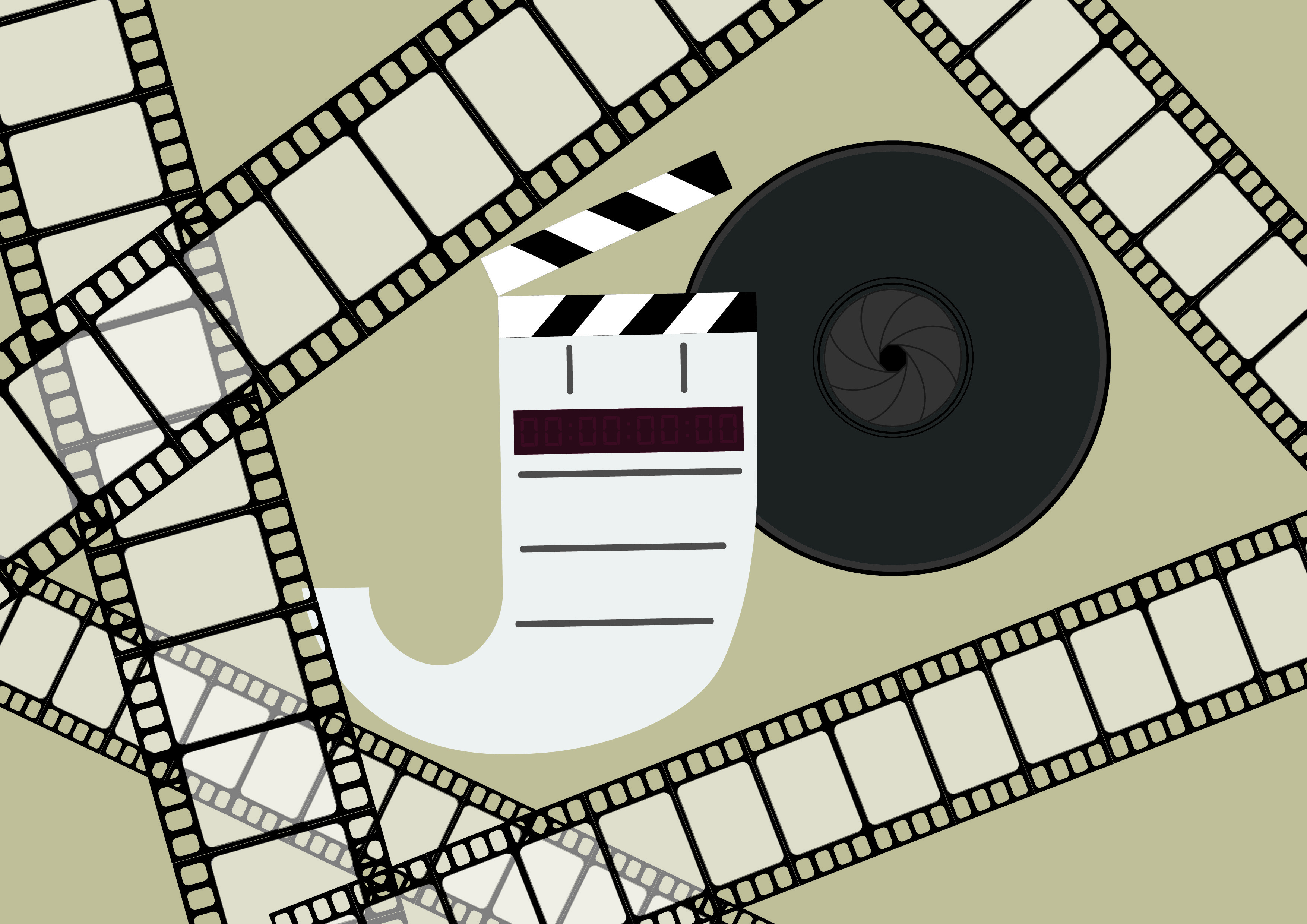
The main elements of being a filmmaker that I wanted to highlight were the clapper board, the camera lens, and the film reel. The use of a brownish colour is to give the sense of nostalgia to convey that film is where is feel comfort.
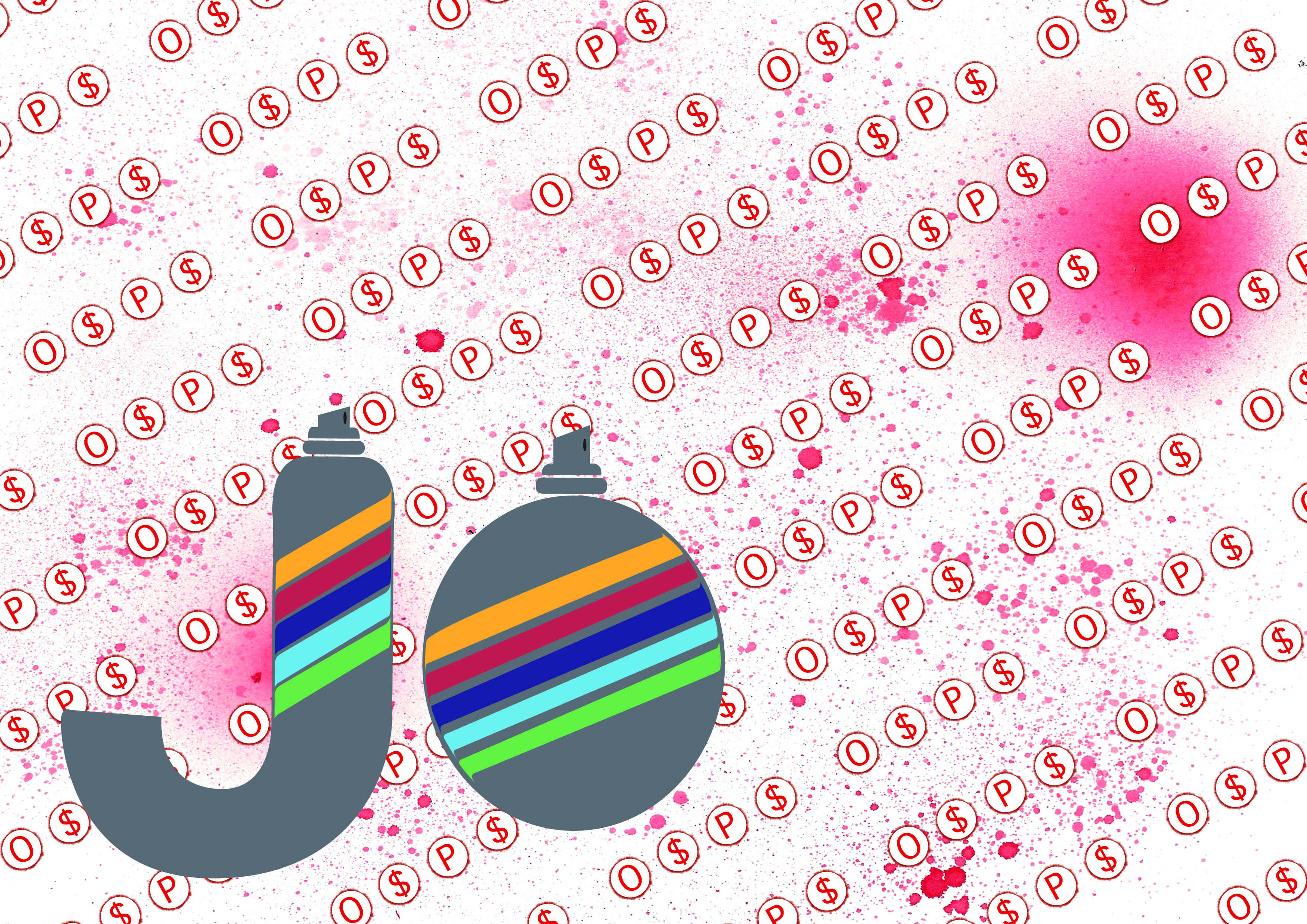
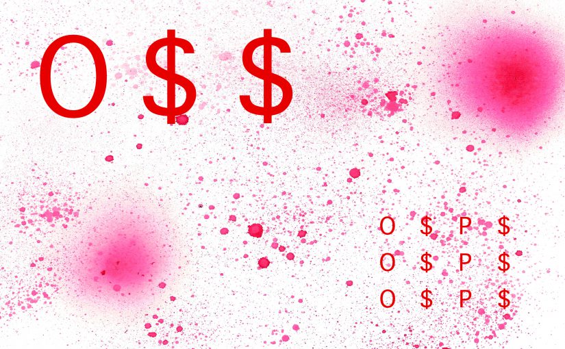
I am a Gangster Graphic Designer
The main elements of being a gangster graphic designer that I wanted to highlight were the O$P$ graffiti and the spray paint. While this was the most interesting idea to me, conveying the idea of a graphic designer is challenging. I feel that the use of patterns conveys that in a slightly less direct manner.
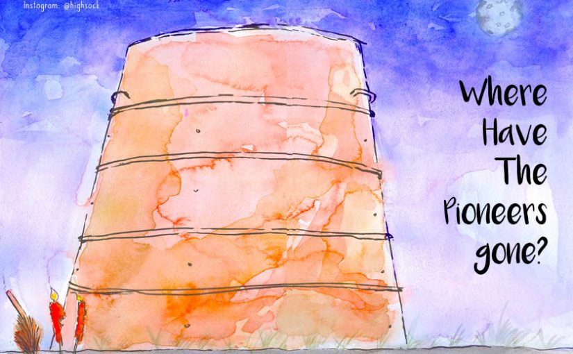
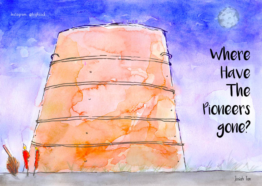
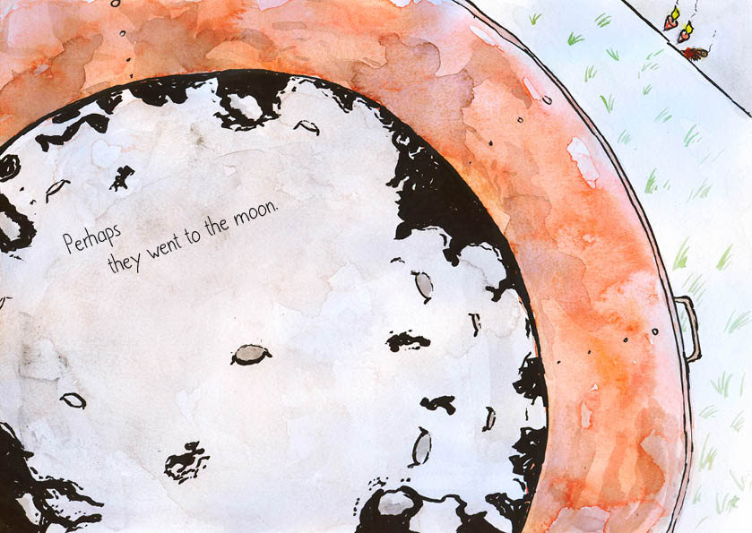
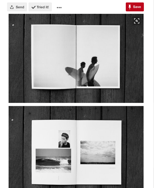
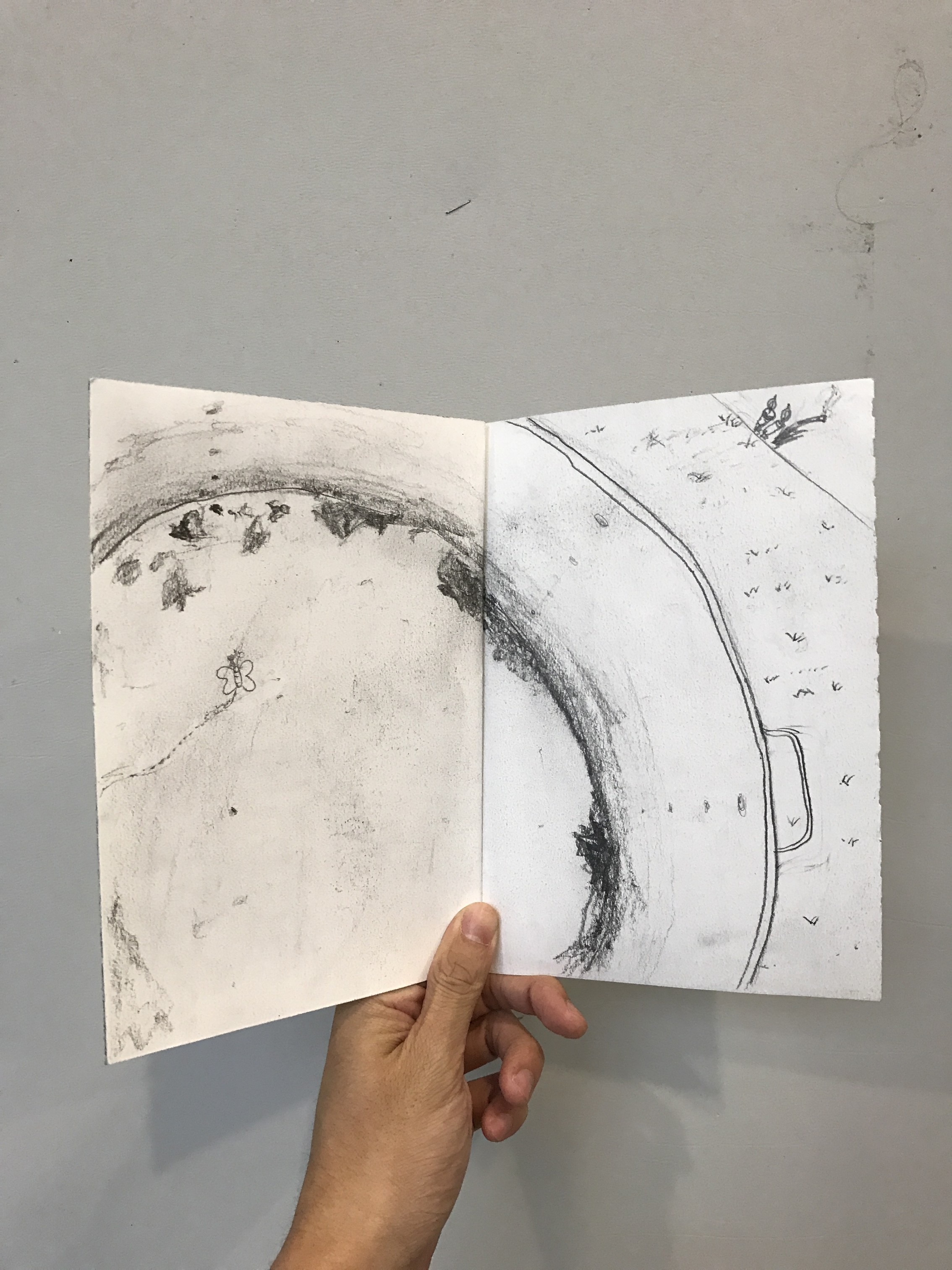
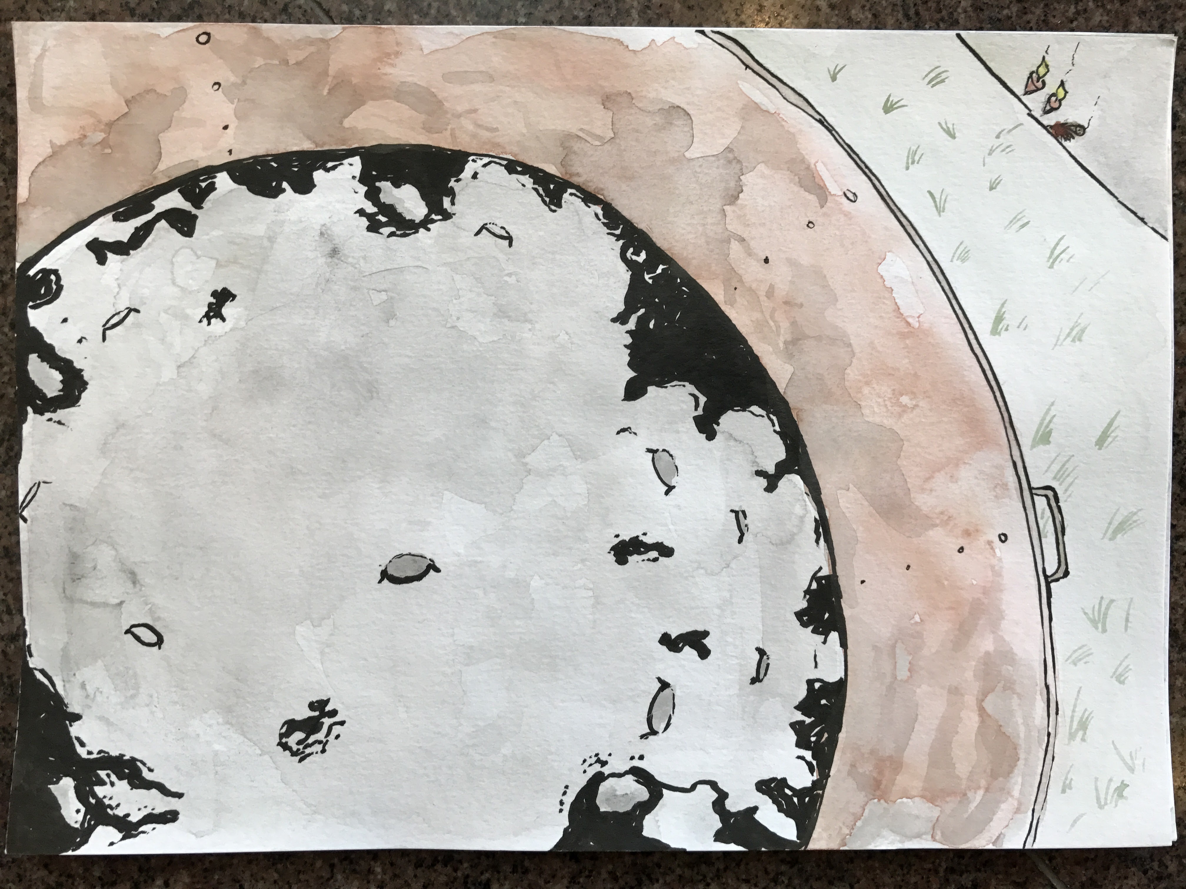
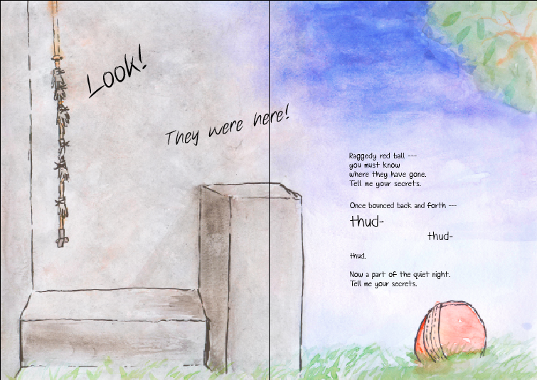
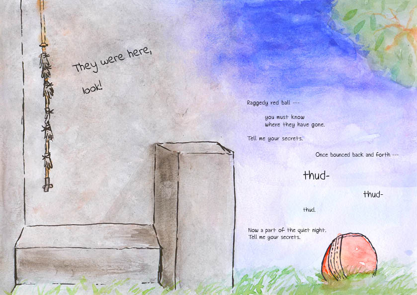
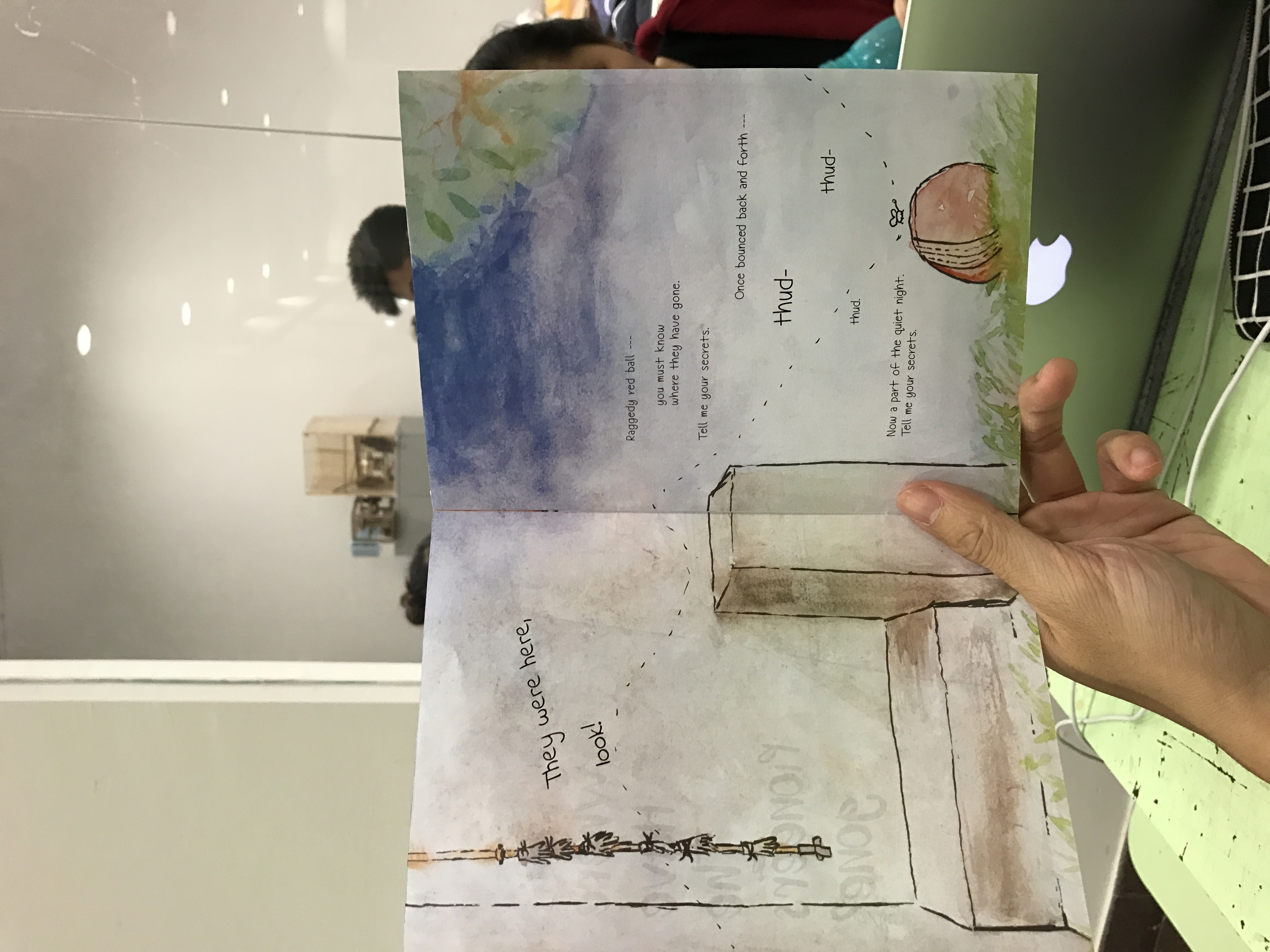
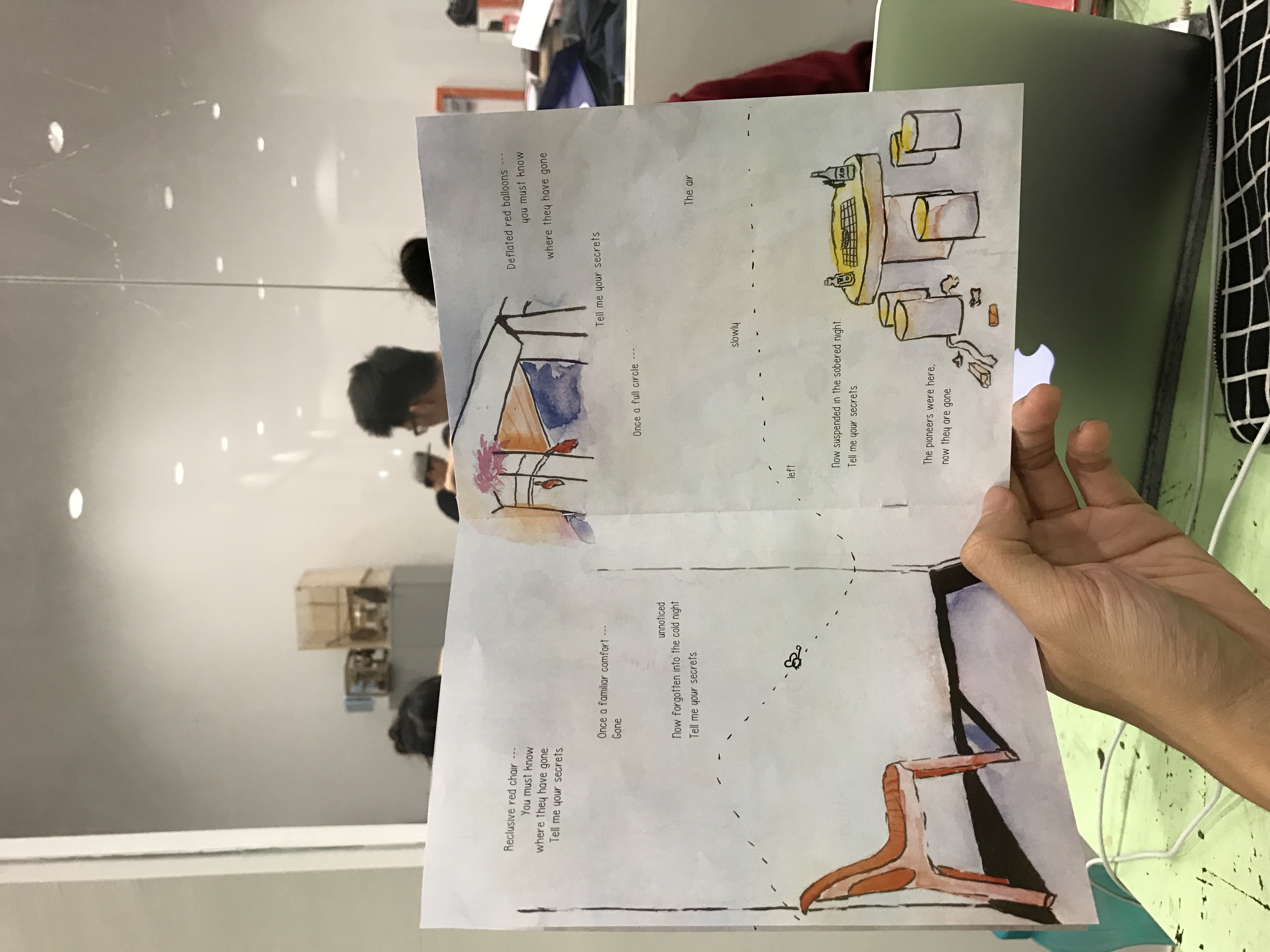
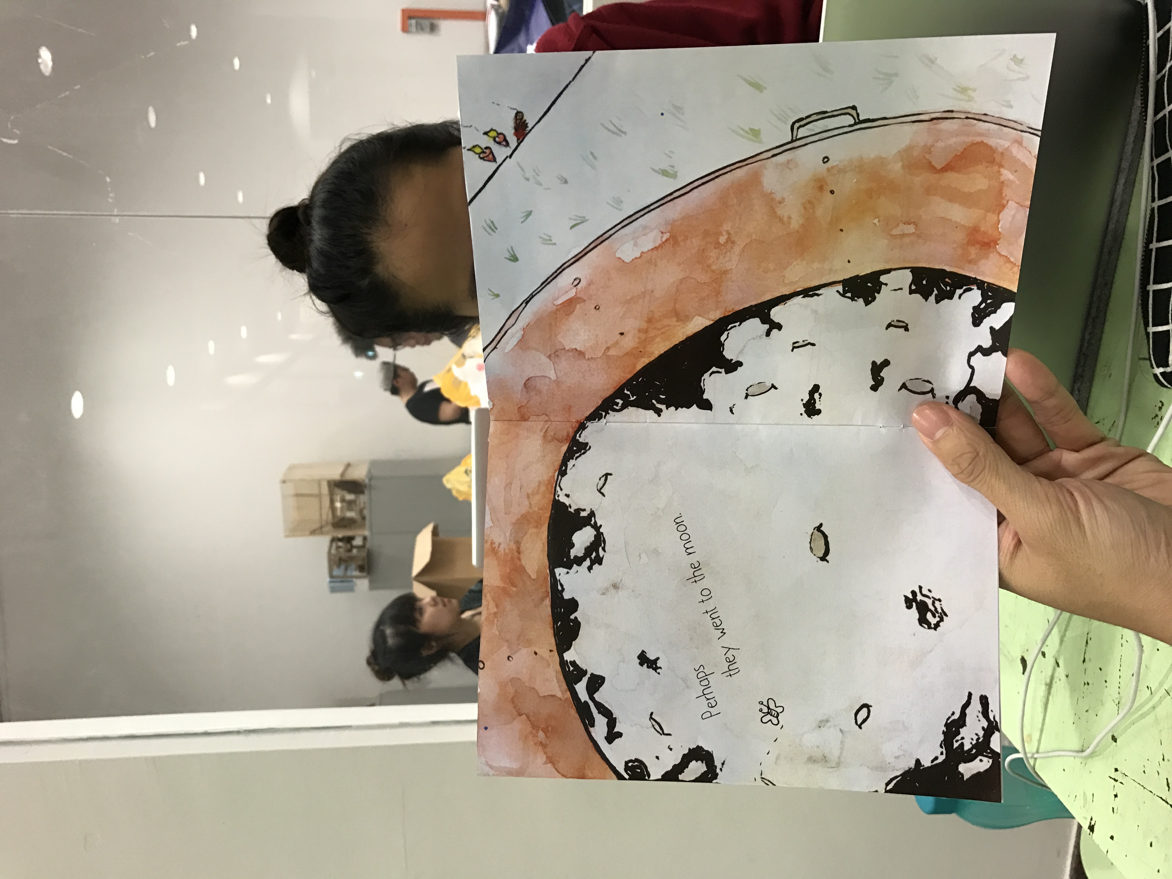
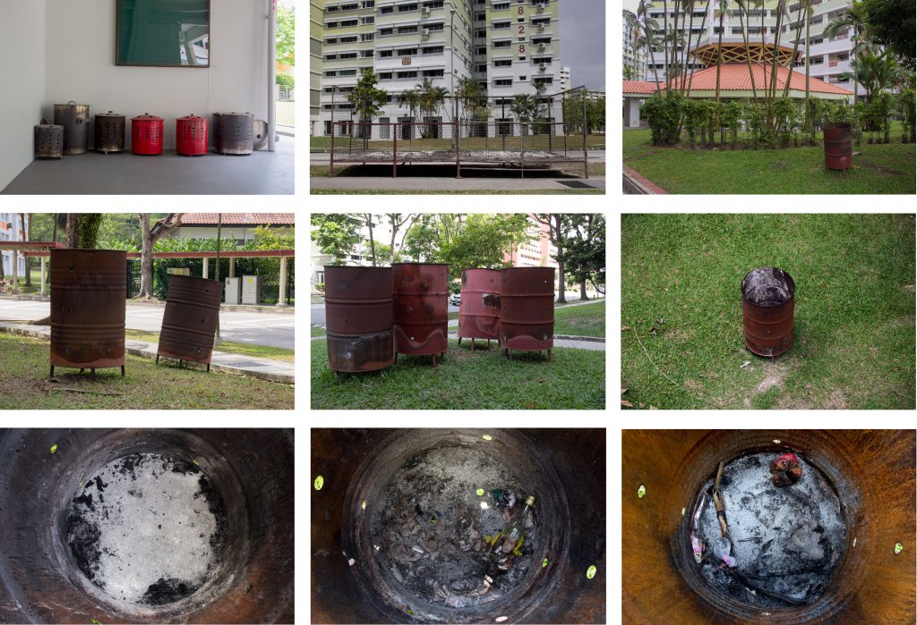
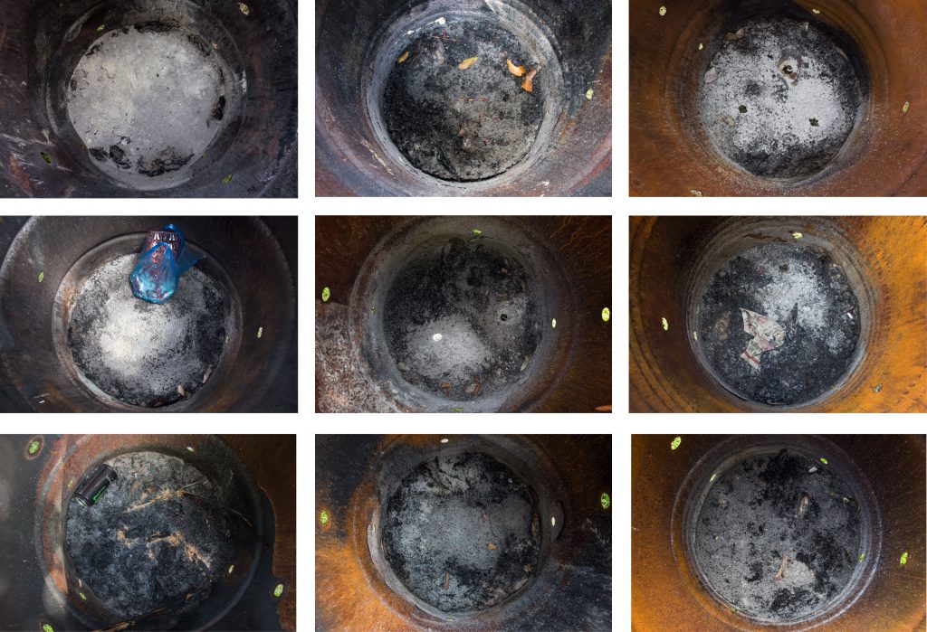
In my travels around Pioneer, I found many burning bins. This made me think of the morbid question: Are the pioneers all dead? I took a couple of photos of the insides of the burning bins and saw the moon. This made me think that maybe they went to the moon – a metaphor for them passing on. The poetry that accompanies the images were transformed from being just a narrative of the pioneers passing away to my reflections on the difficulties in connecting with the pioneers. In the poem, there is a progression from the ease of communication between kids and grandparents, to inexplicably losing it in our youth, to its complete loss when our grandparents have passed on – perhaps to the moon.
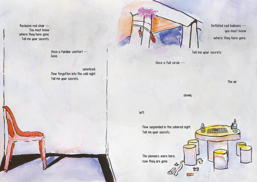
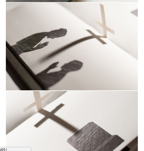
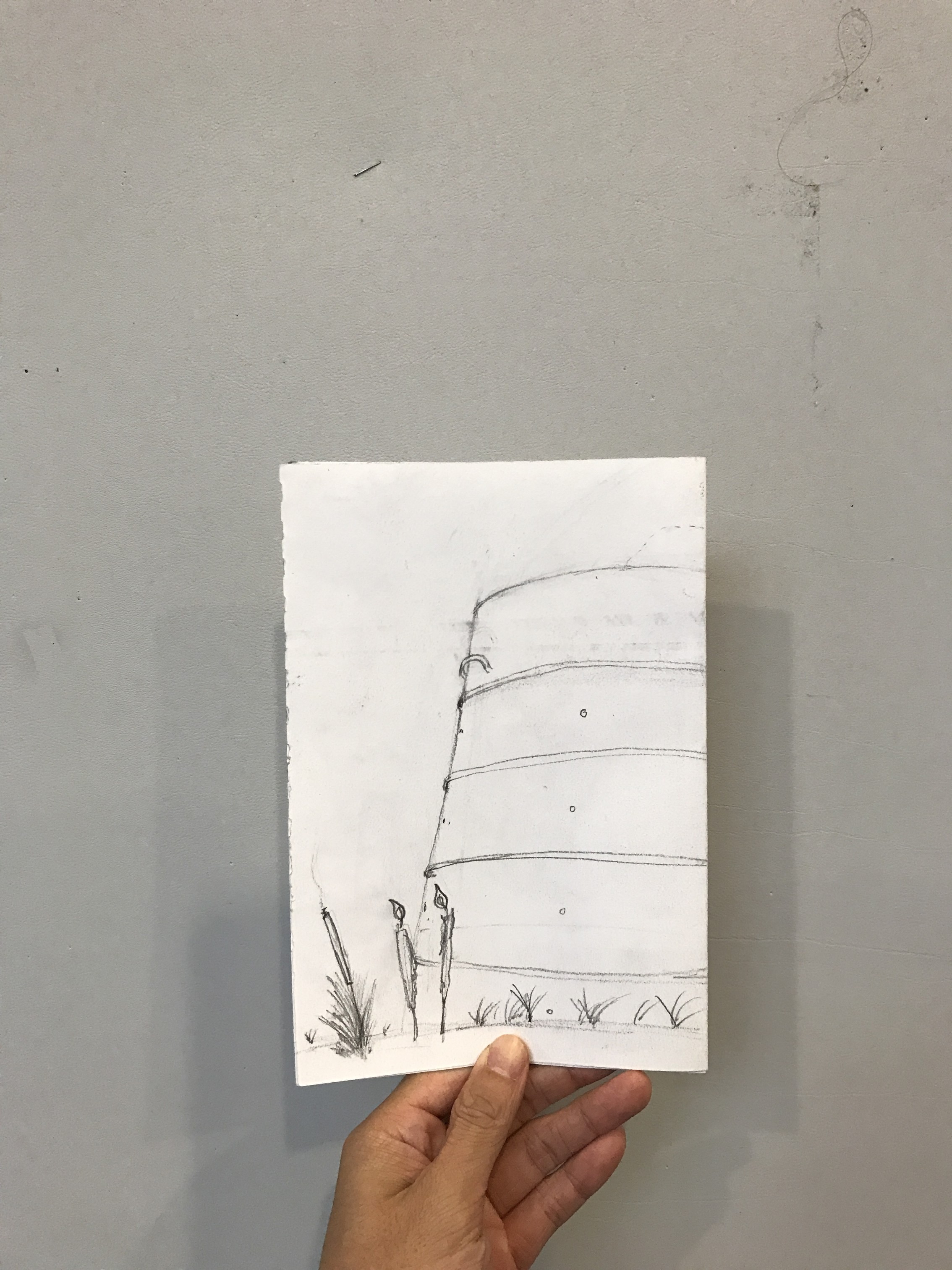
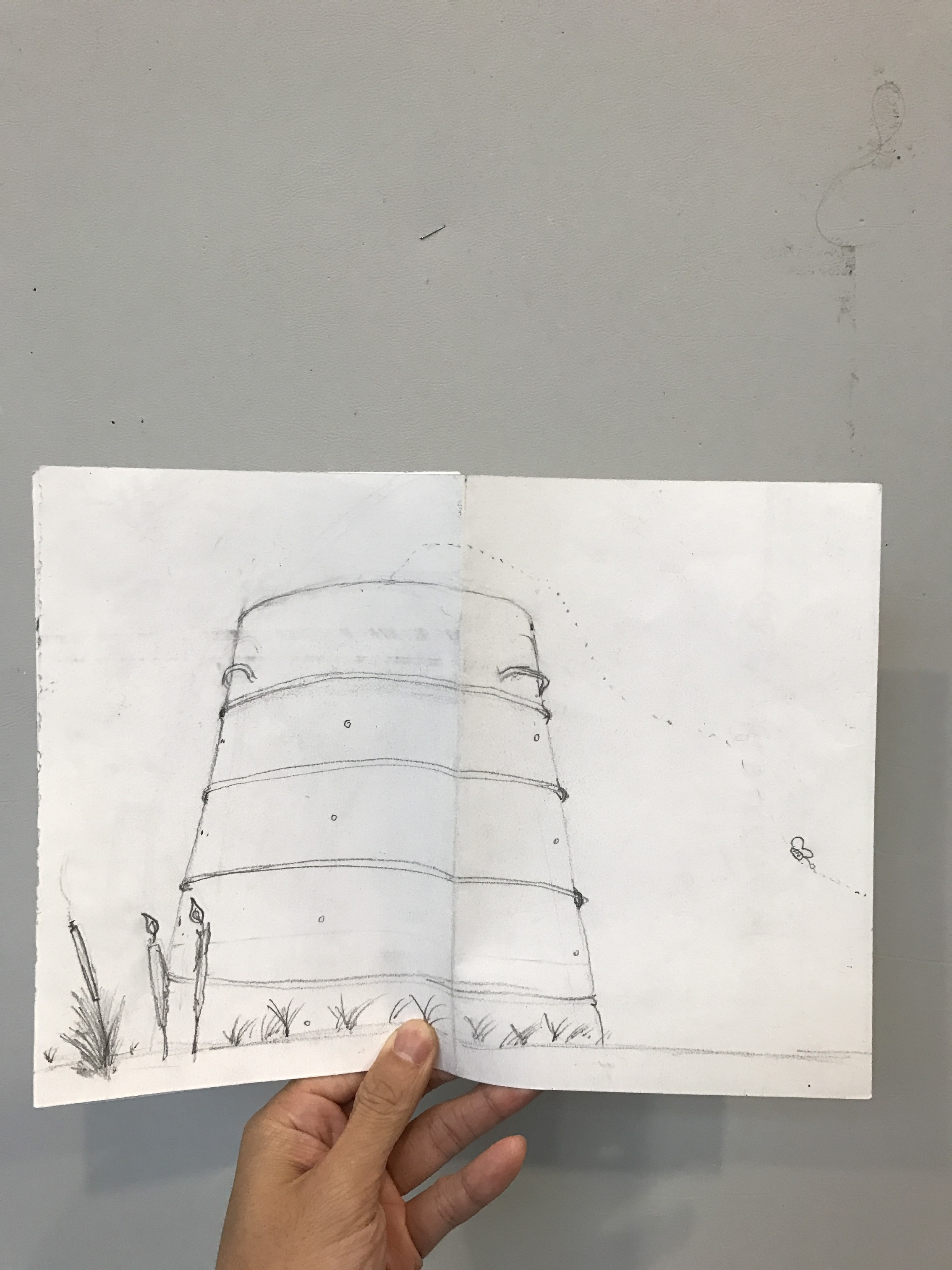
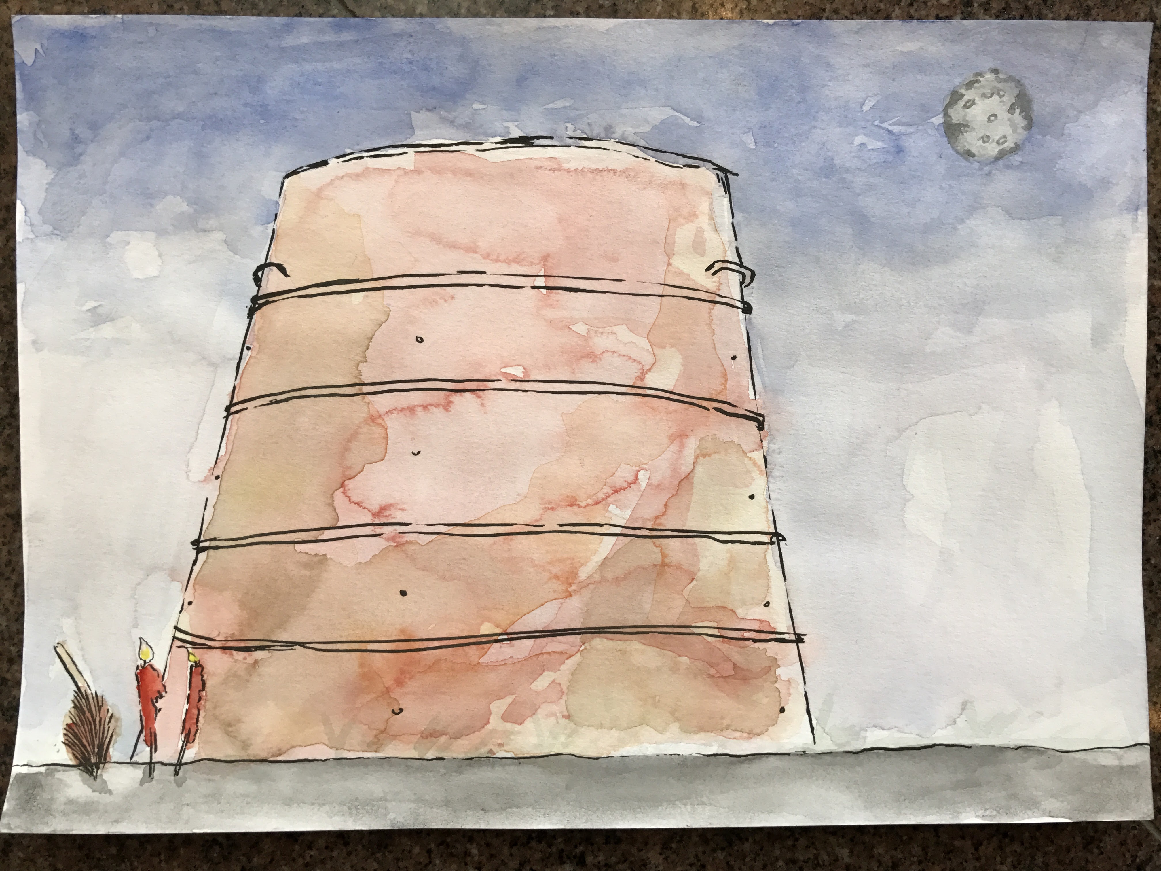
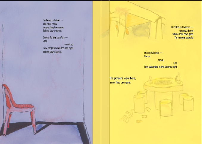
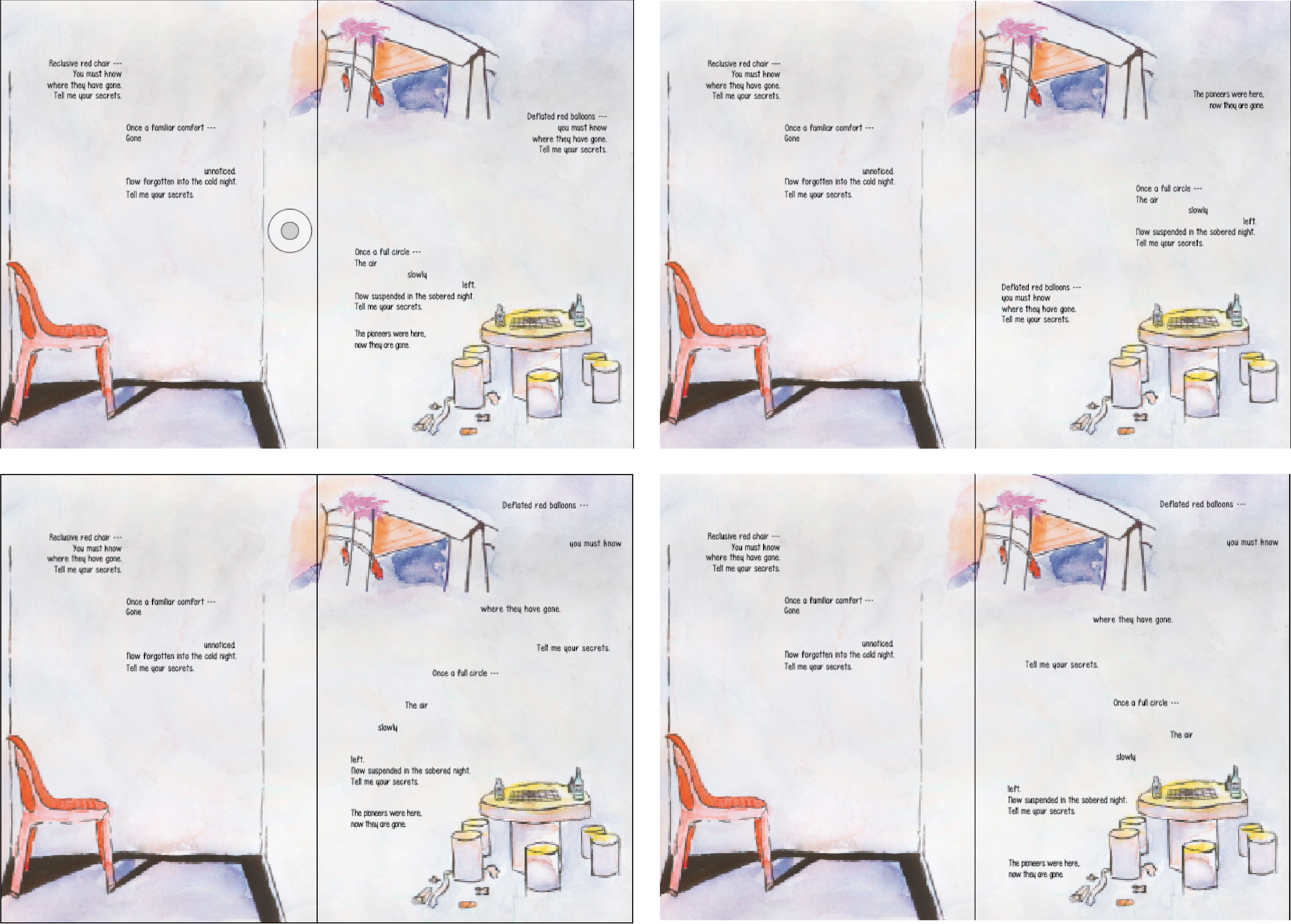
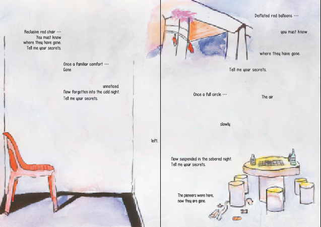
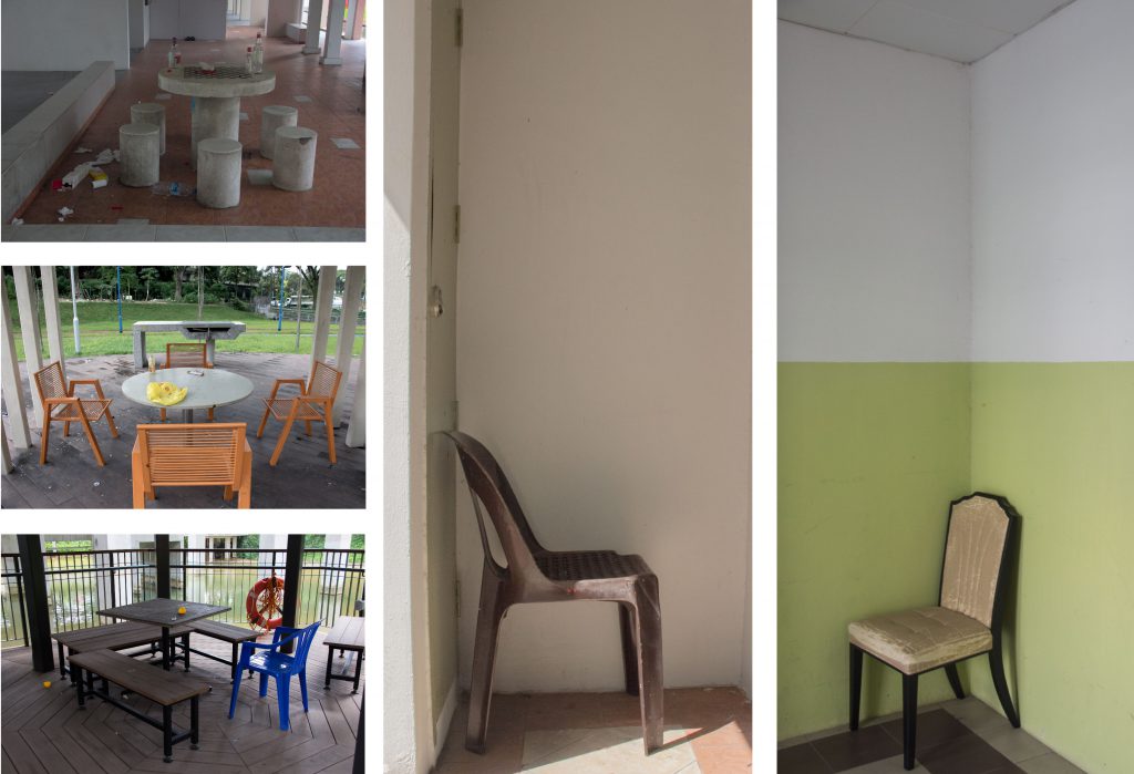
The burning bin takes up space in spread on both sides. Only part of it is shown on the first spread and the reader is invited to guess what it might be. The moon and the cool colour tones used suggest that it is night. The font used is a handwriting font and is meant to set the tone as having a child-like mindset (i.e. a children’s book)The grass bleeds into the concrete environment to on the left page to give a surreal feel to the spread. It also contrasts with the blocky, grey elements on the left. In that sense, there is a transition from greys to colours. The font on the left is larger and playful looking to suggest excitement; different but still consistent in style with the font on the right. On the right, the text is arranged in a way that reflects the pacing of the content. The font decreases in size at with each “thud” and only ends with a period on the last “thud” – suggesting the end of the bouncing back and forth.On the left page, the text is done in a manner more rigid than any of the other pages. This creates a contrast and a sombre feeling as compared to the rest of the pages which tend to be more dynamic. The solid shadows enhance the loneliness of the red chair. The hut on the right page cuts into the left page just slightly to suggest that something is off; it’s not a fairy tale. The chess table is placed at the bottom-right mostly to create space and balanced asymmetry in the composition. Because of this, I am given enough space to create an effect in the text where it looks like each line is slowly breaking apart up to the point where the word “left” hits you. It then returns to normalcy, which prepares the reader for an epilogue/conclusion.This was a simple spread, but was by far my most favourite. I like that the perspective was enough to suggest a burning bin, ashes, soot, grass and the burning candles and joss sticks. I added craters in the bin to help readers form the connection to the moon (it was what I thought of when I took pictures of the inside of these bins). When they turn over to the back cover, they will see the same candles, joss sticks, and handles and it will be clear what they were looking at in this spread. The font of this page is done larger to suggest something along the lines of wanting to hold on to fairy tale ideals. Perhaps it is better to live a beautiful lie.
That is all. If you have any queries, please don’t hesitate to ask.
Following presentation, I planned out a rough spread-by-spread design using the photos that I took.
I wasn’t able to think about a front cover but I worked on everything else. Arranging the photos on InDesign, I created my very first draft.
IFC & pg 2
Pg. 3 & 4
Pg 5 & IBC
Back Cover
I liked the use of some of the photos and how they fit into the composition.
Overall though, I felt like I should be doing illustrations instead if I intend to take a narrative “children’s’ story” approach. I was worried about the illustrations not being able to convey that what I saw was actually there, but it turns out that it was not a problem at all. That was nice.
Before proceeding, I went to find inspiration for zine designs. I made saw a couple that piqued my interest.
Chungking Express Sardines
I loved the variety of designs in each spread of this zine by ADM seniors.
Poems from Egghead: Or, you can’t live on ideas alone.
I enjoyed the poems and the way it was paced. The illustrations were delightful as well.
Random Pinterest zines
Interesting photo layoutThought about using the shadow effect, but this being a simple zine, I took inspiration from the mood of this pieceI like how this piece has a square-ish shape that crosses the page
With a rough composition out and zinespirations, I proceeded to work on the rough draft in illustration,
Front CoverIFC & Page 2Page 3 & 4Page 5 & IBCBack CoverFront & Back Cover
I found the use of images blending into each other or crossing over to the other page to be very liberating. I quite liked the recurring motif of the butterfly to represent souls flying through though I suspect that I will have to work on the composition before locking down the idea of the butterfly.
Now I needed to watercolour the composition and then add in the words and lay them out.
Back Cover & Front CoverIFC & Page 2Page 3 & 4Page 5 & IBC
Personally, it would have been better to do a wet-on-wet medium but I didn’t have the means then. Still, I think that it achieved the intended look for the most part.
I thought about handwriting everything but I heard from someone that it was necessary to make use of InDesign so I did. That’s why I painted them in spreads as opposed to the “print” order. I also decided to use fonts because it forced me to think about different fonts to make use of. In the end, scanning and editing them on photoshop made it easier to lay it out. Composition-wise, I think that editing it in post-production helped.
Adjusting the colours to make the sky look more like night.Playing around with colours to see how it affects the contentPlaying around with text layout.Tried funny things like putting the “left” on the left side of the spreadPlaying around with different fonts and cutting across the spread too. In the end, I decided against it
After trying and failing a couple of times, I managed to settle on design that I liked. I don’t like the idea of having to put my name in the zine but it seemed like it fit stylistically so I put it in. So finally, here are the final spreads.
After finalising the zine, I went to the adm library to print it. $4.28 per zine – I thought they were supposed to be cheap to make.
Butterfly says hi to Tisya WongButterfly on the ballButterly flying straight towards the end of the right page to suggest that heart rate monitor flatlining.Resting place
Overall though, I felt that the butterflies and the lines were distracting. Okay, it was just the lines but I didn’t want to include the butterfly without the lines. It then just becomes another element to think about. I didn’t want that.
Off to print again!
Total money spent: $8.56.
I was thankful that the binding wasn’t too much of a hassle. That said, I learnt valuable lessons about binding. Firstly, remember to score the centre of the zine first, then staple them together on a surface like an eraser (or blue foam). Other than having the bleed marks, it is important to know how to use the bleed marks properly. I made the mistake of cutting it all the way through from one side to the other. Because of this, either the horizontal or vertical bleed mark will be cut away and you will have no marks to work with on either the horizontal or vertical mark, depending on which you worked on first. What you should do is: use a penknife to cut it from the bleed mark and not from each end of the paper. cool stuff.
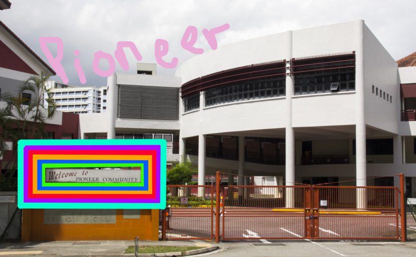
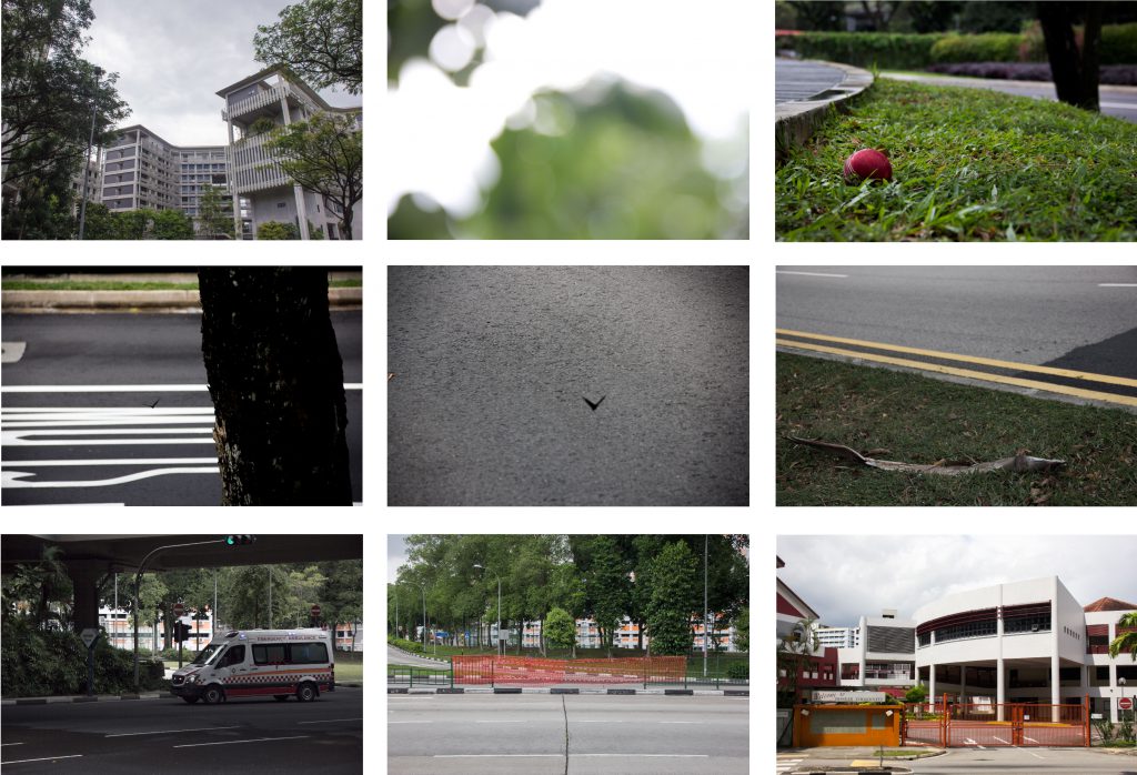
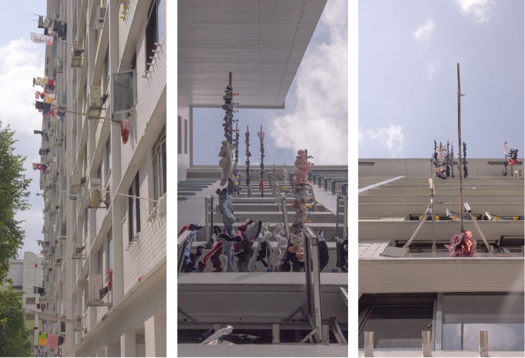
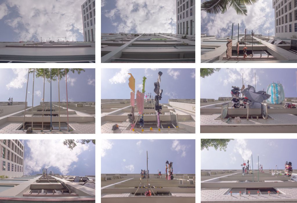
After weeks of gruelling assignment after assignment after assignment after assignment, I was forced to leave the Technological University of the Nanyang in search of something majestical to capture within the vicinity of the Land of the First Men – Pioneer.
It took awhile for my eyes to adjust to the new surroundings. I saw, lying on the patch of green, a crimson orb that has been keeping the secrets of an old tree.
I saw many more wonderful things.
I saw many different portals to new worlds. I saw the moon.
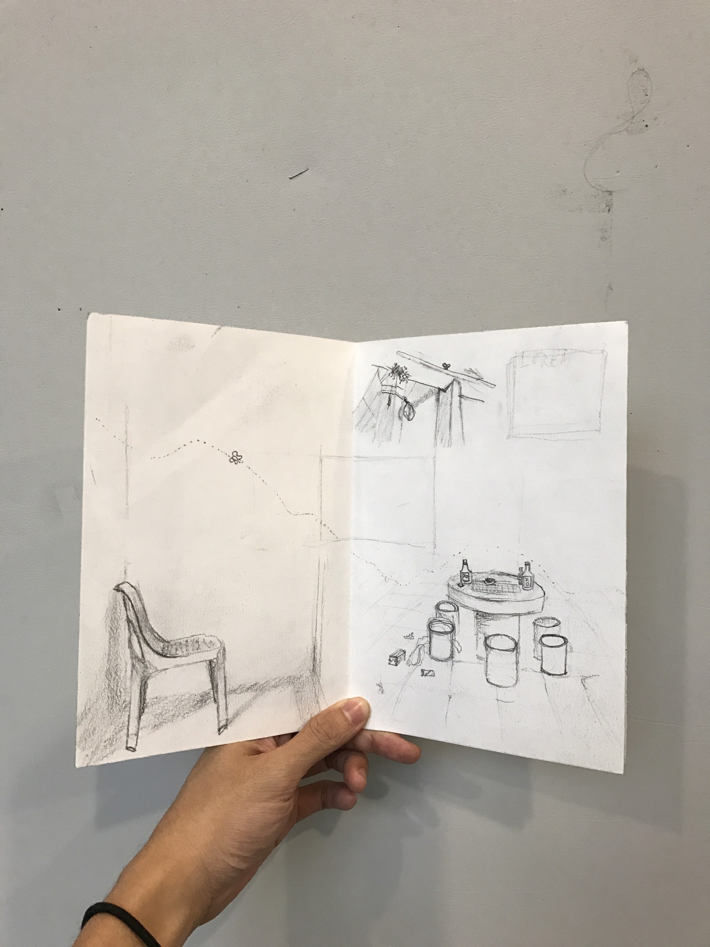
There were people who had been around the Land of the First Men, but all that was left was their chairs to tell their stories.
I looked up the concrete towers of fabric and saw paradise. The wind would blow and I would hear what each line of fabric had to say to me. They were reaching out to me and I was thoroughly entranced.
The main elements of being a taxi driver that I wanted to highlight were the cab signs of Singapore, the car itself, and the beaded seats that all cab drivers seem to use.
For this design, my name is placed on the side of a taxi car. It is meant to feel flatter than the other designs; as though it was floating in space. This gave me room to deliver a clearer message.
I combined the cab sign and the beaded seats to form the typeface, imagining what it would be like if I were to create a whole font series. I made sure to keep the element to a minimum to ensure that the communication would be clear and not possibly confuse.
I made the background to look like the side of a car, specifically a yellow car. We can tell that it is a car with the hint of a wheel on the bottom left. There is also a metallic shine/sheen on the yellow area to enhance the believability that it is a car.
I used the colour yellow for the car because taxi cabs in Singapore are easily identified as being yellow or blue- which is why the cab sign is in the ComfortDelgro blue.
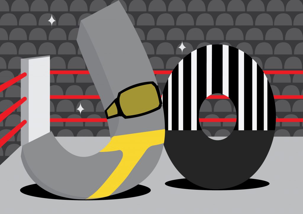
I am a Professional Wrestler
Design approach:
The main elements of being a professional wrestler that I wanted to highlight were the ring, the championship belt, the tights, the referee, and the fans.
One thing that I had to be aware of is that I did not want people to mistake this composition as actual wrestling like in the olympics or like UFC (Ultimate Fighting Championship). Because of that, I made the setting less gritty. I even made the tights, yellow.
The typeface looks like actual characters in a scene: J, the wrestling champion, and O, the referee. I distinctly wanted to give this a 3D effect to give it an almost cartoon vibe. This also gives the font some literal weight, enhanced by the shadows. I chose my setting/background to be off centre to create more dynamism in my composition. This also allowed the typography to have more space. As a result, I have a more balanced composition.
I added diamond shaped camera flashes from the adoring fans to have small accents in the composition to create visual interest. I repeated the heads of the fans to create an in-situ. Just the heads was enough.
I made minimal use of colours. I used mostly greys so that when I did use colour, it would stand out all the more – the funny yellow tights, the red in the ring ropes evoke that sort of fiery passion of both myself, for the job, and of the fans as well.
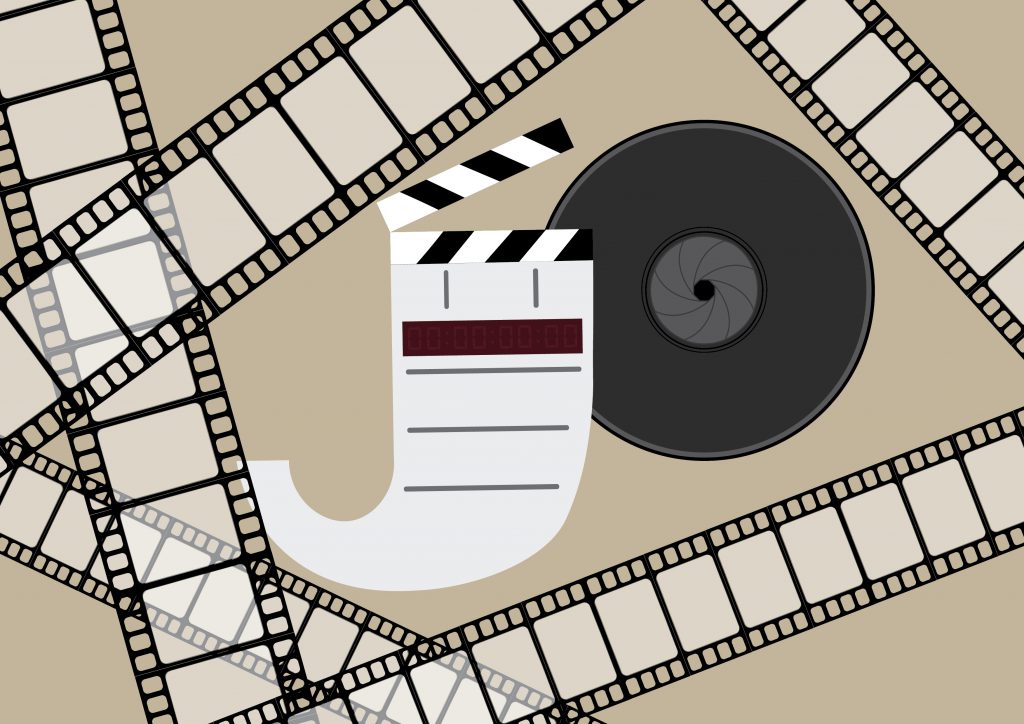
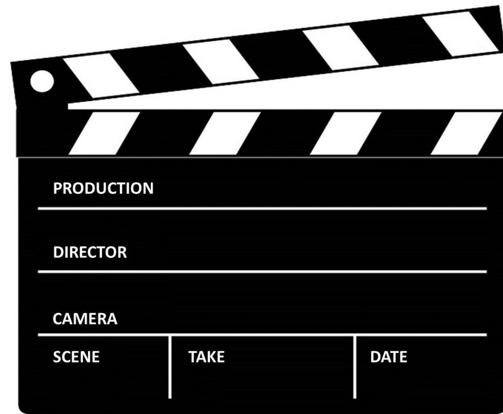
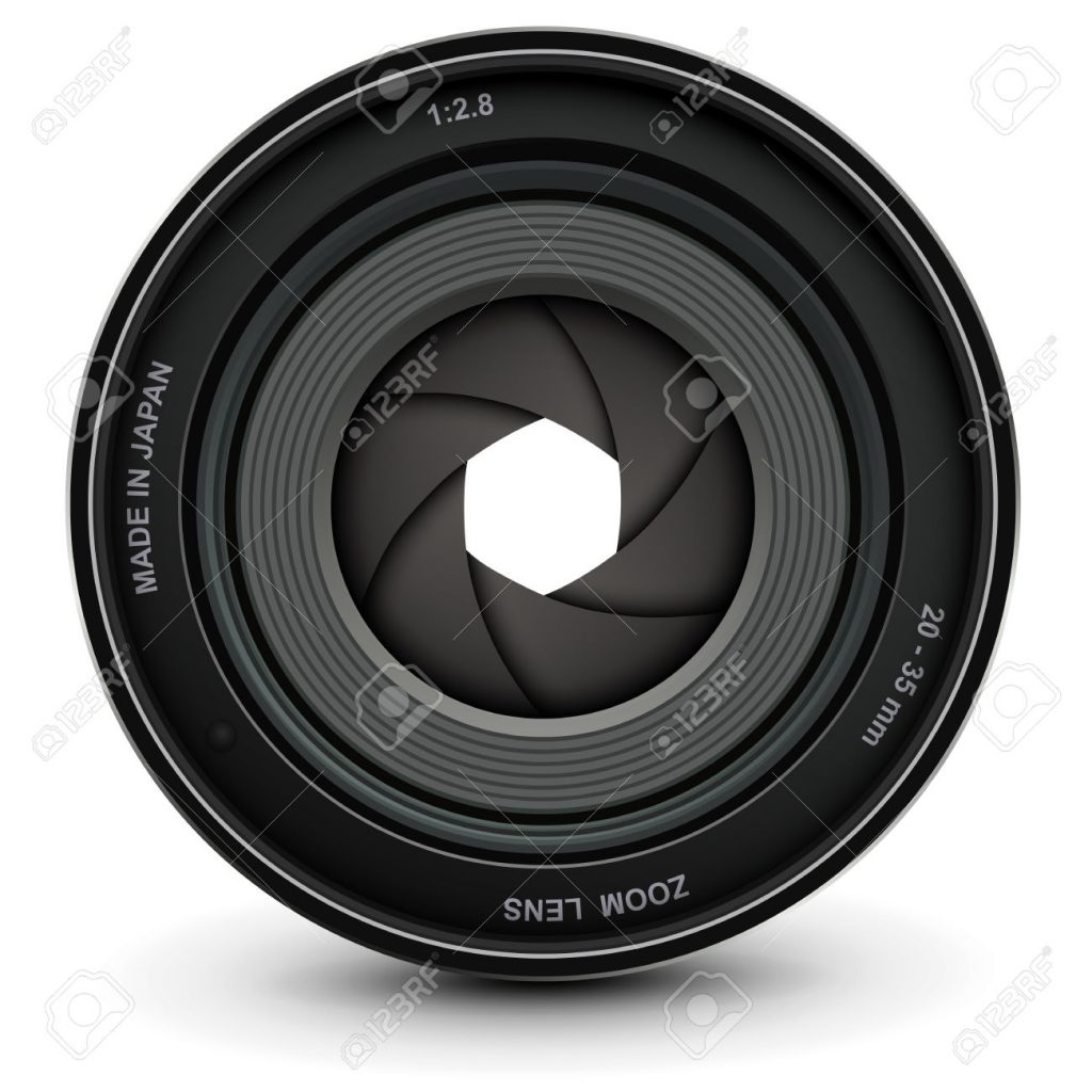
I am a Filmmaker
Design approach:
The main elements of being a filmmaker that I wanted to highlight were the clapper board, the camera lens, and the film reel.
I used the elements of the clapper board and camera lens to create the typeface of my name. The camera lens, accompanied by the clapper board make it clear that I am a filmmaker as opposed to a photographer.
I wanted to go against my instincts in this composition. I wanted to really get out of my comfort zone. Even though it was already clear what my future job was, I needed another element to the design, so I used film reel to give a sense of depth, texture, and patterns.
I used the colour brown as a background because I wanted to give a nostalgic/sepia/homely feel to the design. Filmmaking is, after all, where I feel most at home.
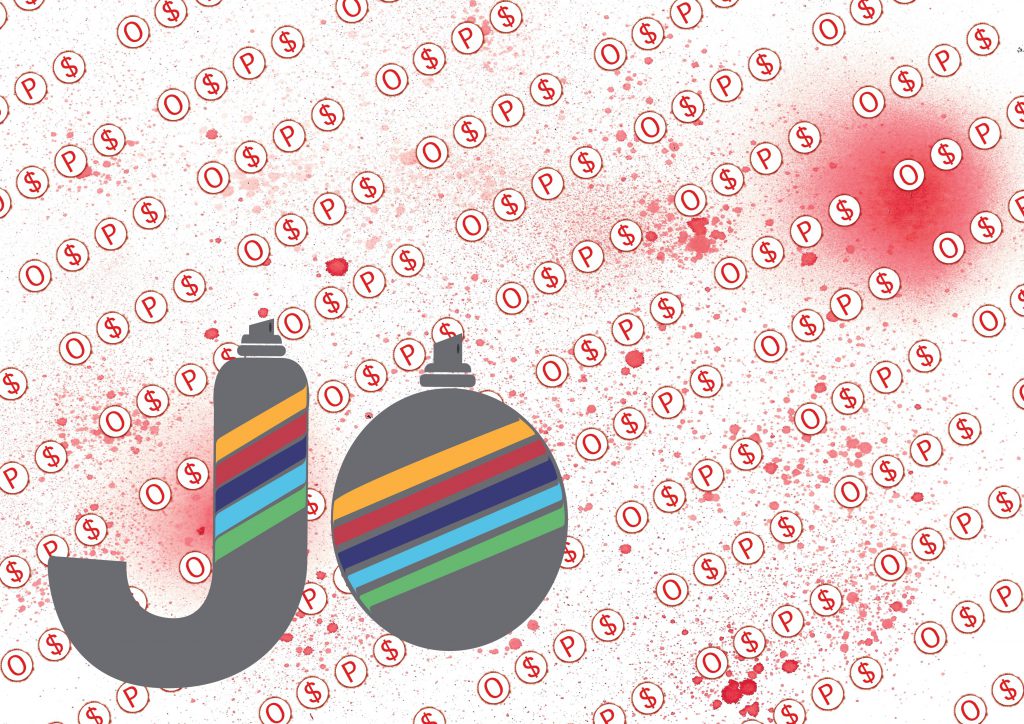
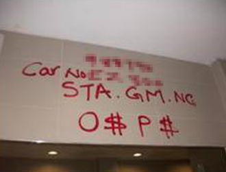
I am a Gangster Graphic Designer
Design approach:
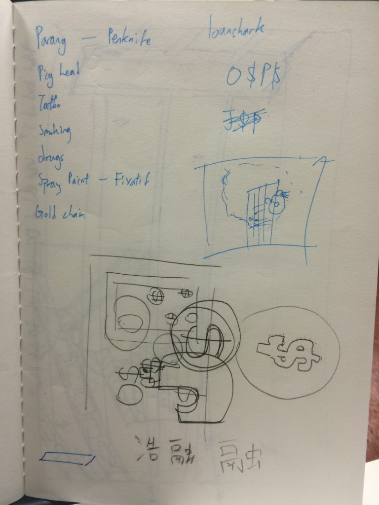
The main elements of being a gangster graphic designer that I wanted to highlight were the O$P$ graffiti, and the spray paint.
Though this one had the fewest elements, I felt that the job was specific enough and that I could express this job in ways other than just the elements.
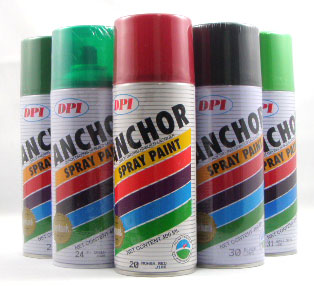
As with the taxi driver design, I imagined what it would be like to create a whole font series with the spray paint. I felt that I made sure that it looks like a spray can/bottle because it is modelled after iconic spray paint brand, Anchor.
With the design of the background, I filled it with the O$P$ sign (with a twist). Instead of having the O$P$ sign be random or clumsily done, it is neatly done in repetition, giving off the idea that it is a graphic designer’s handiwork. The background is tilted at an angle to create dynamism in the composition while not looking messy, another trait of graphic designers.
Choosing the colour red was an obvious choice, but I had to make it look a little more on the bloody side to accentuate the violence that is often associated with gangs.
My main goal for this project is to experiment more with design/composition as well as colours. I also plan on either drawing/painting or illustrating my final compositions because money is tight – plain and simple.
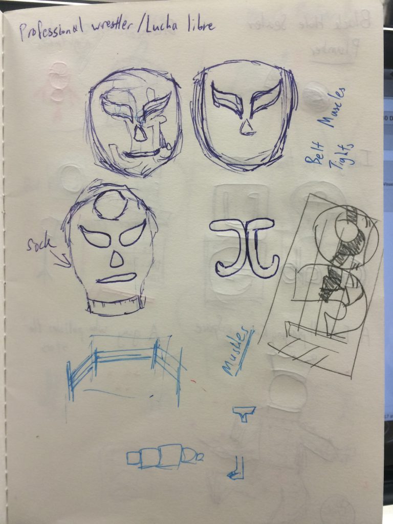
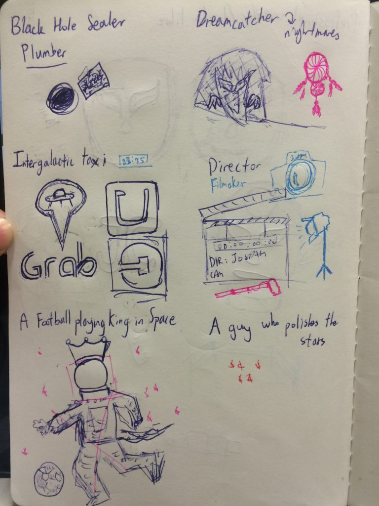
I started off this project by sketching out a couple of jobs that I wanted to work on. I did not think about what aesthetics I could make use of first because I did not want to create what has already been created. People will argue with me about this but this process is more organic to me and it is how I have to do things.
These were based off my own ideas of trying to create typography and blend it with the future job. After the consultation, however, I was told that I should imagine if the letter was the job. That meant that we were to characterise our letters; in my case, J and O.
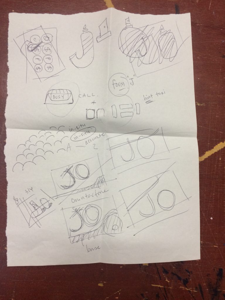
With that, I came up with a couple of new thumbnails (some of which can be seen with the sketches above)
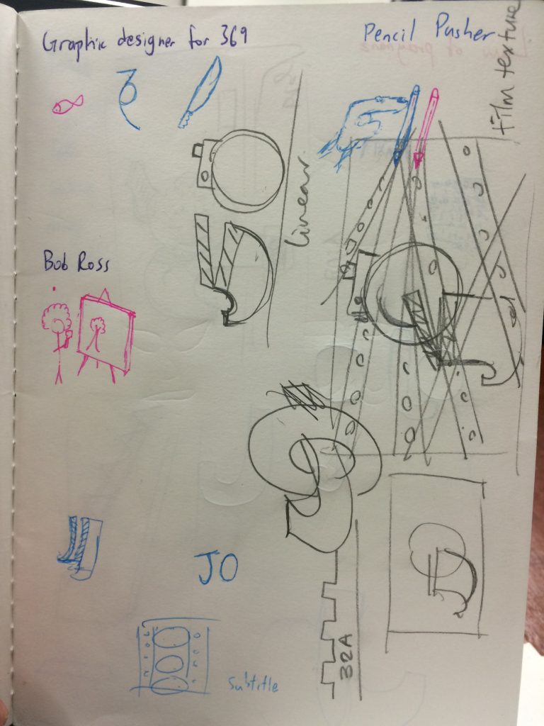
taxi cab designfilmmaker design, and my dashed dreams of being bob rossO$P$
I then worked on turning the thumbnails into illustrations.
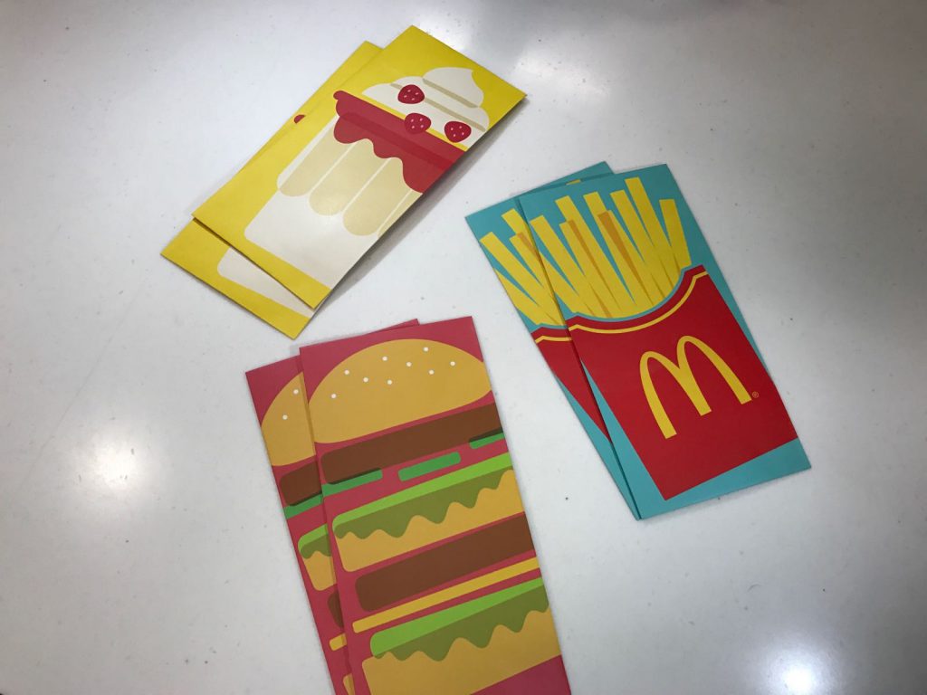
I was looking out for inspiration and it so happened that I was having MacDonald’s, one day, near Chinese New Year. They were giving out Angpaos that had really nice illustrations. I decided to try adapting this style to create my compositions.
I looked for points of reference for my elements, then implemented them in my designs.
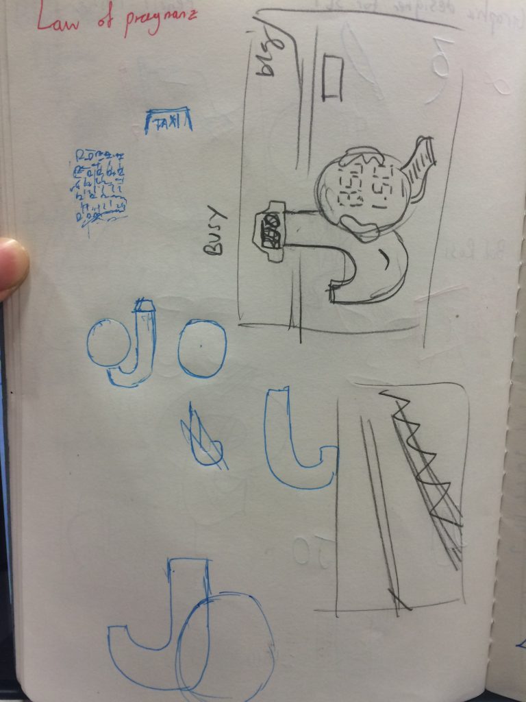
Taxi Driver
Professional Wrestler
Filmmaker
Graphic Designer for Gangs
After working sufficiently on the rough versions of the illustrations, I brought them for consultation again. This time though, I was told that I should create a single font style for each job. I was a little perplexed now. Was there a wrong way of doing typography? Were things right one week and wrong the next? Perhaps this was just a means of creating variety in the work. Nevertheless, the client gets what the client wants – those are the rules of the game.
To be fair though, I believe that the taxi driver one was difficult to decipher.
In the end, I had a mixture of typography (typographies?) that were either characters or that could be a full set.
In hindsight, variety is probably good.
I went through several iterations of this oneand several more for this one
I experimented with colours, spacing and trying the O as the stencil for the $. All of these were steps in the right direction.
This was the right direction I wanted to be heading in. It was getting better. I liked that even though they were all illustrations, they had styles that made them diverse.
I need to add a metallic sheen on the taxi. It was hard to find a way to do that. I also needed to straighten the clapper board in the filmmaking composition because there were enough angled film reels. This would give variety to the design. A couple more tweaks and I should have my designs.