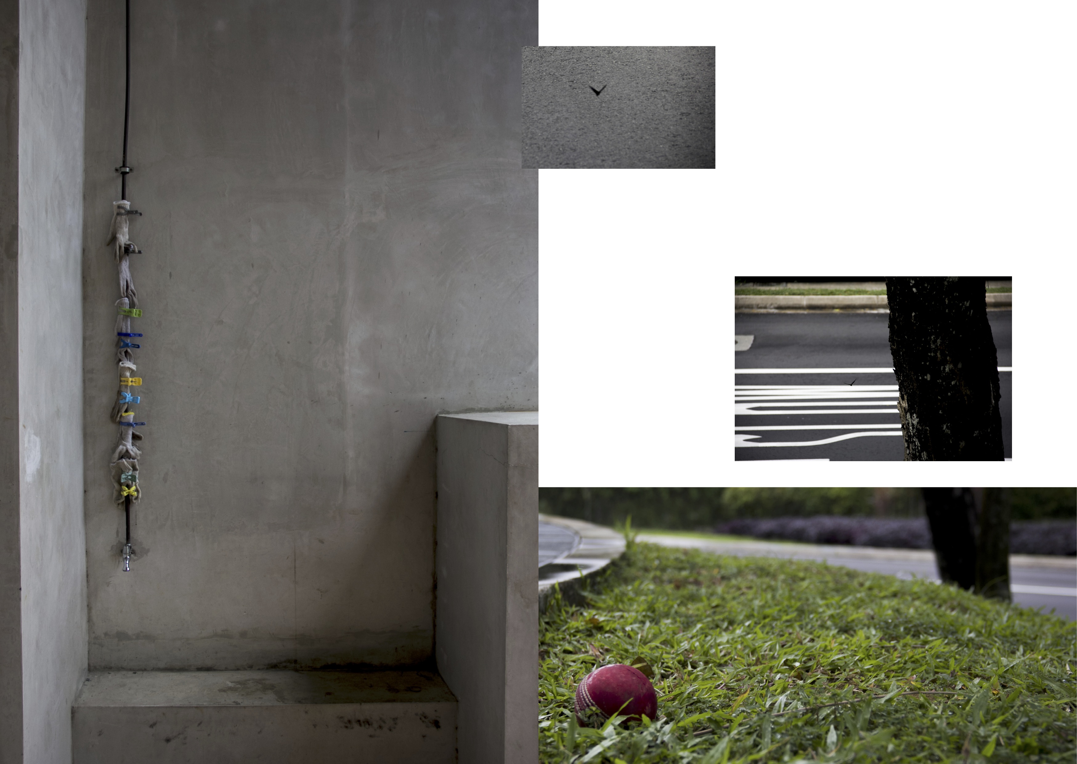
Following presentation, I planned out a rough spread-by-spread design using the photos that I took.
I wasn’t able to think about a front cover but I worked on everything else. Arranging the photos on InDesign, I created my very first draft.
IFC & pg 2
Pg. 3 & 4
Pg 5 & IBC
Back Cover
I liked the use of some of the photos and how they fit into the composition.
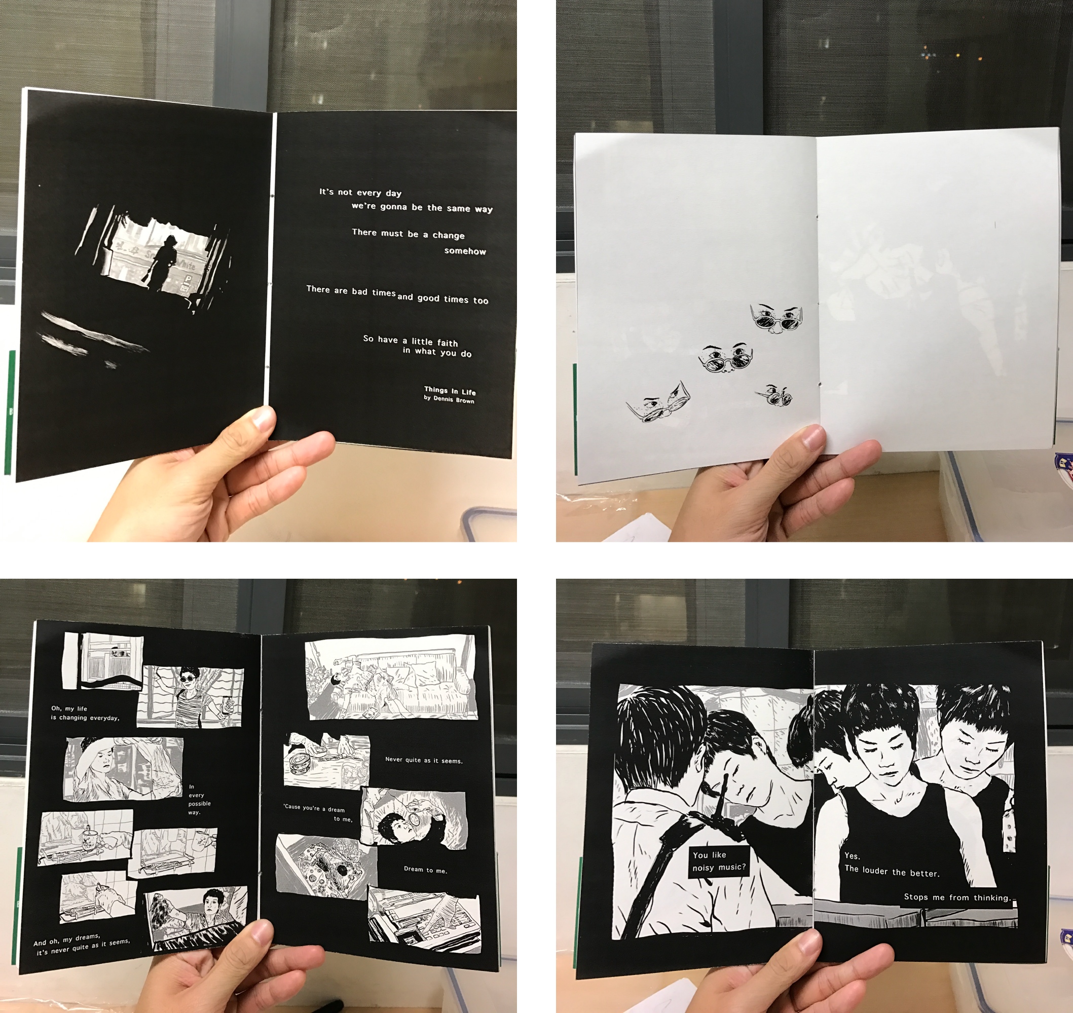
Overall though, I felt like I should be doing illustrations instead if I intend to take a narrative “children’s’ story” approach. I was worried about the illustrations not being able to convey that what I saw was actually there, but it turns out that it was not a problem at all. That was nice.
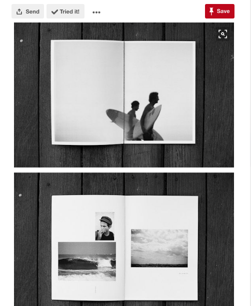
Before proceeding, I went to find inspiration for zine designs. I made saw a couple that piqued my interest.
Chungking Express Sardines

Poems from Egghead: Or, you can’t live on ideas alone.
Random Pinterest zines
With a rough composition out and zinespirations, I proceeded to work on the rough draft in illustration,


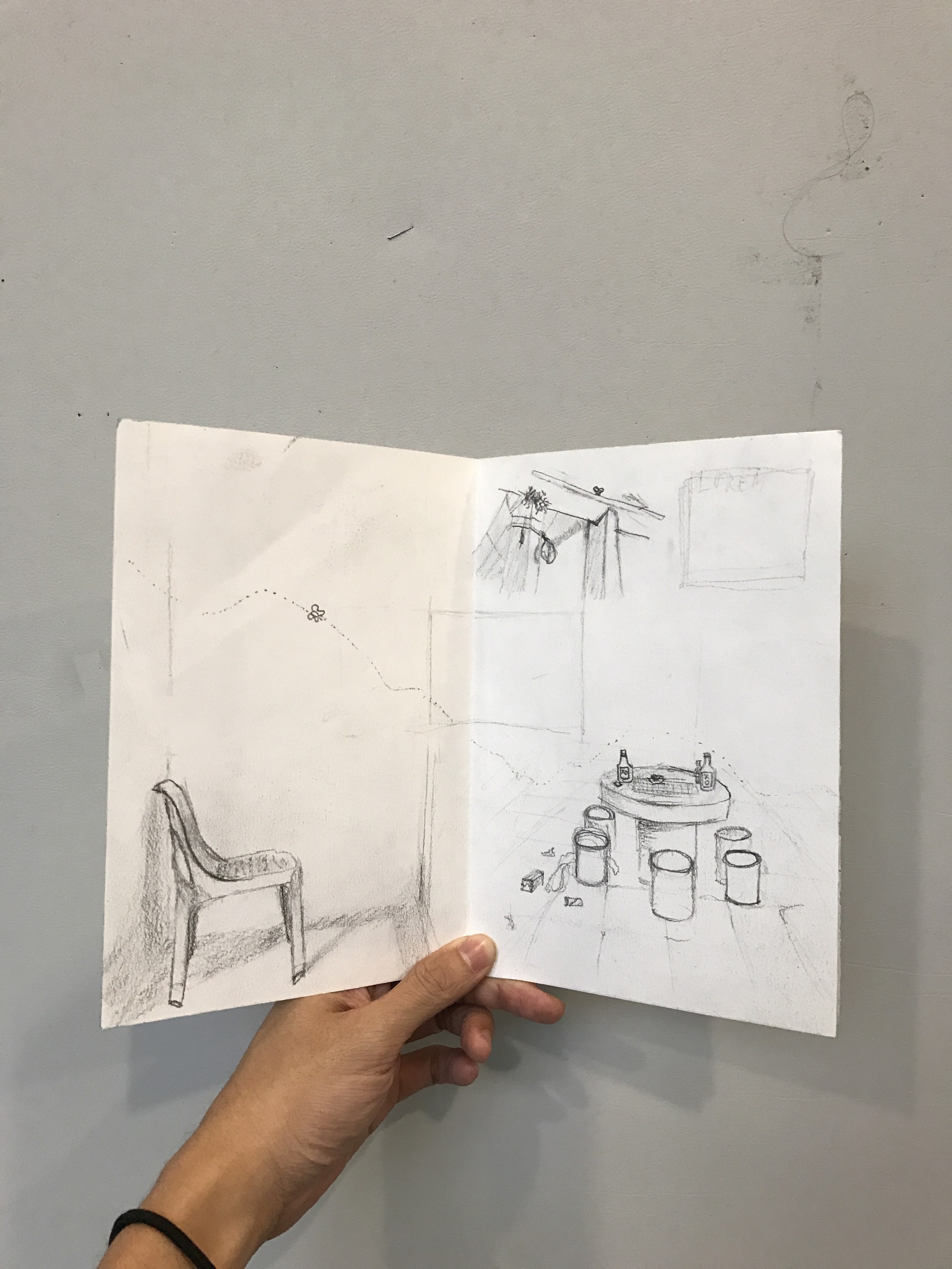
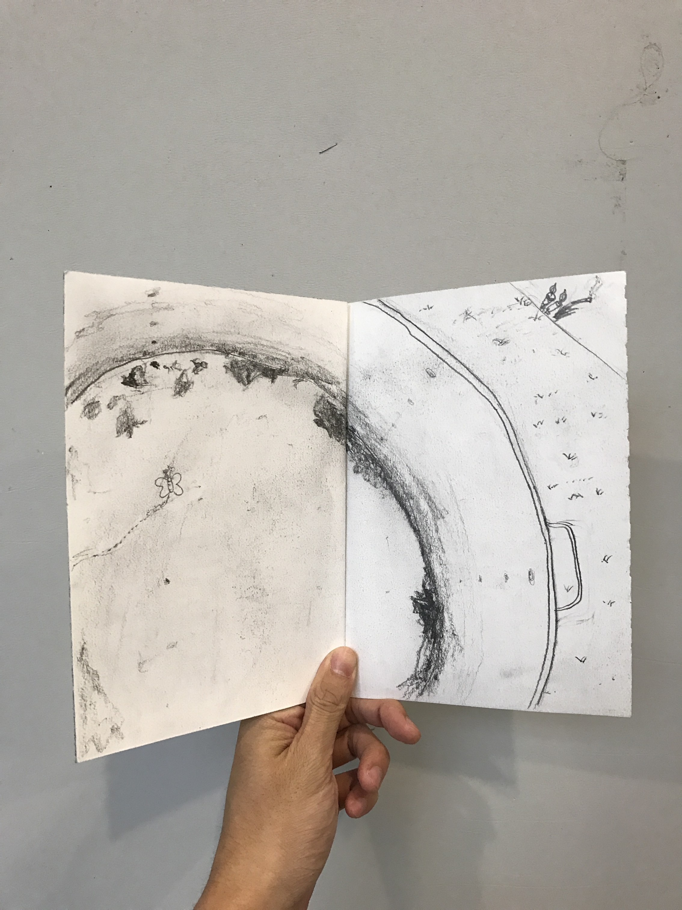
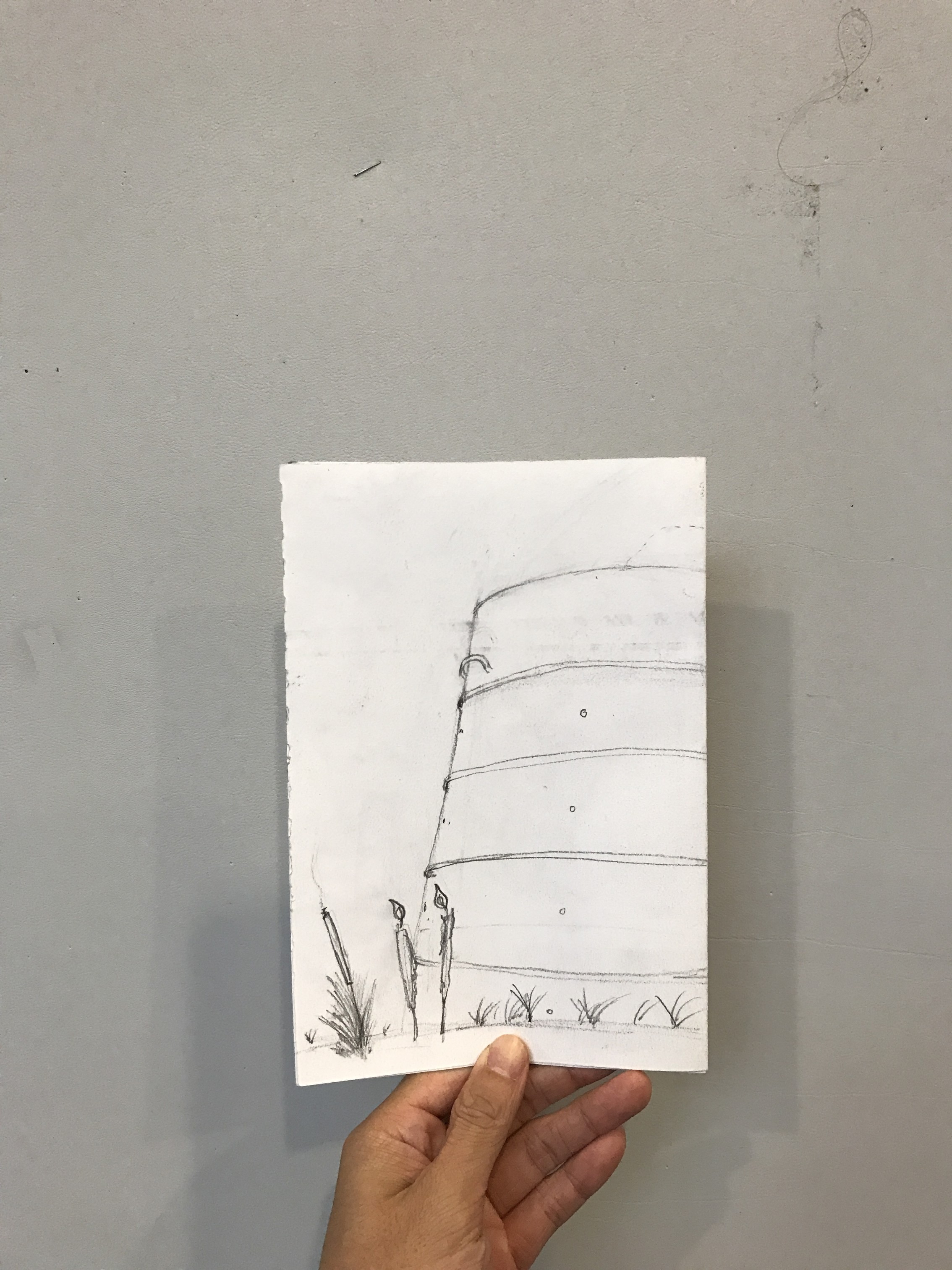
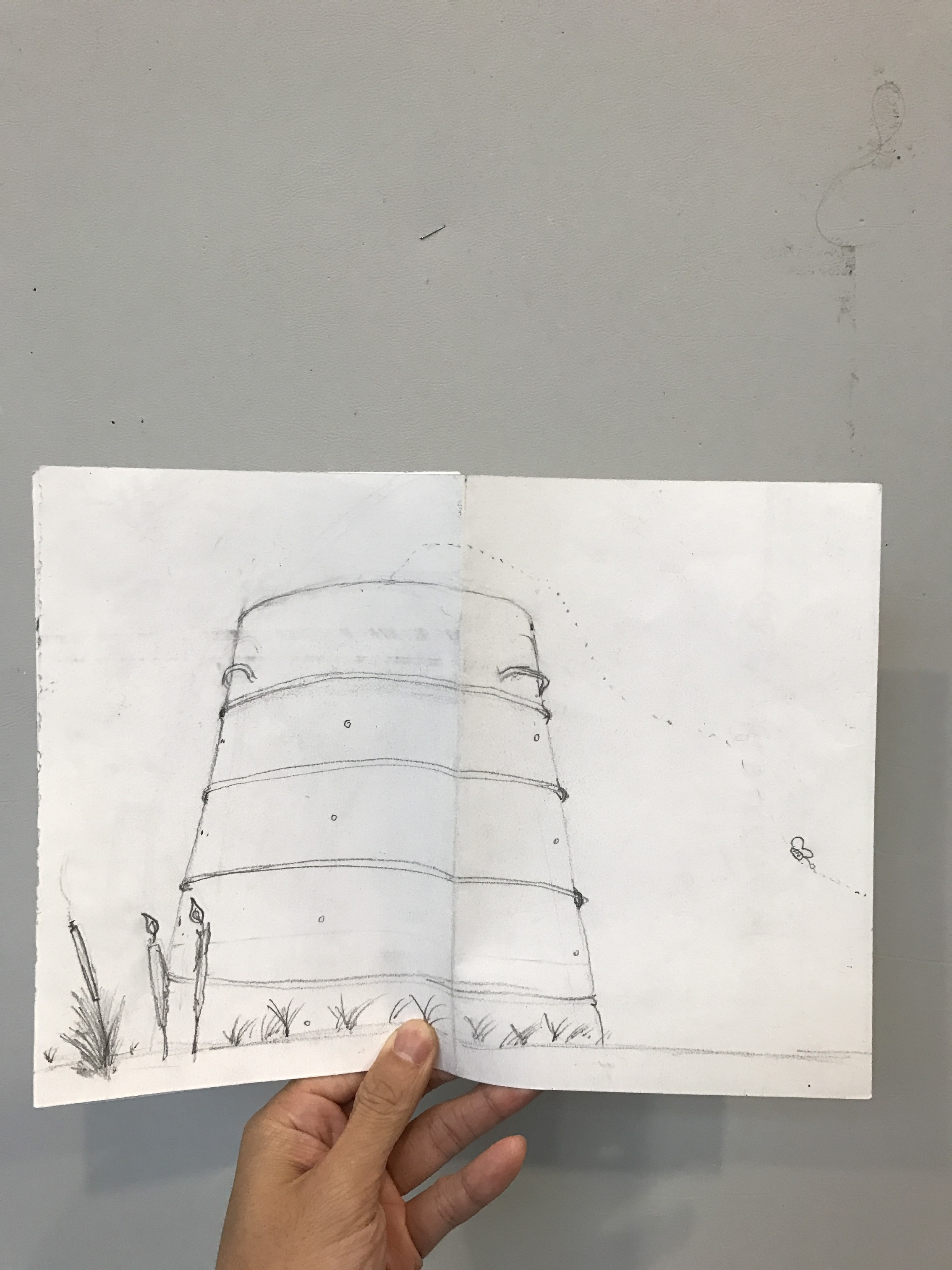
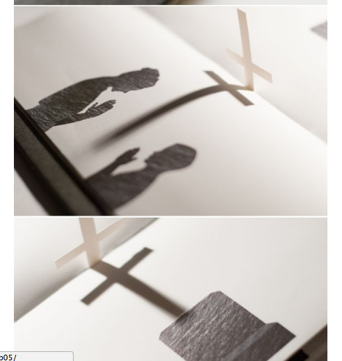
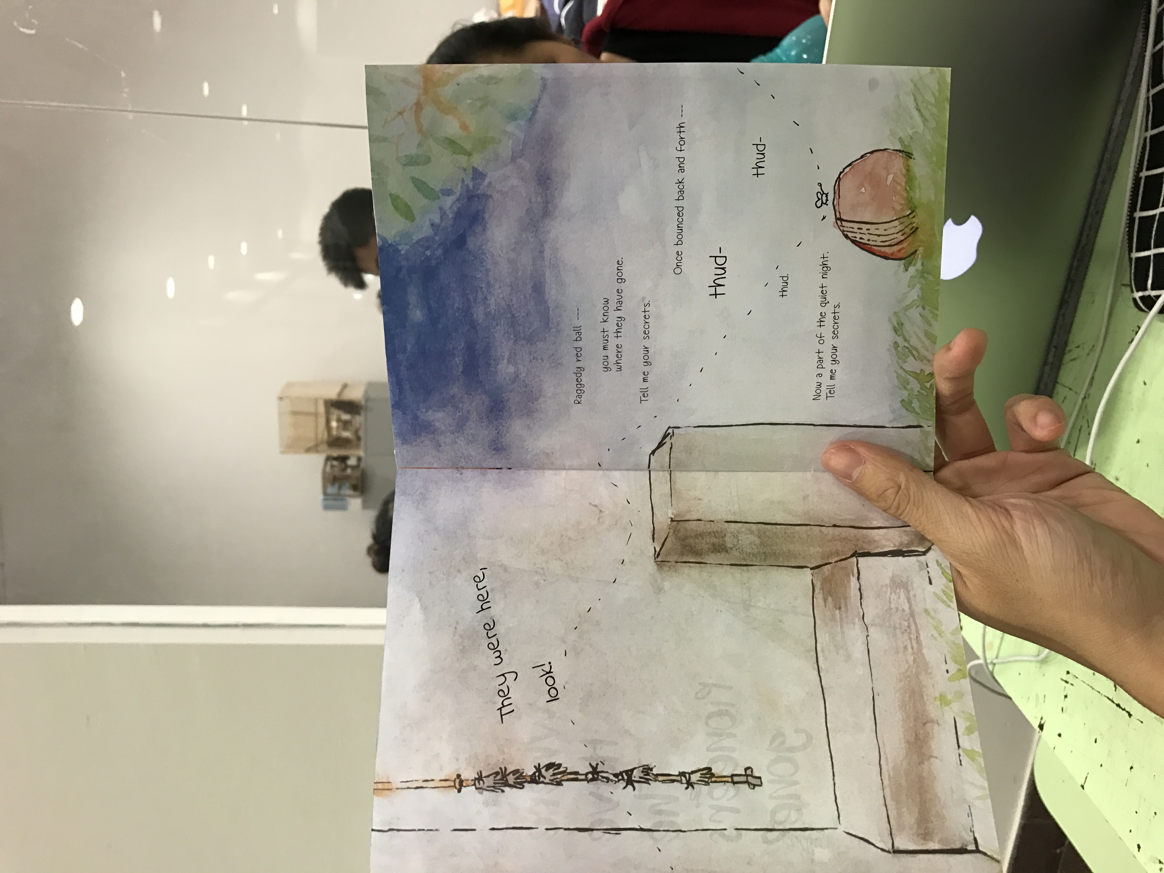
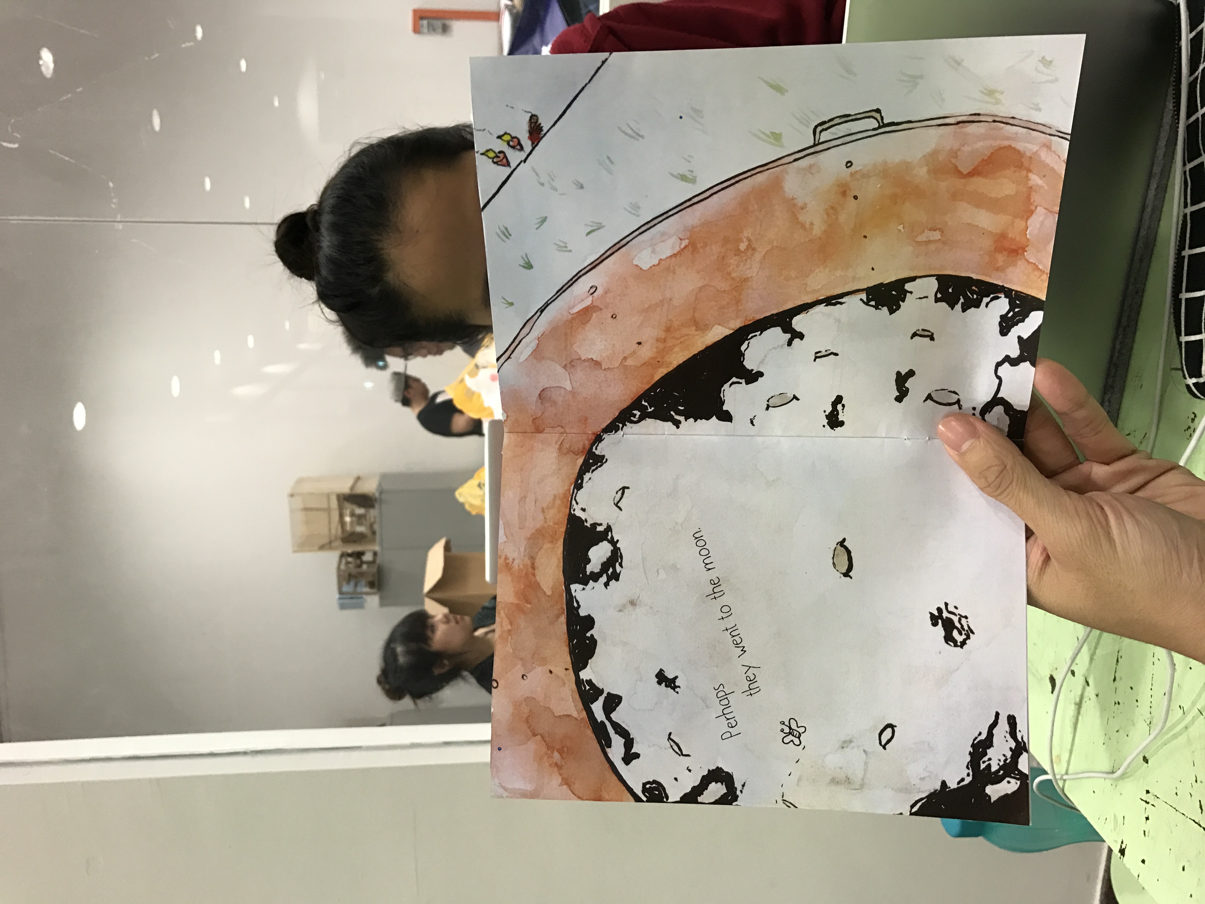
I found the use of images blending into each other or crossing over to the other page to be very liberating. I quite liked the recurring motif of the butterfly to represent souls flying through though I suspect that I will have to work on the composition before locking down the idea of the butterfly.
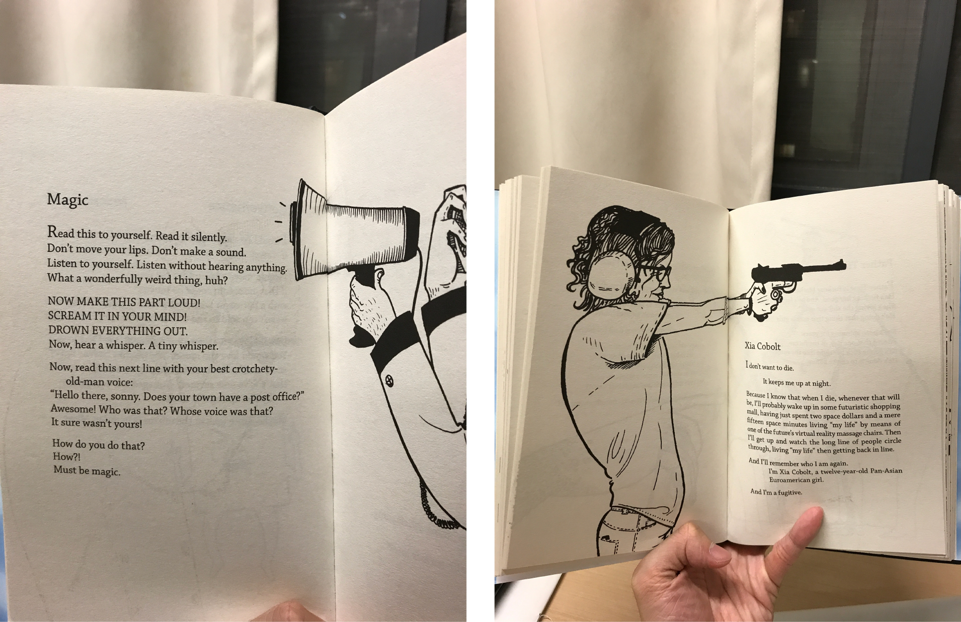
Now I needed to watercolour the composition and then add in the words and lay them out.
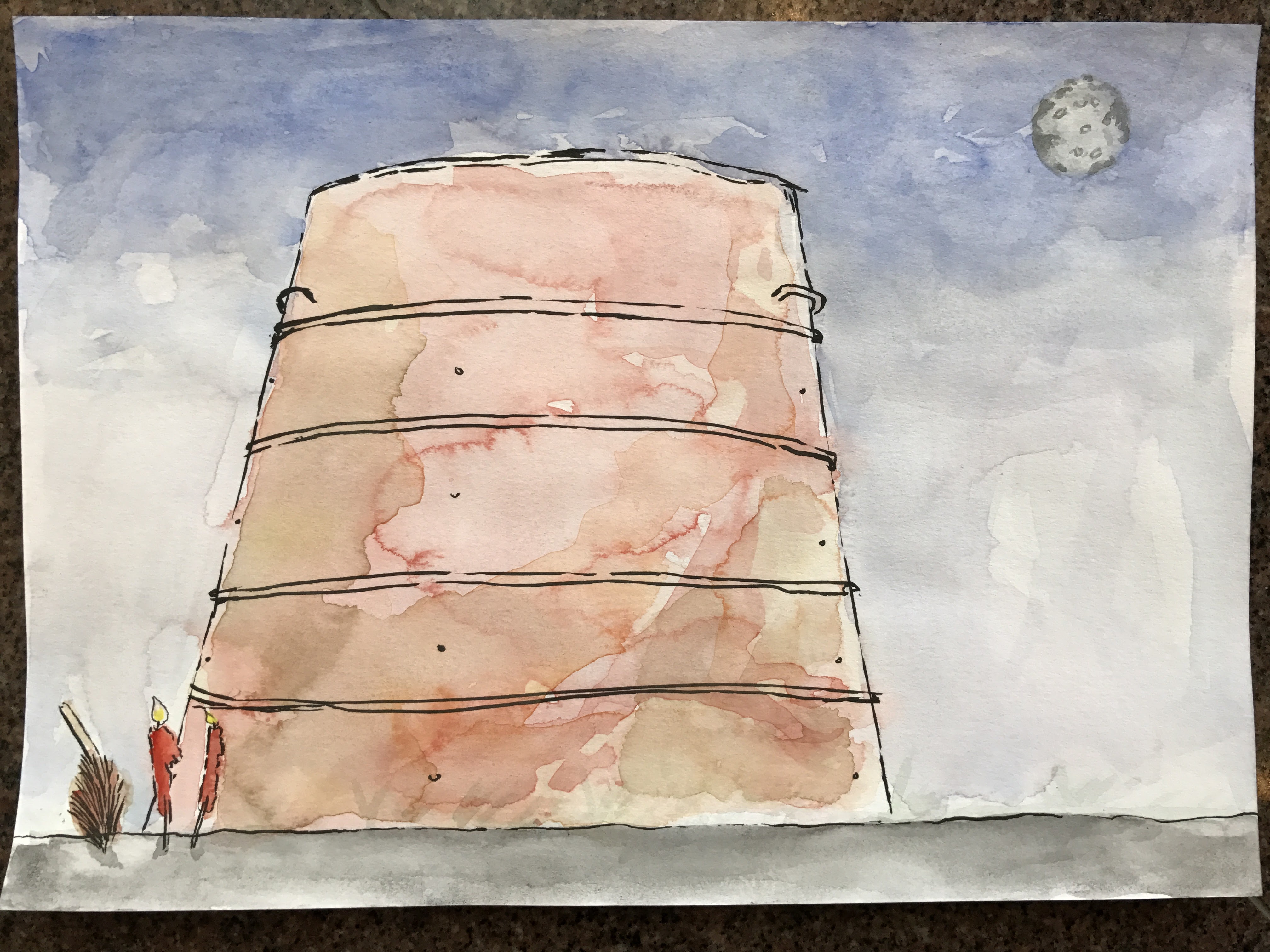


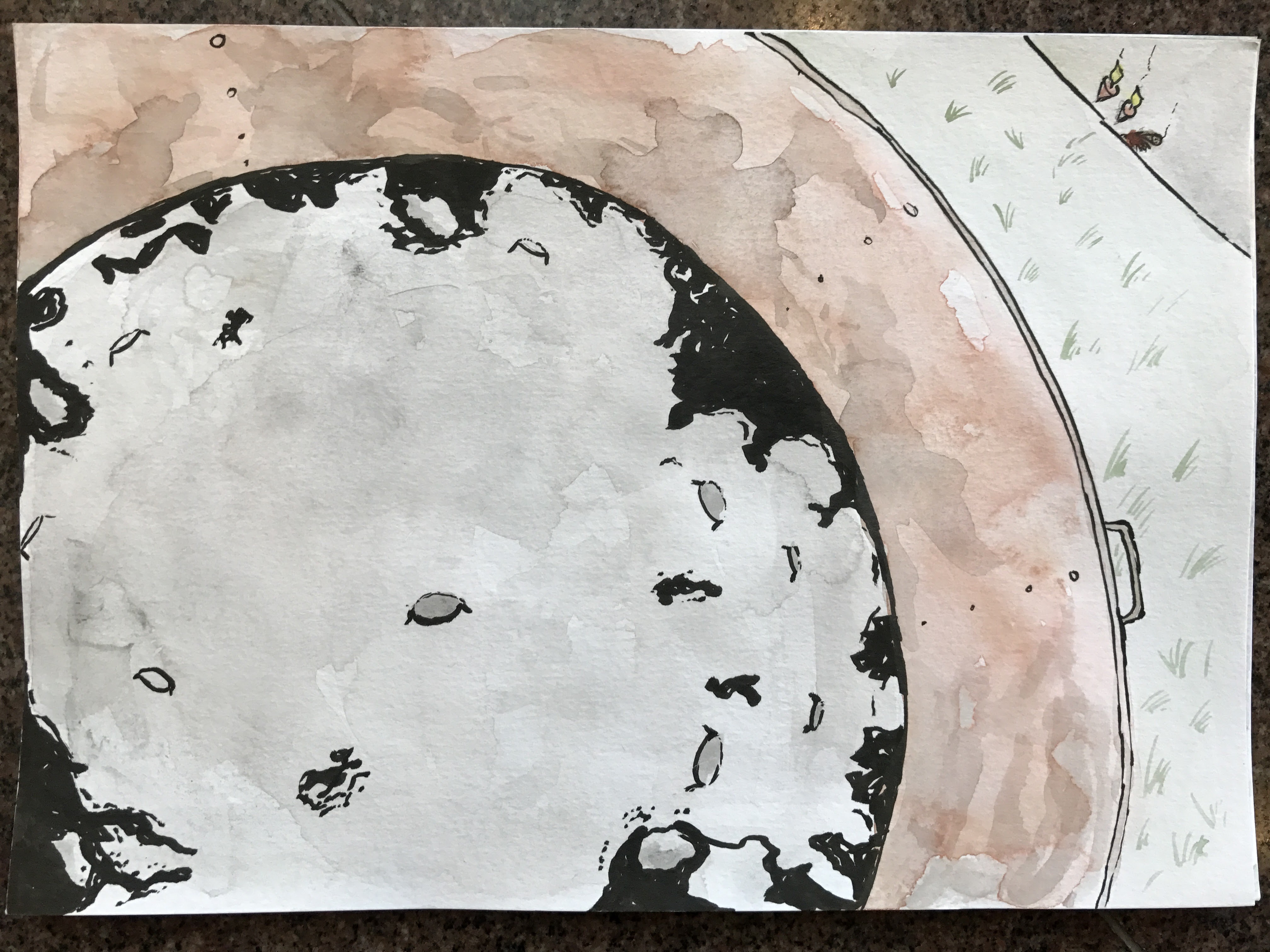
Personally, it would have been better to do a wet-on-wet medium but I didn’t have the means then. Still, I think that it achieved the intended look for the most part.
I thought about handwriting everything but I heard from someone that it was necessary to make use of InDesign so I did. That’s why I painted them in spreads as opposed to the “print” order. I also decided to use fonts because it forced me to think about different fonts to make use of. In the end, scanning and editing them on photoshop made it easier to lay it out. Composition-wise, I think that editing it in post-production helped.

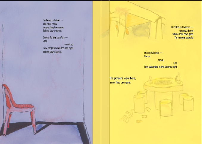
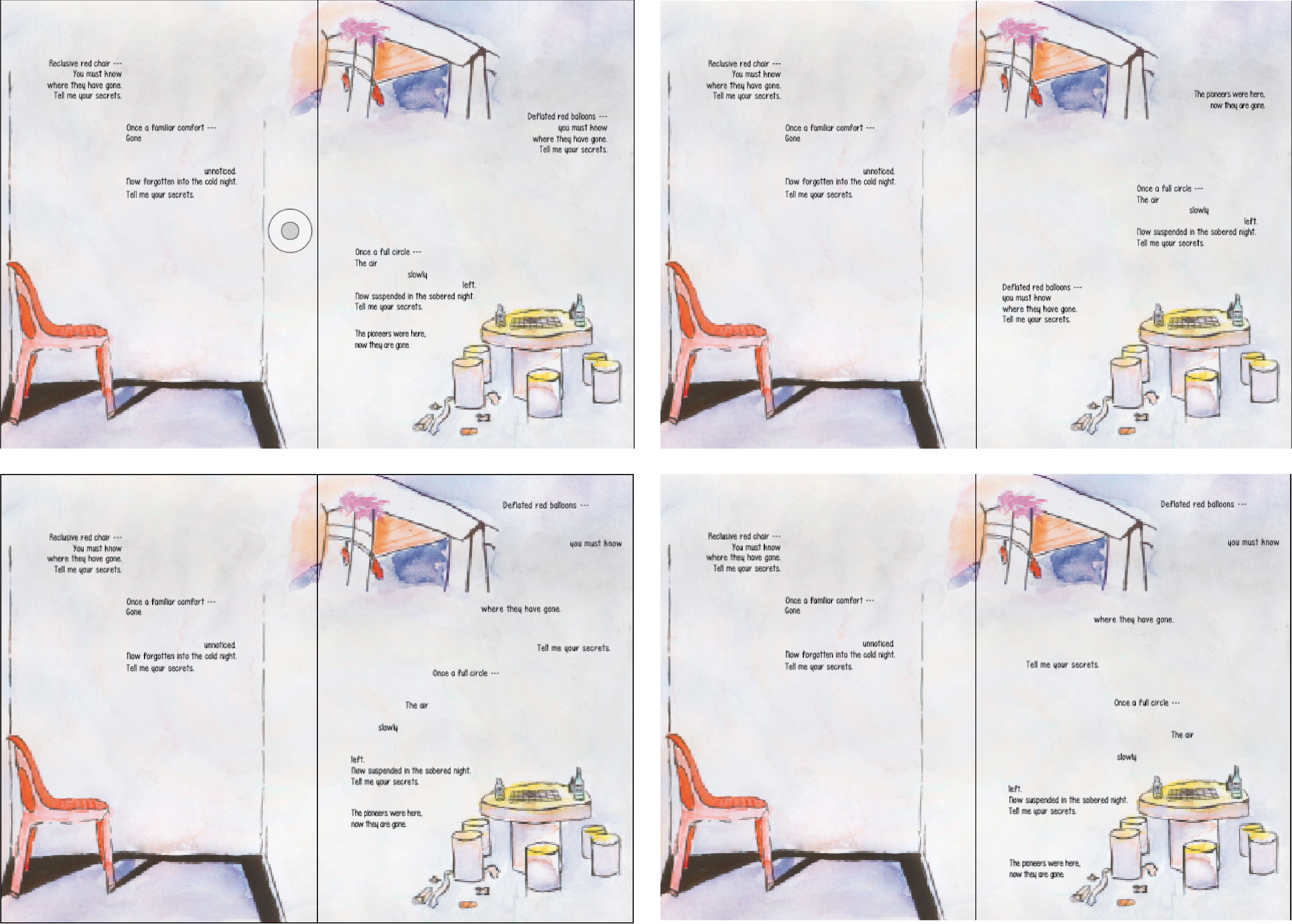
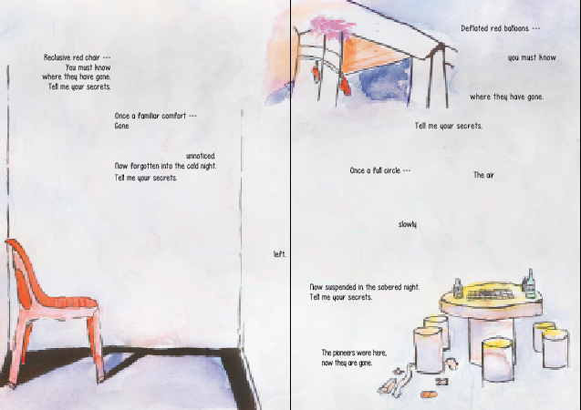
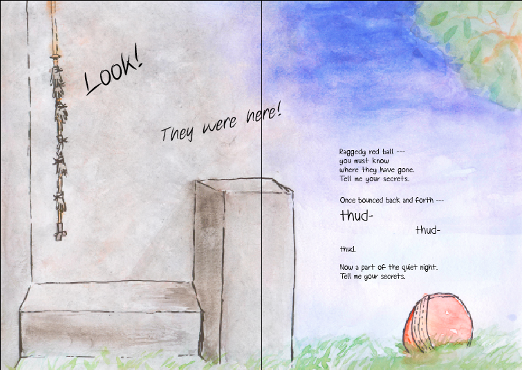
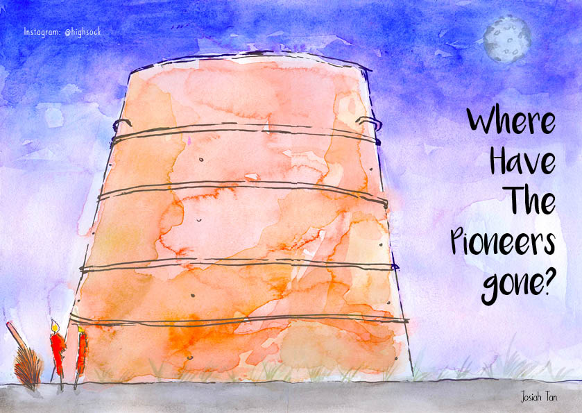
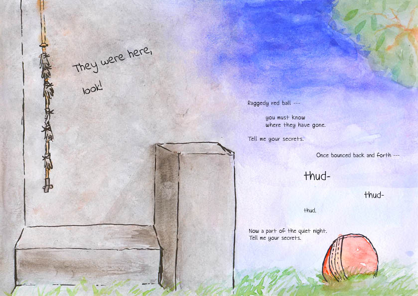
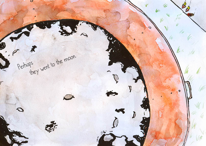
After trying and failing a couple of times, I managed to settle on design that I liked. I don’t like the idea of having to put my name in the zine but it seemed like it fit stylistically so I put it in. So finally, here are the final spreads.

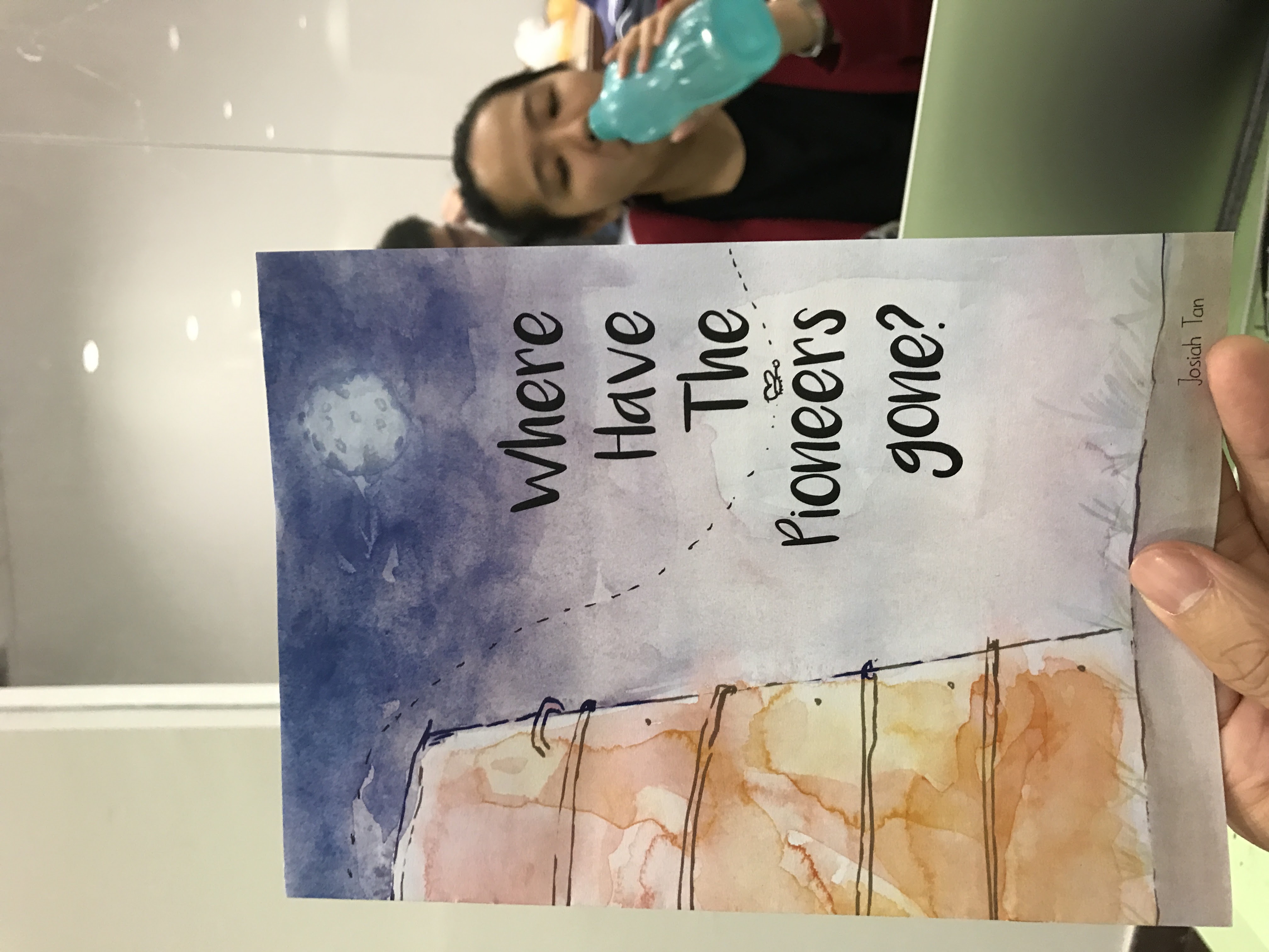
After finalising the zine, I went to the adm library to print it.
$4.28 per zine – I thought they were supposed to be cheap to make.
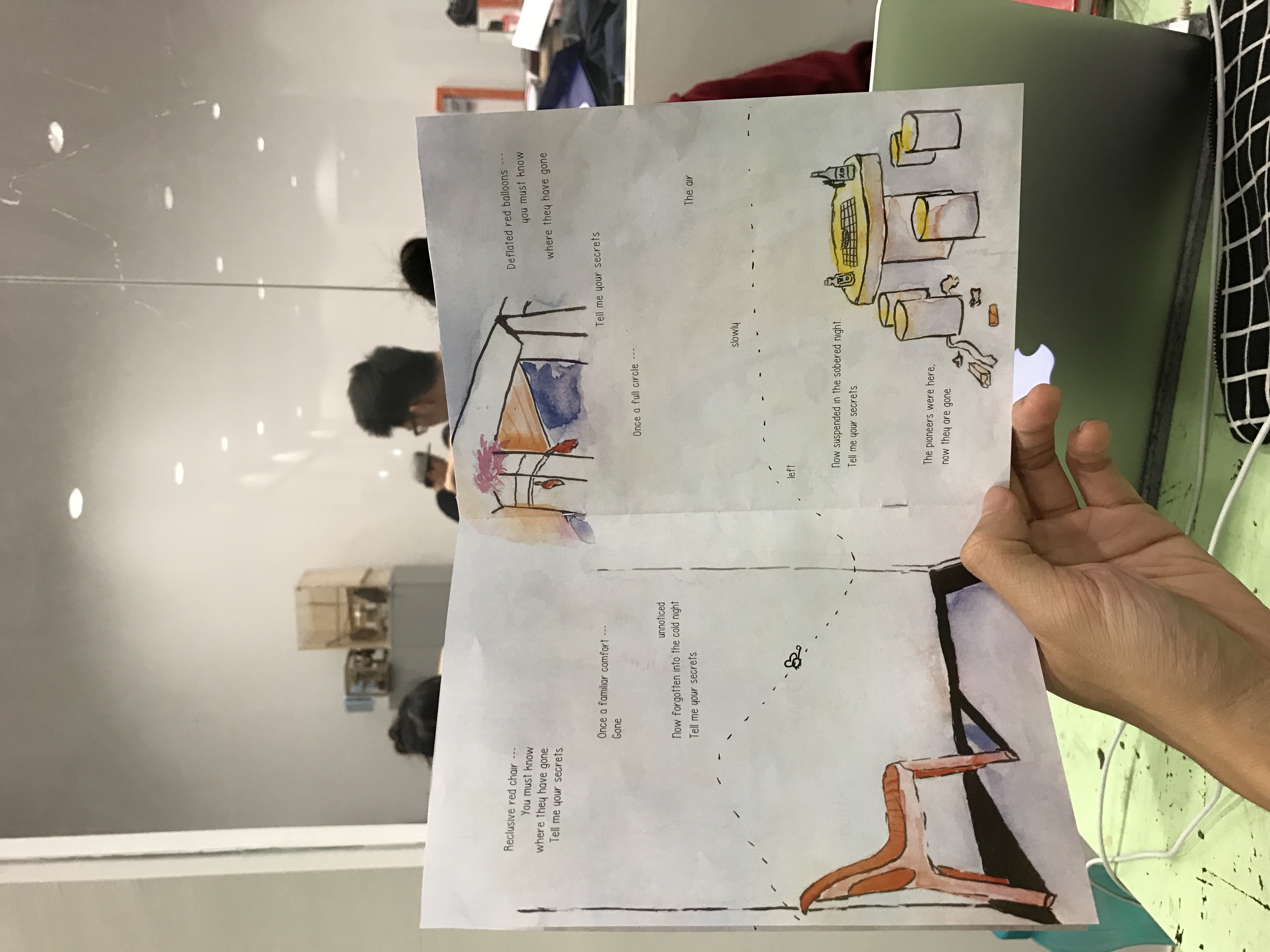
Overall though, I felt that the butterflies and the lines were distracting. Okay, it was just the lines but I didn’t want to include the butterfly without the lines. It then just becomes another element to think about. I didn’t want that.
Off to print again!
Total money spent: $8.56.
I was thankful that the binding wasn’t too much of a hassle. That said, I learnt valuable lessons about binding. Firstly, remember to score the centre of the zine first, then staple them together on a surface like an eraser (or blue foam). Other than having the bleed marks, it is important to know how to use the bleed marks properly. I made the mistake of cutting it all the way through from one side to the other. Because of this, either the horizontal or vertical bleed mark will be cut away and you will have no marks to work with on either the horizontal or vertical mark, depending on which you worked on first. What you should do is: use a penknife to cut it from the bleed mark and not from each end of the paper. cool stuff.