
That is all. If you have any queries, please don’t hesitate to ask.
Wew~
Time to get some sleep!
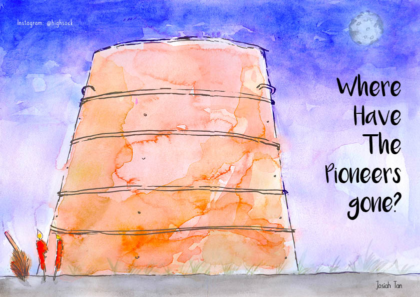
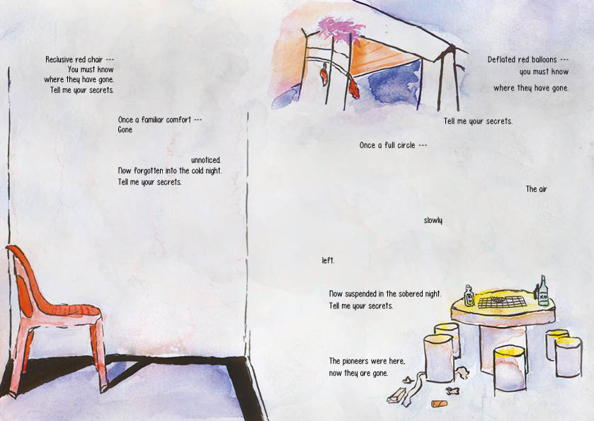
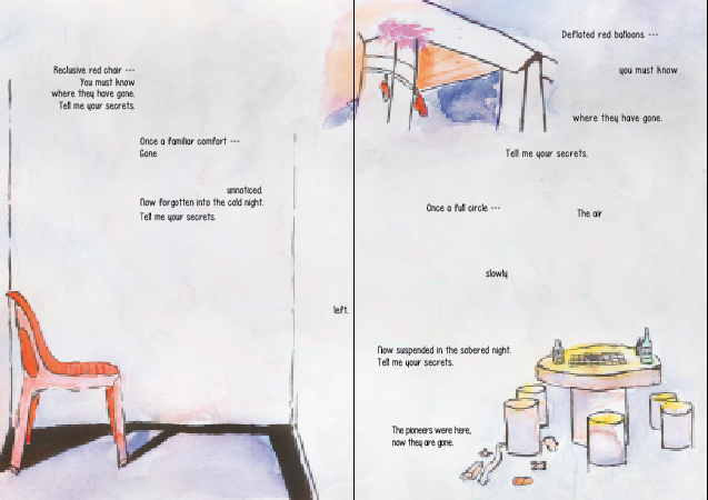
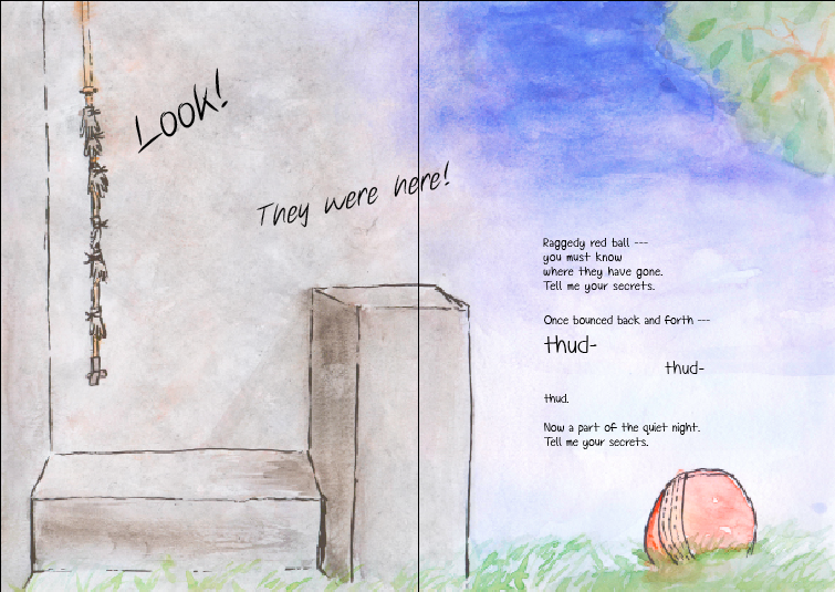
The pioneers too have gone to sleep.
That is all. If you have any queries, please don’t hesitate to ask.
Wew~
Time to get some sleep!
The pioneers too have gone to sleep.
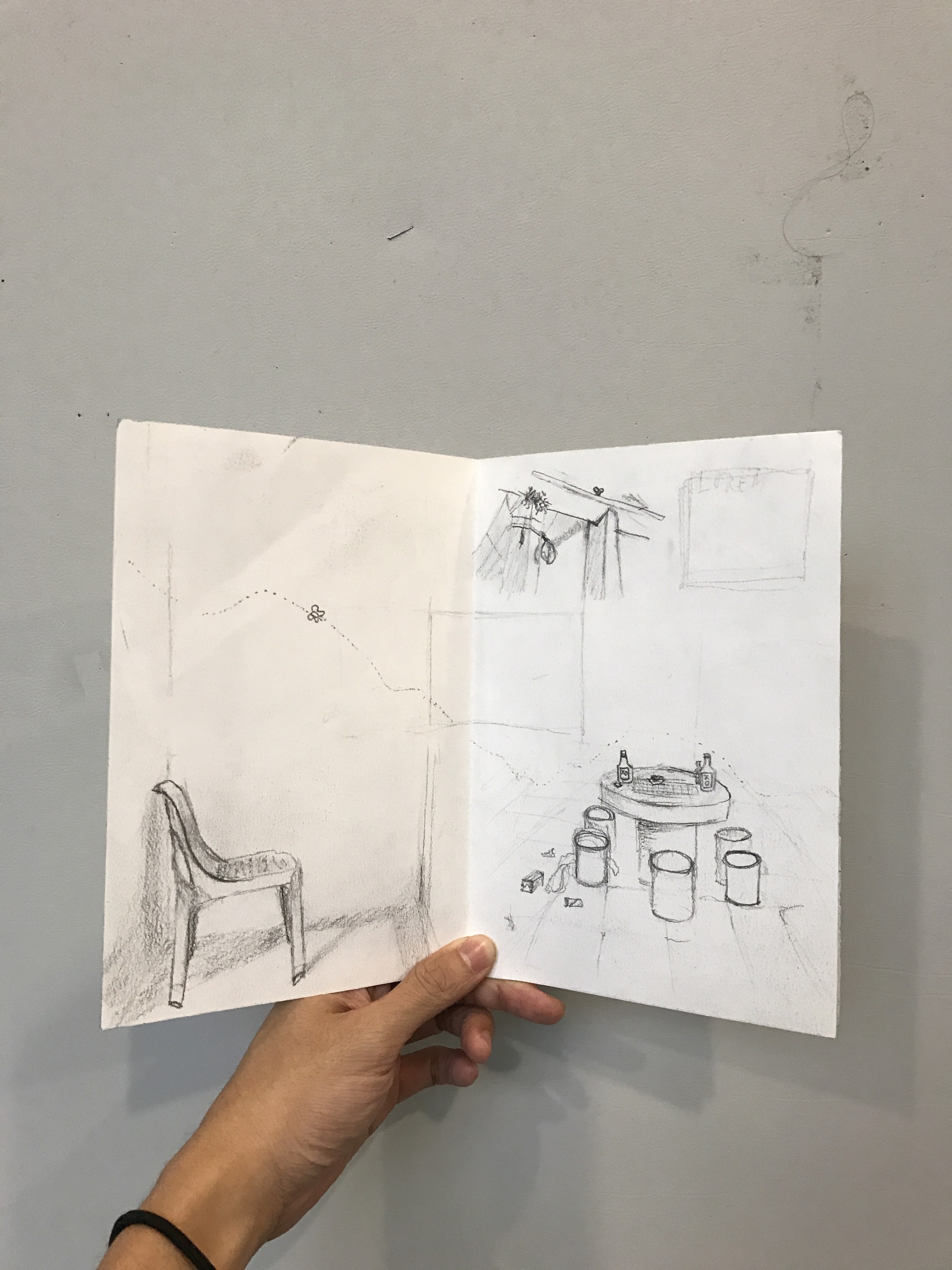
Following presentation, I planned out a rough spread-by-spread design using the photos that I took.
I wasn’t able to think about a front cover but I worked on everything else. Arranging the photos on InDesign, I created my very first draft.
IFC & pg 2
Pg. 3 & 4
Pg 5 & IBC
Back Cover
I liked the use of some of the photos and how they fit into the composition.
Overall though, I felt like I should be doing illustrations instead if I intend to take a narrative “children’s’ story” approach. I was worried about the illustrations not being able to convey that what I saw was actually there, but it turns out that it was not a problem at all. That was nice.
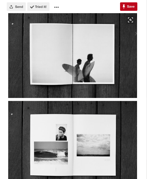
Before proceeding, I went to find inspiration for zine designs. I made saw a couple that piqued my interest.
Chungking Express Sardines

Poems from Egghead: Or, you can’t live on ideas alone.
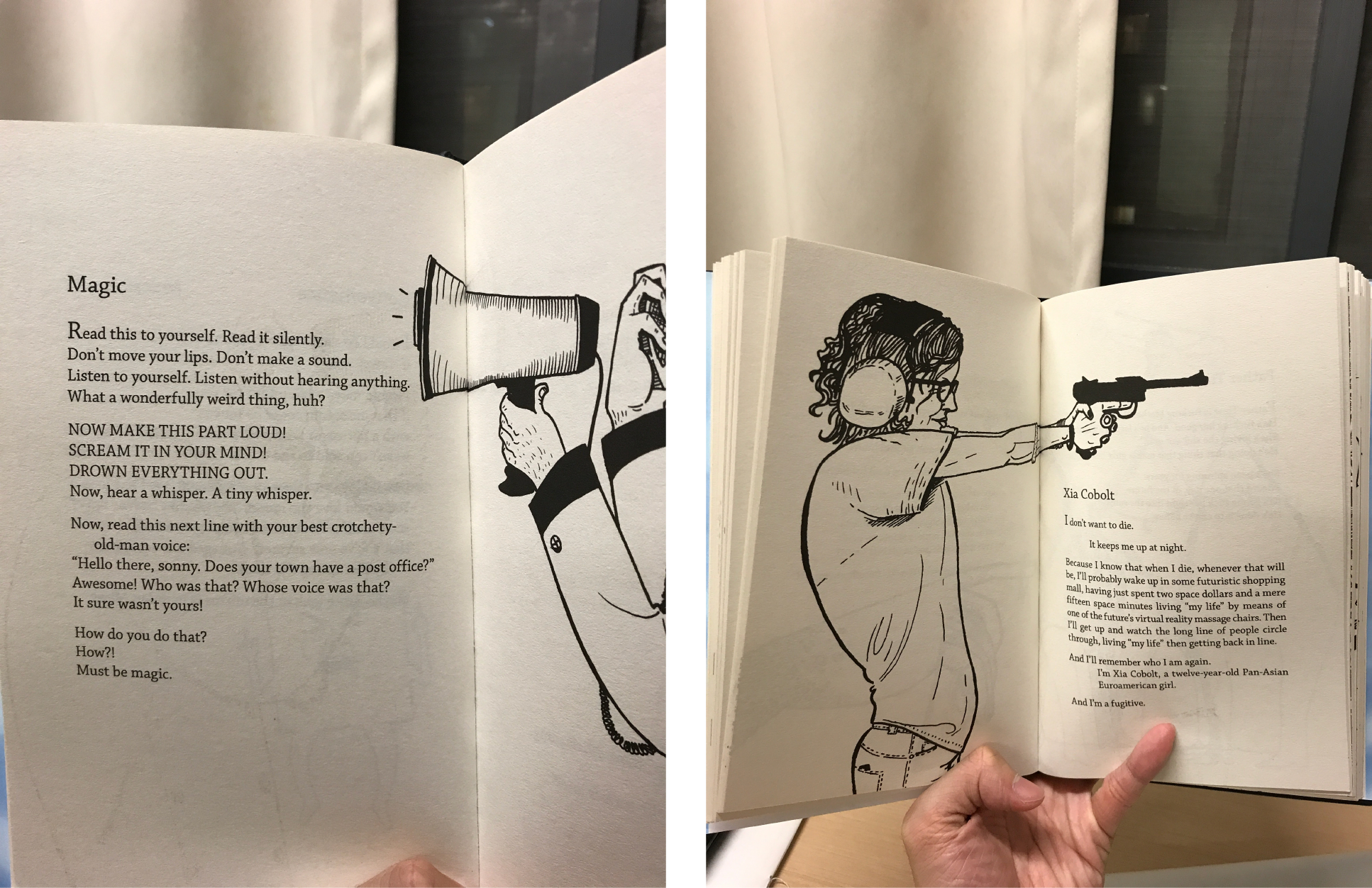
Random Pinterest zines
With a rough composition out and zinespirations, I proceeded to work on the rough draft in illustration,


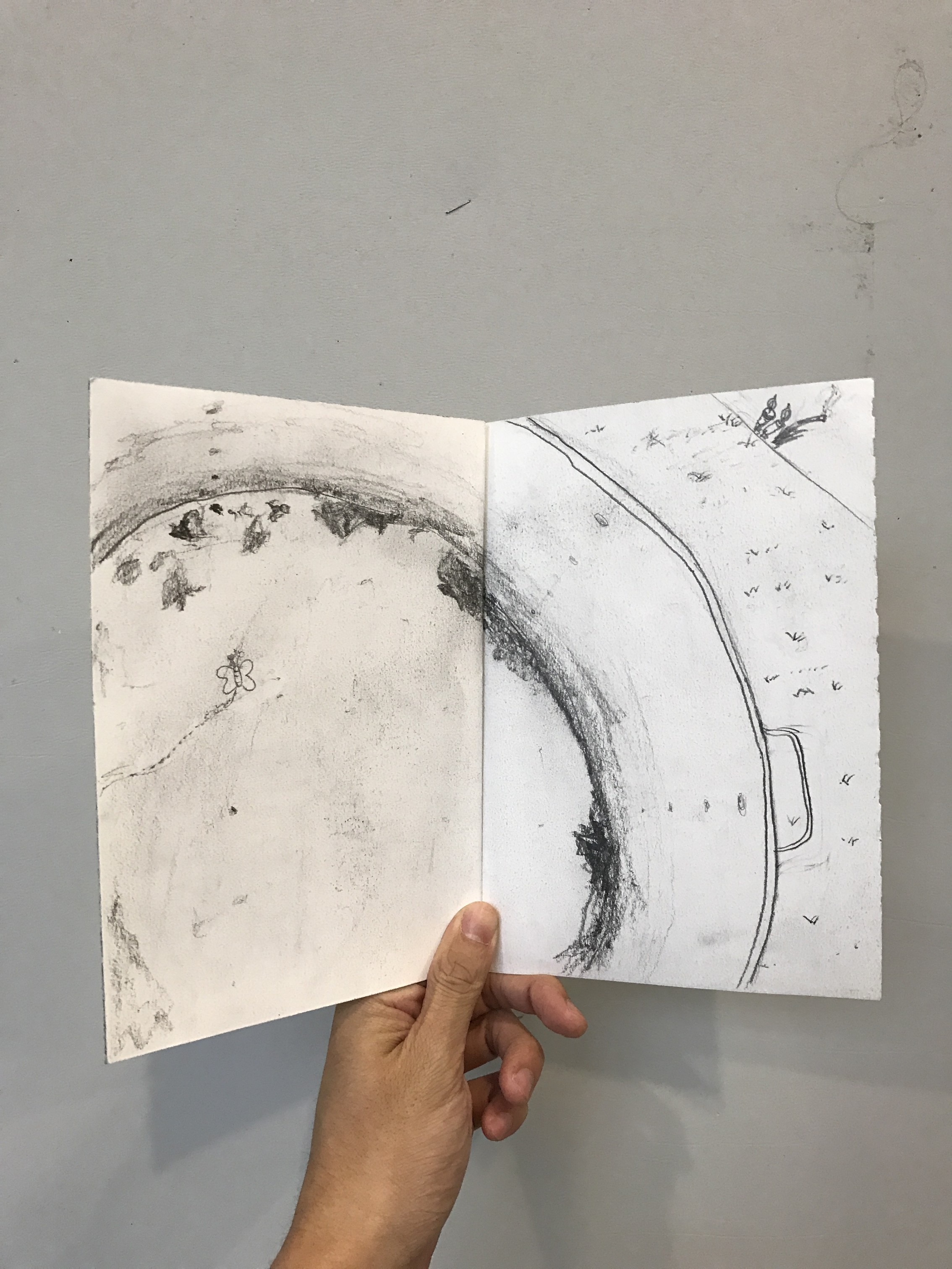
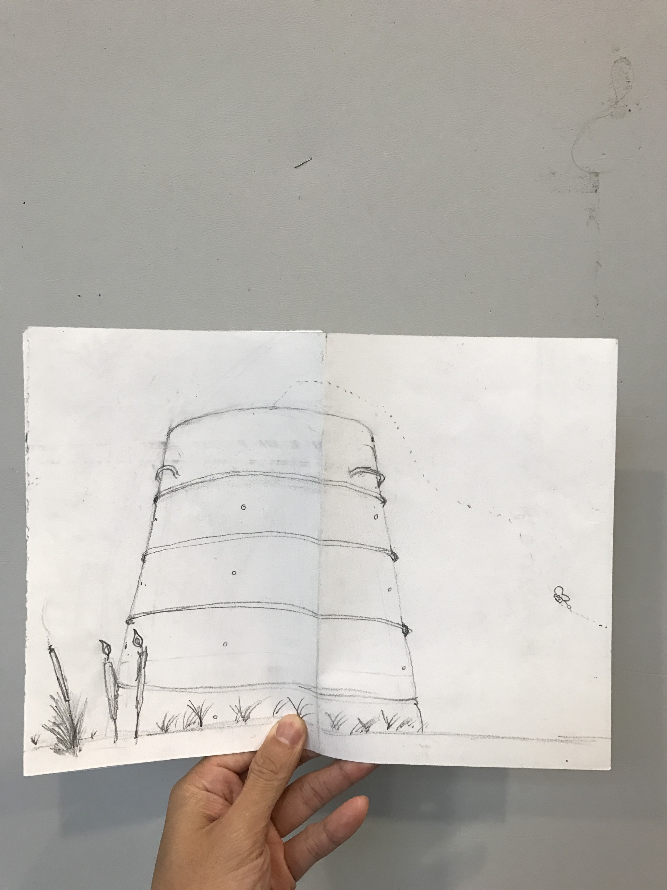
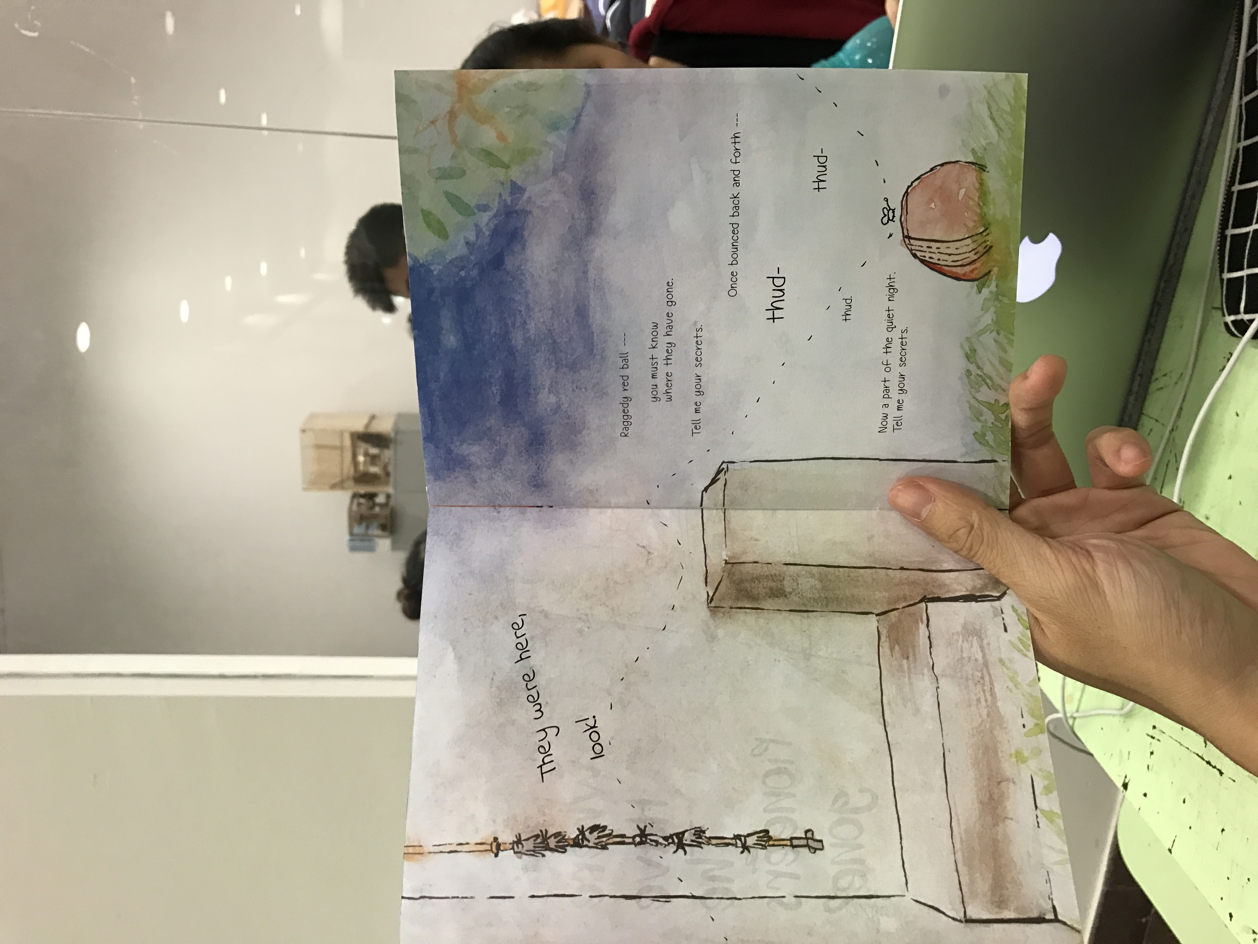
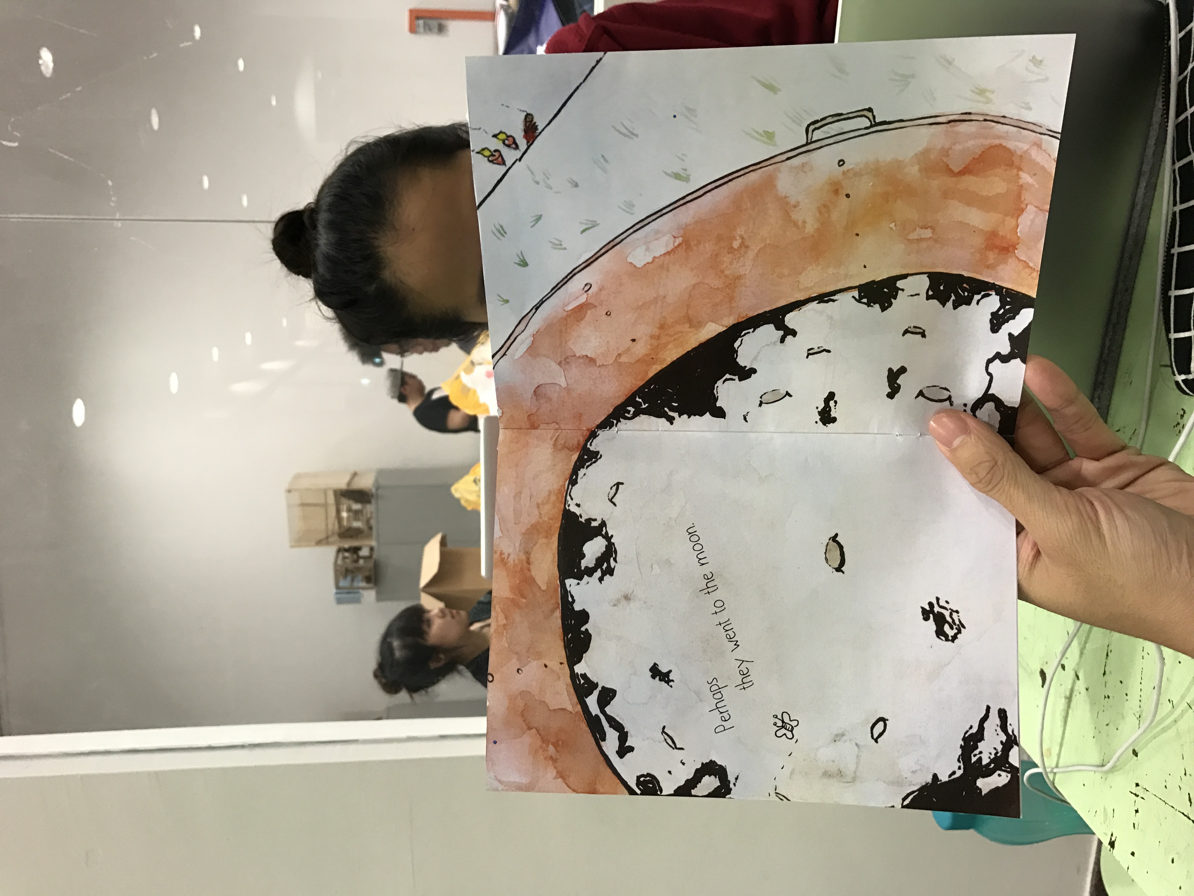
I found the use of images blending into each other or crossing over to the other page to be very liberating. I quite liked the recurring motif of the butterfly to represent souls flying through though I suspect that I will have to work on the composition before locking down the idea of the butterfly.
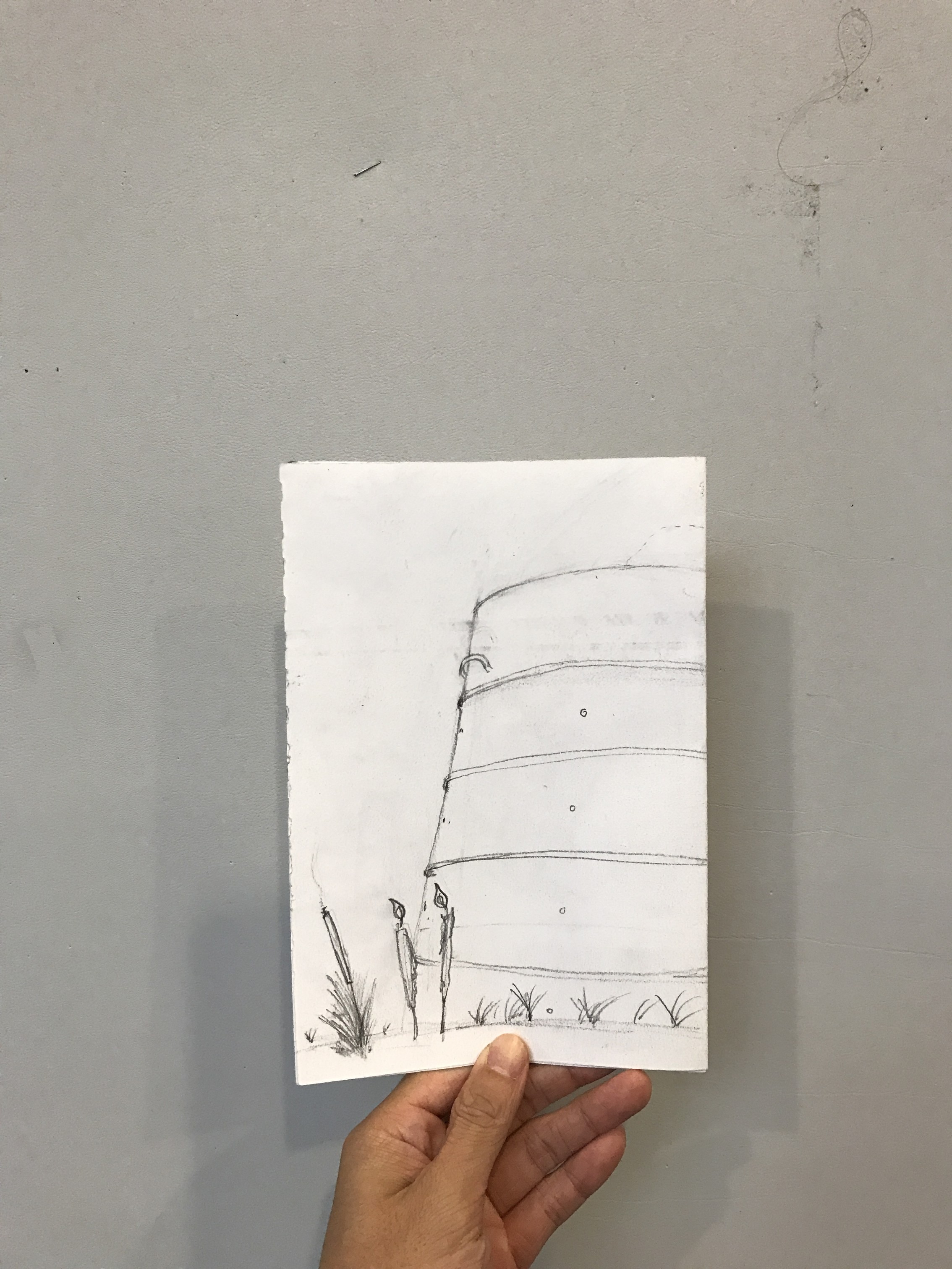
Now I needed to watercolour the composition and then add in the words and lay them out.


Personally, it would have been better to do a wet-on-wet medium but I didn’t have the means then. Still, I think that it achieved the intended look for the most part.
I thought about handwriting everything but I heard from someone that it was necessary to make use of InDesign so I did. That’s why I painted them in spreads as opposed to the “print” order. I also decided to use fonts because it forced me to think about different fonts to make use of. In the end, scanning and editing them on photoshop made it easier to lay it out. Composition-wise, I think that editing it in post-production helped.

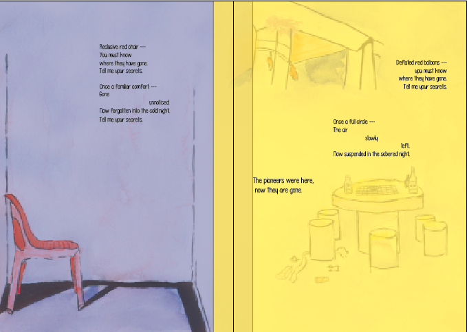
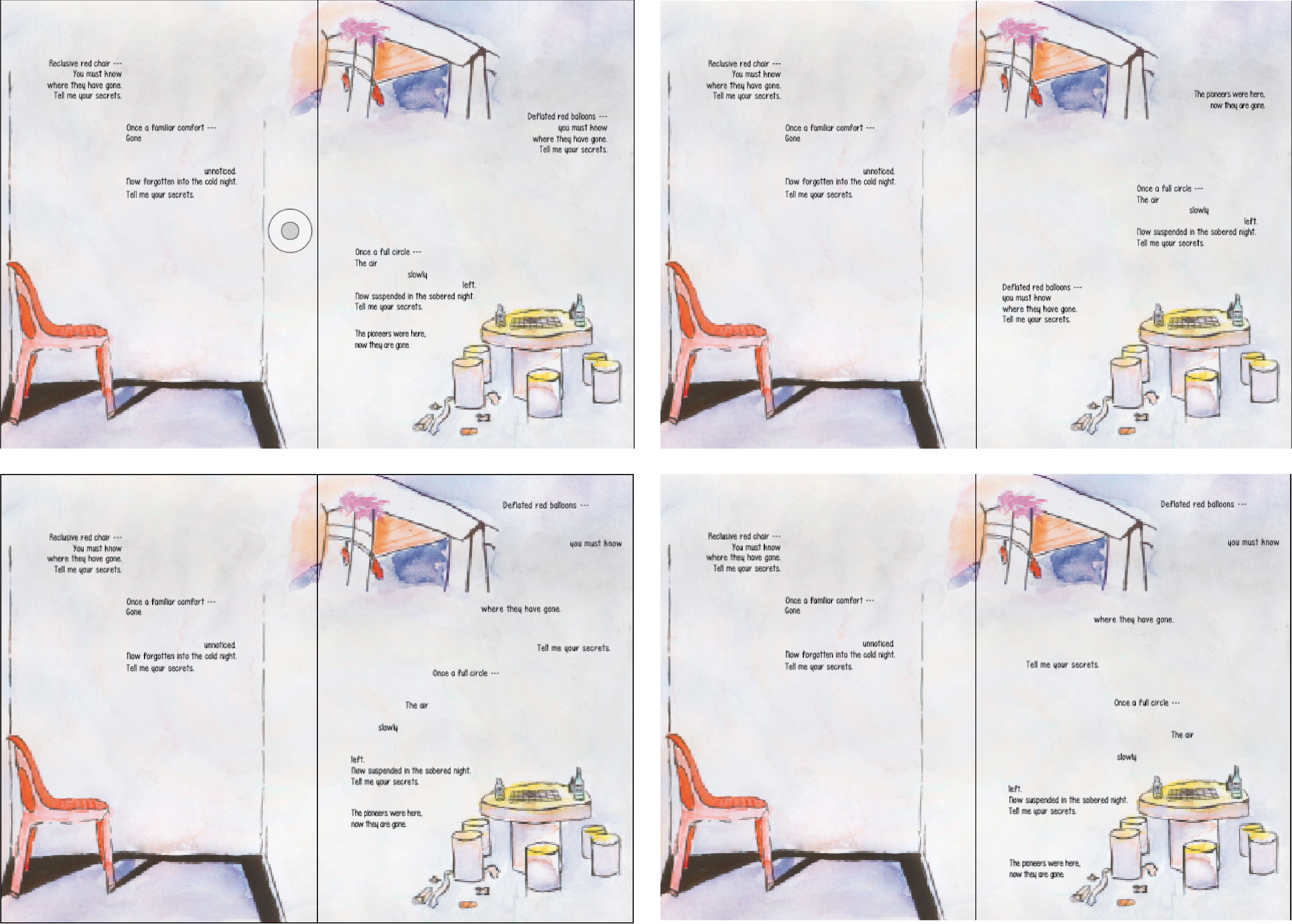
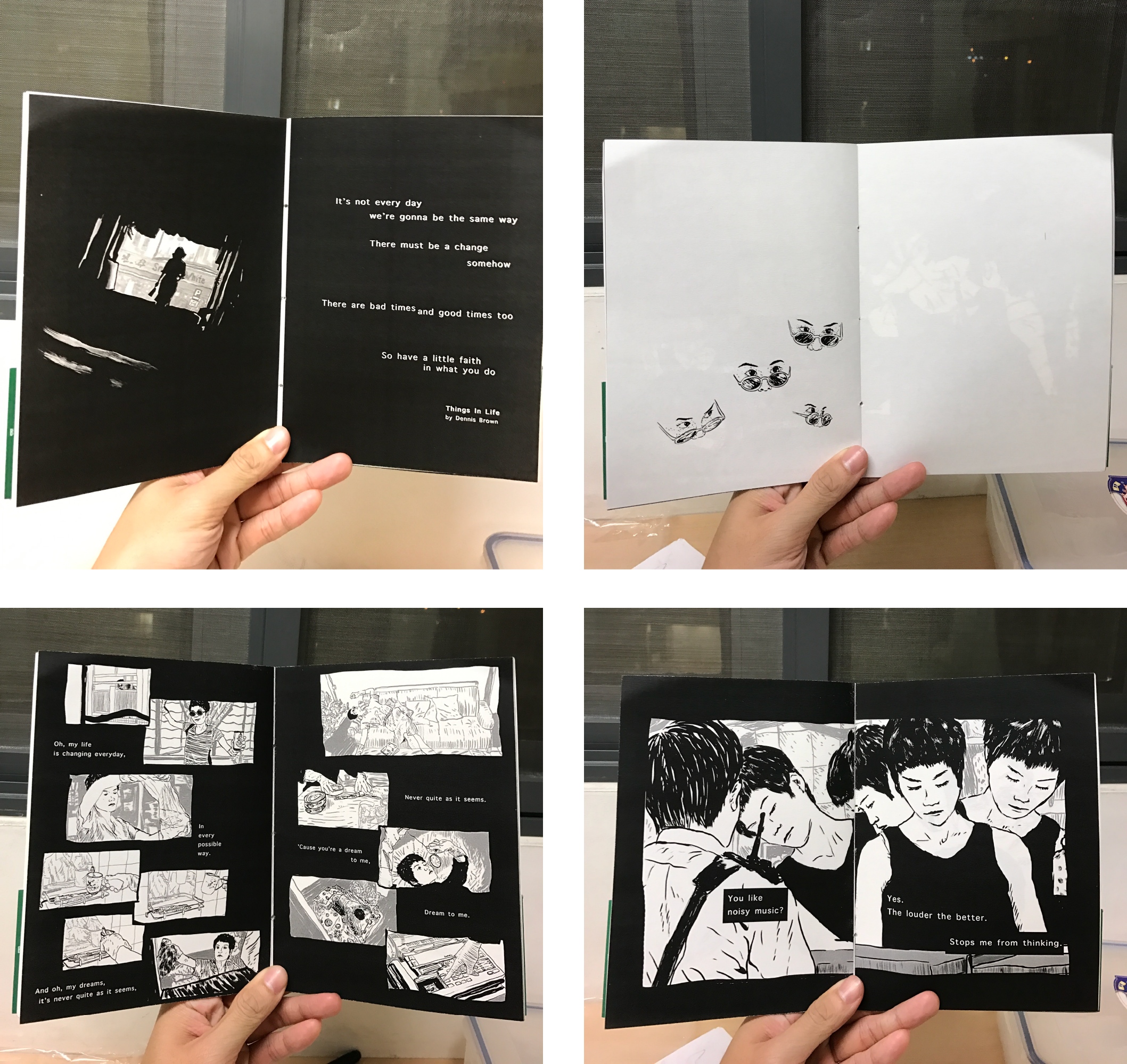
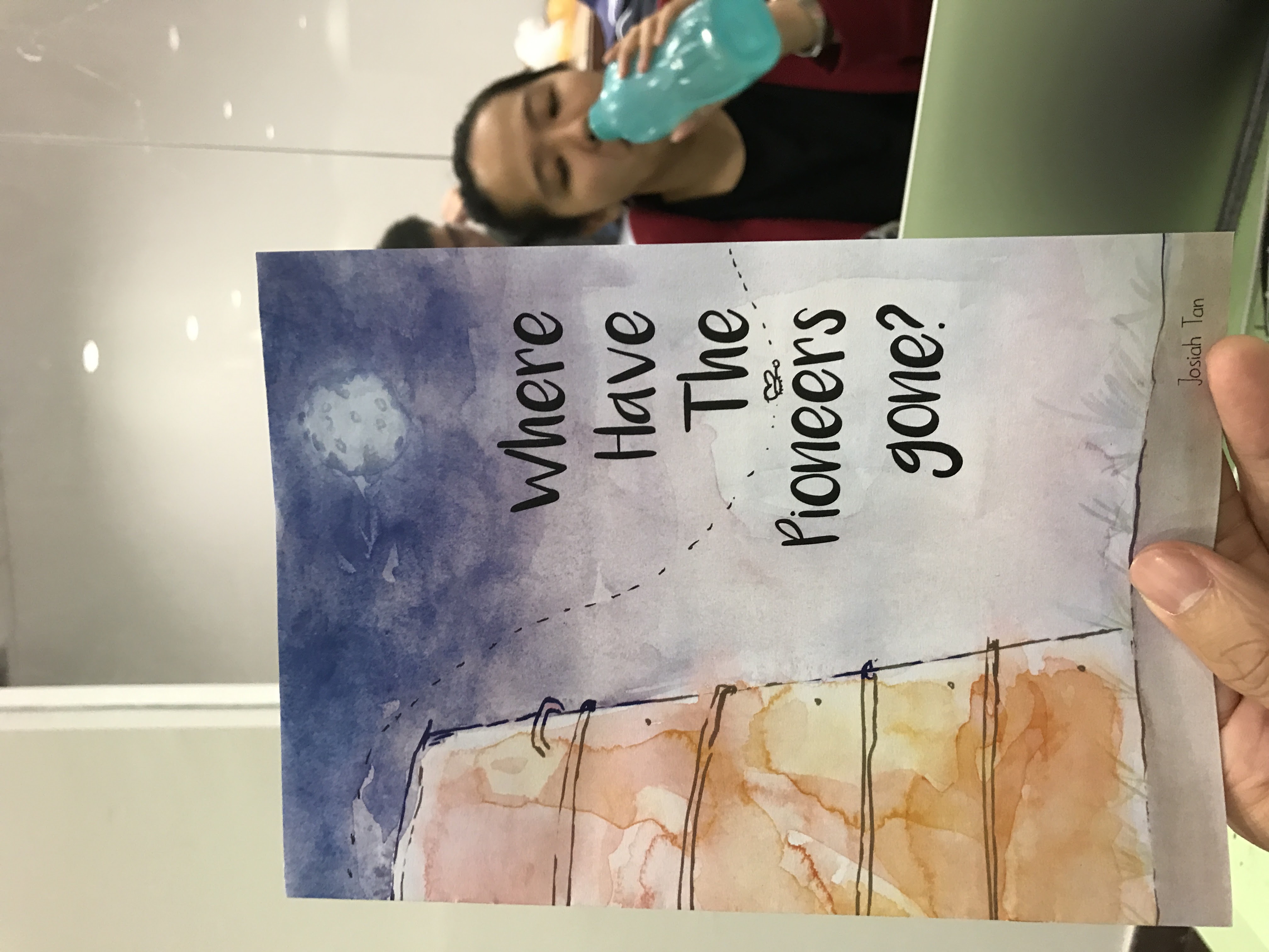
After trying and failing a couple of times, I managed to settle on design that I liked. I don’t like the idea of having to put my name in the zine but it seemed like it fit stylistically so I put it in. So finally, here are the final spreads.


After finalising the zine, I went to the adm library to print it.
$4.28 per zine – I thought they were supposed to be cheap to make.
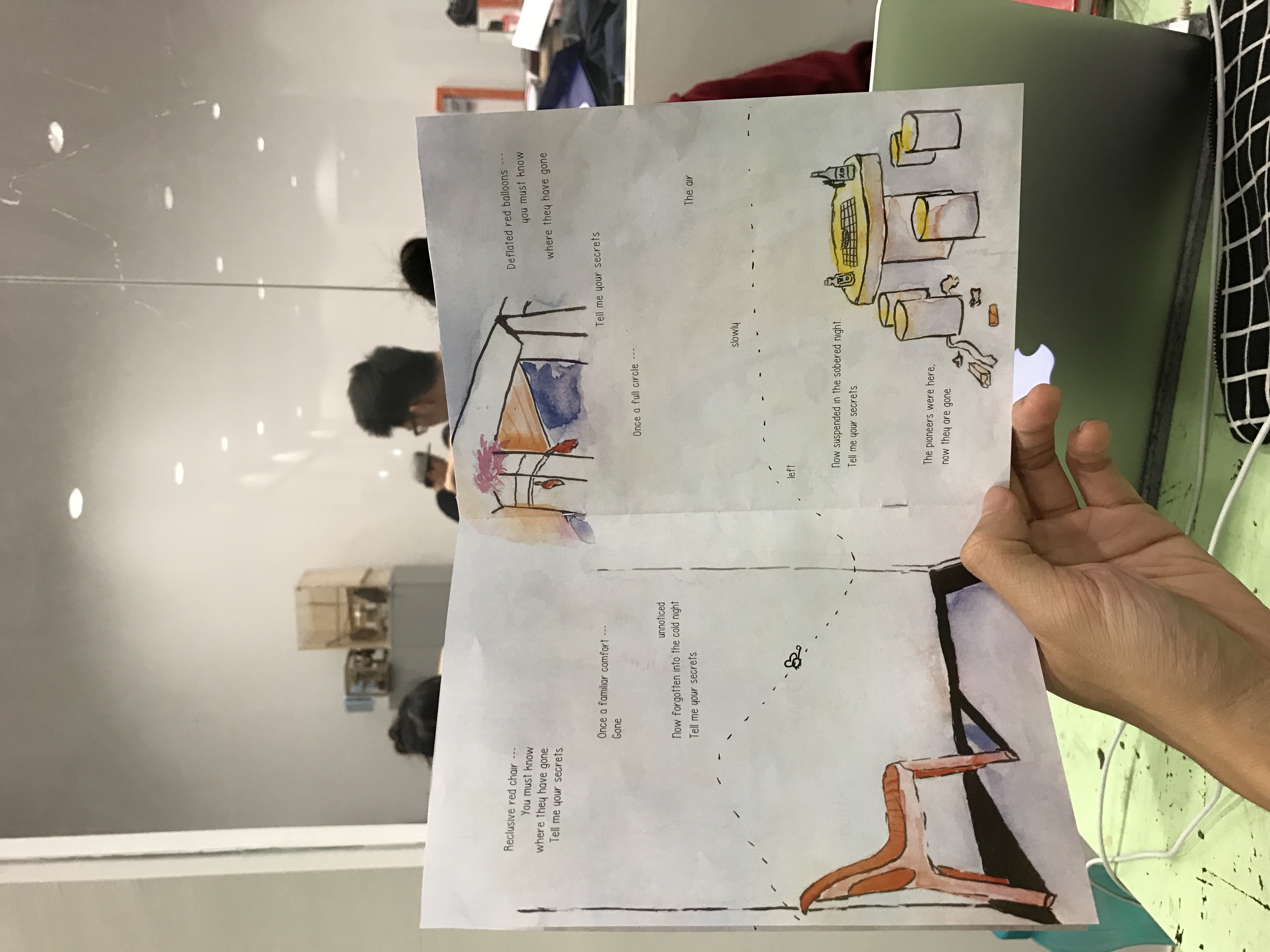
Overall though, I felt that the butterflies and the lines were distracting. Okay, it was just the lines but I didn’t want to include the butterfly without the lines. It then just becomes another element to think about. I didn’t want that.
Off to print again!
Total money spent: $8.56.
I was thankful that the binding wasn’t too much of a hassle. That said, I learnt valuable lessons about binding. Firstly, remember to score the centre of the zine first, then staple them together on a surface like an eraser (or blue foam). Other than having the bleed marks, it is important to know how to use the bleed marks properly. I made the mistake of cutting it all the way through from one side to the other. Because of this, either the horizontal or vertical bleed mark will be cut away and you will have no marks to work with on either the horizontal or vertical mark, depending on which you worked on first. What you should do is: use a penknife to cut it from the bleed mark and not from each end of the paper. cool stuff.
Because there is a proper way of submitting the assignment, I will just stream of consciousness this process of sorts over here instead.
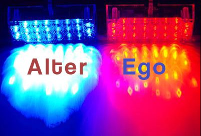
I had the joy of not having a friend to perform the role Sabina for me so I decided that I should be my own alter ego. The result was a blend between two of us. Coincidentally, this made the story I wrote from week one of class, relevant. Below is the entire story I had to read out in all its unedited glory.
“Once upon a time there was a short and scrawny boy studying in primary school. He had no friends, was not particularly good in his studies and was, overall, a forgettable person. One day, he received a letter from the school; an invitation to join the school choir. Now, while he was quiet and introverted, he also had very little going on in his life. He thought to himself, “why not?”
The choir practice room was filled with a sea of girls and one loud, overweight boy. Overweight Boy was comfortably talking to the other choir members when he saw Scrawny Boy sitting down in a corner of the music room. His eyes lit up in surprise, realising that the quiet kid from his class would consider joining the school choir, a form of performance art no less. Overweight Boy made his way across the room and with a smile, said, “Hi,” Caught off-guard by Overweight Boy’s approach, Scrawny Boy was at a loss for words. Scrawny Boy thought of many things. He thought of ways to escape this confrontation. He thought he might cry. He thought of how silly he looked to everyone else in the room. With great effort, he managed to mouth the words, “Hi.”
This might seem like an insignificant incident to most, but this is precisely how Scrawny Boy and Overweight Boy became best friends.”
(through the rest of primary school)
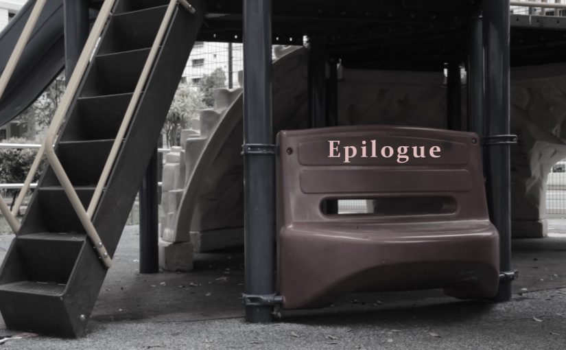
The starting point of my film sort of carries on from the end of this story; a sort of down-to-earth “ever after”.
The film is titled, “Epilogue” and will be in the official post.
I had wide shots, medium shots, close-ups, flat shots, and angled shots.
I had the words. Now I needed the sentence. I made two rough cuts, all of which I dislike at this point.
In the first cut, it was intended to be done with a monologue by “Sabina” talking about choosing lightness and the loneliness and other things that come with it.
In the “frontal cut”, it would be more from the perspective of “Sabina” just coming to the realisation and understanding that this is, fundamentally, her. She will never change, but maybe she wonders what it would be like if she had chosen otherwise.
Some shots were not great. I like the first one better because the emotions come out better. I am hesitant to desaturate the colours to manipulate the emotions, making it more dramatic than it ought to be, which is actually meant to be more contemplative. Still, I will do it because aren’t we all here to try. Anyway, having colours could be distracting and conflicting to the story.
I wrote the lines while looking at the edit so that I could fit the words to compliment the visuals. I used Paris, Texas as a point of reference in terms of delivery of the lines. I did not want to give off the exact same emotions as the movie. This is, after all, an entirely different story.
What came out was a deeply boring video that will put you off within the first few seconds. Still, this piece of work is for me, mostly.
I felt that the delivery of the lines were too lifeless, but I didn’t want to go too much in the opposite direction. What I needed was to go up by about 20%, or change the lines.
I gave in eventually and watched the film adaptation of book – 3 hours of my time. It did not really help me in coming up with lines but it did give me a small understanding of the feelings of Sabina.
Ultimately, I made it more of a mesh between the two of us. I felt that there were enough parallels in character that infusing her thoughts with mine would make sense.
Geez. I’m embarrassed to post these up. Most people have nice process visuals and all I have is failure. I must have re-recorded the lines at least 10 times. More tweaking to audio and lines needs to be done, but I think I am set on the visuals. I chose not to completely desaturate the footage because I think that black and white is almost stylistic already. What I want to achieve is the footage being dull but having interesting composition. Likewise, there is good and bad in choosing lightness or weight.
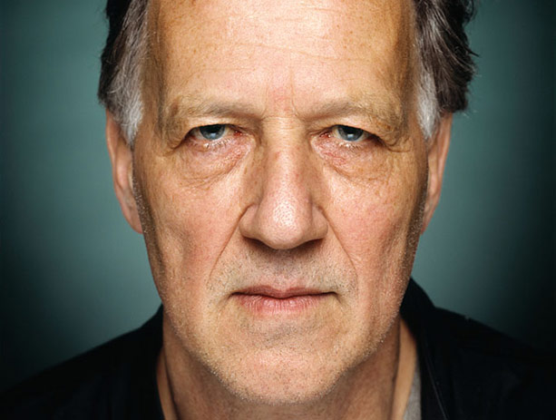
Having not actually filmed much and also adopting the Werner Herzog philosophy of having a broad idea of what I wanted to shoot and going to the locations to let the shots present themselves, in place of having a storyboard, I took quite a number of shots.
Coincidences always happen if you keep your mind open, while storyboards remain the instruments of cowards who do not trust in their own imagination and who are slaves of a matrix. If you get used to planning your shots based on aesthetics, you are never far from kitsch.
Werner Herzog
Coincidentally, Sabina is against kitsch too. (More on that in the previous post)
I used the movie “Before Sunrise” as a point of reference for this film; opting not to be influenced by the movie adaptation of The Unbearable Lightness of Being.
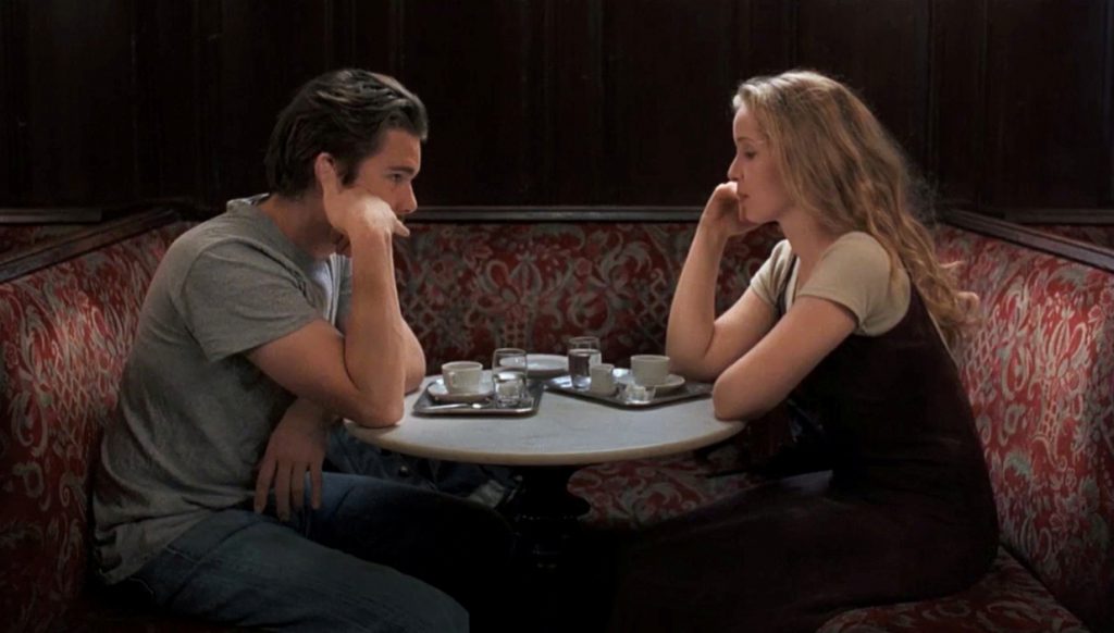
Before Sunrise is one of those films that had a profound impact on me as a teen. I still go back to it to learn about filmmaking. One of the many moments that I remembered from the film was the ending where we see wide shots of places where the two protagonists had been throughout the night. Because we’ve been through the journey with them, there is a feeling of, perhaps, nostalgia. I can’t quite pinpoint the feeling with words. Maybe it is the feeling that these places have a magical hold on us. They are just places to everyone else, but these places are memories to us. Yes. That is what I am trying to achieve; or at least just a fraction of.
The difference is I am jumping straight to the epilogue and expecting the audience to fill in the blanks themselves. This will either show my confidence or failure as a storyteller.
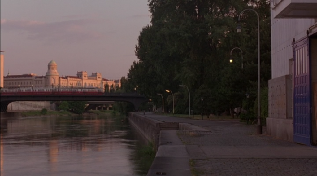
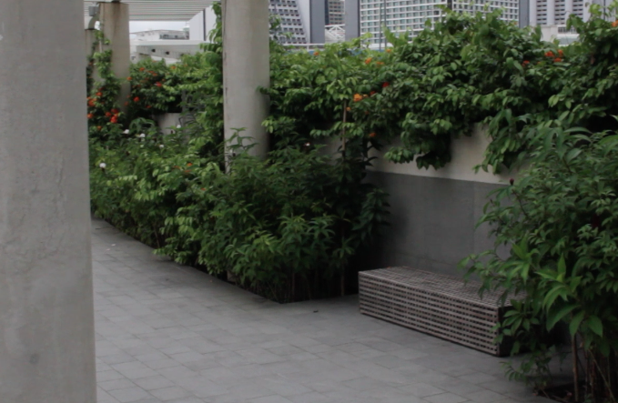
After my research, I had to come with a story for what would be shown in the 1 minute of film. Keeping in line with the character not having friends, I went out on my own on Chinese New Year to film the places I used to hang out with friends. The story is an epilogue. Imagine a person having gone through so many relationships and now has no one. This person is reflecting on his decisions.
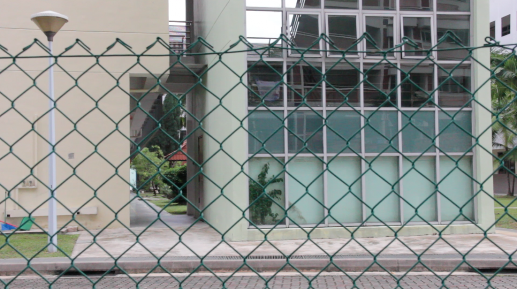
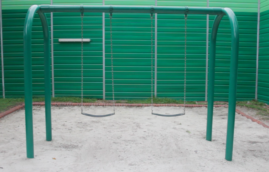
I made my way to Pasir Ris and started with the nearest place, Coral Secondary School.
And found that they had already slapped a new name on top of the body and essence that was my school.
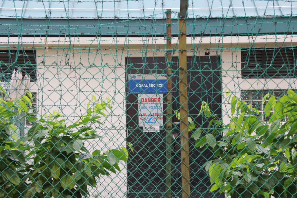
But I digress.
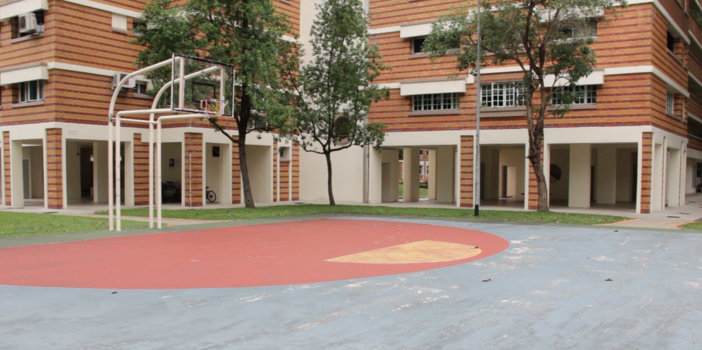
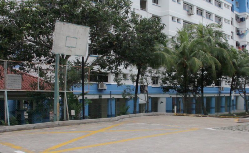
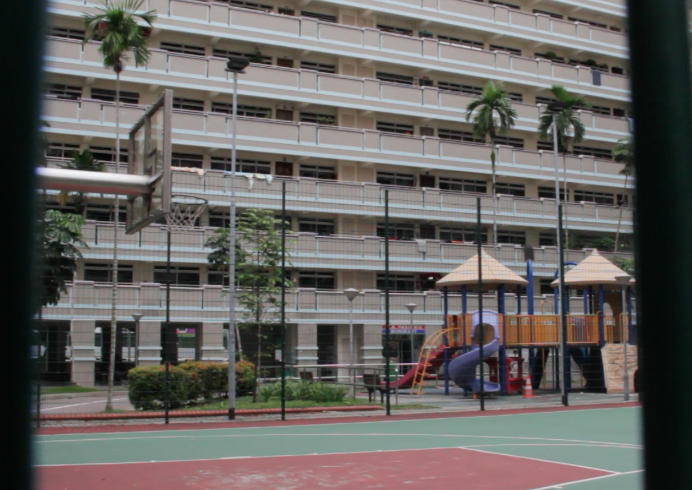
I walked the route from school that I normally took to get to the basketball court below a friend’s house.
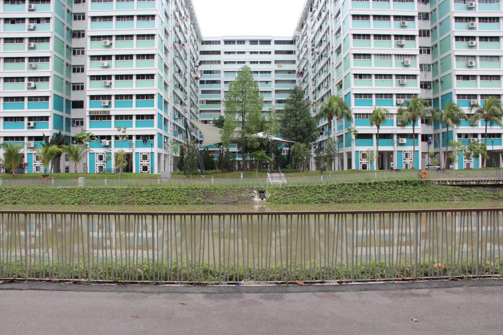
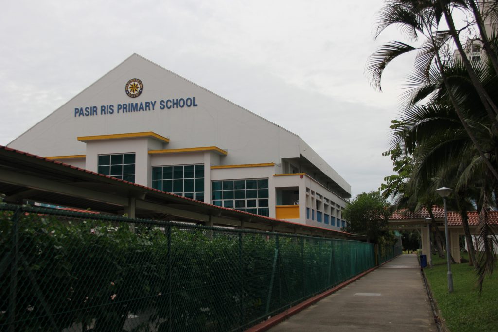
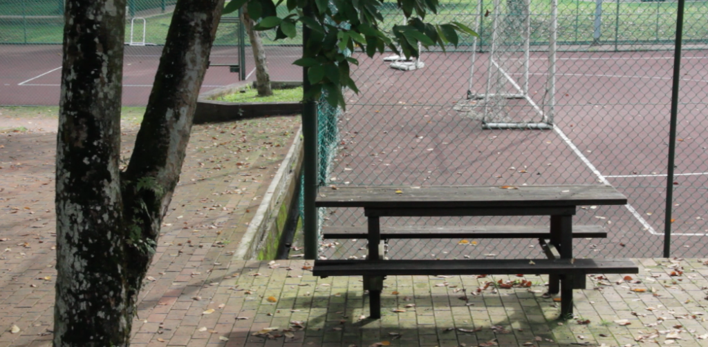
Next I went over to Loyang point and Street 21 where my primary school was, and still is, located.
After all that I walked back to the MRT station and ended off the day’s shoot with the area near my house.
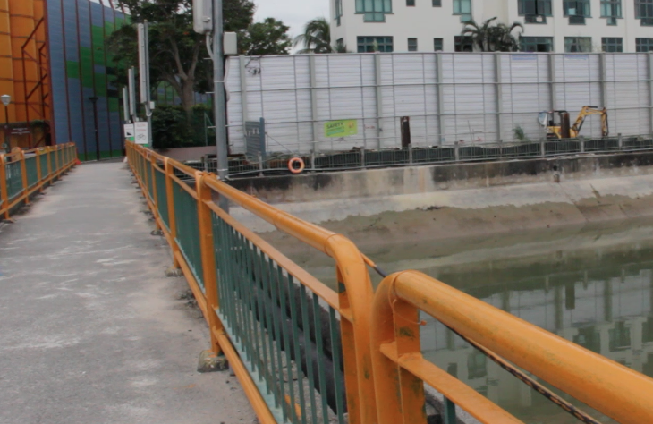
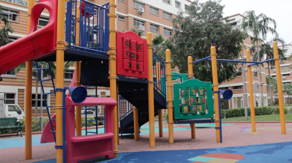
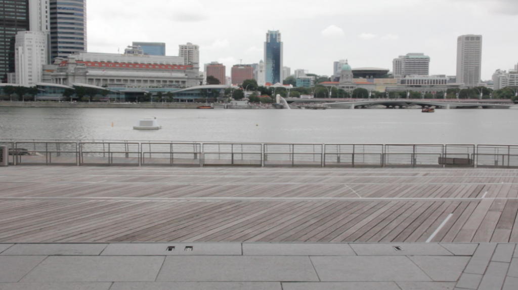
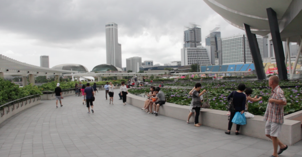
The next day, I went to more crowded places for variety before heading back to school.
The feel I was going for was somber and I know that it will turn out coming off as some prick with a stick up his butt- BUT I wanted to try taking something seriously for once. I always talk about how philosophy seems pointless because there is no answer. That is because I can never bring myself to make a stand. I am trying to make a stand and because I am, I have to question myself endlessly.
With that in mind I ask myself, “Who do I make art for?”
A lot of times I don’t want to answer the question because an answer might define me and I am supposed to be “light”.
The next couple of shots are pick up shots that I hold no feelings or memories of, but I took them anyway because they evoked an emotion that I wanted to convey.
What is the purpose of my art?
To entertain? To express? To communicate?