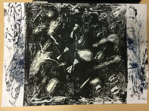
As interesting as Yves Klein is as an artist, I’ll be keeping this as closely related to 2D mark making as possible. With that in mind, let’s dive in to the deep blue.
As I lay stretched upon the beach of Nice, I began to feel hatred for birds which flew back and forth across my blue sky, cloudless sky, because they tried to bore holes in my greatest and most beautiful work.
-Yves Klein
Klein’s feelings towards the birds were in response to a spiritual activity that he was engaged in with his friends, who were also artists. They were to divide up the world between themselves. Klein got the sky and he was to “sign” his name on it- but then came the birds.
Yves Klein is most well known for his use of a single colour: International Klein blue (IKB).

In a way, Klein’s approach to art is translated in the boldness of IKB. Klein was high controversial for his time for his critique of the accepted understanding of abstract art. In the 1950s, abstract art had been accepted as a means for the artist to communicate with viewers through abstraction. Klein rebutted this notion with this monochrome blue paintings much like the one above.

“Blue…is beyond dimensions, whereas the other colors are not. All colours arouse specific ideas, while blue suggests at most the sea and the sky; and they, after all, are in actual, visible nature what is most abstract.”
-Yves Klein
Klein was a pioneer in developing performance art and currently, I stay in Pioneer hall. Coincidence? I think not.
Bad jokes aside, here’s a video showing the performance of two pieces of work.
https://www.youtube.com/watch?v=1mJCVM3d7jw
With performance art, Klein wanted to put an emphasis on the immediate experience of the art itself.

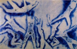
Gaining access to one of France’s major destructive testing laboratories, he made use of “flamethrowers” to create fire paintings as shown in the video. Much like Anthropometry of the Blue Period, got his models to make prints on the canvas but covered them in fire retardant instead. He then used the “flamethrower” to create his fire paintings.


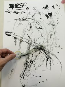
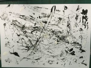
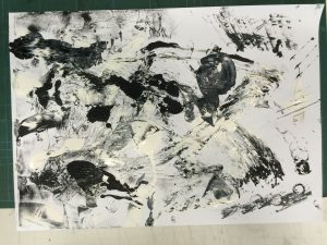
I feel that it becomes harder to feel for the kind of marks being made when you are unaware of the performance that went behind it. There is meaning in the action of using nude models and IKB. There is meaning in using fire against the fire retardant marks of the nude models.
If there is any take away from Klein, it’s that if you want getting the kind of feeling or message to come across clearly , you need to put in careful thought not just into what kind of marks you make but also how you go about making your marks.
Then again, he was also big on the idea of voids so maybe the take away is that once the performance of art is over, what is left is the remains of art; and there is an element of emptiness to the product of performance art.
2 fairly contrasting take aways for you to decide what you want to do with.