After looking through the quotes, I narrowed it down to just four.
I can’t bear this lightness, this freedom…I’m not strong enough. – The Unbearable Lightness of Being 1988
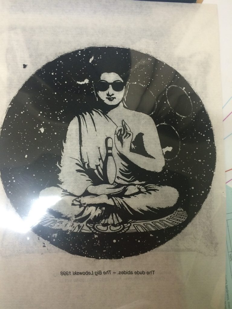
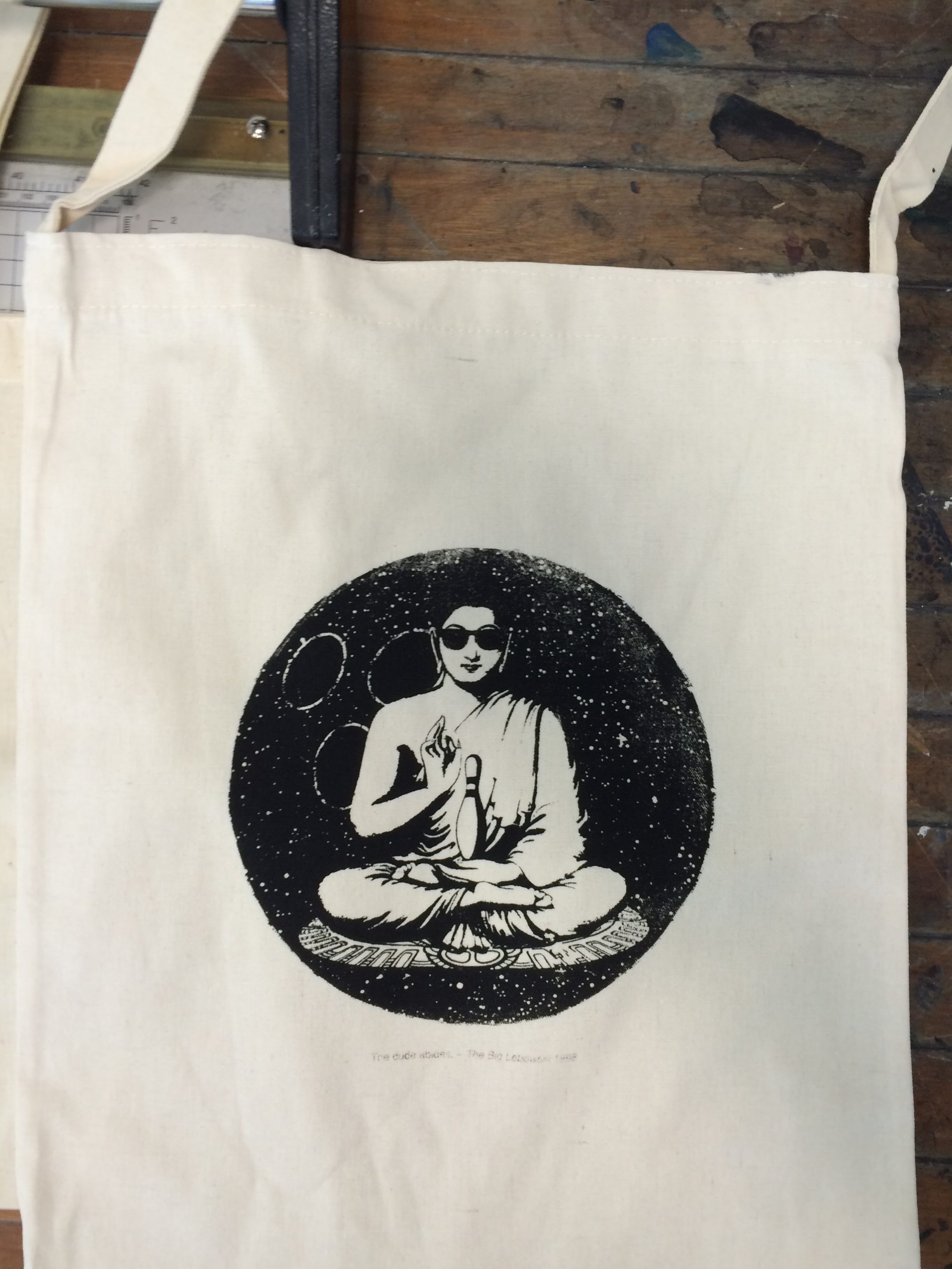
The dude abides. – The Big Lebowski 1998
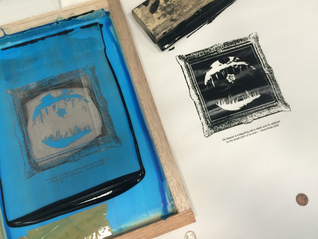
Oh beauty is a beguiling call to death and I’m addicted to the sweet pitch of its siren. – RocknRolla 2008
You stay. I go. No following. – Iron Giant 1999
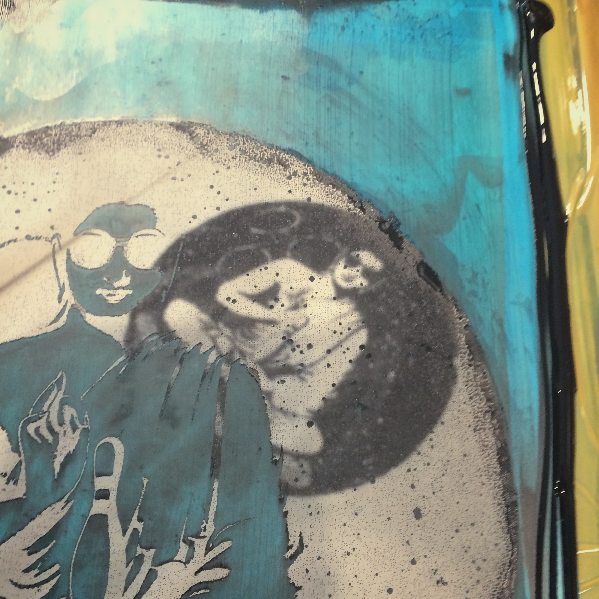
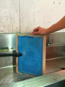
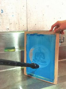
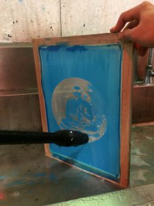
I started with The dude abides as I had the imagery in mind already.
I then modelled the composition around my main point of interest – Buddha.
From there, I threw in a couple of elements to create the following:

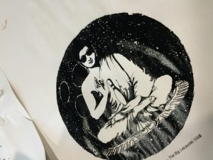
The quote is about ‘taking it easy’; very much like inner peace hence Buddha being in the centre. I have also added the sunglasses to give Buddha more chill; Buddha has no worries. The roundness of the bowling ball and the balanced composition gives off the feeling of peace; there is no tension or turmoil. The three holes in the bowling ball are meant to represent the 3 marks of existence – Impermanence, Unsatisfactoriness or Suffering, and Non-self. The marks of existence are all behind Buddha. In a way, this says that the Dude is not bothered by these things.
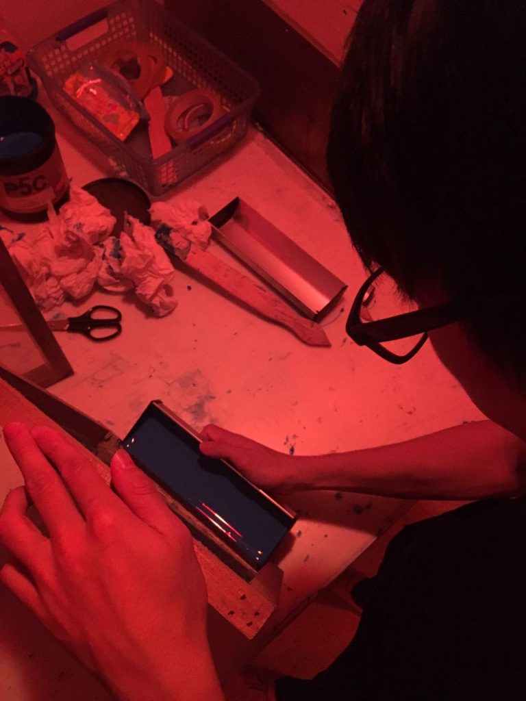
The halftone on the bowling ball looked distracting so I tweaked it a little.
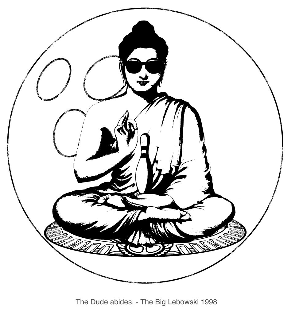
Also added in is a mandala ‘carpet’ that Buddha is seated on – a subtle reference to the film where the Dude’s rug is ruined. The mandala is a spiritual symbol in Indian religions for the universe.
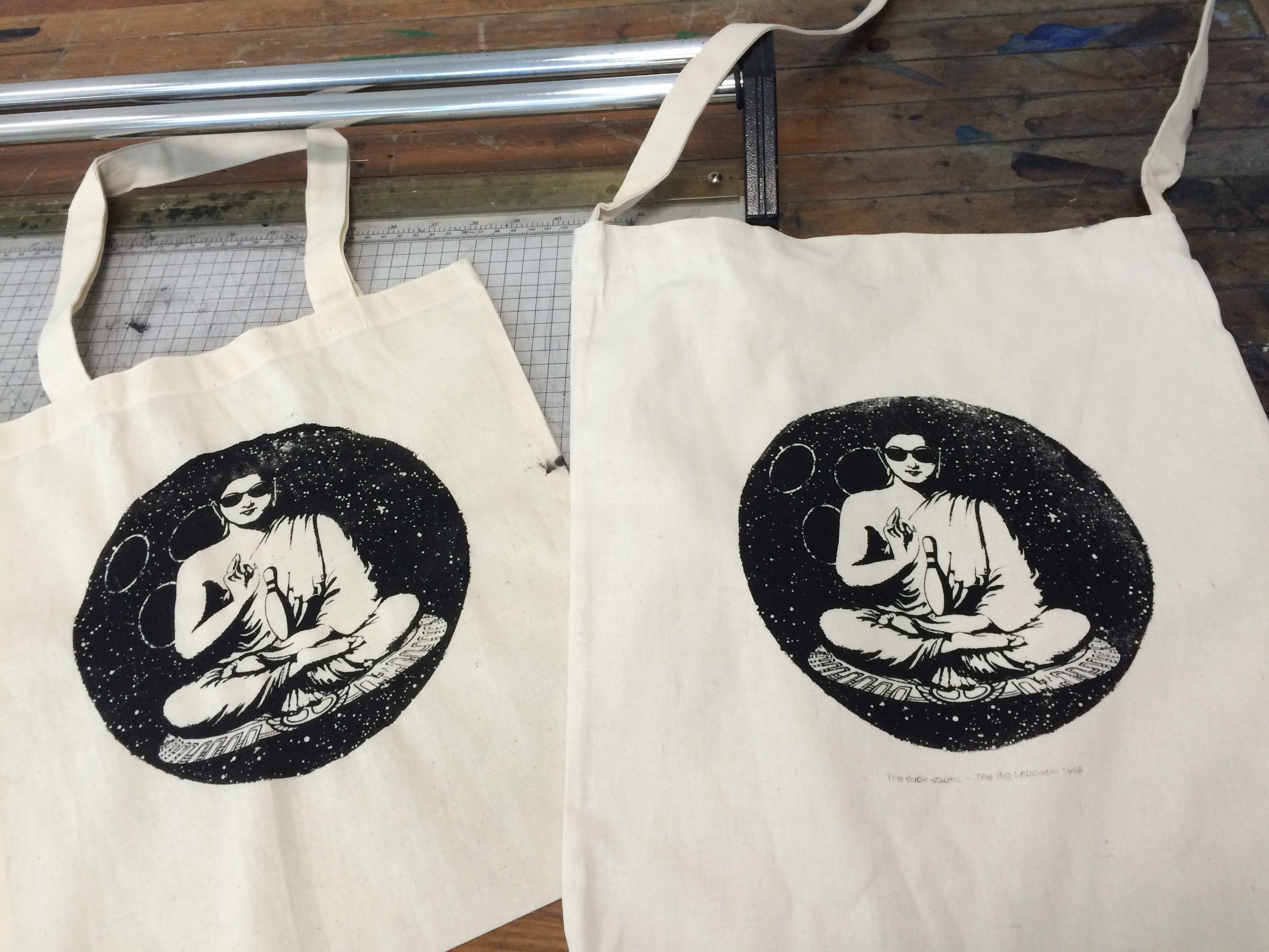
Looking at the composition, the bowling ball does not distract anymore. However, it just looks really plain and boring.
Again, I made tweaks.
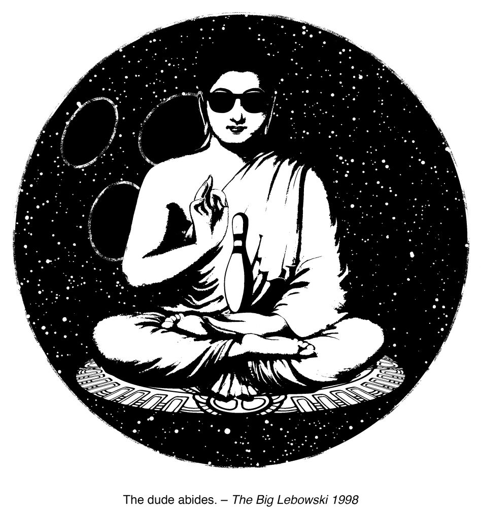
The bowling ball now has more texture to bring out the mood of the composition. The dude is pleased.
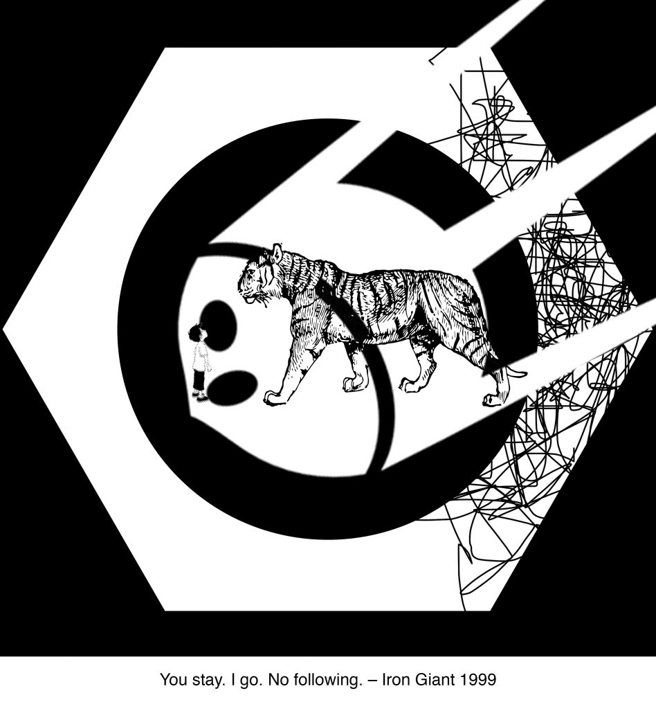
Next up, I worked on the Iron Giant.
I wanted to keep this piece simple so I went with blocky black and white images. The iron giant was a killing machine but was also gentle. I started with a vicious animal who has a choice to kill an innocent boy.
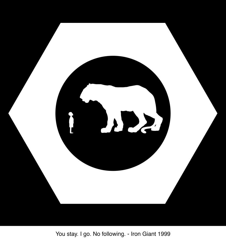
The composition looked flat and just boring. I needed to add more texture to the composition. There was no avoiding it.
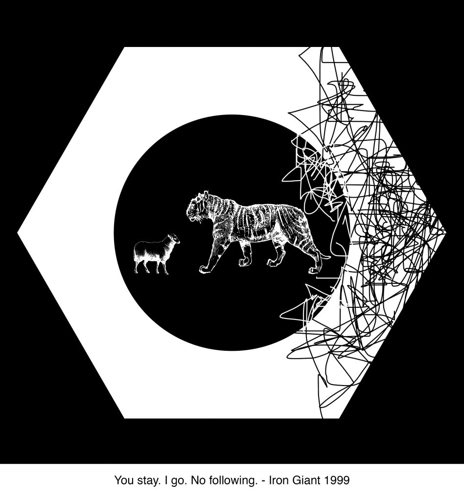
Now there was a little more texture to the composition. I experimented with mark making to create an atmosphere of chaos. I also experimented with a lamb – the symbol for innocence but the composition looked weird to me. It looked a little flat, still.
I tried adding in an image of the Sputnik within the circle of nut.The Sputnik was supposed to be representative of the Cold War. The Sputnik, hopefully, sets the mood of the composition as being militarily tense. However, I was not happy with this just yet.
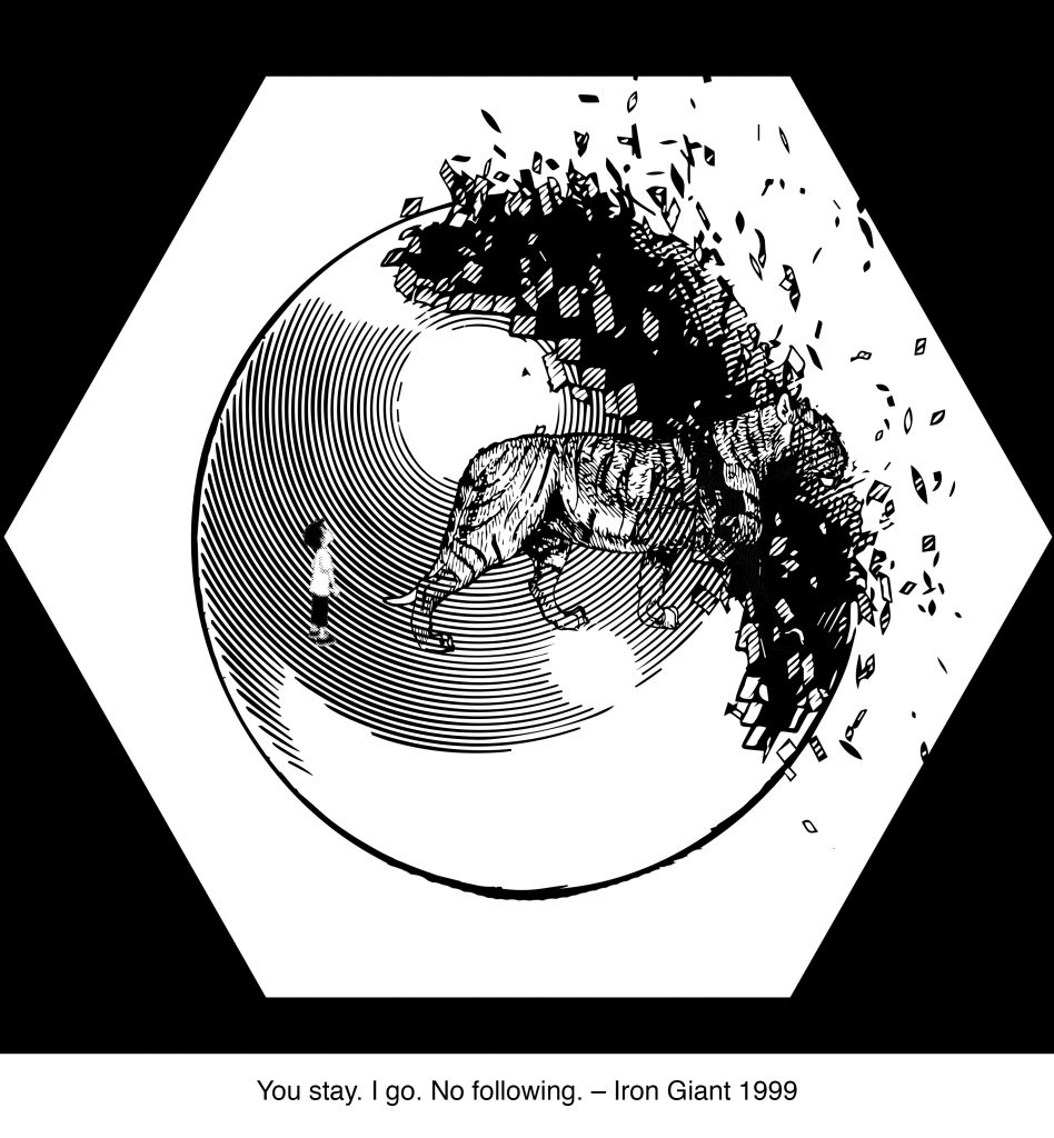
I changed the circle in the nut to be a sphere that is breaking apart. To me, this really sets the mood for the composition. Right now, the tiger looks a little out of place and I want to make it more dynamic.
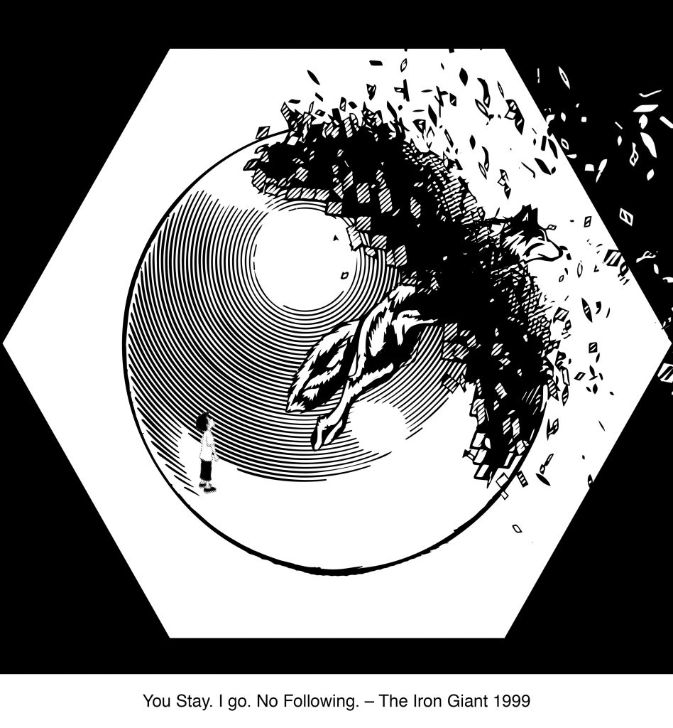
This is the final composition I ended with. I feel that this one is dynamic, sets the mood and evokes emotion.
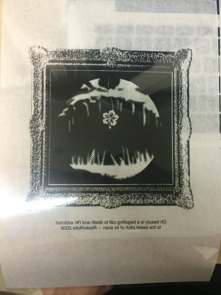
The third composition I worked on is RocknRolla. The idea of being beguiled made me think of the angler fish. That is what I started out with.
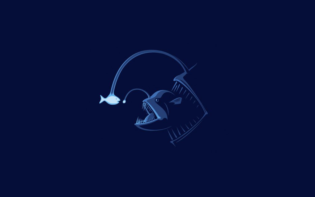
This is the image that I was initially working with. I thought that it was pretty cool except that the side view felt a little flat. I wanted the composition to seem like it’s trying to beguile you.
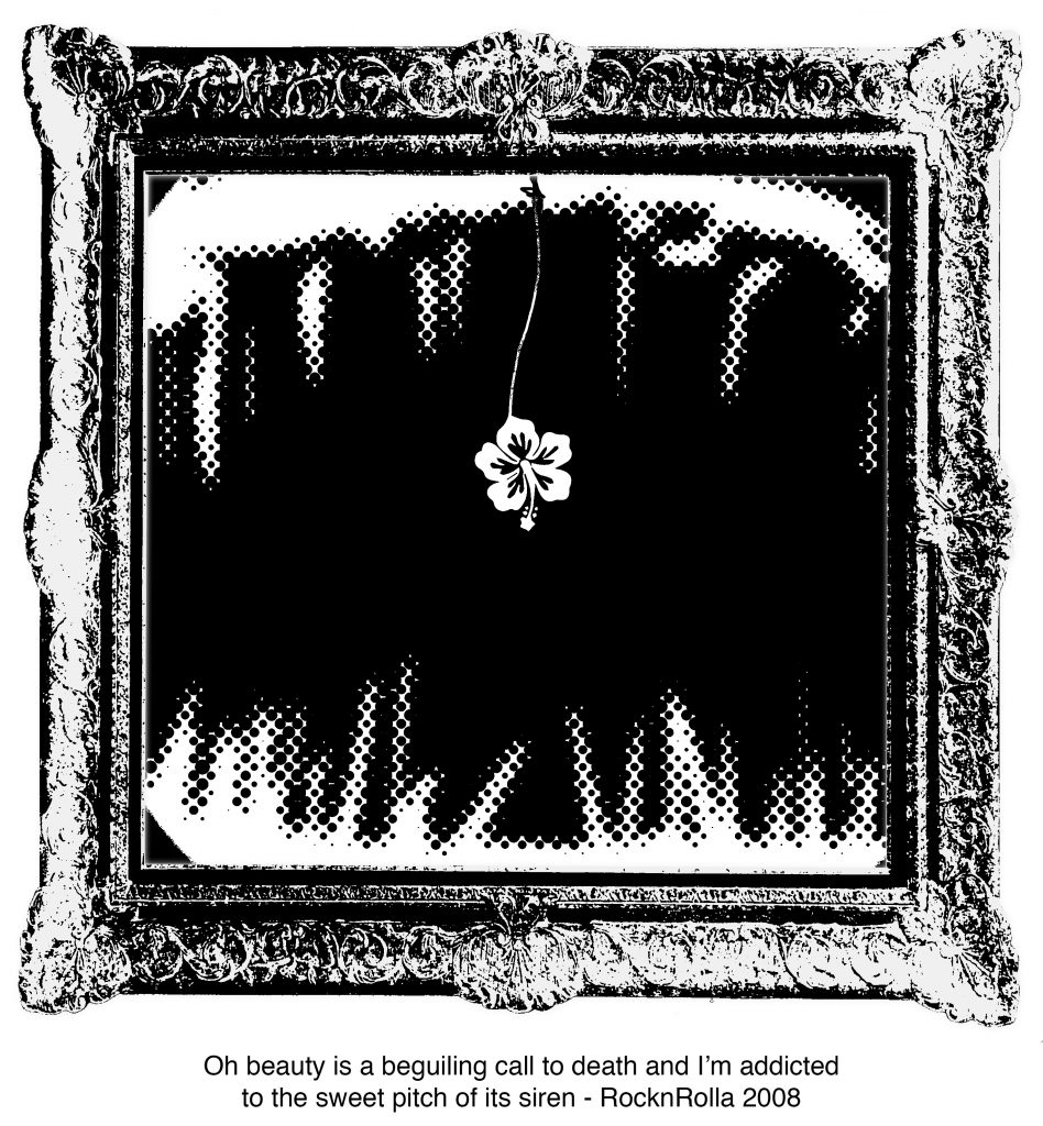
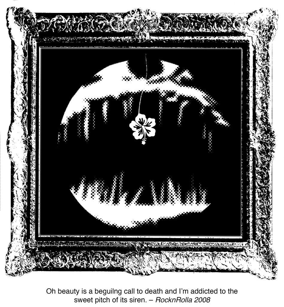
I had two compositions that I made. This one was fairly straightforward to me. It just made sense. The flower represents beauty and also happens to be the lure of the angler fish at the back. The frame of the painting also happens to be a representation of beauty and sometimes we get sucked into art.
I had to choose between the one that was more of a close up or one where you could see the fish. I entertained the idea that if the fish was a lot bigger, then it would feel like it was really close to you, increasing the sense of danger. Alas, it just looked like grass. In the end, I went with the wider shot of the fish.
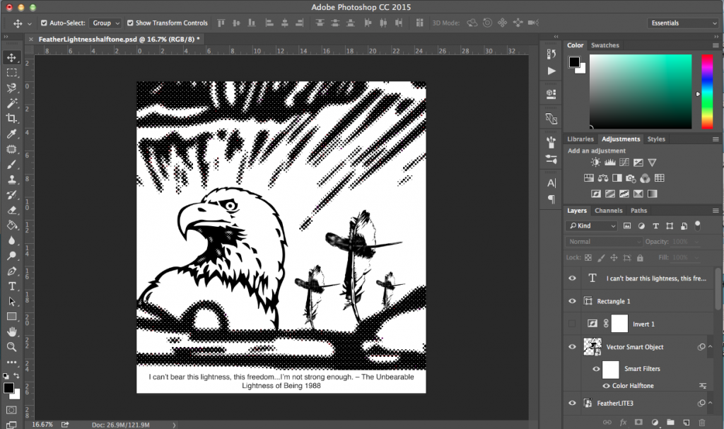
Lastly, I worked on The Unbearable Lightness of Being.
This one was a little tricky for me. It was such a big undertaking of a quote and it means a lot to me. I can only hope that I do it justice.
I wanted to create a composition where lightness/our idea of freedom is bearing down on us. It burdens us.
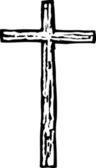
My first thought was the cross. When we say, “It is my cross to carry,” we mean that it is our burden to bear. With that in mind, I created this.
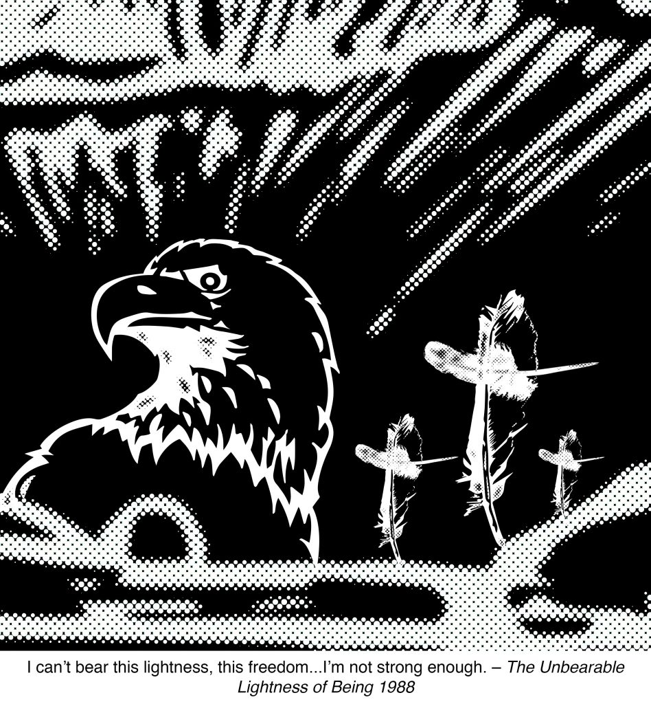
The American Bald Eagle is a representation of freedom and it looks down on us and makes us feel small. The sunset brings about a sense of freedom but the sharp lines cut through the cloud, pointing towards the eagle almost as if to say that freedom is painful. Lastly, we have the feather which are shaped like crosses, implying that freedom is a burden.
Another interesting thing that I noted was that when inverted, the bald eagle gives off different moods.
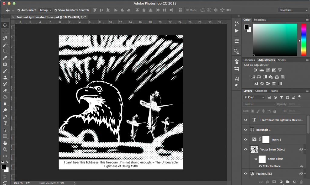
In the first one, it looks like the eagle is looking beyond but in the second one, the eagle is looking down on us – just something that I thought was interesting.
BONUS:
Not that I was very free but-