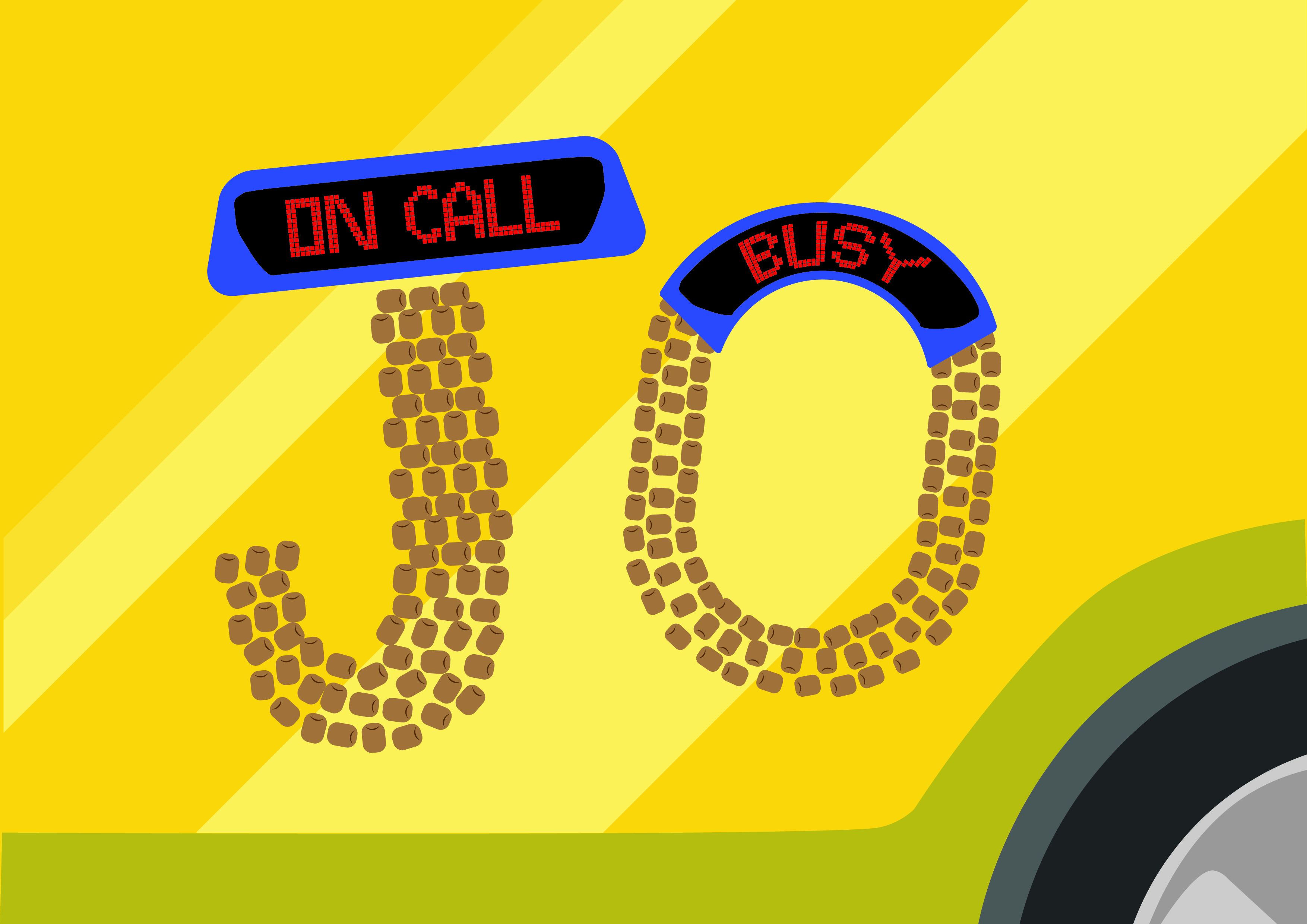
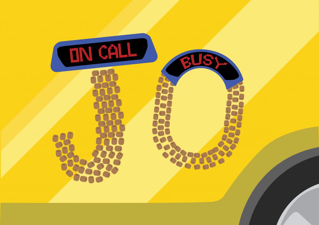
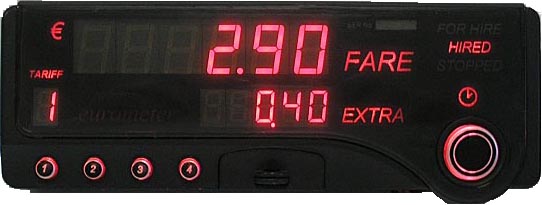
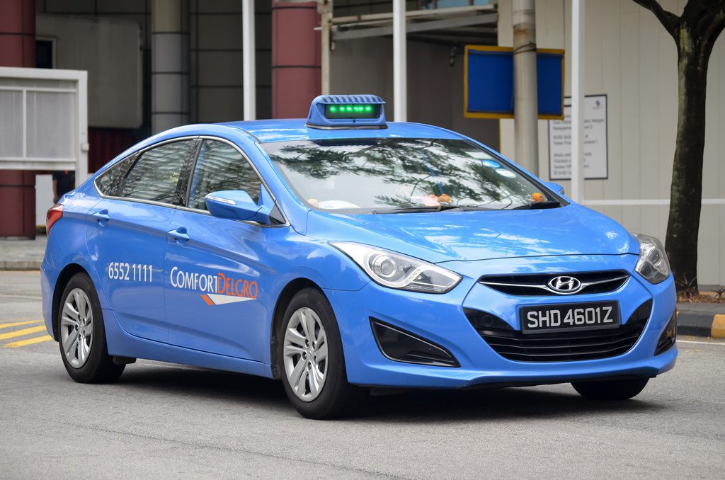
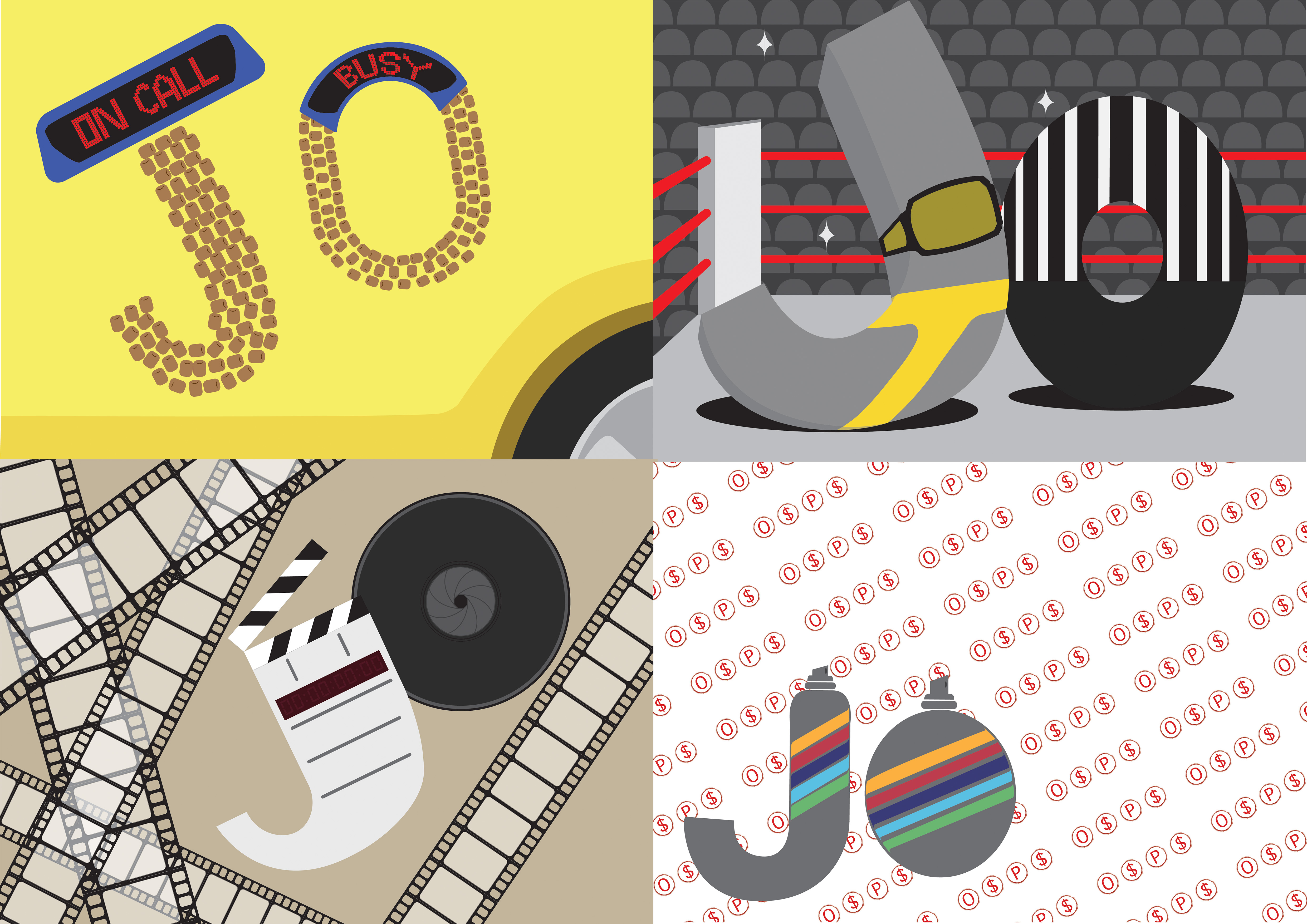
The main elements of being a taxi driver that I wanted to highlight were the cab signs of Singapore, the car itself, and the beaded seats that all cab drivers seem to use.
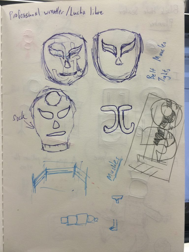
I am a Professional Wrestler
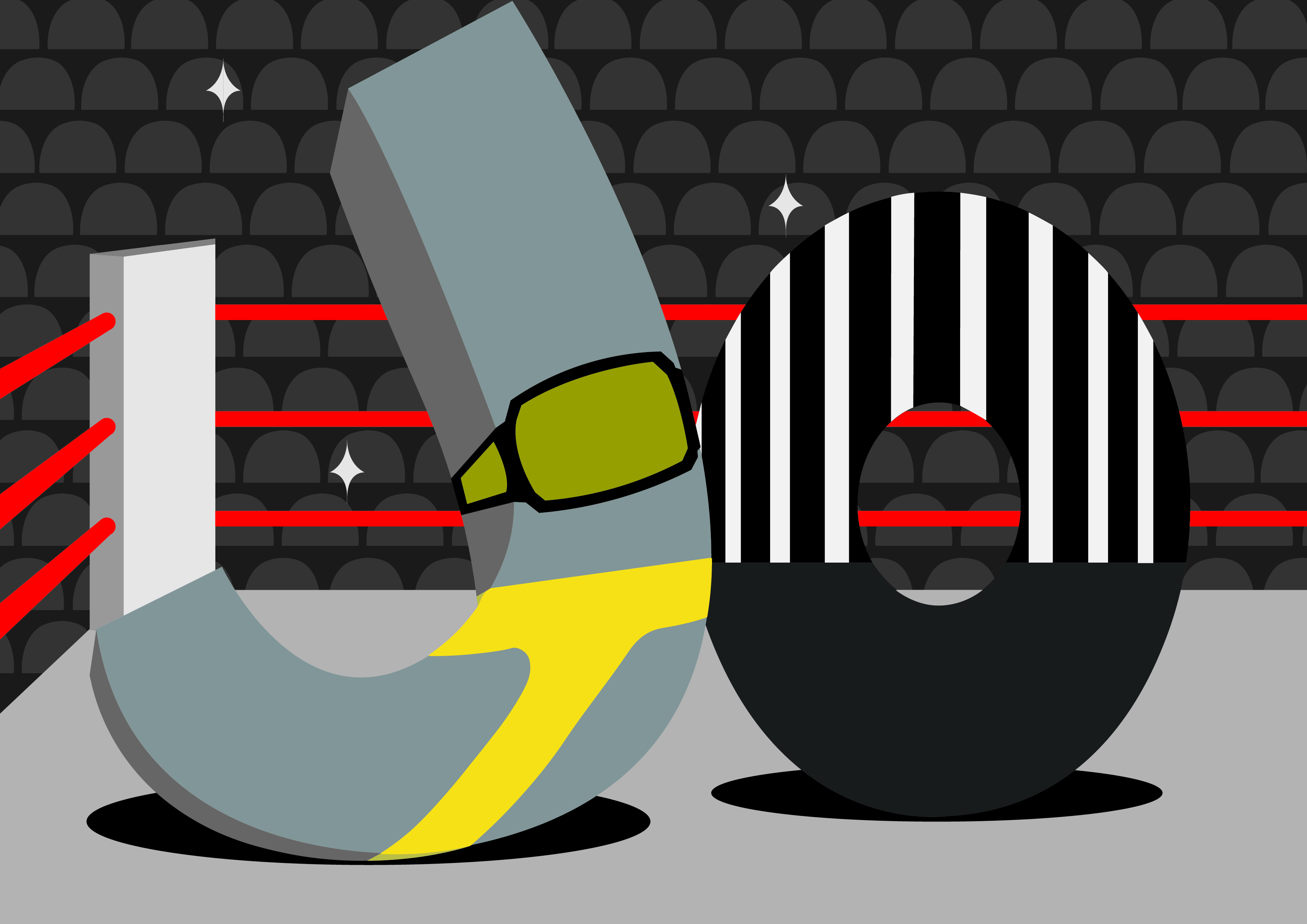
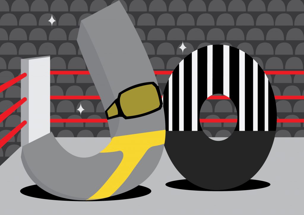
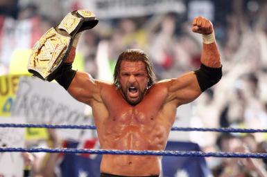
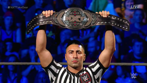
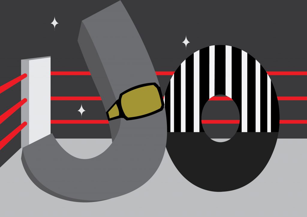
The main elements of being a professional wrestler that I wanted to highlight were the ring, the championship belt, the tights, the referee, and the fans. Additionally, to remove the confusion of professional wrestling to real wrestling, I wanted to make the type less gritty and more playful.
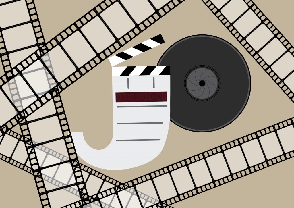
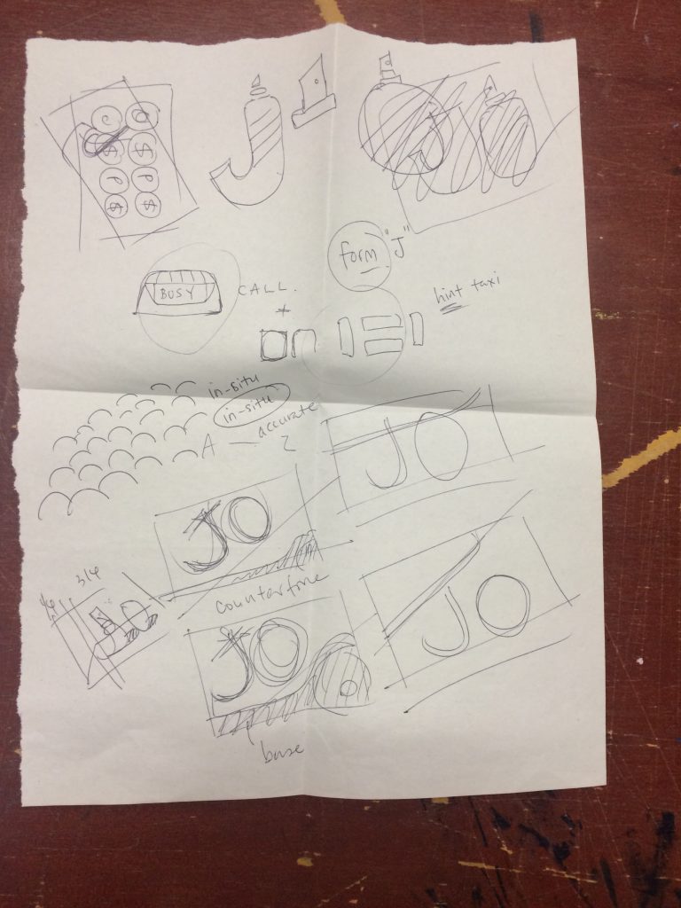
I am a Filmmaker
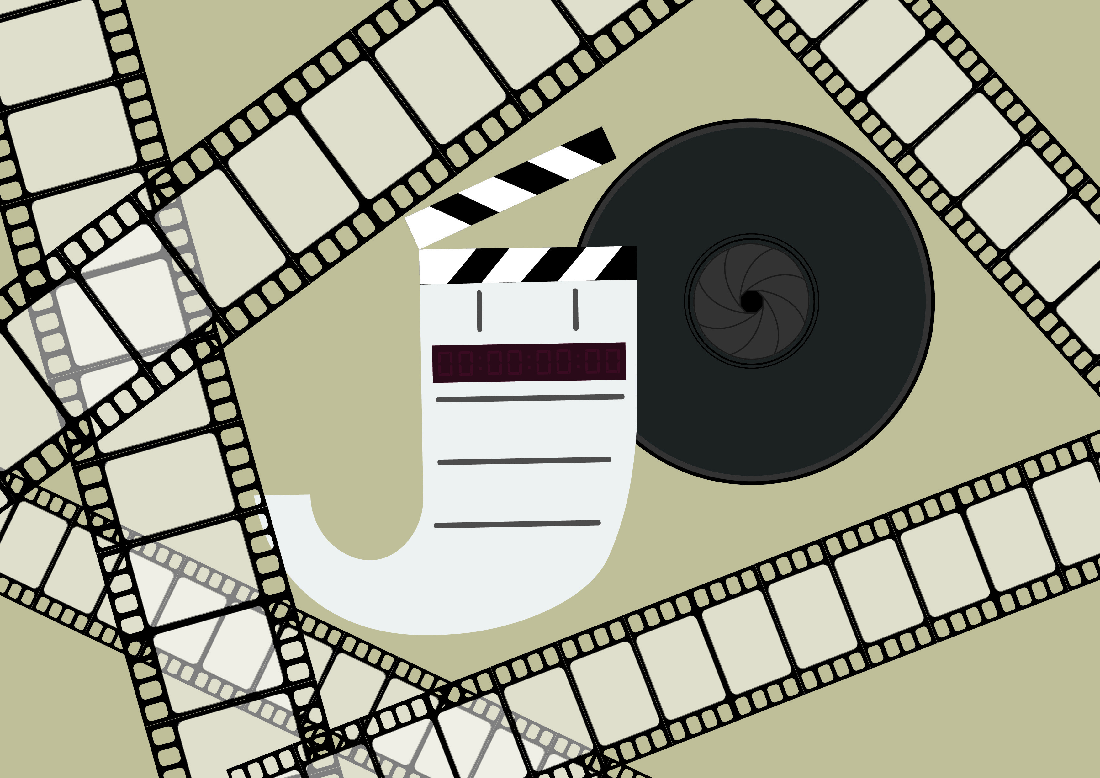
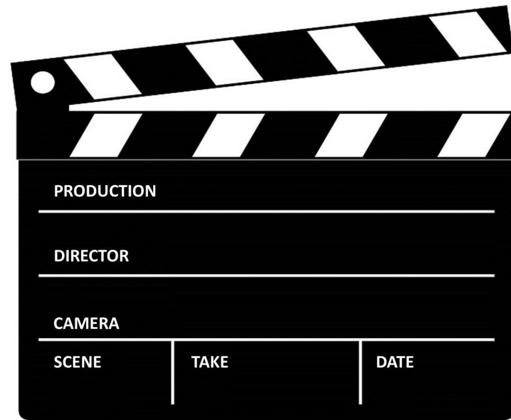
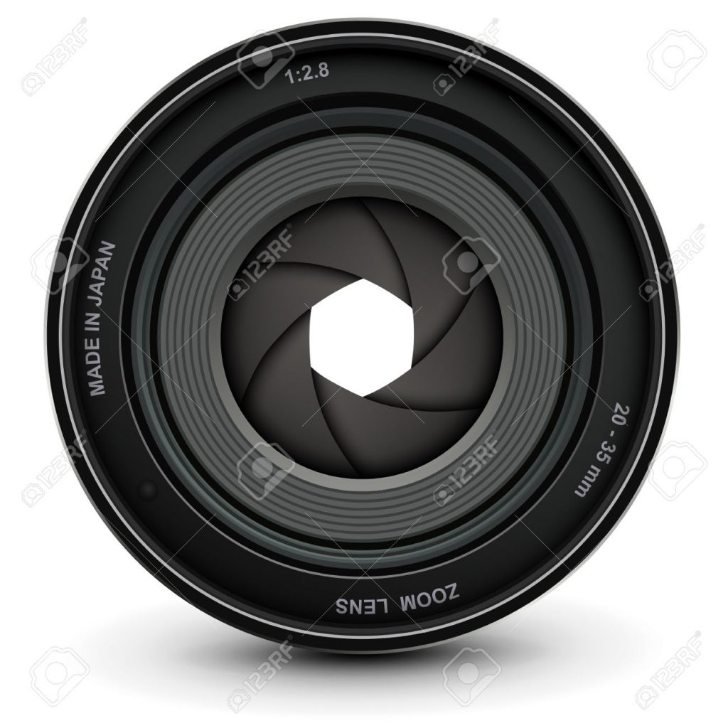
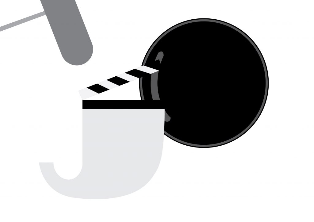
The main elements of being a filmmaker that I wanted to highlight were the clapper board, the camera lens, and the film reel. The use of a brownish colour is to give the sense of nostalgia to convey that film is where is feel comfort.
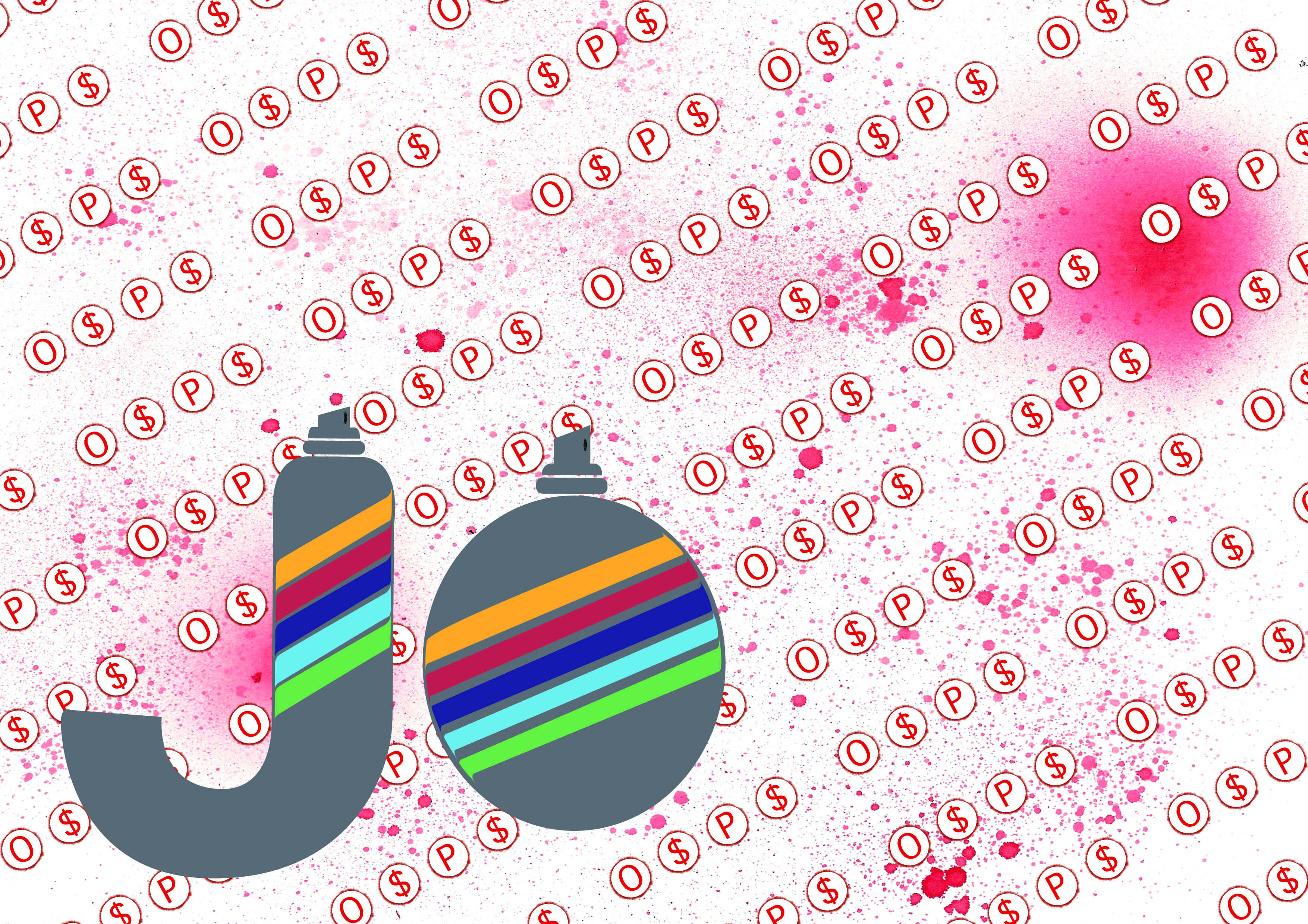
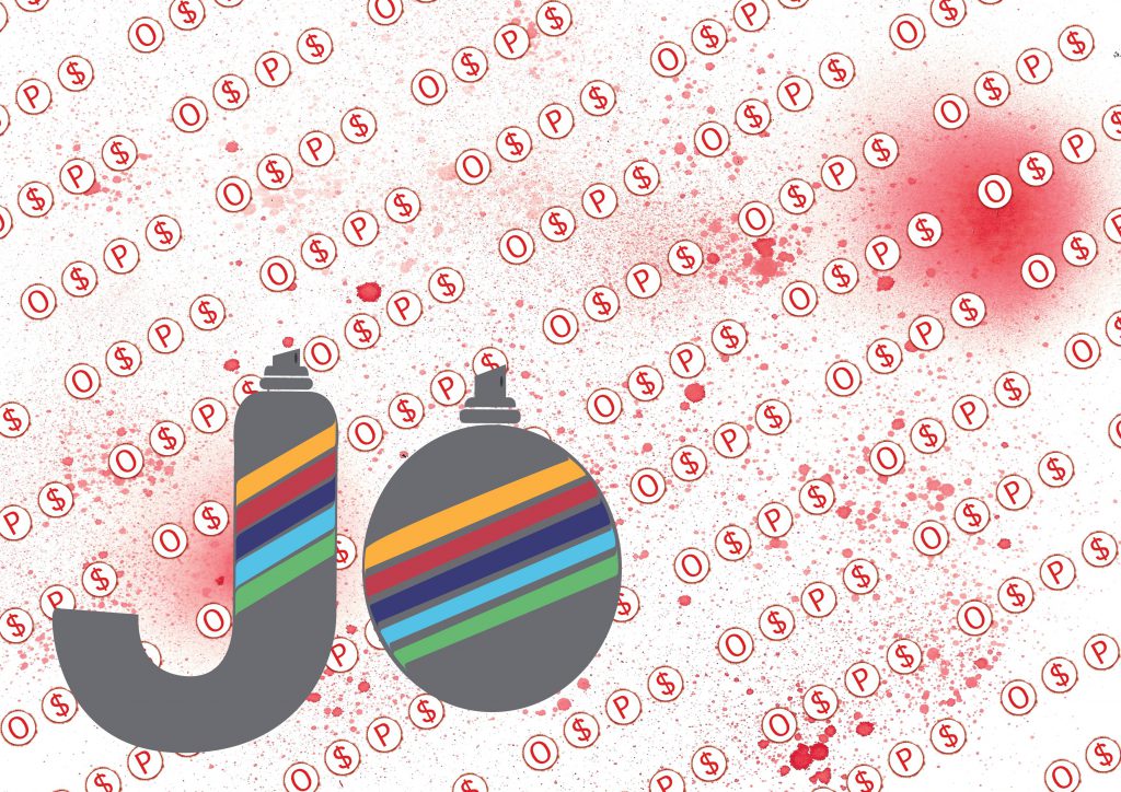
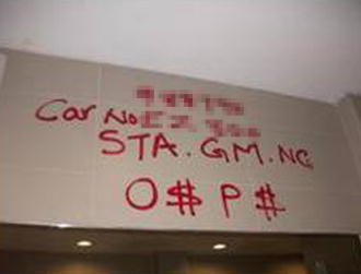
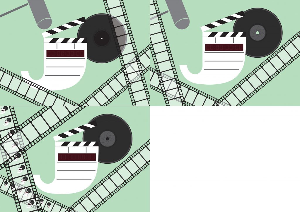
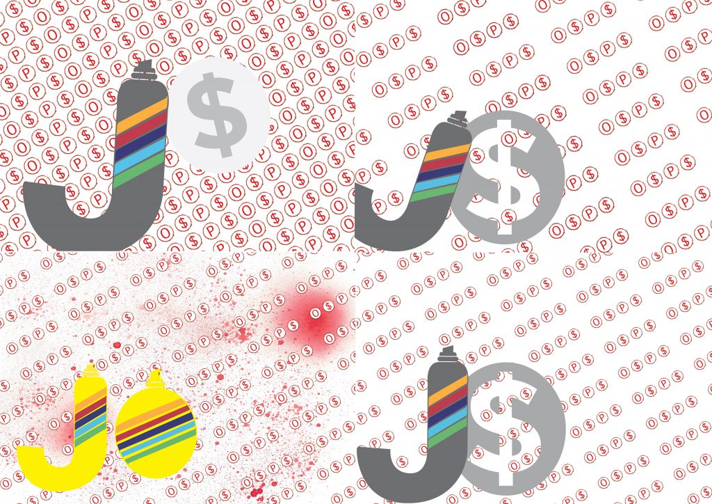
I am a Gangster Graphic Designer
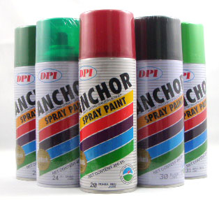
The main elements of being a gangster graphic designer that I wanted to highlight were the O$P$ graffiti and the spray paint. While this was the most interesting idea to me, conveying the idea of a graphic designer is challenging. I feel that the use of patterns conveys that in a slightly less direct manner.
The main elements of being a taxi driver that I wanted to highlight were the cab signs of Singapore, the car itself, and the beaded seats that all cab drivers seem to use.
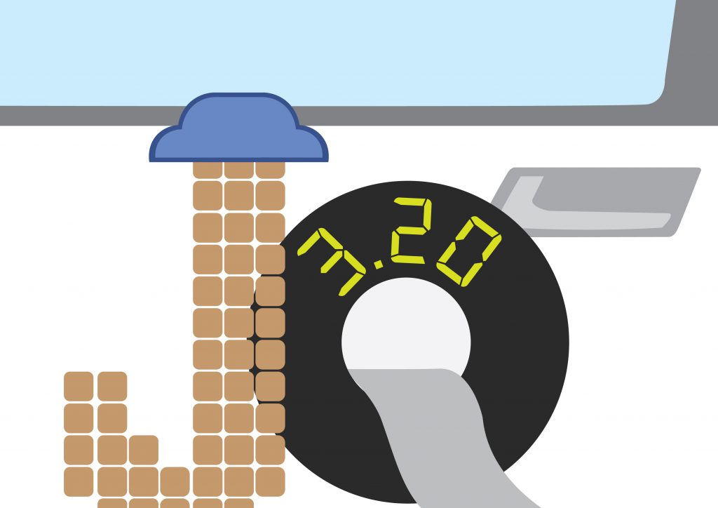
For this design, my name is placed on the side of a taxi car. It is meant to feel flatter than the other designs; as though it was floating in space. This gave me room to deliver a clearer message.
I combined the cab sign and the beaded seats to form the typeface, imagining what it would be like if I were to create a whole font series. I made sure to keep the element to a minimum to ensure that the communication would be clear and not possibly confuse.
I made the background to look like the side of a car, specifically a yellow car. We can tell that it is a car with the hint of a wheel on the bottom left. There is also a metallic shine/sheen on the yellow area to enhance the believability that it is a car.
I used the colour yellow for the car because taxi cabs in Singapore are easily identified as being yellow or blue- which is why the cab sign is in the ComfortDelgro blue.
I am a Professional Wrestler
Design approach:
The main elements of being a professional wrestler that I wanted to highlight were the ring, the championship belt, the tights, the referee, and the fans.
One thing that I had to be aware of is that I did not want people to mistake this composition as actual wrestling like in the olympics or like UFC (Ultimate Fighting Championship). Because of that, I made the setting less gritty. I even made the tights, yellow.
The typeface looks like actual characters in a scene: J, the wrestling champion, and O, the referee. I distinctly wanted to give this a 3D effect to give it an almost cartoon vibe. This also gives the font some literal weight, enhanced by the shadows. I chose my setting/background to be off centre to create more dynamism in my composition. This also allowed the typography to have more space. As a result, I have a more balanced composition.
I added diamond shaped camera flashes from the adoring fans to have small accents in the composition to create visual interest. I repeated the heads of the fans to create an in-situ. Just the heads was enough.
I made minimal use of colours. I used mostly greys so that when I did use colour, it would stand out all the more – the funny yellow tights, the red in the ring ropes evoke that sort of fiery passion of both myself, for the job, and of the fans as well.
I am a Filmmaker
Design approach:
The main elements of being a filmmaker that I wanted to highlight were the clapper board, the camera lens, and the film reel.
I used the elements of the clapper board and camera lens to create the typeface of my name. The camera lens, accompanied by the clapper board make it clear that I am a filmmaker as opposed to a photographer.
I wanted to go against my instincts in this composition. I wanted to really get out of my comfort zone. Even though it was already clear what my future job was, I needed another element to the design, so I used film reel to give a sense of depth, texture, and patterns.
I used the colour brown as a background because I wanted to give a nostalgic/sepia/homely feel to the design. Filmmaking is, after all, where I feel most at home.
I am a Gangster Graphic Designer
Design approach:
The main elements of being a gangster graphic designer that I wanted to highlight were the O$P$ graffiti, and the spray paint.
Though this one had the fewest elements, I felt that the job was specific enough and that I could express this job in ways other than just the elements.
As with the taxi driver design, I imagined what it would be like to create a whole font series with the spray paint. I felt that I made sure that it looks like a spray can/bottle because it is modelled after iconic spray paint brand, Anchor.
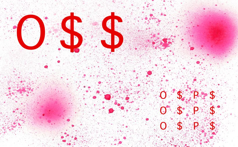
With the design of the background, I filled it with the O$P$ sign (with a twist). Instead of having the O$P$ sign be random or clumsily done, it is neatly done in repetition, giving off the idea that it is a graphic designer’s handiwork. The background is tilted at an angle to create dynamism in the composition while not looking messy, another trait of graphic designers.
Choosing the colour red was an obvious choice, but I had to make it look a little more on the bloody side to accentuate the violence that is often associated with gangs.
My main goal for this project is to experiment more with design/composition as well as colours. I also plan on either drawing/painting or illustrating my final compositions because money is tight – plain and simple.
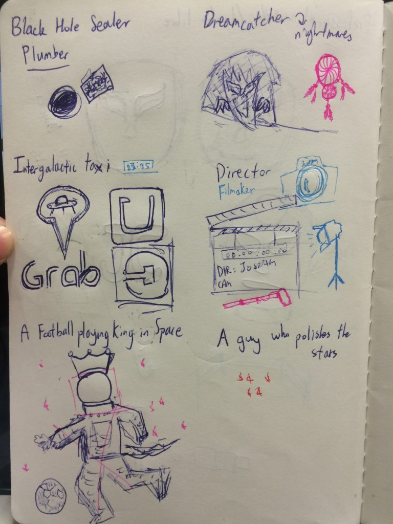
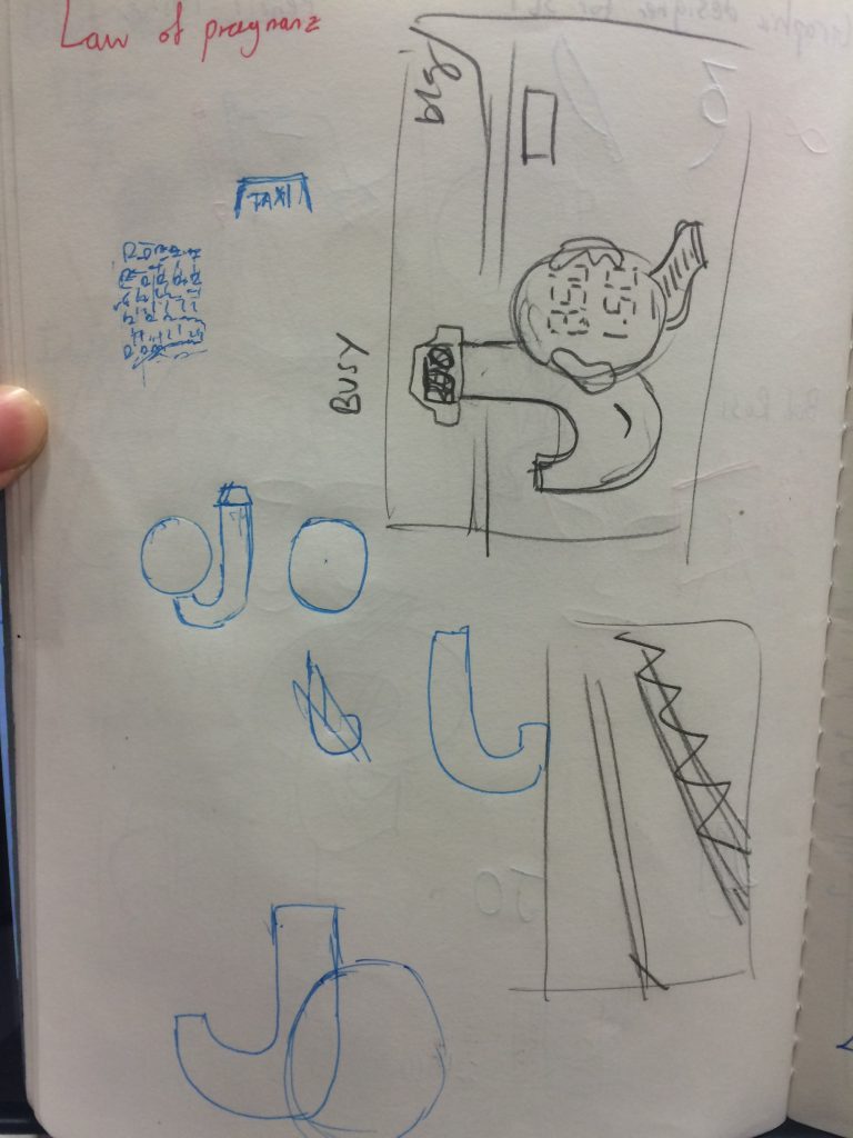
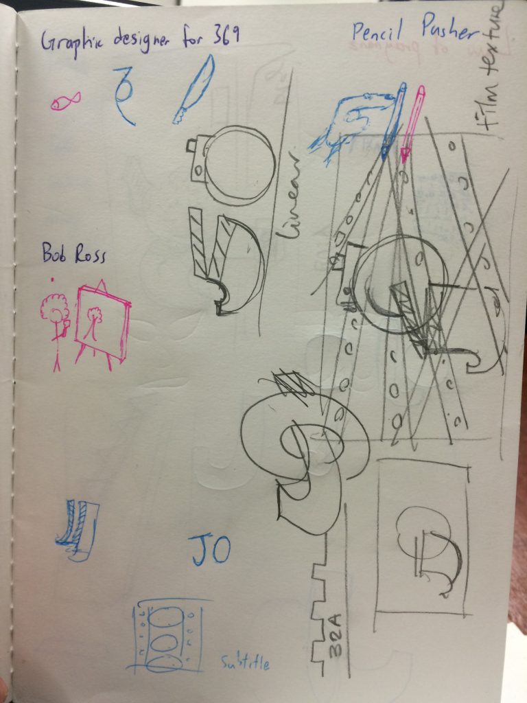
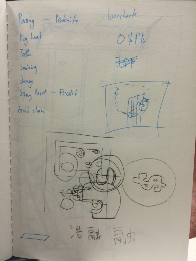
I started off this project by sketching out a couple of jobs that I wanted to work on. I did not think about what aesthetics I could make use of first because I did not want to create what has already been created. People will argue with me about this but this process is more organic to me and it is how I have to do things.
These were based off my own ideas of trying to create typography and blend it with the future job. After the consultation, however, I was told that I should imagine if the letter was the job. That meant that we were to characterise our letters; in my case, J and O.
With that, I came up with a couple of new thumbnails (some of which can be seen with the sketches above)
taxi cab designfilmmaker design, and my dashed dreams of being bob rossO$P$
I then worked on turning the thumbnails into illustrations.
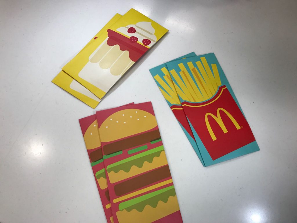
I was looking out for inspiration and it so happened that I was having MacDonald’s, one day, near Chinese New Year. They were giving out Angpaos that had really nice illustrations. I decided to try adapting this style to create my compositions.
I looked for points of reference for my elements, then implemented them in my designs.
Taxi Driver
Professional Wrestler
Filmmaker
Graphic Designer for Gangs
After working sufficiently on the rough versions of the illustrations, I brought them for consultation again. This time though, I was told that I should create a single font style for each job. I was a little perplexed now. Was there a wrong way of doing typography? Were things right one week and wrong the next? Perhaps this was just a means of creating variety in the work. Nevertheless, the client gets what the client wants – those are the rules of the game.
To be fair though, I believe that the taxi driver one was difficult to decipher.
In the end, I had a mixture of typography (typographies?) that were either characters or that could be a full set.
In hindsight, variety is probably good.
I went through several iterations of this oneand several more for this one
I experimented with colours, spacing and trying the O as the stencil for the $. All of these were steps in the right direction.
This was the right direction I wanted to be heading in. It was getting better. I liked that even though they were all illustrations, they had styles that made them diverse.
I need to add a metallic sheen on the taxi. It was hard to find a way to do that. I also needed to straighten the clapper board in the filmmaking composition because there were enough angled film reels. This would give variety to the design. A couple more tweaks and I should have my designs.