
Creative Industry Report

Aaron Nieh is a Taiwanese Graphic Designer who has won many international graphic design awards. He is an all-rounder designer that has worked on an extensive amount of projects. However, his work mainly centred around two major sectors which are album cover packaging and book cover design. As a graphic designer, he designed 70% of the market’s Chinese album record design for famous artists like Jay Chou, Mayday and Yoga Lin. Initially, Aaron studied Mechanical Drawing, subsequently, he realised his passion for graphic design and eventually studied and graduated with a bachelor’s degree in design from the National Taiwan University of Science and Technology(Sohu, 2019)(YueLin, 2019).
Aaron is a very humble designer. In an interview, Aaron mentioned that “I always hope that the next piece of work will be more exciting than the previous one. I don’t want to ever feel like I’ve created a so-called ‘masterpiece’. I want my future to be exciting and hold unlimited possibilities.” Recently, he even undertakes additional Computational Art classes to explore coding visual possibilities (YiJie, 2020). In Aaron’s design process, he has a tendency to throw away the first few designs concepts as those are common designs that others might think of too (Audrey, 2020). Therefore, we can see that he always is striving for the newest and most unique ideas.
In many of his works, Aaron’s design is really unique and daring. His style is contemporary, minimalistic yet provocative with really bold fonts and colours that sometimes might even give a fluorescent effect which I felt it is not easy to manage or strike a balance with. However, he manages to implement it well and achieving aesthetically pleasing outcomes. Aaron’s is very sensitive when it comes to design and his works have a very strong conceptualization that goes along with his attention to details. When he conveys messages he doesn’t only focus on the visuals but also takes into consideration of the context, material and object chosen to represent information visually and spacially.
As an international multi-award winner, I truly respect how he continues to stay humble and is always keen on exploring new possibilities without limiting himself. I appreciate Aaron’s clever attention to details and the thoughts he put into his works. His sense of minimal design with a fusion of bold colours creates a really well-balanced piece (HereNow, 2018). His beliefs inspire me to be brave and step out of my comfort zone and never limit myself in terms of design. The thoughts and details he put into his work encourage me to be more aware of every aspect that is included in the work I do. His sense of design is something I aspire to learn from and achieve.


Bibliography
Audrey, K. (2020, May 07). 專訪聶永真:這個世界上,有你的同類存在,你並不奇怪|性別力 Gender Power. Retrieved October 04, 2020, from https://womany.net/read/article/18651
HereNow. (2018, July 18). Taiwanese graphic designer Aaron Nieh talks about Taiwanese Design: HereNow Taipei: 1. Retrieved October 04, 2020, from https://www.herenow.city/en/taipei/article/aaron-nieh/1
Sohu. (2019, May 30). 聂永真:对不美的绝不妥协_设计. Retrieved October 04, 2020, from https://www.sohu.com/a/317615305_720444
YiJie, Z. (2020, June 23). 專訪/聶永真的風格美學設計!從專輯封面到直視社會議題「我還是喜歡做酷的東西」: La Vie. Retrieved October 04, 2020, from https://www.wowlavie.com/Article/AE2000805
YueLin, M. (2019, June 14). 為何大明星都要聶永真?|天下雜誌. Retrieved October 04, 2020, from https://www.cw.com.tw/article/5001077
Protected: FYP research Week2 to Week5
4TD Kerning Exercise (Week 5)


3TD Bezier curves exercise 1 (week 5)


Task 1B: Exploratory Research – Survey
Survey Aim
This survey mainly target female of age between 13-30 years old who had been in a relationship before. This survey is handed out to both genders who may or may not have been involved in dating violence.
This survey aims to collect data on generally whether people are aware of the causes and effects of dating violence and where to seek help when needed. It is also to see how common it is for people to experience dating violence. It is also to gather the perspective of people who have never dated before and how would they react or help others when encountering such situations.
Survey Findings
Respondents’ gender: 43 females 17 males

Respondents’ age: Mainly 21-24 years old

Most of the respondent started dating at the age of 14-16 years old which is around the age of teenagers when we are studying in secondary schools.

A mixture of ideas regarding dating violence. Both emotional and physical level is mentioned.

Most respondent roughly knows the effect of dating violence.

There is a mixed opinion regarding how common is an abusive relationship.

80% of the respondent thinks that dating violence is a serious issue.

Top 3 situation that respondent strongly agreed and considered as dating violence are: Physical, Forcing, Threatening


Nearing half of the respondents have experienced dating violence before.

Most respondent experiences more verbal, emotional and manipulative abuse rather than physical abuse in dating violence.

Many of the respondents are emotionally affected.

The main reason for respondents in this survey still choose to stay in an abusive relationship is out of forgiveness.

Respondent’s reaction( including both those has been and those hasn’t been in an abusive relationship before): As a whole, some respondent felt that is easy and some felt it is difficult to identify whether if they are in an abusive relationship. While 16 out of 28 of those who have been in an abusive relationship before finds it not easy.

However, when it comes to leaving 43% of the respondents felt that it’s difficult.

Most respondents would give advice to break up but it is up to the person to do it or not. While others would just support them by listening.

Most respondents would rather prefer to resolve the issue of being in an abusive relationship by themselves.

69% of the respondents don’t know whether their close ones are involved in dating violence while 31% of them do know someone that is involved.

Top 3 suggested solution for raising awareness: Online platform, Video, Toolkit and interactive poster

73% of the respondents as a whole does not know of any helplines or specialist centers.

Final Key Conclusion
- Approximately half of the 60 respondent had experienced an abusive relationship before and are mainly females that started dating during at age 14-16 years old.
- Approximately 1 in 3 would rather prefer to solve the issues by themselves instead of seeking help.
- 23 out of 28 respondent who has experienced an abusive relationship before are unaware of any helplines.
- People who had experienced an abusive relationship before find it not easy to identify that they are in one and it is difficult for them to get out of it.
Task 2: Infographic Poster – Final

Final Infographic Poster

CONTEXT: There is an increasing trend of dating violence. Many were unaware that unmarried woman faces the same violence as domestic violence. It is dangerous as they are not protected by Singapore law.
OBJECTIVES: The infographic aims to inform and gain more awareness so as to improve the situation and help the people around us that encounter dating violence.
TARGET AUDIENCE: Unmarried woman of age between 13 – 30 years old and the general public.
Process


Task 4: Deliverable 2-Final Artwork (App)

Final Artwork


Selflov is an app designed for women targeted between age 13-30 years old who may or are experiencing dating violence. It serves as a self-assessment and emotion tracking app that functions as a daily diary with a checklist that allows one to gains awareness. Secondly, the app also provides helpline and information resources to protect them from further being a victim.
This app aims to solve some of the common issues that most women who are in dating violence experiences. That is, to most women who are experiencing dating violence, they are unaware that they are in an abusive relationship or are unsure of where and how to seek help.
PROCESS


Task 3: Deliverable 1-Final Artwork (MRT Poster by the door)

FINAL ARTWORK

An MRT poster by the door that informs the general public regarding dating violence and serves as a platform that reaches out and direct women who may or are experiencing dating violence to download an app, Selflov(2nd deliverable). The app act as a self-assessment app that allows one to gains awareness, provides help and resources to protect them from further being a victim.
MOCKUPS


PROCESS


(Layout & Color Explorations – second draft)


Assignment 3 – Process and Final

Sketches
[Camouflage Event]
Event Concept:
For the camouflage event, I have gone with a more playful concept. It is an event for all ages to have fun with camouflaging themselves and also to find this character that is hiding around all sorts of different types of disguise.
Items:
Invitation cards
Mystery gift bag
Tote bag
Ticket
Gift wrapper
Sketch:
I have come up with a character and 5 different thumbnail sketches of various patterns that camouflage the character in various ways.

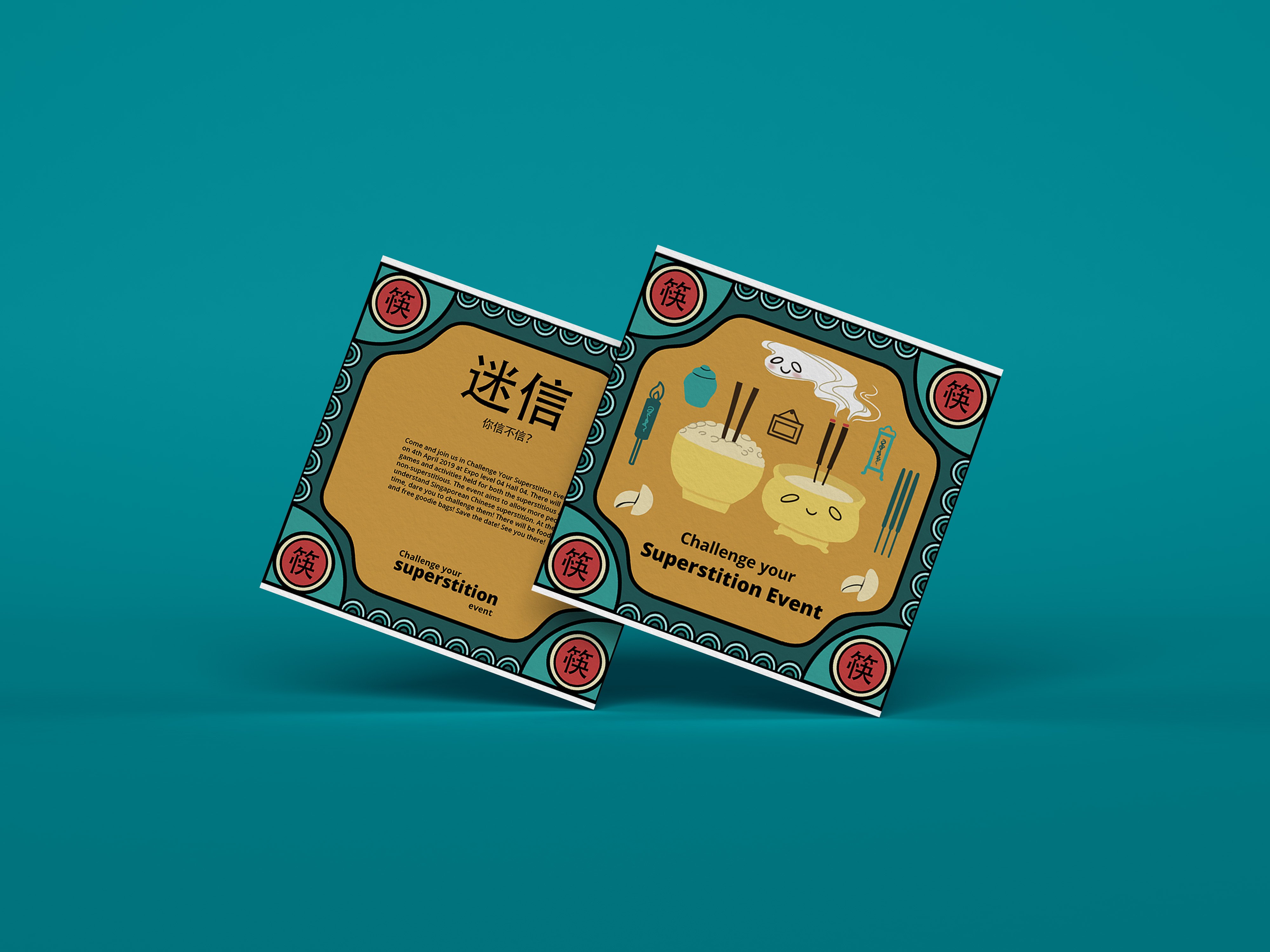
[Superstition Event]
Event Concept:
The event aims to challenge visitors with their beliefs in Chinese superstitions. There will be games, installations and free goodie bags that stores inauspicious gifts such as pear juice, umbrella, and a handkerchief to play out the contradiction of the concept of giving the visitors gifts that shouldn’t be given.
Items:
Invitation cards
Tickets
Tote bag (As the event goodie bag that stores all in inauspicious free goodies to be given out to visitors)
Umbrella → Pear Packaging → Pear Juice Label(Inauspicious goodies #1, changes made due to execution and aesthetics reasons)
Handkerchief(Inauspicious goodies #2, initial fifth item)
Sketch:
I have come up with 4 different thumbnail sketches for superstitions that are mainly from the spirits category as they are more interesting. I have also included one inauspicious gift(pear juice) to play out the idea of challenging people’s beliefs in superstition by giving them the inauspicious gift as a gift for the event itself.
Superstition 1: Don’t sleep facing mirrors
Superstition 2: Don’t stick chopsticks in your rice
Superstition 3: Don’t open umbrella in the house
Superstition 4(inauspicious gift): Don’t give pear(juice) as a gift.


Element:
Chinese border with 4 corners of different version of the main key themed item. However later on it was changed to Chinese characters that symbolized the key themed item instead as it brings out the theme better and it is more consistent. Main center superstition accompanied by floating daily item placed randomly that will be seen in such a scene to create a sense of place.
Superstition 1: Don’t sleep facing mirrors
I have drawn a person sleeping on a bed facing a huge mirror with ghostly figures that represented as her soul that is going towards into the mirror showing that her soul is being sucked inside.
Superstition 2: Don’t stick chopsticks in your rice
I have drawn a comparison by putting a rice bowl with chopsticks sticking inside and a Chinese incense burner to show the similarity of both and how they are being associated. The ghostly figures here represented the incencse is an offering for our ancestors.
Superstition 3: Don’t open umbrella in the house
I have drawn a house that is filled with household items with an opened umbrella and a ghostly figure floating out from it to show that opening an umbrella in the house attracts spirits.
Superstition 4(inauspicious gift): Don’t give pear(juice) as a gift.
I have drawn a pear and put the two Chinese character of “pear” lí and “separate”lí that sounded similar side by side as a comparison at the bottom shows a broken rope to represent the idea of separation.
After further consultation, I have decided to go with the superstition event concept as it is more interesting and unique. Also, its a concept that not a lot of people have explored it in illustration before, therefore, I would like to give it a try and see how it turns out.
Style

For the style that I’m going with, I have come across this Korean Illustrator Subin Yang. I felt that the way she illustrates is really interesting. It is very stylised in a way that gives this hand-drawn feeling. Her style also closely explores themes such as home, culture, and identity. Basically very daily life illustrations with a sense of playfulness in her illustration. I felt that it would be quite suitable for the theme that I am touching on as well since a superstition is something really cultural and close to our everyday life.
Some of her style’s traits
-flat vibrant colors
-simplistic facial features representation
-outline on the inside of the illustrations
-simple chunky body shapes
Color Palette
Since I’m doing something traditional, I have chosen to use those vintage Chinese color palette that is slightly desaturated to enhance the whole superstition theme.

Initial Rough Sketch/ Color Test

The initial color test was not ideal as all the illustration does not look like they belong to the same family. Therefore, after consultation, Prof Lisa suggested going with the green, red and yellow palette that looks the most harmonious as a whole out of the 4 color test. The rest of it was either too bright or dull. Hence, I went on to look for more similar color palette references to better help me with my illustration.

Process


During the process of creating the illustration, I have decided to first use Illustrator to create the outer borders for all four superstitions. This is because I felt that Illustrator is better at creating borders and shapes with symmetrical style. The borders were later imported to Photoshop for painting the main elements and center illustrations in as I wanted to give my illustration a more textured hand drawn/painted feel to it.
Final


Mock Up


Reflection
Initially, I couldn’t imagine myself doing the superstition event as I find it difficult to convey superstition through illustration. Superstitions are usually an act of displaying a certain action, a belief or the combination of both rather than a scene or situation to be illustrated. Therefore I find it a little challenging at the start and unsure of how to translate it into illustrations. However, as I research more and tried to find references, I had a better idea of how to go about with the illustrations.
The second challenge for me was balancing the color for all 4 illustrations to look harmoniously. At the start, looking at vintage Chinese labels was really very colorful and I did not have a focused color palette. After some discussion with Prof Lisa, we manage to narrow down on focusing on just one color palette. Overall, I have sort of stepped out of my comfort zone a little and tried to illustrate something that I’ve not done before and I’m glad that I did!