FORREST GUMP FINAL
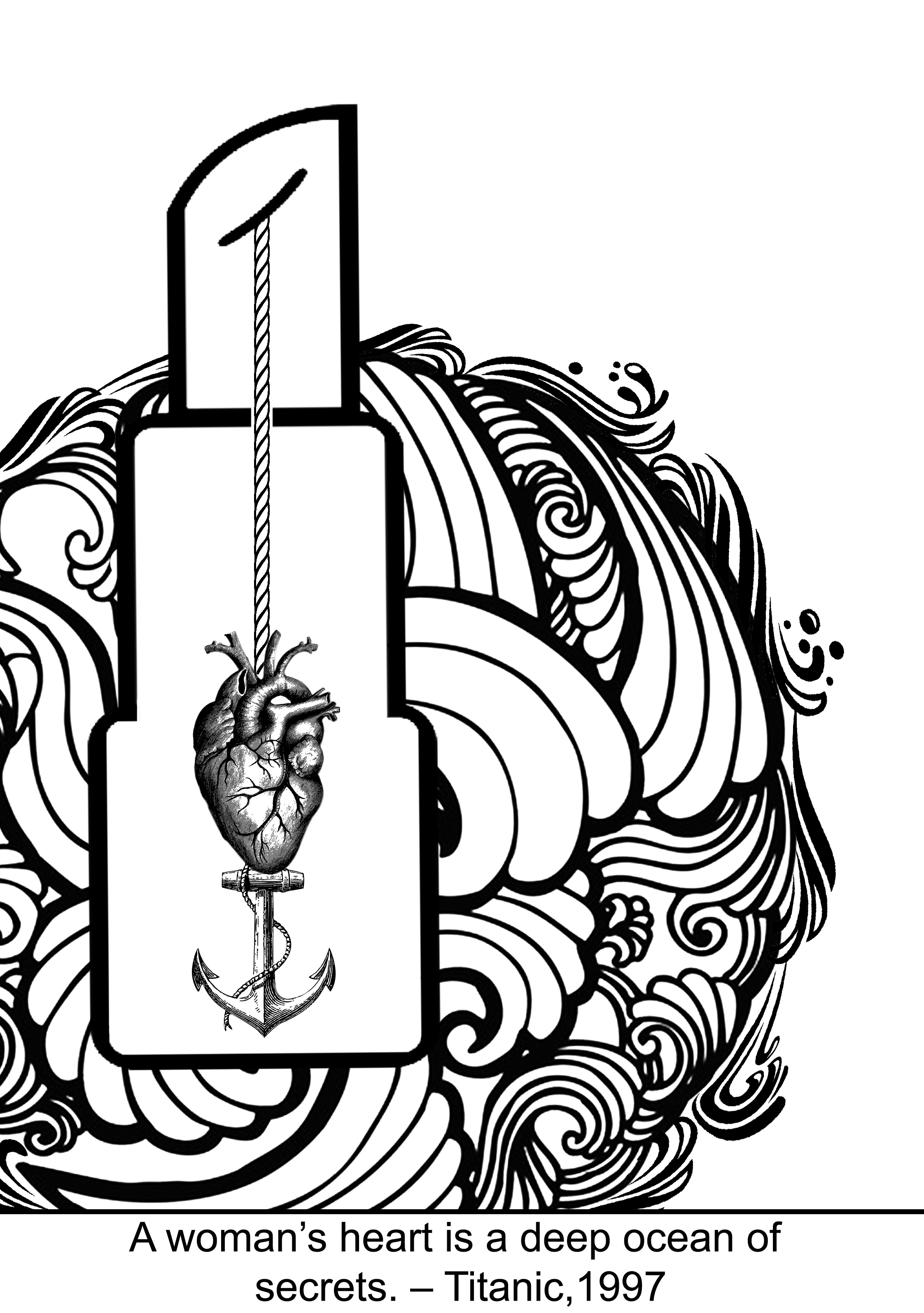
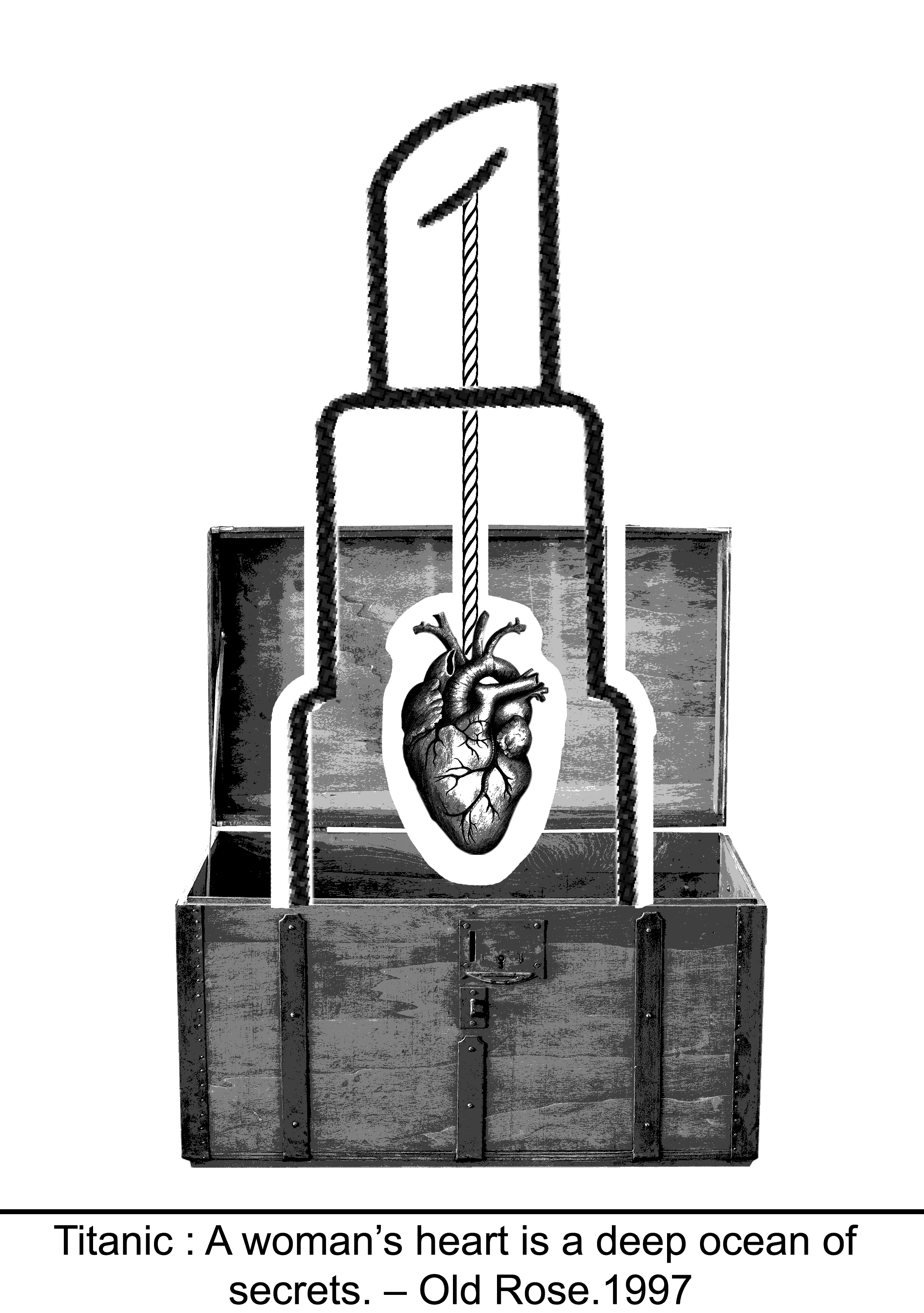
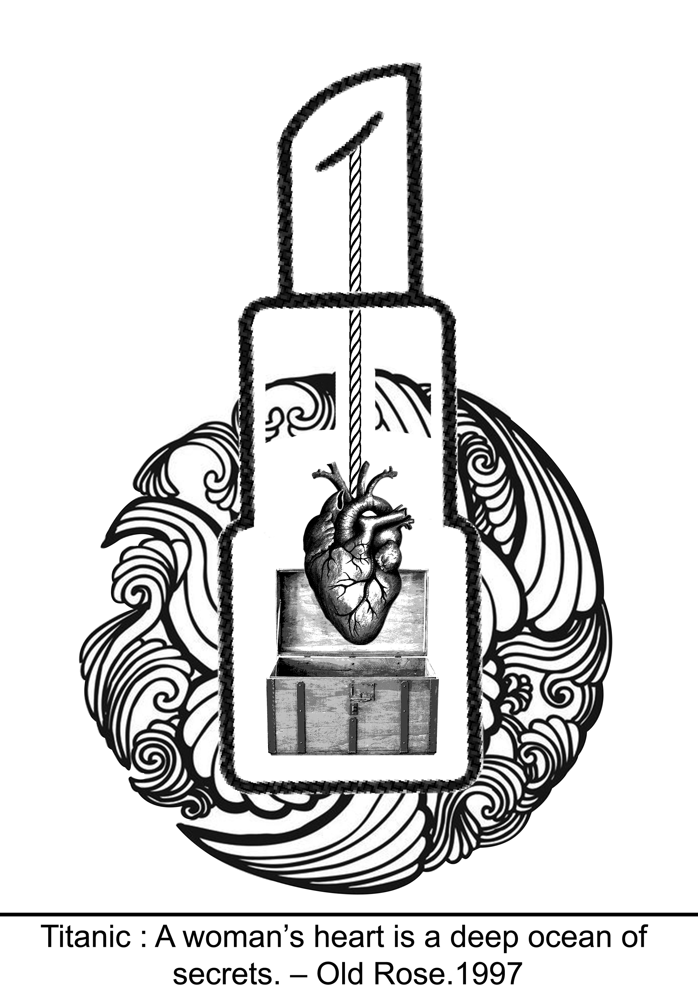
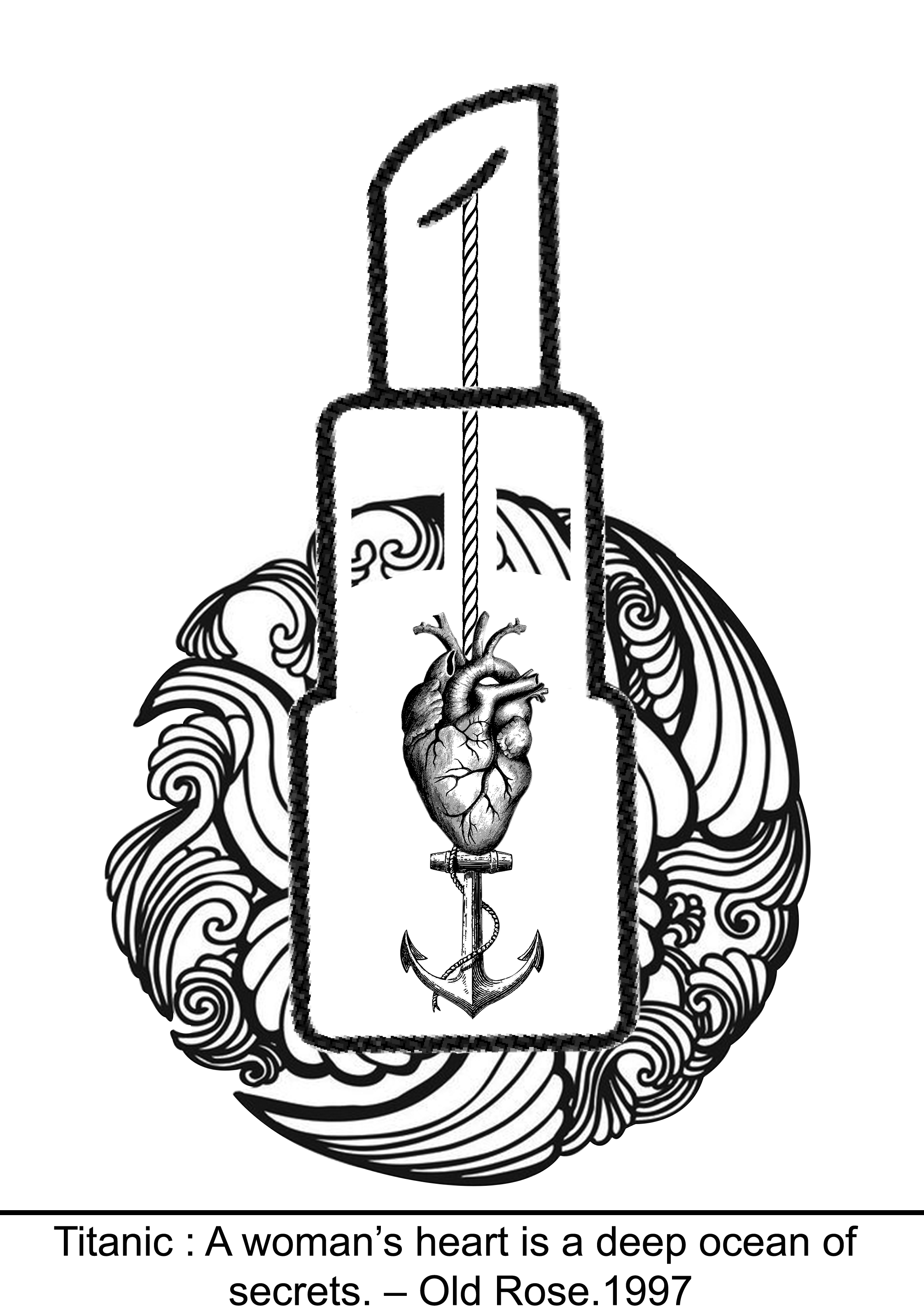
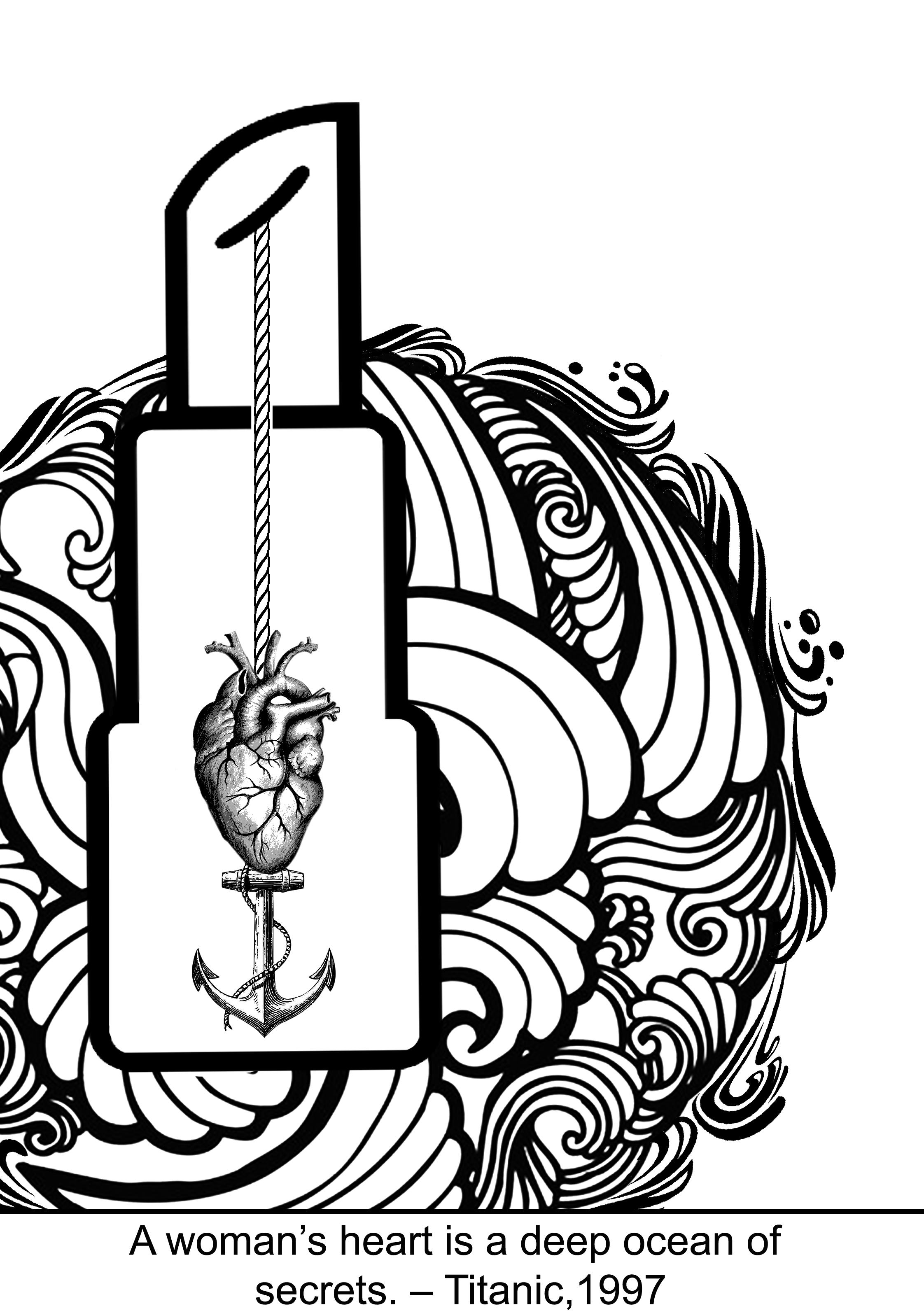
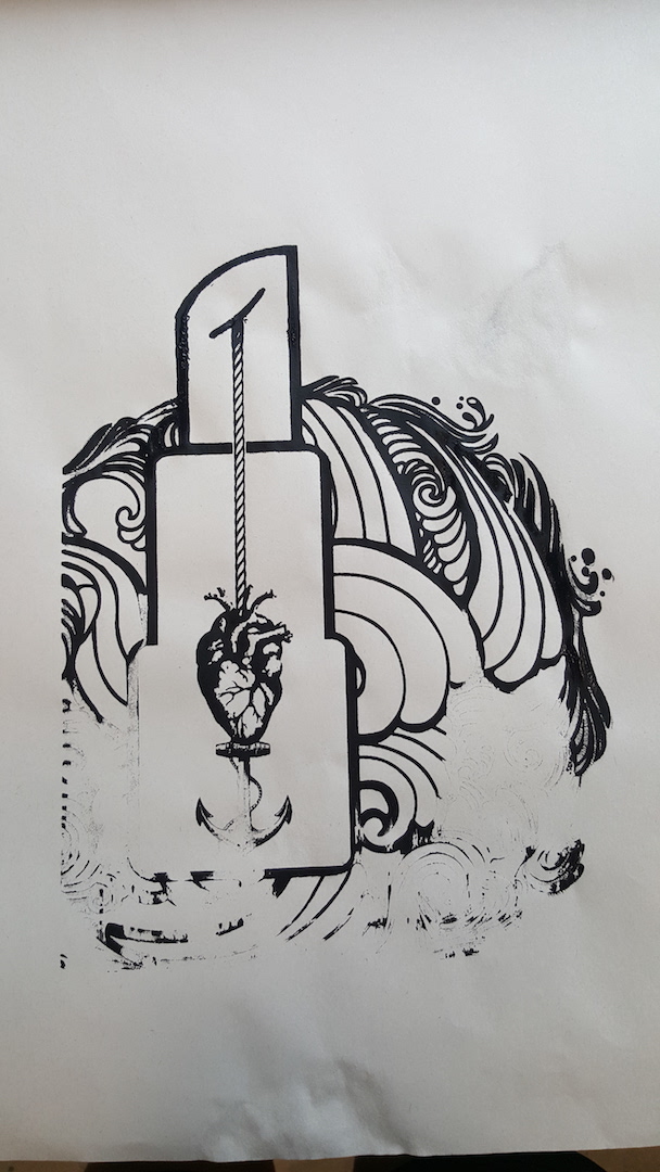
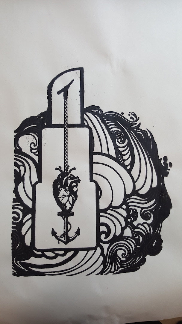
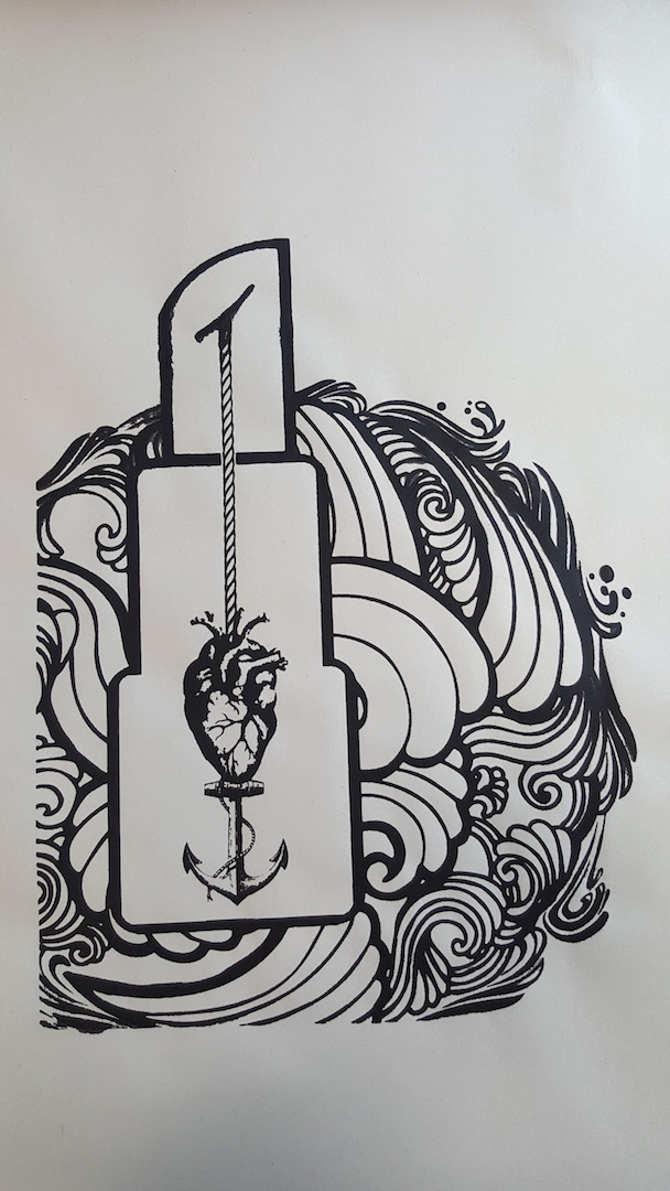
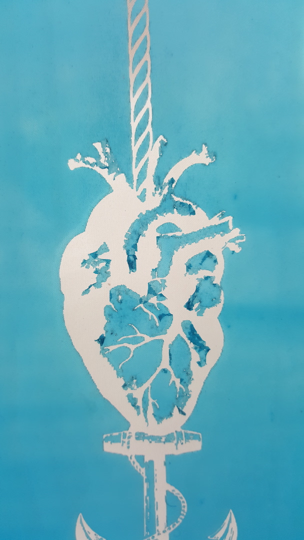
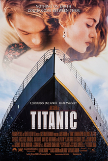
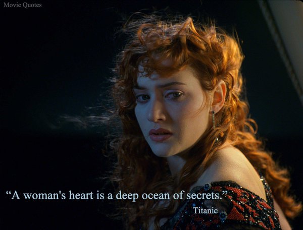
1) ” A Woman’s heart is a deep ocean of secret. ” – Titanic
My interpretation
My interpretation of the quote is that to me, a woman’s heart is something that is difficult to be understood, like a treasure chest weight down deep in the sea that can never be unlocked. It is hard to interpret how a woman truly thinks and feel as well.
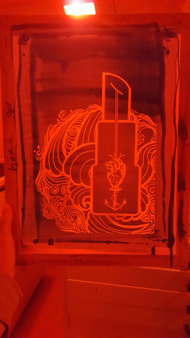
Every time when we think of women, we will think of things like lipstick, heels, and makeup to represents women in general. Therefore, I have used a lipstick to represent “woman” and it acts like a case encasing the heart away from the surrounding showing how woman tends to hide their true thoughts and feelings away from others or avoiding being too direct.
The rough waves that encompass the lipsticks symbolize how we are often overloaded with fluctuating overwhelming feelings most of the time.
A heart being pierced and weighed down by an anchor symbolize how deep we always keep our real thoughts and true feelings hidden, and how difficult it is to uncover it.
Use of design principle
Asymmetry – The off-center design to make the composition much more interesting to look at.
Negative/white space– Making use of the white space that is around the waves and the white space that encompasses the heart, helps in highlighting the most important subject of my composition.
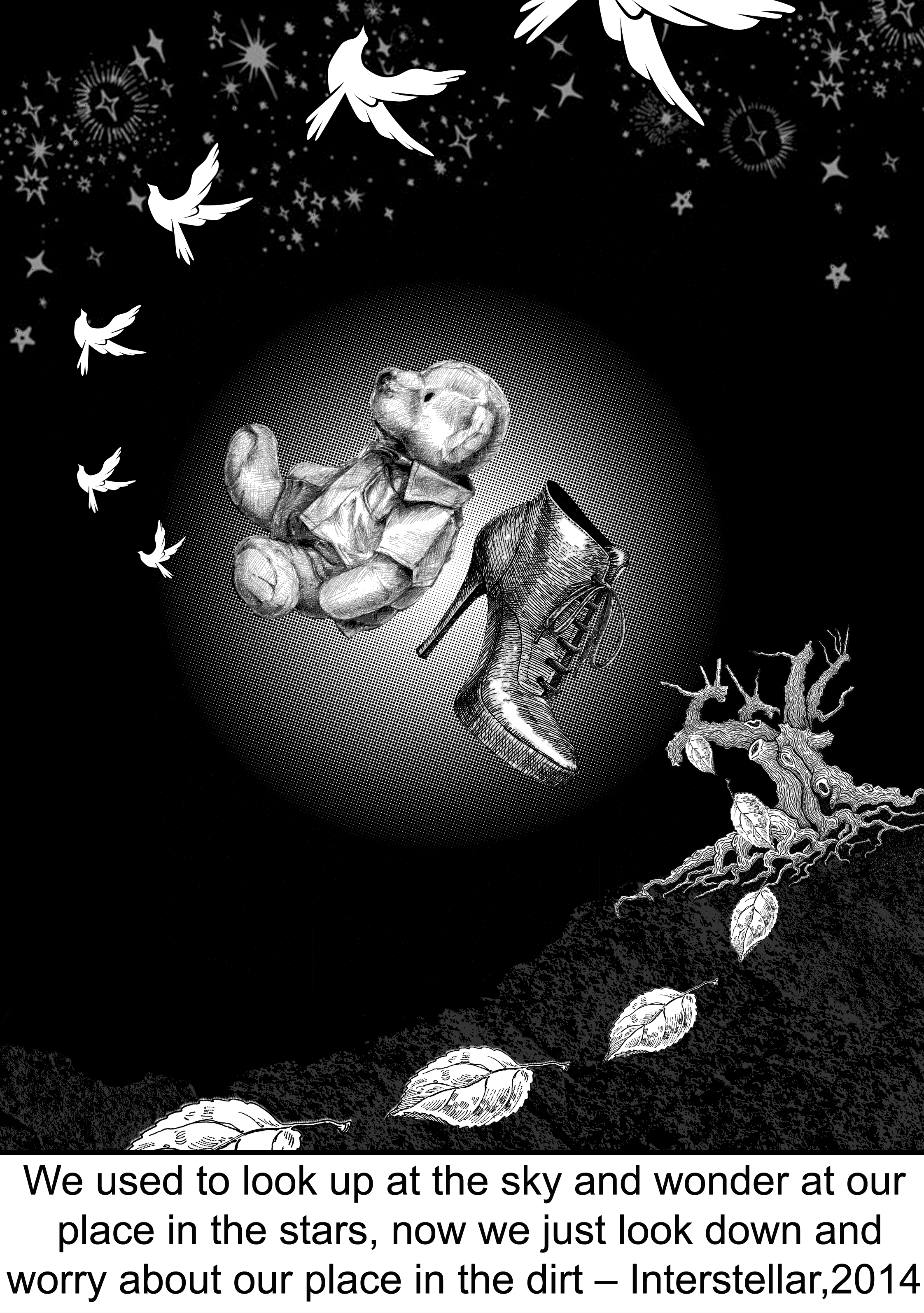
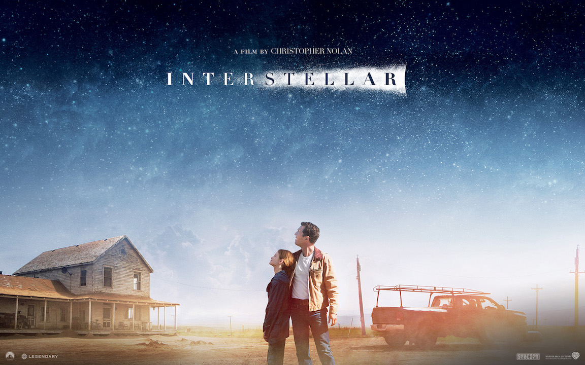
2) ” We used to look up at the sky and wonder at our place in the stars, now we just look down and worry about our place in the dirt. ” – Interstellar
My interpretation
To me, I have interpreted this quote in an entirely different way from the original movie meaning of the quote. The original meaning of the movie for this quote is closely related to the story whereby it tells us how much as an astronaut trying to save Earth they have to go on a mission in space. as when we are young we use to look up in the sky full of dreams and hopes, now as we grow older we look down full of burden with a lot of worries as reality hit on us.
As for me, I interpreted it as, when we are young we use to look up in the sky filled with dreams and hopes, we always tell people about our ambition and there are so many things we want to fulfill when we grow up. Now as we grow older, we became more realistic as the reality hit on us. We look down as we began to have more burden shouldering upon us. We start to have more worries as we grow and being more practical, sometimes we choose to accept life and dreams are just something that is unrealistic, unreachable and never comes true.
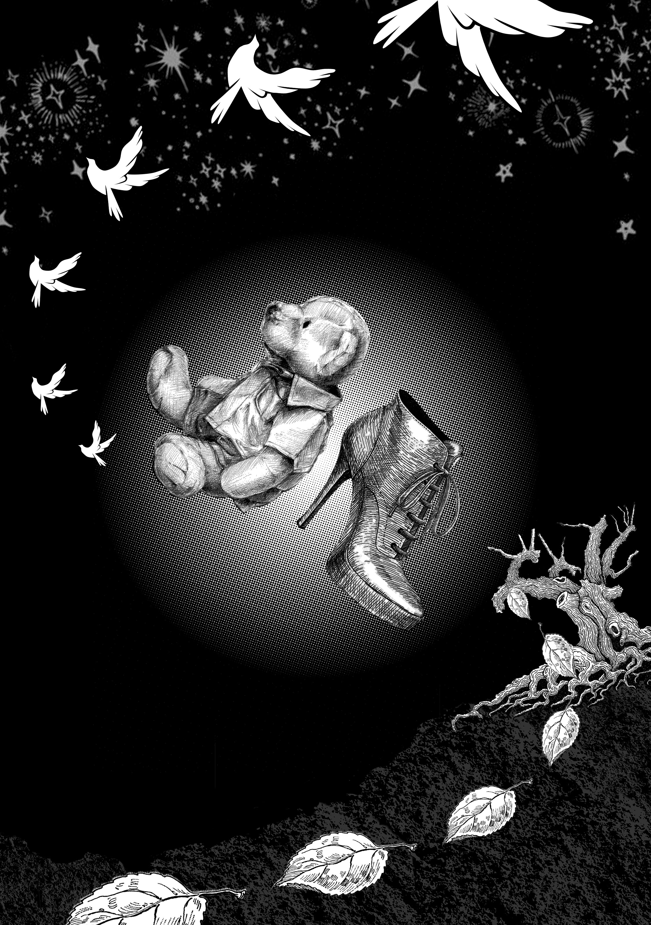
So for this composition, I’ve decided to use bear to represent when we are young. Looking in an upwards direction to portray hopefulness. Pigeons flying out representing hopes and wanting to achieve more in the big world that is outside.
As for the representation of when we get older, I have used heels to represent a grown-up lady, pointing in a downwards direction to show the emotion of filled with worries and hopelessness.
Leaves withering from the dying tree going out of page represents the never-ending worries that we have as we have more responsibilities.
Use of design principle
Progressive Rhythm/ Visual Direction – The repetition of the pigeon and leaves vary in sizes starting from small to big as it flows out of the page creates a sense of movement and rhythm as if they are really “moving” and “flying” towards a certain direction.
Asymmetrical Balance – Element is evenly distributed for the top left and bottom right of the composition. However, the use of different elements results in an asymmetrical design that adds a little more interest in this piece.
Visual Hierarchy & Emphasis – Using gradient effect, placing my main subject right at the center and sizing them slightly bigger as compared to the rest of the element emphasized their importance as compared to the rest of the element.
Gestalt, Continuation – Viewer’s eyes are being led from the centerpiece(bear) following a curved flow of the pigeon to the upper right corner and then back down to the centerpiece(heels) again and flow through the curves together with the leaves and out of the page.
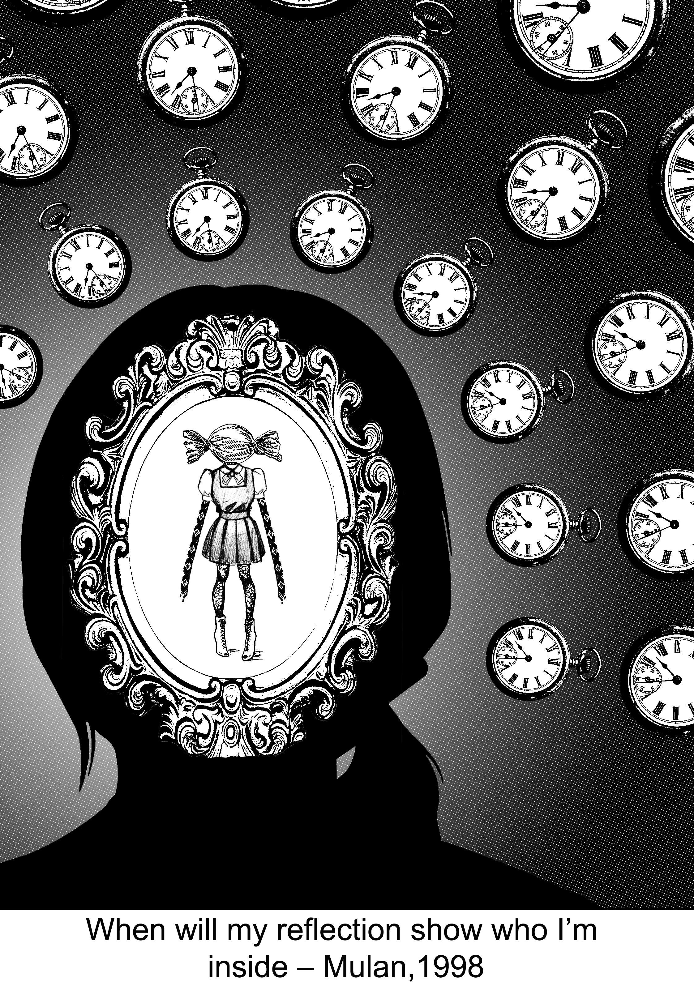
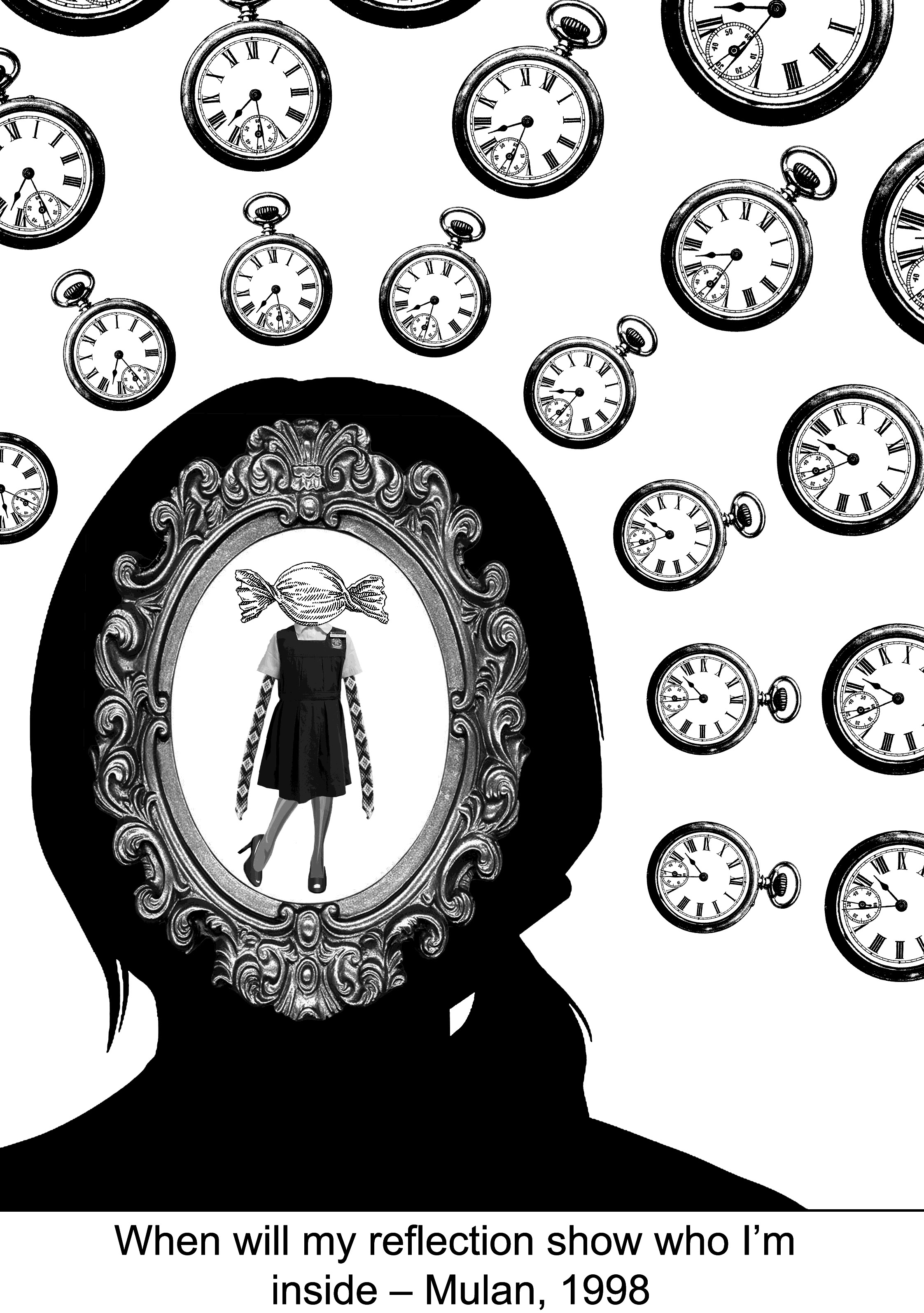
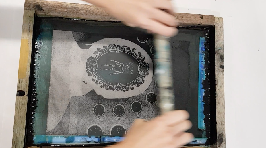
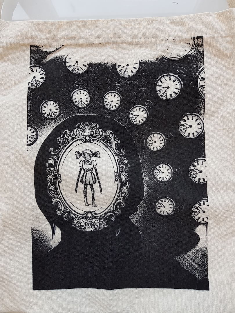
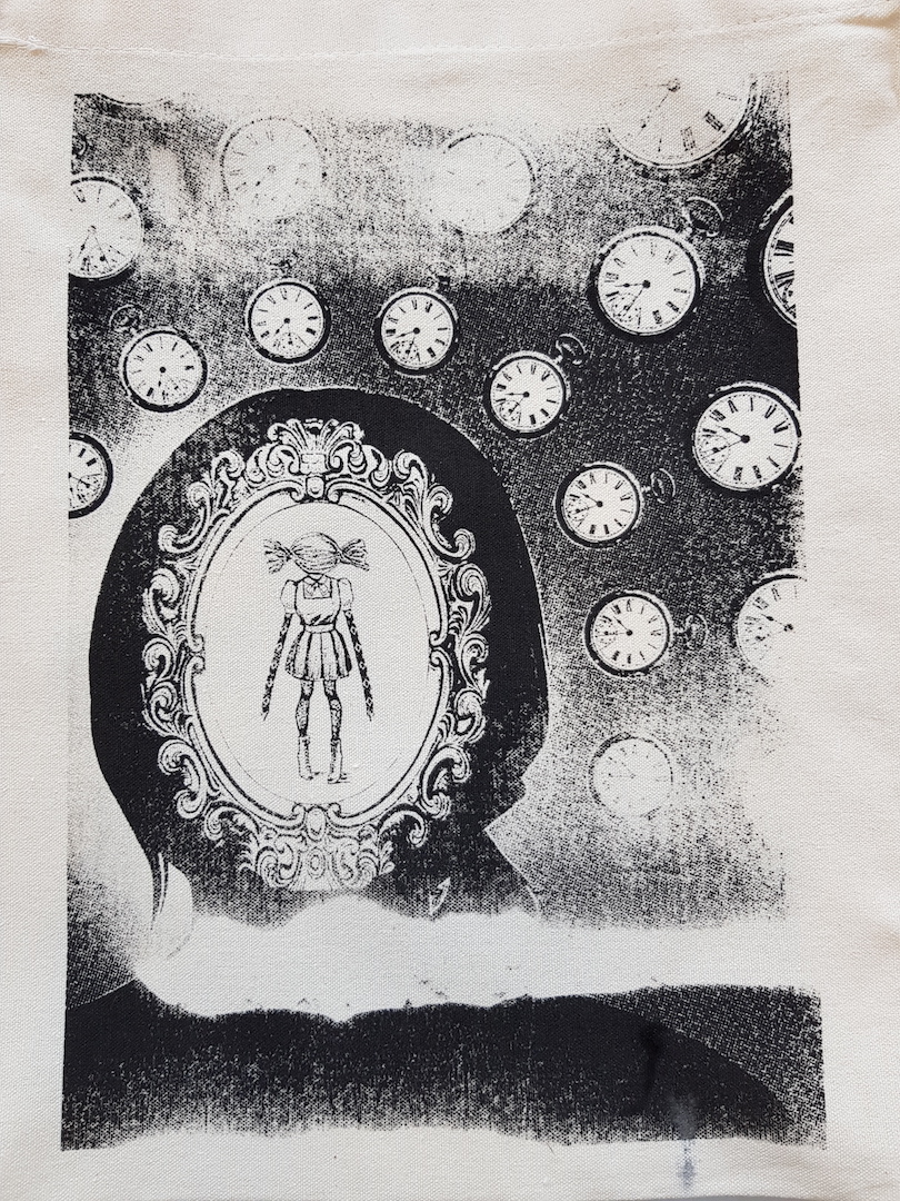
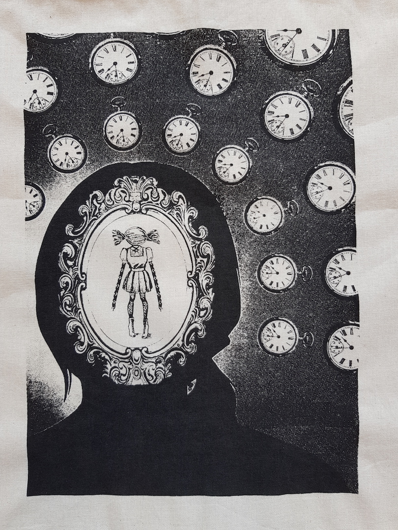
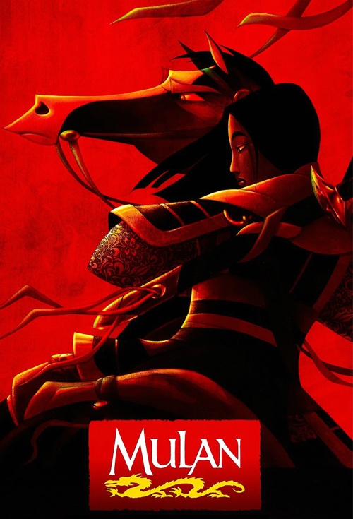
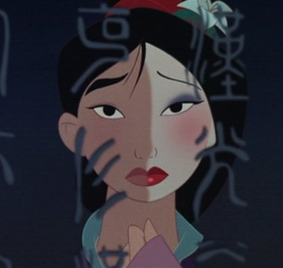
3) ” When will my reflection show, who I’m inside. ” – Mulan
My interpretation
My interpretation of this quote is that in life we have many roles to play. Sometimes we are kids to our parents. Sometimes we are students to our teacher. Sometimes we are friends to our friends. Sometimes we have to act like a grown up. It is because of having all these different roles that we have to take up in life, to me, It is difficult and it takes a very long time to find out who I truly am. Sometimes some people take their entire life to search for who they are, and some don’t even get the chance to find out till the end of time.
Hence, I have used clocks to represent the sense of timelessness, the infinity of time, to symbolize not knowing when can we truly find our true self. The mirror to show the reflection of ourselves, however, whats inside is not who we are. I used different items to represent different roles that we have to take up. Such as candy to represent kid, uniform for being the student, friendship band to represent friends, legs in stocking and heels to represents acting as an adult. All of these made up to a me that isn’t the true me.
Use of design principle
Emphasis – The use of repeated clocks forming a gradient from outside pointing inwards to the girl silhouette helps in emphasizing the main element which is the girl in the mirror.
Repetition – The use of repeated clocks show a form of unity and consistency which overall helps the composition to look more harmonious.
Negative space – The use of negative space within the mirror that is surrounding the girl in school uniform helps with emphasizing her in the composition.
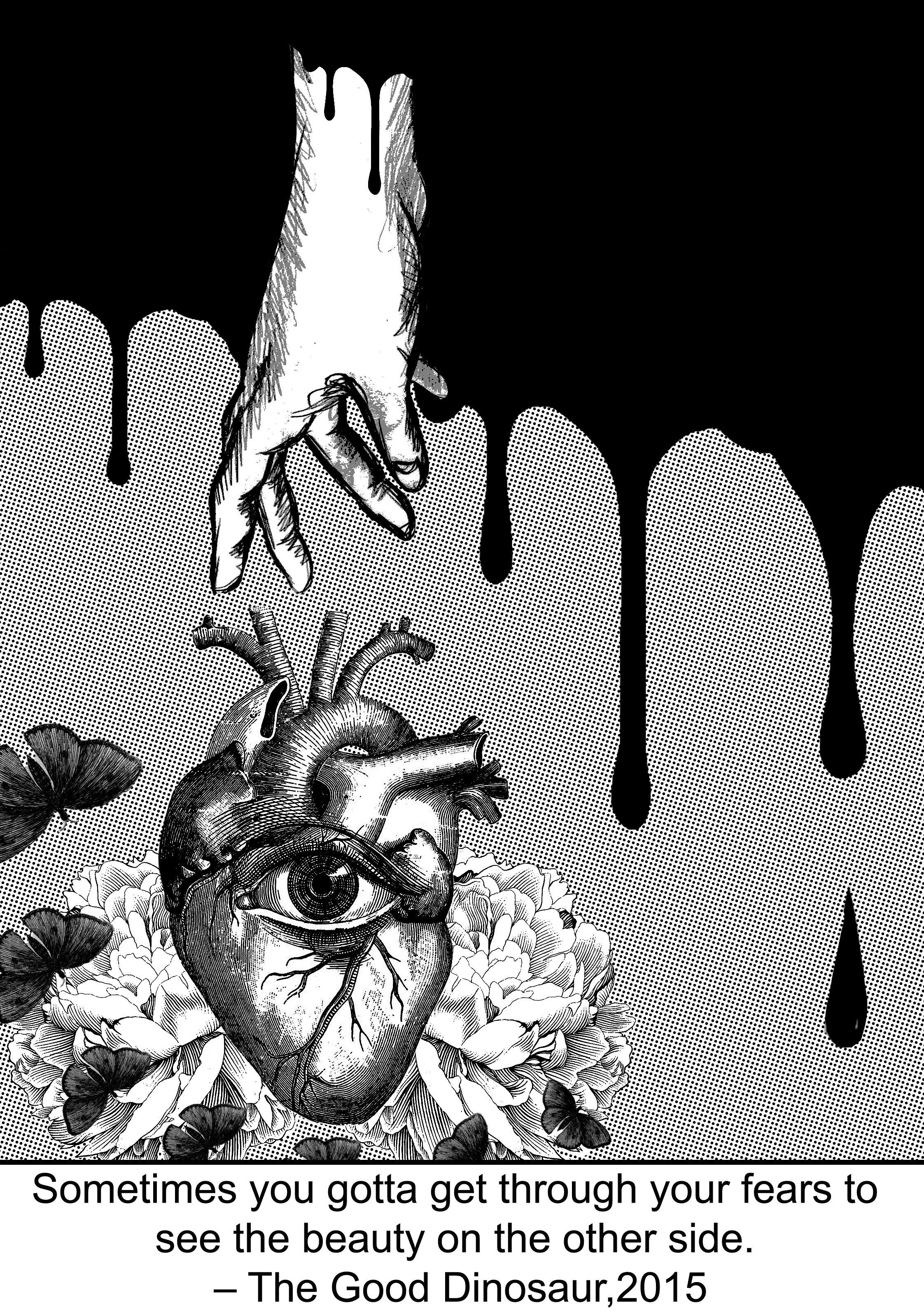
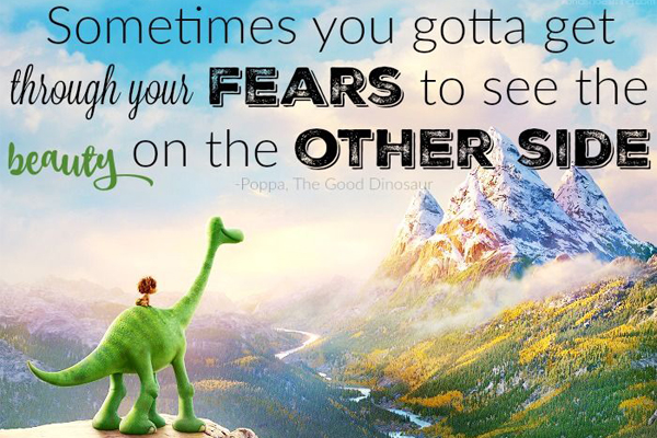
4) ” Sometimes you gotta get through your fears to see the beauty on the other side. ” – The Good Dinosaur
My interpretation
I have interpreted this quote as instead of just seeing the beauty after overcoming your fear, it is more of finding inner peace and a sense of freedom after getting rid of your fear. In my opinion, it is also to show that we can see a much clearer view about the issues around us with a change in perspective and not be blinded by fear anymore.
Therefore, I used blood to represent fears, hand passing through the fears showing the process of how difficulties and how we try our best to overcome them. Flower to symbolize beauty and peacefulness. Butterfly to symbolize freedom and finally a heart with an opened eye to show that we are looking much clearer regarding the issues that used to be our fear, not getting blinded anymore.
Use of design principle
Proximity – The heart, butterflies, and flowers are being grouped/clustered together to show their relationship whereby they represent the “good side” of the quote.
Contrast – The contrasting background of solid black and grey helps in organizing and separating the information of the “good side”(flowers, heart, butterflies) from the “bad side”(blood that symbolizes fear).
Progressive Rhythm/ Visual Direction – The repetition of the butterflies vary in sizes starting from big to small as it encompasses the main element (the heart and flower) creates a sense of movement/rhythm as if they are really “flying” towards a certain direction. It also helps in emphasizing.
Emphasis – The hands and blood are all pointing in a downwards direction that helps to lead viewer’s eyes to the main subject which is the heart.
Conclusion
One of the difficulties I have overcome in this project is regarding the researching of images. Sometimes you just can’t find the kind of images or the type of style that you want and it could be really frustrating when you already have a design in mind and you can’t execute it out properly due to certain limitations. So, you just have to learn to make do with what you have and learn to work around it.
AND
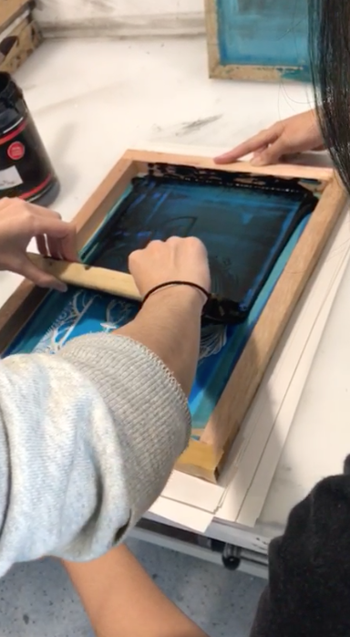
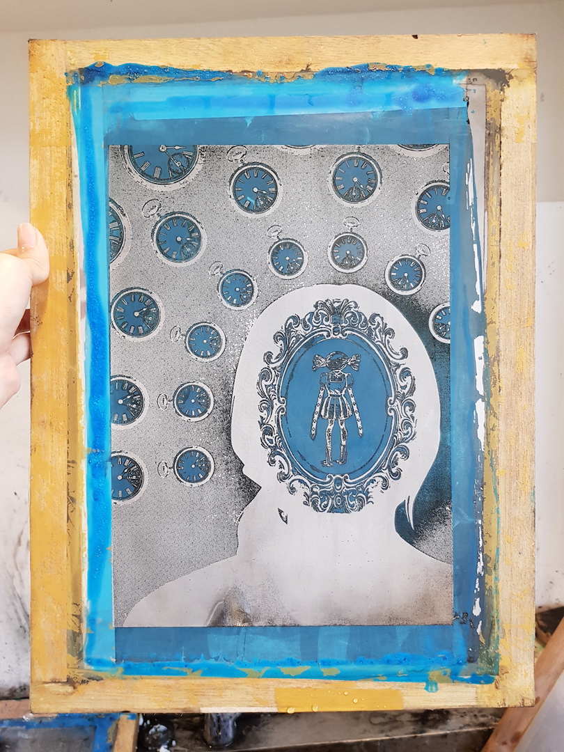
Another difficulties and lesson learned are that the process of translating my design from soft copy to something physical and more technical is a little tough at first for me. In the sense that, during the process of translating there will be many technical difficulties that are inevitable. Such as I’ve encountered problems with Photoshop whereby the adjustment layer does not show when I saved my PSD into images(despite trying different image format and flattening my layers). Another lesson learned is that when designing a design we have to always bear in mind of the physical technical printing issue of it. Due to still being very inexperienced at first, I was not mindful and used greys in my images that are not compatible with the silkscreen printing method.
My take away from this project is that before I have learned anything about the design/composition principles, I have always design or make compositions with whatever that makes me feel that it looks right. Which is really not a very professional way of doing things. After learning all the designing principles, I’ve learned to appreciate the designs around us more in a new perspective, because nothing happens coincidentally. Everything that is placed in the canvas/design is carefully planned with the use of many of the design principles in order to craft out something that satisfies the criteria of being visually pleasing, informative and attention-grabbing. So, I feel that as a designer I have much more to learn ahead.
This time round I really enjoyed this assignment very much! Even though at the start I’m still a little not used to the idea of abstract even after going through assignment one. However, I’ve discovered more about myself, in terms of I REALLY REALLY LOVE DOING THIS. I love how I can have full control of the intended message that I want to convey. I love how I can express myself freely with the way I want to. And I love the interactions/relations between the creator and viewer. It is interesting and fulfilling to see the message that you want to convey is not direct yet at the end, it is being understood or your viewers get to interpret it in their own way!
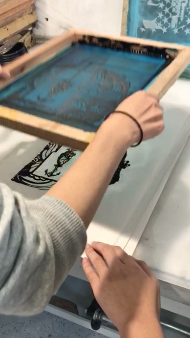
All in all, I love creating prints! The process of making your soft copy prints printing on to something physical (silkscreen printing onto tote bag) feels fulfilling!