
Week 2
Here are some designs that I’ve been working on for my first 2 quotes!
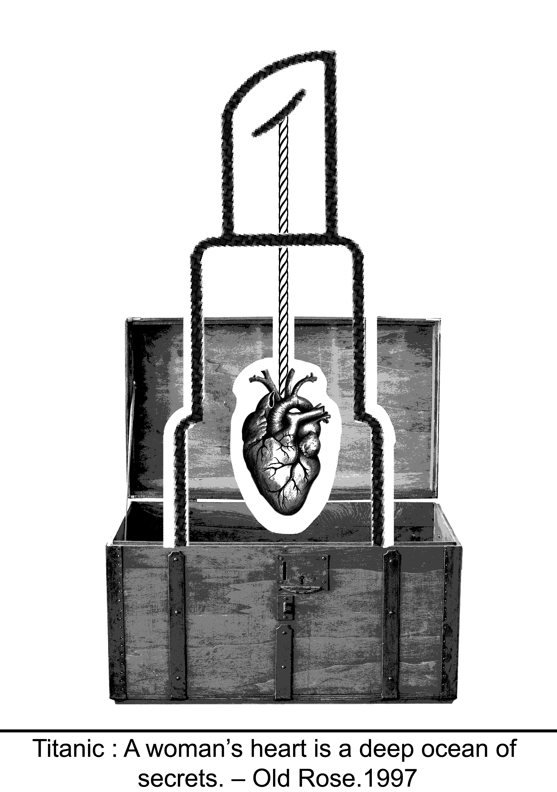
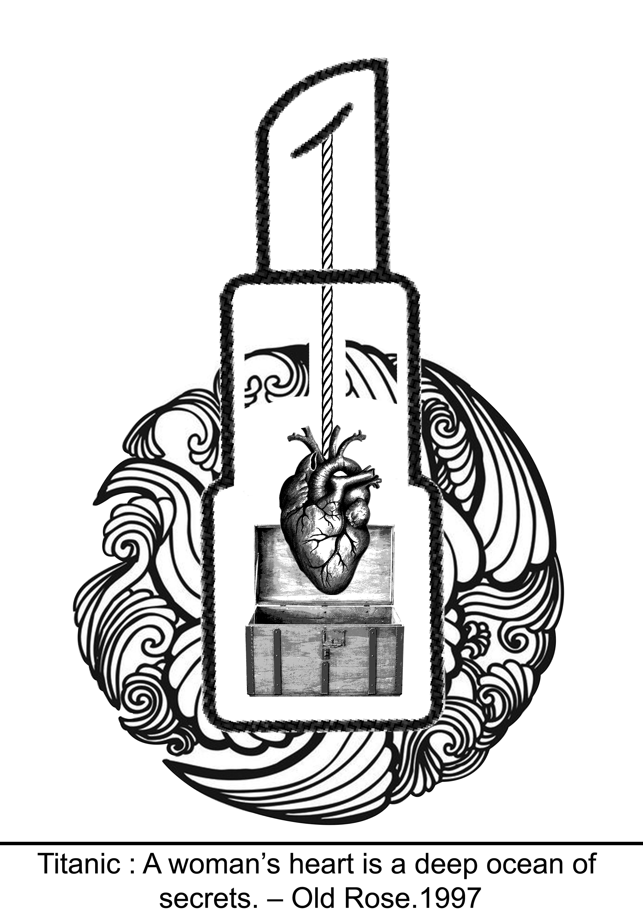
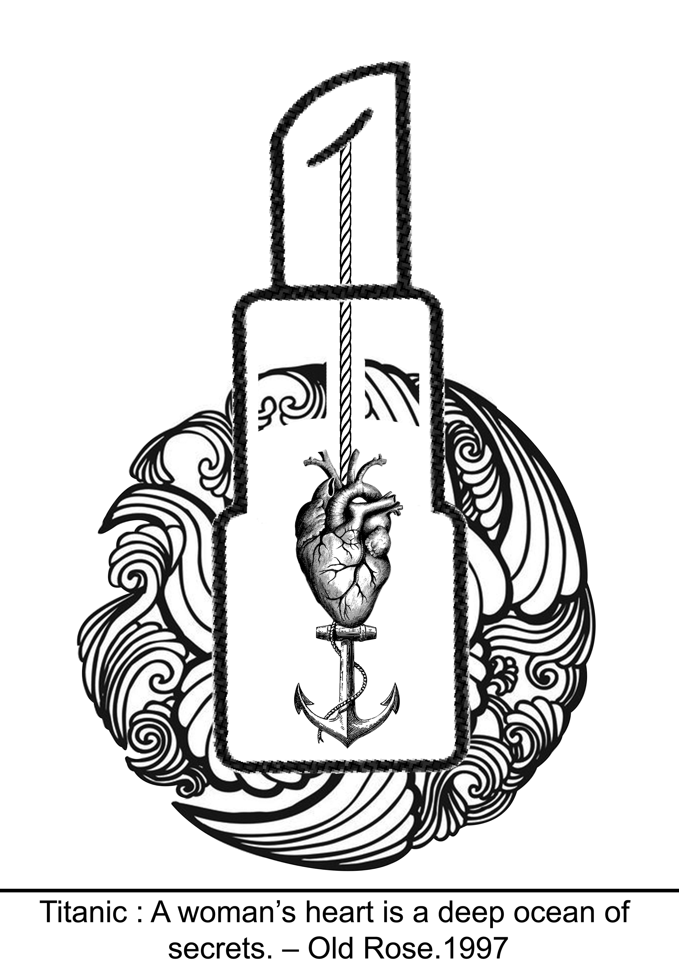
Quote 1
Titanic – ” A woman’s heart is a deep ocean full of secrets. ”
Version 1 – Lipstick and heart in a treasure chest
Version 2 – Heart in a treasure chest
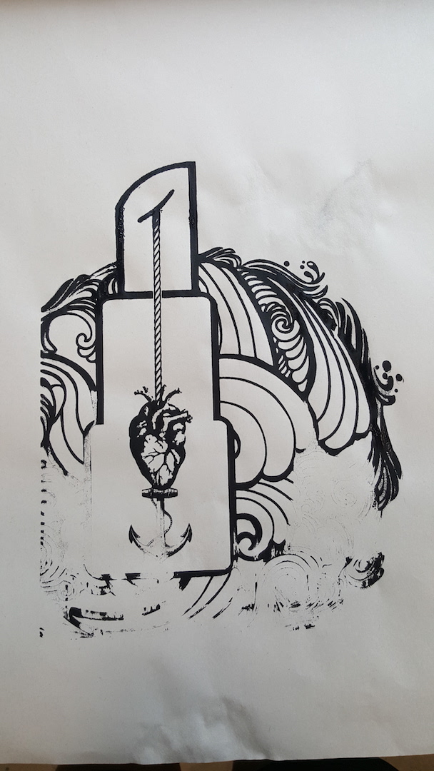
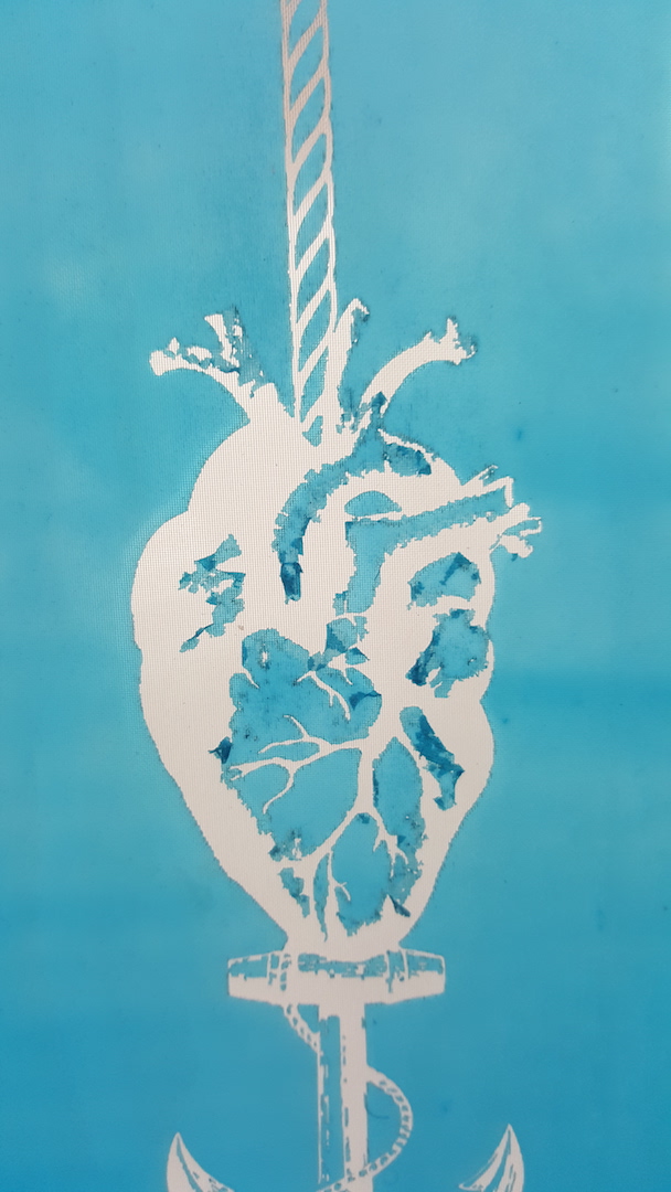
Version 3 – Heart weighed down by an anchor
After Consultation:
Version 3 for the titanic quote is more preferred because with the anchor the heart is much more clearly as compared to the one with a treasure chest. However, the overall design is too symmetrical and uninteresting, therefore it was suggested to be improved on making the design more asymmetrical. Also, the wave design is too contained and peaceful (which means doesn’t even feel like a wave anymore), thus splashes was also adviced to be added on to have more feels~~ hahaha. So after editing the rough final design is out! 😀
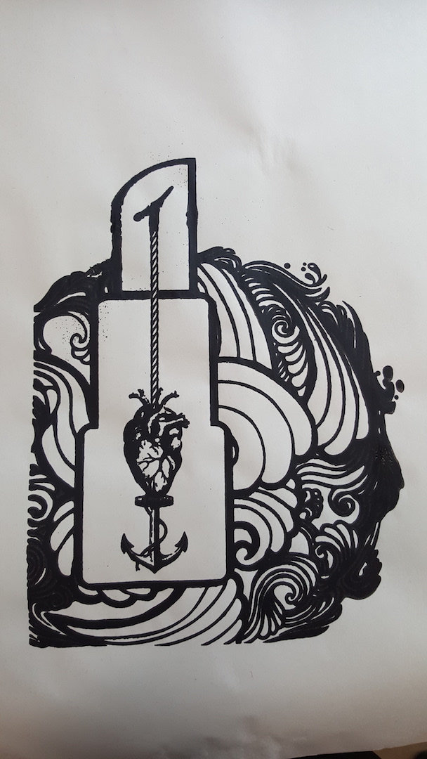
Version 4 – Rough final design
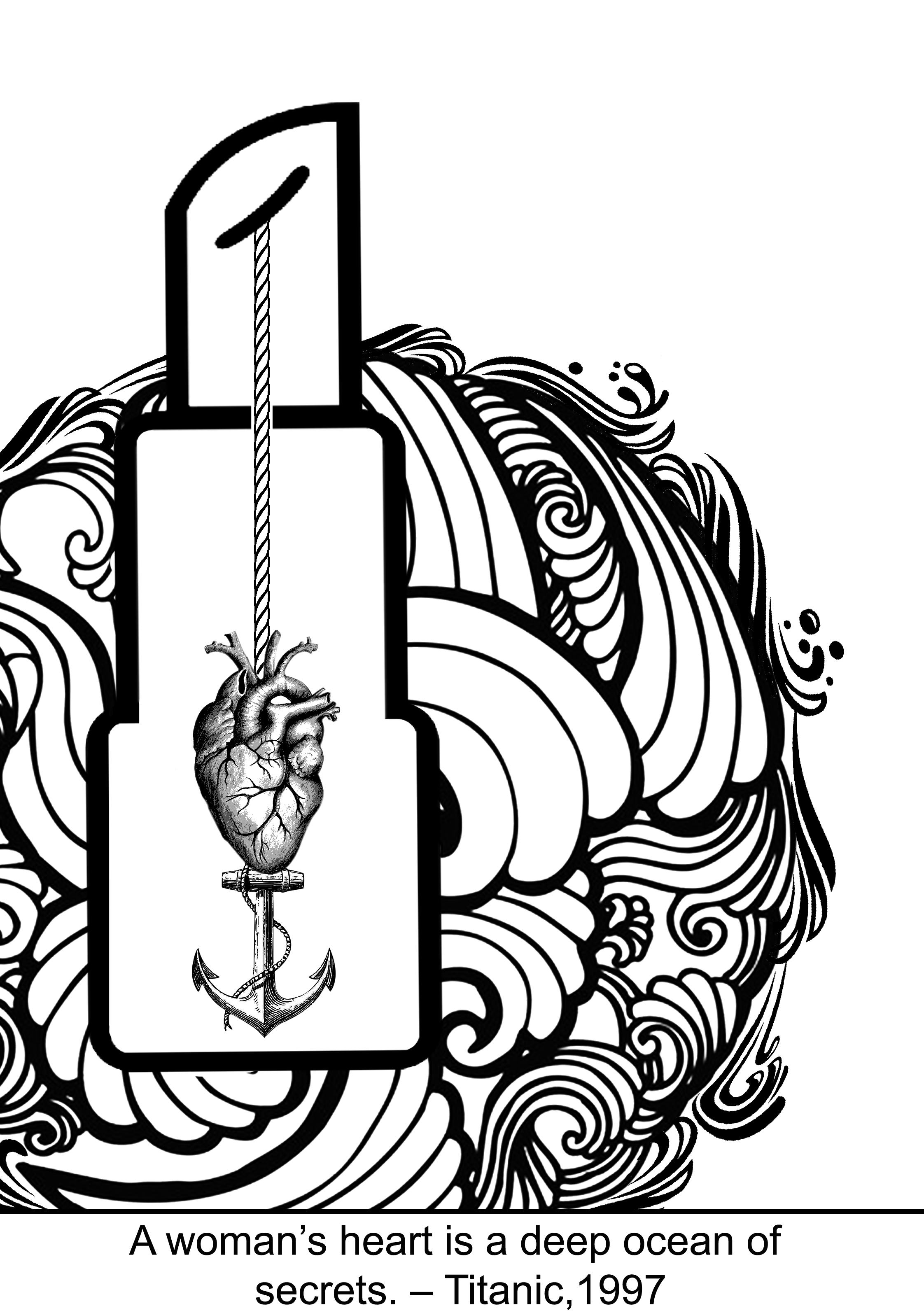
After making the necessary changes, the off-center design is more interesting than the original one. The splashes give it a lot of feelsssss too!!! Making use of the principle of white space to emphasize on the design and giving the heart more emphasis!
Quote 2
Interstellar – ” We used to look up in the sky and wonder at our place in the stars, now we just look down and worry our place in the dirt. ”
For this second design, I wanted to try something more centralized since I already have one that is off-center. The initial design for this instead of the high heel shoes, it is actually a wheelchair to symbolize when we grow “older” we don’t dream anymore, we are full of burdens to carry and worries to think of. However, after consultation, I realize that wheelchair symbolizes more of old age instead of that kind of grown-up burdens and worries we have. Thus, I changed it into heels to represent more of a middle age working adult. The above image is the revamped version! 🙂
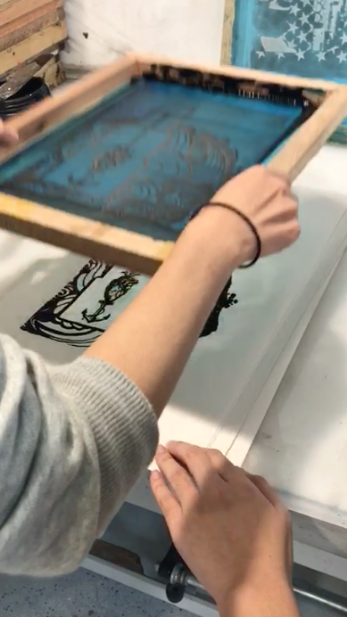
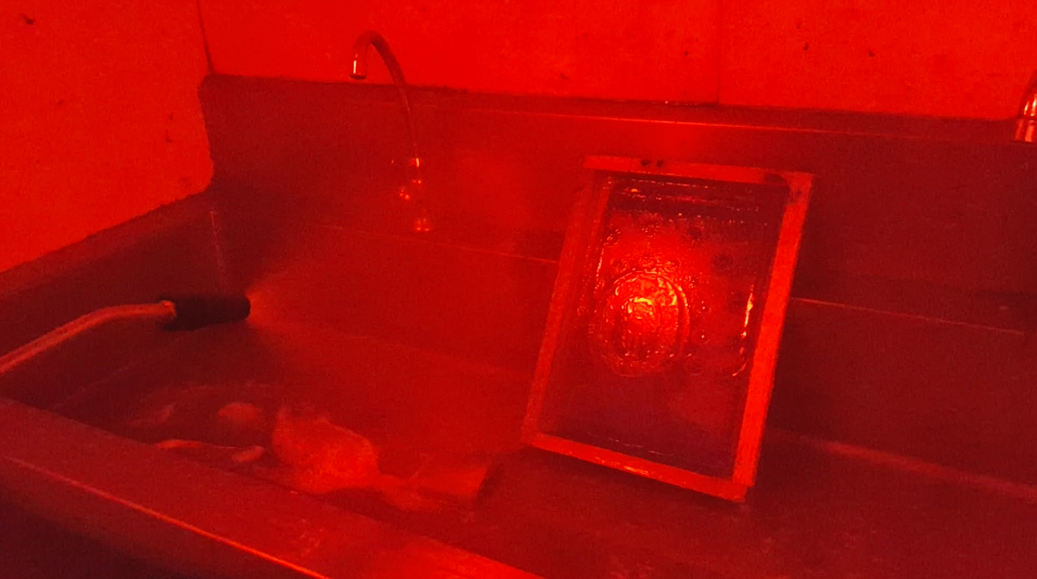
Week 3 (SILK SCREEN PRINTING TRY OUT!)
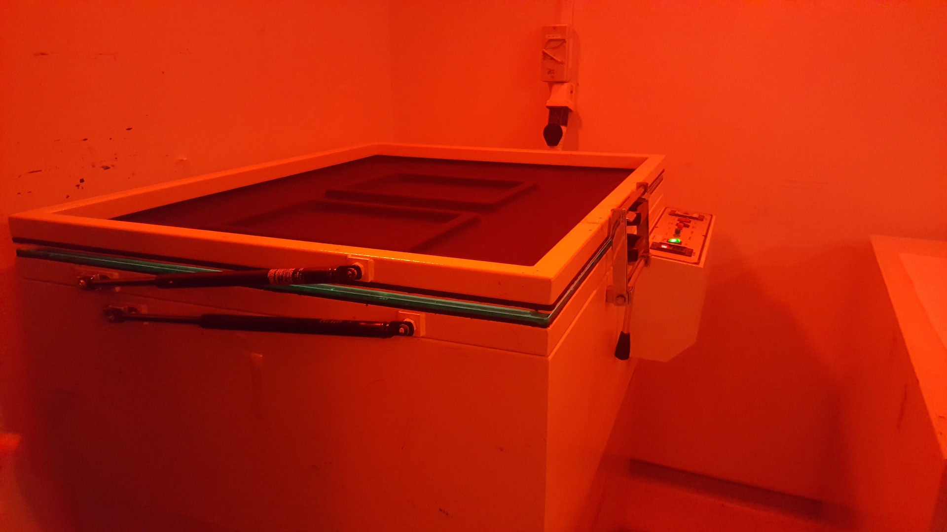
This cool looking machine vacuum our template and expose our print!!! SO COOL! The room is cool too! Red lighting haha.
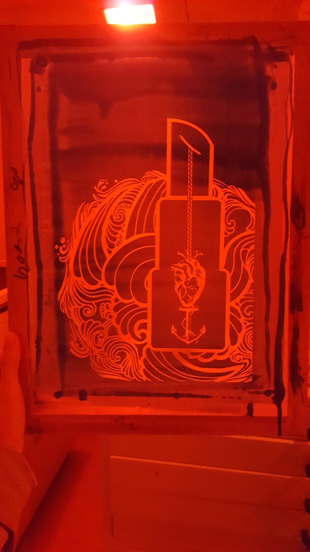
MY PRINT IS DONE EXPOSING AND WASHING! SO EXCITED TO GET IT PRINTED AND SEE THE RESULTS!
My first try was a fail because I either didn’t put enough strength or the ink is just not enough 🙁
The second try was a fail too because of too much ink!!!! My god, still trying to get the hang of this 🙁
Finally, the third try works out!!
PROBLEMS ENCOUNTERED!!!!
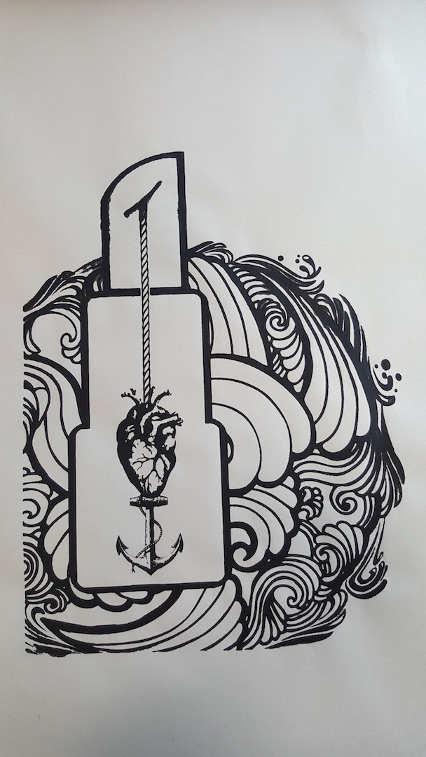
1) HOWEVER, I realized that as compared to my original design, even though my heart uses the poisterise effect on my design the grey doesn’t show out on my print:(
2) I realize the emulsion on my template at the heart area is coming off and I need to redo the template again 🙁 cries, so much for the first attempt for silkscreen printing ya. haha
SOLUTIONS!!!!
So I have to find a different heart design that is more to engraving or woodcut kind so there will not be greys and my print will show 🙁
Week 4&5 (SILK SCREEN 2ND&3RD SESSION)
Decided to change came out with the design for my third quote and might silk print with the new quote design instead~
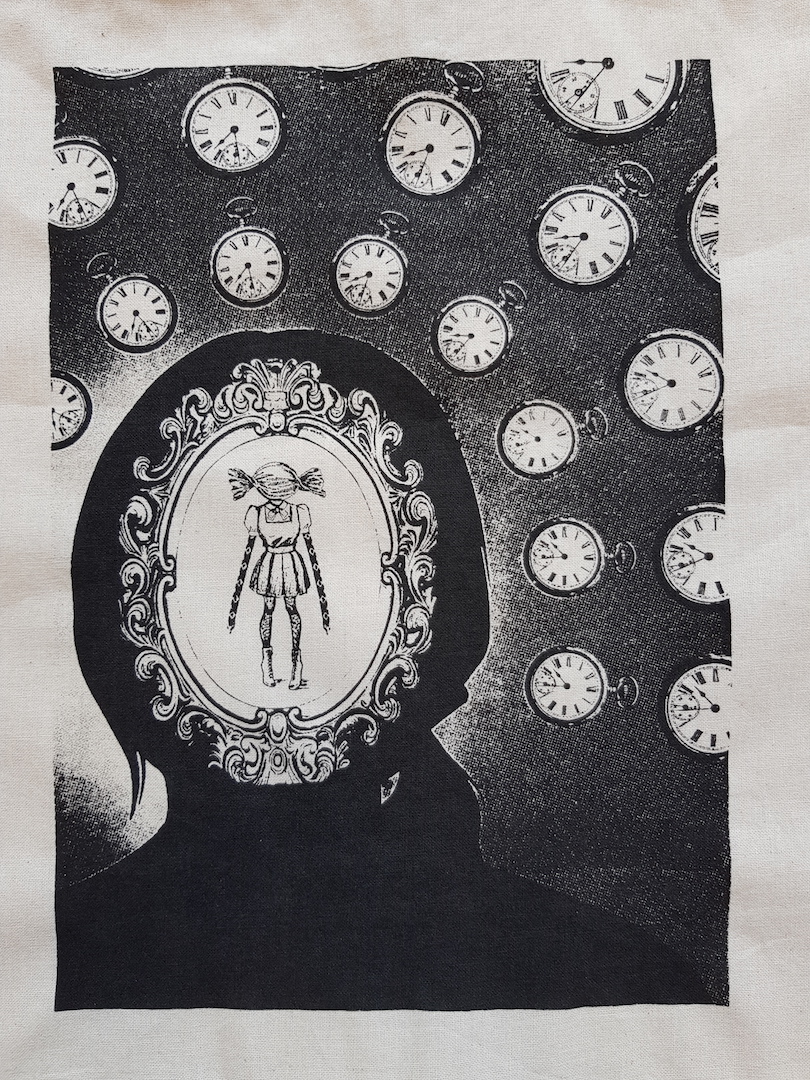
Quote 3
Mulan – ” When will my reflection show who I am inside? ”
Version 1 – White BG and girl with greys
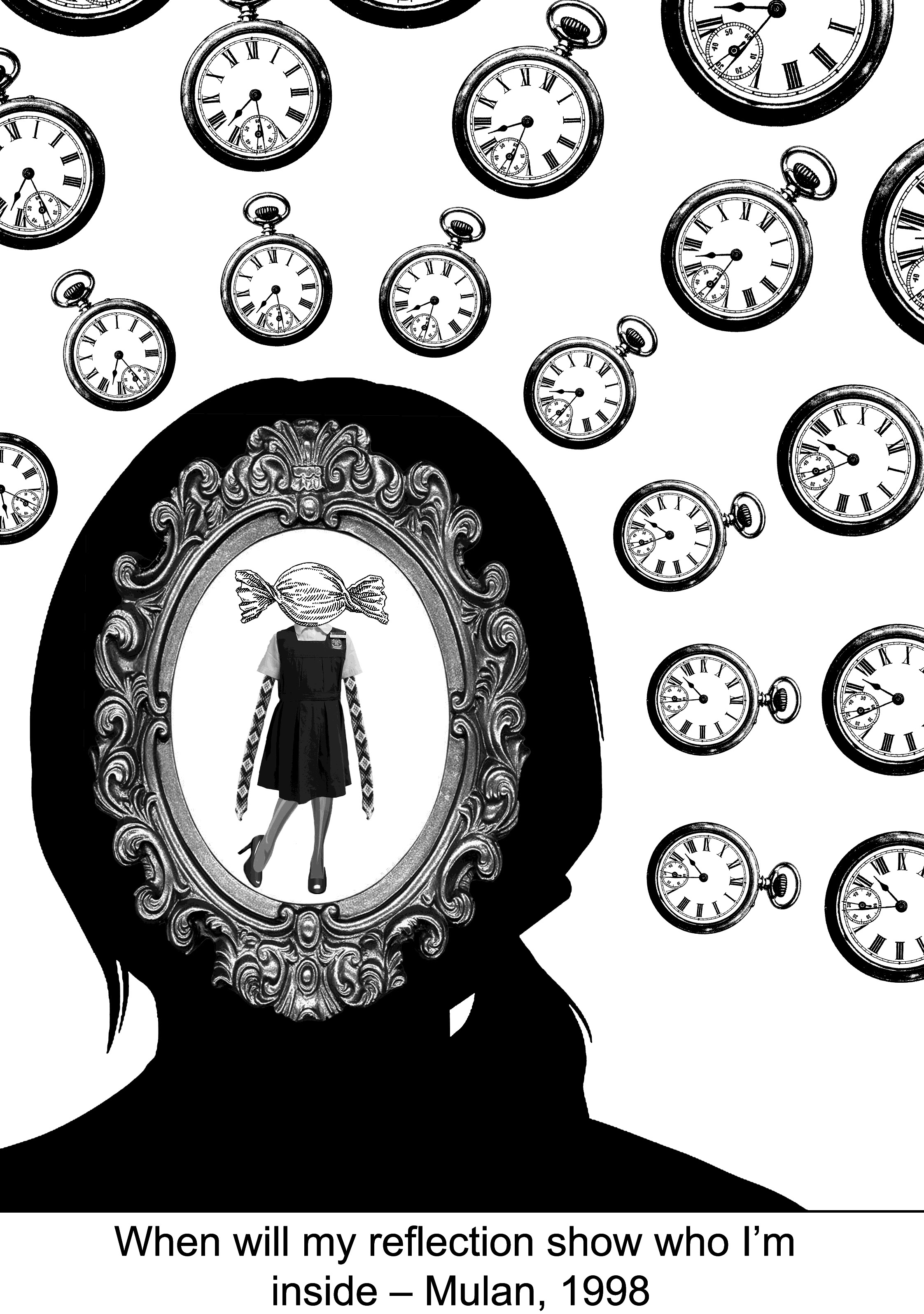
For this design, I wanted to make the girl the focus so I use the clocks to point towards her. By using a silhouette to further make her the focus. This time round I learned my lesson, realizing that the design has a lot of greys and is not suitable for silk screen printing, I searched for girl images again to ensure that every part of her is just black and white. As for the mirror, I used threshold effect to make it black and white. So that all of these is more printing friendly! 😀
Version 2- Gradient BG with B&W girl
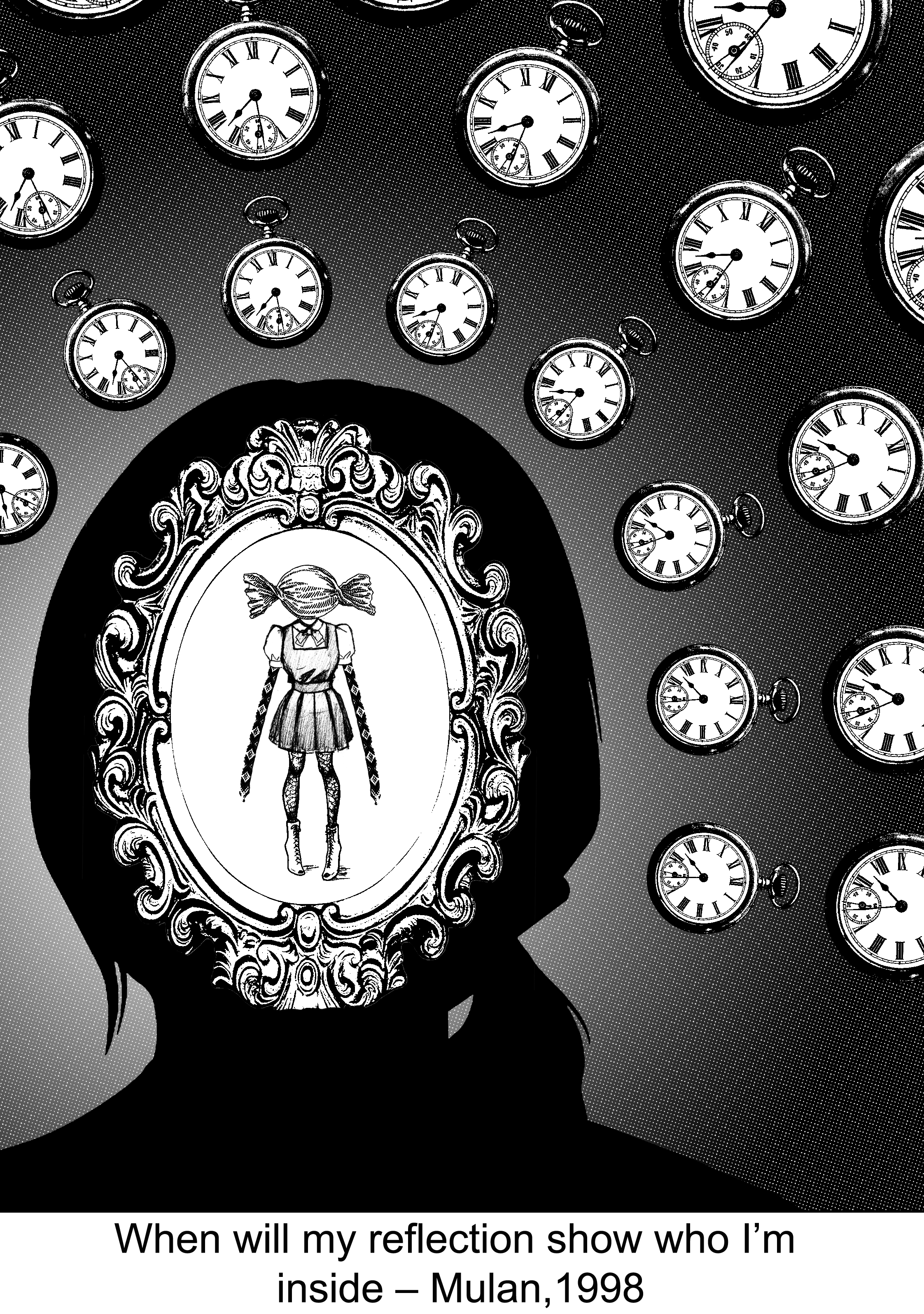
I further add on a gradient halftone background to make the overall background less plain and more interesting! The gradient effect also helps in further enhancing the focus on the girl!
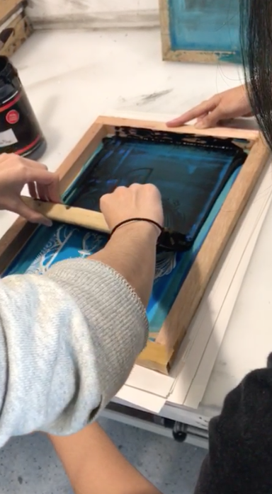
Again going through the same process of spraying away the emulsion to get our print on the template.
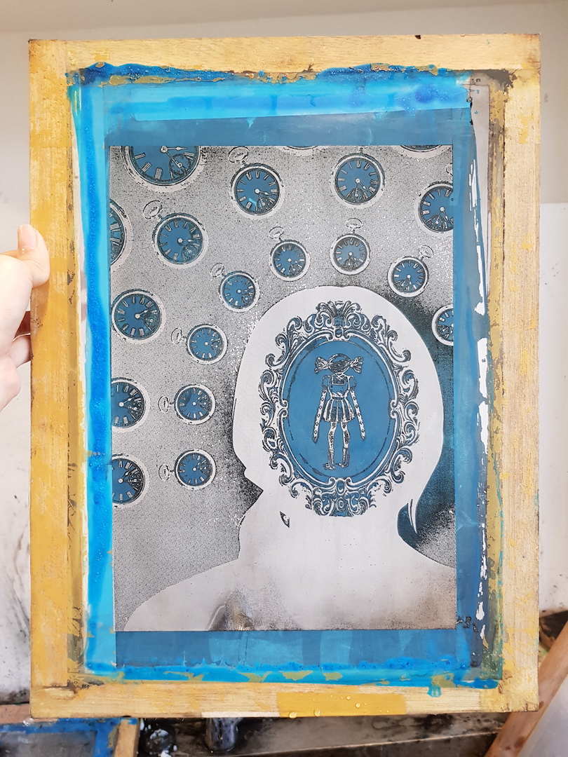
New design template!
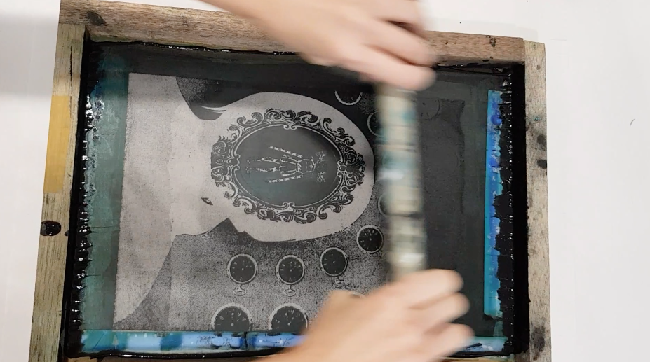
Time to do the printing!
First time printing on the tote bag provided and it didn’t work out 🙁 Blank patches is every where~
The second try on the other side of the provided tote bag didn’t come out well either, there is too little ink and I guess my force just isn’t equal throughout 🙁
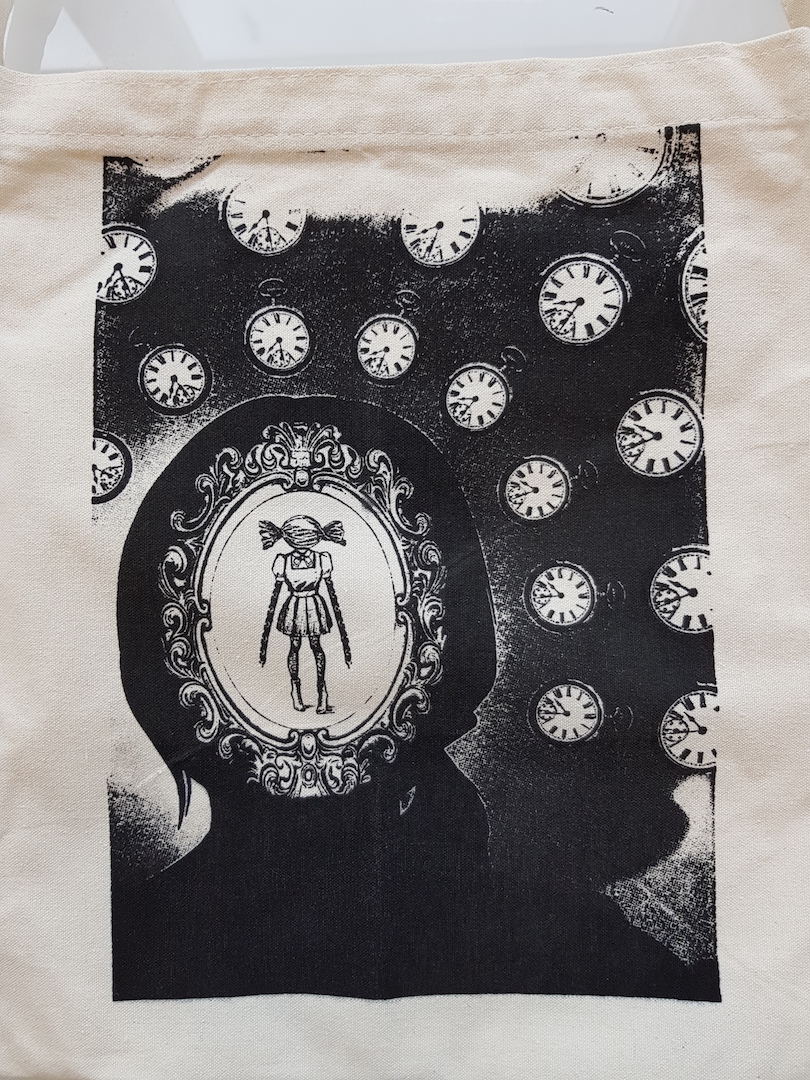
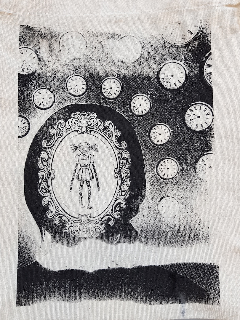
So in the end, I have to go to Muji and get my own tote bag to be printed on~ And very thankful for our senior Shervon who have given a lot of tips on the silkscreen printing! Basically, the trick is not to put too much ink and when we swipe the ink across we have to push down with enough strength and our action has to be fast! AND TADAH! Finally a successful print on the tote bag.
Also, I’ve found out from her that while we are washing the emulsion off for the print to appear, we are not supposed to do it too close with the water spraying machine because it may rip our design as well. LOL and most probably I suspect this is what happened for my previous Titanic heart design *cries* :”)
LESSON LEARNT FOR SILK SCREEN PRINTING
1) DO NOT SPRAY TOO CLOSELY TO YOUR DESIGN
2) INK SHOULD NOT BE TOO MUCH
3) ALIGN YOUR TEMPLATE PROPERLY MAKING SURE IT IS ON A FLAT SURFACE AND THERE IS NO BUMP ANYWHERE
4) BE FAST HAVE STRENGTH WHEN YOU SWIPE
LESSON LEARNT FOR MAKING DESIGN FOR SILKSCREEN
1) AVOID GREYS, POISTERISE EFFECT MIGHT NOT WORK
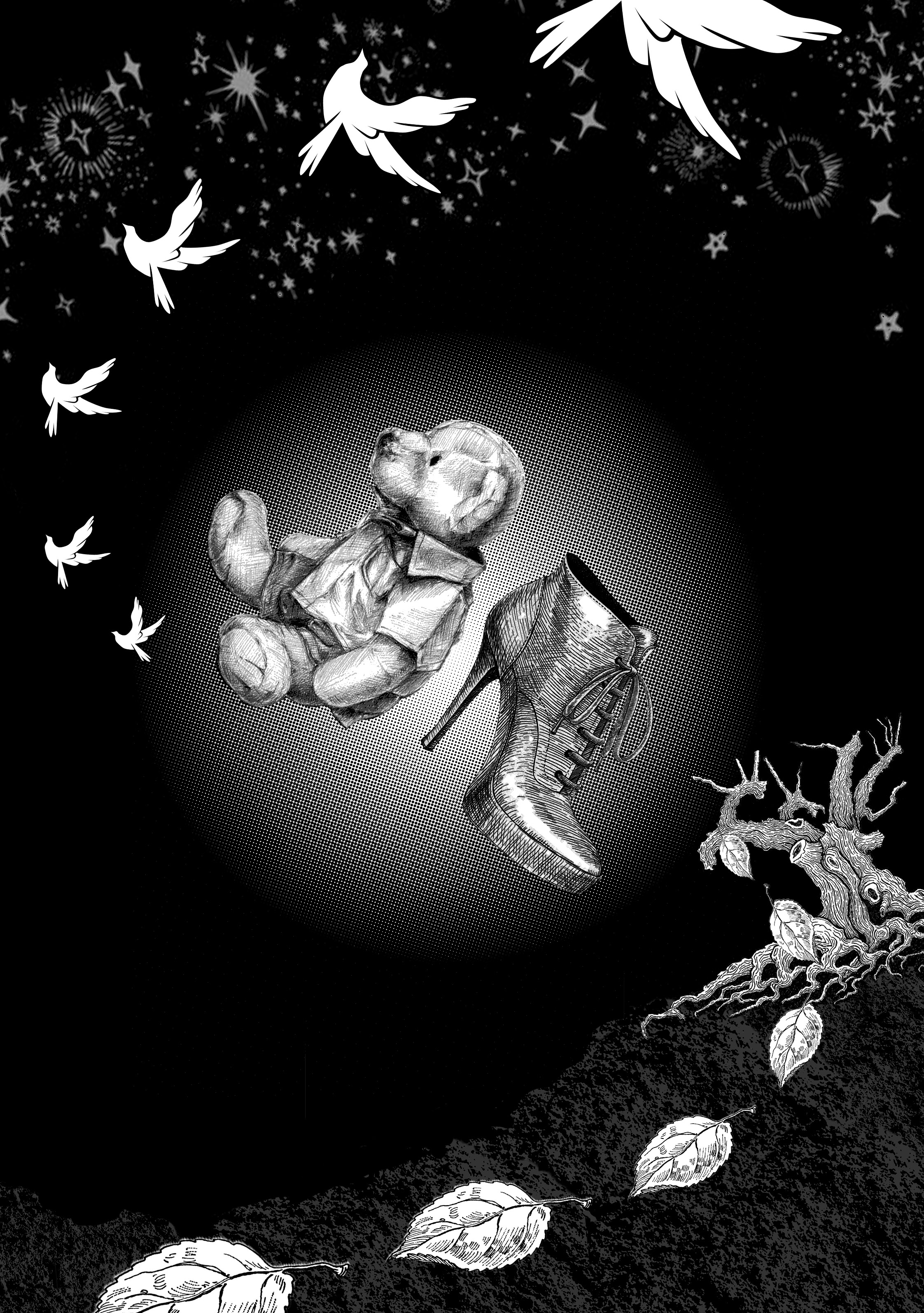
Week 6
Final quote design
Quote 4
The Good Dinosaur – ” Sometimes you gotta get through your fears to see the beauty on the other side. ”
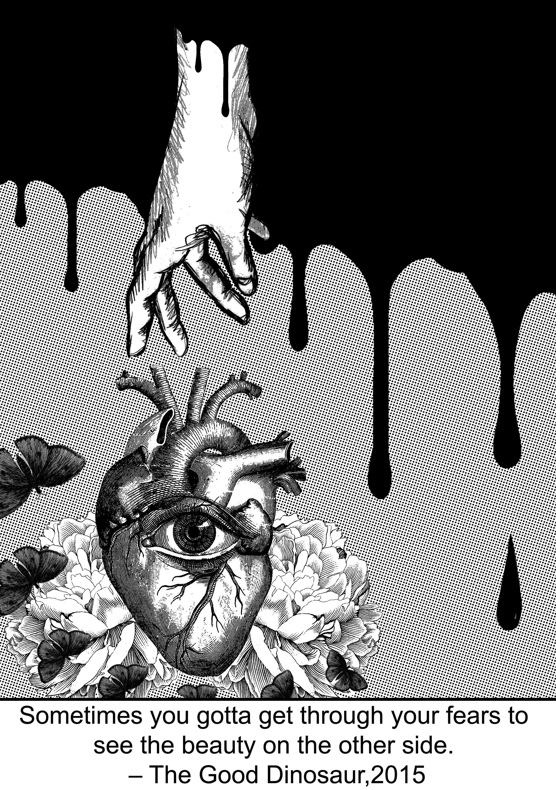
So for the final design, initially instead of blood, I wanted to use many repetitive knifes pointing downwards to show fear, but it didn’t turn out nice. As for the “beauty on the other side” part, initially, I tried using an angel with wings silhouette to encompass the heart with eyes and flower, to symbolize finding peace and freedom after overcoming fears. But it turns out weird too. So eventually I landed on this final design that is shown on top!