Hazel Tan Jia Xin


A place to keep my art and memories


When I first started sketching, I was really lost and unsure of what kind of layout should I be using as I’m unfamiliar with doing magazine layouts. So I roughly looked through some of the past senior’s work and researched some online layout to look for inspiration. I roughly planned out where should the images and text be, however, the pages look rather plain and I’m still quite lost at that point in time.

After the consultation, mentioning my concerns regarding the plain looking of my zine. Ms. Shirley encouraged that white space is good for the design. The definition of white space doesn’t mean literally empty, instead, we could add in shapes and textures to enhance the overall look. Ms. Shirley has also guided me along with reminding me of the emphasis on the images so as to be able to lead my viewers with the hierarchy of images to look at.
Having the idea of transitioning from old to new and, black and white to color, I have decided that my first spread will be black and white photos. Followed by the second spread that is only filled with colored photos and finally, the last spread is a mixture of both. Having that in mind, Ms. Shirley had also further advised me that the last spread could be adapting the style of drawing over with colors within the stripe that I have found as a reference.
At first, the Chinese word couldn’t be seen properly as it blends with the background. Hence, I have edited the photo in photoshop to make that particular area darker in order to allow the white Chinese words to pop.


Decided to use analogous color scheme of red, orange, yellow as the background base color to give a more happy and cheerful feel to it. In the first two spread, both seem to be too plain. After consultation, I was advised to add texture such as lines or polka dots to solve that issue.
Some of my classmates have also given me feedback that my first spread seems rather rigid. Hence, Ms. Shirley advised me to use left alignment for my text instead of using justify alignment that will make people feel too serious and rigid! (Omg? I did not know that? hahaha)
Also, besides being very plain, my second spread’s images do not have a hierarchy at all, making people not knowing where to focus on. Hence, I have to make the three images varying in sizes from big to small.

Upon gathering feedback from my classmate, the border around this spread was really distracting. I was advised to blow the image up and shift it to the right.

Finally, for the back cover, I have decided to create a map to show the places I have went to. I have made the map half colorful and half greyscale to show the distinction between to new and old area around Tiong Bahru neigbourhood that I have explored!
I have made necessary changes as mentioned, to all the spreads and these are the outcomes! Having upwards diagonal line texture, word arrangement and the stripe of illustrated design helps with further expressing the cheerful energy of the zine.
While the circular shapes convey the message of harmony and protection. Symbolising unity, commitment, love, and community bring out the essence of the zine that aims to bring out the colorful, positive and new energetic side of Tiong Bahru.

As for the back cover I was advised to have the circle on my front cover to continue to my back cover to make my zine look more as a whole!
Before the start of this project, we are supposed to select a location and followed by capturing something unique about this location to us.
However, there are so many options to choose from!! Whats more we can’t choose those locations that we already are familiar with 🙁 It took me awhile to select the location. Initially, I was leaning towards Sengkang and Punggol area however it seems like there isn’t really any interesting things around that neighbourhood. So, in the end, I decided to go to TIONG BAHRU! Its a really old estate! So there must be something unique there for me to work on! haha


Immediately after alighting from the MRT, I walked and explored the HDB neighbourhood area around Jln Membina, Kim Tian Rd, Blk 18A. All the way from the left side of the map to the right, where all the older white Moderne style building and Tiong Bahru Market is located at. When I first arrived, the vibe that Tiong Bahru gave me was that it is a rather quiet and peaceful neighbourhood. The new HDB high rise around the neighborhood is really tall and filled with different colors. However, as I travel nearer to the older neighborhood, most of the buildings are really plain, white and has a distinctive design style.
Along the way, I’ve discovered 3 main distinctive quality of Tiong Bahru!


Saw many different types of chairs laying around the neighborhood area! Which is really weird and different because I hardly see other neighbourhood doing this! There are baby chairs, wheelchairs, chairs for chilling, chairs with trolley, closed chairs, added chairs that form one row with existing chairs and lonely chair by the pillar!

The next thing I discovered was that Tiong Bahru is a really hilly place! Walking around the neighbourhood, I realize that there are a lot highly elevated, layers of ramps and flights of stairs one after another!


Finally, the last thing I discovered is that Tiong Bahru is full of colors!!! Colorful chairs, wall, umbrellas, playground, flowers, sign, carpark doors and cleaning tools etc.

Towards the end of my trip, I saw a lot of white houses with iconic styles!
Thereafter, I went on to do some secondary research about Tiong Bahru and had some really interesting findings!


After consulting Ms. Shirley, I have developed 3 concepts/ideas!


The first concept is to tell the stories of the different chairs from its perspectives.


The second concept is to use a wheelchair as my main character to explore around Tiong Bahru. Showing how tough it is to walk up all these stairs and hills.


The third concept is to tell the stories of Tiong Bahru by showing that it is a neighbourhood that has gone through transitions and has a rich mix culture of both the old and the new.
In the end, I decided to pick the colorful Tiong Bahru idea! I love the combination of both primary findings of the colorfulness of the neighborhood and secondary finding of the meaning of the name itself brings out the essence of Tiong Bahru having a transition and coexistence of both old and new, white and colorful!


Plan #1: The plan is to show the old and new of Tiong Bahru with the use of colors from transitioning from black and white to a colorful estate.
Plan #2: By using a WHITE character to bring viewers through a journey in the zine exploring Tiong Bahru estate. As the character explore, colors are added on and it became colorful as well.


These are some of the styles that I’ve researched and would like to use them in my zine. The play between of having black and white images and half colourful overlay. Also, I would like to try out the partially drawn over a strip of colorful illustration effect!


Since my theme is colorful, I have decided to go with a pastel colorful rainbow palette!
My name is
and I’m a Matchmaker
My name is
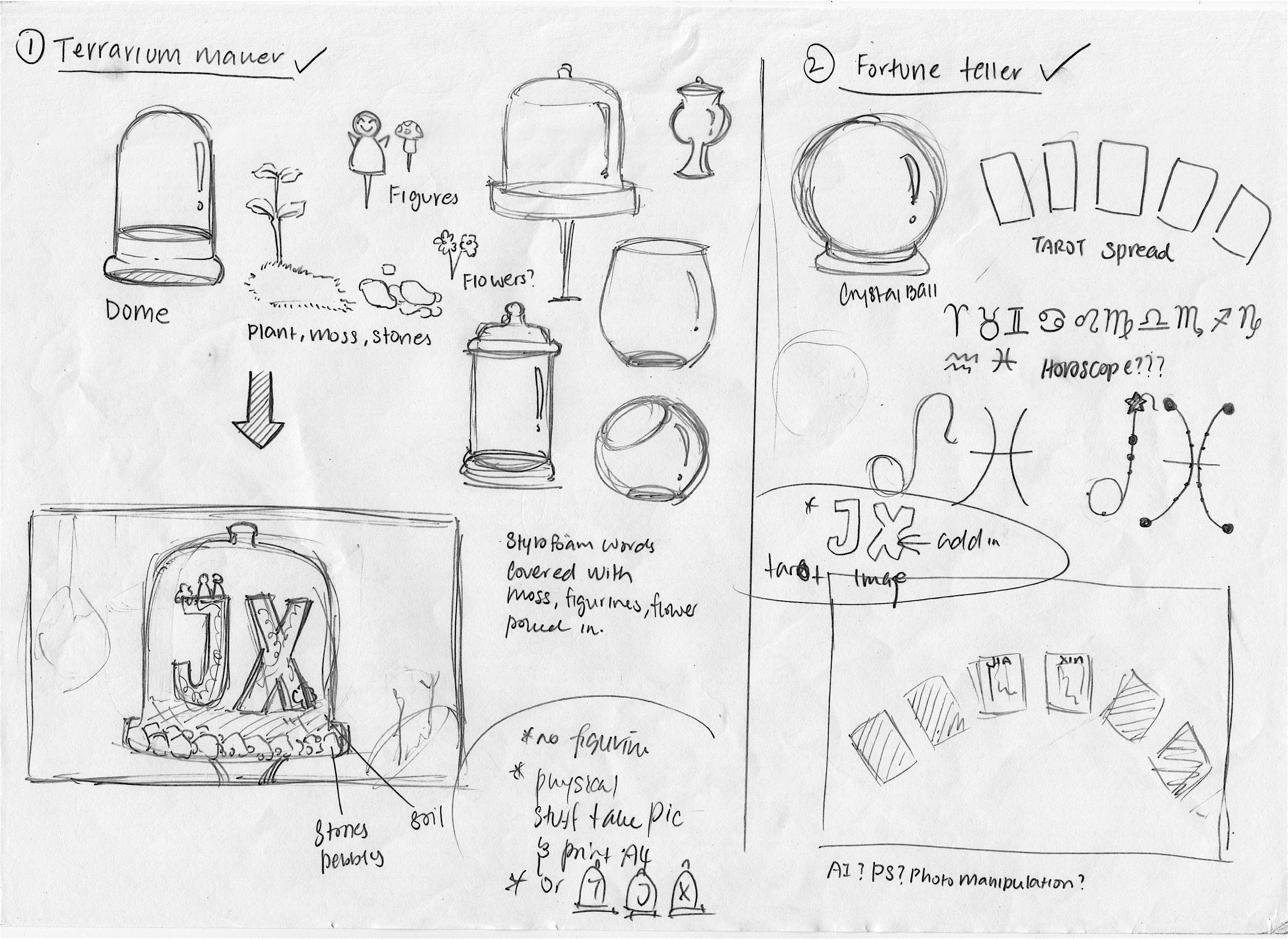
and I’m a Terrarium Artist
My name is
and I’m a Carnival Game Planner
My name is
and I’m a Fortune Teller
During the first few weeks of project 1, I have sketched out the visuals and written down some of the execution methods of the different jobs that I had in mind. I have also further research on the different related images to capture the different key essence of the jobs.
In my mind, I have thought of doing something different this time round from what I usually do(which is digital photoshop painting). I planned to do 2 physical and 2 digital art piece. As for the digital ones I will be using illustrator. It’s my first time creating artwork with illustrator!!! I was a little nervous at first as I was afraid that I couldn’t create pieces that are up to standard and also taking too much time as I was unfamiliar with the interphase 🙁 HOPE IT WILL TURN OUT FINE :”)
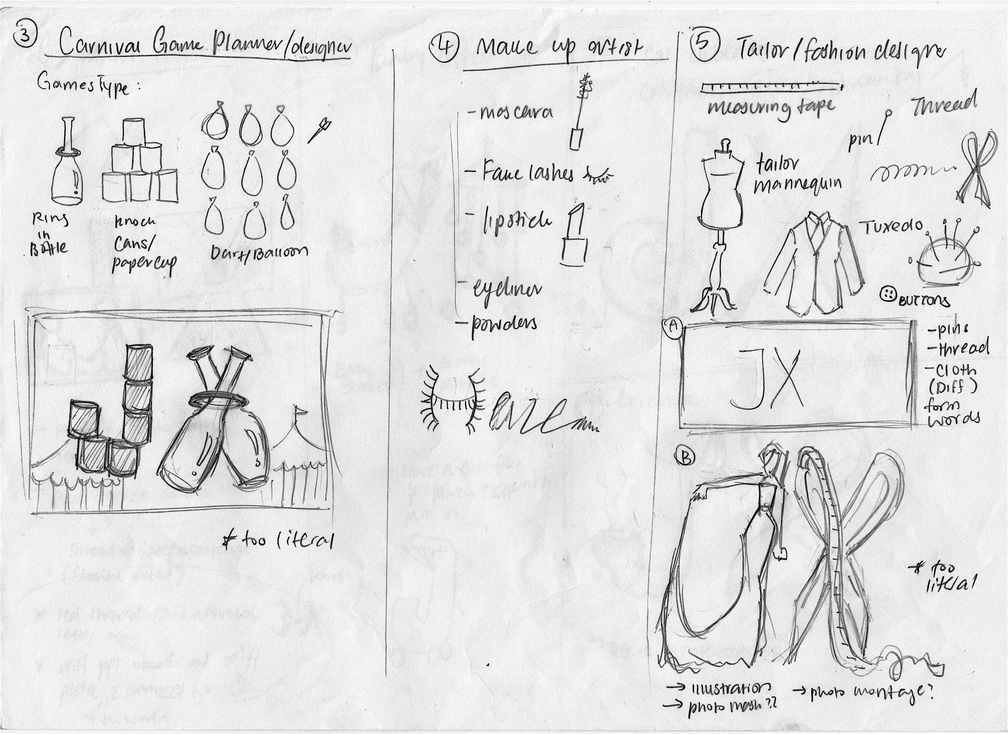

During this first few sketches, you can see there is a lot of ideas that are very literal. In the sense that take for example, the carnival game planner job, there is only the stacking of cans and bottles to make up my initials.
Before this project, I’m really clueless on how to truly integrating the essence with type! LOL, thinking back it was a little embarrassing as stacking things together to form words are rather basic, perhaps even pre-school kids are able to achieve it:( and that was what I did during the first few weeks of idea generation. Fortunately, halfway through I was enlightened by Ms. Shirley, and finally understand the “injecting essence” concept!
After the consultation, I have revamped some of the ideas into more of “injecting essence” instead of taking objects and placing them together. Such as by using typeface as the base and putting in the object’s texture, symbols, and its qualities.
In the end, I have decided on my four jobs that closely relates to me. They are the Matchmaker, Terrarium Artist, Fortune teller and Carnival Game Planner.
As mentioned, using my name’s initials to create the four panels inspired me to choose jobs that are more relatable to me such as my current or past hobbies and personalities.
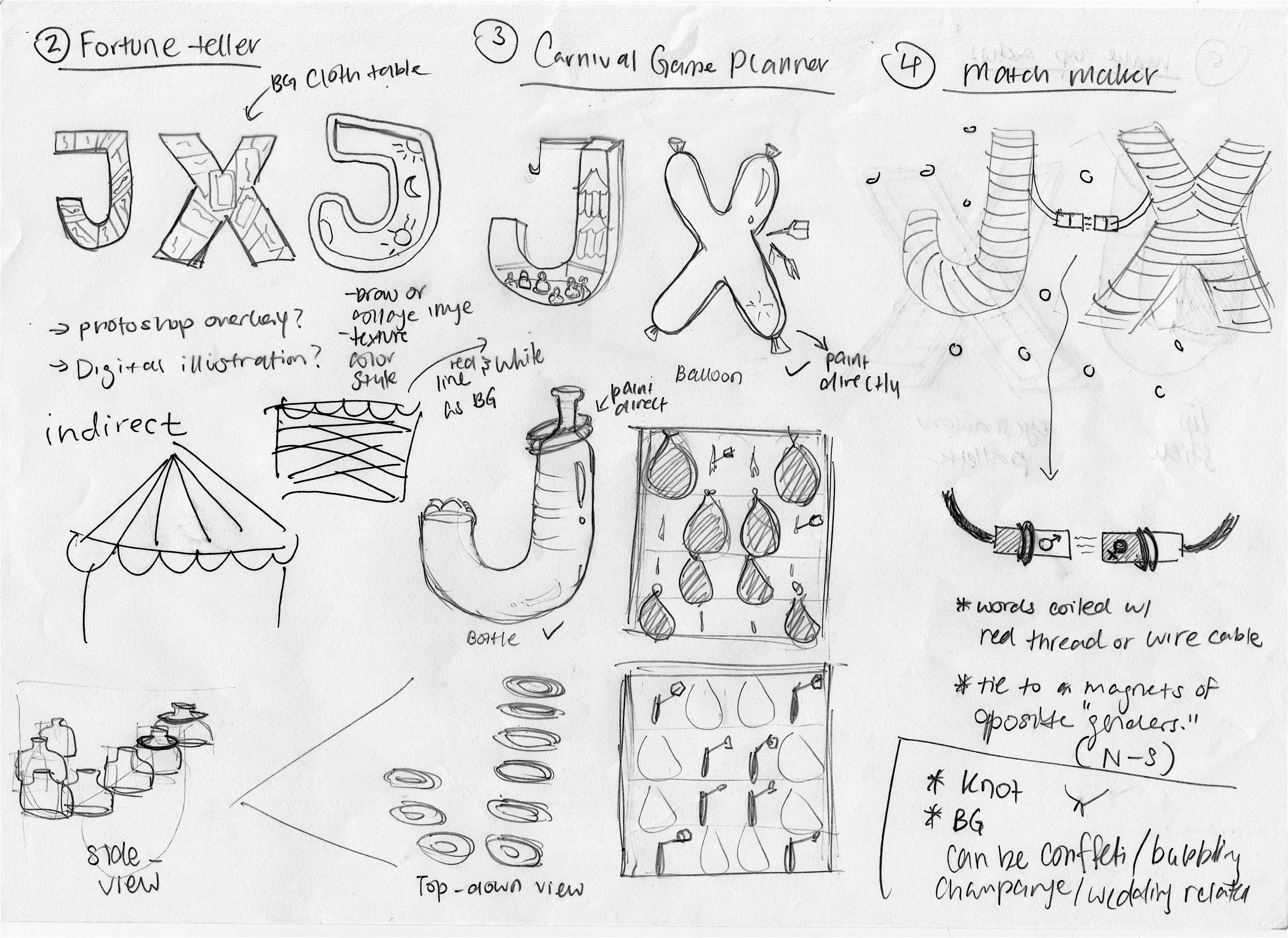
For the idea of matchmaker, I’m someone that likes to matchmake my friends up. I’m always very interested in my friend’s relationships and have been giving advice when needed to. Hence, I thought it would be interesting to portray my name in a matchmaker context!
As for the terrarium artist, not long ago I’ve received a terrarium as a gift. Ever since then, I’ve become really interested in terrariums and creating my own terrarium has become a hobby I love to do!
The idea of fortune teller is inspired from myself who used to be really interested in things like astrology and tarot readings.
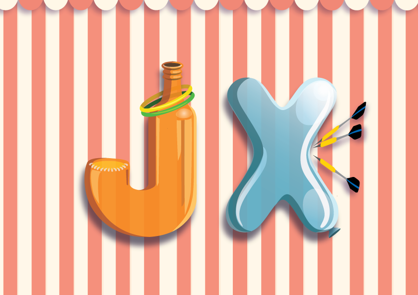
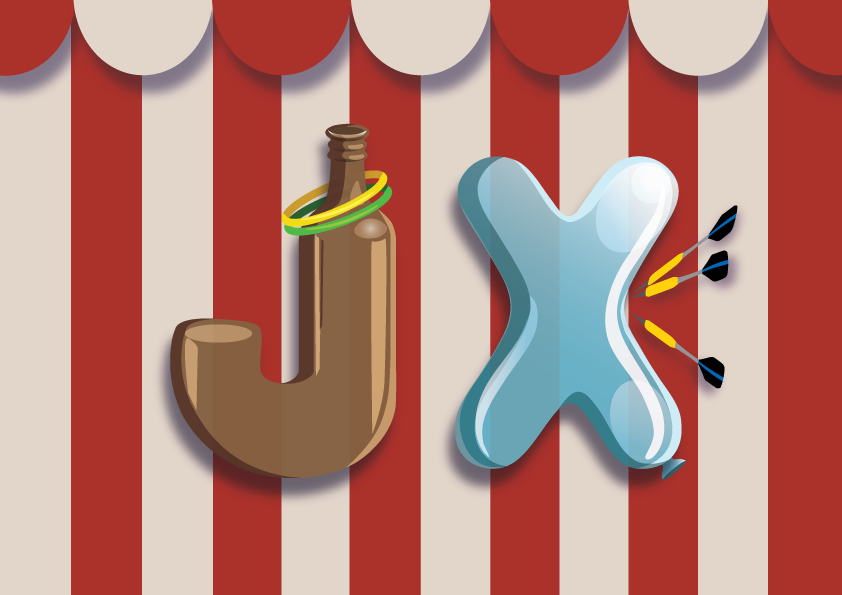
As for carnival game creator, I’ve picked this job because traditional physical carnival games really bring back a lot of memories I had and it is a place I love and enjoy going too. However, especially in Singapore, such old-school carnival places can hardly be found unless there is Pasar Malam or big events. Which all the rides and booth games can cost quite a lot as compared to the ones in the past. Hence, I wanted to be a “carnival game creator” to bring back the nostalgia. Expressing the appreciation of old-school games. At the same time, I thought that it would be great if I can be a carnival game creator too!
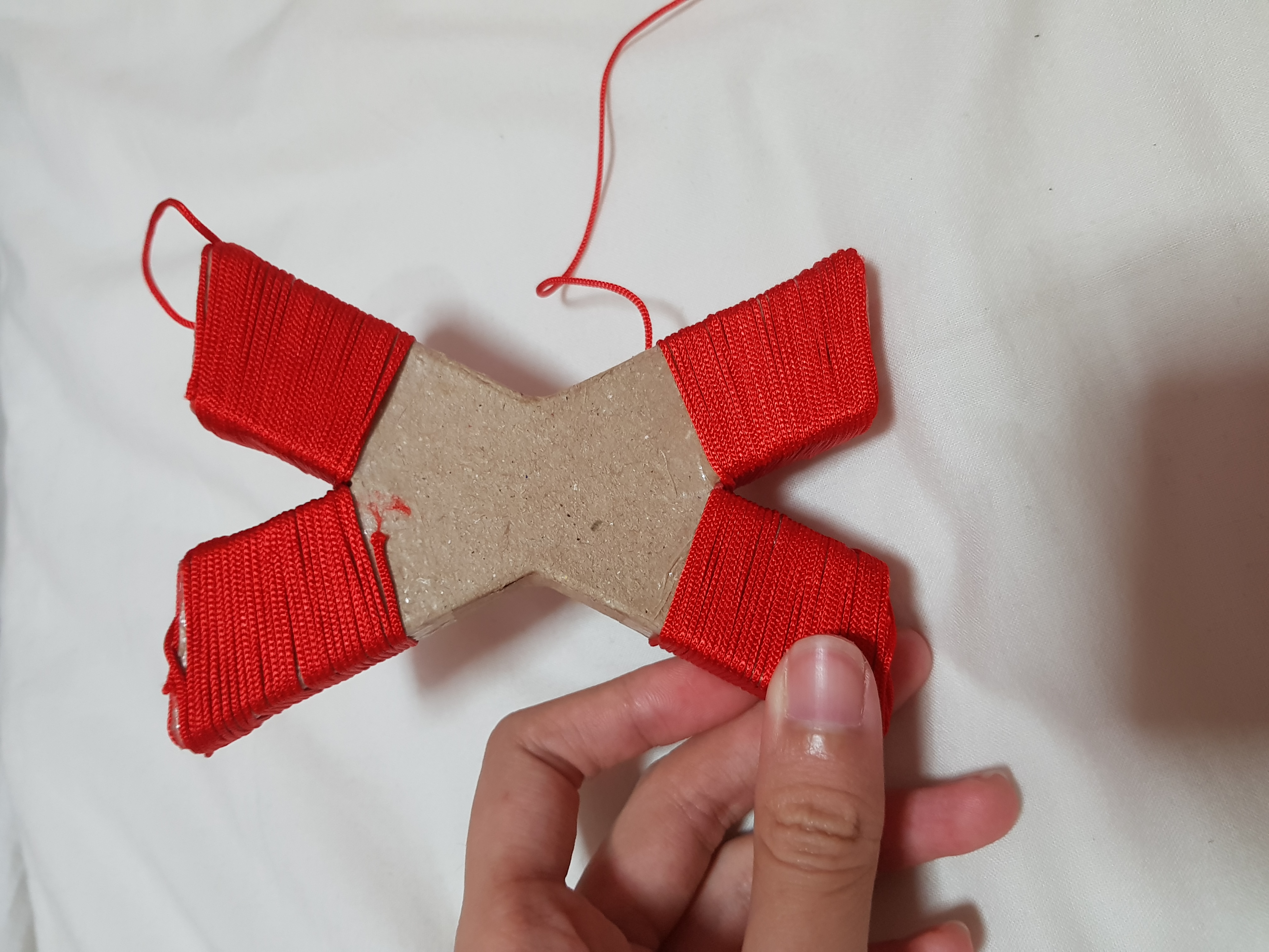
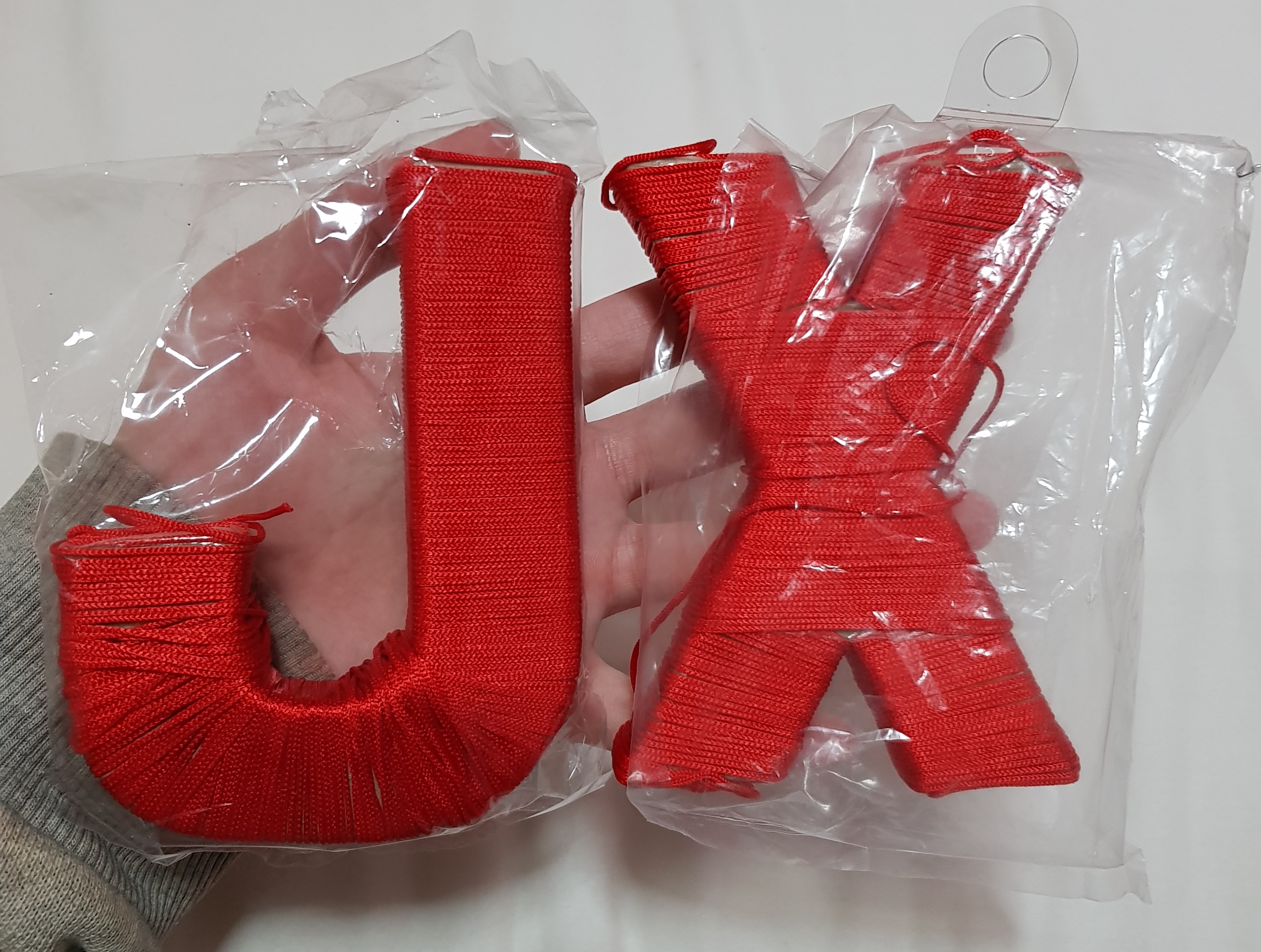
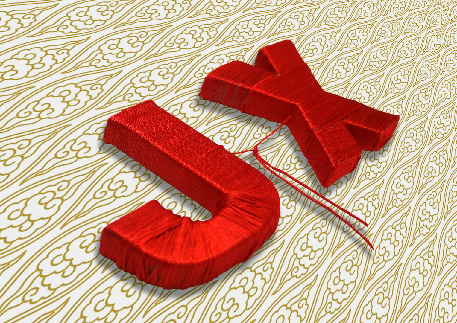
I have bought the cardboard initials from art friend. Puting double sided tape all over the cardboard letter and started coiling the red thread on to the letter.(It may seem easy, this was what I thought at the start too :”) But… I WAS WRONG :”) It takes forever to coil it and it’s no joke when all your thread starts to tangle in a bunch :”) not to mention the base and corners of the letter makes my thread keep coming off :”))
Since the red thread of fate is originated from Chinese culture, I wanted to use a background that has more Chinese essence to it. Hence, I’ve looked up references on paper cutting, Chinese embroidery prints and patterns inspired by the idea of the Chinese wedding. As for the background, I tried my best to look for something gold since my main subject is already in red. Furthermore, red and gold are the auspicious colors in Chinese cultures!
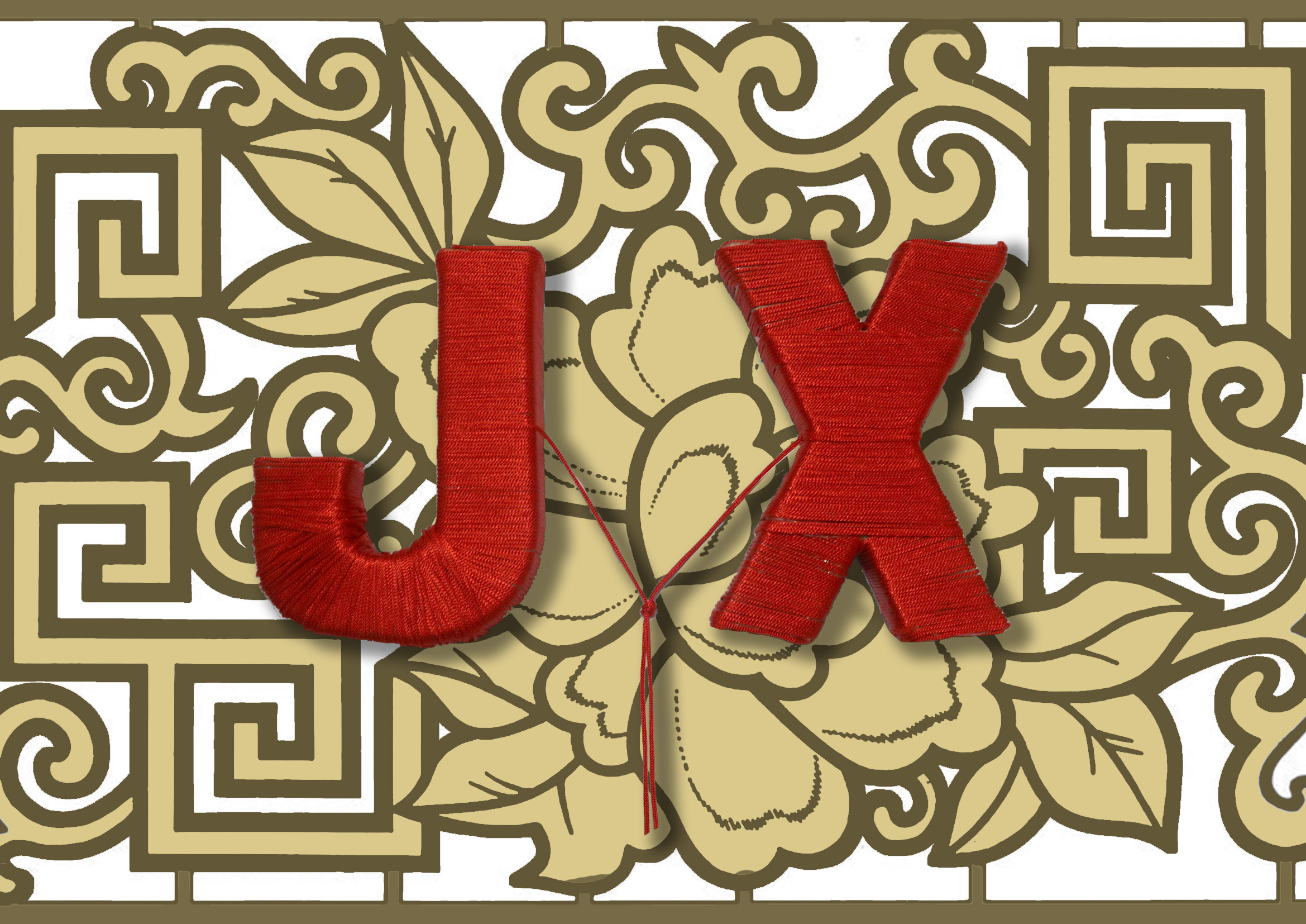

Explored different backgrounds!
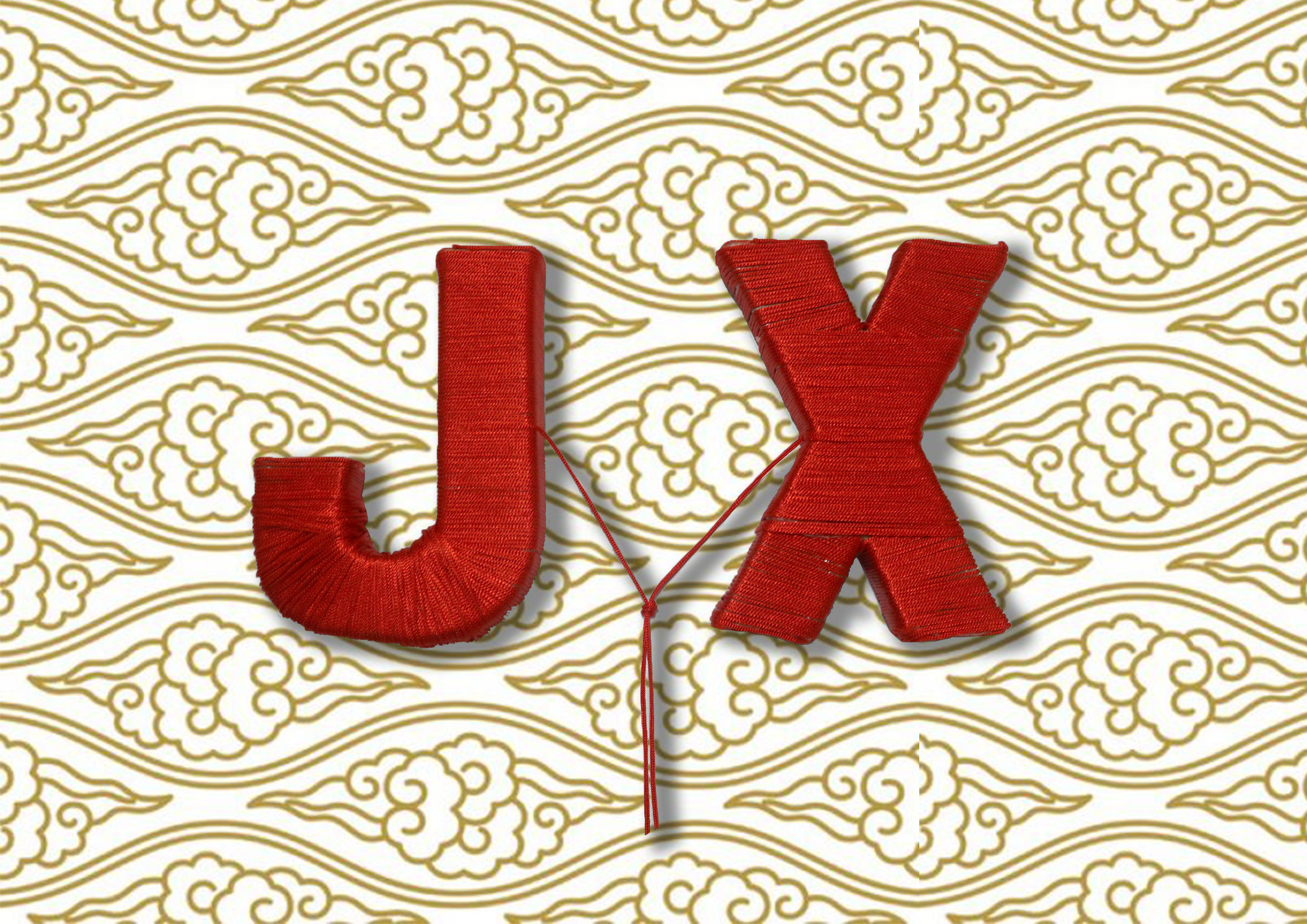
TADA! My first version of the matchmaker type, but it looks too flat and boring.
After consultation, I have made the necessary amendments to the perspectives and now it looks more interesting in composition as compared to the original one!
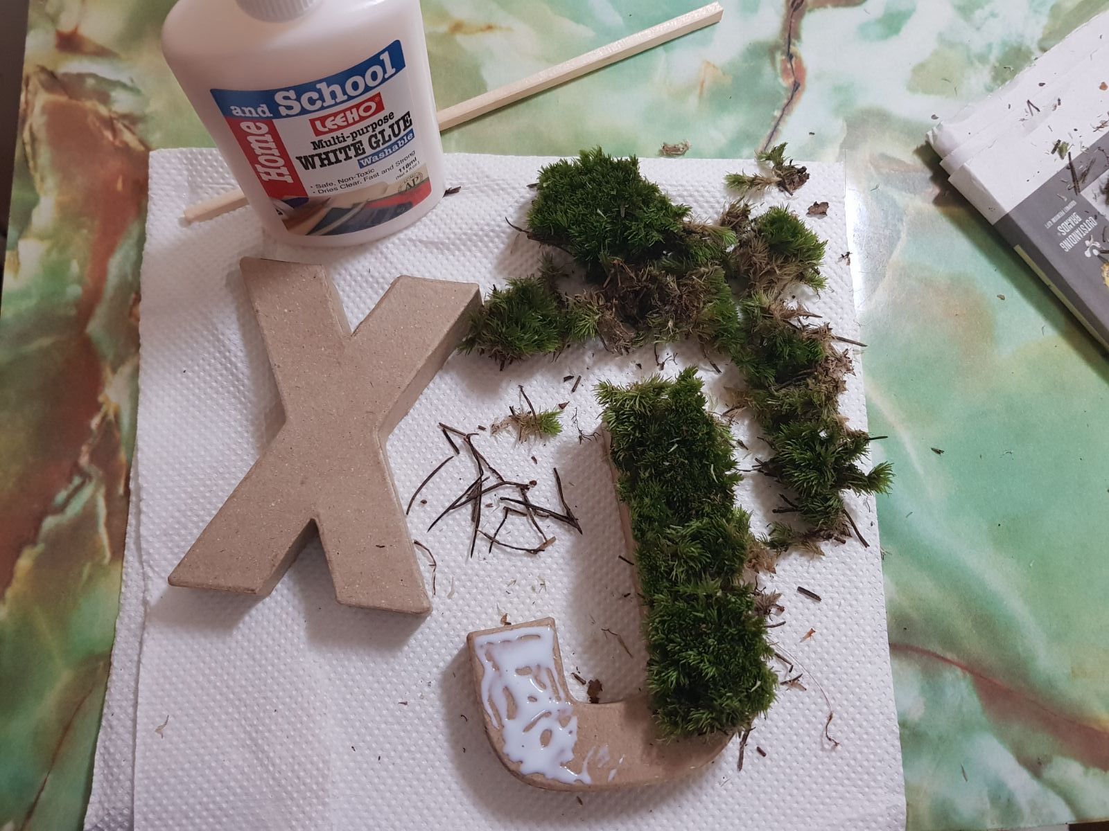
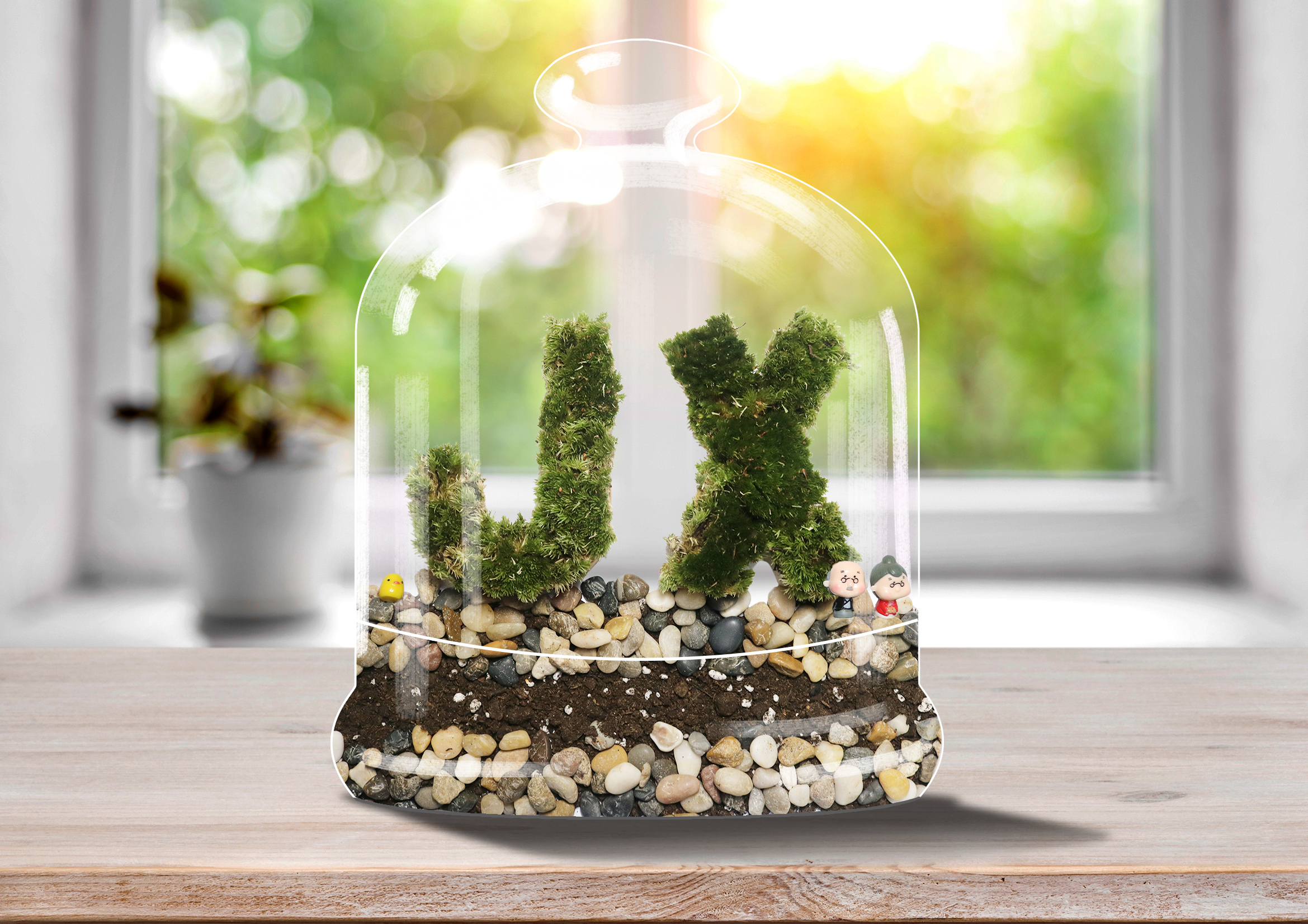
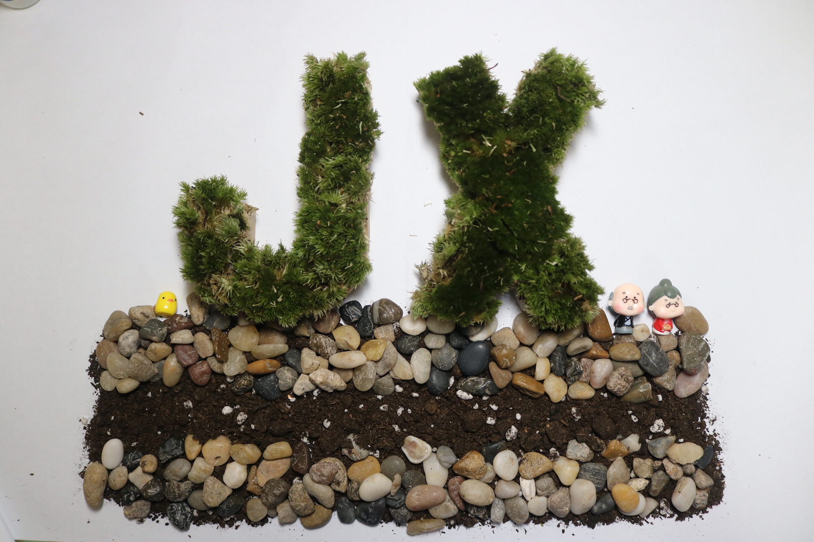
For the terrarium piece, I have bought real terrarium moss, soil, stones and figurines into creating it. With the same cardboard letters, I have put white glue and pasted the moss accordingly!
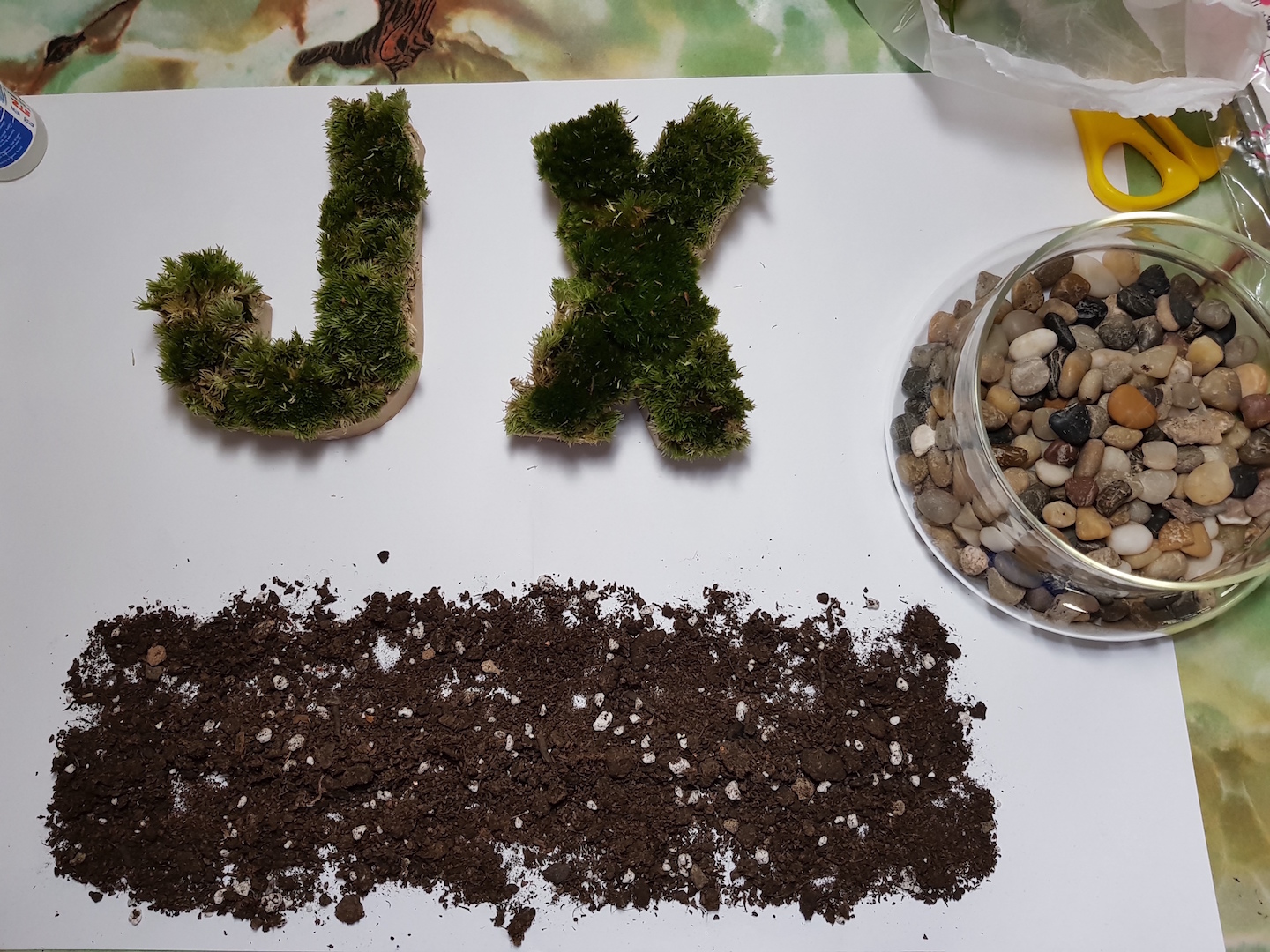
For the base, I have laid out the soil first.
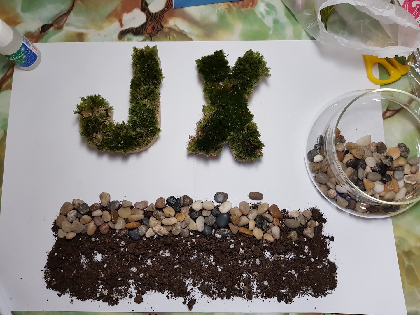
Followed by the top layer of pebbles.
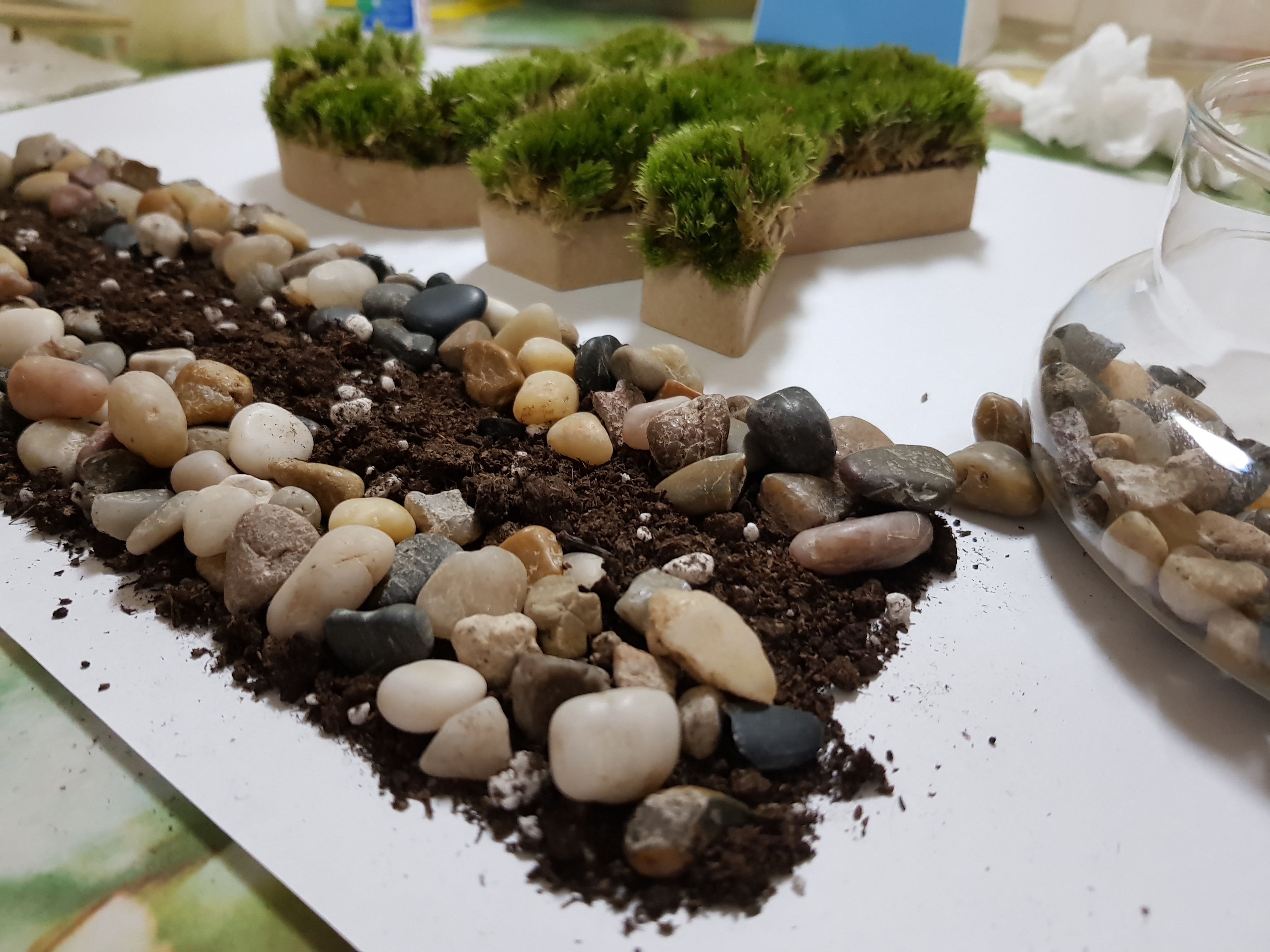
And then the bottom layer of pebbles!
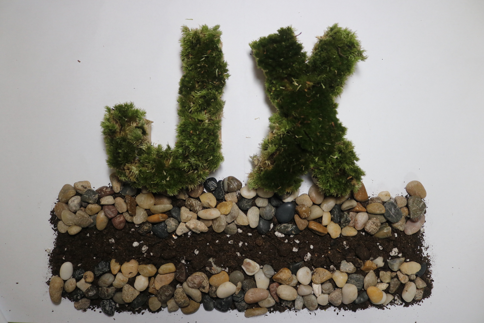
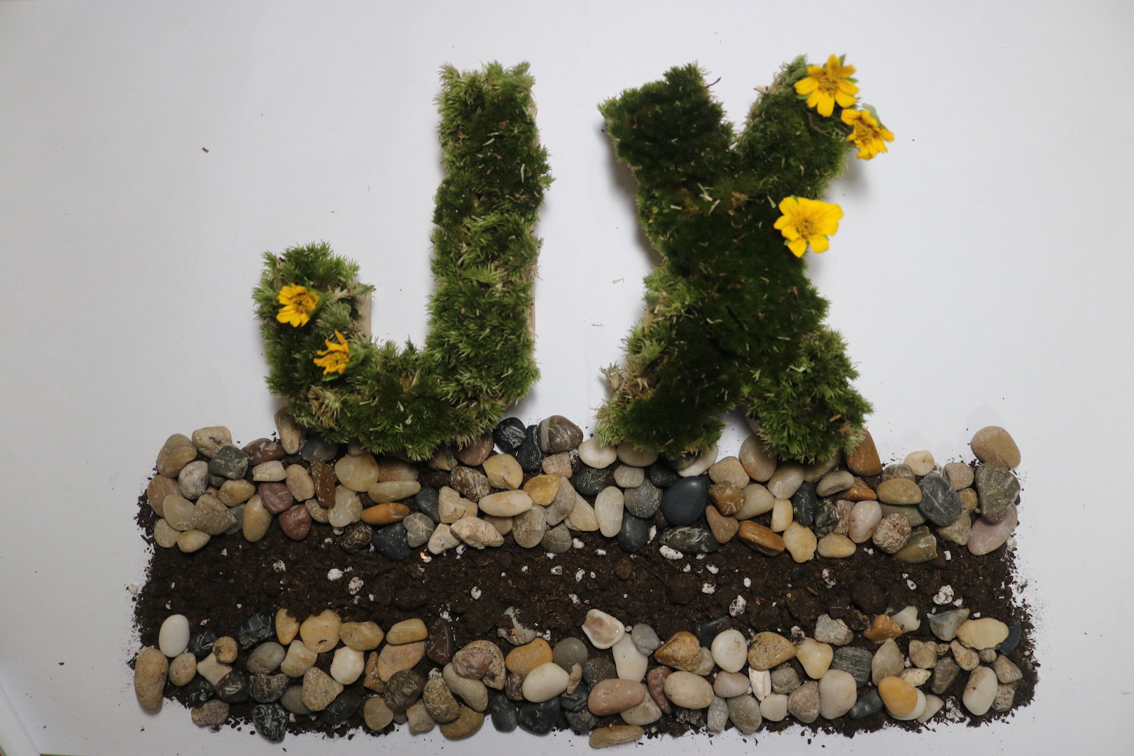
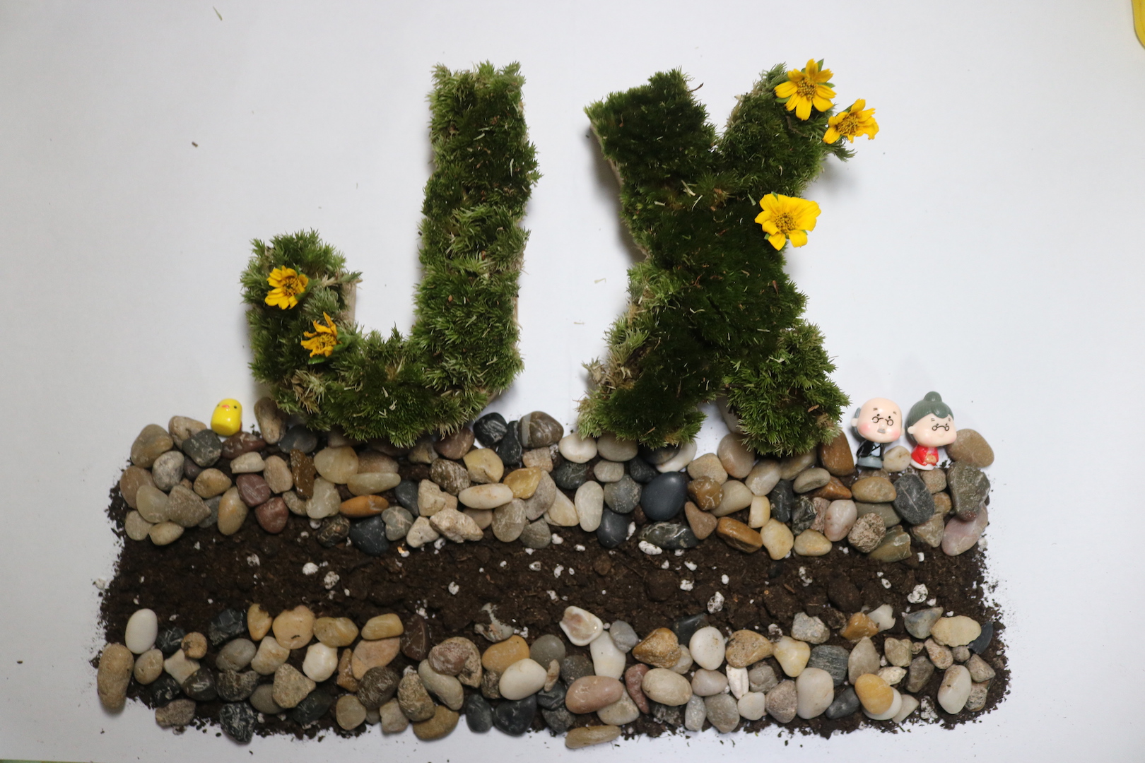
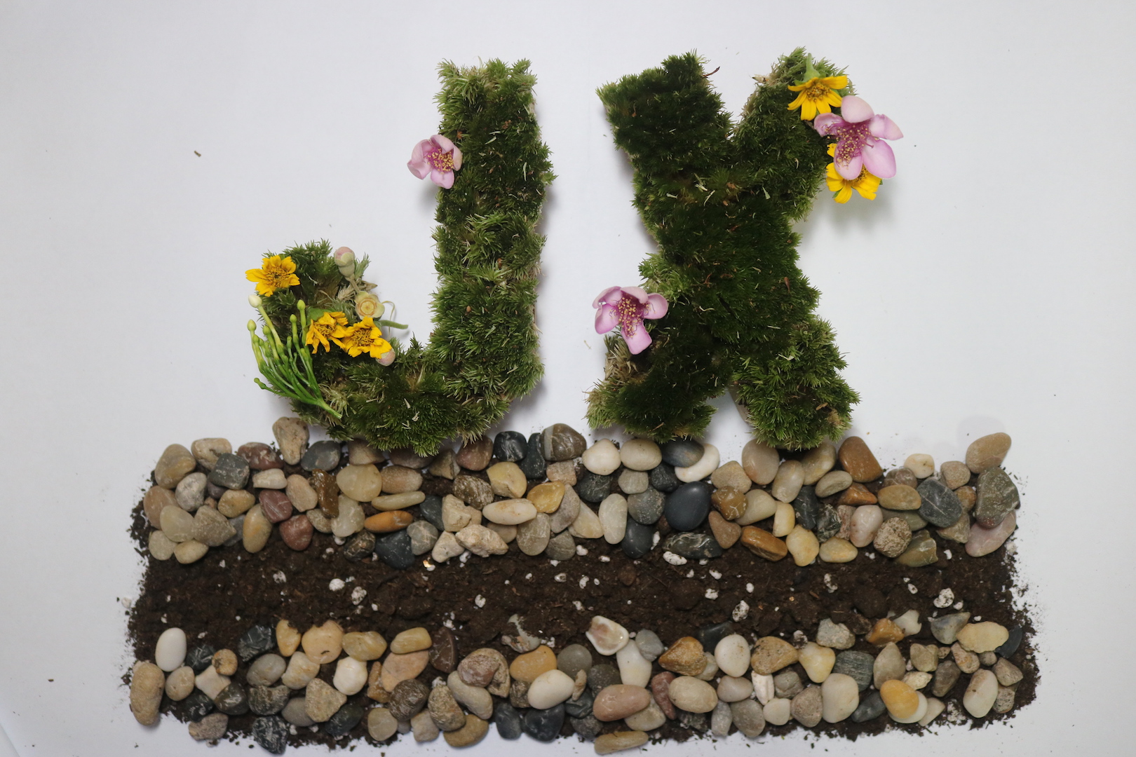
The flower ones looked more like a garden theme instead of a terrarium theme and it is too distracting while the plain one is too plain. Hence, in the end, I have decided to go with the one with the figurine 😀
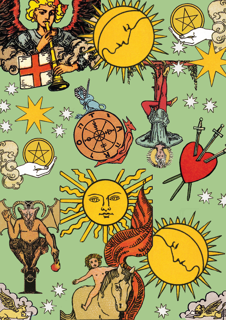
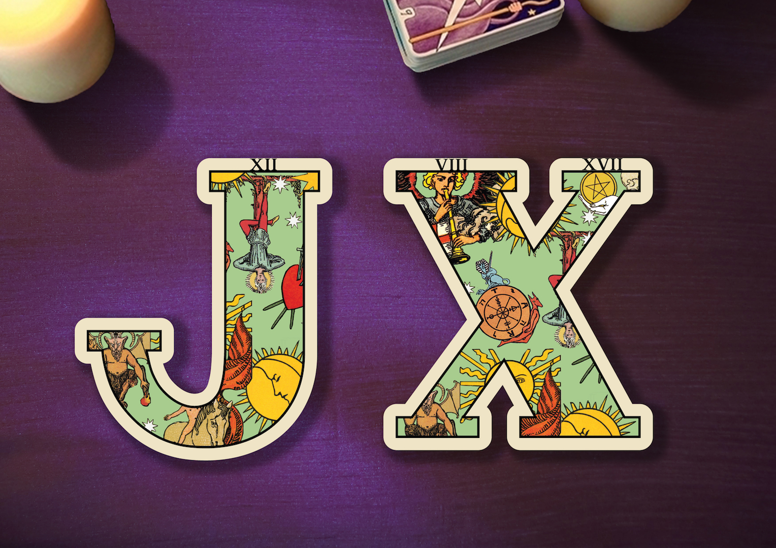
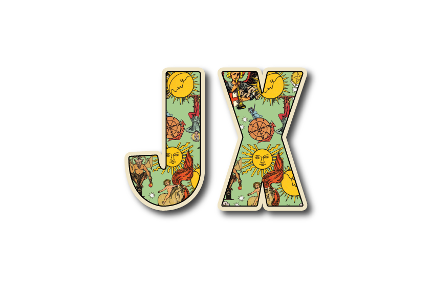
For this piece, I have extracted different images in the tarot cards and masking them collaging them all into one canvas. In general, I have used a more “dirty” nostalgic color for both the green background and tarots symbols in this collage to create a more vintage, olden days feel to it. Even the borders around the letter “JX” is made off white on purpose.
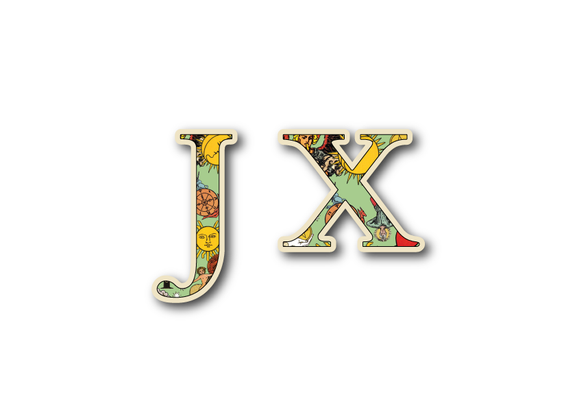
After which, I’ve looked up for different type phase and manage to find this serif one having the more mysterious olden era feel to it. However, the width of the type is too narrow, hence it couldn’t really portray the symbols and essence of the tarot card.
I further explored with a sans-serif squarish type that is much thicker showing more of the symbols and looking like a card at the same time. However, a peer commented that it looks like a badge instead of a tarot card and suggested that instead of just putting candles at the background, I should put a deck of cards to hint my viewers! It was a good suggestion and it kind of strikes me to further revise my typeface!
So, since tarot is something mystical from the olden days, I decided to go with a serif type that is also thick in width at the same time to achieve a win-win situation!
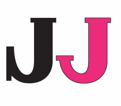
I’ve finally found the suitable fonts and downloaded it however halfway through, I realized the “J” ‘s serif looks really out of place and not to my liking. Hence, I tried to “create” my own font through illustrator by making changes to the serif. (Black J–the original font to Hotpink J–the one I edited)
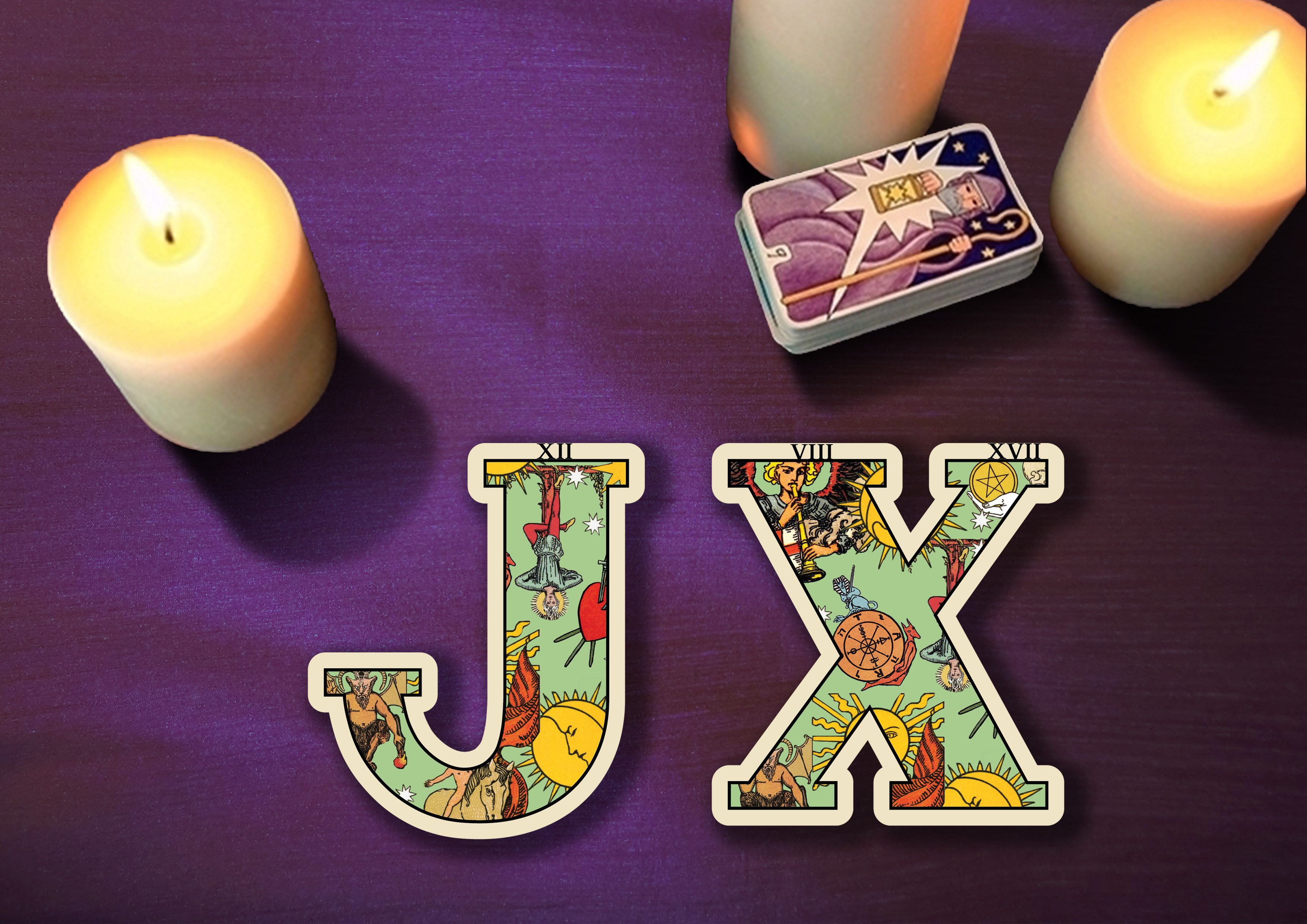
Taking the advice of my classmate, I have managed to find a deck of cards and included it in my piece. However, during the consultation, I’ve come to notice that I have the tendency to allow my background of stealing the focus of my main subject which is my type phase. Hence, taking suggestions from Ms. Shirley I further revamped my piece to allow my ‘JX’ to be more in focused.
As for the background, I have chosen purple as the color of the tablecloth to express the mysterious and magical nature of fortune telling.
Hence, after consultation, I have made the background stripes smaller and lighter in color so that it is not as attention seeking and brighten up the bottle’s color to orange to lift up the mood. Using complimentary colors for my main subject, orange and blue allow the piece to be more interesting and harmonious in colors. I have also learned from this piece that sometimes, an object doesn’t have to stay to its color to bring out the essence of it, as long as certain elements are present.
Before this project, I have always been very fascinated by the different innovative typeface I see around me. I have always wondered how those designers actually integrated words and the essence of what they are advertising so well. Haha, I’m initially not trained as a designer as I was from an animator background. Therefore, I really admire typeface design and at the same time wonder how did the designers create it. However, I was extremely grateful for this project! Especially being enlightened by Miss Shirley HAHA! As I’ve learned so much on how to integrate intangible essence into rigid forms such as into a typeface!
Sometimes, I really think that especially for non-designers we have taken designs for granted. When you see a poster or a type, the first thing that hits u is the basic direct message of the advertisement is trying to convey, but not thinking twice about how incredible it is for designers to extract out the most basic essence of something and integrating them with other elements to make us understand messages immediately with one look.
I’m also grateful that finally, I’m stepping out of my comfort zone exploring and trying many different methods of creating my piece! Like I’ve mentioned, previously I’m trained as an animator thus I’m very used to doing digital painting/illustration with photoshop! However, this time round, I decided to go all out by not touching photoshop digital painting. I’ve mainly integrated a lot of physical craft with photos editing and vector painting in illustrator in this project. Through this project, it had really pushed me to look up for videos and learn the basics of illustrator.
As a start for this project, I have went on to find out more about what is typography to further help me in better understanding this project!
It is the visual art of creating type.
There are 3 main components to be considered while creating our own fonts.
There are basically 2 main basic fonts which are sans-serif and serif. These are the very first decisions we have to make before creating any type.

Serif: Considered as a more older typeface that is usually used in newspaper or book publishing. It is a typeface having a stroke that extends from letters. It can be in the form of a tail, sharp or blunt, decorative or plain.
Associated Mood: Classic, elegant, formal, confident and established.
Examples: Times Roman, Rockwell, Georgia, and Baskerville.
Sans-Serif: Typically considered as a more modern typeface. Sans-serif lacks strokes at the end of letters thus its name “Sans” serif. It is associated with simplicity and modernistic as it lacks the add-on details. The edges of a Sans-serif varies from sharp to rounded.
Associated Mood: Modern, friendly, direct, clean and minimal
Examples: Helvetica, Arial, Futura and Franklin Gothic.


For the brainstorming part, since we are using initials from our names, I wanted to take up jobs that are more in relation to me on a personal level. I wanted to choose jobs that define me as who I’m. Therefore, even though some of the jobs may not seem as out of the world and crazy, they represented some of my hobbies, personalities, and aspirations. Below are some of the jobs I’ve thought of that I feel are related to me and I’ve noted down some of the visual element/essence that has come to my mind when I thought of these jobs.
Moss letters, Soil and stone base, Glass dome background


Using real fake lashes, lipstick and mascara stains


Fur texture on letters
Games: Darts popping balloons, Ring on the bottleneck, Can knocking


Tarot spread, Opened tarot cards with my initials, Horoscope signs


Thread, Measuring tapes, Mannequin, Guiding needle


Red thread


Flower bouquet, Wedding gown, Grand venue
Baby mobile, Safety pins, Baby Pram
Notebook, Magnifying glass, Detective hat, Smoking pipe