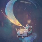
Assignment 3 – Process and Final

Sketches

[Camouflage Event]

Event Concept:
For the camouflage event, I have gone with a more playful concept. It is an event for all ages to have fun with camouflaging themselves and also to find this character that is hiding around all sorts of different types of disguise.

Items:
Invitation cards
Mystery gift bag
Tote bag
Ticket
Gift wrapper

Sketch:
I have come up with a character and 5 different thumbnail sketches of various patterns that camouflage the character in various ways.

[Superstition Event]

Event Concept:
The event aims to challenge visitors with their beliefs in Chinese superstitions. There will be games, installations and free goodie bags that stores inauspicious gifts such as pear juice, umbrella, and a handkerchief to play out the contradiction of the concept of giving the visitors gifts that shouldn’t be given.

Items:
Invitation cards
Tickets
Tote bag (As the event goodie bag that stores all in inauspicious free goodies to be given out to visitors)
Umbrella → Pear Packaging → Pear Juice Label(Inauspicious goodies #1, changes made due to execution and aesthetics reasons)
Handkerchief(Inauspicious goodies #2, initial fifth item)


Sketch:
I have come up with 4 different thumbnail sketches for superstitions that are mainly from the spirits category as they are more interesting. I have also included one inauspicious gift(pear juice) to play out the idea of challenging people’s beliefs in superstition by giving them the inauspicious gift as a gift for the event itself.

Superstition 1: Don’t sleep facing mirrors
Superstition 2: Don’t stick chopsticks in your rice
Superstition 3: Don’t open umbrella in the house
Superstition 4(inauspicious gift): Don’t give pear(juice) as a gift.


Element:
Chinese border with 4 corners of different version of the main key themed item. However later on it was changed to Chinese characters that symbolized the key themed item instead as it brings out the theme better and it is more consistent. Main center superstition accompanied by floating daily item placed randomly that will be seen in such a scene to create a sense of place.

Superstition 1: Don’t sleep facing mirrors
I have drawn a person sleeping on a bed facing a huge mirror with ghostly figures that represented as her soul that is going towards into the mirror showing that her soul is being sucked inside.

Superstition 2: Don’t stick chopsticks in your rice
I have drawn a comparison by putting a rice bowl with chopsticks sticking inside and a Chinese incense burner to show the similarity of both and how they are being associated. The ghostly figures here represented the incencse is an offering for our ancestors.

Superstition 3: Don’t open umbrella in the house
I have drawn a house that is filled with household items with an opened umbrella and a ghostly figure floating out from it to show that opening an umbrella in the house attracts spirits.

Superstition 4(inauspicious gift): Don’t give pear(juice) as a gift.
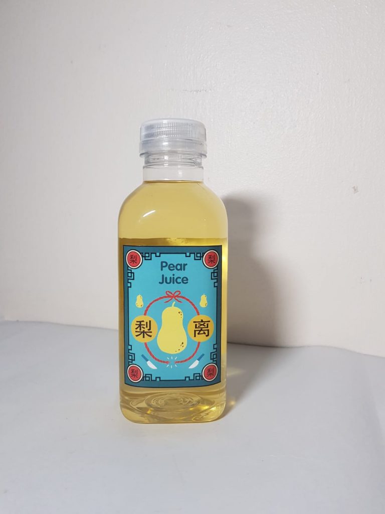
I have drawn a pear and put the two Chinese character of “pear” lí and “separate”lí that sounded similar side by side as a comparison at the bottom shows a broken rope to represent the idea of separation.


After further consultation, I have decided to go with the superstition event concept as it is more interesting and unique. Also, its a concept that not a lot of people have explored it in illustration before, therefore, I would like to give it a try and see how it turns out.


Style

For the style that I’m going with, I have come across this Korean Illustrator Subin Yang. I felt that the way she illustrates is really interesting. It is very stylised in a way that gives this hand-drawn feeling. Her style also closely explores themes such as home, culture, and identity. Basically very daily life illustrations with a sense of playfulness in her illustration. I felt that it would be quite suitable for the theme that I am touching on as well since a superstition is something really cultural and close to our everyday life.

Some of her style’s traits
-flat vibrant colors
-simplistic facial features representation
-outline on the inside of the illustrations
-simple chunky body shapes


Color Palette

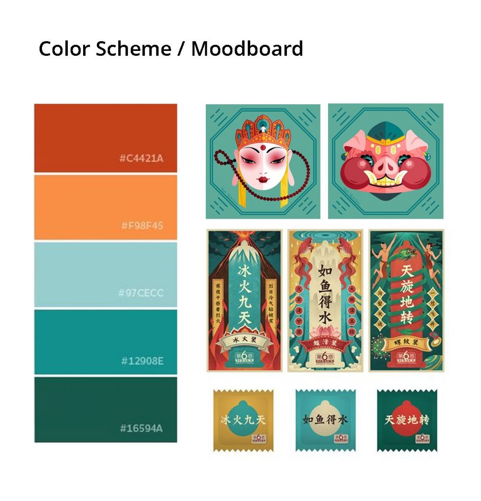
Since I’m doing something traditional, I have chosen to use those vintage Chinese color palette that is slightly desaturated to enhance the whole superstition theme.

Initial Rough Sketch/ Color Test

The initial color test was not ideal as all the illustration does not look like they belong to the same family. Therefore, after consultation, Prof Lisa suggested going with the green, red and yellow palette that looks the most harmonious as a whole out of the 4 color test. The rest of it was either too bright or dull. Hence, I went on to look for more similar color palette references to better help me with my illustration.

Process

Border – “Superstition 3: Don’t open umbrella in the house
Border – “Superstition 2: Don’t stick chopsticks in your rice”
Border – “Superstition 1: Don’t sleep facing mirrors”
Border – “Superstition 4(inauspicious gift): Don’t give pear(juice) as a gift”

During the process of creating the illustration, I have decided to first use Illustrator to create the outer borders for all four superstitions. This is because I felt that Illustrator is better at creating borders and shapes with symmetrical style. The borders were later imported to Photoshop for painting the main elements and center illustrations in as I wanted to give my illustration a more textured hand drawn/painted feel to it.


Final

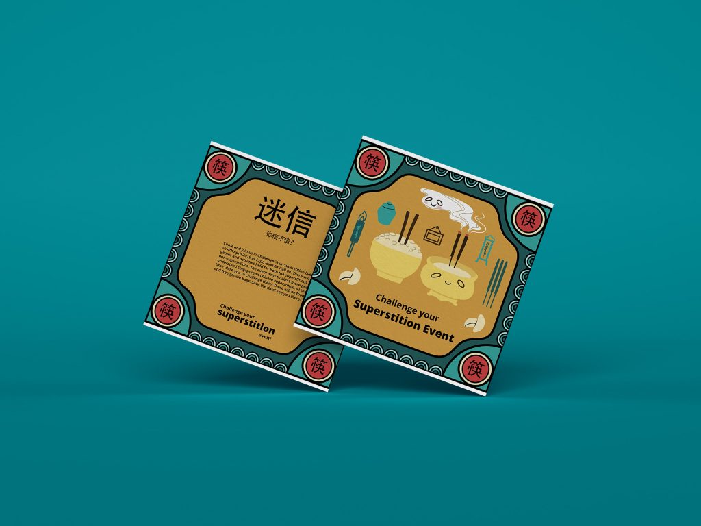
Challenge Your Superstition Event – Invitation Card
Challenge Your Superstition Event – Tote bag
Challenge Your Superstition Event – Pear Juice Label
Challenge Your Superstition Event – Ticket

Mock Up

Challenge Your Superstition Event – Invitation Card Mockup
Challenge Your Superstition Event – Tote bag Mockup
Challenge Your Superstition Event – Ticket Mockup
Challenge Your Superstition Event – Pear Juice Mockup
Challenge Your Superstition Event – Pear Juice+Ticket Print Out


Reflection

Initially, I couldn’t imagine myself doing the superstition event as I find it difficult to convey superstition through illustration. Superstitions are usually an act of displaying a certain action, a belief or the combination of both rather than a scene or situation to be illustrated. Therefore I find it a little challenging at the start and unsure of how to translate it into illustrations. However, as I research more and tried to find references, I had a better idea of how to go about with the illustrations.

The second challenge for me was balancing the color for all 4 illustrations to look harmoniously. At the start, looking at vintage Chinese labels was really very colorful and I did not have a focused color palette. After some discussion with Prof Lisa, we manage to narrow down on focusing on just one color palette. Overall, I have sort of stepped out of my comfort zone a little and tried to illustrate something that I’ve not done before and I’m glad that I did!

Assignment 2 – Varoom Empathy (Process+Final)

16 quick idea thumbnails

After researching more into the different types of empathy, and how empathy can affect ourselves and others. I have come out with 16 different ideas that branch out towards different aspect of empathy-related topic. Some of the following ideas are from my own, some are from idioms and some are generated through random word generator that sparks inspirations.


(* looking from top left to bottom right)

1) The idea of being empathetic is a  never-ending process is represented in the form of never-ending flowing of water.

2) The idea of being empathetic is all about the mind’s well-being.

3) Being empathetic could be defensive sometimes whereby when an empath is being hurt before they could become defensive and reject on being empathetic anymore.

4) Being an empath could be about concealing as well since empath has to be the one that understands others, they tend to conceal and bury their own emotions, needs and wants to please others.

5) The first type of empathy-cognitive empathy. It is about understanding how others think. Helping in information relating and better communication.

6) The second type of empathy-emotional empathy. It is about understanding how others feel to build an emotional connection.

7) In this thumbnail, the idea is to show how people that lack empathy can actually drain empath. The thumbnails depict an empath as a power source charging someone who lacks empathy.

8) The third type of empathy- compassionate empathy. It is about going beyond understanding and through sharing the connection it makes the empath wants to take action into helping the other party in whatever way they can.

9) Similar concept as number 7 but represented in a different manner of narcissist sucking the soul out of an empath.

10) Working further on the idea of “sucking the soul out of an empath”. This thumbnail illustrated how on the surface narcissist is nice to an empath caged up in his control. While the reflection of shadow on the ground shows otherwise. It depicts the narcissist sucking the soul and shadow of the empath.

11) In this thumbnail, the idea is to show an empath feeling drown from being empathetic.

12) Being empathetic could also take the form of being burdened and unable to be free in wanting what you truly yearn for.

13) Empathy could also be a two-edged sword for an empath. They have both good and bad sides.

14) Empath could sometimes feel that they are alone too. They always tried to understand others but when it comes to them, they could feel that no one truly understands them or truly are by their sides since what they always give is more than what is returned.

15) Empathy could also take in the form of the idea of superiority or wealth versus poor. In the sense that people who are rich looks down and does not have empathy towards the poor.

16) Sometimes, empath could unknowingly expect people to be the same towards them in return.

I have further narrowed down the options and chosen on some of the concepts that have more potential to work on.  They are, standing in someone else’s point of view, narcissist (people who lack empathy) draining empaths and being empathetic can be draining.

Refine ideas and sketches

Concept 1 (standing in someone else’s pov)

For the first idea on the left, I wanted to show that instead of the idiom of saying “standing in somebody else’s shoe”. I wanted the illustration to be more relatable visually and including my own perspective of the theme empathy—understanding another person’s mind. Hence I have cut a person’s head open showing there’s a lot of wires to represent human’s mind are actually very complicated. I have also drawn another mini human within the head with a mini light bulb showing that the mini human(representing another party) trying to understand the broken wire(representing the issue that this lady is thinking of causing her to be upset).

The second idea, shows a person putting her spectacles for another person to wear to represent the idea of “seeing in another person’s point of view”.


Concept 2 (being empathetic is draining)

Both sketches show the same idea of how being overly empathetic as an empath can be extremely draining. Working on the idea of draining I have come up with 2 compositions. The first shows four hands representing other people, taking syringes to drain the content out from an empath’s heart. The second sketch shows within the empath there is an IV drip that is connected to the empath’s heart and transfusing blood(representing empathy energy) to the rest of the people around her with her facial expression looking indifferent to show how it had caused her to be so exhausted.


Concept 3 (Narcissist drains empath)

The final concept is about contrasting the behavior and relations between a person lacking empathy being together with an empath. Which leads to the idea of having a narcissist draining the energy of an empath. The above shows 2 compositions, the one on the left shows my initial idea of just making the empath doll-like laying down on the ground expressionless to show “drained”. While the narcissist is looking into the mirror admiring himself while attached to a wire draining the energy from the empath to show his vanity. However, I was not satisfied with the composition and went on to zoom in a bit more to their face since the contrasting facial expression between the two is quite an important part of this concept.

After some discussion with Prof Lisa, I have chosen the third concept of “narcissist drains empath” as it is the strongest concept out of the three, with the zoomed in composition as it is better in composition as compared to the initial one.

Reference Images

Prof Lisa recommended making the lady looking more drained and sucked by giving her sunken cheeks with protruding cheekbones. Hence I further looked into gaunt, drug addict and anorexic references.


Mood board

Regarding the color palette and mood board, I wanted to use something that shows clam and cold to give a feel of how empty and drained this piece is. Yet at the same time, I wanted to show a little sense of unsettling and danger to it to represent that how an empath being together with someone lack of empathy could be really toxic and never-ending. So I have picked mainly blue and red for my main color palette in this illustration.

Refine sketches & color blocking

Refine sketch
Refine Sketch – Man’s gross back view

For a more refined sketch, the feedback was to make the man’s back view looking grosser in reality so as to contrast how he sees himself in the mirror as perfect.  So I have made him having bald patches, face full of pimples and bumps, hair full of dandruff as compared to the initial draft. As for the wire cable, it was suggested that both the reflection in the mirror and in reality should both be in a heart shape to look more like a reflection. The cable, in reality, should also be frayed to further enhance the idea of how the reality is bad but both characters do not see it in the mirror. In the mirror, they see their relationship as perfect due to one being blinded by self while the other being blinded by someone she likes.

Refine sketch with base color
Texture

I have further put down the base color of the entire composition to have a sense of the entire look and what tones of blues should be used at which part of the illustration. I also wanted just the reds to be on the batteries and cables to highlight that it is the main focus and what is happening(draining empath’s empathy) is dangerous. Prof Lisa suggested to add tints of blue shadow on the lady’s face to gel better with the environment and that the extra mirrors at the background are not needed as my main focus already has a lot happening. However, I still felt that it might be a bit too empty in the background hence I thought of adding on some texture of wall to enhance the overall feel of the “dark” concept.

I have also felt that the man is not gross enough so instead, I changed the man’s battery to be embedded in his exposed brain in his skull. Having it stitched up at the back of his neck with some vein protruding. I have also added fallen hair and dandruff on his shoulder.

Final


Reflection

I felt that one of the most important take away is that good ideas and creativity happens when you are being random or doing something else that sparks inspiration. I was someone who initially is really bad with idea generation, however, I felt that this project has pushed me to be creative and learned different ways of generating ideas. Also, I have learned that in order to illustrate conceptual ideas it is very important to keep your mind open and never stuck with a certain perspective of issues. Some problems that I have encountered is that I felt the process of choosing colors and applying them on to your piece is a little challenging as you really need to plan it’s finished look. Another challenge is that the natural feature of this magazine of having a title at the top and subtitle at the bottom with a unique magazine size. I have followed a wrong size initially stated in the brief and managed to salvage it by finding the correct size and fill up the extra spaces with colors.

Project 1 : Self Portrait

Research

For our first project, its to draw a self-portrait that represents our personality or what we like in general. I was stuck at first as I’m not too sure what kind of self-portrait should I go for. The more realism kinda? More abstract and conceptual kind? Or something that is more stylized. I was also of the composition and can’t really decide to go for something that only shows my face in the center of the canvas like how typical self-portrait look or should I go for something that depicts a scene.

Anyway, for the first week, we are tasked to list down some words that describe us or the things that we like best. Draw them individually and then proceed with doing some thumbnail sketches. So I started from there and here are some of my word list and individual item sketches!

[Word List & Individual Thumbnail Sketch]

Favorite…
Pet: Cat
Hobbies/interest: Travelling, Singing
Movies: Interstellar
Fruits: Watermelon, Strawberry

About myself…
Practical
Organized
Sentimental
Balanced

[Self-Portrait Idea Reference Images]
Before, starting out on my thumbnail sketches, I have looked at some conceptual self-portrait references for some inspiration. My initial intention was to do something similar to the following sort of abstract conceptual self-portrait. As I felt that it would be interesting to explore this sort of self-portrait.

Process

[Thumbnail Sketch]
After which, I start sketching my thumbnails and incorporate all my favorite things together with my self-portrait!


[Digital Sketch]

1)


For this sketch, I had a more nature theme with me wearing a watermelon dress and hair full of strawberries! Hand holding on to a glass globe with a cat lying on the outside and a mic floating on the inside showing how much I really love singing. On the left, I had a more curved and organic plant to symbolize the sentimental part of me. While on the right, I had a more angular plant to show the practical and organized part of me. However, the feedback of this piece is that it is too static and composition wise it is not as interesting as it is right at the center.

2)


For this sketch, I added the globe at the bottom to represent how much I love to travel and a background full of stars to represent the movie Interstellar. Within my head, there are watermelons, strawberries, and gears which shows my favorite fruits and that I had a practical personality respectively. I wanted to create a very fantasy and dream-like feel for my self-portrait to give the sense of escaping from reality and traveling to different places.

3)

This sketch is a similar concept to the one above just that from a different perspective and composition. After some consultation and feedback session, this is much preferred than the other two as it is less static as compared to the other two and it has a more dynamic composition in terms of the flow of actions together with foreground, midground, and background which makes it a little more interesting to look at as compared to the other two. Hence, I went on to further work on this draft.


[Style Reference]

The style that I choose, I decided to go with a more stylistic look. Having stylised features such as triangular nose with a rosy cheek and with textured sort of illustration. To go with the overall dream-like fantasy theme.


[Color Scheme]

As for color palette wise, as mentioned before I wanted to create a more dreamlike, fantasy feel since I love to escape from reality and travel to different places. I have chosen a more dreamy, galaxy color palette which consist of mainly pink blue purple and turquoise.


Final

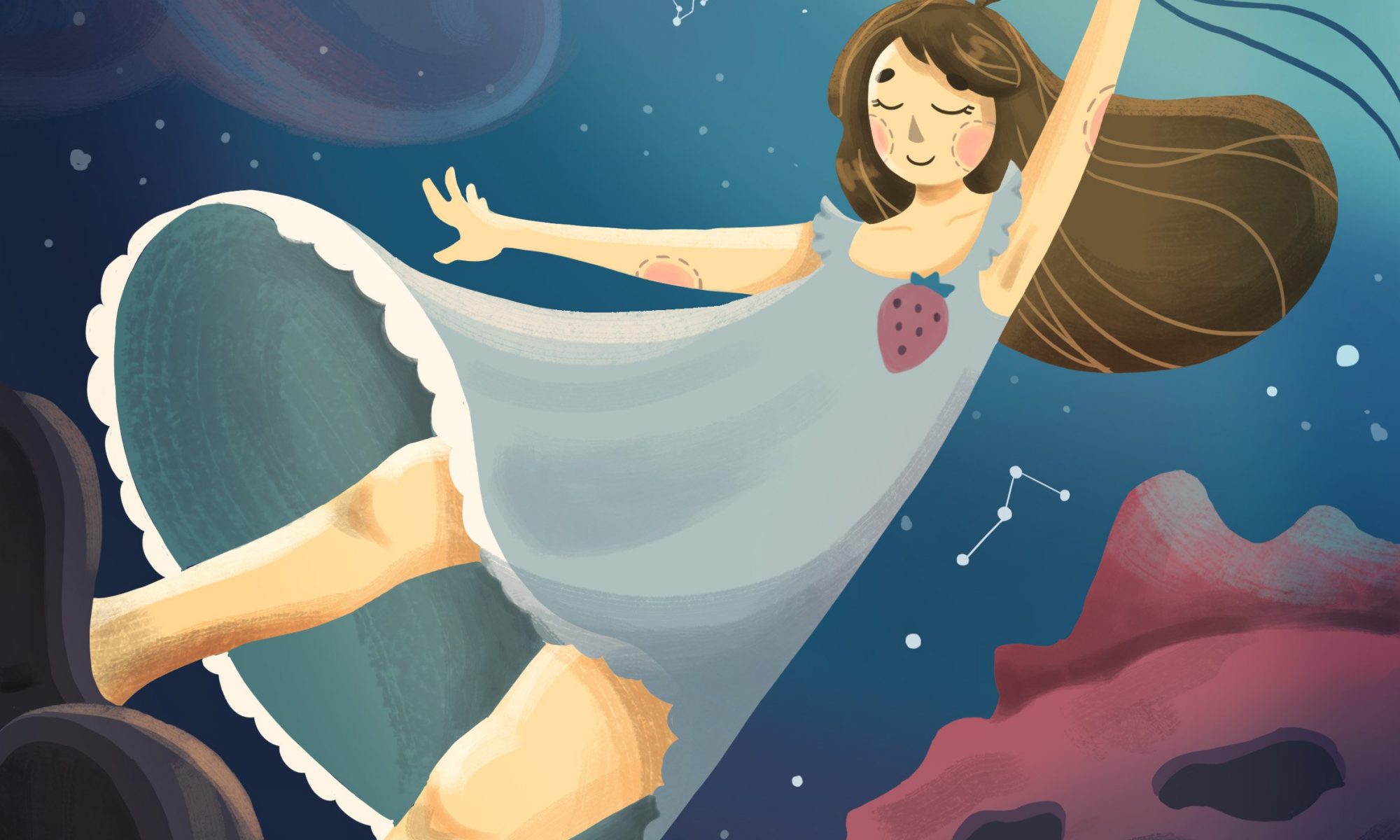
My final piece, showing me flying away carried by my mic balloons in my dreamland, traveling within the galaxy filled with my favorite things. The scene depicts how much I like to escape away from reality to a more fantasy place and travel around the world. The mic balloons represent how much I like singing. There are stars around the galaxy representing my favorite movie interstellar, cat constellations representing my favorite pet, together with watermelon and strawberry planet representing both of my favorite fruits!


[Reflection]
Overall, I really enjoyed this project very much as it allows us to have the freedom to explore ourselves, our own style and our own imagination! What I have taken away is that self-portrait doesn’t necessarily always have to be having yourself situated at the center of the piece and to combine with abstract elements. It could also be a scene of interesting composition that tells a “story” about yourself. Also, I have learned to just enjoy, have fun and sometimes go with the flow of what comes to you naturally. Since its a self-portrait, it should always reflect your own style and how you go about working with the given theme!


References (Images retrieved from)

(Self-Portrait ideas)
https://www.pinterest.com/pin/405042560235723096/
https://www.pinterest.com/pin/405042560235723012/
https://www.pinterest.com/pin/405042560235723001/
https://www.pinterest.com/pin/405042560235723024/
https://www.pinterest.com/pin/405042560235722966/
https://www.pinterest.com/pin/405042560235614255/
https://www.pinterest.com/pin/405042560235613996/

(Style and Color Scheme)
https://mei-ling7.livejournal.com/919.html

Color Palette #1288


http://fayehsu.blogspot.com/
https://www.pinterest.se/pin/447263806735039104/
http://www.diana-toledano.com/blog/2012/10/dreamy-night
https://www.pinterest.com/pin/651403533577590392/?lp=true
https://www.pinterest.fr/pin/206884176611951351/
https://www.pinterest.com/pin/434175220309828803/?lp=true
https://www.pinterest.com/pin/324892560604460904/