Month: September 2018
Quick Reflection on the Crystal Goblet
Warde equates typography, a modernist concept. Essentially she questions the necessity of typography on the printed page and how important it was that legibility and thought behind typographical choices as it creates the different dynamic for the reader. She then does a comparison between a typographer and an artist. While the former thinks more than feels, the latter feels more than thinks.
Warde argues that typography in print are like the tiny specs of detailing on a building – if there’s an error, you notice it, if not, it is seamless. She justifies this with the thought how the eyes treat type. If the eyes notice the type more than the text itself, it is bad type. In her concluding paragraph she further emphasises that being flashy is very easy, however being disciplined is not. For those who pick a book, they would rather read the text than read the typography.
Arguably, I do agree with her. There is a necessity in picking the right type face to augment a seamless reading experience. By altering the typeface in an ostentatious manner without rhyme or reason would only cause difficulty reading and distraction from the text itself. Warde argues that unless it is for advertising, the discipline of keeping typefaces as they are is rather hard.
Furthermore, her comparison of separating the artist and the designer was very apt. While artists feel the colours, form, and space; typographers think about the colours, form, and space. It becomes a mathematical and slightly formulaic approach towards this invisible art form.
Conclusively, the statement, “good type is invisible, bad type is visible”, really springs true to Warde’s argument and the study of typography had stood the test of time. In the end, it is wiser to keep thinking how is this legible instead of feeling if it is legible. Perhaps sample peer feedback on legibility and type choices are more essential in this prevailing day and age than anything else.
Why are designers not being critical or fresh?

The tagline for 2018 was A MARCH OF DESIGN.
The annual SDW brings together a collection of local and international design activities in Singapore. Organised by the DesignSingapore Council, the SDW is open to the design community, businesses, design students, public sector officers and the general public.
As one of Asia’s premier design festivals, SDW champions design thought leadership by bringing the design, business, and public policy worlds together to answer how they can intersect better to bring about needed innovation and solutions to build businesses, engage communities and enrich people’s lives. It is a hub where the best design talents and businesses from Singapore and Asia converge to be showcased to the world; and a platform where Singaporeans and visitors can experience the value of design through delightful activities.
Through SDW, the Council hopes to enhance the synergy among our design partners, and in turn boost Singapore’s profile and attractiveness as a global city for design.
In looking at the purpose of design week, I wanted to see what was the programming and mission and vision of design week.
I would like to bring two points in their mission statement.
- Through SDW, the Council hopes to enhance the synergy among our design partners, and in turn boost Singapore’s profile and attractiveness as a global city for design.
- ….SDW champions design thought leadership by bringing the design, business, and public policy worlds together to answer how they can intersect better to bring about needed innovation and solutions to build businesses, engage communities and enrich people’s lives
Examining these statements, I wanted to see if Design Singapore was helmed by designers, business owners, and public policy makers.
The head of Design Singapore, Mark Wee was an artist, designer, architect and educator
The Deputy Director, Ms Emily Ong, held positions in public policy making and was formerly an executive selling advertisements and was also a suit.
While the heads of the DesignSingapore Council are formerly from either design backgrounds, public policy, or within the field of creative innovation, it didn’t show that they were political bigwigs or did it mean anything about the programs. I still couldn’t understand why the design scene was stale. So I decided to look at the programmes that SDW present.
I will first examine the anchor event, SINGAPLURAL 2018.
Singaplural 2018 had housed several Singapore-based interior firms showcasing their commissions for the Singaplural Pavilion. Apart from the pavilion Singaplural housed master lectures by notable designers from the western hemisphere.
Their theme was “A State in Play” and it was written as :
With the theme ‘A State In Play’, SingaPlural 2018 is a celebration of the stage of work even before design begins. This is when you allow naivety to the core, and simply play, explore and experiment, unfettered by an end in mind. Are the by-products of Play accidents, failures and wastes? Or are they prototypes of ideas yet to discover their full potential and applications? In Play, there are no failed experiments, only experiments with unexpected outcomes.
I then looked at the “playful works” that the commissioned designers had conjured and one of them really got to me.
I don’t want to be too critical, but it feels like I’ve seen this before. What is creating a room that many corporations already have, a form of play.
Through this analysis, perhaps I am wrong, but maybe the problem is not that designers are not creative enough, but the idea of playing for sudden creative thunder bolts is not an accurate representation of creative process. Perhaps there needs to be a stronger link to the thought process of the designer and the various criticality that each designer have to think of before coming up with solutions to solve their “design problem”.
History of Design : Visual Communications in Illuminated Manuscripts


Origin (Elizabeth)
Different types of Manuscripts (May Thu)
Noteworthy Manuscripts (Jenson)
Evolution of Manuscripts (Felicia)
Advantages vs Disadvantages (Su Yang)
Rebus Thing
Go Figure ; )
My OSS Moodboard? Or something.
My word map is Fresh, Critical, Contrast


The visual exploration I want to undertake from the mood board is to show contrasting school of thoughts in graphic design. Some people are more inclined towards the cutesy, some people are more inclined toward the clean, and some are more inclined to the critical and I want to find a way to marry these schools. Because that is how I feel Singapore Design Week should be, showcasing different school of thoughts within graphic design.
The Tale of the 2 M’s

This is the key visual for the MONTREUX JAZZ FESTIVAL by French Illustrator Malika Favre. I think it’s captivating by the repetition of the female form and shows a playful side to the festival. Jazz is energetic and vibrant but she chose to use black and white to show the deep contrast between the silhouettes and the white space. In term of text, not much was used except for a small detail at the bottom left corner. Visually, people would think that it’s a dance festival but it illicit a different mood when the viewer realises it’s a jazz festival instead.

This is a poster promoting Metahaven’s WikiLeak’s fundraiser at art berlin contemporary 2012.
Metahaven is by Amsterdam based design/art collective that creates visual design that is subversive and deliberately breaks the convention of contemporary graphic design where things are clean and visually direct.
The design for the poster present is much more politically charged than it seems. Apart from promoting the event itself with the use of text for the details, the word Wikileaks and the Macbook’s spinning rainbow are seemingly clouded and obscured or torn out. Visually, it is very different from the usual and it makes the viewer feel curious. The use of imagery is simple although unconventional. It literally means, Wikileaks is in limbo, and the image does feel like it is “leaking”.
Comparing the two, they take very different approaches. The former being more clear-cut, fun and takes the risk of not using direct images relating to jazz but more of evoking a feeling, and the latter being more subversive, politically-charged, and questions the audience in linking the visuals mentally before reading the text. Both are very appealing but maybe not for Singapore.
Trip to the National Design Centre
Unfortunately, my phone got broken on the day of the trip and I lost the photos I took.
Personally I feel that what I encountered was various design practices over the years but they were more mainstream and commercial driven projects.
The practices present during the show were very pragmatic, with categories like fashion accessories, visual communication, architecture and environmental design, and product design. I noticed that visual clutter is being removed over the years and things became more minimalistic. It is evident when looking at fashion, when you compare the Singapore Girl in the past and the fashion of today.
Although the focus of the the Design 2025 talks about turning Singapore into a design hub that is commercially driven, there are lesser talks about critical thinking and critical design. In essence, design is seen as a tool to “design” commercially viable projects and to push innovation and commercialisation.
Effective? Who knows.
Stanley Morison
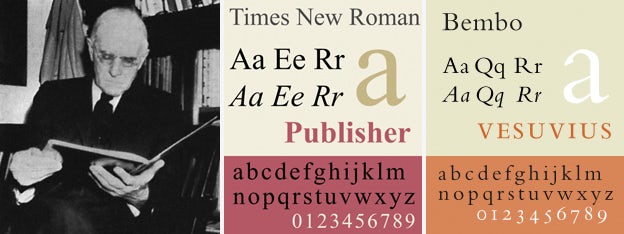
Stanley Morison was the one that designed Times New Roman, the font that becomes a practical default for many systems. While it looks dated and ugly, it is very practical and versatile. This typeface allows easy reading in both web and print because of its small serifs that makes it easier to read.

HyperEssay – Zul Mahmod
Zul Mahmod is noted as one of Singapore’s leading sound artist. As a sound artist, Zul has been interested in sound-media with a mix of interdisciplinary and experimental approaches. He is known for integrating 3D forms such as his copper pipe installations that are massive and are visually arresting when looked at.
The work that I am examining is a work that is particularly different from the rest of Zul’s repertoire. While many of his soundscapes are made pre-recorded or programmed to sound the same, Dialog is a work that is influenced by the people that are present in the vicinity. The work changes with the audience, with every audience transmitting sound that moves through the Esplanade tunnel. It is essentially like a live version of the telephone game where the sound begins to be displaced post-transmission. As such, Dialog is a work that showcases interactive media due to its interactive nature because the work requires audience response and the results are not predetermined by the artist
When discussing the work of Nam June Paik to illustrate the ideas of interactivity, his work Magnet TV requires the viewer to move the magnet around the TV. Nam June Paik’s body of work, although backs his claim as the “father of video art” with his work – Magnet TV, the breakthrough of it is also due to the incorporation of requiring audience participation. Similarly, Dialog displaces the audiences’ senses by providing and aural and visual intervention at the Esplanade Tunnel. Using the echoey environment of the tunnel, Zul programmes the work to take in sound made by the surroundings to create sound through solenoids and copper pipes. At a default setting, the sound created by the echo already interacts with the artwork. With the added sound by viewers – through their involuntary steps (across the tunnel), or voluntary sounds, the sound changes, disrupting the default state of the work. Conclusively, Dialog by Zul Mahmod fulfils this criterion in which it is a form of interactive art due to its requirement of audience interaction.
Apart from the requirement for audience interaction, another important point to determine if an artwork is a form of interactive media is that it should be unpredictable. As a form of cybernetics, Zul programmed the work to create sound on its own while interacting with the surroundings. It is similar to how Wiener (1954) describes Cybernetics as a term “…the study of messages as a means of controlling machinery and society, the development of computing machines and other such automata, certain reflections upon psychology and the nervous system”. However, apart from it being self-regulatory, Dialog is also a form of Behaviorist Art. As Ascott (1966) defines behaviorist art as “a retroactive process of human involvement, in which the artefact[sic] functions as both matrix and catalyst.” Dialog provides feedback to the human involvement it receives. It develops the sound as a matrix but is also a catalyst as its site specific nature orders the viewer to walk through the work, creating involuntary walking sounds that react with the work itself. It also reacts with itself.
To build up on the previous point. While Dialog is in its default state, predetermined, the experience evoked per audience provides an independent output. This creates a experience which Ascott (1966) derives as “more variety into the system and leads to more variety in the output.”
If we compared to work to the sound art of John Cage, it is essentially very similar. While John Cage decided on the types of sounds, textures for Variations V, and essentially the work was an interaction of sound and movement with programmed staged lightings to trigger the dancers to move to create the sound, Zul had programmed the solenoids, microcontrollers and copper pipes to produce sound. The reactivity is also similar to Robert Rashchenberg’s Soundings which produces light from pitch of voice. In essence, the similarity in nature of the artworks highlights the discipline of which Zul Mahmod’s Dialog is indeed, an interactive work since it is reactive to an individuals experience and the input given to the work by the audience produces variable output.
Conclusively, we can determine the Zul Mahmod’s Dialog is a form of Interactive Media through the use of interactivity. By producing sound and being on the genre of sound art, Zul expands his repertoire by adding an interactive element to his work.
Following Dialog in 2016, Zul had also made another interactive work, SONICconversation. Similar to Dialog, the work interacts with the acoustics of the environment, allowing the audience to play a part in the work. In nature, Zul’s work at the default state already produces sound that becomes echoed for the work itself to generate a response. While arguable that Dialog is not an interactive work as it is already predetermined by its default state, it however is still interactive as the different audience interaction then becomes another layer of sound for the cybernetic work to react to. Due to the fact that Dialog requires and audience feedback and that the work itself is not predetermined, thus it is a form of interactive media.
References :
- Smith, R. (2006, January 31). Nam June Paik, 73, Dies; Pioneer of Video Art Whose Work Broke Cultural Barriers. Retrieved from https://www.nytimes.com/2006/01/31/arts/design/nam-june-paik-73-dies-pioneer-of-video-art-whose-work-broke.html
- Media Art Net. (n.d.). Media Art Net | Cage, John: Variations V. Retrieved from http://www.medienkunstnetz.de/works/variations-v/
- Norbert Wiener, “Cybernetics in History,” 1954, Multimedia: From Wagner to Virtual Reality
- Roy Ascott, “Behavioral Art and the Cybernetic Vision,” 1966, Multimedia: From Wagner to Virtual Reality