Author: Jenson Gabriel Tan
I like to research on textiles, fashion, gender and fiction.
Your Manifesto Is Semi-Irrelevant
“DO WHAT YOU NEED TO DO, REMEMBER THAT EVERY ACTION HAS CONSEQUENCES.”
In response to the post-modernist theory of designing as critique, as compared to the modernist design of functionalism.
Every work that you do will have a consequence.
Work only when you know what you are working for.
Remember that the form and function all denotes a certain semiotic and code.
Every piece of work is subjected to criticism and the critique should be internalised because that is the consequence from their critique.
All work produced have to have relevance if not it is a waste of space, time, resources.
DO NOT MAKE FOR THE SAKE OF MAKING.
DO NOT USE A MEDIUM FOR THE SAKE OF USING A MEDIUM.
DO NOT USE GIMMICKS BECAUSE THEY ARE ACTIONS WITH NO MEANING.
Always remember to do what you need to do and what is necessary around you, otherwise, don’t do it at all, because it is a waste of space, time resources with loaded consequences.
Post Presentation Essay.
In the 1930s to 1960s, during the period of World War II till its end, the design of products amidst the warring states in Europe had created a great change on their respective treatment towards product and design. For countries that were affected by the war, their design had, in essence, been affected by their political influences or economic status. A prime example would be the Germans. During the rule of Hitler, the Bauhaus school had to be closed in 1933 due to the disagreements of the Bauhaus’ internationalist approach and decision to remain apolitical to the Nazis. Post-World War II, the Ulm School was started to research on new methods of production and social responsibility in design. It was also successful thanks to the implementation of the Marshall plan by the United States of America. While this is a prime example of the political intervention to design, I will be examining the Europe that had little to even no involvement in the war – the Scandinavians.
Referring to specifically, Denmark, Finland, Sweden, Norway, and Iceland. While Norway and Denmark had been invaded by Germany, Sweden had managed to remove herself from most of the action through strict diplomacy. Although it is noted that the Scandinavians had little action during the war and were mainly co-operative during this period, the main crux of their design ethos laid with their surroundings. With 3 months of summer and 9 months of cold winter, limited resources, and their strive for democratic design, the Scandinavians had produced a unique characteristic of designed products to reflect their characteristics and environment.

The cold climate in the Nordic countries proved that they required another source of warmth. The Danish concept of ‘hygge’ which refers to the feelings of ‘coziness’ and ‘warmth’ was heavily implied throughout the designs of the region. In order to achieve this feeling, a lot of natural materials like wood and stone were used. Products were designed to look like natural objects. In Figure 1., the glass vase was constructed to reflect the image of an apple. The underlyingnaturalism of these products create a pseudo-natural effect on interiors when used, augmenting the concept of ‘hygge’. Other examples would be the use of wood.
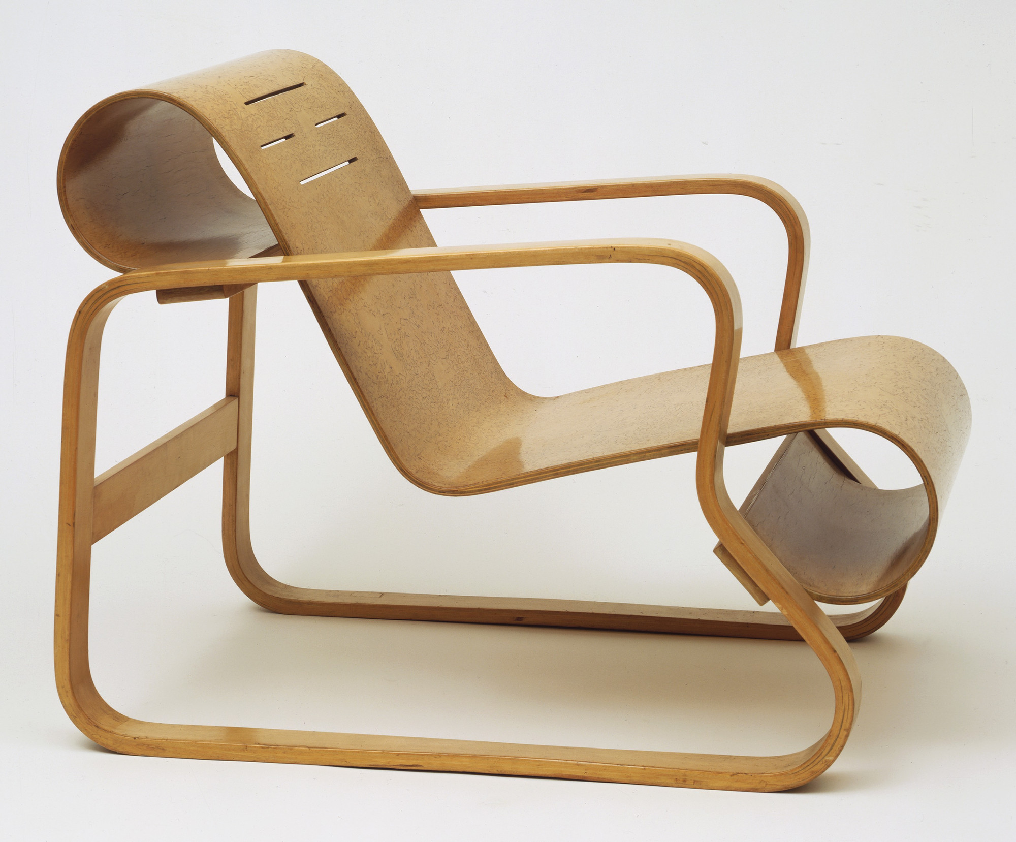
The chair in Figure 2. is a prime example of the application of ‘hygge’ despite having a modernist minimalist design. The wood is bent in a curvilinear manner as opposed to angular bends. The chair provides a warm ‘feeling’ through the use of material and form, reinforcing the concept of ‘hygge’ in a non-naturalistic manner (as opposed to the Apple Vase in Figure 1.). Another example of the warmth in the design is the curves emulating the human physique, providing the imprint of human in the design
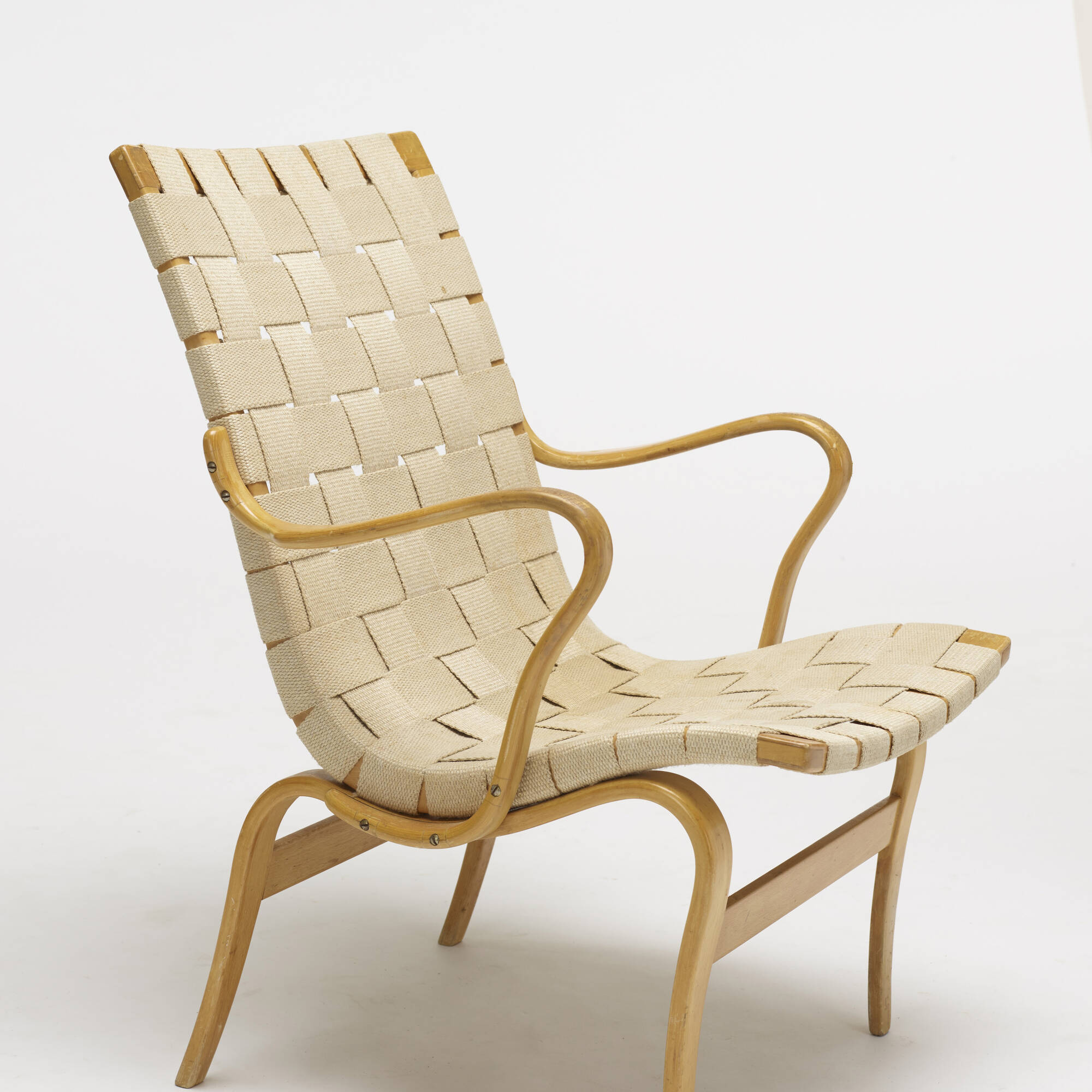

Due to their geographic isolation, the Scandinavians had to learn how to marry their skills in craftsmanship and with their surrounding resources. As a result of this lack of resources, a serious need for functionalism was adopted. However, in the previous paragraphs, it is also noted that the use of ‘hygge’ was also adopted through the functionalism. An example of this was the lamp. Yki Nummi’s Kuplat Lamp was anelegant lamp that emulated a bubble. This design was showed that the beauty of something so simple did not detract from its inherent function – the lamp as asource of light and illumination. Another good example of this skilled craftsmanship would be the chair in Figure 5. The chair is essentially made with one piece of wood, demonstrating the skilled craftsmanship and smart use of limited resources, yet the smart use of wood reinforced the idea of ‘hygge’, or the feeling of warmth and coziness.
The Scandinavians post-war, had a steady rise in economy and industry. There was the rise of the working class, creating a starker inequality level within the region. In 1943, Ingvar Kamprad started the ball rolling by creating his mail-order sales company, IKEA which would soon grow into the furniture chain. In 1959, IKEA started its first flat package design. The democratic design of IKEA furniture was fuelled by the belief that the not as well-off should be given the same opportunities. Through this, we can understand that the Scandinavians believed in opportunities for all and even in their interior and product design, they ensured that everyone could experience the same feelings ‘hygge’ in their lives.
Consequently, the Scandinavians were well-aware that they were unique in their design methodology. Being situated in a unique continent, they managed to work with their cold environment to create an intrinsic, psychological experience of warmth in their design. Through naturalism and the thoughts and concepts of ‘hygge’ the Scandinavians managed to push through by experimenting on forms and materials. Their leave-no-one-behind mentality was also emphasised with modular designs and flat packaging design through IKEA. In the end, despite their lack of resources except for their environment, they managed to pull through and create objects that were both functional and possessing the spirit of ‘hygge’ unlike the Bauhaus school of thought which aimed for functionalism, and believed in utilitarian design.
References:
[Digital image]. (n.d.). Retrieved November 3, 2018, from https://static3.businessinsider.com/image/5b59f31be361c03c008b45ea-1200/in-the-1960s-ikea-discovered-that-it-could-make-tables-more-affordable-by-producing-them-from-particle-board-a-materialmade-from-wood-chips.jpg
Eyþórsdóttir, K. S. (2011, June 13). The Story Of Scandinavian Design: Combining Function and Aesthetics. Retrieved November 11, 2018, from https://www.smashingmagazine.com/2011/06/the-story-of-scandinavian-design-combining-function-and-aesthetics/
Mjøset, L. (2000, February 15). The Nordic Economies 1945-1980 – ARENA Centre for European Studies. Retrieved from https://www.sv.uio.no/arena/english/research/publications/arena-working-papers/1994-2000/2000/wp00_6.htm#topp**
my custom DROPCAP!

Class participation

Bauhaus Inspi –


So I tried to make a bauhaus typeface of my name and an simple bauhaus-ish Kandinsky-ish poster.
To be honest, I think that a lot of design in Singapore like the whole minimalist idea? A lot of shapes, a lot of lines and a lot of block colours.
It’s very vexing!
At this point of my research, I’m a bit vexed. I resorted to reading a particular book for inspiration. The book is called “flows and counterflows globalisation in contemporary art” and it talks about contemporary art that is affected by globalisation. In the first chapter, Art and Nomad, it was described that there were two forms of art that was influenced by the process of globalisation: the ones that work around the globalised world through ease of travel, and the ones that work within the globalised world through the ease of import and export. I looked towards contemporary art because I was struggling looking for a visual representation on the idea of the globalised world.

I was drawn to the Storage Piece by Haegue Yang that examined the commodification of objects within art and Walead Beshty’s large FEDex sculptures that showed the effect of objects traversing the globe via courier services.
Moving forward, while thinking about these fragilities, I had to remind myself that despite all globalisations, I needed to stay true to my idea of pushing trade within a globalised framework. Soooo I looked at trade show designs to see what people did for trade shows.
![]()
![]()

The last 3 showcases the converging of ideas and shapes. In terms of visual representation, I want to show the traversing ideas to Singapore for Design Week, making it both literal and figurative.
You are lonely because you only see money – My Haiku
Quick Reflection on the Crystal Goblet
Warde equates typography, a modernist concept. Essentially she questions the necessity of typography on the printed page and how important it was that legibility and thought behind typographical choices as it creates the different dynamic for the reader. She then does a comparison between a typographer and an artist. While the former thinks more than feels, the latter feels more than thinks.
Warde argues that typography in print are like the tiny specs of detailing on a building – if there’s an error, you notice it, if not, it is seamless. She justifies this with the thought how the eyes treat type. If the eyes notice the type more than the text itself, it is bad type. In her concluding paragraph she further emphasises that being flashy is very easy, however being disciplined is not. For those who pick a book, they would rather read the text than read the typography.
Arguably, I do agree with her. There is a necessity in picking the right type face to augment a seamless reading experience. By altering the typeface in an ostentatious manner without rhyme or reason would only cause difficulty reading and distraction from the text itself. Warde argues that unless it is for advertising, the discipline of keeping typefaces as they are is rather hard.
Furthermore, her comparison of separating the artist and the designer was very apt. While artists feel the colours, form, and space; typographers think about the colours, form, and space. It becomes a mathematical and slightly formulaic approach towards this invisible art form.
Conclusively, the statement, “good type is invisible, bad type is visible”, really springs true to Warde’s argument and the study of typography had stood the test of time. In the end, it is wiser to keep thinking how is this legible instead of feeling if it is legible. Perhaps sample peer feedback on legibility and type choices are more essential in this prevailing day and age than anything else.
Why are designers not being critical or fresh?

The tagline for 2018 was A MARCH OF DESIGN.
The annual SDW brings together a collection of local and international design activities in Singapore. Organised by the DesignSingapore Council, the SDW is open to the design community, businesses, design students, public sector officers and the general public.
As one of Asia’s premier design festivals, SDW champions design thought leadership by bringing the design, business, and public policy worlds together to answer how they can intersect better to bring about needed innovation and solutions to build businesses, engage communities and enrich people’s lives. It is a hub where the best design talents and businesses from Singapore and Asia converge to be showcased to the world; and a platform where Singaporeans and visitors can experience the value of design through delightful activities.
Through SDW, the Council hopes to enhance the synergy among our design partners, and in turn boost Singapore’s profile and attractiveness as a global city for design.
In looking at the purpose of design week, I wanted to see what was the programming and mission and vision of design week.
I would like to bring two points in their mission statement.
- Through SDW, the Council hopes to enhance the synergy among our design partners, and in turn boost Singapore’s profile and attractiveness as a global city for design.
- ….SDW champions design thought leadership by bringing the design, business, and public policy worlds together to answer how they can intersect better to bring about needed innovation and solutions to build businesses, engage communities and enrich people’s lives
Examining these statements, I wanted to see if Design Singapore was helmed by designers, business owners, and public policy makers.
The head of Design Singapore, Mark Wee was an artist, designer, architect and educator
The Deputy Director, Ms Emily Ong, held positions in public policy making and was formerly an executive selling advertisements and was also a suit.
While the heads of the DesignSingapore Council are formerly from either design backgrounds, public policy, or within the field of creative innovation, it didn’t show that they were political bigwigs or did it mean anything about the programs. I still couldn’t understand why the design scene was stale. So I decided to look at the programmes that SDW present.
I will first examine the anchor event, SINGAPLURAL 2018.
Singaplural 2018 had housed several Singapore-based interior firms showcasing their commissions for the Singaplural Pavilion. Apart from the pavilion Singaplural housed master lectures by notable designers from the western hemisphere.
Their theme was “A State in Play” and it was written as :
With the theme ‘A State In Play’, SingaPlural 2018 is a celebration of the stage of work even before design begins. This is when you allow naivety to the core, and simply play, explore and experiment, unfettered by an end in mind. Are the by-products of Play accidents, failures and wastes? Or are they prototypes of ideas yet to discover their full potential and applications? In Play, there are no failed experiments, only experiments with unexpected outcomes.
I then looked at the “playful works” that the commissioned designers had conjured and one of them really got to me.
I don’t want to be too critical, but it feels like I’ve seen this before. What is creating a room that many corporations already have, a form of play.
Through this analysis, perhaps I am wrong, but maybe the problem is not that designers are not creative enough, but the idea of playing for sudden creative thunder bolts is not an accurate representation of creative process. Perhaps there needs to be a stronger link to the thought process of the designer and the various criticality that each designer have to think of before coming up with solutions to solve their “design problem”.