The Pre-Seminar Questions

Dialog by Zul Mahmod

Zul Mahmod creates and codes a timely sequence of solenoids hitting on copper pipes of different length and thickness to create a sound. Being a site specific installation, Zul confronts the audience in a long underground passageway towards the Esplanade. The audience is then confront on their midway journey by the sound they hear from the artworks while on a visual escapade with the visible artwork itself.

I feel that the work takes advantage of it’s site, where the potential audience are just transiting from a point to another, and using the sound to surprise the audience on their transit. While the intention of the artwork is very intriguing, and the visual aesthetics of the complex pipeline is pleasing, the artwork seems to be weak in perpetrating the audience to confront the artist’s intention between sight and sound.

Peace Can Be Realized Even Without Order – TeamLAB

The work is an interactive art during the Singapore Biennale 2013. The viewer is to enter a room where it is faced with multiple holograms of feudal Japanese musicians. The viewer’s movements would trigger the music by these holograms to stop and due to the capacity of viewers, it starts to trigger a cacophony. However, this chaos is soon harmonious after awhile should the viewer stay still or leave.

The work is abstracted from the Awa Dance Festival in Japan . It contextualised contemporarily by noting to help viewers feel that they are part of the installation and that they can feel peace without order. As in the festival, individual musicians would play in their own rhythm but subconsciously matches to other groups as they congregate in the town. Unfortunately, the work fails by perpetuating a set of rules to allow the artwork to reach consonance again.

The Seminar Questions!

What is sound?

I suppose upon reading Neuhaus’ article, sound itself is movement of waves in the air which becomes audible to an individual. Sound when composed in a lyrical sense would be contextualised as “music”, which with the workings of time signatures and proper rhythmic structure and symmetry bar structures would also be known as “a different way to tell time”. Sound art in its entirety form a different category on it’s own. It separates itself from music, losing most of it’s integral rules and constructs itself into anything that could make sound, or not, that is placed into the context of fine art.

How has it been use in culture and society?

The idea of sound has also been used culturally with phonographs to record and convey messages across time and space. The act of recording on a phonograph presents the idea of the background or surface noise, which Adorno relates the phenomenon to cinematic use known as “hear-strip”, the buzzing sound during the film recording of silence. DeMarinis’ article further states that as time goes, popular music begins to fill the void of silence with sound in fear of confronting it.

Likewise, various traditional cultures have continued the idea of “background noise”, such as in Carnatic Indian music, the tambura is used to generate a drone, a continuous base that carries the traditional art form through silences and movements. The Western classical equivalent would be the bass line which most famously, the Alberti bass would represent.

What makes it an art?

Sound art under the context of “fine art” transcends the notion of craftsmanship and ventures into an abstracted territory. As Neuhaus states that most of the time, sound art is not necessarily about sound, or about art itself. The comparison of creating a steel sculpture that generates sound, that is repurposed as sound art would only mean that any work of art producing a sound would be generalised as sound art.

While definitions are not entirely necessary, Neuhaus corrects the reader by informing that works of art that makes sound are mostly considered as “sound art” as a secondary label. Therefore, making it “an art” through association with it’s original intent.

How does advancement in audio technology affect our sense?

With the advancement of technology, in recordings and film, audiences require a void of silence to be filled. As mentioned previously, the fear of confronting silence is mediated with a buzzing sound known as the “hear-strip”

Neuhaus explains in 2000 that sound could be shaped to infinite possibilities, going beyond music. In retrospect, DeMarinis observes back in 1997 that artists like John Cage have gone as far as to use silence, as a form of reflection of the acoustics, causing an incredible tick to the listeners mentally, thus perpetuating the notion that the advancement in audio technology causes us to be unable to accept silence.


Inspiring…

I found some abstract artworks I really like and used them as an inspiration to some of my works.

Untitled. 1960. Oil on canvas. opening: 156.4 x 156.6 cm. (61 9/16 x 61 5/8 in.). Museum purchase, Fowler McCormick, Class of 1921, Fund. y1987-47. Photo: Bruce M. White

I liked Ad Reinhart’s idea of similar tonality. In his work, he played with the colour black, processing blacks of various tones in a 3 x 3 square to question on the idea of absolutes.

Mark Rothko, Untitled. From the Gugenheim

I also like Mark Rothko’s work. Seeing a Rothko piece in South Korea, I was in awe by the beauty of his use of blending and tones. They seemed really soft and really smooth and evoked a slow, calm effect.

Gerhard Richter, from his website

Gerhard Richter’s work look like scrapped paintings. His aluminium pieces create a nice “wipe” effect to the panel.

Autumn Rhythm by Jackson Pollock from his website

Jackson Pollock’s beautiful work might look like a mess after eating McDonald’s, but the vivid strokes show energy and tells a fierce, fiery outburst, to the audience.

Foundation 4D : Project 2

I brained stormed with a few words like, necessity and salvation.

When I thought of necessity, I thought of the idea of Singaporean queuing, and I created a draft of Singapore Pools and Hawker Centre queues.

However, I thought the idea carried a connotational message of negativity as the idea of Singapore’s queuing culture was connoted to be negative “kiasuism” & “kiasism”

I also thought of salvation and picnic. But I thought Googling for “People looking up to the sky” was more appropriate.

It created a more optimistic message and the denotational idea of looking up in the sky was very apparent.


Processing… Part 3

I have done a few of the emotions linked with songs and gave them a physical manifestation in the form of mark making :

Emotion : Jealousy

Songs I tagged it to : SZA – Supermodel, Tricky ft Fifi Rong – If Only I knew 

Ideas I wanted to portray : I wanted to portray the idea of having two sides, wanting to become each other. Therefore the thick bold line or the patches are in conflict with each other, creating a “war” between two places. The concept of jealousy causes conflict and the depiction of desire to be another being.

Emotion : Mortification

Songs I tagged it to : Dmitri Shoshtakovich – Cello Concerto No. 1 in E-Major

Ideas I wanted to portray : I wanted to portray the idea of incompletion, coupled with shock and irregularity. I wanted to show that mortification is more than distress and pain. It was the idea of when you are in shock, there is a need for closure. Therefore despite the chaos, there are white our spots or places which requires insertion.

Emotion : Shame

Songs I tagged it to : Rina Sawayama – Cyber Stockholm Syndrome , Robyn – Dancin’ on my own

Ideas I wanted to portray : I layered sparse dots against a very hazy background to portray the idea of aloneness despite being in a large group. I wanted to show the idea of social shame and the idea of embarrassment for not being able to fit into the canon of others. Is it really a shame to not be able to fit in? Or is it better to stand out on your own.

Emotion : Pride

Songs I tagged it to : Bedrich Smetana – Moldau, No. 2 Vltava, Johanne Brahms – Hungarian Dance (Pick One) 

The Ideas I wanted to portray : I wanted to portray the idea of standing still against the current, despite a large opposing body, pride comes before you fall. The idea of nationalism or self-pride was what I picked out from the songs and I wanted to show the idea of conformity versus deviance, how civil or international destruction comes due to the pride of politics.

Emotion : Astonishment

Songs that I tagged it to : Maurice Ravel – Piano Concerto No. 1 

The idea I wanted to portray was to show that astonishment was just “great surprise”. It doesn’t mean it would be positive or negative. I wanted to use large big strokes to show the negative energy of astonishment, showing grave surprise, like disbelief. While I wanted the smaller splatter to show the good, positive surprise, like the ‘yay’ astonishment.

Emotion : Lust

Songs that I tagged it to : STWO – Virgo, Taku – Down For You

Ideas that I wanted to portray : Lust was depicted to have to aspects. One, was to show that lust was sensual and physical. The other was the monotony of lust. The idea of lust being a repetitive action with no outcome.

That is all!

Processing… Part 2

I did some permutations but it made me very frustrated because I couldn’t get what I want. What I did was visualise an image like those visualisers you see on Windows Media Player. Just that it worked with a song tagged to an emotion.

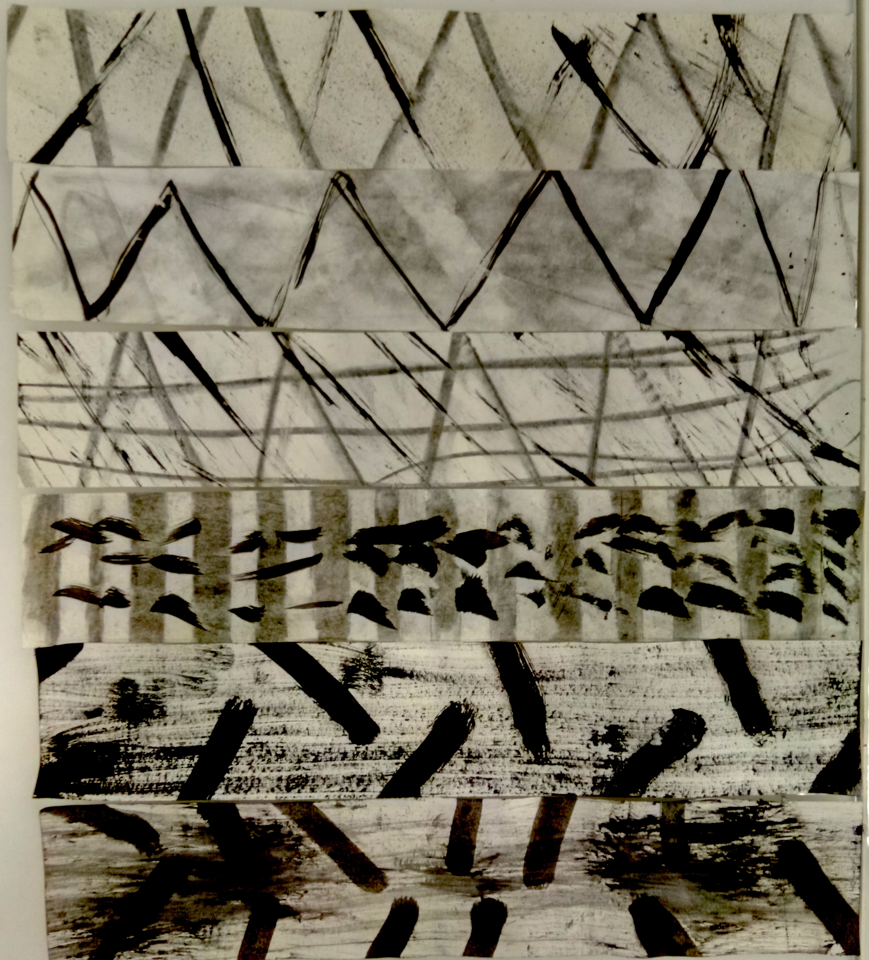
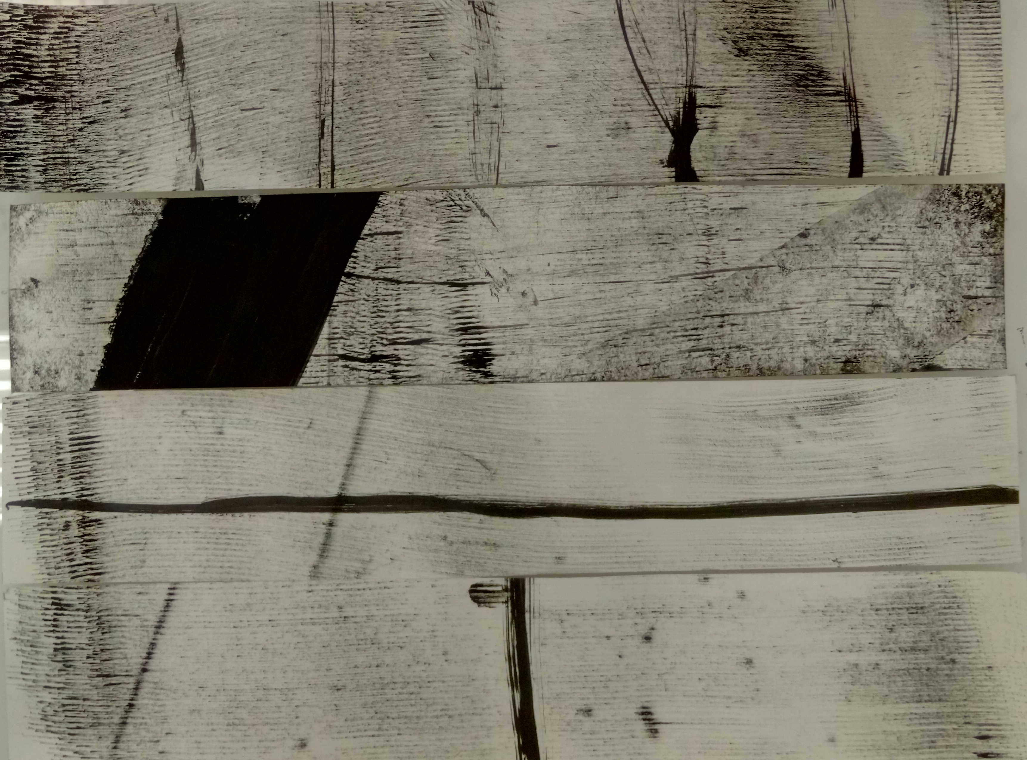
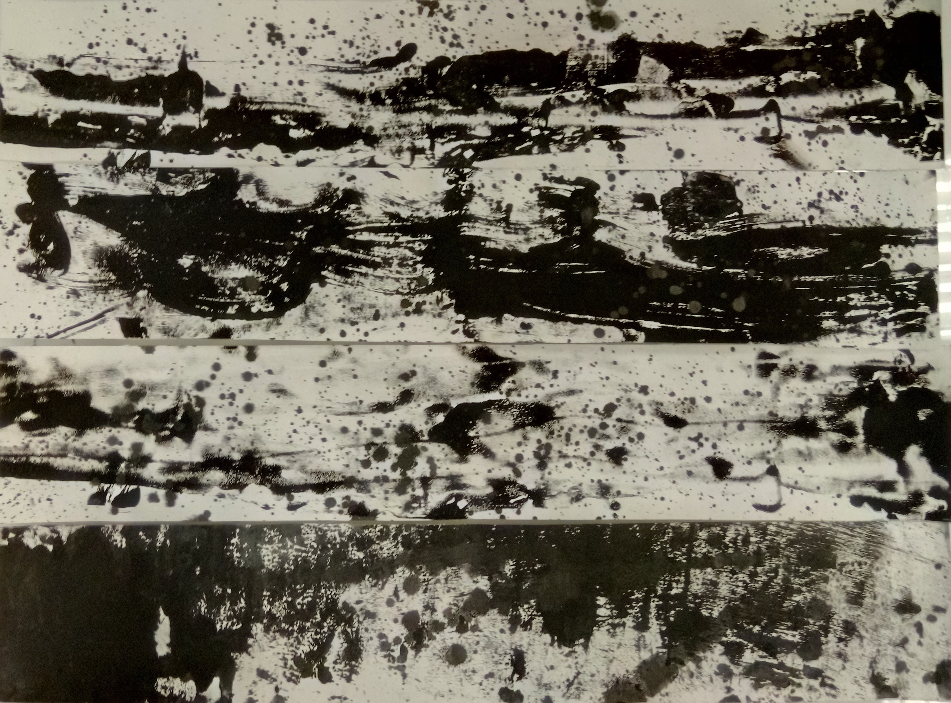
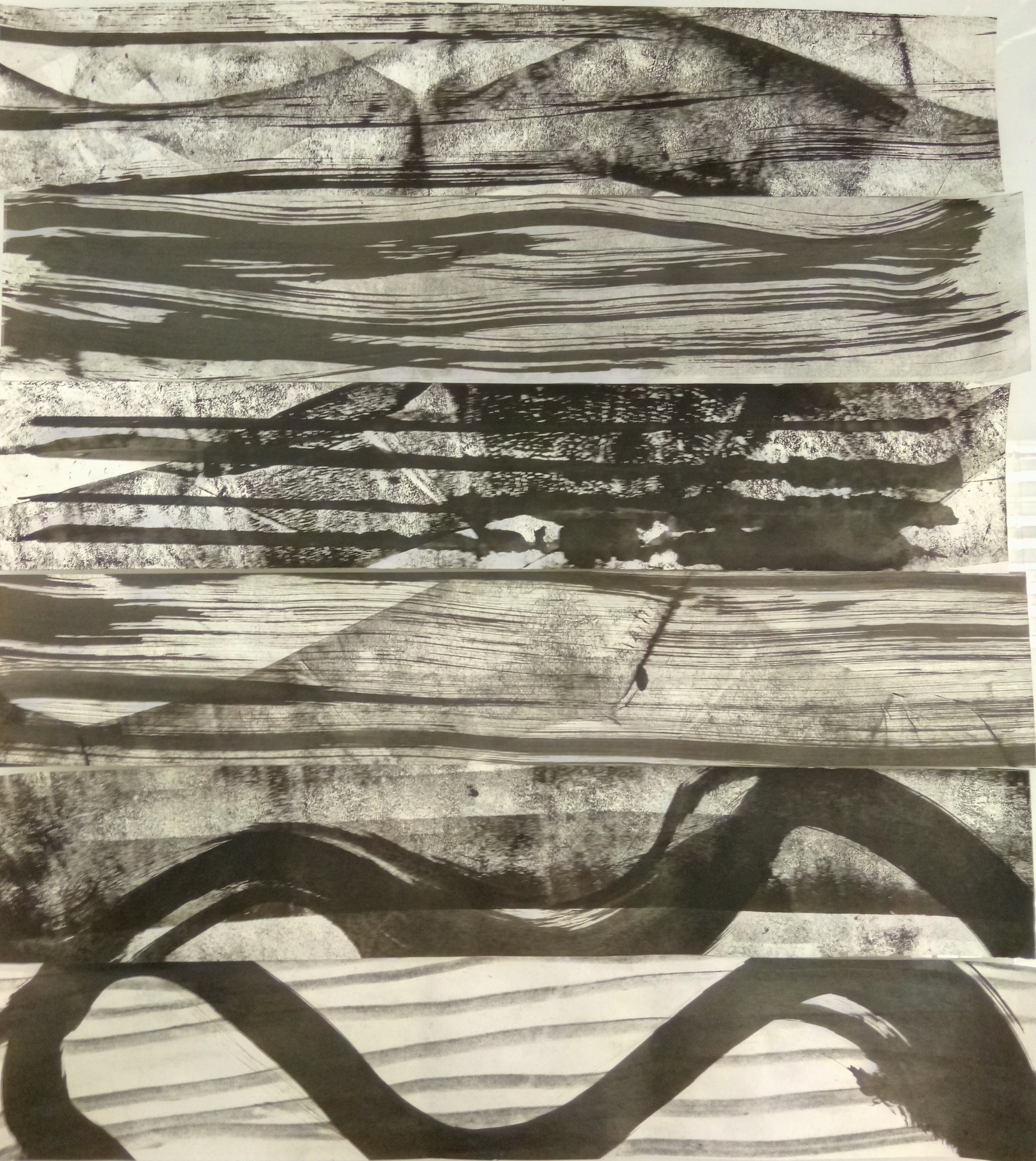
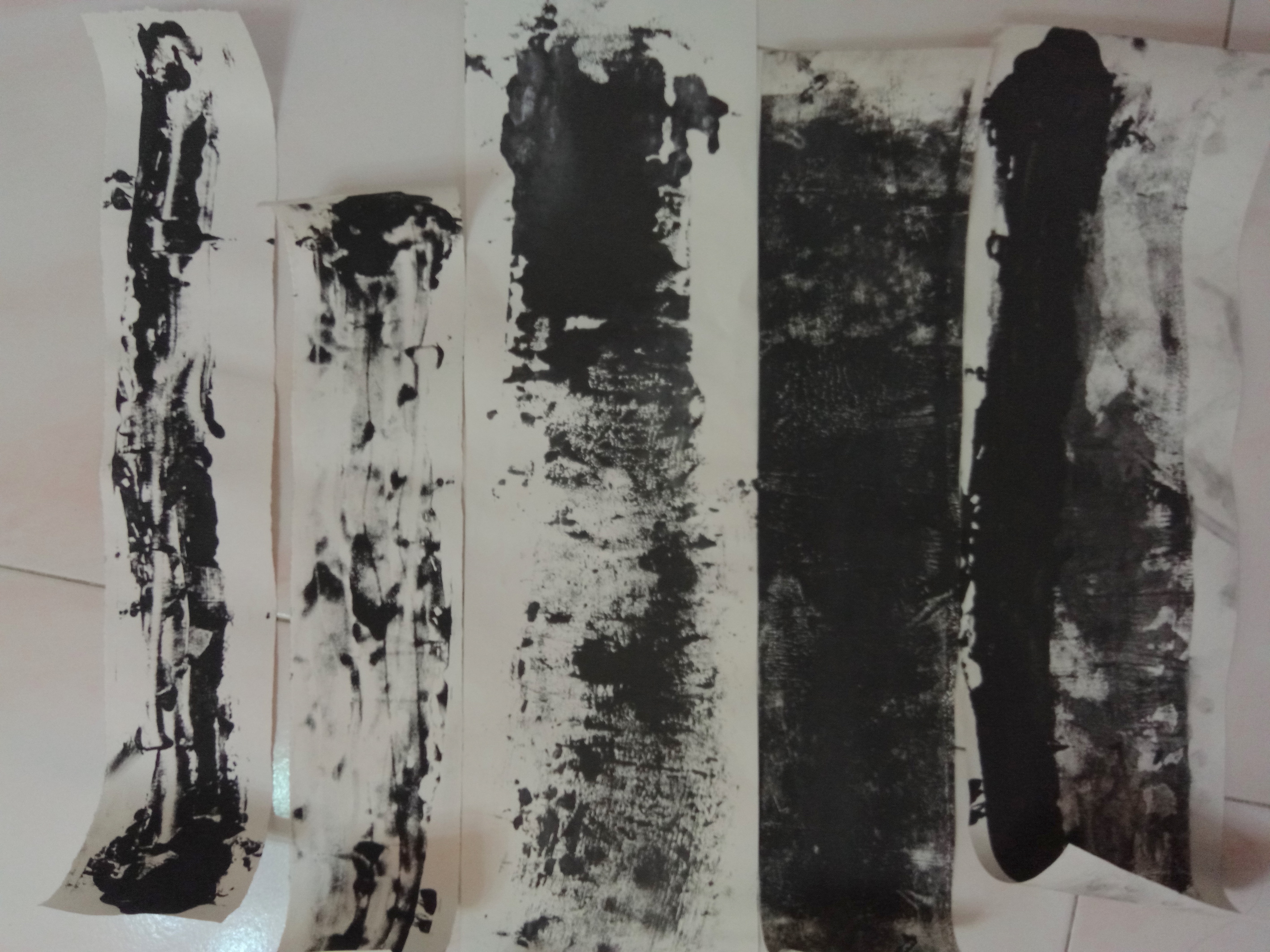
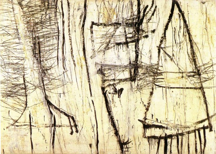
Exhibit A, I tried using the roller to give a swishing effect to show sensuality and intertwining for “lust”. But it was only concentrated on the side, it didn’t roll nicely, but the effect was still intended, I could still see a soft intertwining effect. Secondly, I tried to layer another feeling on top of the feeling of sensuality. This was because I felt that a singular stroke or line was not enough to represent the complexity of emotions, therefore I added more rigid, repetitive lines on top of the swishes. I think that it achieved an intended effect, but there is more to work on in terms of finding the right layer.
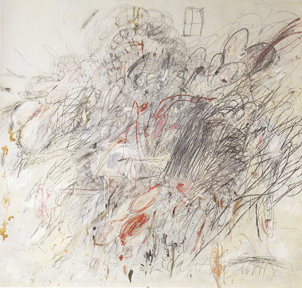
Another issue I had was the eventual cropping of the larger lines I made. In the end, the lines have to narrowed down and be framed within the guide of 380 x 72. However, for some lines it worked, it worked in which the cropping augmented the emotions that I was portraying. Like wise, for others, a large significant portion of the emotions were cut off and it needed to be re-layered with another feeling to further bring out the emotion.

This was eventually resolved. Nothing much rocket science smile

Processing… Part 1

So, I did a few experimentations with various mediums and felt there were very similar lines created by different objects. Some of my lines ended up like this :  This line gave a more rejuvenating look, and it was very lively and very exciting. It was made with a toothbrush.This line was made with a nail in a similar fashion of witches “scrying” for people on a map with a crystal. It gave more pendular effect and the lines varied in weight. Very large spaces the lines feel very cold, but wise. If you get what I’m saying.

This line was made with charcoal and then smudging the charcoal to create implied lines. The lines are very soft and it flakes due to the softness of the paper. I like how it gives a very subtle textured look. But I need to work on smudging. It looks very forced.

These black lines were made after both, rolling paint on a piece of paper and plastering another on top, or putting it a piece of paper on top of a piece with wet Chinese ink. I think the ones with paint gives a very rugged edged but it tapers to a soft sensuality. Due to the plastering of the two pieces of paper together, it ends up having a softer, liquidised look as seen in the second piece from the left.

Reflection on “Rhetoric of the Image”

Barthes’ Rhetoric of the Image aimed to investigate the necessity of context within an image. Whether analogical representation, or a context is required to interpret images and if the interpretation of images could be decoded using a systematic detailing list of practical, national, cultural, aesthetics to be decoded.

Some key terms and concepts introduced was the idea of the signifieds (meaning) and signifiers (image) and how the idea of semiotics is brought upon via the denotational and connotational. Another concept that struck me was the idea of drawings vs photographs and how the relationship of signs contrasted between these two mediums. Expanding further, Barthes also explain how film is no longer a subset medium of photography but a completely different set of signs.

I do agree as the approach taken for image decoding is dependent on the signs and symbols and how the signified is relative to the signifier. Another concept which I agree would be the the choice of mediums. As stated, there is no drawing without style, as such the stylistic interference would already have a connotation within itself. As such, photographs are purer in providing signs and symbols as opposed to drawing, however, with photography comes with manmade interventions like framing.

In relation to the article by Barthes, the denoted image of the print ad is that of a simple burger, namely the BigMac. However, the use of text has transformed the connotations. The rhetoric used challenges the reader on their toughness to tackle the burger. While meat is usually contextualised with masculinity, the idea of the rhetoric is to influence audience to consume the BigMac to prove their own masculinity. This breakdown would have been impossible without the use of text to supplement the advertisement and thus changing the connoted message within the denoted image of the burger.

This breakdown on the connoted message provided by the text used in the advertisement is further augmented by Barthes’ idea of identifying the message through a list of practical, national, cultural, aesthetics.

Practically, a burger is just an item for consumption and sustenance. However the added context of McDonalds’ provides the idea of fast food and a fast paced consumption rate at an affordable price range. This is further pushed through with the fact that McDonalds’ stemmed from American values in which consumerism, commercialism and capitalism thrives on. The cultural context is then put into play when the rhetoric is used to influence buyers to purchase. The cultural association of beef to masculinity and the idea of the challenging the readers’ manliness is put into play. Furthermore, in terms of aesthetics, the photograph was framed to be in a luxurious red bed setting, which provides an idea of luxury and seduction, thus using human intervention (framing and setting) to give a connoted message as well.

Inspiration for My Strange Encounter

Taken from Q-TA’s website. Click here for website.

Japanese Artist Q-TA uses multiple images to construct images for his clients. These images fit his clients such as Majolica Majorca, and ISETAN JP by demonstrating a quirky and whimsical visual language for their brand. His work captivates through usage of human figures and distortion of form by combining it with elements and colours that fit his intended mood. He mainly distorts perception through the enlarging of his figures and displacing them with a cosmic background or a warped landscape and uses a centred composition to capture attention.

Many of his other works have a fashion focus and relates to the audience by putting the figure at the foreground, creating a ‘breaking the fourth wall” effect.

Work by Amsyar Ashaary. Click Here for Portfolio.

Amsyar Ashaary captivates by storytelling through collages. He uses vintage character images, dystopian landscapes with vector graphics to create fresh settings, in which he distorts the viewers perception of time and place. He also uses a mainly cool colours like purple and cyan that are pleasing to the eye and does not force attention to the audience. While most collage artists would work with found images, Amsyar Ashaary does not hesitate to create his own graphics to fit into his narrative and to expand his image vocabulary. Doing so, it gives him more flexibility in crafting his image to augment his narrative.

Unlike Q-Ta, who has a more fashion focus, Amsyar Ashaary creates with no client in mind, thus it gives him the freedom to create settings that are more odd and unexpected.

Mark Making Inspirations

I am inspired by Cy Twombly because he manages to take the narrative and reduces it through abstract expressionism. While he works abstractly, his final product is usually symbolic of his original intent and the iconography of the elements in his work can be deciphered through the use of shapes and colours.

His work might look mainly like child’s play but the sheer thought of reducing the heavy imagery to loose lines and shapes is applauded by academics and critics.

Leda And The Swan (1962)
Cy Twombly
Oil, pencil, and crayon on canvas
190.5 x 200 cm
© 2017 Cy Twombly Foundation

An example would be Leda And The Swan.  Where there are many representational shapes such as hearts and also abstract elements like strong lines and violent swirls. The artwork ends off with a representational image of a very thin window at the top which grounds the violent imagery in the painting which symbolises an idea of the third-party viewing the violent seduction of Leda and The Swan.