2D – Ego


My ego creative process can only be described as one thing : excruciating.

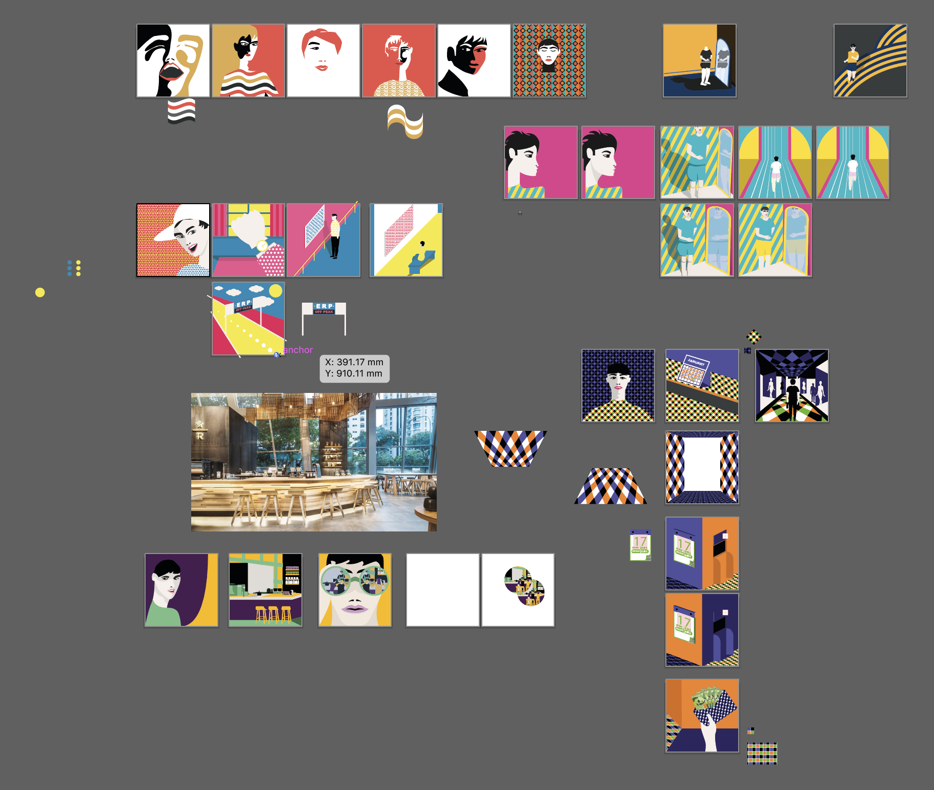
In a nut shell, this was my art board on illustrator. I will be going in depth on work flow and creative process.

ME

When I first conceptualised my “Me” I knew that I wanted my style to be reminiscent of Malika Favre.

I wanted the minimalist and gestalt look and style. This was something I never done before in my 5 years doing graphic design and illustration. Usually my illustration style is very lifelike and very ostentatious.

My First Set.

When I did my first set, I wanted to talk about my obsession with staying relatively in size.

On illustrating me, I wanted it to look chic, because to be a beauty, you need to be chic and beautiful.

From my first set, I wanted to play with patterns and make it a recurring motif across all my sets. I used the triad colour harmony and for my first set, I used fuchsia, cyan and yellow.

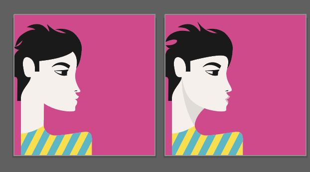
On the left was my initial illustration. I referenced this from Malika Favre.

I wanted the very chic, fashion beauty that Malika Favre’s work shows.

Unfortunately, I wasn’t very satisfied with my initial work, that’s why I added shadows to my neck and coloured my lips. This use of subtle shadows allows me to create depth to my work and allows my bright colours to pop.

For feeling fat. Initially I thought of using a darker deeper colour. But I ended up keeping the colours consistently and made use of the line motifs. To play on the gestalt motif I changed the colour of my character and certain elements to match the background to increase the negative space effect.

Upon my consultation with my tutor, she told me to work on my proportions and therefore I ended up with another panel. where my character is shorter.

I also ended up working on shadows. Shadows to me allows me show my prowess in choosing colour. Because the shadows are essentially toggling the brightness over individual lines.

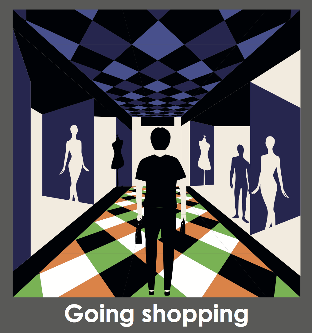
For going for a run. I wanted to keep it simple. I thought that I could make a running on a track character. But I thought, running to the horizon was more interesting, because it made me feel like I’m running away from my problems.

Set Two

For me, I knew what I wanted. I wanted a happy adventurous look.

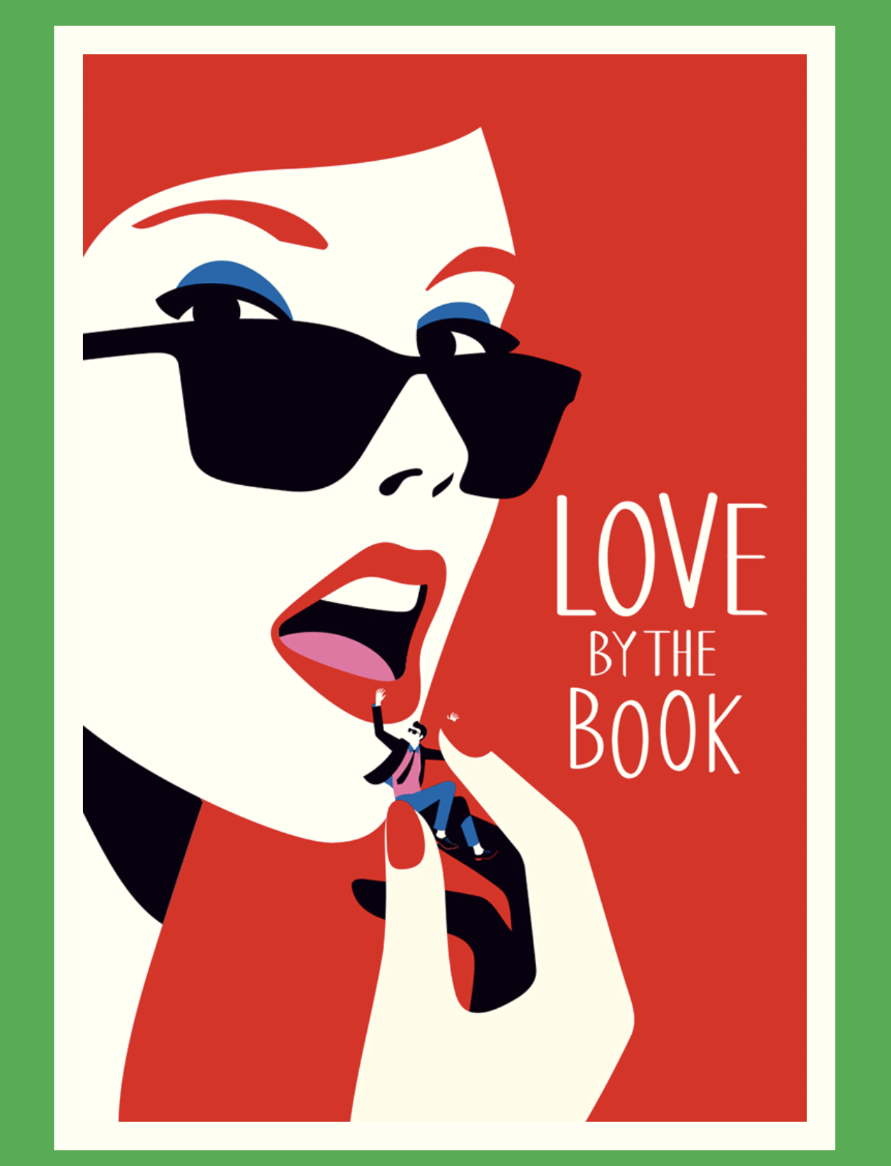
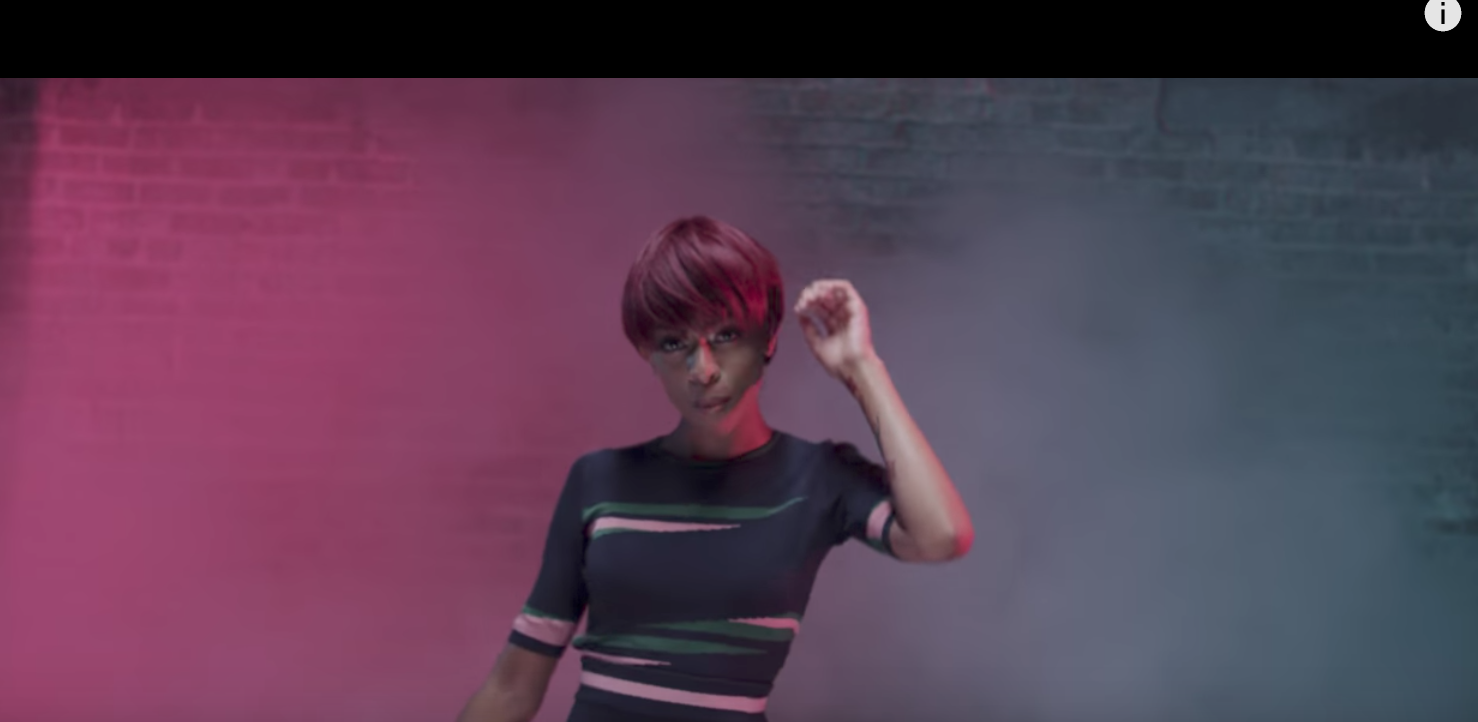
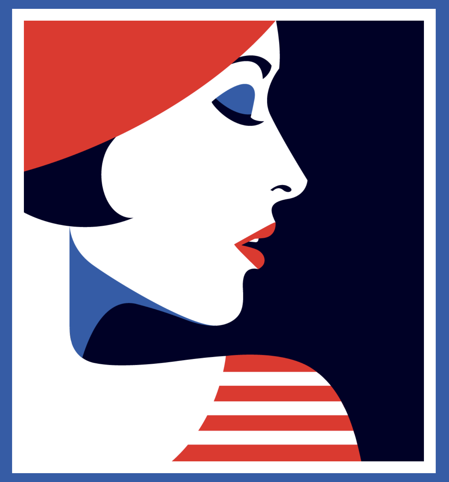
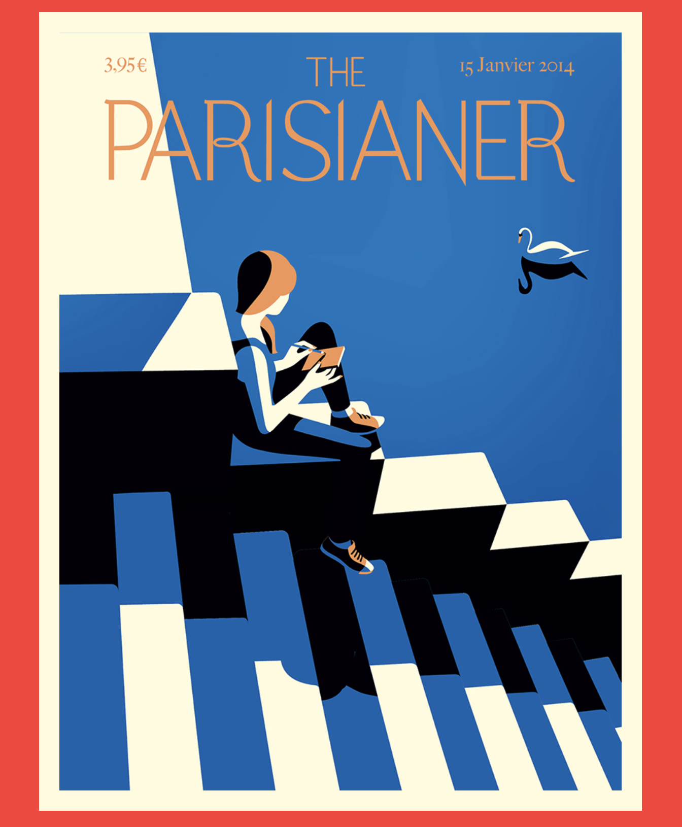
This was my reference image. I loved how she used the red to insinuate the hair.

For this set, I wanted to focus on polka dots and carried this motif throughout my set. Furthermore, I used the same colour motif as the previous set, because, triad doesn’t have much to choose from anyway.

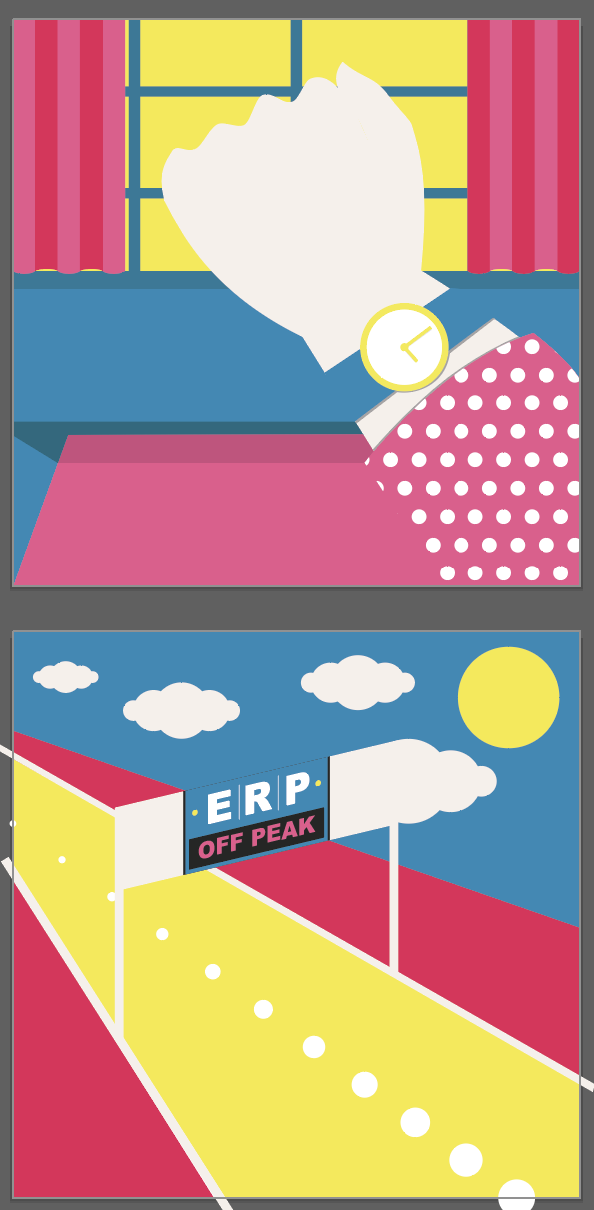
Firstly, I thought of talking about off peak hours as 3 o-clock. I canvassed a few people to see if they under stood what my image meant. Unfortunately not everyone did and someone suggested ERP. Because, ERP only off when it’s off peak! Get it? haha.

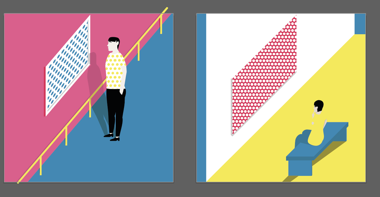
The next was going to the museum. I did the one on the left at first and didn’t like how it looked. It looked too sterile and had no dimensions. I got inspired by this.

I wanted my character to blend in more to the surroundings because it emulated my thoughts on blending into the background when I am at the museum. Also, I added the blue portion walls to create a dimensional effect to make it seem like there are walls in front and at the back. Doing so this would allow me to play with the colours.

Third Set

My third set, I wanted to look FASHUN. I wanted to show how much I love luxury clothes and runway.

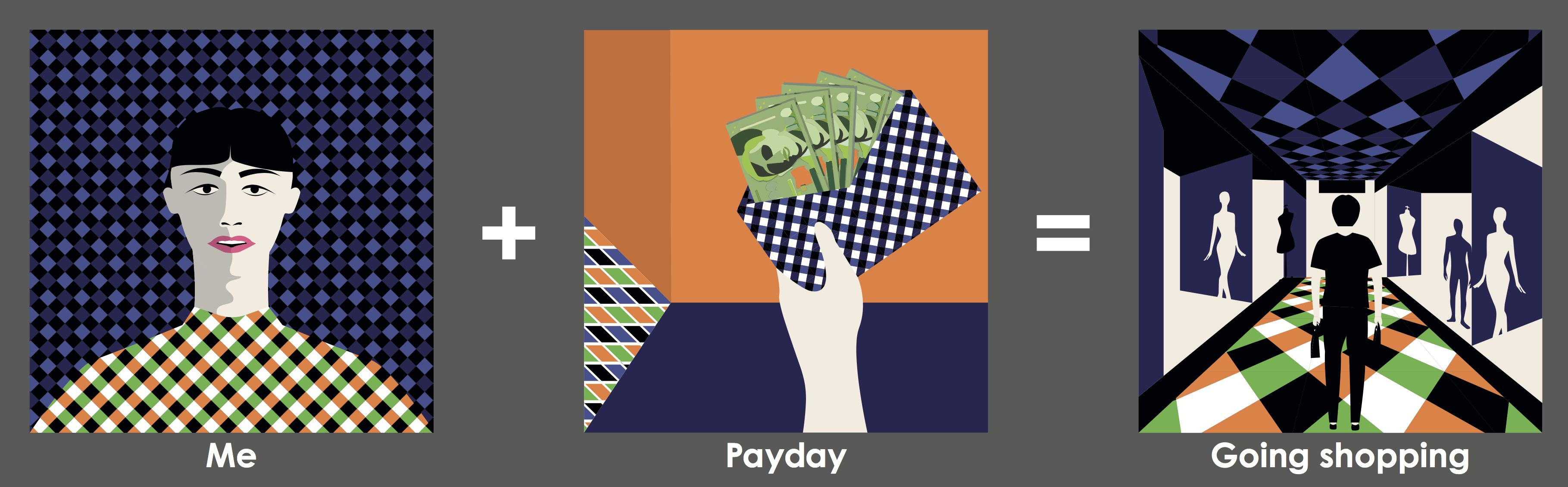
The “me” I portrayed was a dark, slightly hippy a bit preppy me, but I don’t really dress like this actually. I used the checkered pattern and the dark cool colours, green and purple with the darker orange.

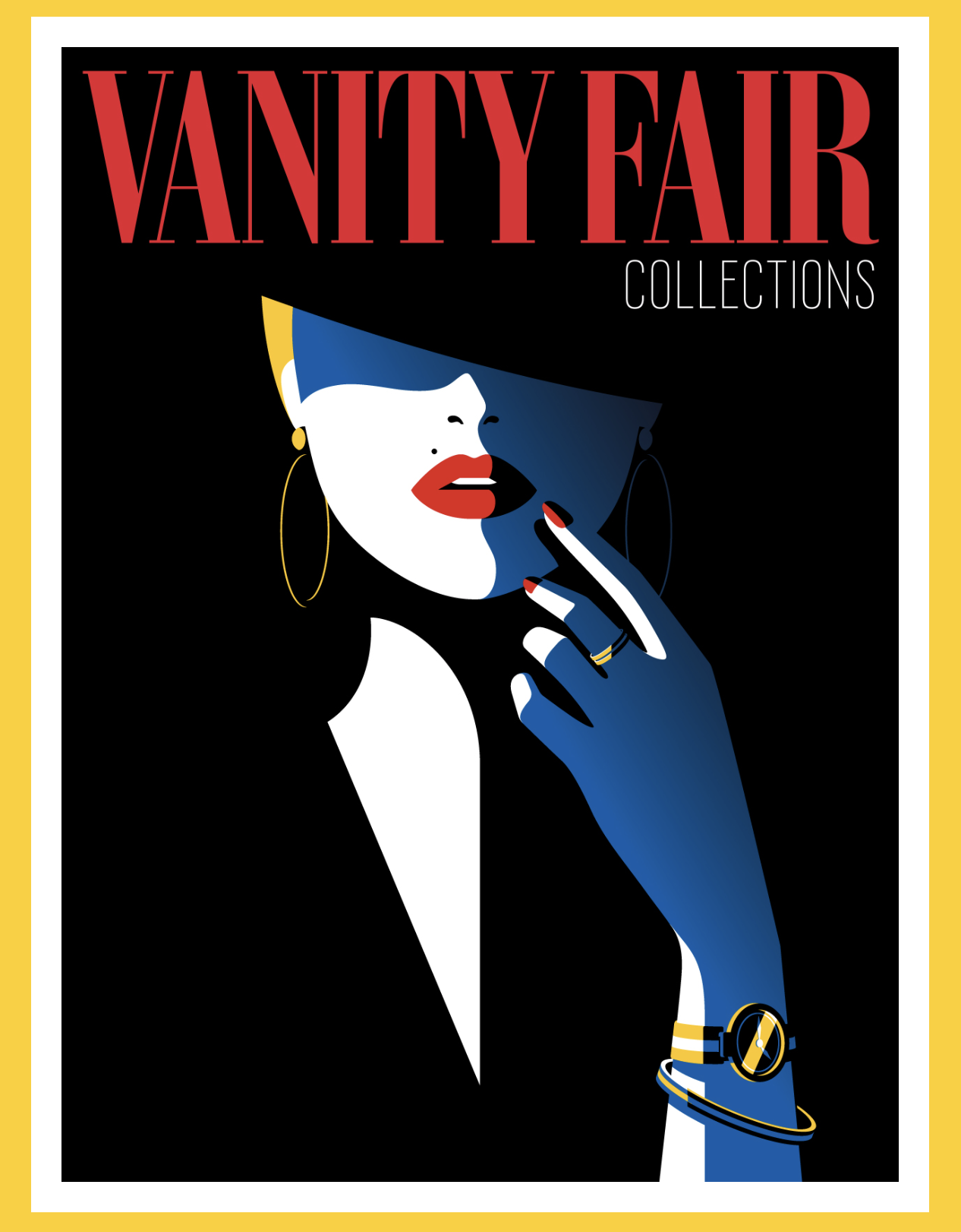
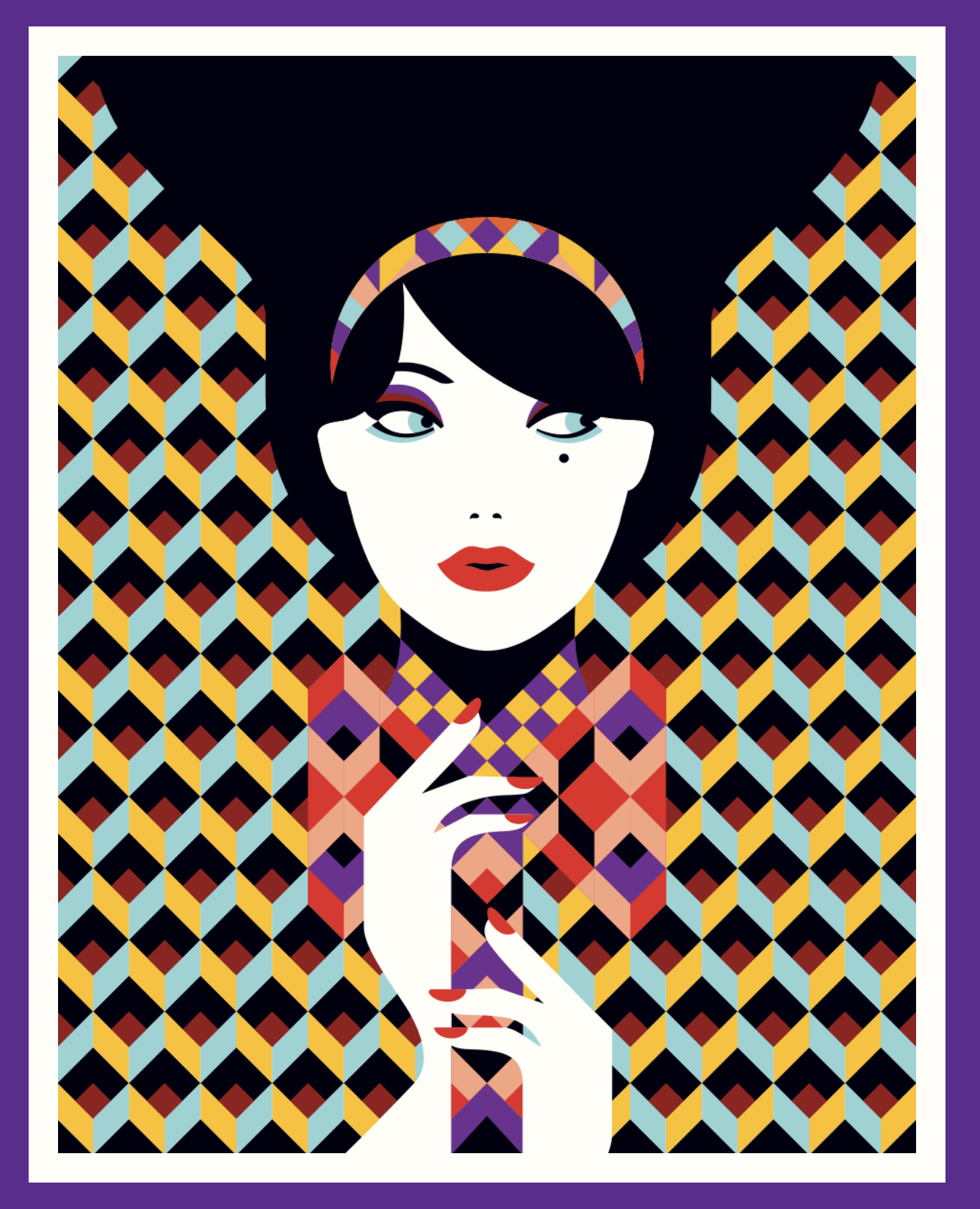
I used these as my reference to be more chic and stylish.

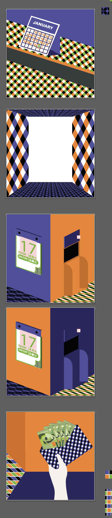
For Payday, I used the idea of the calendar at first. However, I felt that no one gets it. I then tried to make a calendar with an ATM but people still didn’t get the idea of Payday!

So after consultation with my tutor on finding the imagery of payday, I decided to make a person holding an envelope with money. Because it can mean more than just payday. It could mean allowance, or getting cash.

and that leads me to the last one, my favourite of all 12 panels.

When I first did it, I was half awake and trying to make some ends meet. When I finished, I was barely awake, but I fell in love with it. It looked so drippy and minimalistic. The use of gestalt and minimalism supplemented with the checkered flooring to make it look like a carpet, while the darker checkered pattern above looked like ceiling lights. It was just an incredible accident that made this work cohesive and I decided to just leave it.

Last but not least,

Fourth Set

The last set, I wanted me to look like this,

I guess I managed to get that effect and look! Instead of a fedora, I gave my “me” a spotlight To make the shadows and the character pop against a darker background as the green I selected was quite pastel in tone.

Also, doing this set, I decided I wanted to use blocks of colours. Meaning, no more patterns but just full on details. At this point, it was also when my Macbook crashed on me (boohoo).

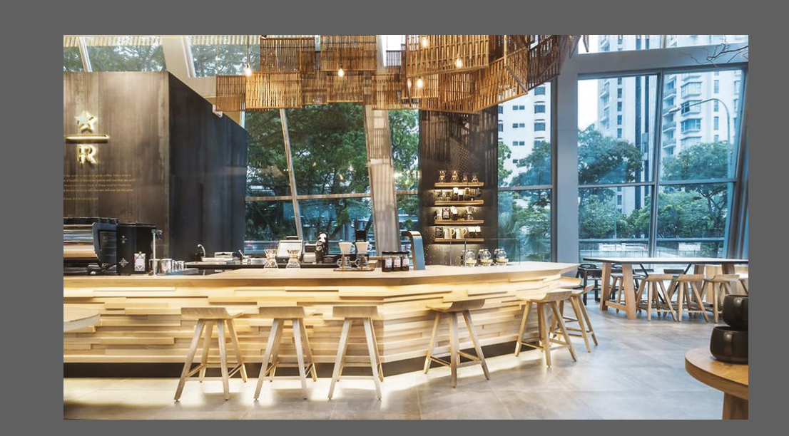
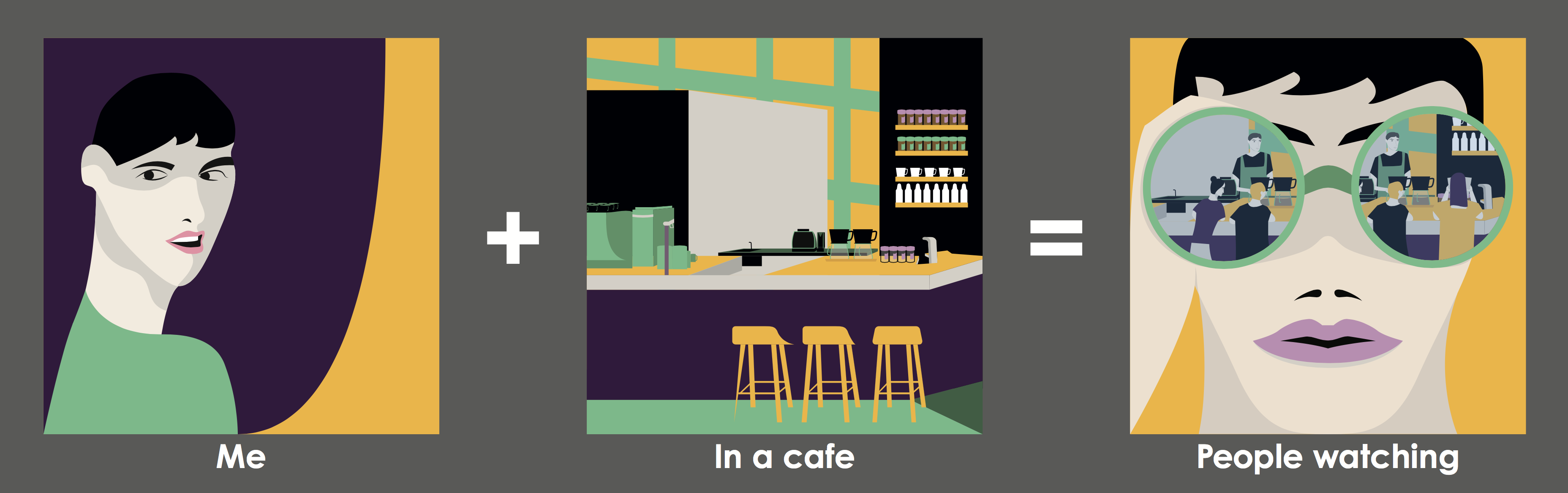
I used the United Square Starbucks as a reference.

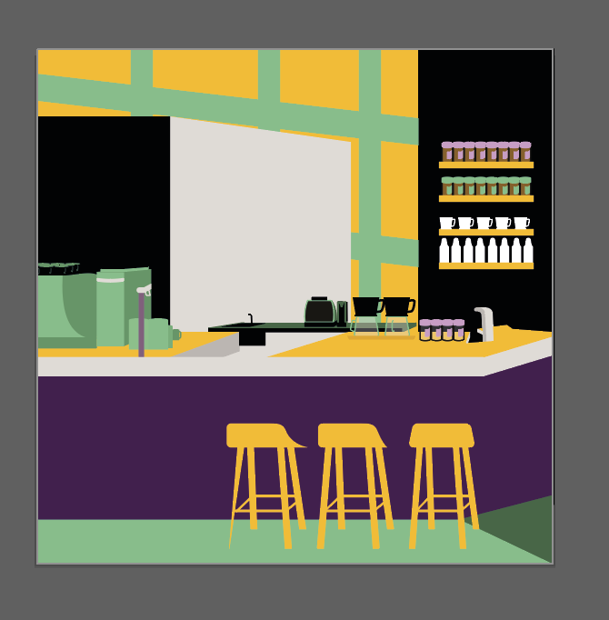
and recreated this cafe look. I wanted to ensure that my cafe looked… like a cafe.

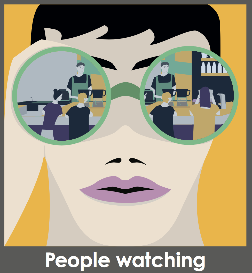
Last but not least, I did the people watching frame. I basically used my cafe frame and inserted people inside and make a character watch it through the lens.

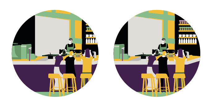
I used this framing at first, but I thought the focus should be people watching, not the cafe. So I should be focused on the people instead of the scene in the cafe.

Finally, I explained all my 12 panels.

I think, I could’ve done better by pushing myself in details and lighting, but I have much to learn and this project only further teaches me how to use a cohesive colour palette to make my work more attractive and helps to make certain parts POP!

2D – Colour Lighting Reference

This music video of Ravyn Lenae has a very good way of lighting black people. With the use of turquoise and magenta, it illuminates the skin of black people very well. this is because black people have cool undertones usually, unlike white people that have warm undertones usually.

A Look at How HBO’s ‘Insecure’ Lights Black Actors so Well

2D – More artist references

http://malikafavre.com

I have been a fan of Malika Favre since forever. Seeing her work decorate the walls of Sephora is such an awe.

I love how she can be so minimal and so detail at the same time. Her work while vector, is so expressive with the use of colour. I really love her work. Teehee.

http://www.yusukenakamura.net/

Yusuke Nakamura is another vector artist known for his album covers for the Japanese Rock band, ASIAN KUNGFU GENERATION. His distincstyle is his character design juxtaposed by detailed and complex illustrations. I love his use of that black outline mixed with the vibrant colours and well-composed artwork.

http://marumiyan.com/

Another artist which I have been following very closely is Marumiyan, who has been moving towards 3D works lately. His 2D works are well illustrated vector works supplemented with stock vectors of flowers. The stylistic beauty of it lies with the composition and the bright vibrant use of colours. He also uses the idea of gestalt to create a high contrast figure combined with vibrant colours for facial details.

https://www.yukariterakado.com/w

Another artist I like is Yukari Terakado.

She has a strong sense of portrait works which I enjoy the feminine qualities of of her work.

http://www.mynameistran.com/

Another artist which I love and want to try to emulate is Tran Nguyen.

She has well composed portraits which she supplements with unrelated objects and it creates a different setting. I love the expression of her characters. There is an idea of forlorn and strength and her sense of scale is amazing as well, composing figures that are just unimaginably striking.

http://victo-ngai.com

Victo is an award winning illustrator known for her simple and striking graphics, the great use of perspective, colour, and composition. She uses this to her advantage to create complex, yet well composed images to sell her story. I really like her works because there’s a very good use of colour palette and she is able to go the gradient work so well without making it look too metallic.

2D – Some Artist References

http://www.kawaguchielly.com/

I like her work. Her line work is very exquisite and I can see the form. I guess I need to find filters that gives such exquisite quality of line work. Although she draws them herself, I think her composition is something to think of.

http://www.jamesjean.com/

James Jean’s monochromatic work is really an awe to see. It is high detailed and it has a very simple line quality to them.


2D – And another bites the dust.

My last quote to explore,

So, my little Amélie, you don’t have bones of glass. You can take life’s knocks.

This was when Mr Dufayel told Amelie that she would need to get out of her comfort zone to pursue the man she loves. She cannot wait anymore and she can take it because she isn’t made of glass like Mr Dufayel.

Draft 1. The most literal and banal. Literally you are made of bones, the world will knock you but you won’t break. Obviously it looked too simple.

Draft 2, I then explored the idea of knocking on a skull and what better way to illustrate this than a door knocker. It seemed a little too plain, so I added “people” to knock the door after.

Draft 3, I really liked that this work wasn’t as symmetrical as my previous few works and there was interaction and movement to it. I do feel however, it does not encapsulate the quote anymore.

Out of whim, I created a draft 4, which was a wine glass that was made of bones. It looked more like a chalice, but you get the drift. I did this because I thought wine glasses were fragile and that it being made of bones would augment the idea. However, I did not take into account that I need to show life knocking.

It brings me to draft 5. However, this then makes me feel like “Amelie” personified by the bone wine glass is hurting the glass objects when knocked onto it. It then reverses the idea to Amelie being to strong and hurting Dufayel, which is… incorrect.

Draft 6, I then recalled an idea of repetition to show strength and emphasis. I decided to repeat the broken wine glasses around the bone-glass. In the it shows that no matter what, the glass shatters but the bones remain intact. I guess I made my point here.

After consulting Mimi, she said that my chalice looks too photoshopped and I should make it more crafted instead of a human body. I should also make the glasses smaller to make the chalice stand out.

Using segments of a human skeletal system, I re-crafted the chalice to look more like a glass than a skeletal system. I also used the idea of emphasis to augment the intention of strength. Overall I am quite happy how this turned out. It’s not my usual route to do something like this. I would either go full illustrative or full pattern, but this is a simple idea which resulted from me editing concept execution to be concise.

Post-assignment. I really learnt how to be concise with myself. I need to keep doing that so that I can be a stronger designer, balancing ostentatiousness with good design. I think the pit fall of many people is that they want their works to look pretty and grandeur, but their concept breaks apart and their work needs to be heavily explained. The design no longer speaks for itself.

Overall, I want to reach the level in which people get my work without the need of explanation. They get my intentions and they get my designs.

2D – One more to the list.

One more to the lit of quotes to ideate.

Everybody wants to be us.

Well no surprise, this was from Devil Wears Prada when Andrea told Miranda about some guys ploy to replace her and Miranda shocks Andrea that Miranda had already calculated and sacrificed her pawns wisely. In which Andrea responds that she didn’t want to become like Miranda, but Miranda said the line and Andrea walks off in self-realisation.

Draft 1, where I put a Marilyn Monroe onto a screen with paparazzi shooting her. As usual, from the beginning, the idea is way too simple. Although I want to depict the idea of beauty and fashion and desire.

The next Draft, I used the leading fashion lady herself, Anna Wintour and how in evolution, even monkeys wanted to be her, I think this was very clear but at the same time this was very simple and needed more layering. It didn’t look aesthetically pleasing as well.

The next draft was inspired by runway and how we are chasing for the latest fashion trend or the latest runway collateral. This was a bit confusing because the paparazzi silhouette didn’t show well. The Elizabethan girl was very well juxtaposed and the hands looked a bit too awkward. I did like the flag effect that followed through with the idea though.

I then had a sudden stroke of genius one night. I recalled a friend talking to me about her FYP many years back about how we are sheep to the media, blindly following trends, how we wanted to be like what the media portrayed.

My next draft would be this. A pin-up pose model enclosed in a TV set with a herd of sheep following her. I made her a wolf because the media preys on our attention. To supplement the idea of attention, I used the paparazzi photo to enhance the idea. I think this encapsulates the idea of the quote. Although I wish it could be augmented to be large in length, it does look very pleasing and I do like the juxtaposition between the engraving texture and the threshold effect.

Following this, I consulted Mimi and she told me to lighten the background and to edited the sheep so it does not look so patchy.

I inverted the silhouette to that the engraved mesh parts would more of a grey tone. However, I do think that it looked better darker. It looks like a TV static which is to what I like. It really does speak the quote, but I think that the background should’ve remained the previous one.


2D – Another quote.

The next quote I explored was

Listen, balance, my darling, is not letting anybody love you less than you love yourself.

it was a line from Eat, Pray, Love  by Felipe to Liz when Felipe asked Liz if she loved him and they got into an argument where Felipe screamed this at her and she screamed back that he didn’t know anything. He exposes her inner insecurities about herself and what she wanted to find in her journey and causes her to lose her so called sense-of-balance.

Draft 1, I used the skull to signify life, the heart to signify love, and the scales for balance. I went super literal on this and I felt like it was so plain. SCRAP!

Next, draft 2, I used the girl on a tight rope to show her own inner turmoil of balance. I put her in a plague doctor mask and put her on top of a roaring crowd of fans filtered in a moire pattern. I liked the story aspect of this, because the idea of the girl crossing the tight rope to find her balance, yet there is a distracting crowd pressurising her despite her anonymous look except with a plague doctor mask.

I did feel that this was not a good composition but a good concept to carry on, having a story to go with.


Draft 3, it was using the concept of listening to your inner self. The idea is having the silhouette of the maiden balancing and listening to the encased heart in lock and chain to find her inner voice. I’m not sure for this work. There is something off about it, maybe the use of the see- saw. But I liked the idea of listening, so I might continue the idea of encasing the heart and listening.

Draft 4, I carried on the listening concept and used the symbol of balance, yin and yang to encase the figure listening to her heart in a yin-yang symbol.

There’s something off about this image, but I wanted to explore the yin-yang symbol and push the idea even further.

Draft 5, I created the idea of listening to forest of your heart in your head. I really liked this idea, but I felt like it is still literal. I’m getting closer? But I do like the aesthetics of this.

After consultation, my tutor told me that a lot of my ideas began to be too connoted and there was too much to decipher from the image. I decided to scale back.

She told me to take draft 3 and expand the idea to that of a confessional.

I adapted the idea of eaves dropping into this image to include a confessional. The idea was to adapt the concept of eavesdropping into yourself. But I feel like I needed someone to tell to have someone to hear.

I removed the locks because it was too much and left the heart inside the confessional. I also added someone to “tell”. I chose an old woman instead of a younger similar woman. I guess it could show that the old woman is telling younger self to listen to her heart… which brings me to an even more interesting edit to the balance scale.

I added the clock face to the scale. I guess it would make it look like the confessional is a time portal. While I think it might convolute the quote and pack too much ideas into one image, I do think that there is a small value to it than having a simple balance scale.

After consulting Mimi, she told me to use an actual confessional and to blow up the size and to have someone listening to the heart. I came up with this at first and felt like I need to embellish the idea with more and more things.

I ended up increasing the saturation of the mesh to make the person look more ambiguous but seen. while balancing the heart on a see-saw and to encase the person in an actual box, setting a scenery behind their conversation.

I used a mesh technique to create a forest foliage look, I do have to commend myself on that creativity. Haha.

Overall, I do not like this one as much as the ones I have done, because I felt like I should have edited myself more concisely and to not put too many elements.

While I do like the idea of having the background. I could have done away with the see-saw or vice-versa. I could have made the silhouette more obvious by darkening the figure and then using the moire technique for the confessional instead of the other way round.

2D – Quotes to Ideas

So I have finally chosen 4 quotes to fill up my project. I will slowly ideate them here (because I need to write to fill my brain).

Pretty on the outside… but like a fruit that bugs have eaten from within

This quote came from the Japanese movie Helter Skelter. The premise of the sentence and the movie was the main character, Liliko, describing her rotten nature and personality despite her outer appearance as an idol. Liliko is a supermodel in Japan who had attained full body plastic surgery from a hospital with illegal practices and to sustain the beauty, she requires the expensive treatment. Due to the decline in her popularity, her manager is no longer inclined to invest in Liliko. As a result, her health and beauty starts to decline, she begins to age, look uglier, have spots on her body.

Some key ideas that I would want to demonstrate from this quote is the idea of beauty and fruit.

Fruits that have been linked to beauty would be the apple due to the links it had with knowledge and humility. Eg. Garden of Eden, Apple with Eve in the bible and Lilith before her despair in Faust.

Flies and maggots are a symbol of a symbiotic relationship of the world, where the flies are parasitic to left over and maggots are left to hatch in the crevices of the rotten fruits. The pagan God or Abrahamic Demon Beelzebub, has also been described as a giant fly.

Draft 1, I decided to go literal.

I used a female statue and the apple to describe heart and lungs (the core of a person) as well as a fly to ‘eat’ it. The background is negligible.

I don’t really like it because the apple looks too small and the rotten apple feeling isn’t pushed through.

Draft 2, I decided to go a little macabre, using virgin Mary as a symbol of beauty but the dead body and the rotten apple to signify rotting. It’s still too literal! But it is visually pleasing.

Draft 3, The lungs, apple, fly. I wanted to show the inner beauty thing with the rotten heart (rotten apple) being eaten by the fly. But it’s not pushing through aesthetically.

Draft 4, The tabernacle of rotten fruit. I decided to use an object that was sacred and connoted as beautiful, the tabernacle and replace the eucharist with a rotting apple with a lot of flies and being laid on a maggot background. I quite like this because it looks very eerie and stark. It helps to supplement my idea of beauty on the outside but rotten on the inside.


Draft 5, I decided to redo draft 2 to include a mirror frame. It would look like a reflection of self and had a more refine quality to it as compared to the original.

Consequently, I realised that it was a good idea to continue with this and to clean it up so it looks like a good print for silkscreen.

Overall, I do enjoy this work as it encapsulates the quote of self-reflection and decay. I think it has spoken for itself and I’m glad I chose this permutation.

2D – Quotes for Forrest Gump Project Research

Kamikaze Girls :

If It Makes You Happy, Do It.

My Soul is Rotten

Humans Are Cowards in Face of Happiness

Confessions :

As She left, I heard the sound of something important to me disappearing

The Weak will always hurt those weaker than them

Amelie :

Your bones aren’t made of glass, you can take life’s knocks

He’s Just Not That Into You :

You’re Either the Exception or the Rule

Devil Wears Prada :

I refuse to be sick, I’m wearing Valentino for crying out loud.

Everyone wants to be us.

Florals? For Spring? Groundbreaking.

Please bore someone else with your questions

Details of your incompetence do not interest me.

By all means move at a glacial pace. You know how that thrills me.

Helter Skelter : 

Pretty on the outside… but like a fruit that bugs have eaten from within

It’s certainly, convenient to be pretty

We’ll be forgotten, we’re machines for the processing of desires.

Lose weight, get prettier, beauty makes you strong

Eat, Pray, Love :

Listen, balance, my darling, is not letting anybody love you less than you love yourself.

You don’t need a man, Liz. You need a champion.

Hey, Groceries. Believe in love again.

It won’t last forever. Nothing does.