My Line is Emo

Concluding the project, I was really glad that most of my classmates appreciated my work and understood my concept. I was glad that many people understood my layering process and ideology and was intrigued by my methods.

Recapping from my instructor’s feedback in which she liked the exploration of the black background and appreciated my exploration of various line work, however I needed to explore different papers. I understood her point of view but I do stand firm that I liked the consistency of the papers.

Moving forward, I think for future work, I could continue using layering and texturing for my image making and to consult my tutor if I do have ideas before it’s too late. I could also come out with more drafts and not be too emotionally entangled with the drafts so that I can let them go and redo a cleaner and more refined version of the work.

Inspiring…

I found some abstract artworks I really like and used them as an inspiration to some of my works.

Untitled. 1960. Oil on canvas. opening: 156.4 x 156.6 cm. (61 9/16 x 61 5/8 in.). Museum purchase, Fowler McCormick, Class of 1921, Fund. y1987-47. Photo: Bruce M. White

I liked Ad Reinhart’s idea of similar tonality. In his work, he played with the colour black, processing blacks of various tones in a 3 x 3 square to question on the idea of absolutes.

Mark Rothko, Untitled. From the Gugenheim

I also like Mark Rothko’s work. Seeing a Rothko piece in South Korea, I was in awe by the beauty of his use of blending and tones. They seemed really soft and really smooth and evoked a slow, calm effect.

Gerhard Richter, from his website

Gerhard Richter’s work look like scrapped paintings. His aluminium pieces create a nice “wipe” effect to the panel.

Autumn Rhythm by Jackson Pollock from his website

Jackson Pollock’s beautiful work might look like a mess after eating McDonald’s, but the vivid strokes show energy and tells a fierce, fiery outburst, to the audience.

Processing… Part 3

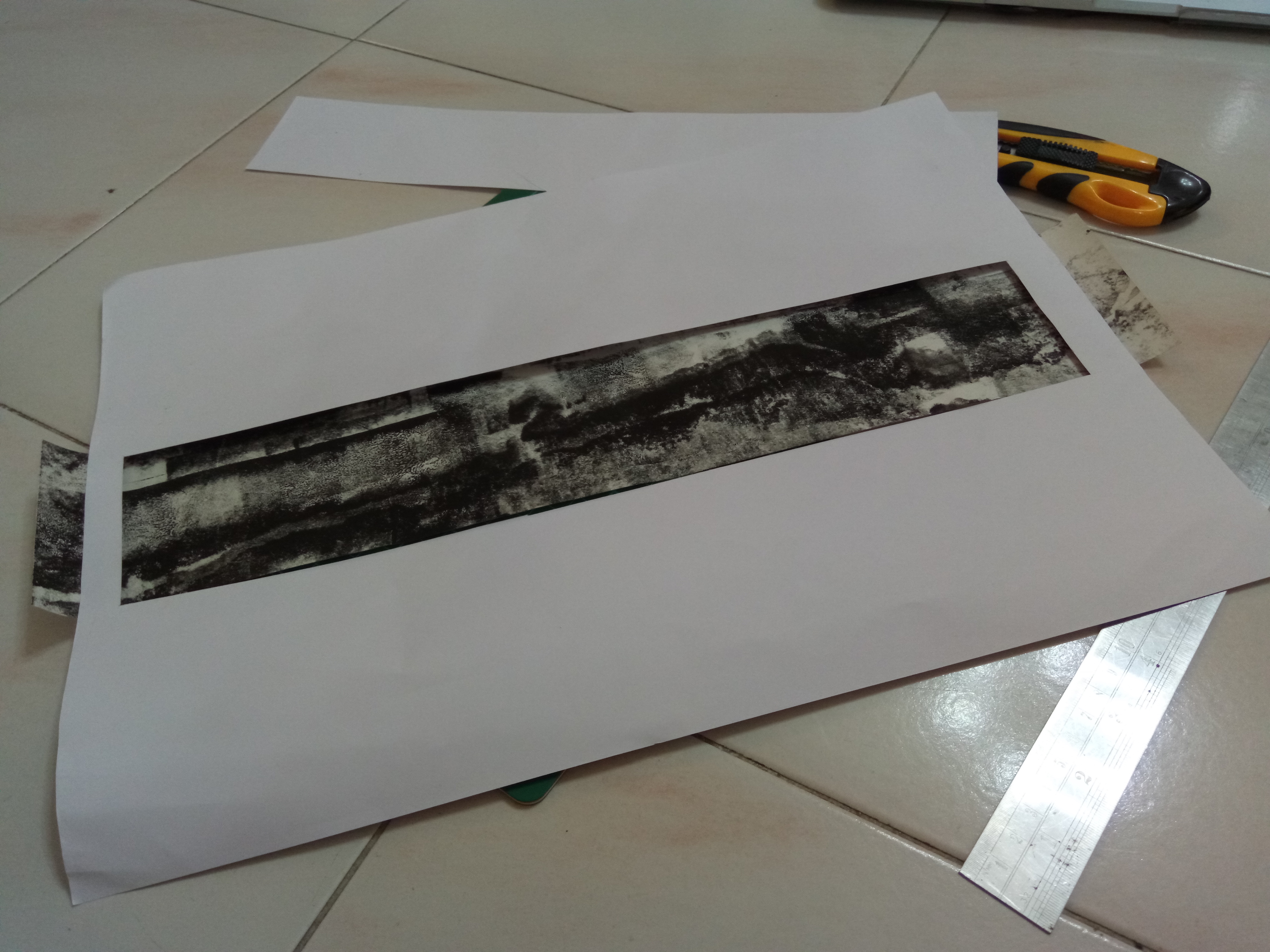
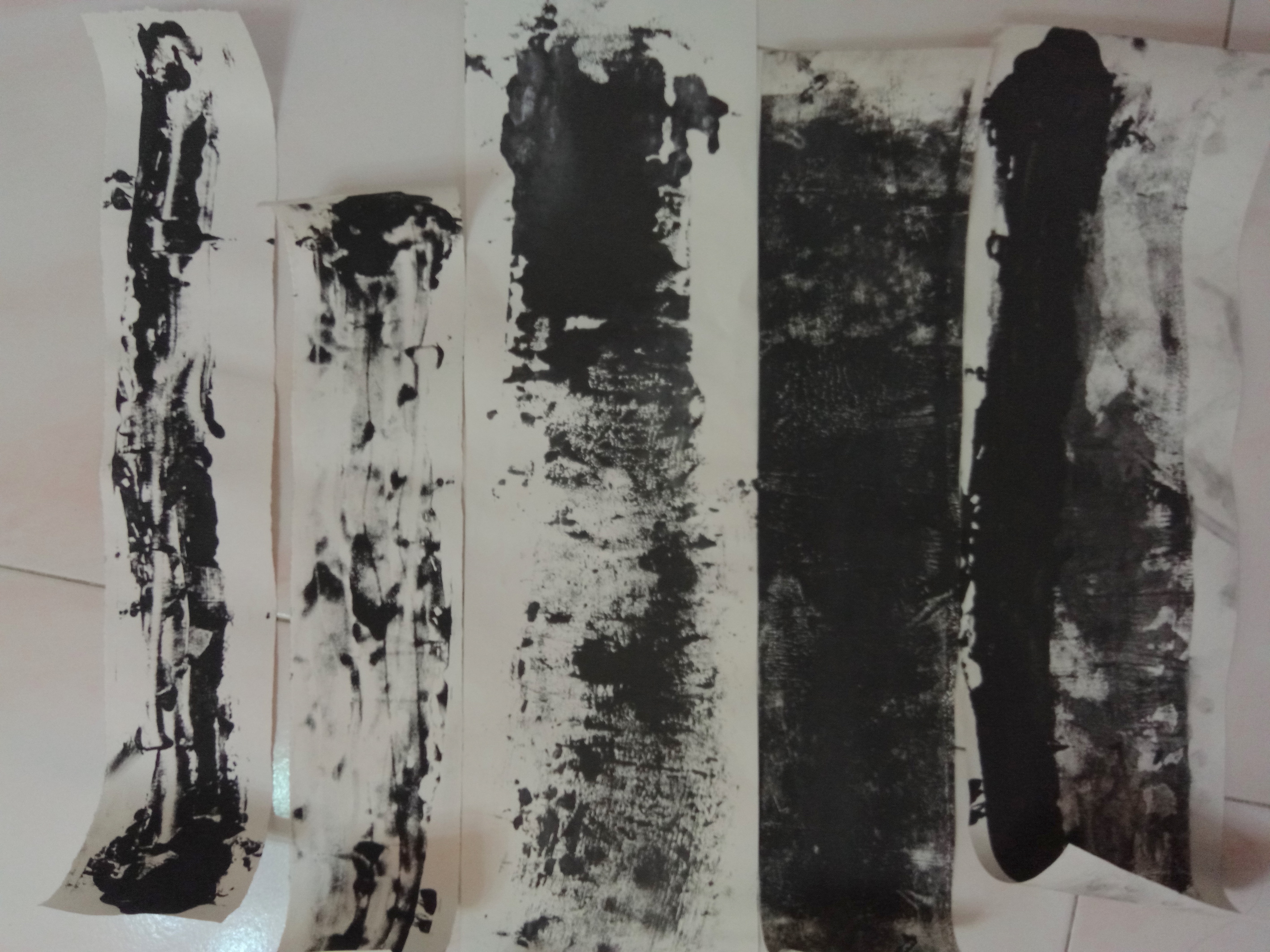
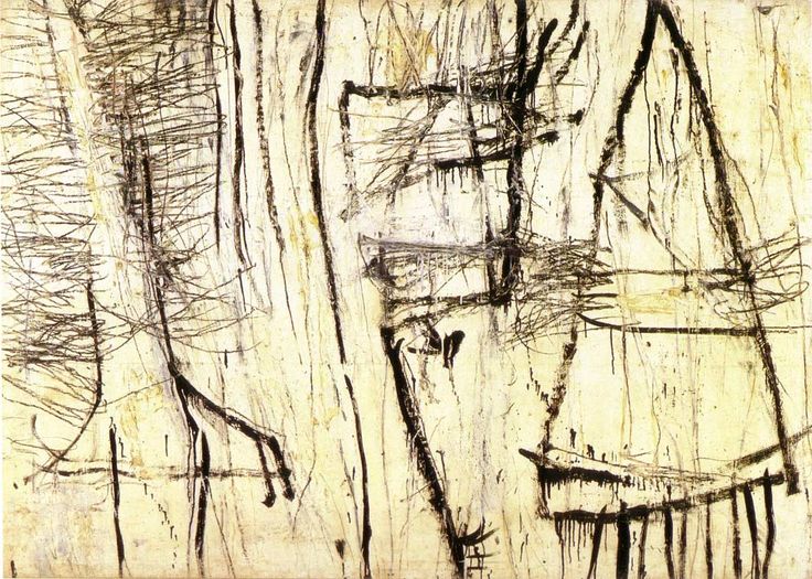
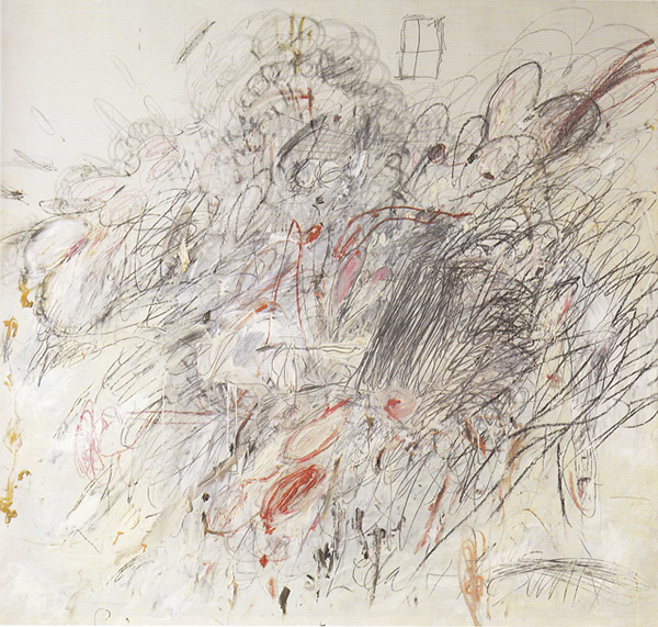
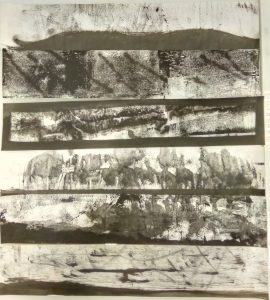
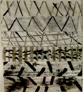
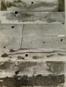
I have done a few of the emotions linked with songs and gave them a physical manifestation in the form of mark making :

Emotion : Jealousy

Songs I tagged it to : SZA – Supermodel, Tricky ft Fifi Rong – If Only I knew 

Ideas I wanted to portray : I wanted to portray the idea of having two sides, wanting to become each other. Therefore the thick bold line or the patches are in conflict with each other, creating a “war” between two places. The concept of jealousy causes conflict and the depiction of desire to be another being.

Emotion : Mortification

Songs I tagged it to : Dmitri Shoshtakovich – Cello Concerto No. 1 in E-Major

Ideas I wanted to portray : I wanted to portray the idea of incompletion, coupled with shock and irregularity. I wanted to show that mortification is more than distress and pain. It was the idea of when you are in shock, there is a need for closure. Therefore despite the chaos, there are white our spots or places which requires insertion.

Emotion : Shame

Songs I tagged it to : Rina Sawayama – Cyber Stockholm Syndrome , Robyn – Dancin’ on my own

Ideas I wanted to portray : I layered sparse dots against a very hazy background to portray the idea of aloneness despite being in a large group. I wanted to show the idea of social shame and the idea of embarrassment for not being able to fit into the canon of others. Is it really a shame to not be able to fit in? Or is it better to stand out on your own.

Emotion : Pride

Songs I tagged it to : Bedrich Smetana – Moldau, No. 2 Vltava, Johanne Brahms – Hungarian Dance (Pick One) 

The Ideas I wanted to portray : I wanted to portray the idea of standing still against the current, despite a large opposing body, pride comes before you fall. The idea of nationalism or self-pride was what I picked out from the songs and I wanted to show the idea of conformity versus deviance, how civil or international destruction comes due to the pride of politics.

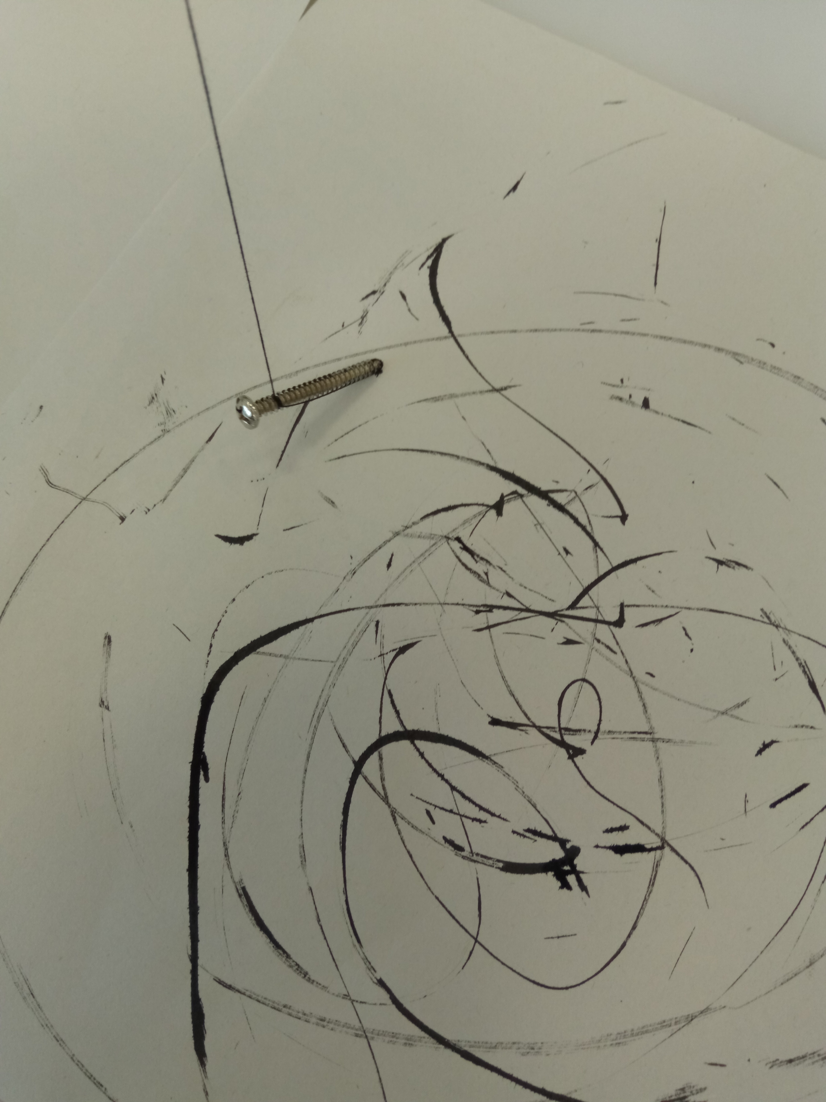
Emotion : Astonishment

Songs that I tagged it to : Maurice Ravel – Piano Concerto No. 1 

The idea I wanted to portray was to show that astonishment was just “great surprise”. It doesn’t mean it would be positive or negative. I wanted to use large big strokes to show the negative energy of astonishment, showing grave surprise, like disbelief. While I wanted the smaller splatter to show the good, positive surprise, like the ‘yay’ astonishment.
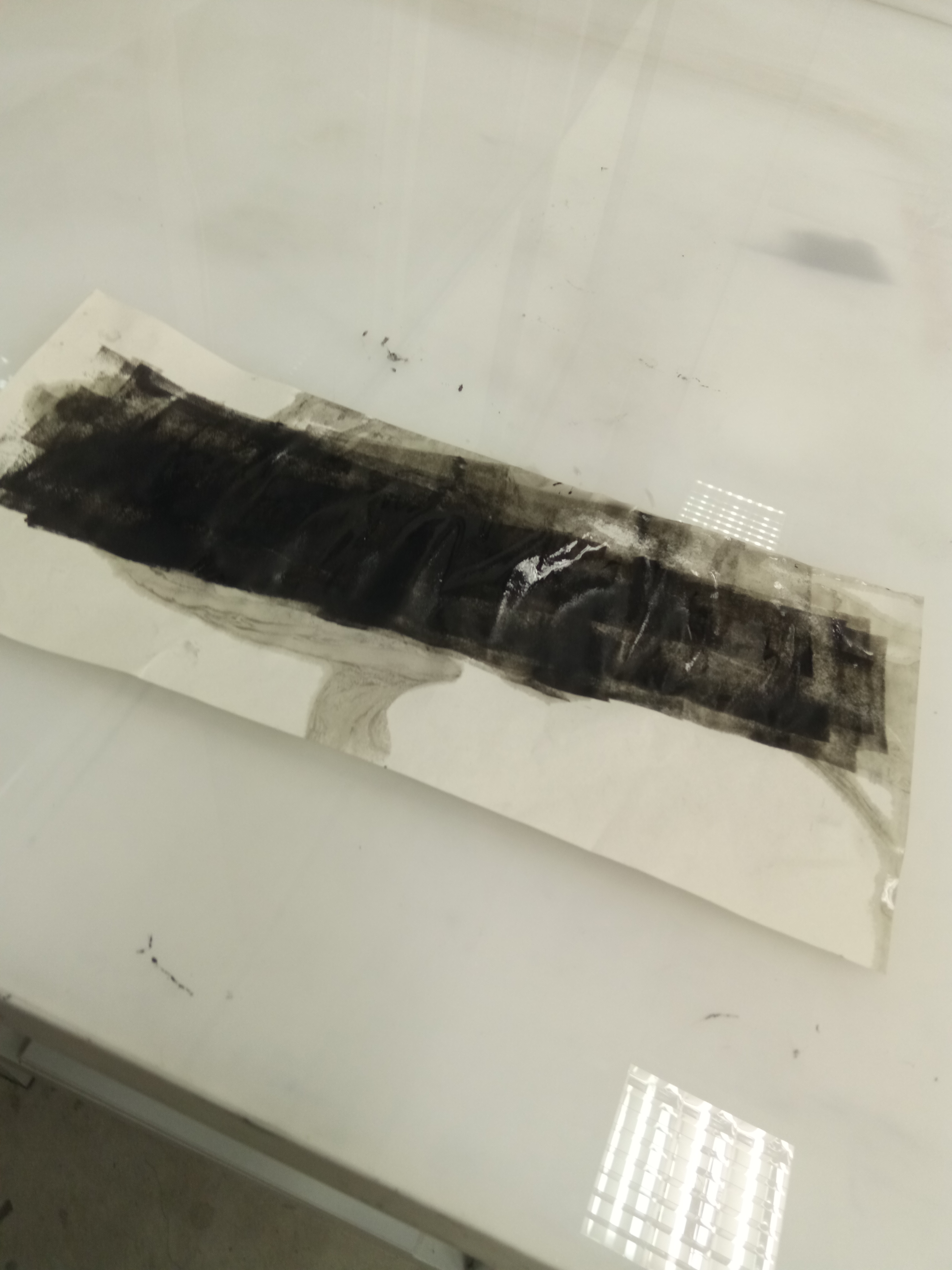
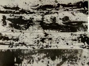
Emotion : Lust

Songs that I tagged it to : STWO – Virgo, Taku – Down For You

Ideas that I wanted to portray : Lust was depicted to have to aspects. One, was to show that lust was sensual and physical. The other was the monotony of lust. The idea of lust being a repetitive action with no outcome.

That is all!

Processing… Part 2

I did some permutations but it made me very frustrated because I couldn’t get what I want. What I did was visualise an image like those visualisers you see on Windows Media Player. Just that it worked with a song tagged to an emotion.

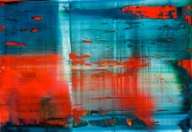
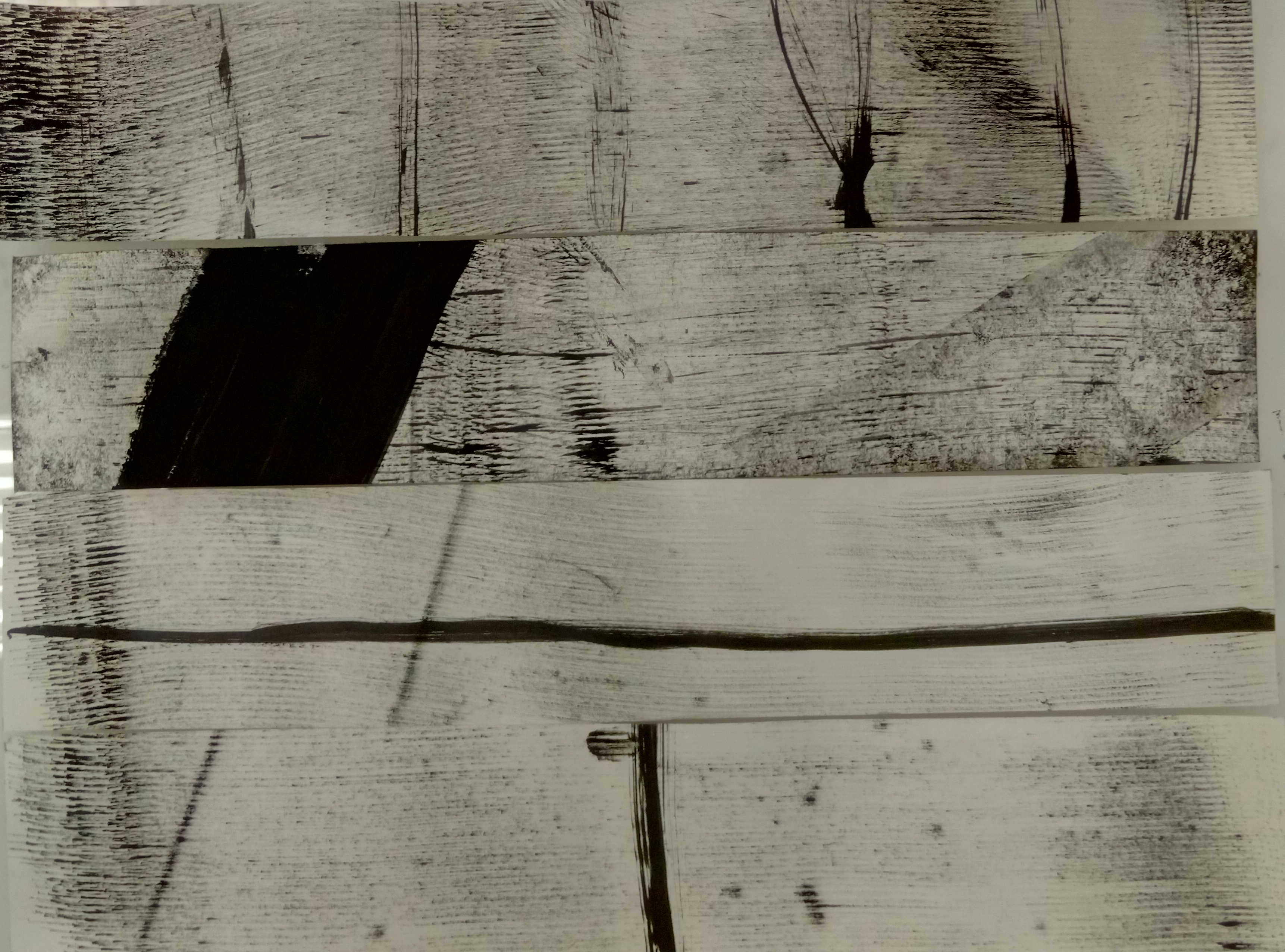
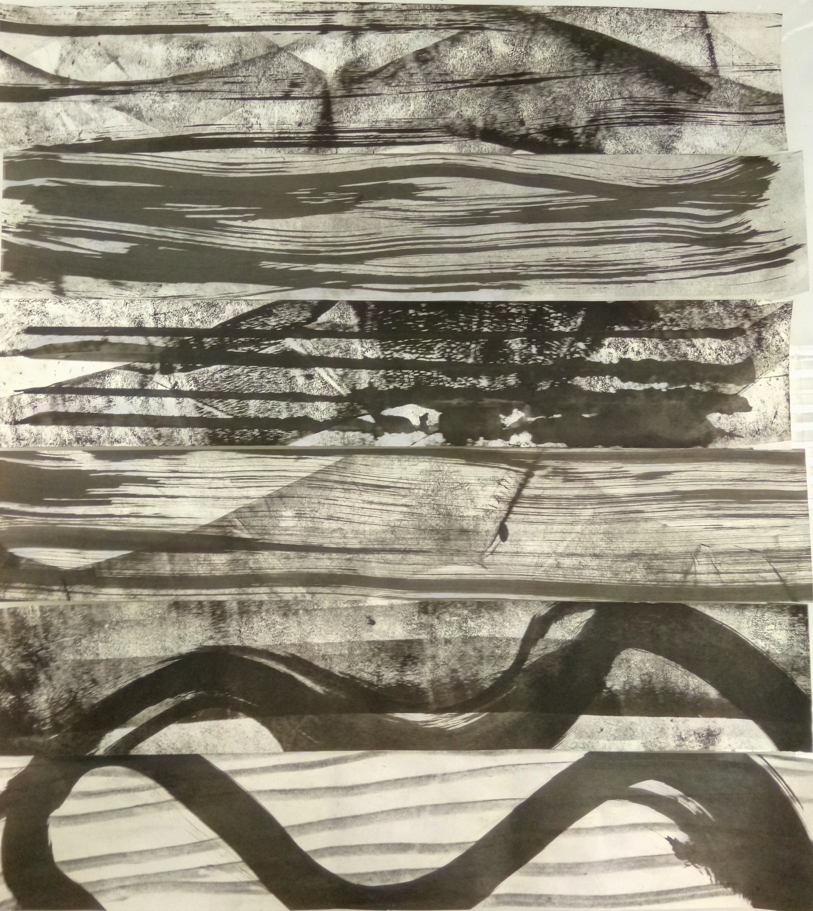
Exhibit A, I tried using the roller to give a swishing effect to show sensuality and intertwining for “lust”. But it was only concentrated on the side, it didn’t roll nicely, but the effect was still intended, I could still see a soft intertwining effect. Secondly, I tried to layer another feeling on top of the feeling of sensuality. This was because I felt that a singular stroke or line was not enough to represent the complexity of emotions, therefore I added more rigid, repetitive lines on top of the swishes. I think that it achieved an intended effect, but there is more to work on in terms of finding the right layer.

Another issue I had was the eventual cropping of the larger lines I made. In the end, the lines have to narrowed down and be framed within the guide of 380 x 72. However, for some lines it worked, it worked in which the cropping augmented the emotions that I was portraying. Like wise, for others, a large significant portion of the emotions were cut off and it needed to be re-layered with another feeling to further bring out the emotion.

This was eventually resolved. Nothing much rocket science smile

Processing… Part 1

So, I did a few experimentations with various mediums and felt there were very similar lines created by different objects. Some of my lines ended up like this :  This line gave a more rejuvenating look, and it was very lively and very exciting. It was made with a toothbrush.This line was made with a nail in a similar fashion of witches “scrying” for people on a map with a crystal. It gave more pendular effect and the lines varied in weight. Very large spaces the lines feel very cold, but wise. If you get what I’m saying.

This line was made with charcoal and then smudging the charcoal to create implied lines. The lines are very soft and it flakes due to the softness of the paper. I like how it gives a very subtle textured look. But I need to work on smudging. It looks very forced.

These black lines were made after both, rolling paint on a piece of paper and plastering another on top, or putting it a piece of paper on top of a piece with wet Chinese ink. I think the ones with paint gives a very rugged edged but it tapers to a soft sensuality. Due to the plastering of the two pieces of paper together, it ends up having a softer, liquidised look as seen in the second piece from the left.

Mark Making Inspirations

I am inspired by Cy Twombly because he manages to take the narrative and reduces it through abstract expressionism. While he works abstractly, his final product is usually symbolic of his original intent and the iconography of the elements in his work can be deciphered through the use of shapes and colours.

His work might look mainly like child’s play but the sheer thought of reducing the heavy imagery to loose lines and shapes is applauded by academics and critics.

Leda And The Swan (1962)
Cy Twombly
Oil, pencil, and crayon on canvas
190.5 x 200 cm
© 2017 Cy Twombly Foundation

An example would be Leda And The Swan.  Where there are many representational shapes such as hearts and also abstract elements like strong lines and violent swirls. The artwork ends off with a representational image of a very thin window at the top which grounds the violent imagery in the painting which symbolises an idea of the third-party viewing the violent seduction of Leda and The Swan.