


Interview for Locale Research
Video for Locale Research
Process for Research can be found here.
Interview for Locale Research
Video for Locale Research
Process for Research can be found here.
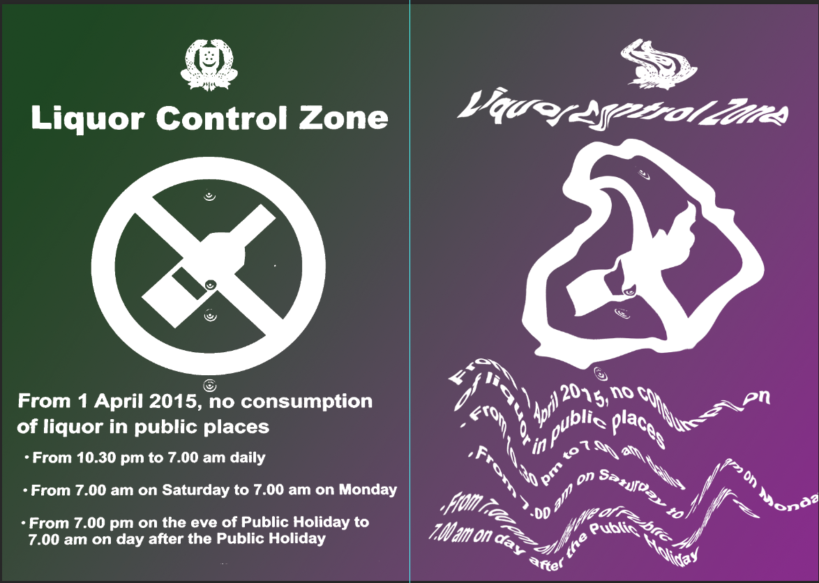
Sell your location. ABSTRACT!
To be honest this was such a mind boggling assignment! I had to sell a location abstractly. But I guess my consultation with Joy was pretty helpful in a sense that she narrowed me down to focusing on order in disorder and disorder in order.
3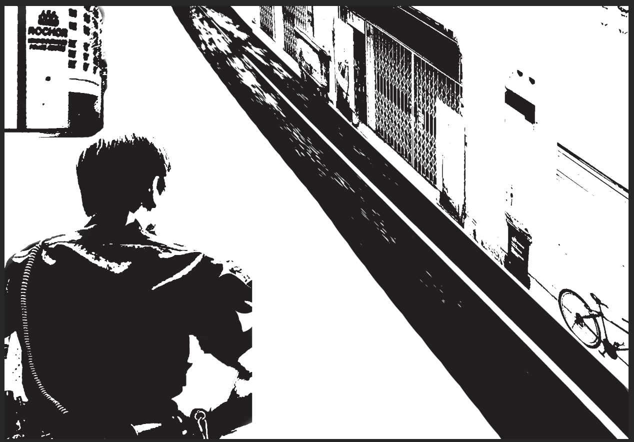

I tried digital painting, it didn’t work…
So I decided to appropriate images and collage it ala Forrest Gump last sem.
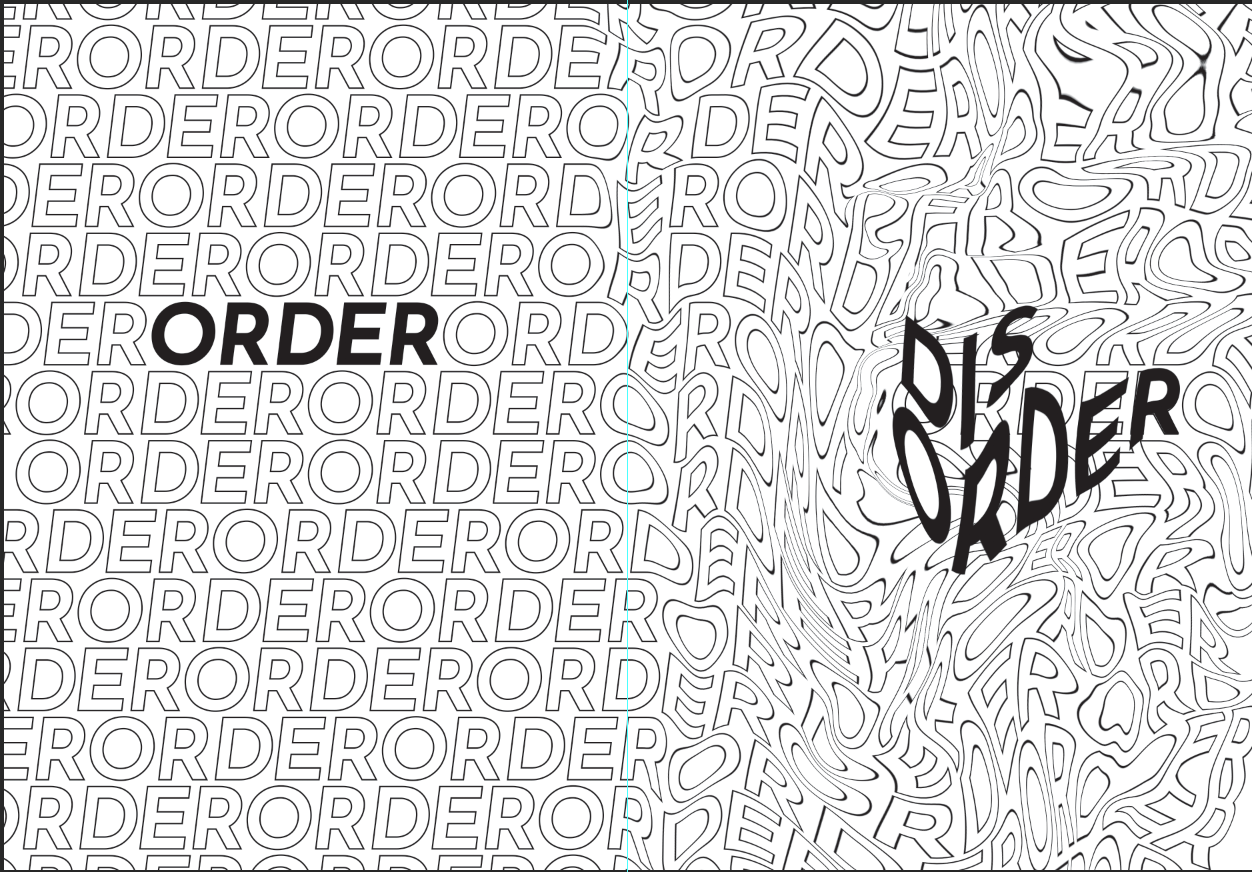
This was what I ended up with! I added more distortion to talk about order in disorder and disorder in order. This was my centrefold, showing the transition of order to disorder.
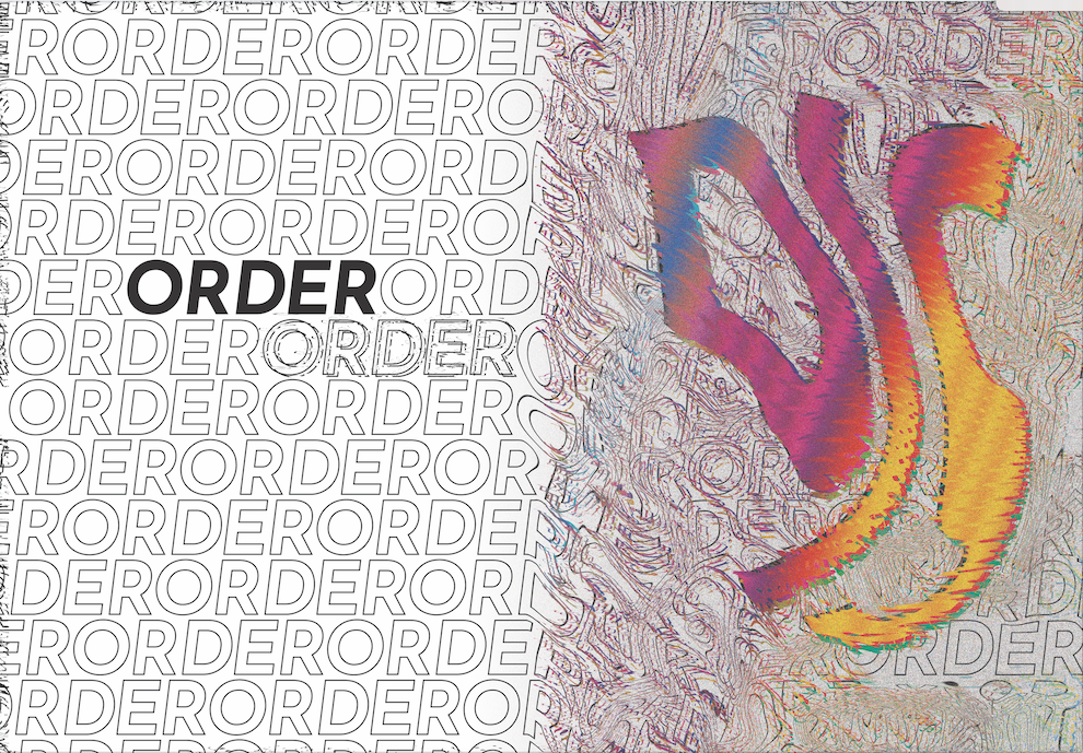
for another page i tried this at first. But Joy told me the colour wasn’t working and that I needed to show more order in disorder and more mess.

I decided to change my colour, make it more crinkled and go crazy with it!
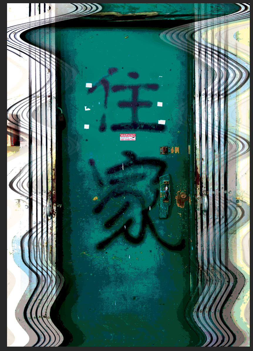
Was really proud of this page! I made the rip a rip!
This was my first draft which Joy said, MORE!!! and also have some disorder in order as well.
Yeap, gone crazy.
Lastly! Was the cover.
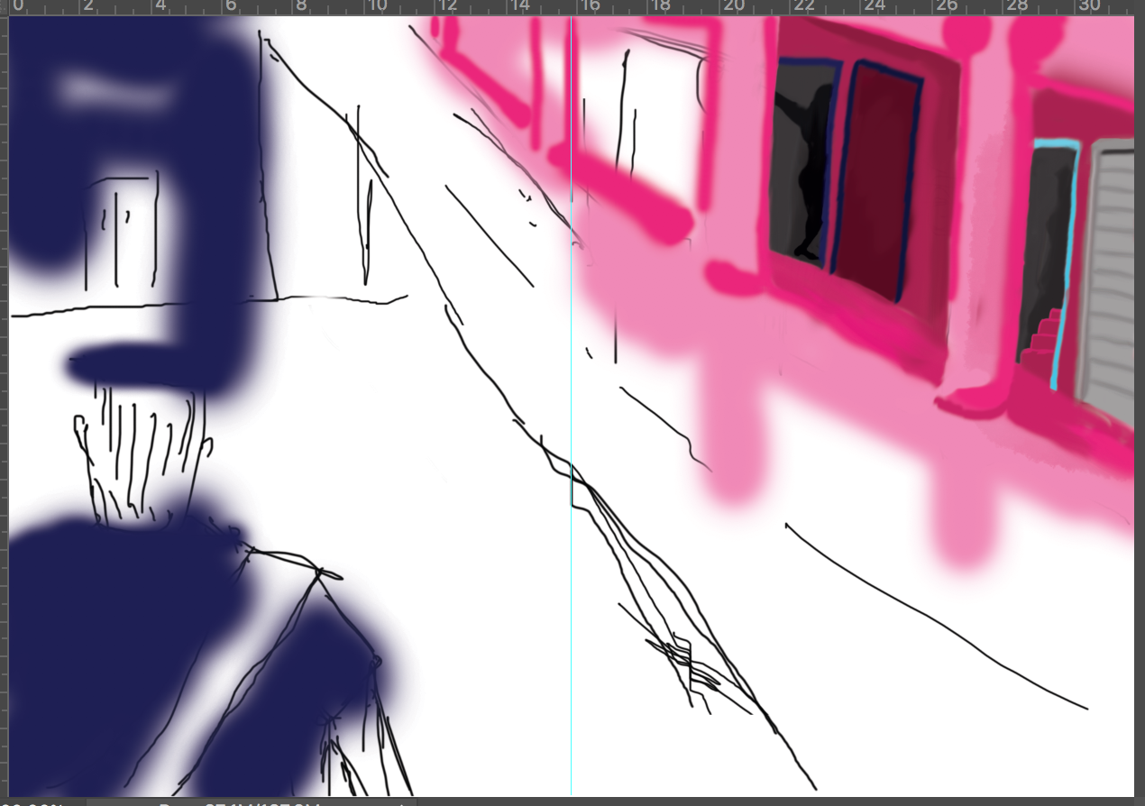
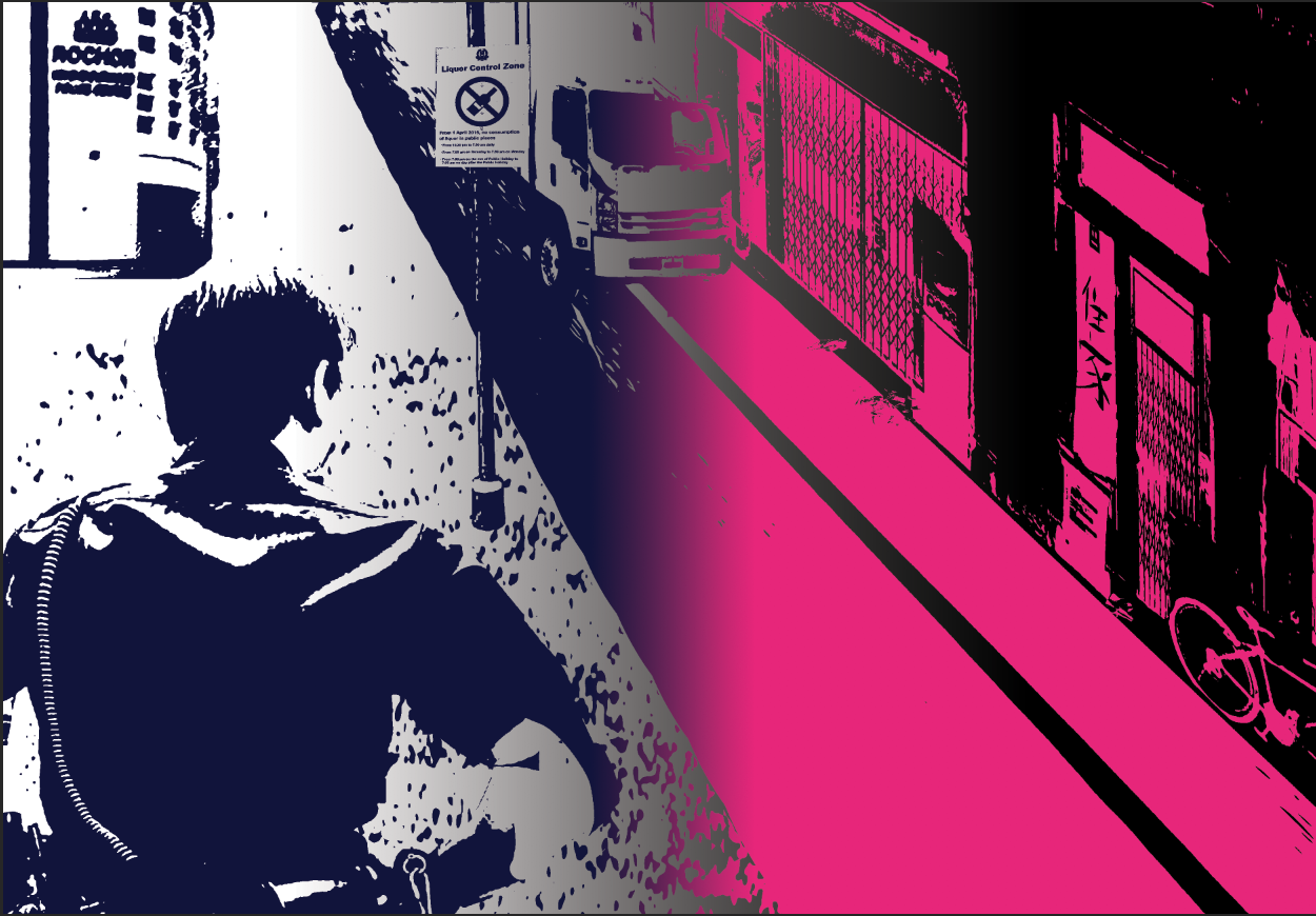
I had to further augment these to order in disorder and disorder in order. But at the same time I need to understand which image for order and which image for disorder.
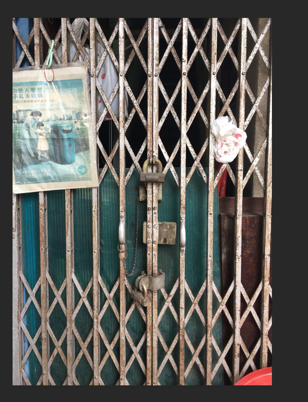
I decided to use the gate for disorder because behind the gate with an open door is when the prostitutes would tease the men and haggle prices before opening for them to go in. While a shut door is just a shut door with no business or no meaning except for its flavour in the neighbour hood.

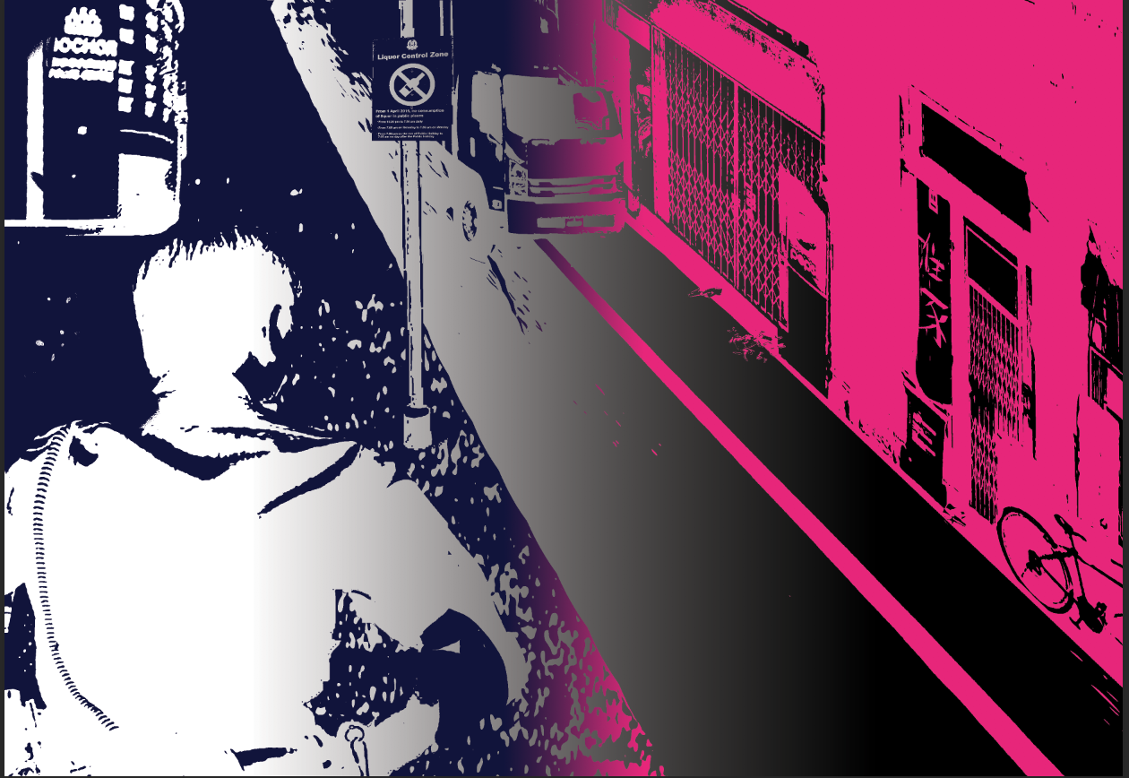
This was the amount of distortion and text setting that I settled with. But after some consultation with my peers, I decided to make order, more orderly.

this was my final cover page.
Didn’t enjoy this project as I felt that the interpretation and purpose was too varied. I rather something less fleeting and more grounded. But I did enjoy playing with semiotics on order and disorder and it was something different from what I usually do, which is straight out coloured flashy illustrations and graphic play.
So! We were tasked to find a location to research on and to sell the information that I gotten.
So why Rowell Road? I wanted to kill two birds with one stone. I work at an agency there and am required to go there once a week to touch base with my manager on my account and to work on something. When I introduced the project to my colleagues, they were very happy to bring me around and lend me their devices to take photographs of the place.
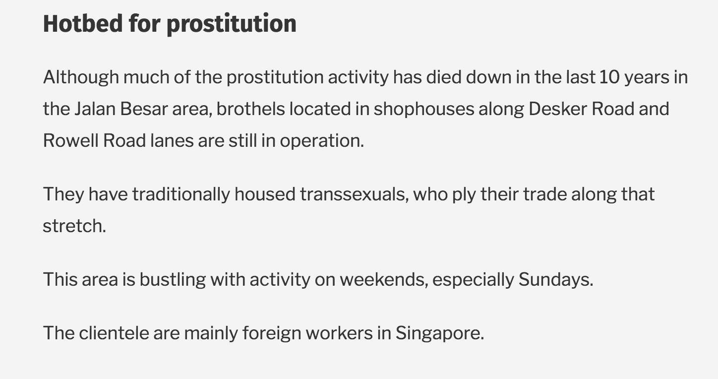
Through my research, I have discovered interesting things about the place, especially how transgendered sex workers would co-exist with the local businesses in Singapore.
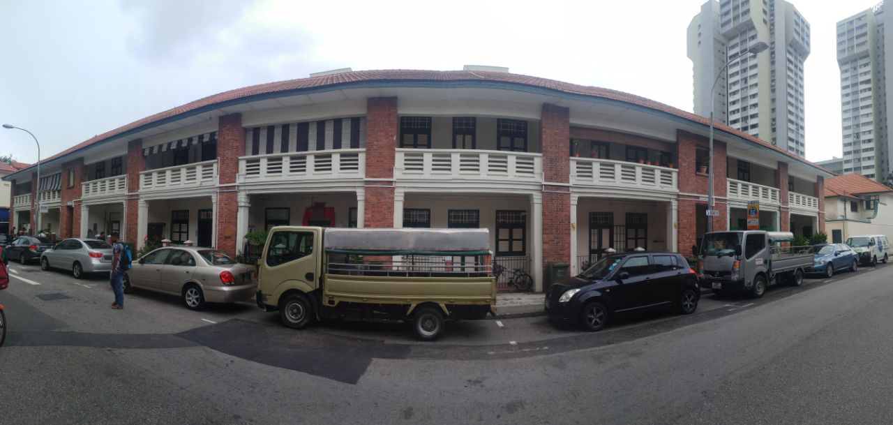
This is a panoramic view of the old bungalow building opposite the office. 
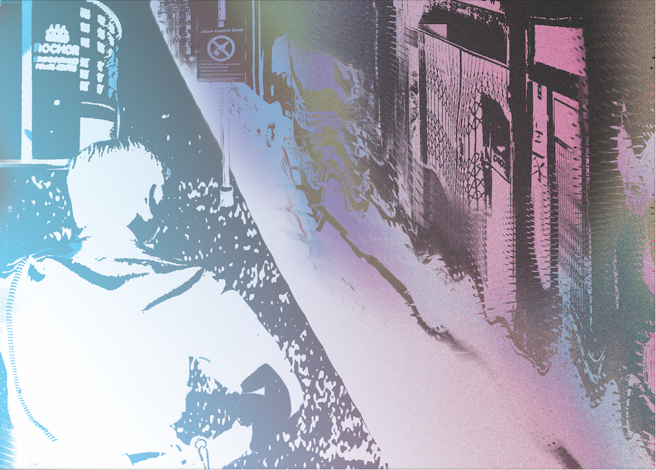
My research stemmed from this image which was the pink light. The pink light was symbol of notice for a prostitution ring.
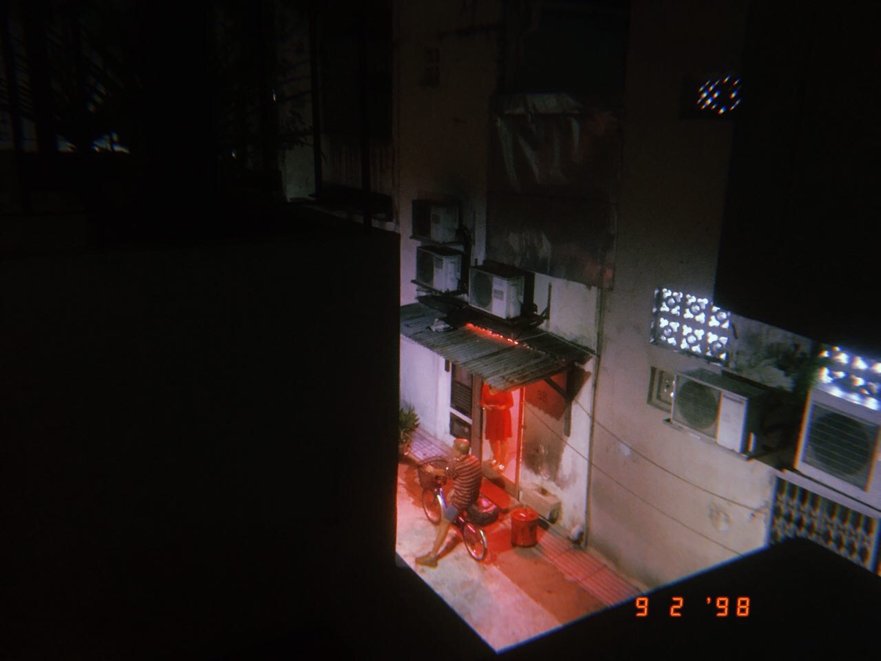
This photo was taken at the office toilet that showed the visible back alley at night. You can clearly see the mama-san talking to the old man. Probably not soliciting (because that’s illegal).

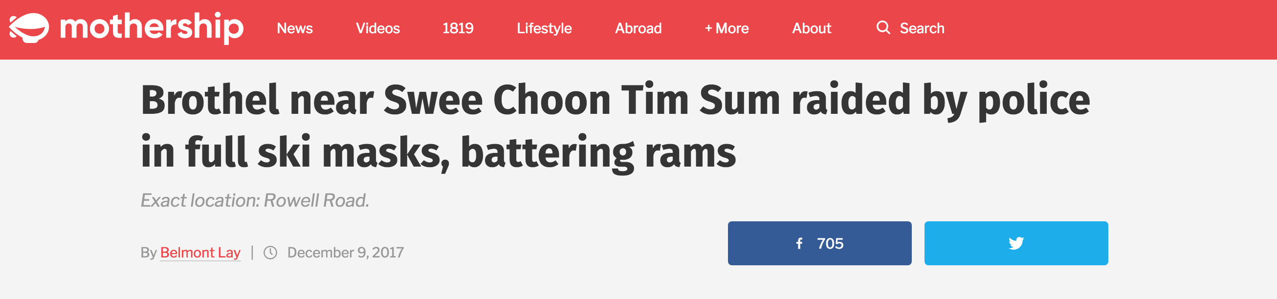
I then went to dig into articles! Because I remembered mothership had just published an article because of a recent raid and I managed to dig out a post that was finding out the history of prostitution.

Don’t you love how beautiful the shophouses are? They have that Roman style columns and it’s amazing!
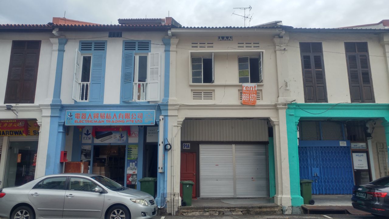
These ones are more plain.
___
Okay back to prostitution!
So you can read the history here, but in a nutshell, it was because it was near Johor Road which was near Bugis! Where it was more well-known for transgendered entertainer, until 1980s, when the place was cleaned up.

A different scene at the end of Rowell Road is this weird green building which I aptly call 1979 for it’s number tag on the top of the building. There’s also a lot of people queuing up to go upstairs (I don’t know why and I don’t think I want to know why)
Apart from the sleaziness, I decided to check on housing prices to see if its actually cheaper to stay there.
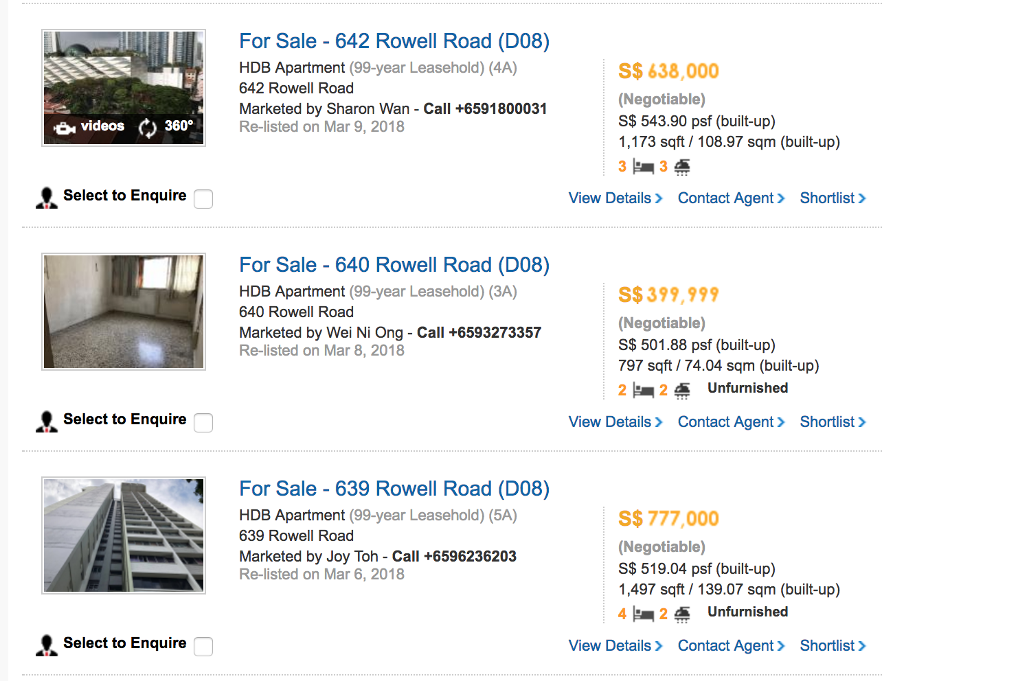

Apparently, it’s not!
So I got my colleague Angela, to help me to make the phone call (because of her foreign accent of course, it’s more convincing). You can listen to it here.
All in all, I had a very good time exploring the place. I also realised that Rochor Police Station is a stone’s throw away and that every other evening, the police would be patrolling around the area.
Well, I would say, if you can’t beat them, join them, but since the police and justice department is involved, if you can’t beat them, make sure no one knows.
I began this project with hesitation as I felt that there was no aim and goals as the letter forms were barely shown. Upon receiving the brief, I knew however, what art direction I wanted to take : Fashion Magazine Editorial.
Garance Dore

Megan Hess
My sad attempt.
I began most of my work with a composition setting as seen below and I tried to sketch a form to fit the typeface composition that I have created. Unfortunately, it wasn’t a good move.

Harper’s Bazaar 2013

Harper’s Bazaar Mexico 2013 January
I decided to try another approach, drawing silhouettes onto the typographical compositions that I have created and then fill it in later.

The interaction seems to fit well and the letterforms are being fitted well. But after various consultation with Joy and attempting to fit clothings on the figure, I discovered it was a horrendous failure.

Looks like grandma clothes instead of being a model.
Slowly, I ended going back to my first love, Malika Favre.

Malika Favre, Vanity Fair
But I have already took her as an inspiration last semester… So I decided to create a different take of this style. Adapting the use of negative space but bringing my own hide-and-seek sexy twist. Since clothings do not fit well, I have completely omitted it and let the androgynous silhouettes take precedence in the work.
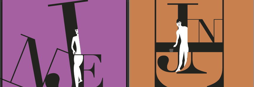

It’s really not easy to think of ways to play with these compositions but I didn’t want to make the letters of my name JEN too obscured. I wanted to promote the job and the person at the same time. If you cannot read the letters, then how would you know who’s the beautiful person behind the job?
Based on the above, after consultation, I felt like the barista and the art critic wasn’t sexy enough. Joy also commented that I should play more with the shadows and the silhouettes. Since my characters were already not meant to be proportionate but to be irresistibly salacious, here begins the grand edit.
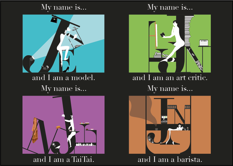
At the end of the day, I made the Taitai do more Taitai things, like pedicure, the model be in a photoshoot, the art critic studying a work, having a pile of books and trying to update the ART TRENDS website and for the barista to look like a seduction curvaceous bombshell making that latte art for the customer.
Overall, I felt that I stayed true to what I wanted to do. The main challenge I had was to keep it minimalistic, but salacious and sexy. I felt that I managed to do it, but during consultations, my frustration would be between adding more secondary elements to interact with the letterforms or to stop and remove.
The use of Didot (typeface) was a smart move to me because Bodoni, a popular fashion magazine typeface, was too bulbous and Didot had a good balance between the thick and thin and transits very well to allow me to form a composition with the characters.
Truthfully, I do want to be as sexy as my characters and try all 4 jobs at least once in a lifetime. Okay, maybe not barista because I risk dropping the coffee.

