Category: Typography 1 – G3
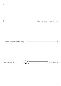
my custom DROPCAP!

You are lonely because you only see money – My Haiku
Quick Reflection on the Crystal Goblet
Warde equates typography, a modernist concept. Essentially she questions the necessity of typography on the printed page and how important it was that legibility and thought behind typographical choices as it creates the different dynamic for the reader. She then does a comparison between a typographer and an artist. While the former thinks more than feels, the latter feels more than thinks.
Warde argues that typography in print are like the tiny specs of detailing on a building – if there’s an error, you notice it, if not, it is seamless. She justifies this with the thought how the eyes treat type. If the eyes notice the type more than the text itself, it is bad type. In her concluding paragraph she further emphasises that being flashy is very easy, however being disciplined is not. For those who pick a book, they would rather read the text than read the typography.
Arguably, I do agree with her. There is a necessity in picking the right type face to augment a seamless reading experience. By altering the typeface in an ostentatious manner without rhyme or reason would only cause difficulty reading and distraction from the text itself. Warde argues that unless it is for advertising, the discipline of keeping typefaces as they are is rather hard.
Furthermore, her comparison of separating the artist and the designer was very apt. While artists feel the colours, form, and space; typographers think about the colours, form, and space. It becomes a mathematical and slightly formulaic approach towards this invisible art form.
Conclusively, the statement, “good type is invisible, bad type is visible”, really springs true to Warde’s argument and the study of typography had stood the test of time. In the end, it is wiser to keep thinking how is this legible instead of feeling if it is legible. Perhaps sample peer feedback on legibility and type choices are more essential in this prevailing day and age than anything else.
Stanley Morison
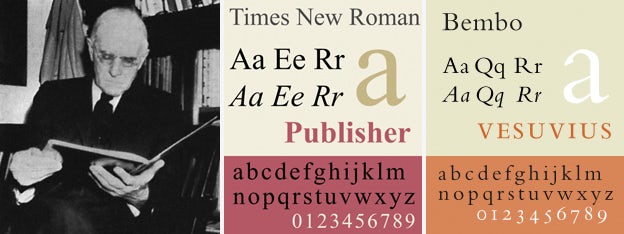
Stanley Morison was the one that designed Times New Roman, the font that becomes a practical default for many systems. While it looks dated and ugly, it is very practical and versatile. This typeface allows easy reading in both web and print because of its small serifs that makes it easier to read.
Type in the wildddddddddd
Found these on a day I was on my night run.


For an existing Instagram looking for type in the wild :
https://www.instagram.com/publicnoticesg/