It’s very vexing!

At this point of my research, I’m a bit vexed. I resorted to reading a particular book for inspiration. The book is called “flows and counterflows globalisation in contemporary art” and it talks about contemporary art that is affected by globalisation. In the first chapter, Art and Nomad, it was described that there were two forms of art that was influenced by the process of globalisation: the ones that work around the globalised world through ease of travel, and the ones that work within the globalised world through the ease of import and export. I looked towards contemporary art because I was struggling looking for a visual representation on the idea of the globalised world.

Related image

I was drawn to the Storage Piece by Haegue Yang that examined the commodification of objects within art and Walead Beshty’s large FEDex sculptures that showed the effect of objects traversing the globe via courier services.

Moving forward, while thinking about these fragilities, I had to remind myself that despite all globalisations, I needed to stay true to my idea of pushing trade within a globalised framework. Soooo I looked at trade show designs to see what people did for trade shows.

Image result for world expo branding

Image result for world expo branding

Image result for world expo branding

The last 3 showcases the converging of ideas and shapes. In terms of visual representation, I want to show the traversing ideas to Singapore for Design Week, making it both literal and figurative.

Why are designers not being critical or fresh?

Singapore Design Week 2018 celebrates the impact of design

The tagline for 2018 was A MARCH OF DESIGN.

The annual SDW brings together a collection of local and international design activities in Singapore. Organised by the DesignSingapore Council, the SDW is open to the design community, businesses, design students, public sector officers and the general public.

As one of Asia’s premier design festivals, SDW champions design thought leadership by bringing the design, business, and public policy worlds together to answer how they can intersect better to bring about needed innovation and solutions to build businesses, engage communities and enrich people’s lives. It is a hub where the best design talents and businesses from Singapore and Asia converge to be showcased to the world; and a platform where Singaporeans and visitors can experience the value of design through delightful activities.

Through SDW, the Council hopes to enhance the synergy among our design partners, and in turn boost Singapore’s profile and attractiveness as a global city for design.

In looking at the purpose of design week, I wanted to see what was the programming and mission and vision of design week.

I would like to bring two points in their mission statement.

  1. Through SDW, the Council hopes to enhance the synergy among our design partners, and in turn boost Singapore’s profile and attractiveness as a global city for design.
  2. ….SDW champions design thought leadership by bringing the design, business, and public policy worlds together to answer how they can intersect better to bring about needed innovation and solutions to build businesses, engage communities and enrich people’s lives

Examining these statements, I wanted to see if Design Singapore was helmed by designers, business owners, and public policy makers.

The head of Design Singapore, Mark Wee was an artist, designer, architect and educator

The Deputy Director, Ms Emily Ong, held positions in public policy making and was formerly an executive selling advertisements and was also a suit.

While the heads of the DesignSingapore Council are formerly from either design backgrounds, public policy, or within the field of creative innovation, it didn’t show that they were political bigwigs or did it mean anything about the programs. I still couldn’t understand why the design scene was stale. So I decided to look at the programmes that SDW present.

I will first examine the anchor event, SINGAPLURAL 2018.

Singaplural 2018 had housed several Singapore-based interior firms showcasing their commissions for the Singaplural Pavilion. Apart from the pavilion Singaplural housed master lectures by notable designers from the western hemisphere.

Their theme was “A State in Play” and it was written as :

With the theme ‘A State In Play’, SingaPlural 2018 is a celebration of the stage of work even before design begins. This is when you allow naivety to the core, and simply play, explore and experiment, unfettered by an end in mind. Are the by-products of Play accidents, failures and wastes? Or are they prototypes of ideas yet to discover their full potential and applications? In Play, there are no failed experiments, only experiments with unexpected outcomes.

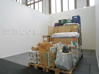
I then looked at the “playful works” that the commissioned designers had conjured and one of them really got to me.

I don’t want to be too critical, but it feels like I’ve seen this before. What is creating a room that many corporations already have, a form of play.

Through this analysis, perhaps I am wrong, but maybe the problem is not that designers are not creative enough, but the idea of playing for sudden creative thunder bolts is not an accurate representation of creative process. Perhaps there needs to be a stronger link to the thought process of the designer and the various criticality that each designer have to think of before coming up with solutions to solve their “design problem”.

My OSS Moodboard? Or something.

My word map is Fresh, Critical, Contrast

Malika Favre MoreImage creation: template. design. criação. inspiração. portfólio. ideia.Auri Sacra Fames. by Anthony Neil Dart, via Behance https://www.facebook.com/pages/EXPONLINE/141220162699654?ref=hl

Secret Societ gig postersbrigade__cynophile

The Rodina – graphic design & code — vampire supermodernism graphic designNew Wave Design | Critical Studies

I like the playful overtly critical nature of this poster. It brings a humor to the self critical nature of design. I could see an adaptation of this in a portfolio with a little playful humor.No automatic alt text available.

The visual exploration I want to undertake from the mood board is to show contrasting school of thoughts in graphic design. Some people are more inclined towards the cutesy, some people are more inclined toward the clean, and some are more inclined to the critical and I want to find a way to marry these schools. Because that is how I feel Singapore Design Week should be, showcasing different school of thoughts within graphic design.

The Tale of the 2 M’s

This is the key visual for the MONTREUX JAZZ FESTIVAL by French Illustrator Malika Favre. I think it’s captivating by the repetition of the female form and shows a playful side to the festival. Jazz is energetic and vibrant but she chose to use black and white to show the deep contrast between the silhouettes and the white space. In term of text, not much was used except for a small detail at the bottom left corner. Visually, people would think that it’s a dance festival but it illicit a different mood when the viewer realises it’s a jazz festival instead.

Metahaven, WikiLeaks Dark Store | Artists Space

This is a poster promoting Metahaven’s WikiLeak’s fundraiser at art berlin contemporary 2012.

Metahaven is by Amsterdam based design/art collective that creates visual design that is subversive and deliberately breaks the convention of contemporary graphic design where things are clean and visually direct.

The design for the poster present is much more politically charged than it seems. Apart from promoting the event itself with the use of text for the details, the word Wikileaks and the Macbook’s spinning rainbow are seemingly clouded and obscured or torn out. Visually, it is very different from the usual and it makes the viewer feel curious. The use of imagery is simple although unconventional. It literally means, Wikileaks is in limbo, and the image does feel like it is “leaking”.

Comparing the two, they take very different approaches. The former being more clear-cut, fun and takes the risk of not using direct images relating to jazz but more of evoking a feeling, and the latter being more subversive, politically-charged, and questions the audience in linking the visuals mentally before reading the text. Both are very appealing but maybe not for Singapore.

Trip to the National Design Centre

Unfortunately, my phone got broken on the day of the trip and I lost the photos I took.

Personally I feel that what I encountered was various design practices over the years but they were more mainstream and commercial driven projects.

The practices present during the show were very pragmatic, with categories like fashion accessories, visual communication, architecture and environmental design, and product design. I noticed that visual clutter is being removed over the years and things became more minimalistic. It is evident when looking at fashion, when you compare the Singapore Girl in the past and the fashion of today.

Although the focus of the the Design 2025 talks about turning Singapore into a design hub that is commercially driven, there are lesser talks about critical thinking and critical design. In essence, design is seen as a tool to “design” commercially viable projects and to push innovation and commercialisation.

Effective? Who knows.