Zine! – Rowell Road

Sell your location. ABSTRACT!

To be honest this was such a mind boggling assignment! I had to sell a location abstractly. But I guess my consultation with Joy was pretty helpful in a sense that she narrowed me down to focusing on order in disorder and disorder in order.

3

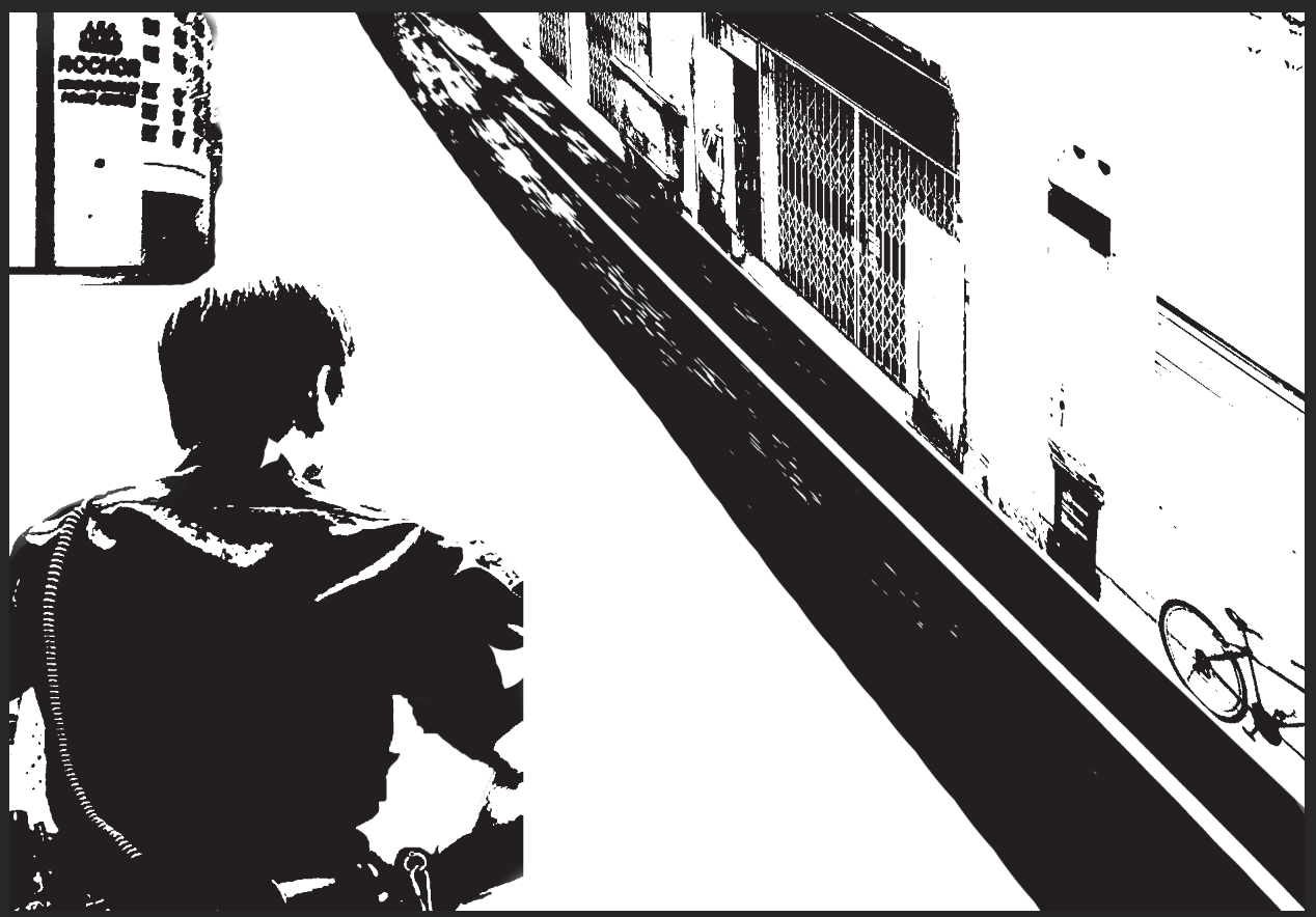
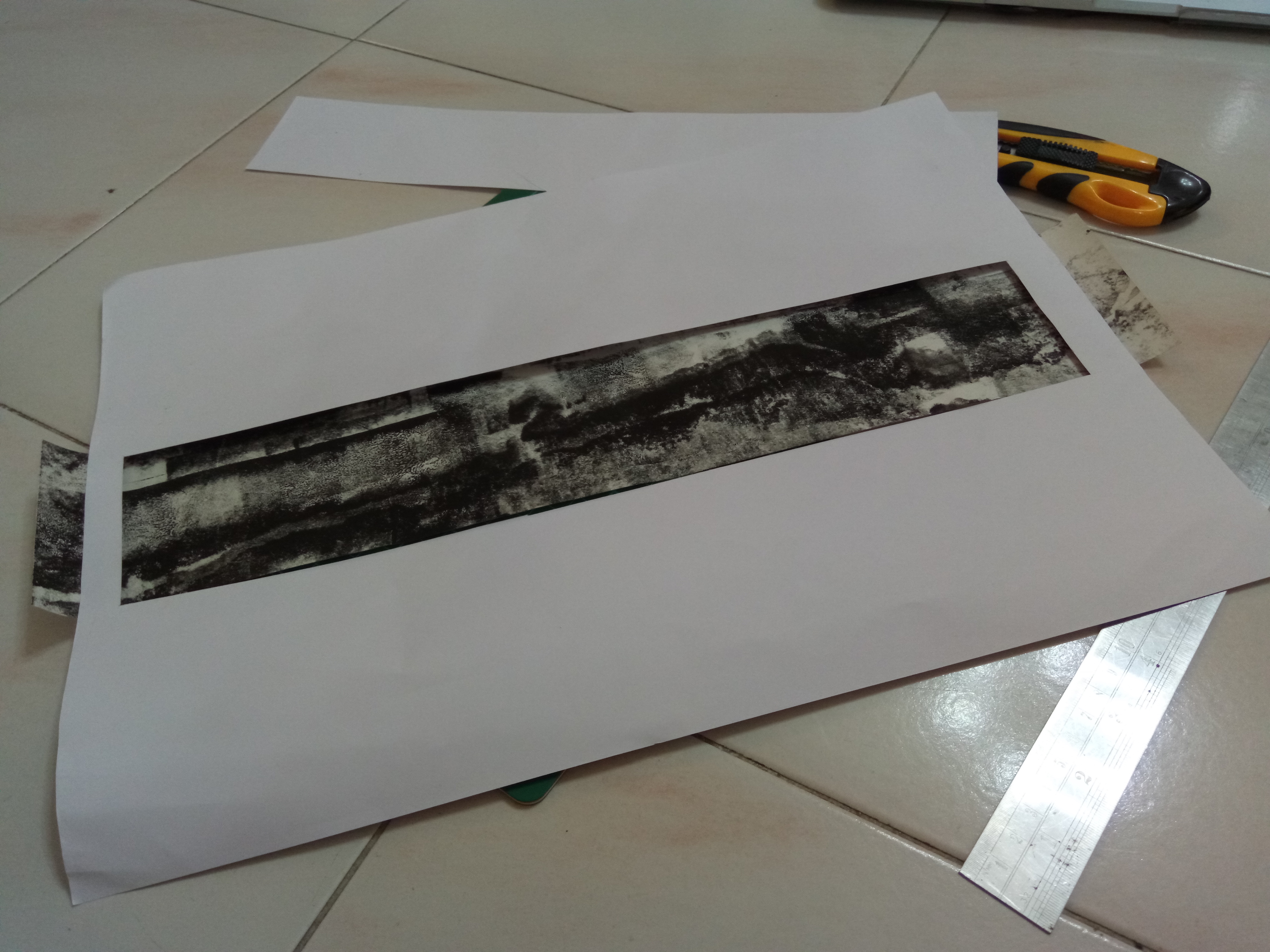
I tried digital painting, it didn’t work…

So I decided to appropriate images and collage it ala Forrest Gump last sem.

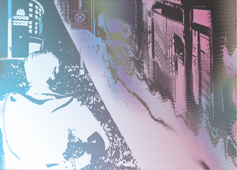
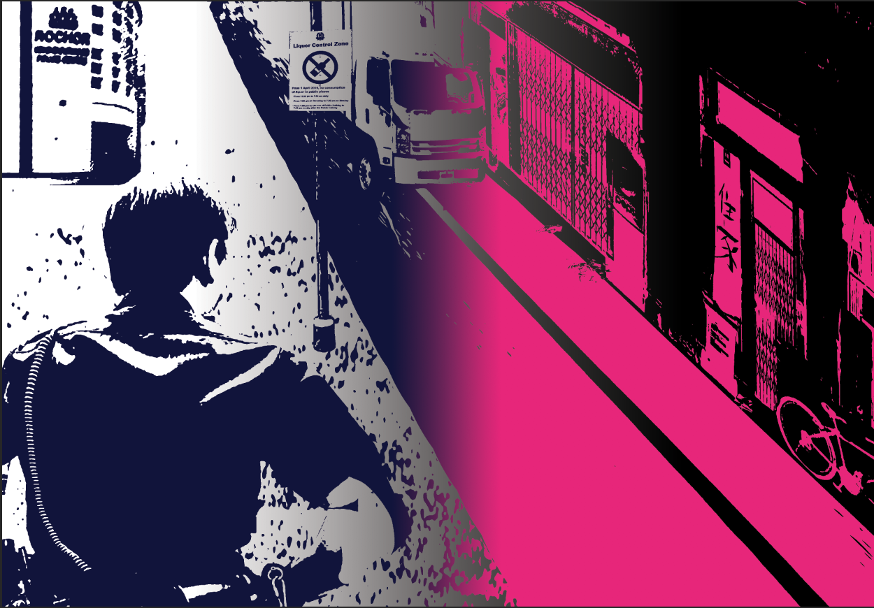
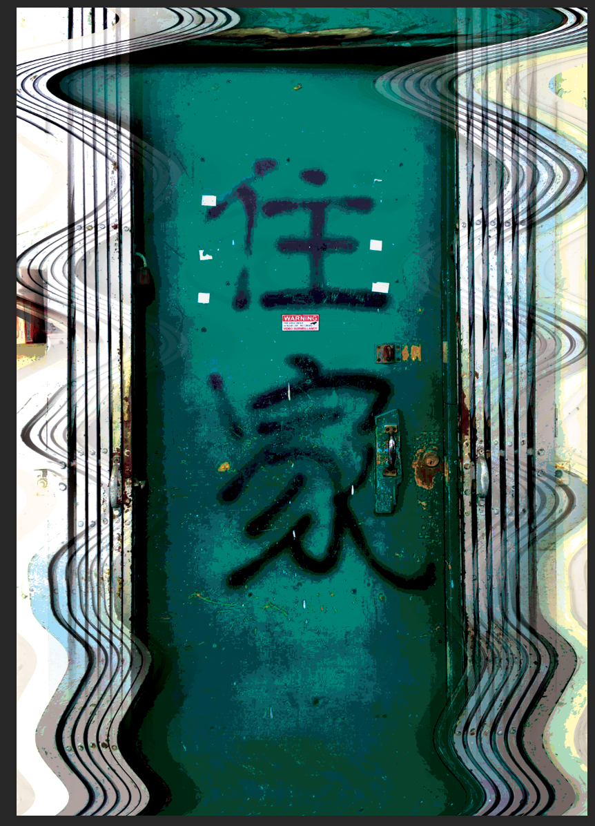
This was what I ended up with! I added more distortion to talk about order in disorder and disorder in order. This was my centrefold, showing the transition of order to disorder.

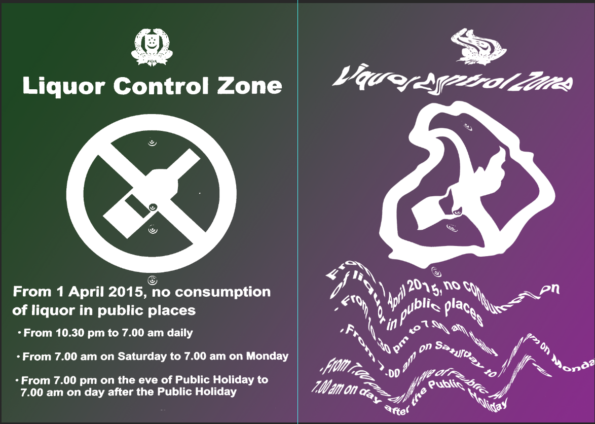
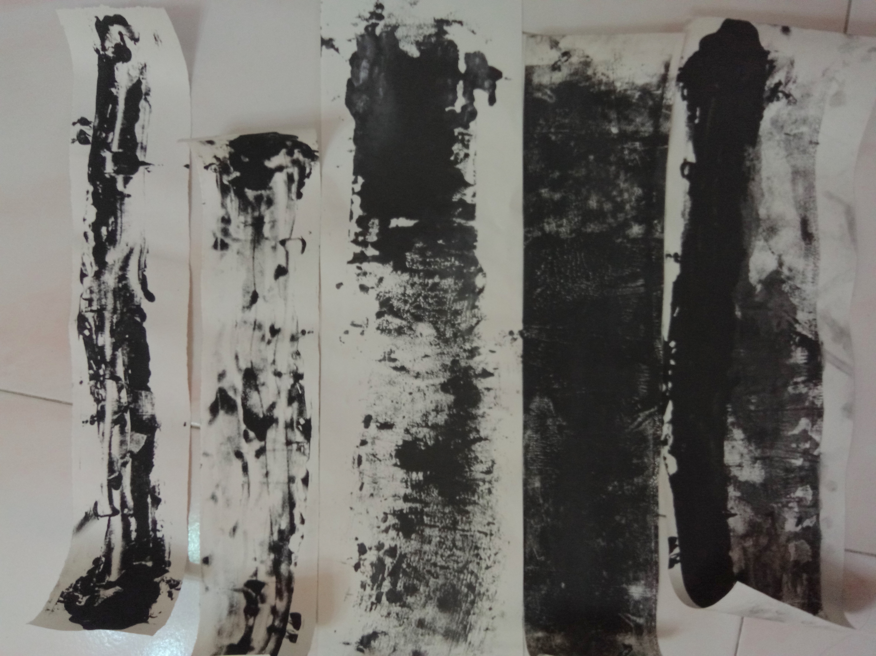
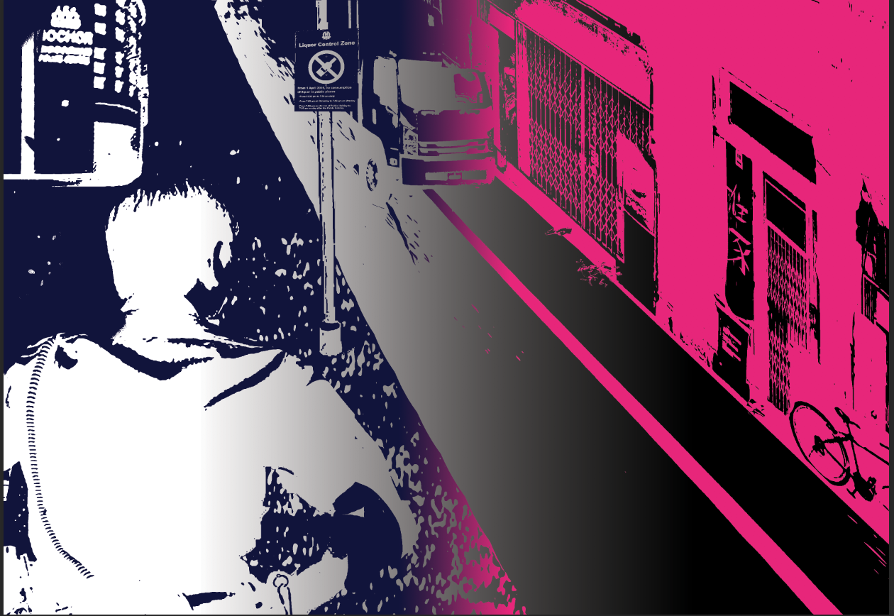
for another page i tried this at first. But Joy told me the colour wasn’t working and that I needed to show more order in disorder and more mess.

I decided to change my colour, make it more crinkled and go crazy with it!

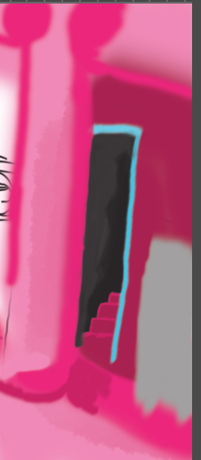
Was really proud of this page! I made the rip a rip!

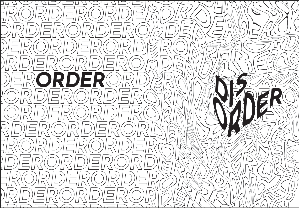
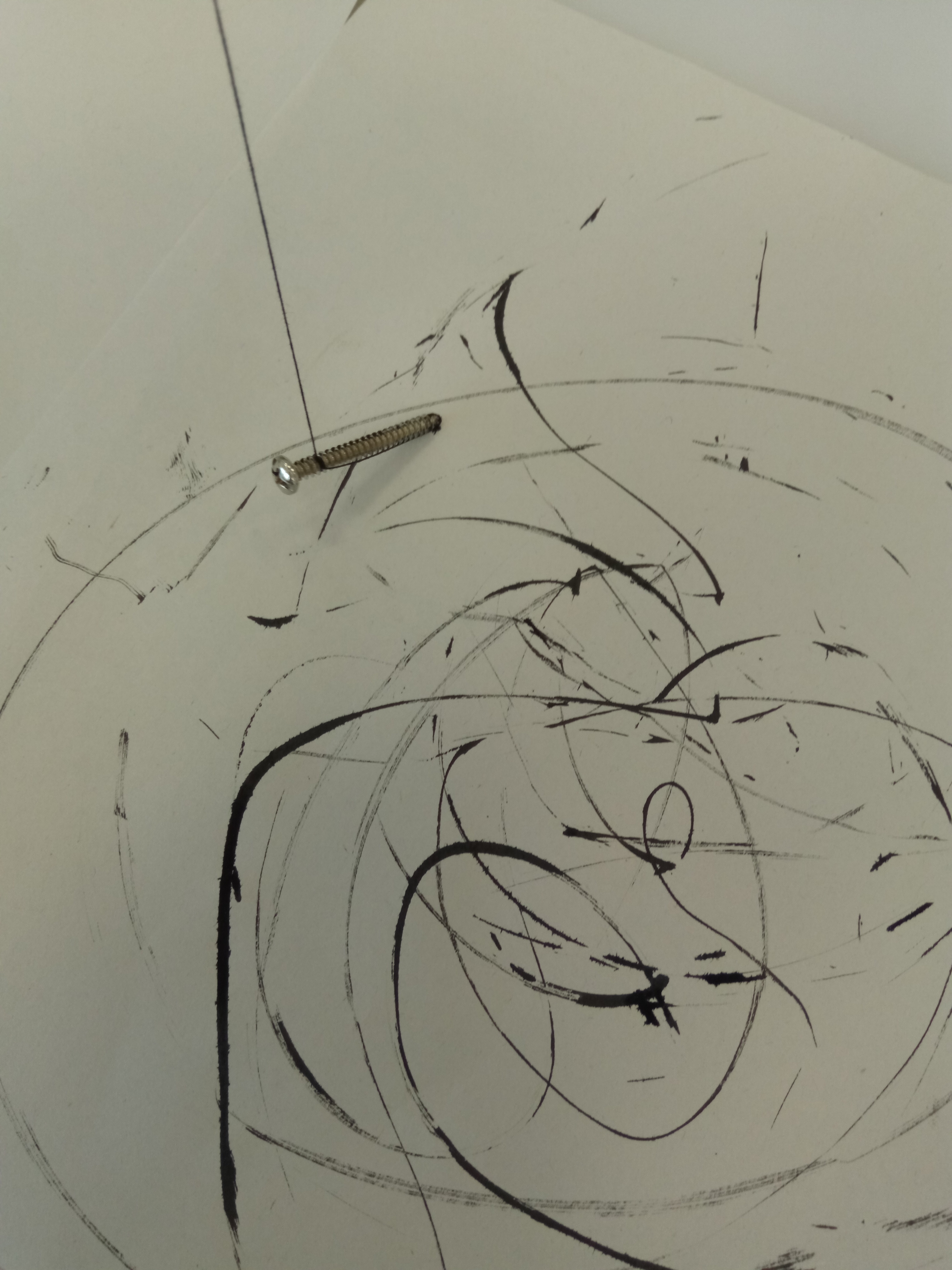
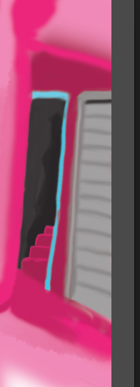
This was my first draft which Joy said, MORE!!! and also have some disorder in order as well.
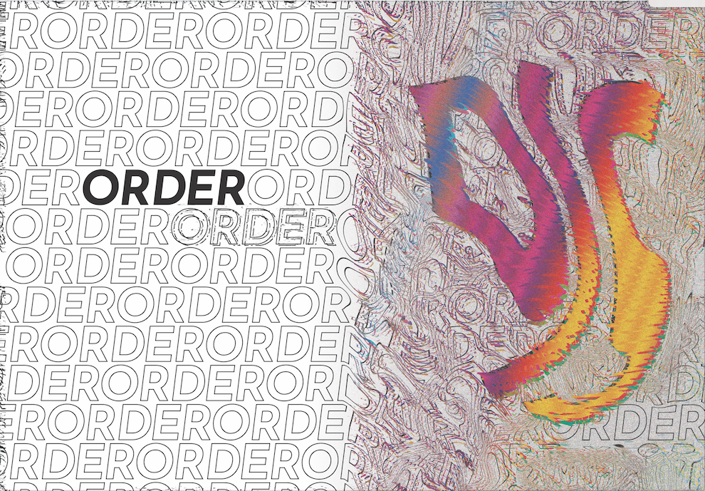
Yeap, gone crazy.

Lastly! Was the cover.

I had to further augment these to order in disorder and disorder in order. But at the same time I need to understand which image for order and which image for disorder.

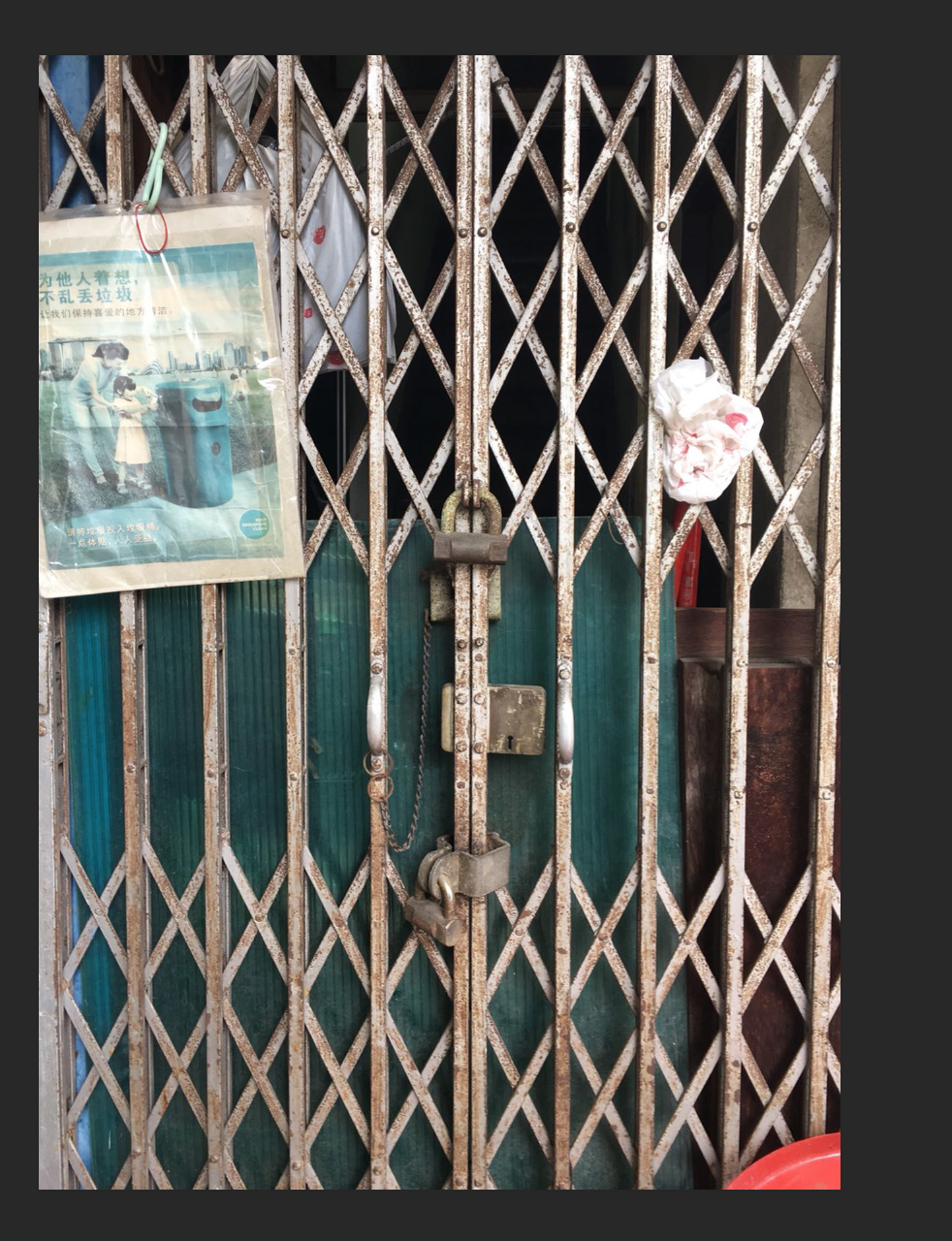
I decided to use the gate for disorder because behind the gate with an open door is when the prostitutes would tease the men and haggle prices before opening for them to go in. While a shut door is just a shut door with no business or no meaning except for its flavour in the neighbour hood.

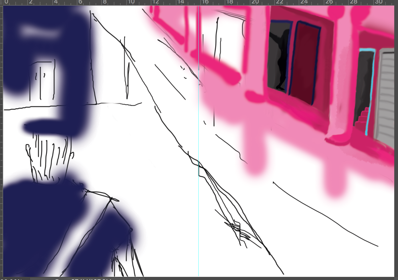
This was the amount of distortion and text setting that I settled with. But after some consultation with my peers, I decided to make order, more orderly.

this was my final cover page.

Didn’t enjoy this project as I felt that the interpretation and purpose was too varied. I rather something less fleeting and more grounded. But I did enjoy playing with semiotics on order and disorder and it was something different from what I usually do, which is straight out coloured flashy illustrations and graphic play.

My Line is Emo

Concluding the project, I was really glad that most of my classmates appreciated my work and understood my concept. I was glad that many people understood my layering process and ideology and was intrigued by my methods.

Recapping from my instructor’s feedback in which she liked the exploration of the black background and appreciated my exploration of various line work, however I needed to explore different papers. I understood her point of view but I do stand firm that I liked the consistency of the papers.

Moving forward, I think for future work, I could continue using layering and texturing for my image making and to consult my tutor if I do have ideas before it’s too late. I could also come out with more drafts and not be too emotionally entangled with the drafts so that I can let them go and redo a cleaner and more refined version of the work.

Processing… Part 2

I did some permutations but it made me very frustrated because I couldn’t get what I want. What I did was visualise an image like those visualisers you see on Windows Media Player. Just that it worked with a song tagged to an emotion.

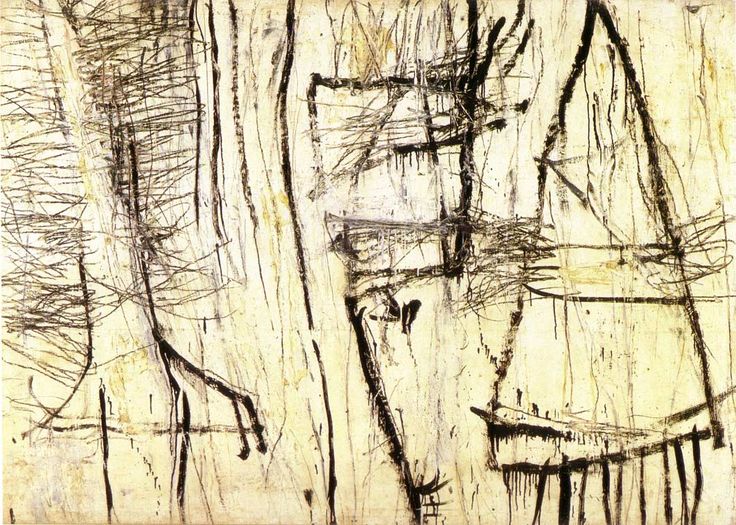
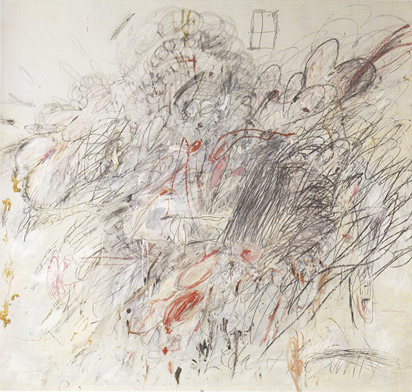
Exhibit A, I tried using the roller to give a swishing effect to show sensuality and intertwining for “lust”. But it was only concentrated on the side, it didn’t roll nicely, but the effect was still intended, I could still see a soft intertwining effect. Secondly, I tried to layer another feeling on top of the feeling of sensuality. This was because I felt that a singular stroke or line was not enough to represent the complexity of emotions, therefore I added more rigid, repetitive lines on top of the swishes. I think that it achieved an intended effect, but there is more to work on in terms of finding the right layer.

Another issue I had was the eventual cropping of the larger lines I made. In the end, the lines have to narrowed down and be framed within the guide of 380 x 72. However, for some lines it worked, it worked in which the cropping augmented the emotions that I was portraying. Like wise, for others, a large significant portion of the emotions were cut off and it needed to be re-layered with another feeling to further bring out the emotion.

This was eventually resolved. Nothing much rocket science smile

Processing… Part 1

So, I did a few experimentations with various mediums and felt there were very similar lines created by different objects. Some of my lines ended up like this :  This line gave a more rejuvenating look, and it was very lively and very exciting. It was made with a toothbrush.This line was made with a nail in a similar fashion of witches “scrying” for people on a map with a crystal. It gave more pendular effect and the lines varied in weight. Very large spaces the lines feel very cold, but wise. If you get what I’m saying.

This line was made with charcoal and then smudging the charcoal to create implied lines. The lines are very soft and it flakes due to the softness of the paper. I like how it gives a very subtle textured look. But I need to work on smudging. It looks very forced.

These black lines were made after both, rolling paint on a piece of paper and plastering another on top, or putting it a piece of paper on top of a piece with wet Chinese ink. I think the ones with paint gives a very rugged edged but it tapers to a soft sensuality. Due to the plastering of the two pieces of paper together, it ends up having a softer, liquidised look as seen in the second piece from the left.

Mark Making Inspirations

I am inspired by Cy Twombly because he manages to take the narrative and reduces it through abstract expressionism. While he works abstractly, his final product is usually symbolic of his original intent and the iconography of the elements in his work can be deciphered through the use of shapes and colours.

His work might look mainly like child’s play but the sheer thought of reducing the heavy imagery to loose lines and shapes is applauded by academics and critics.

Leda And The Swan (1962)
Cy Twombly
Oil, pencil, and crayon on canvas
190.5 x 200 cm
© 2017 Cy Twombly Foundation

An example would be Leda And The Swan.  Where there are many representational shapes such as hearts and also abstract elements like strong lines and violent swirls. The artwork ends off with a representational image of a very thin window at the top which grounds the violent imagery in the painting which symbolises an idea of the third-party viewing the violent seduction of Leda and The Swan.