2D – More artist references

http://malikafavre.com

I have been a fan of Malika Favre since forever. Seeing her work decorate the walls of Sephora is such an awe.

I love how she can be so minimal and so detail at the same time. Her work while vector, is so expressive with the use of colour. I really love her work. Teehee.

http://www.yusukenakamura.net/

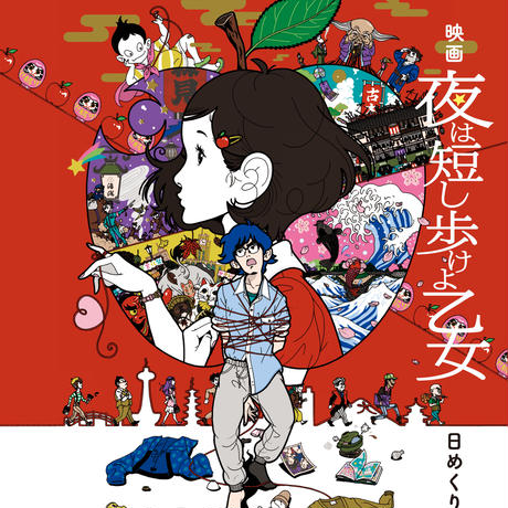
Yusuke Nakamura is another vector artist known for his album covers for the Japanese Rock band, ASIAN KUNGFU GENERATION. His distincstyle is his character design juxtaposed by detailed and complex illustrations. I love his use of that black outline mixed with the vibrant colours and well-composed artwork.

http://marumiyan.com/

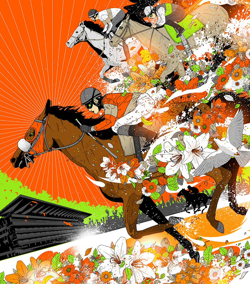
Another artist which I have been following very closely is Marumiyan, who has been moving towards 3D works lately. His 2D works are well illustrated vector works supplemented with stock vectors of flowers. The stylistic beauty of it lies with the composition and the bright vibrant use of colours. He also uses the idea of gestalt to create a high contrast figure combined with vibrant colours for facial details.

https://www.yukariterakado.com/w

Another artist I like is Yukari Terakado.

She has a strong sense of portrait works which I enjoy the feminine qualities of of her work.

http://www.mynameistran.com/

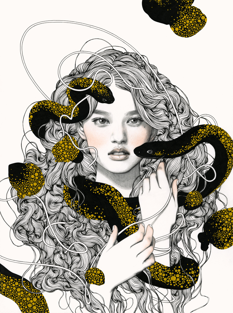
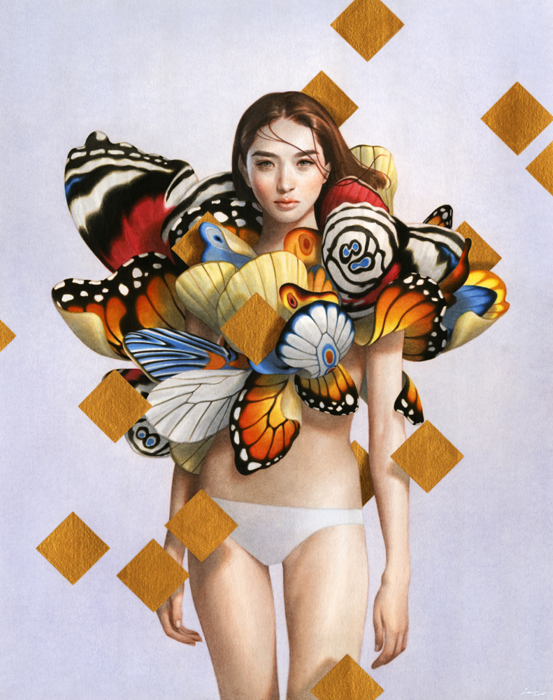
Another artist which I love and want to try to emulate is Tran Nguyen.

She has well composed portraits which she supplements with unrelated objects and it creates a different setting. I love the expression of her characters. There is an idea of forlorn and strength and her sense of scale is amazing as well, composing figures that are just unimaginably striking.

http://victo-ngai.com

Victo is an award winning illustrator known for her simple and striking graphics, the great use of perspective, colour, and composition. She uses this to her advantage to create complex, yet well composed images to sell her story. I really like her works because there’s a very good use of colour palette and she is able to go the gradient work so well without making it look too metallic.

2D – One more to the list.

One more to the lit of quotes to ideate.

Everybody wants to be us.

Well no surprise, this was from Devil Wears Prada when Andrea told Miranda about some guys ploy to replace her and Miranda shocks Andrea that Miranda had already calculated and sacrificed her pawns wisely. In which Andrea responds that she didn’t want to become like Miranda, but Miranda said the line and Andrea walks off in self-realisation.

Draft 1, where I put a Marilyn Monroe onto a screen with paparazzi shooting her. As usual, from the beginning, the idea is way too simple. Although I want to depict the idea of beauty and fashion and desire.

The next Draft, I used the leading fashion lady herself, Anna Wintour and how in evolution, even monkeys wanted to be her, I think this was very clear but at the same time this was very simple and needed more layering. It didn’t look aesthetically pleasing as well.

The next draft was inspired by runway and how we are chasing for the latest fashion trend or the latest runway collateral. This was a bit confusing because the paparazzi silhouette didn’t show well. The Elizabethan girl was very well juxtaposed and the hands looked a bit too awkward. I did like the flag effect that followed through with the idea though.

I then had a sudden stroke of genius one night. I recalled a friend talking to me about her FYP many years back about how we are sheep to the media, blindly following trends, how we wanted to be like what the media portrayed.

My next draft would be this. A pin-up pose model enclosed in a TV set with a herd of sheep following her. I made her a wolf because the media preys on our attention. To supplement the idea of attention, I used the paparazzi photo to enhance the idea. I think this encapsulates the idea of the quote. Although I wish it could be augmented to be large in length, it does look very pleasing and I do like the juxtaposition between the engraving texture and the threshold effect.

Following this, I consulted Mimi and she told me to lighten the background and to edited the sheep so it does not look so patchy.

I inverted the silhouette to that the engraved mesh parts would more of a grey tone. However, I do think that it looked better darker. It looks like a TV static which is to what I like. It really does speak the quote, but I think that the background should’ve remained the previous one.


Art Science Museum Visit

Corrine Mauriad FAKE|REAL ME Lightbox Photograph


The initial impression of the work would be that it would be about Asian beauty stereotypes. I think it leaves a curious taste in the viewers palette as South Korea is known for its plastic surgery. I think the artist is curious about the beauty standards. While these 3 women are inherently different from one another, they have chosen a common beauty denominator to look a like. I think the first reaction to see through this was that the three women had different facial shapes, something that people who go through plastic surgery would commonly not alter and it reflects back to the Korean Wave that had hit internationally with the celebrities looking alike. The use of lightbox photography was a clever medium. It highlights the “perfect” look like an illuminated wanted poster.

I think after reading the text, it didn’t sway me much as it was very similar to what I had thought initially. I think that those who had prior knowledge about the culture in S. Korea would get this work immediately, but those who did not would require text to assist. Overall, I think it didn’t require as much resolution in the communication.

Jaemin Park When We All Live to 150 Mixed Media Installation

I think when I first saw the work, I thought it was just a family tree to depict genealogy. I did not associate it with lifespan or about old age until I saw the secondary images and read more about the work. I thought it had a tongue in cheek quality and a parody of genes. This was due to the common usage of Family Trees to depict genes and heredity. This was a creative use of multiple mediums from photography to a large format poster to a small booklet to augment the idea of a brochure to a longer lifespan.

After understanding the work, it did not relate to my initial perception of the work. This was because the work was in fact an imagination of the world if the life expectancy would be moved to 150. I think this might be a challenge to resolve. It could be a curatorial issue. I might present the photographs first before the family tree and brochure.

Inspiration for My Strange Encounter

Taken from Q-TA’s website. Click here for website.

Japanese Artist Q-TA uses multiple images to construct images for his clients. These images fit his clients such as Majolica Majorca, and ISETAN JP by demonstrating a quirky and whimsical visual language for their brand. His work captivates through usage of human figures and distortion of form by combining it with elements and colours that fit his intended mood. He mainly distorts perception through the enlarging of his figures and displacing them with a cosmic background or a warped landscape and uses a centred composition to capture attention.

Many of his other works have a fashion focus and relates to the audience by putting the figure at the foreground, creating a ‘breaking the fourth wall” effect.

Work by Amsyar Ashaary. Click Here for Portfolio.

Amsyar Ashaary captivates by storytelling through collages. He uses vintage character images, dystopian landscapes with vector graphics to create fresh settings, in which he distorts the viewers perception of time and place. He also uses a mainly cool colours like purple and cyan that are pleasing to the eye and does not force attention to the audience. While most collage artists would work with found images, Amsyar Ashaary does not hesitate to create his own graphics to fit into his narrative and to expand his image vocabulary. Doing so, it gives him more flexibility in crafting his image to augment his narrative.

Unlike Q-Ta, who has a more fashion focus, Amsyar Ashaary creates with no client in mind, thus it gives him the freedom to create settings that are more odd and unexpected.

Mark Making Inspirations

I am inspired by Cy Twombly because he manages to take the narrative and reduces it through abstract expressionism. While he works abstractly, his final product is usually symbolic of his original intent and the iconography of the elements in his work can be deciphered through the use of shapes and colours.

His work might look mainly like child’s play but the sheer thought of reducing the heavy imagery to loose lines and shapes is applauded by academics and critics.

Leda And The Swan (1962)
Cy Twombly
Oil, pencil, and crayon on canvas
190.5 x 200 cm
© 2017 Cy Twombly Foundation

An example would be Leda And The Swan.  Where there are many representational shapes such as hearts and also abstract elements like strong lines and violent swirls. The artwork ends off with a representational image of a very thin window at the top which grounds the violent imagery in the painting which symbolises an idea of the third-party viewing the violent seduction of Leda and The Swan.