I began this project with hesitation as I felt that there was no aim and goals as the letter forms were barely shown. Upon receiving the brief, I knew however, what art direction I wanted to take : Fashion Magazine Editorial.
Garance Dore

Megan Hess
My sad attempt.
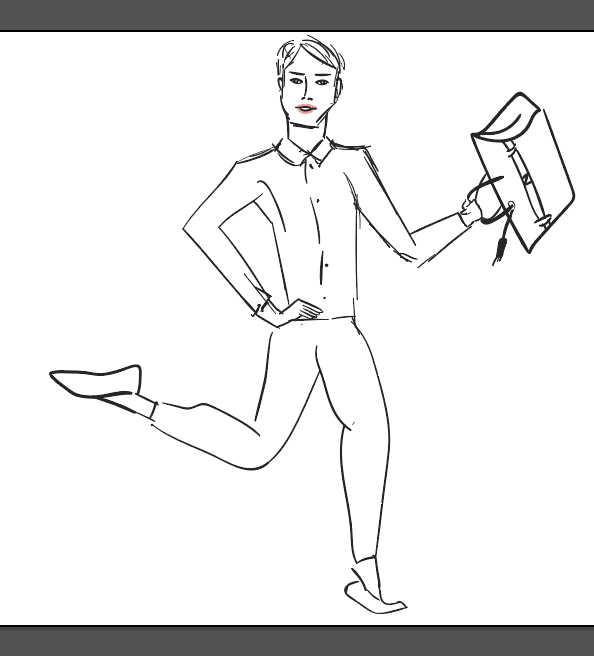
I began most of my work with a composition setting as seen below and I tried to sketch a form to fit the typeface composition that I have created. Unfortunately, it wasn’t a good move.

Harper’s Bazaar 2013

Harper’s Bazaar Mexico 2013 January
I decided to try another approach, drawing silhouettes onto the typographical compositions that I have created and then fill it in later.

The interaction seems to fit well and the letterforms are being fitted well. But after various consultation with Joy and attempting to fit clothings on the figure, I discovered it was a horrendous failure.
Looks like grandma clothes instead of being a model.
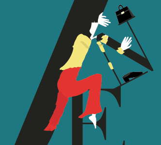
Slowly, I ended going back to my first love, Malika Favre.

Malika Favre, Vanity Fair
But I have already took her as an inspiration last semester… So I decided to create a different take of this style. Adapting the use of negative space but bringing my own hide-and-seek sexy twist. Since clothings do not fit well, I have completely omitted it and let the androgynous silhouettes take precedence in the work.
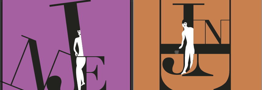
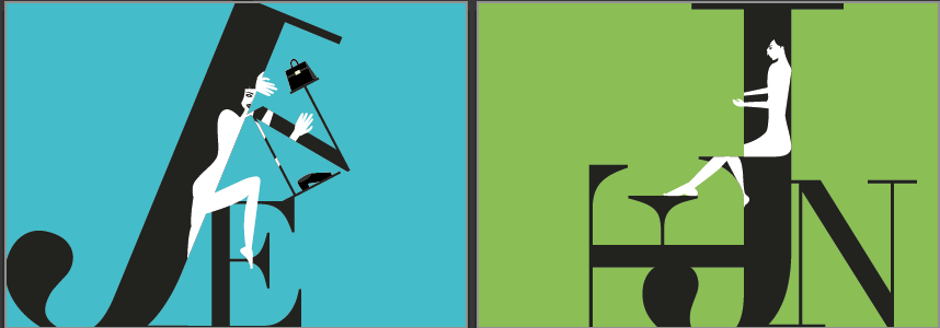
It’s really not easy to think of ways to play with these compositions but I didn’t want to make the letters of my name JEN too obscured. I wanted to promote the job and the person at the same time. If you cannot read the letters, then how would you know who’s the beautiful person behind the job?
Based on the above, after consultation, I felt like the barista and the art critic wasn’t sexy enough. Joy also commented that I should play more with the shadows and the silhouettes. Since my characters were already not meant to be proportionate but to be irresistibly salacious, here begins the grand edit.
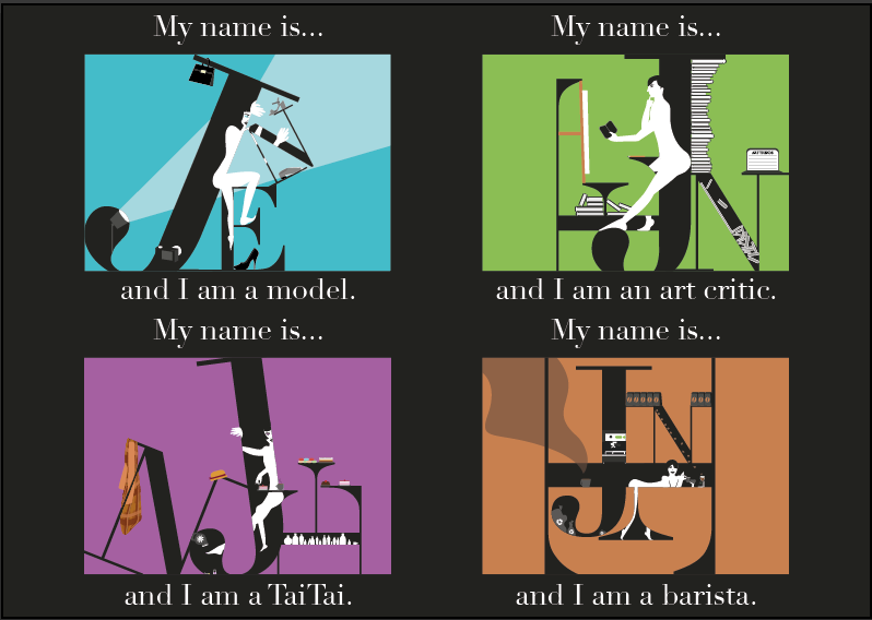
At the end of the day, I made the Taitai do more Taitai things, like pedicure, the model be in a photoshoot, the art critic studying a work, having a pile of books and trying to update the ART TRENDS website and for the barista to look like a seduction curvaceous bombshell making that latte art for the customer.
Overall, I felt that I stayed true to what I wanted to do. The main challenge I had was to keep it minimalistic, but salacious and sexy. I felt that I managed to do it, but during consultations, my frustration would be between adding more secondary elements to interact with the letterforms or to stop and remove.
The use of Didot (typeface) was a smart move to me because Bodoni, a popular fashion magazine typeface, was too bulbous and Didot had a good balance between the thick and thin and transits very well to allow me to form a composition with the characters.
Truthfully, I do want to be as sexy as my characters and try all 4 jobs at least once in a lifetime. Okay, maybe not barista because I risk dropping the coffee.