Exploratory Research

The population of the visually impaired in Singapore

  1. 1.5% x 4.026 x 10^6 = 60,393 (visually & hearing disability)
  2. No. of visually people in SG who opted out of the voting process → no info available
https://www.singstat.gov.sg/find-data/search-by-theme/population/population-and-population-structure/latest-data
https://sadeaf.org.sg/faq-on-sadeaf-and-about-the-deaf-and-hard-of-hearing/faq-on-number-of-deaf-in-singapore/
https://www.spd.org.sg/about-us/disability-facts-figures/


Voting at Singapore’s presidential or parliamentary elections is compulsory for all eligible citizens but many citizens with disabilities face great difficulties in participating in the voting process.

  1. Difficulties faced during voting process
    1. Participation in electoral process
      1. Election rallies are not necessarily planned with accessible routes to the venues.
      2.  
      3. Information about the accessible features available at election rallies and polling stations is not available on the Elections Department website and therefore not known to most people with disabilities.
      4. Election information and political party manifestos/campaign materials are not provided in accessible formats, for example braille, large text, easy-to-read, audio.
      5. The Elections Department and political parties’ websites do not comply with the Triple-A Web Content Accessibility Guidelines which ensure that webpages are easily accessible to those with disabilities.
  2. Voting Day
    1. No braille voting cards

Propositions to improve electoral process

  1. Participation in electoral process
    1. Reserved area at election rally venues
    2. Information Hotline: The Elections Department could create a toll-free hotline for persons with disabilities or their caregivers to request for accommodation or information about the elections. This line could be activated in the run up to the elections if it is not feasible to run it all year round.
    3. Publicise accessible measures on voting day at welfare organisations/NGOs
    4. ELD website to comply to Triple-A Web Content Accessibility Guidelines
    5. The Elections Department and political parties’ websites do not comply with the Triple-A Web Content Accessibility Guidelines which ensure that webpages are easily accessible to those with disabilities.

Research Findings derived from: Publication by Disabled People’s Association (Singapore) in 2016, titled “Achieving Inclusion in Electoral Process”

https://www.dpa.org.sg/wp-content/uploads/2016/10/Achieving-Inclusion-in-Electoral-Process-compressed.pdf

Task 1A: Exploratory Research

What are some current issues confronting the world today?

A. Political: Indeliberate Exclusion of the Disabled from Voting in Singapore

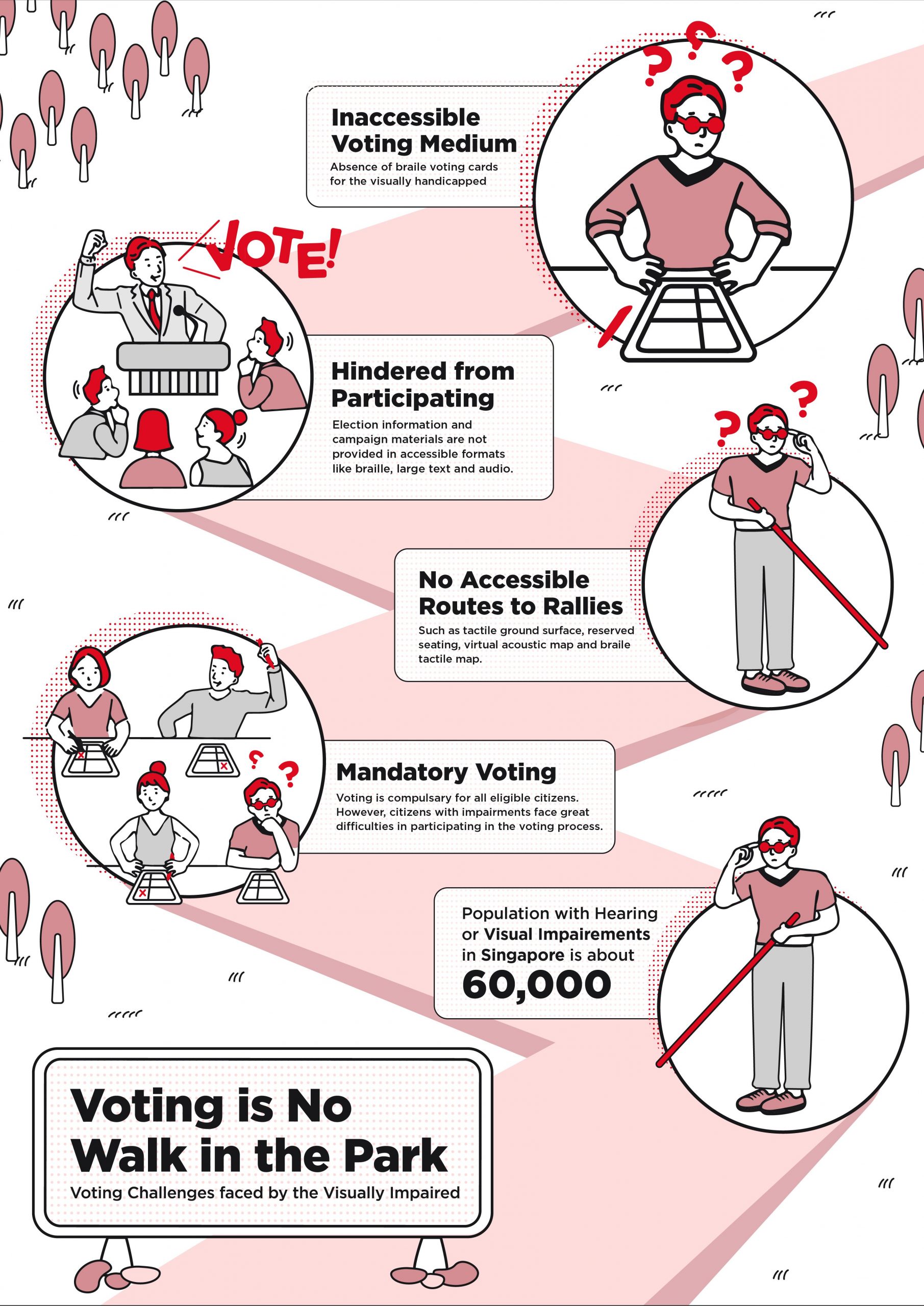
Voting at Singapore’s presidential elections is mandatory for all eligible citizens, including those with disabilities. However, there seems to be a higher barrier to electoral participation for those with physical, visual and mental impediments. These barriers range from a lack of awareness on one’s right to vote, to asymmetrical electoral information and physical barriers at election rallies and voting stations. As a result, the disabled may be deterred from voting and might even be left out of the process altogether. Some efforts have been observed in attempts to alleviate such voting issues however more could be done to resolve the physical barriers, the information and communication barriers as well as systemic barriers.

https://www.dpa.org.sg/wp-content/uploads/2016/10/Achieving-Inclusion-in-Electoral-Process-compressed.pdf

https://www.straitstimes.com/politics/self-inking-pens-prototype-polling-booths-among-changes-for-singapores-next-general

https://www.gov.sg/article/can-i-help-a-physically-handicapped-family-member-mark-his-ballot-paper

US case studies:

Reforming Elections Without Excluding Disabled Voters

https://time.com/5622652/disability-voter-turnout-2020/

https://www.pewtrusts.org/en/research-and-analysis/blogs/stateline/2018/02/01/how-voters-with-disabilities-are-blocked-from-the-ballot-box

B. Education: Restructuring Upper Secondary Maths Syllabus for students with ADHD

Math is an extremely crucial and useful skill that many of us overlook every day. However, solving math problems can be frustrating and tedious for those struggling with attention deficit hyperactivity disorder (ADHD). Math is a complex process that requires memory, attention, problem-solving and organising, all of which are challenging for students with ADHD. As a student progresses up to upper secondary in Singapore, he/she is put at a huge disadvantage with the long word problems and complex answers that even average students struggle deeply with. Since ADHD causes one to be unable to focus and hyper-stimulated, it is not an indication of one’s intelligence. Moreover, O/N-level being one of the preliminary national examinations that any student in Singapore has to go through, being compromised for the school’s oversight in catering for one’s learning ability is a huge disservice to students who require so.

https://www.verywellmind.com/adhd-and-math-skills-20804

9 + 9 = 18 Tips to Sharpen Your Child’s Math Skills

https://www.imh.com.sg/clinical/page.aspx?id=249

What it’s like in S’pore’s mainstream school system with ADHD & dyslexia, according to a 10-year-old

https://www.straitstimes.com/singapore/students-invent-robot-that-could-help-adhd-children-to-learn

C.  Social & Technology: Mental Health of the Elderly

Along with a bourgeoning silver generation comes ageing issues which include mental health issues, specifically depression stemming from feelings of loneliness. Cited from Channel News Asia insider, “one in five elderly persons in Singapore aged 75 and above show signs of depression”, and studies have shown that elderly “living with their children, but without their spouses, were as lonely as those living on their own” and “it’s about having a peer; having someone you can connect with”

https://www.straitstimes.com/singapore/more-than-1-in-3-suicides-committed-by-elderly-as-singapore-population-ages

D. Environment: Does recycling do more environmental harm than good?

NEA reports that the recycling rate of plastic waste has been decreasing from 11% to 4% from 2013 to 2018. This was so due to waste contamination, which drives the cost and resources needed to clean, process and recycle plastic. Part of the issue also includes the disposal of plastic trash which is often disposed at an illegal foreign landfill, exported to other countries and even dumped in the ocean. To add to the rising plastic waste, the zero-waste trend could have also contributed to the rise in demand for zero-waste “kits” and sometimes, even an increase in disposable waste.

Can Plastic Recycling Do More Harm Than Good?

https://www.vox.com/the-goods/2019/5/14/18563375/zero-waste-products-straws-jars-tote-bags

‘Wishful recycling’: More harm than good

https://news.sky.com/story/recycling-could-be-doing-more-harm-than-good-11291742

Why is the issue important? Who does it affect and how?

I’ve chosen the political issue on the indeliberate exclusion of the disabled from voting in Singapore.

Article 29 of the United Nations (UN) Convention on the Rights of Persons with Disabilities (CRPD) is a series of legal obligations that promote, defend and reinforce the human rights of all persons with disabilities. It deals specifically with the right of every person who has a disability to participate fully and effectively in political life on an equal basis with others hence this issue is important due to unheard marginalised needs and has the right to be heard. In addition, this does not only refer to the right to physical access and ability to participate in election rallies and booths, but also the right to access all electoral information and communications prior to the election.

The severity of issue: The WHO estimated that Asia alone holds 58% or 40 million, of the world’s blind. It is estimated that another 20 million are severely visually impaired. Currently, the population of the blind in Singapore still isn’t hasn’t been formally calculated (which does say a lot about the governmental/corporate care for he marginalised).

http://www.annals.edu.sg/pdf/35VolNo3200604/V35N3p215.pdf

https://savh.org.sg/wp-content/uploads/2018/08/2017-2018-Annual-Report.pdf

Who do you need to communicate to and why?

Stakeholders such as

  • eligible citizens with visual impairment
  • family members and caretakers of the above
  • Healthcare provider such as the Singapore Association of the Visually Handicapped (SAVH)
  • Election Department in Singapore (ELD)

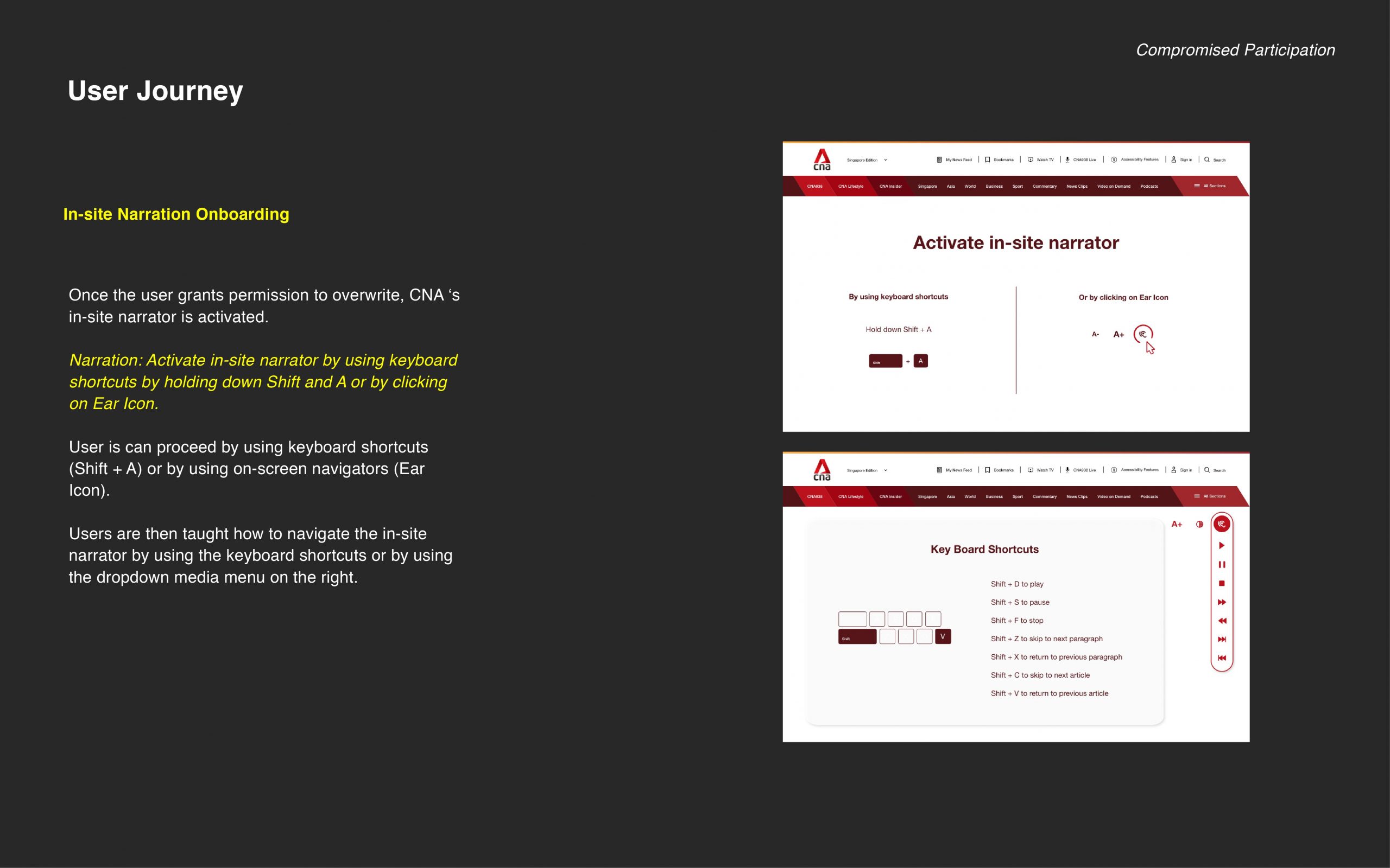
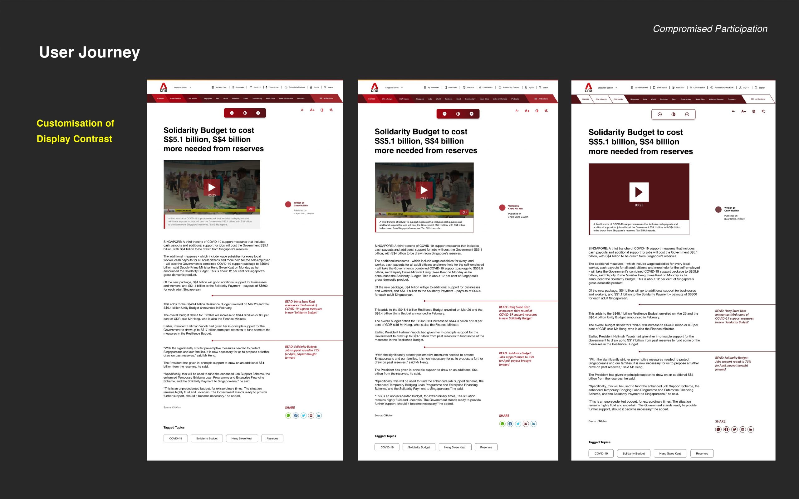
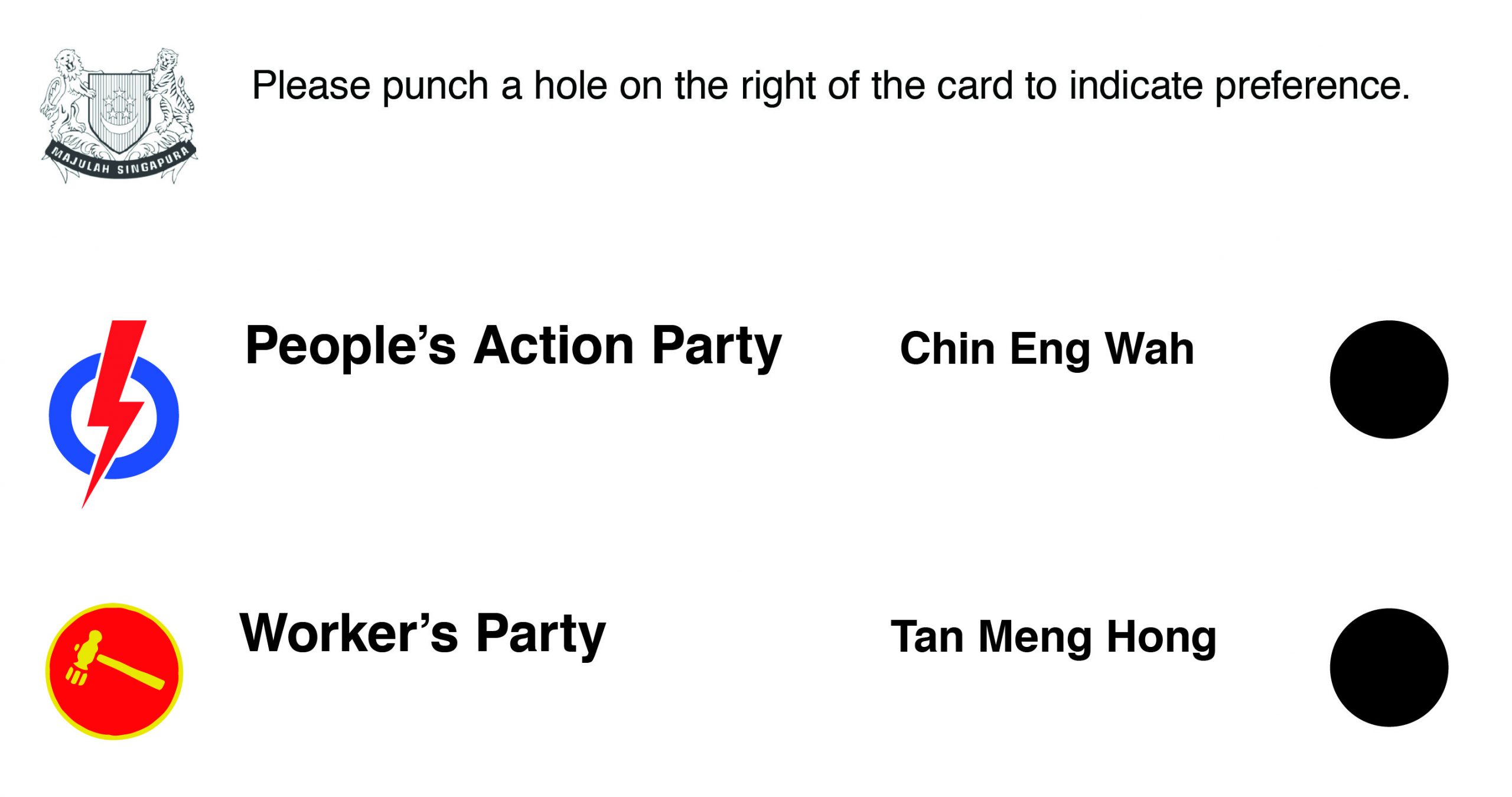
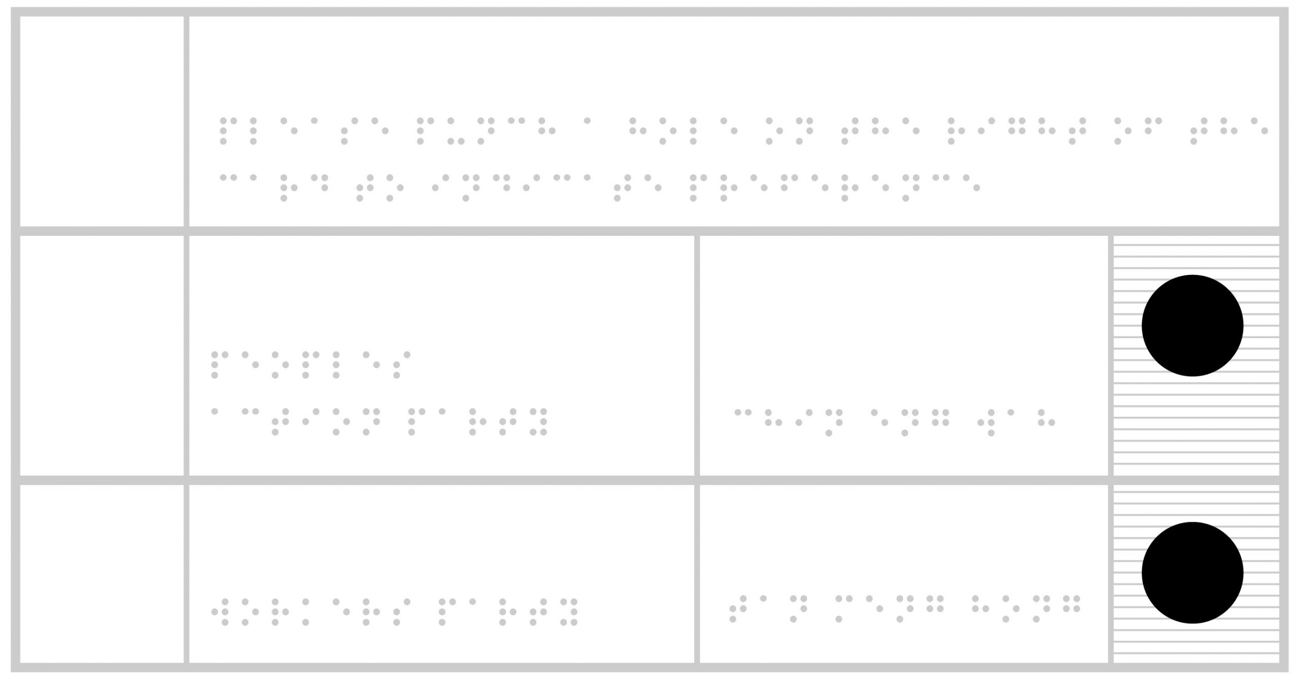
I anticipate the need for a spatial set up to read and vote in private as well as visual (braille) and auditory (instructional audio recording) guidance in voting. A need for wayfinding arises too, so as to ensure a calm and smooth voting experience for the visually handicapped.

Real-Life Examples: India has recently introduced a braille voting card for the visually impaired, facilitating more than 800 visually impaired electorates to vote. Another country that did so was Egypt in 2019 and Australia in 2012.

https://www.ndtv.com/india-news/lok-sabha-elections-2019-ballot-paper-in-braille-for-visually-impaired-meghalaya-voters-2015297

https://www.egypttoday.com/Article/2/68509/NEA-to-print-Braille-ballot-papers-for-1st-time-in

http://www.dailymirror.lk/21496/tech

How has visual communication contributed to the cause?

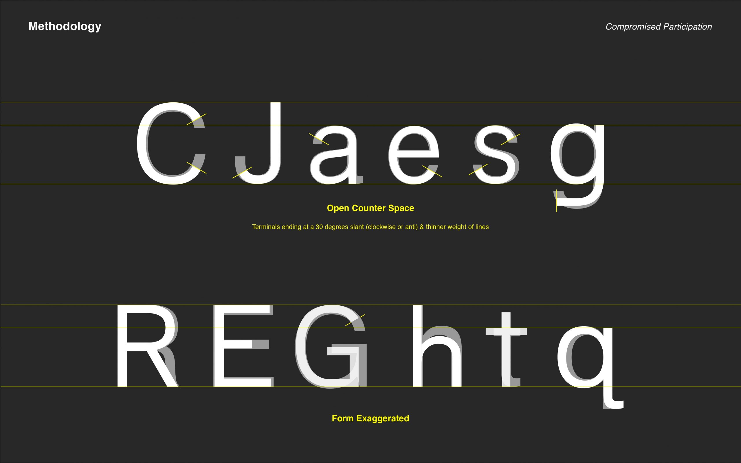
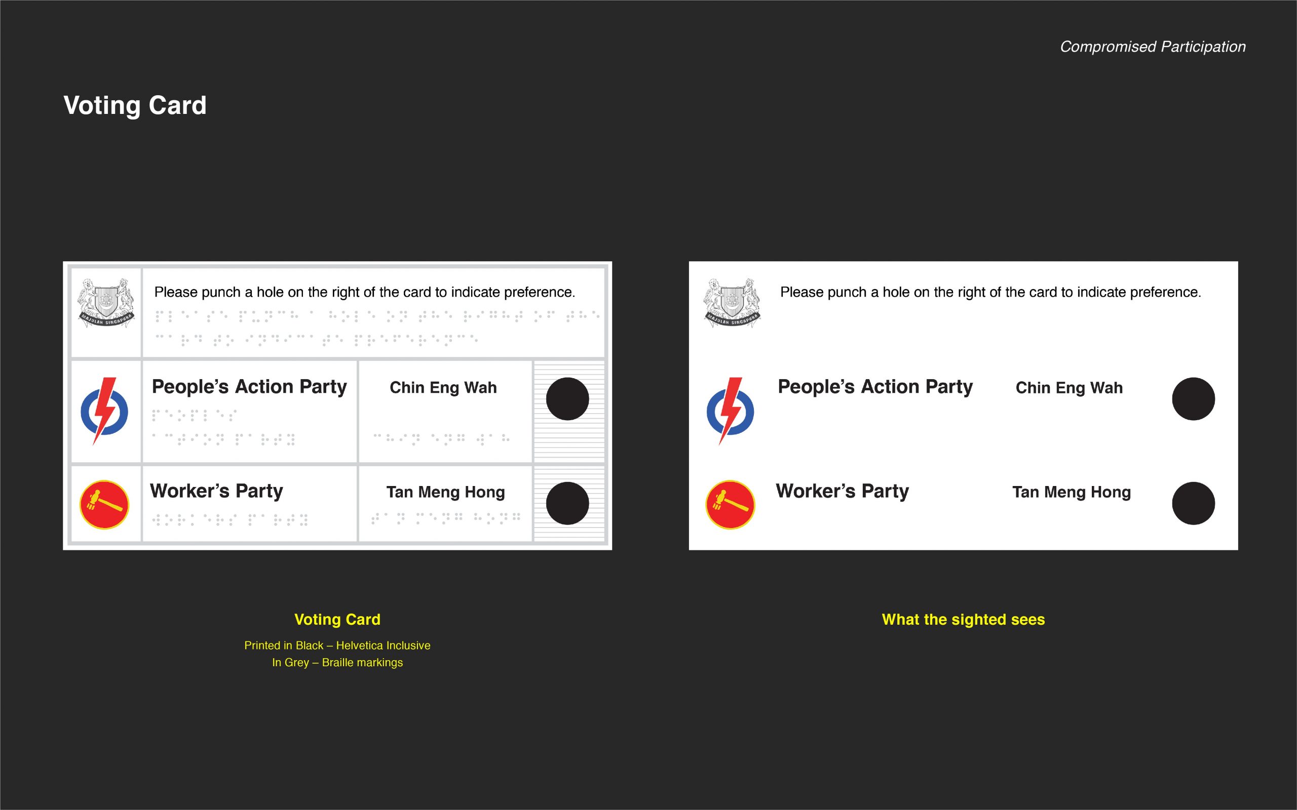
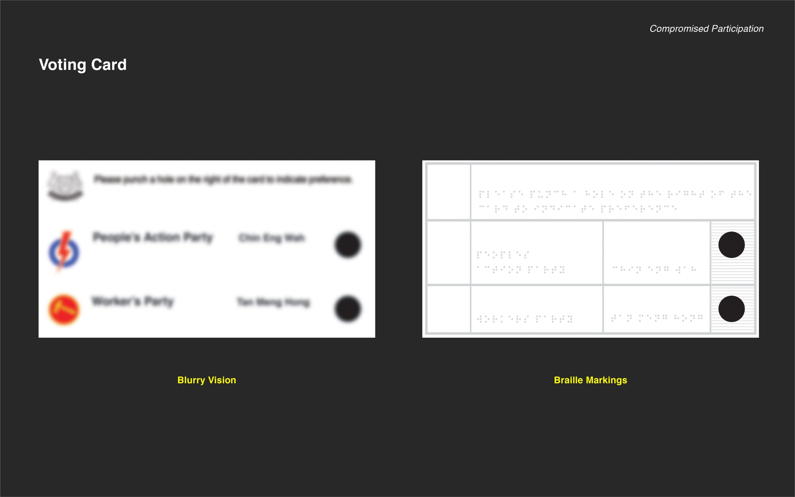
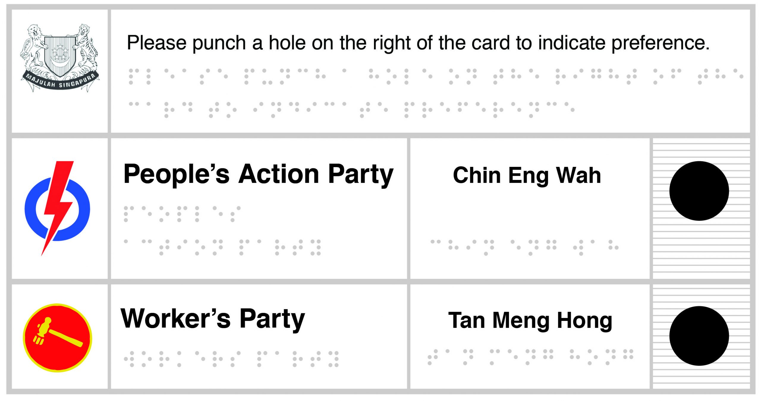
The combination of both the alphabet and braille makes it easy for bookkeeping, administrative processes and of course, the visually handicapped themselves. Using physical paper cards is still retained as the main form of voting in Singapore as it leaves a physical and traceable audit behind.

Braille Reading

I would incorporate this form of tactile interaction into the voting process for the visually impaired. It’s economical and easy to manage.

SIT has recently designed a low-cost, replicable voting booth for the upcoming election in 2020. I intend to work off this space to create a set-up that can be easily manoeuvred around by a visually handicapped.

https://www.straitstimes.com/singapore/changes-at-ge-will-make-it-easier-for-voters-and-candidates

To Bauhaus & Beyond: Sach Plakat

It’s pretty funny how everything comes back in a full circle. Just like fashion, the trends come and go, often making appearances or renaissances (ie. Matching clothing sets and Birkenstocks) in later years. Similarly, in the advertising industry, product messaging recycles its messaging in a cyclical fashion. Product promotion can take on the emphasis on an association with a product, be it lifestyle, societal status, historical or cultural. Messaging in product promotion can also go the other way and to take on a product-based messaging.

This was a poster published by Coca-Cola in the 1890’s as a cough medicine. In the poster, a well-dressed lady who seems to be living comfortably (as seen from the blooming, decorative flowers in the pot on an embellished table lined with cloth) and is seen to be consuming the “ideal brain tonic”. This gives the subtle messaging that if one drinks coca-cola, he or she will be healthy and will fare well in life.

Likewise, in this poster that is promoting a liqueur, attests that the liqueur is so good that it can entice a monk to drink from it and to even get him addicted, despite his religious beliefs.

Whereas, in the 1910s, advertising seemed to have pared on the messaging and to focus solely on the product as seen from Lucien Bernhard’s “Manoli’ Sach Plakat poster. Perhaps, this was information fatigue at the end of the consumer, in which consumers have been bombarded by so much advertising tactics that in turn, they opt for brands are that straight-to-the-point and no-frills hence the production of object-based posters created by Bernhard.

Evidently, today advertising is back to product messaging uses association. Perhaps, in a couple of decades to come, consumers would opt for messaging that is less flamboyant and straight-forward.

Project 3 – Motion Notion Invite

Motion Notion Invite

This invite is created from 1 of the 3 variations of posters exhibited on the media wall, drawing colours of black, green and purple from the poster on the extreme left. The visual juxtaposition of fluidity and planar structure is meant to demonstrate the underpinning principle of uncertainty — wave-particle duality.


Front & Back of print

Fold lines are in yellow

Paper: Maple Bright White 120GSM

Font: Alte Haas Grotesk

Project 1, Project 2 Process, Project 2 Final

Graphic Design So Far: Wes Wilson’s Psychedelic Posters

I was drawn to Wes Wilson’s psychedelic posters almost immediately, given the clashing colours or lack of white space in the composition. Born in of a time of wild experimentation with layout and type, Wes Wilson’s posters definitely stretched the utility and composition of a poster.

One of Wilson’s most renown posters was “Are We Next?” in which he makes a commentary on the political tussle between the democrats and communists, and questions the resilience of the democratic political supremacy.

He regards the viewing of a poster an adventure that “visually performs psychedelic awareness and identity”. This is conveyed through the bright colours, “fluid” type and layout, culminating in a “visual acid trip” for the viewer. His handwritten/drawn typefaces generally take up any space there is in the layout, often resembling Art Nouveau-like curves and almost liquid-esque forms. He uses human figures or close-ups of facial features and often makes them the central subject of his posters while embellishing the surrounding white space with information, which contributes to many of his posters being centre aligned.

Bibliography

Psychedelic Poster Pioneer Wes Wilson on The Beatles, Doors, and Bill Graham

When Posters Went Psychedelic

Reflective Essay: Question 2

Aesthetics

The tenet of creating a cohesive and all-together immersive experience with art, has got long running roots in the history of design. It’s birthed from the philosophy, “Gesamtkunstwerk” which is a German word for “total work of art”. Owing its origin to Richard Wagner, an opera composer, the philosophy of creating all-consuming art is equated to that of a musical composition, “pieced together by sensory stimulants” to “inspire imagination” and evoke “emotional fluctuations” (Finger). Today, this design principle stay rooted in design-thinking today. In graphic design, branding is used to communicate a coherent brand’s story and values to its audience. In interactive art, creating an immersive and interactive physical or psychological environments is more often than not, used to transport its audience to another dimension. While in product design, part of spatial design requires the construction of a cohesive and uniform visual theme within a physical space. This collection of works, titled Aesthetics, aims to reiterate the spirit of putting up an all-consuming performance for the audience through design. 

This collection, titled Aesthetics, features Lufthansa corporate identity, developed by Otl Aicher from the Ulm School of Design in 1962, Stoclet Palace, built by Josef Hoffman between 1905 to 1911, as well the Sensorama by created Morton Heilig, 1957. 

https://www.behance.net/gallery/4888087/A505-Lufthansa-Graphic-Design

https://www.behance.net/gallery/4888087/A505-Lufthansa-Graphic-Design

https://www.flickr.com/photos/rmit/14646813799

When Aicher was commissioned to develop the corporate identity for Lufthansa, this included the “airplane livery, crew attire, display systems, printed materials, and numerous other items” (Airline Visual Identity 1945–1975). This meant that whenever passengers interacted with anything Lufthansa, it meant the immersion into the world of Lufthansa. As such, when Aicher introduced the iconic yellow and blue for the airline, not only did the passengers associate these colours with Lufthansa. These colours differentiated Lufthansa due to the lack of colours in an age when airlines were typically “one colour with white, or a combination of red and blue”. Hence, Aicher had successfully created a whole new meaning to the iconic in the public’s eye.


https://www.architectmagazine.com/design/the-palais-stoclet-seduces_o

https://www.architectmagazine.com/design/the-palais-stoclet-seduces_o

https://www.architectmagazine.com/design/the-palais-stoclet-seduces_o

The Stoclet Palace was built by Josef Hoffman as a thesis to achieve Gesamtkunstwerk”. Inheriting the principle of good craftsmanship from the Arts and Craft Movement, visuals of the signature whiplash and sinuous lines from the Art Nouveau movement and strong, geometric forms from the Art Deco Movement, the Stoclet Palace sought to create a total work of art in every nook and cranny of the space; from the furniture to the murals and to the lights. No details were spared. As such, Josef Hoffman was able to create a whole new fiscal dimension of luxury with the Stoclet Palace.


https://www.digitaltrends.com/cool-tech/history-of-virtual-reality/

https://www.engadget.com/2014/02/16/morton-heiligs-sensorama-simulator/

Created by Morton Heilig in 1957, the Sensorama is a hallmark of the immersive experience as it was one of the very first entertainment machines that employed total sensorial engagement. Tracing back to his film-making roots, the Sensorama machine stimulated sight, hearing, smell and touch and transported its audience to a whole new space altogether. This was achieved with a “bucket seat for a single viewer, a set of handles and viewing holes that were surrounded by a series of vents” (Turi). The 3D film was then “viewed through a set of ocular portals” that filled the user’s peripheral vision. This immersive experience effectively rendered passive entertainment passé and paved the way for what we know today as, virtual reality. 


Bibliography

Finger, Anke. “The Death And Life Of The Total Work Of Art”. 2015, https://www.researchgate.net/publication/280935380. Accessed 17 Nov 2019.

Airline Visual Identity 1945–1975. Callisto, 2019, pp. 174-175, http://www.garciamedia.com/assets/uploads/blog/Airline_Visual_Identity_1945-75_FINAL_VERSION.pdf. Accessed 17 Nov 2019.

Turi, Jon. “Engadget Is Now A Part Of Verizon Media”. Engadget.Com, 2014, https://www.engadget.com/2014/02/16/morton-heiligs-sensorama-simulator/.

Writings to Typography Reflection

Regular script, c. 200–700

Given the many hours being taught type attributes and characteristics, learning more about the history and hosts of impacts/roles that type plays in our life/heritage is, undoubtedly, refreshing.

I appreciate the rich history behind this regular Chinese script. Its origin dated back to the rule of Qin Shi Huang, who was the very first emperor to unify the raging fragments of China.

Owing to the evolution of Chinese calligraphy, the small seal script or the Seal script or Qin script, evolved into clerical, semi-cursive, cursive and finally, standard/regular script. Under his leadership, the Chinese writing was made standardised for the very first time, such that all words with the same meaning in the country’s varied languages would be represented by the same characters. By doing so, he was able to regulate the level of dissent in the country, thereby allowing him to keep a tight grip on his political rule and clout. He also rewrote history, both figuratively (by unifying China) and literally, by ridding of all politically-critical writing/literature.

This simply illustrates the core principle and purpose behind text, script or type (for that matter), communication. Communication with current and future generations.

This is an apt quote by Dan Brown and it says,

“History is always written by the winners. When two cultures clash, the loser is obliterated, and the winner writes the history books-books which glorify their own cause and disparage the conquered foe. As Napoleon once said, ‘What is history, but a fable agreed upon?”

Sources:

https://www.nationalgeographic.com/culture/people/reference/qin-shi-huangdi/

https://www.goodreads.com/quotes/148791-history-is-always-written-by-the-winners-when-two-cultures