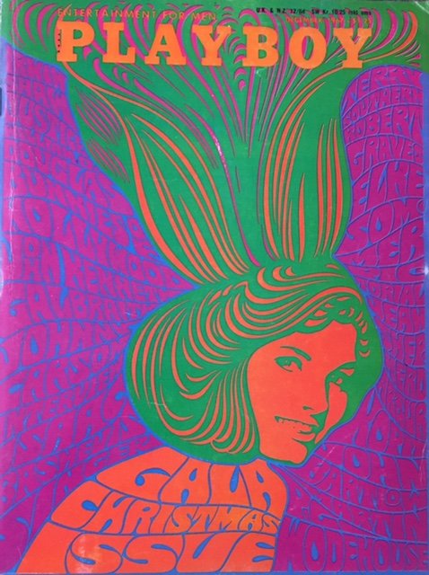
I was drawn to Wes Wilson’s psychedelic posters almost immediately, given the clashing colours or lack of white space in the composition. Born in of a time of wild experimentation with layout and type, Wes Wilson’s posters definitely stretched the utility and composition of a poster.
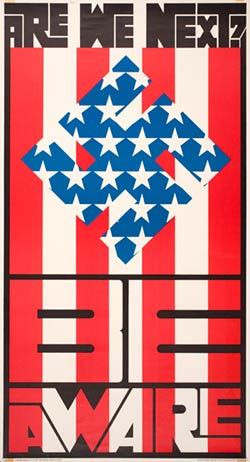
One of Wilson’s most renown posters was “Are We Next?” in which he makes a commentary on the political tussle between the democrats and communists, and questions the resilience of the democratic political supremacy.
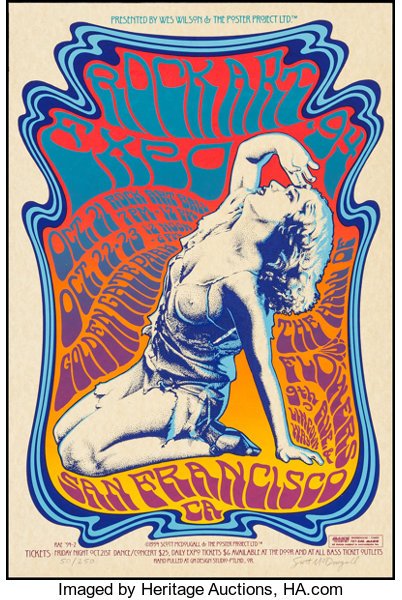
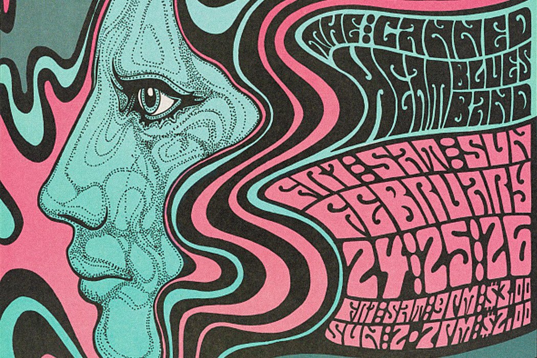
He regards the viewing of a poster an adventure that “visually performs psychedelic awareness and identity”. This is conveyed through the bright colours, “fluid” type and layout, culminating in a “visual acid trip” for the viewer. His handwritten/drawn typefaces generally take up any space there is in the layout, often resembling Art Nouveau-like curves and almost liquid-esque forms. He uses human figures or close-ups of facial features and often makes them the central subject of his posters while embellishing the surrounding white space with information, which contributes to many of his posters being centre aligned.
Bibliography
Psychedelic Poster Pioneer Wes Wilson on The Beatles, Doors, and Bill Graham
You must be logged in to post a comment.