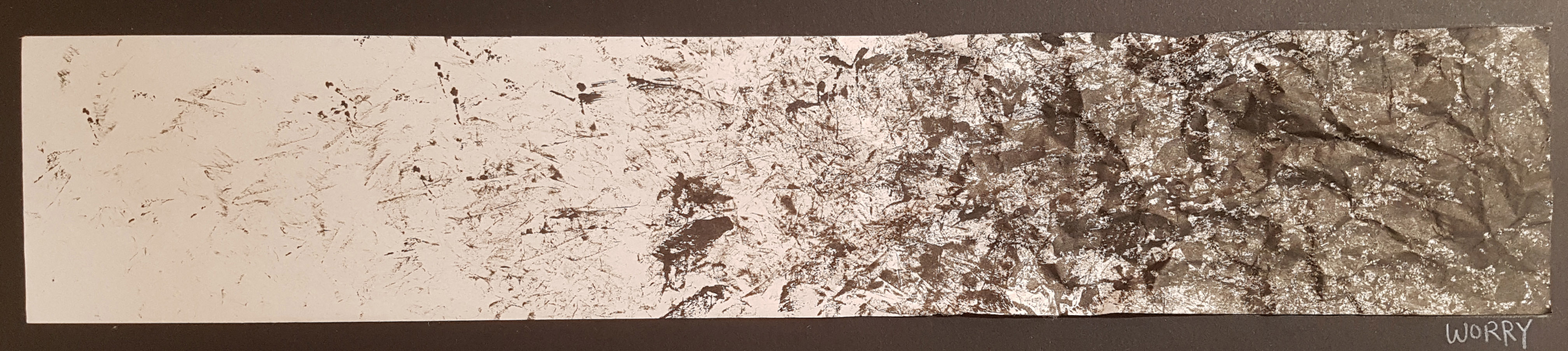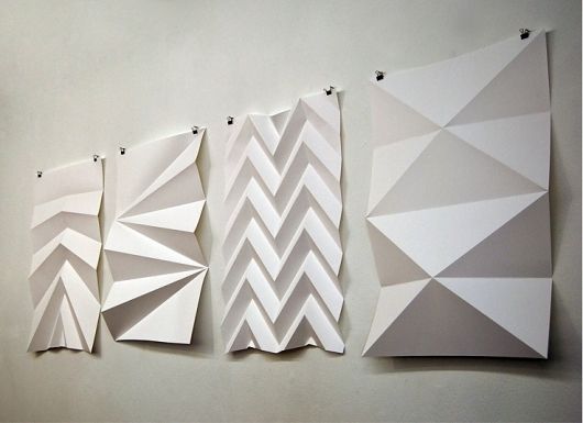
Ikebana

Ikebana is the Japanese art of flower arrangement. As is true of all other arts, ikebana is creative expression within certain rules of construction.
Materials used:
Living branches, Grasses, Leaves and Blossoms, ANY MATERIALS
What distinguishes Ikebana from other approaches such as “flower arrangement” is its asymmetrical form and the use of empty space as an essential feature of the composition. For each Ikebana, the artist’s intention behind each arrangement is shown through a piece’s colour combinations, natural shapes, graceful lines, and the implied meaning of the arrangement.
From: http://www.ikebanahq.org/whatis.php
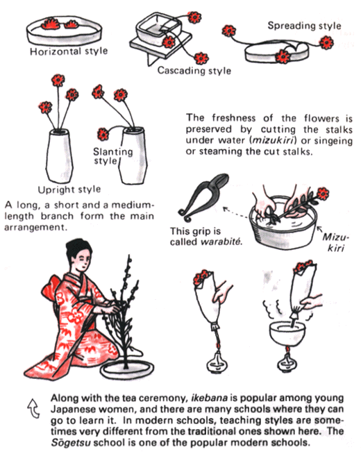
Ikebana comprises of 2 main styles, the Moribana and Heika.
From:
- http://web-japan.org/kidsweb/virtual/ikebana/ikebana03.html
- http://ikebanabyjunko.co.uk/Moribana.htm
Moribana uses a shallow container and a kenzan, a holder with many sharp points into which flowers are inserted. The big feature of moribana is the broad expanse of natural-looking shapes and a mound of beautiful flowers. This creates beautiful volume which can be viewed from three sides.
From:
- http://web-japan.org/kidsweb/virtual/ikebana/ikebana03.html
- http://ikebanabyjunko.co.uk/Moribana.htm
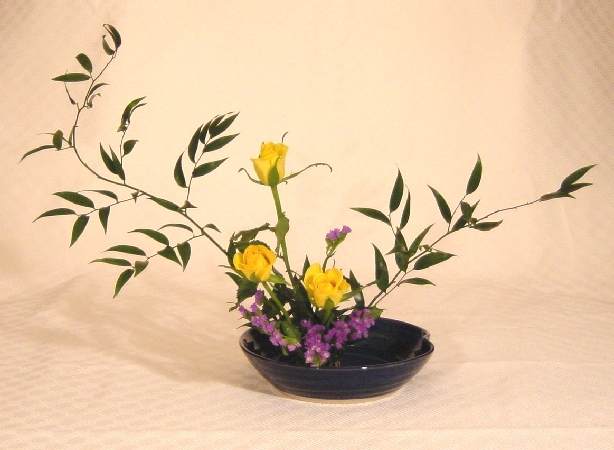
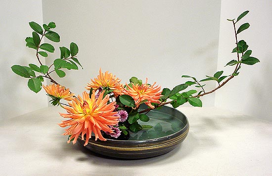
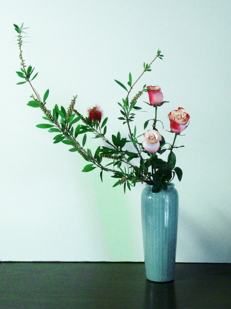
Heika (also called rikka, shoka, or seika) is a basic style of ikebana arrangement that uses a tall vase and highlights vertical lines. The biggest feature is the emphasis on bringing out the flowers’ natural charms and arranging them in a tasteful and elegant manner.
From: http://web-japan.org/kidsweb/virtual/ikebana
Different Arrangement Styles for Ikebana:
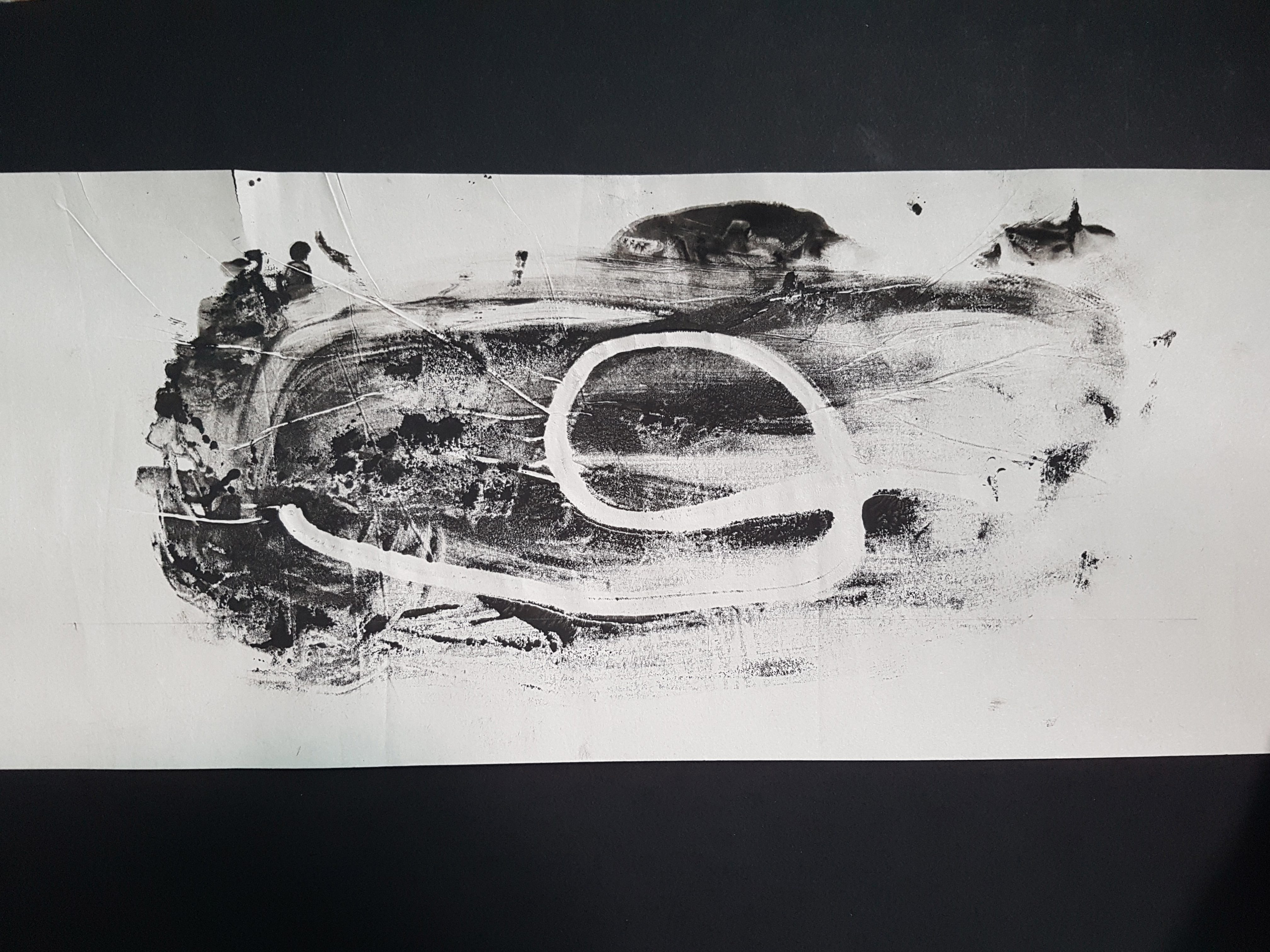
Another unorthodox style is the Jiyūka (“free style”). It is a free creative design and does not confine the materials to just flowers; every material can be used.
To compose a free style arrangement, there are basic principles of formation and some other important factors to consider. Analysis of the elements of the plant’s form, shape, colour, texture and quantity should be conducted to decide how it should be used.
These decisions will be influenced by such things as desired mass, line, point (focal point) or surface area. The composition or blend of these elements, the sense of proportion, contrasts, rhythm and harmony should be carefully considered.
This style is more closely related to our assignment with the use of free form designs and different materials to create a model.
From:
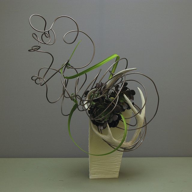
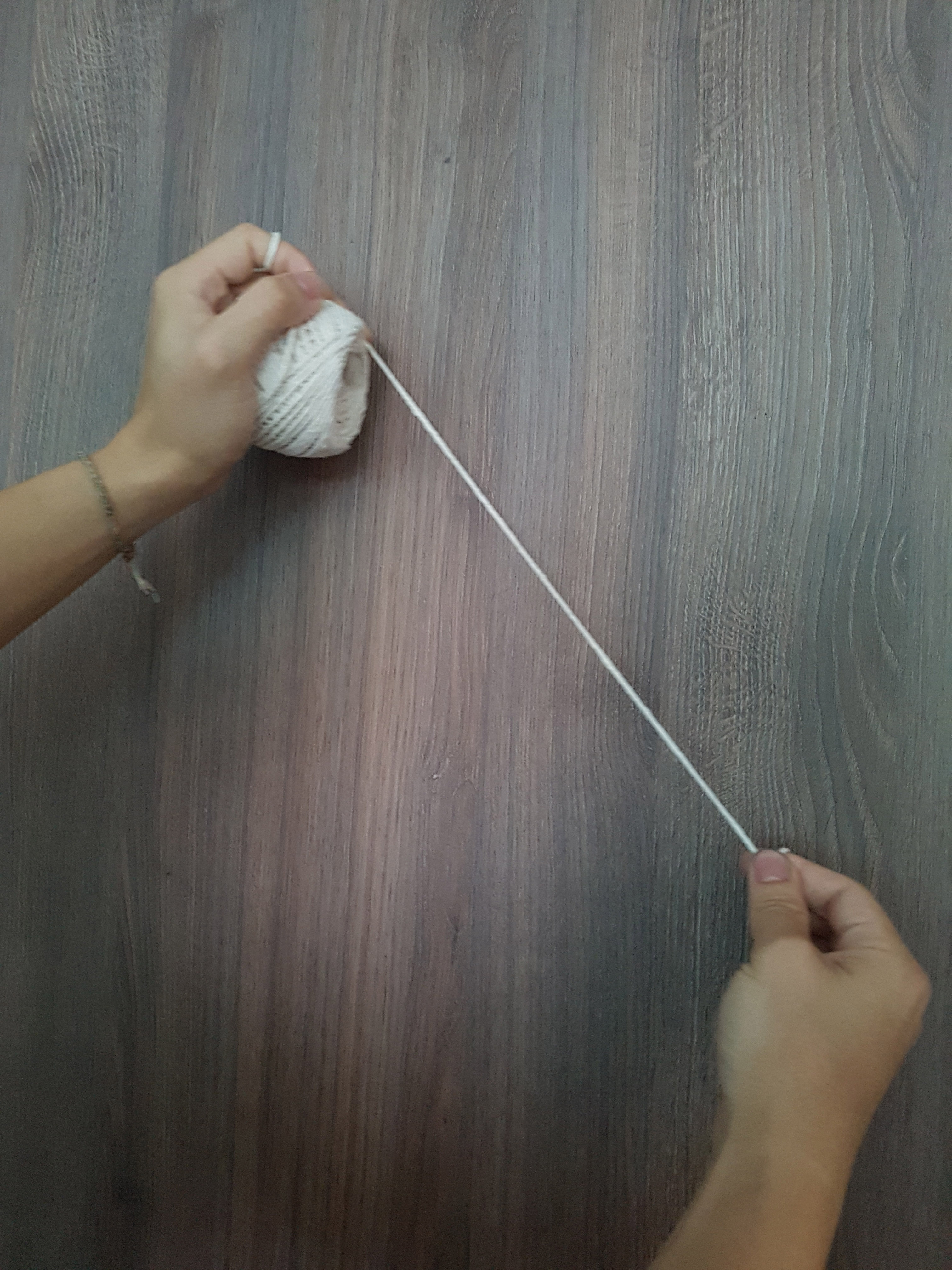
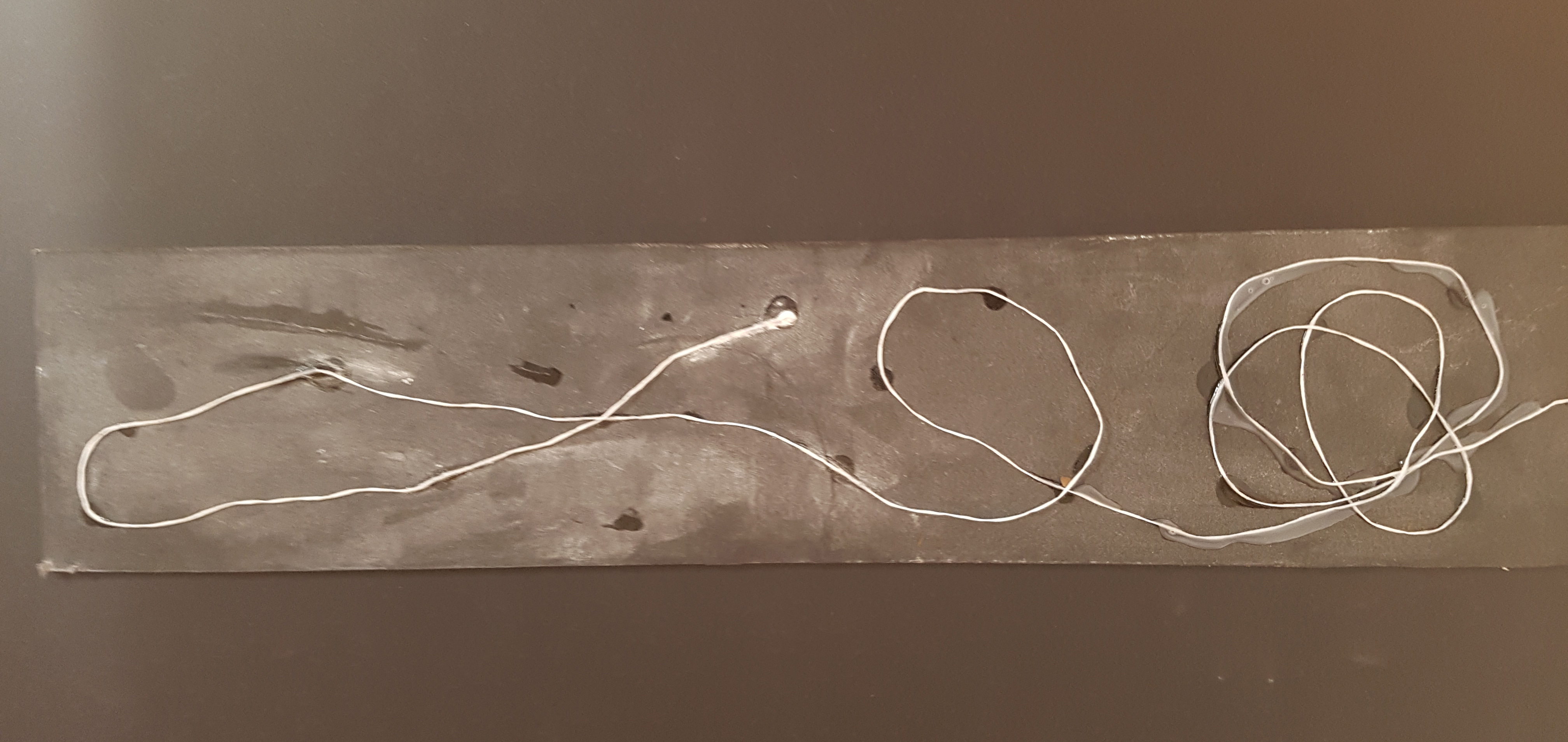
The use of wires and free form arrangement of wire and leave.

The use of unorthodox forms and shapes.
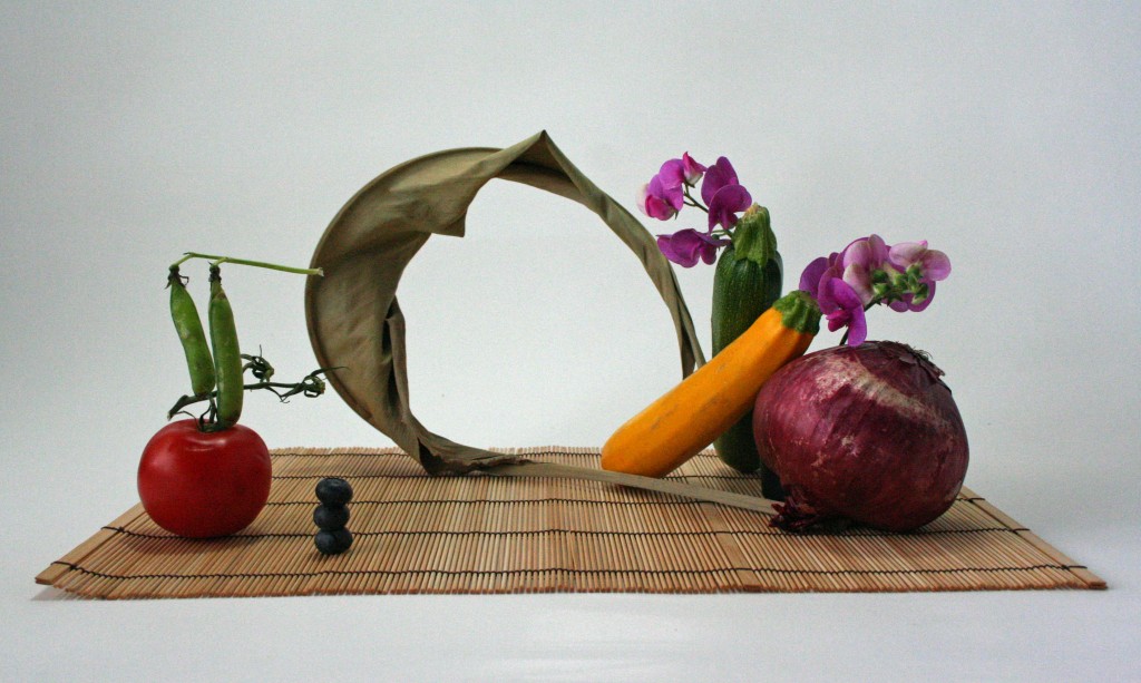
Ikebana with fruits and vegetables.
Taste & Food
5 Basic Tastes:
Sweet – Sweetness, usually regarded as a pleasurable sensation, is produced by the presence of sugars and a few other substances.
Sourness – is the taste that detects acidity. The mouth-puckering sensation is caused by acids in lemons, yogurt and sourdough bread and other food.
Saltiness – Our brains are programmed so that a little salt tastes good, and a lot tastes bad.
Bitter – Bitterness is the most sensitive of the tastes, and many perceive it as unpleasant, sharp, or disagreeable. Bitterness is a distinctive bad taste accompanied by a reflexive “yuck” expression on the face.
Unami – Umami is an appetitive taste. It’s best described as “savory”—a taste rich in flavor released by cooking, curing or aging.
From:
- https://en.wikipedia.org/wiki/Taste#Sweetness
- https://parade.com/396983/johnmcquaid/flavor-101-the-five-basic-tastes/
How we taste:
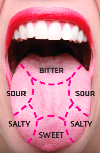
The idea that the different parts of our tongue taste differently is a common misconception.
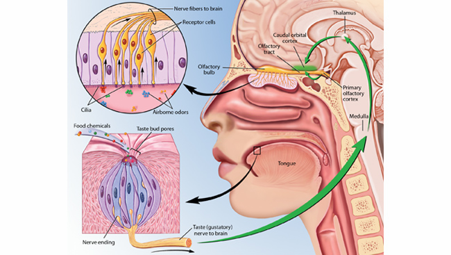
Food produces Chemicals –> Taste Buds containing sensory cells –>Nerve –> Brain
Airborne odors –> Cilia in the nose –> Receptor cells –> Nerve –> Brain
Sight and Taste:
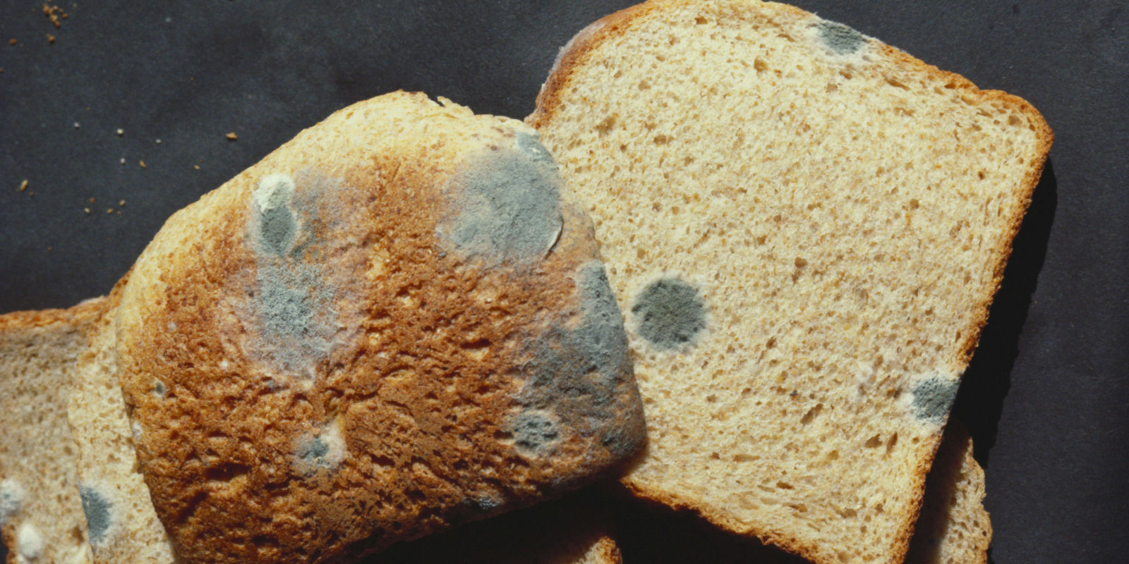
Taste as a sense is made up of sight, smell, touch and resulting taste. What we see will directly affect how we taste. For instance, when a moldy bread is placed in front, our brain already analyse the taste or the food and made its mind up that the moldy bread is disgusting.
From: http://www.huffingtonpost.com/Menuism/does-the-way-we-see-food-affect-taste_b_1872204.html
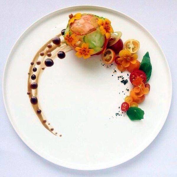
The appearance of the food is also important when we want to make food taste good. Below are ways we can make our food look more appealing (FOOD PRESENTATION) and appetizing and this is similar to our final model where we have to create the different sensory aspects with the use of food and other materials. Besides, in food presentation, we can see different 3D design elements like the trios of Dominant, Subdominant & Subordinate.
From:
- http://thetimes-tribune.com/news/health-science/make-food-look-more-appealing-1.1125375
- https://www.leaf.tv/articles/purpose-of-garnishing-food/
- https://spoonuniversity.com/lifestyle/importance-of-plating-your-food
Garnish – Usually consisting of an edible component, garnishes brighten the plate, give a clue to the flavor of the meal, complement the taste of the dish or fill empty space on the plate.
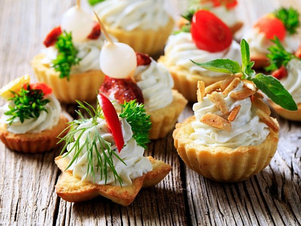
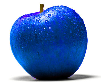
Using right colours – Colour is often the first element noticed in the appearance of a food product. Humans begin to associate certain colors with various types of foods from birth, and equate these colors to certain tastes and flavors throughout life. For example we associate apple as sweet because it is red. Imagine we have a blue apple.
Plating – The presentation of the plating makes an impression, even a promise, with the viewer. If the foodie is intrigued by the food, the artistic plating has done its job. If it looks good, you’re gonna wanna have it.The design in plating makes the experience of food more than just eating and enjoying, but further into an expression of craftsmanship and art.
Spring
Similar to the previous assignment, we also had to pick a random season from the Pandora box and for this assignment, the season that I received was SPRING.
According to https://simple.wikipedia.org/wiki/Spring, SPRING is the season after winter and before summer. Days become longer and weather gets warmer in the temperate zone because the Earth tilts towards the Sun. In many parts of the world plants grow and flowers bloom. Often people with hay fever suffer more, because of the allergens. Many animals have their breeding seasons in spring. In many parts of the world it rains for hours. This helps the plants grow and the flowers bloom.
Colours play a huge role in terms of the appearance of our final model hence the colours that represent SPRING are important for us to take note.
Colours of SPRING – Distinct yellow undertones symbolize the new growth that is visible everywhere in grass, trees and plants. With maturity, Spring’s foliage yields its yellow-tinged spring green colour and gives way to the cool blue undertones of Summer. Spring’s colours are as daring as the first crocus that pushes its way through the frost-covered ground. Even the neutrals of Spring, like camel and champagne, have a certain zest! Spring is a time of vigoro and growth, and the colours of Spring reflect this. From: http://www.theimagearchitect.com/articles/TheFourSeasonsofColor.pdf
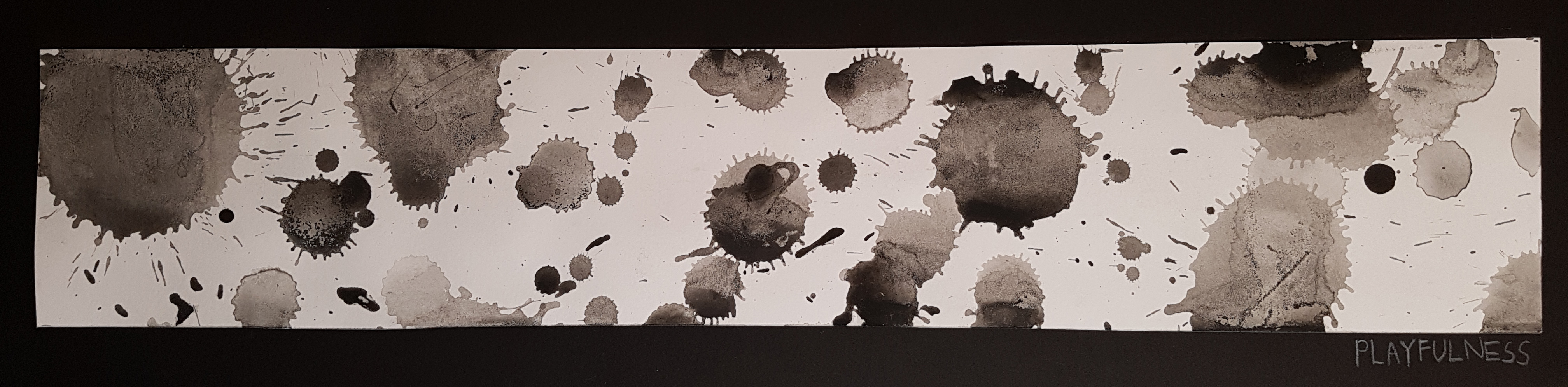
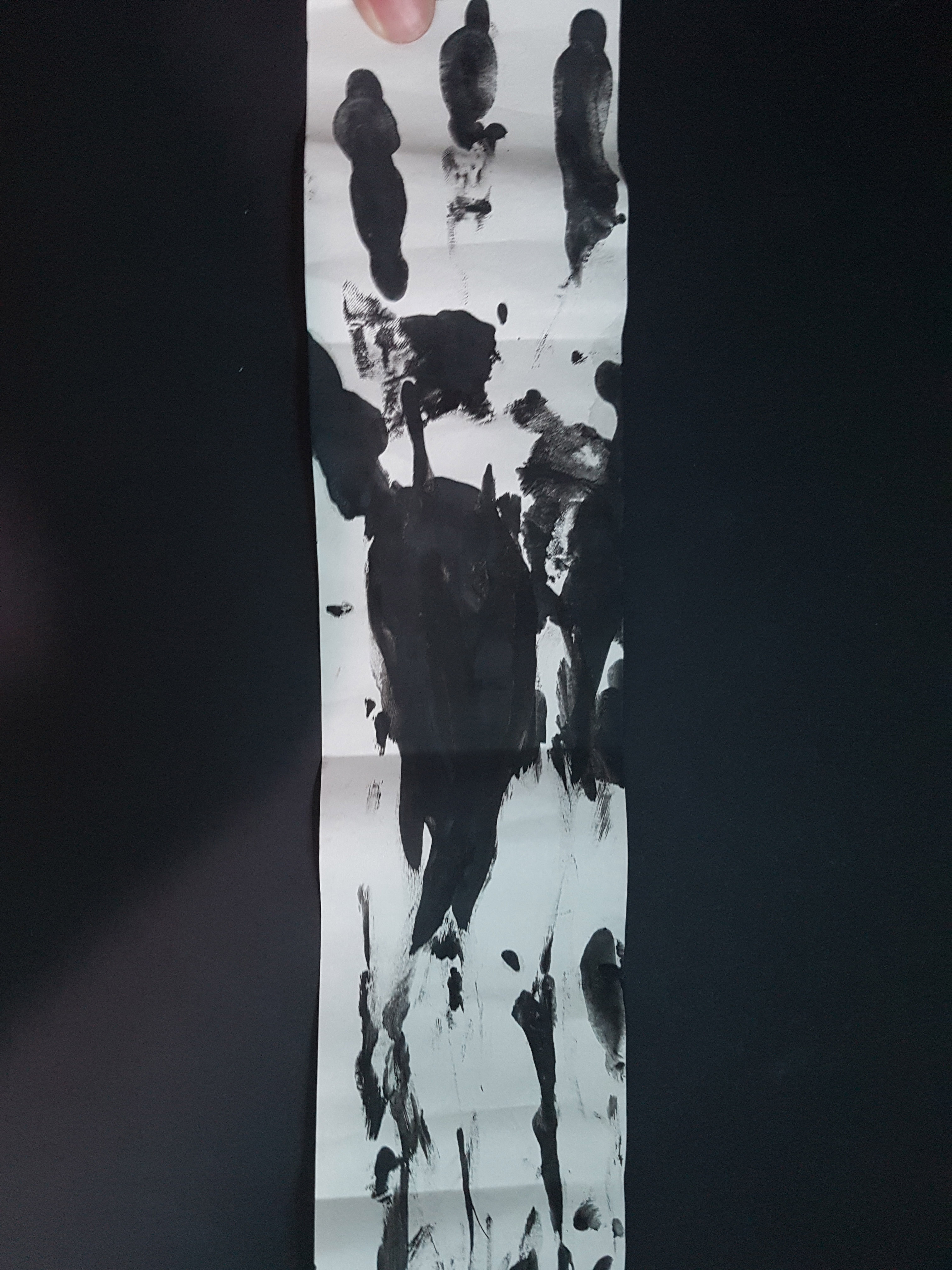
MIND-MAP for SPRING:
SKetch MODEL
Before forming our final FooKebana (Food + Ikebana), we were required to come up with 3 sketch models using a sphere, a cone and a cylinder that has similar elements to that of Ikebana.
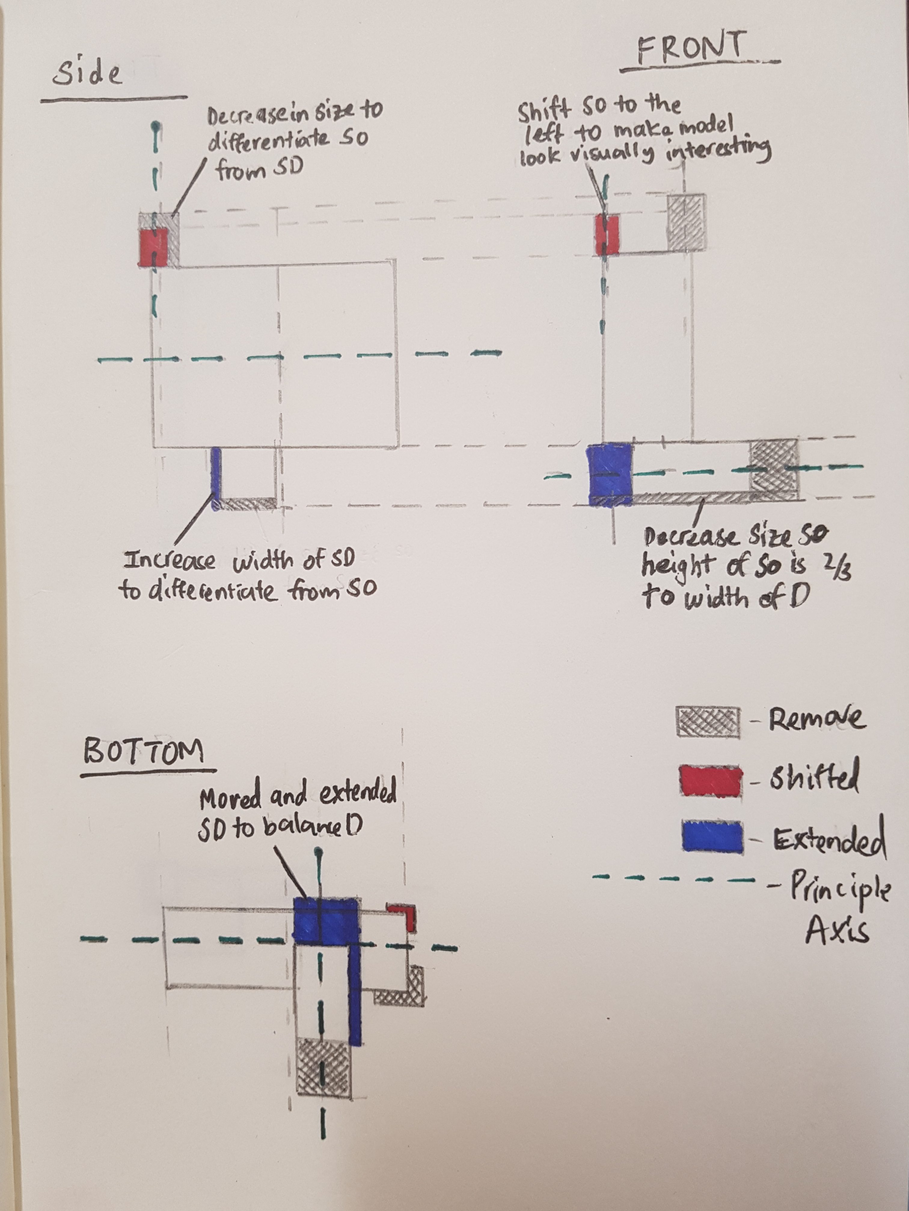
Checklist for 3D models:
- Each model must consist of a sphere, cone and cylinder.
- The Dominant(D), Subdominant(SD) and Subordinate(SO) should stay consistent from all angles.
- The model should be interesting looking while taking into account the proportion of the object and model itself.
- Create a balance (Dependent, Precarious, Independent) of directional forces from every position.
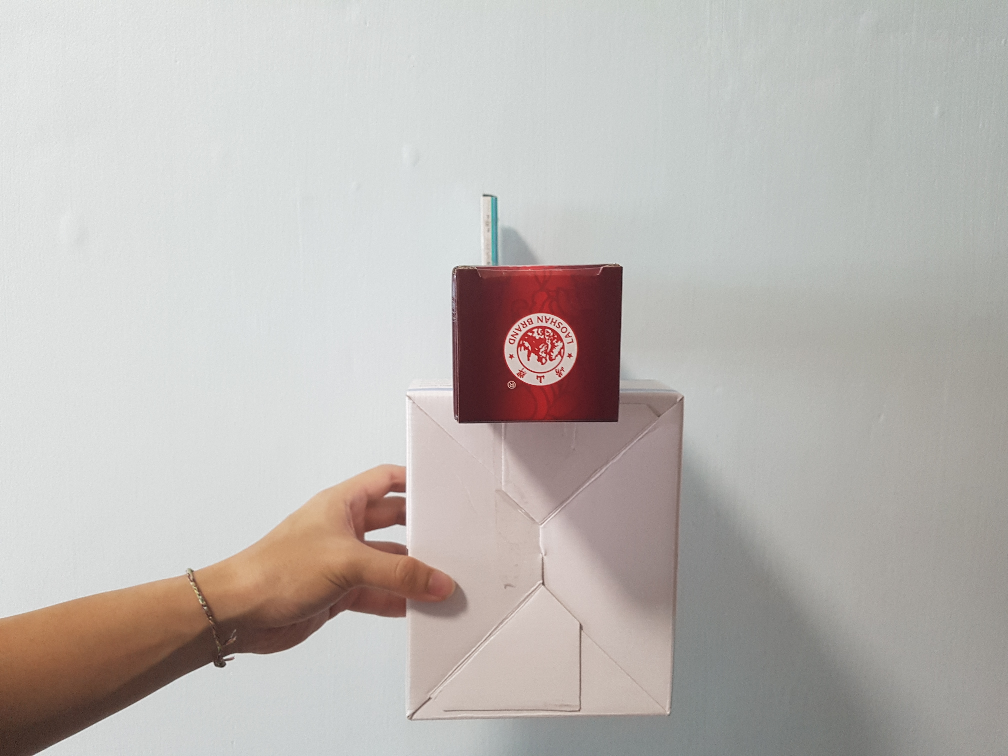
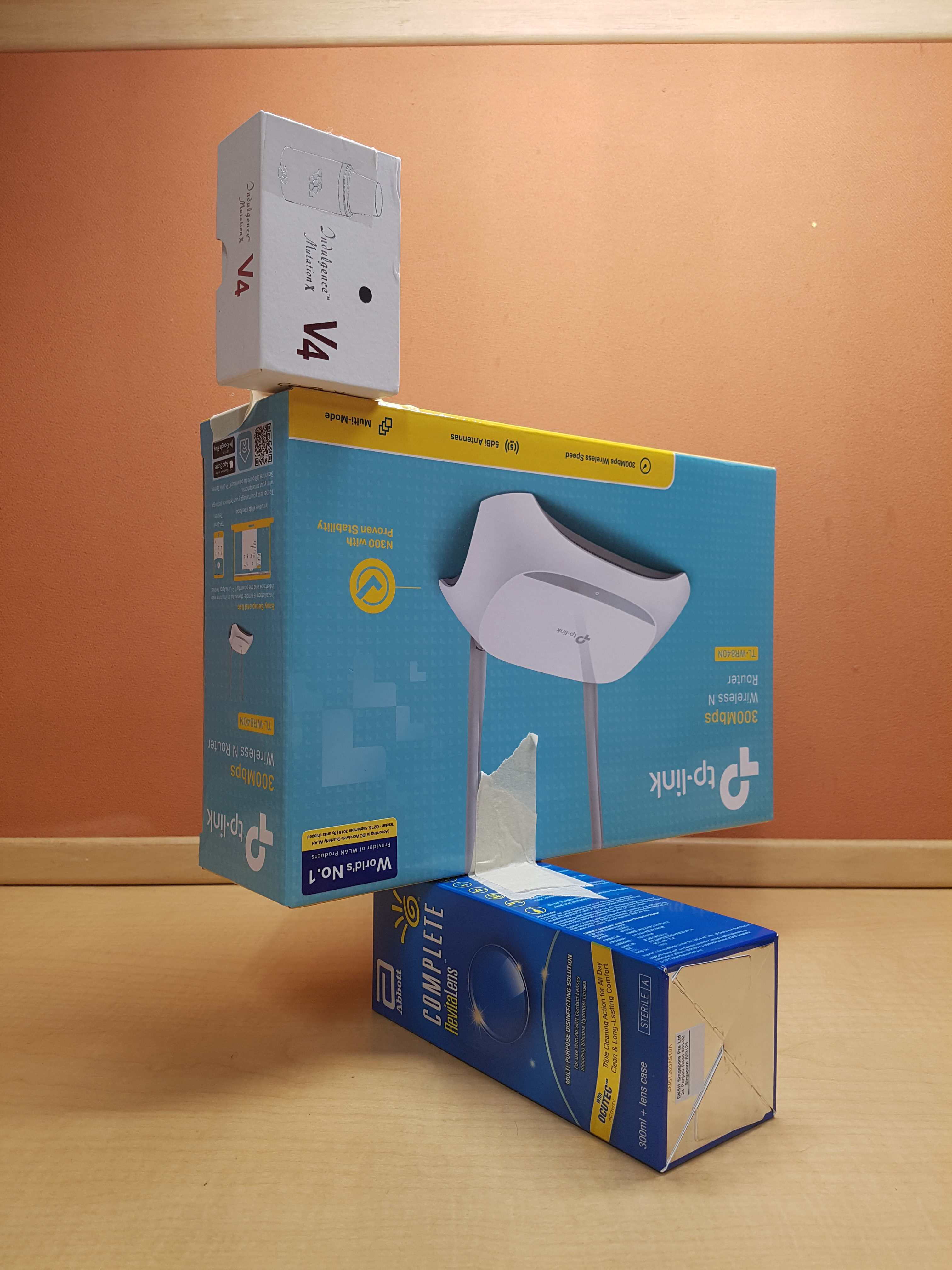
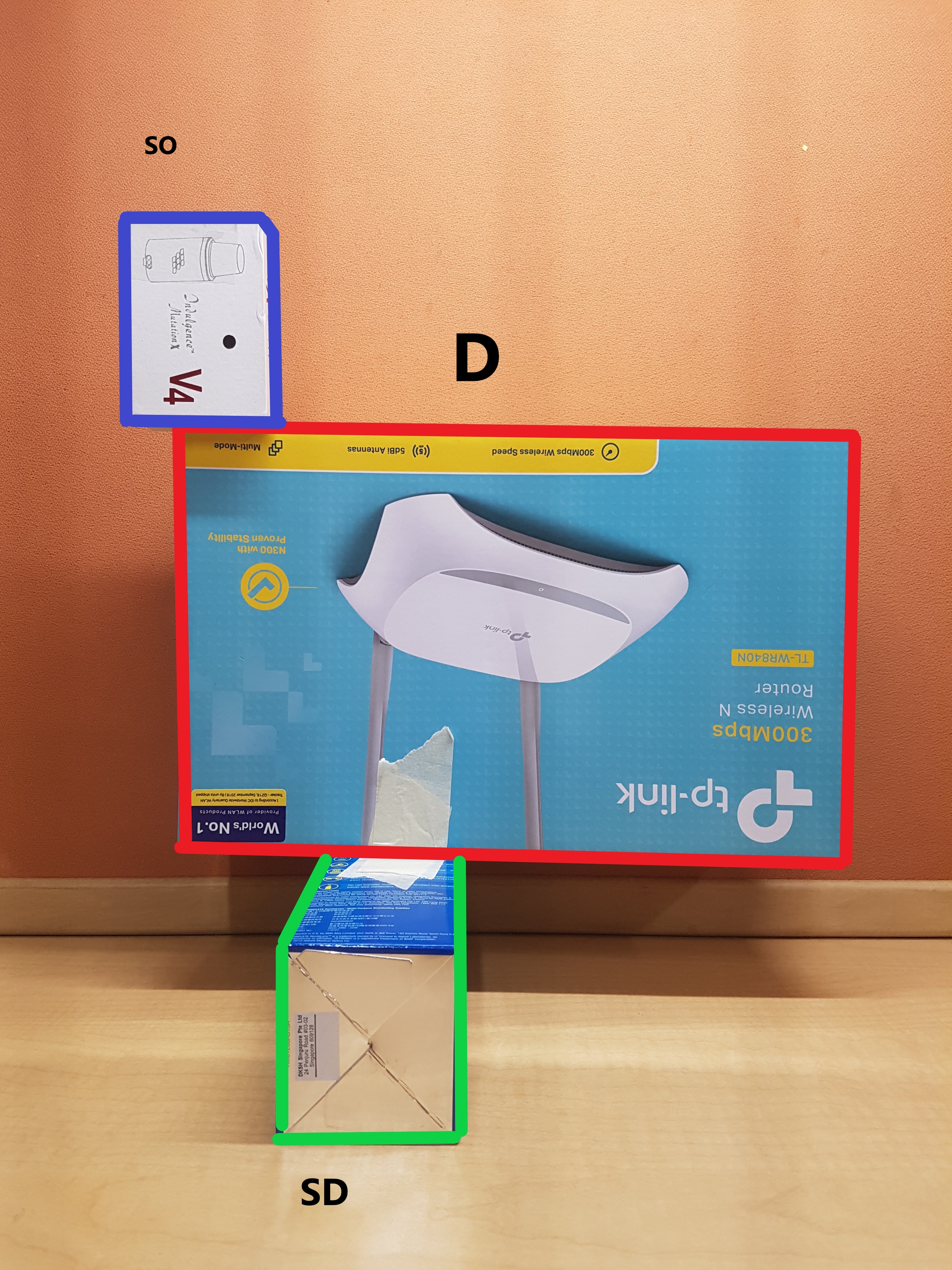
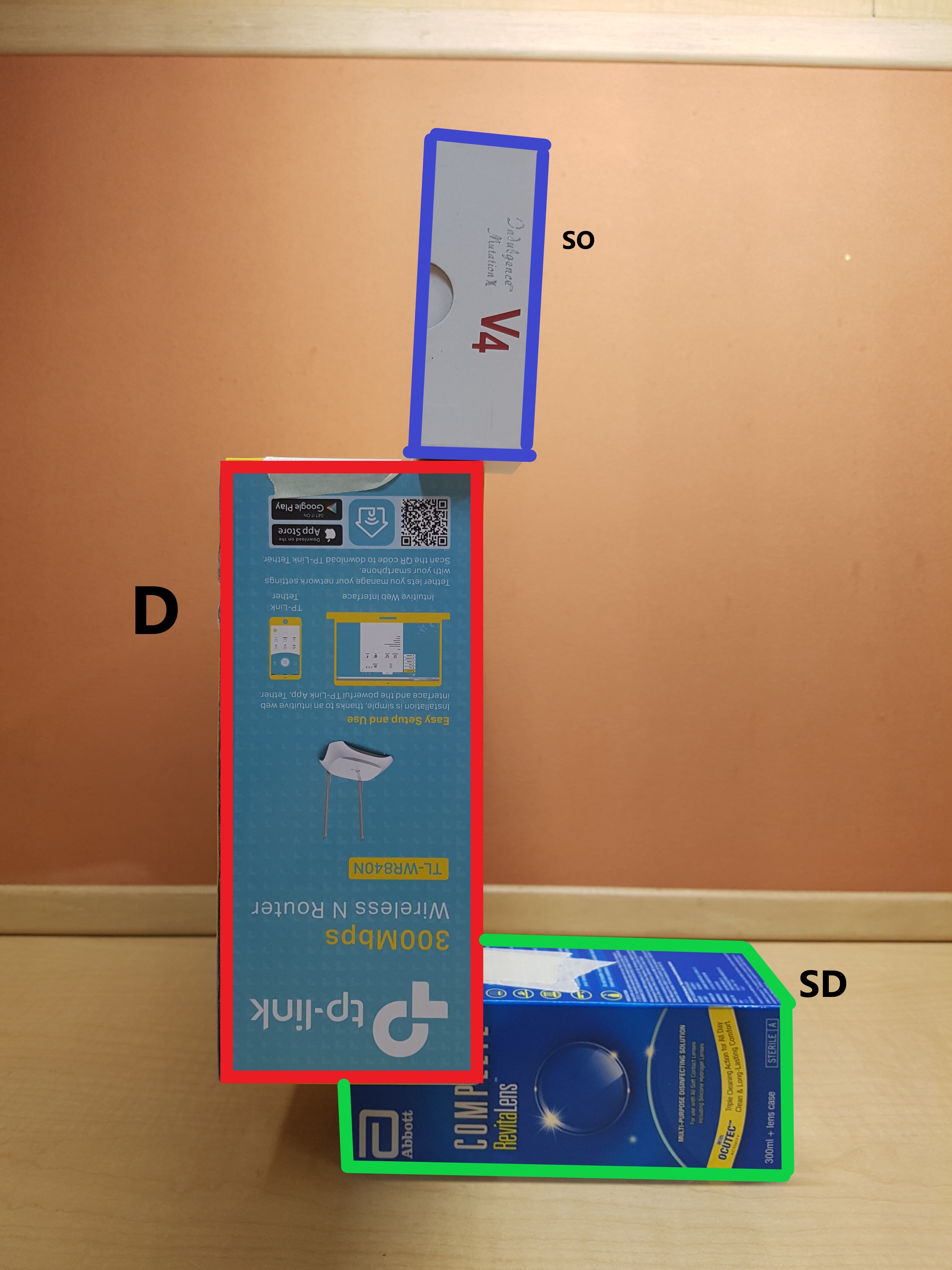
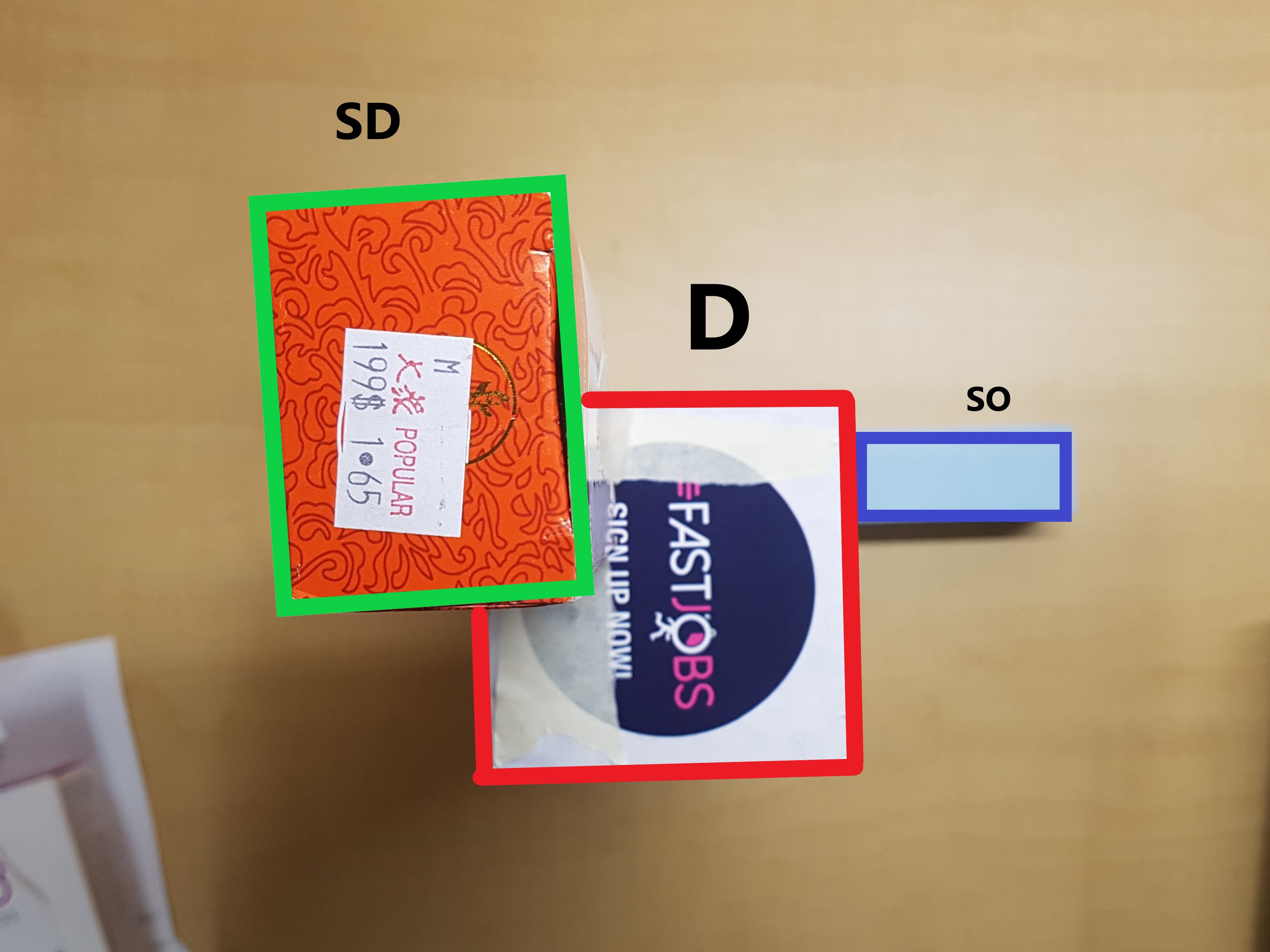
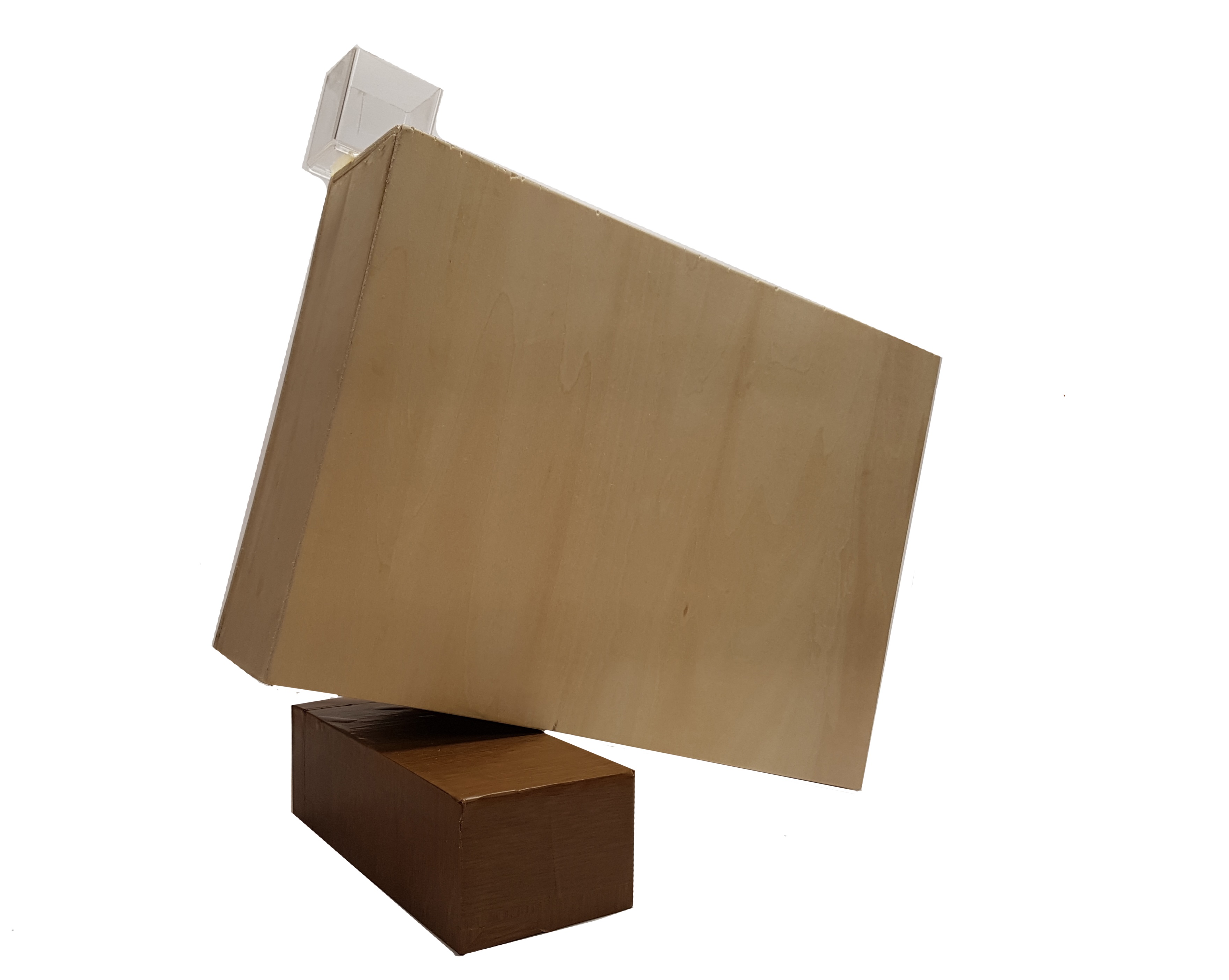
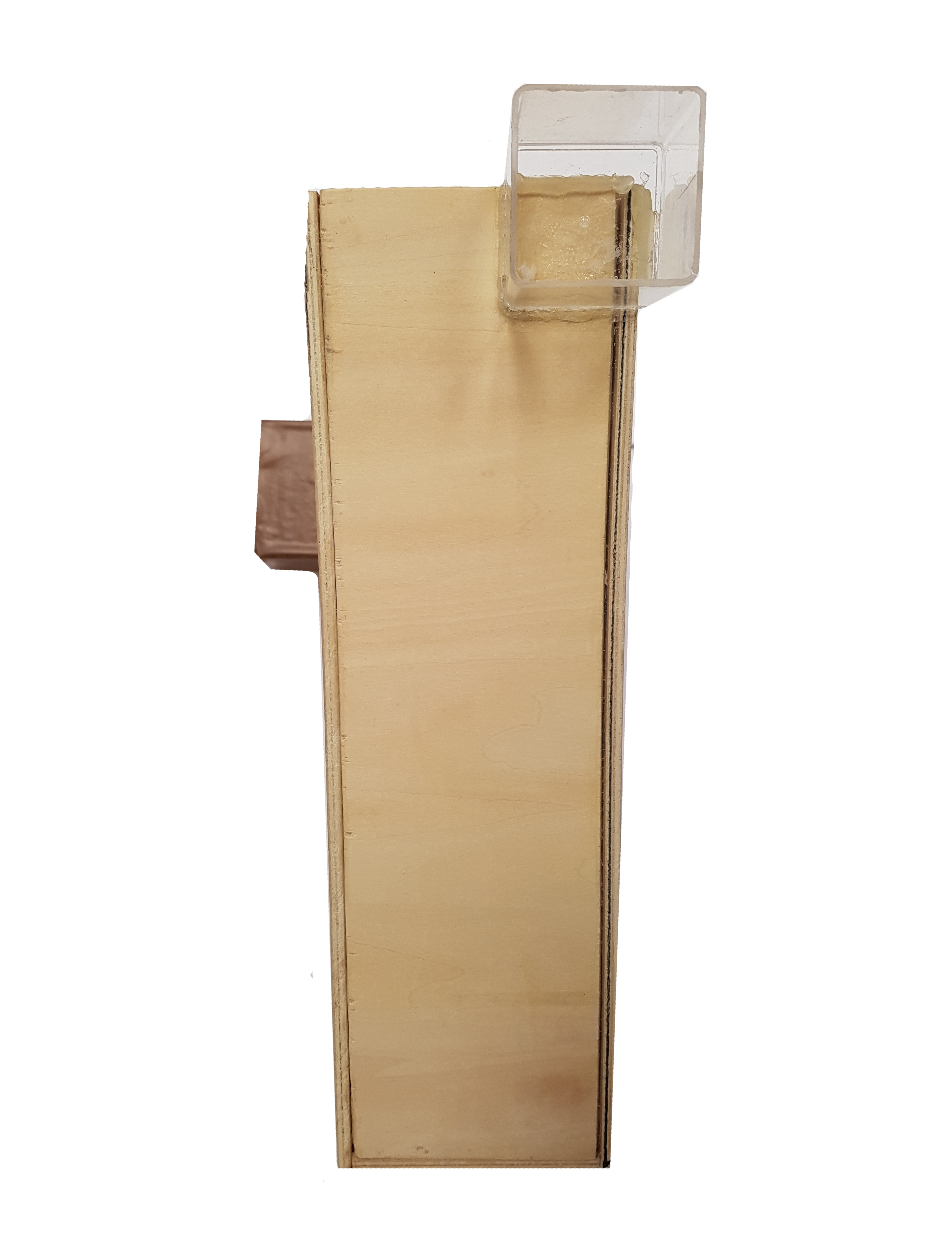
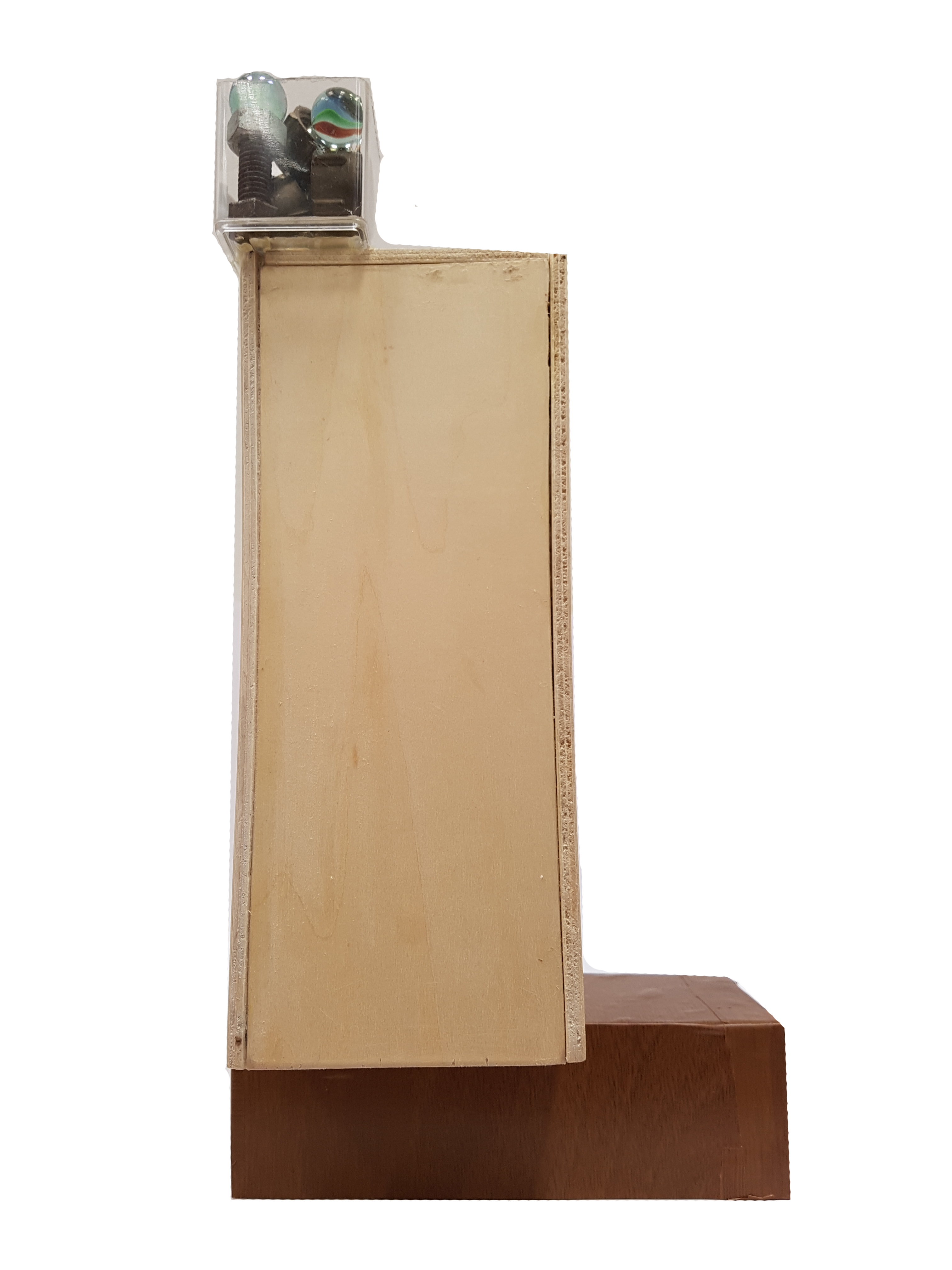
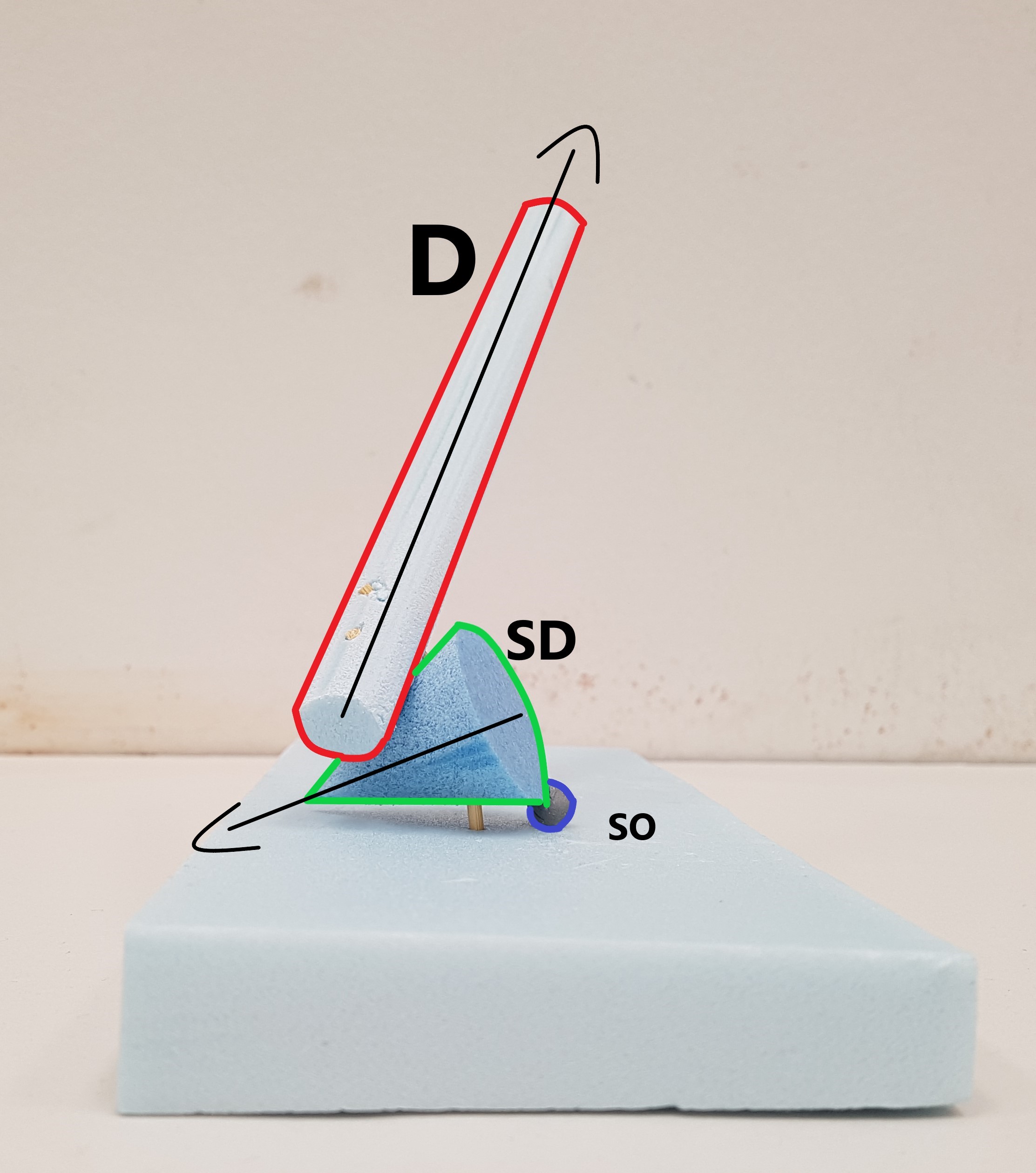
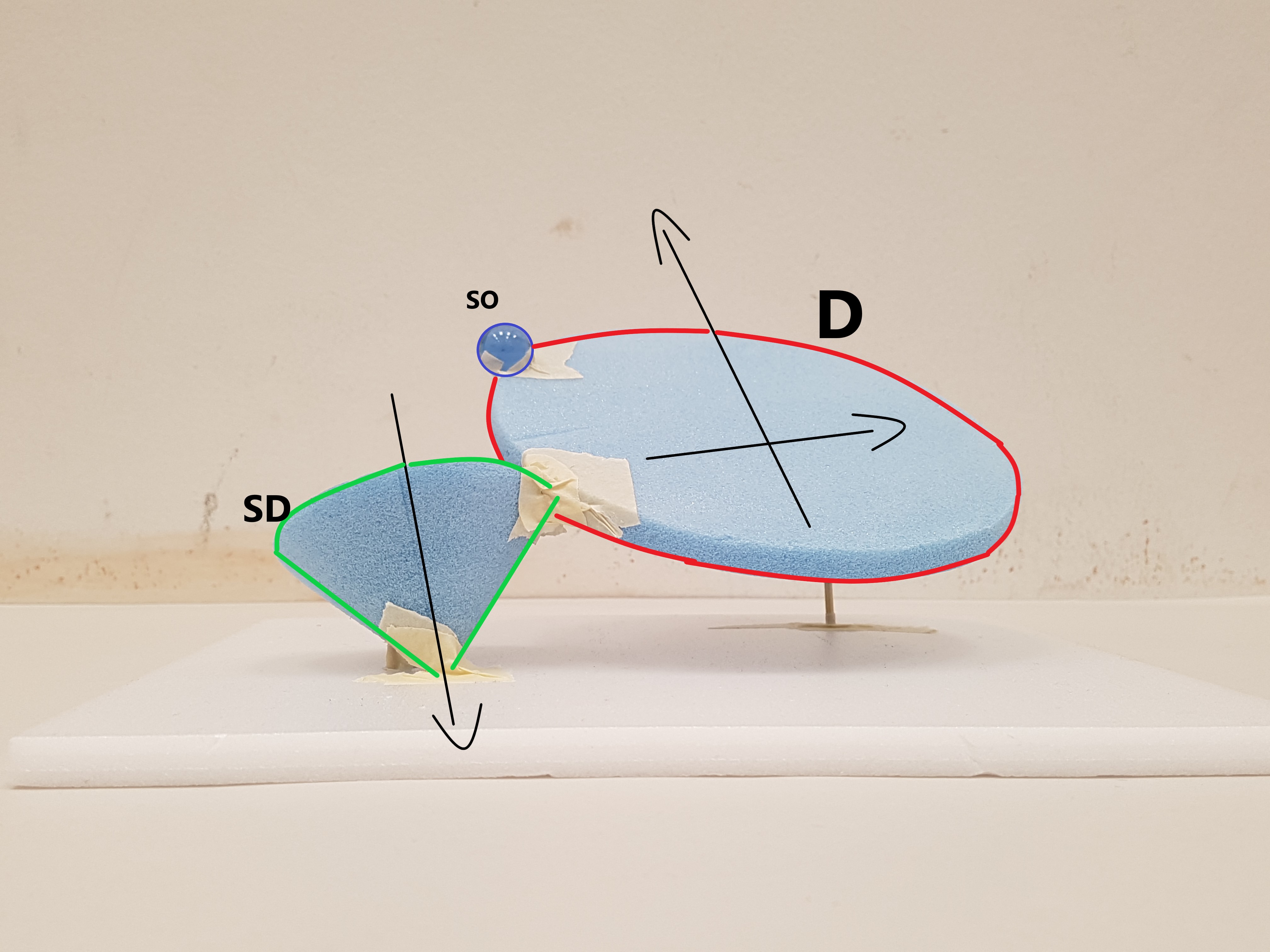
#1 Sketch Model
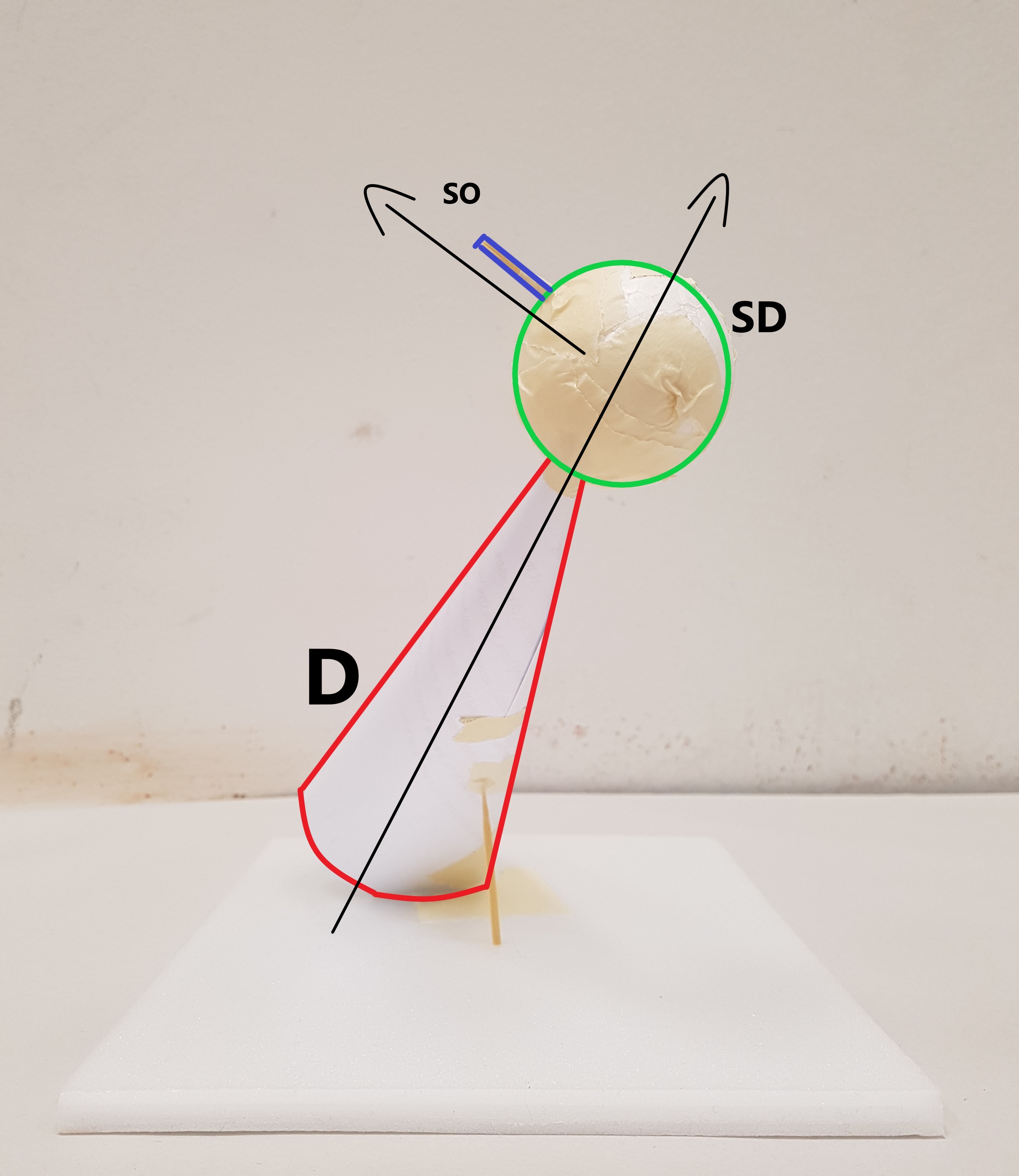
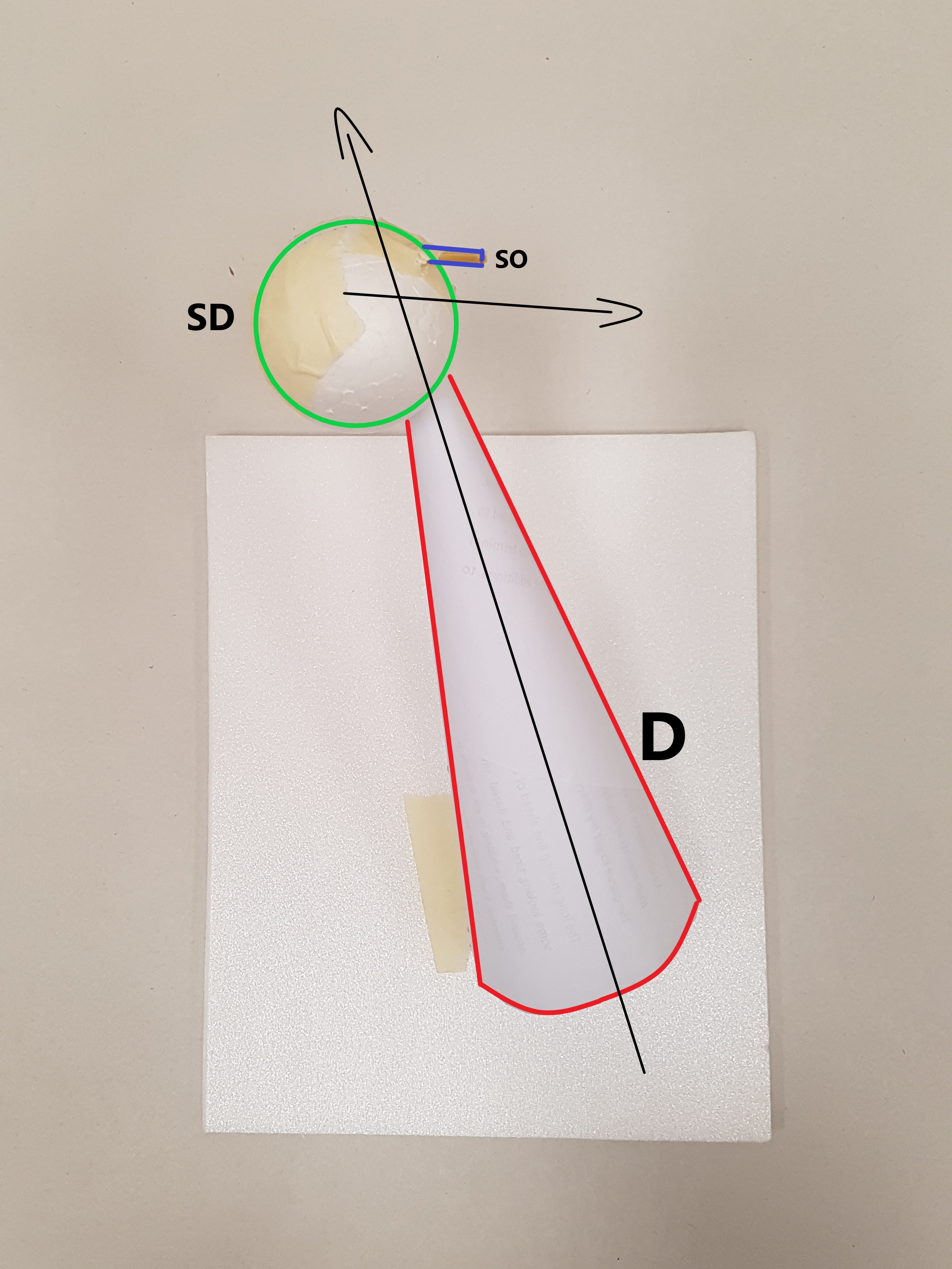
- Dominant – Cone , Subdominant – Sphere , Subordinate – Cylinder
- Consistent D, SD & SO from all angles.
- Wedging of Cone and Sphere
- Piercing of Cylinder into Sphere
- Axis of each volume going in different direction creating dynamic movement
- Cone is placed in a precarious position while supporting both sphere and cylinder.
- Shortlisted for 2D sketch Analysis
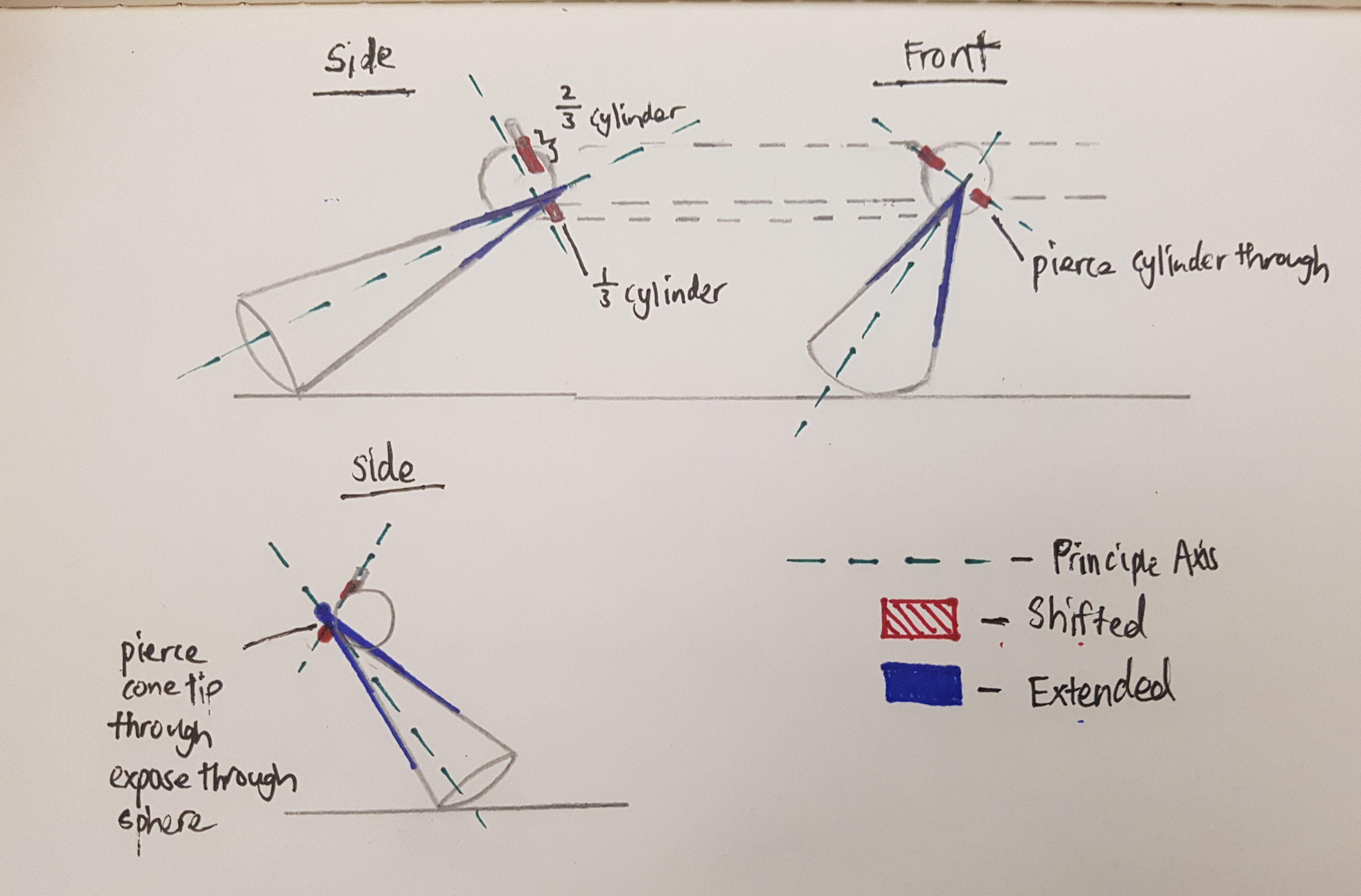
Improvements:
- Cylinder could be pierce through the sphere whereby 1/3 of the cylinder is exposed on other side of the sphere.
- The placement of the Sphere. The apex of the cone creates dynamism hence by wedging the apex with he sphere, it made the model less dynamic.
- Perhaps pierce the apex through the Sphere.
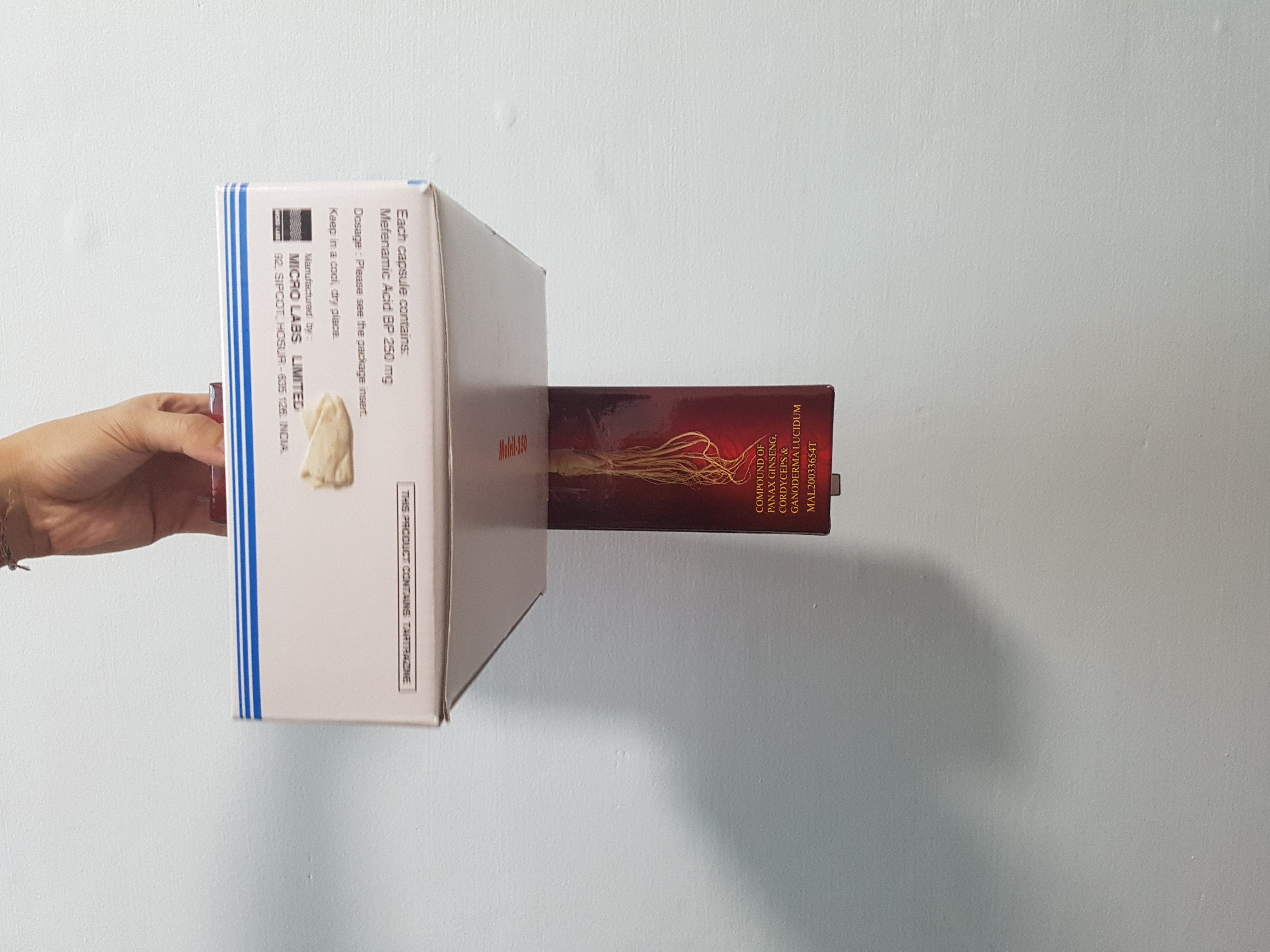
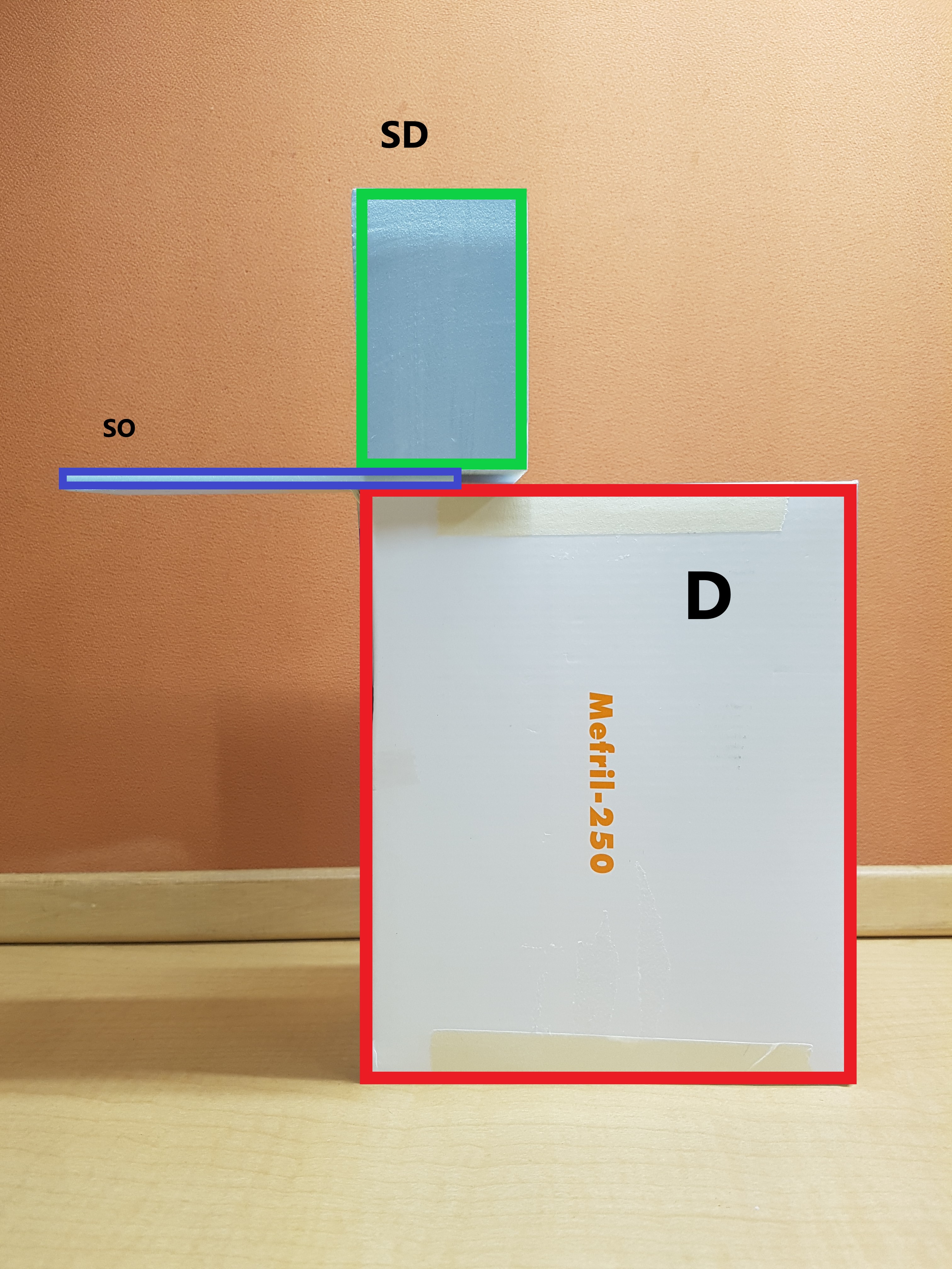
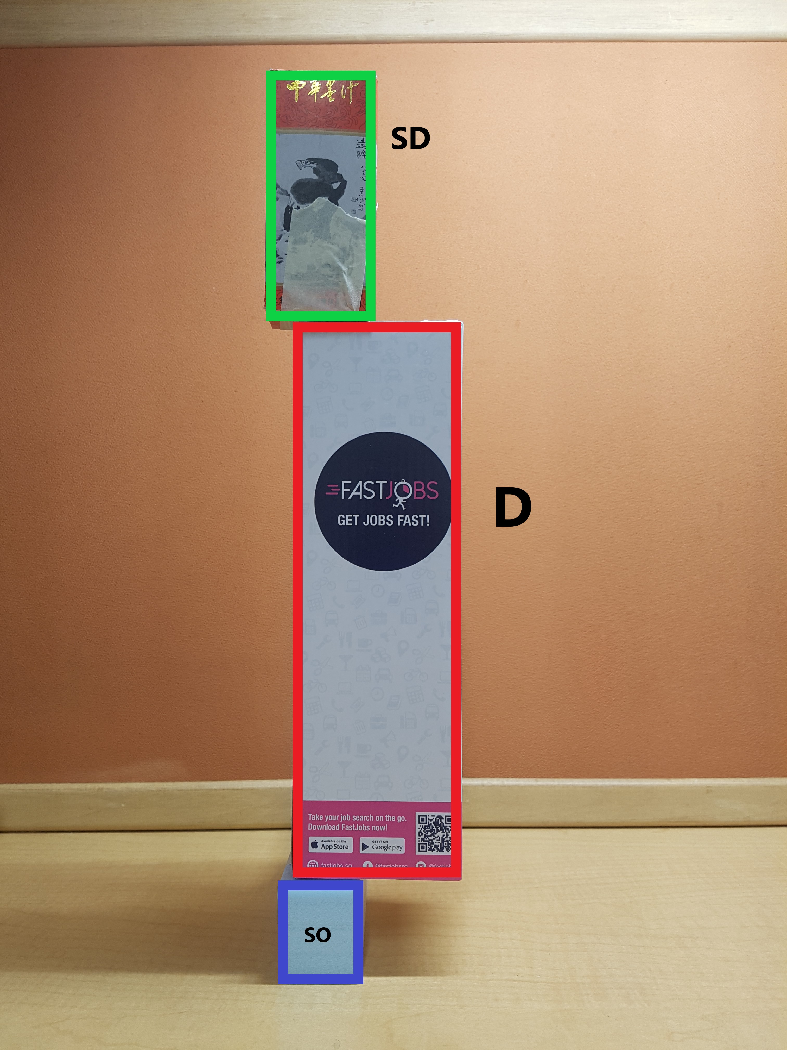
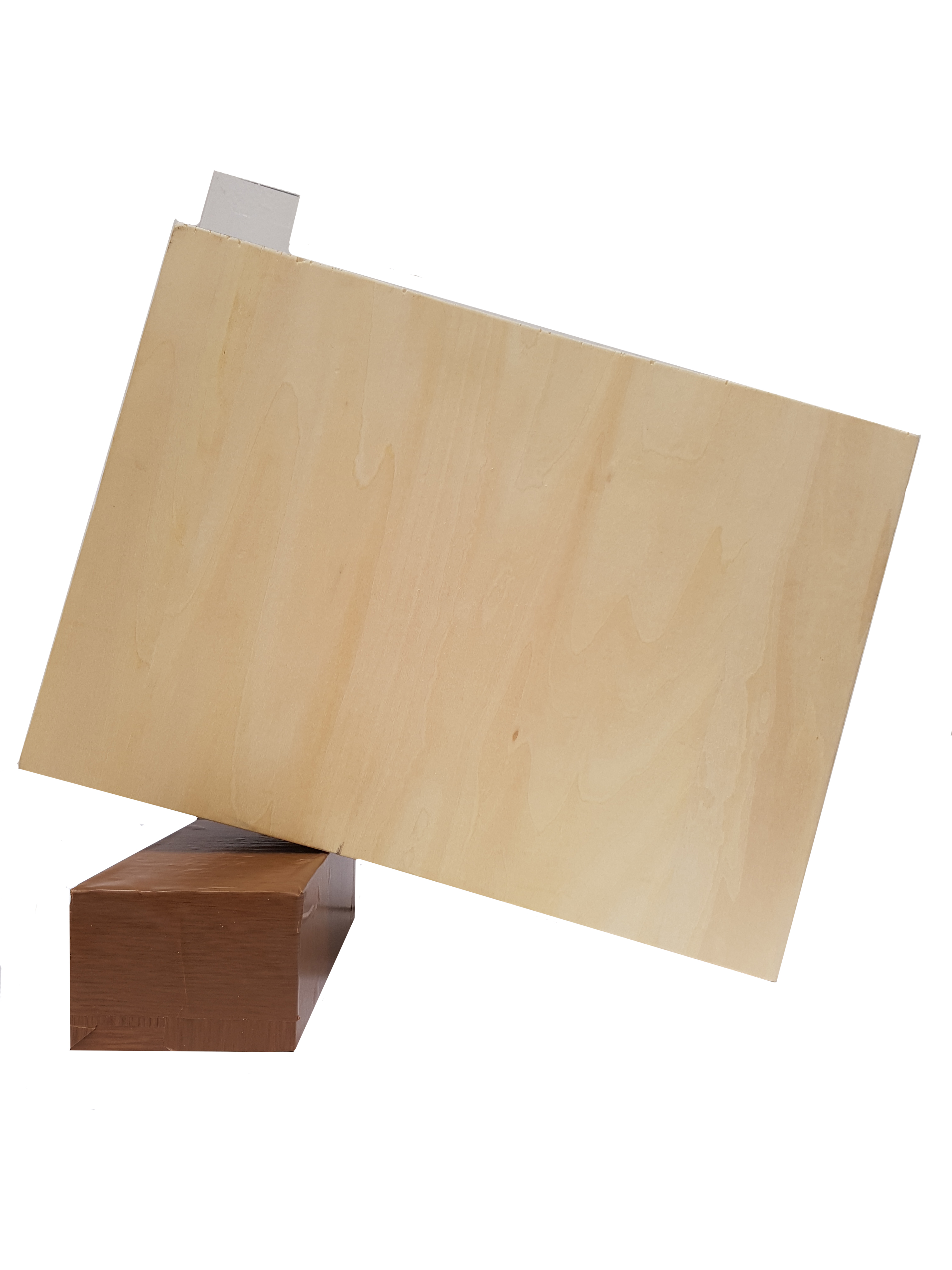
#2 Sketch Model
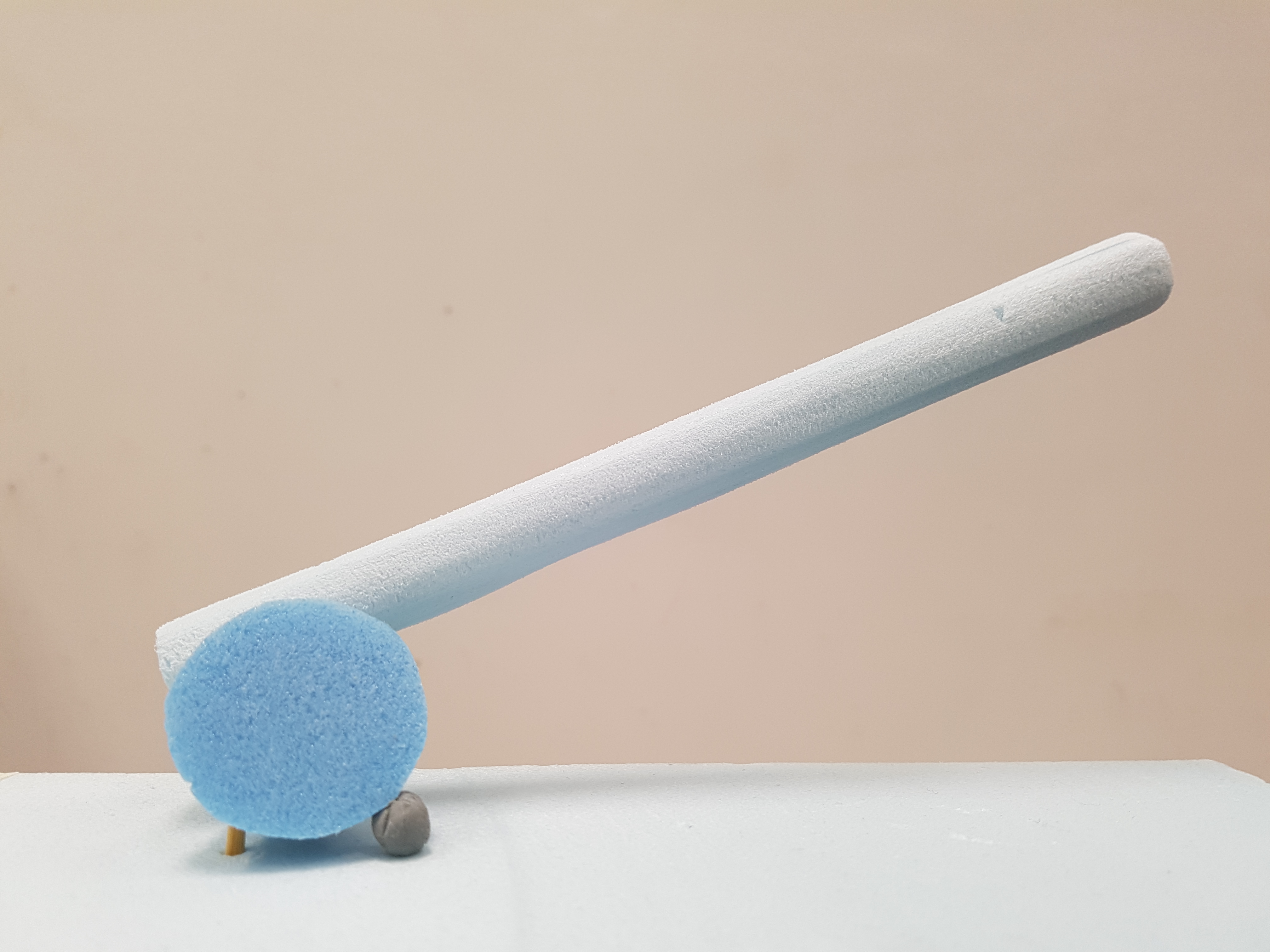
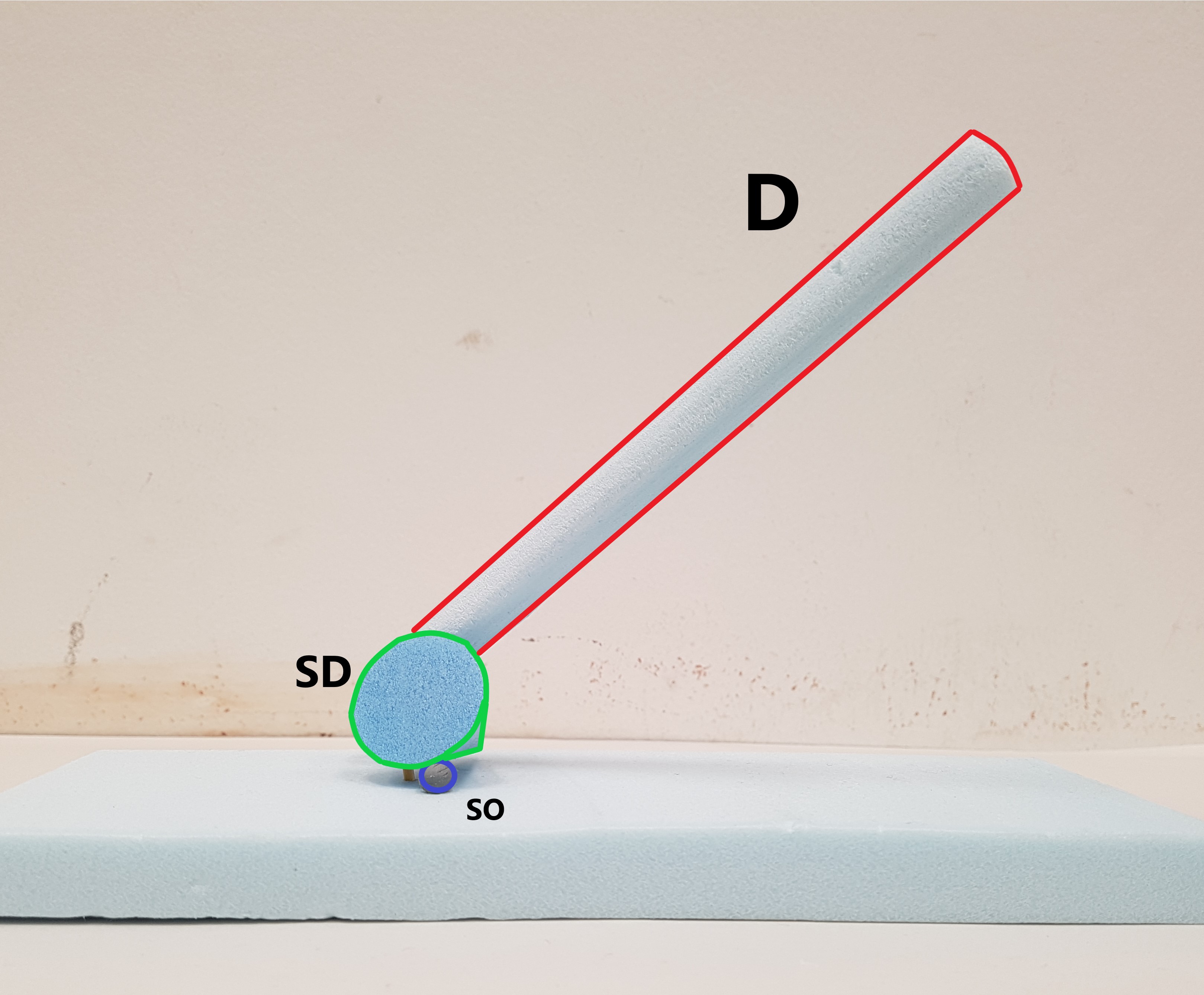
- Dominant – Cylinder , Subdominant – Cone , Subordinate – Sphere
- Consistent D, SD & SO from all angles.
- Axis of each volume going in different directions. Zig-Zag Axis in play.
- The use of a small Sphere and an exaggerated cylinder creates a form of dynamism in the overall proportion.
- The use of a small Sphere creates a feel of levitation to the whole model.
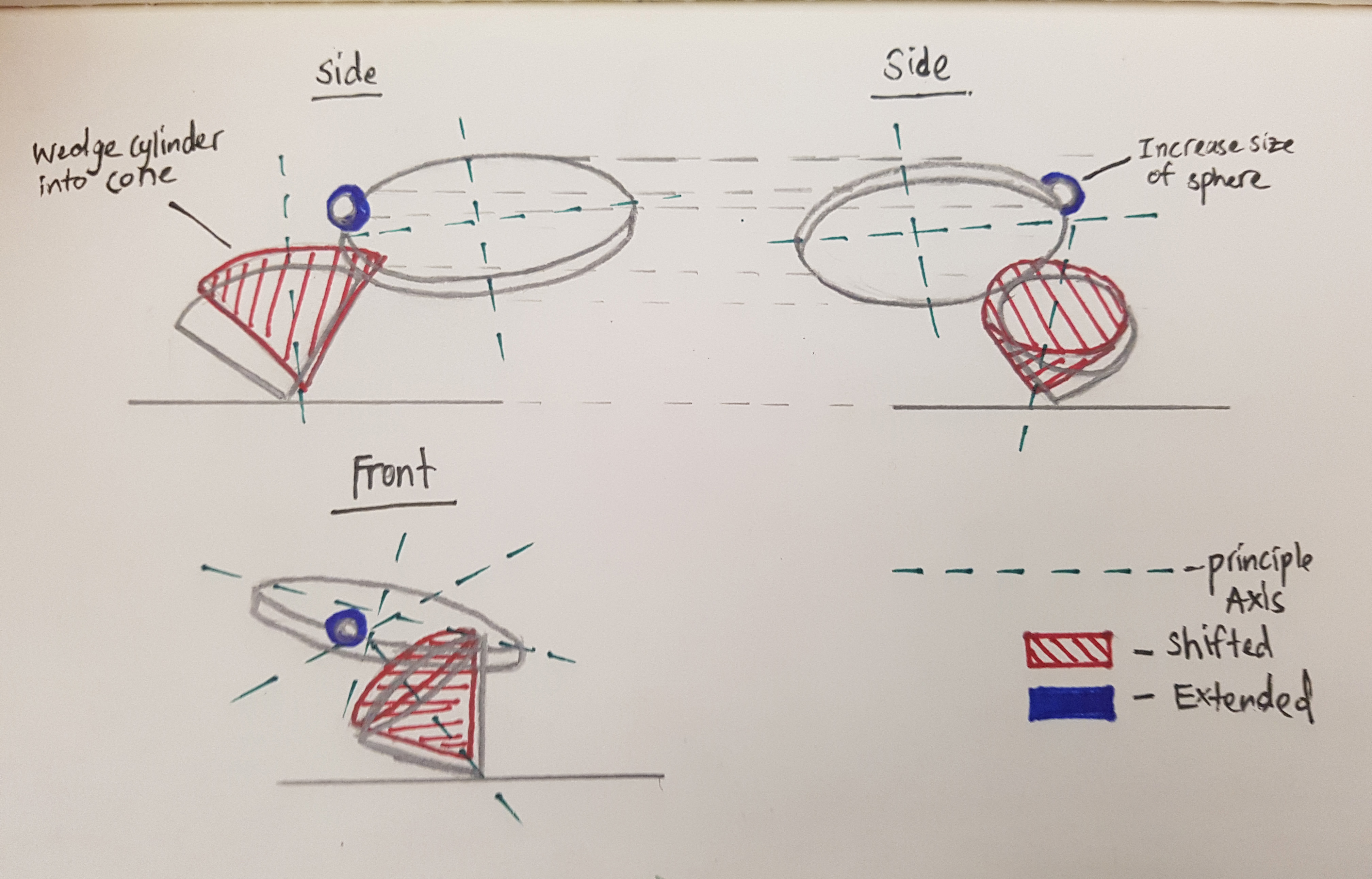
Improvements:
- Make Sphere slightly bigger
- Wedge in cylinder into cone
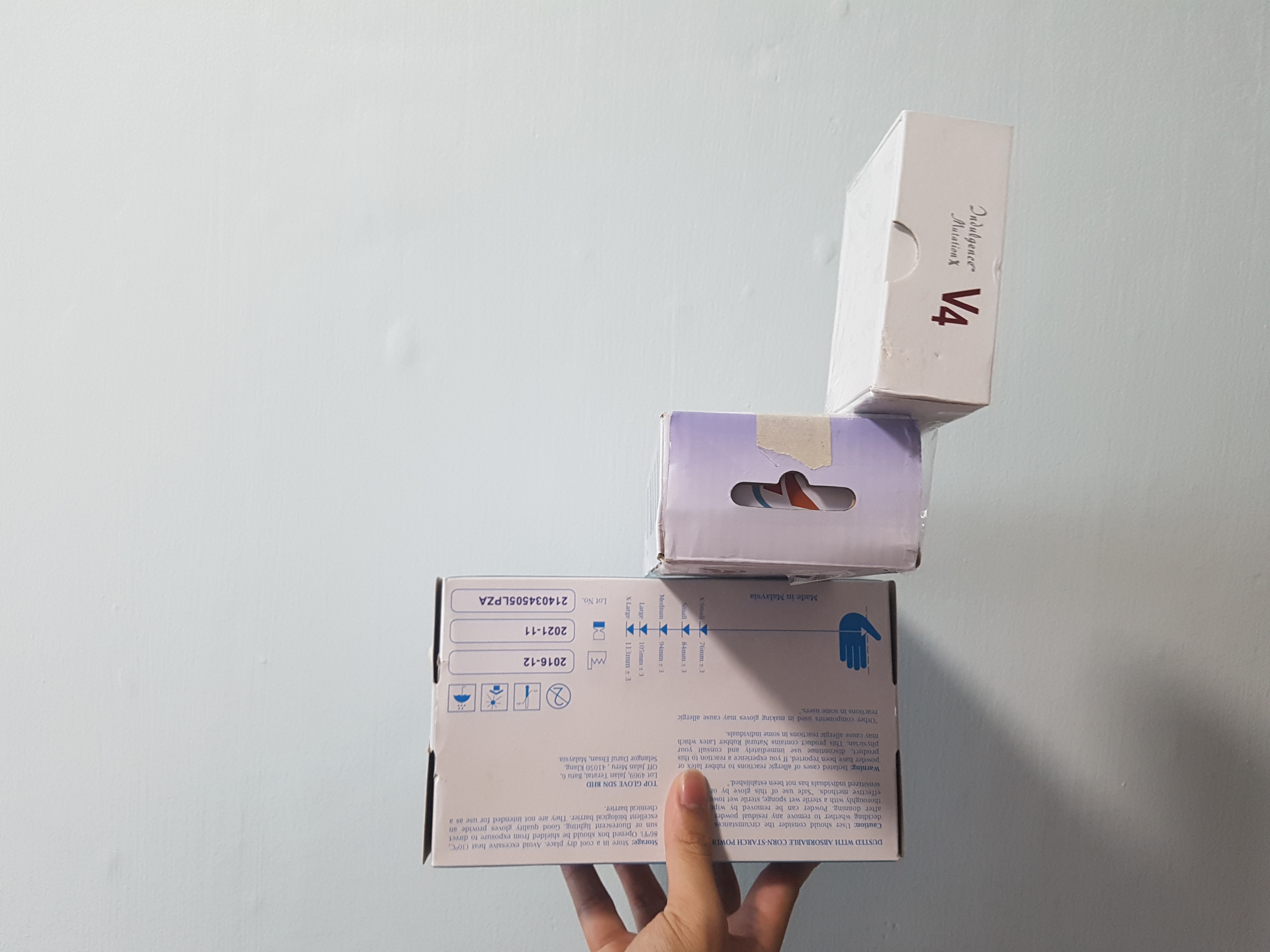
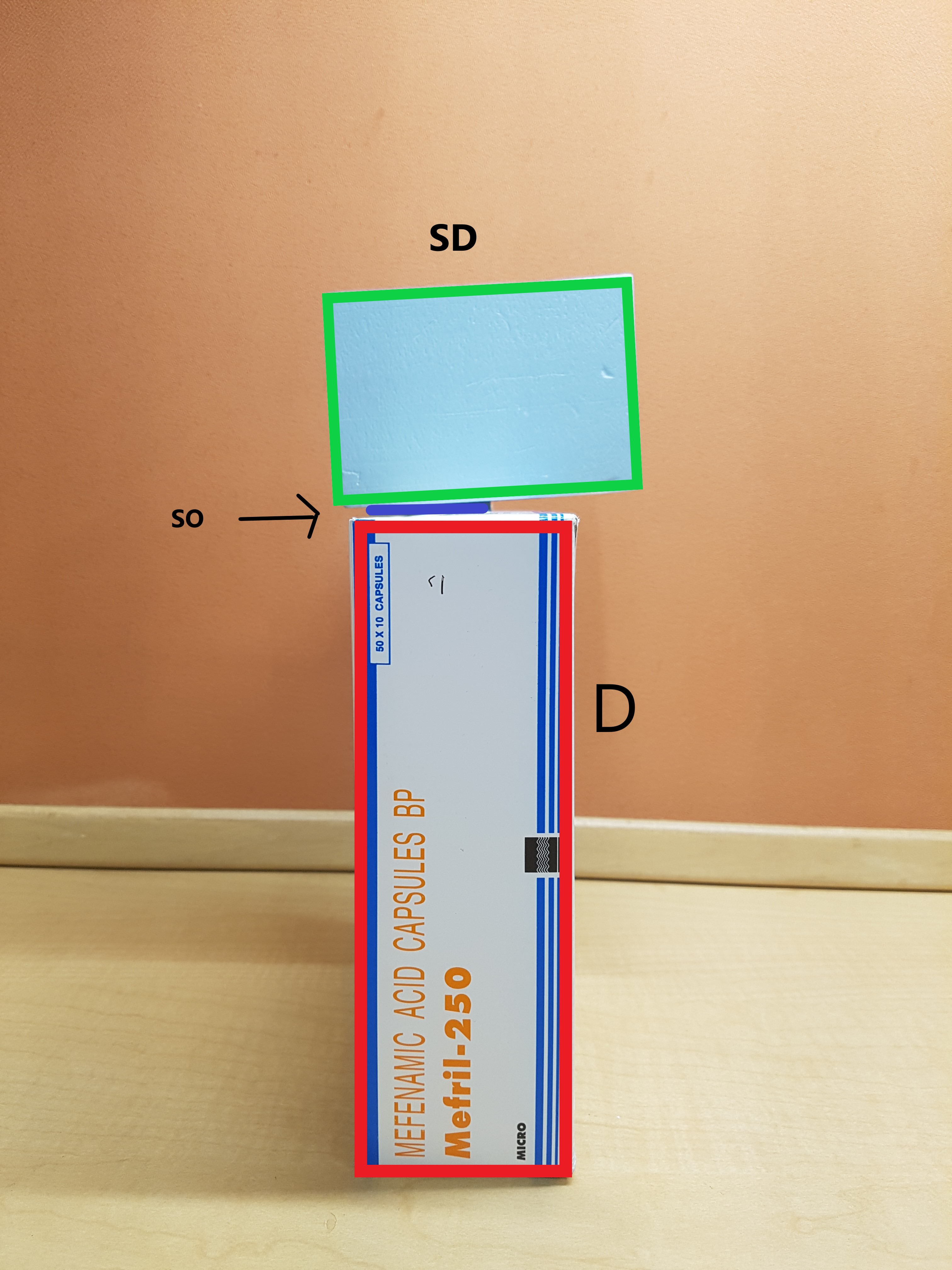
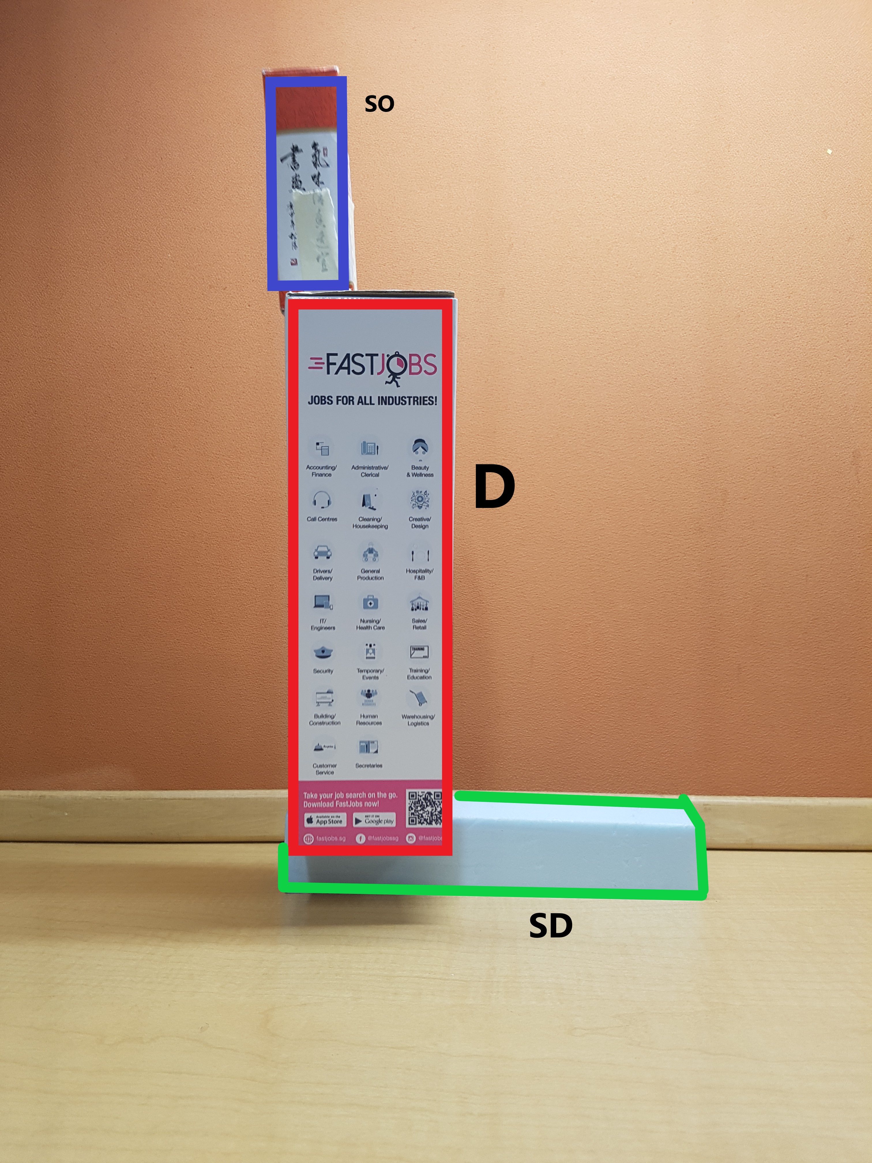
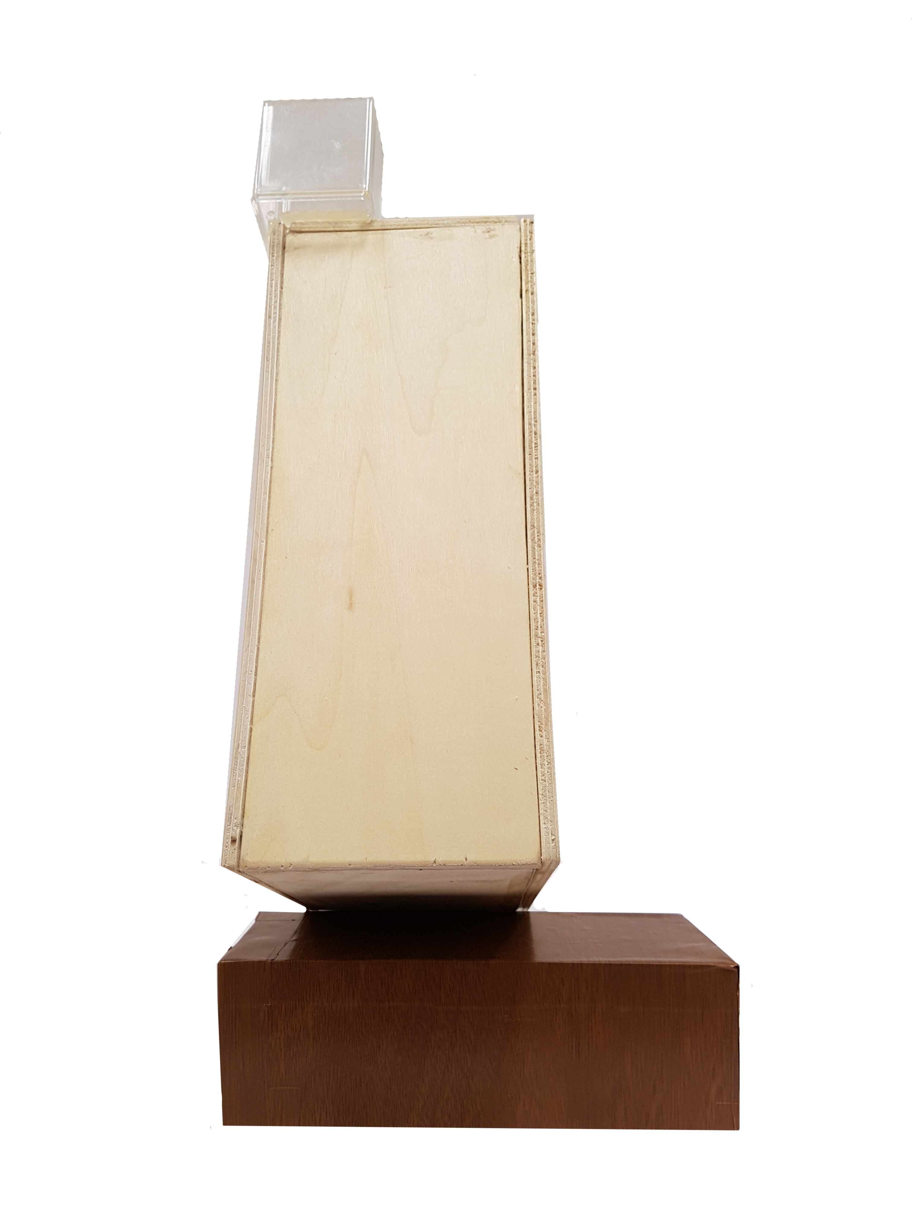
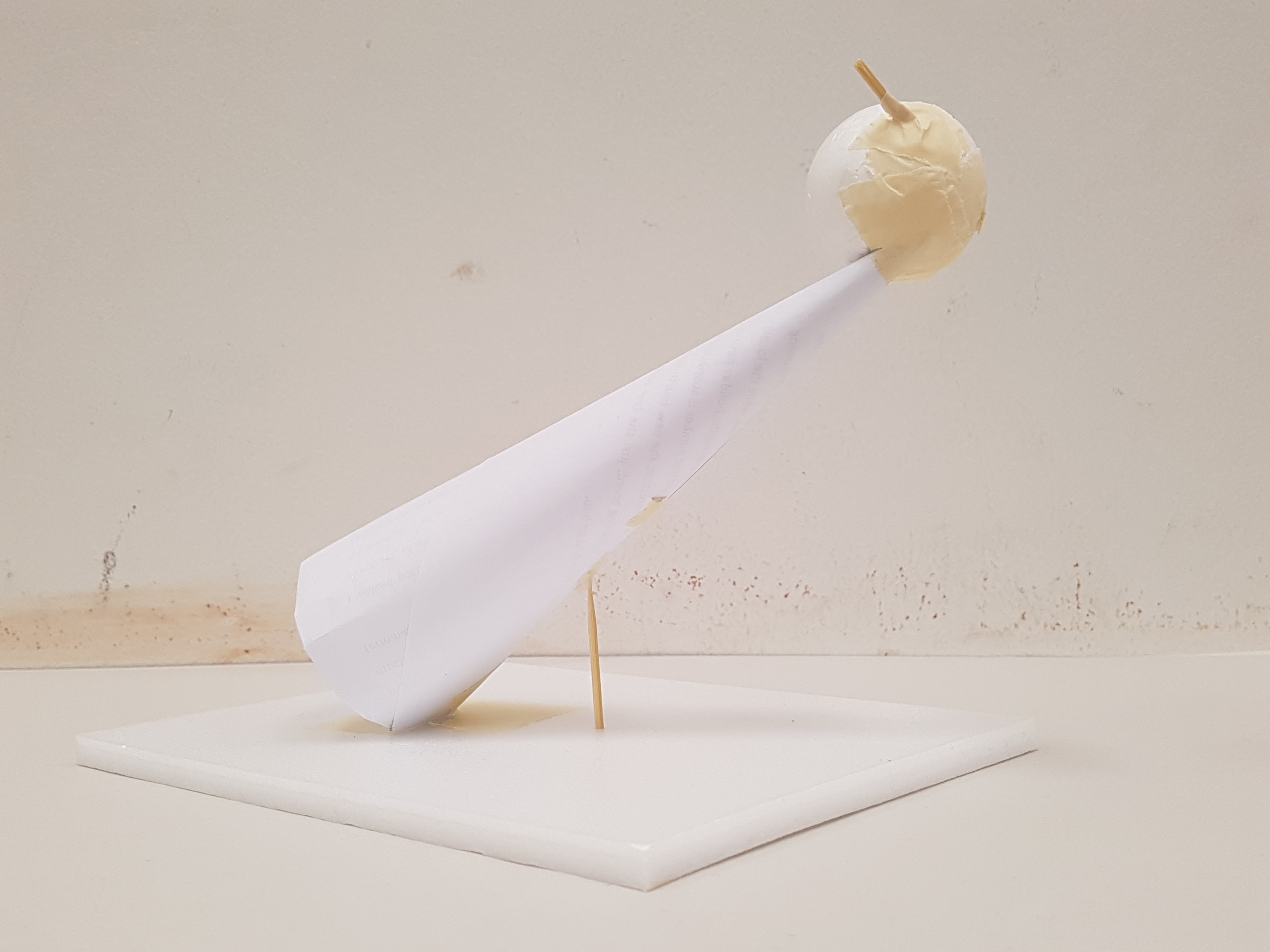
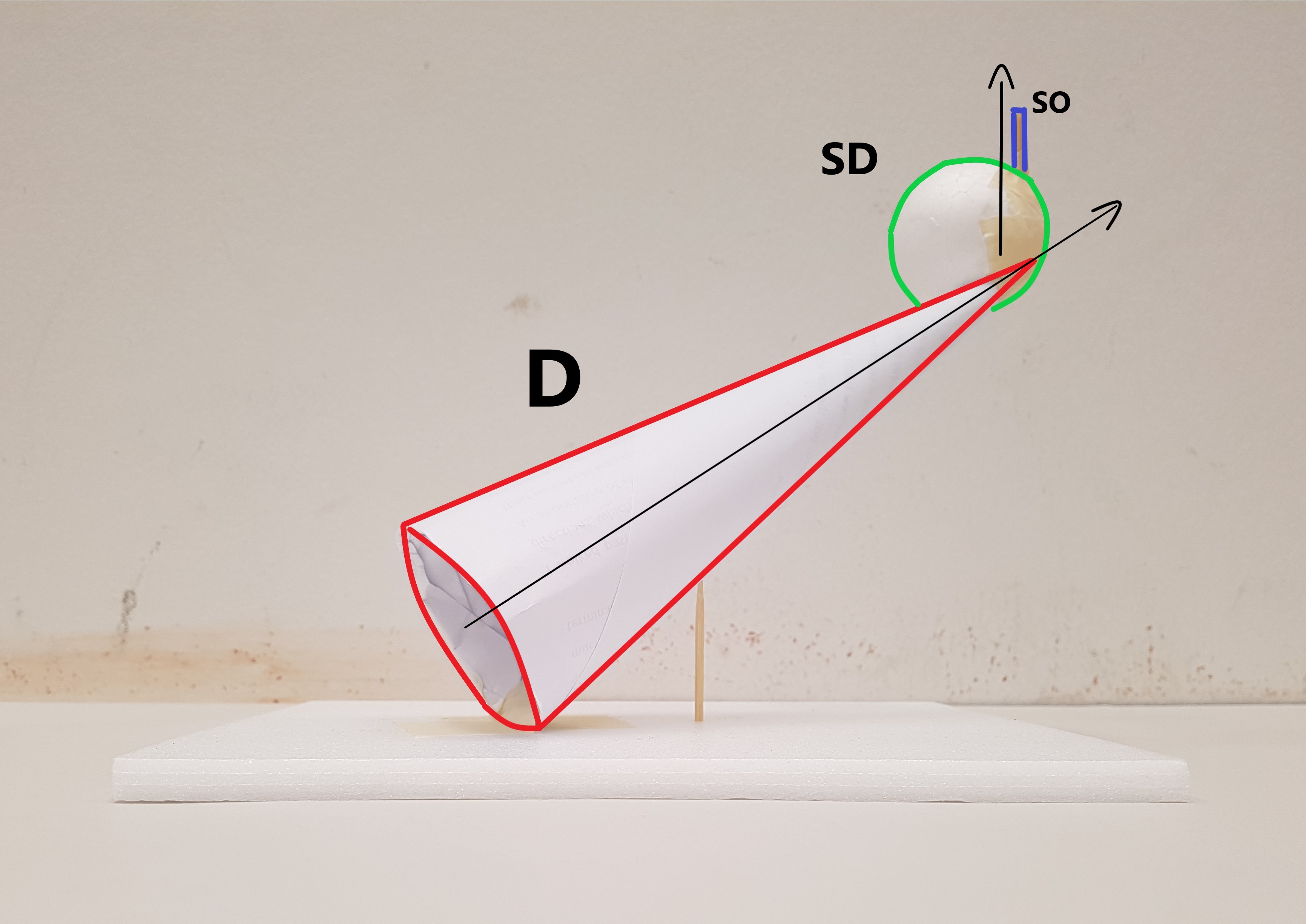
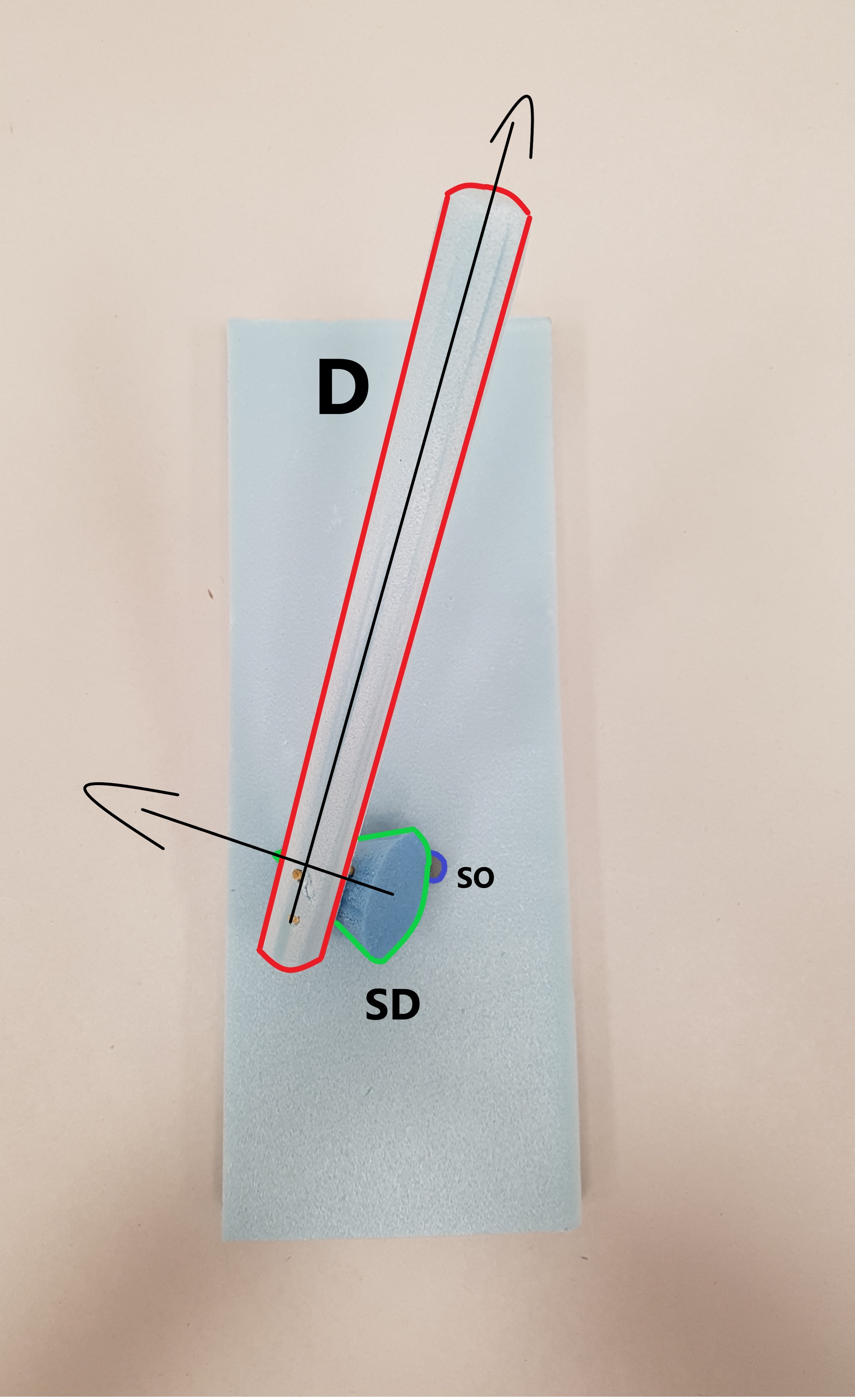
#3 Sketch Model

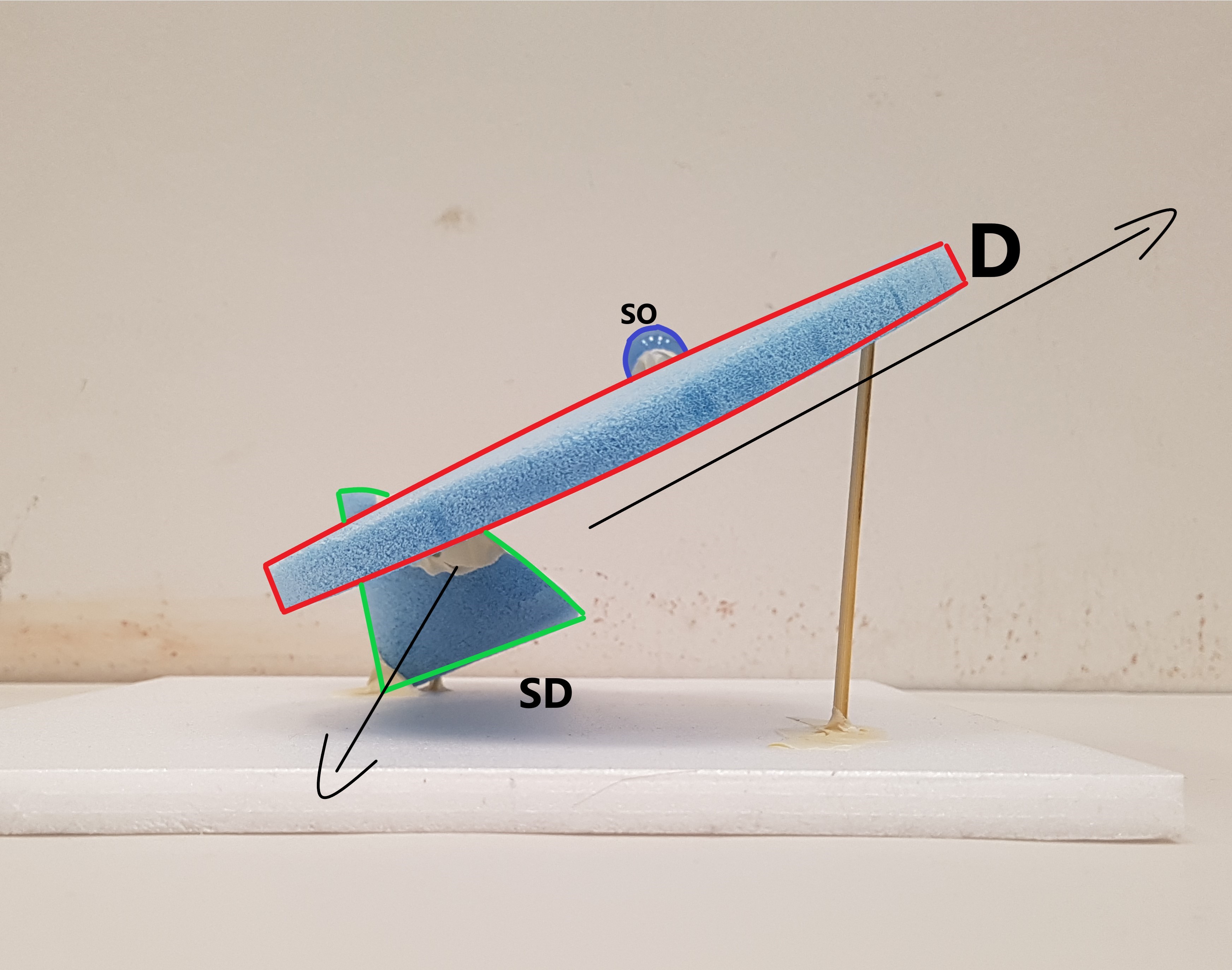

- Dominant – Cylinder , Subdominant – Cone , Subordinate – Sphere
- Consistent D, SD & SO from all angles.
- Axis of cone and cylinder going in different directions. The addition of sphere brings out the X, Y and Z element.
- Changed the inherent proportions of the cylinder by making the diameter of it’s circumference longer than its thickness.
- Audience should view the model from the top first then view the model from the front. From the top, the model looks overwhelming because of the circumference of the cylinder and the cone as it covers a lot of surface. However when looked at a lower angle there is actually a lot of space hence creating a form of illusion with the use of the void below the cylinder and cone.
- Shortlisted for 2D sketch Analysis.
Improvements:
- Make Sphere slightly bigger
- Wedge in cylinder into cone
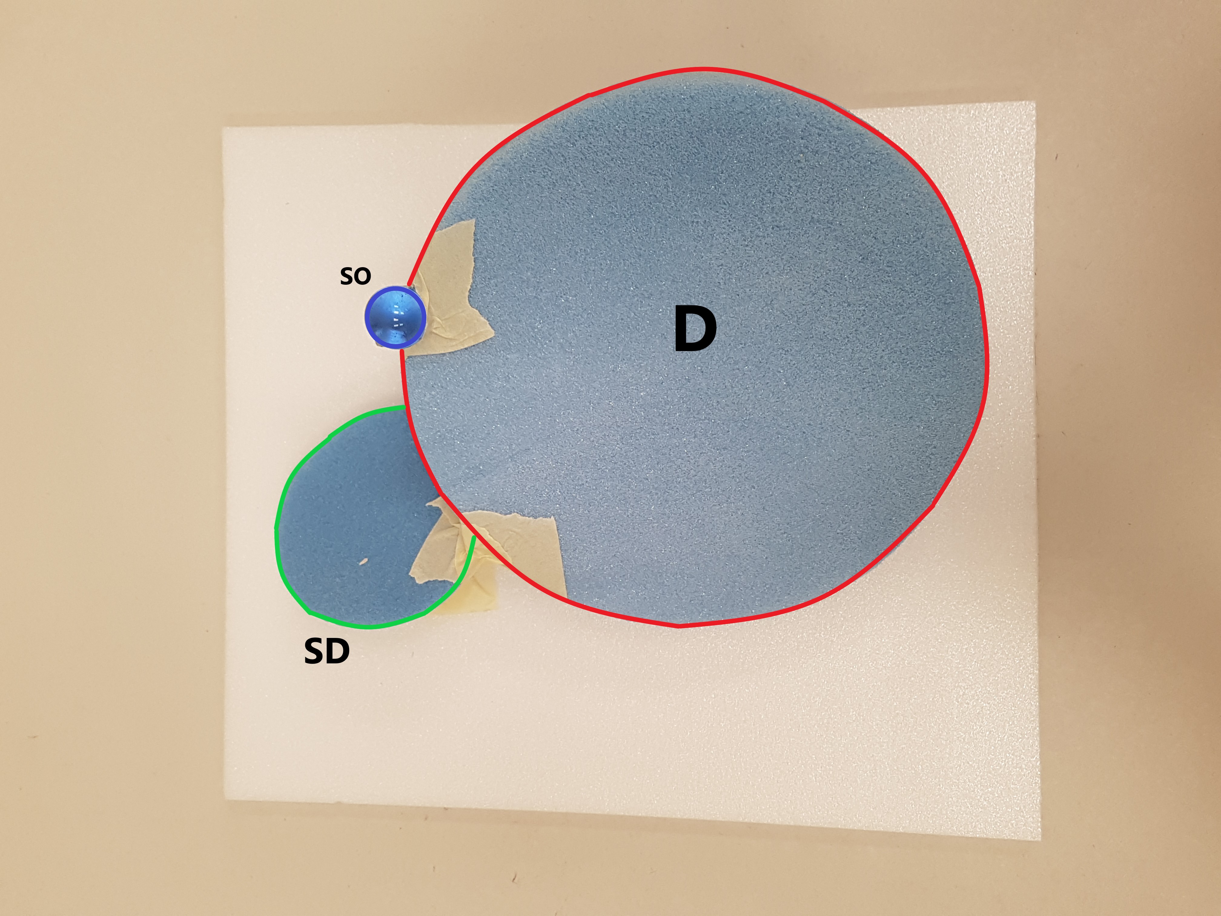
2D Sketch Analysis
Sketch Model 3 to be used for reference for final product.
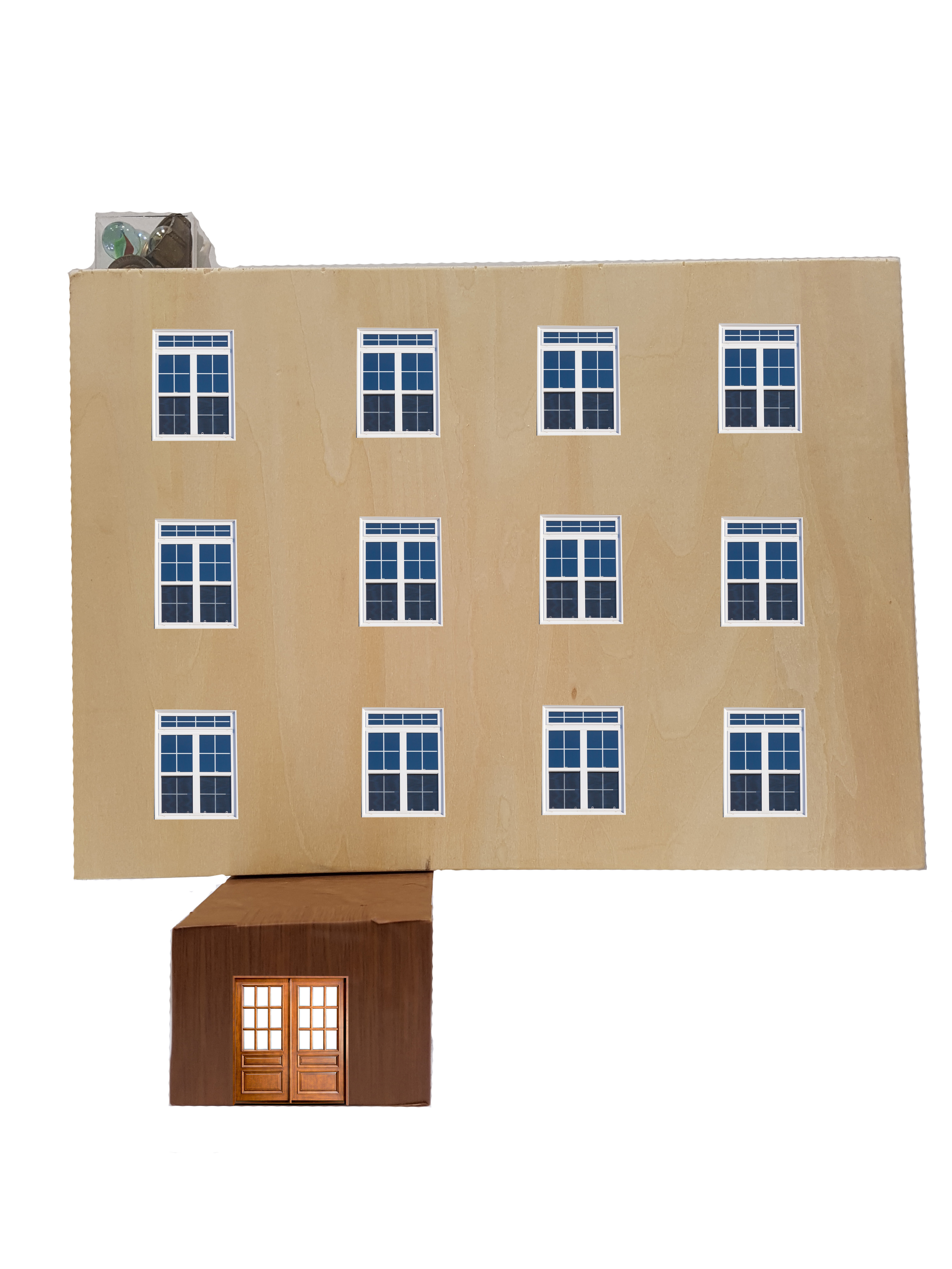
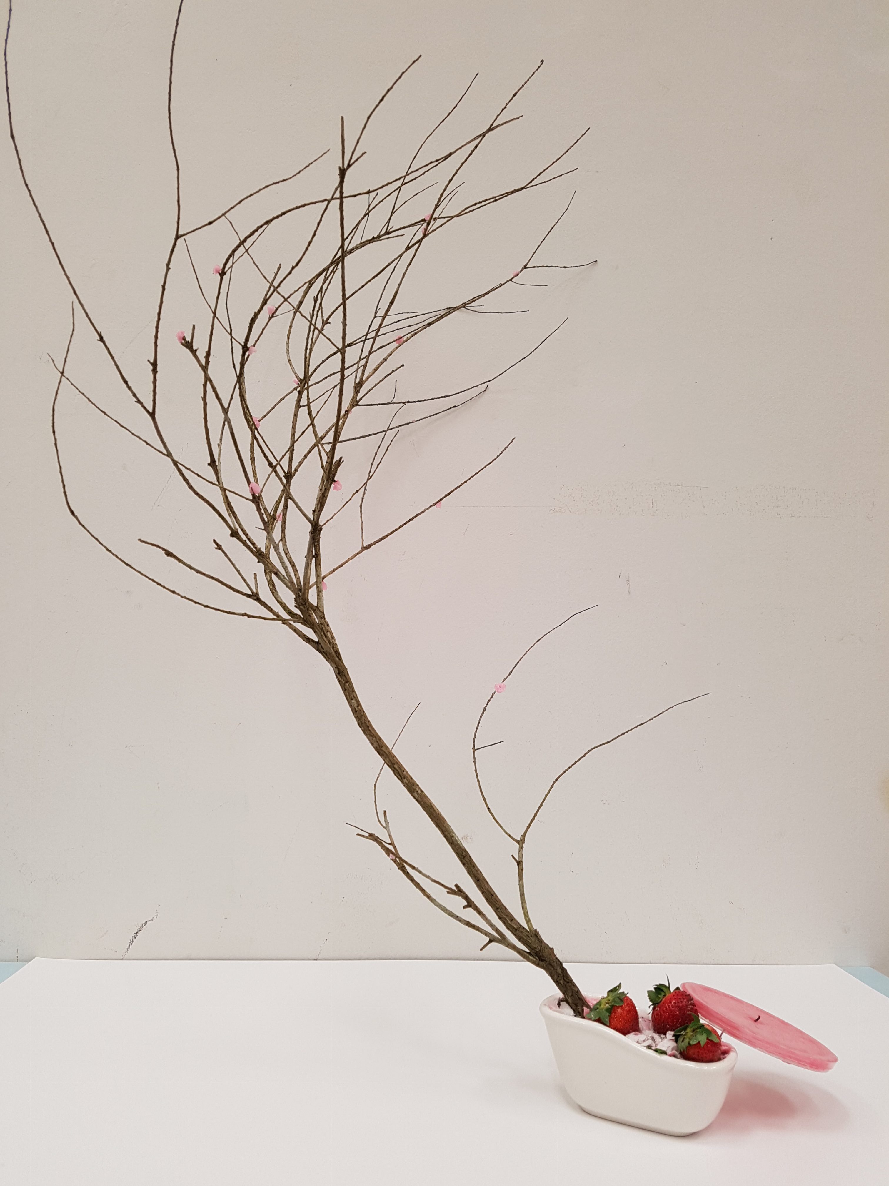
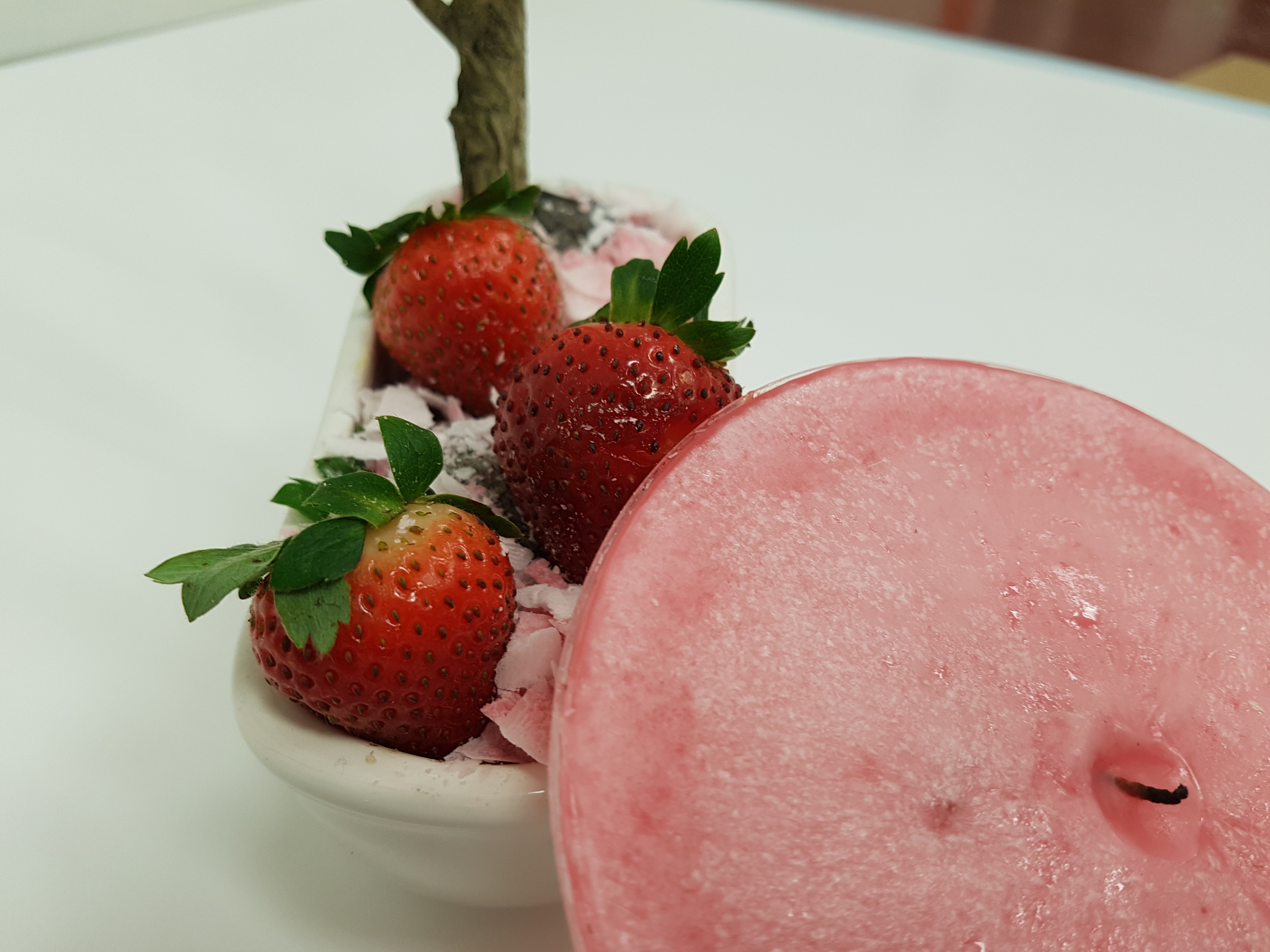
Final Product
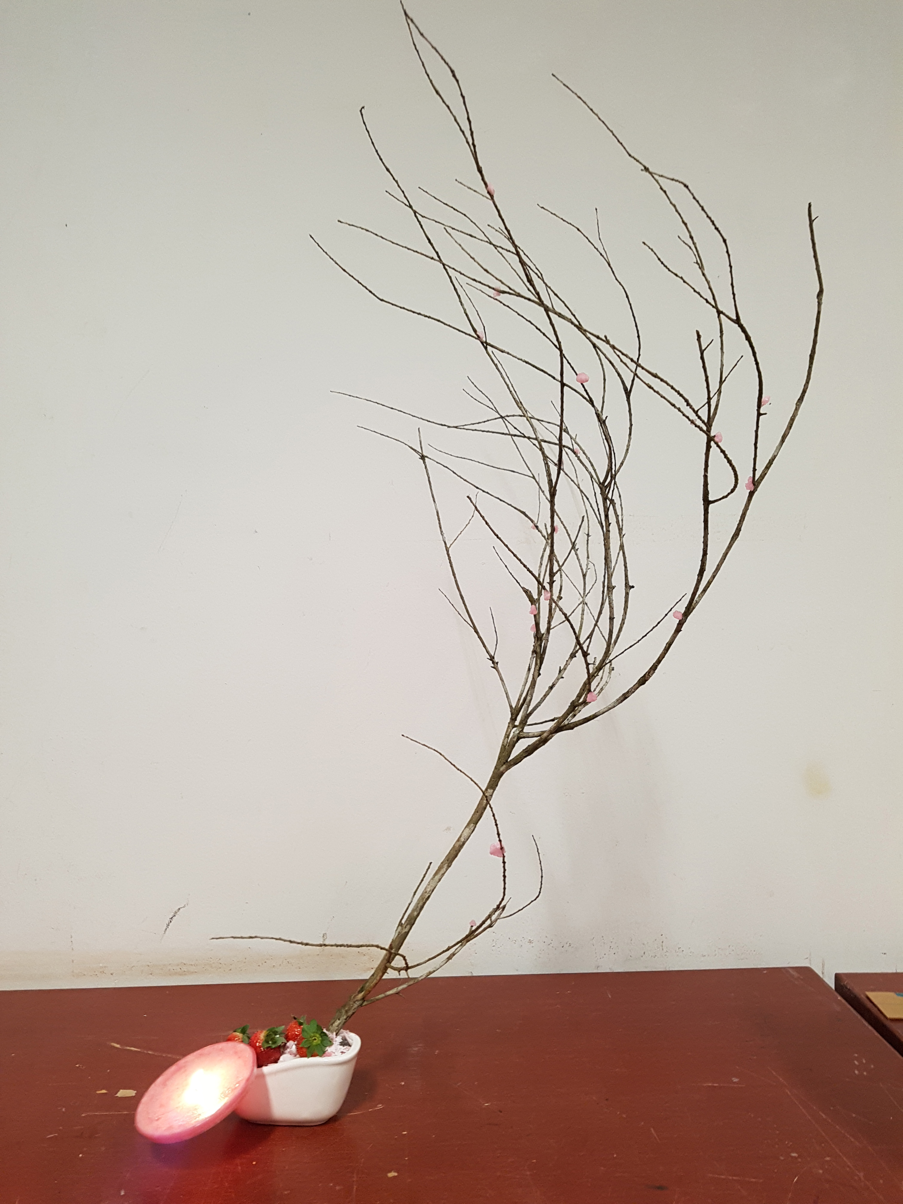

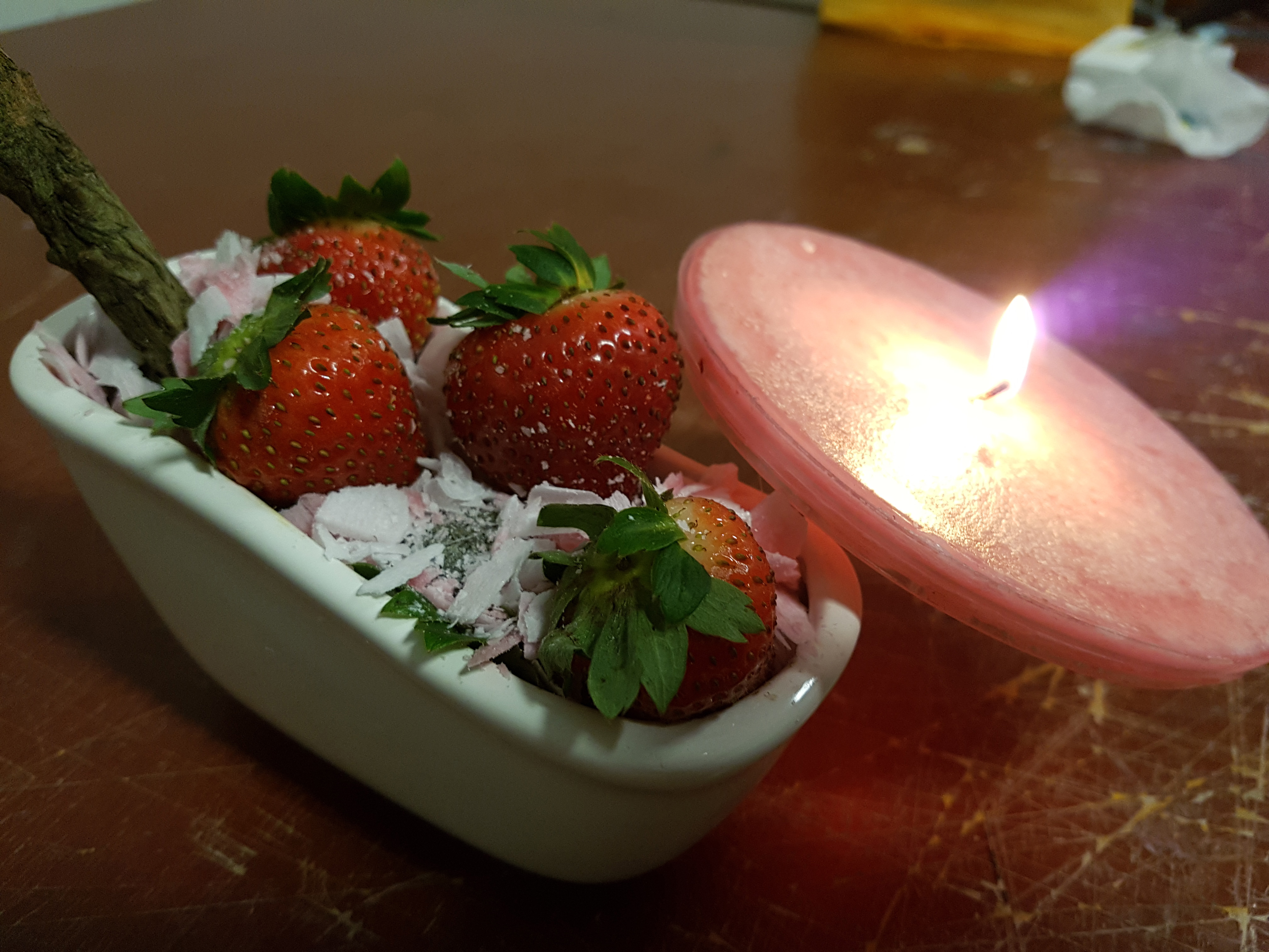

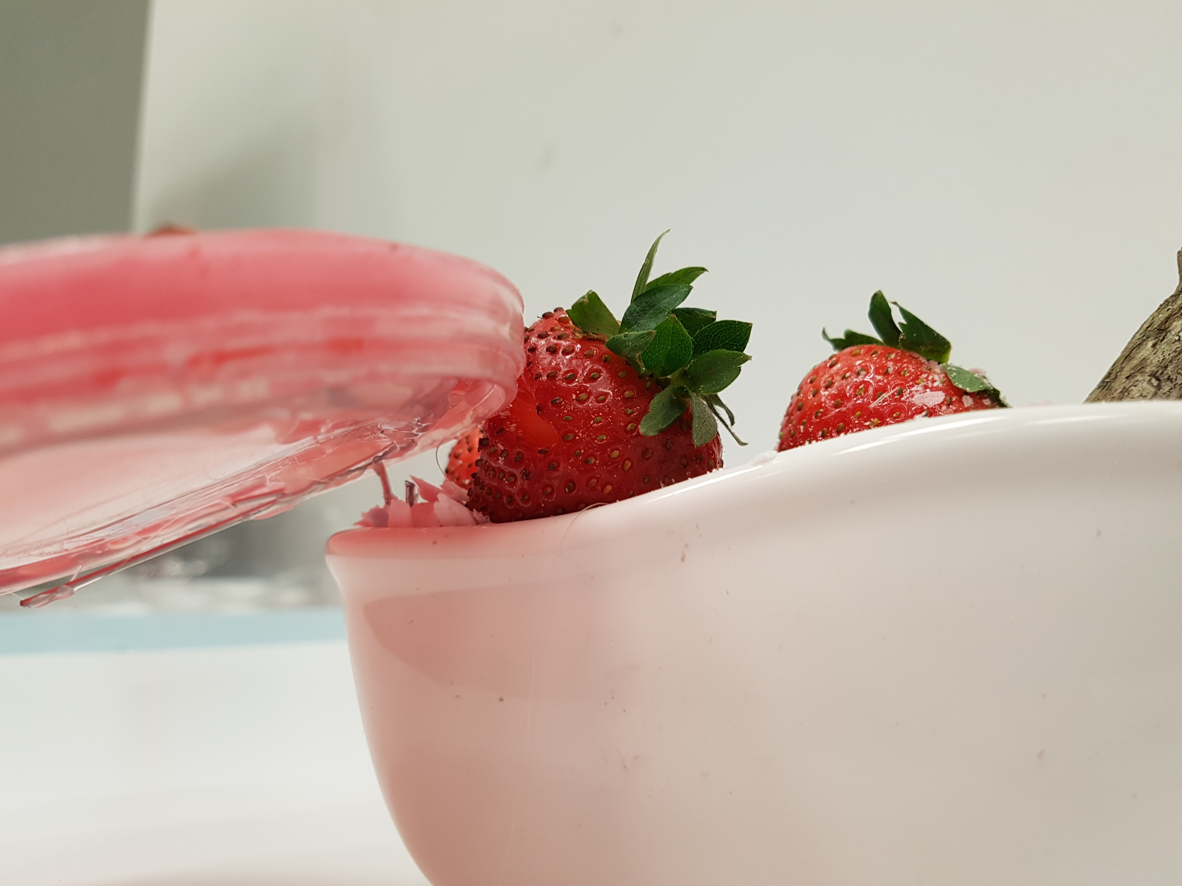
Materials used for final product:
- Branch
- Cotton Candy
- Candle
- White Bathtub (BASE)
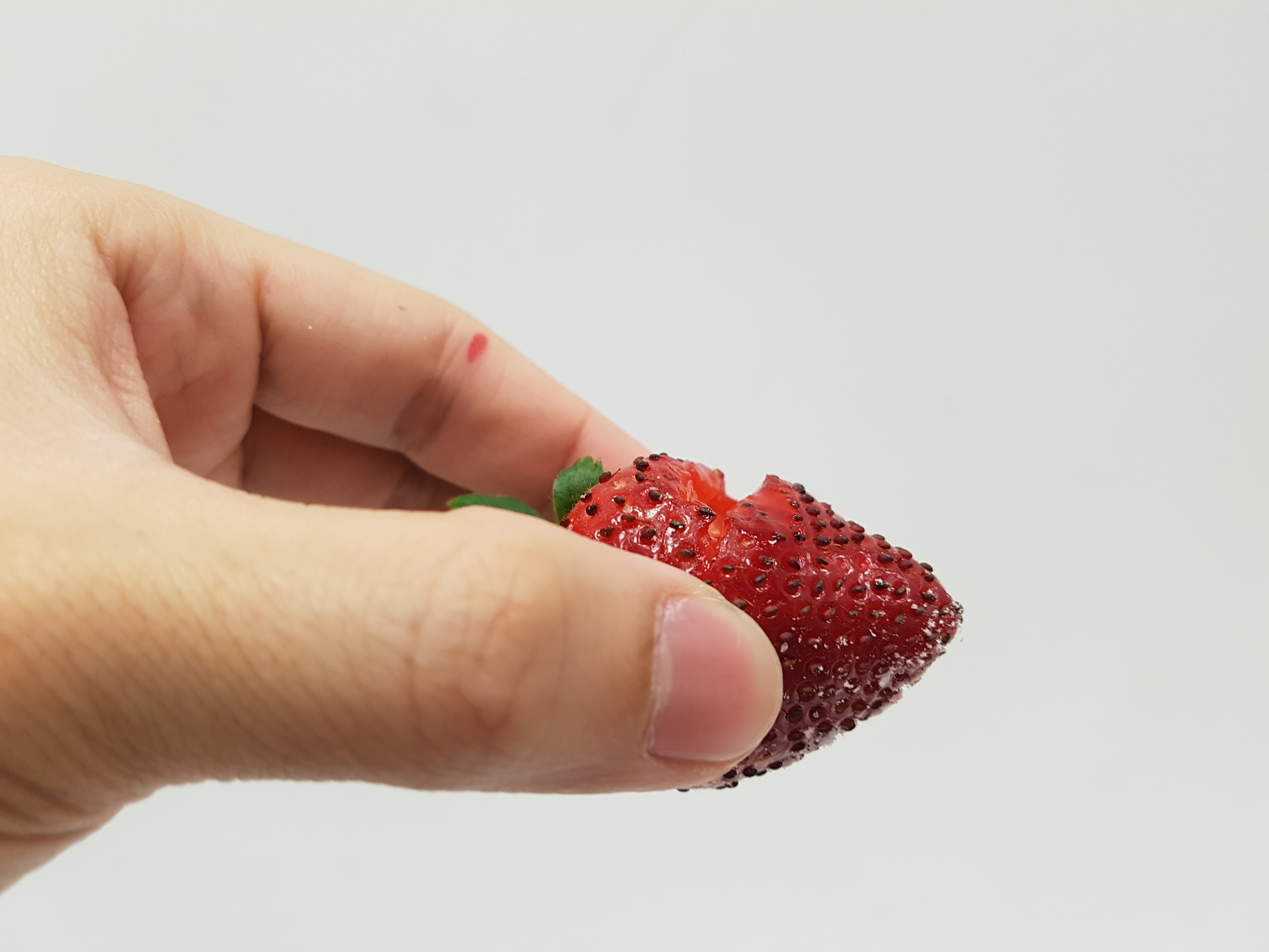
- Strawberries
Colour Concept:
- Pink
- White
- Red
- Light Brown
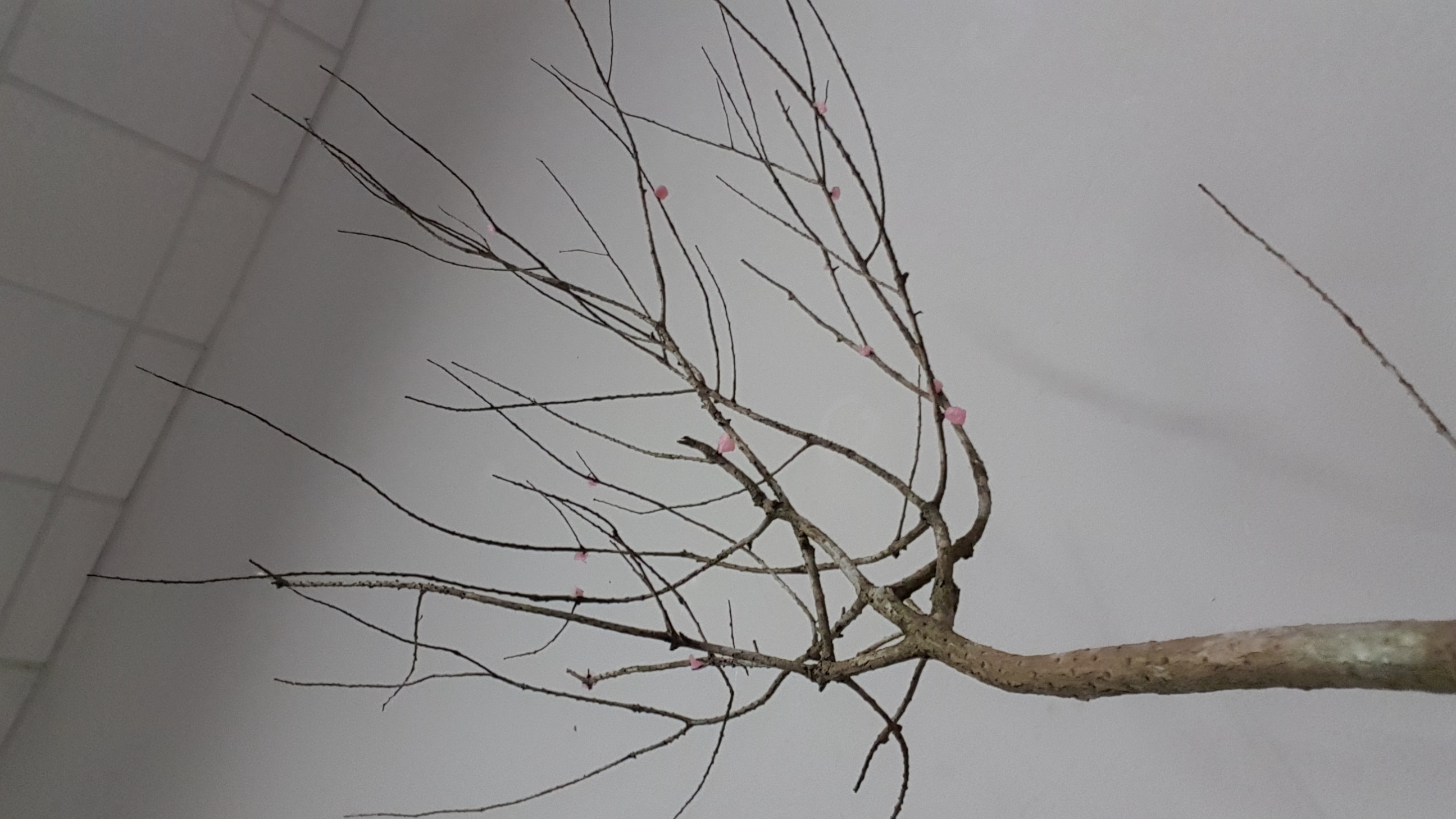
Dominant: Tree Branch
Sub-Dominant: Candle, Strawberries, White Base
Sub-Ordinate: Cotton candy balls
Idea Concept:
When I think of spring the first time that popped up to my mind was Cherry Blossom. Hence my color concept that I chose for this final product comprises of pink, white and red which resembles that of Cherry Blossom.
Spring represents growth, vigor and blossoming, thus I intentionally chose a dynamic looking branch so that it can instantly capture the audience attention and bring out the ideas of spring. The branch is dynamic looking as it extends from a branch from the base to many branches and curls back, making it look interesting.
For me, I feel that Spring encompasses the taste of sweetness as it represents a sweet new beginning and spring break. Therefore, I used foods that are sweet like Strawberries and Cotton candy. I rolled the cotton candy into balls and placed them randomly on the tree branch as it bear resemblance to the cherry blossoms.
The candle symbolizes the warm of Spring and also the longer day time during spring. As the flame burns through the wax, it releases a fragrant floral smell that you will normally smell when flower blossoms during spring.
Analysis of Final Product
Ikebana emphasizes aesthetics in minimalism, therefore I tried to keep my final product as simple looking as possible while making it look interesting and encompasses the ideas of Spring.
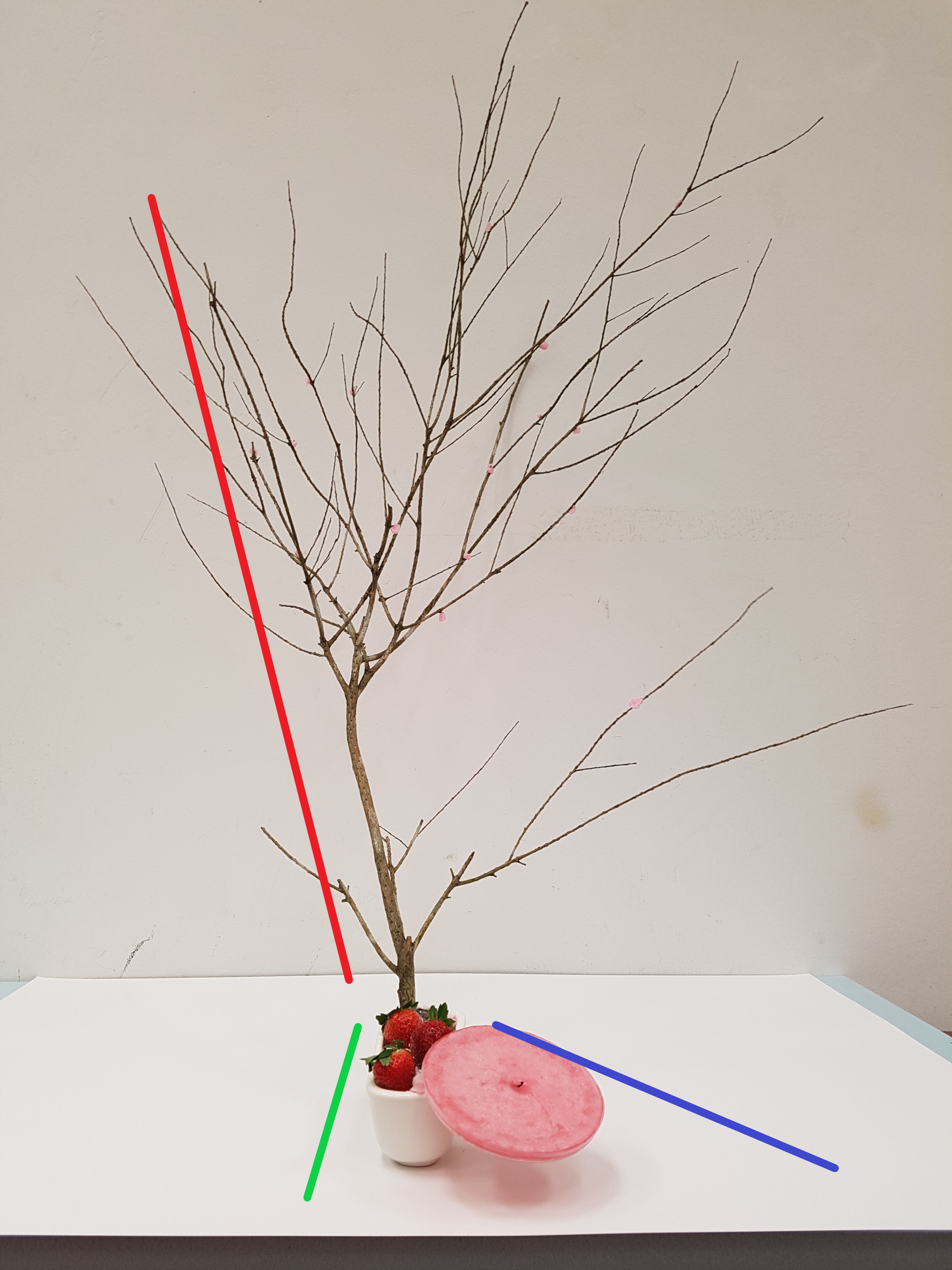
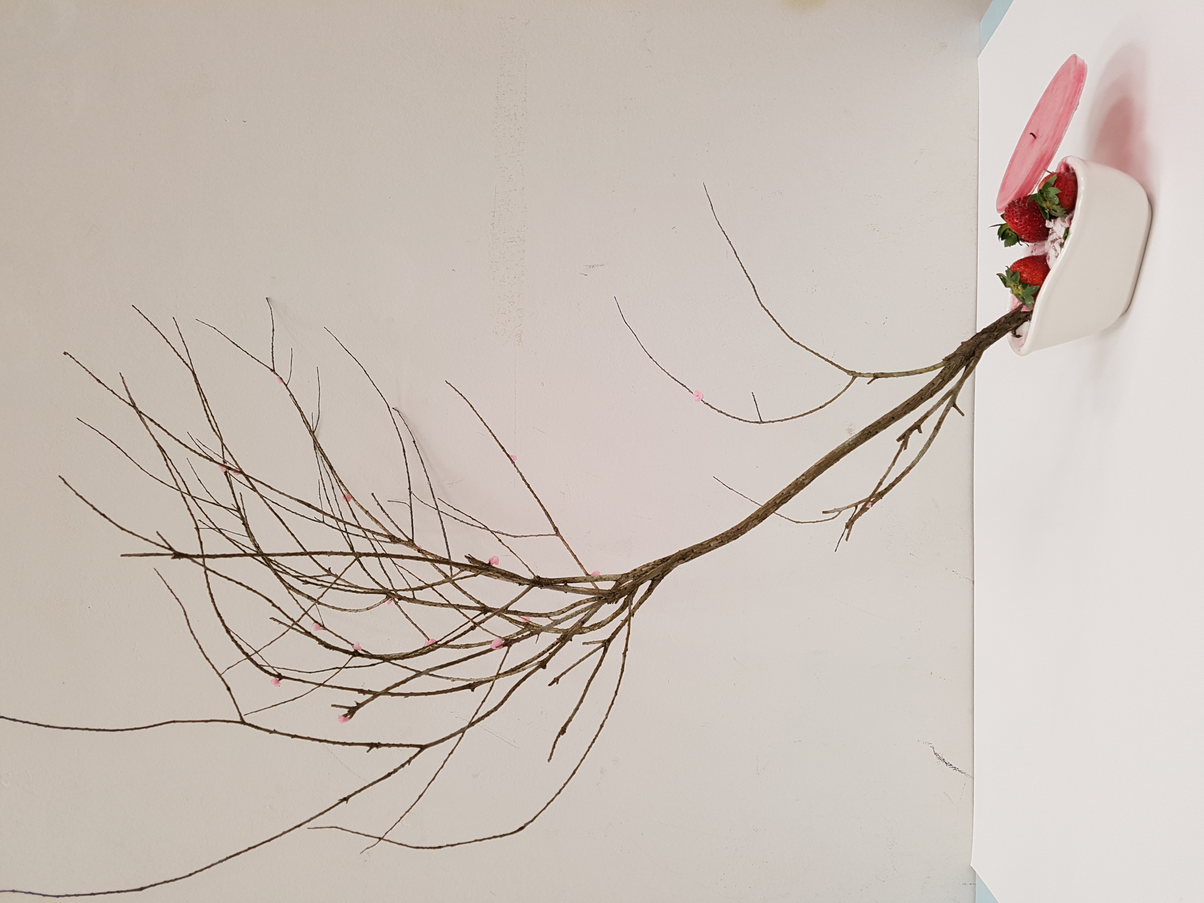
Initially the placement of my branch in line with the base but after that I shifted and tilted it towards the side and placed my candle diagonally on the other side of the base to make the whole composition look more interesting and dynamic.
Improvements:
- Lesser strawberries (Too many strawberries made the base looked very messy and overwhelming)
- Wedge Strawberry with candle (Connection between the objects in the model)
Reflections
This assignment is really cool as it allows us to express our creativity and ideas through the arrangement and combination of random objects like food and tree branches. Because it has no limitations and restrictions, it enables us to explore the different means and ways we can use to arrange our objects. It was really cool to see the different interpretation of the seasons everyone was given and the different ways they approach the Ikebana.
However, doing the Ikebana was really frustrating because I was unable to achieve what I initially planned out to do for my Ikebana. My idea for my Ikebana was rather different from what I originally planned because I was unable to source for the materials I wanted. Hence I had to consistently improvise to make my model look as close to what I had planned. It was just frustrating because no matter how hard you try, you are still unable to get what you want…
But overall, it was really enjoyable 😀