Sketch Model
Research on Modular Structure
Just someone struggling to make an honest living
Done by: Jing Yi, Jia Ying and Jun Ming
Brief Description: A piece of memory shared between a boy and a girl.
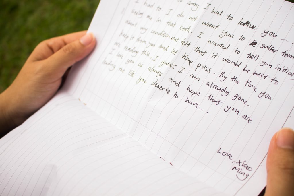
Plot: A boy falls in love with a girl. Their relationship developed through various pieces of shared memories. However, at the peak of their relationship, the boy has to leave the girl as he travels overseas. Although the boy left the girl, the girl still anticipates for his return. As time passes, the girl eventually moved on with her life and forgot about the boy. One day, the girl received a post paid letter from the boy – a letter of memories and sadness.
Genre: Romance, Drama, Coming of Age
Initially, we had a different idea to our story and had already completed Task 1 for this assignment. However, while editing for Task 2 we discovered that we had a lot of missing visual parts for our story and our stories were not flowing well.

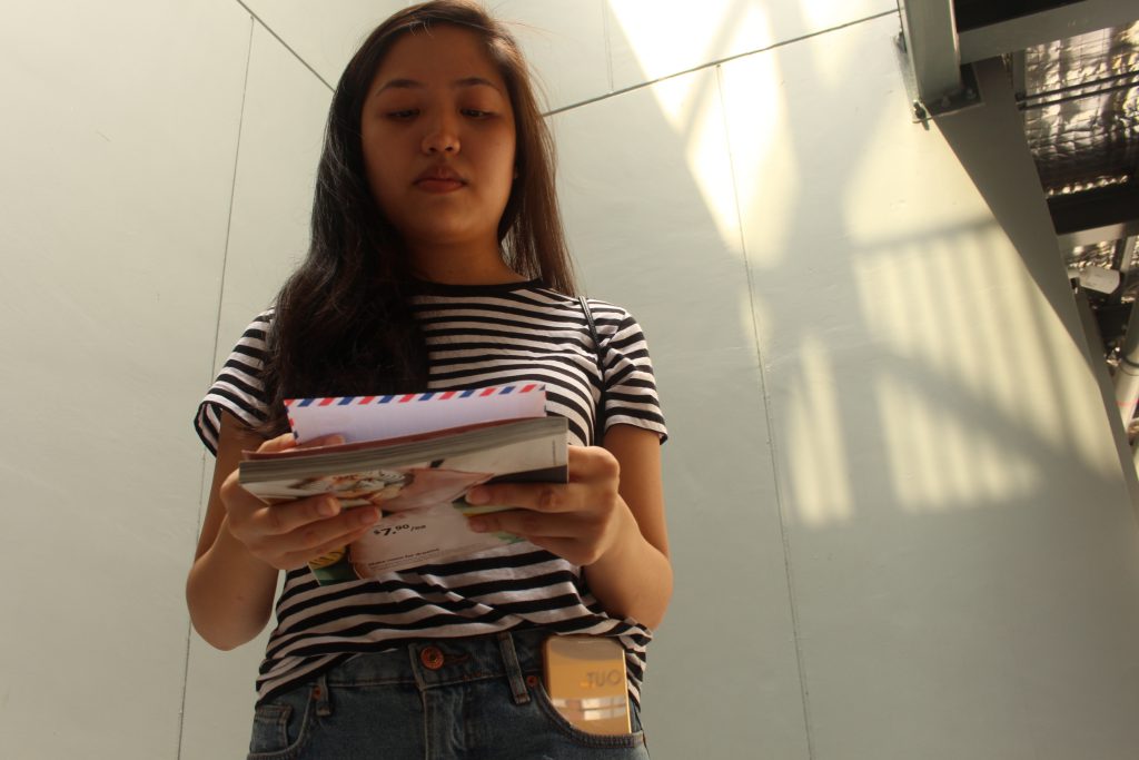
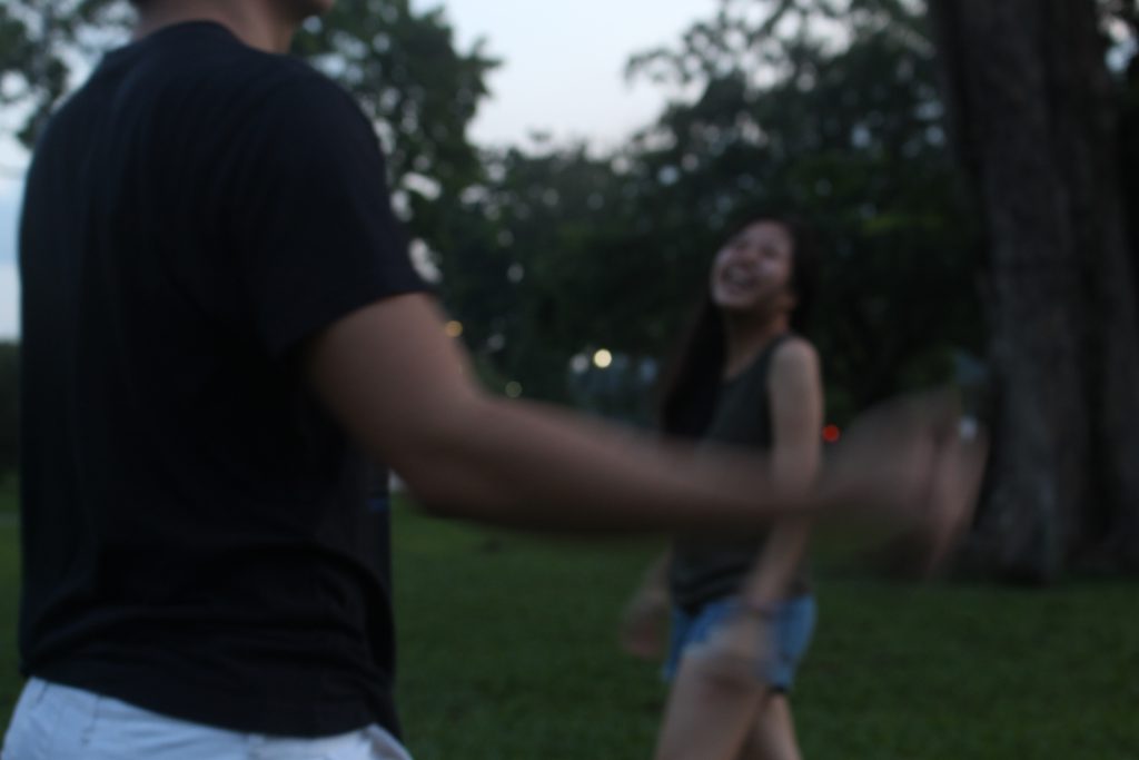
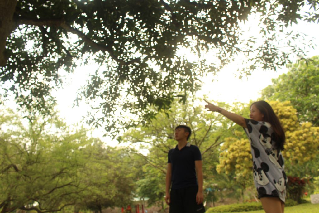
Some of the problems we faced initially were the undecided story plots and unclear story boards. Therefore, after our consultation, we re-plot our story and make sure we confirm all the camera shots and angles we are going to use in our story boards so that we will not face the same problems we had previously.
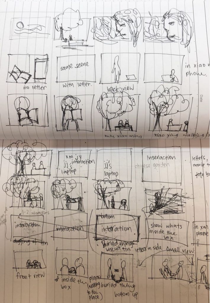
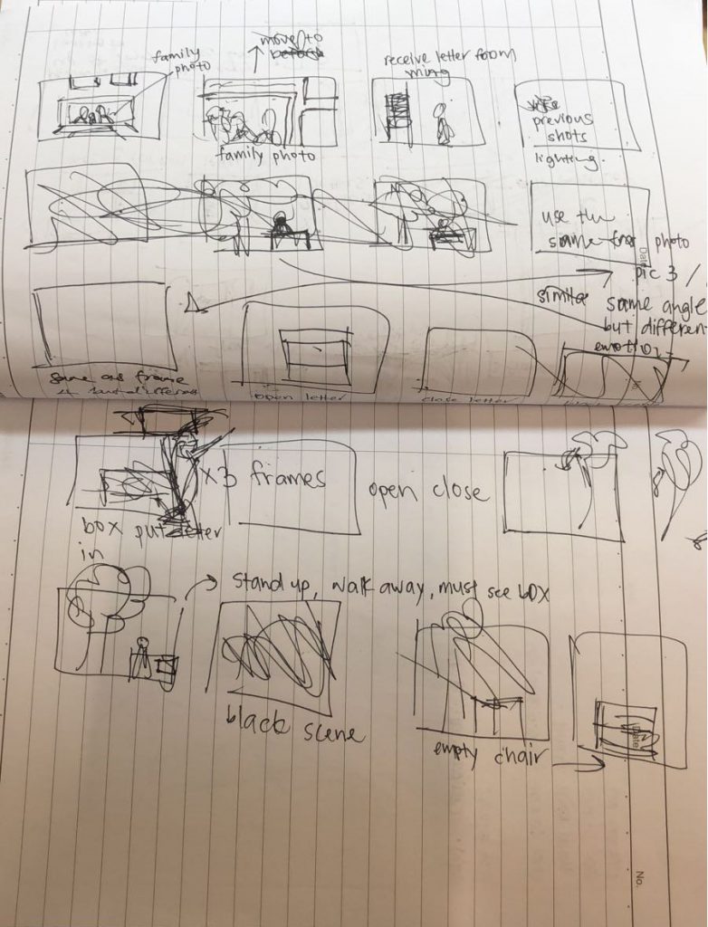
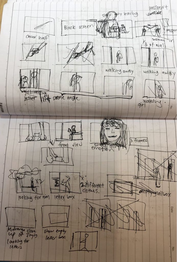
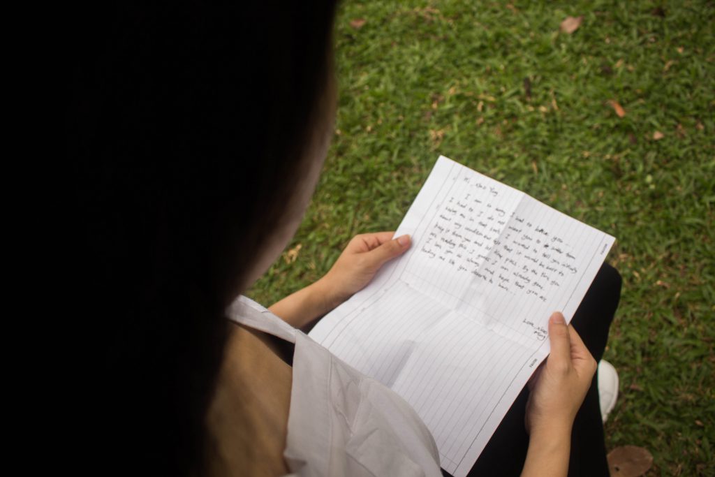
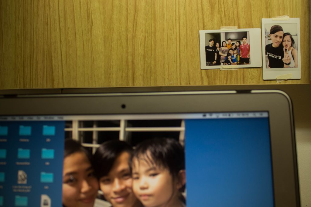
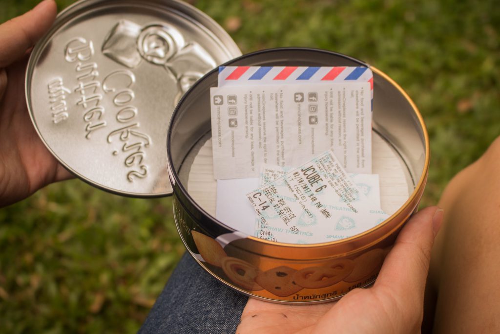
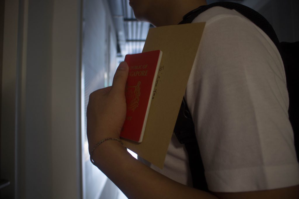
After adding in the missing parts, our story connects better.
Colour: Warm colours were used to represent the happy memories while dull colours were used to represent sad memories. The different colouring of the images can be seen in order as it follows the mood of the story plot. To show that some of the images are memories of the past, I purposely edited these images by adding vignette and highlights to show a dreamy setting/ memories.
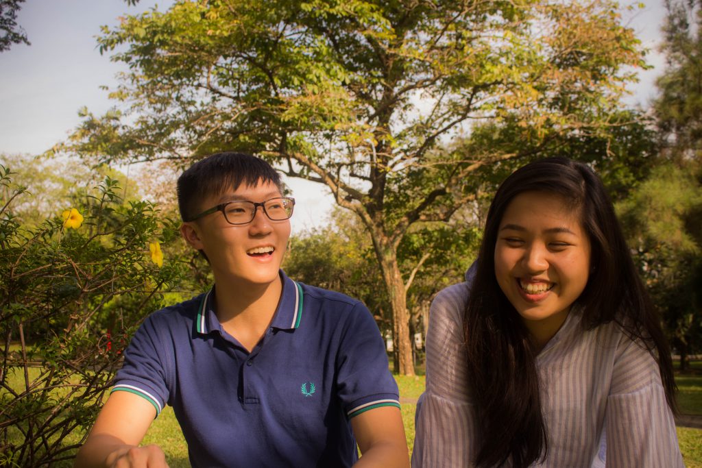

Story: Present –> Past –> Past –> Present
Mood: Neutral (Acceptance) –> Happy –> Sad –> Neutral (Acceptance/ Closure)
Colour: Neutral –> Warm –> Dull –> Neutral
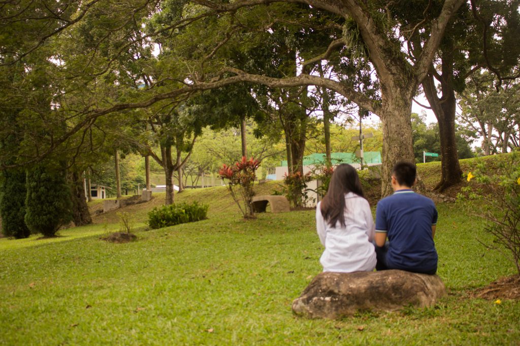
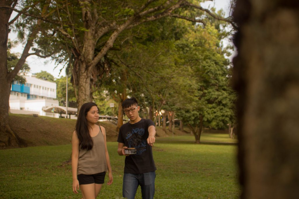
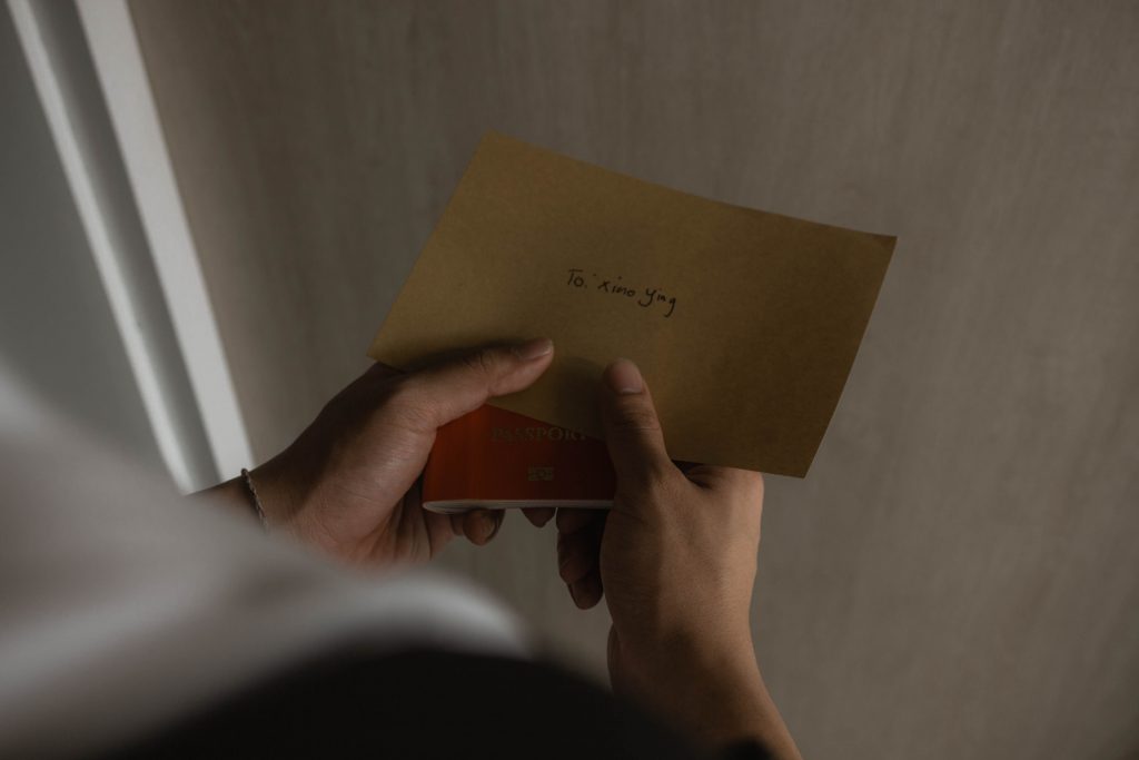
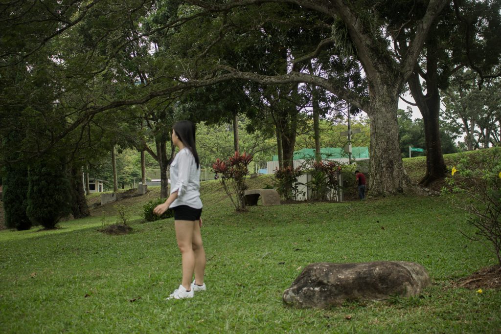
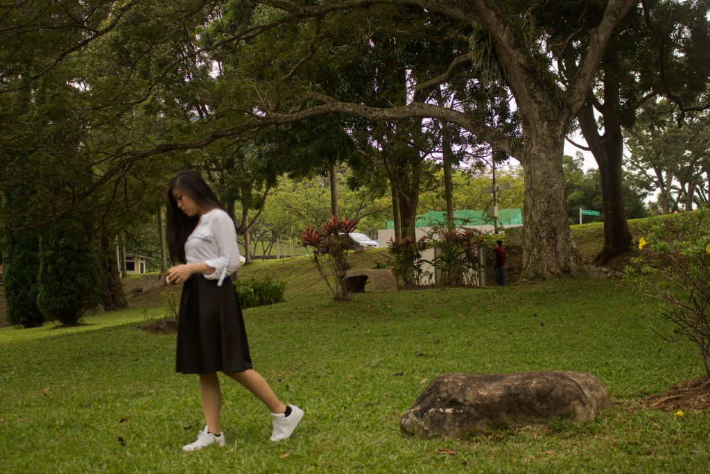
Camera Shots Technique:
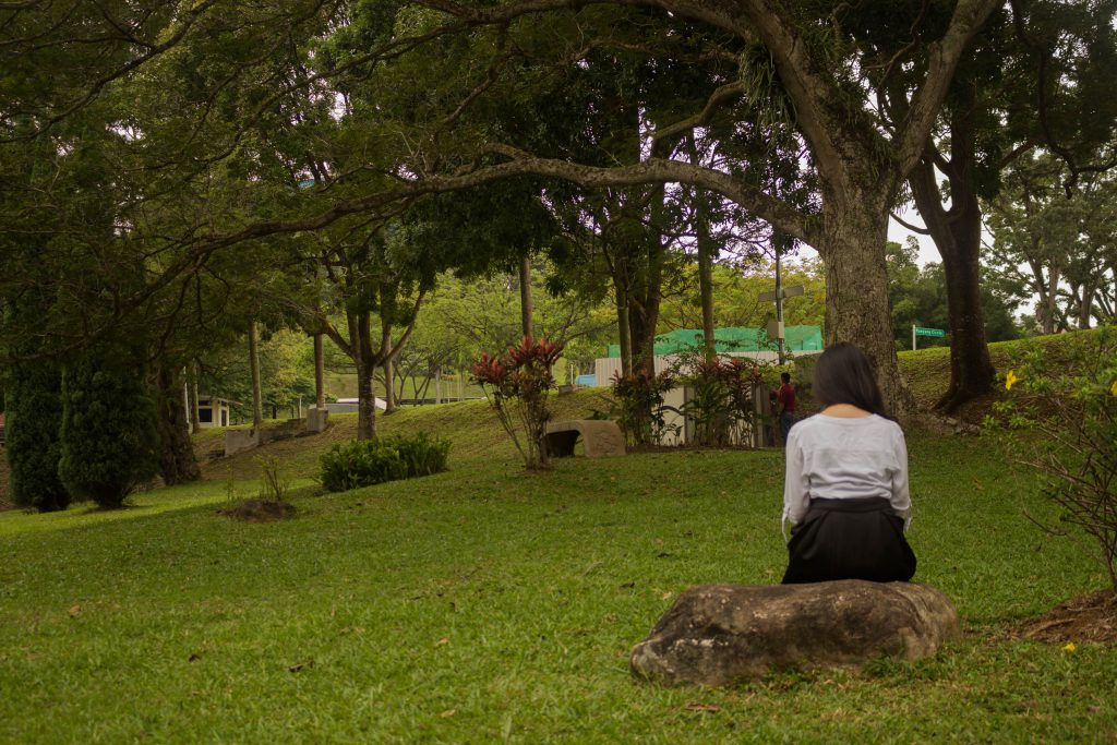
Similar Shots – The use of similar shots help us to convey the idea of memories. By using similar shots with different costumes and actions it establishes the idea that time has pass which is one of the element of our story.
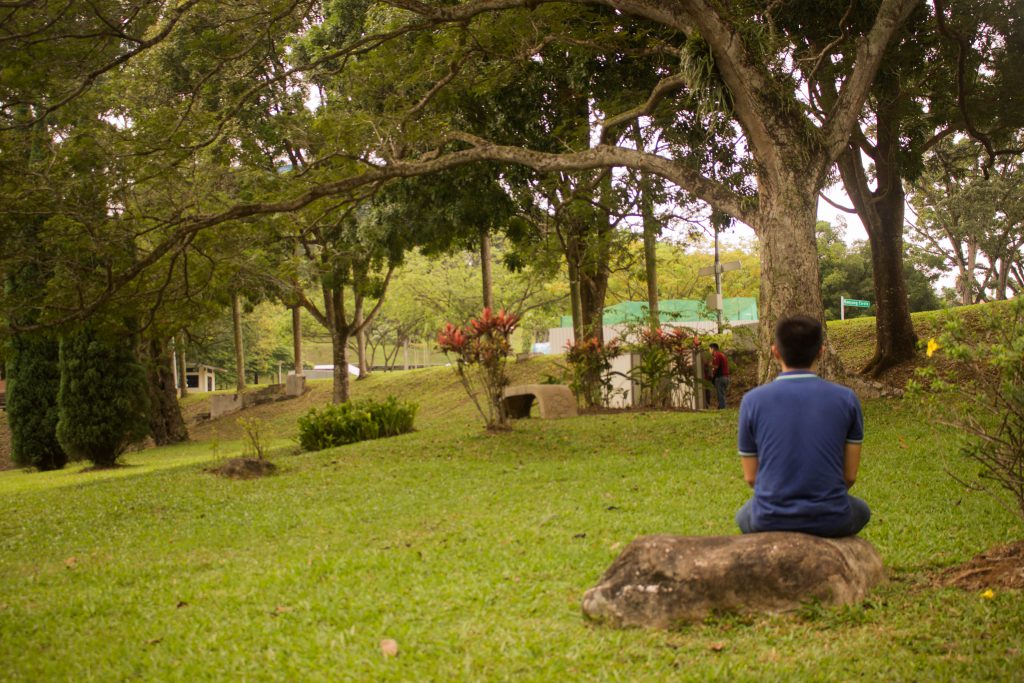
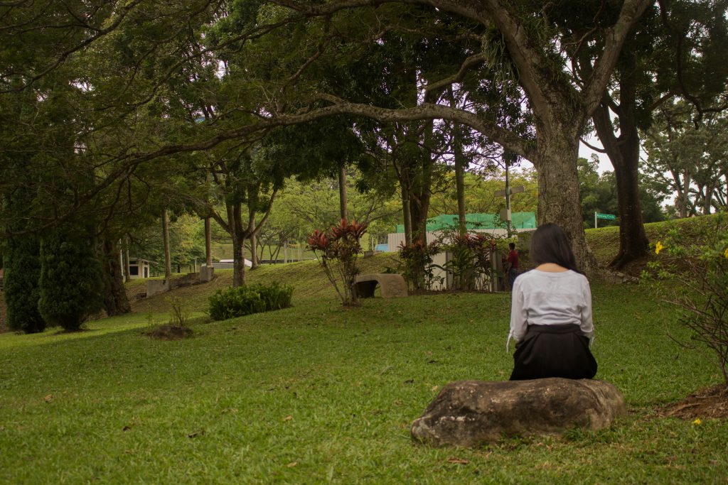
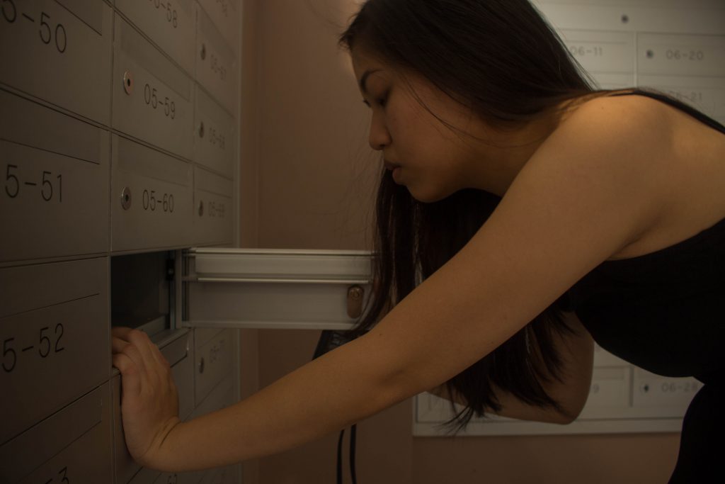
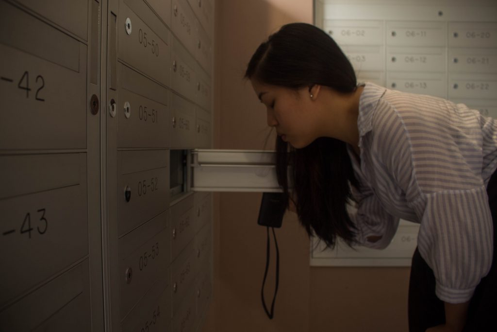
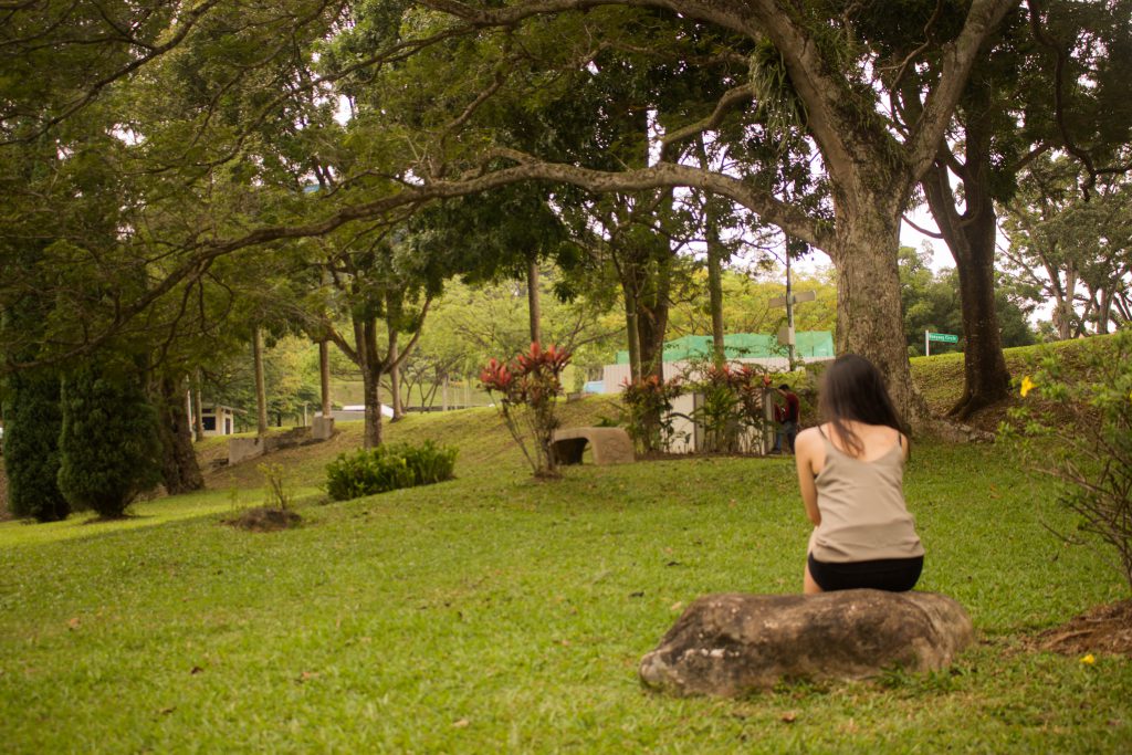
Wide angle to Closed up shots: Wide angle shots show spaces especially when only 1 or 2 characters are in the frame. The spaces can create the feeling of anticipation and loneliness. Anticipation can be seen scenes when they are meeting each other and loneliness can be seen when the girl is reading the letter the boy left for her after he left.
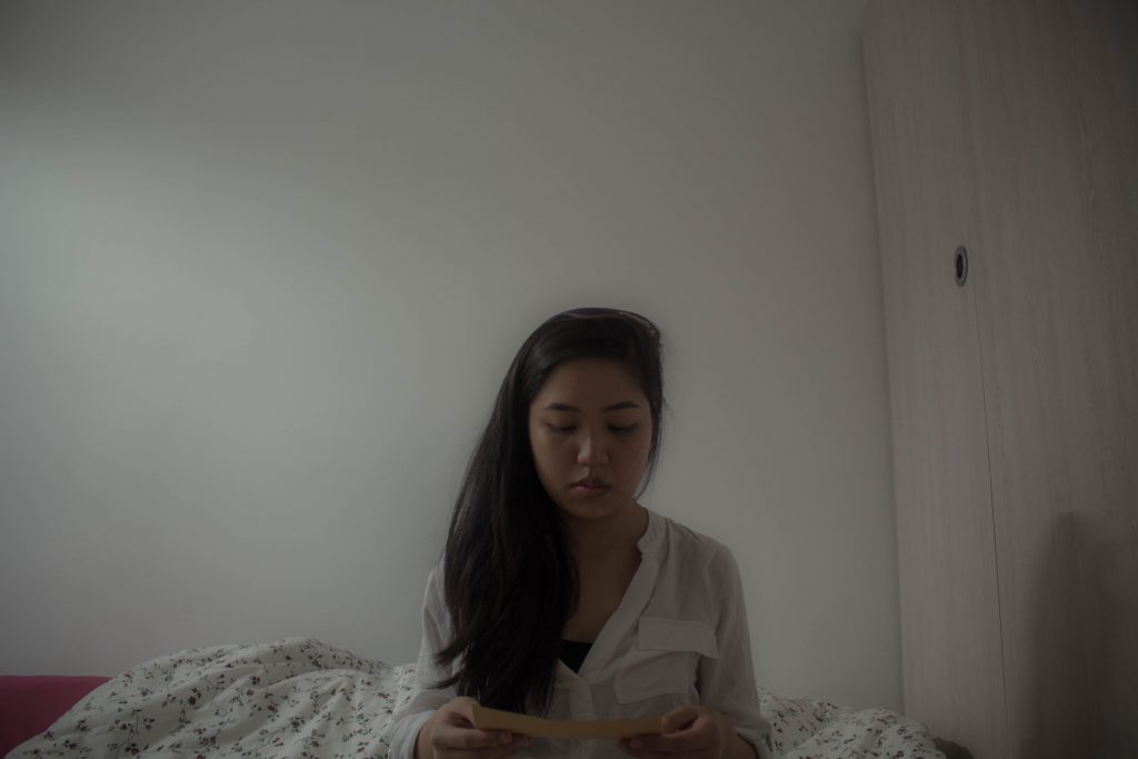
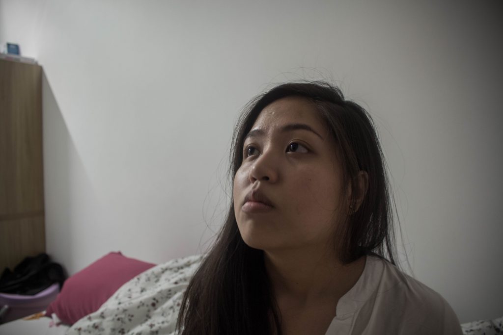
As mentioned previously we used a lot of closed up shots to create the intimacy between the audience and character. Closed up shots also allow the character to do the story telling which creates more emphasis in emotions.

Black Screen – Black screens were used to help me convey the passing of time as they acted as gaps between certain time periods. By using black screens with sound, it creates a moments of suspense for the audiences.
For this short photo-film, I am going to set it in a very melancholic and emotional style. Therefore, I decided to emulate the style of Spike Jonze in his film, Her (2013).
The film Her is a romantic movie that plays with memories and emotions. In the film, Spike Jonze uses a lot of closed up shots to express a sense of loneliness. Through the closed up shots, it allows us to feel really intimate to the character and allows us to feel what the character is going through. Besides, because most parts of the film is about the main character.
Mood music – As mentioned, I wanted to create an emotional and melancholic feel to the film. To create the mood, I used 2 different music pieces to help me. The first piece is played at the start and at the end. It is a neutral piece of music and helps me to connect time periods together. The second piece is more solemn and it is played when the girl received the letter before the boy left her. Although the both pieces are used for different occasions, n overall both pieces brings a very emotional and melancholic feel.
Sound effects – I tried to experiment with some non-diegetic sound effects to make it more creative in a sense. For instance the sound effect of wind chimes at 00:58 to create the feeling of peacefulness and pleasant memories, the sound effect of increasing heartbeats at 02:01 to create the nervousness and anxiety of the Character when reading the letter and the sound effect of airplane flying across to further enforce the idea of the boy leaving and travelling overseas.
Voice Over/Narration – After editing everything, I discovered that the ending part to show what happened to the boy wasn’t made clear enough. Although there was a few shots of the letters, the idea was still not strong. Hence I decided to do a voice over, a narration of the letter. The narration of the letter is spans across the last part which provides a closure to the film. The narration begins at 03.32 of the film.
Silence – Humans are not used to silence, silence can be used in an interesting way for instance to create certain tensions. In some of the scenes, I intentionally muted all the background sounds and only emphasized one sound to create the tension. For instance the scenes between 01:30 to 02:10, I did add in any environmental sound or any music. This is done so to create a tension and anticipation of the climax (Girl receiving the letters).
I was really excited to do this assignment because I get to experiment with a new way of making film. It was really rewarding for me personally as I love film as this assignment allows me to have a deeper understanding on how visual compositions and sounds can play such a huge emphasis on the whole story telling in a film. Most importantly I was really happy because this assignment was a good refresher for my video and sound editing skills as I get to practice them before it turns rusty.
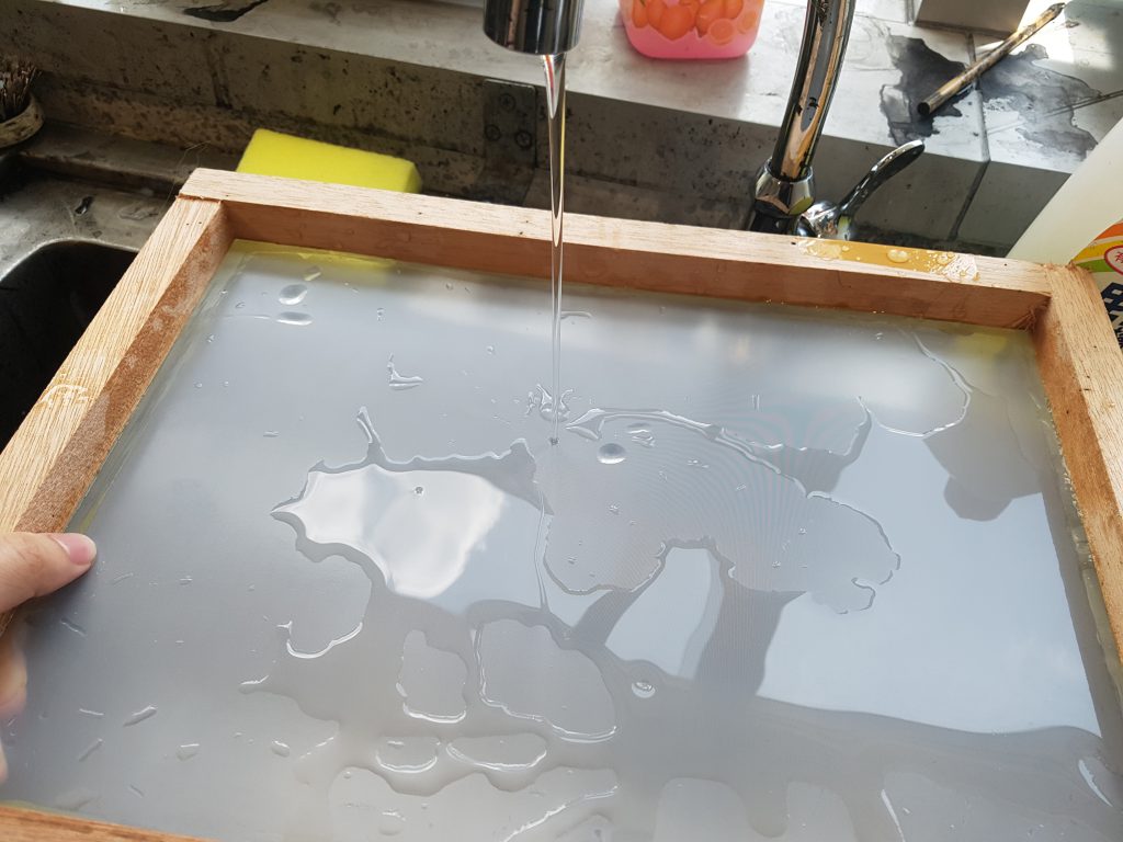
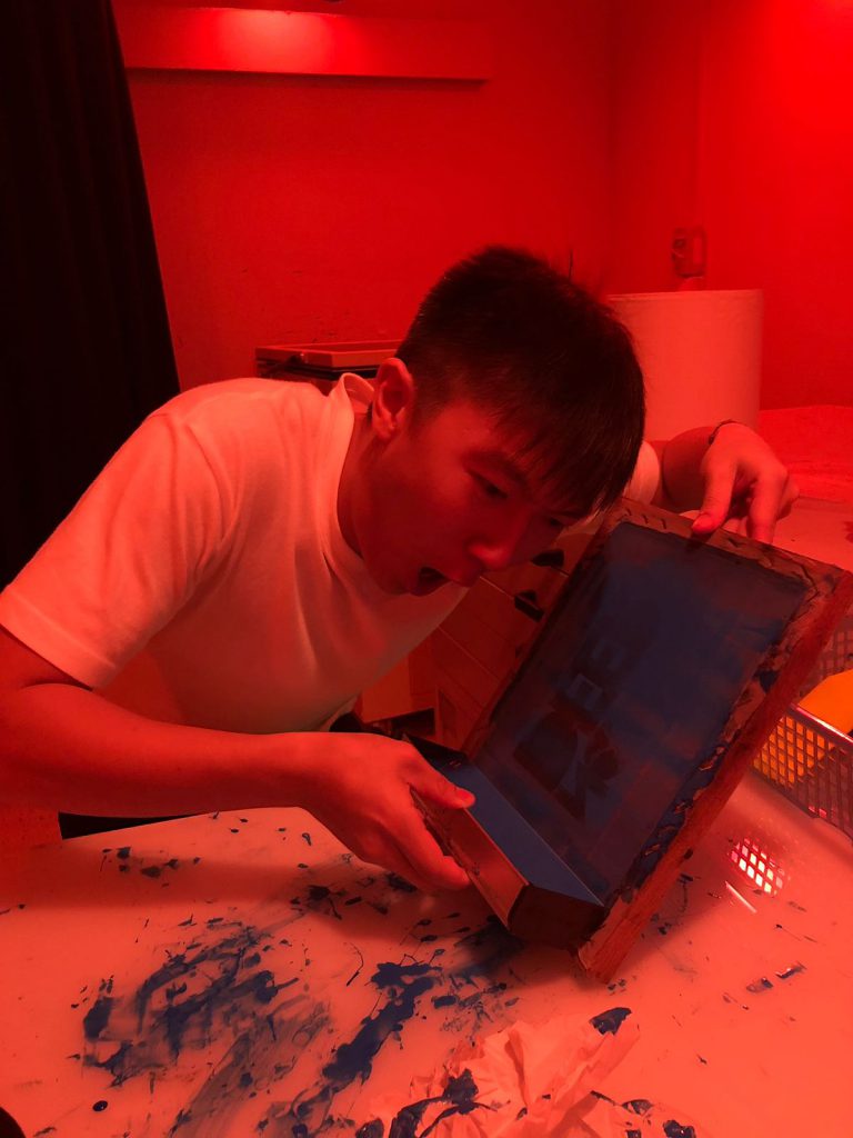
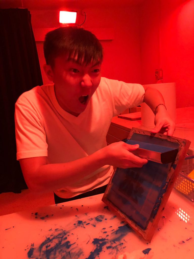
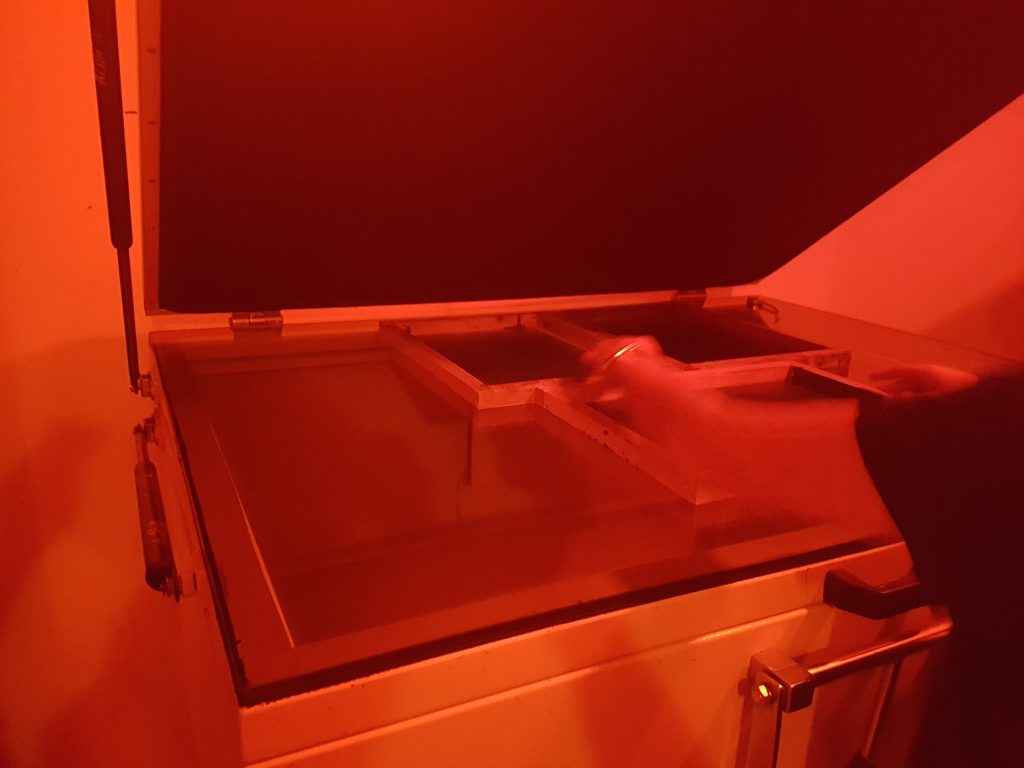
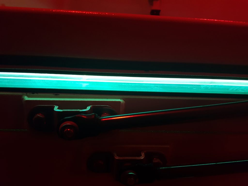
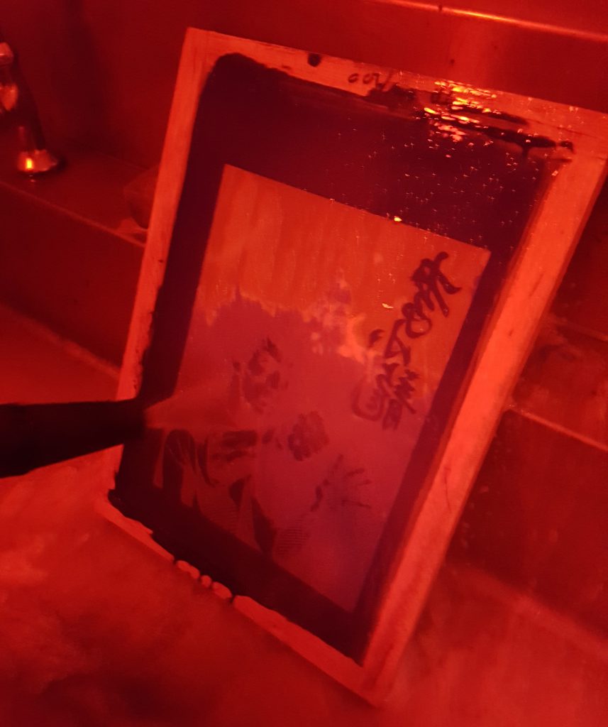
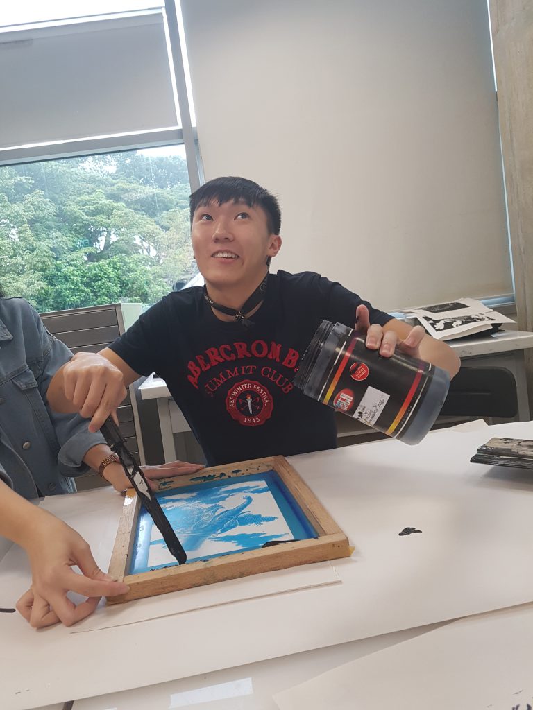
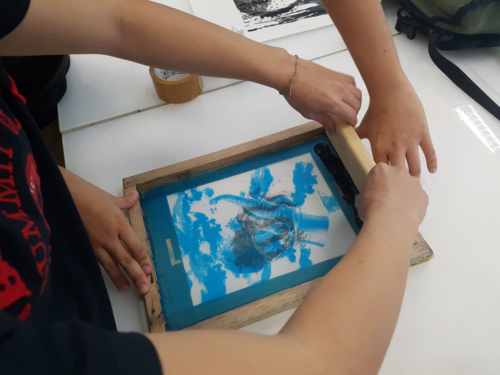
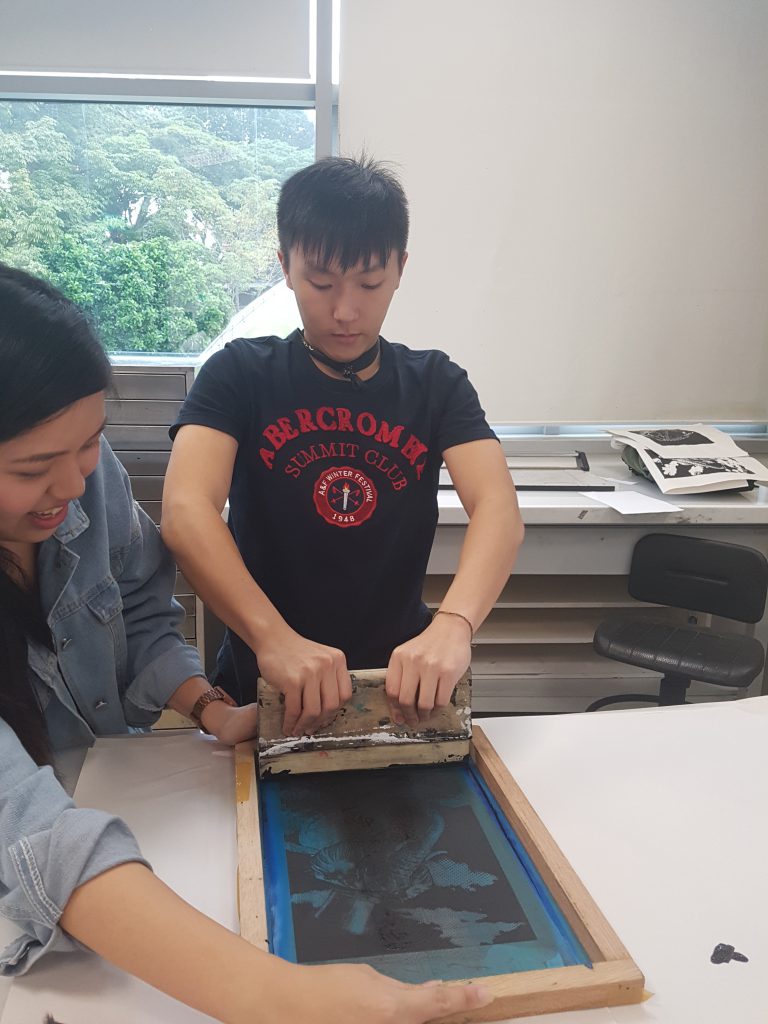
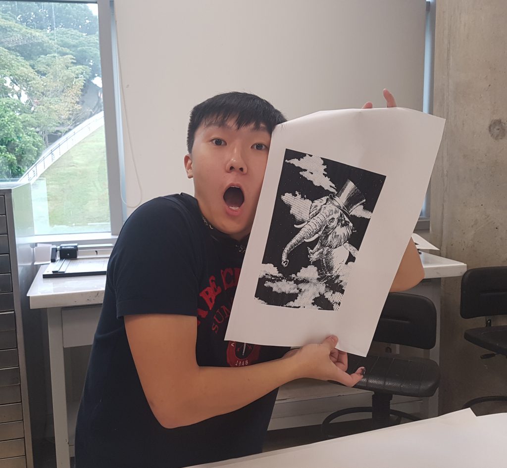
After practicing on papers, I decided to try it out on my tote bag to produce my final piece. My first attempt was a failure as I did not apply enough ink and did not apply the pressure evenly.
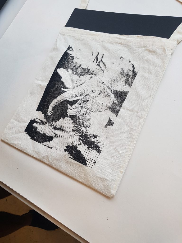
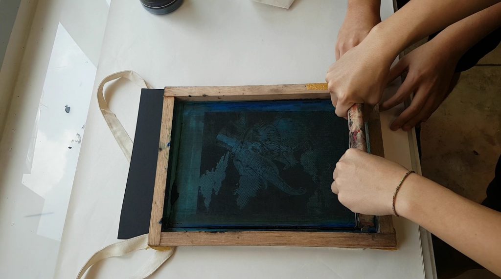
After my first failed attempt, I learnt that in order for it to turn out successful, the amount of ink to be applied has to be estimated accurately and it had to be printed in one swipe/ stroke. Depending on the composition, more black areas means that we have to apply more black ink. Like for my composition, I had to apply a lot of black ink to it.
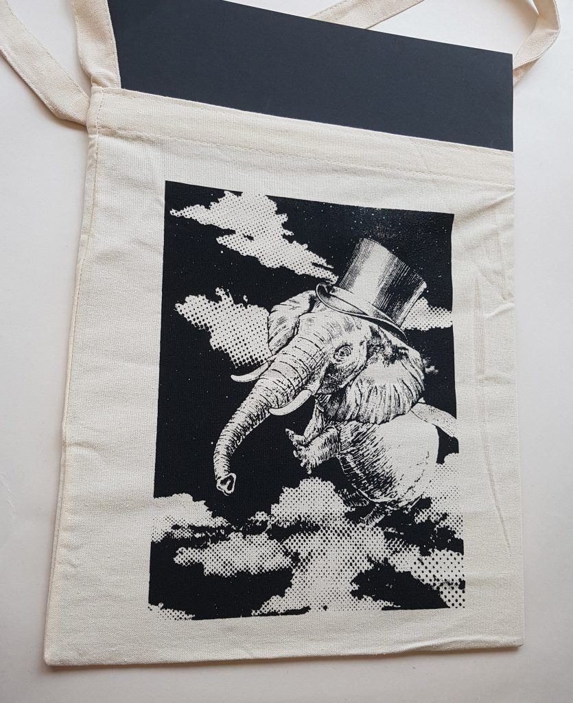
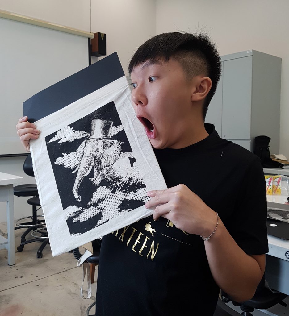
“You mustn’t be afraid to dream a little bigger darling.” – Inception
Keywords: Dream, Not afraid to dream bigger.
For this quote, the main emphasis is on not being afraid, to dream big. When I think of the word dream, I instantly linked the word dream with fantasy. And when I think of fantasy, all I can imagine are mythical and magical beasts and creatures like the ones we see in the movie Alice in the Wonderland, Where the Wild Things Are and The Spiderwick Chronicles. Hence I decided to create a composition of a flying creature which has an elephant head, hippopotamus body and dragonfly wings to represent dreams and dreaming big.
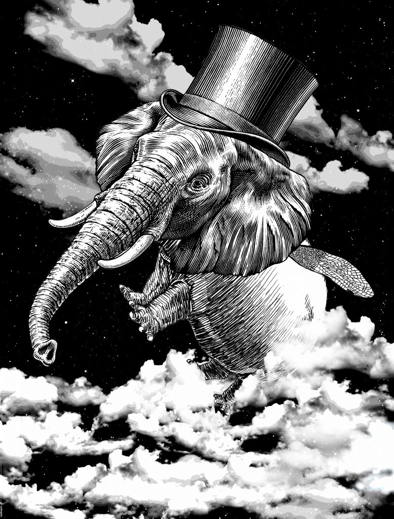
And for the idea of not being afraid, I initially wanted to show the creature flying out of a brain. However, the idea of showing a brain is too literal therefore I switched to showing the creature flying and emerging through layers of clouds with a starry background. Besides, flying through clouds can also bring out the idea of exploring into the unknown; having big dreams. Also, the combination of clouds and starry background also creates a very magical and dreamy setting to the whole composition.
Suggestions on improvements after consultation:
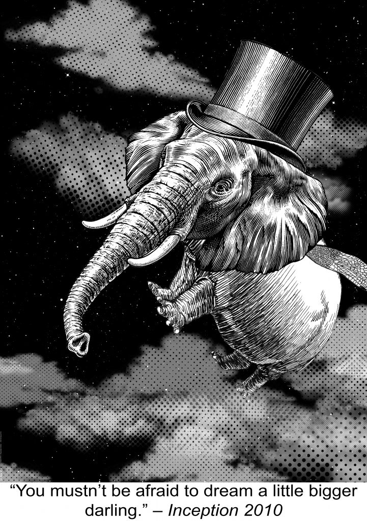
The design principle that I adopted for this composition is hierarchy. As what I had mentioned previously, the clouds before the adjustment was too overpowering hence it competes in terms of the visual presence with the creature even though the creature was the dominant figure. Hence after the adjustment, the design looks better as the dominant (creature), sub-dominants (clouds + black background), sub-ordinate (stars) becomes clearer. Besides, also apply the principle of contrast by placing my creature behind the black background to make it stand out even more.
“Beautiful things don’t ask for attention.” – The Secret Life of Walter Mitty
Keywords: Beautiful things, Don’t ask for attention.
Things that are associated with beautiful things to me are a beautiful lady, flowers, butterfly.
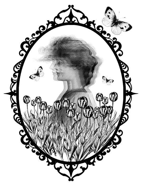
For beautiful lady, I purposely make it look faded so that we cannot see it clearly hence creating a mysterious vibe to it. I then placed the Tulips that symbolizes love and beauty and added butterflies around the lady to further emphasize beauty. Next, I placed the composition in a mirror as mirror attracts attention.

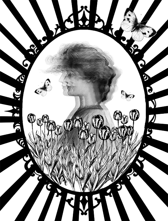
However, I felt that the composition is still lacking something hence I decided to use the idea of one point perspective to draw the audience attention to the composition. I was thinking of using mandala pattern as the background to make it look more elegant, but the composition looked too messy and distracting, therefore I decided to use the one point perspective pattern instead.
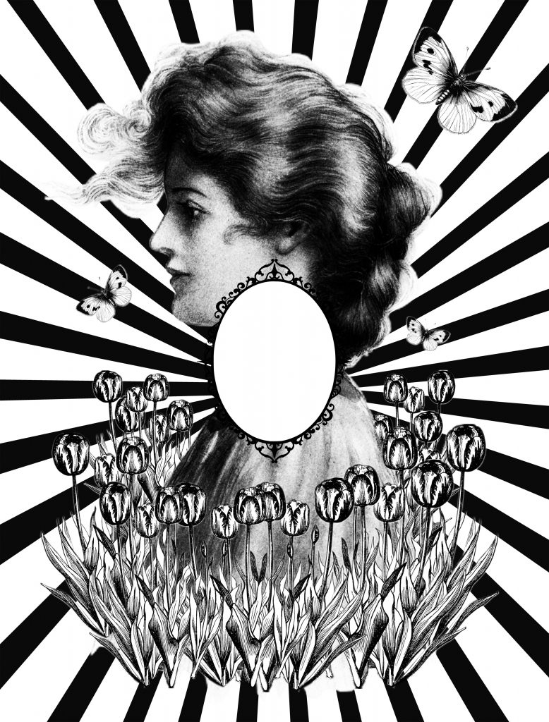
Although I was quite satisfied with my composition I found that the message I was trying to bring out was contradictory as it showed that beautiful things ask for attention rather than beautiful things don’t ask for attention. Thus, I placed the Lady, Tulips and Butterflies outside of the mirror frame while keeping the inside of the mirror empty.
How the composition works is through the idea of perspective. As audience looks at the composition, they expect to see something being reflected in the mirror, however, there is nothing inside the mirror. Instead, their attention now shifts to the tulips, butterflies and the girl outside of the frame. The beautiful things become the secondary attention hence conveying the idea that beautiful things do not ask for attention.
The principle of design that I adopted for this composition is balance and alignment. I intentionally aligned everything symmetrically so that so that the audience’s attention is drawn directly to the mirror which is at the center. I also align the composition in such a manner whereby everything is connected hence the audience attention will shift naturally from the lines to the mirror than outside of the mirror again.
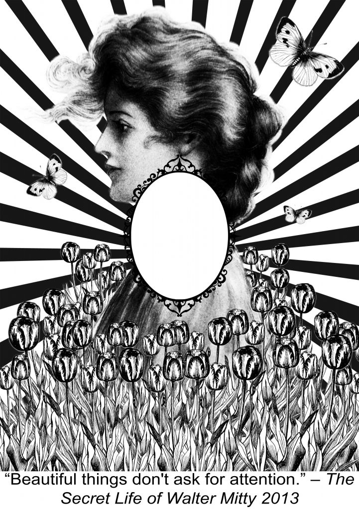
Tulips duplicated to cover the bottom part of the composition.
“No man can walk out of his own story.” – Rango
Keywords: Man, Walk out, Story
Break down of quote gives the idea of unable to escape and being stuck. Hence I thought of creating a composition that is similar to the stairs illusion.
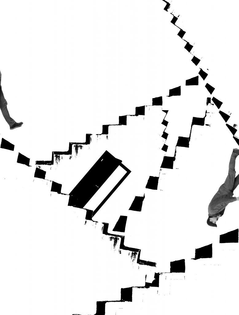
For my first composition, I experimented it by stacking and arranging the stairs in different directions in a random manner to form a maze. I divided the man into 2 parts, the leg and the body. As the man tries to walk out of the frame, his right legs appears back into the frame hence showing that he is unable to escape. Besides, I added a door that is inaccessible in the maze to create the idea of trapped.
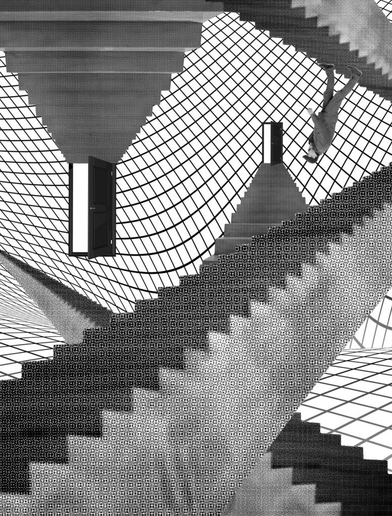
One of issue with the composition was that the stairs was not really visible, so I changed the picture of the stairs. Again I placed the stairs in random order to make it look like an illusion. The placement of the inaccessible doors and inverted man defies the law of physics of the reality making it look like a limbo world. Besides, I added the background that resembles a net to reinforce the idea that the man is trapped in this world.
After my consultation, it was suggested that the net looked too overpowering visually. Therefore, I was recommended to change the my stairs to find engravings of it instead of using images via halftone. However I was unable to find quality pictures of engravings that I really liked. Thus I had to adapt and change my background instead.
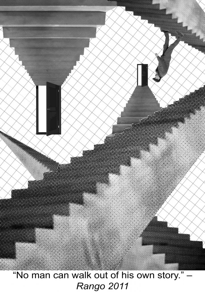
For this composition I adopted the design principle of hierarchy. The dominant for the composition is the stairs which I intentionally duplicate them and place them randomly across the composition in different sizes. The subdominant is the grid background to further add on the illusion setting which I wanted to create. Next the human figure and the door are the sub-ordinates.
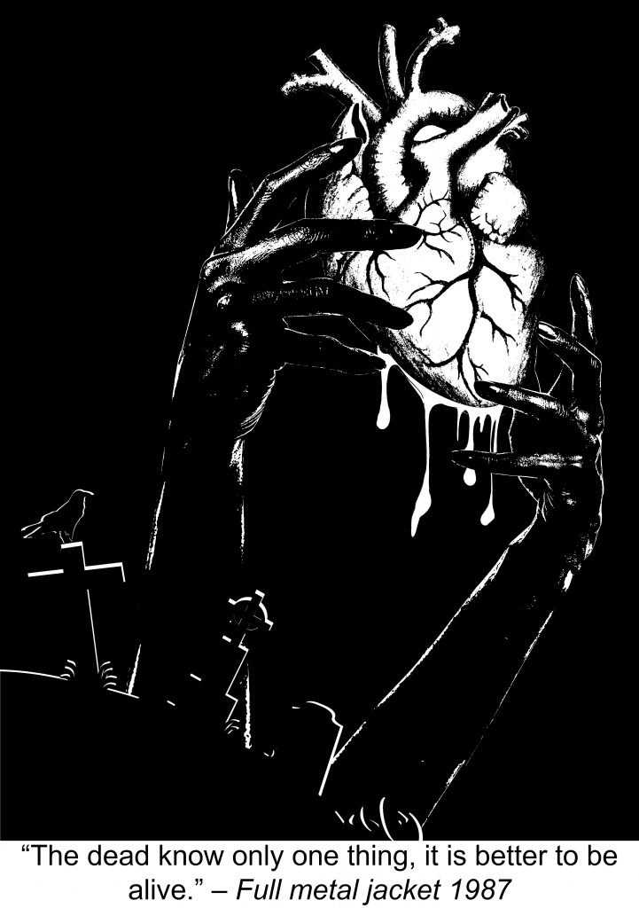
“The dead know only one thing, it is better to be alive.” – Full metal jacket
Keywords: Dead, Better to be, Alive
Before starting on my composition, I decided to search for all the symbolism of dead/death and alive/life and pick out a few that best fit the quote.
Dead:
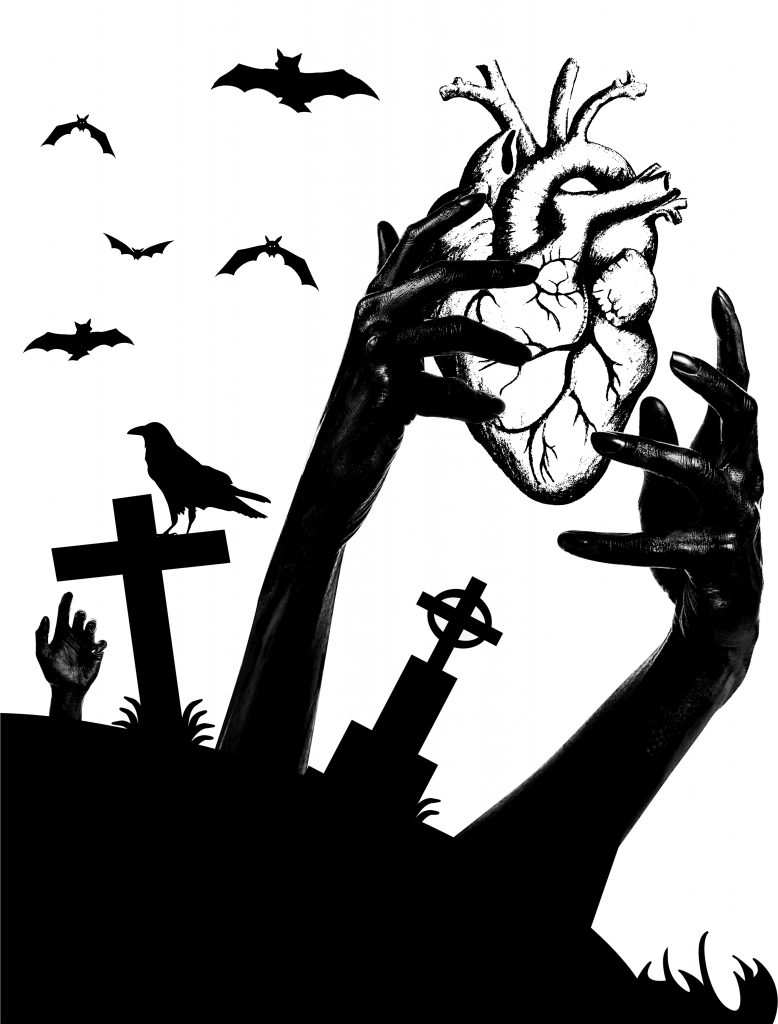
After picking out different pictures to symbolise dead and alive, I combine the 2 elements together to produce a composition showing the dead rising from the grave trying to grab the heart. However, the composition looked very boring and the alignment looked very planned. 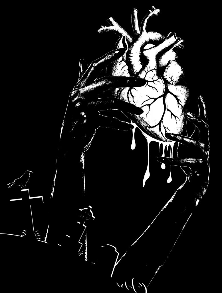
Hence to make my composition look more interesting I thought of the idea of using the contrast as my principle of design. I intentionally made my background black so that the heart stands out the most due to visual contrast. Besides, I also played with another design principle, hierarchy. Because i wanted to maintain the heart as the main focus, I gave the grave, raven and the hands minimal highlights so that it does not compete with the heart for visual presence but stands out at the same time. I also removed the bats and made the arms looked more proportionate and added the blood drip on the bottom of the heart. I want it to be simple but looked interesting.
A plane is an element that has surface direction and slant unaccompanied by mass. And there are two- and three-dimensional planes.
2D planes:
3D planes:
The first part of this assignment requires us to make us of 3D and 2D planes to create an interesting visual composition. The planes are cut from art-board and each strips measure from 8 cm to 0.5 cm in width.
Things to note when doing the models:
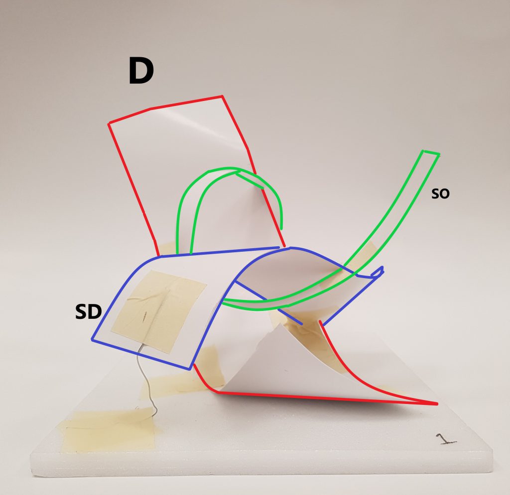
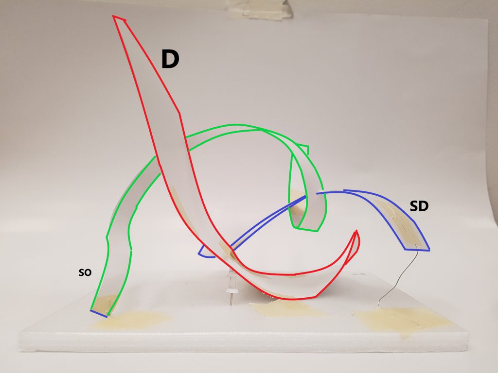
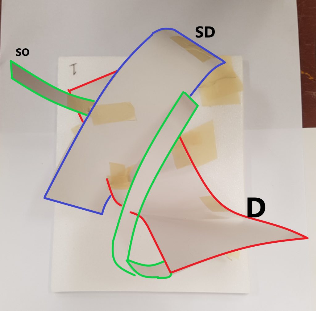
Sketch Model 2:
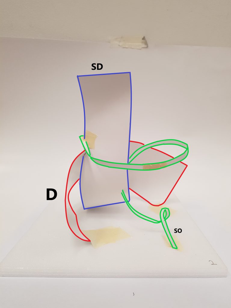
Improvements:
Improvements:
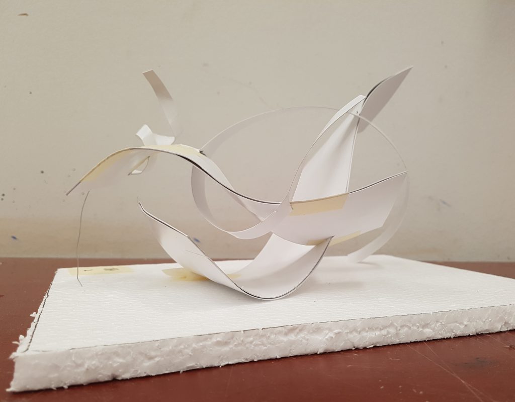
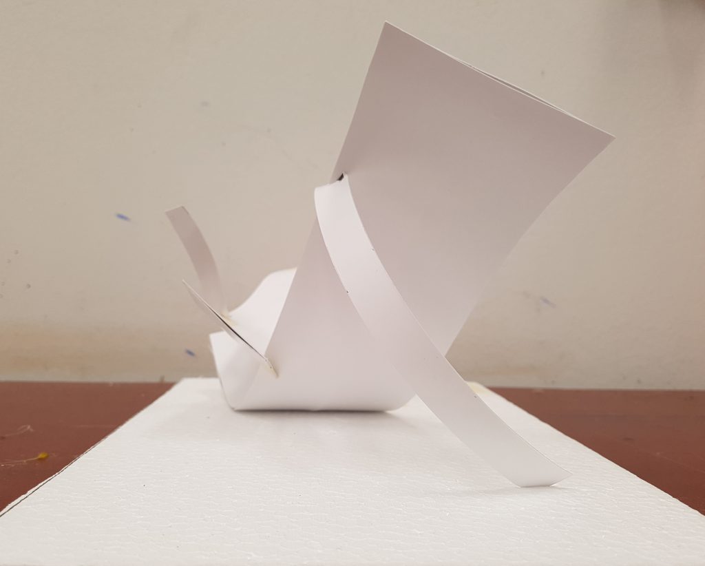
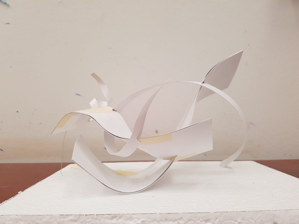
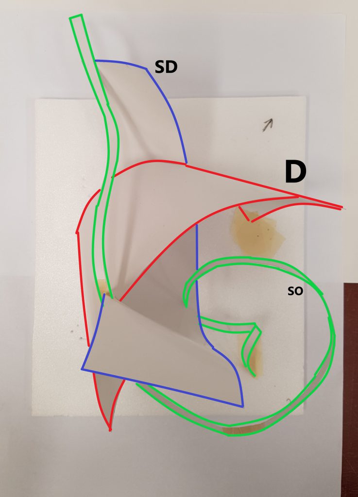
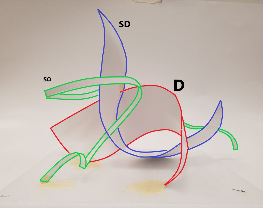
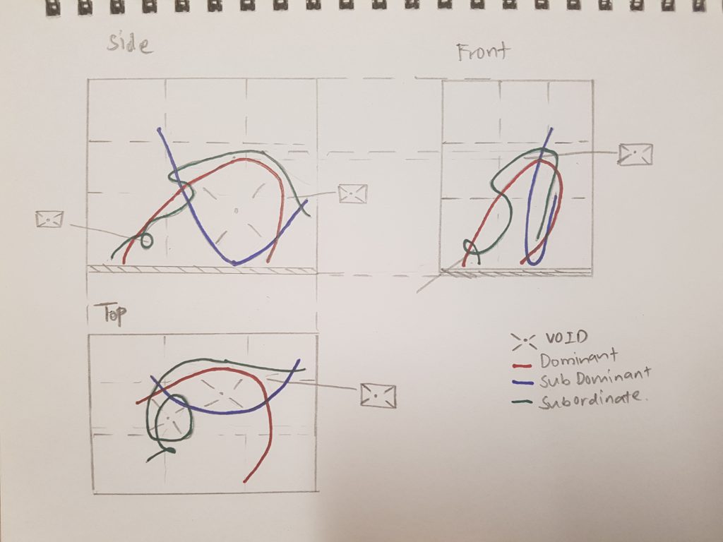
Model 1 has 4 different elements – 1 Dominant, 2 Sub-dominant and 1 Sub-ordinate. Each planes have contrasting proportions and extends in different directions. When viewed, the dominant plane acts as a stationary while the 2 sub-dominant planes curl and warp around it creating voids between the 2 elements. The sub-ordinate is added to fill up the emptiness at the front making it look more visually interesting.
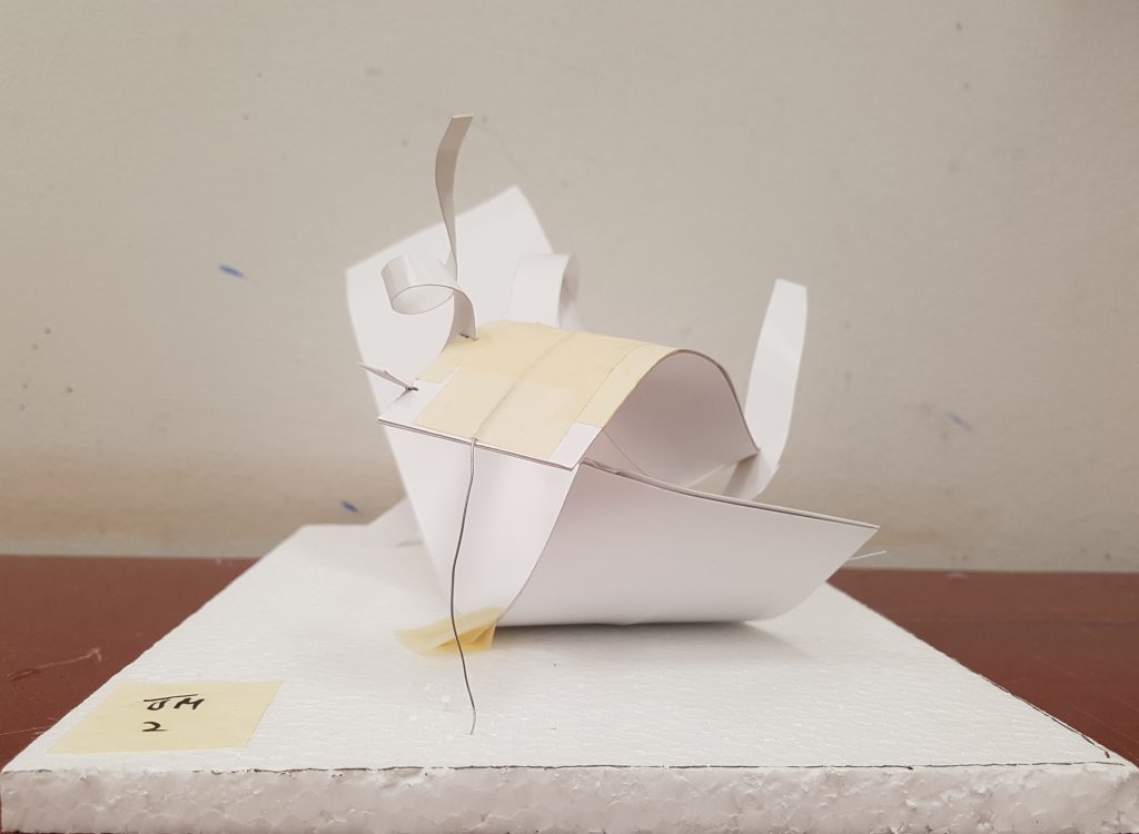
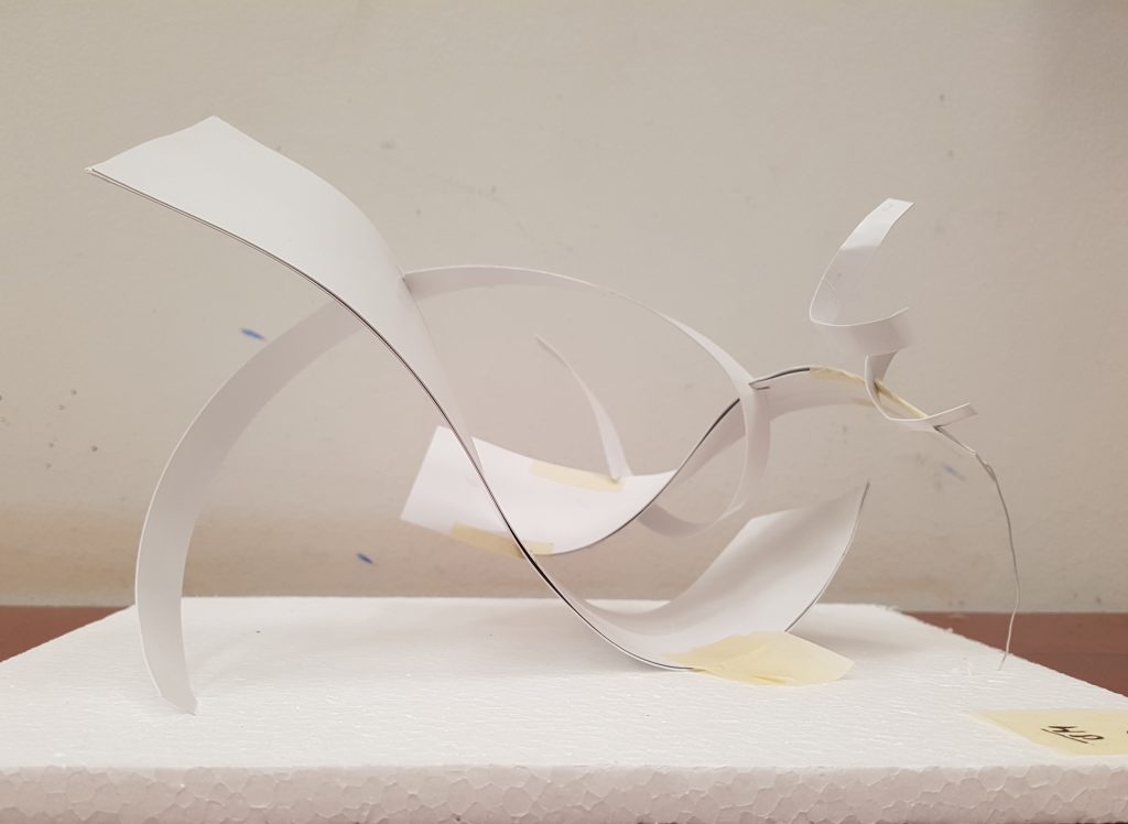
Model 2 has 3 different elements – 1 Dominant, 1 Sub-dominant and 1 Sub-ordinate. Compared to model 1, the dominant plane in model 2 extends horizontally with both its ends touching the base. The ends of the dominant plane is folded to bent axis planes and broken planes. The sub-dominant extends vertically and creates a void between it and the dominant plane. The sub-ordinate wraps itself around the sub-dominant, like a free flowing form making the model look more interesting.
Smell belongs to one of the five senses that we humans have. We use our nose to smell and by definition it means the power to perceive odors or scents by using our nose. According to science, smell is relatively more capable of triggering certain emotions and memories than our other senses.

Incoming smells are first processed by the olfactory bulb, which starts inside the nose and runs along the bottom of the brain. The olfactory bulb has direct connections to two brain areas that are strongly implicated in emotion and memory: the amygdala and hippo-campus. And our visual, auditory and tactile information does not pass through these 2 brain areas hence explaining why smell is so capable of triggering certain emotions and memories.
According to https://psychcentral.com/lib/memory-and-mnemonic-devices/ , Mnemonic devices are techniques a person can use to help them improve their ability to remember something. In other words, it’s a memory technique to help your brain better encode and recall important information.
Some of the Mnemonic techniques include:
ACRONYMS

VISUAL
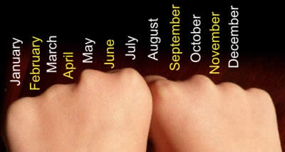
CHUNKING
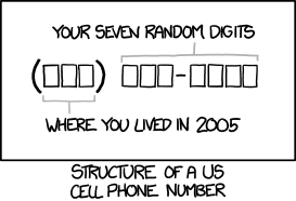
Chunking is simply a way of breaking down larger pieces of information into smaller, organized “chunks” of more easily-managed information. 10 digits broken into 3 chunks, allowing almost everyone to remember an entire phone number with ease.
ORGANISATION

Organizing information into either objective or subjective categories also helps. If you can divide a list of items into a fewer number of categories, then all you have to remember is the categories (fewer items), which will serve as memory cues in the future.
THE METHOD OF LOCI
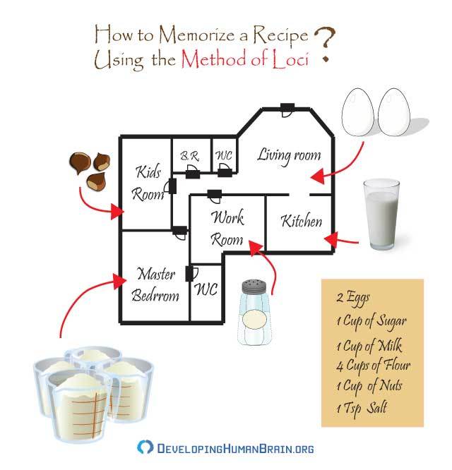
It’s based on the assumption that you can best remember places that you are familiar with, so if you can link something you need to remember with a place that you know very well, the location will serve as a clue that will help you to remember. You go through a list of words or concepts needing memorization, and associate each word with one of your locations.
From: http://health.howstuffworks.com/human-body/systems/nervous-system/how-to-improve-your-memory7.htm
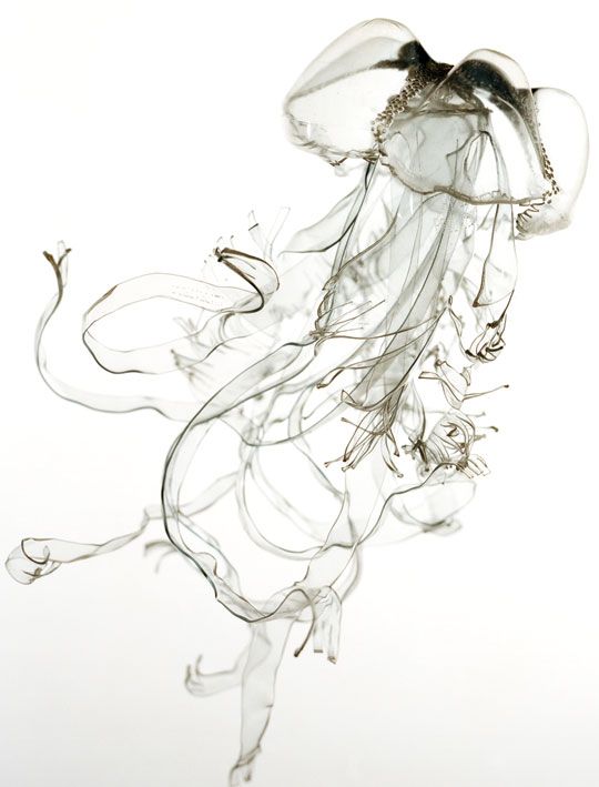
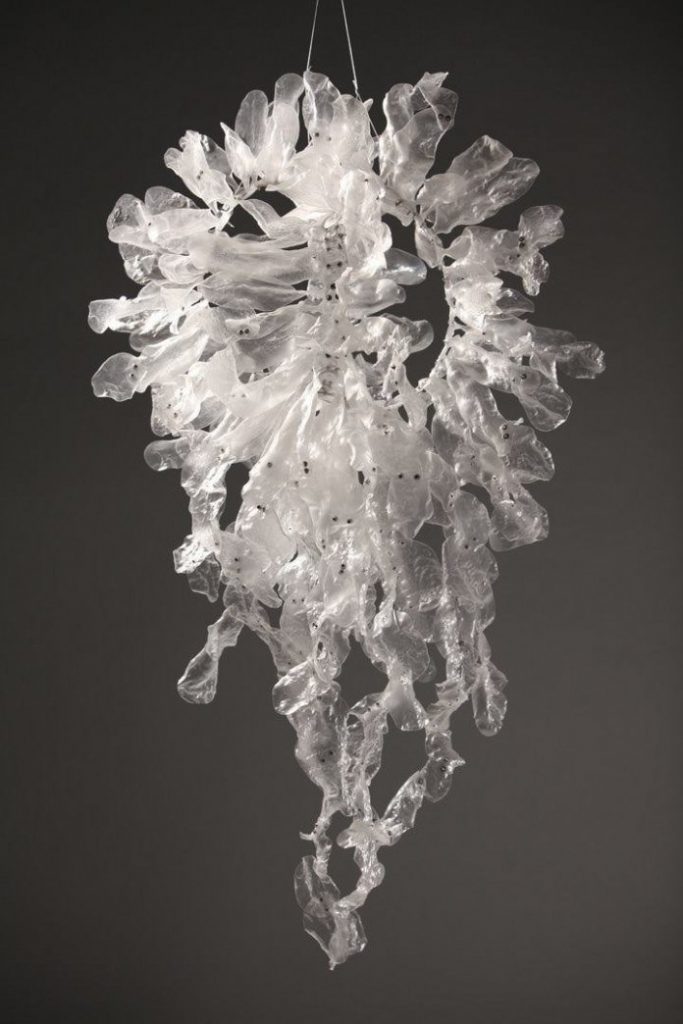

For this assignment, we were required to bring 2 smells that bring back both pleasant and unpleasant memories.
PLEASANT MEMORIES
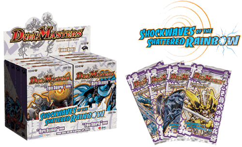
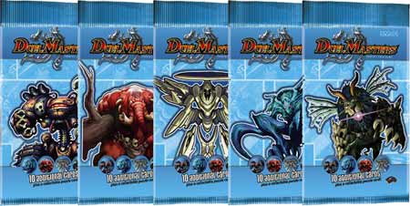
To me smell of trading cards brings back pleasant memories as it reminds me of the excitement of opening up new booster packs when I was young. Buying cards and collecting them were my childhood hobbies and hence the smell of these cards bring me back in time to the excitement I had when I was young.
UNPLEASANT MEMORIES
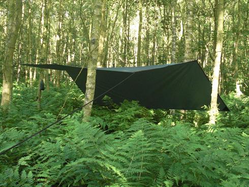
The smell of the groundsheet brings me back unpleasant memories. It has a very distinct “Plasticky” smell and the smell reminds me of my time back in the National Service. The smell of the groundsheet becomes a reminder for me to move out field and to sleep in the forest. It also reminds me of a time when I had to build a shelter with my team mate but we were unable to get it set up properly hence when it rained in the middle of the night, we were drenched and cold and were unable to sleep.
WORDS ASSOCIATION
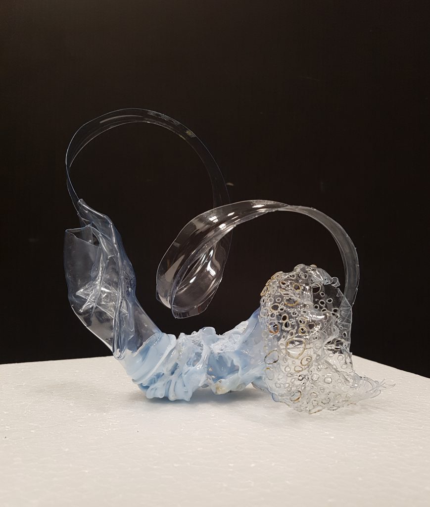
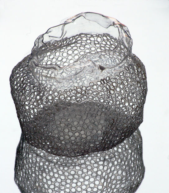
The model is first viewed from the bottom portion of the model. As the saying goes, “bad memories are easier to remember”, therefore I wanted to create something that is striking compared to the other parts of the model. The main idea that I was trying to bring out was the idea of irritation which was the unpleasant memory I had when I smell my groundsheet. To create this, I cut out sharp edges and poked many holes and used the heat gun to make it curl to an organic shape. Hence when viewed, the Aichmophobic edges and Trypophobic holes gives out a sense of irritation, the idea that you do not even want to touch or see it.
The “unpleasant memory” is then connected to a twisted form which was created by twisting and melting 2 different plastic parts together. It acts as a bridge fusing 2 of my smells and memories together. At the other end of the form comes a thin piece of planar plastic which protrudes out from the opening.
The thin planar plastic represents the “pleasant memory”. The “pleasant memory” is represented by the smooth surface and the wavy and curvy form it has. It extends diagonally and when gives the idea of a ‘flowy’ and calming feeling which was what my object reminds me of when I smell it. The length it has represents the nostalgic and lasting memories it belongs in my mind.
The “pleasant memory” then extends and hovers above the “unpleasant memory” creating a sense of void between the 2 elements.