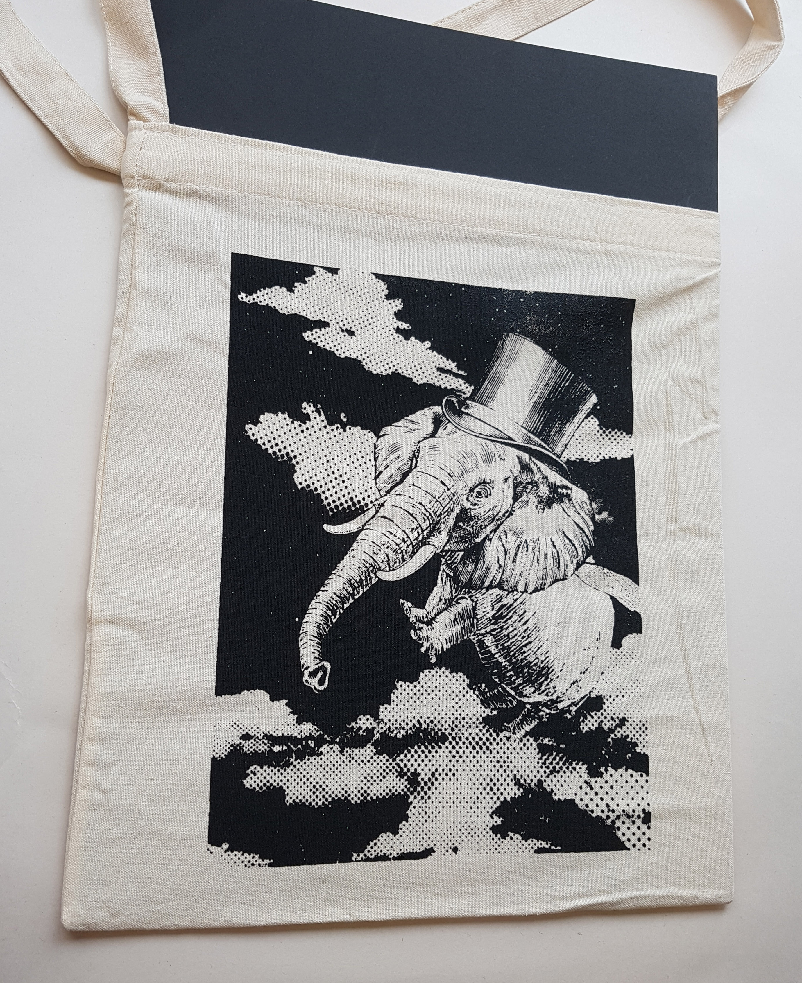
Project 3: Ego (Process + Final)

Episode 2

Based on the mindmap i did in the previous episode, I picked out 4 things that describe me.

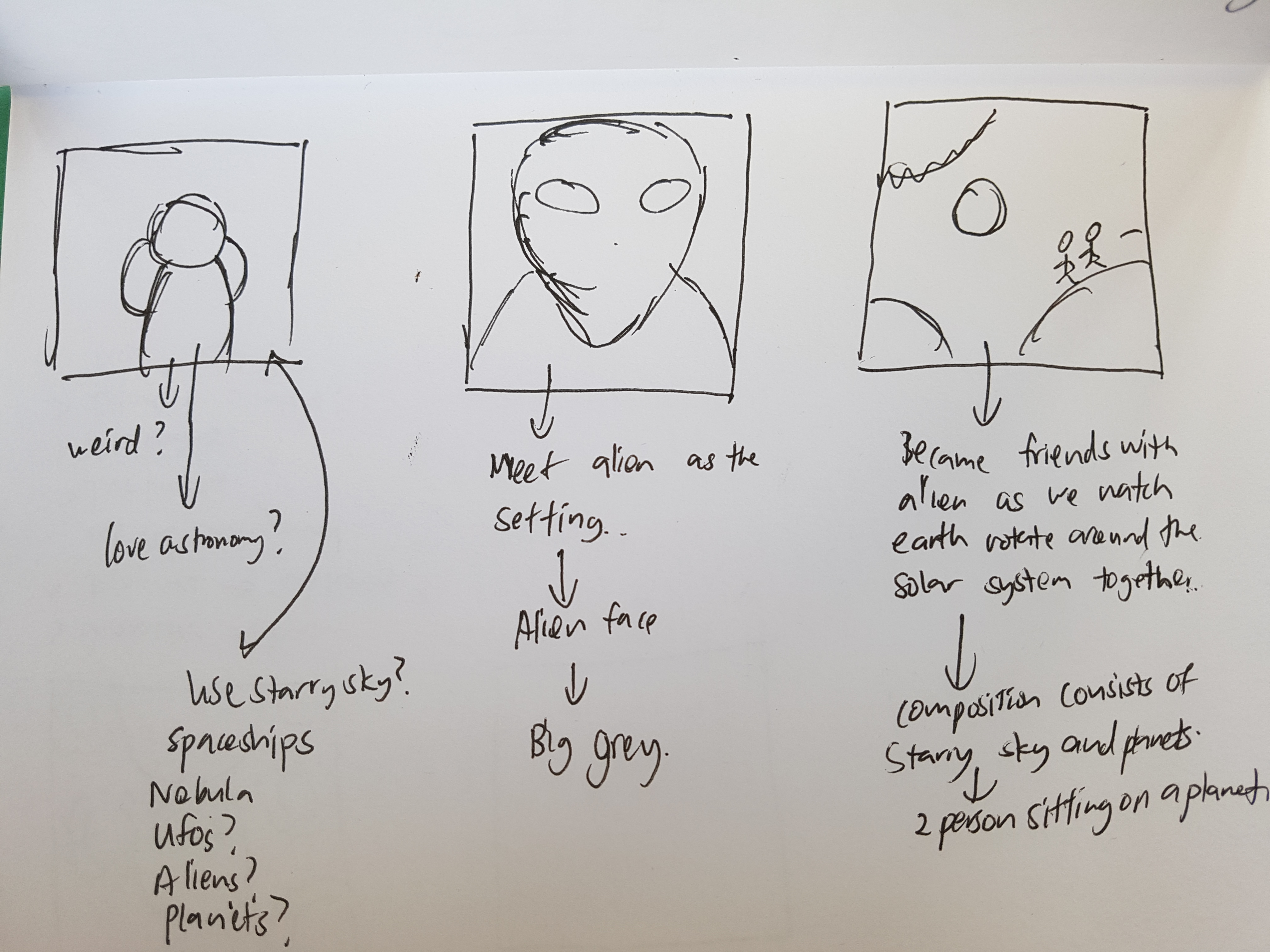
  • Alien/ My fascination with space and astronomy
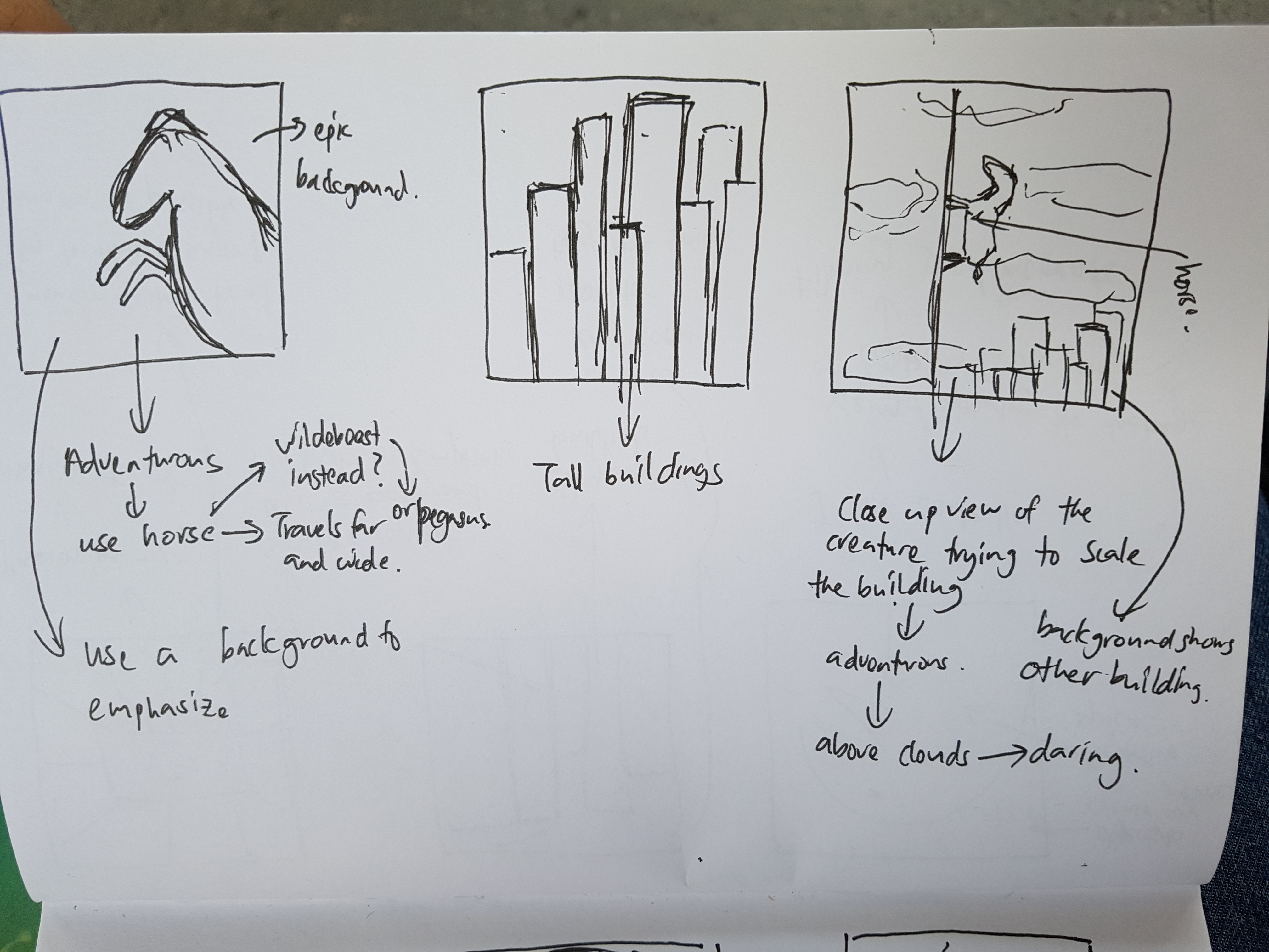
  • Aventurous/ Travelling/ Exploring
  • Passion in film-making/ Imaginative
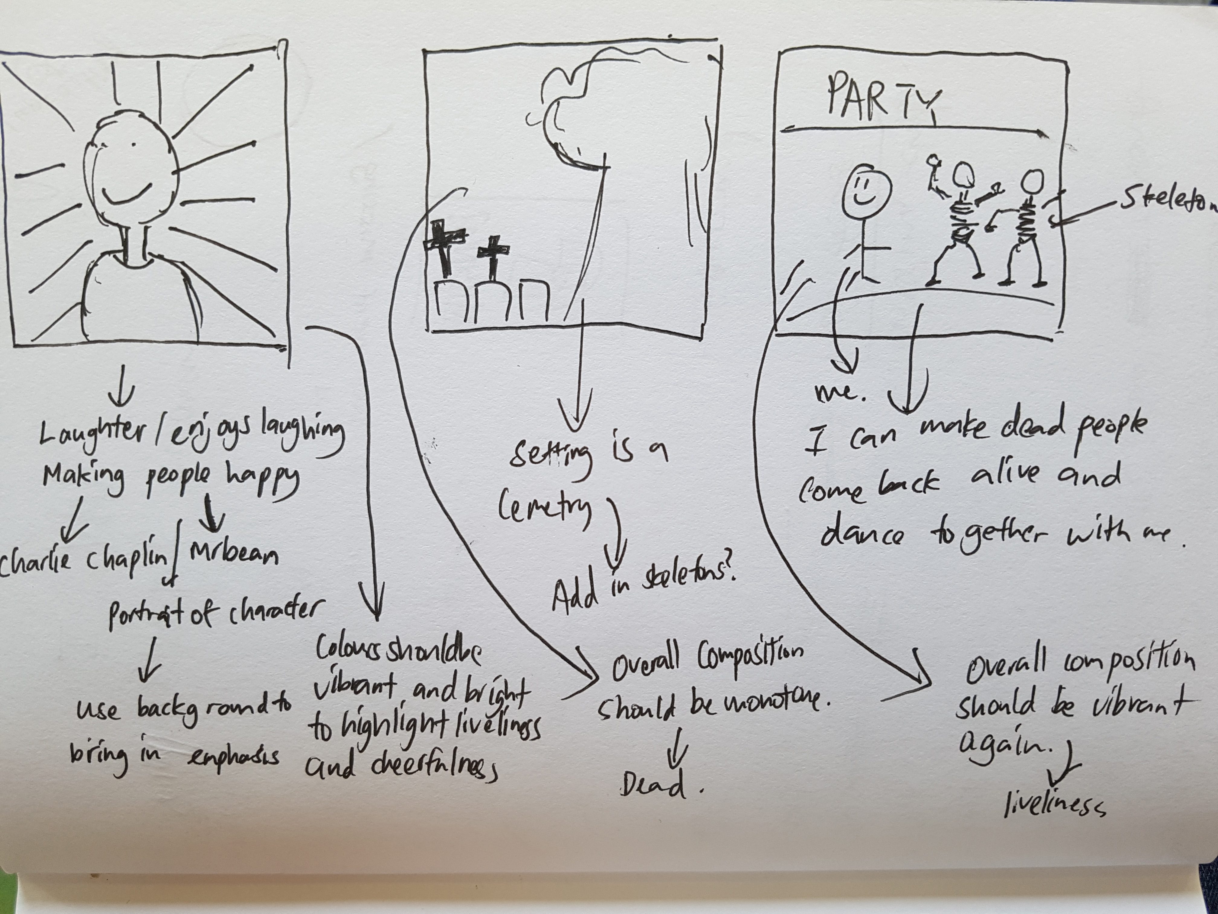
  • Loves to laugh/ Spreading happiness
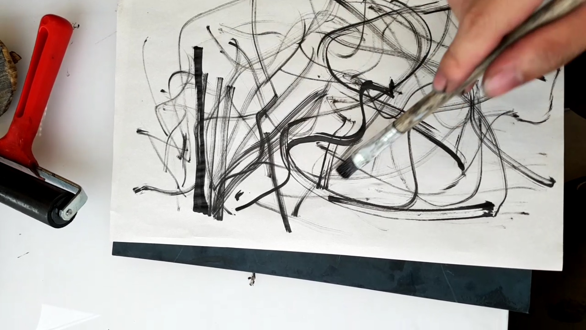
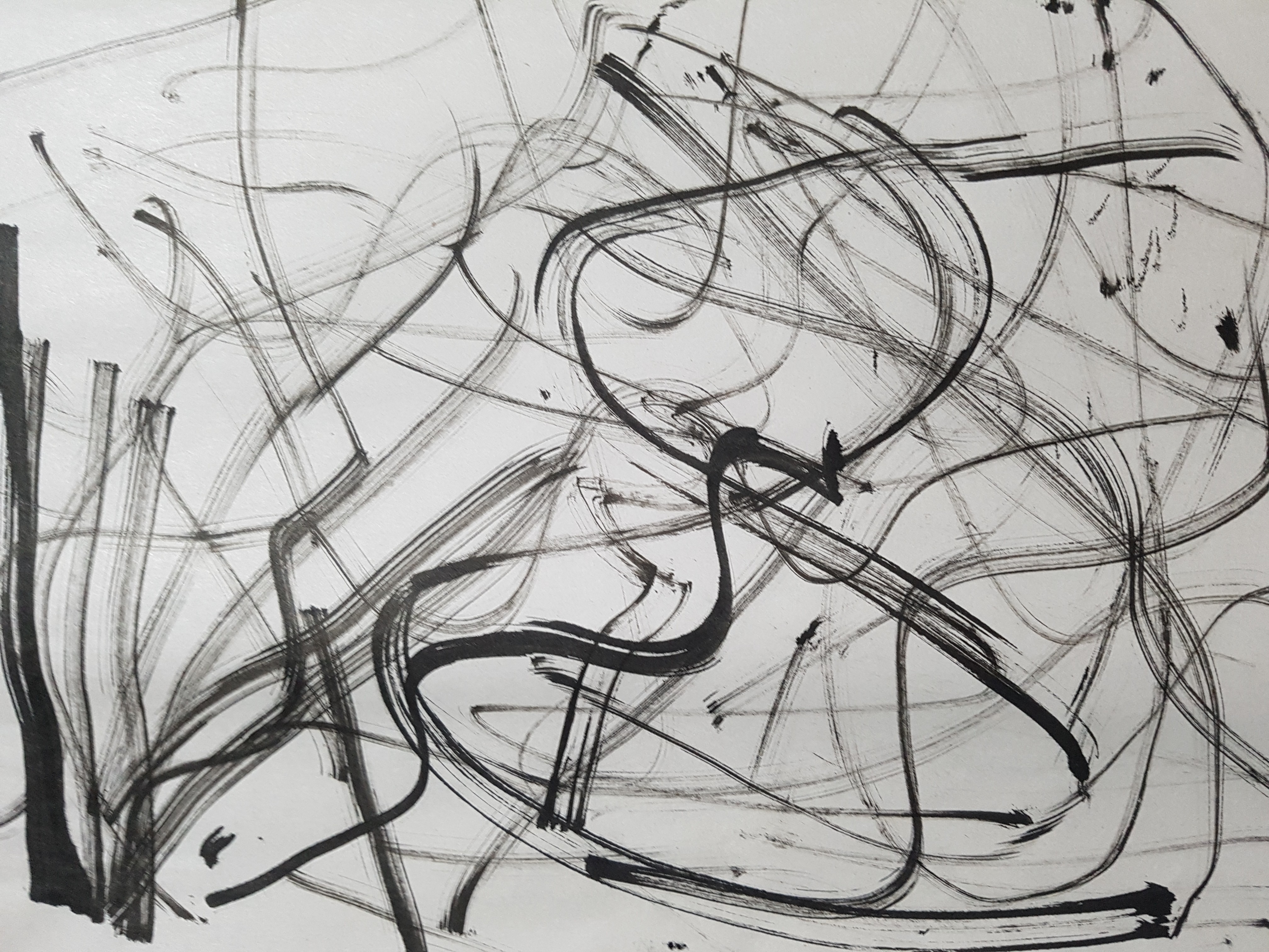
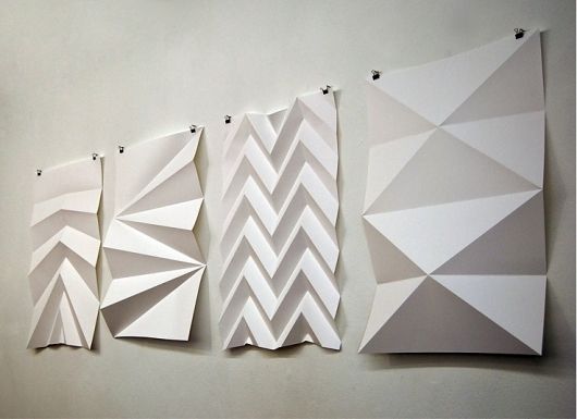
Sketches:

*These are just the initial planning of sketches. Changes of the sketches are made after consultation and personal exploration.

References

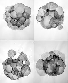
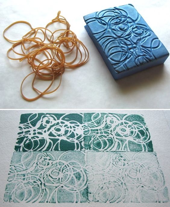
While looking through different ways of doing vintage surreal collage, I stumbled upon some very useful websites and videos that can help me with my work.

http://eugenia.queru.com/2012/10/29/how-to-do-modern-vintage-collage-digital/

Eugenia Loli who is one of my reference artists has a website where she teaches people the basic steps of making these collages.

These are some tutorials I found on Youtube that helped me with my collage.

The best of the best websites I found were websites that contained a compiled list of high quality vintage images that we can download and use to create the collages.

https://www.flickr.com/groups/vintagemags/pool/page50

https://www.flickr.com/photos/eugenia_loli/favorites/page4

Final

Strip 1: 

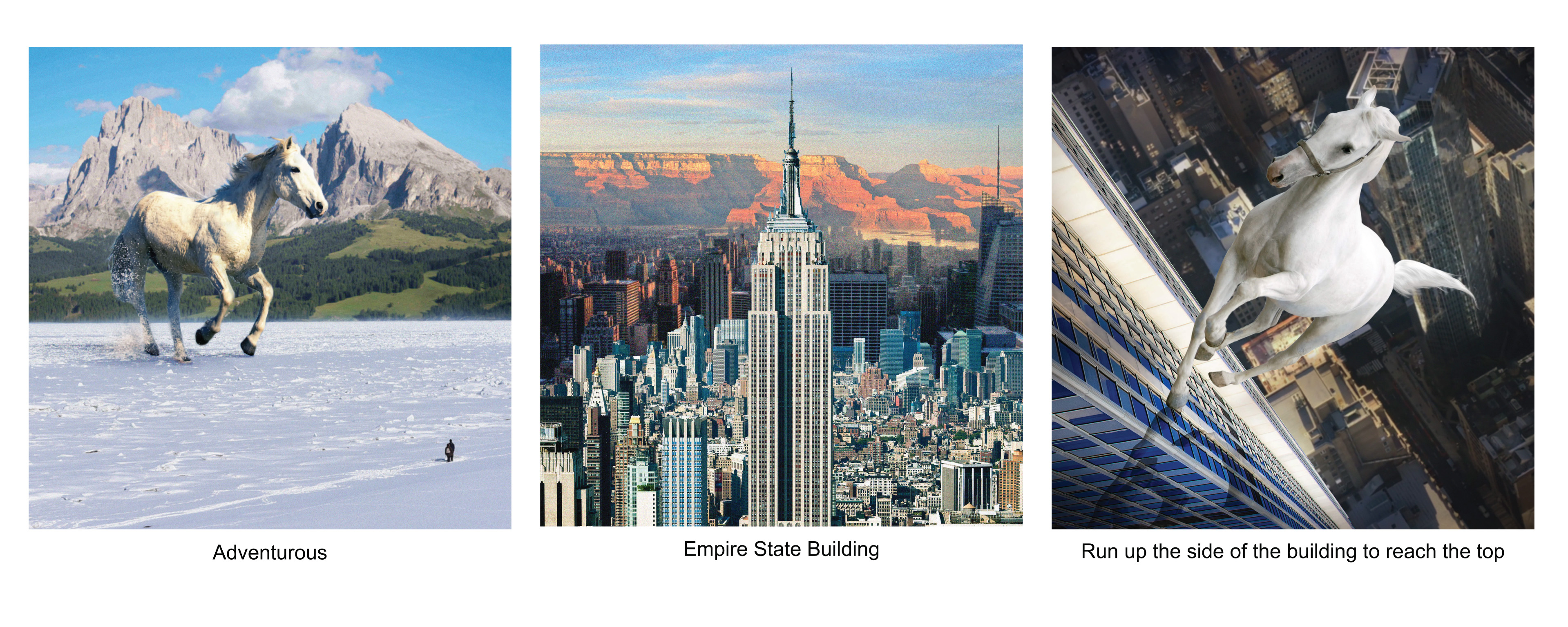
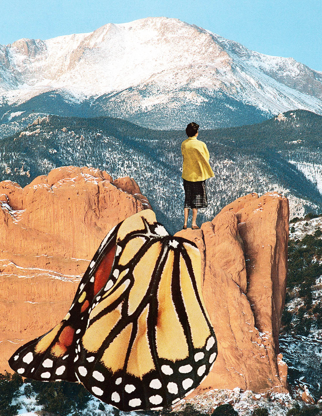
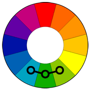
For the first panel, I picked out horse to represent me because horses travel far and wide, making adventures of their own. For me I want to be like a horse, being able to roam everywhere and seek my own adventures. I used analogous colours, blue, green and white to bring out the serenity and peaceful feeling when I make my own adventures.

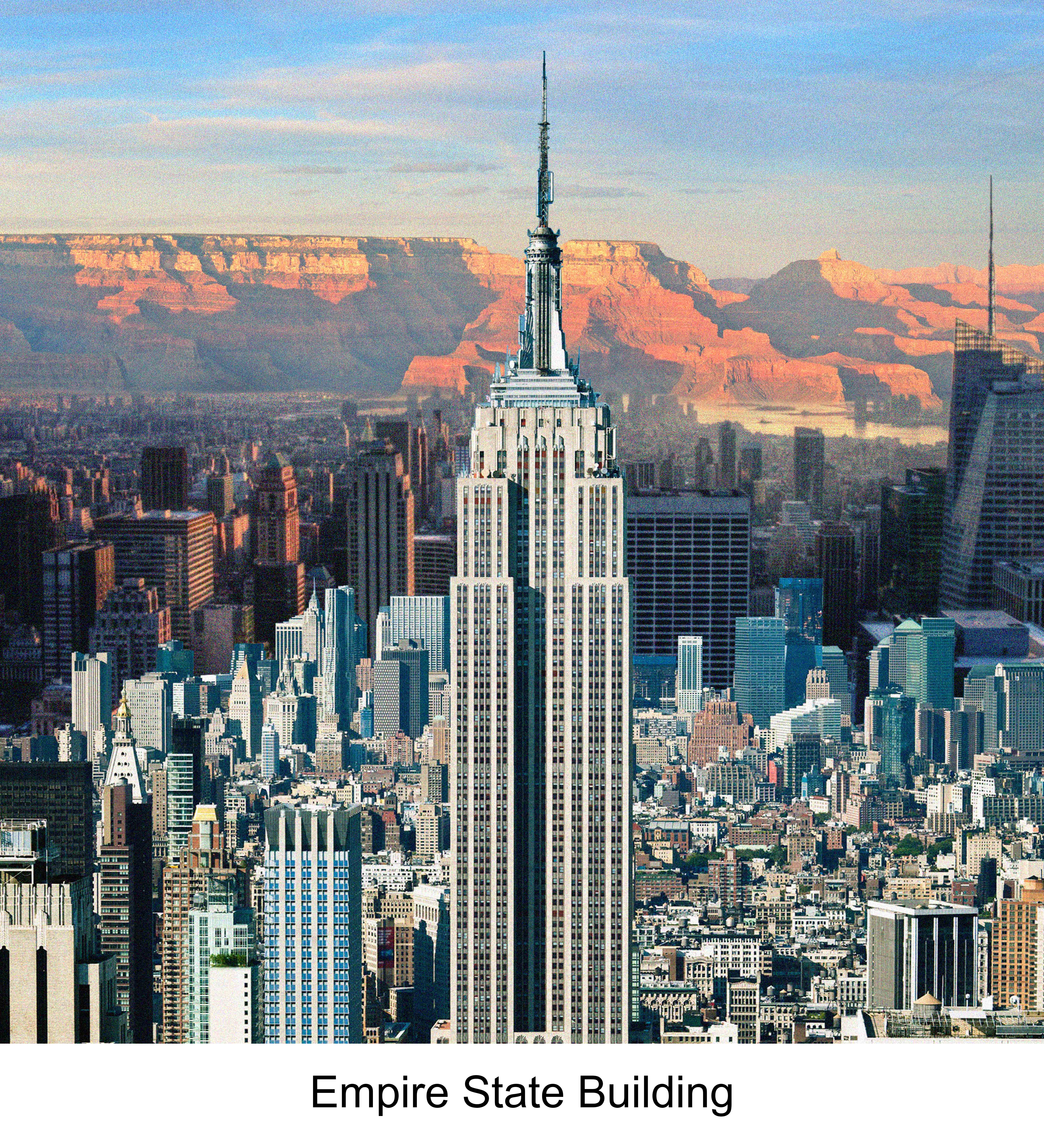
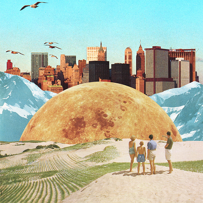
The setting I have picked out is the iconic empire state building. Standing tall and high in New York City.

Because I am adventurous, instead of taking the lift up to the top of the building, I will run up the side of the wall of the building, seeking my form of thrills and adventure. I placed the white horse at the center and darken the other spaces so that the visual dominance and focus is placed on the horse itself.

Strip 2: 

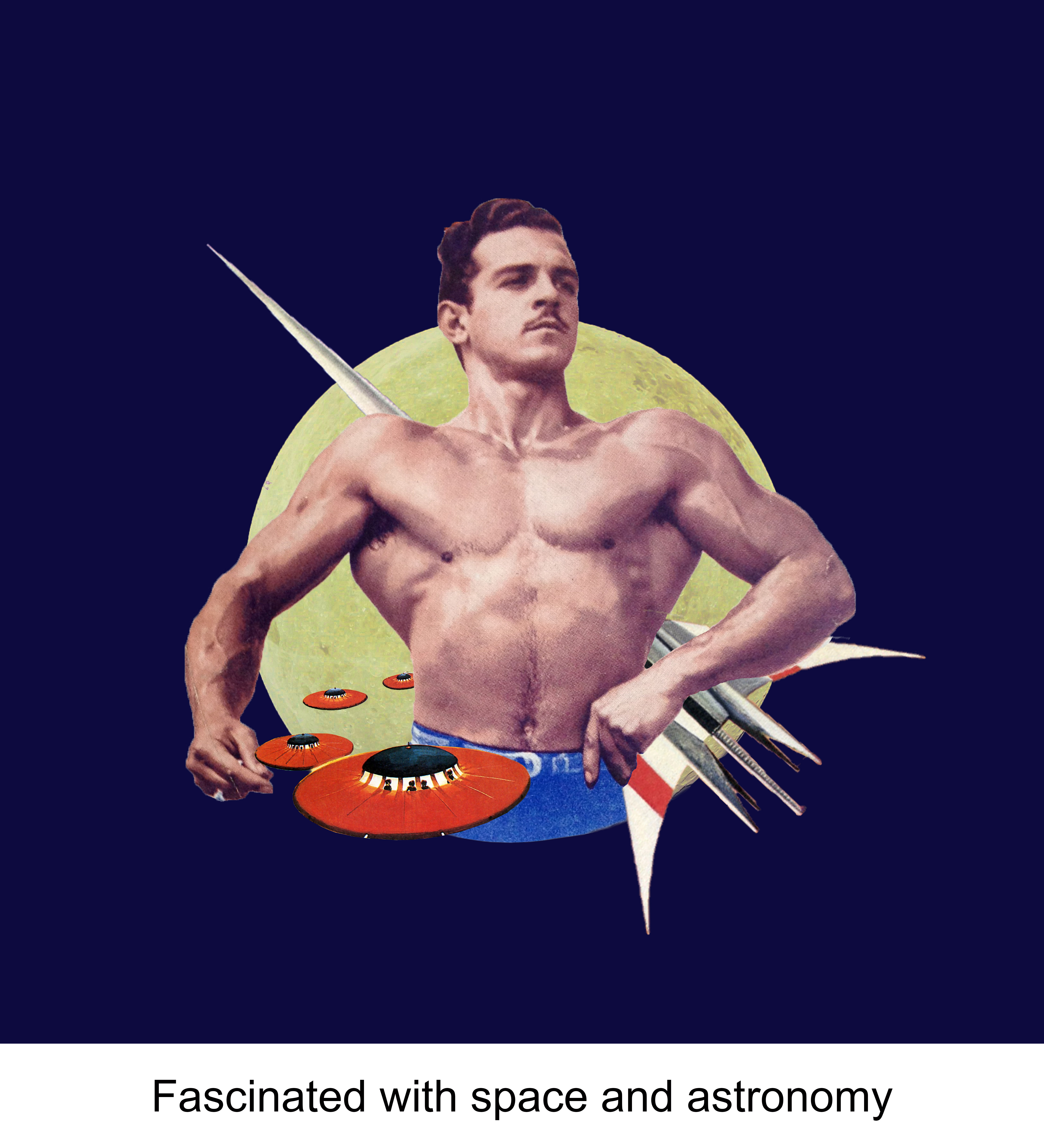
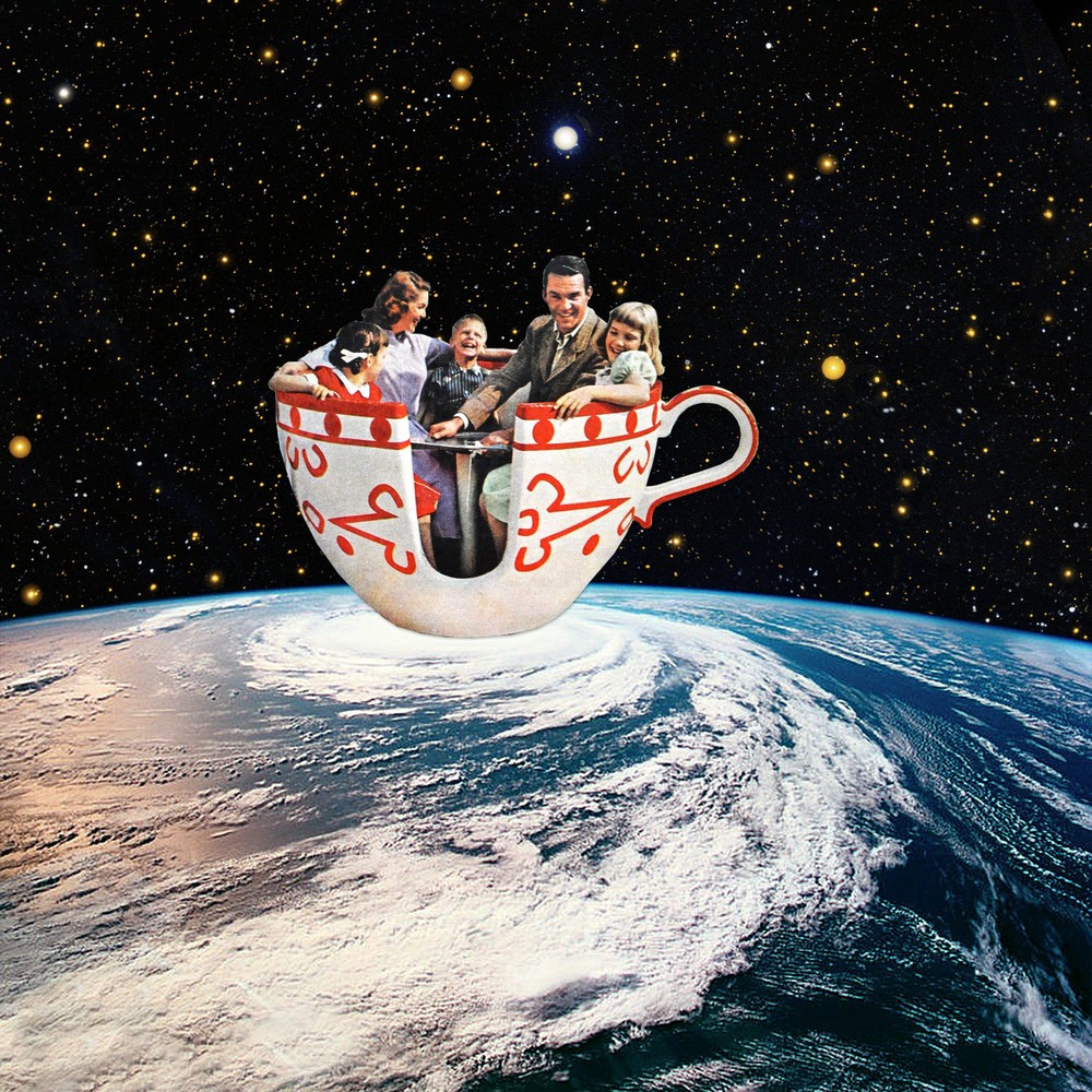
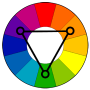
Even since I was young, I was always fascinated with space and astronomy stuff. Things like the galaxies and aliens always excites me and it was even my ambition to become an astronaut when I was young. For the first composition, I  added space elements that I like and revolves these elements around the musuclar man (Me). For the colour wise, I played with the Triadic colour scheme by using blue, red, yellow and white. I really like the background because it contrast with the elements at the center making everything pop out. P.s. Inspired from the NASA Logo.

For this composition I played with complementary colours Green and Pink with a dark background. This combination helps to make the composition stand out. I chose a pink planet to show the fantasy and dreamy ideas.

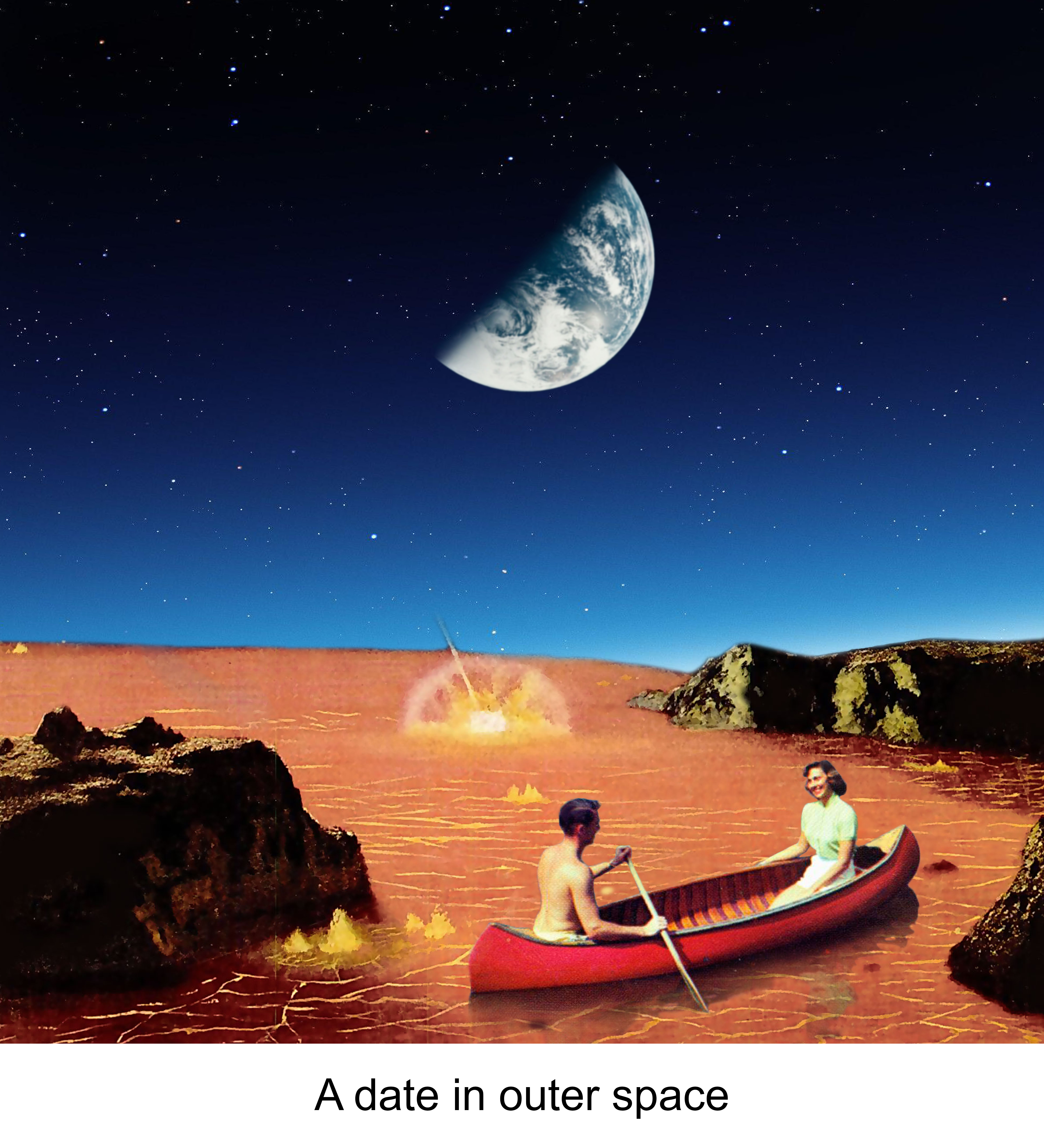
Isn’t it cool to be able to go on a date in outer space??? The pink lake links back to the pink planet you see in the second composition of this strip. I tried playing with different backgrounds of different colours but in the end I chose this because it contrasts well with the pink lake and is pleasing to look at.

Strip 3:

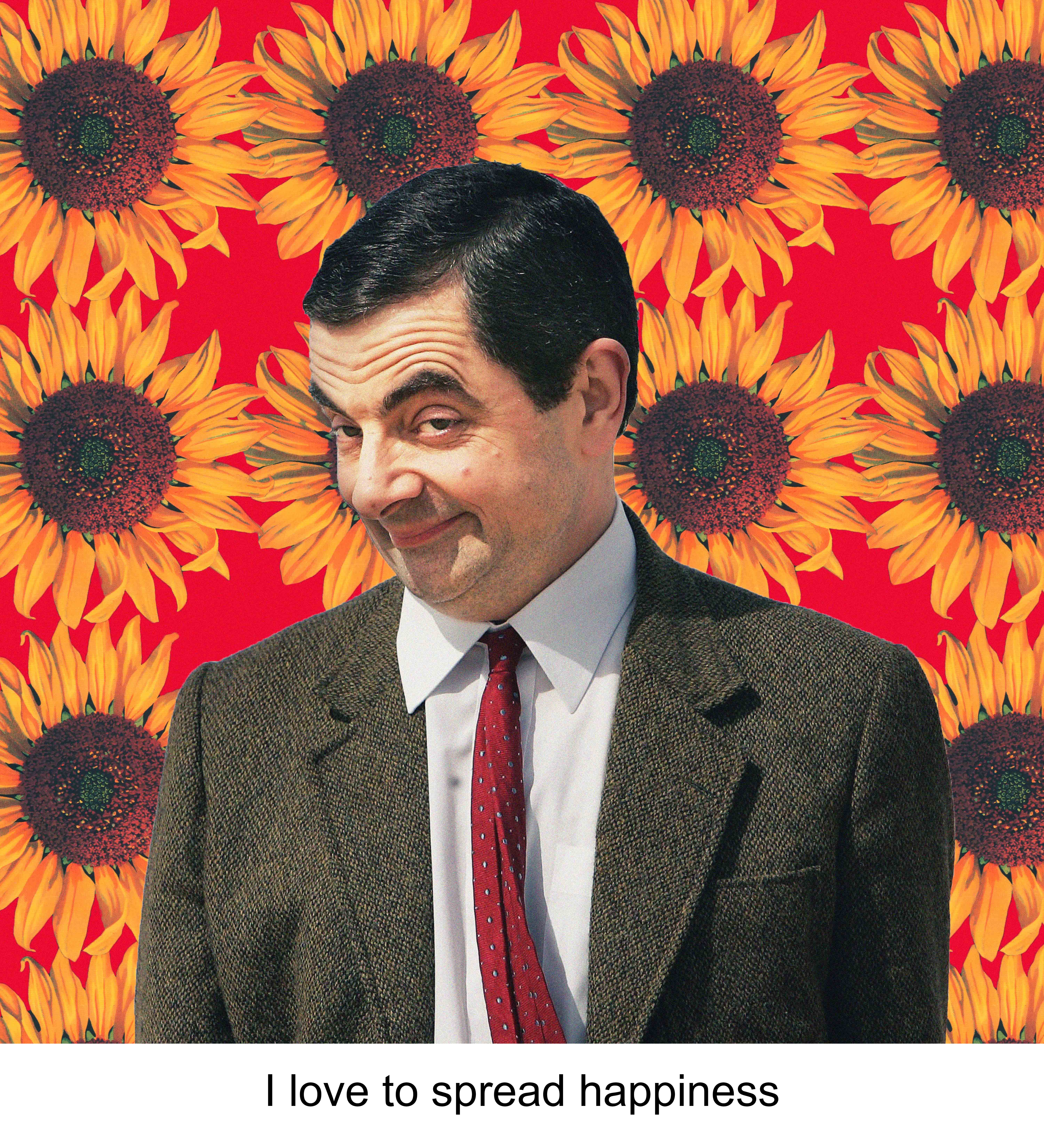
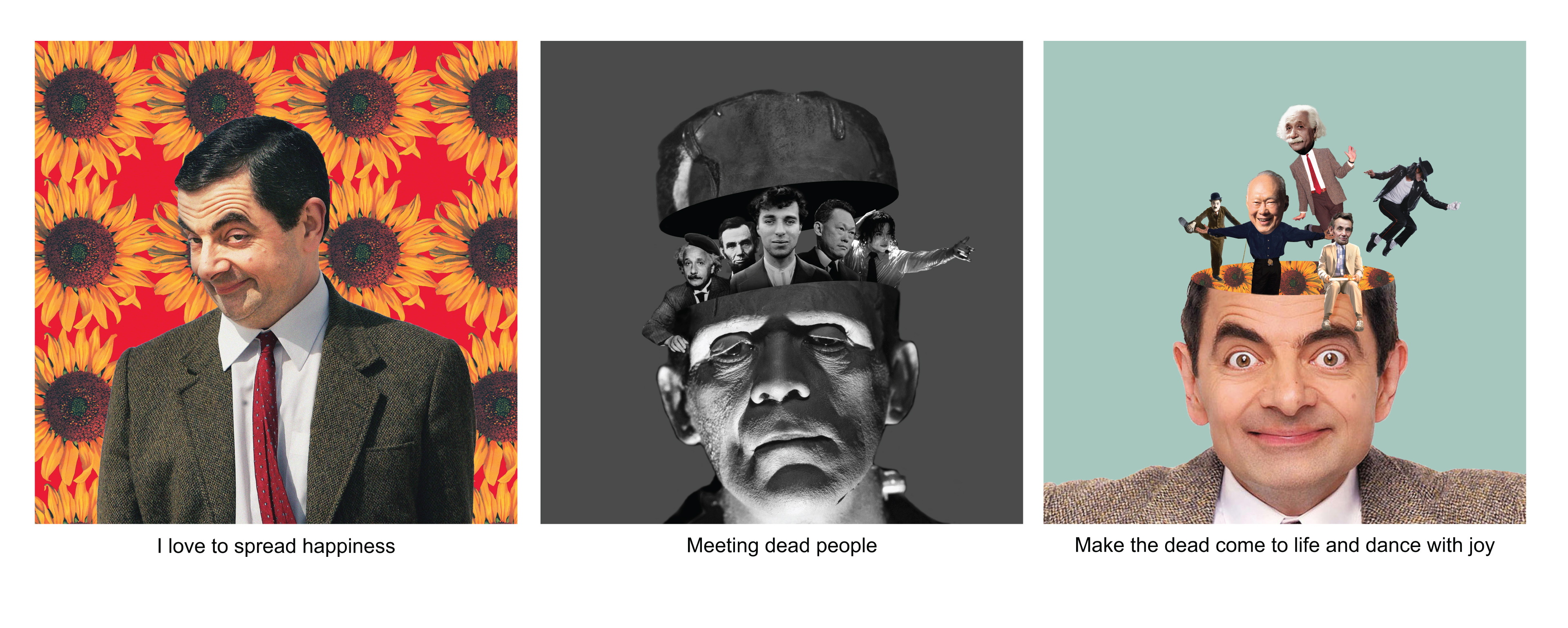
I love making people laugh and spreading happiness makes myself happy. To represent this side of me, I think the best way to show it is to bring in the iconic character, MR BEAN!!! Sunflowers are used to represent cheerfulness. I use the combination of yellow sunflowers and red background to further emphasize the liveliness and joy in me.

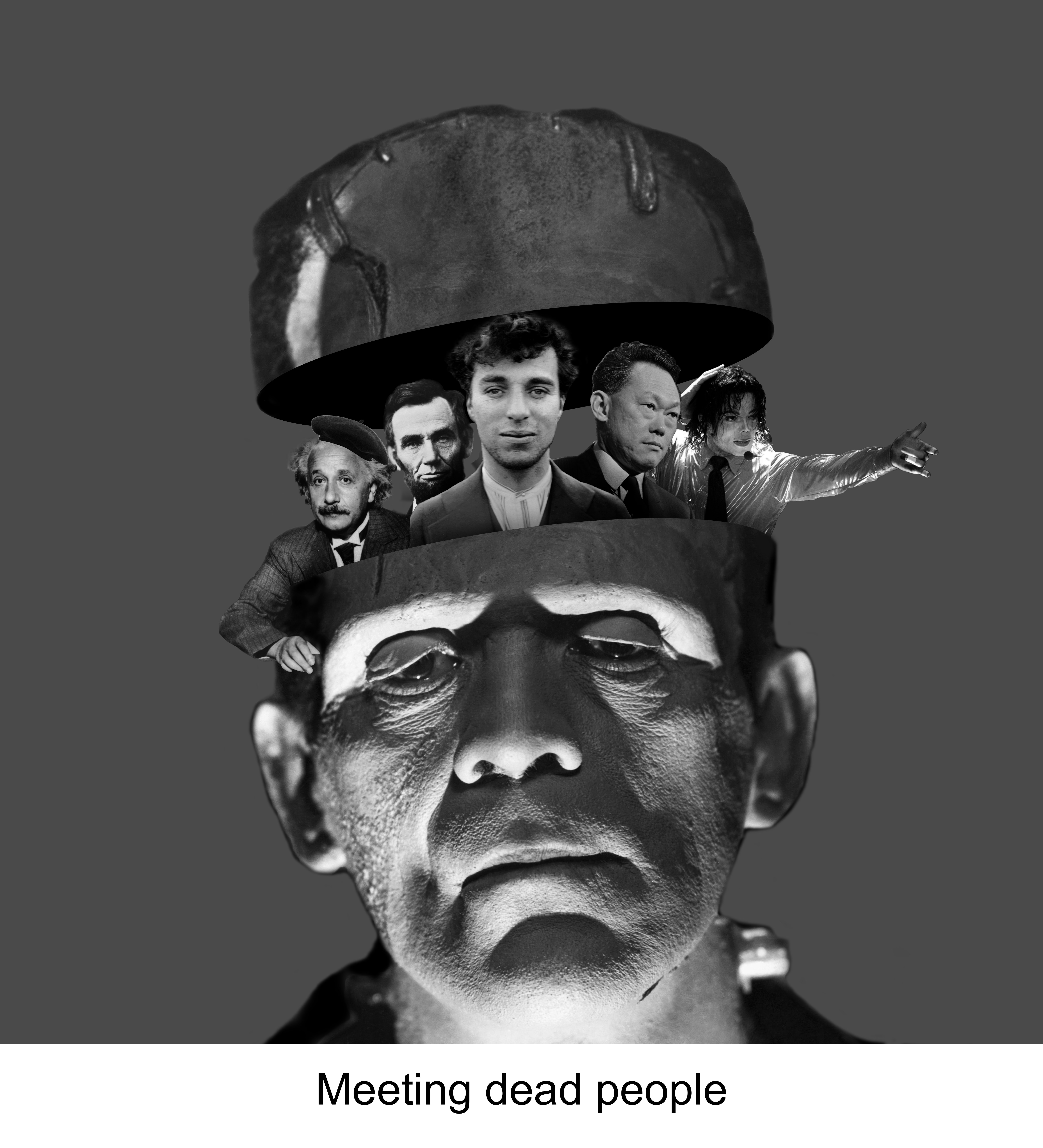
My initial idea for this was to show a setting of a cemetery, but because the style I was going for was surrealist collage style, I was stuck for awhile for this portion because i do not know how to show the cemetery settings. I decided to change it up abit and reference Julia Geiser’s collage style and decided to try the “head manipulation technique”. I cut the frankenstein head into half and added famous dead people that we all know of. Besides, I used monochromatic colour scheme of black, grey and white to give it a dead and dull look.

For the third composition I also used the same technique of collage. In this composition, all the dead comes back to life as shown in the change from monotone to colours. The dead appears to come out of my head which is filled with Sunflowers. And as they come back to life, they began to dance with joy. I use a neutral pastel background so that it does not overpower the focus on Mr Bean’s head.

Strip 4:

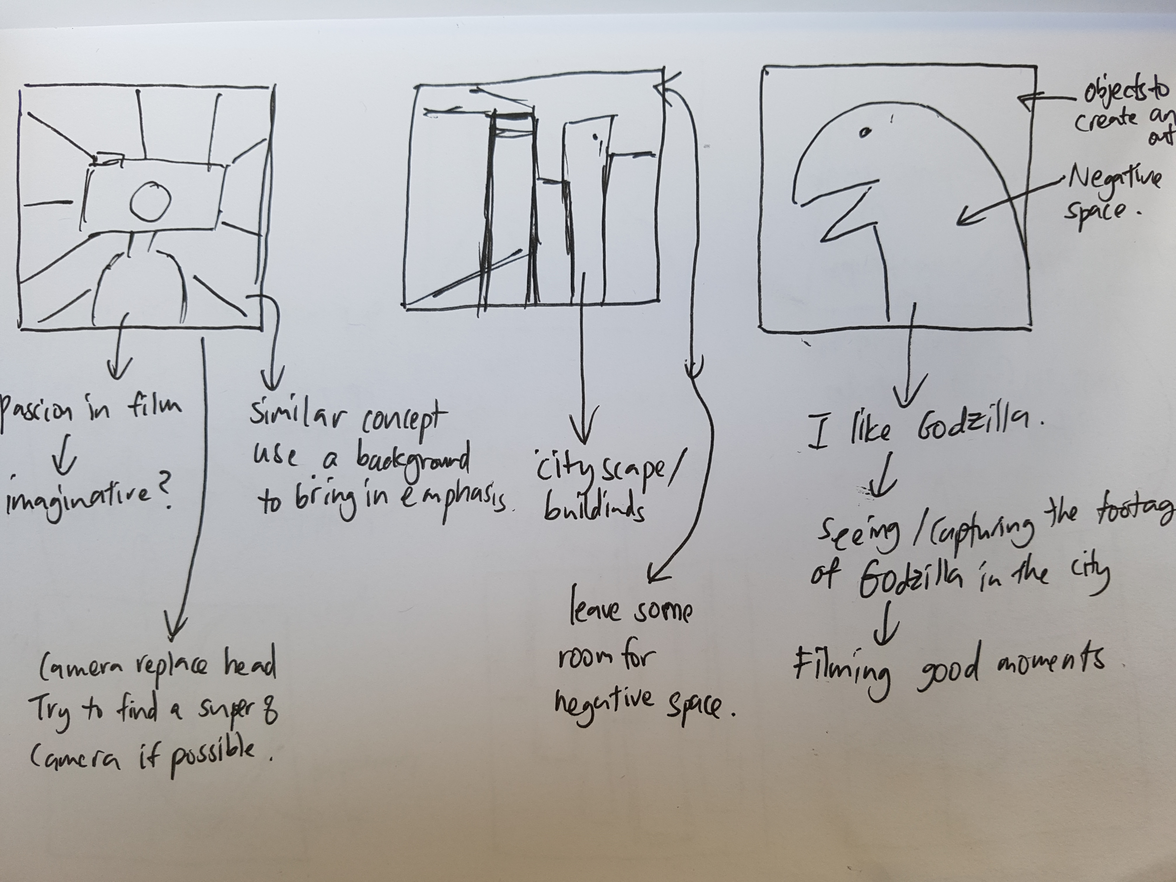
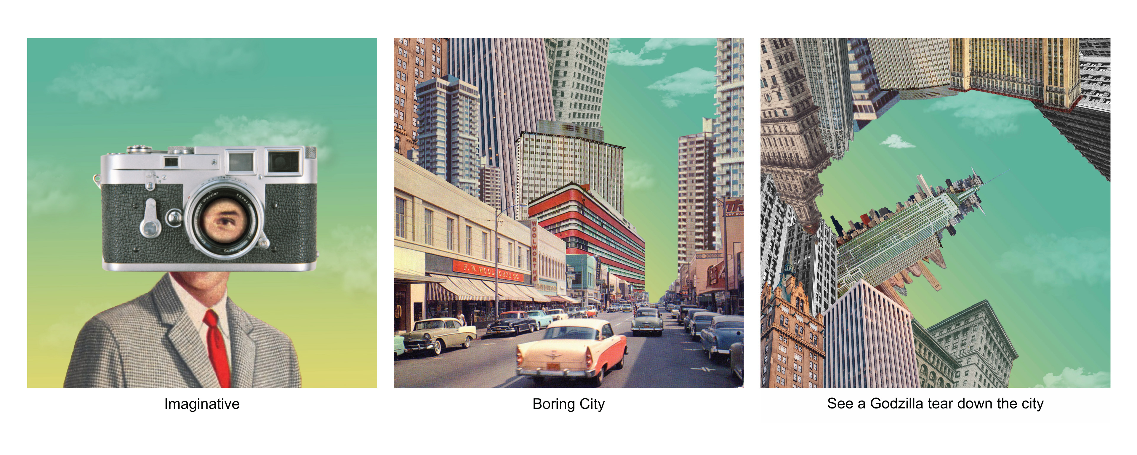
I have a strong passion in film and I am quite an imaginative person (humble) and I always tend to try to think outside of the box and do something different. Hence I came out with a simple composition of a man and a camera on my head to represent the imaginative side of me when I look through the lens of a camera.

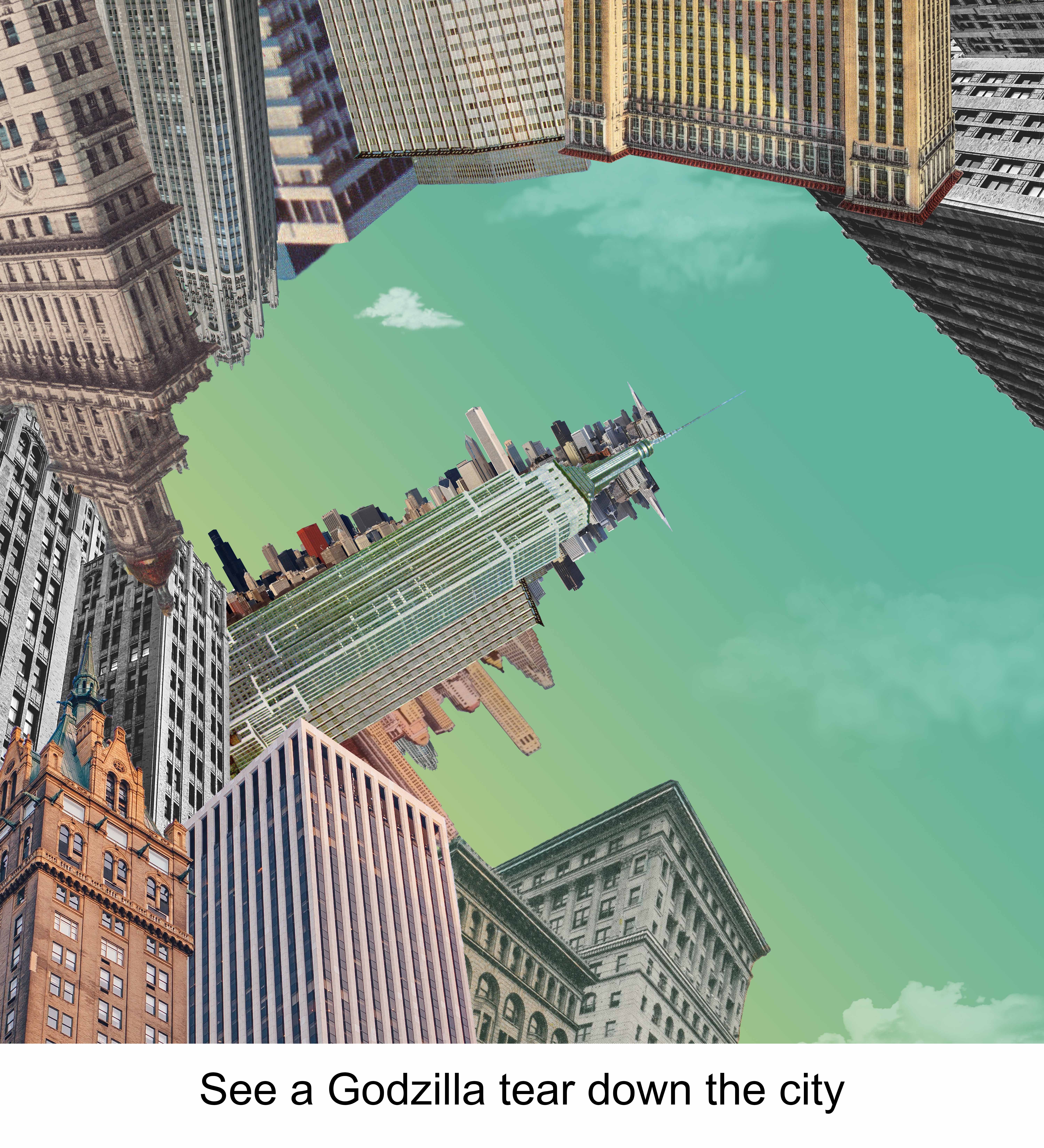
And as I walk through a boring while looking through the lens of my camera,my imagination begins to run wild as I turn the boring city into something interesting by seeing a Godzilla tearing the city apart. The third composition is the extension of the second composition as the view pans upward. I tried playing with negative spaces by outlining the shape of the Godzilla with different buildings. I used the analogous colour scheme of Yellow, green and light green for all 3 compositions for this strip. By keeping it consistent it also help me better to tell a linear narration. i purposely chose a combination of lighter colours as the darker colours looked too harsh and was unable to bring out the Godzilla shape that I wanted.

Reflection

This project got me quite stressed initially because I was unsure of which styles or techniques to approach because I was not confident of doing any of them. Besides when I was doing my first strip, I got frustrated with myself because I spent hours and hours on the single strip but was unable to get what I wanted. And also, it was really annoying because it was really hard for me to look for pictures that fit perfectly and the pictures that had the right colours in them. However, as I slowly progress, I started to get the hang of doing as I begin to do it with the mentality of “just try & learn”. I definitely learnt a lot more skills on photoshop and was even better than I was 13 weeks ago. 2D really made me see everything differently now as the design elements ideas constantly get stuck in my head wherever I go.


Project 3: Ego (Research)

Episode 1

For this last assignment for 2D, we were required to come up with 4 x 3 panels to describe ourselves. This is similar to the previous assignment, except this time we need to come up with 12 instead of 4 compositions. Besides that, this time round we will have to play with elements of colours and its different combinations.

ME, MYSELF & I

Before starting, I need to think of the various personalities, characteristics or things that describes me.

ARTIST REFERENCES

Because I am not really confident with doing illustration or using traditional methods I decided to approach collage style for this assignment. One style i really like is the vintage surreal collage style.

  • Karen Lynch
https://static1.squarespace.com/static/5861e6ec414fb5a4e21a5ff2/t/599250f7ff7c501ee65af186/1502761207939/?format=500w
https://static1.squarespace.com/static/5861e6ec414fb5a4e21a5ff2/t/586b28fe725e250e1dba7e77/1483417854421/?format=500w

Karen lynch uses vintage pictures and piece them up together creating a vibrant surrealist collage which I really like. Her collages style mainly focuses on creating imaginative settings by layering different images together.

  • Eugenia Loli
http://24.media.tumblr.com/tumblr_mckkw202K81rx1nxro1_500.jpg
https://i.pinimg.com/originals/d3/62/52/d362524460d211a8b89823279261055b.jpg

Similar to Karen Lynch, Eugenia Loli also does Surreal Collages. Her collages really wows me because they are so creative. She is able to find the correct moments to piece with the correct settings creating a really fun and amazing compositions.

  • Julia Geiser
https://www.ignant.com/wp-content/uploads/2013/11/julia_coll_05.jpg
http://www.thephotophore.com/wp-content/uploads/2016/01/julia_geiser_001.jpg

Another surreal collage artist is Julia Geiser where most of her collage involves a person. She creates a surrealist composition by slicing and dividing the body parts and adding different images to it. Although it looks creepy, but I think this is an interesting style to show the me portion.

COLOURS

Playing with different colour combinations can help to make your composition stand out and make them pleasing to look at. Below are some examples on the different ways we can play with the colours.

https://upload.wikimedia.org/wikipedia/commons/thumb/1/1a/CPT-Websites-monochrome.svg/1200px-CPT-Websites-monochrome.svg.png

Monochromatic color schemes are derived from a single base hue and extended using its shades, tones and tints.

Complementary

Colors that are opposite each other on the color wheel are considered complementary.

Analogous

Analogous color schemes use colors that are next to each other on the color wheel.

Split Complmentary

The split-complementary color scheme is a variation of the complementary color scheme. In addition to the base color, it uses the two colors adjacent to its complement.


Triadic

A triadic color scheme uses colors that are evenly spaced around the color wheel.

Reference from: http://www.tigercolor.com/color-lab/color-theory/color-theory-intro.htm

Foundation 2D: Forrest Gump (Process)

SILKSCREEN PRINTING PROCESS


Wash the frame clean
Coating of P5C blue emulsion on Frame
Failing the coating of P5C blue emulsion on tray
Placing frames on exposing unit
Exposing

Washing of the blue emulsion to create the printing layer
Placing Ink on the top part of the frame
Preparing for the most important part (Printing)
Printing
Practice on paper

After practicing on papers, I decided to try it out on my tote bag to produce my final piece. My first attempt was a failure as I did not apply enough ink and did not apply the pressure evenly.

Failed Attempt on Tote Bag


One smooth swipe

After my first failed attempt, I learnt that in order for it to turn out successful, the amount of ink to be applied has to be estimated accurately and it had to be printed in one swipe/ stroke. Depending on the composition, more black areas means that we have to apply more black ink. Like for my composition, I had to apply a lot of black ink to it.

Finished tote bag
Final Piece


Foundation 2D: Forrest Gump (Final)

Forrest gump


“You mustn’t be afraid to dream a little bigger darling.” – Inception

Keywords: Dream, Not afraid to dream bigger.

For this quote, the main emphasis is on not being afraid, to dream big. When I think of the word dream, I instantly linked the word dream with fantasy. And when I think of fantasy, all I can imagine are mythical and magical beasts and creatures like the ones we see in the movie Alice in the Wonderland, Where the Wild Things Are and The Spiderwick Chronicles. Hence I decided to create a composition of a flying creature which has an elephant head, hippopotamus body and dragonfly wings to represent dreams and dreaming big.


Draft #1

And for the idea of not being afraid, I initially wanted to show the creature flying out of a brain. However, the idea of showing a brain is too literal therefore I switched to showing the creature flying and emerging through layers of clouds with a starry background. Besides, flying through clouds can also bring out the idea of exploring into the unknown; having big dreams. Also, the combination of clouds and starry background also creates a very magical and dreamy setting to the whole composition.

Suggestions on improvements after consultation:

  1. Move the Creature so that it is not at the center of the composition. Placing it at the side or corners create a more interesting composition.
  2. Reduce the number of clouds and decrease the opacity of the cloud layers. The clouds are too overwhelming especially the cluster of clouds below the Creature; the clouds are competing visually with the Creature even though my intention is to make the Creature the main focus.
  3. Apply the halftone effect on the clouds as the grey tones might not be printed out nicely.
Final Composition #1

The design principle that I adopted for this composition is hierarchy. As what I had mentioned previously, the clouds before the adjustment was too overpowering hence it competes in terms of the visual presence with the creature even though the creature was the dominant figure. Hence after the adjustment, the design looks better as the dominant (creature), sub-dominants (clouds + black background), sub-ordinate (stars) becomes clearer. Besides, also apply the principle of contrast by placing my creature behind the black background to make it stand out even more.

“Beautiful things don’t ask for attention.” – The Secret Life of Walter Mitty

Keywords: Beautiful things, Don’t ask for attention.

Things that are associated with beautiful things to me are a beautiful lady, flowers, butterfly.

Draft #1

For beautiful lady, I purposely make it look faded so that we cannot see it clearly hence creating a mysterious vibe to it. I then placed the Tulips that symbolizes love and beauty and added butterflies around the lady to further emphasize beauty. Next, I  placed the composition in a mirror as mirror attracts attention.

Mandala Pattern
Draft #2

However, I felt that the composition is still lacking something hence I decided to use the idea of one point perspective to draw the audience attention to the composition. I was thinking of using mandala pattern as the background to make it look more elegant, but the composition looked too messy and distracting, therefore I decided to use the one point perspective pattern instead.

Draft #3

Although I was quite satisfied with my composition I found that the message I was trying to bring out was contradictory as it showed that beautiful things ask for attention rather than beautiful things don’t ask for attention. Thus, I placed the Lady, Tulips and Butterflies outside of the mirror frame while keeping the inside of the mirror empty. 

How the composition works is through the idea of perspective. As audience looks at the composition, they expect to see something being reflected in the mirror, however, there is nothing inside the mirror. Instead, their attention now shifts to the tulips, butterflies and the girl outside of the frame. The beautiful things become the secondary attention hence conveying the idea that beautiful things do not ask for attention.

The principle of design that I adopted for this composition is balance and alignment. I intentionally aligned everything symmetrically so that so that the audience’s attention is drawn directly to the mirror which is at the center.  I also align the composition in such a manner whereby everything is connected hence the audience attention will shift naturally from the lines to the mirror than outside of the mirror again.

Final Composition #2

Tulips duplicated to cover the bottom part of the composition.

“No man can walk out of his own story.” – Rango

Keywords: Man, Walk out, Story

Break down of quote gives the idea of unable to escape and being stuck. Hence I thought of creating a composition that is similar to the stairs illusion.

Draft #1

For my first composition, I experimented it by stacking and arranging the stairs in different directions in a random manner to form a maze. I divided the man into 2 parts, the leg and the body. As the man tries to walk out of the frame, his right legs appears back into the frame hence showing that he is unable to escape. Besides, I added a door that is inaccessible in the maze to create the idea of trapped.

Draft #2

One of issue with the composition was that the stairs was not really visible, so I changed the picture of the stairs. Again I placed the stairs in random order to make it look like an illusion. The placement of the inaccessible doors and inverted man defies the law of physics of the reality making it look like a limbo world. Besides, I added the background that resembles a net to reinforce the idea that the man is trapped in this world.

After my consultation, it was suggested that the net looked too overpowering visually. Therefore, I was recommended to change the my stairs to find engravings of it instead of using images via halftone. However I was unable to find quality pictures of engravings that I really liked. Thus I had to adapt and change my background instead.

Grid background (Thinner lines)
Final Composition #3

For this composition I adopted the design principle of hierarchy. The dominant for the composition is the stairs which I intentionally duplicate them and place them randomly across the composition in different sizes. The subdominant is the grid background to further add on the illusion setting which I wanted to create. Next the human figure and the door are the sub-ordinates.

“The dead know only one thing, it is better to be alive.” – Full metal jacket

Keywords: Dead, Better to be, Alive

Before starting on my composition, I decided to search for all the symbolism of dead/death and alive/life and pick out a few that best fit the quote.

Dead:

Draft #1

Alive: 

After picking out different pictures to symbolise dead and alive, I combine the 2 elements together to produce a composition showing the dead rising from the grave trying to grab the heart. However, the composition looked very boring and the alignment looked very planned. 

Hence to make my composition look more interesting I thought of the idea of using the contrast as my principle of design. I intentionally made my background black so that the heart stands out the most due to visual contrast. Besides, I also played with another design principle, hierarchy. Because i wanted to maintain the heart as the main focus, I gave the grave, raven and the hands minimal highlights so that it does not compete with the heart for visual presence but stands out at the same time. I also removed the bats and made the arms looked more proportionate and added the blood drip on the bottom of the heart. I want it to be simple but looked interesting.

Final Composition #4


Foundation 2D: Forrest Gump (Movie Quotes)

Everyone loves watching films and everyone has their own favourite movie lines/ quotes. Here below are 4 of my favourite quotes which I am going to be using for my “Forrest Gump” assignment. I try to use quotes that are not too long, probably around 7 words so that it is easier to break it down and piece into a visual.

http://quotesgram.com/rango-quotes-funny/

“No man can walk out of his own story.” – Rango

https://www.tumblr.com/search/dream%20%20bigger%20%20darling

“You mustn’t be afraid to dream a little bigger darling.” – Inception

https://www.tumblr.com/search/walter%20mitty%20quotes

“Beautiful things don’t ask for attention.” – The Secret Life of Walter Mitty

https://www.youtube.com/watch?v=gSYXbs3Q7lU

“The dead know only one thing, it is better to be alive.” – Full metal jacket


My Line Is Emo

My Six Emotions: Playfulness, Hate, Love, Lost, Worry, Depression

Playfulness – the quality of being light-hearted or full of fun.

For me the word playfulness draws connection to the word cheerfulness which links to the word bubbly. Hence, I try to convey playfulness through circular patterns which is done so via dripping paint.When you drip paint, you create circular shapes with additional splatter patterns. The splatters represent the liveliness when one is full of fun. The contrasting tones and sizes further adds into the element of excitement.I Dripped paint from different height to create splatters of different sizes using a straw while controlling the ratio of water and paint to create the different tones in the splashes.

Hate – feel intense dislike for.

Hate is a very intense feeling. When you hate you feel the inside of your heart burning up, tearing and opening up slowly. As you hate, hatred will slowly consume you letting the dark side take over, turning you into someone else.

I used a coil and used the burning end to slowly burn through the paper creating the line. The line shows how hate burns and tears up our soul and heart. The line opens up the with a dark background to show like the dark side is coming for you.

Love – a strong feeling of affection.Love is a strange thing it can make the strongest person or toughest person in the world to go weak, to go soft. Love makes you vulnerable. The use of wood and rope signifies toughness in a person. I purposely create the holes to show the vulnerability when love comes about. The slowly snapping ropes also helpings to show that love slowly breaks you apart when you do not know it. My interpretation of what love does to you in a visual way.

Lost – to describe the uncomfortable feeling of being in an unfamiliar situation

For this emotion, I was trying to creating a dreamy setting whereby a man is trapped in a place (limbo) where he is unable to escape and find his way out. The emotion lost was also inspired by a soundtrack called “Theme” from Eternal Sunshine of the Spotless Mind. In my opinion, the piece sounded like a man being trapped in a world where he is trying to escape but it always goes back to a loop. The dreamy setting is created with the use of baby powder. I spread the baby powder out on the black board to create like a misty and foggy scene. 

Worry –  anxious or troubled about actual or potential problems.I am a thinker and sometimes I feel like I think too much. I over analyse things too much and most of the times, the things I worry about do not even happen at all. So, I feel that worrying always leads to nothing or it leads to further emptiness.

For the interpretation of worry, I used crushed paper to create a very messy composition to represent the chaotic mind i.e. looks like brain cells working. Next the crushed paper mark making will slowly fade off as it moves from right to left symbolising that worrying leads to nothing or that it just leads to more emptiness. Besides I crushed the right side to add further bring out the messy state of mind.

Depression – feelings of severe despondency and dejection.

Victims of depression are mostly unaware that they have depression. Depression is an illness, it is not a choice. Sometimes people we think are fine are the ones that need our help the most. From the outside they might seem fine, but sometimes they are suffering deep down.

I created this by using pen knife and my finger nails. The cuts were made by pen knife which represents self-harm. And as you look closer, you can see the marks made by my finger nails, these represents the pain they are suffering from the inside which we do not understand.


Overall, I think this mark making project is very fun and interesting as it is a very open project whereby you can share your ideas through creative means. Beside, I think it is very cool how everyone has their own unique and distinct styles and very often you can point out a person’s characteristics and personalities through their mark makings. I also feel that sometimes aesthetically pleasing works are not necessary good because I feel that the stories and interpretation from the artists themselves are more important and gives the artwork a life. (In my opinion) One thing I learnt from doing this is the importance of referencing. Sometimes when you reach an idea block, referencing from other sources for creative ideas is actually useful. However, it is good to reference and pick out certain good points from other sources but I try not to refer to it too much as our idea will start becoming similar. Another thing I learnt is patience. Actually I am not really a patient guy, so during the process, I got quite annoyed and frustrated on a few occasions as I was unable to achieve what I wanted. But oh well, life is about success and failure, and only through failure will you learn. Success and learn!!! 😀

Mark Making: Week 3 (Process)

Week 3

For week 3, we prepared the rough idea of the mark making we are going to do for our emotions and experimented it in class.

The emotions that I had in mind was regret, peacefulness, lost, playfulness and worry.

Fingerprint + Ink on paper

For regret, I wanted to create a mark making using my finger prints. I used finger prints to signify the things that we do that we regret on are pulling us back in life. I wanted to have my finger prints swirl on it, but the ink was either too thick or too wet hence I was unable to create the product I wanted.

Broom Bristle + Ink on paper


For peacefulness, I wanted to create the idea of flowy gentle tall grass by using thin brush or thin tools. To me when I think of peacefulness, peaceful the image of standing in a field of tall grass field popped up my mind instantly. Standing in the field as the breeze caressing your gentle cheeks as you stand there looking towards the endless horizon without worrying about anything at all. I cut out some bristles of the bottom of the broom to do the mark making.

Mono Printing + Strings + Ink on paper
Creating a dreamy landscape/background
Mono printing + Rope + Ink on paper


For lost, I decided to use mono printing to create the work. I wanted to recreate something like what I had last week but using a a string or rope that is much thinner in dimension. I wanted to also create a rather dreamy landscape that looks like a limbo hence I used a wetter ink. The problem I faced when doing this was the control of the ink, I was not really sure how wet it must be and some of my pieces came out totally black as well. But I was quite satisfied with the result using the rope creating an abstract piece of a man trapped inside a world.

Dripping from different heights
Dripping Paint + Water on paper
Nice splash with different tones.


For playfulness, I tried dripping paint to create a bubbly and cheerful piece. I played around with different tools for me to drip the paint from using a brush to using a scoop. In the end I found out the best tool to drip paint is by using straws. Next I also played around with the mixture of paint by adjusting the ratio and paint accordingly to create different tones.  However, I was unable to created splashes that are bigger. Need to experiment more.

Crushed paper + Ink on paper

For worry, I decided to use last weeks experimentation with crushed paper. I crushed the paper and mixed it with ink and dabbed it on paper creating a very messy look. Satisfied!

Week 3.5

Before confirming my 6 emotions, I realized that my works are mostly using inks and 2D stuff hence I need to experiment with the use of more materials and techniques maybe play around with 3Ds and textures.

Further improvements on current works:

Different results

For playfulness, I am sticking with the same concept but to further improve my work, I made some adjustments like changing my tool to straw, adjusted the ratio of water and paint accordingly to achieve different tones and adjusting the height where I drip the paint to get splashes of different sizes.


For lost, I wanted to recreate it but by using different materials instead of ink. Hence, I thought of using my dental floss and place it on a black background.

Tools used


The hard part was trying to stick the string on the black board as I do not want to use too much glue because the glue stands out after it dries. Hence I have to use toothpick to slowly glue the string on the black board.

Other interesting methods that I tried out was to create burn holes. I was looking through interesting patterns and I stumbled across this method.

https://www.google.com.sg/url?sa=i&rct=j&q=&esrc=s&source=images&cd=&cad=rja&uact=8&ved=0ahUKEwiEpZz83YjWAhWLtY8KHdNWAXEQjRwIBw&url=https%3A%2F%2Fwww.pinterest.com%2Fbenobaileyo%2Fart-mixed-media%2F&psig=AFQjCNEDWk0vskP2IJXLFVPdU8A5fDq6pw&ust=1504515790291963
Burning holes


At first I used a lighter to create the holes, but the whole paper caught fire and it failed. I tried it out using a joss stick and paper and holes came out looking similar.

I was interested in creating layering in my work piece after doing some research on layering art as it can help add the 3D element into my works.

Texture art paste on canvas:

https://www.google.com.sg/url?sa=i&rct=j&q=&esrc=s&source=images&cd=&cad=rja&uact=8&ved=0ahUKEwiGysGR4IjWAhXBso8KHeLtC48QjRwIBw&url=http%3A%2F%2Fwww.robinurton.com%2Fblog%2Fcreating-textured-backgrounds%2F&psig=AFQjCNFLC2G7iKFlldo8IwntpqAkscn0WA&ust=1504518990271112

Paper Mache:

https://www.google.com.sg/url?sa=i&rct=j&q=&esrc=s&source=images&cd=&cad=rja&uact=8&ved=0ahUKEwj15KHk4IjWAhXCvo8KHWKsAxoQjRwIBw&url=http%3A%2F%2Fwww.thecraftedblog.com%2Fhow-to-newspaper-canvas-artwork%2F&psig=AFQjCNHB7mJPf8uOXSz6JiEL28SUDCgDHA&ust=1504519158748621

Folding art:

https://www.google.com.sg/url?sa=i&rct=j&q=&esrc=s&source=images&cd=&cad=rja&uact=8&ved=0ahUKEwim-dyt4YjWAhVHpI8KHdaED8kQjRwIBw&url=https%3A%2F%2Fwww.pinterest.com%2Fexplore%2Fpaper-folding-art%2F&psig=AFQjCNGgDBsSiNg8HU1y4YuOQoCBR-J-Ww&ust=1504519248176868
Folding 1
Folding 2
Folding 3


All 3 are creative ideas and I feel like the folding art idea can help to create layering effect on the background hence helping to accentuate the emotion even more. 

Other interesting method I tried was using string and on wood.

Furry String
String with wood


Failed experimentation:

(Lost) Water colour + string + Paper
(Playful) Drip ink + Hard paper
(lost) String on black board
Paper folding (I quite like it but I never use)
Paper Folding
Burning holes in paper
Burning more holes

These are the more interesting methods that I tried out with. After some experimentation and research, I feel that mark making is actually very fun as it enables you to express your ideas through creative and artistic means. Its cool… but super messy 😀


Mark Making: Process (Week 2)

Process


The second week of Foundation 2D was filled with fun. We had the chance to experiment mark making with different tools and techniques. For me I kept to my word and brought the garlic bread snack that I had back in hall and also brought a roll of toilet paper that had nice patterns on it.

Garlic bread:

I dipped the garlic bread into chinese ink and started sliding it across the paper and also started dabbing it on the paper.


Toilet paper:

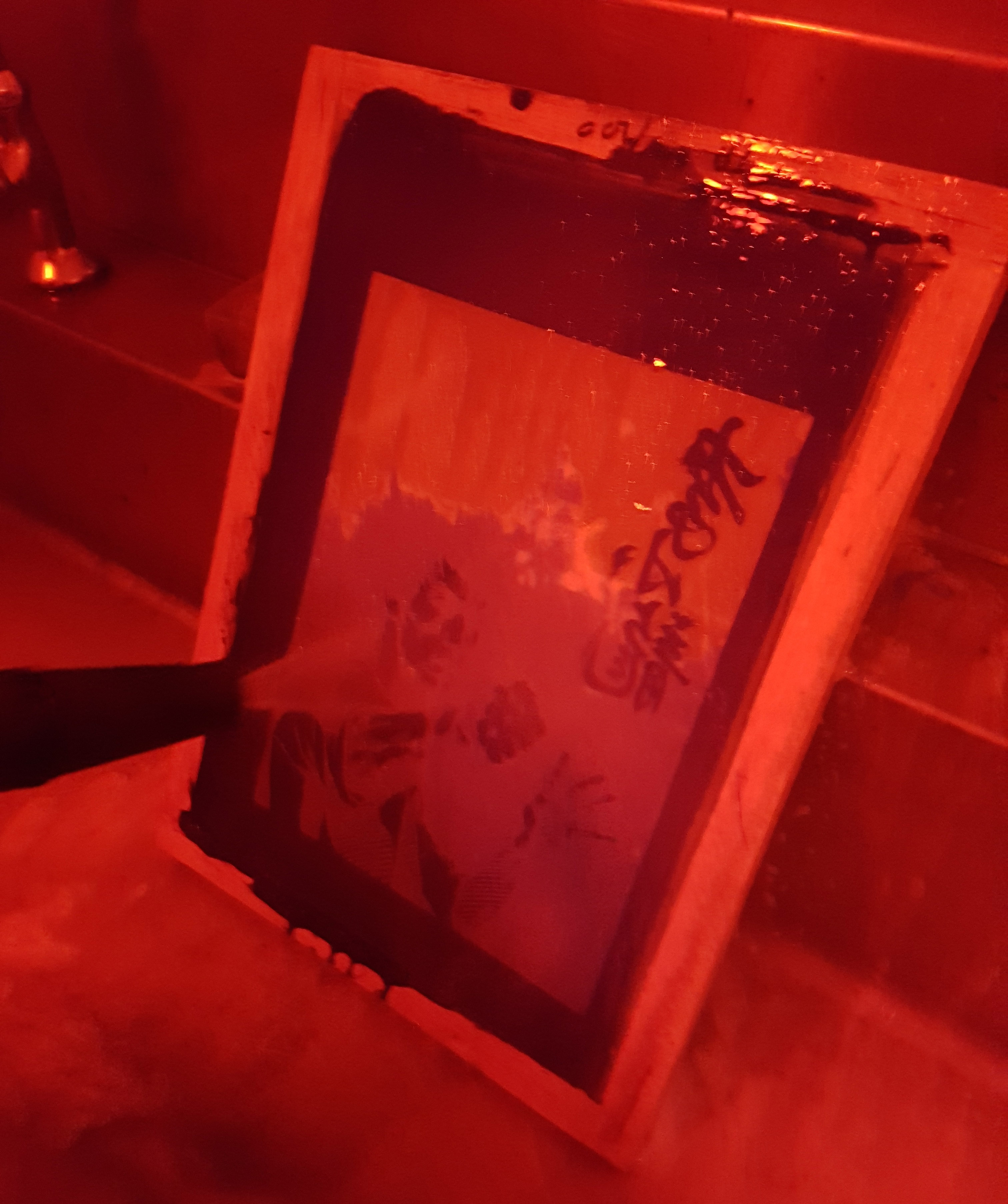
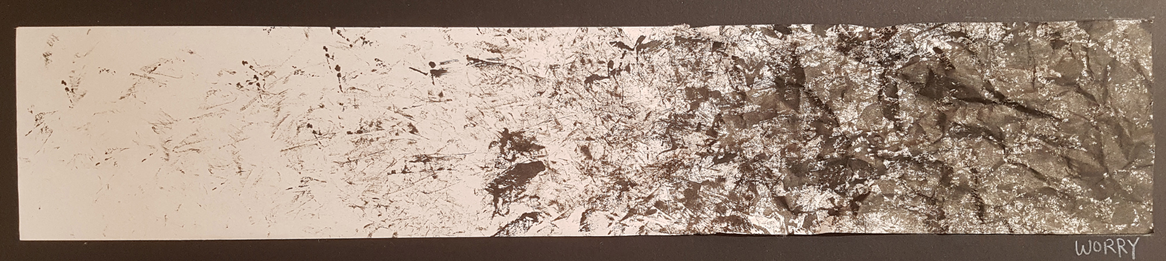
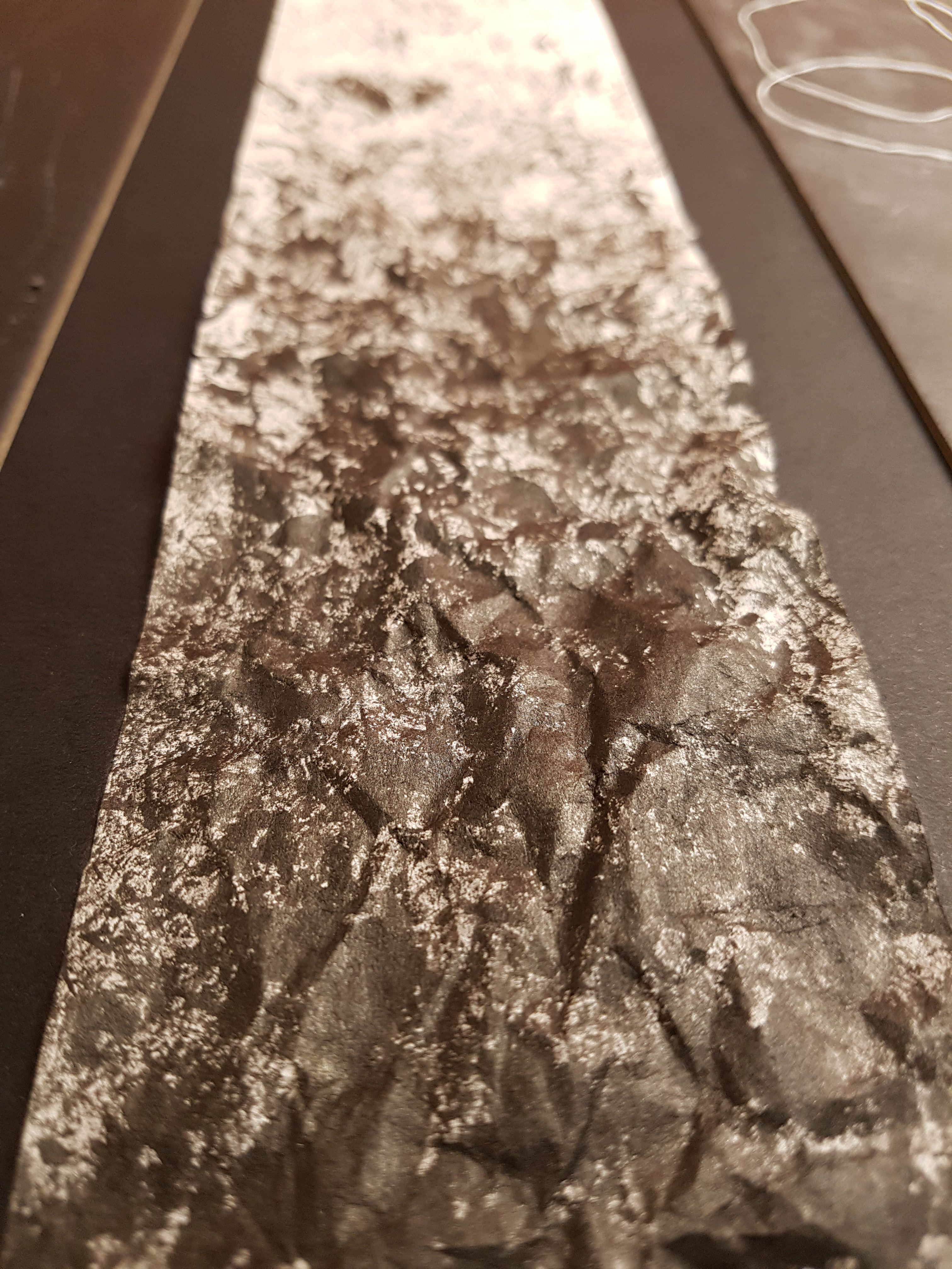
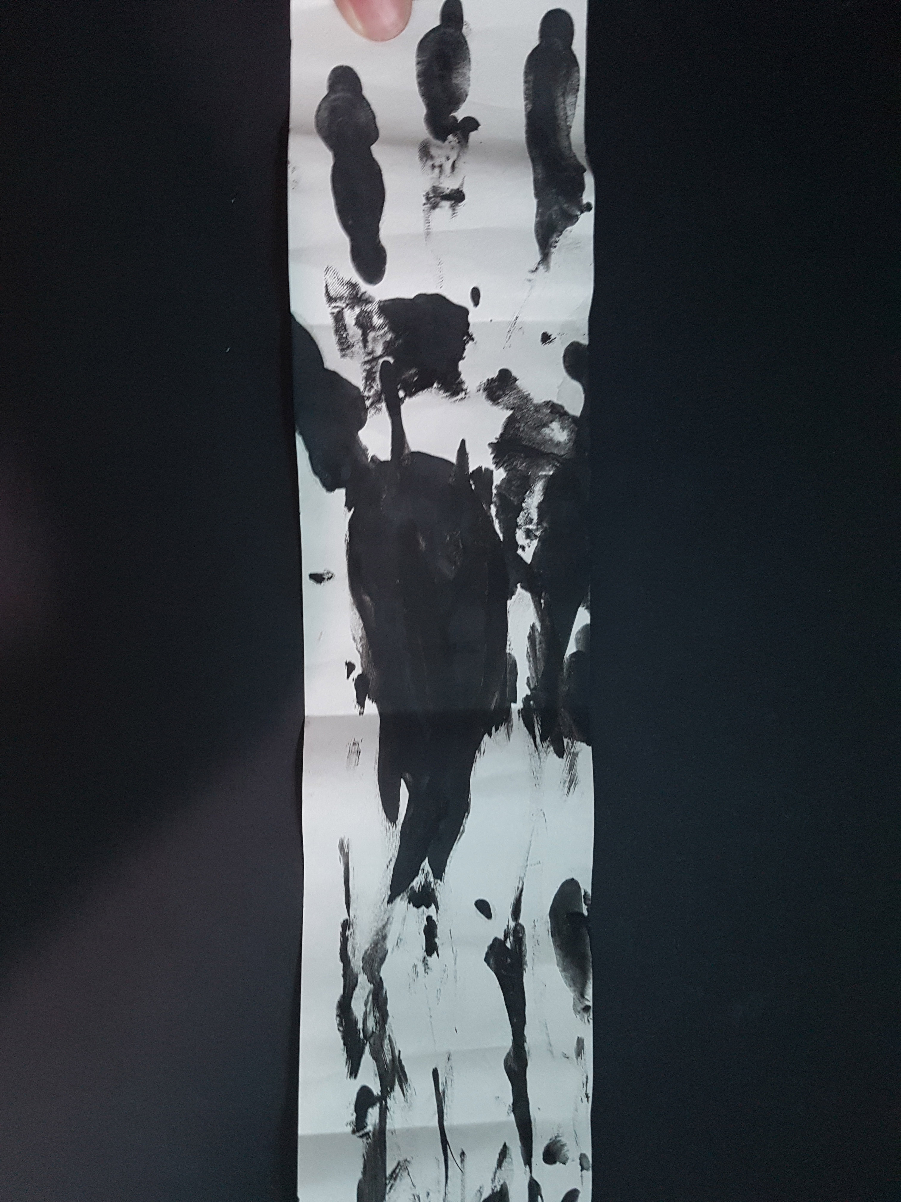
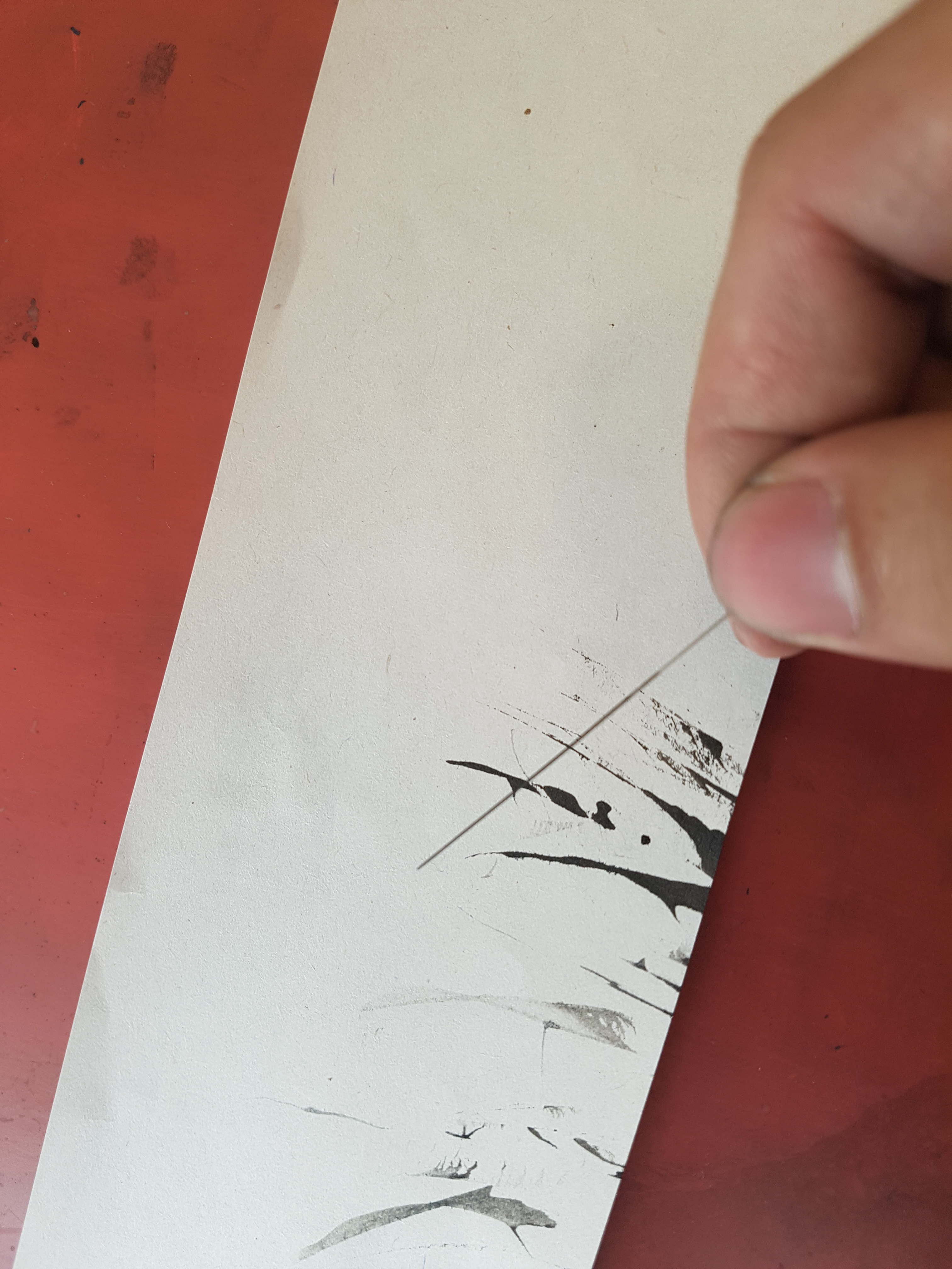
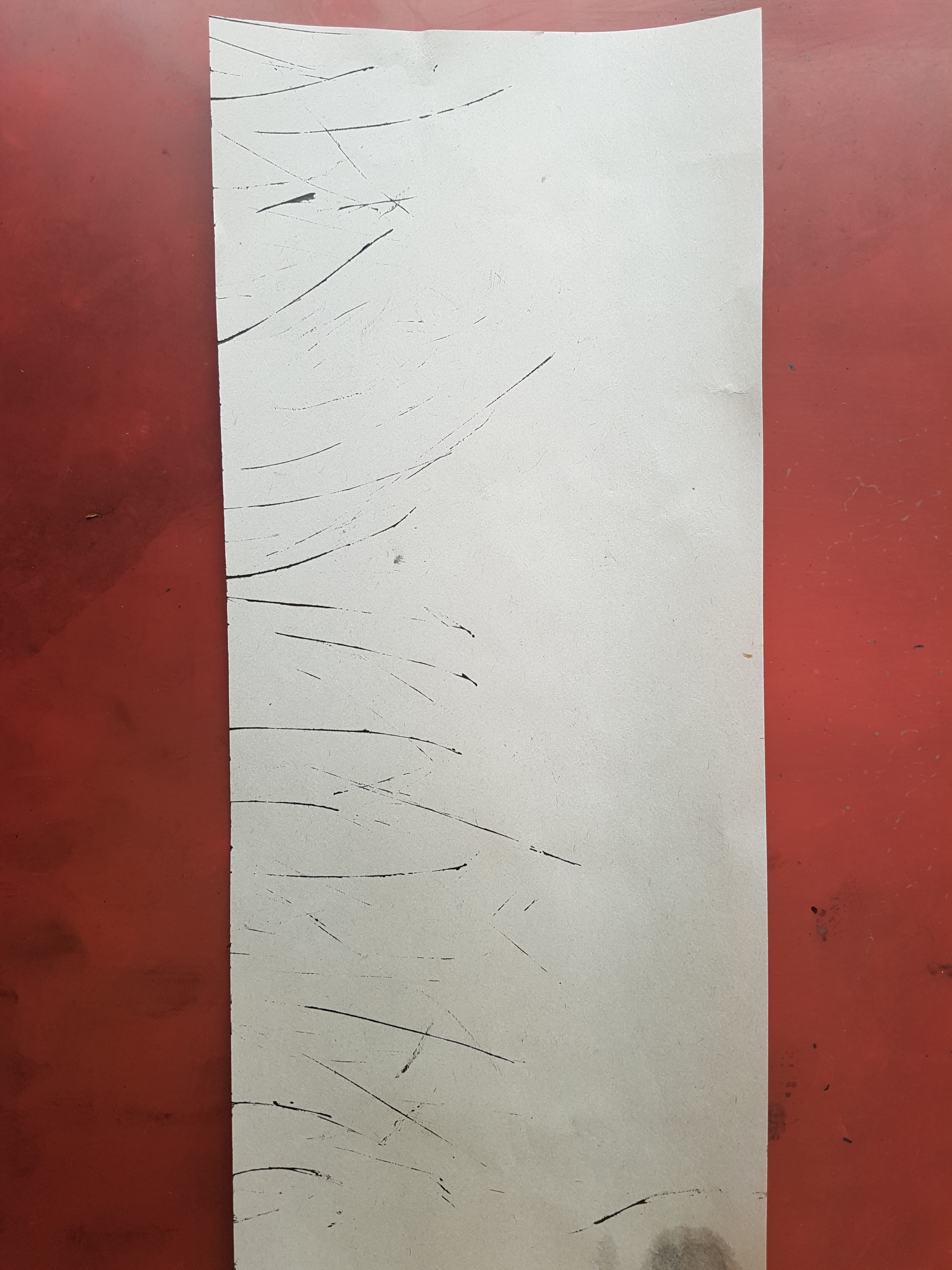
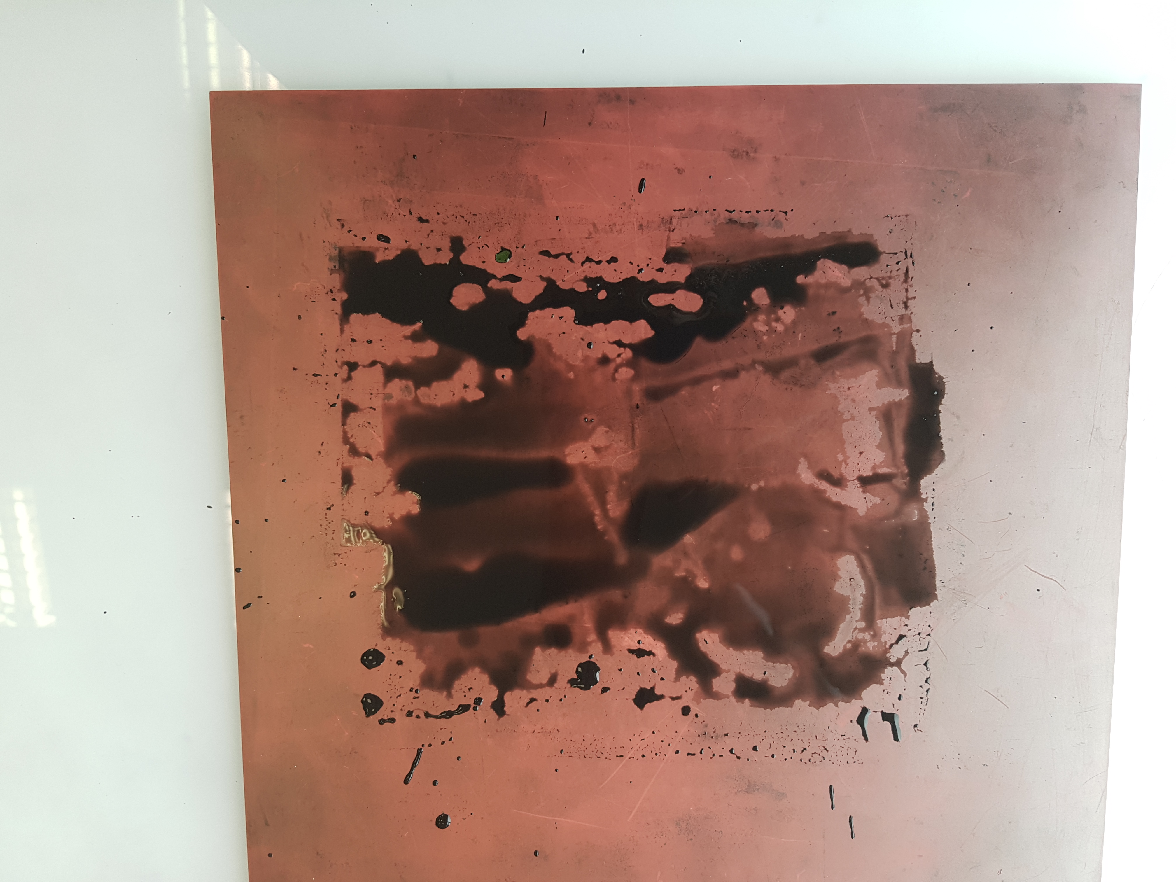
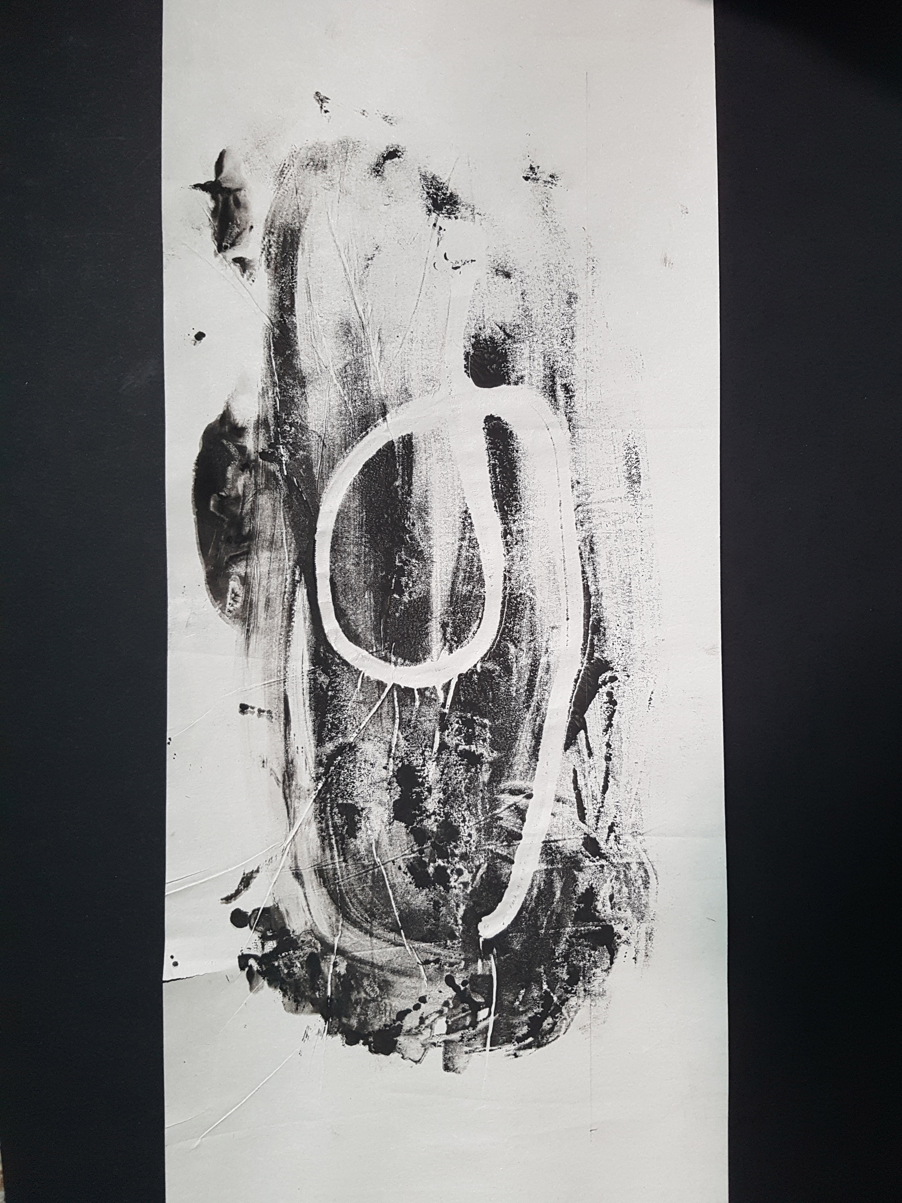
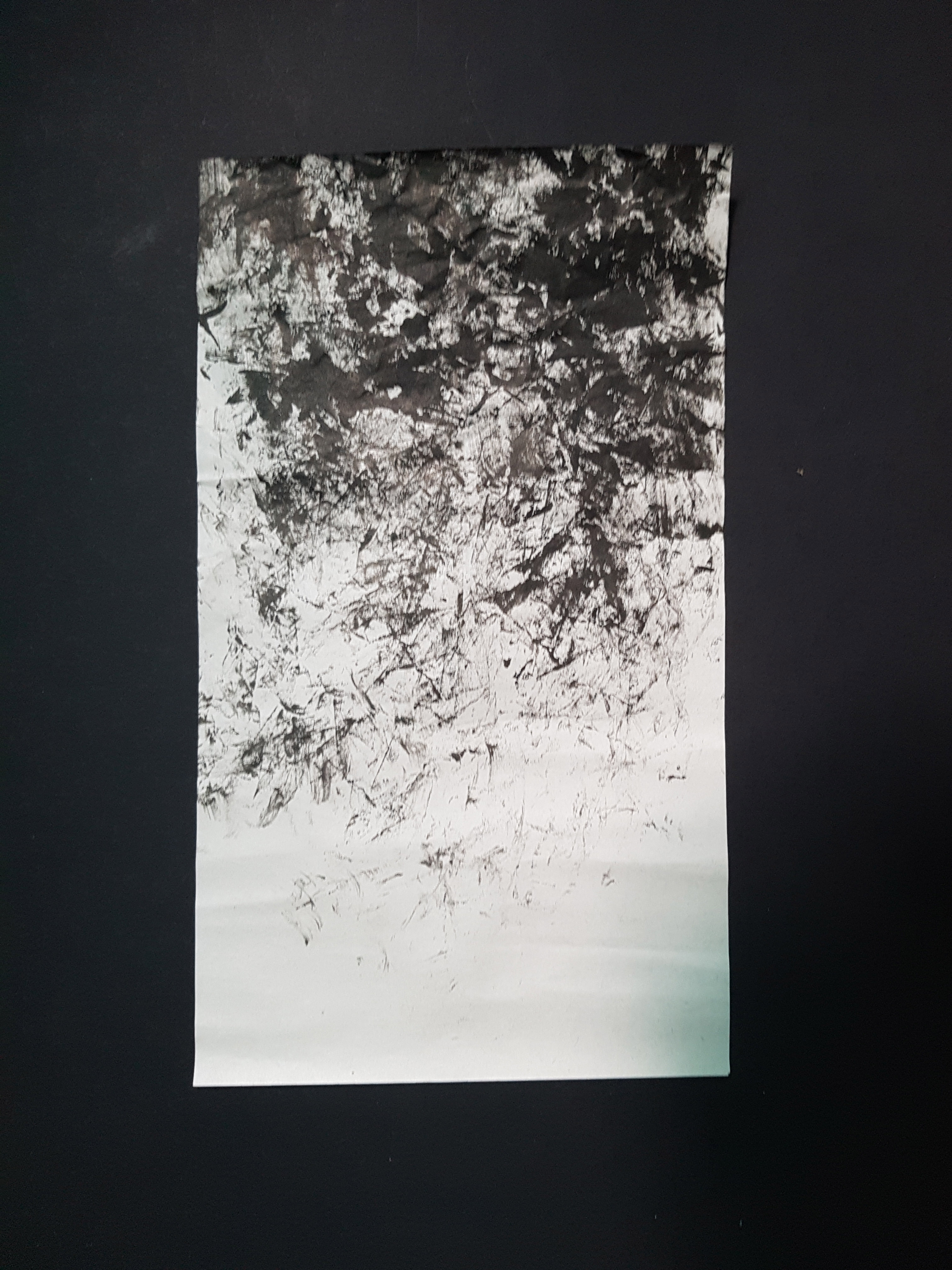
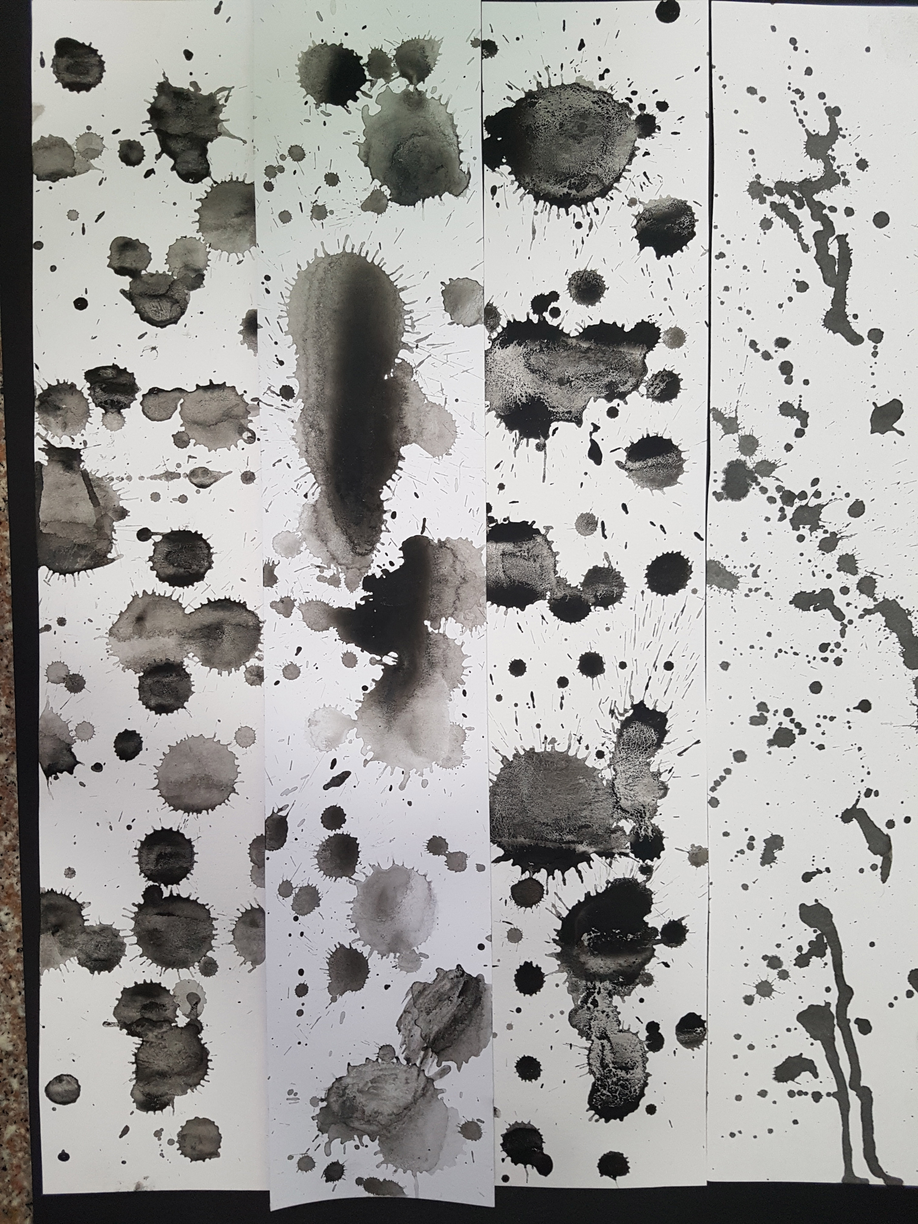
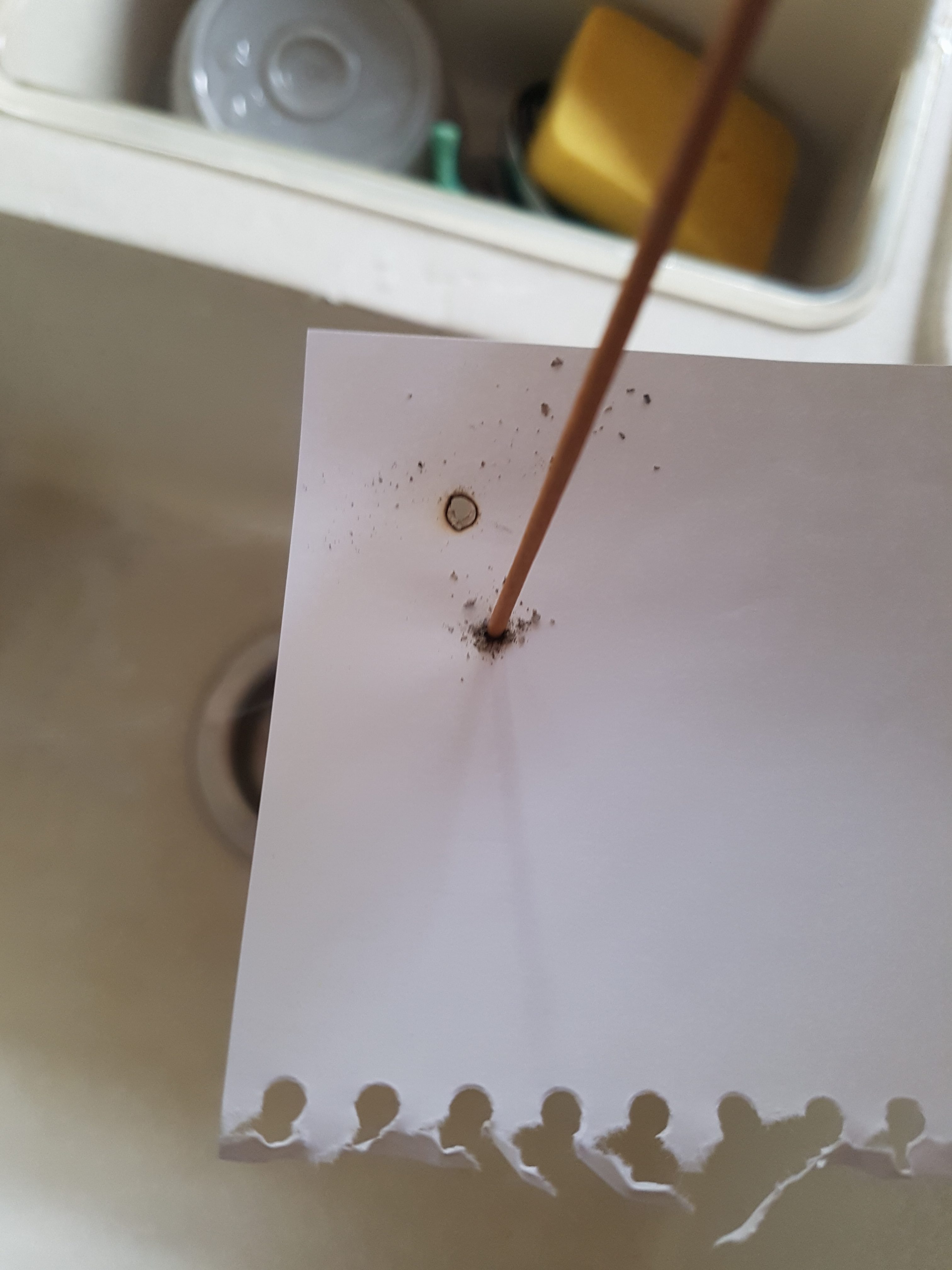
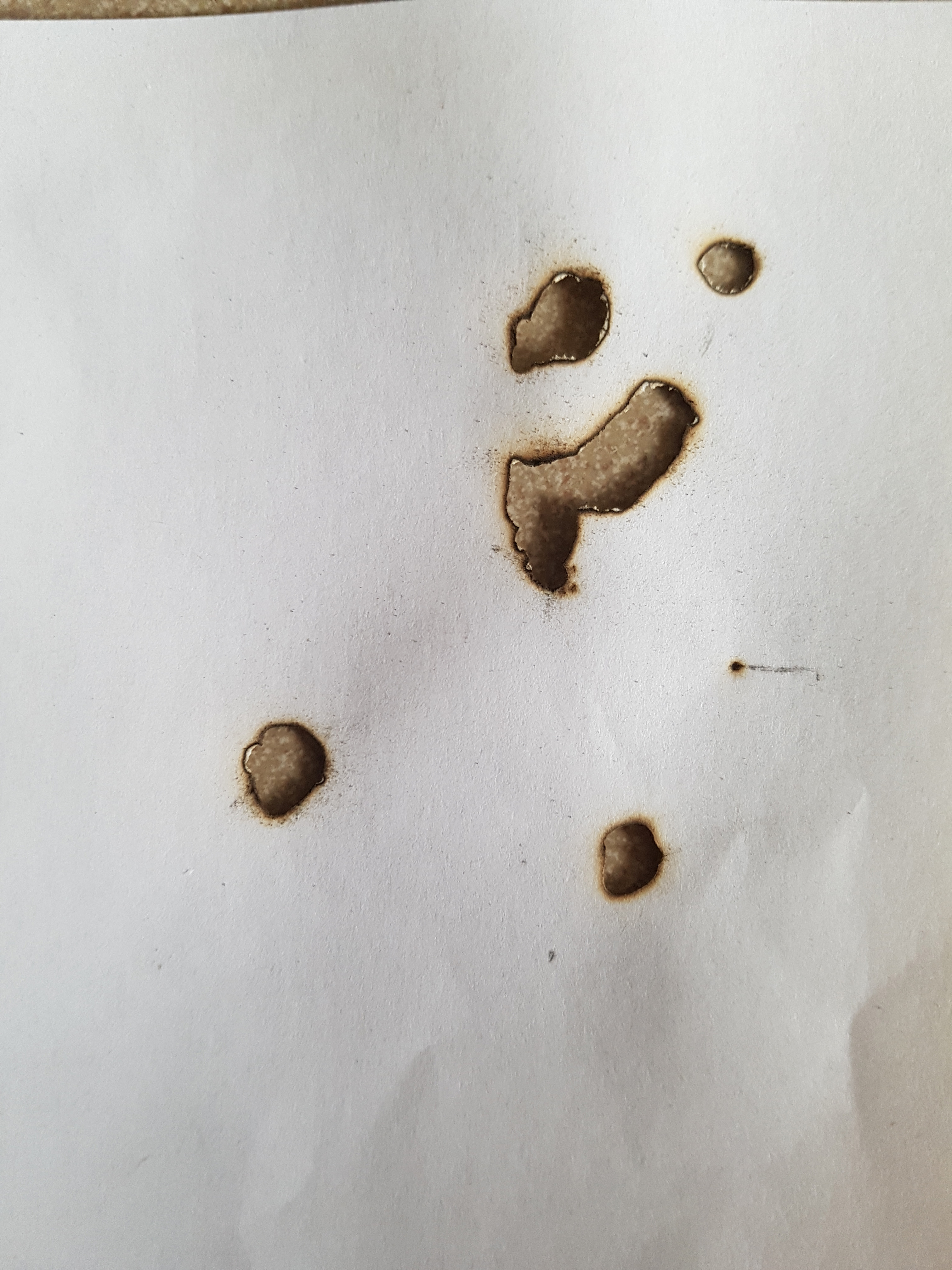
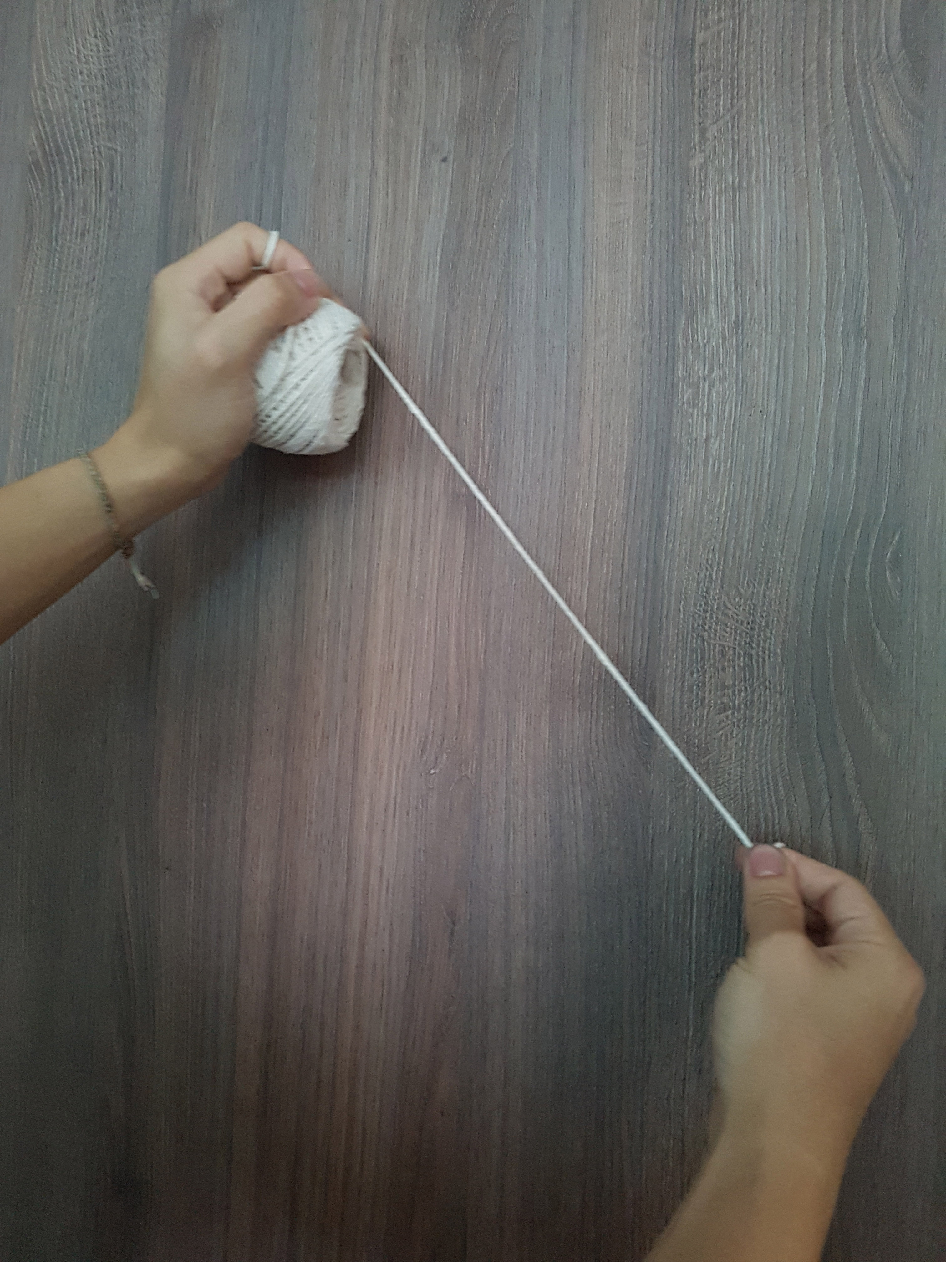
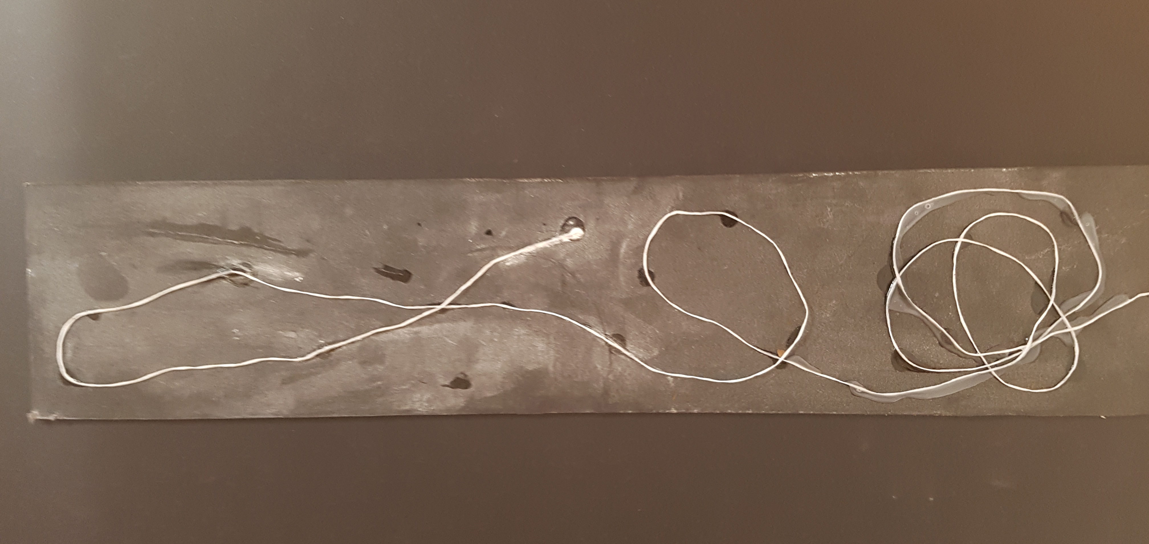
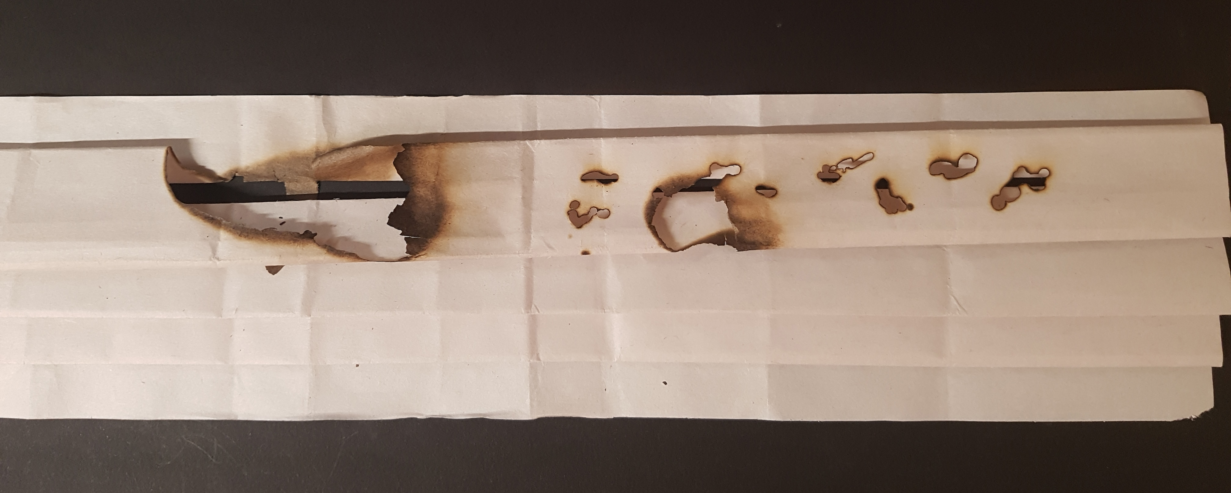
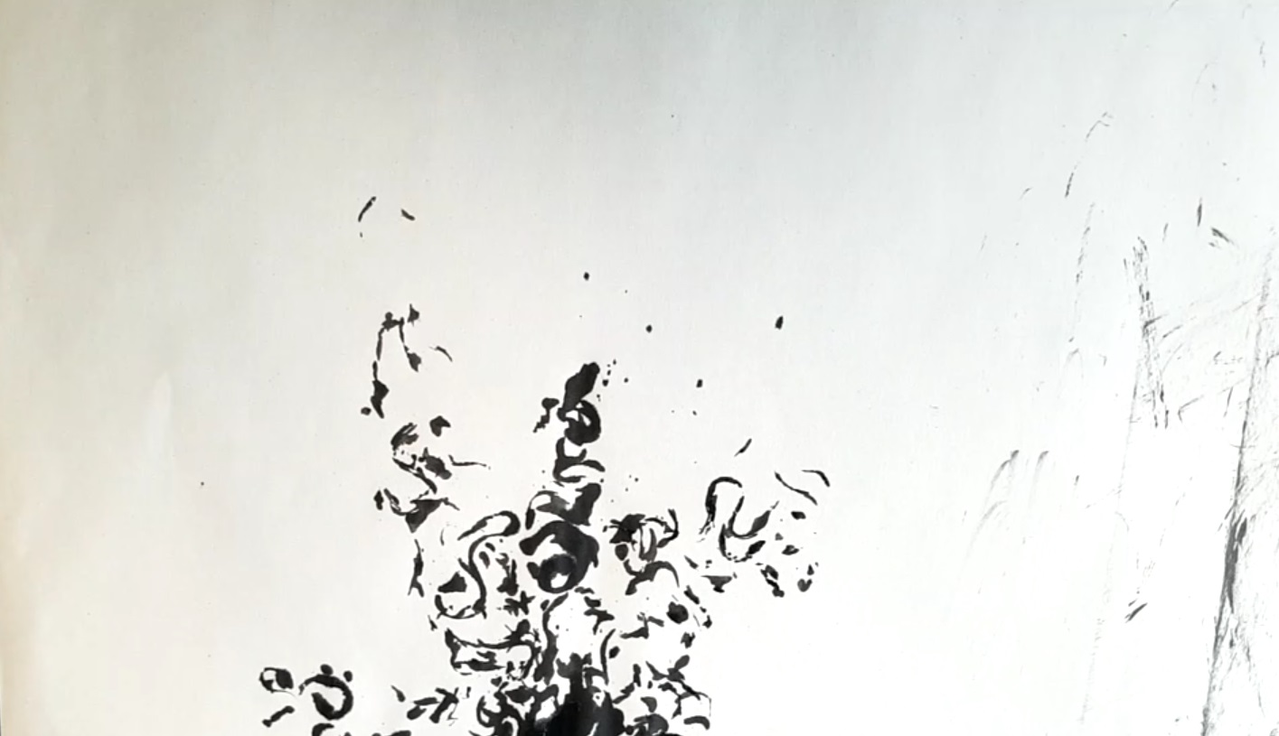
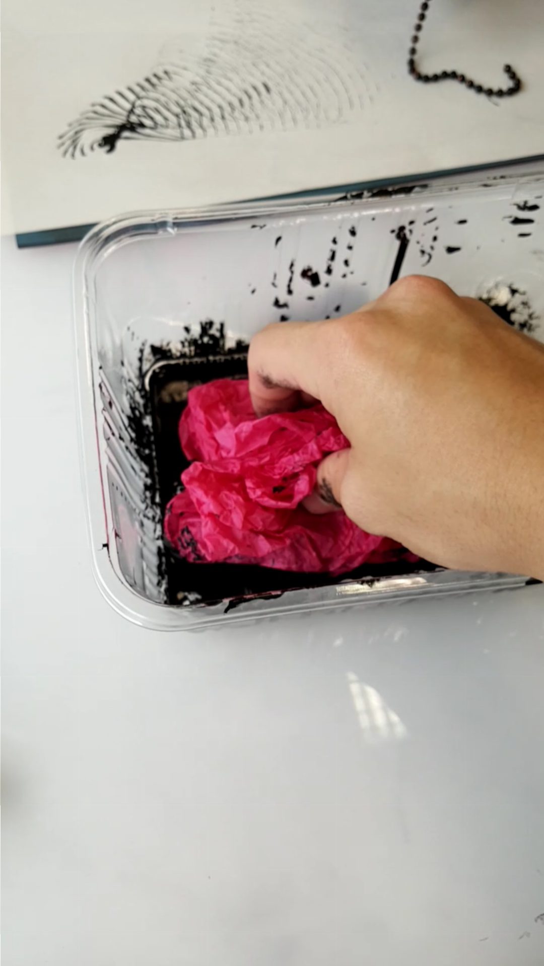
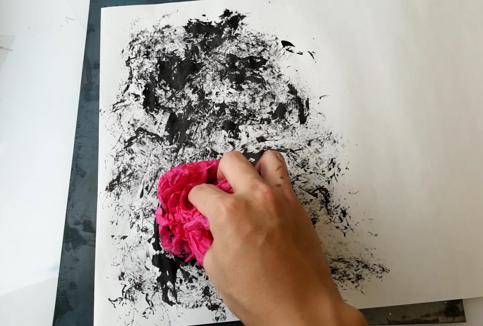
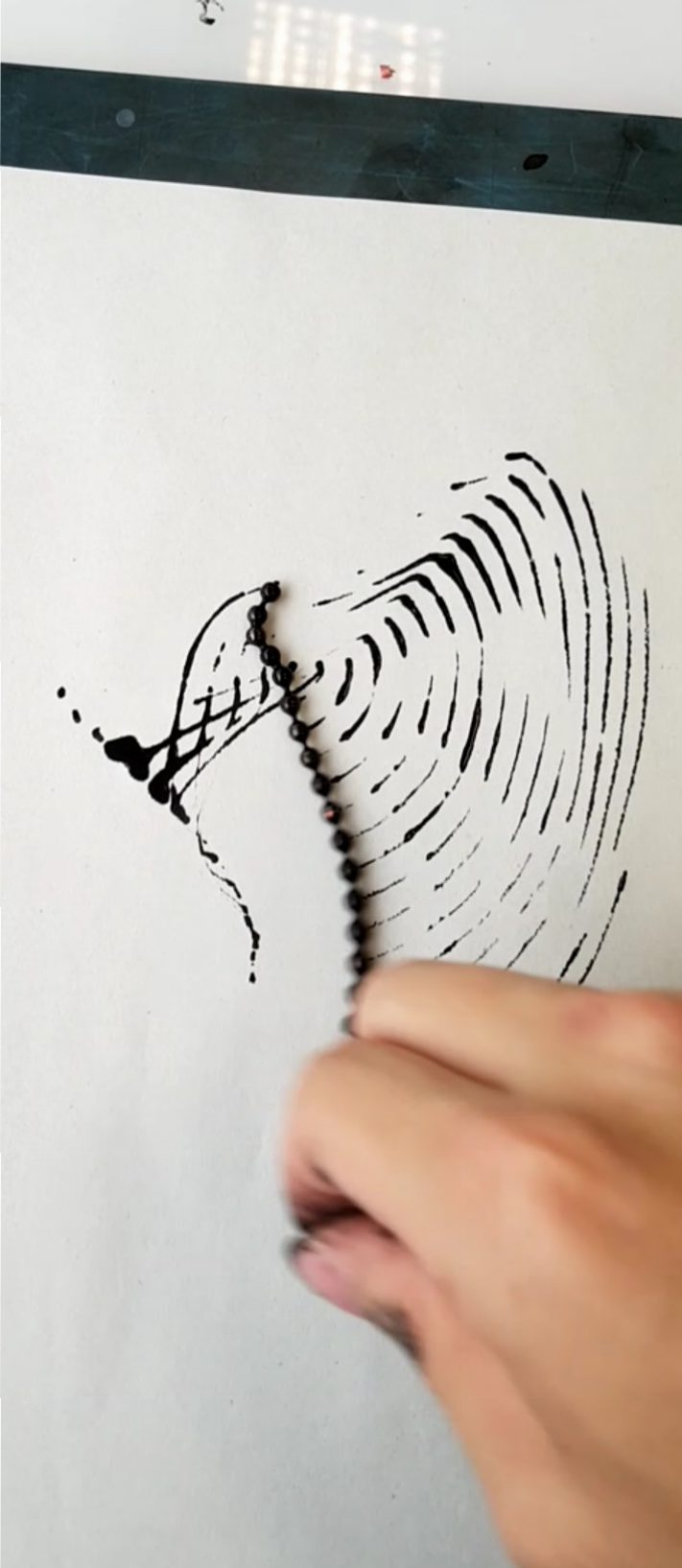
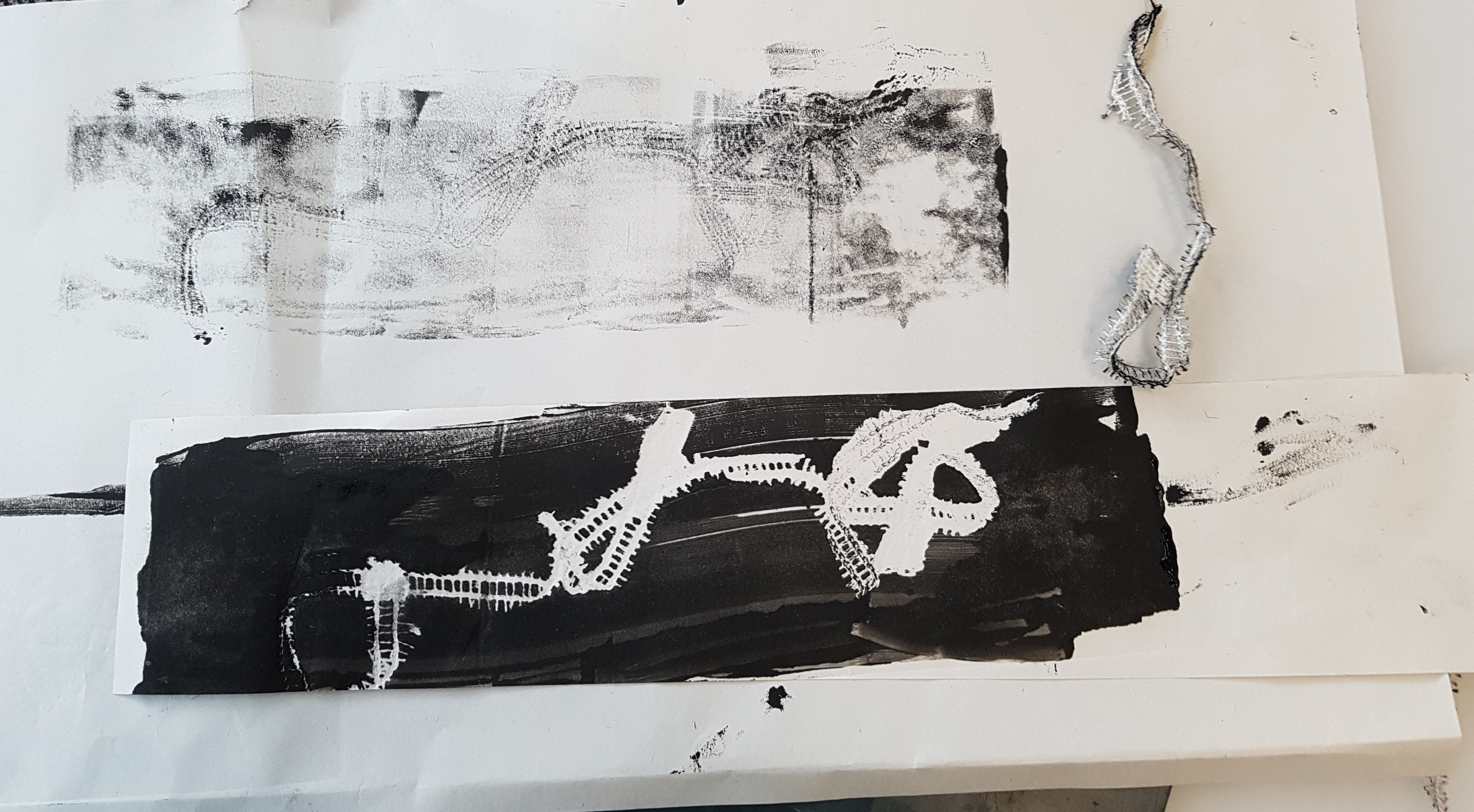
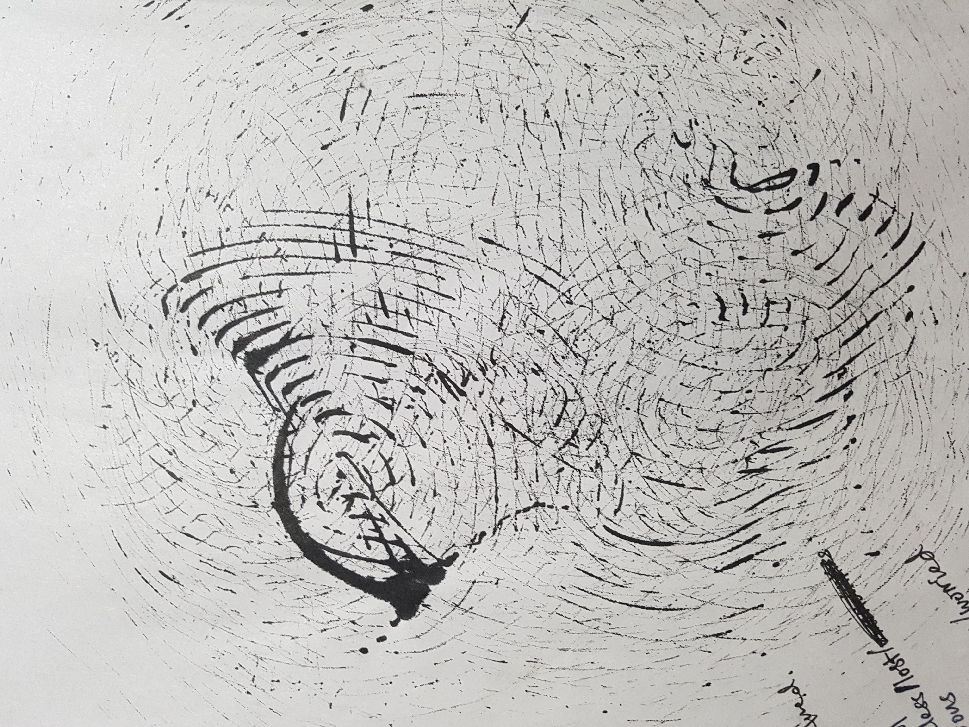
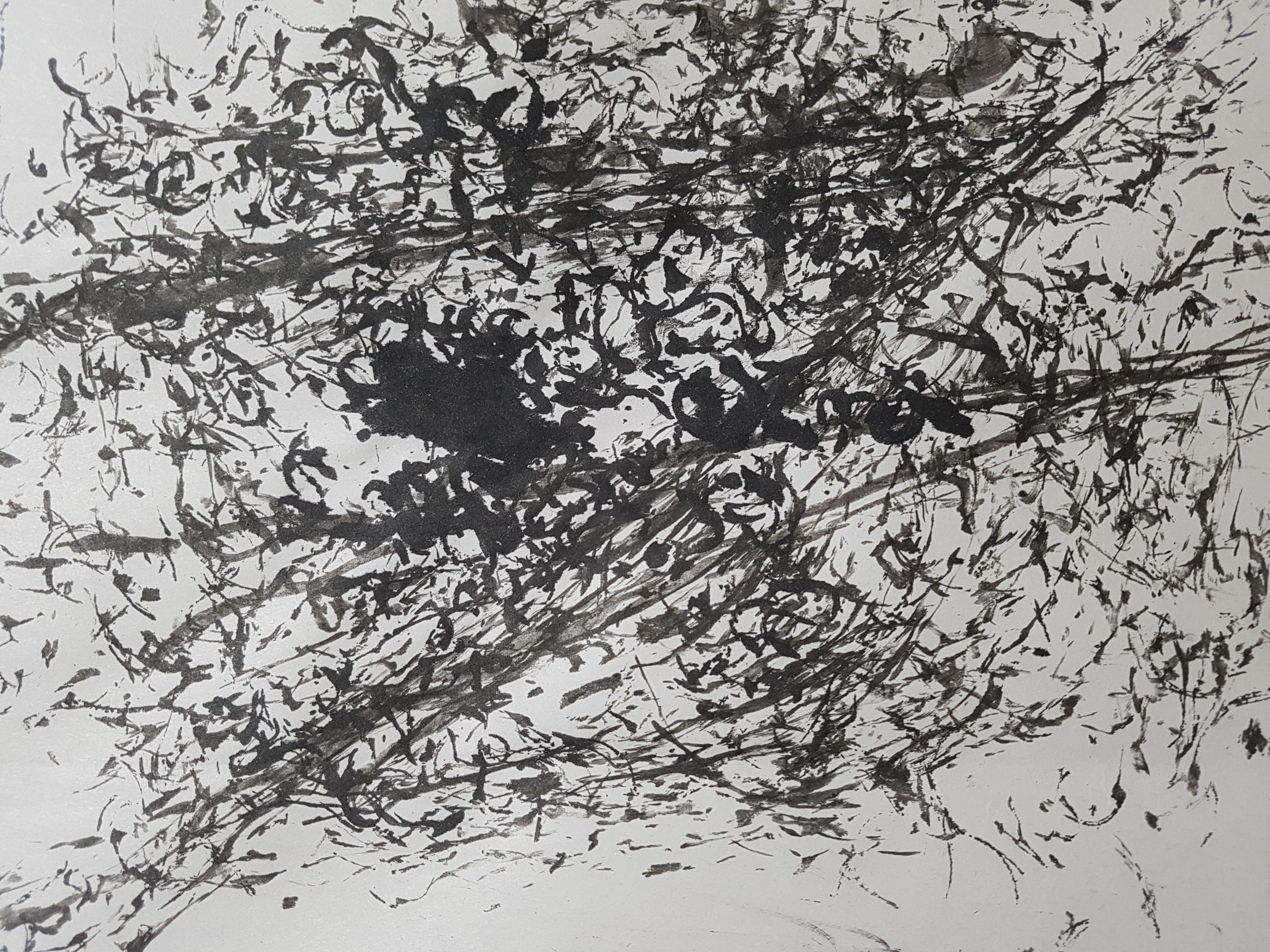
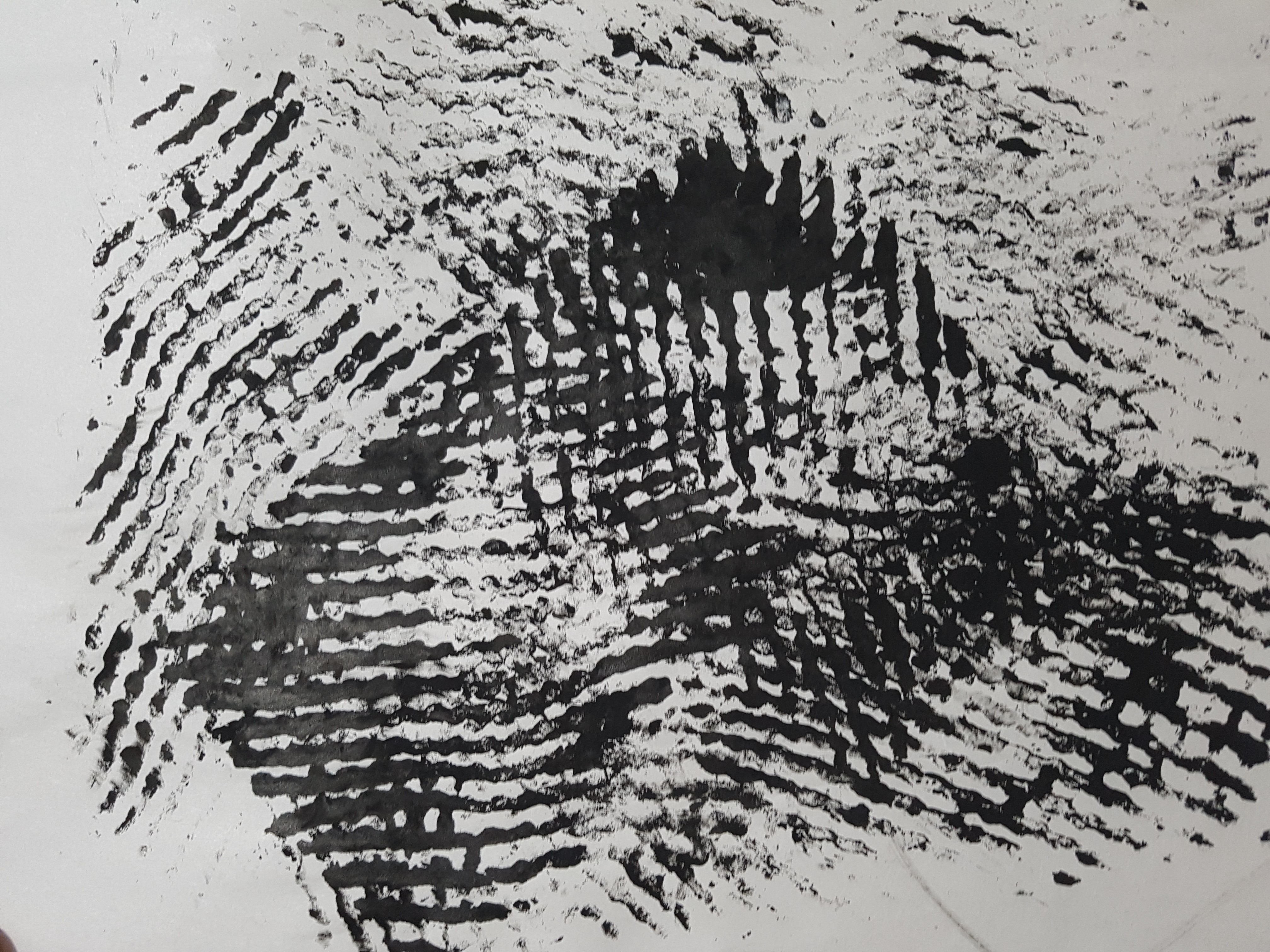
I thought it would be interesting to twist the toilet paper to create more sophisticated patterns. However it was a complete disaster as the toilet paper got stuck with the roller as I rolled over it. Worst thing was that the ink turned the toilet paper into a soggy mess. Failed experimentation.


Noodles:


Initially when I first saw the Syam bringing in the noodle I was literally laughing about using noodle as a mark making tool as I thought my garlic bread was already outrageous. However, when I started to experiment with it, I was surprised by the beautiful patterns it created on the paper. By dragging the noodle across the surface, you can create long wave-like lines and by dabbing it on the surface, you can create short curvy patterns. Both of which looks really amazing.


Crushed paper:


One of my favorite tool that I experimented on was crushed paper. It created a messy yet interesting pattern and when the patterns overlap each other it did not look too overwhelming. Might be using this for my project 1.


Chain with metal beads:

Another interesting mark making design was produced by a chain that has tiny metal beads attached on it. I dipped it in ink and started spinning it on the surface. It created symmetrical circular patterns that reminded me of the growth rings of trees or space galaxies. Besides spinning, you can also drag it across the surface created layers of wavy patterns that are spaced consistently from one another. Great tool!


Dish washing scrub:

The scrub when dipped with black ink looks like a sea urchin. The spiky scrub created a rough looking texture on the surface. Maybe this tool can be used for emotions representing anger. However this tool is tricky to use as you have to apply the correct pressure when sliding it across the surface – when too much pressure is applied, too much ink will be produced.


Cut out sponge/foam:
Another cool tool was a cut out sponge/foam that has a flower shape to it. The holes from the sponge/foam created small dots of different tone when pressed against the surface. I also tried to spin the tool creating swirly circular patterns that looks like the stars in the painting “The Starry Night”.

https://www.google.com.sg/url?sa=i&rct=j&q=&esrc=s&source=images&cd=&cad=rja&uact=8&ved=0ahUKEwjG7IuN4vTVAhWKRY8KHTWlCjwQjRwIBw&url=https%3A%2F%2Fen.wikipedia.org%2Fwiki%2FThe_Starry_Night&psig=AFQjCNHgY1x1KU4ICL-19eTi8gRi0oo_Xw&ust=1503832322333301


Mono-printing:

 I also tried to do mark marking using the mono printing technique. I think this technique is cool for tools that have really interesting patterns.


Other cool experiments:

Socks + Rubbing:

Paint brush + Random Stroke: 


Fruit Wrap + Punching: Look like Criss Cut (Waffle) Fries

End Results:

Dish washing scrub

Chain with metal beads

Cut out sponge/foam
NoodlesFruit Wrap

Paint Brush

Garlic Bread

Sock


Mark Making (Research)

Research (2)

Other Mark Making techniques:

Paint on Canvas:

Jackson Pollock was an art painter who is known for his mark making technique of splashing paints onto canvases to create abstract artwork to express his emotions. He splashes the canvases with strokes of different thickness and colours to convey his ideas and emotions.

https://www.google.com.sg/url?sa=i&rct=j&q=&esrc=s&source=images&cd=&cad=rja&uact=8&ved=0ahUKEwiI96TLpuHVAhVEro8KHTNCCU8QjRwIBw&url=https%3A%2F%2Fwww.jackson-pollock.org%2F&psig=AFQjCNHV2t5KvhYHAbR3hKQ67hDqnQOjCA&ust=1503162957707287

Vomit dyed milk on Canvas: 

Millie Brown is a female artist who stepped up from the traditional art technique and invented her own unique style of mark-making. Instead of splashing paints like Jackson Pollock, Millie Brown drinks dyed milk and regurgitates out the milk onto the canvas creating abstract patterns. She VOMITS out the milk!!!! YUCKS!!!

https://www.google.com.sg/url?sa=i&rct=j&q=&esrc=s&source=images&cd=&cad=rja&uact=8&ved=0ahUKEwjy09PAqeHVAhUQTo8KHVGTDccQjRwIBw&url=http%3A%2F%2Fwww.ripleys.com%2Fweird-news%2Fmillie-brown-vomit-artist%2F&psig=AFQjCNH6s3W0BneJdSRXYeHNETmGQpCP-g&ust=1503164292816639
https://www.google.com.sg/url?sa=i&rct=j&q=&esrc=s&source=images&cd=&cad=rja&uact=8&ved=0ahUKEwjK_rzUqeHVAhUMqI8KHTqmB1oQjRwIBw&url=http%3A%2F%2Fwww.dailymail.co.uk%2Ffemail%2Farticle-2549351%2FIts-like-cleanse-body-mind-Vomit-Painter-throws-canvas-create-Jackson-Pollock-style-splatter-paintings-Lady-Gaga-loves.html&psig=AFQjCNH6s3W0BneJdSRXYeHNETmGQpCP-g&ust=1503164292816639


Mono Printing:

Mono printing is a process whereby inks and patterns are pressed onto a paper. Any materials can be used with different coloured inks to create interesting and intricate designs.

https://www.google.com.sg/url?sa=i&rct=j&q=&esrc=s&source=images&cd=&cad=rja&uact=8&ved=0ahUKEwj84_XnreHVAhUEto8KHfPFD28QjRwIBw&url=http%3A%2F%2Fhuggerboo.typepad.com%2Fhugger-boo%2F2009%2F09%2Ftutorial-leaf-monoprinting-for-kids-3.html&psig=AFQjCNGHxZZCimkrX5xnIuqXvuXE2roWeg&ust=1503165451072937

Sunburning/Tanning:

During my hall camp, my seniors used henna and wrote words on my arm. I had a sunburn and became tanned and found that the words from the henna are now etched on my skin. Hence I got an idea and thought of the weirdest idea of mark-making which is tanning. While Sun bathing, individuals can cover their bodies with patterns to create the art. I call it the sunburn art.

https://www.google.com.sg/url?sa=i&rct=j&q=&esrc=s&source=images&cd=&cad=rja&uact=8&ved=0ahUKEwjXqbW7r-HVAhUCTI8KHezHAkcQjRwIBw&url=http%3A%2F%2Fwww.notizie.it%2Ftag%2Ftatuaggio%2F&psig=AFQjCNEWyrz4fZHrJl9t67acvNiCy9qTsg&ust=1503165884201158

Mark-making has no right or wrongs, it is all about expressing yourself, your thoughts and emotions.


Mark Making (Research)

Research 

Mark making is a term used to describe the different lines, patterns, and textures we create ​in a piece of art. Mark making is used as a form of self-expression where individuals convey their feelings, emotions and ideas.Mark making can be done in any surfaces using a variety of mediums such as pencils, charcoal, paint and can also be done using a variety of techniques.

Drawings in pencils:

https://www.google.com.sg/url?sa=i&rct=j&q=&esrc=s&source=images&cd=&cad=rja&uact=8&ved=0ahUKEwicgO6V3eDVAhXEsY8KHVJYAaMQjRwIBw&url=https%3A%2F%2Fwww.pinterest.com%2Fexplore%2Fmark-making%2F&psig=AFQjCNGIhIDxkQ7Ci4o1RT6v5yu3RTIwXg&ust=1503143803684363

Monoprinting on canvas: 

https://www.google.com.sg/url?sa=i&rct=j&q=&esrc=s&source=images&cd=&cad=rja&uact=8&ved=0ahUKEwihgpj_3uDVAhVIrI8KHcwYCCkQjRwIBw&url=http%3A%2F%2Fblog.milliande.com%2F2013%2F06%2Fmonoprinting-on-fabric-capi-textiles.html&psig=AFQjCNEEQVTX9wtMB3Z_CscTPv3NK1TU-g&ust=1503144291117449

Mark making can even dated back to the 1800s. Vincent Van Gogh was an artist during the 19th century and is best known as the artist who painted the famous ““The Starry Night”.

https://www.google.com.sg/url?sa=i&rct=j&q=&esrc=s&source=images&cd=&ved=0ahUKEwil1q_44uDVAhXBrI8KHSuYACUQjRwIBw&url=https%3A%2F%2Fen.wikipedia.org%2Fwiki%2FThe_Starry_Night&psig=AFQjCNGl8Ju5EHg0y7x24nTQnja6yn4Eeg&ust=1503145351266387

He is best known for applying bold, dramatic brush strokes which expressed emotion and added a feeling of movement to his works. This can be seen in his reed-pen drawing of his artwork ” Wheat Field With Cypresses”.

https://upload.wikimedia.org/wikipedia/commons/thumb/b/b7/Van_Gogh_-_Weizenfeld_mit_Zypressen2.jpeg/1024px-Van_Gogh_-_Weizenfeld_mit_Zypressen2.jpeg
https://www.google.com.sg/url?sa=i&rct=j&q=&esrc=s&source=images&cd=&cad=rja&uact=8&ved=0ahUKEwjOvPKb5uDVAhXLKY8KHcz7C5EQjRwIBw&url=http%3A%2F%2Fwww.billdamon.com%2Fvan-goghs-classic-a-wheat-field-with-cypresses%2F&psig=AFQjCNFiRarXnWPZeJUe1LNTfHvCI7lgwA&ust=1503146233150645

The bold and heavy strokes can be seen applied to the wheat and the trees while soft swirls are applied on the clouds before painting. Through the artwork, Van Gogh expresses his deeply felt spiritual beliefs, appreciation of manual laborers and connection to nature.

Other Mark Making techniques:

Paint on Canvas:

Jackson Pollock was an art painter who is known for his mark making technique of splashing paints onto canvases to create abstract artwork to express his emotions. He splashes the canvases with strokes of different thickness and colours to convey his ideas and emotions.

https://www.google.com.sg/url?sa=i&rct=j&q=&esrc=s&source=images&cd=&cad=rja&uact=8&ved=0ahUKEwiI96TLpuHVAhVEro8KHTNCCU8QjRwIBw&url=https%3A%2F%2Fwww.jackson-pollock.org%2F&psig=AFQjCNHV2t5KvhYHAbR3hKQ67hDqnQOjCA&ust=1503162957707287

Vomit dyed milk on Canvas:

Millie Brown is a female artist who stepped up from the traditional art technique and invented her own unique style of mark-making. Instead of splashing paints like Jackson Pollock, Millie Brown drinks dyed milk and regurgitates out the milk onto the canvas creating abstract patterns. She VOMITS out the milk!!!! YUCKS!!!

https://www.google.com.sg/url?sa=i&rct=j&q=&esrc=s&source=images&cd=&cad=rja&uact=8&ved=0ahUKEwjy09PAqeHVAhUQTo8KHVGTDccQjRwIBw&url=http%3A%2F%2Fwww.ripleys.com%2Fweird-news%2Fmillie-brown-vomit-artist%2F&psig=AFQjCNH6s3W0BneJdSRXYeHNETmGQpCP-g&ust=1503164292816639
https://www.google.com.sg/url?sa=i&rct=j&q=&esrc=s&source=images&cd=&cad=rja&uact=8&ved=0ahUKEwjK_rzUqeHVAhUMqI8KHTqmB1oQjRwIBw&url=http%3A%2F%2Fwww.dailymail.co.uk%2Ffemail%2Farticle-2549351%2FIts-like-cleanse-body-mind-Vomit-Painter-throws-canvas-create-Jackson-Pollock-style-splatter-paintings-Lady-Gaga-loves.html&psig=AFQjCNH6s3W0BneJdSRXYeHNETmGQpCP-g&ust=1503164292816639


Mono Printing:

Mono printing is a process whereby inks and patterns are pressed onto a paper. Any materials can be used with different coloured inks to create interesting and intricate designs.

https://www.google.com.sg/url?sa=i&rct=j&q=&esrc=s&source=images&cd=&cad=rja&uact=8&ved=0ahUKEwj84_XnreHVAhUEto8KHfPFD28QjRwIBw&url=http%3A%2F%2Fhuggerboo.typepad.com%2Fhugger-boo%2F2009%2F09%2Ftutorial-leaf-monoprinting-for-kids-3.html&psig=AFQjCNGHxZZCimkrX5xnIuqXvuXE2roWeg&ust=1503165451072937

Sunburning/Tanning:

During my hall camp, my seniors used henna and wrote words on my arm. I had a sunburn and became tanned and found that the words from the henna are now etched on my skin. Hence I got an idea and thought of the weirdest idea of mark-making which is tanning. While Sun bathing, individuals can cover their bodies with patterns to create the art. I call it the sunburn art.

https://www.google.com.sg/url?sa=i&rct=j&q=&esrc=s&source=images&cd=&cad=rja&uact=8&ved=0ahUKEwjXqbW7r-HVAhUCTI8KHezHAkcQjRwIBw&url=http%3A%2F%2Fwww.notizie.it%2Ftag%2Ftatuaggio%2F&psig=AFQjCNEWyrz4fZHrJl9t67acvNiCy9qTsg&ust=1503165884201158

Bubble on paper:

http://parametricworld.tumblr.com/post/27690081583/wblut-ink-mixed-with-soapy-water-bubbles-dry

Interesting technique and very cool looking with circular shapes of different shades.

Rubber band monoprinting:

http://approachable-art.stfi.re/search/label/stamp%20tutorial?sf=lgkjpjp

Creating loops and circular shapes.

Mark-making has no right or wrongs, it is all about expressing yourself, your thoughts and emotions.