Episode 2
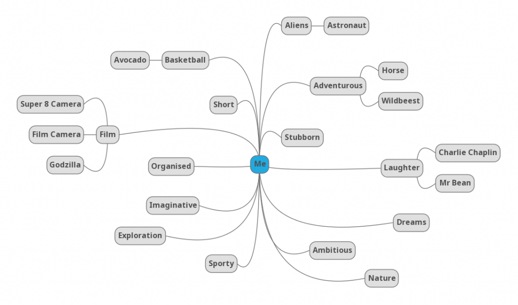
Based on the mindmap i did in the previous episode, I picked out 4 things that describe me.
- Alien/ My fascination with space and astronomy
- Aventurous/ Travelling/ Exploring
- Passion in film-making/ Imaginative
- Loves to laugh/ Spreading happiness
Sketches:
*These are just the initial planning of sketches. Changes of the sketches are made after consultation and personal exploration.
References
While looking through different ways of doing vintage surreal collage, I stumbled upon some very useful websites and videos that can help me with my work.
http://eugenia.queru.com/2012/10/29/how-to-do-modern-vintage-collage-digital/
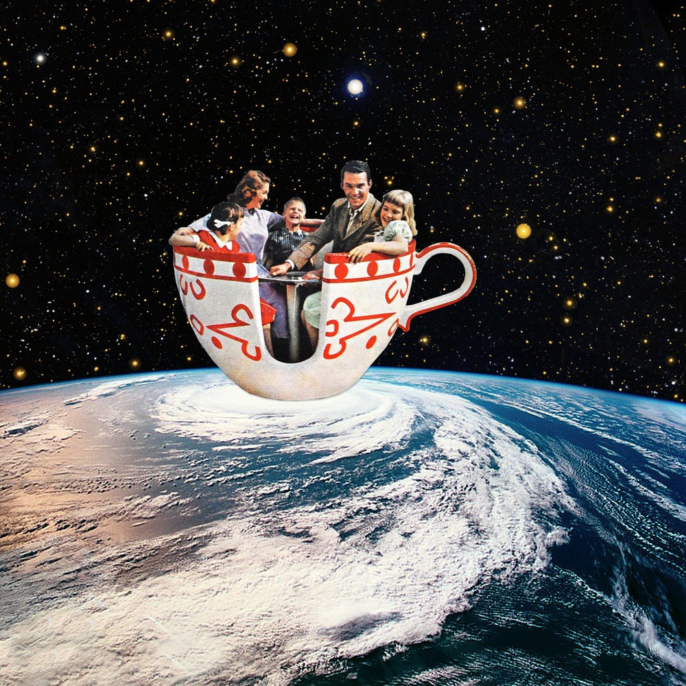
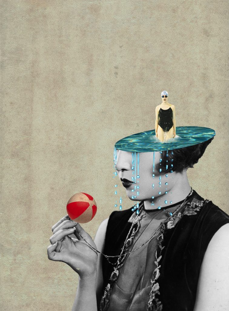
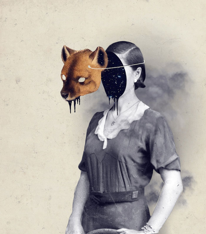
Eugenia Loli who is one of my reference artists has a website where she teaches people the basic steps of making these collages.
These are some tutorials I found on Youtube that helped me with my collage.
The best of the best websites I found were websites that contained a compiled list of high quality vintage images that we can download and use to create the collages.
https://www.flickr.com/groups/vintagemags/pool/page50
https://www.flickr.com/photos/eugenia_loli/favorites/page4
Final
Strip 1:
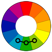
For the first panel, I picked out horse to represent me because horses travel far and wide, making adventures of their own. For me I want to be like a horse, being able to roam everywhere and seek my own adventures. I used analogous colours, blue, green and white to bring out the serenity and peaceful feeling when I make my own adventures.
The setting I have picked out is the iconic empire state building. Standing tall and high in New York City.
Because I am adventurous, instead of taking the lift up to the top of the building, I will run up the side of the wall of the building, seeking my form of thrills and adventure. I placed the white horse at the center and darken the other spaces so that the visual dominance and focus is placed on the horse itself.
Strip 2:
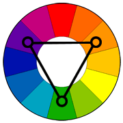
Even since I was young, I was always fascinated with space and astronomy stuff. Things like the galaxies and aliens always excites me and it was even my ambition to become an astronaut when I was young. For the first composition, I added space elements that I like and revolves these elements around the musuclar man (Me). For the colour wise, I played with the Triadic colour scheme by using blue, red, yellow and white. I really like the background because it contrast with the elements at the center making everything pop out. P.s. Inspired from the NASA Logo.
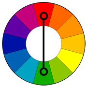
For this composition I played with complementary colours Green and Pink with a dark background. This combination helps to make the composition stand out. I chose a pink planet to show the fantasy and dreamy ideas.
Isn’t it cool to be able to go on a date in outer space??? The pink lake links back to the pink planet you see in the second composition of this strip. I tried playing with different backgrounds of different colours but in the end I chose this because it contrasts well with the pink lake and is pleasing to look at.
Strip 3:
I love making people laugh and spreading happiness makes myself happy. To represent this side of me, I think the best way to show it is to bring in the iconic character, MR BEAN!!! Sunflowers are used to represent cheerfulness. I use the combination of yellow sunflowers and red background to further emphasize the liveliness and joy in me.
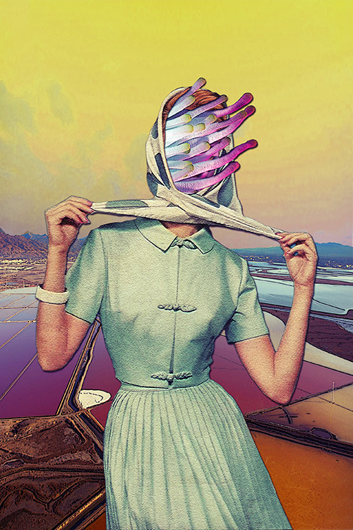
My initial idea for this was to show a setting of a cemetery, but because the style I was going for was surrealist collage style, I was stuck for awhile for this portion because i do not know how to show the cemetery settings. I decided to change it up abit and reference Julia Geiser’s collage style and decided to try the “head manipulation technique”. I cut the frankenstein head into half and added famous dead people that we all know of. Besides, I used monochromatic colour scheme of black, grey and white to give it a dead and dull look.
For the third composition I also used the same technique of collage. In this composition, all the dead comes back to life as shown in the change from monotone to colours. The dead appears to come out of my head which is filled with Sunflowers. And as they come back to life, they began to dance with joy. I use a neutral pastel background so that it does not overpower the focus on Mr Bean’s head.
Strip 4:
I have a strong passion in film and I am quite an imaginative person (humble) and I always tend to try to think outside of the box and do something different. Hence I came out with a simple composition of a man and a camera on my head to represent the imaginative side of me when I look through the lens of a camera.
And as I walk through a boring while looking through the lens of my camera,my imagination begins to run wild as I turn the boring city into something interesting by seeing a Godzilla tearing the city apart. The third composition is the extension of the second composition as the view pans upward. I tried playing with negative spaces by outlining the shape of the Godzilla with different buildings. I used the analogous colour scheme of Yellow, green and light green for all 3 compositions for this strip. By keeping it consistent it also help me better to tell a linear narration. i purposely chose a combination of lighter colours as the darker colours looked too harsh and was unable to bring out the Godzilla shape that I wanted.
Reflection
This project got me quite stressed initially because I was unsure of which styles or techniques to approach because I was not confident of doing any of them. Besides when I was doing my first strip, I got frustrated with myself because I spent hours and hours on the single strip but was unable to get what I wanted. And also, it was really annoying because it was really hard for me to look for pictures that fit perfectly and the pictures that had the right colours in them. However, as I slowly progress, I started to get the hang of doing as I begin to do it with the mentality of “just try & learn”. I definitely learnt a lot more skills on photoshop and was even better than I was 13 weeks ago. 2D really made me see everything differently now as the design elements ideas constantly get stuck in my head wherever I go.


