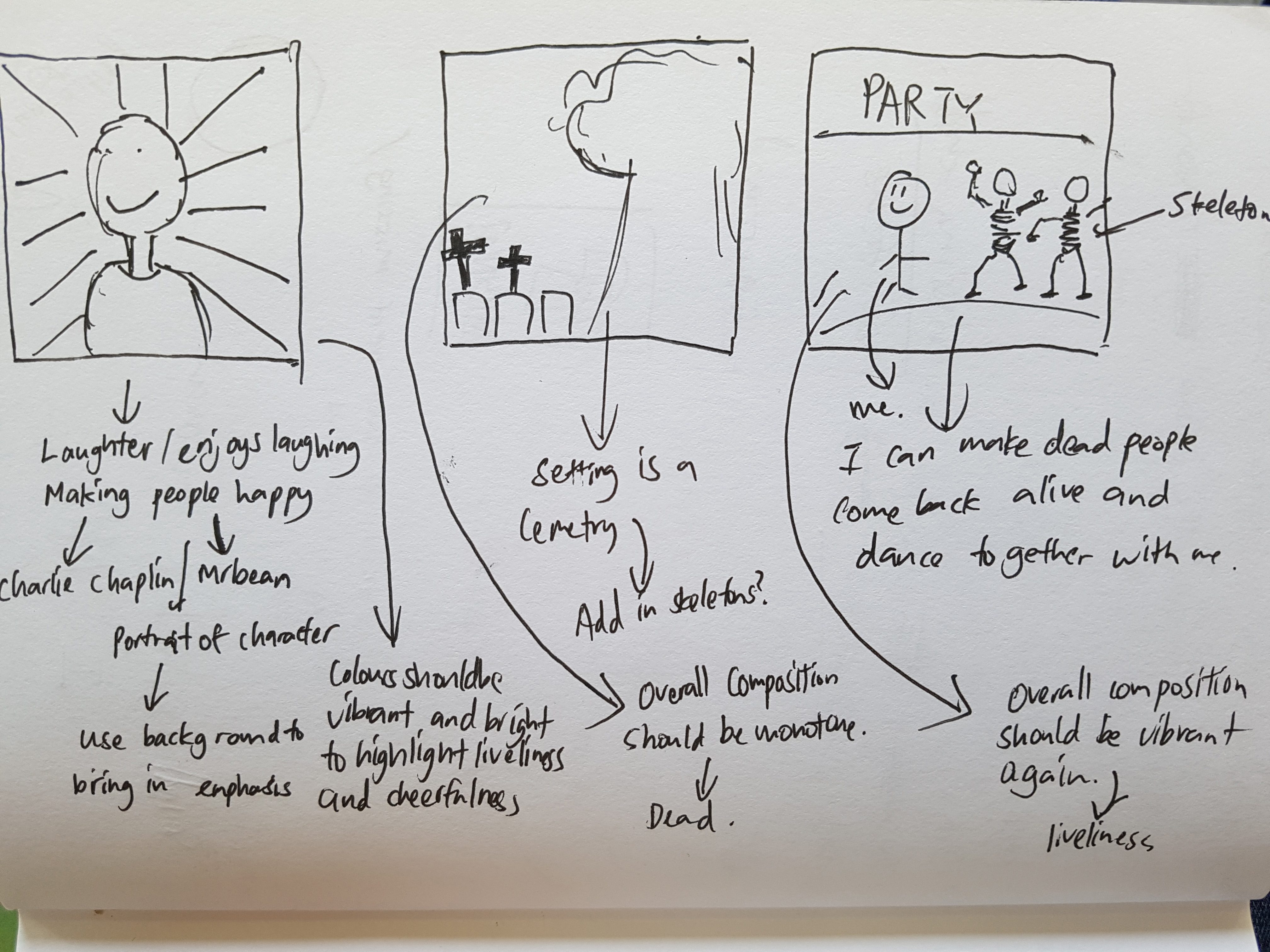
Based on the mindmap i did in the previous episode, I picked out 4 things that describe me.
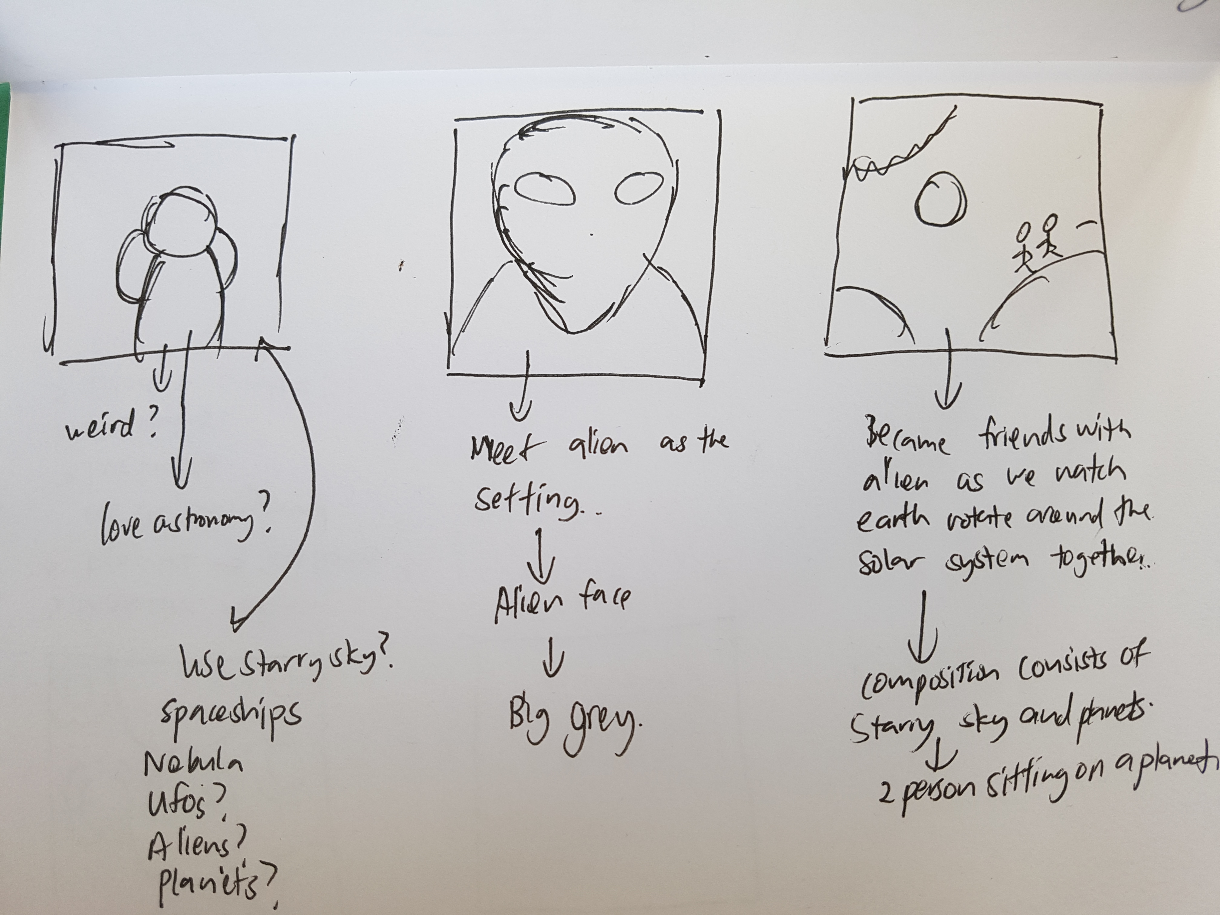
Alien/ My fascination with space and astronomy
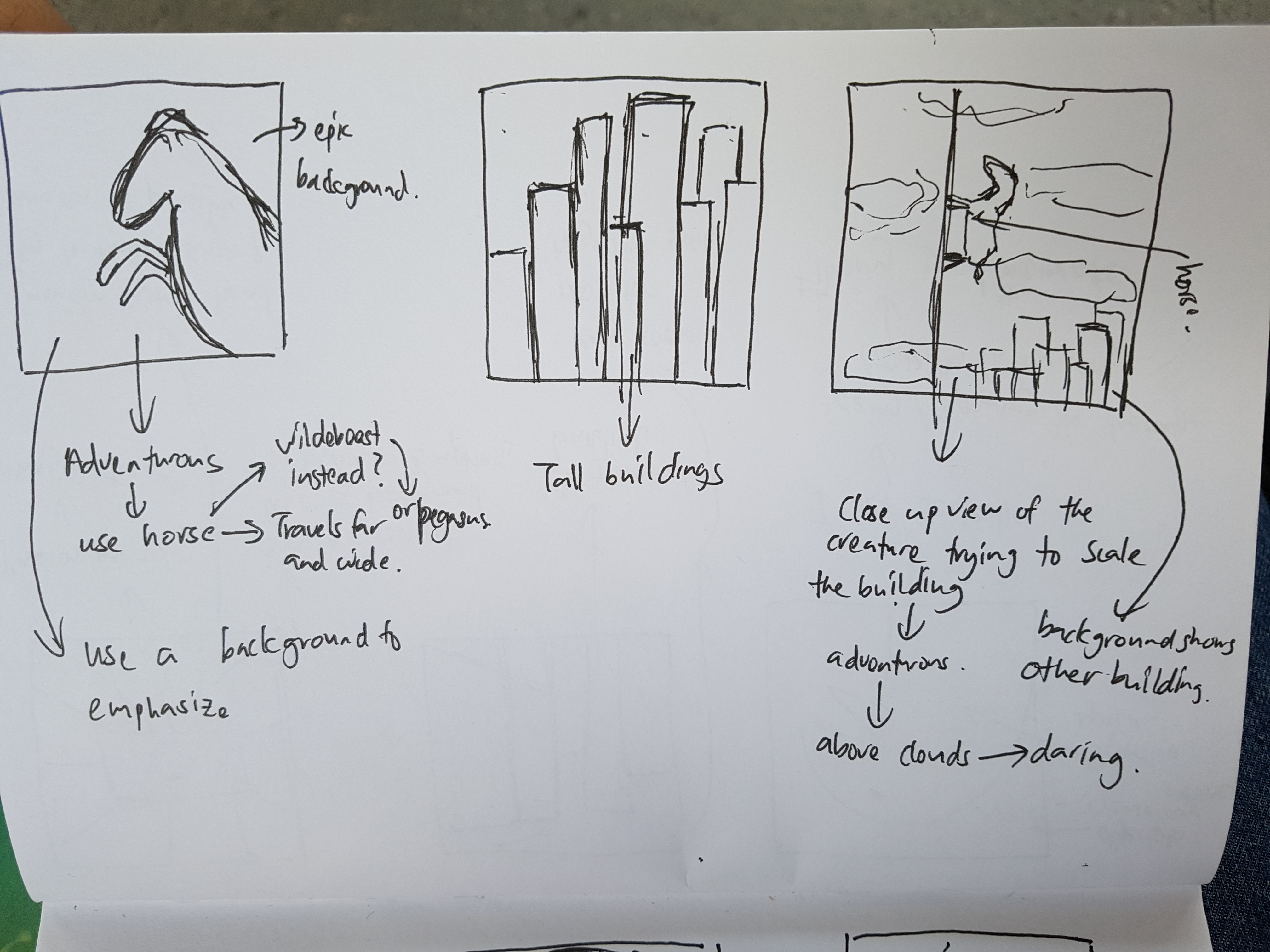
Aventurous/ Travelling/ Exploring
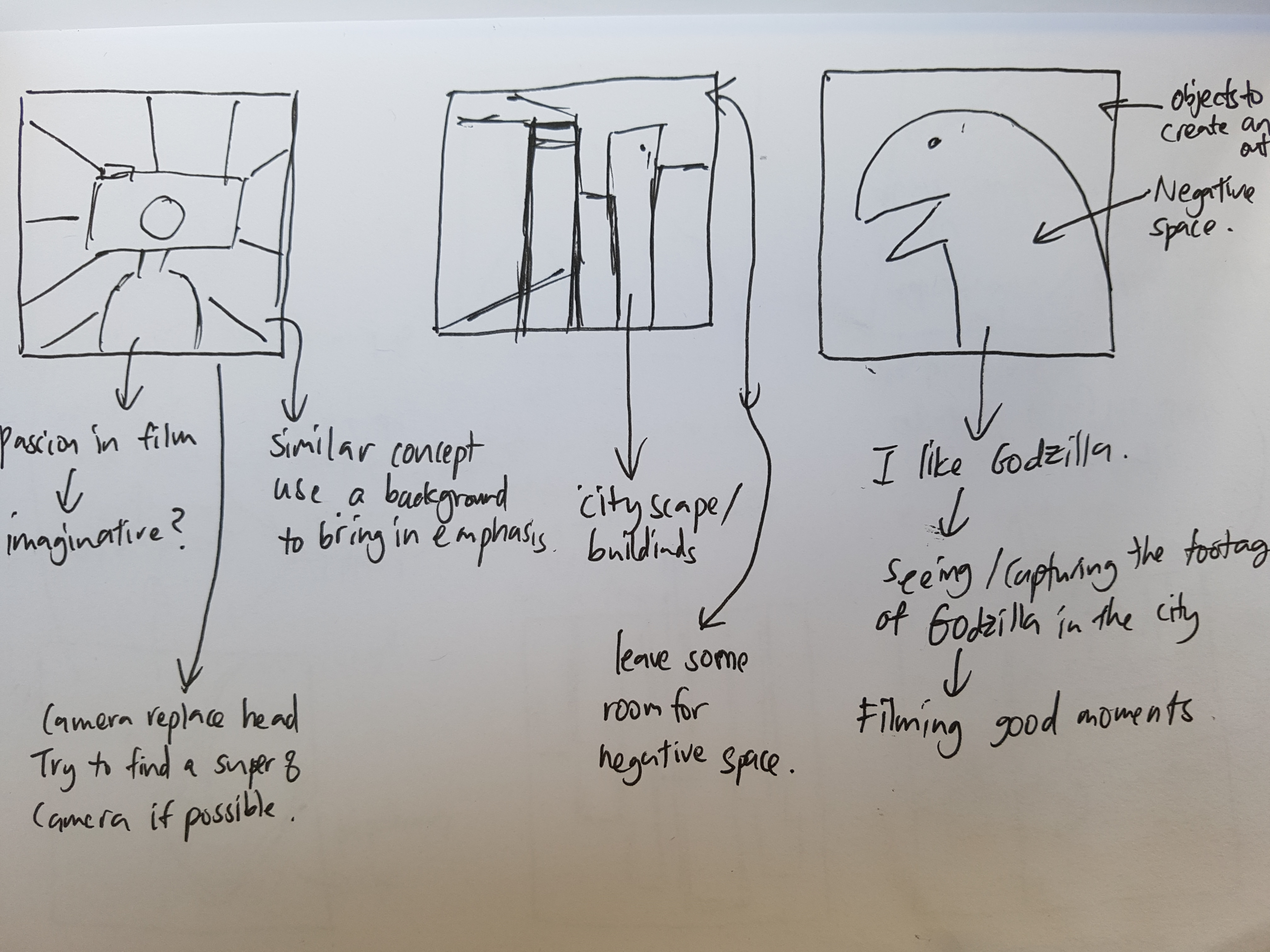
Passion in film-making/ Imaginative
Loves to laugh/ Spreading happiness
Sketches:
*These are just the initial planning of sketches. Changes of the sketches are made after consultation and personal exploration.
References
While looking through different ways of doing vintage surreal collage, I stumbled upon some very useful websites and videos that can help me with my work.
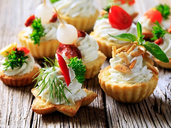
Eugenia Loli who is one of my reference artists has a website where she teaches people the basic steps of making these collages.
These are some tutorials I found on Youtube that helped me with my collage.
The best of the best websites I found were websites that contained a compiled list of high quality vintage images that we can download and use to create the collages.
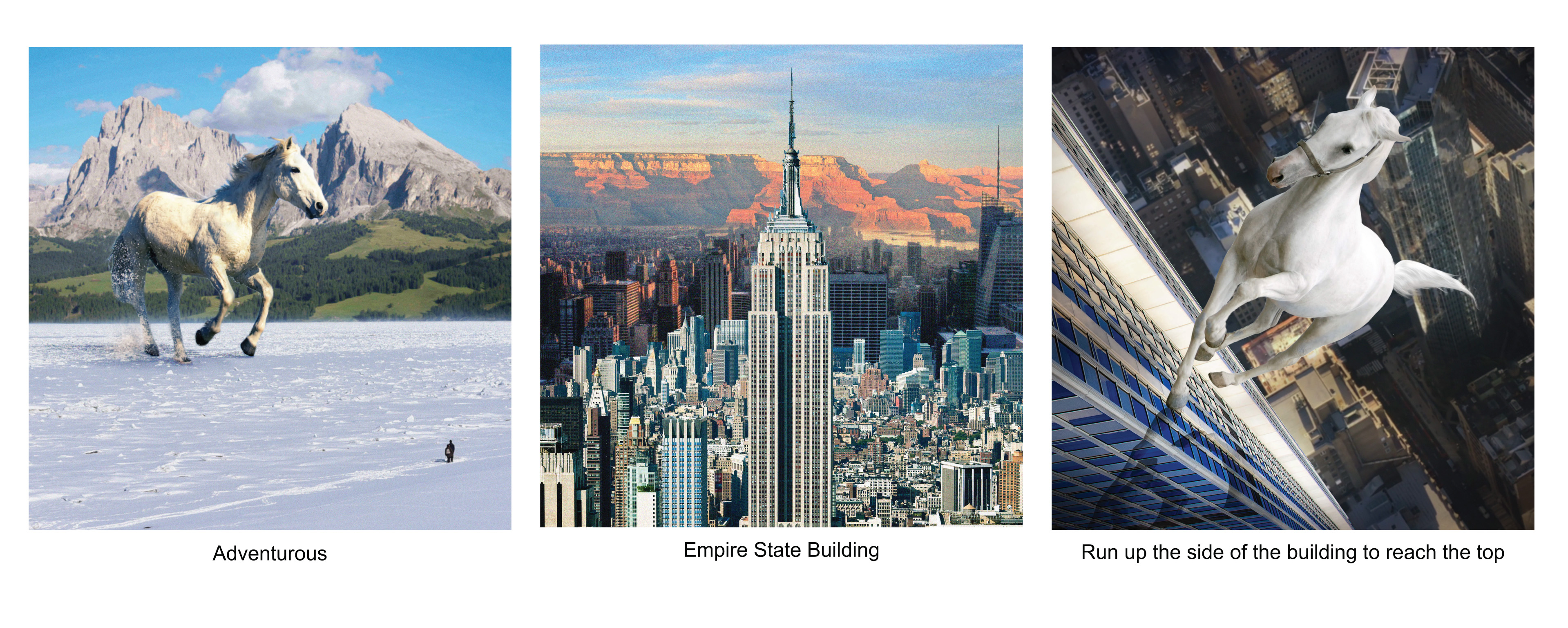
For the first panel, I picked out horse to represent me because horses travel far and wide, making adventures of their own. For me I want to be like a horse, being able to roam everywhere and seek my own adventures. I used analogous colours, blue, green and white to bring out the serenity and peaceful feeling when I make my own adventures.
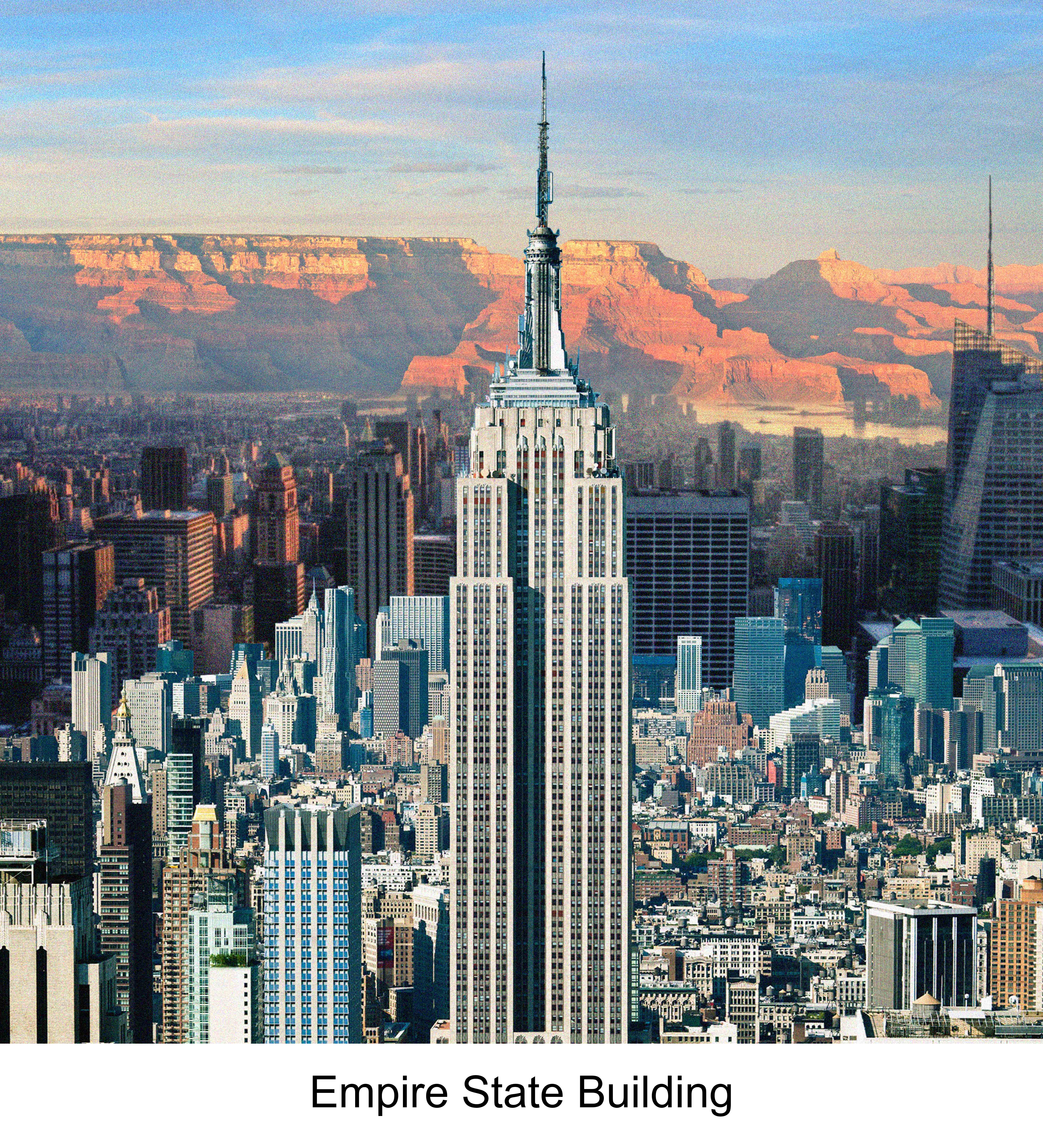
The setting I have picked out is the iconic empire state building. Standing tall and high in New York City.
Because I am adventurous, instead of taking the lift up to the top of the building, I will run up the side of the wall of the building, seeking my form of thrills and adventure. I placed the white horse at the center and darken the other spaces so that the visual dominance and focus is placed on the horse itself.
Strip 2:
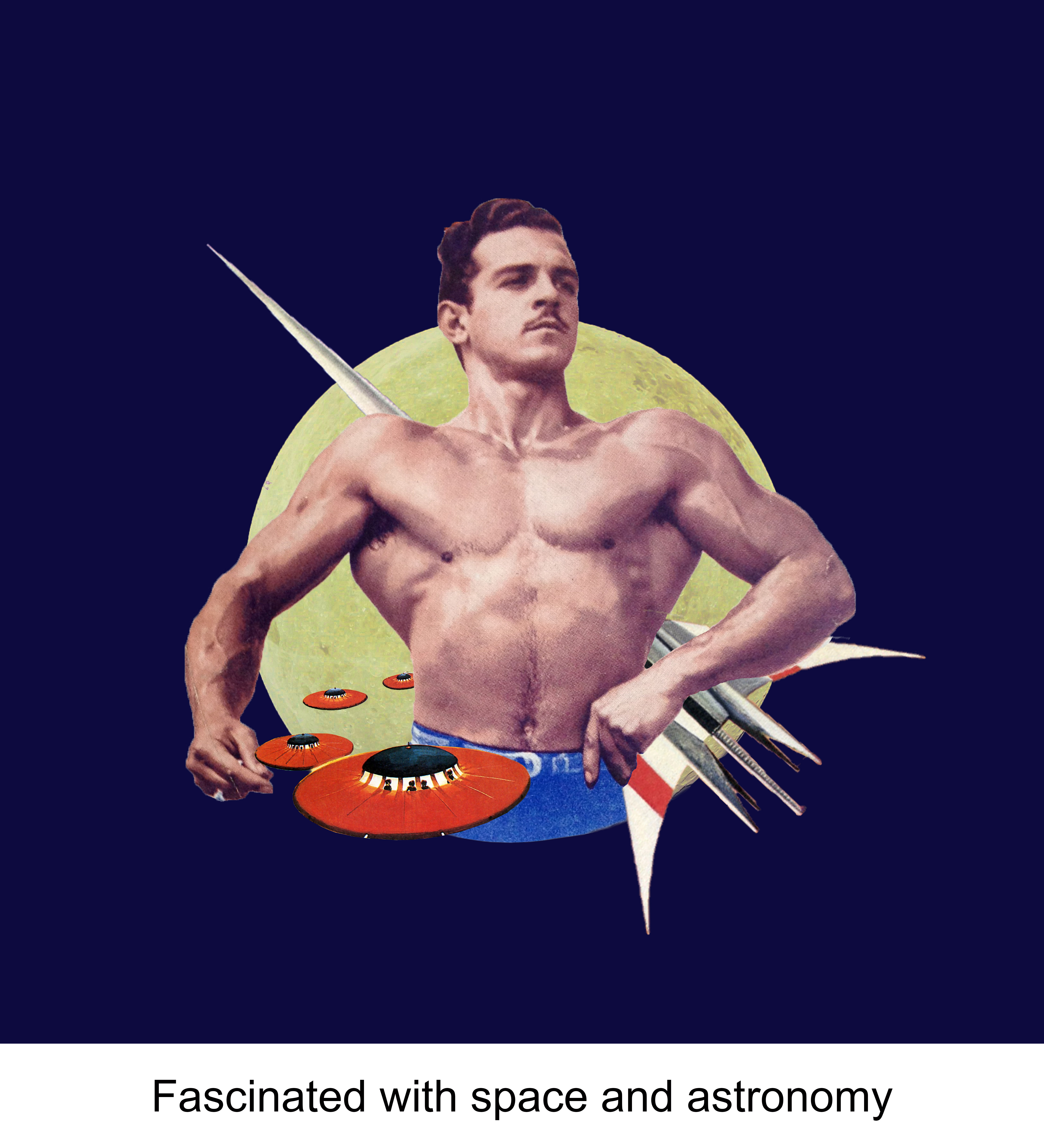
Even since I was young, I was always fascinated with space and astronomy stuff. Things like the galaxies and aliens always excites me and it was even my ambition to become an astronaut when I was young. For the first composition, I added space elements that I like and revolves these elements around the musuclar man (Me). For the colour wise, I played with the Triadic colour scheme by using blue, red, yellow and white. I really like the background because it contrast with the elements at the center making everything pop out. P.s. Inspired from the NASA Logo.
For this composition I played with complementary colours Green and Pink with a dark background. This combination helps to make the composition stand out. I chose a pink planet to show the fantasy and dreamy ideas.
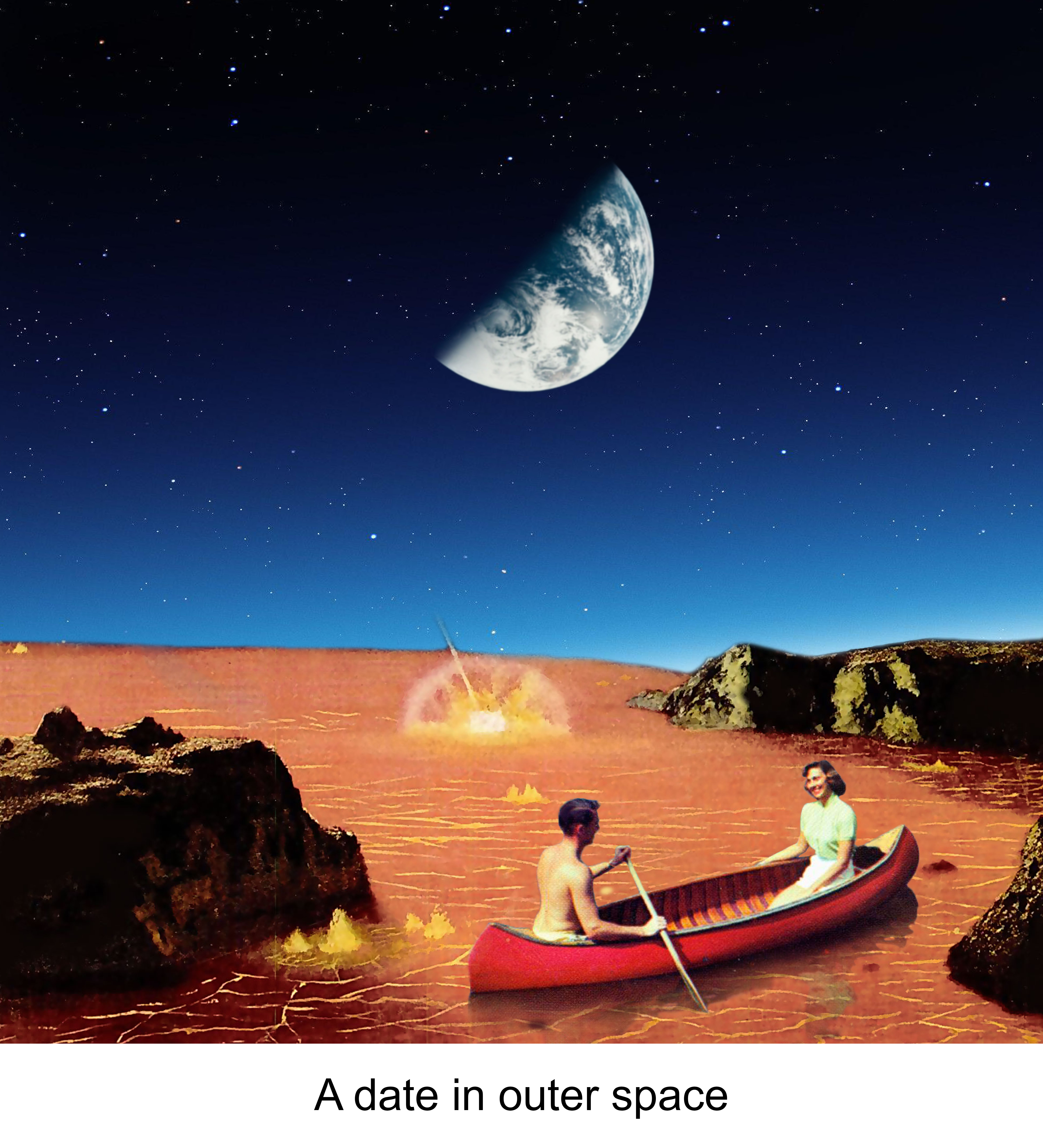
Isn’t it cool to be able to go on a date in outer space??? The pink lake links back to the pink planet you see in the second composition of this strip. I tried playing with different backgrounds of different colours but in the end I chose this because it contrasts well with the pink lake and is pleasing to look at.
Strip 3:
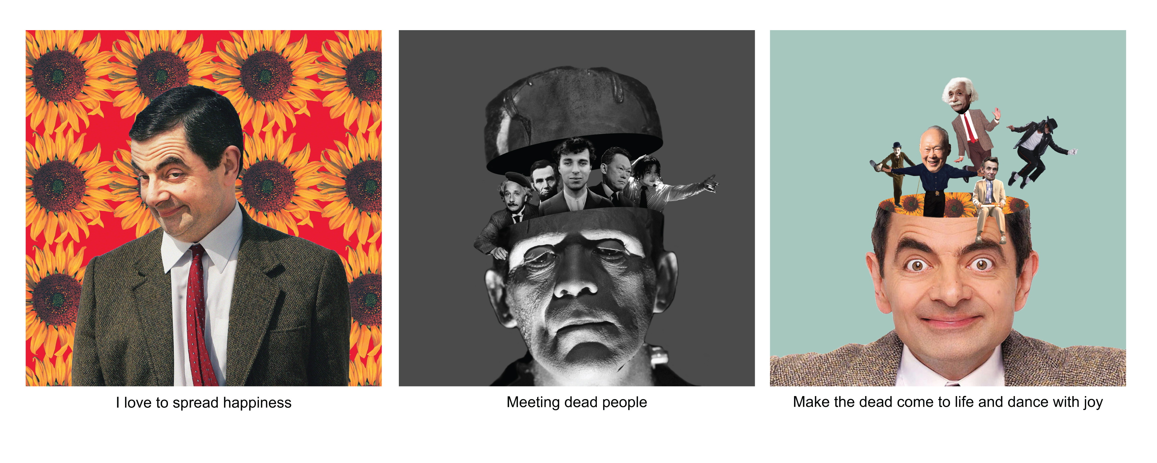
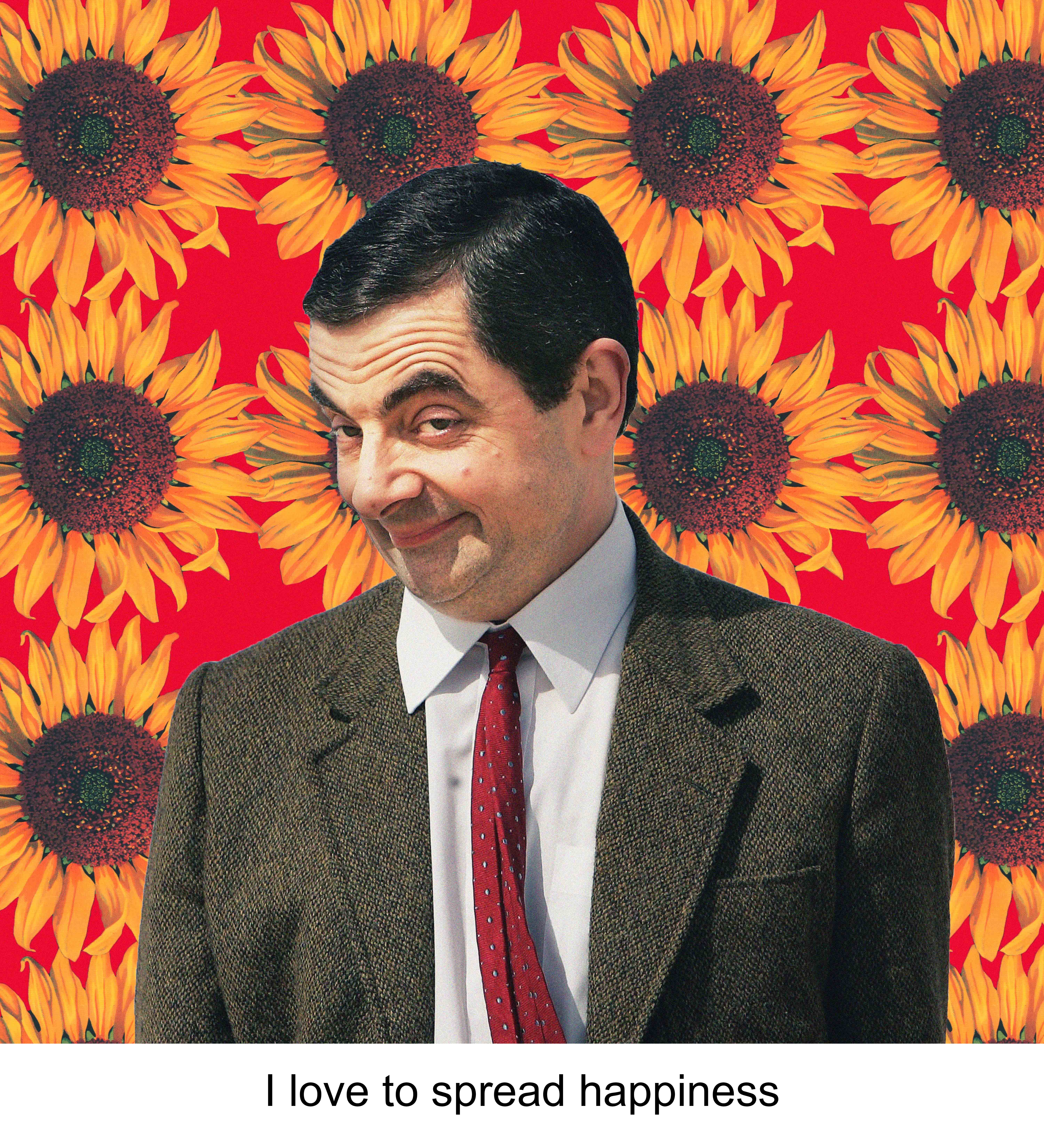
I love making people laugh and spreading happiness makes myself happy. To represent this side of me, I think the best way to show it is to bring in the iconic character, MR BEAN!!! Sunflowers are used to represent cheerfulness. I use the combination of yellow sunflowers and red background to further emphasize the liveliness and joy in me.
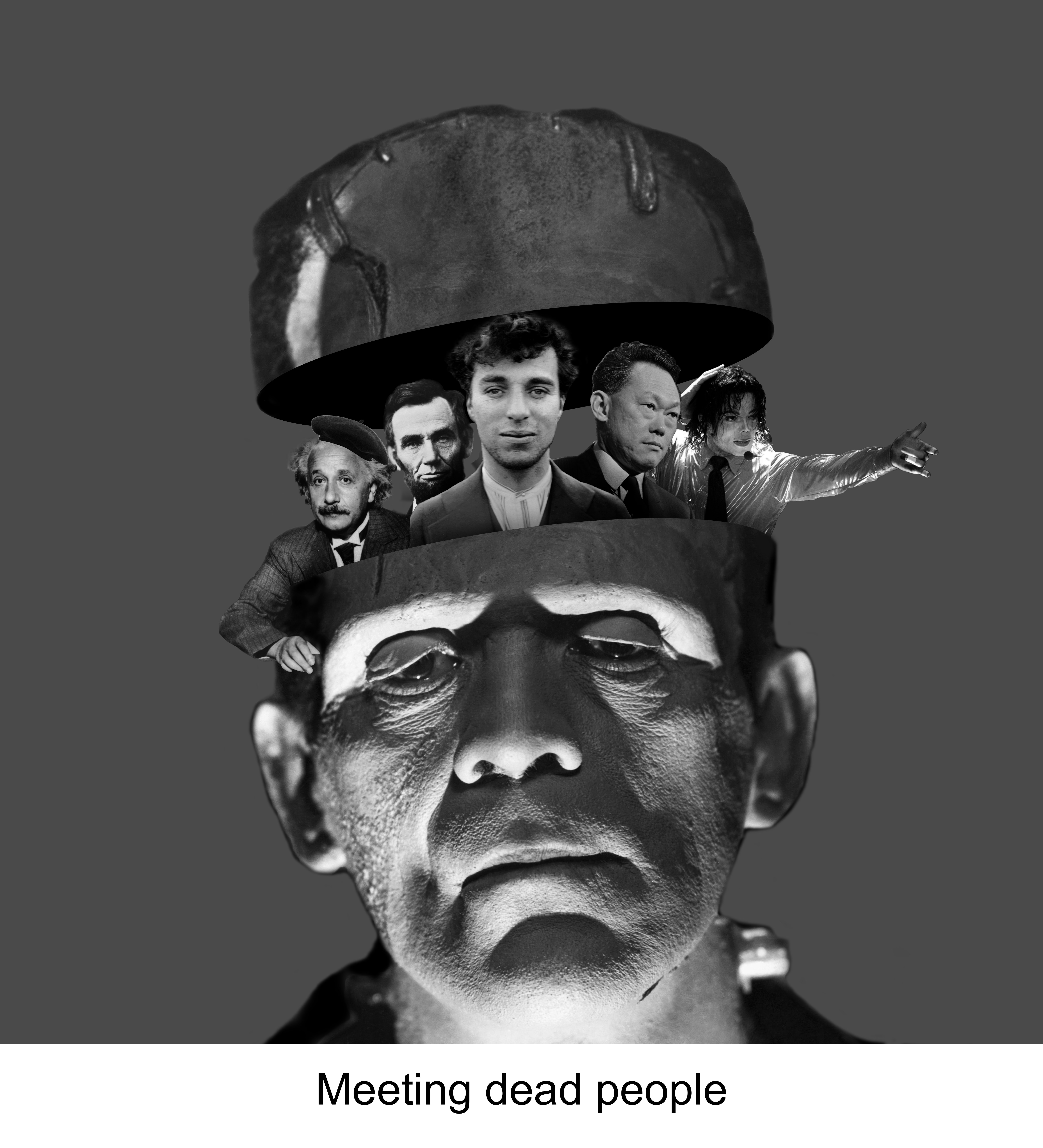
My initial idea for this was to show a setting of a cemetery, but because the style I was going for was surrealist collage style, I was stuck for awhile for this portion because i do not know how to show the cemetery settings. I decided to change it up abit and reference Julia Geiser’s collage style and decided to try the “head manipulation technique”. I cut the frankenstein head into half and added famous dead people that we all know of. Besides, I used monochromatic colour scheme of black, grey and white to give it a dead and dull look.
For the third composition I also used the same technique of collage. In this composition, all the dead comes back to life as shown in the change from monotone to colours. The dead appears to come out of my head which is filled with Sunflowers. And as they come back to life, they began to dance with joy. I use a neutral pastel background so that it does not overpower the focus on Mr Bean’s head.
Strip 4:
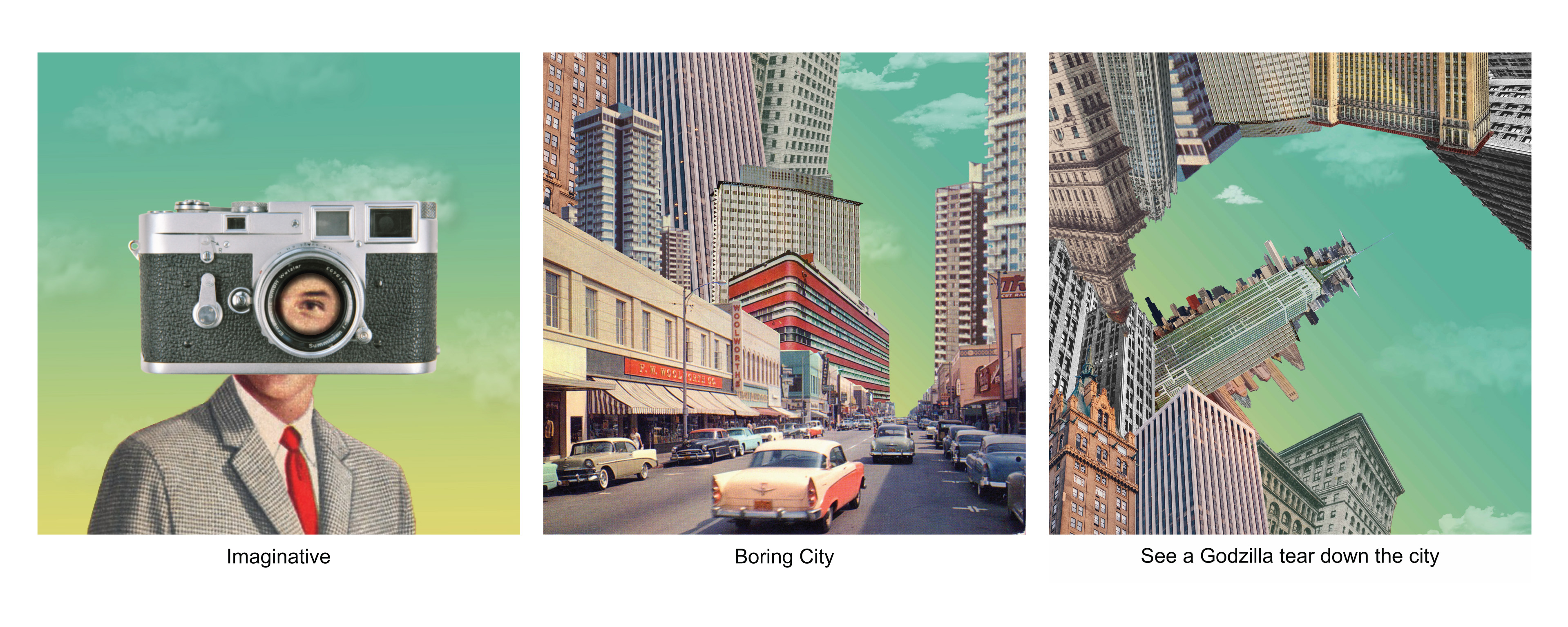
I have a strong passion in film and I am quite an imaginative person (humble) and I always tend to try to think outside of the box and do something different. Hence I came out with a simple composition of a man and a camera on my head to represent the imaginative side of me when I look through the lens of a camera.
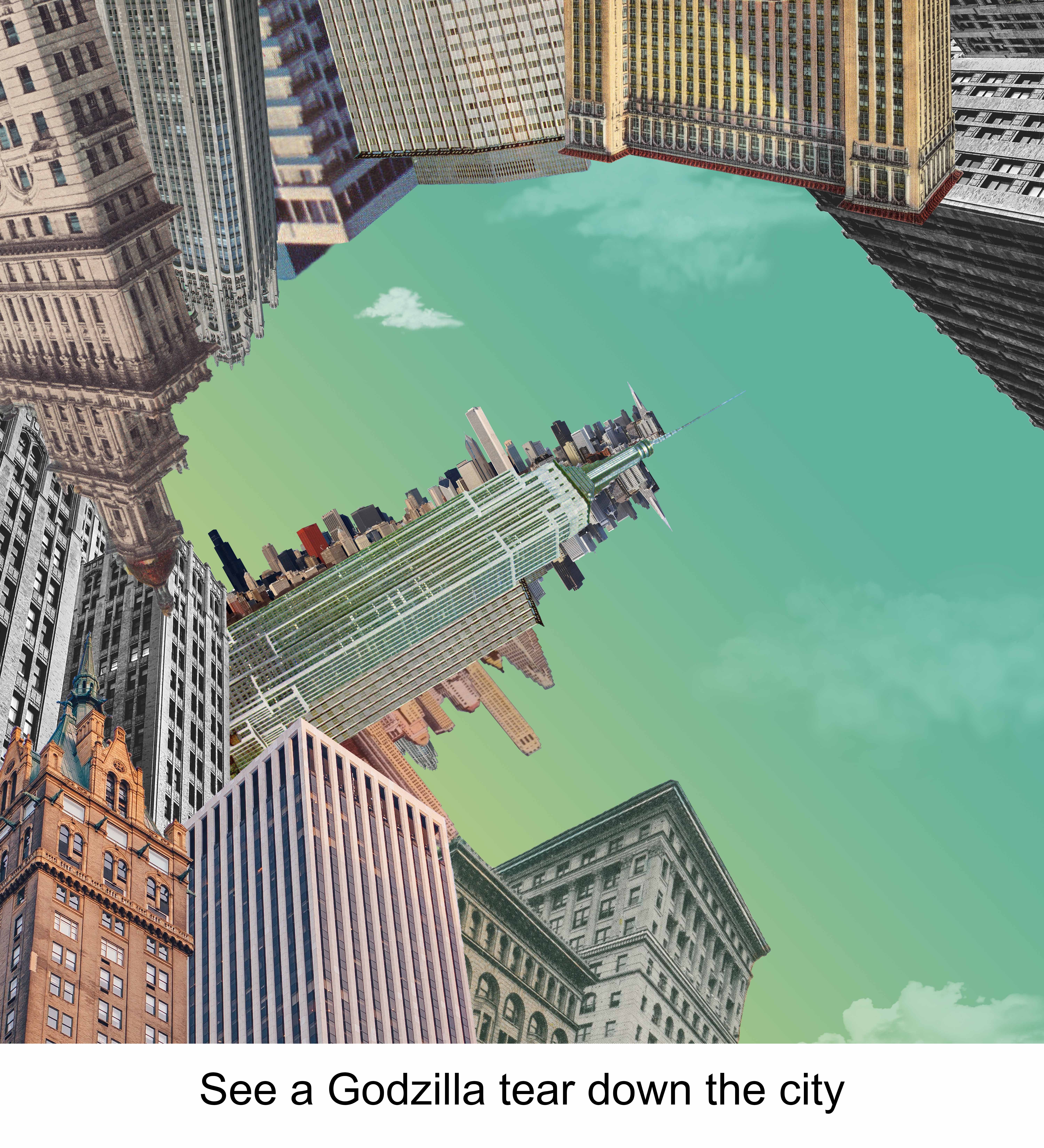
And as I walk through a boring while looking through the lens of my camera,my imagination begins to run wild as I turn the boring city into something interesting by seeing a Godzilla tearing the city apart. The third composition is the extension of the second composition as the view pans upward. I tried playing with negative spaces by outlining the shape of the Godzilla with different buildings. I used the analogous colour scheme of Yellow, green and light green for all 3 compositions for this strip. By keeping it consistent it also help me better to tell a linear narration. i purposely chose a combination of lighter colours as the darker colours looked too harsh and was unable to bring out the Godzilla shape that I wanted.
Reflection
This project got me quite stressed initially because I was unsure of which styles or techniques to approach because I was not confident of doing any of them. Besides when I was doing my first strip, I got frustrated with myself because I spent hours and hours on the single strip but was unable to get what I wanted. And also, it was really annoying because it was really hard for me to look for pictures that fit perfectly and the pictures that had the right colours in them. However, as I slowly progress, I started to get the hang of doing as I begin to do it with the mentality of “just try & learn”. I definitely learnt a lot more skills on photoshop and was even better than I was 13 weeks ago. 2D really made me see everything differently now as the design elements ideas constantly get stuck in my head wherever I go.
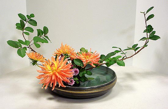
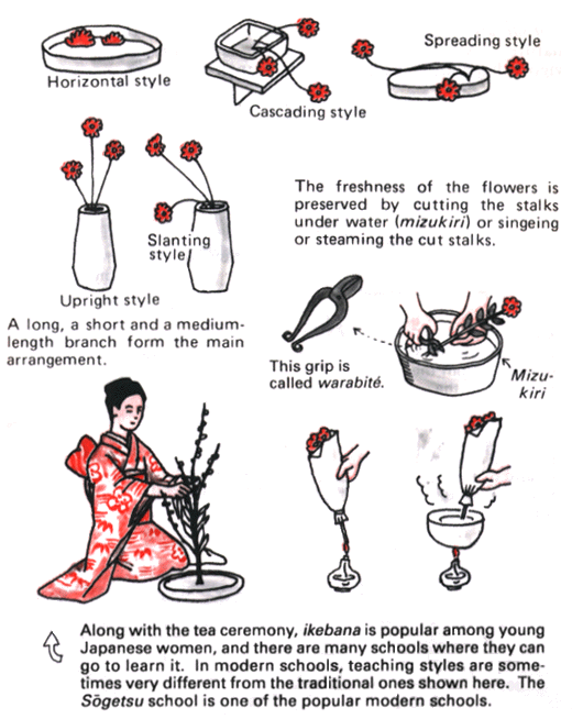
Ikebana is the Japanese art of flower arrangement. As is true of all other arts, ikebana is creative expression within certain rules of construction.
Materials used:
Living branches, Grasses, Leaves and Blossoms, ANY MATERIALS
What distinguishes Ikebana from other approaches such as “flower arrangement” is its asymmetrical form and the use of empty space as an essential feature of the composition. For each Ikebana, the artist’s intention behind each arrangement is shown through a piece’s colour combinations, natural shapes, graceful lines, and the implied meaning of the arrangement.
Moribana uses a shallow container and a kenzan, a holder with many sharp points into which flowers are inserted. The big feature of moribana is the broad expanse of natural-looking shapes and a mound of beautiful flowers. This creates beautiful volume which can be viewed from three sides.
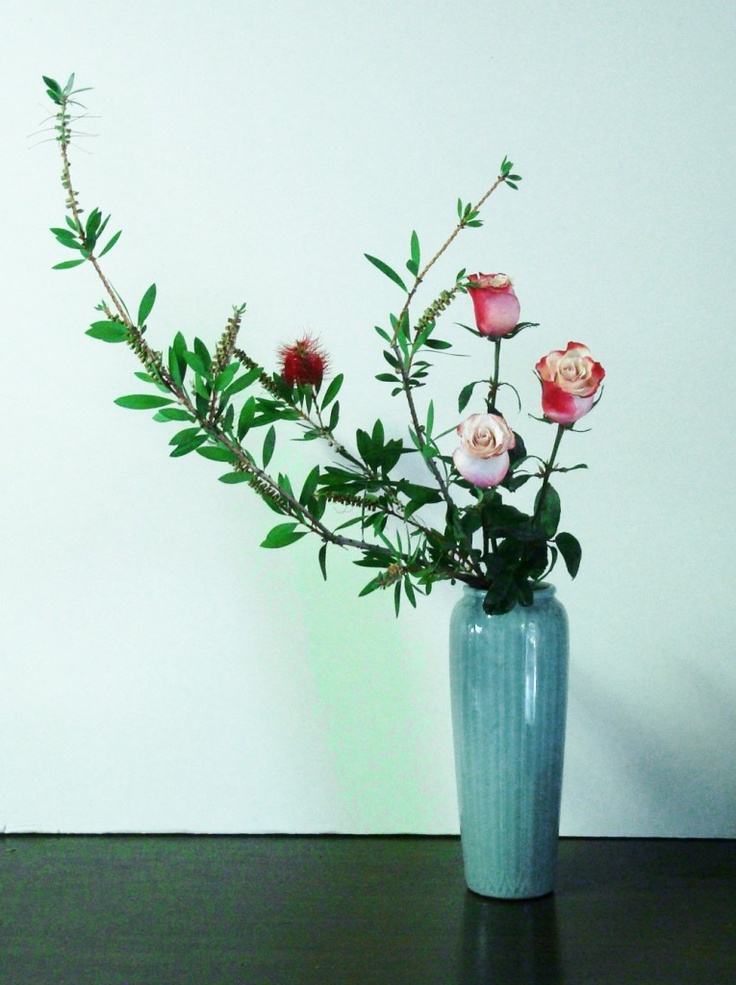
Heika (also called rikka, shoka, or seika) is a basic style of ikebana arrangement that uses a tall vase and highlights vertical lines. The biggest feature is the emphasis on bringing out the flowers’ natural charms and arranging them in a tasteful and elegant manner.
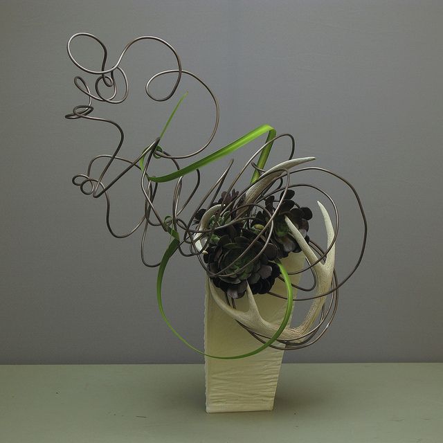
Another unorthodox style is the Jiyūka (“free style”). It is a free creative design and does not confine the materials to just flowers; every material can be used.
To compose a free style arrangement, there are basic principles of formation and some other important factors to consider. Analysis of the elements of the plant’s form, shape, colour, texture and quantity should be conducted to decide how it should be used.
These decisions will be influenced by such things as desired mass, line, point (focal point) or surface area. The composition or blend of these elements, the sense of proportion, contrasts, rhythm and harmony should be carefully considered.
This style is more closely related to our assignment with the use of free form designs and different materials to create a model.
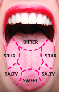
Sweet – Sweetness, usually regarded as a pleasurable sensation, is produced by the presence of sugars and a few other substances.
Sourness – is the taste that detects acidity. The mouth-puckering sensation is caused by acids in lemons, yogurt and sourdough bread and other food.
Saltiness – Our brains are programmed so that a little salt tastes good, and a lot tastes bad.
Bitter – Bitterness is the most sensitive of the tastes, and many perceive it as unpleasant, sharp, or disagreeable. Bitterness is a distinctive bad taste accompanied by a reflexive “yuck” expression on the face.
Unami – Umami is an appetitive taste. It’s best described as “savory”—a taste rich in flavor released by cooking, curing or aging.
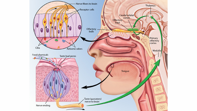
Airborne odors –> Cilia in the nose –> Receptor cells –> Nerve –> Brain
Sight and Taste:
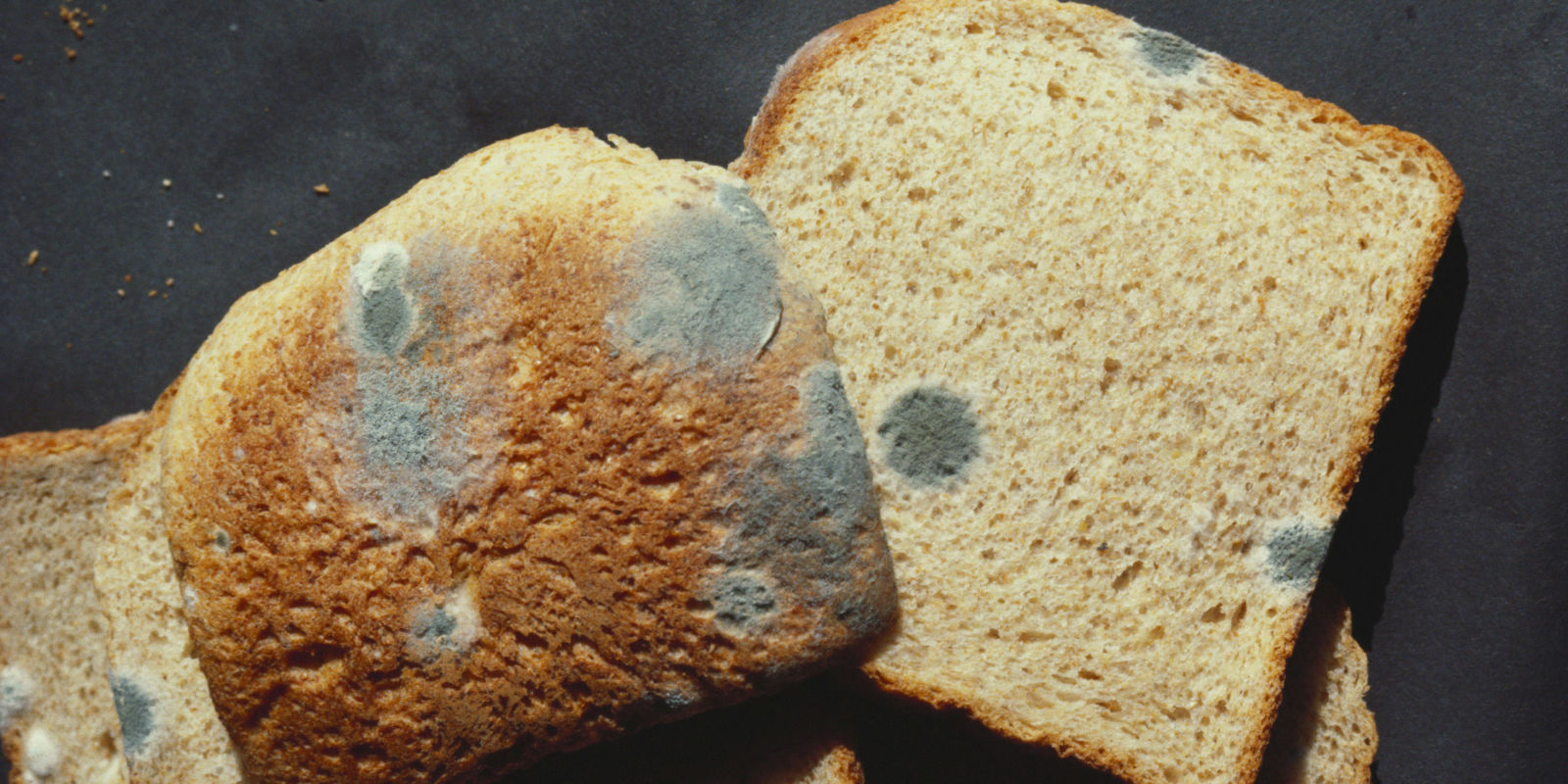
Taste as a sense is made up of sight, smell, touch and resulting taste. What we see will directly affect how we taste. For instance, when a moldy bread is placed in front, our brain already analyse the taste or the food and made its mind up that the moldy bread is disgusting.
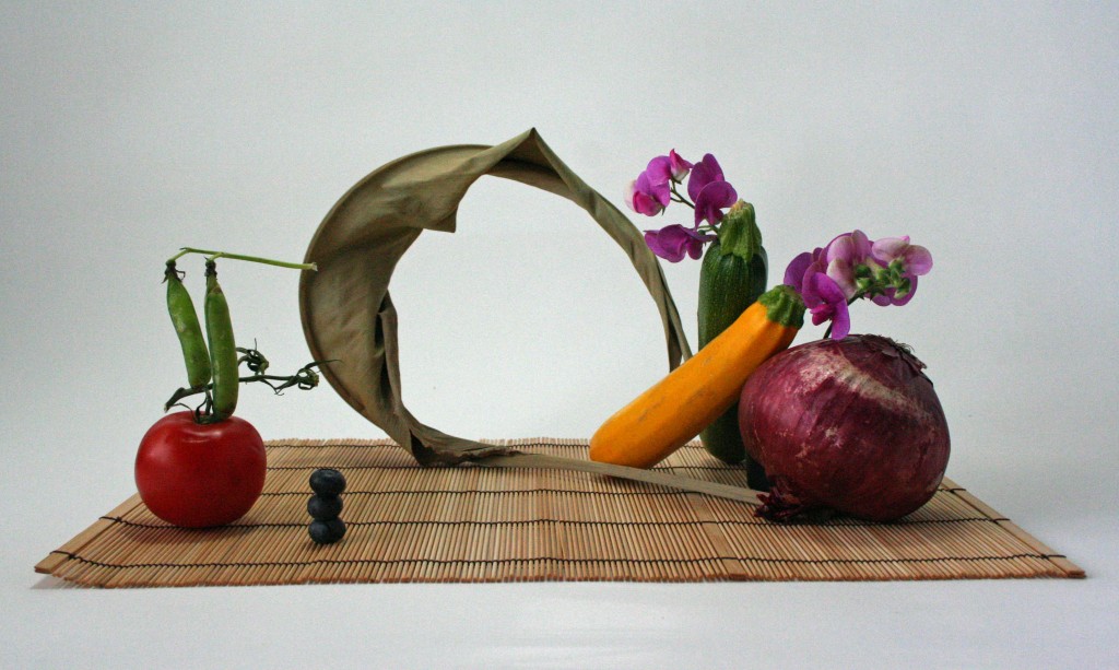
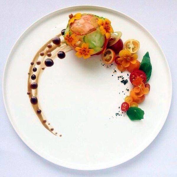
The appearance of the food is also important when we want to make food taste good. Below are ways we can make our food look more appealing (FOOD PRESENTATION) and appetizing and this is similar to our final model where we have to create the different sensory aspects with the use of food and other materials. Besides, in food presentation, we can see different 3D design elements like the trios of Dominant, Subdominant & Subordinate.
Garnish – Usually consisting of an edible component, garnishes brighten the plate, give a clue to the flavor of the meal, complement the taste of the dish or fill empty space on the plate.
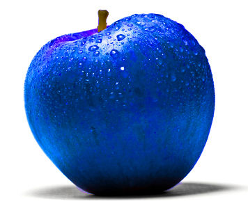
Using right colours – Colour is often the first element noticed in the appearance of a food product. Humans begin to associate certain colors with various types of foods from birth, and equate these colors to certain tastes and flavors throughout life. For example we associate apple as sweet because it is red. Imagine we have a blue apple.
Plating – The presentation of the plating makes an impression, even a promise, with the viewer. If the foodie is intrigued by the food, the artistic plating has done its job. If it looks good, you’re gonna wanna have it.The design in plating makes the experience of food more than just eating and enjoying, but further into an expression of craftsmanship and art.
Similar to the previous assignment, we also had to pick a random season from the Pandora box and for this assignment, the season that I received was SPRING.
According to https://simple.wikipedia.org/wiki/Spring, SPRING is the season after winter and before summer. Days become longer and weather gets warmer in the temperate zone because the Earth tilts towards the Sun. In many parts of the world plants grow and flowers bloom. Often people with hay fever suffer more, because of the allergens. Many animals have their breeding seasons in spring. In many parts of the world it rains for hours. This helps the plants grow and the flowers bloom.
Colours play a huge role in terms of the appearance of our final model hence the colours that represent SPRING are important for us to take note.
Colours of SPRING – Distinct yellow undertones symbolize the new growth that is visible everywhere in grass, trees and plants. With maturity, Spring’s foliage yields its yellow-tinged spring green colour and gives way to the cool blue undertones of Summer. Spring’s colours are as daring as the first crocus that pushes its way through the frost-covered ground. Even the neutrals of Spring, like camel and champagne, have a certain zest! Spring is a time of vigoro and growth, and the colours of Spring reflect this. From: http://www.theimagearchitect.com/articles/TheFourSeasonsofColor.pdf
MIND-MAP for SPRING:
SKetch MODEL
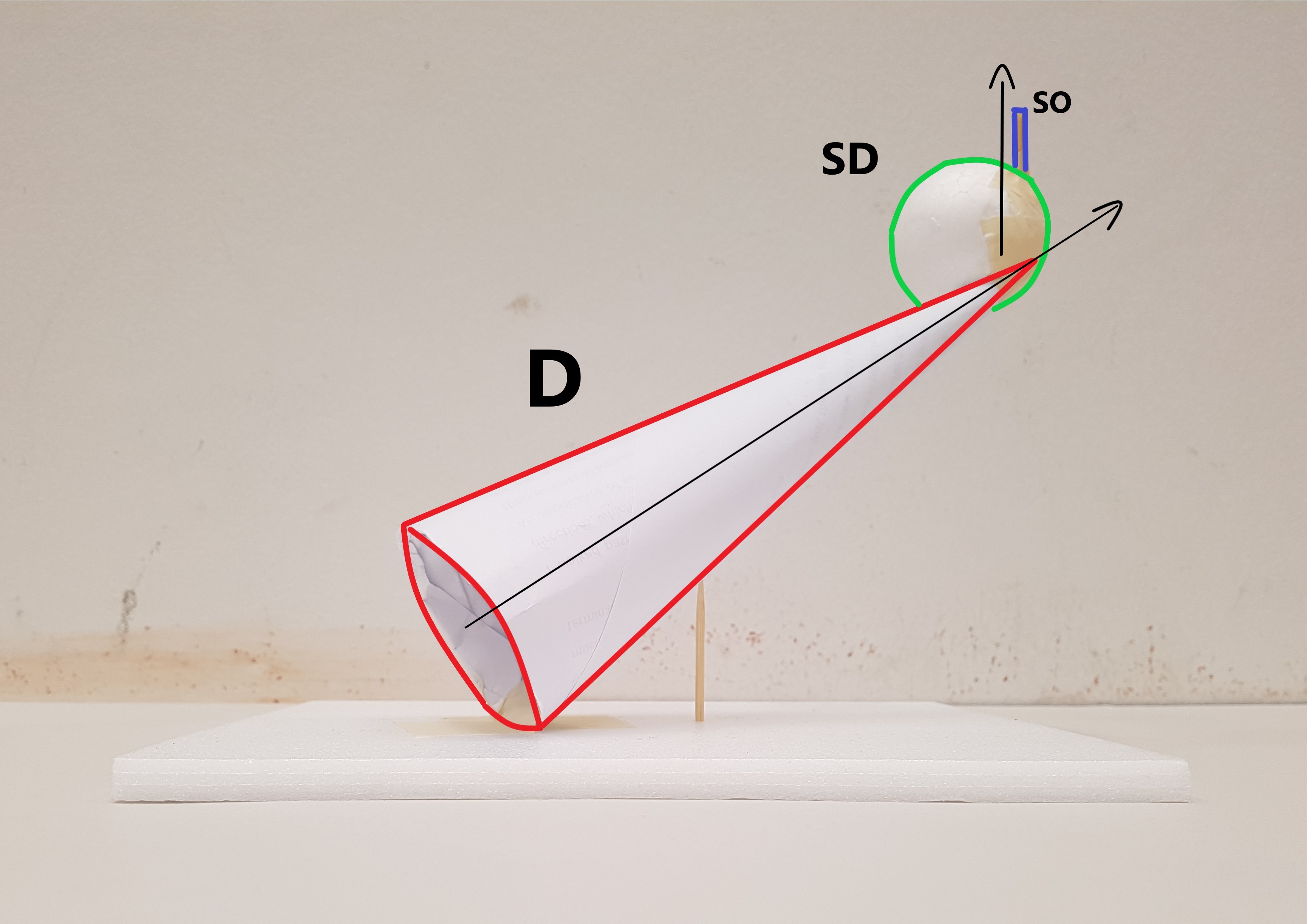
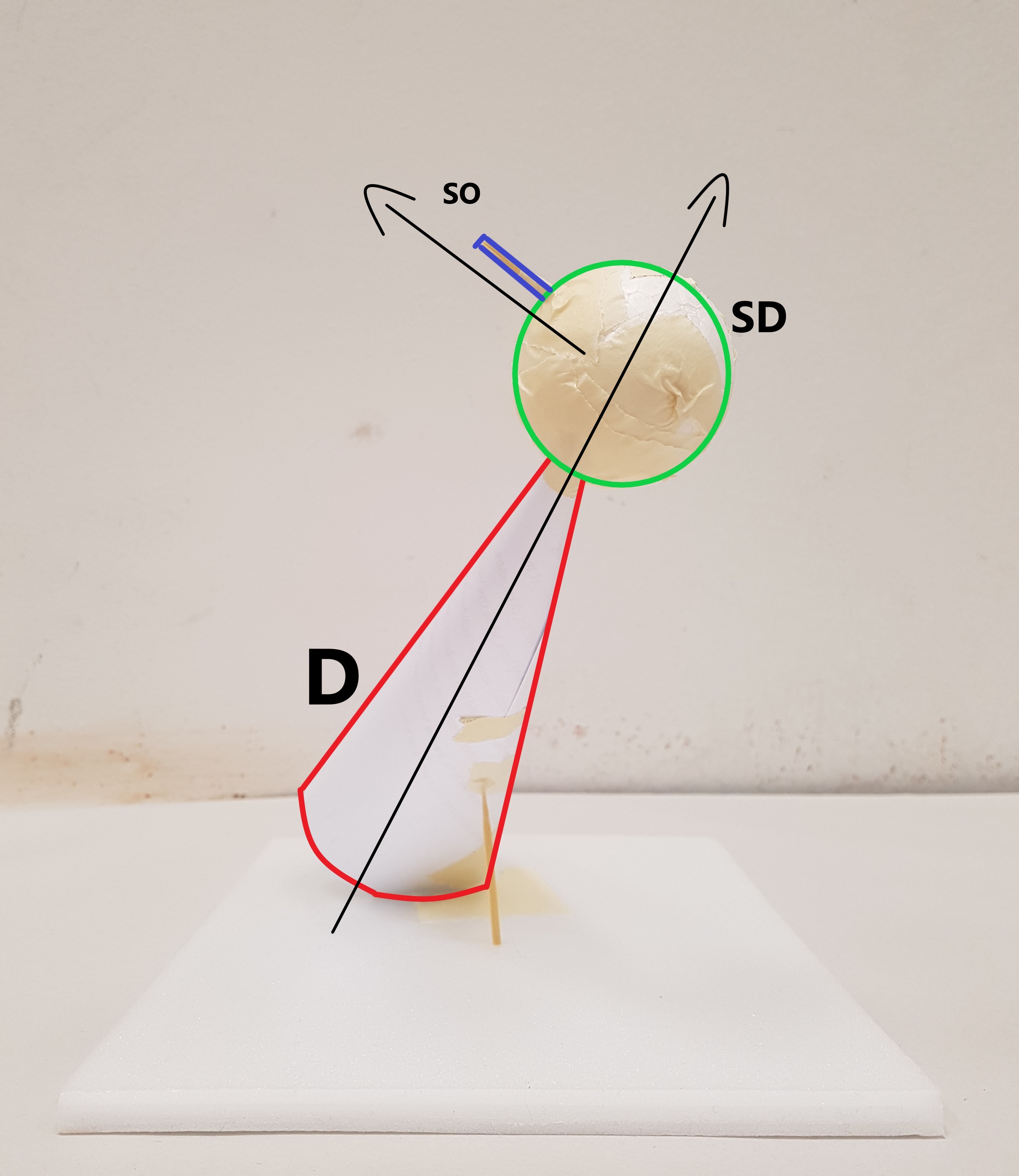
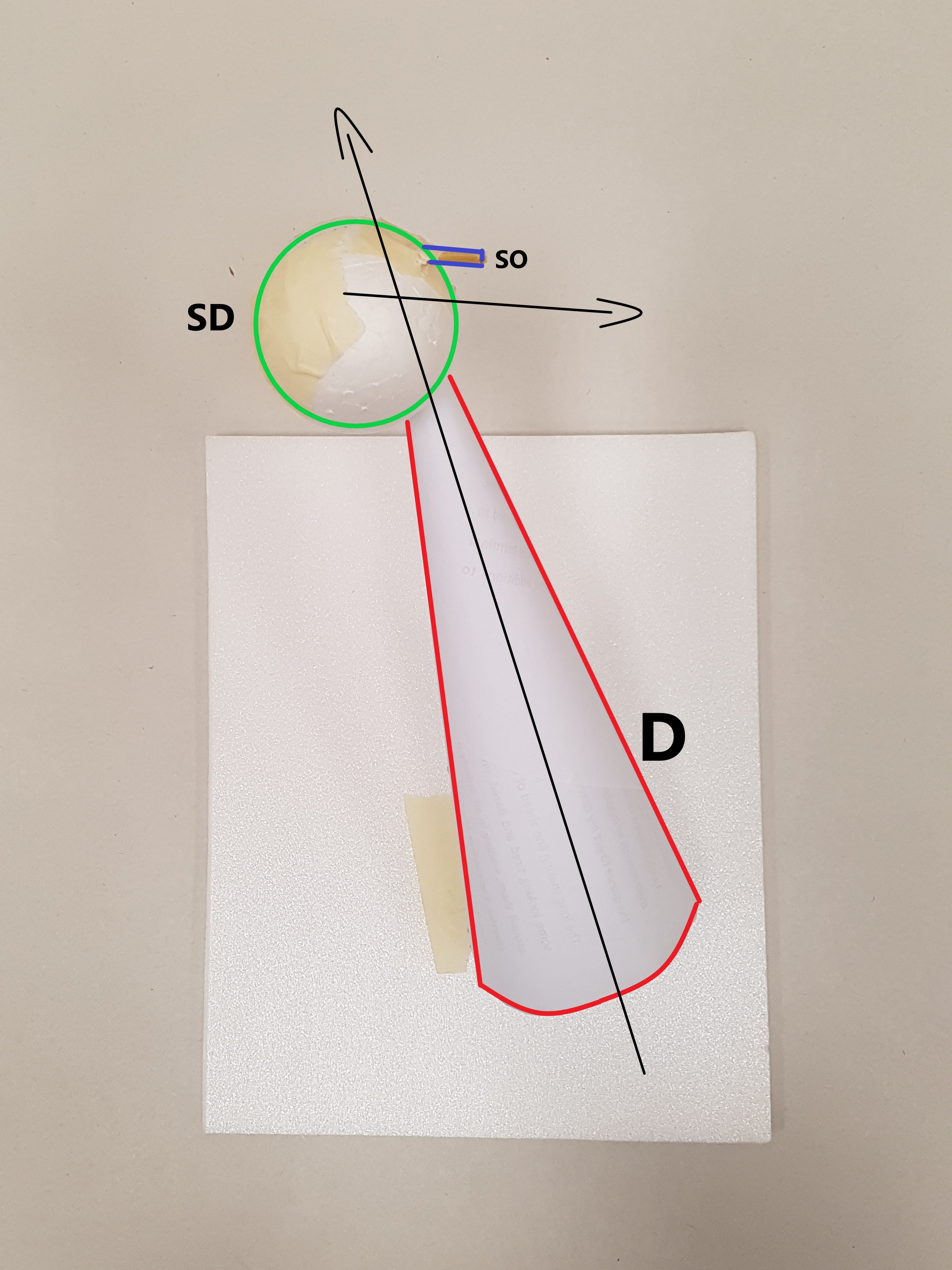
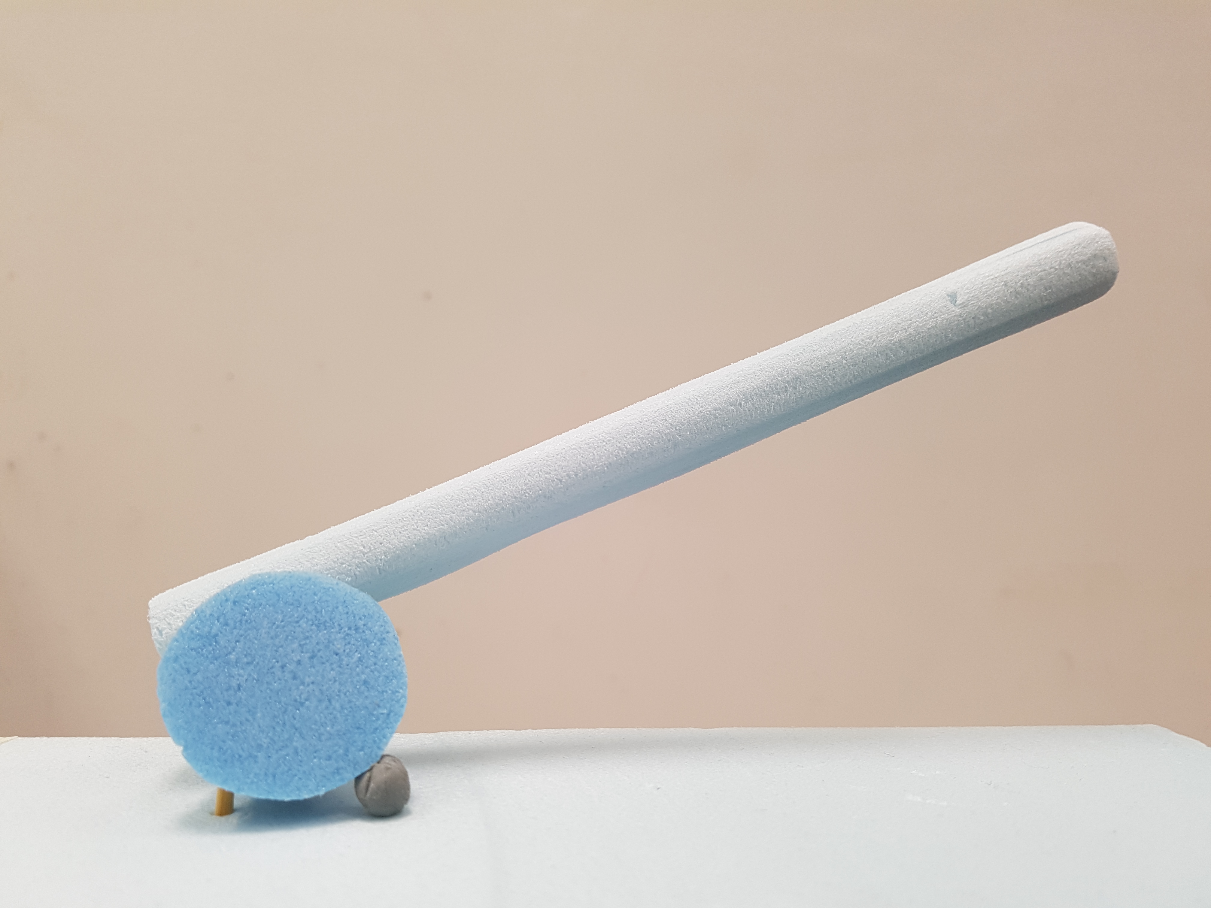
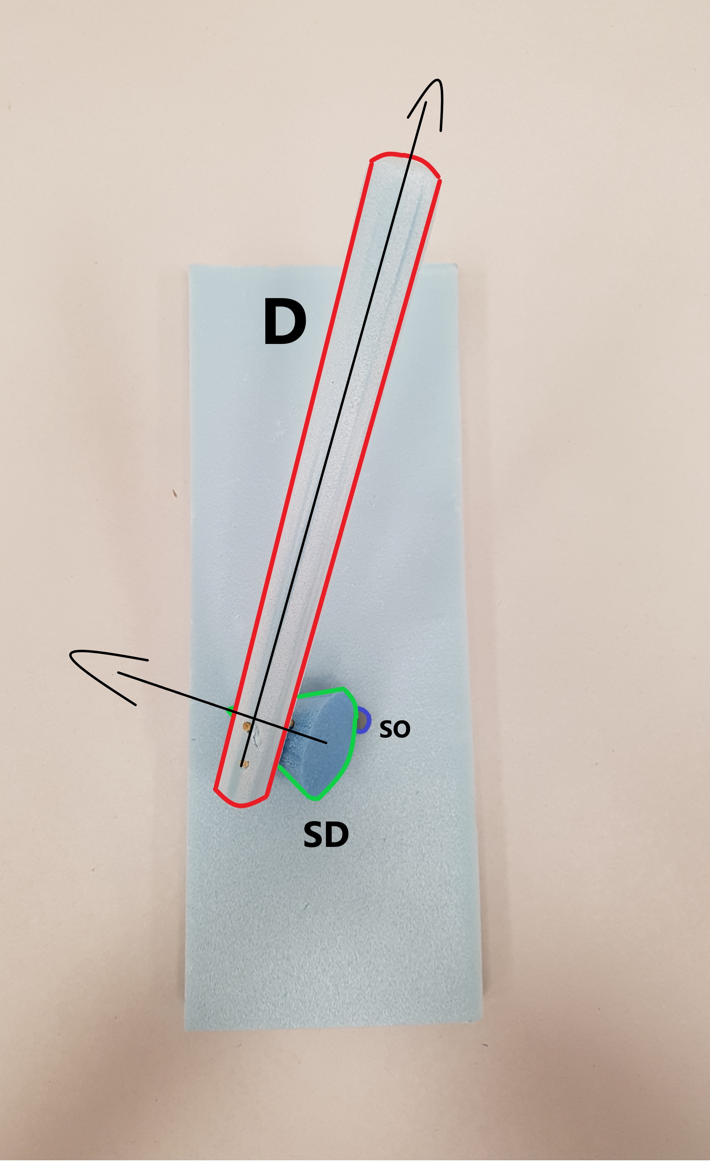
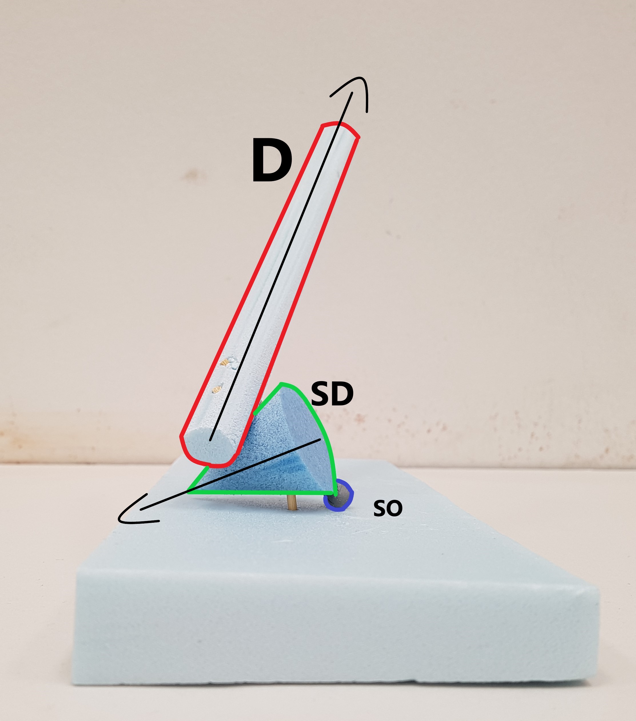
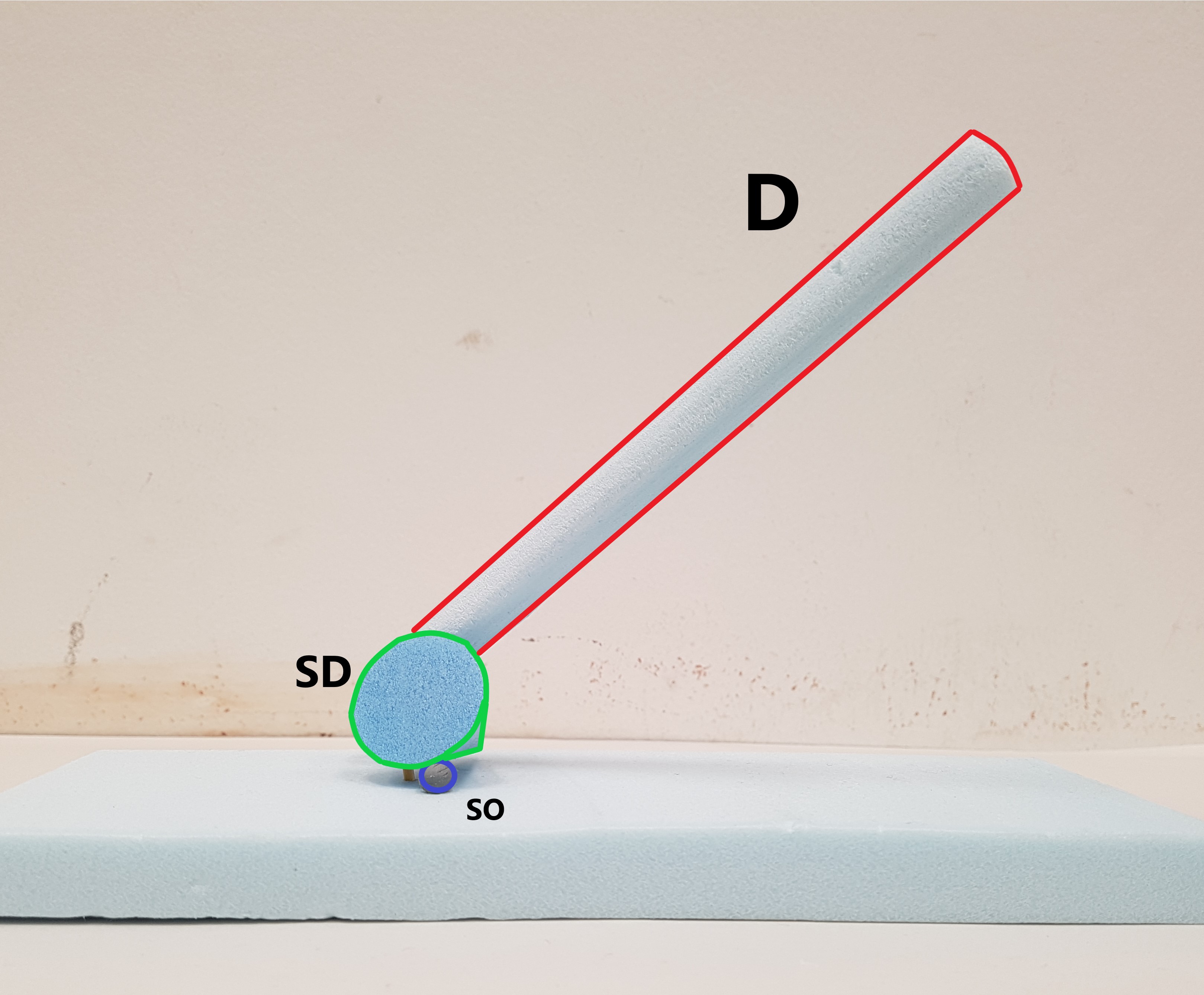
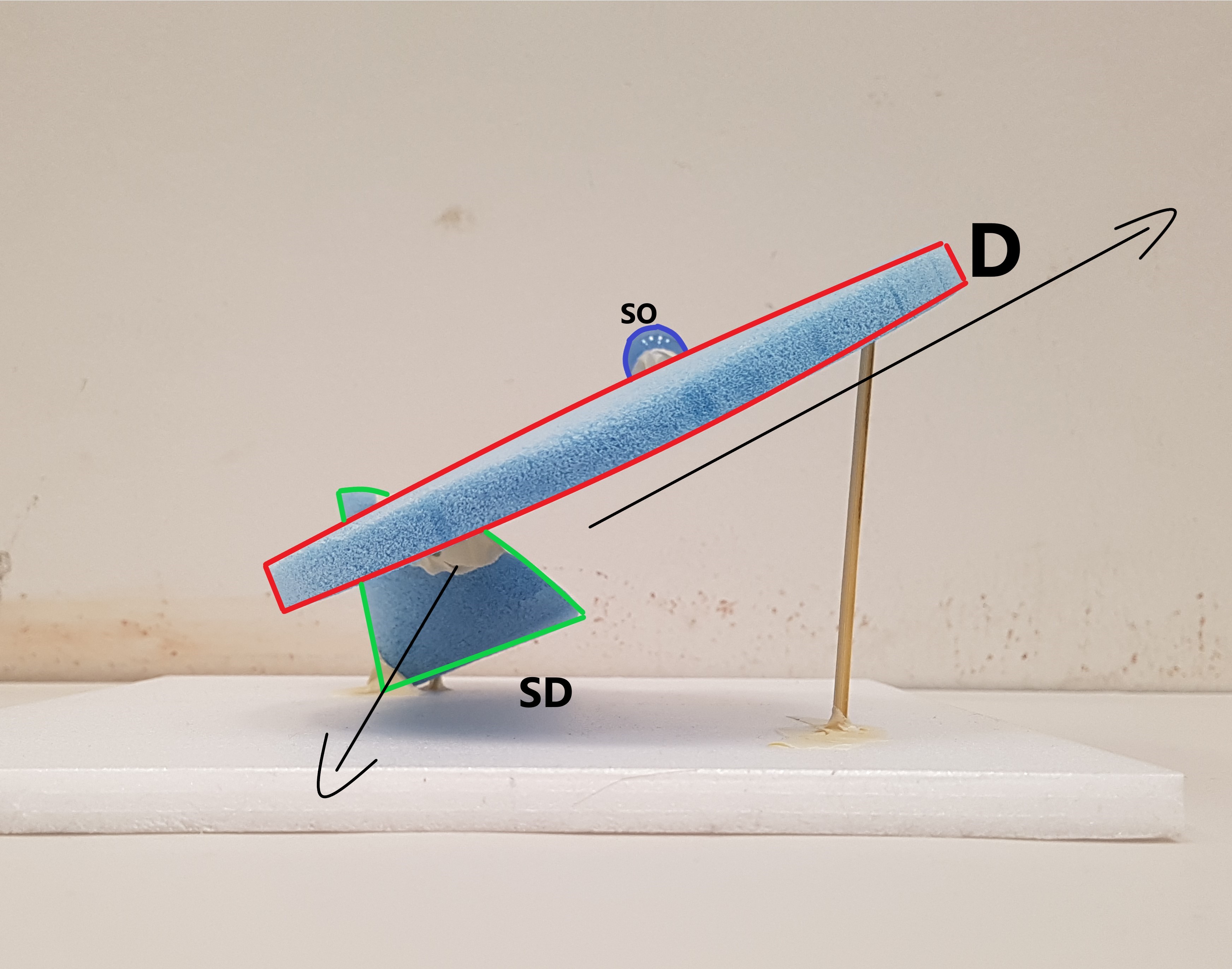
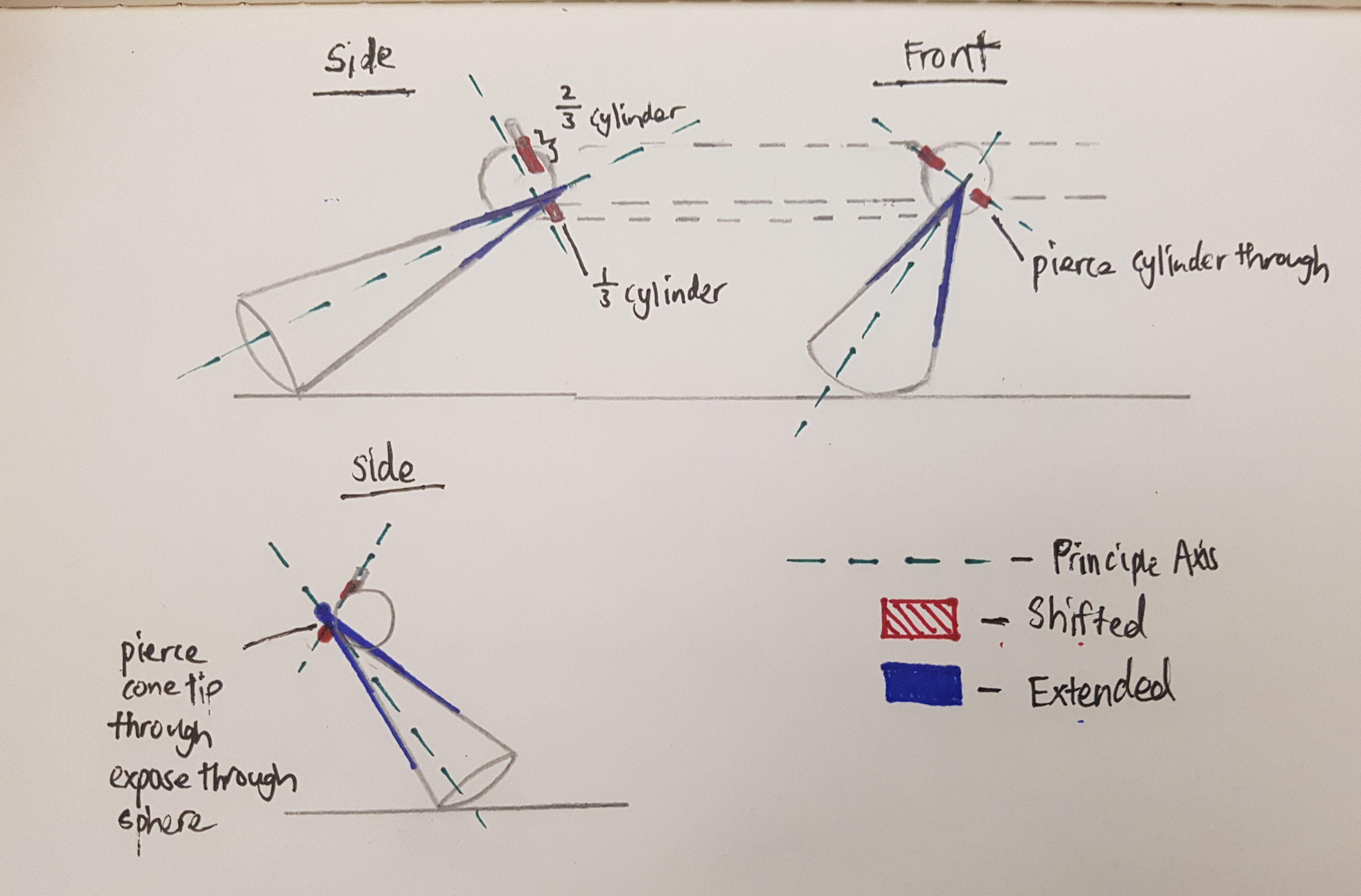
Before forming our final FooKebana (Food + Ikebana), we were required to come up with 3 sketch models using a sphere, a cone and a cylinder that has similar elements to that of Ikebana.
Checklist for 3D models:
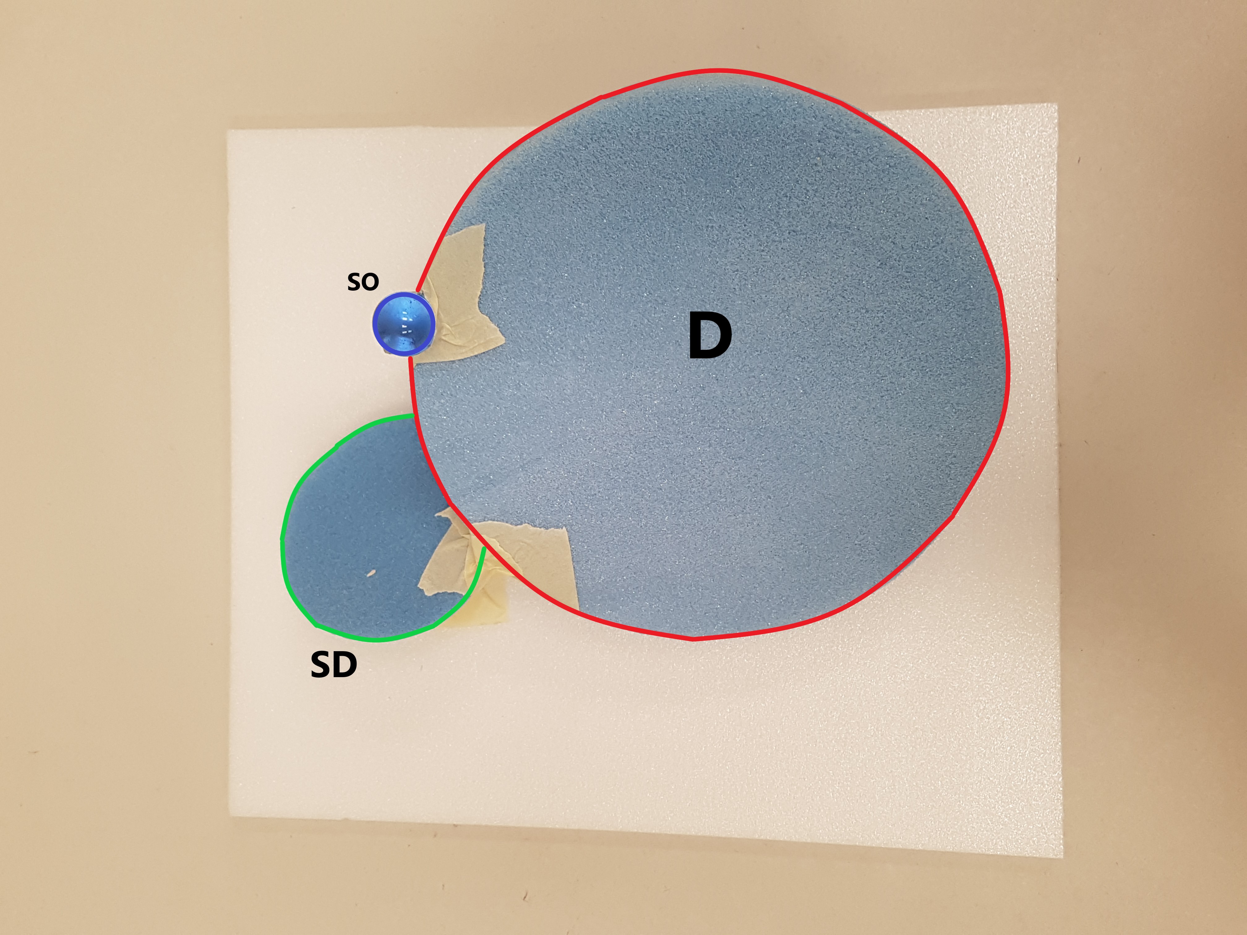
Each model must consist of a sphere, cone and cylinder.
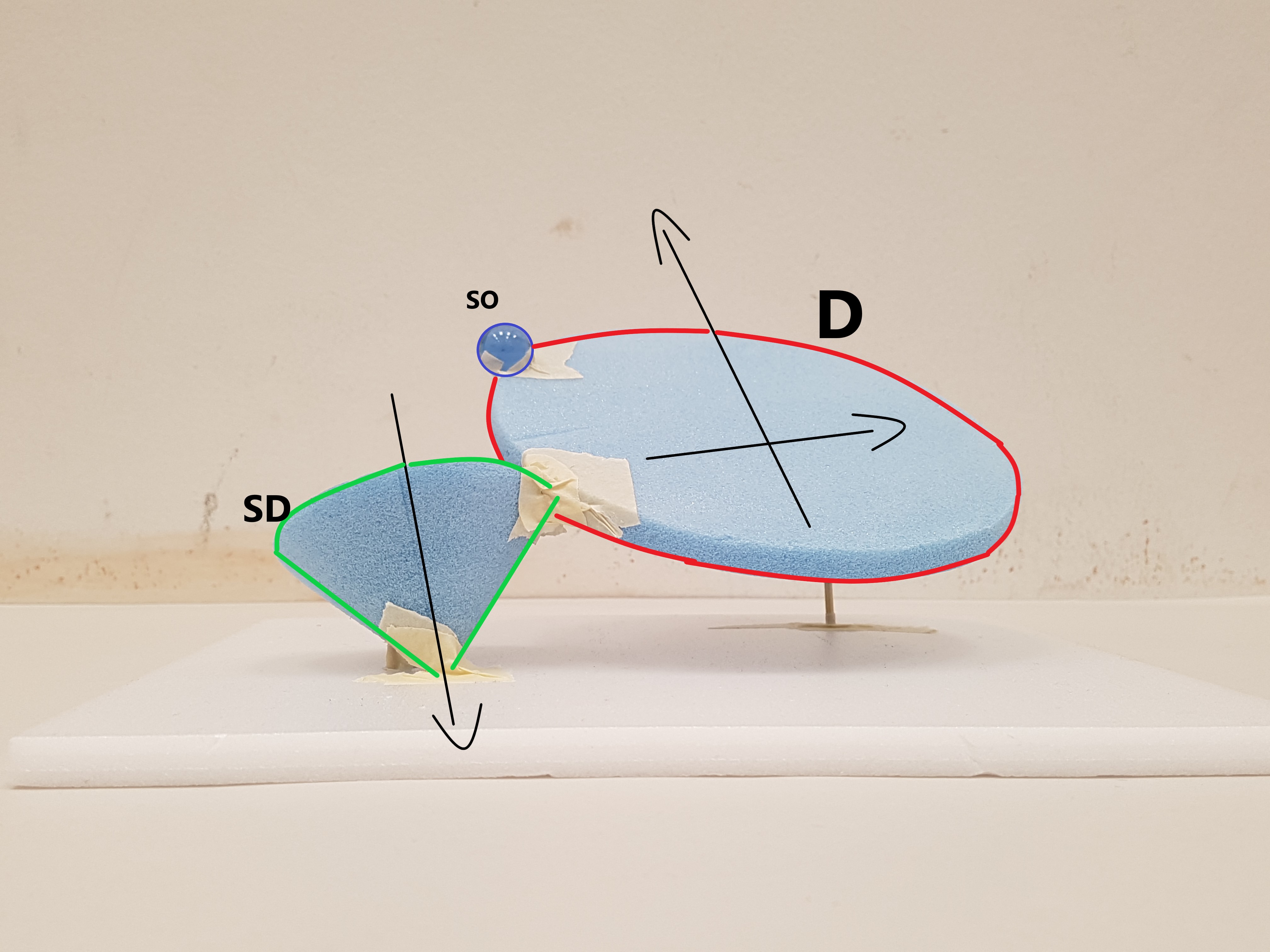
The Dominant(D), Subdominant(SD) and Subordinate(SO) should stay consistent from all angles.
The model should be interesting looking while taking into account the proportion of the object and model itself.
Create a balance (Dependent, Precarious, Independent) of directional forces from every position.
Axis of cone and cylinder going in different directions. The addition of sphere brings out the X, Y and Z element.
Changed the inherent proportions of the cylinder by making the diameter of it’s circumference longer than its thickness.
Audience should view the model from the top first then view the model from the front. From the top, the model looks overwhelming because of the circumference of the cylinder and the cone as it covers a lot of surface. However when looked at a lower angle there is actually a lot of space hence creating a form of illusion with the use of the void below the cylinder and cone.
Shortlisted for 2D sketch Analysis.
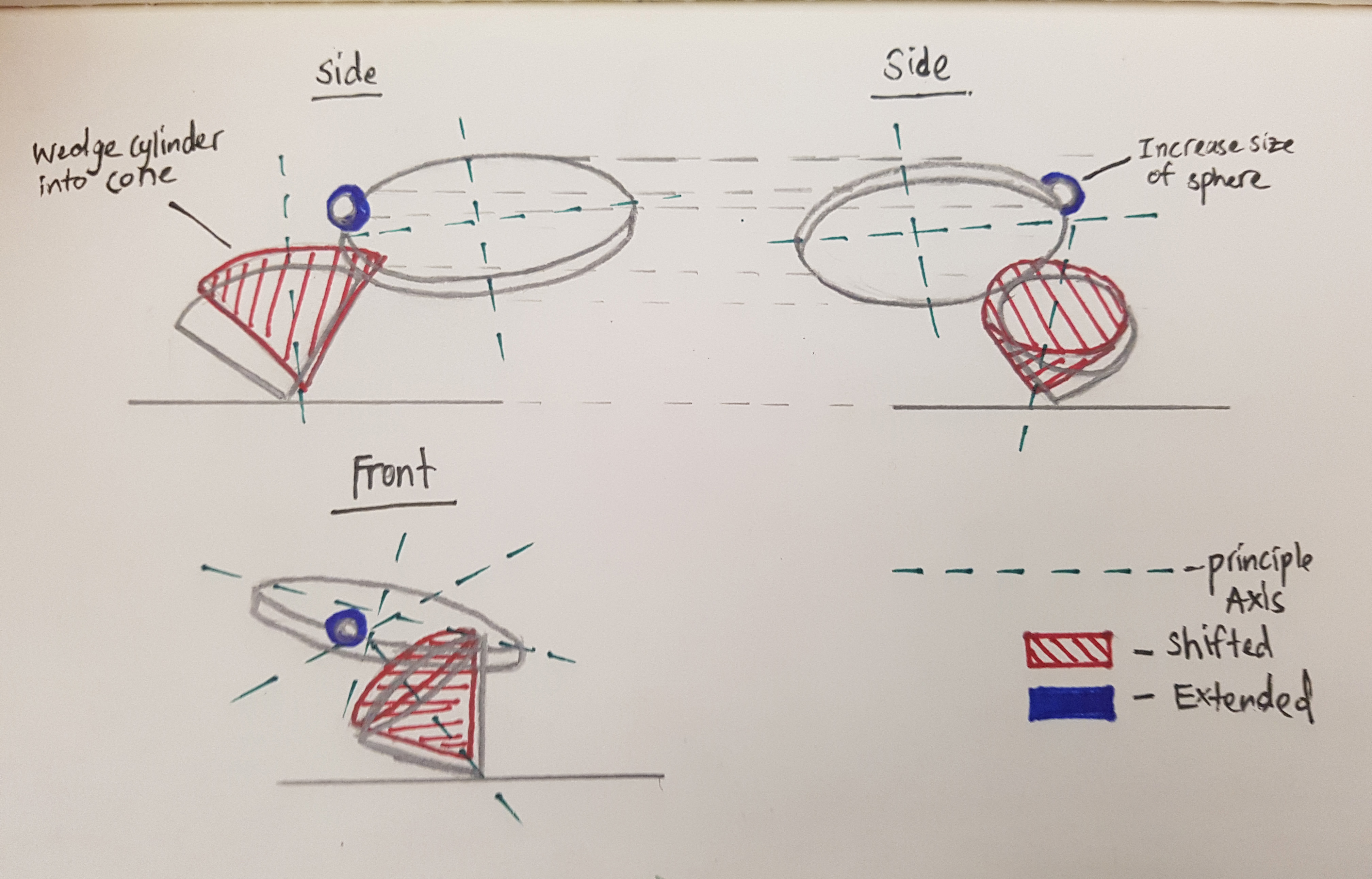
Improvements:
Make Sphere slightly bigger
Wedge in cylinder into cone
2D Sketch Analysis
Analysis for Sketch Model #1Analysis for Sketch Model #3
Sketch Model 3 to be used for reference for final product.
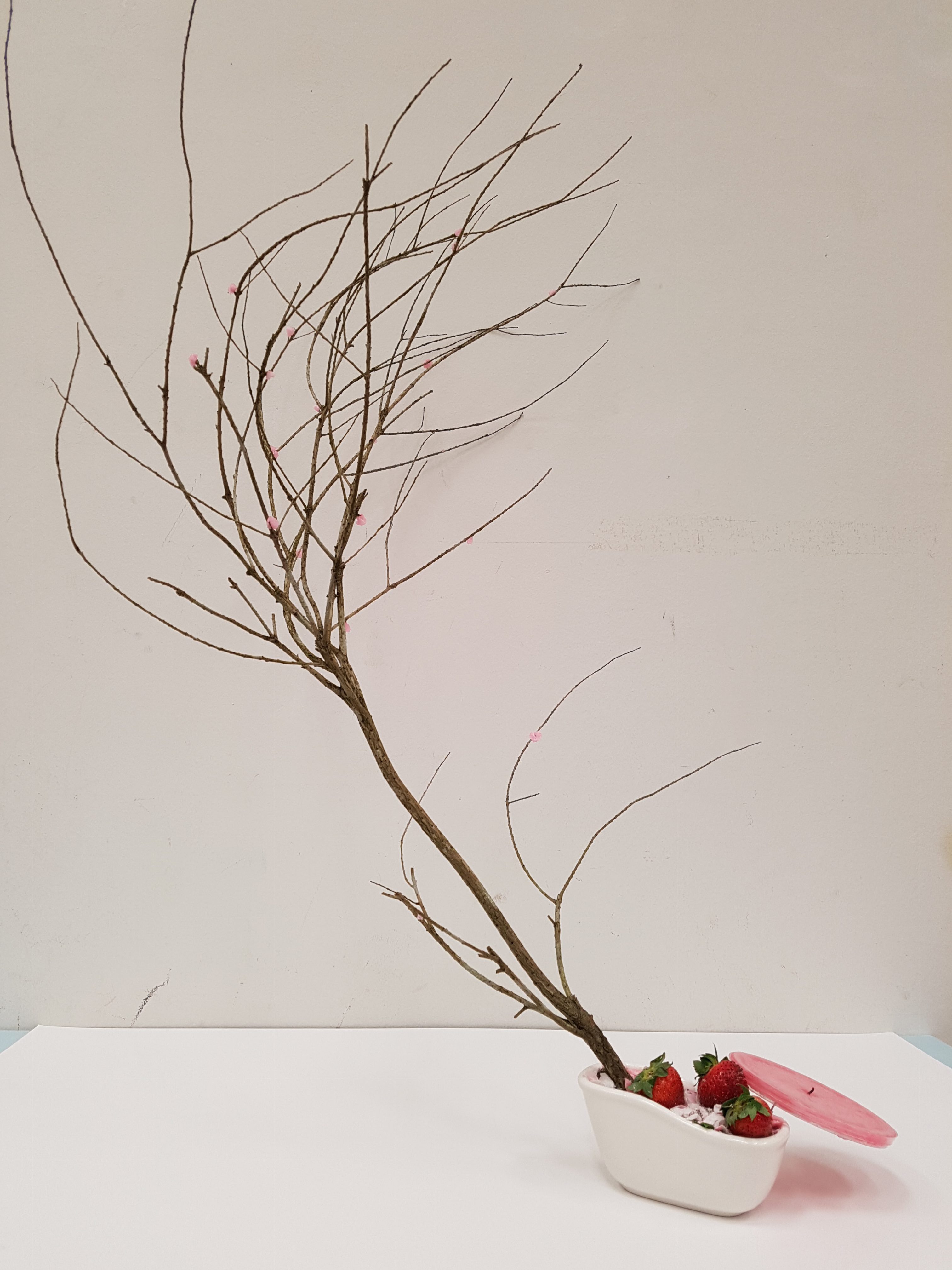
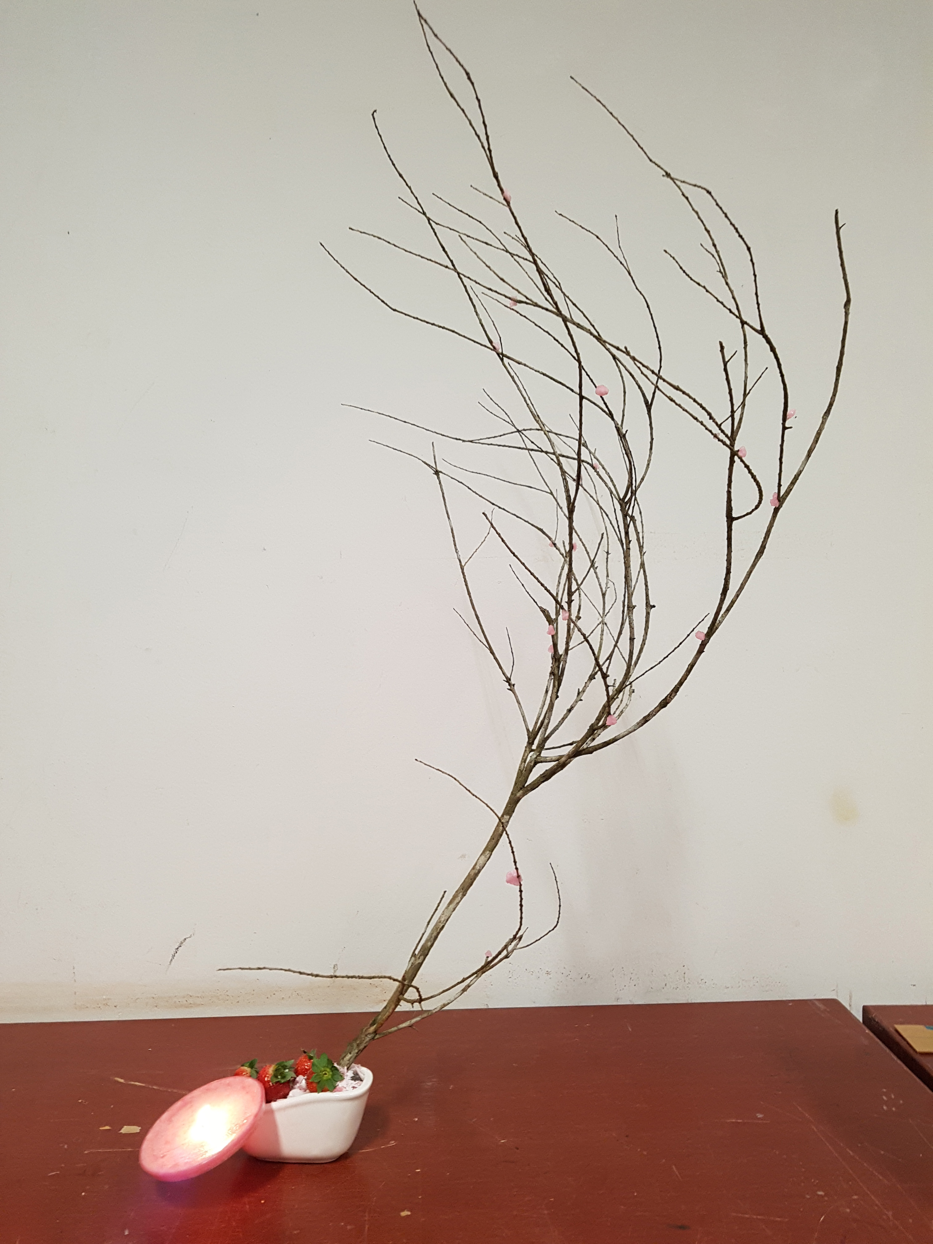
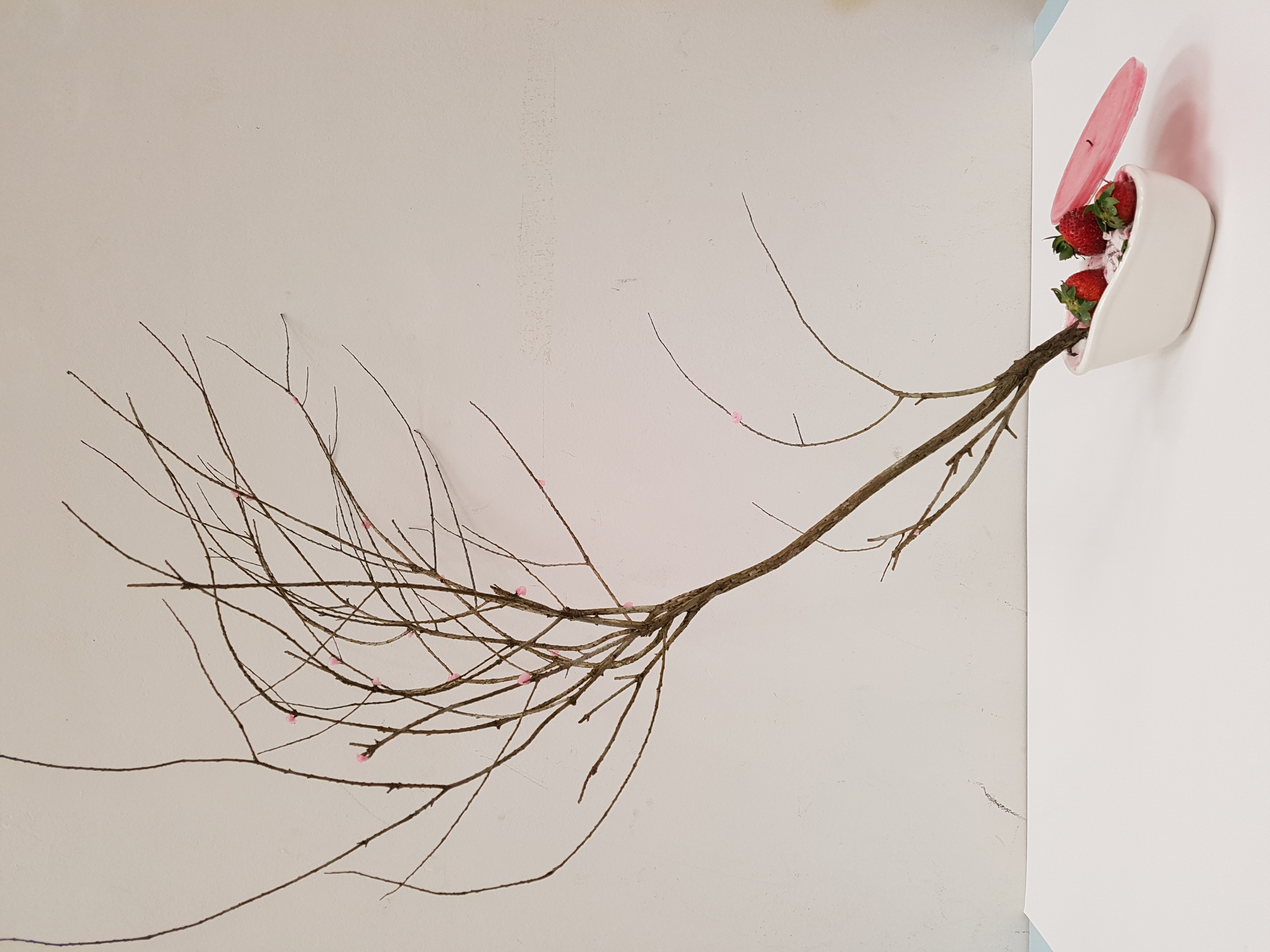
Final Product
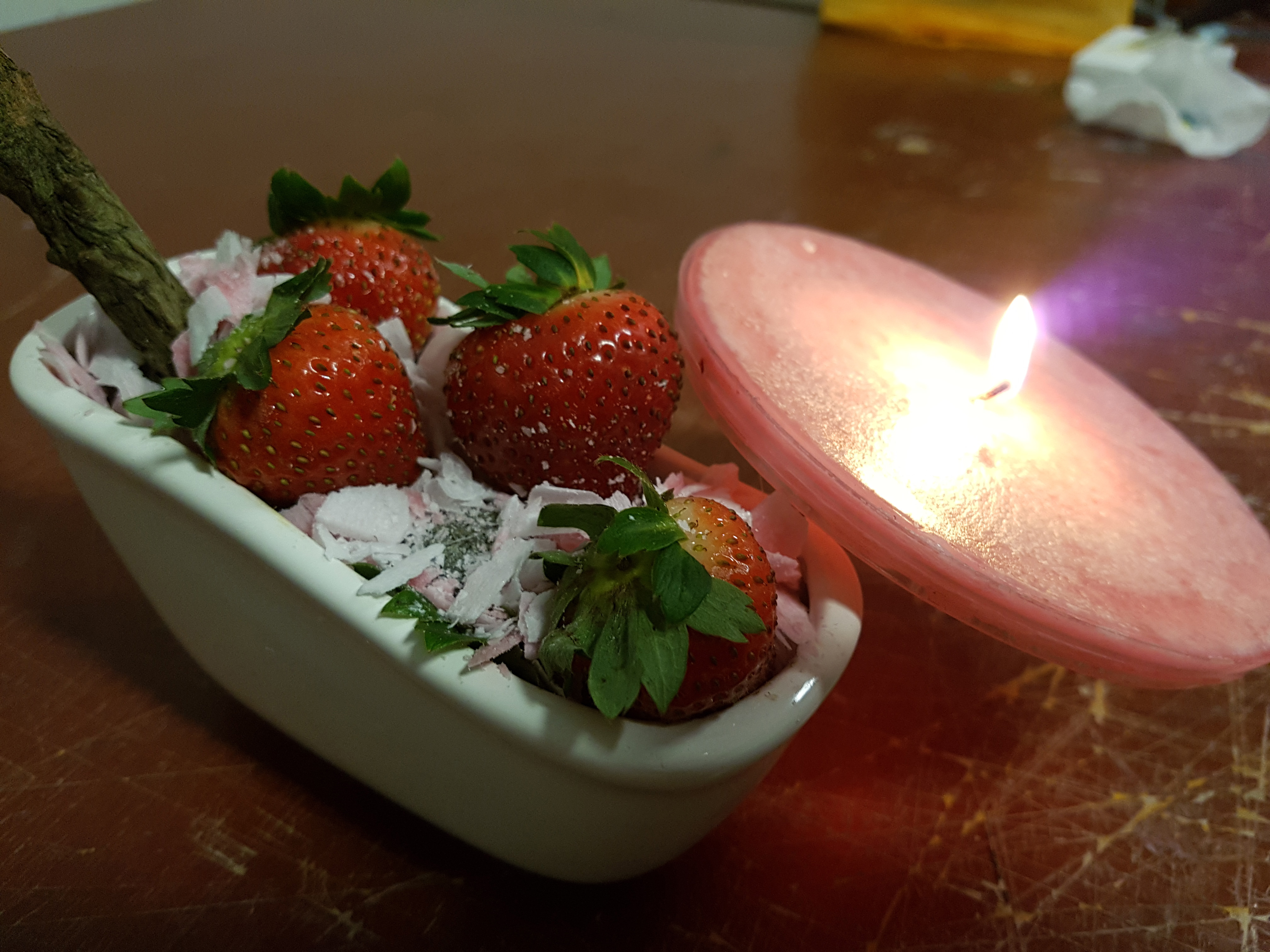
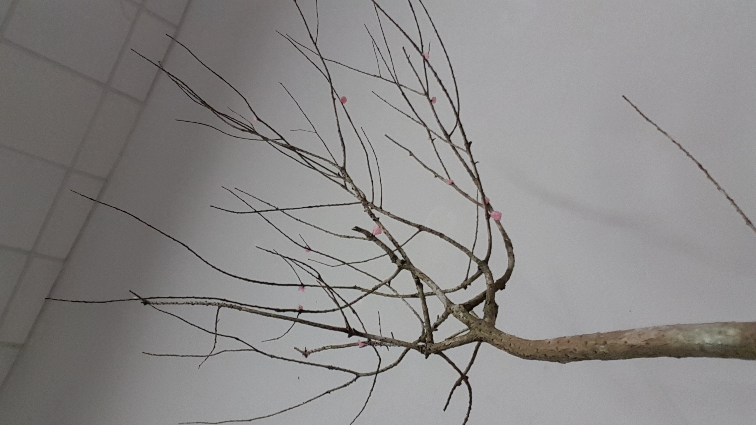
Final Product (Side View)Final Product (Front View)Close up (Strawberries + Candle + White Base)Close up (Tree Branch + Cotton Candy Balls)Bottom up view of Tree Branch
Materials used for final product:
Branch
Cotton Candy
Candle
White Bathtub (BASE)
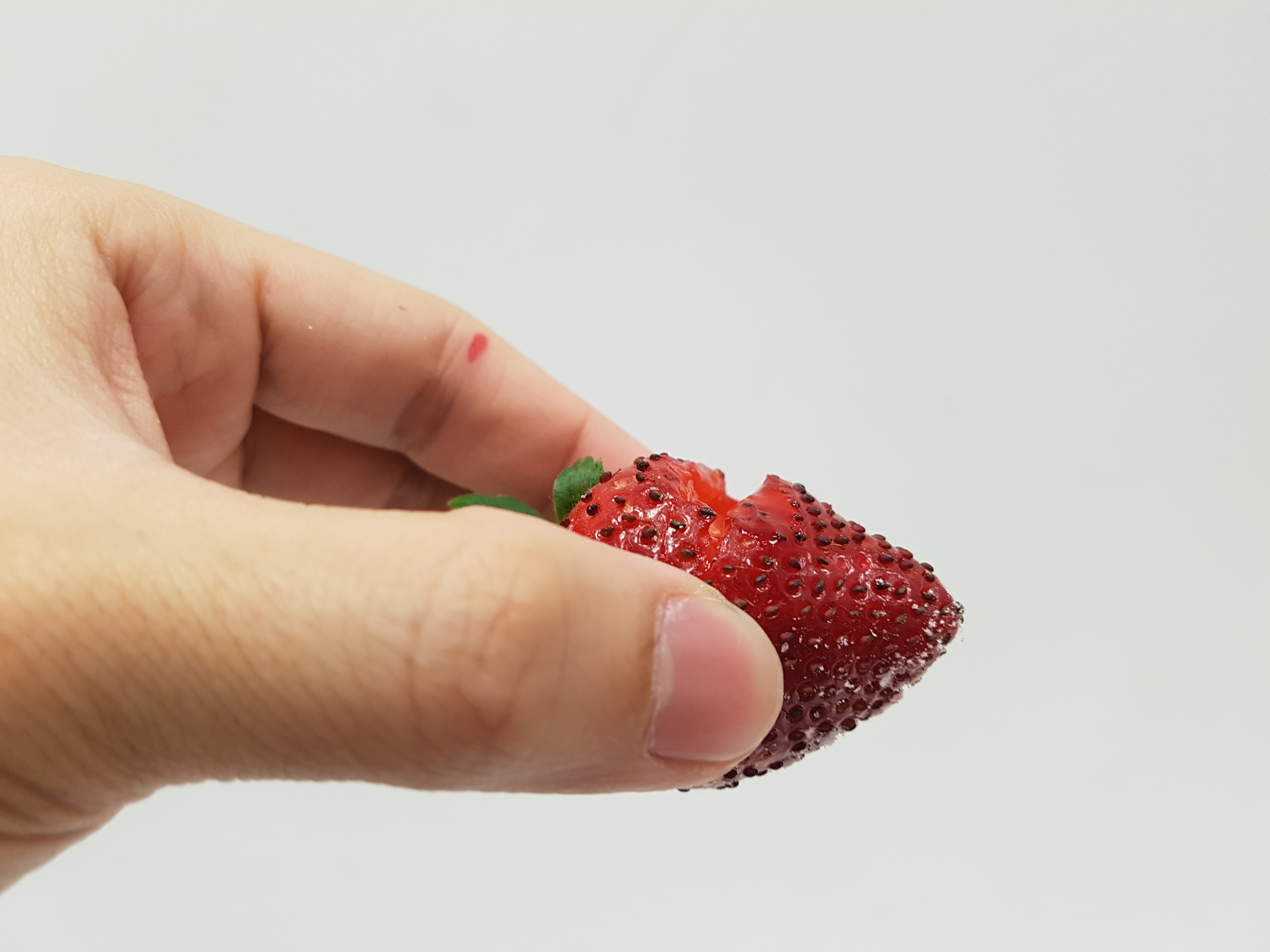
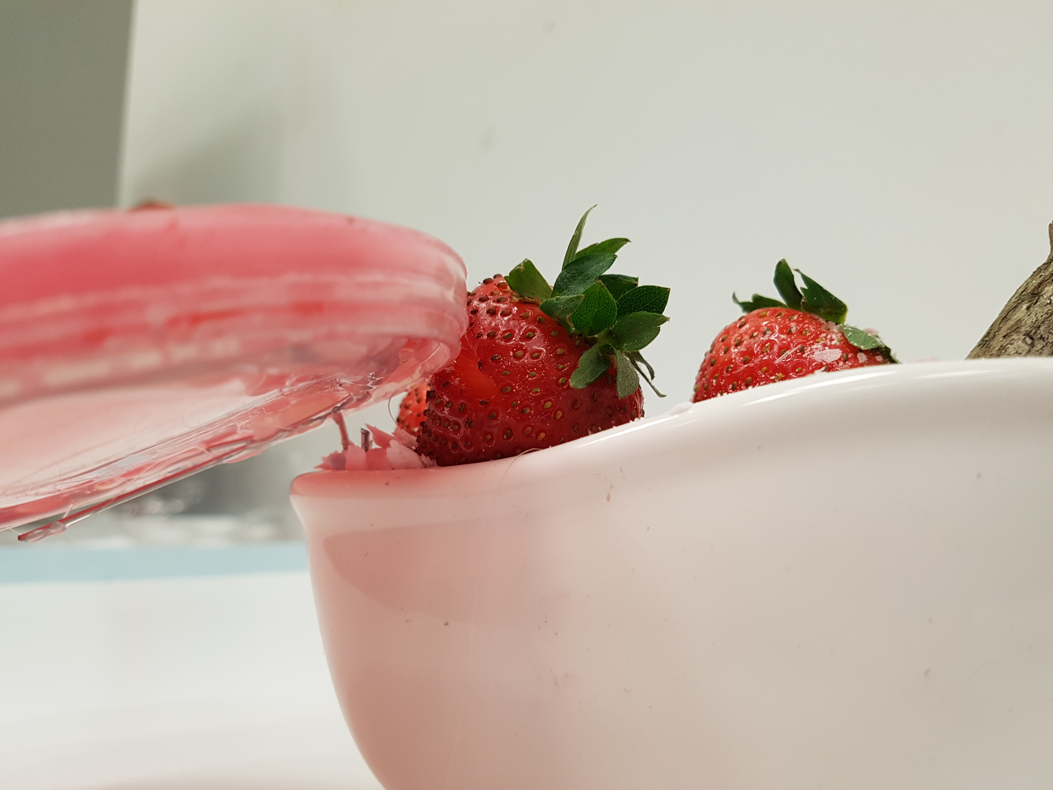
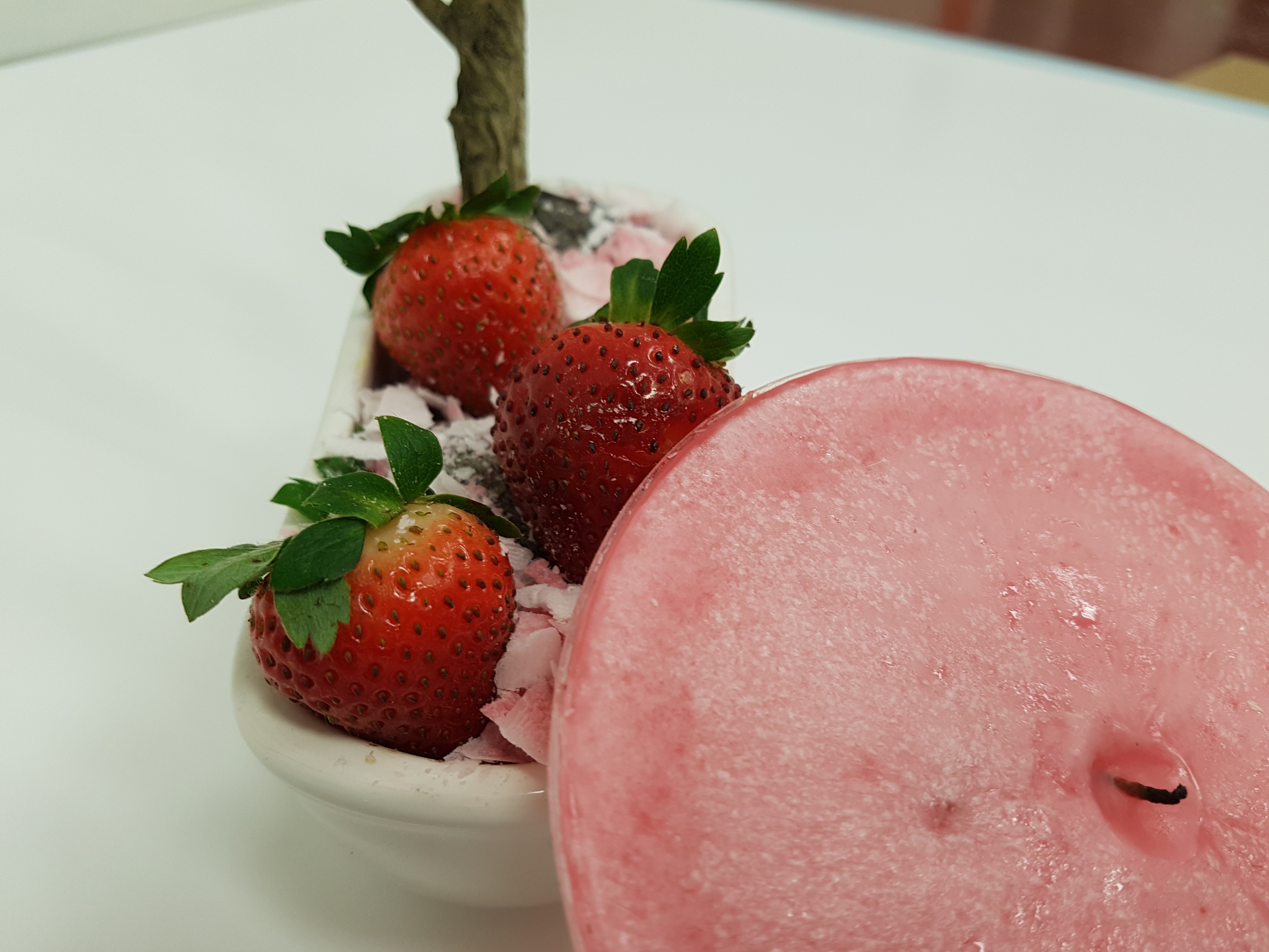
Strawberries
Colour Concept:
Pink
White
Red
Light Brown
Dominant: Tree Branch
Sub-Dominant: Candle, Strawberries, White Base
Sub-Ordinate: Cotton candy balls
Idea Concept:
When I think of spring the first time that popped up to my mind was Cherry Blossom. Hence my color concept that I chose for this final product comprises of pink, white and red which resembles that of Cherry Blossom.
Spring represents growth, vigor and blossoming, thus I intentionally chose a dynamic looking branch so that it can instantly capture the audience attention and bring out the ideas of spring. The branch is dynamic looking as it extends from a branch from the base to many branches and curls back, making it look interesting.
For me, I feel that Spring encompasses the taste of sweetness as it represents a sweet new beginning and spring break. Therefore, I used foods that are sweet like Strawberries and Cotton candy. I rolled the cotton candy into balls and placed them randomly on the tree branch as it bear resemblance to the cherry blossoms.
The candle symbolizes the warm of Spring and also the longer day time during spring. As the flame burns through the wax, it releases a fragrant floral smell that you will normally smell when flower blossoms during spring.
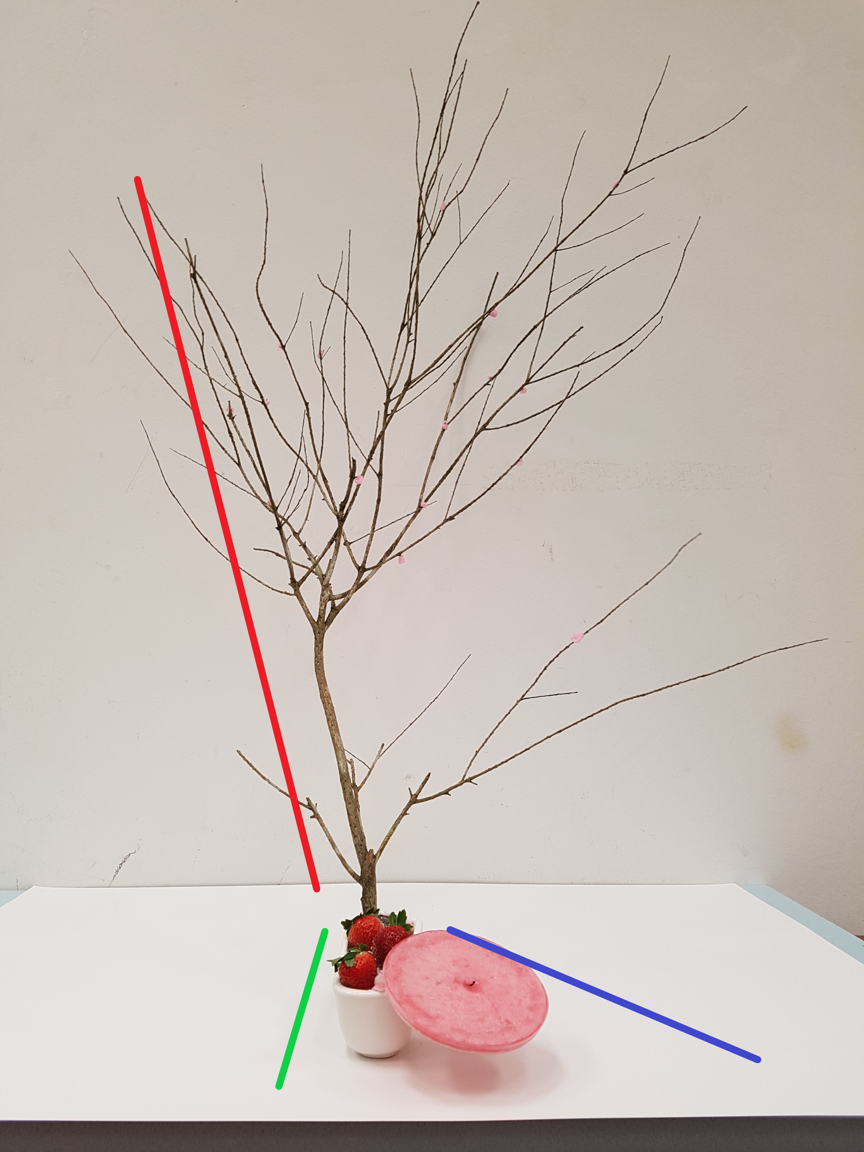
Analysis of Final Product
Ikebana emphasizes aesthetics in minimalism, therefore I tried to keep my final product as simple looking as possible while making it look interesting and encompasses the ideas of Spring.
Front View (Lines showing the Axis going different directions)
Initially the placement of my branch in line with the base but after that I shifted and tilted it towards the side and placed my candle diagonally on the other side of the base to make the whole composition look more interesting and dynamic.
Improvements:
Lesser strawberries (Too many strawberries made the base looked very messy and overwhelming)
Wedge Strawberry with candle (Connection between the objects in the model)
Carving a gap on strawberryWedging of strawberry on candleMinus one strawberry and wedging of strawberry and candle
Reflections
This assignment is really cool as it allows us to express our creativity and ideas through the arrangement and combination of random objects like food and tree branches. Because it has no limitations and restrictions, it enables us to explore the different means and ways we can use to arrange our objects. It was really cool to see the different interpretation of the seasons everyone was given and the different ways they approach the Ikebana.
However, doing the Ikebana was really frustrating because I was unable to achieve what I initially planned out to do for my Ikebana. My idea for my Ikebana was rather different from what I originally planned because I was unable to source for the materials I wanted. Hence I had to consistently improvise to make my model look as close to what I had planned. It was just frustrating because no matter how hard you try, you are still unable to get what you want…
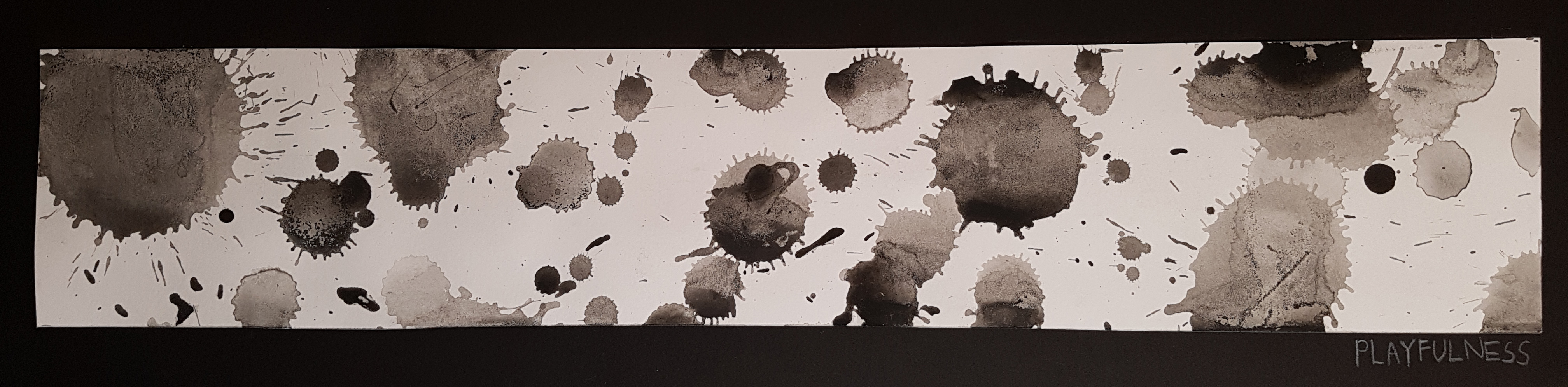
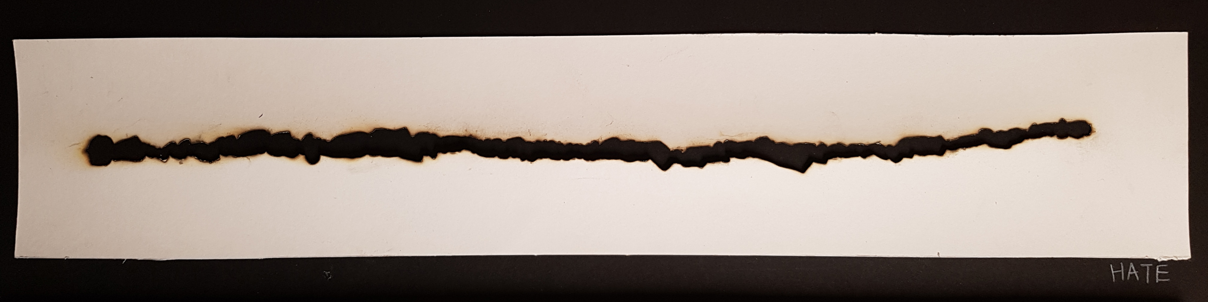
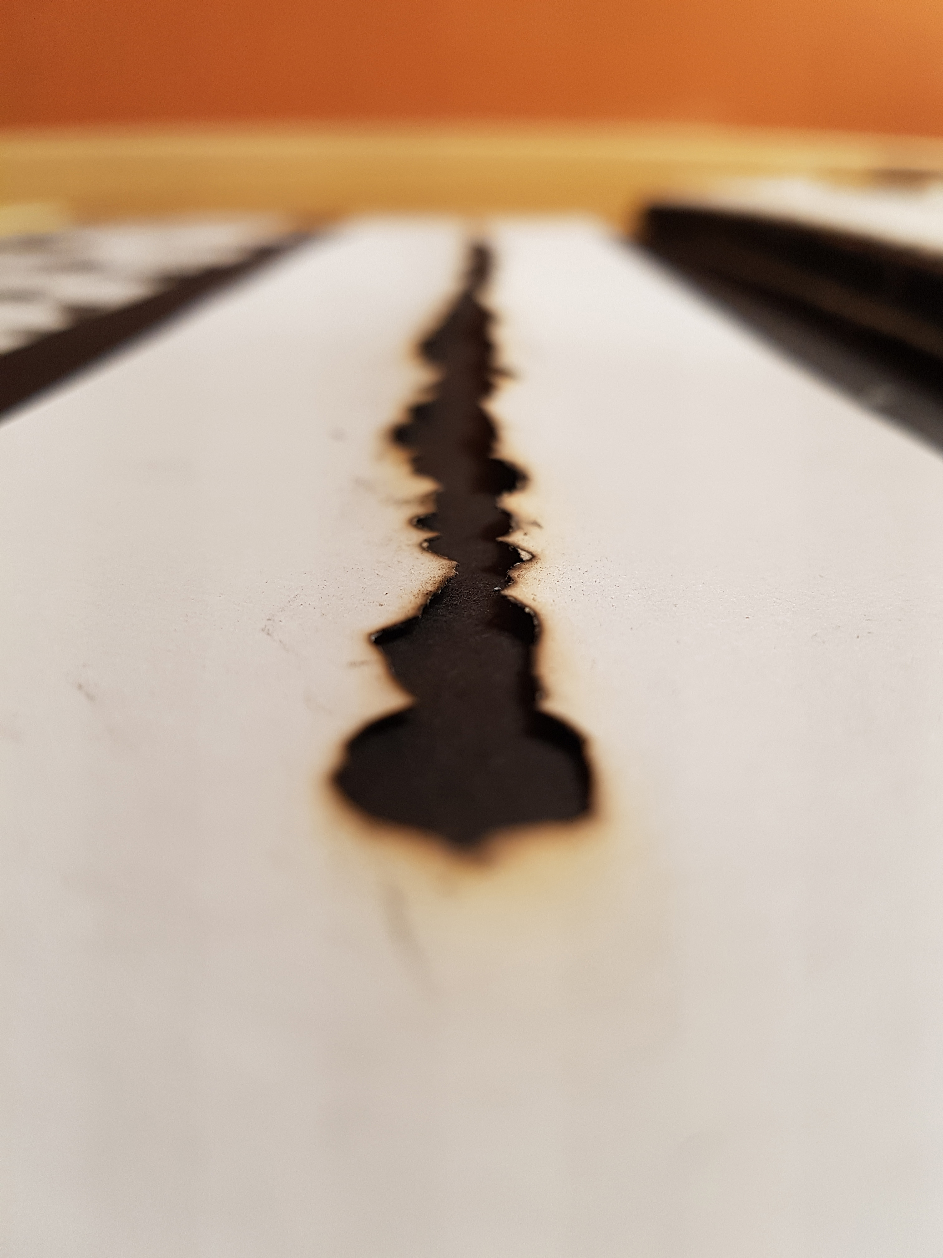
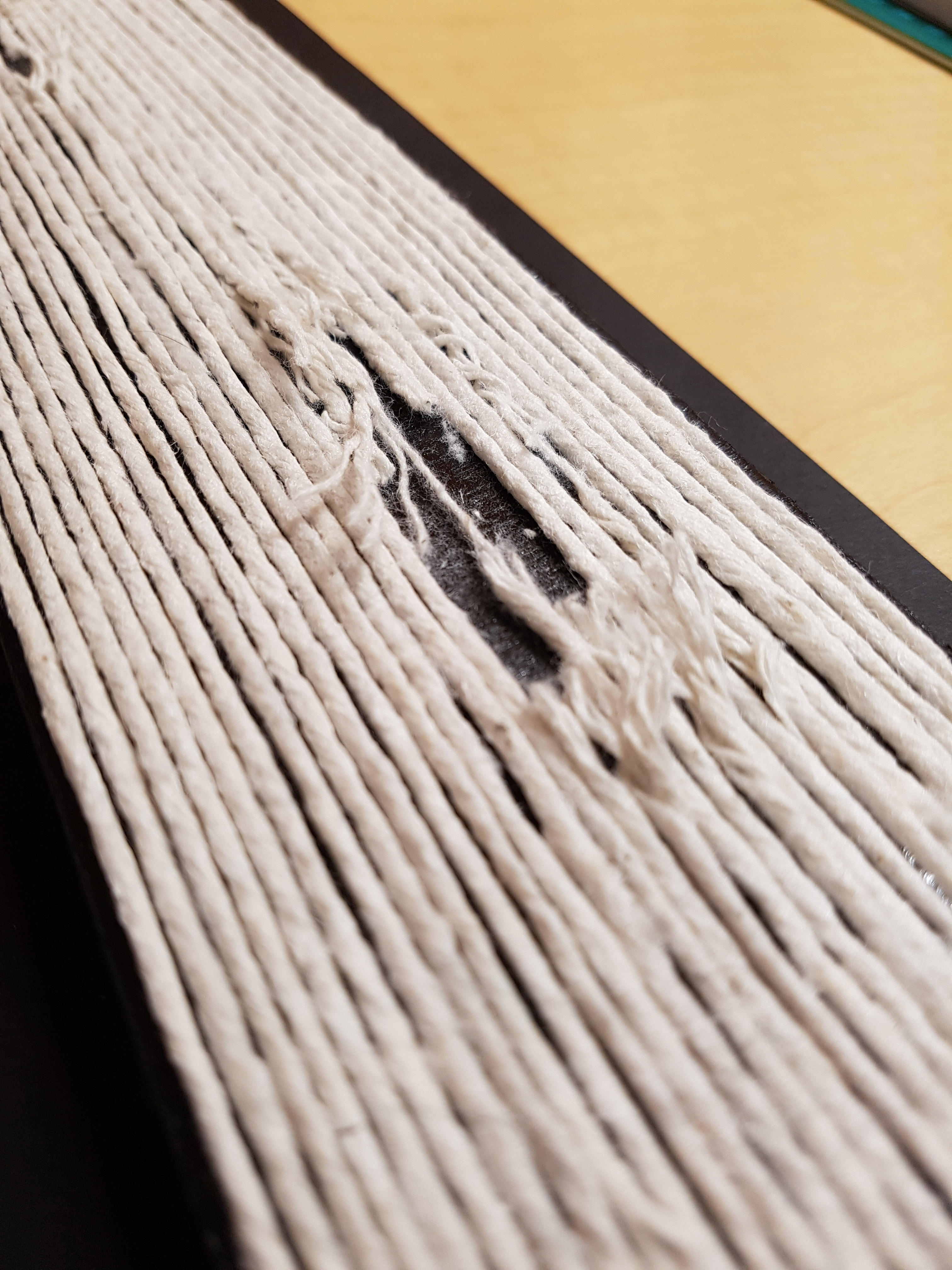
My Six Emotions: Playfulness, Hate, Love, Lost, Worry, Depression
Playfulness – the quality of being light-hearted or full of fun.
For me the word playfulness draws connection to the word cheerfulness which links to the word bubbly. Hence, I try to convey playfulness through circular patterns which is done so via dripping paint.When you drip paint, you create circular shapes with additional splatter patterns. The splatters represent the liveliness when one is full of fun. The contrasting tones and sizes further adds into the element of excitement.I Dripped paint from different height to create splatters of different sizes using a straw while controlling the ratio of water and paint to create the different tones in the splashes.
Hate – feel intense dislike for.
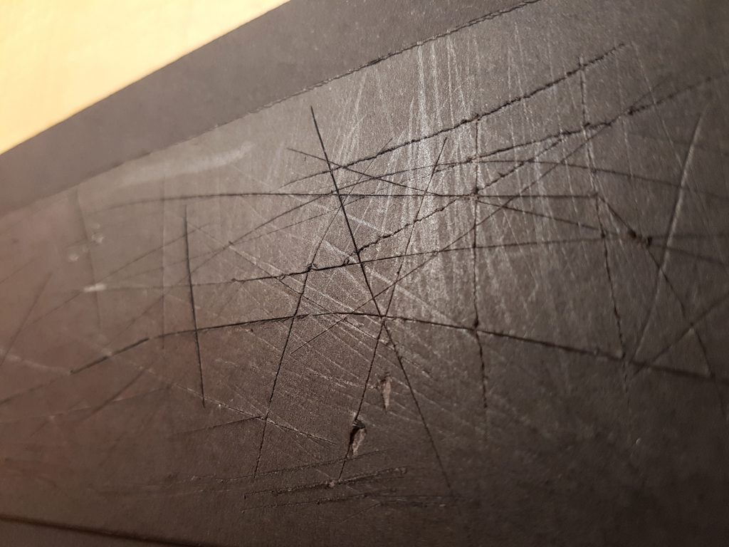
Hate is a very intense feeling. When you hate you feel the inside of your heart burning up, tearing and opening up slowly. As you hate, hatred will slowly consume you letting the dark side take over, turning you into someone else.
I used a coil and used the burning end to slowly burn through the paper creating the line. The line shows how hate burns and tears up our soul and heart. The line opens up the with a dark background to show like the dark side is coming for you.
Love – a strong feeling of affection.Love is a strange thing it can make the strongest person or toughest person in the world to go weak, to go soft. Love makes you vulnerable. The use of wood and rope signifies toughness in a person. I purposely create the holes to show the vulnerability when love comes about. The slowly snapping ropes also helpings to show that love slowly breaks you apart when you do not know it. My interpretation of what love does to you in a visual way.
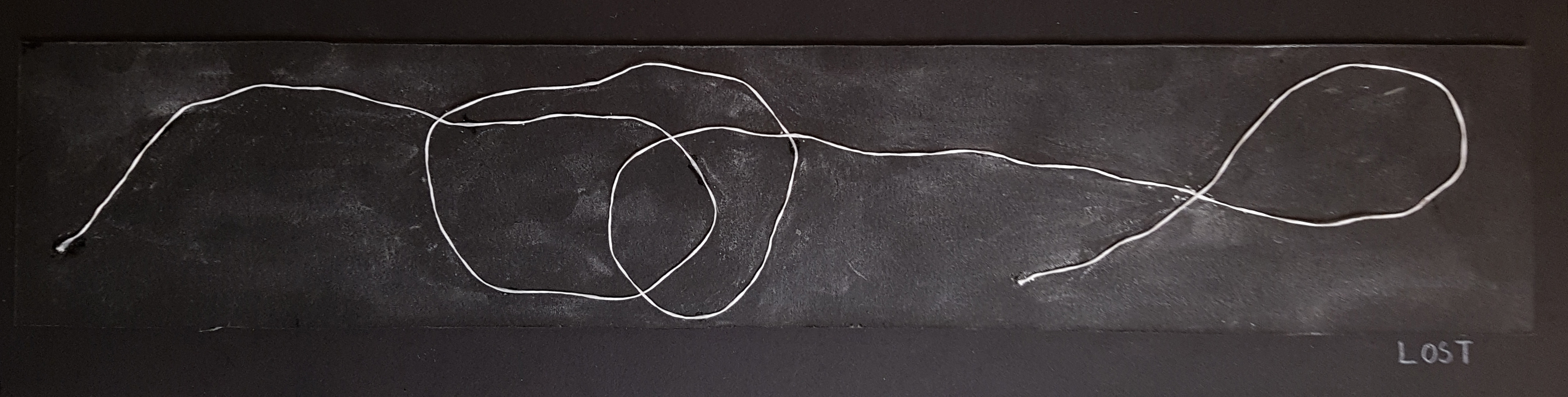
Lost – to describe the uncomfortable feeling of being in an unfamiliar situation
For this emotion, I was trying to creating a dreamy setting whereby a man is trapped in a place (limbo) where he is unable to escape and find his way out. The emotion lost was also inspired by a soundtrack called “Theme” from Eternal Sunshine of the Spotless Mind. In my opinion, the piece sounded like a man being trapped in a world where he is trying to escape but it always goes back to a loop. The dreamy setting is created with the use of baby powder. I spread the baby powder out on the black board to create like a misty and foggy scene.
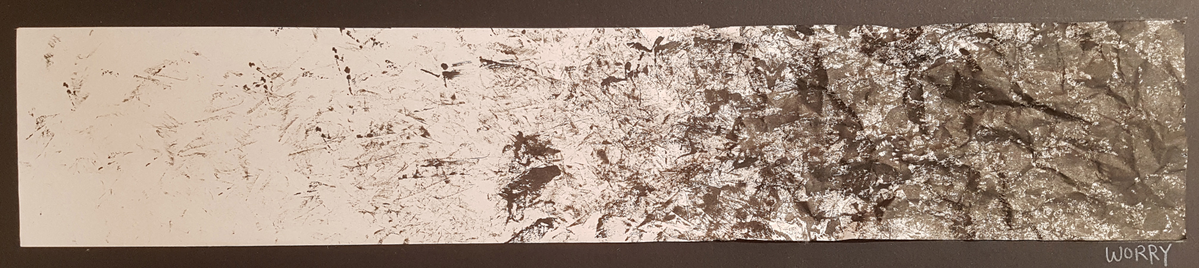
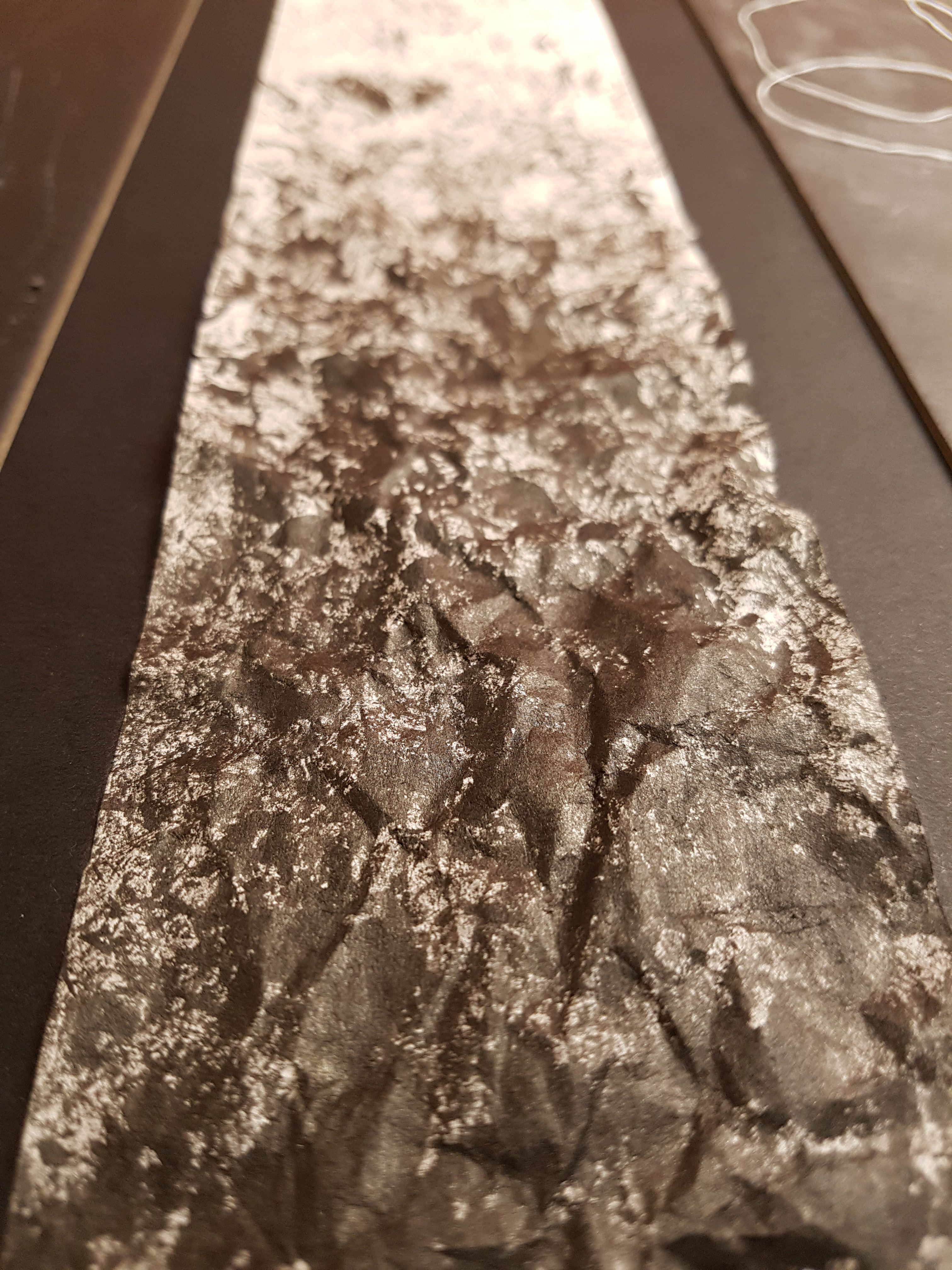
Worry – anxious or troubled about actual or potential problems.I am a thinker and sometimes I feel like I think too much. I over analyse things too much and most of the times, the things I worry about do not even happen at all. So, I feel that worrying always leads to nothing or it leads to further emptiness.
For the interpretation of worry, I used crushed paper to create a very messy composition to represent the chaotic mind i.e. looks like brain cells working. Next the crushed paper mark making will slowly fade off as it moves from right to left symbolising that worrying leads to nothing or that it just leads to more emptiness. Besides I crushed the right side to add further bring out the messy state of mind.
Depression – feelings of severe despondency and dejection.
Victims of depression are mostly unaware that they have depression. Depression is an illness, it is not a choice. Sometimes people we think are fine are the ones that need our help the most. From the outside they might seem fine, but sometimes they are suffering deep down.
I created this by using pen knife and my finger nails. The cuts were made by pen knife which represents self-harm. And as you look closer, you can see the marks made by my finger nails, these represents the pain they are suffering from the inside which we do not understand.
Overall, I think this mark making project is very fun and interesting as it is a very open project whereby you can share your ideas through creative means. Beside, I think it is very cool how everyone has their own unique and distinct styles and very often you can point out a person’s characteristics and personalities through their mark makings. I also feel that sometimes aesthetically pleasing works are not necessary good because I feel that the stories and interpretation from the artists themselves are more important and gives the artwork a life. (In my opinion) One thing I learnt from doing this is the importance of referencing. Sometimes when you reach an idea block, referencing from other sources for creative ideas is actually useful. However, it is good to reference and pick out certain good points from other sources but I try not to refer to it too much as our idea will start becoming similar. Another thing I learnt is patience. Actually I am not really a patient guy, so during the process, I got quite annoyed and frustrated on a few occasions as I was unable to achieve what I wanted. But oh well, life is about success and failure, and only through failure will you learn. Success and learn!!! 😀