
Counter balance
According to the dictionary, a counterbalance is a weight that balances another weight or a force or influence that offsets or checks an opposing force.
Checklist for 3D models:
- Models should achieve the idea of counter-balance
- All boxes must be able to be seen when rotated around.
- Model should comprise of a dominant (D), sub-dominant (SD) and sub-ordinate (SO) and they should stay consistent on different sides.
- The model should not be flat looking. Try to make model look interesting with varying boxes. 360-degree interesting.
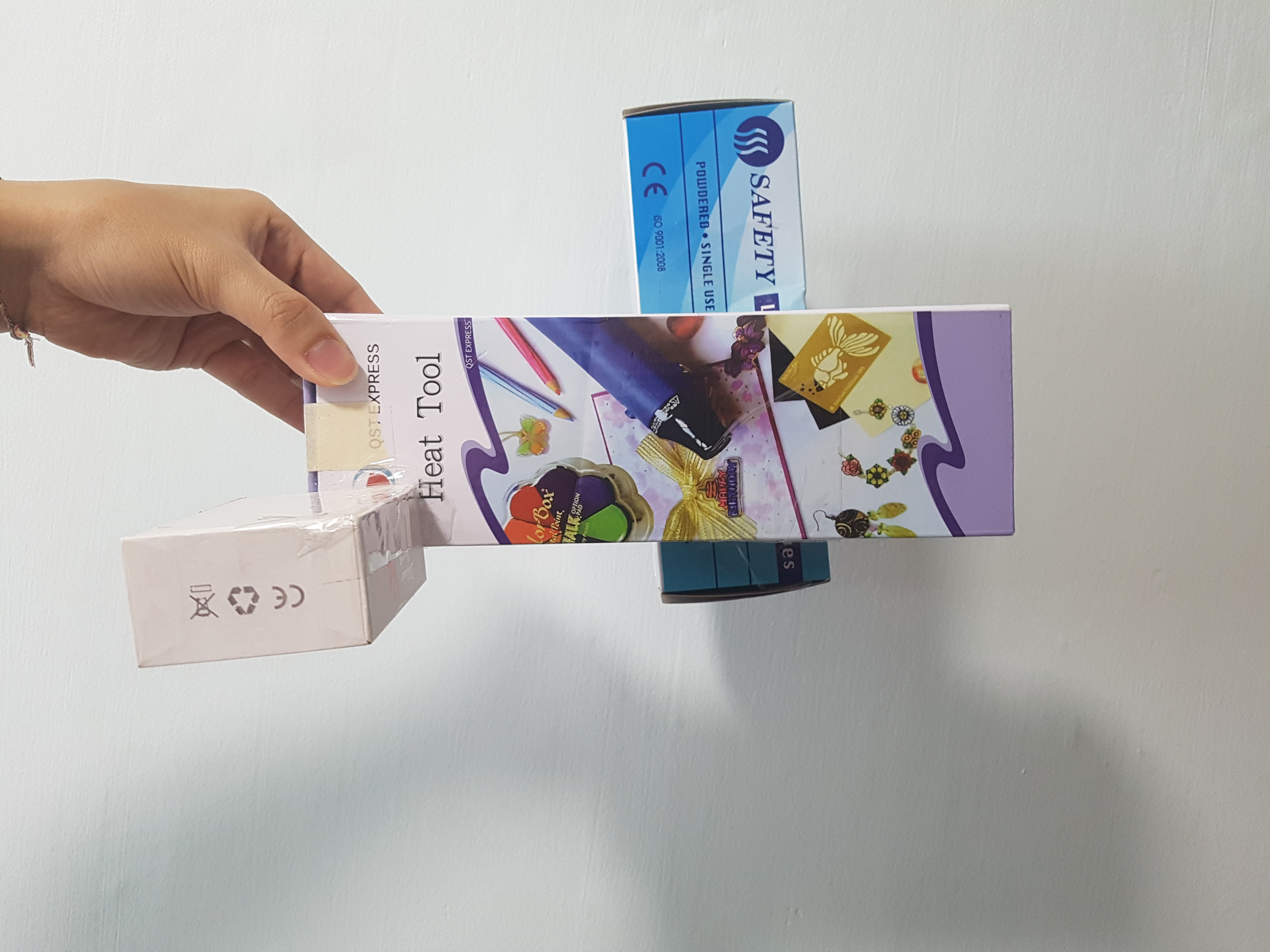
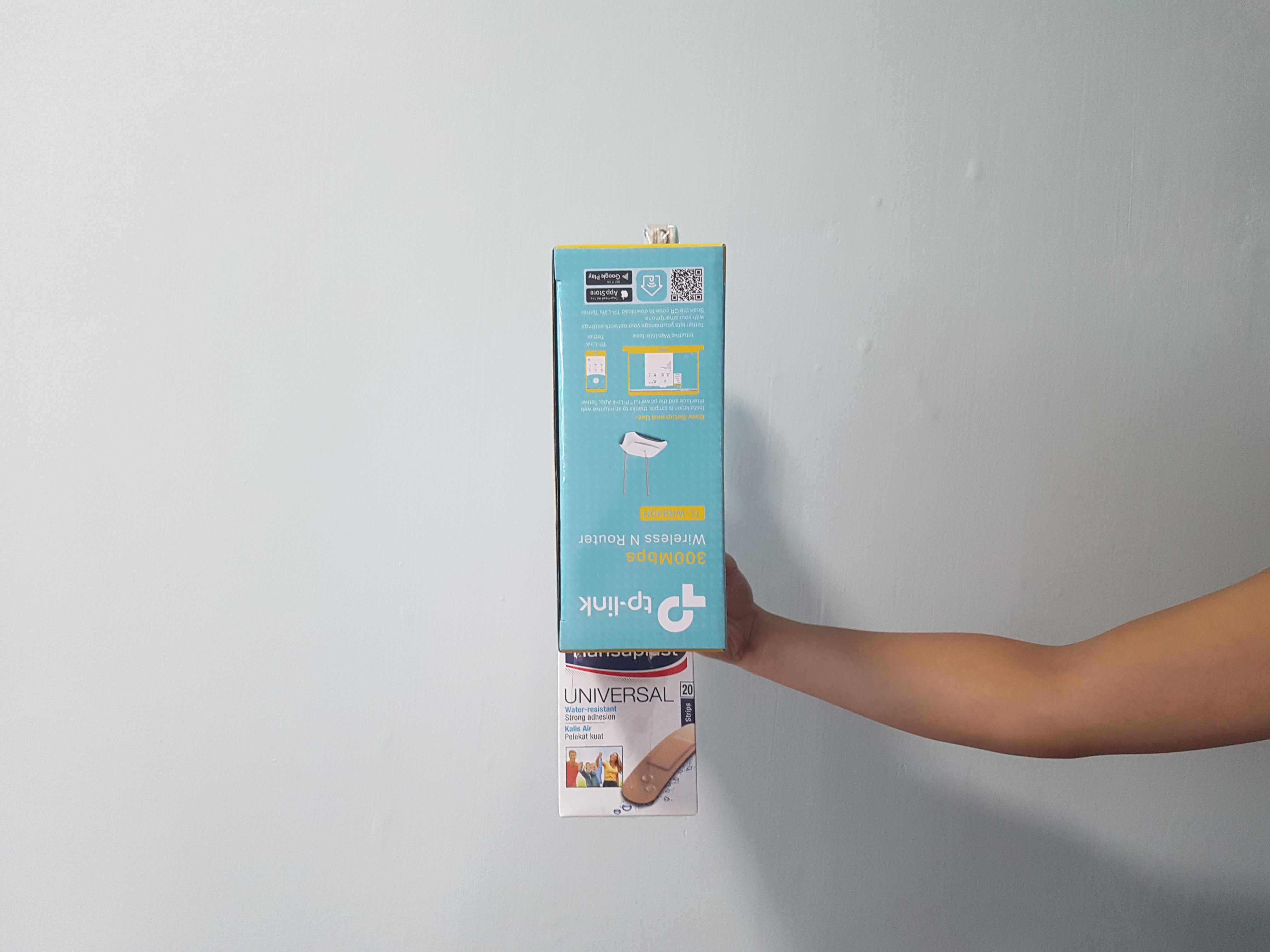
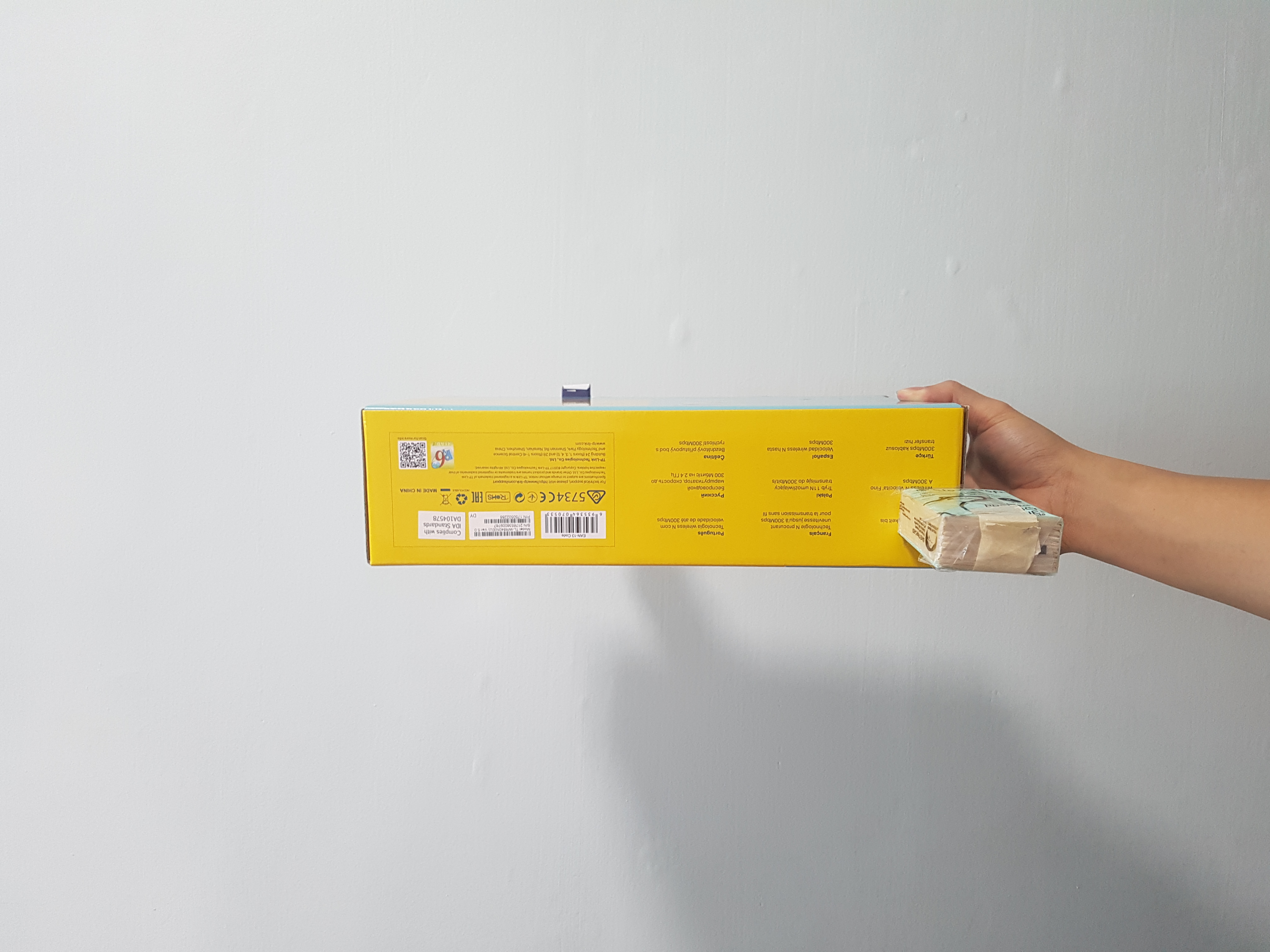
During week 1, I only focused on getting the counter balance idea and making sure the 3 boxes are visible from different sides. However, I did not take note with the dominant, sub-dominant and subordinate concept.
Failed compositions from week 2:
Model 1:
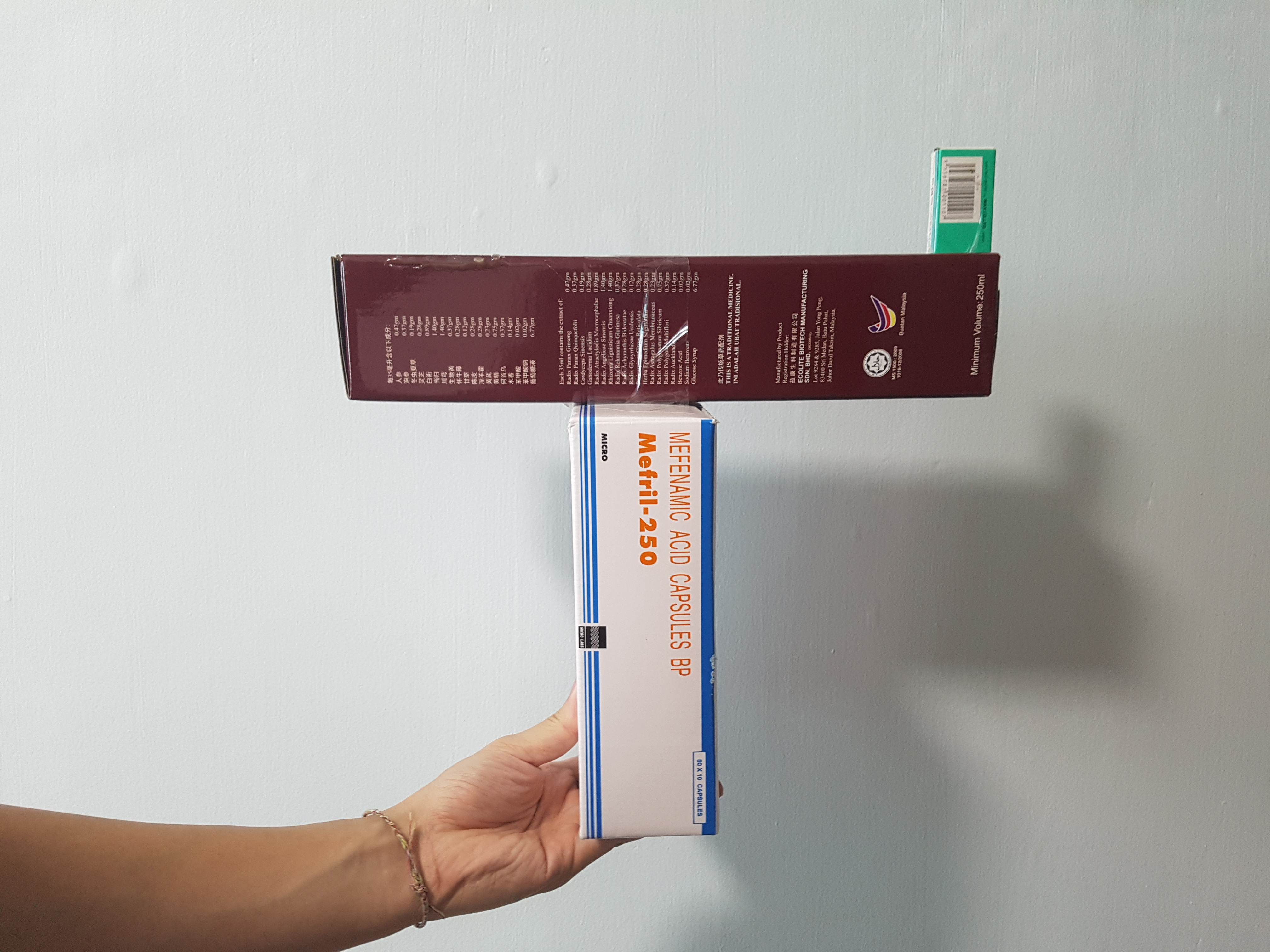
Model 1 failed because I was unable to achieve the groups of D, SD and SO consistently from different view.
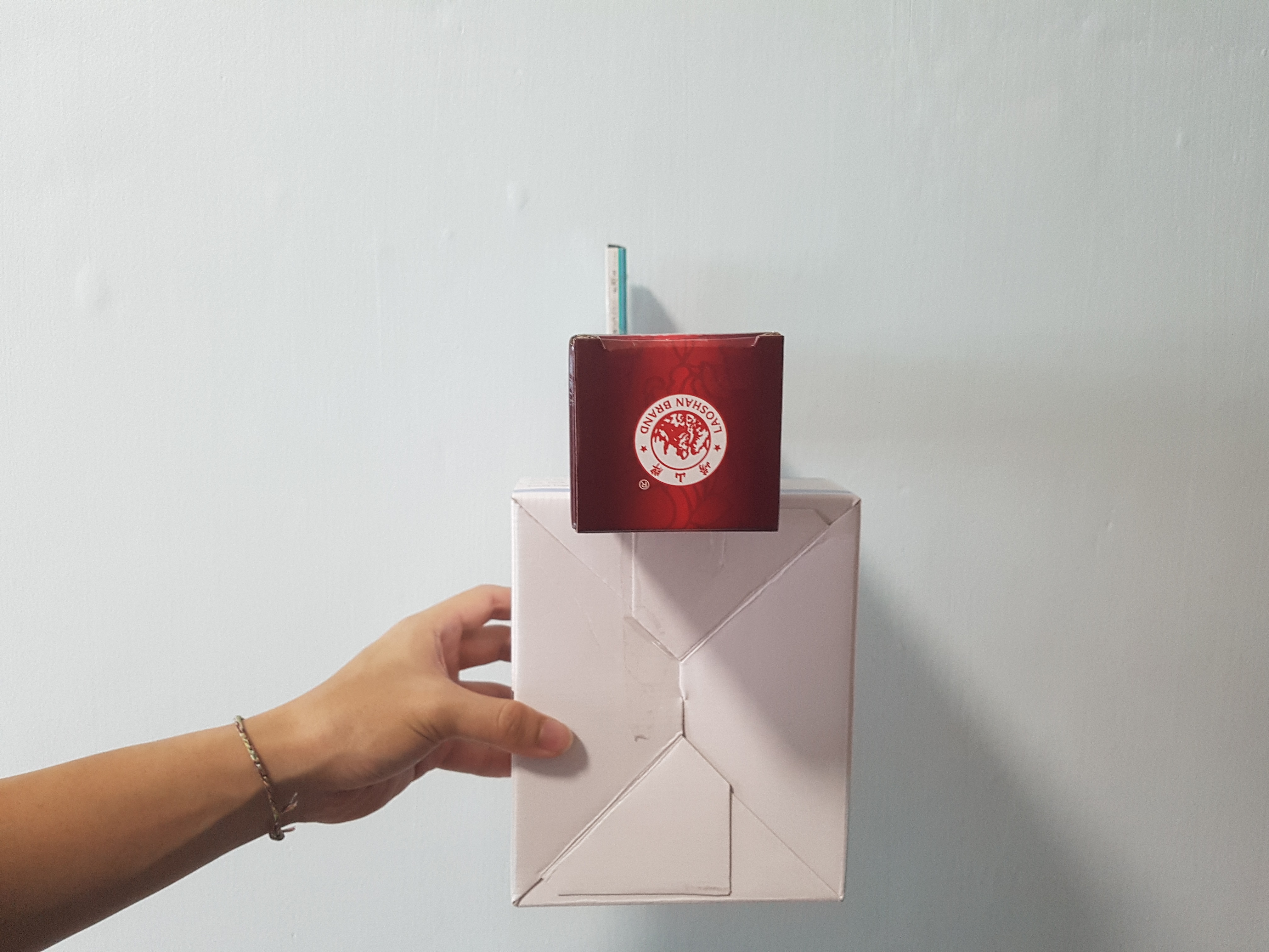
Model 2:

Same goes for model 2, I was unable to achieve the groups of D, SD and SO consistently.
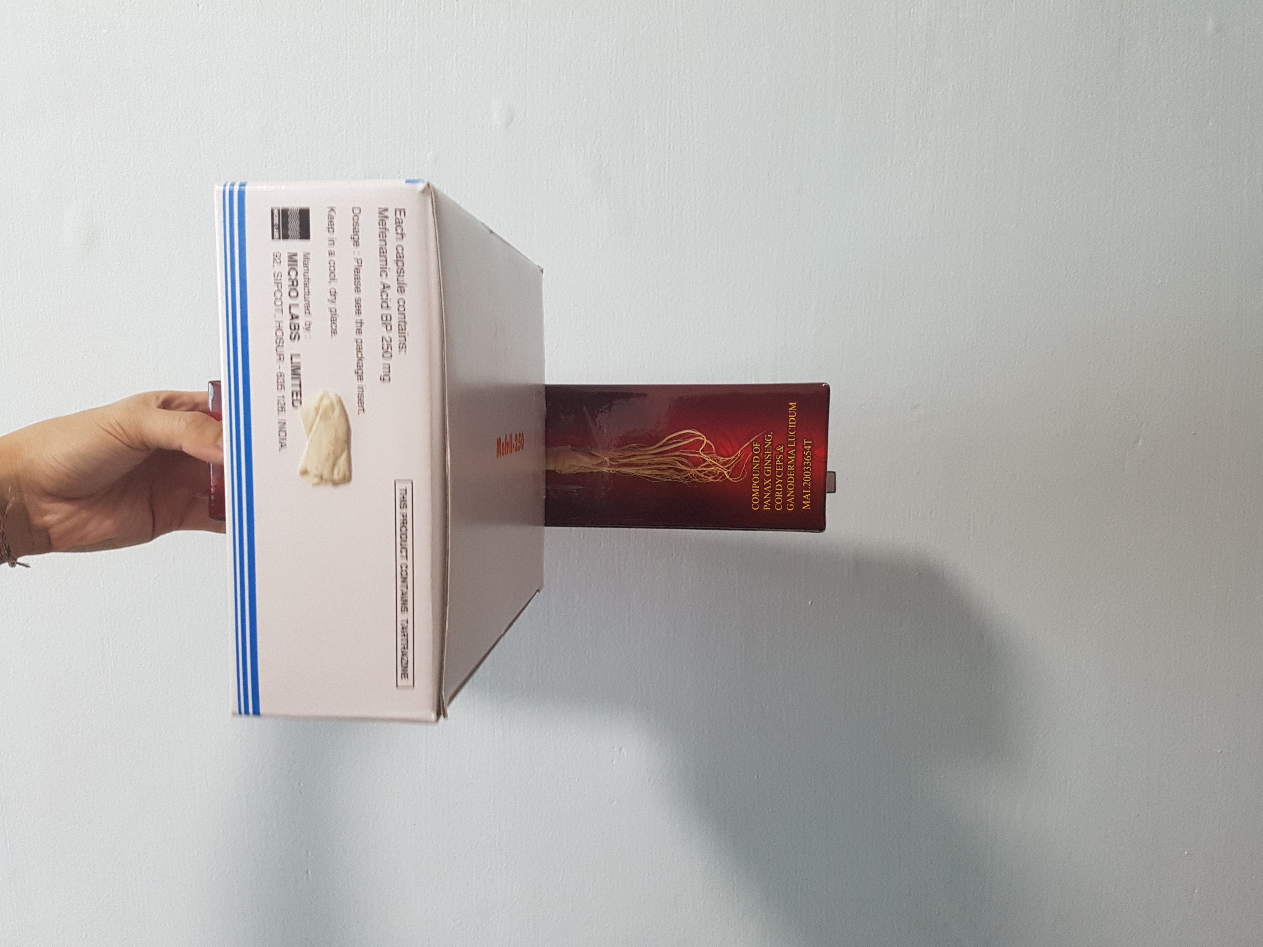
Model 3:

For model 3, it looks too flat and was not interesting looking.
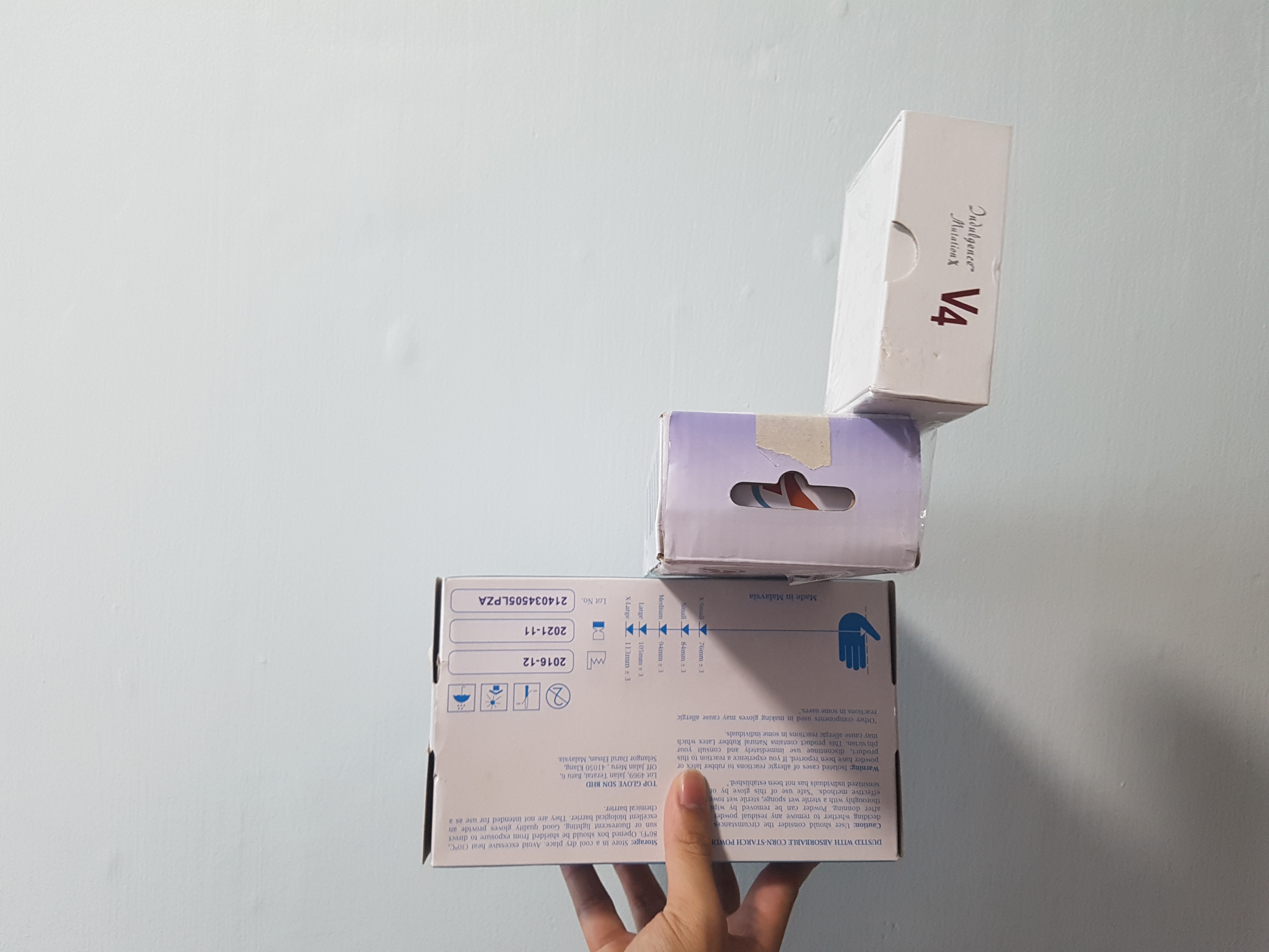
Although I tried applying the counter balance idea into the models, all 3 models looked like one another and was not visually interesting.
Week 3
For week 3, I tried to play with more different combinations to achieve the idea of counter balance while trying my best to apply the groups of D, SD and SO into my models. I placed my boxes without taping them together first and tried to play with counter balancing the acting forces or the weights so that I could get as close as possible to the idea of counter balance.
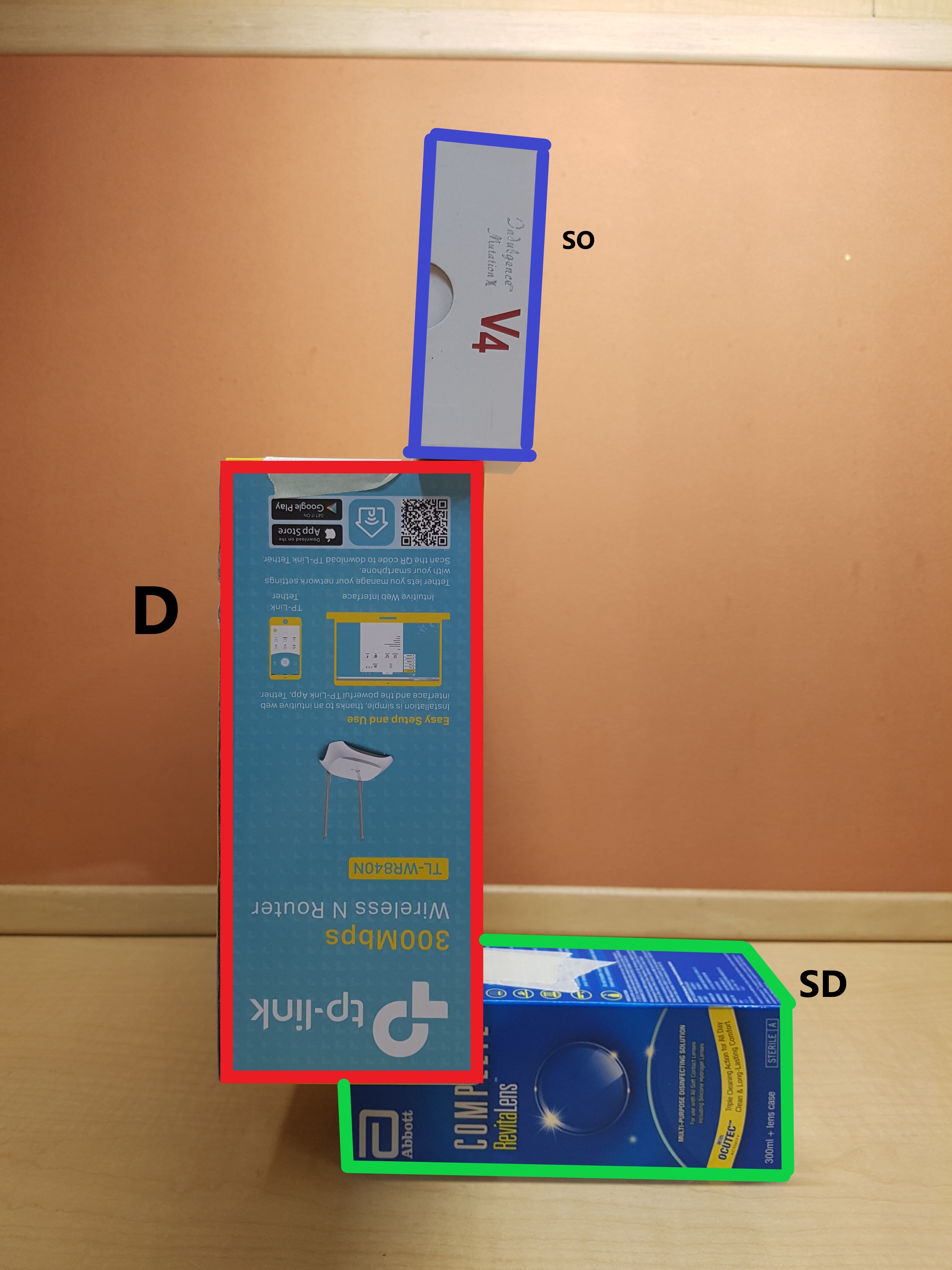
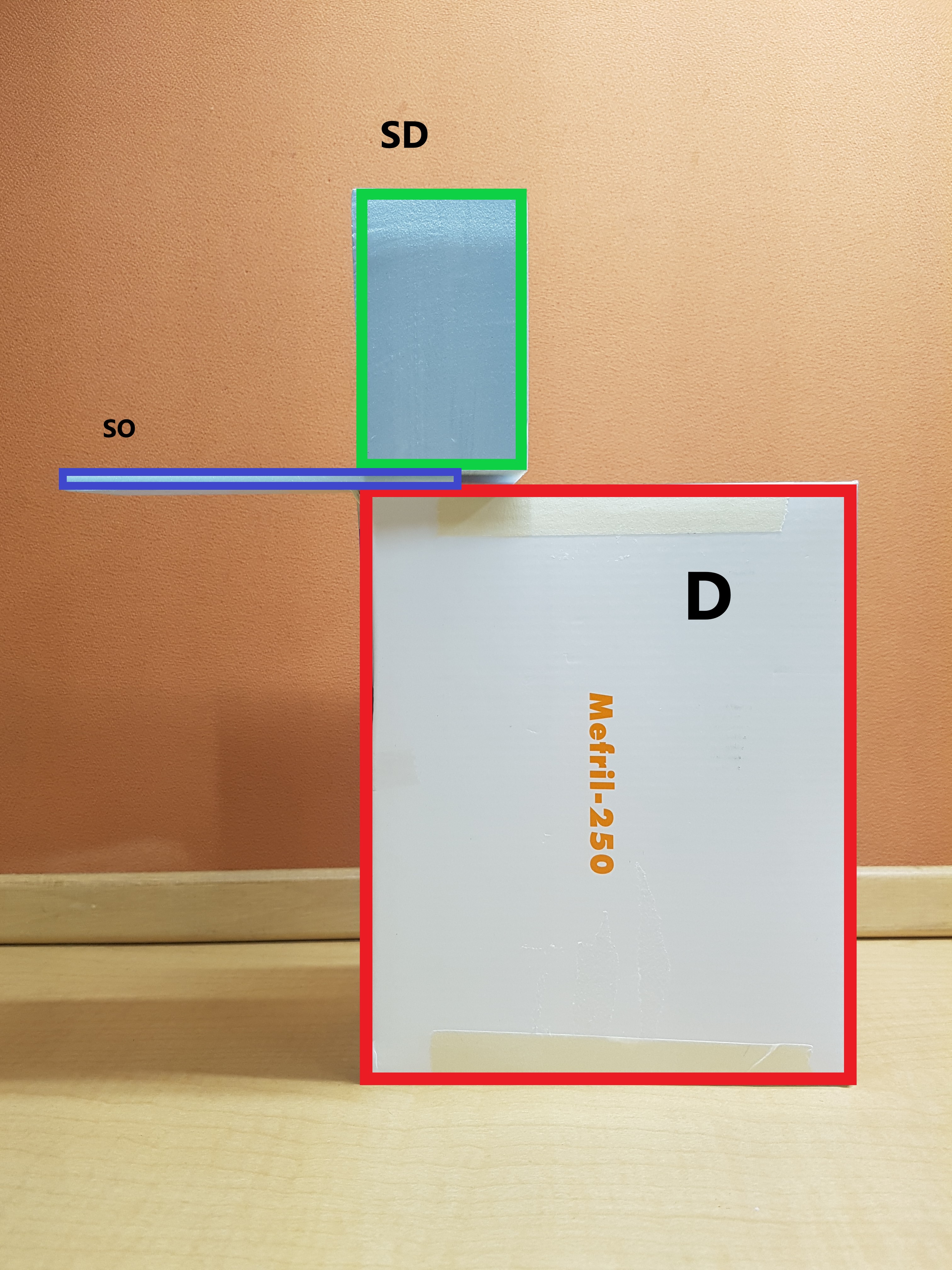
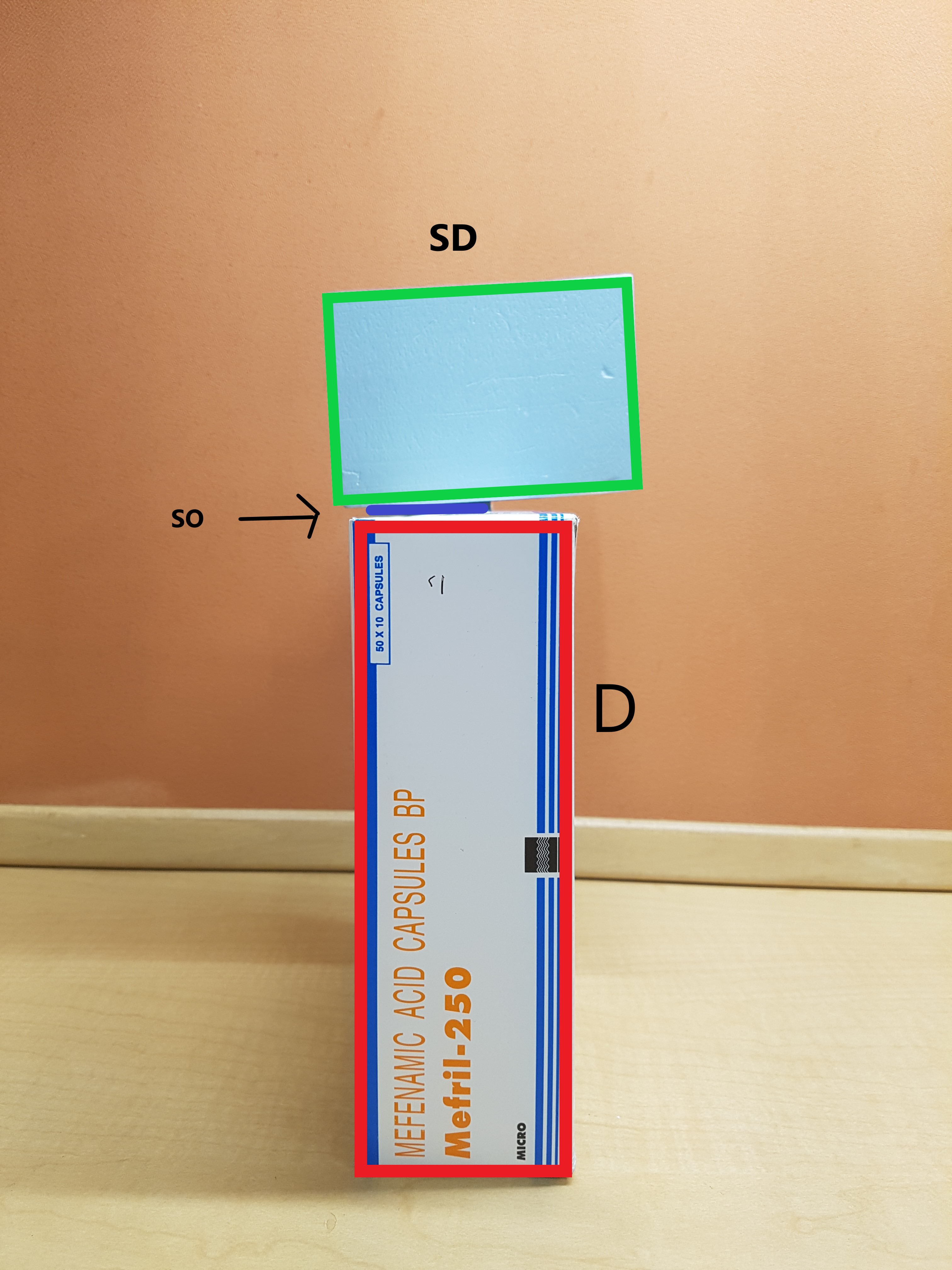
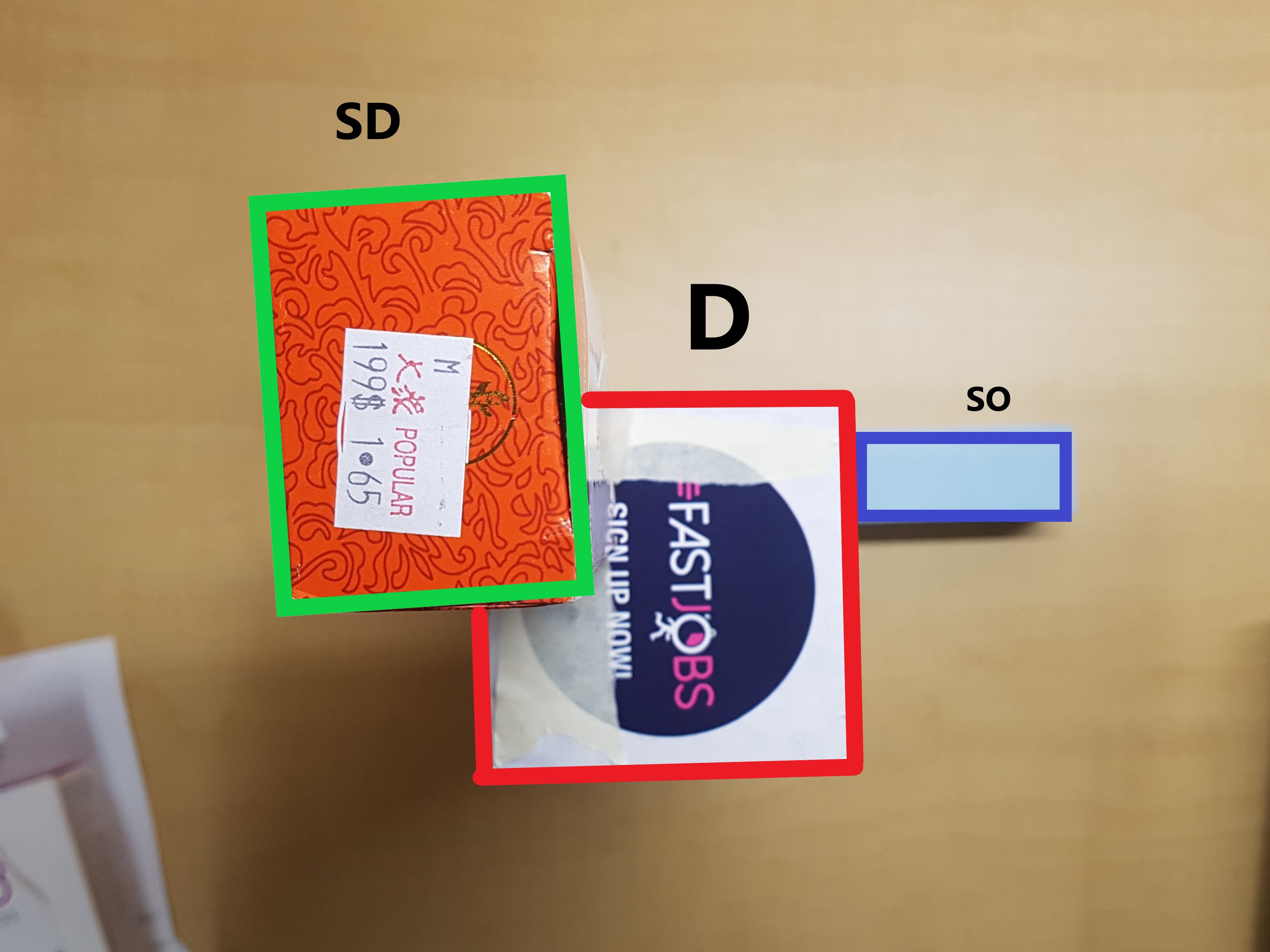
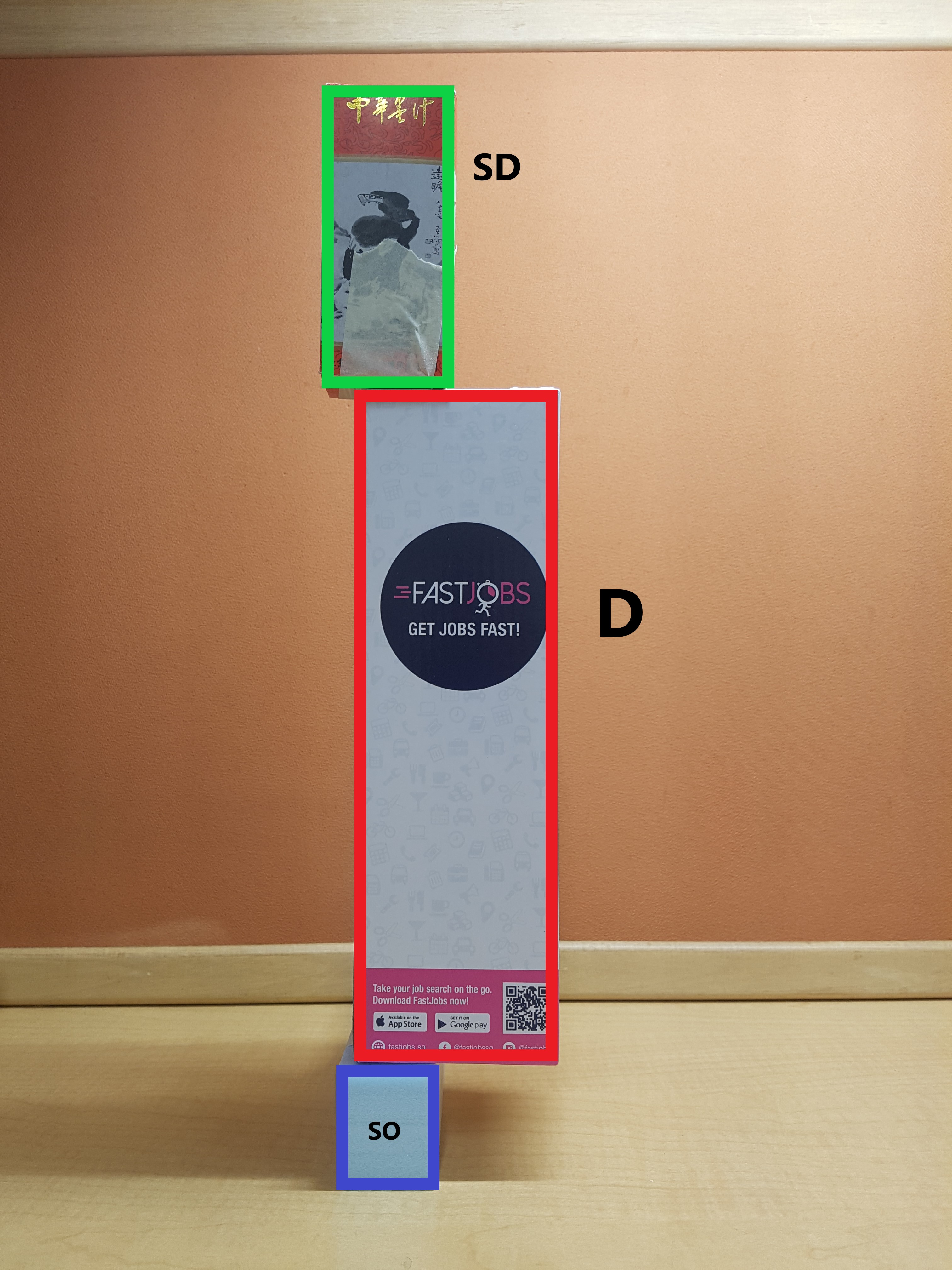
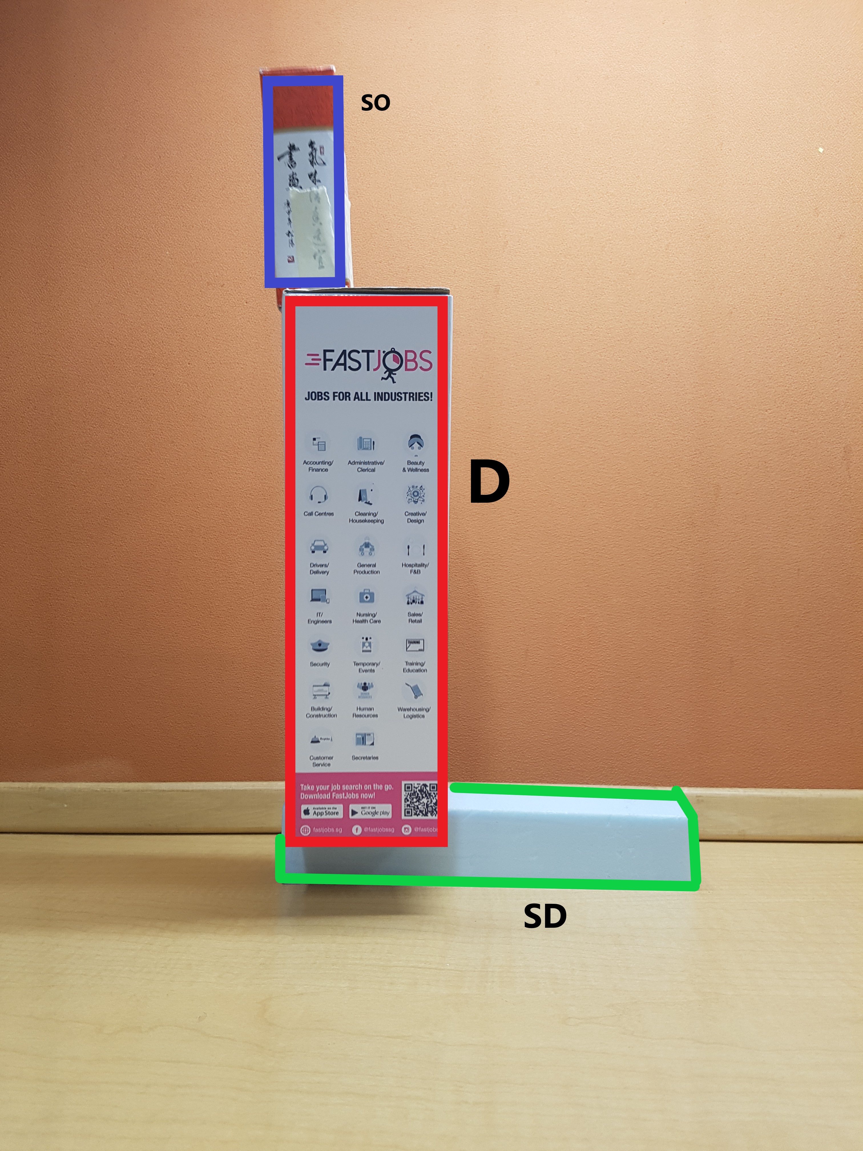
Red – Dominant
Green – Sub Dominant
Blue – Sub Ordinate
Sketch Model 1: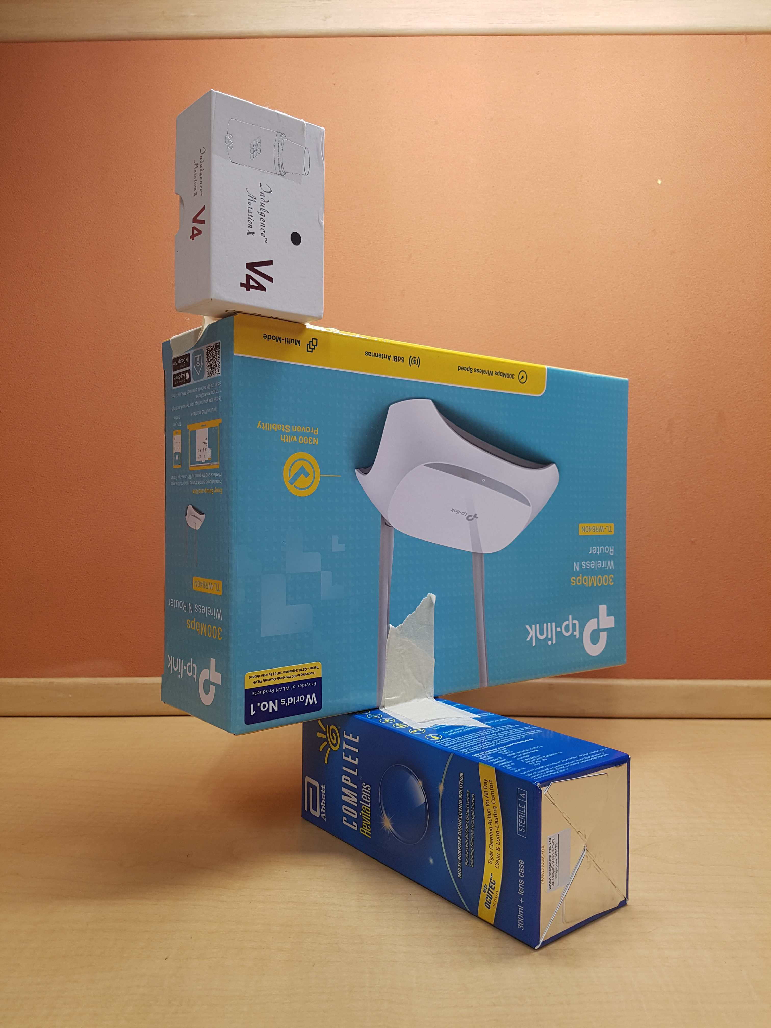

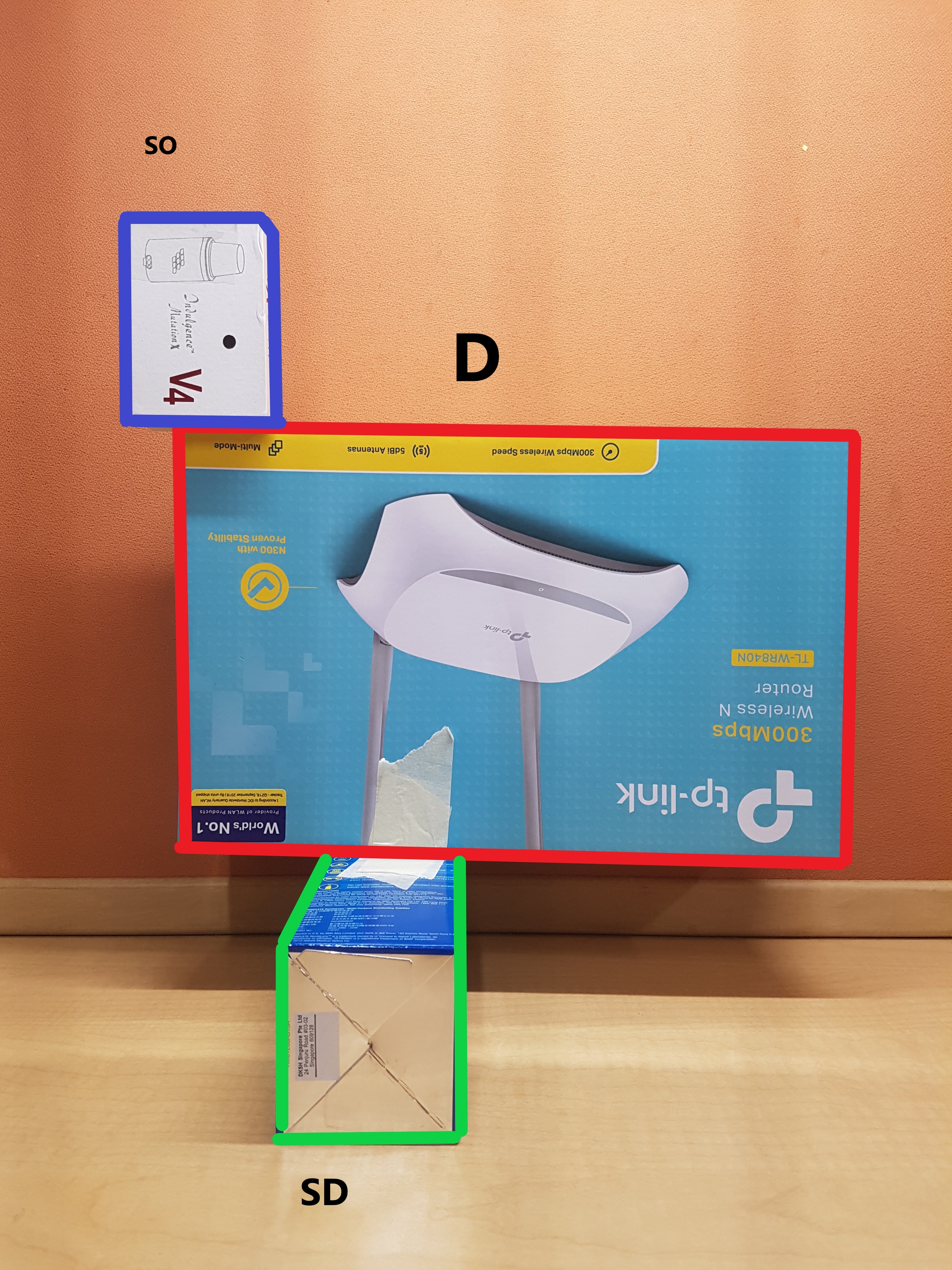
- For the first model, the D is placed in a way that it is tipping towards the right as seen from the side view. To counter against the force and achieve balance, the SO is placed on the top left.
- All sides have consistent D, SD and SO.
- Length and width of D and SD too similar from front view.
- SD and SO similar in size when looking from side view.
- Have the X,Y and Z plane elements.
- Shortlisted for 2D analysis.
Sketch Model 2:

- For model 2, the SO is tipping over towards the left as seen from the side view. The SD is placed in such a way to counter against the force so that it achieves a balance.
- Visual hierarchy of D, SD and SO not consistent from all sides.
- Length of SO is too long hence making it hard to differentiate between SD and SO from the side.
- Unable to differentiate the D, SD and SO from the top view.
- I tried to make the model more interesting by making the SO as thin as possible hence when you look from the front, it also presents the idea of levitation.
Sketch Model 3: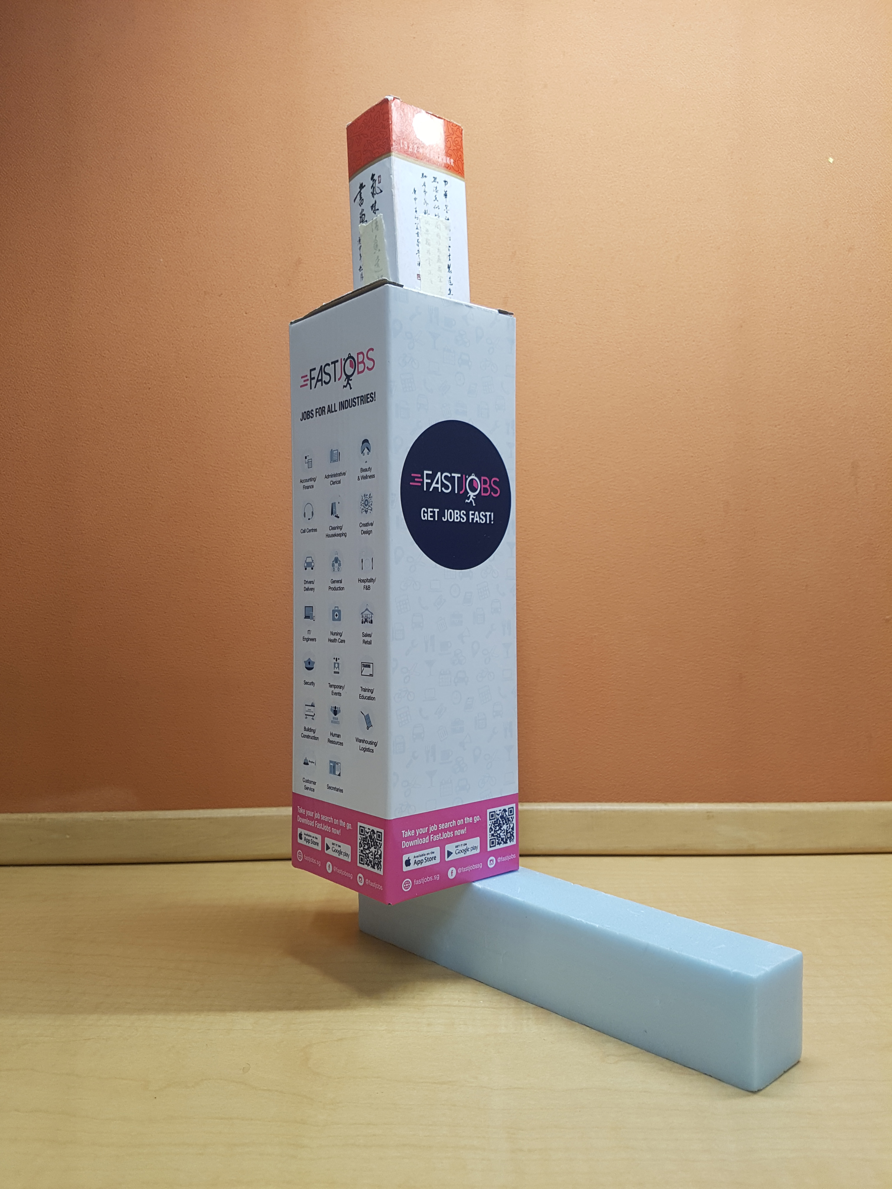
- For model 3, the D tipping over to the right side as seen from the front view. The SD is placed on the left to counter against the force so that it achieves balance.
- Unable to get the consistent D, SD and SO.
- SD became the SO from the side view.
- SO became the D from the top view.
- I had the toughest time thinking for model 3 on how to make it different from the other 2 and make it interesting. I tried to play with length by using longer boxes but the result was satisfying.
After considering all 3 different sketch models, I decided to use sketch model 1 as my final model.
2D Sketch Analysis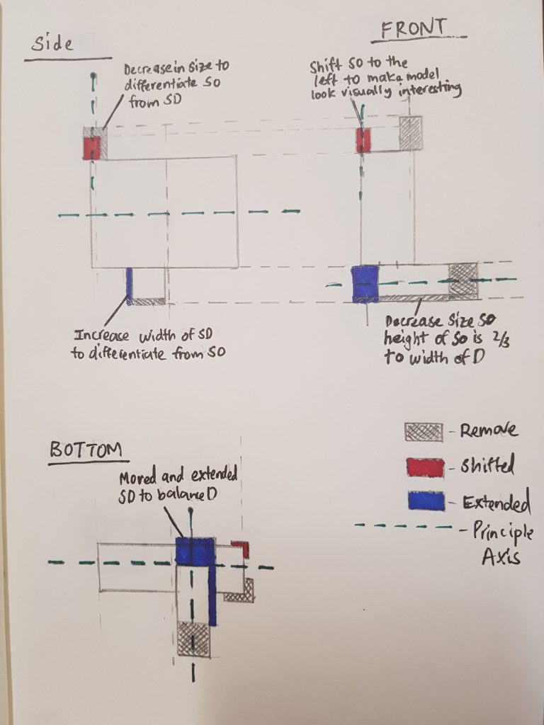

Key points to note:
- Decrease size of SO to 80% of original size or decrease size of SO so that it can be differentiated from SD
- Shifted SO’s position to create a more dynamic composition
- Increase width of SD to differentiate from SO
- Decrease size of SD so that height of SO is 2/3 to the width of D from front view.
- Moved and extended SD to balance D after shifting position of SO
- Materials for D = Lighter wood + Light colour
- Materials for SD = Harder and tougher wood + Dark Colour
- Materials for SO = Light and transparent (Plastic/ Transparency/ Acrylic)
- Not using techniques like wedging or piercing because these techniques will make the model firm which I do not want. In order to present the idea of counter balance, I want my model to present some form of unbalance and unsteadiness.
- The use of contrasting volumes is needed to create the idea of counter balance as it requires the use of small and big volumes of different mass.
- Adding weights to SO to make it interactive.
Materials
Dominant:
For dominant, I am going to be using lighter wood to create a box that is hollow. The colour of the box is light brown so that I can divert the attention to D as it is where the central of the idea of counter balance occurs at.
Sub-dominant:
For SD, I am going to be using hard wood that is dark in colour. Dark colour conveys the idea of firmness and stability which is what I wanted for the SD which serves as a base for the D and SO. Besides I chose dark colour so that I can shift the attention towards the D and SO which are the main focus of the model.
Sub-ordinate:
For my SO, I decided to use a light and transparent material. I wanted it to be transparent to convey the idea of lightness. Besides, it helps to create a perceived illusion of making the SO look transparent and dispensable when weights are not added in, and in contrast makes the SO become important when weights are added in as the attention shift to the SO. I got the idea of using transparent materials from a Japanese architecture called Kazuyo Sejima.
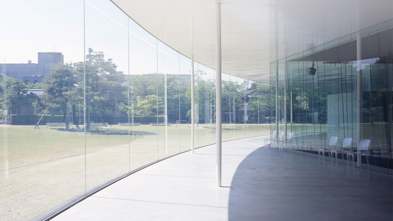
Kazuyo Sejima is a Japanese Architecture whose style is very simple but able to create a very powerful . She emphasizes on the idea of immateriality as seen from her work in the 21st Century Museum of Contemporary Art, Kanazawa. The use of glass and the colour white makes the whole building feels simple and weightless at the same time. The use of transparent vs opaque materials can create different kinds of idea in our models. Hence, I try to use the idea of transparent vs opaque to create different perception of weight and mass on my model. Since my word is counterbalance, mass and weight is important to the design of the model.
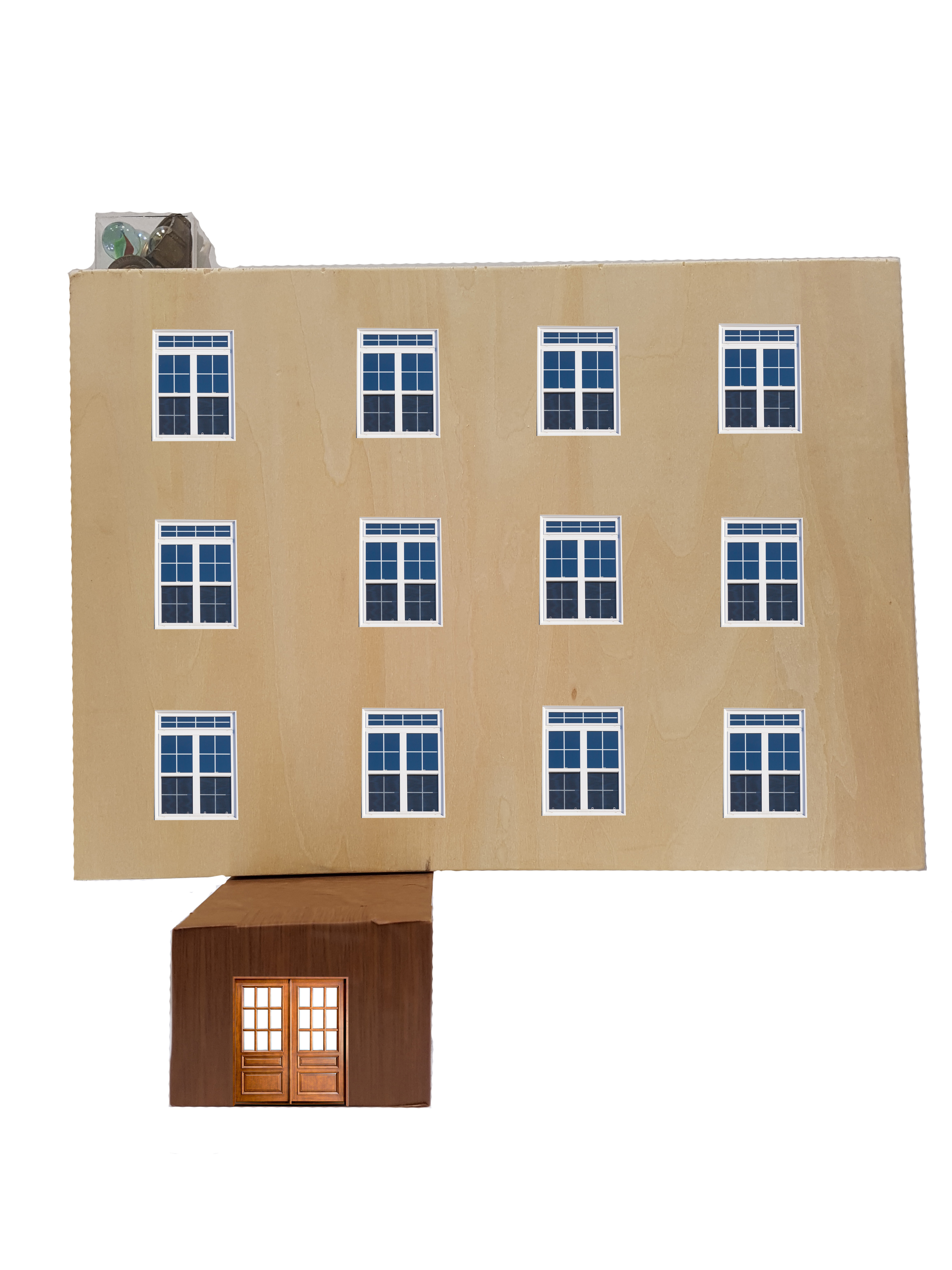
Final model
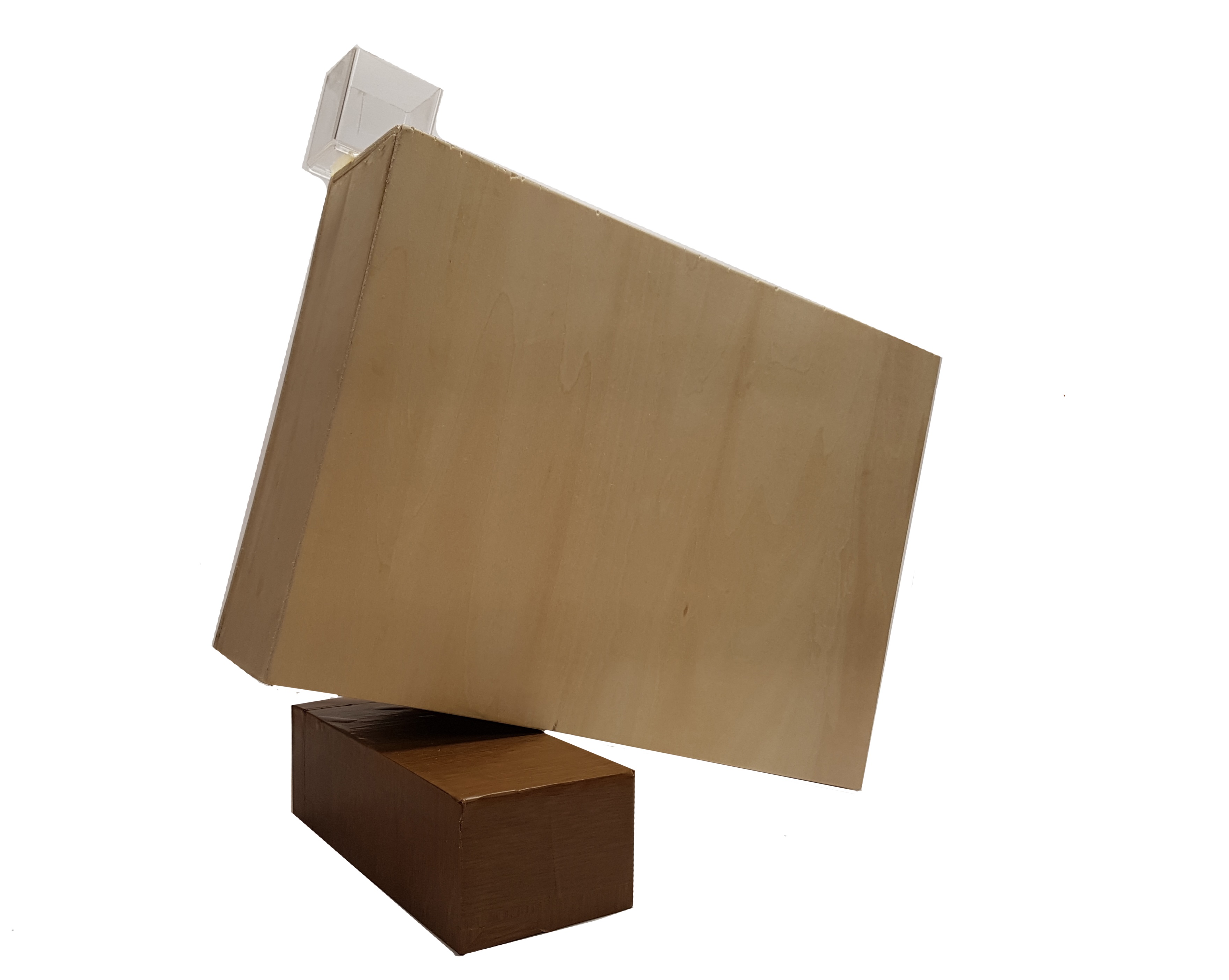
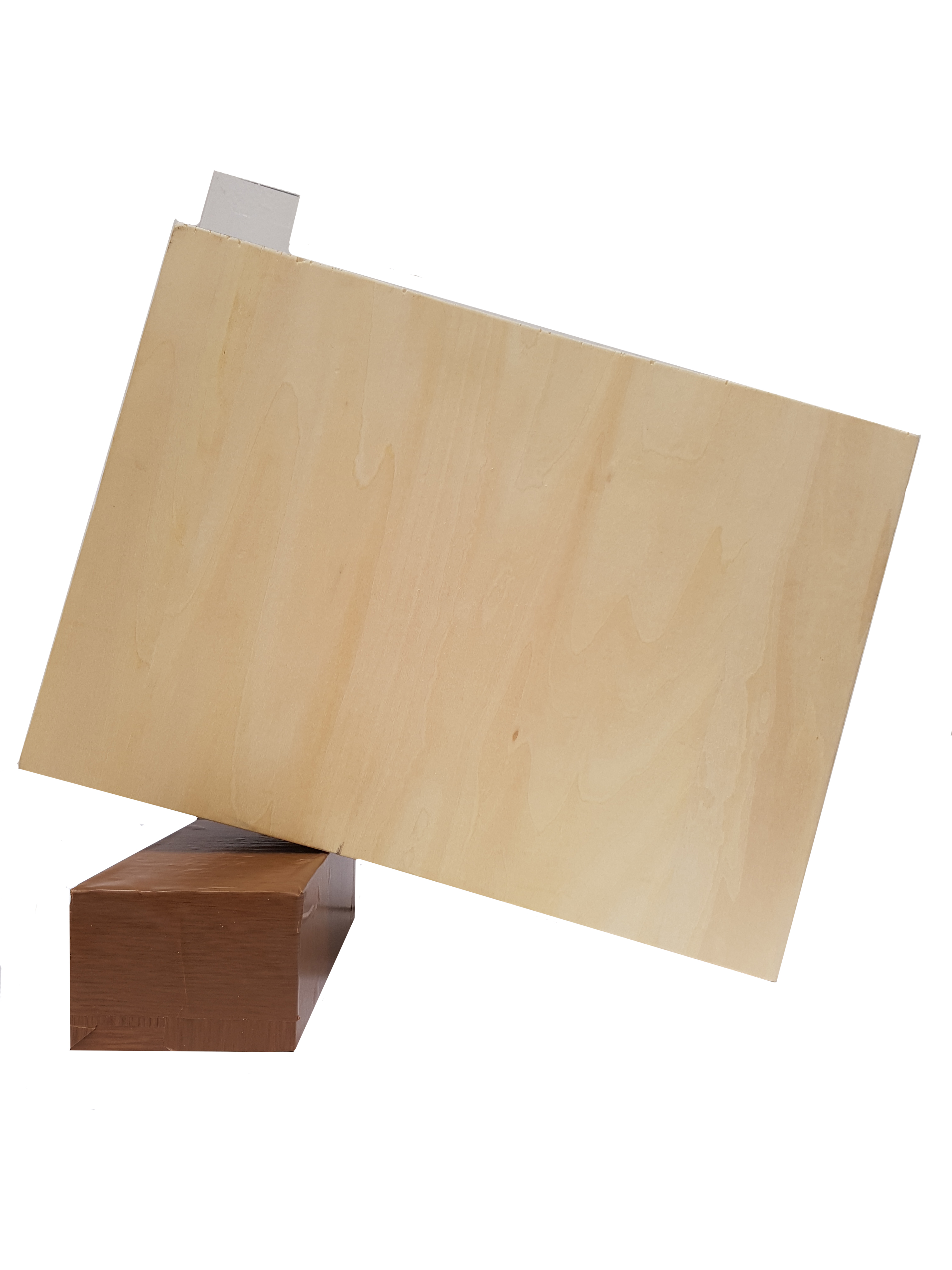
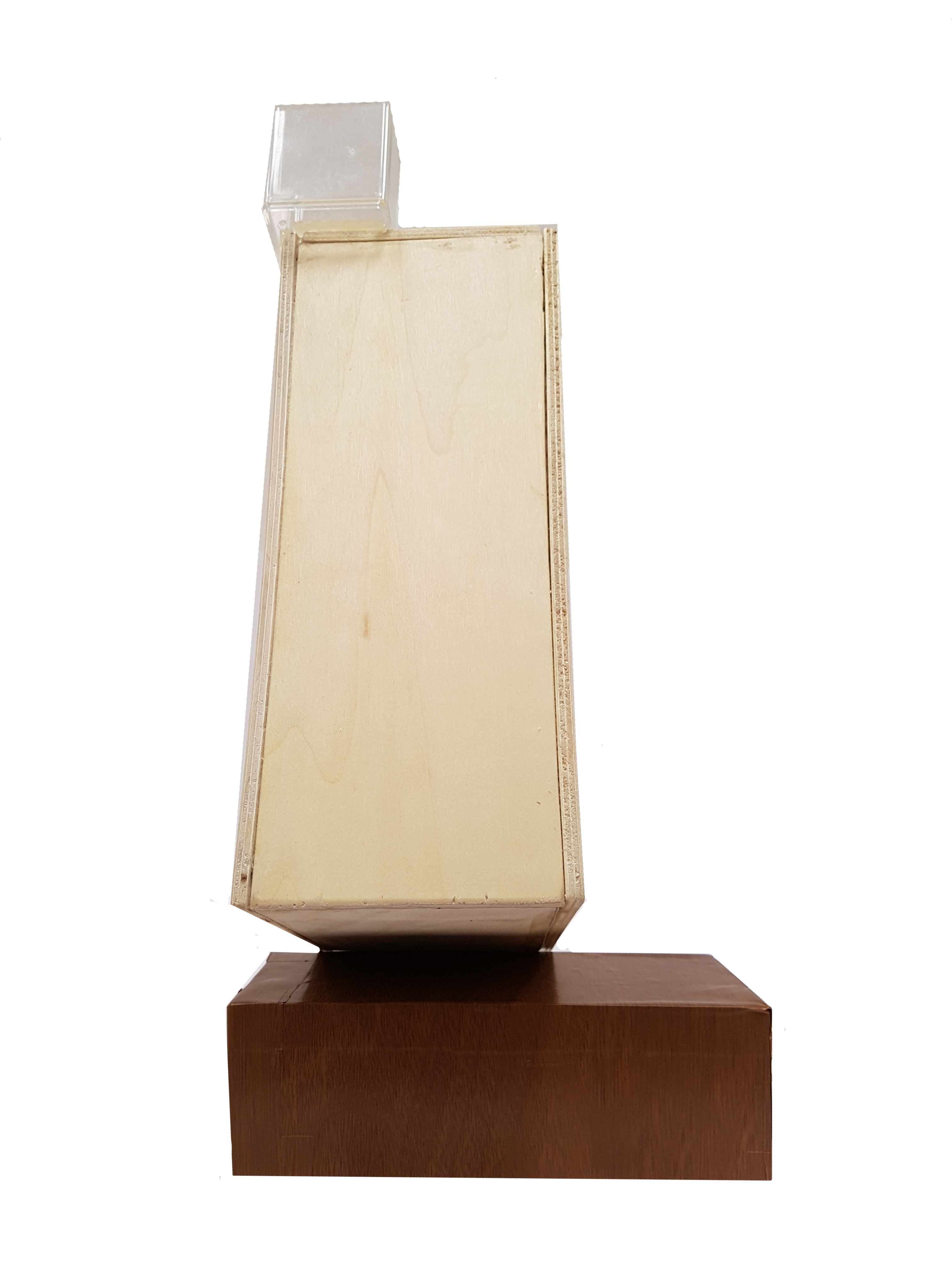
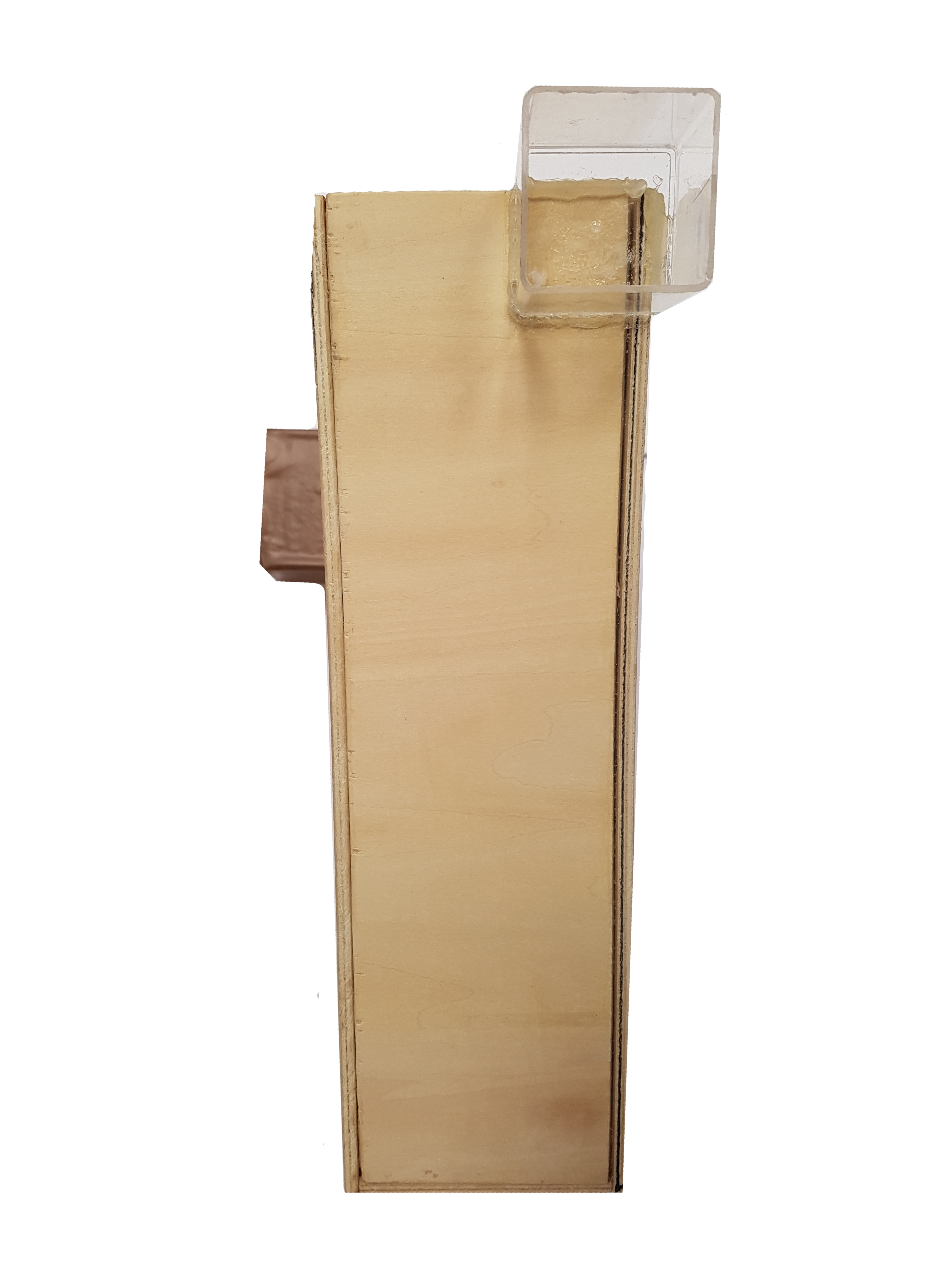
When weights are not added into the subordinate, the model becomes unsteady and causes the dominant to tilt to one side. Therefore, weights are added to counterbalance against the force that is acting on the dominant which causes it to tilt.

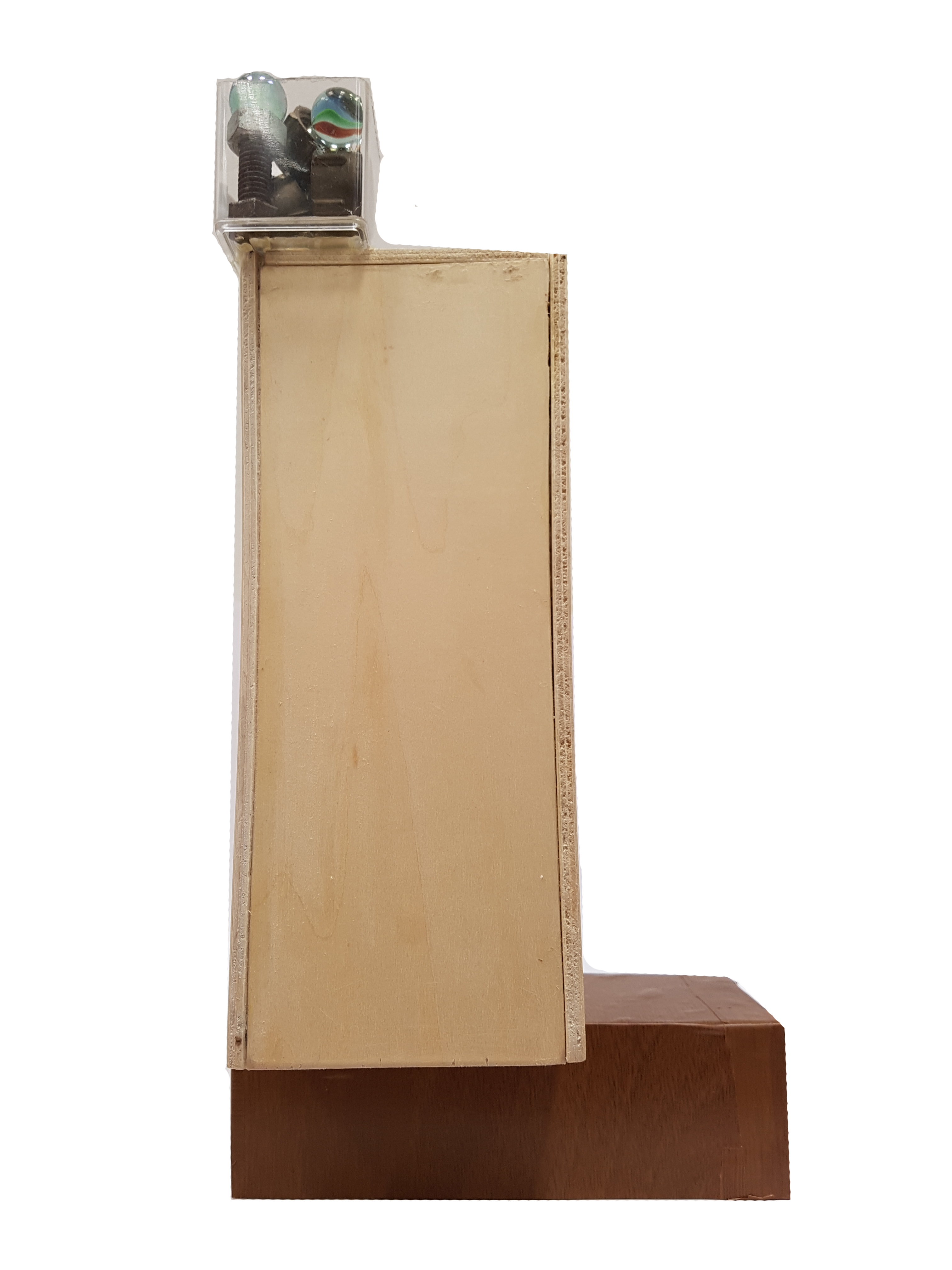

When weights are added, the model achieves a balance.
Future Applications
Reflection
After doing this project, I was able to learn more on different design principles and how we can apply them in real life. As i slowly work on my project, I found that all these design principles like, rule of thirds, visual hierarchy, mass and voids and so on are everywhere around us and we can always relate to our surroundings. I also learnt the idea of materiality vs immateriality, the idea of using different materials and textures to create different perceptions and ideas. This is interesting as it opens up our simple mind and allow us to observe things like we never had.
The project also help me to create an eye when looking at things and also develop a critical mind when analyzing objects. It challenges my mind to think of the different methods and ways to make my model and on how to improve them. Besides, I learnt that craftsmanship and patience are both important for 3D and both of which I do not have and I need to work on them.