

I was interested in multiple images from the lecture like the rebus principle, cuneiform, and italic Old Style from the Roccoco era. However, Nicholas Jenson’s colophon really piqued my curiosity.
At first glance, his colophon reminded me of the Leviathan Cross which was adopted as an emblem of Satanism by Anton LaVey in the 1960s and I was curious to see if Jenson had any Satanic associations.

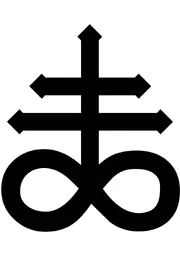
(Un)fortunately, Jenson has no deals or seals with the devil- rather his colophon is an iteration of Italian Colophon of the 15th Century.
Colophons were often composite marks made from the alchemical symbols printers used to produce the metal type they put in their presses, personal heraldry, or imagery from local culture.
Source: Danger Press

combining the alchemical symbols for Cinnabar and Antimony (Stibnite ore) to form the mark for the new Lead alloy used by printers
Benefits of Lead as a new alloy:
This new alloy would fill their molds better and achieve finer detail in letter forms due to its rare property among metals of expanding as it cools from a liquid to a solid. It also made the type harder and stronger, allowing them to print longer runs with cleaner edges.
And thus the 15th Century Italian colophon became a “symbol for quality” and was used as a “general printer’s mark for fine printing throughout the Renaissance.”
Besides the becomings of colophons and their alchemic histories, I found the behaviour of printmakers and typographers during the Italian Renaissance very telling of the development of knowledge and thus ownership and property.
The rise of innovation and knowledge during the Renaissance would equate the creation of “intellectual property.” I believe colophons are evidence of the desire for recognition and attribution of one’s property.
(I think the goal of this reflection was to comment on typography but I found this behaviour very innately human.)
I enjoy both Jenson’s Blackletter and Roman typefaces but I am curious to know if both types were still circulating in the same time period and if Jenson was printing in each concurrently.

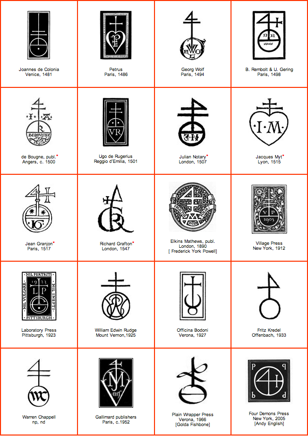
(Also I came to find that Joannes de Colonia is also attributed to the same colophon?)
Nicholas Jenson did design Greek and Gothic fonts towards the last decade of his life!