GRAPHIC FORM // DN1009 // PROJECT: IMAGE MAKING THROUGH TYPE // CPJ
This is a creative process journal of my project IMAGE MAKING THROUGH TYPE!
See the final products here!
Ideation:


When introduced to this project, my mind immediately strayed to visually grotesque “jobs” as well as jobs I think I would genuinely embrace.
Grotesque – have to do with the body:
- Pore squeezer
- Skin grafter
- Finger Cracker
- Tongue scraper
- Hangnail puller
- Tattoo Remover
- Reverse Plastic surgeon
- Tooth Harvestor
- Nosehair trimmer
- Shower Assistant
every day, rEGULAR:
- Discipline Master
- Buffet Dumpster (many elements, confusing and unclear)
- Construction Worker (too layman, how to make interesting?)
- Fire extinguisher Tester
OUTERSPACE:
- Alien pig farmer
- Anti-gravity gymnast
After listing many jobs, I noticed that those that fell under the “Grotesque” category were the most interesting, even though some layman, and created the strongest visuals in my head. I thus initially decided to go for HANGNAIL PULLER, SHOWER ASSISTANT, TATTOO REMOVER and PORE SQUEEZER.


Inspiration:


Sources (respectively):
http://www.baubauhaus.com/image/37135

https://olhaquemassa.com/2012/08/09/pia-bramley/https://mir-s3-cdn-cf.behance.net/project_modules/hd/573d8825153791.563423f20a598.jpg

www.itsnicethat.com/articles/mariano-pascual-36-days-of-type

http://sixnfive.com/carrefour

http://sixnfive.com/abelina

Um banho com Pia Bramley

https://www.typostrate.com/artists/typographers/the-plant/
Process:
1. Hangnail Puller
A medical professional who specialises in the extraction of peeling off licks of dried skin from the fingertips. The most experienced Pullers are able to peel the longest strips of skin off, leaving a river of open flesh behind.
I sketched out my idea for the base: where each end of a letter would be in the form of a fingertip. I wanted the bends of the letters to look like knuckles: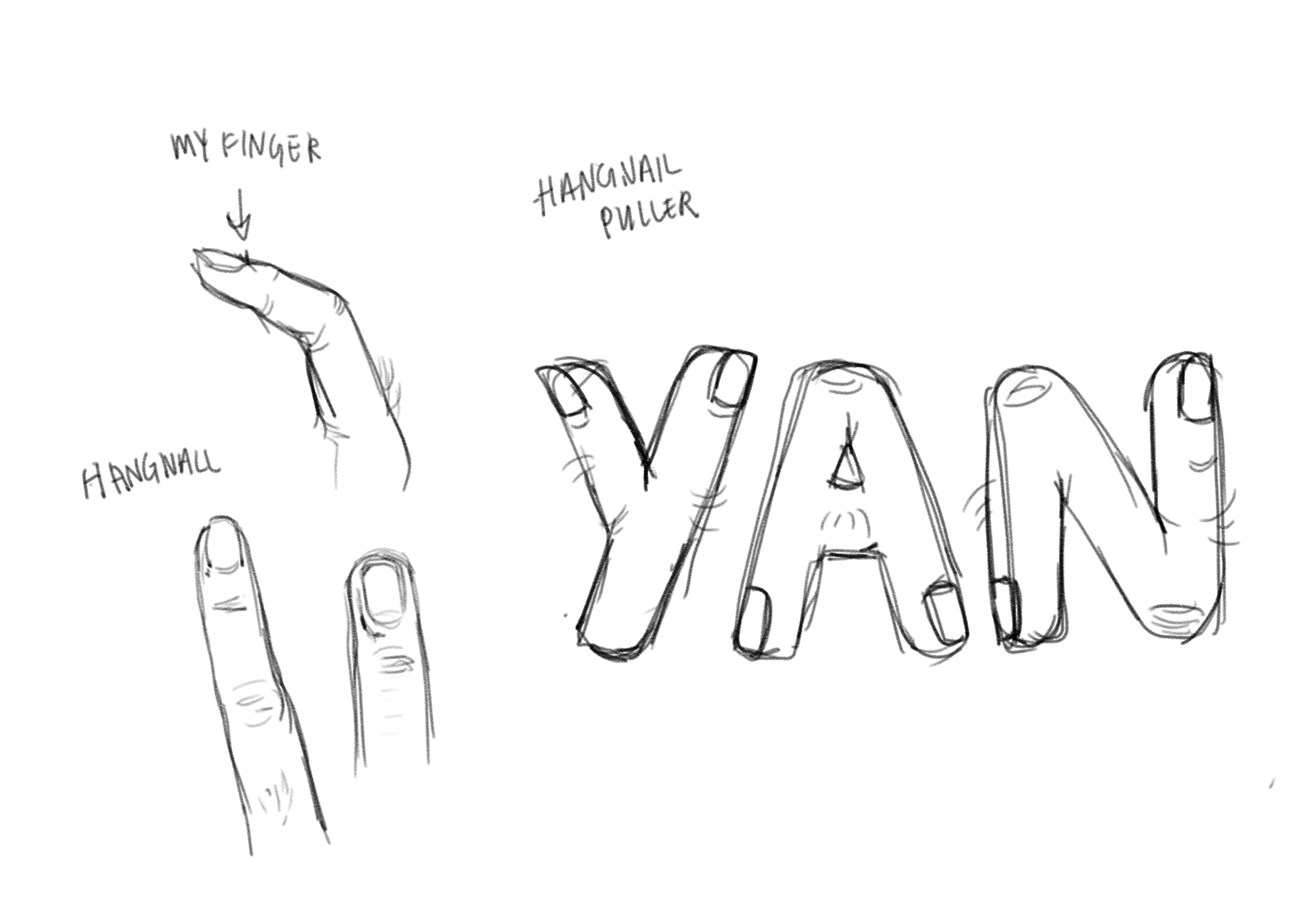
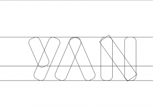
I chose my Chinese name: Yan as I wanted to use the ‘A’ and ‘N’ to convey the structure of a human finger.
Rough colourised sketch:
I wanted to use a sanserif, round font to mimic the shape of fingers and chose to have the letters lay “flat” in one line as I did not want to compromise specific details I wanted to include by skewing the image. (I approached the rest of the “jobs” with a similar thought process.)
Post-crit note: Seems like many people chose different baselines for their own works as they felt that a flat baseline and flat perspective is boring. I definitely take that away as a consideration I will make for future typographic projects.
Translation into vectors:
I used the rounded rectangle tool to try to create a uniform font with equal weight and density. I initially just forced the rectangles into my sketch and after that, I added 3 guidelines to help make a more believable font.


From there, I merged the shapes and created the fingertips which would replace the ends of each letter:


I felt that the Y having three fingertips was strange and unconvincing, so I removed the bottom fingertip.
Merged shapes:

The skin tone was a bit orange for me so I chose a new base that leant towards a pinkish undertone. I drew out a rough guideline to where the hangnail wound would be and added some simple shading.

To that, I added some deeper tones to imply depth in the wound and drew on some strands of hair.
I felt that the colour palette was not very pleasing and decided to make changes:
Changing the skin tone again and adding softer shading using a textured brush. I also decided that the background would mimic a surgical bench top with the blue cloth that is used.
This would not only provide visual context as a signifier but also contrast and guided focus as the blue and orange are complementary colours. This will allow the fingers to stand out against the background as the main focus.
Further shading and adding texture to the fingers and to the nails. Adding finer, more “realistic” strands of hair. Rendering a more believable strip wound:
I added texture to the knuckles and highlighted the skin that gave way to the wound. I added highlights of white to the inside of the wound to suggest that it is still wet and thus fresh.
I wanted the background to be able to set the scene of where the job of the Hangnail Puller would take place, thus I added some items that read “SURGERY” and medical profession. I found that the metal dish and steel tweezers were suitable for conveying this message.
The background is also important to the framing of the image, I felt that without framing components, the fingers looked very flat with the negative space.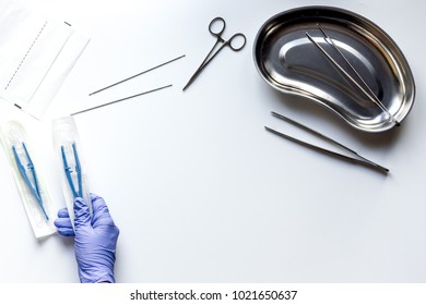 Source: https://image.shutterstock.com/image-photo/surgeon-surgery-table-doctors-tools-260nw-1021650637.jpg
I also looked for textural properties of the blue surgery covers and found this image with very telling folds that I could emulate.
 Source: https://image.made-in-china.com/202f0j00VZKQcYhybWzP/Surgical-Disposable-Paper-and-Plastic-Roll-Table-Covers.jpg
In reference to the photo above, I painted the metal dish and added lines that suggested creases in the cloth: these lines also provided another sort of frame and would control the eyes to look within the “box”.
I also added a drop shadow to make the fingers look like they are laying on the table and to create more contrast with the dark blue and light beige. Overall it increases the emphasis on the typography.
Additionally, to up the goriness of the image, I added some bloodstains and the tweezers.
Hangnail Puller:
Final outcome: https://oss.adm.ntu.edu.sg/jtiong002/graphic-form-project-1-gallery/
- Finger-tipped letters with nails and the overall skintone-colour create the visual of realistic fingers.
- The fine finger hairs create a sense of discomfort as they stick out from the smooth skin-like base.
- The bright red streak reminds of blood and injury and has shadows and highlights that suggest depth and thus imply that the skin is cut open.
- The position of when the “cut” starts is in a familiar position – at the hangnail – and represents the painful act of pulling a hangnail too far.
- The recognisable blue of the background calls to the cloth draped over a surgical table – suggesting a medical procedure is in progress
- The steel tweezers and the metal dish are also familiar and represent surgical acts.
- The bloodstains on the cloth suggest a messy and bloody procedure and also then imply pain and disgust in viewers
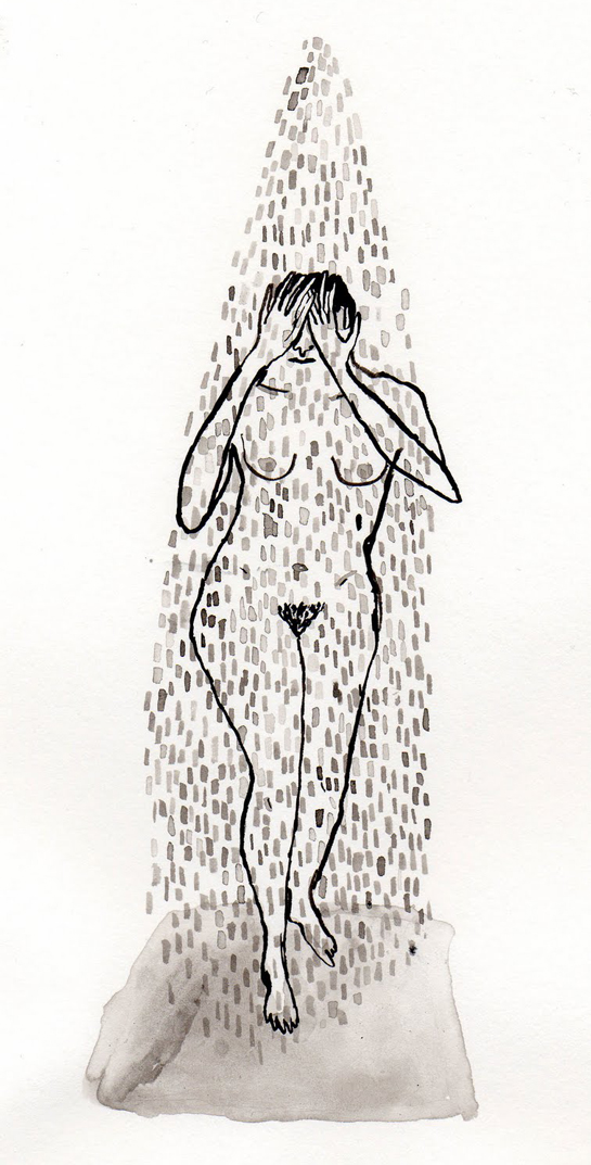
2. Shower Assistant
A shower assistant is hired to help you wash away your worries- oh, and the dirt and grime from the nooks and crannies you can’t reach. 😉
Initial sketch: combining elements of skin with body hair, soap bubbles [shower], rubber gloves with soap [assistant] in the form of my initials in a round sanserif font.

Using the same technique of forming letters with rounded rectangles, I attempted to warp them into more organic and human-like shapes. The letters had joints like human shoulders or elbows.


I ended up warping the yellow glove into the letters rather than having them act as an element of the letters, so I had to scrap it in the end.
I also realised that the green soap bar did not really imply a shower- some feedback is that “dishwasher” was suggested instead.

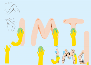
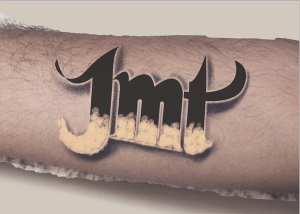
Realising my initials are JMT and not JMG. [Jessie Michelle Tiong]
Trying out a bathroom-tile background.
I did not really like anything about this design besides the ‘M’ on its own. I decided to scrap it and try a different colour scheme.
Attempt 2:
I decided to base my work on the foundations of a preexisting font. RM Playtime was strange as all of its edges were very angular, so I used the pen tool and created a “smoother”, round version for my own usage. Despite its poor edges, I enjoyed how the capital J looked and the weight reminded me of how I would draw limbs.

Source: https://www.1001fonts.com/rm-playtime-font.html
Colour, shading, highlighting and some bubbles (blue complementing the orangy-beige):
The skin looked so smooth- like a balloon, it was unnatural.
 Adding individual strands of hair to humanise the letters more. Adding two elements of soap bubbles to each letter. Adding yellow rubber glove hands that caress the body letters.
The yellow kind of clashed with the skintone but I maintained it as they are iconic to the job. I added “water” in a low opacity light blue shape around each glove and some bubbles to aid with this colour clash.

 Lighter and thinner hair looks more natural and convincing. The closer to life it is, the more uncanny as flesh and bone are not meant to form these shapes.
Adding the background:
I wanted to convey a shower scene- thus, I added a shower curtain, tiles and a bathtub. I also experimented with colour combinations.


Though the purplish-blue provided a complement to the skintone and gloves, I felt the green was more appropriate as a visual in a shower- where freshness is conveyed through light, pastel colours.
Using a tile texture as a reference to convey my own, yellow tiles.
 Source: https://www.pinterest.com/pin/337840409527261753/?lp=true

I added the bathtub filled with water that reflected the floating letters to create a more believable environment where everything interacts.


Shower Assistant
Final outcome: https://oss.adm.ntu.edu.sg/jtiong002/graphic-form-project-1-gallery/
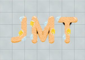
- Beige, rounded letters have the appearance of human limbs
- The shading in the joints and nooks of the letters with the bushes of hair again represent that of a human.
- The soap bubbles and the bright, wide highlights on the letters suggest an element of water and washing.
- The yellow, shiny fingers give the impression of gloved hands – they caress the letters
- The background sets the scene of a shower at a bathtub.
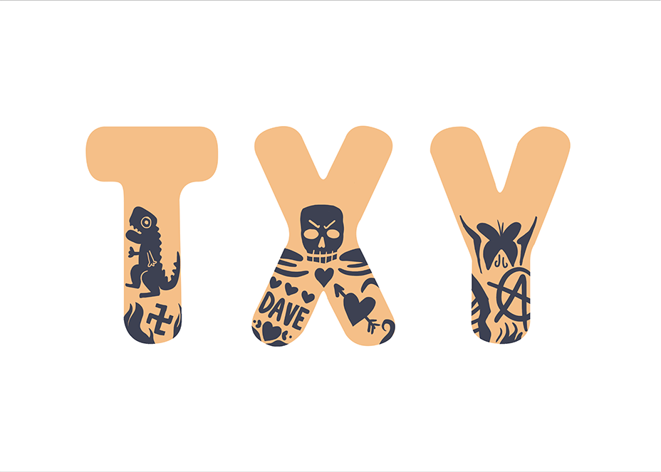
3. Tattoo Remover
A skilled individual who wields a high powered laser pointer to zap the mistakes and ink out of your skin. But before your mistakes clear, you need to suffer hideous white blisters that are raised in the shape of your original tattoo anyway.
Initial sketch: Skin with tattoos that are in the midst of being removed with a laser. I wasn’t really sold on this idea.
I thought it would be funny to have the M look like a butt to suggest that the tattoo being removed was a tramp stamp, but this didn’t fit the brief.


Attempt 2:
Another idea I had and tried to expand on:
The font would be the actual tattoo that is halfway removed (with the white blisters and scarring) and it would be set on an arm or human skin.
Because my aim was for the font to mimic a tattoo, I wanted it to be serif and a bit gothic. As if my ex-boyfriend got my initials tattooed on his arm and wanted them removed.
Key inspiration:

Digital sketch on to a picture of my own forearm:

Indicating where the cut-off point would be for tattoo and the scarred skin.

Vectorising: I added parallel lines as a guide for the italicised font and altering the “T”.


Adding a drop shadow to mimic a lettered tattoo and applying the blending mode “Dissolve” to achieve the pointillism effect that is done by tattoo artists: this also creates contrast against the skin and draws focus.

I also warped transformed the image to wrap it to the curvature of the arm.
I wanted a mid-point stage of the tattoo removal so I researched online for how it would appear:
 Reference: http://info.astanzalaser.com/blog/7-most-frequently-asked-questions-from-tattoo-removal-patients
The scarring on its own is very iconic and specific to this procedure, but I feel its also a niche piece of knowledge- I thus stayed with my design on the half-removed effect. Viewers would look at a tattoo that has a half that is an irregular texture and would still be able to understand the job despite not knowing exactly what the texture is.
Adding the scarring blisters that happen from laser tattoo removal:

I added each blister one by one as if my brush tool was the laser, this took a while but the pattern was not the desired effect.
I felt that this design was clashing with the rest as it looked very out of place, so I tried to vectorise the arm and simplify the arm like how I did in the previous two designs.


After simplifying the arm, it did not look like it depicted an arm anymore, so I tried to Multiply some arm texture on to it:

 Source: http://www.allcgtextures.com/v/Human/HandandArm/Hand018.jpg.html?g2_imageViewsIndex=2
I still wasn’t feeling this design and with the advice from some friends, I decided to scrap it and try to make it more cohesive with the previous two designs:
The base of the font is some form of skin or human flesh and elements were added on to it.
Attempt 3:
Sketch: Still along the same lines of the idea that half of the tattoos on each letter were the scarring blisters.
I chose a round and serif font this time to follow the theme of letters that looked like human flesh. I liked the weight of this font as I found that I needed a wider surface to add the tattoo designs on.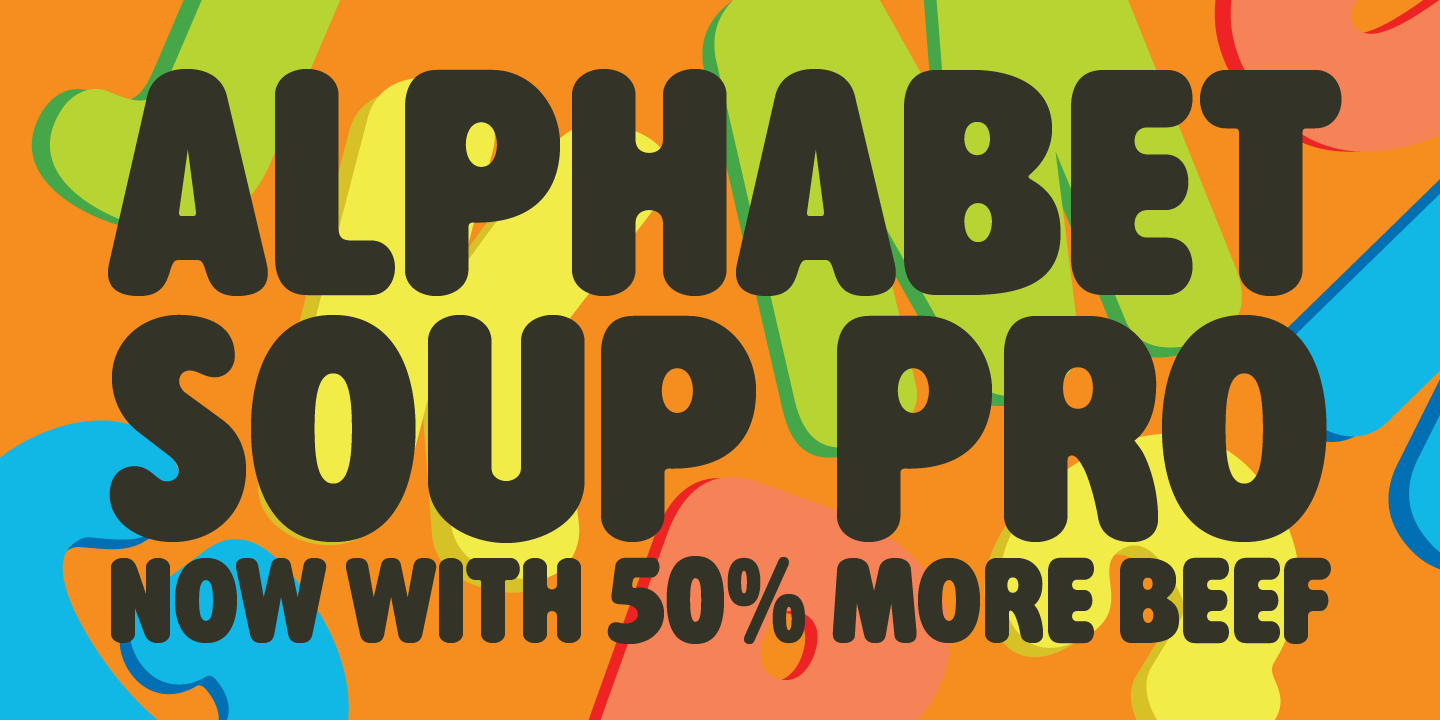 https://www.myfonts.com/fonts/redrooster/alphabet-soup-pro/
 Extracting T X Y (Tiong Xiang Yan) instead of JMT as I wanted to utilise the legs of the X and also wanted more variety in my designs.
Adding some hand-drawn regretful tattoos that I would imagine the owner would want to remove:
- Hate symbols (swastika, anarchy)
- Ex’s name
- Tramp stamps
I used the same method of drawing individual scars again with a medium opacity brush and decided it was taking too long for a mediocre effect. So I tried to use a circle brush with a high % of scattering to mimic how the Remover will avoid overlapping the points of lasering.
Initially, the dots looked too uniform as I was just tracing the shapes back and forth, but and I switched to mimicking the actual movements of a tattoo remover, the effect was a lot better.


Instead of doing sweeping strokes to cover a large surface area, the Remover would do short horizontal strokes.
Adding some shading on the edges to create form and have it so the light source is directly on top of the letters like it would be in a tattoo removal clinic.
I used the same textured brush as in the Hangnail Remover so as to create harmony across designs. I also added some “blush” and faint highlights.
The tattoo designs are
- Multiplied on to the base skin layer
- Reduced in opacity
- Blurred at the edges
to mimic how an actual tattoo would appear on the skin.
I did the same for the tattoo scarring once I “removed” every half.
Standalone scarring with toning:
Testing out different blending options:


To convey the setting of the job, I wanted the background to look like the texture of the grey clinic table/chairs with a piece of tissue(?) paper on top that is used for sanitation. (Example is in the Youtube video above!)
 I painted the base and the tissue paper with the same brush for continuity and harmony and added shadows and creases where the letters lie to convey that they exist in the same space and plane as well as create contrast and thus emphasise the letters.
This started to convey baked butter cookies on a baking pan so I added fine body hair and some red to indicate irritated skin. Additionally, a beam of a laser to represent the act of lasering off the tattoo instead of depicting a hand and machine. [SYNECDOCHE]
I felt that skull tattoo not really fit the theme of the ‘X’ so I tried different images instead:
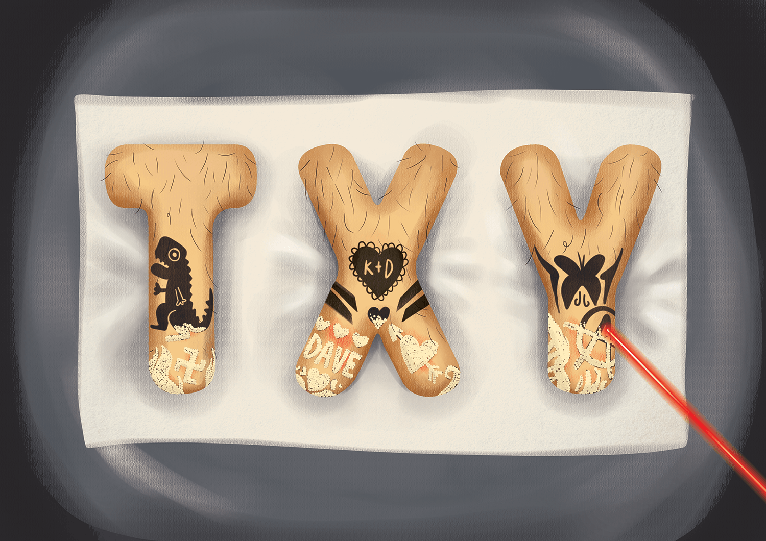
TATTOO REMOVER
Final outcome: https://oss.adm.ntu.edu.sg/jtiong002/graphic-form-project-1-gallery/
- Beige, rounded letters with fine brown line have the appearance of human skin with body hair
- The half-black images have the appearance of tattoos as they are superimposed onto the skin.
- The pale yellow portions are textured and suggest some kind of scarring. As the main tattoos are partially covered in these, it suggests some kind of tattoo removal.
- The reddened skin also implies some form of irritation and would suggest an irritant.
- The laser suggests laser tattoo removal as well as provides a line of sight to guide the viewers’ eyes towards the letters [emphasis]
- The grey faux leather- vinyl seat calls to the image of clinic beds that are covered in a layer of disposable tissue. Setting the scene for a cosmetic medical procedure
- The shading of the seat also creates a radial focus that draws the eyes to the centre of the design – to the letters.
4. Cannibal
I changed from PORE SQUEEZER/PIMPLE POPPER to CANNIBAL as I found it difficult translating the ideas of pores and pimples on a font that was effective so I decided to create a narrative amongst all the designs:
A professional Cannibal will eat human flesh, but only if it’s cleansed of impurities and in a perfect, clean slate- hair is preferred however; it helps with fibre intake.
Initial sketch: a rounded sanserif font with exposed bones and bite wounds and hands on the end of the “limb” letters.

I wanted the background to be a jungle as it goes along with the stereotype that cannibals are all native tribal forest people. I also added spears and some bonfire to convey the idea that the meat is roasting – another reference to eating.
I found this fat and round serif font that was good for conveying a juicy chunk of human meat.

Source: https://www.behance.net/gallery/47967261/Hit-and-Run-Sans-Serif-Font
I chose JES as an abbreviation of JESSIE as I wanted to have the ‘S’ shape as an obscure looking noodle limb.
Adding the bone ends to the font (within the confines of the font and then clipping the excess away. I did not add the hands for these as I felt that it would interfere with the “body” aspect of cannibalism and instead focus too much on arms.


Adding shadows in vectors where the light source would be the bonfire and experimenting with bite marks and missing chunks of letters/flesh.
Initially, I took two bites out of each letter, but I felt it interfered with the letters as it would be against the jungle background.


- I made the bite marks more understated where the bite pattern would be indented on the skin but the pink “flesh” inside remains intact – I felt like this detail would draw more interest.
- Adding brush strokes for hair (I changed them to finer strands of hair so it was less distracting and more similar to body hair)
- Adding the wooden spokes (with bulbs that suggest branches) that spear into the flesh of the letters – I thought about having the spear in the ‘S’ weave in and out, but it was distracting to the shape.
- Adding the jungle in very simple shapes layered on top of each other to imply depth and I wanted the weight of the leaves to mimic that of the letters to create a sense of harmony.

I wanted to go along with this storybook style and add a paper texture to the background and added cartoon-style fire at the base of the spears. I also added highlights and shading to warm up the letters and create texture with a textured brush.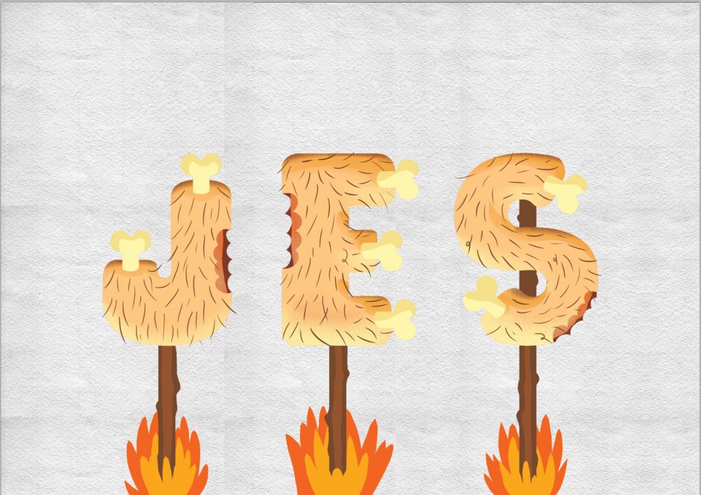 Source: https://www.123rf.com/photo_29418519_old-paper-texture-closeup-high-resolution.html
Experimenting with Blending Style:
Blending: Overlay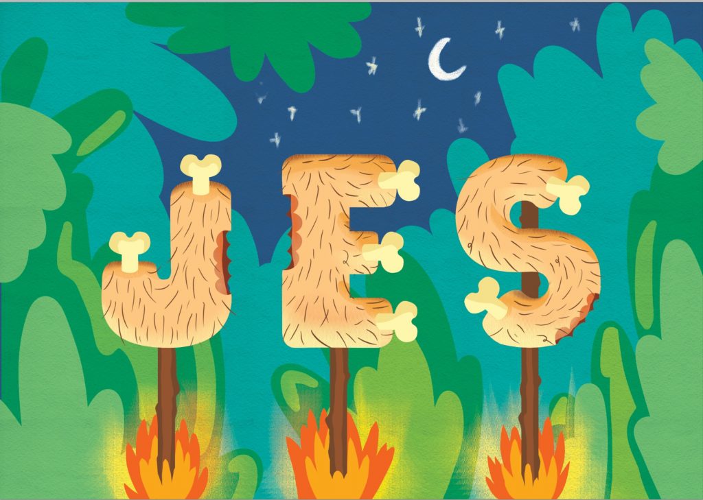 This made everything a bit too light and made the letters look washed out, which was not my intention as I wanted them to pop.
Blending: Difference Happy accident! All the background colours were inverted and created a very pleasing pairing of the orange of the foreground and the muted purple as they are complementary colours! This is not only a very attractive prehistoric-end-of-the-world colour palette but also allowed contrast to be drawn to the letters and thus the eye would always lead back to the focus.
Muting the colours of the flames and adding a shadow under the letters on the spears.
CANNIBAL
Final outcome: https://oss.adm.ntu.edu.sg/jtiong002/graphic-form-project-1-gallery/
- Fat, rounded serif font in beige appears to be a body part or piece of flesh.
- Added body hair conveys the human aspect as humans are one of the few mammals with sparse body hair and not fur
- The exposed bone ends and bite marks imply that the flesh is being eaten.
- The wooden spokes over fire suggest the flesh is being roasted – a cooking image that is iconic and linked to eating and thus reiterates the idea of cannibalism
- The jungle suggests some outdoor activity and altogether suggest a tribal atmosphere.
Conclusion:
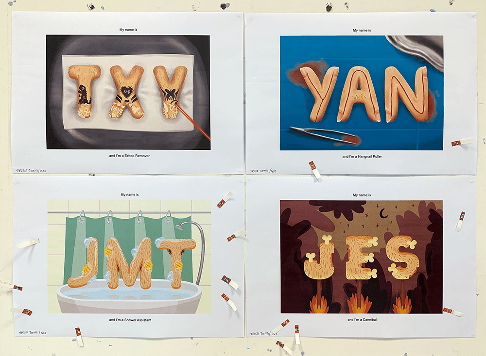
Final outcome: https://oss.adm.ntu.edu.sg/jtiong002/graphic-form-project-1-gallery/
I always want my designs in a project to be connected in either concept or visual and I am happy that I was able to do it for this one. All the jobs I chose had something to do with the human body and particularly the skin.
In addition, there is a loose narrative if you squint where the cannibal prepares their food before they consume it. All of the designs have similar properties in perspective, fat rounded serif, body hair and beige tones but at the same time, they can exist as standalone designs.
I ran into problems using Illustrator and found it very useful to utilise both Photoshop and AI for this project. Illustrator to achieve the vector shapes and clean lines and Photoshop for shading and painting. I also ran into many ruts in trying to express a certain idea, especially when I strayed from my instincts.
I initially felt restricted by the brief in having to make a homogenous font, but I realised later on that having “less” to do was a blessing. I enjoyed this project and the HANGNAIL PULLER in particular.
Interestingly, the class voted the most for the SHOWER ASSISTANT which I could say is my least favourite. I think the message was the most literal and clearly conveyed and that is why they preferred it.
If I could do this project again, I would experiment with kerning, different baselines and perspective.
Final outcome: https://oss.adm.ntu.edu.sg/jtiong002/graphic-form-project-1-gallery/