2400 – Final Sem Submission

2400

Mixed Media, Audio Clip 4:59

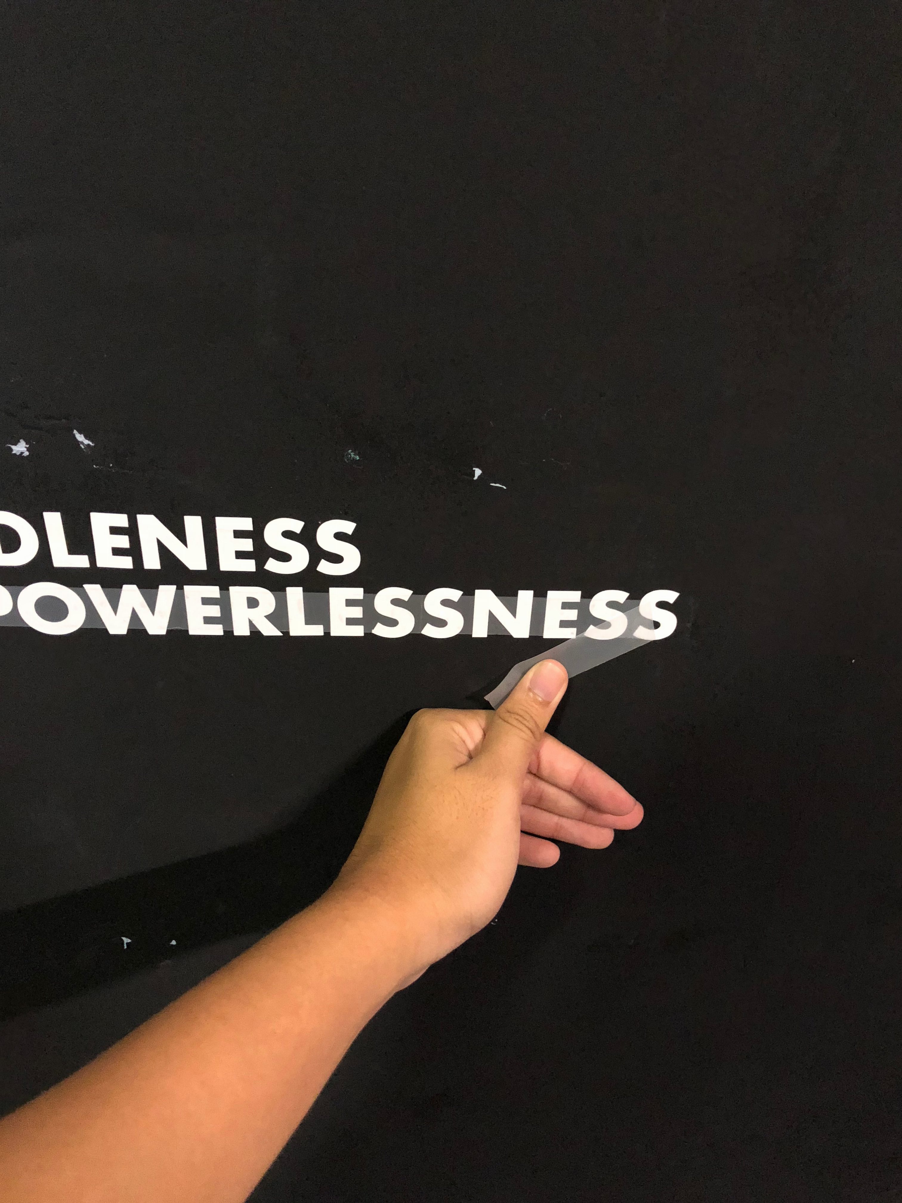
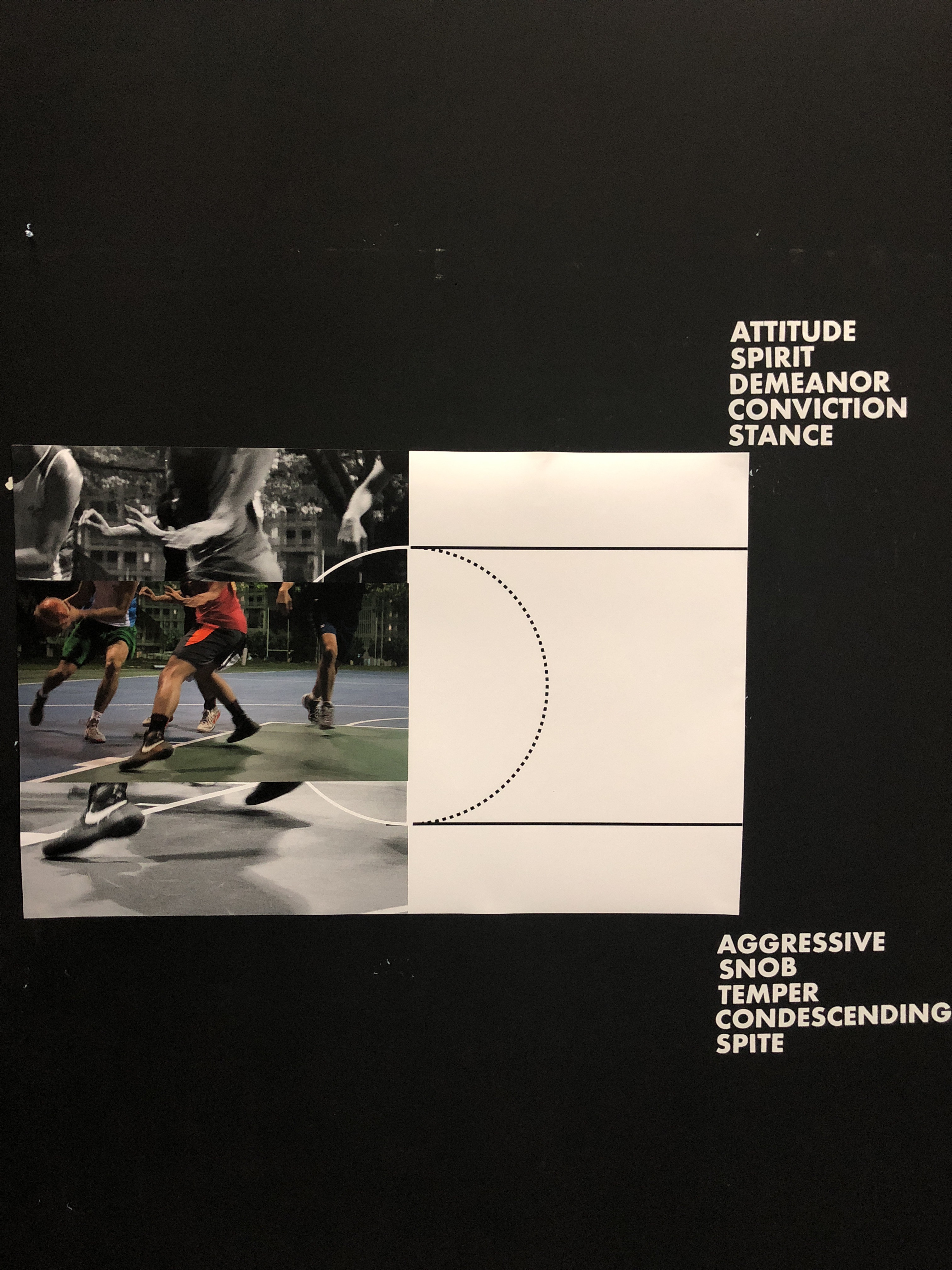
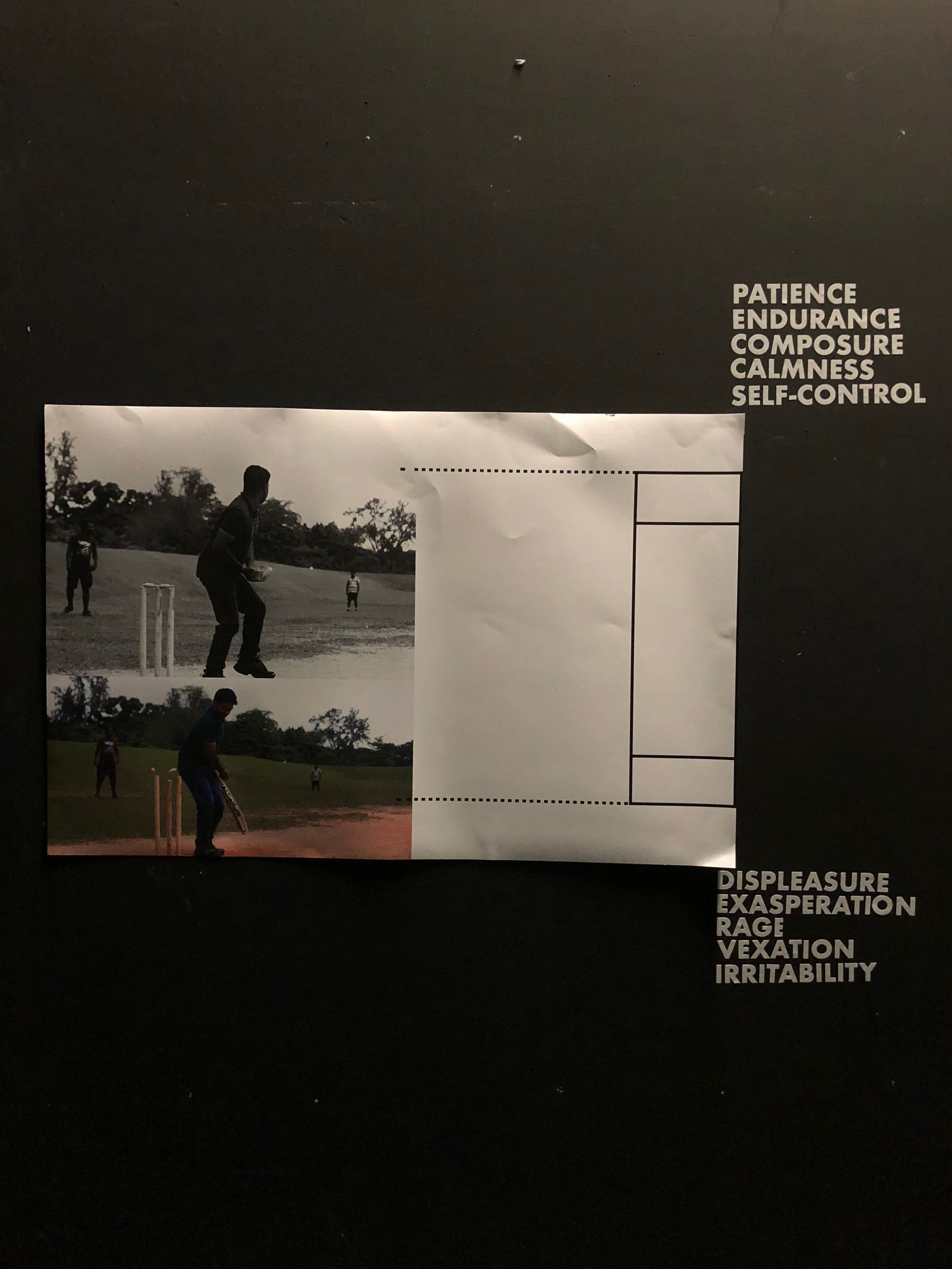
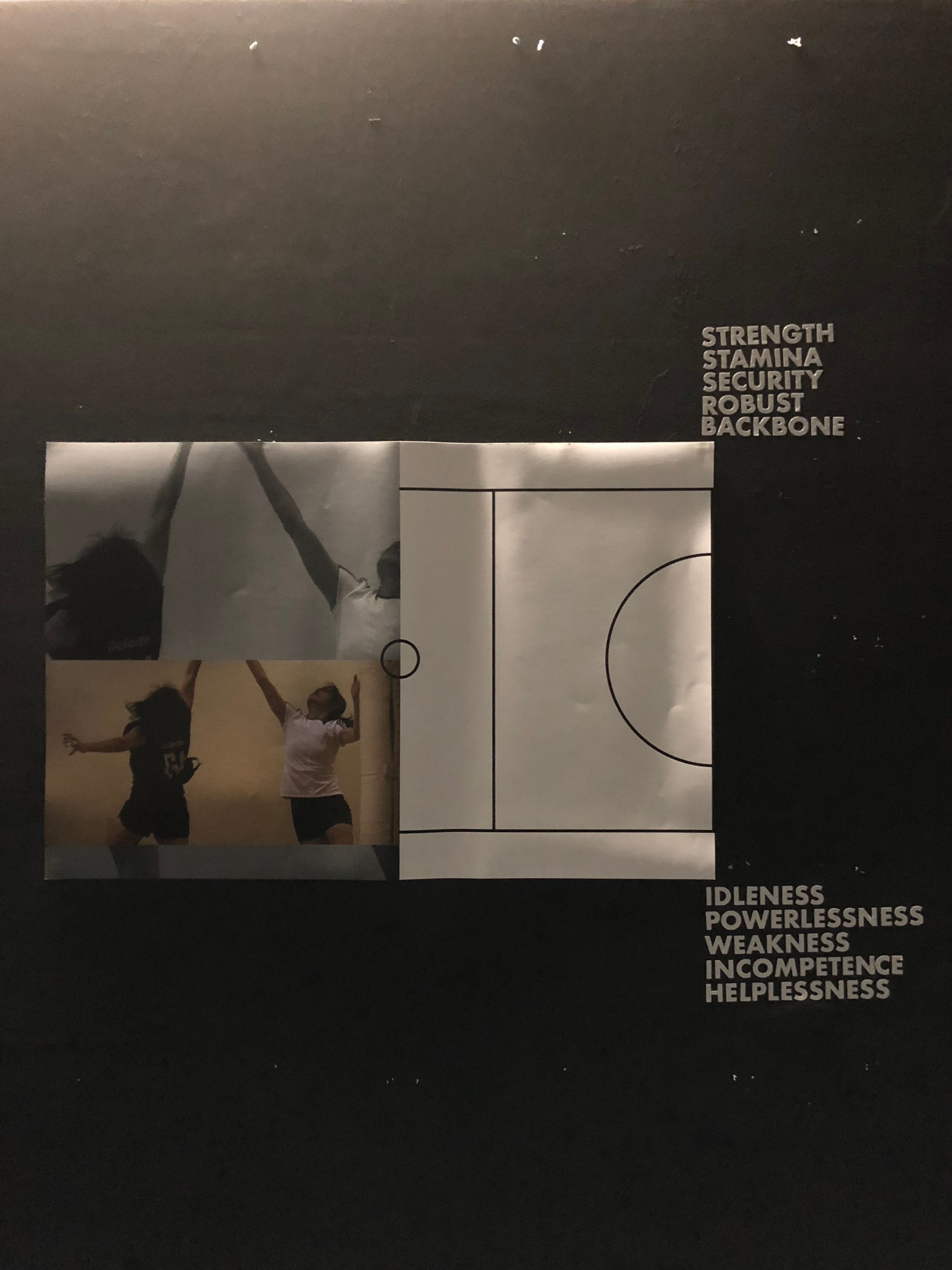
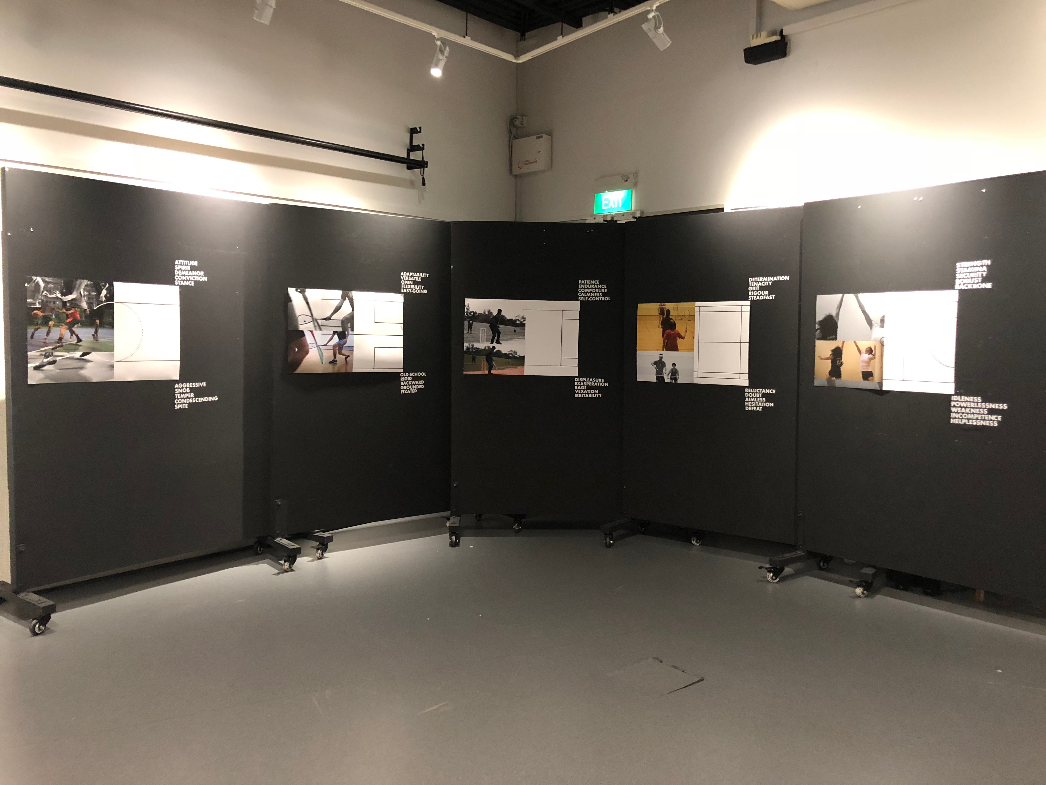
Sports, as one might think, is commonly associated to be purely for health or survival benefits, and also a distraction for those who prize pragmatism. Rather, sports is closely tied to many domains of life that are beyond the value of sports itself. Sports, either recreational or competitive in nature, can be used as a means to cultivate values, such as respect, discipline and teamwork; which many do not realise. However, more often than not, competitive sports, and not recreational sports, are usually in the limelight for the development of such values.

Through a design ethnography study, 2400 seeks to explore and visualize how recreational sporting  activities can be of benefit as a source of value creation to each individual.

Using a visual documentation method to highlight the importance of potential learning through sports, 2400 aims to send a message that it is possible for one to participate in sports at any time of the day. Instead of dismissing its purpose aside at the first glance,  recreational sports play can actually be a venue where values are learnt.


Process

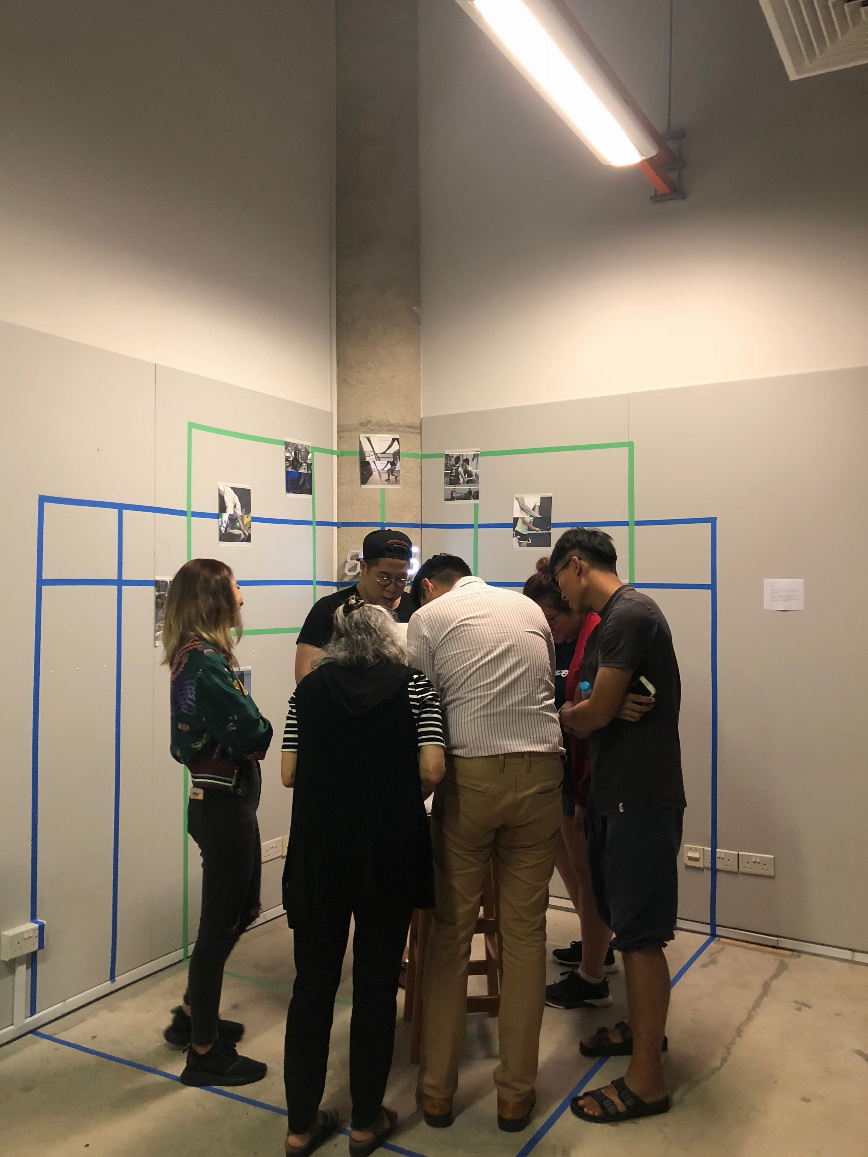
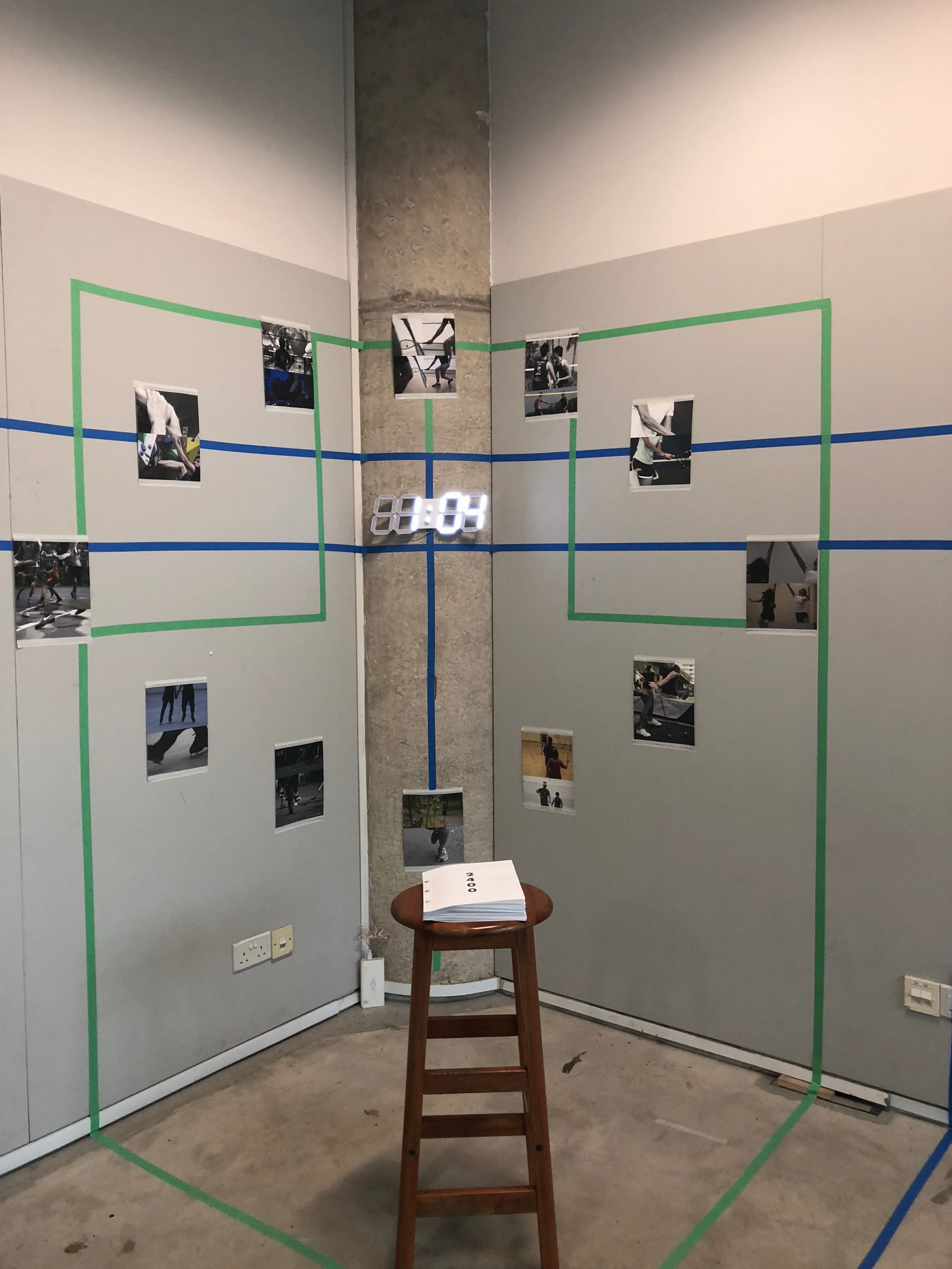
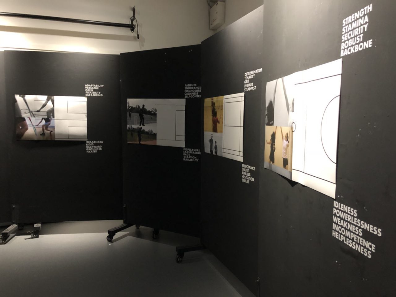
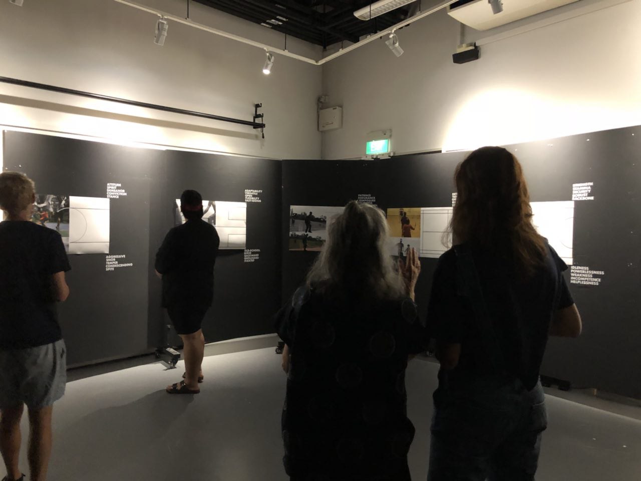
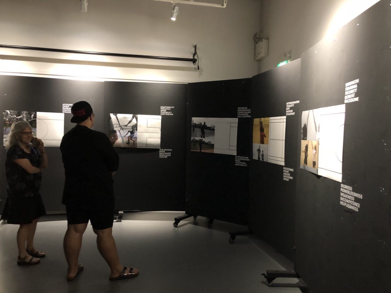
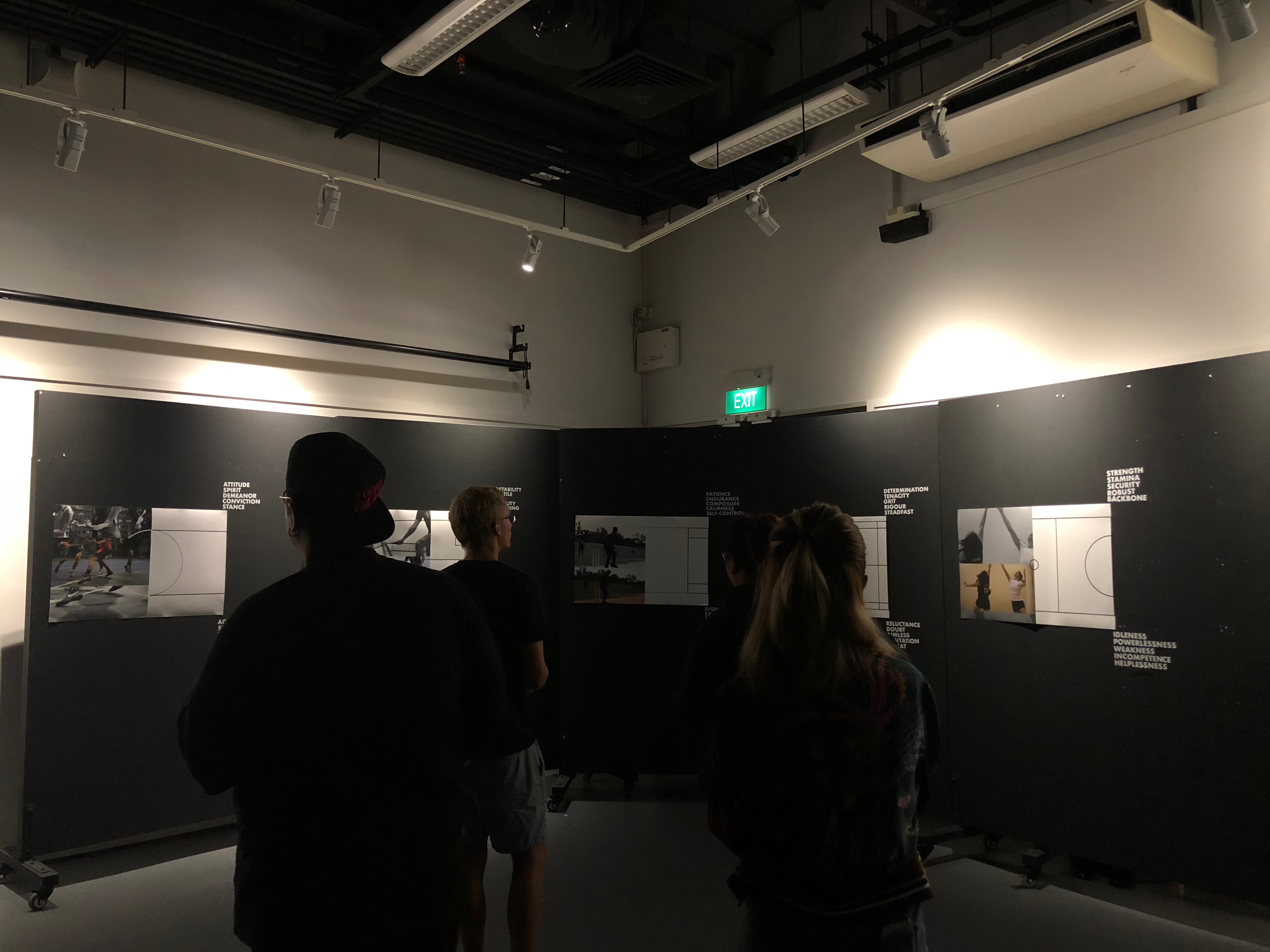
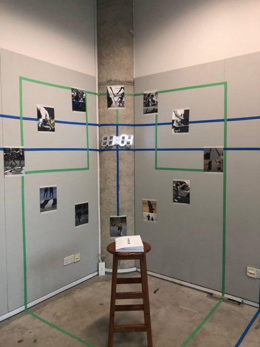
12 images are printed on  A4 canvas satin photo paper and cut into shape. 12 images are to tell the story of the 12 hours of the day since 24 images to represent 24 hours is too cluttered. 6 morning photos together with 6 night photos are chosen for equal representation.

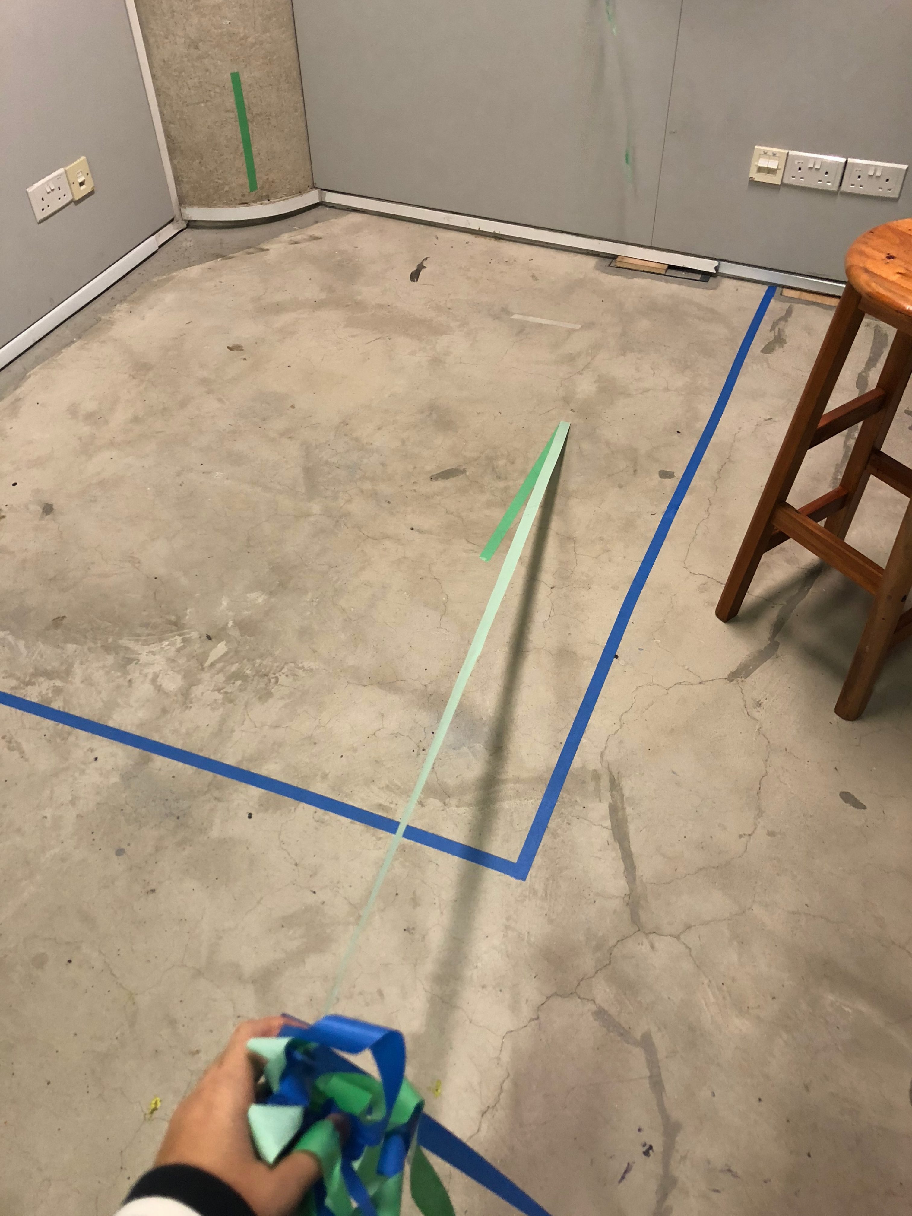
Painters tape is used to draw and mark out court lines of the squash (green) and badminton (blue) courts. The publications 2400 and 33:41:27 are placed on the chairs in front.

Book images

2400

33:41:27

2400 and 33:41:27 are publication made to accompany the diptych images on the wall installation.

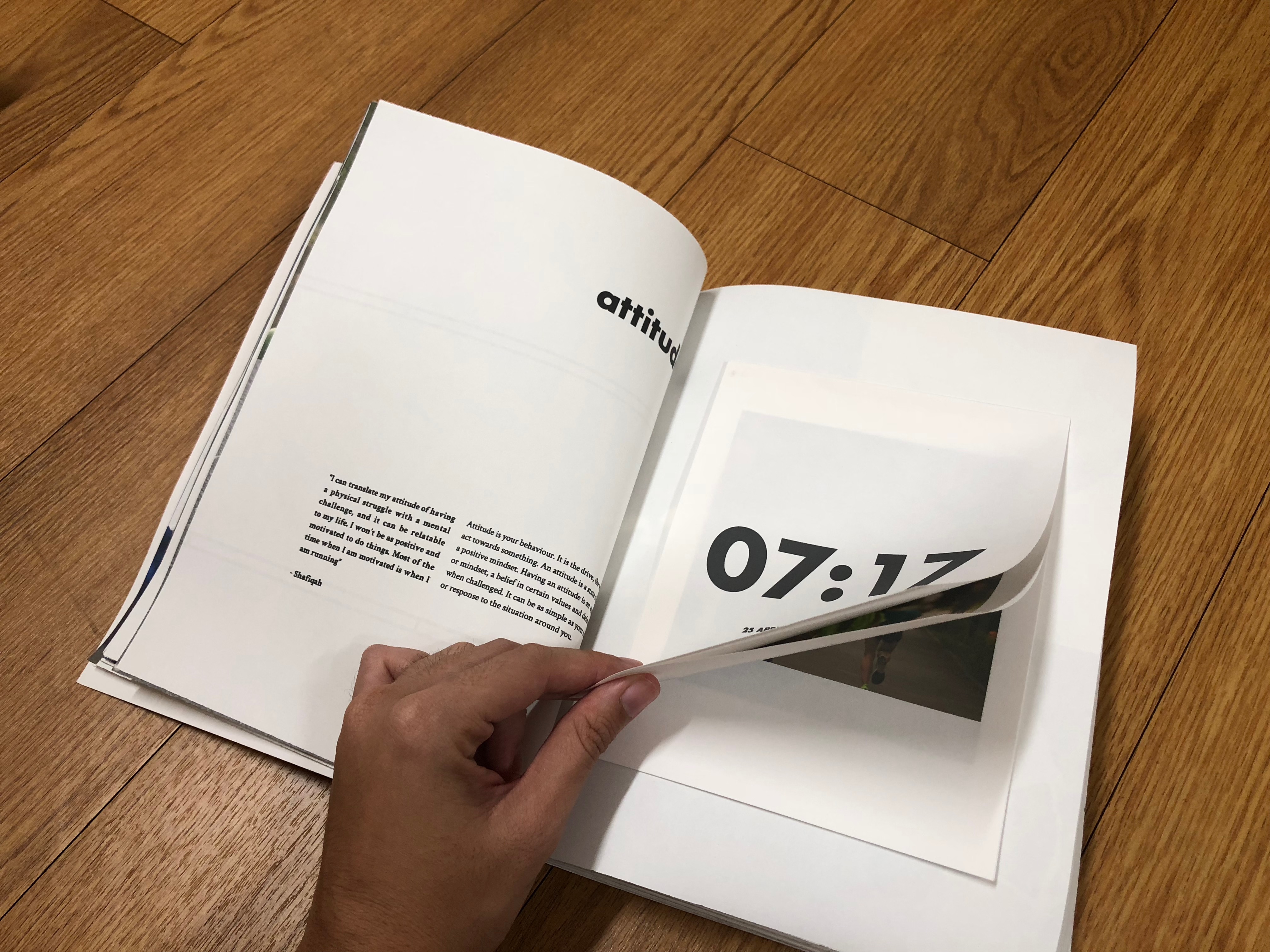
2400 is a book that showcases sports played at different hour of the day together.
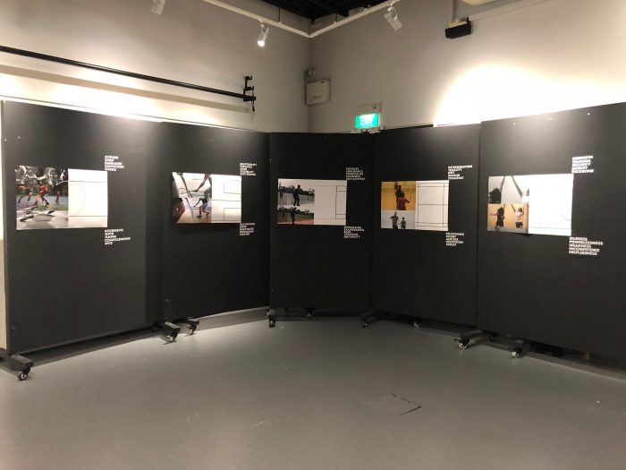
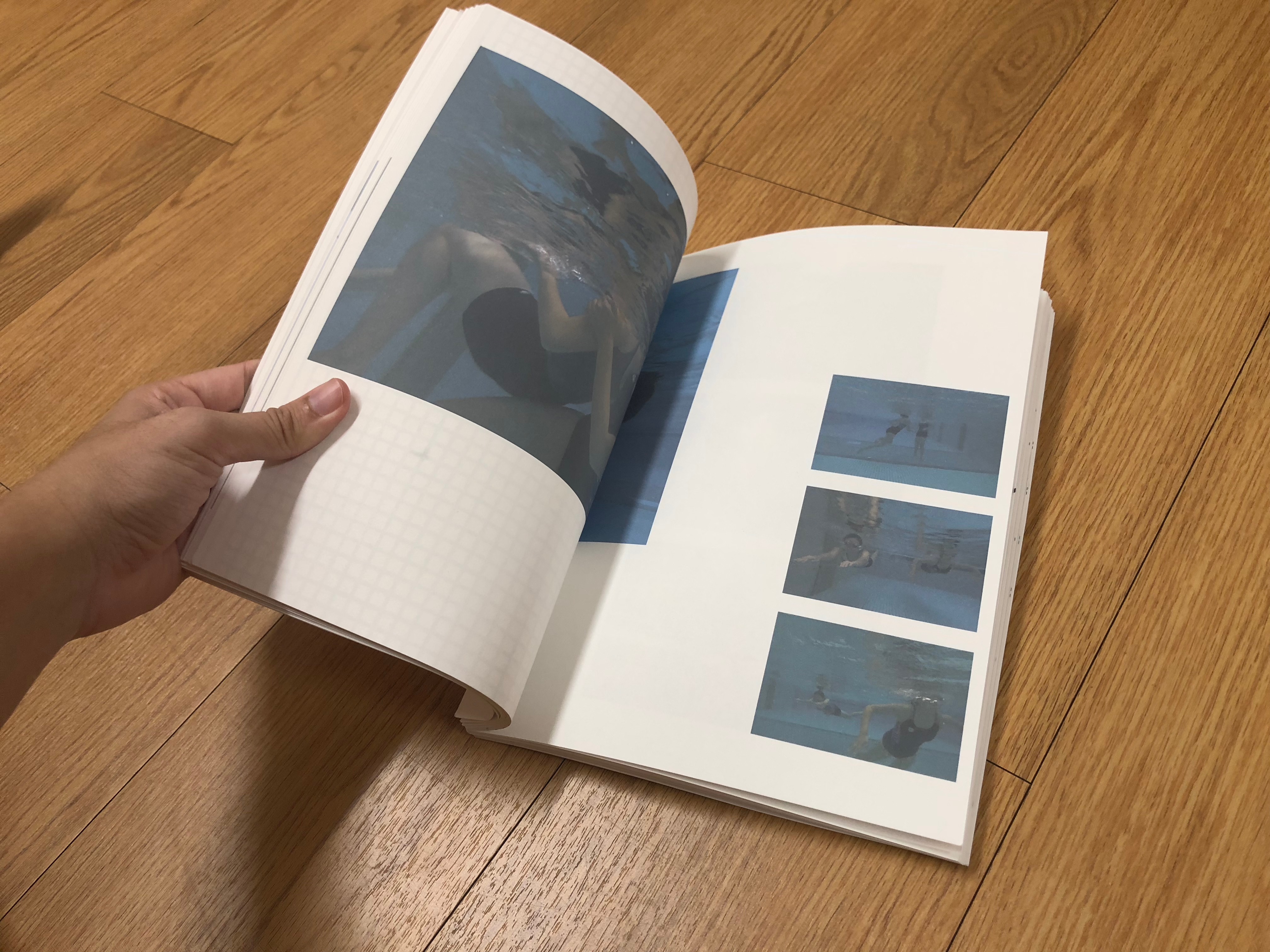
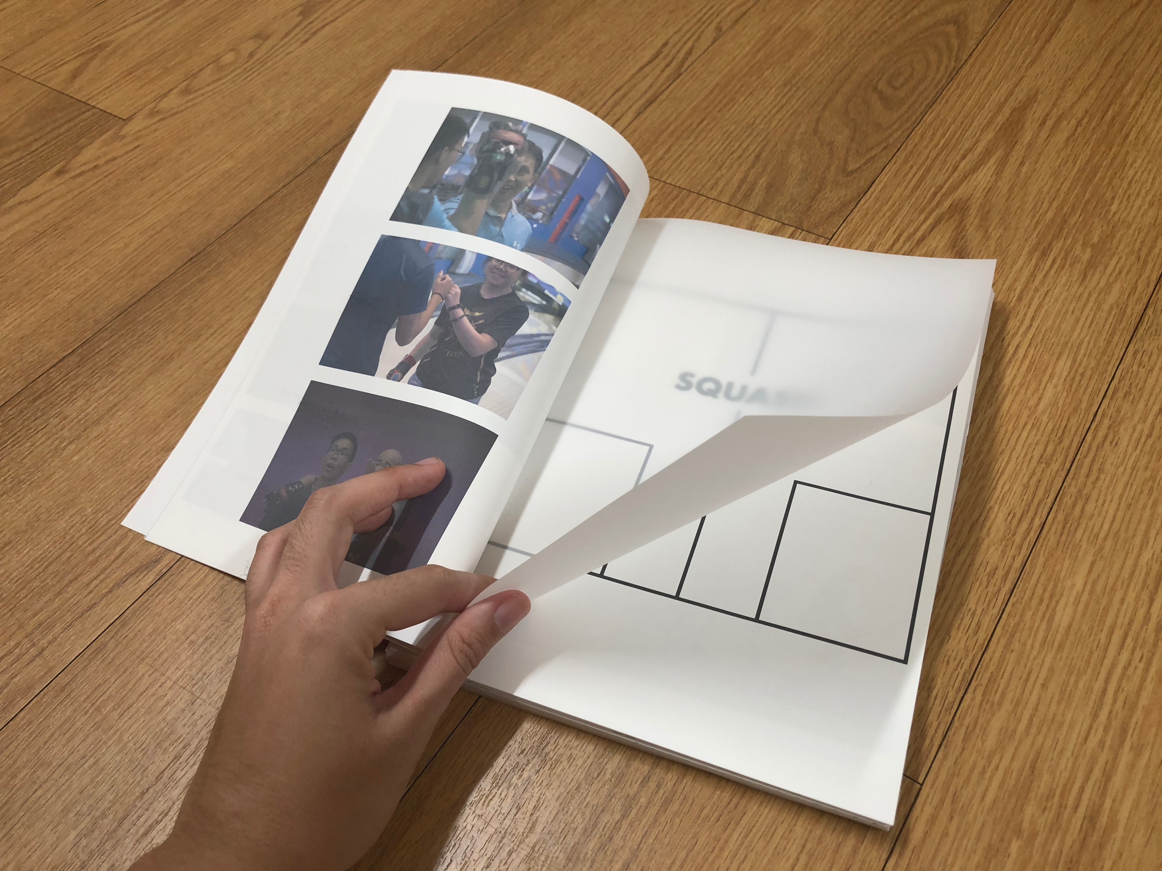
The contents of the book consist of the values, quotes, a short description of the sport and photos that tells a narrative story of these 24 groups of people playing recreational sports.

33:41:27 is the second publication that is named after the total time taken for me to travel as well as to photograph the entire 24 sports documented in this project.
It is a compilation photobook of the 24 sports photographed that did not appear in the first publication where there are outtakes, candid photos that are more casual.

Final

Growth – Mid Sem Review

Growth

Mixed Media, Audio Clip 4:59

Sports has been commonly associated to health and survival benefits but is that all there is?

Sports is closely tied to other domains of life, beyond its own value of just a physical activity to sweat it out. Growth speaks of the values that one can learn through the various forms of sporting activities around us in Singapore.

Process

Images are printed on a A1 size photo paper while the words are laser cut on sticker paper and pasted individually onto the wall via transfer paper.

Individual Screens Images

Diptych Images are paired along with keywords, both positive (on the top) and negative (at the bottom) to show the growth in achieving the key value of the sport.

Final

5 screens of keywords and images are placed together to show a collection of how each sport is linked to values that can be learnt. The collectiveness presents a greater cohesiveness in the idea of growth than just a single image

Presentation Images


Oceanic Convening / Sea State Strategies

Atif Akin

Tepoto Sud Morph Moruroa, 2017 / Multi-Media Installation

Tue Greenfort

Tamoya Obbaya, 2017 / Installation

Armin Linke

Oceans, Dialogues between ocean floor and water column, 2017 / Film

__________________________________________________

Strategy #1: Film/Images Projections

From the 3 artists above, they have used various ways of projections which I thought was interesting and strategic in terms of how they presented their content. For Atif Akin, the projections were on the floor, with different images played which plays with the perception of the viewer by presenting it on the floor than on a wall. The images are panned from drone captured videos to an animated 3d renderings which captured my attention as I do not only see the beautiful video stills but the sciencey part of how scientists look at these areas. As for Tue Greenfort, what caught my attention most was the projected screen that he used. The bottom half of the screen was a transparent acrylic but the part which the video was projected on is actually covered with a sticker that made the acrylic slightly frosted – which also made the acrylic textured. And with that, this allows the projection to be shone onto the screen. Lastly, Armin Linke’s 4 screens projection captures different perspectives of the scientists at work and this allows us, the audience, to see the many viewpoints of their expedition work. Similar to Akin’s work, Linke’s shows how these researchers work but with a different mode of presentation in their content.

__________________________________________________

Nabil Ahmad

Inter-Pacific Ring Tribunal (Interprt), 2016-Ongoing / Diagram printed on acrylic

__________________________________________________

Strategy #2: 2D/Print/Graphic Presentation

Nabil Ahmad’s work was different from most of the works around the exhibition as his execution takes an unconventional turn by using acrylic that is rasterised/cut. The figures and diagrams were simplified using symbols which can be found in the legends table at the side. This allowed me to decipher bits and pieces of the work which I thought was interesting as it creates an interaction and understanding of the work between the artist and viewer.

This is especially relevant to me as I come from a viscomm background and I could see how the artist is able to present his content of the same topic in another form of expression as compared to the videos/photos that is mostly seen around the exhibition.

__________________________________________________

Charles Lim

Sea State Exhibition

__________________________________________________

Strategy #3: Space – Screens & Prints

Charles Lim’s exhibition allowed me to reflect on the visual space used and following the first 2 strategies of using projections/screens and prints. His works are placed mostly one on each white wall, with a space solely dedicated to it. This allowed me, as the viewer, to fully focus on the screen/print itself instead of being overwhelmed with the things around. With the empty space around, this allows me to concentrate better on the many moving images as well.

There were 3 screens in a long portrait format style, with varying perspectives of the content shown. For one, is just the view of the sea and waves, in zoomed in or out, or another the sand being pumped out onto the seafloor. I liked how he cut his various frames in different angles to fit the long frame and I would stare at the screen for a good 10mins to figure out the whole picture of the video.


The Emperor’s New Clothes

The Emperor’s New Clothes

A story about courtly pride and intellectual vanity. Pursuing of worldly standards to be validated by his own people, and while the kingdom is also pretentious in nature.

It also speaks about the conformity in the general public and the fear of speaking out in defiance to be different from the rest.

“Magnificent. Just look your Majesty, what colors! What a design!”


Concepts:

  1. Colorful, psychedallic, holographic, foiling
  2. Watercolor, marbling
  3. Punch hole, white

moodboard-04

Concept 1: 

The idea of randomness and chaos, not knowing what there is to focus on. The bombardment of colors as to convey the pretentious and vain nature of man. But it also expresses the mess of defiance in being different from a flat color.

moodboard-02

Concept 2:

The endless flow of water and complete randomness of a paint blib or wavy pattern

moodboard-03

Concept 3:

Punch hole technique seems like a reverse braille process and with braille being for the blind. It focuses on the idea of the unseen from afar but can be seen when look upon up close. To express that some might too short sighted to judge based on appearances. The feeling of emptiness and nakedness

Reference: https://www.pinterest.com/klinzrap/pattern/

We All Have A Story To Tell

IMG_6071.JPGIMG_6073.JPG

Everyone Has A Story To Tell, 2015 

Ang Kai Lin, Singapore

__________________________________________________________________________

“We judge based on who we are and not who the people truly is.”

Everyone have a story to tell, they do, we all do. It amounts to whether one is ever brave enough to speak of it, the pain or the sorrow, the joy or the excitement. It boils down to this very judgemental society of what should be worthy enough to be spoken.

This dress is made with lace to show the delicate being of humans, seemingly so transparent in thought but actually much more than what is seen by the eyes. The dress is fixed with a sound sensor where the LEDs on the flowers surrounding the dress will light up when sounds are detected.

I was inspired by the stories that every human holds, blooming in gorgeous thoughts, exciting in wonderful nature but held within because we are all too afraid to speak. The the delicacy of the human heart that is so fragile.

Materials: Lace, Plastic Bags, Assorted beads and sequins, Flat plastic boning, Ardino Lilypad, LEDs, Sound Sensor

Techniques: Pattern drafting, bodice fitting, sewing, embroidery, fusing of plastic bags