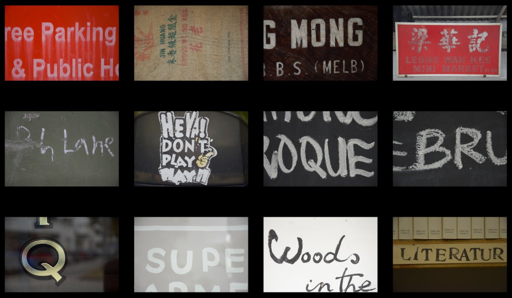
For the second postcard, I wanted to address the brief more directly and take it on from a typographic angle. As a designer, I am always looking around and paying attention to the typography that I see around me. I also have a habit of taking photographs of interesting type that I come across on the streets. For this design, I decided to look back to a series of photographs that I had taken of type in Tiong Bahru. I really feel a particular connection to the place as I have personally spent quite a bit of time hanging out in the cafes and places along the location. I also had the good fortune of being able to work on the branding of one of the cafés there – The Dispensary. I also felt that the way the old and the new live seamlessly in Tiong Bahru, is representative of how I tend to incorporate a harmonious mix of traditional and digital media in my works. As such, I felt that it was only appropriate to include the typography that was representative of this place, to represent me.
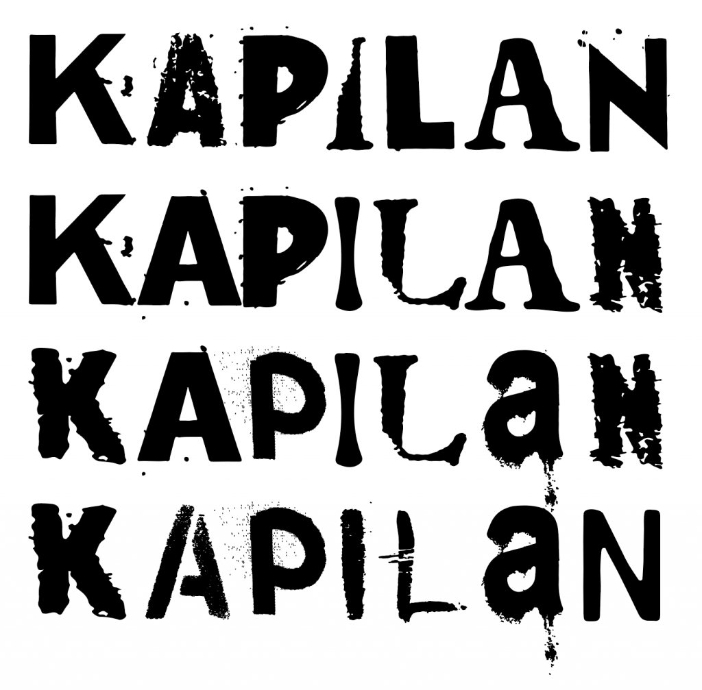
I chose once again to show my first name, using the letters that I found to create it. I also had the idea of swapping out various versions of the letters in my name to create the animation aspect of the design.
In creating the letterforms, I first began with the collection of photos that I had taken.
I then took these photographs into Photoshop to have them enhanced and cleaned up. I used processes such as inverting the image, modifying the levels using selective channels to isolate the typography. These processed images were then converted to monochrome. I then brought the black and white edits into Illustrator, where they were Image Traced and converted into vectors.
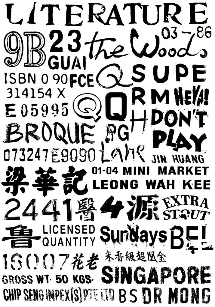
The vectors were then compiled into a ‘sticker sheet’ as individual letters that I could use in the project. There were the shortlisted letters that ended up being used.
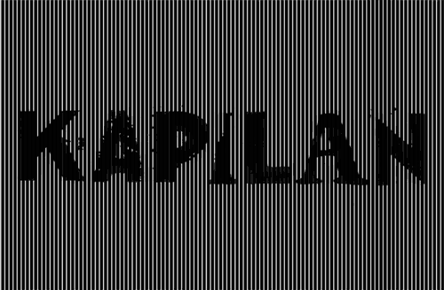
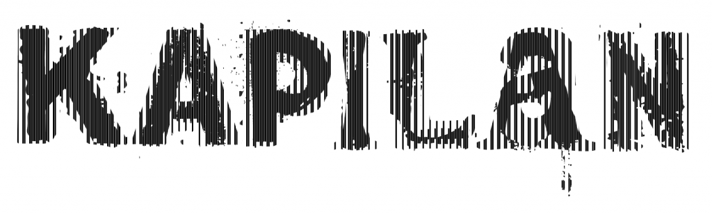
I then applied the moiré process to the frames above to create the following composite.
And here is the final interactive animated version of the piece.