Armed with my research of Op Art, I went to work on experimenting and creating a few pieces. I like using digital as my weapon of choice. Especially with the creation of very precise geometrical shapes, I felt using a tool that was equally as accurate would make sense. I created these on Adobe Illustrator. Here are the results:
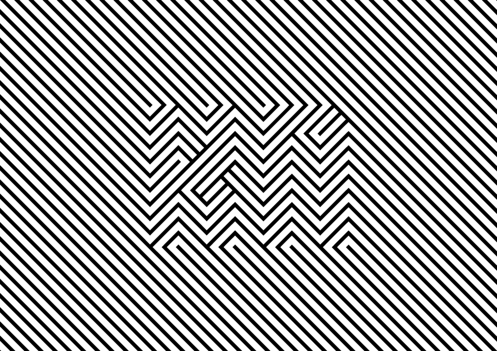
This first image is composed of diagonal lines and my initials ‘KN’. The optical trick here is achieved by using opposing 45° tilts to create form. My initials become much easier to view the farther it is seen from. Squinting and looking at the image may also help. Although I consider this to be rather successful execution, in the scope of the brief, I found it lacking and boring. It did not speak much about myself as a person. I initially intended to experiment with printing these designs on colored paper, I don’t think they would help increase the interest going on in the design.
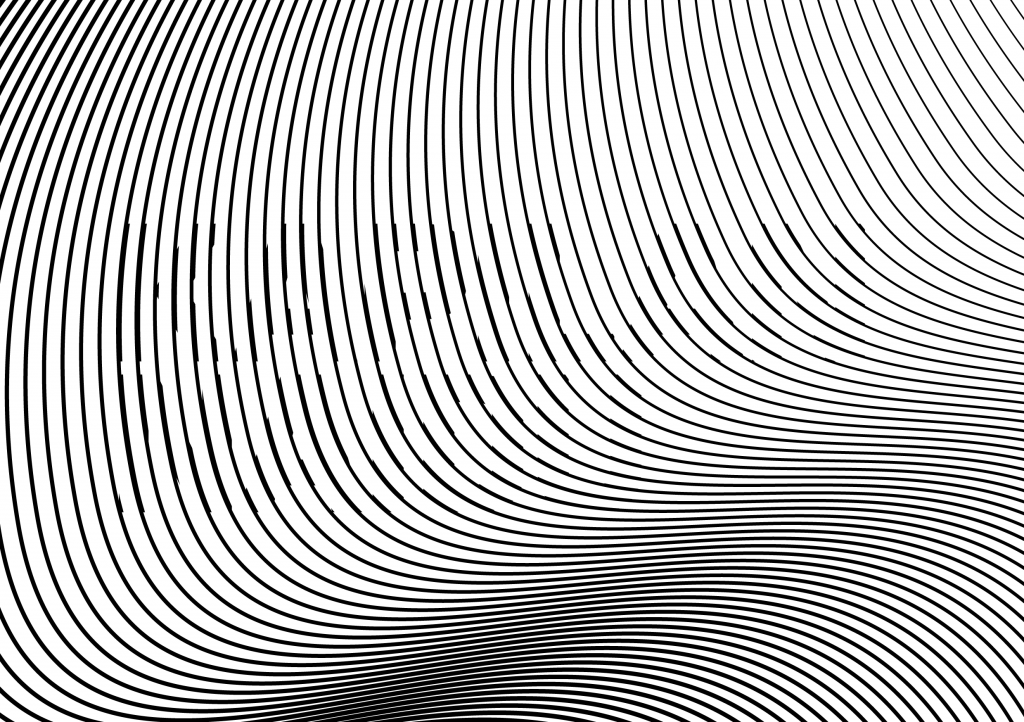
This second design uses a much more intricate method to create the illusion. While the design spells out my first and last name, it is much harder to spot. The effect is created by selectively thickening some of the moire lines to create form. Once again, this illusion is much easier to spot if the viewer squints. It might also be easier to spot by moving from side to side.
Although I found these two experimentations to be interesting and fruitful in exploring the moire technique, I felt that creating works to fulfill an ‘Op Art’ criteria was the wrong way to go about this brief. I need a way to incorporate a conceptual element into the Op Art execution in order for this series to be successful. I will continue to look into other ways of playing with moire and optical illusions.