For the second idea, I was extremely excited to use the Fleen software that I had recently discovered. What made this all the more special was that this software was created by a fellow artist. The program was written with the sole intention of making art.
Category: 2D Foundation II – G1
Organizing Order (Pixel Sort Part 2)
Here are some thumbnails of the creation process. I have documented the different stages, from the start to the finish. The different sorting results were imported into Photoshop and composited together. I also made the image black and white to resolve the color differences between my source images. I also felt that the series would look more cohesive if all the final results were monochromatic.
Organizing Order (Pixel Sort Part 1)
While working on the series, I consulted Ina to see if I could work on a larger scale. I wanted to have the works be detailed and intricate and thought that the larger size will be able to do justice to the compositions. I decided that working on A3 for my final works would be an ideal size. With this decided, I was able to create works that were larger and more complex.
The first design that I created was the Pixel Sorting one. The biggest challenge with making this work was identifying a process that would help me produce the results I wanted in an efficient manner. After looking around, I realized that I would have to create a program that would help me analyze a digital image and carry out the pixel sorting according to the instructions I gave it.
Reinterpreting the Brief
I took some time to really look through and understand the brief. But I felt that I kept coming short of the objective of the brief. This was mainly due to limits and constraints placed on the points of view. One of the only things that I felt sure about was the execution and creative direction that I wanted to undertake for this project. After the previous project, I wanted to take more risks and push the digital/analogue frontier even further. I wanted to pursue code modification and generative art for this series. After consulting with Ina, I decided to carry out more research into the area. Continue reading “Reinterpreting the Brief”
The Final Results


At the end of the project, I was really glad with the results and how I was able to create something digitally and reproduce it faithfully using analog media. The animation and the interactive experience of playing with the postcards really complemented the concept that I was trying to convey.
Assembling the Postcard
Here are some images of the process of assembling the final postcard. I created a plastic sleeve with the moiré screen and the text descriptor printed on. The actual frames of the animation were printed on a separate piece of paper that was inserted into the sleeve. The movement of the slip inside creates the animation.
Postcard Four (3D Modeling)

The last and final postcard was going to created to represent three-dimensionality. Of late, I had been working more and more with digital 3D techniques and I wanted one of these postcards to reflect that. Continue reading “Postcard Four (3D Modeling)”
Postcard Three (Coding)
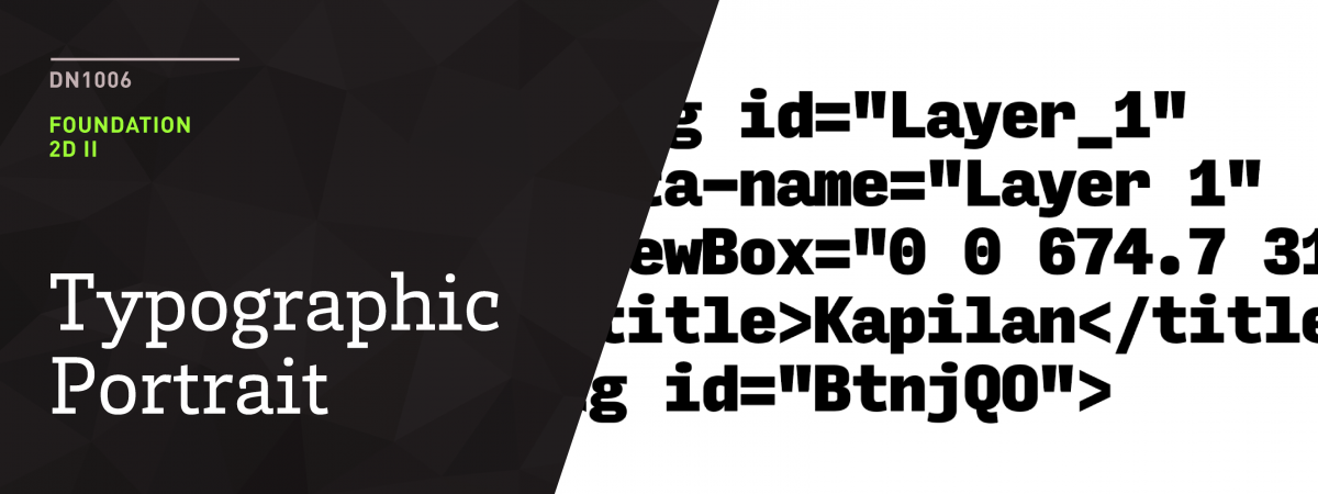
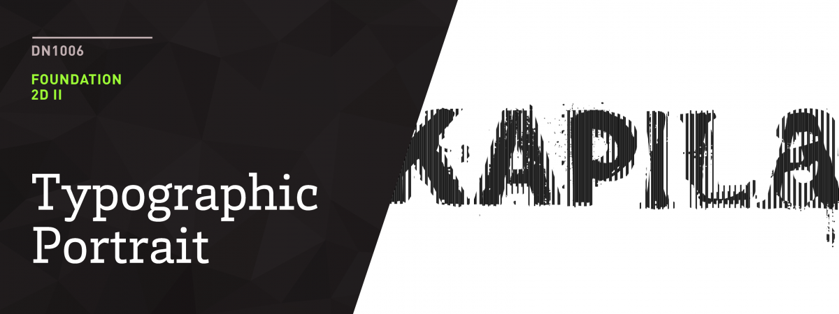
The third postcard was meant to explore the contrasting relationship between analogue and digital. For this design, I wanted to show my tendencies in working with digital mediums as opposed to print and traditional materials. However, I wanted to take a reversed approach with the execution of this design. Instead of using code to create a work or design, I wanted to create something by hand first, and then convert it to code. Continue reading “Postcard Three (Coding)”
Postcard Two (Typography)
For the second postcard, I wanted to address the brief more directly and take it on from a typographic angle. As a designer, I am always looking around and paying attention to the typography that I see around me. I also have a habit of taking photographs of interesting type that I come across on the streets. For this design, I decided to look back to a series of photographs that I had taken of type in Tiong Bahru. I really feel a particular connection to the place as I have personally spent quite a bit of time hanging out in the cafes and places along the location. I also had the good fortune of being able to work on the branding of one of the cafés there – The Dispensary. I also felt that the way the old and the new live seamlessly in Tiong Bahru, is representative of how I tend to incorporate a harmonious mix of traditional and digital media in my works. As such, I felt that it was only appropriate to include the typography that was representative of this place, to represent me. Continue reading “Postcard Two (Typography)”
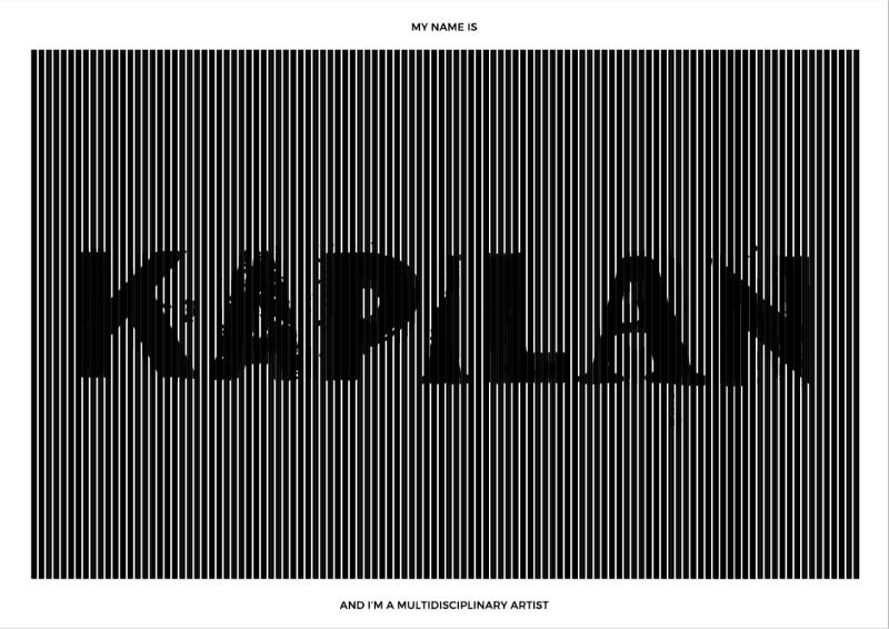
Postcard One (Sound)
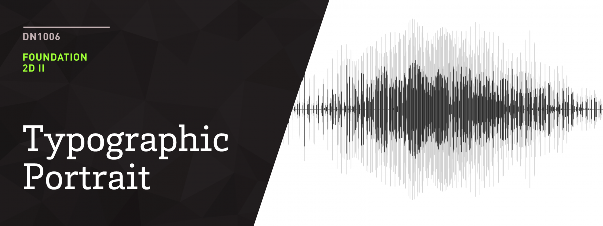
The brief of this assignment called for us to create typographic responses to a facet of ourselves. This particular design was intended to show how “I am a multi-disciplinary artist” by being able to work with and create ideas across disciplines with visual and sound based works. As such, I wanted to work around the concept and imagery of sound. The only ‘issue’ with this idea was that there was nothing bringing me back to the brief where typography was involved. It was at this point that I decided to explore the iconographic nature of typography. Most people associate typography as the design and arrangement of letters. In reality however, there are languages that exist to this day that don’t depend on letters for communication. Typography may also involve pictograms and icons. I decided to play with this idea further. Continue reading “Postcard One (Sound)”