
The last and final postcard was going to created to represent three-dimensionality. Of late, I had been working more and more with digital 3D techniques and I wanted one of these postcards to reflect that.
My initial idea for this design was to use one-point anamorphic. Anamorphic statues and designs are works that only reveal themselves to the viewer when standing at a very precise point in space. The works below are good examples of this effect.
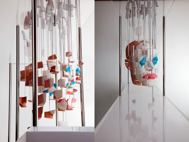
Artworks by Jonty Hurwitz
Apple Design Video
The conceptual reasoning behind this decision was to show how things may not always be what they seem with me. My love in dabbling with all sorts of things usually lead to people not really knowing what I am like artistically or what it is that I like to do. People either tend to assume I just do one thing, Graphic Design, or I mess around with a bunch of things. I wanted this work to reflect the “more than meets the eye” aspect of me.
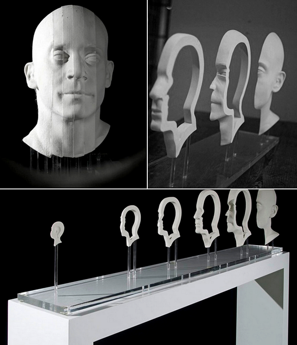
The anamorphic method required to create this effect is called Projection Mapping. I wanted to have my name projected on a geometric solid object as a texture. I would then rotate the object in a way such that the text became unreadable. While this idea seemed really good to me, I was having tremendous amounts of trouble figuring out a way to make this happen in Cinema4D, the 3D Modeling software that I use on a regular basis. As such, I quickly tried to think of an alternative method that could somewhat recreate the intended effect. I then thought about using forced perspective. I eventually came up with this:

While my name appears normal and aligned from the front, rotating the scene and viewing it from the top reveals that the characters are actually of different sizes and position.

I created text extrusions in Cinema4D and began with all the letters arranged in a single line. I offset the letters on the Z-axis and pushed some of them backwards.

I then corrected the scaling of each of the letters such that they look correct when viewed from the front.

The final step in the process was to texture the models such that they appeared like a flat vector illustration. This was done by creating materials that only had luminance and no diffused lighting properties. One black, and one white.

After setting up the scene and the objects, I animated a camera to move the point of view from the front, to an angle above. The final animation ended up looking similar to what I wanted. The view from the top looked like a bunch a polygonal shapes that eventually make sense as the camera comes back to the front.

I reversed the clip and reduced the total number of frames in the animation above to 4. I then put the frames through the moiré process to produce the composite.

And this is what the final animation looks like when interacted with.

great documentation… super glad to see your own take on project