The brief of this assignment called for us to create typographic responses to a facet of ourselves. This particular design was intended to show how “I am a multi-disciplinary artist” by being able to work with and create ideas across disciplines with visual and sound based works. As such, I wanted to work around the concept and imagery of sound. The only ‘issue’ with this idea was that there was nothing bringing me back to the brief where typography was involved. It was at this point that I decided to explore the iconographic nature of typography. Most people associate typography as the design and arrangement of letters. In reality however, there are languages that exist to this day that don’t depend on letters for communication. Typography may also involve pictograms and icons. I decided to play with this idea further.
For this design, I wanted to covert the typographic representation of my name – KAPILAN – into an auditory one. To do this, I decided to record myself speaking my name out letter by letter. I would then be able use the the sound wave representations of these recordings in my design. This way, I would create my own pictographic representation of my name. A font made of sound waves. When processed using the right software and methods, the sound wave font would technically yield the same recording of my voice. In incorporating the animation aspect of this design, I wanted the sound waves to morph from one letter to another. This would be achieved using a seven-frame animation – one for each letter in my name.
To prepare, I first used an audio production and editing software to record my voice. I picked Audacity over the other professional tools that I usually use as it produced the most ‘visually raw and unpolished’ sound waves. That is to say, the sound waves had no aesthetic processing done to them. This would allow me creative freedom in the design and representation of the audio waves later.

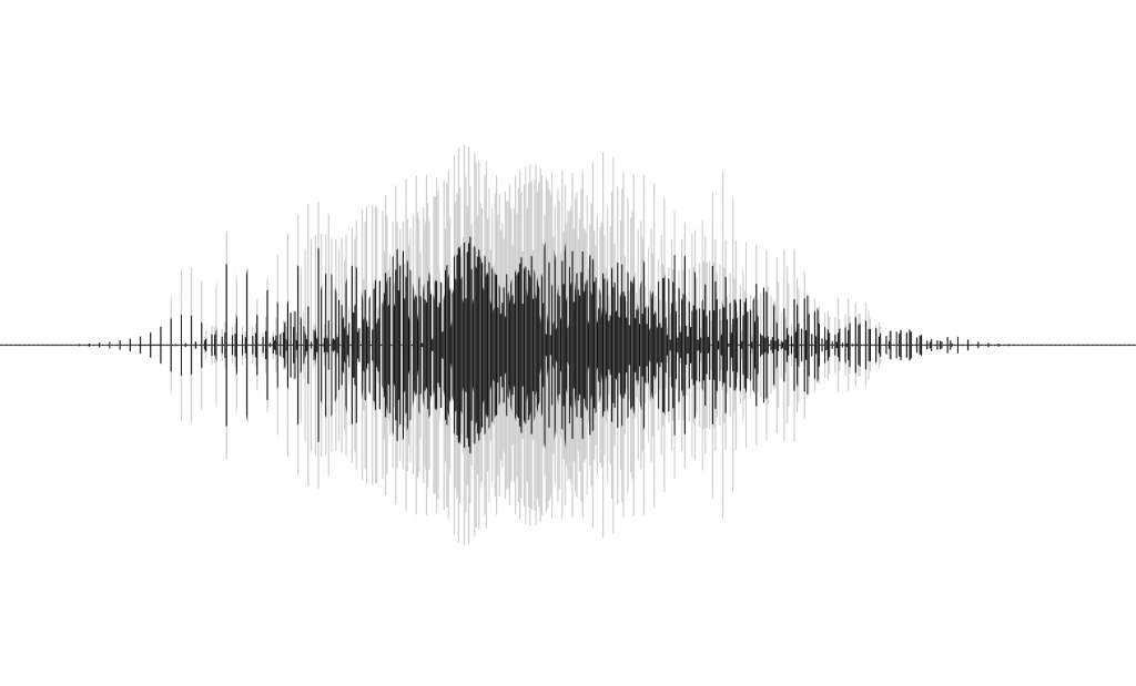
These were the initial sound waves that I got using Audacity to record.
I then took screenshots of the waves and brought them into Illustrator, simplifying their silhouettes in the process. I chose to have them rendered in two colors – black to show the main frequencies, and grey to show the spikes.

I then used moiré process detailed in the earlier post to put them together in a composite.
There were 7 frames for this design, one for each letter in my name. Part of the beauty of the moiré effect is that there happens to be a certain degree of tweeting between the frames. As such, the transition isn’t as jarring as one would expect. This gives the animation a very life-like dynamic quality, making the final product look almost as if its reacting to a live playback of the audio file. Here’s what the final interactive version looks like:
