4. Other Art Assets
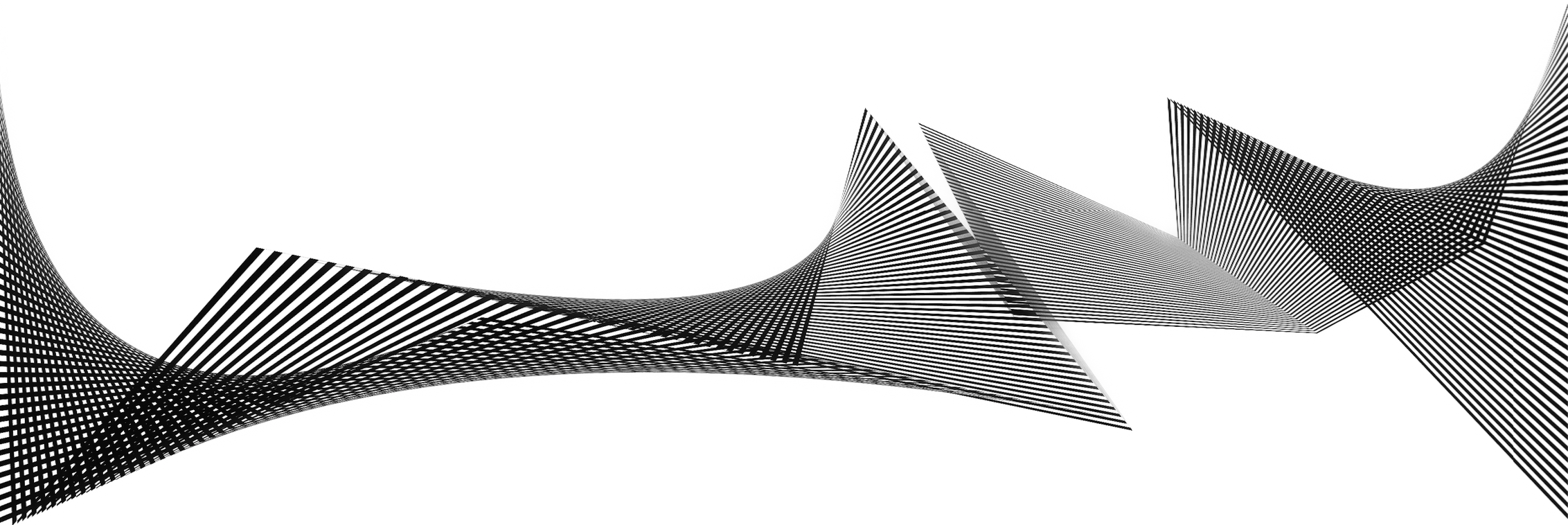
There were two sections in the Zine that needed decorative art work to fill the space in the spreads. Seeing as to how all the work that I created during this semester were being used as Featured material in this Zine, I decided to create a few more simple works to finish up the zine. The first of this design was for the spread introducing Generative Art.
For this, I aptly created another generative design in Processing. This was a geometric design that drew specified number of lines in a shape according to a mathematical formula. The formula’s curve was then simplified to create the final work.
The other work that I created for the zine was an accompanying art work of for the first page of the Encryption article. I wanted to create a work that looked glitchy and distorted. For this, I went back to the visual bank of street typography that I discussed here for my Typographic Portrait. I took some letters and randomly dispersed them on a canvas in Photoshop. I then used a data editor called Hex Fiend to distort the information within the file.
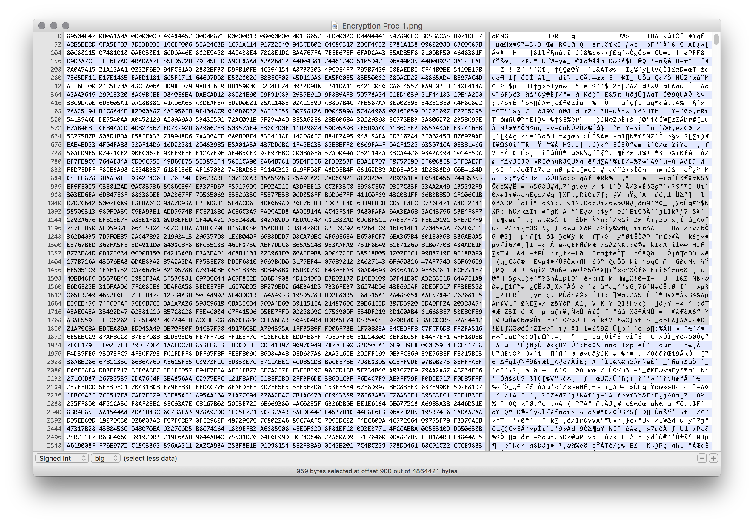 I could select various sections of the image’s underlying code and delete or modify it. This would damage the file to create interesting results. This was the first round of distortion.
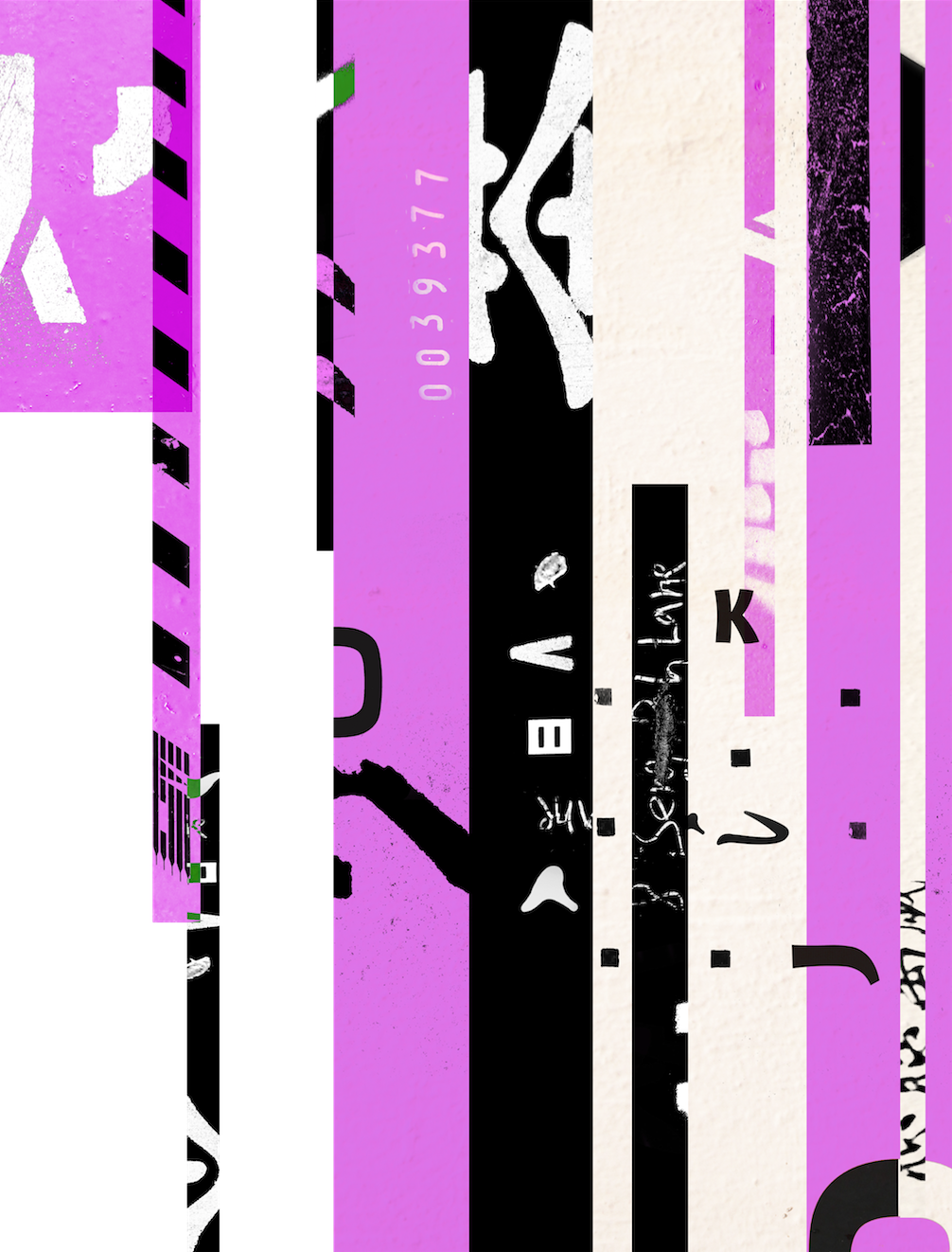
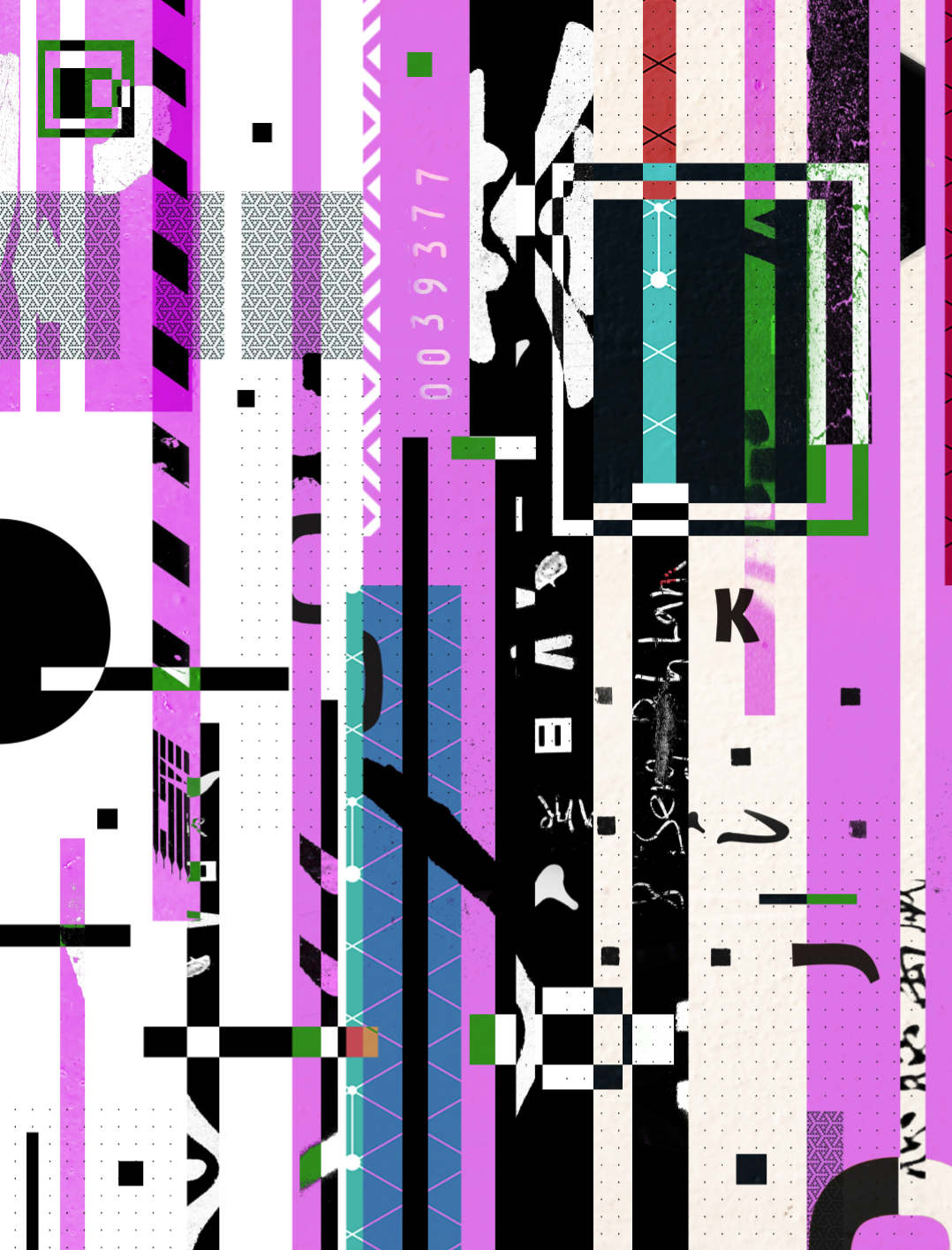
After this, I brought the distorted image into Photoshop to be processed further. I overlaid some geometric patterns on the image to make it look more complicated and jarring. It also introduced more texture into the image. I was careful not to overdo this part.

I then took the image back into Hex Fiend to mess it up a little more.
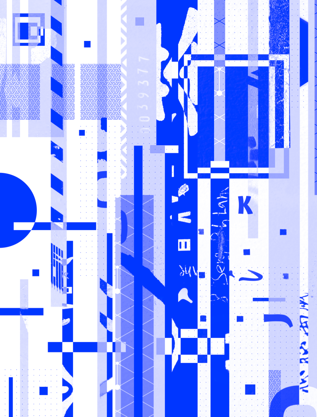
I was happy with the distortions that was introduced into the image. I decided to save the changes and add this image into the zine. I made one last change to the image, making it black and white and adding a cobalt blue gradient map. This made the image fit in better with the rest of the zine’s aesthetic.
5. Typography
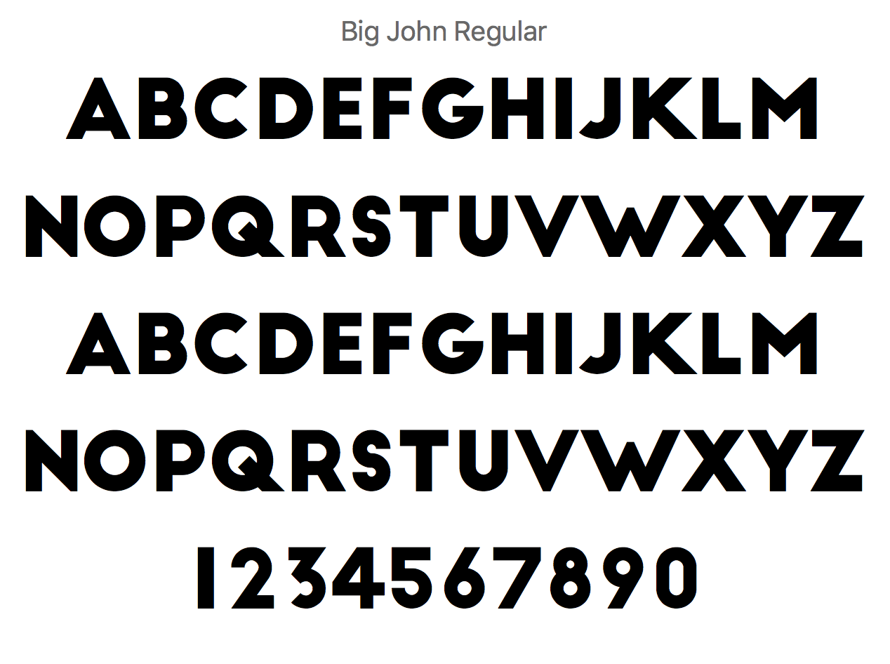
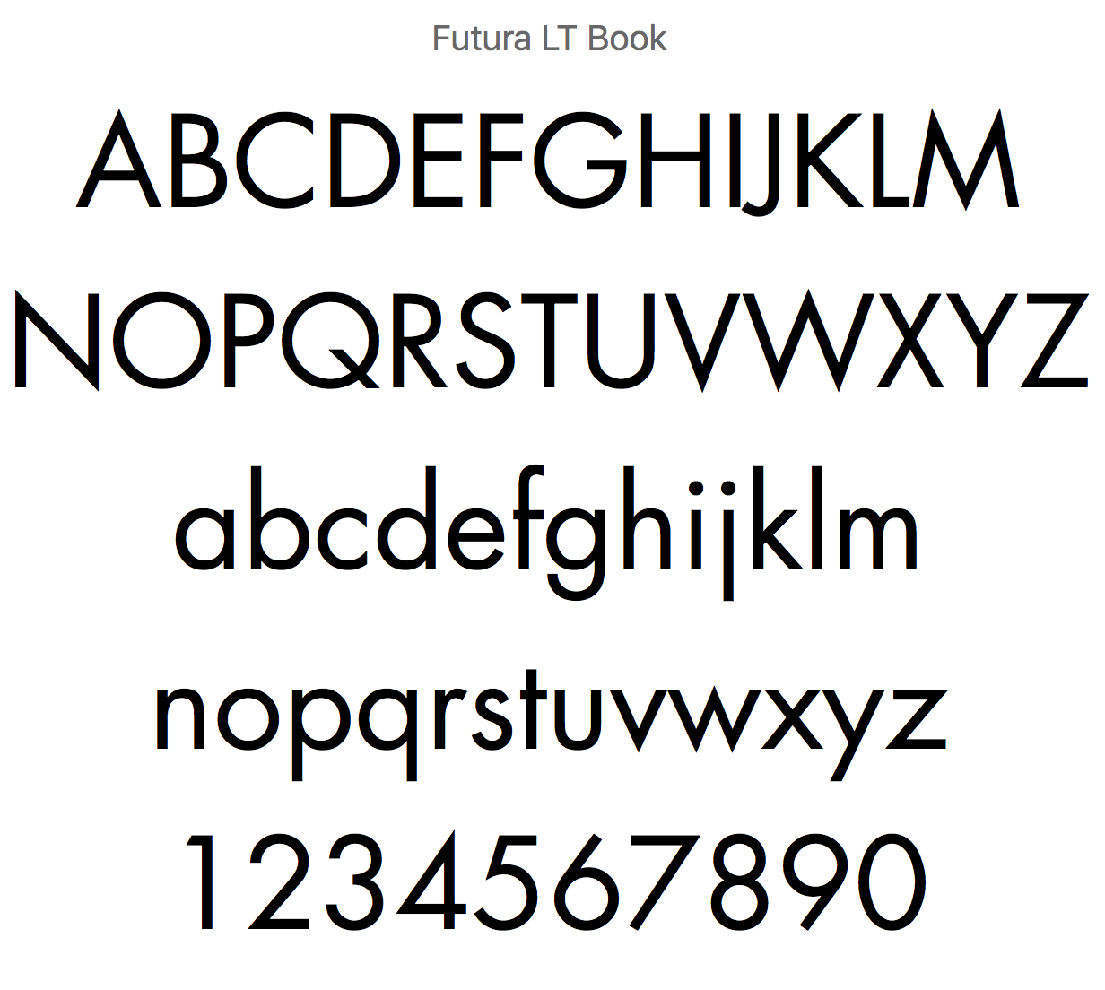
The zine was type set with Big John for headings and Futura for body copy and labels.
However, for the articles discussing Encryption, I wanted a font that would express the sentiments. I also thought that this would break the monotony of type throughout the zine and introduce an element of play. I was also thinking of creating another layered section using transparencies to communicate the idea of encryption. I looked online and found a font that was designed to prevent character recognition softwares from reading text. This was a form of visual encryption, and I liked what it stood for, and how the font looked. I decided this font would be a good fit to headline the articles on encryption. The font I used is called ZXX.

6. Naming the Zine / Working Photos
Now that I was done with a majority of the Zine, I felt it was time to name it. I was coming back to designing the rest of the cover. After picking my brain for awhile, I decided that it would make more sense to write the description of the Zine first. Eventually, I came up with the name Motif. I ended up framing the Zine as a quarterly thematic publication that curated a collection of interesting ideas around a particular topic, as a way to inspire creatives and jumpstart their ideas.

I used Big John to create a typographic logo for the zine.
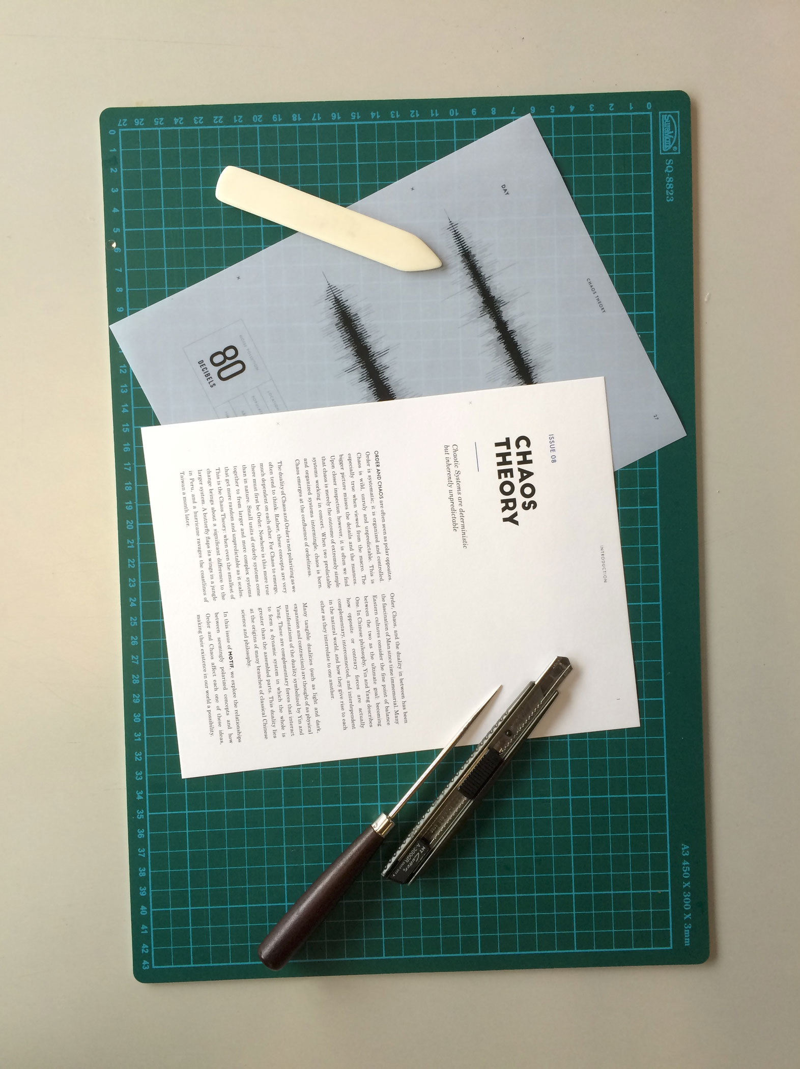
Here are some photos while I was cutting and assembling the zine: