Research on TYpography
What makes for effective typography? It certainly is not just the font that make for good typography. There are many other elements that go into a design such as the font, spacing and font size.[1]
With that being said, the nature of the text also makes a difference. It would not make much sense to use a typeace rendered with feathers and animal fur used for the phrase say ‘Save water’. There are definitely much better ways to illustrate water. There is relation between animals and water no doubt but it would be harder for viewers to comprehen since the relationship is not direct as it could be. This may then result in a misinterpretation from what was originally intended.
In this post, I will be exploring the typographic work of several artists and hopefully find out what makes for a good piece of typographic work, but first, an overview of the anatomy of typography. I recently found out how important it was to know the names and the parts of each letter while I was doing the previous project names “Hello”. I decided to use a minimalistic approach with regard to the letters and knowing what makes up a particular letter made the process much easier. Each letter of the alphabet has its own special features that allow one to identify them, keep those portions and strokes in and removing the rest would thus still allow one to identify the letters even if it is not drawn in completion. The image below is a guide to the anatomy of typography.
Website: https://thelogocompany.net/blog/typography-2/typography-font-deconstruction/
Artist References
Marc Böttler
His works include a set of photographs of carefully positioned wooden blocks to form letters of the alphabet. This is not exactly an example of typography but rather one of a typeface and indeed the reason for choosing this work is of the typeface. The focus of this piece not so much on the font type or size but rather the issue of perspective. A play on perspective, letters only visible when viewed from the correct angle and position. In this case however, Böttler has already fixed the angle for the viewer through the photographs. It would be interesting to apply the same concept but with the actual objects so that the viewer has to change his/her perspective and challenge how they view things. Such a typeface, which plays on perspective, could and would make for an interesting element in typography.

Marc Böttler: http://cargocollective.com/marcboettler/Klotz-Type-Experiment
While we are on the subject of perspectives, let us talk about anamorphosis. Anamorphic art relies heavily on the concept of perspectives and can be considered a form of optical illusion. This form of art comes in various forms such as mirror anamorphosis, sculptures (e.g. Jonty Hurwitz) and typography just to name a few. An example of anamorphic typography can be seen in the work of designer Thomas Quinn. The text is painted in a skewed manner onto several areas of a wall and as a result, it looks like a distorted group of letters. However, by changing the position one is standing at, one will be able to finally see the undistorted text in full. It is thus an interactive piece of work, it is only with interacting with the work that one will get to see the intended text.
It would be challenge to try out anamorphic typography but I would like to try it out regardless. I do feel it makes quite an impact. It gets people involved in the art thus hopefully bringing across the message (whatever it may be) much more easily.
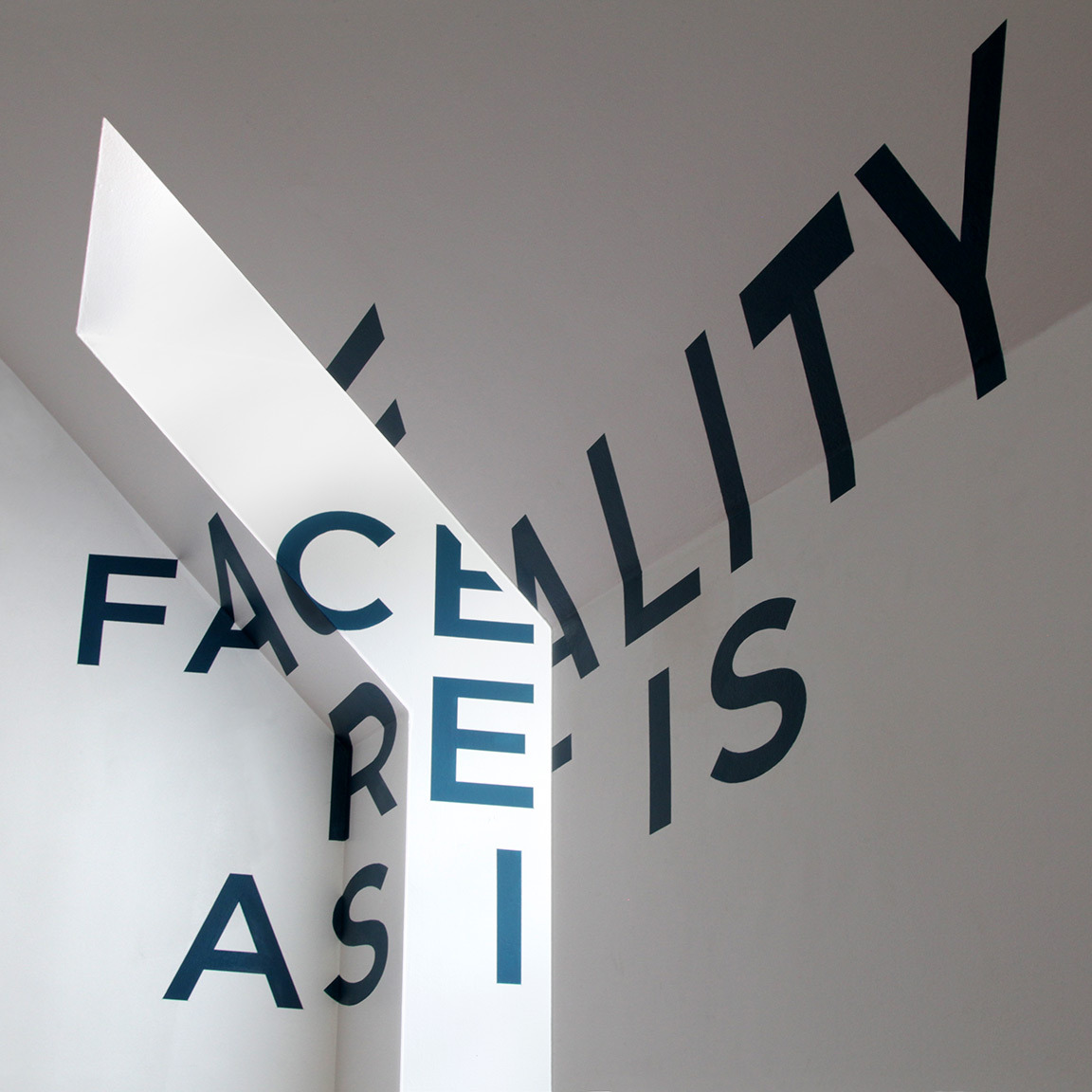
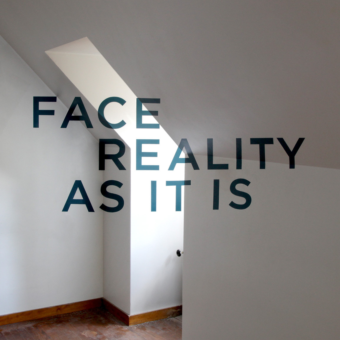
Thomas Quinn: http://www.tqvinn.com/post/24799863149/face-reality-as-it-is
José Ernesto Rodriguez
Rodriguez created the “Handschrift” typeface where letters of the alphabet were created by photocopying and scanning his own hands to create organic letters. This typeface involves the use of the body and it almost becomes a piece of performance art. The special aspect of using body parts is that one can create forms that one probably could not create otherwise (not easily anyway) and yet there are limitations as to how much one can bend and contort to form the letters.
José Ernesto Rodriguez: https://www.behance.net/gallery/Handschrift/1271211
http://jerhandschrift.tumblr.com/
Anna Garforth

This is a 9m long installation made from masking tape stuck onto a wire fence spelling out the phrase ‘wild at heart’. Masking tape is taped in a diagonal manner from top left to bottom right. The left to right direction similar to how words are read in the English language, eye is thus also drawn and directed from left to right which in a way facilitates the reading process and urges the viewer to read the full phrase.
There seems to be a system and some sort of order with regard to the way the tape is stuck. The fence ensures the strips of tape are equally spaced apart and are parallel to each other (angle of each tape is consistent throughout).
This is one of the few typography examples that I would consider to be really interesting simply because it is a 3-dimensional piece and it requires the use of the surrounding environment. It proves that typography does not have to be limited to just the traditional pen and paper or digital means but can be so much bigger. But of course aesthetically pleasing typography really serves little purpose unless the words and design are related and complement each other. The overall design should place emphasis and support the text as best possible. In Garforth’s case, the environment complements the phrase ‘wild at heart’. The text is placed outdoors, amongst (‘at the heart’ of) the flora and fauna thus giving meaning to the word ‘wild’.
Anna Garforth: http://www.annagarforth.co.uk/about.html
Other references
Another example of text and design going hand-in hand would be one where the words are arranged and manipulated to form the shape of whatever it represents. For example in animal typography by Dan Fleming, the word ‘rabbit’ is shaped into the form of a rabbit. They are direct and simple.

Dan Fleming: https://www.behance.net/gallery/6769383/Word-Animals
Food typography has also recently become quite popular. Using food, ingredients to spell out words, for example, using flour to spell out the word flour. The examples that I have seen online are indeed beautiful and straightforward. They also prove that there are few boundaries when it comes to use of medium. There is no reason why anyone should limit themselves to just pen and paper. But of course food typography is also done using digital means.
See Fast Food typography by Thomas Cheng: http://thomascheng.com/academic-work
I have taken a particular interest in typography made using interesting and non-conventional items. I might not use the same items to create my typography but they give me ample reason to break boundaries and not limit myself in terms of medium. An example would be bubblewrap typography by Lo Siento. Coloured water is injected using a syringe into each bubble. One can create their own typeface but one can also choose to find these typefaces in everyday life. To put it simply, finding ‘hidden’ letters in the environment. For example, finding alphabets in the wings of butterflies, ‘Butterfly Alphabet’ by Kjell Bloch Sandved.

Lo Siento: http://www.losiento.net/entry/wired-magazine-lettering
http://www.losiento.net/
[1] “typography.” The Concise Oxford Dictionary of Art Terms. Oxford Art Online. Oxford University Press, accessed January 20, 2016,http://www.oxfordartonline.com.ezlibproxy1.ntu.edu.sg/subscriber/article/opr/t4/e1720.