“Point of View”
Research
I figured I would start out this project by looking at the aim of the project. I thought it would help me to understand the purpose a little better and hopefully allow me to make the best out of this experience and learn more. I’ve also highlighted the points which I think are important to this project.
Aim of this project (from brief):
“The Point of View project gives one the opportunity to approach visual problem solving in a more methodical, conceptual, thought-provoking way. Making the effort to see subjects from different vantage points opens one to the process of self-generating ideas.”
The term ‘methodical’ does stand out to me at this point. Throughout this entire project, I’m going to make sure I do so, working step by step. And hopefully this will help me to have a clearer idea of what my next step would be and also how to apply what I’ve learnt to my work.
The first task:
Select a subject matter and express it from eighteen different view points, using the phrase ‘A ____ from the point of view of ____ is ____’.
Subject matter chosen: Butterflies

I’d like to talk a bit about why I’ve actually chosen butterflies as my main subject out of the many other things, concepts and animals. It was not a random choice for me. There are several reasons for this and I’ll go through them briefly.
Butterflies have a very special place in my life. I grew up in a house with a garden that was and still is filled with all kinds of butterflies, from the small lilac ones to the big orange ones. I was the child who wanted to catch these butterflies (and I did once, but I let them go eventually) and keep them, because they were so beautiful but they were also so fragile. I’d examine, chase them and admire them. I am extremely comfortable with them. So in a way, they were part of my childhood.
When I was studying art in secondary school, butterflies was also my chosen subject matter for my ‘O’ Level coursework. I don’t recall there being much debate about my subject matter, I guess I just gravitated towards them unknowingly. And of course, throughout the process, I got to study them a lot more, the details on their wings and their form at every stage of their lifecycle. My appreciation for this tiny creature grew. Even some of my works which I have done in university revolved around butterflies. It is definitely something I’m attracted to.
As I grew older, I met more people who were afraid of butterflies (especially when they fly too close). So I realised butterflies were like any other insect to people and they frighten others (and I can understand why). I still like them though.
What I think I’m trying to get at is that butterflies aren’t just another six-legged creature to me, they’ve been with me remind me of my past, my childhood and they are really special to me.
The Thought process:
Now that I have chosen my subject matter, what next? How do I move on to come up with the different view points? I thinking about things I’d associate with butterflies, both facts and the fictional (films etc), basically anything that involves or is associated with the insect.
Here are some of the point of views that I thought of:
- A BUTTERFLY FROM THE POINT OF VIEW OF A CHILD IS A GAME OF CATCH.
- A NET FROM THE POINT OF VIEW OF A BUTTERFLY IS DANGER.
The presence of a net just means someone is about to catch it and rid it of its freedom.
- A BUTTERFLY FROM THE POINT OF VIEW OF A BEE IS COMPETITION/SELFISH.

Bees work for the good of the hive while butterflies live for their own.

Both insects need nectar and thus they would be competing for it.
- A BUTTERFLY FROM THE POINT OF VIEW OF A BIRD IS A MEAL.
The usual prey and predator relationship here.
- A BUTTERFLY FROM THE POINT OF VIEW OF A FLOWER IS HELP / SALVATION/ MATCHMAKER/ CUPID.
Butterflies here to pollinate flowers when they visit flowers for nectar.

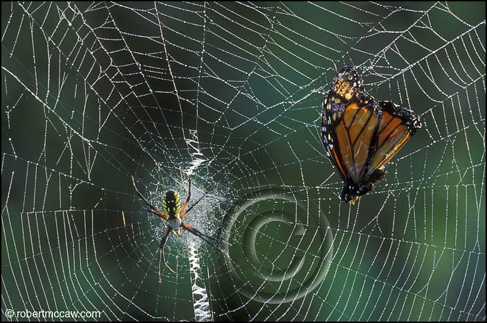
- A BUTTERFLY FROM THE POINT OF VIEW OF A SPIDER’S WEB IS A NEW VICTIM.
If they get catch, they will just be another meal for the spider. A trap with no escape. The new victim.

- A BUTTERFLY FROM THE POINT OF VIEW OF A MOTH IS ENVY.
Moths! The close relatives of the butterflies.
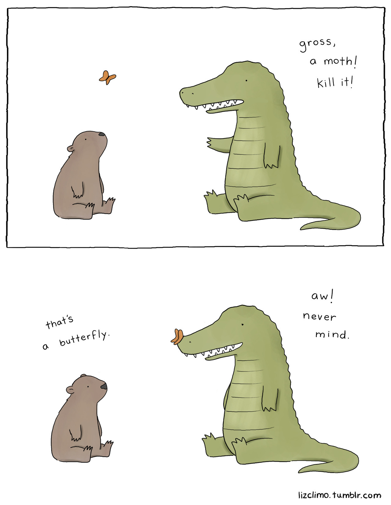
There are definitely more people who would prefer butterflies over moths just because they are more visually appealing. (It’s really quite sad). The wings of a butterfly are more colourful and vivid as compared to a moth. The ‘eyes’ you see on the wings of a moth make them look rather intimidating (creepy as well). I thought maybe a moth may be envious of the attention butterflies get because of their wings as well as the of just the fact that butterflies may be more pleasing to the eye. (That is if appearance matters at all.)
Intimidating is what I would call a moth. It’s generally a lot bigger than butterflies and its patterns are lot more distinct and bold. It’s not just their appearance that sets them apart from butterflies, it’s also how they affect mankind. They are termed as pests. Remember mothballs and the toxic smell of naphthalene that comes with it? Well, you’re actually trying to prevent the webbing clothes moth from destroying your possessions. Their larvae feed on clothes, upholstery, carpets, etc. They are rather destructive.
Here are some extra things about butterflies and moths:

In general, we would assume that moths are more dull in colour and the patterns on their wings aren’t so appealing either. However, I actually found what it called a lily moth.


I thought it was a fake moth at first because even I assumed that moths were all just brown in colour (how stereotypical of me). But it is really quite beautiful. (It’s interesting how we judge insects by their appearance as well, I wonder if it’s really necessary.)
You can take a look at a whole range of really cool moths on this website: https://blogs.extension.org/mastergardener/tag/citizen-science/
They have really cool patterns and sometimes it even forms a face. See image below.

I found an article that argues about how we should embrace moths because they’re not all that bad. Website: http://www.theguardian.com/commentisfree/2014/dec/22/moths-loved-not-loathed-only-few-after-clothes
Something from my childhood…
A film that I often think about is Disney’s Alice in Wonderland. It is one of my favourite Disney films (it’s really nostalgic) and the Caterpillar has always been one of the most interesting and iconic characters of the film.
I’m not able to embed this particular video but you can watch the scene here: https://www.youtube.com/watch?v=PBjExwMtoaw
This whole scene was really bizarre and yet intriguing. From the film itself, I derived several things: the caterpillar and metamorphosis. The lifecycle of a butterfly and its various stages then comes to mind.
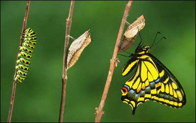

- A BUTTERFLY FROM THE POINT OF VIEW OF A CATERPILLAR IS HOPE/ OPTIMISM/ THE FUTURE/ ANTICIPATION.
Caterpillars also remind me of the book The Very Hungry Caterpillar. It’s really quite iconic. It was even made into the Google logo!

Another scene where butterflies appear would be in the flowerbed. Actual butter flies are seen, more specifically, bread-and-butter-flies. I think it is a hilarious pun. You can see it at 0.15 onwards.
Something extra: A video was brought to my attention by a friend the other day about butterflies. It is really quite cool. Butterflies meet technology.
I then started researching and looking for interesting facts about butterflies. I came across an image a few years ago regarding a ‘metallic’ butterfly chrysalis.

I also found out that butterflies have a pretty short lifespan. When in the butterfly stage, some live for a few weeks or even days. They are affected by rain and wind as well. So they are very fragile creatures as are the many other insects.
- A BUTTERFLY FROM THE POINT OF VIEW OF A GRIM REAPER IS WITHIN REACH.

Since they have such a short lifespan, death is always on the sidelines and fast approaching.
A DOWNPOUR FROM THE POINT OF VIEW OF A BUTTERFLY IS DEATH.
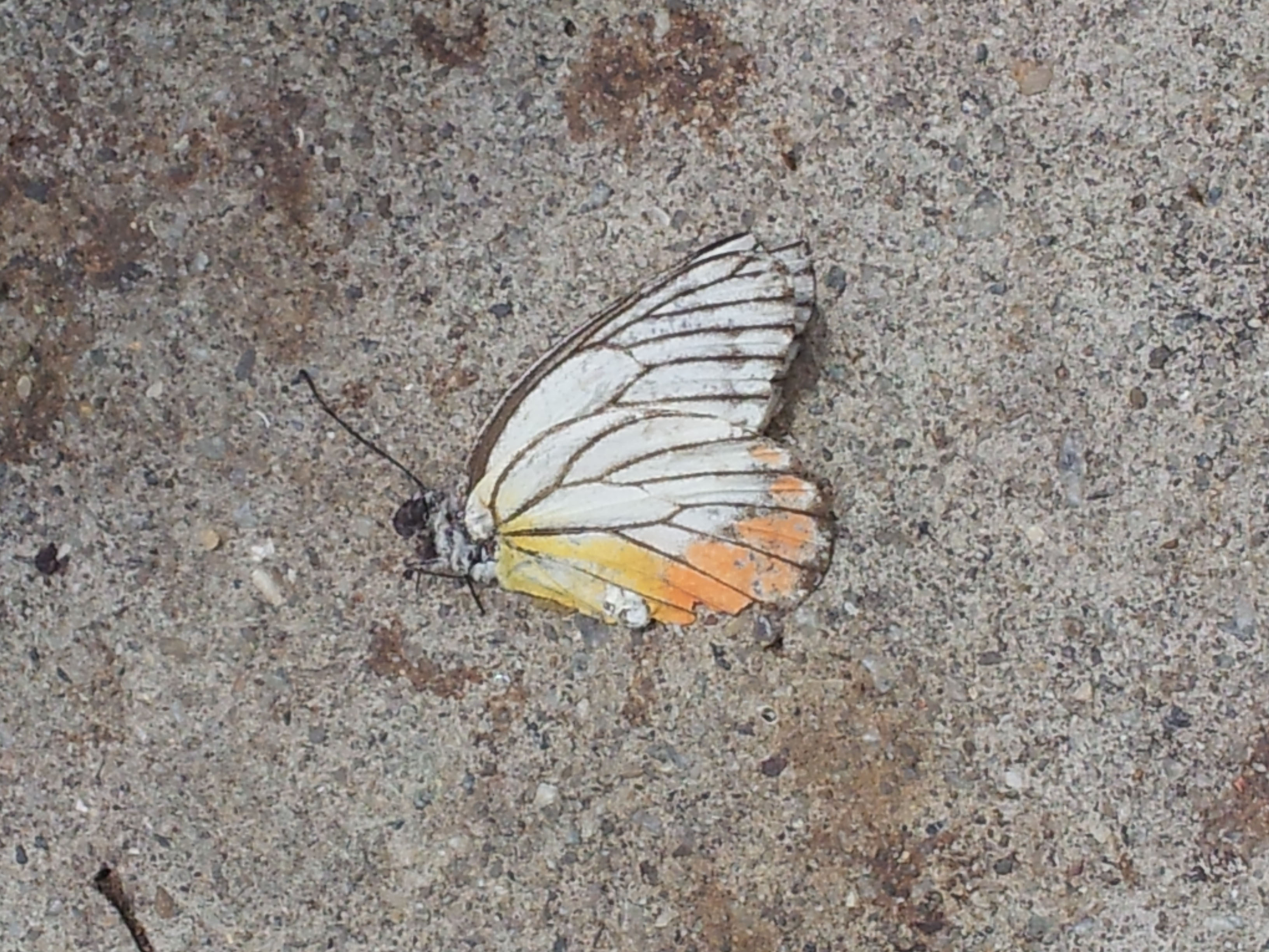
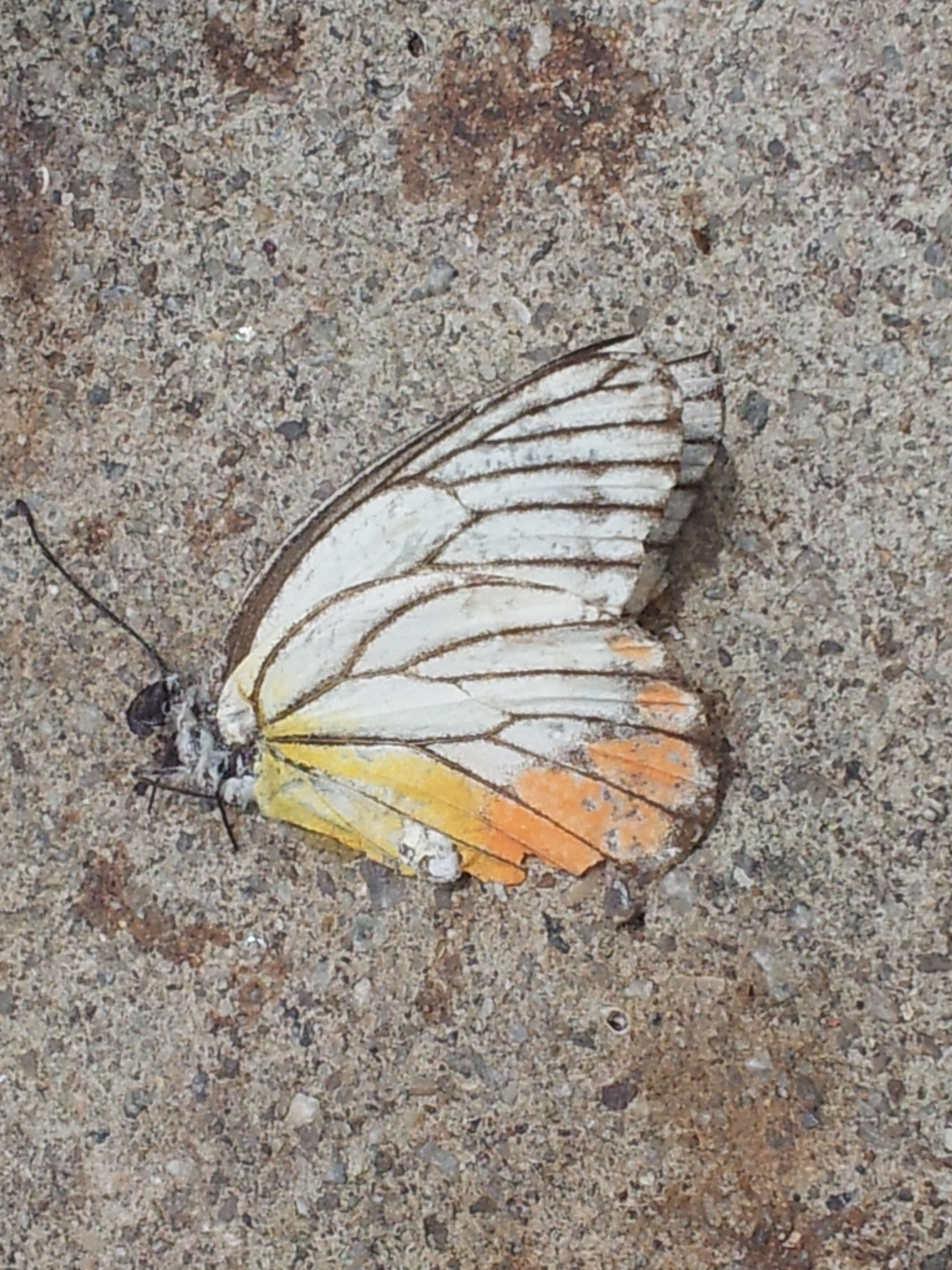
Above are photos I took a few years back of a dead butterfly.
My science is showing….
This project would not be my project if I didn’t include science into this (I like to make good use of what I have studied). But this time, it’s more of an easter egg, the project isn’t based on that.
- A BUTTERFLY FROM THE POINT OF VIEW OF A SCIENTIST IS THE CHAO THEORY.
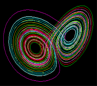

The chaos theory is also known as the butterfly effect. In explaining the chaos theory, it is said the wind from the motion of a butterfly’s wings can cause changes in initial conditions that could then start a chain of reactions eventually causing a large event.

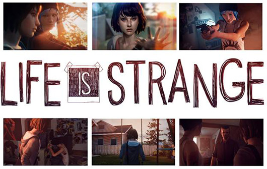
It’s a very interesting concept, the main idea is that a small event could result in large impact later on. There are actually many games that are based off the chaos theory such as Life is Strange and Until Dawn, both of which have an amazing storyline.

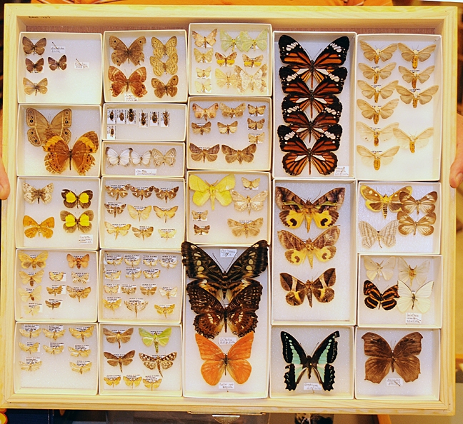
- A BUTTERFLY FROM THE POINT OF VIEW OF AN ENTOMOLOGIST IS A SPECIMEN.
An entomologist is one who studies insects so I think this sentence speaks for itself.
- A BUTTERFLY FROM THE POINT OF VIEW OF AN ENTOMOPHOBIC IS FEAR.
I know that this is definitely true. I know of people who can’t even stand the sight/ image of a butterfly. It is like any other phobia.
- A TAXIDERMIST FROM THE POINT OF VIEW OF A BUTTERFLY IS A MURDERER.

The job of a taxidermist is pretty cool, I’m referring to those who do so for museums, professionals basically. It takes a lot of skill to successfully create a specimen. But in this case, I have referred to it in a negative way. I am referring to possible taxidermist and hobbyists who would purposely catch and stuff butterflies just for their collection. Butterflies are living things so to do so on purpose is inhumane. My curiosity in taxidermy peaked after watching a show called Bates Motel (it’s the modern day Psycho spin-off).
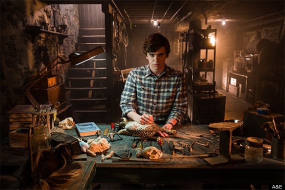
It was not portrayed in the brightest of light, there was something rather sinister and dark about the whole trade (the non-professional one) and so I guess that’s what influenced me to view it in a negative way here.
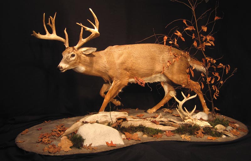
But while looking at images involving taxidermy, I have to say it does make me feel rather uncomfortable to see inanimate animals who were actually once alive.

After more research…
- A BUTTERFLY FROM THE POINT OF VIEW OF MYTHOLOGY IS THE SOUL. / A BUTTERFLY FROM THE POINT OF VIEW OF PSYCHE IS HER SOUL.
It’s Greek mythology time. Psyche in Greek means soul, hence the first variation of the sentence.

For the second portion, it is based off the love story between Cupid and Psyche where Psyche’s soul being represented by a butterfly. See image of painting below. Note the butterfly flying above Psyche’s head.

- A BUTTERFLY FROM THE POINT OF VIEW OF THE SUPERSTITIOUS A BAD OMEN.
Butterflies being seen as bad luck defers culture to culture. It is not the case everywhere.
- A BUTTERFLY FROM THE POINT OF VIEW OF A STOMACH IS ANXIETY.

I think we’ve all experienced this at least once in our lives, ‘butterflies in the stomach’. Nervousness is unavoidable.
- A BUTTERFLY FROM THE POINT OF VIEW OF THE EVERYDAY PERSON IS JUST AN INSECT.
After all this thinking and research of butterflies, I decided on this as my final point of view. I had thought of 17 different point of views about what a butterfly could be.

But then I realised, I wrote those with the mindset that butterflies are special when in fact to many other people, a butterfly is a butterfly, it’s an insect, so what? Nothing special about it. So to the everyday person, I’d imagine that’s exactly how they feel towards these creatures.
The full list:
- A BUTTERFLY FROM THE POINT OF VIEW OF A CATERPILLAR IS HOPE/ OPTIMISM/ THE FUTURE/ ANTICIPATION.
- A BUTTERFLY FROM THE POINT OF VIEW OF A MOTH IS
- A BUTTERFLY FROM THE POINT OF VIEW OF AN ENTOMOPHOBIC IS FEAR.
- A TAXIDERMIST FROM THE POINT OF VIEW OF A BUTTERFLY IS A MURDERER.
- A BUTTERFLY FROM THE POINT OF VIEW OF A BEE IS COMPETITION/SELFISH.
- A BUTTERFLY FROM THE POINT OF VIEW OF A BIRD IS A MEAL.
- A BUTTERFLY FROM THE POINT OF VIEW OF A CHILD IS A GAME OF CATCH.
- A BUTTERFLY FROM THE POINT OF VIEW OF A FLOWER IS HELP / SALVATION/ MATCHMAKER/ CUPID.
- A BUTTERFLY FROM THE POINT OF VIEW OF AN ENTOMOLOGIST IS A SPECIMEN.
- A NET FROM THE POINT OF VIEW OF A BUTTERFLY IS DANGER.
- A BUTTERFLY FROM THE POINT OF VIEW OF A SPIDER’S WEB IS A NEW VICTIM.
- A BUTTERFLY FROM THE POINT OF VIEW OF A SCIENTIST IS THE CHAO THEORY.
- A BUTTERFLY FROM THE POINT OF VIEW OF MYTHOLOGY IS THE SOUL. / A BUTTERFLY FROM THE POINT OF VIEW OF PSYCHE IS HER SOUL.
- A DOWNPOUR FROM THE POINT OF VIEW OF A BUTTERFLY IS DEATH.
- A BUTTERFLY FROM THE POINT OF VIEW OF THE SUPERSTITIOUS A BAD OMEN.
- A BUTTERFLY FROM THE POINT OF VIEW OF A STOMACH IS ANXIETY.
- A BUTTERFLY FROM THE POINT OF VIEW OF A GRIM REAPER IS WITHIN REACH.
- A BUTTERFLY FROM THE POINT OF VIEW OF THE EVERYDAY PERSON IS JUST AN INSECT.
——————————————————-
Artist References
Aim of this project (from brief):
“The Point of View project gives one the opportunity to approach visual problem solving in a more methodical, conceptual, thought-provoking way. Making the effort to see subjects from different vantage points opens one to the process of self-generating ideas.”
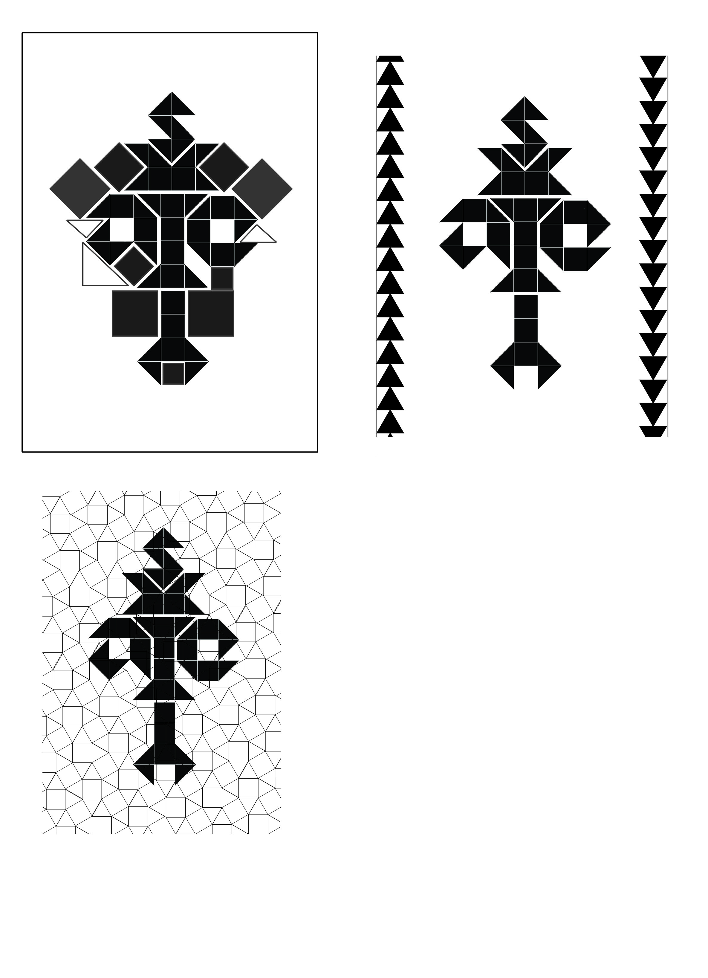
Taking into account the given aim of the project and what was covered during the class sharing this week, I can conclude that with this project, it would be good to represent the point of views about butterflies without explicitly using butterflies in the compositions. Personification would be a good way of putting it; to use something else to represent butterflies.
I was not looking for anything in particular when searching for artist references so I just listed out some of the artists whose works I really admire. The selection started off pretty random but as I continued searching, I more or less found a style and concept that I liked by an artist which I will cover later on in this post. But as a starting point, I looked at artists who incorporated a lot of details into their work because when I think about butterflies, I’m reminded of their intricate patterns on their wings.
Artist #1- Laura Laine
Laura Laine is an illustrator and most of her works can be seen in advertisements and magazines (fashion, etc). I’ve been a fan of her work for over five years now and her works still amaze me till this day.

What attracted me to her works is her attention to detail. The hair of her figures in particular is incredible. Every strand is taken into account and drawn out carefully.

As most of her illustrations are used in fashion magazines, the clothes worn by the figures become crucial. Laine has rendered each fabric beautifully, to the point where you could almost feel the actual texture of the clothes. The softness, sheen and folds of the various fabrics are all taken into account.
Besides the intricate details that come with her work, I also like the way she incorporates her figures with the products she is helping to advertise.

The figures interact with the product and are not independent from it. From her works, it is evident that she takes into account the products of her clients and works with the product rather than against it. As a result, her illustration do not take away any attention from the product but rather has helped to bring attention to it. The merge is also usually done in a quirky way as well so it’s never boring.


I go on forever about Laine’s works but I think I’ll move on. You can check out more of her works at her website: http://www.lauralaine.net/
Artist #2- Maude White
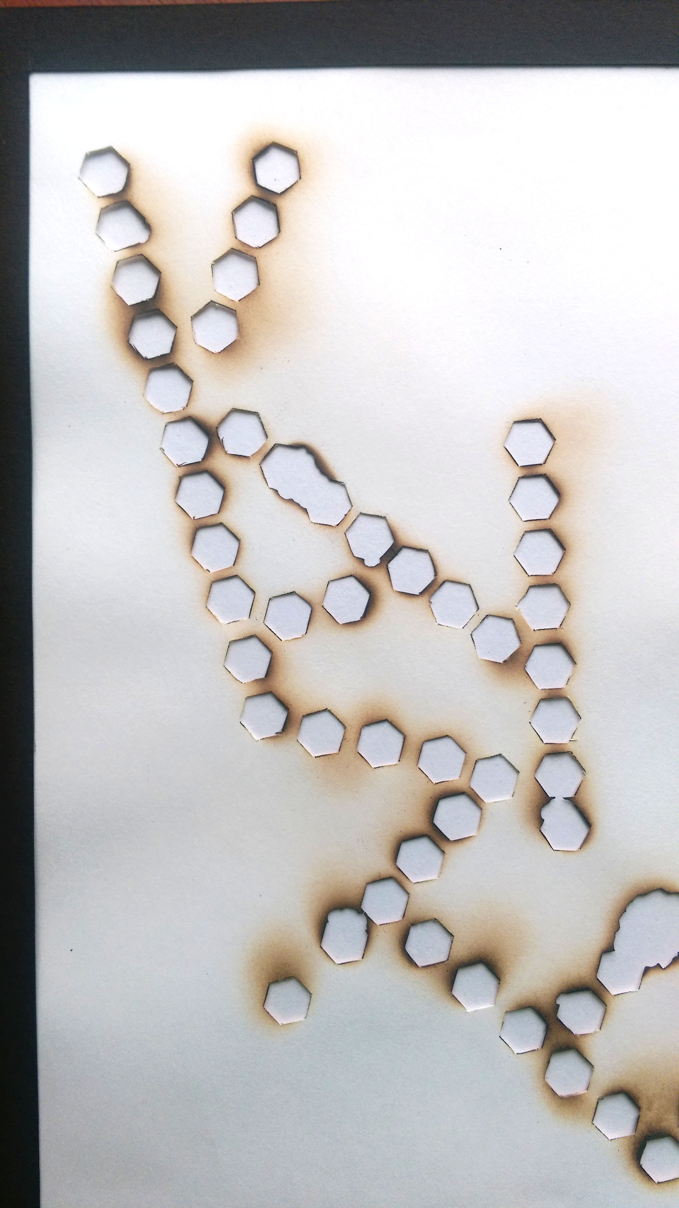
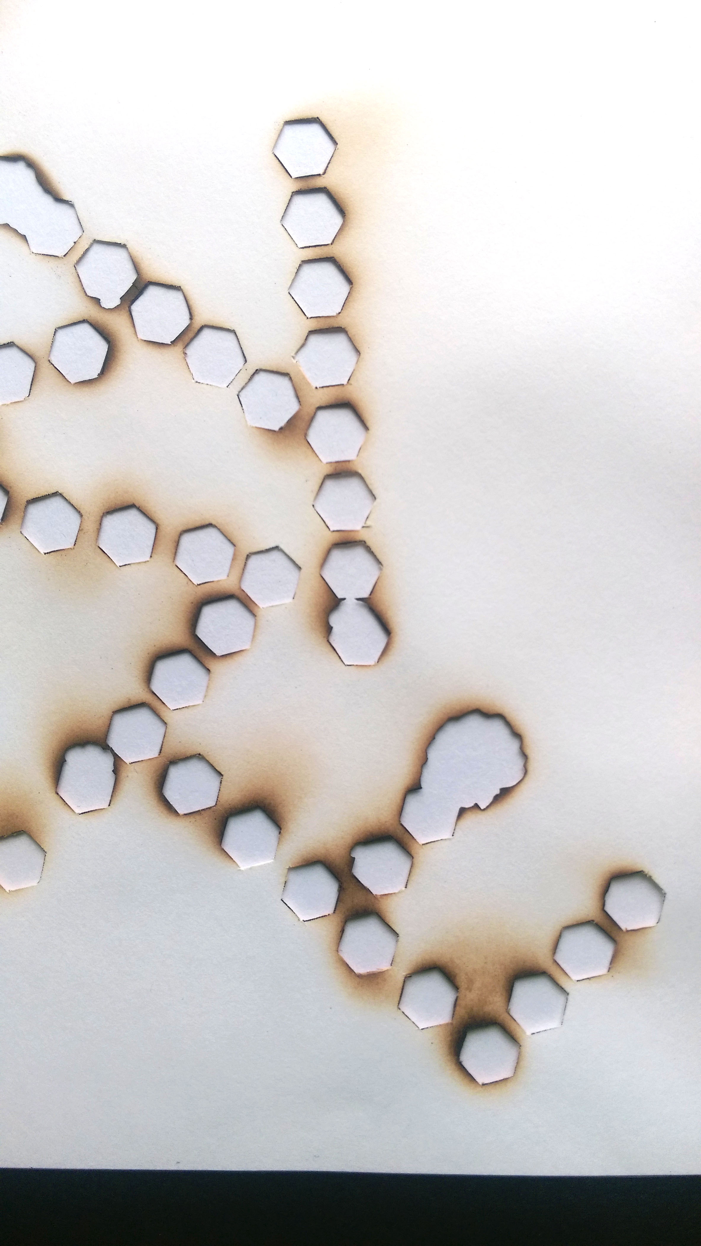
This research would not be complete without a reference to paper cut. It is an art form that requires a lot of time, patience and skill. One wrong cut and the whole piece is ruined. So a steady hand and keen eye for detail is definitely necessary. White definitely has all of these qualities considering the amazing work that she has done. All her works are done by hand.


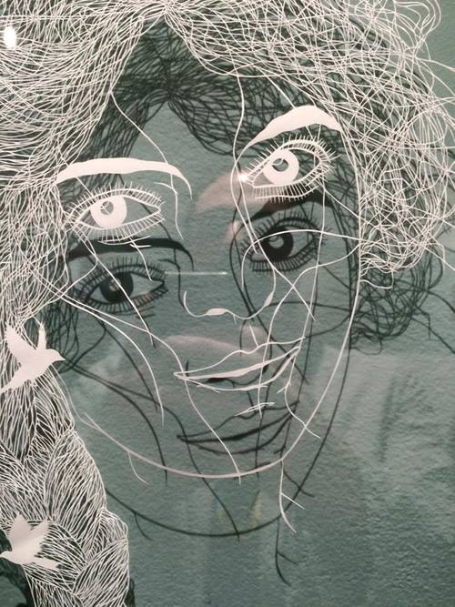
With reference to the work above, we can see that even the display of works is taken into consideration. The shadows cast onto the wall create the image. And again look at the hair on that piece of work! I can appreciate the amount of effort that went into that.
The selected birds section of her works is where the paper cuts get pretty detailed.

The repetition of lines as seen by the almost parallel lines of paper gives texture to the feathers of the eagle. The direction of the lines (in an outward direction) all help to give a little bit of movement and rhythm. It also makes the bird look a lot bigger since it draws the eye from the head to the outer areas and vice versa.
Artist #3-Eugenia Loli
Loli’s works are collage based. She makes use of images from vintage magazines and science textbooks for her collages so it’s not surprising that the final pieces have a vintage feel to them (which I really like). Quite a few of the works involve the universe, planets, galaxy landscapes, just astronomy in general (which I also really like).

Her works are really quirky and humorous. She makes use of different images to create thought provoking works. What’s interesting is that the individual images have their own meaning but when put together with another image, the whole concept and meaning changes. If you look at the image above, ‘Maker’. It is most likely referring to the maker of the universe as the girl is creating the planets. Instead of blowing bubbles, she is blowing out planets and the whole image works. It’s a beautiful image.
The image itself is good but together with the given title, the work gets lifted to a whole new level. Each piece seems to tell a story and is hinted by the title.
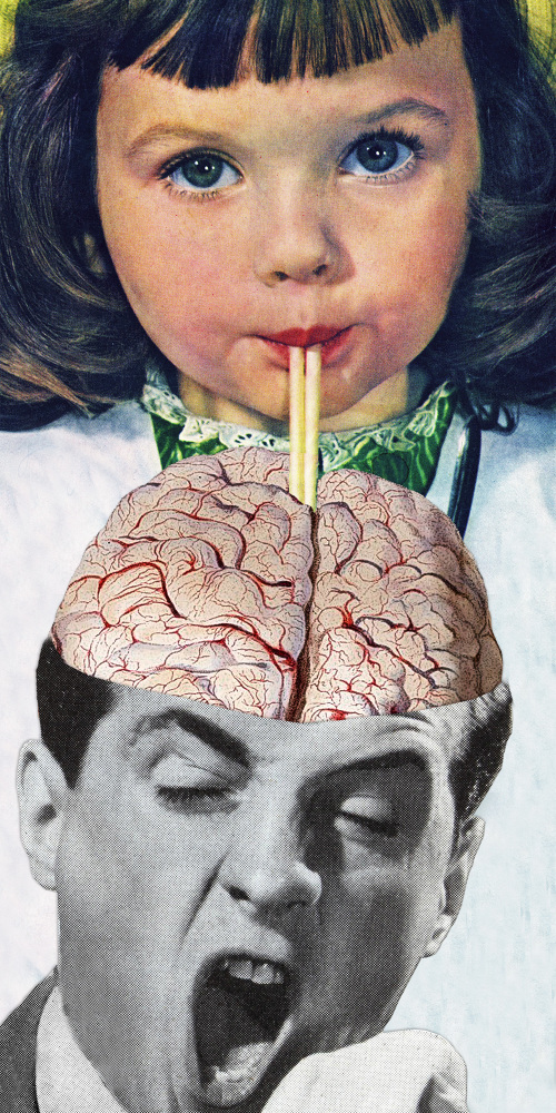
I had a really hard time selecting which works of hers to show because their all so good and funny. The vintage look really is working for me, very classic. Composition is paid attention to as is the use of colour, which I assume can be challenge since the colours of these images are fixed.

The addition of Ironman into this painting changes the meaning of the original work. It is also a juxtaposition of the old and the new (pop culture).
Some of Loli’s other works:


Eugenia Loli’s work- vintage and surreal

Please do check out more of her works: http://cargocollective.com/eugenialoli
Artist #4- Xavier Casalta
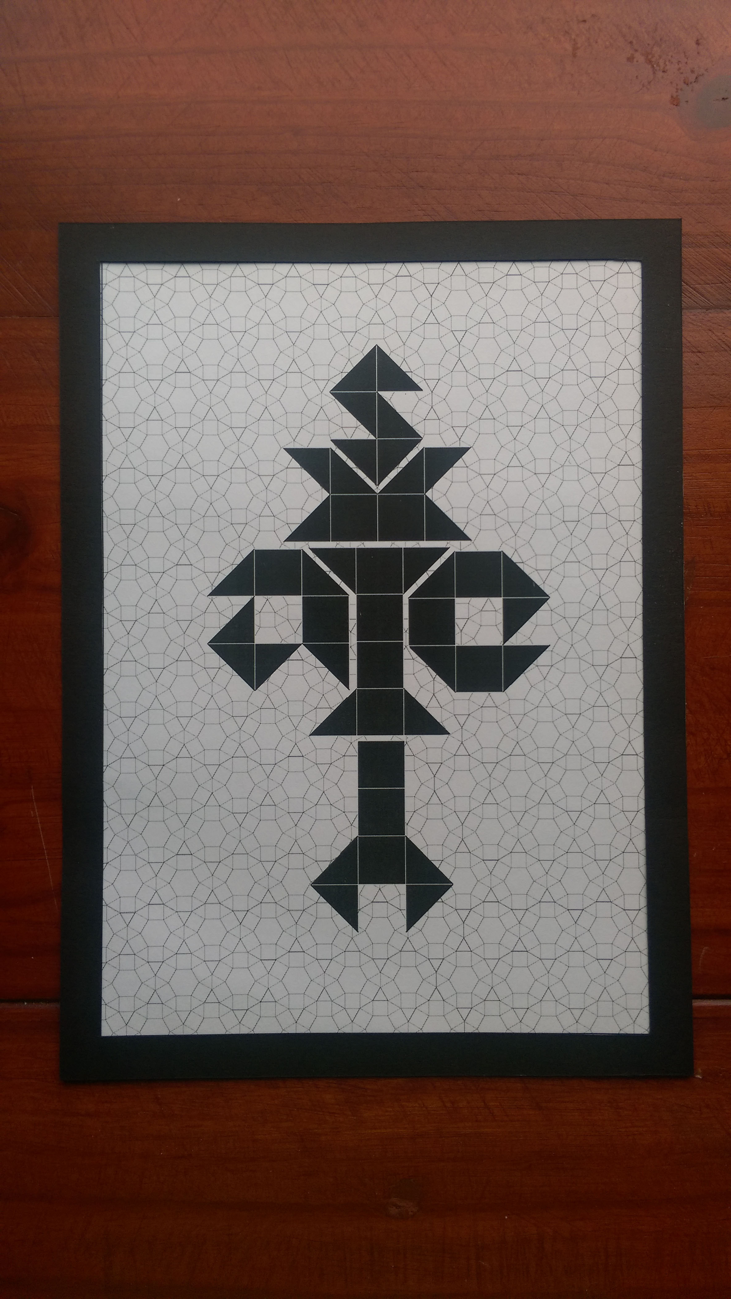
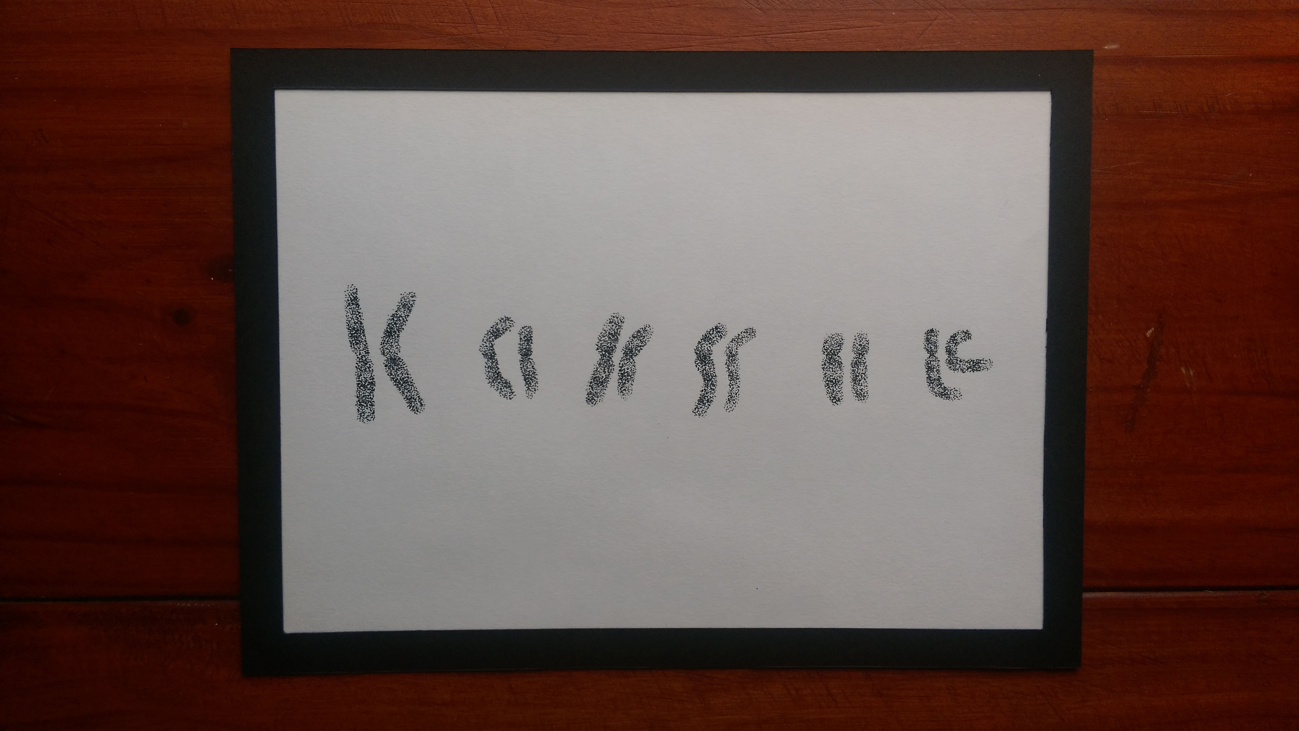
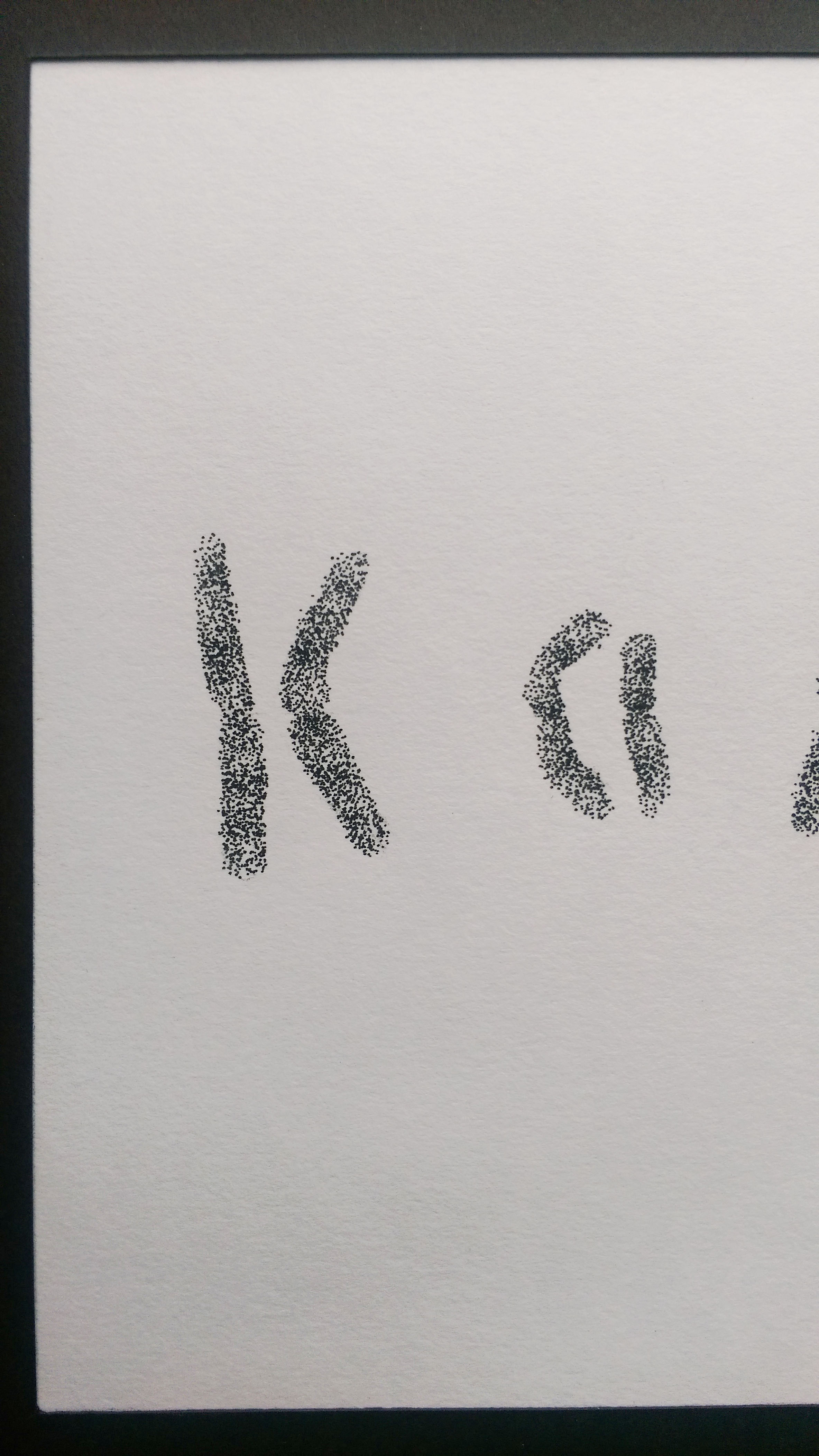
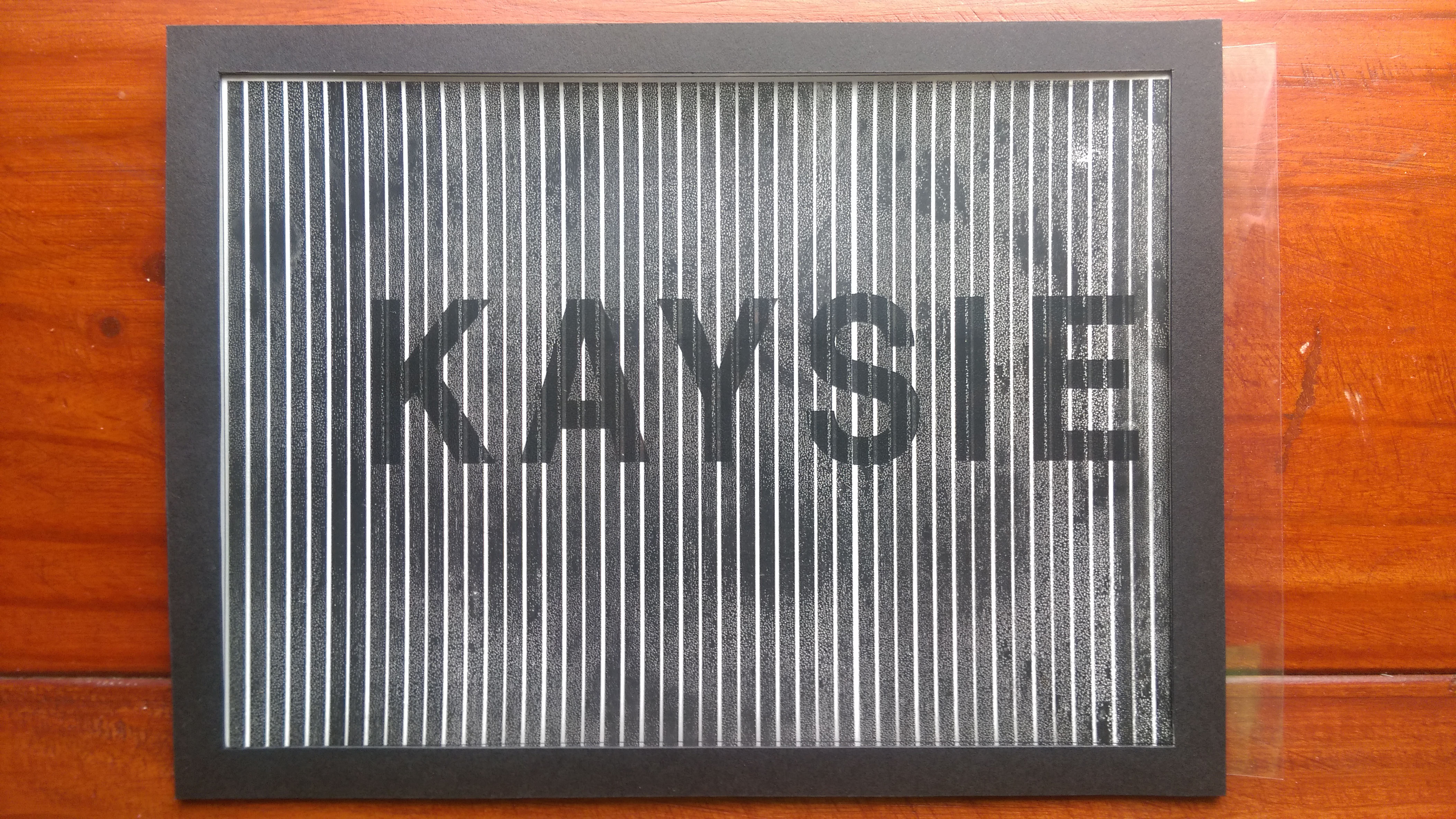
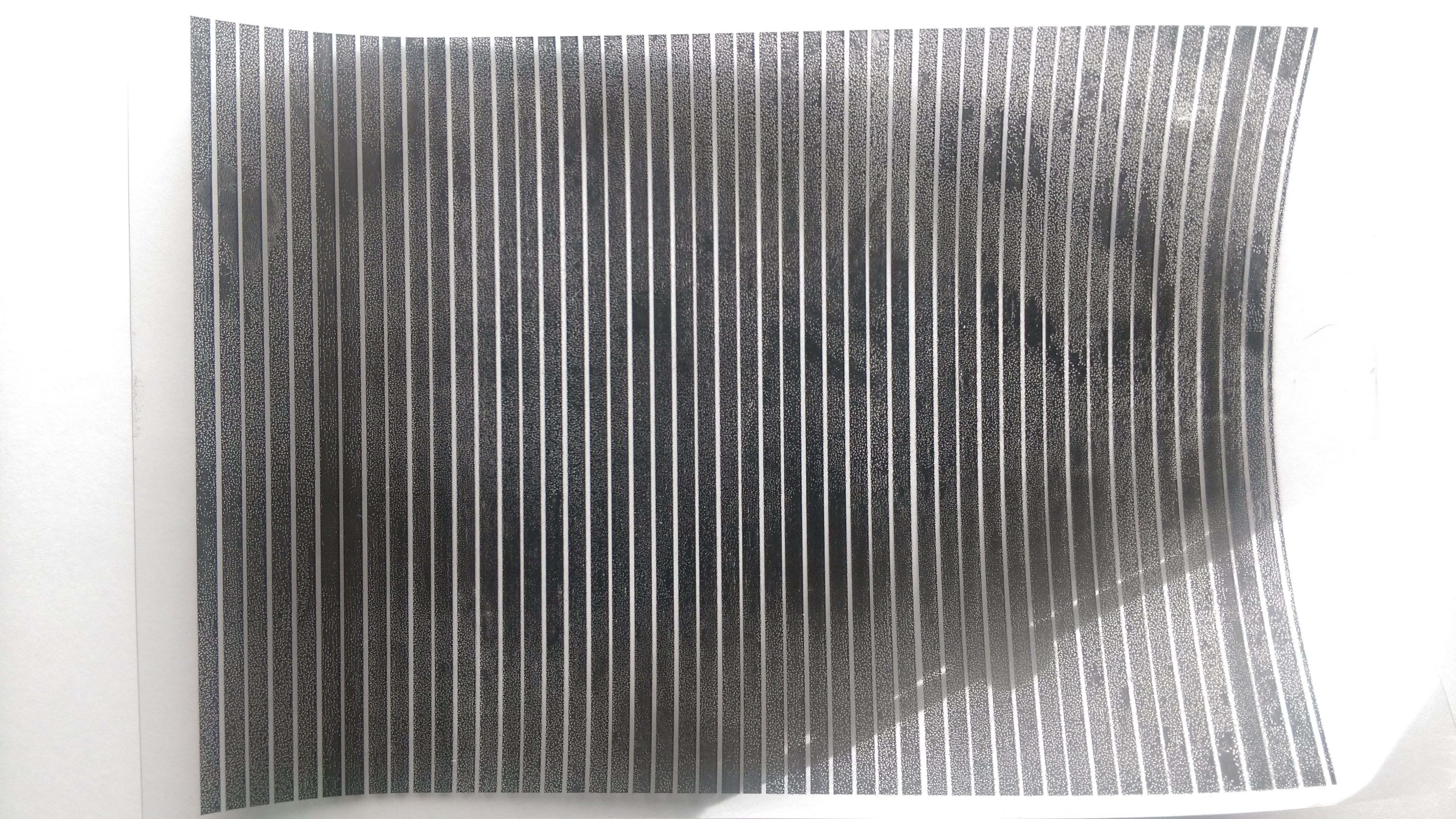
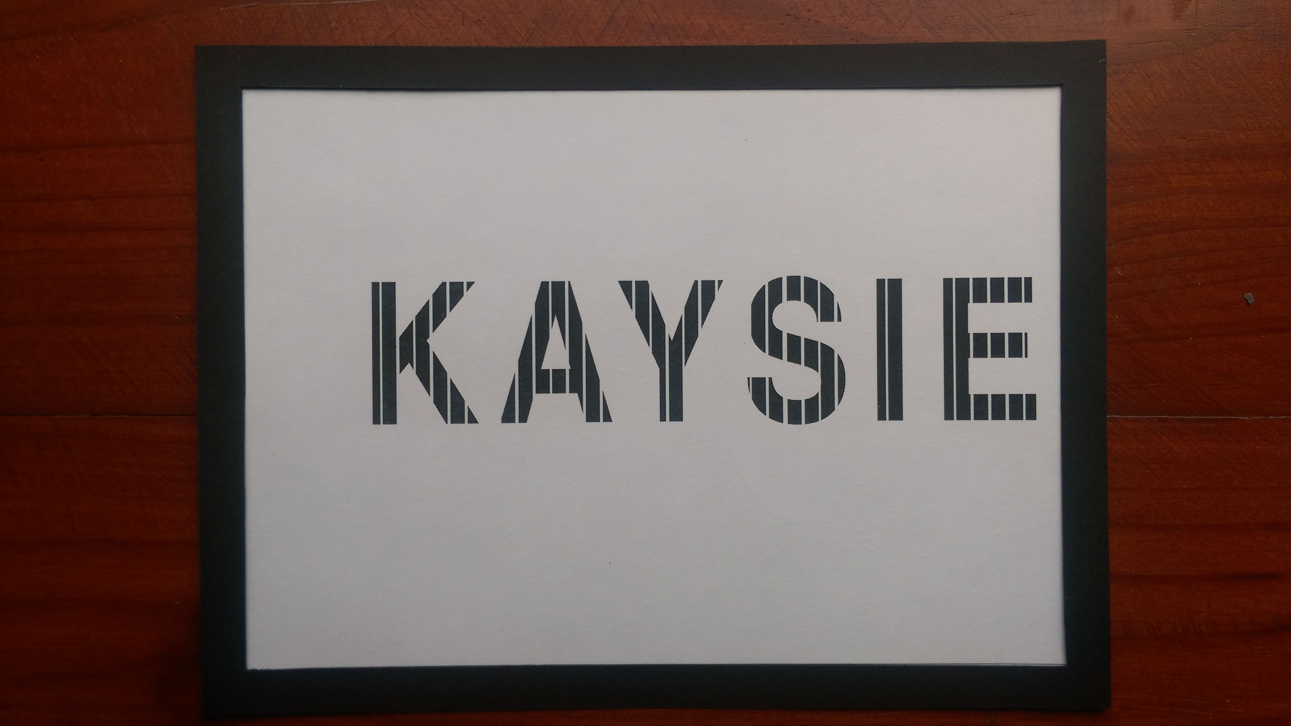
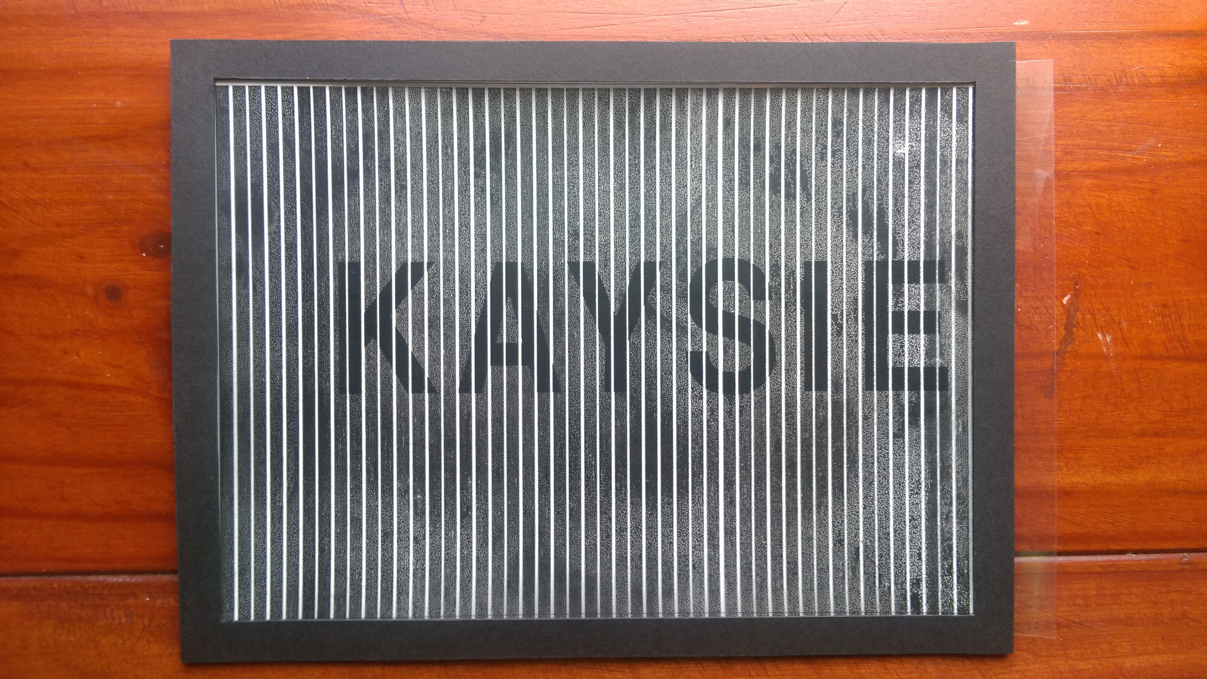
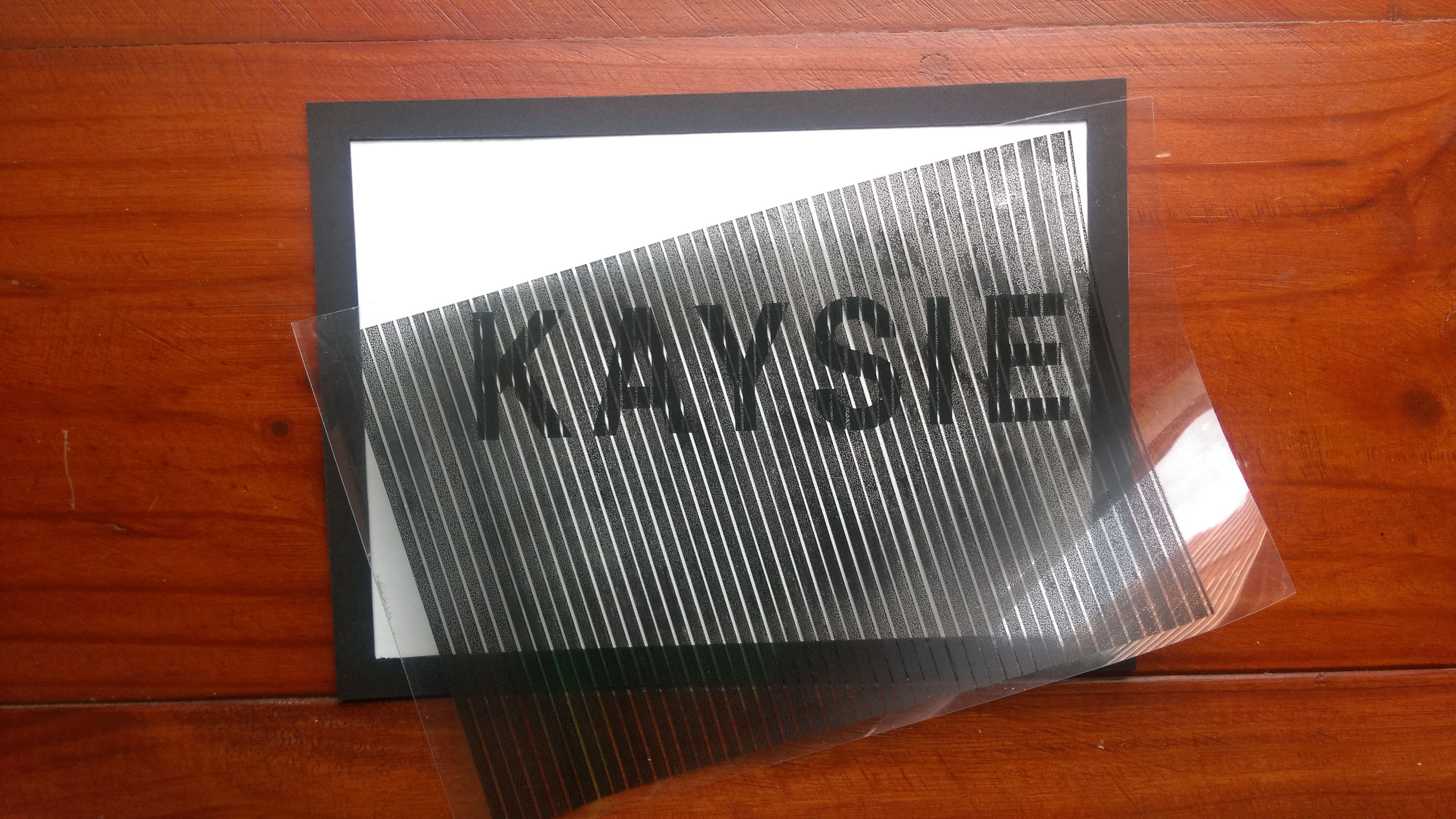
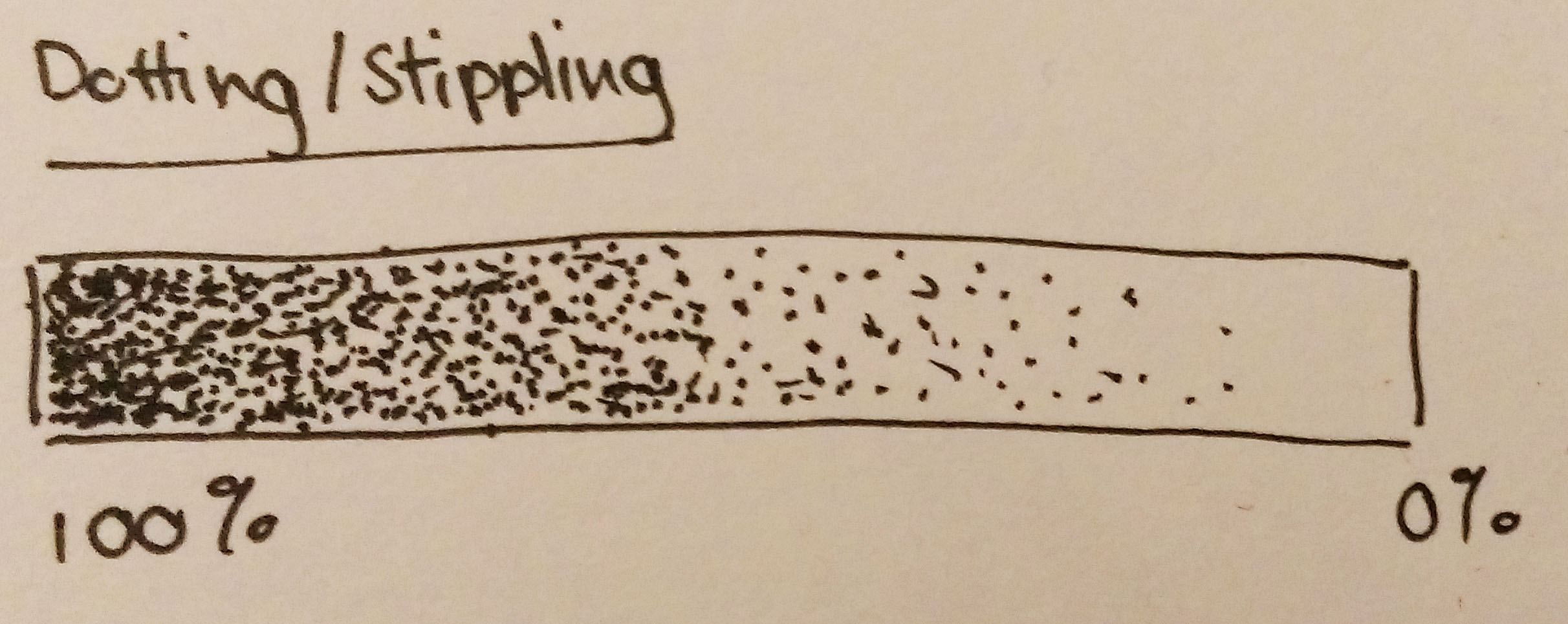
Time and patience. Qualities required for paper cut and stippling. But we’re not talking about paper cut for this reference. We’re talking about stippling, which is a technique of using purely dots to draw. Stippling may also be referred to pointillism, of which Georges Seurat was famous for using (see image below).

Xavier Casalta is an artist that makes use of this technique.


Using stippling allows you to have a lot more control over your drawing because you’re drawing to a much finer degree, almost like painting by pixels. I have used this technique a couple of times and I do enjoy it, I like the control I get with it although I have to admit it is very time consuming (but really worth it).


Depending on how close the dots are and the density of dots in an area, varying shades can be obtained. Stippling gives a rather soft look unlike hatching which can look quite harsh.


Look at the amount of detail that you can get into a drawing with stippling! In the above image, even the veins and texture of the leaves can be drawn in.
Artist #5- Marco Mazzoni
Marco Mazzoni is an artist that uses coloured pencils to create his works. I found out about his works a year ago and his works really made quite an impression on me.

His subject matters include women (their faces especially, but without their eyes), morphed animals, plants, flowers and butterflies. He seems to make use of blues and pinks more often in his works.
The compositions are always balanced and each work is filled with texture, movement. Contrast can be seen in the blank spaces (where the eyes are supposed to be), bringing emphasis to the lack of the eyes before the viewer sees the piece in its entirety.

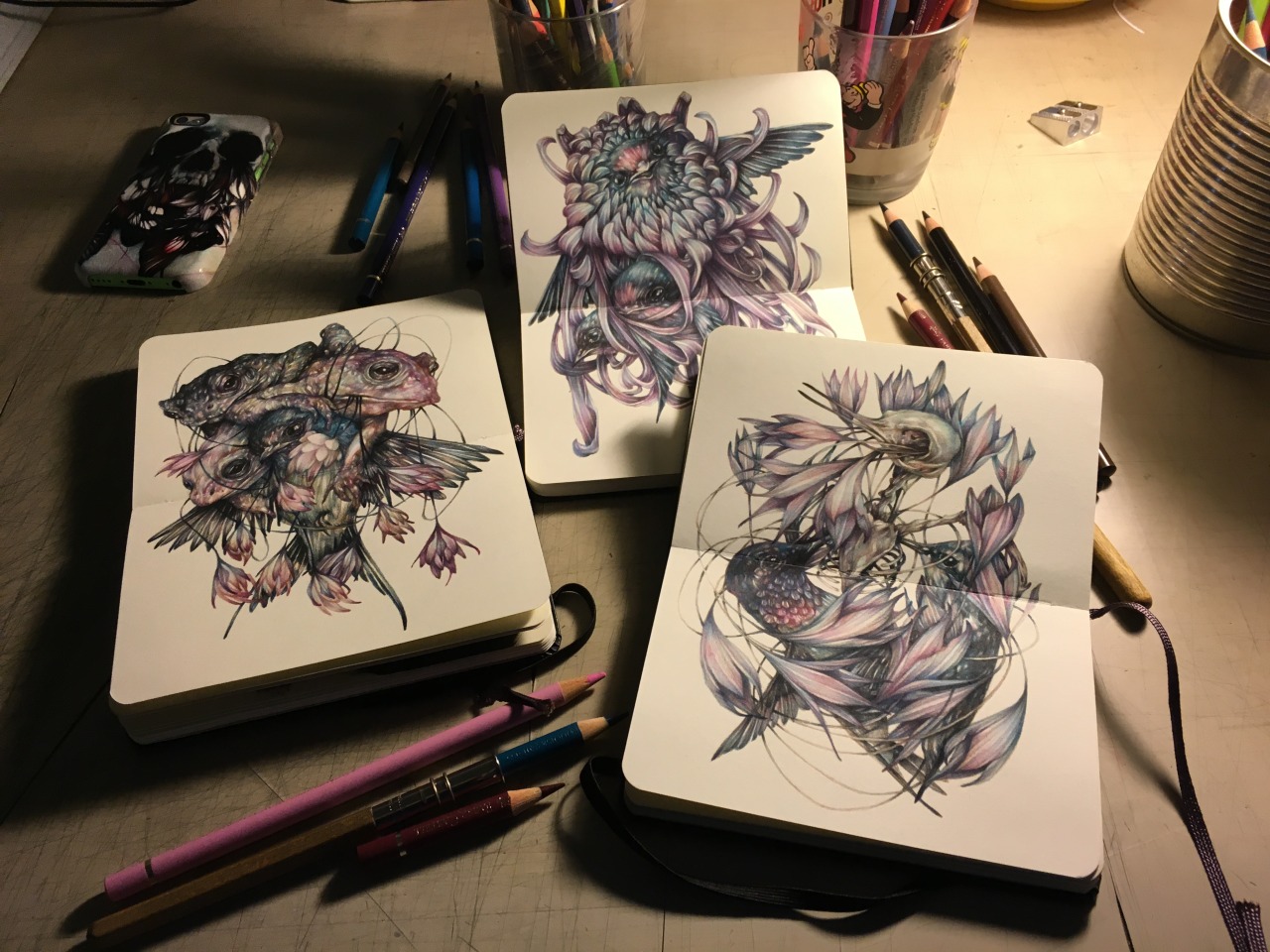

Each work has a sinister or rather haunting feel to it. They all whole a sense of mystery. The use of colours translates very well here. Warm colours such as red orange are used sparingly and when they are used, they are accompanied by a larger amount of black. There seems to be a tension and yet a harmonious existence between the various subject matters in the drawing.
More of Mazzoni’s works here: http://marcomazzoni.tumblr.com/
http://www.galleribenoni.dk/artists/marcomazzoni
Other Artists References


Sarah Esteje creates these amazing drawings with just a Bic pen. With this example and the ones seen by Xavier Casalta, using pens to draw allows for a more detailed drawing since you can get a really fine nib to draw with. Ink has its own aesthetic quality as well. Such drawings are usually in a single colour (and it’s a colour that isn’t too vibrant either).
Thoughts & Reflections
Earlier on I mentioned that there was an artist whose style and concept that I liked and it was actually Marco Mazzonis’. I really liked the tension that exists in his work, there is something dark and mysterious about them. His use of colours and compositions is something I could learn from.
I feel that I could apply these to some of my point of views that involve topics that are a little more melancholy or depressing in a way (topics involving death, envy, etc). After the sharing this week, I was advised to maybe look into using humans to represent my point of views. I guess I can then bring across this same tension and sombre mood into my works. Also mentioned was that butterflies are often associated to femininity rather than masculinity, and I do find that to be the case too. So maybe I could use women, as Mazzoni does in his works, to represent the butterflies.
After writing this artist reference section of this post, I have found myself to be attracted to the works of another artist besides Mazzonis’. I have fallen in love with the collages done by Eugenia Loli. Before the sharing, I only had the opportunity to view some of her works but after researching and looking through most of her works, I can say that I really love them. I love how each piece is quirky and yet has a message (sometimes sarcastic, sometimes of mockery, things like that). I would actually like to try out collages as well.
So to end off, I think for now, the artist references that I will be following will be Marco Mazzoni and Eugenia Loli. Between now and my next post, I will be selecting my six points of view and seeing which style of illustration works best for which. (My apologies for the lengthy post).