Work-in-progress
A little something on another piece of work.
I realised that I am relatively out of touch with physics; it’s been a while since I’ve actually studied a topic in full detail. This is in comparison to the math, biology and chemistry that I have studied in much more detail. Thus, for the next work I have decided to merge math and physics into one. I will be attempting something called moiré patterns which involves as you can guess maths. An artist who has done this quite successfully is Andrea Minini.


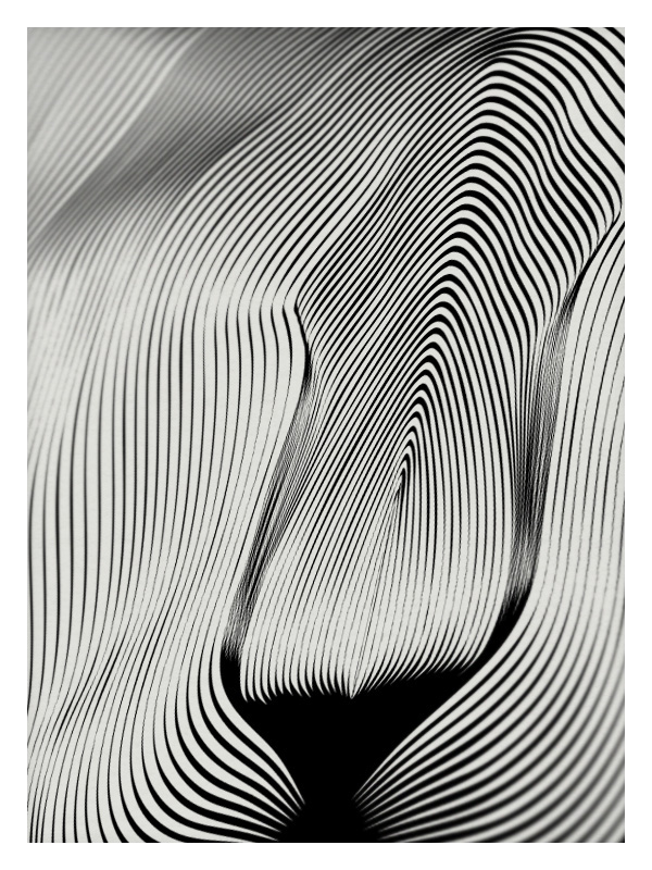
You can check out more of her works here: https://www.behance.net/andreaminini
From my understanding, moiré patterns actually work by use of lines. Patterns of lines that are almost similar and are then overlapped to produce a pattern. I’ll admit I’ll not very good at explaining the science or how exactly this works (a little bit difficult to put it in words) so I found a video that illustrates this point:
If you take a look at Minini’s work you will find that it is made up entirely of lines and nothing else. I really like the simplicity of her works and moiré patterns. It is almost like an optical illusion because you will never see the full image unless every line is in its right place. There is a strong sense of depth from just the use of lines placed at varying proximities and angles. Every line is placed differently but in a rather subtle manner.
With moiré patterns, you can also create ‘moving’ images (much like an animation) depending on how you manipulate the lines as seen in the video here:
For lack of a better more formal term, I would say moiré patterns are just really cool. Moiré patterns can also be seen on television. I realised that I have actually been seeing these patterns on the T.V. and never knew they were moiré patterns. It occurs when actors wear for example stripped shirt. It is quite funny how while researching moiré patterns I found many websites that were teaching how to remove moiré patterns from things like photographs and there I was trying to create that very thing that people were trying to get rid off.
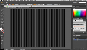
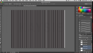
I decided to try my hand at this. I can admit it was rather challenging. The positions of each line are really important to the overall work. I started by making a ‘top’ layer of the work. This will be the piece that will be moved side to side to create the illusion of movement. This layer is done by creating a regular pattern of lines each equidistant. I experimented with lines of different weights and settled with one of a heavier weight (10pt instead of 5pt).
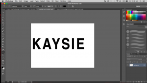
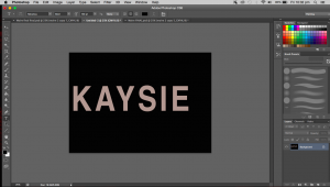
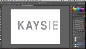
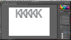
The next step was to create the image below which in this case will be my name. I first created my name, keeping the font fairly simple and straightforward (as they do in science papers and articles). I used Helvetica which isn’t what we use for research papers but I feel like it works best here as it is even more simple and clean than Times New Roman. I inverted the text and made the entire text into a brush and used it as an eraser in the next step.
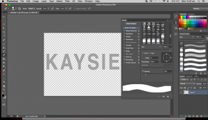
The image above is what the brush looks like. The entire rectangle (A5 sized) will be the eraser. Only the portions filled in black will be erased.
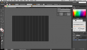
This next step involves the appearance of the first layer (striped layer). I duplicated this layer first, keeping on untouched and worked on the other layer. The process now is fairly simple, taking the new brush that I made, I erased all of the lines, leaving just my name in stripes.
When I place back the unedited striped layer over my name layer, the name is no longer visible.
But as I move this striped layer to the right the name slowly becomes visible.
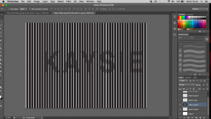
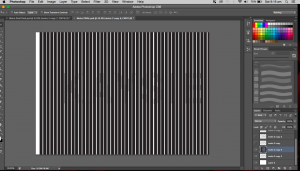 As the layer moves, the name will disappear again. The name will fade in and out as the top layer moves. For this to work, the striped layer has to be printed or drawn on a piece of transparency, while the name can just be on any piece of ordinary paper really. The transparency will then be placed over the name and can be slid around (side to side) to reveal my name. When pulled in one continuous motion, the name will appear to be flashing, fading in and out and regular intervals.
Moiré patterns work on a mathematical basis and can be applied to physics as well. But i would suppose it gravitates more towards maths. I didn’t want to make physics my main focus because I am really out of touch and it wouldn’t be fair to do something entirely on that based on my measly knowledge of physics. This piece is an interacting piece and it shows my inquisitive side, trying out new techniques and taking that risk to try something completely new.
The fading in and out of my name represents my relationship with science. Sometimes I really love, sometimes, not so much. A love-hate relationship. There are times when I want to learn so much and be involved, other times, I want to have nothing to do with it. Sciences aren’t easy to grasp all the time and there are occasions when it just frustrates and confuses me, and it’s times like those that make me withdraw (fade out) from it all. Then something about it will interest me and draw me back in (fade in).
