Work-in-progress
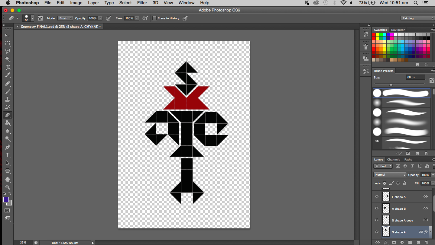
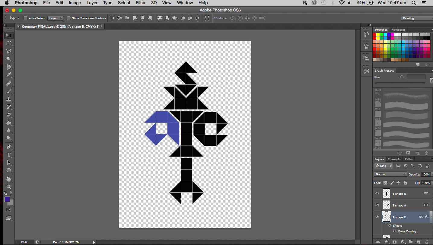
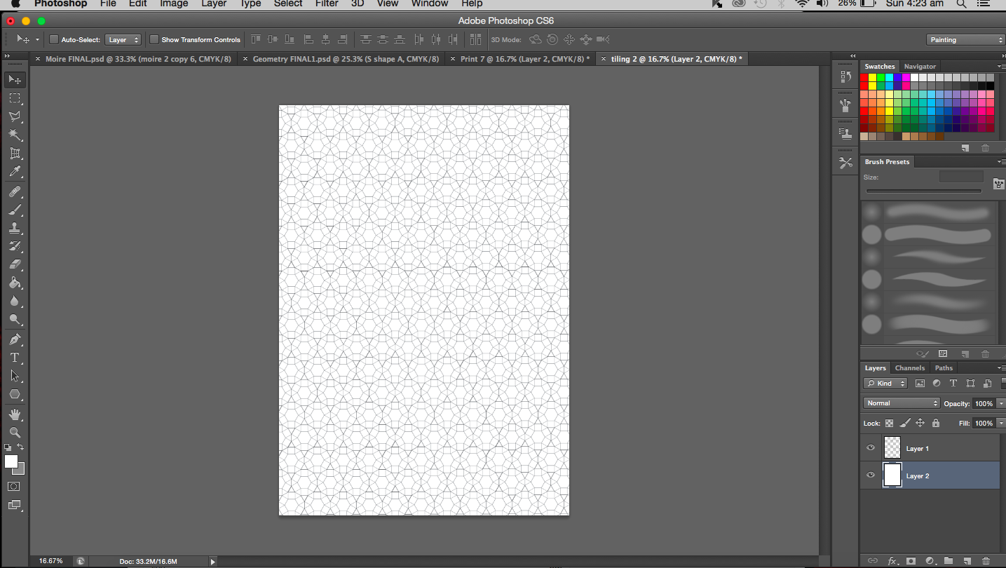
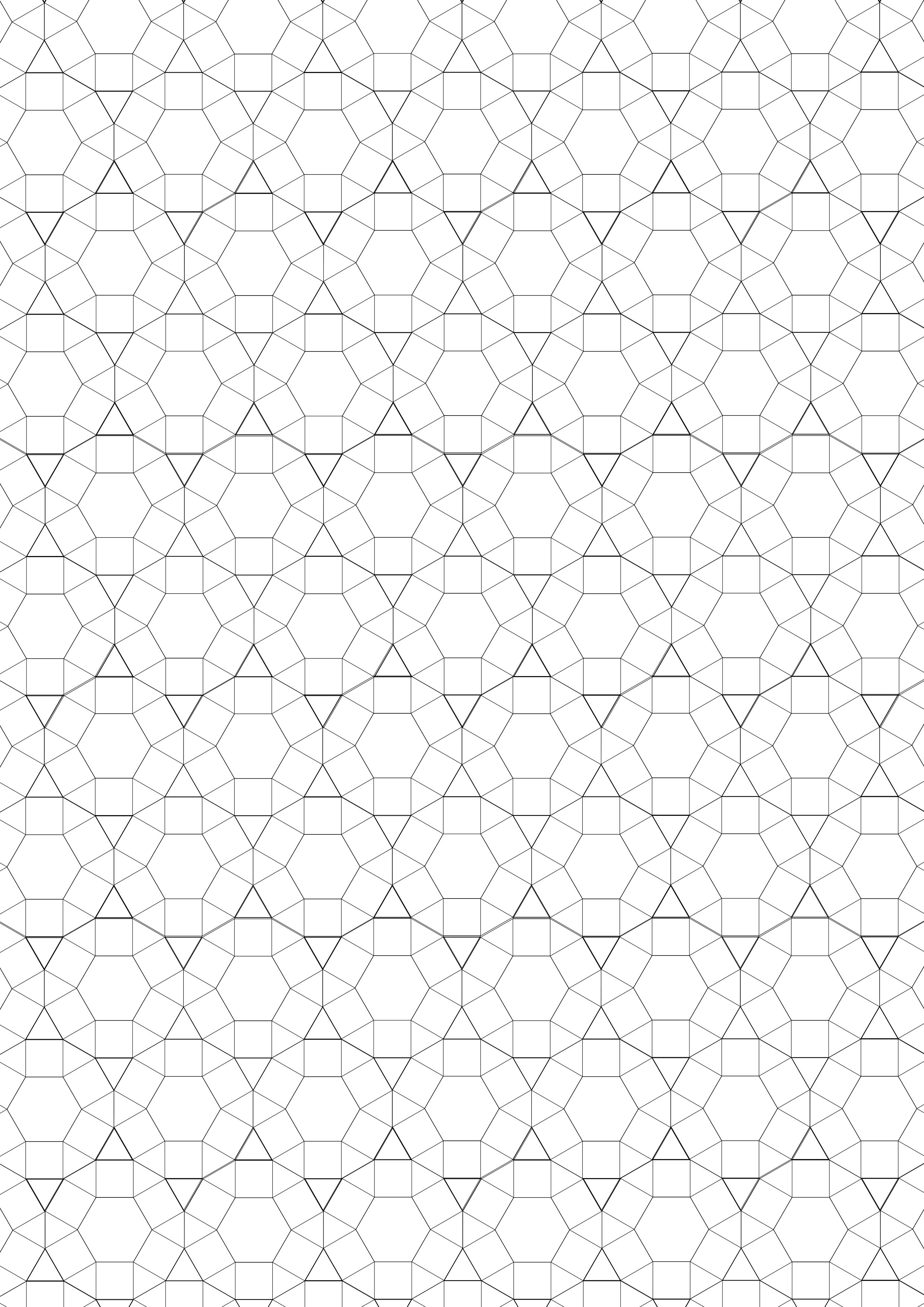
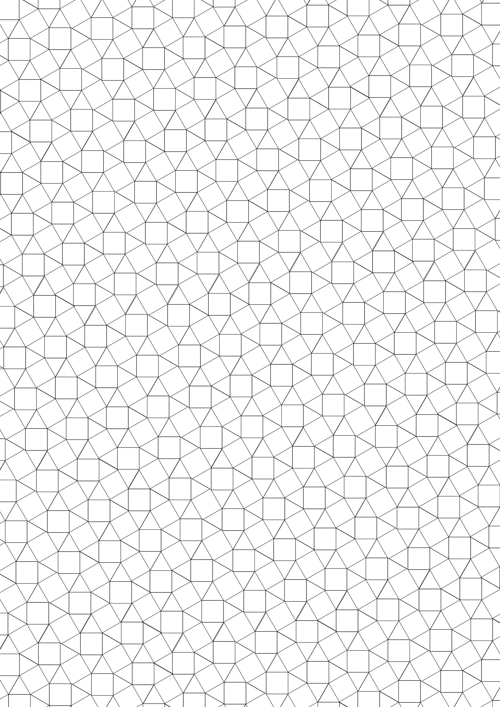
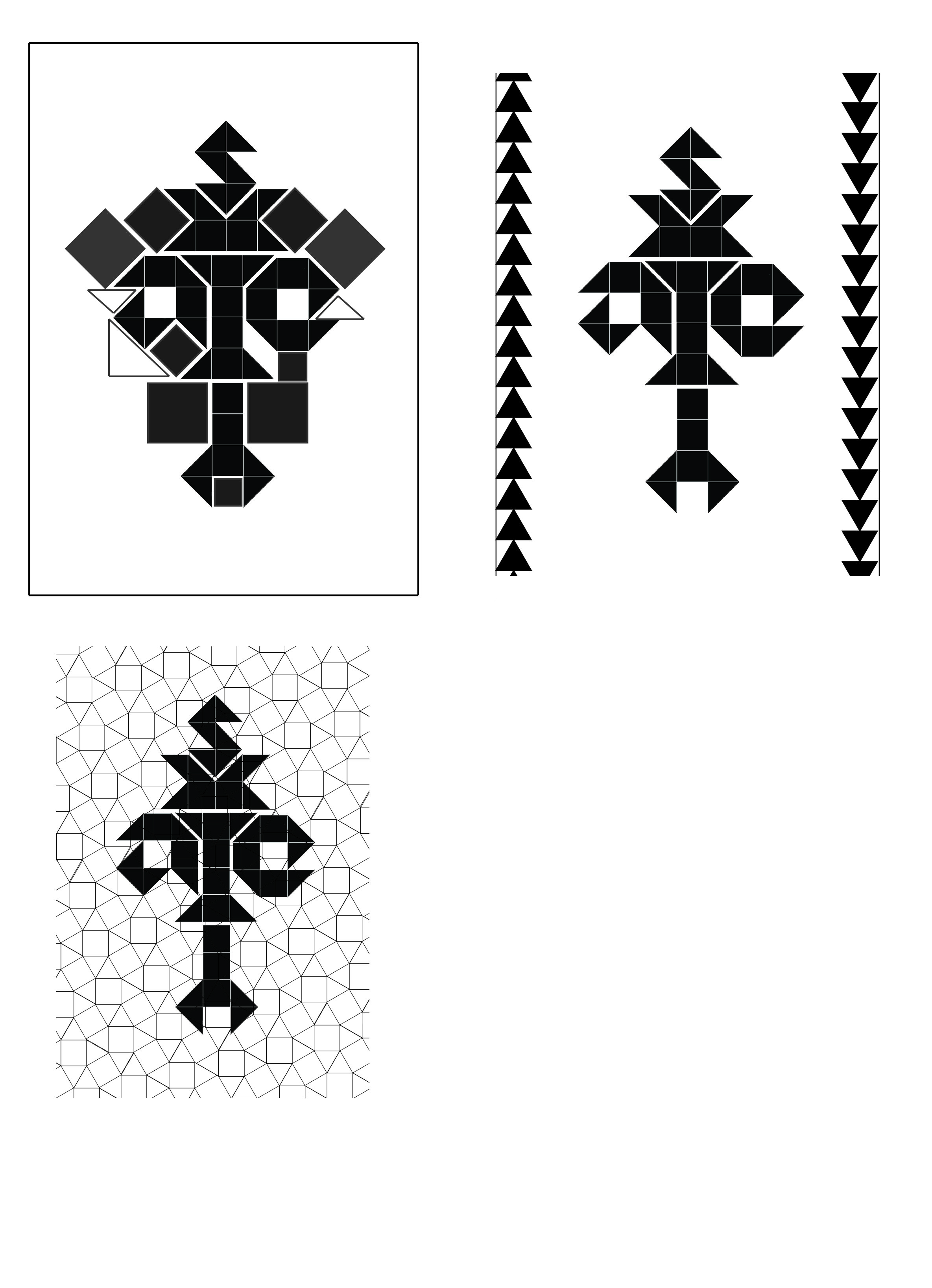
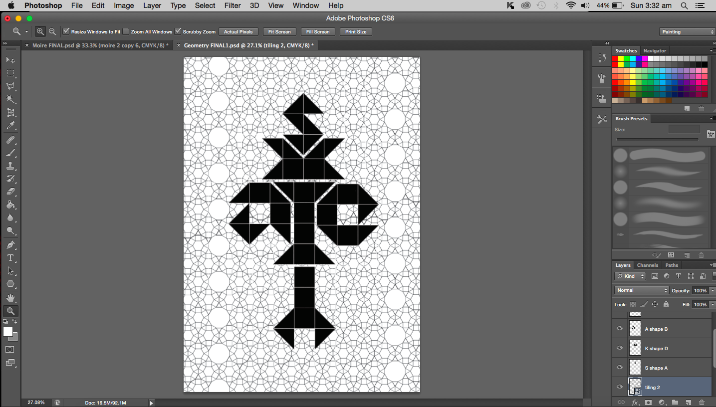
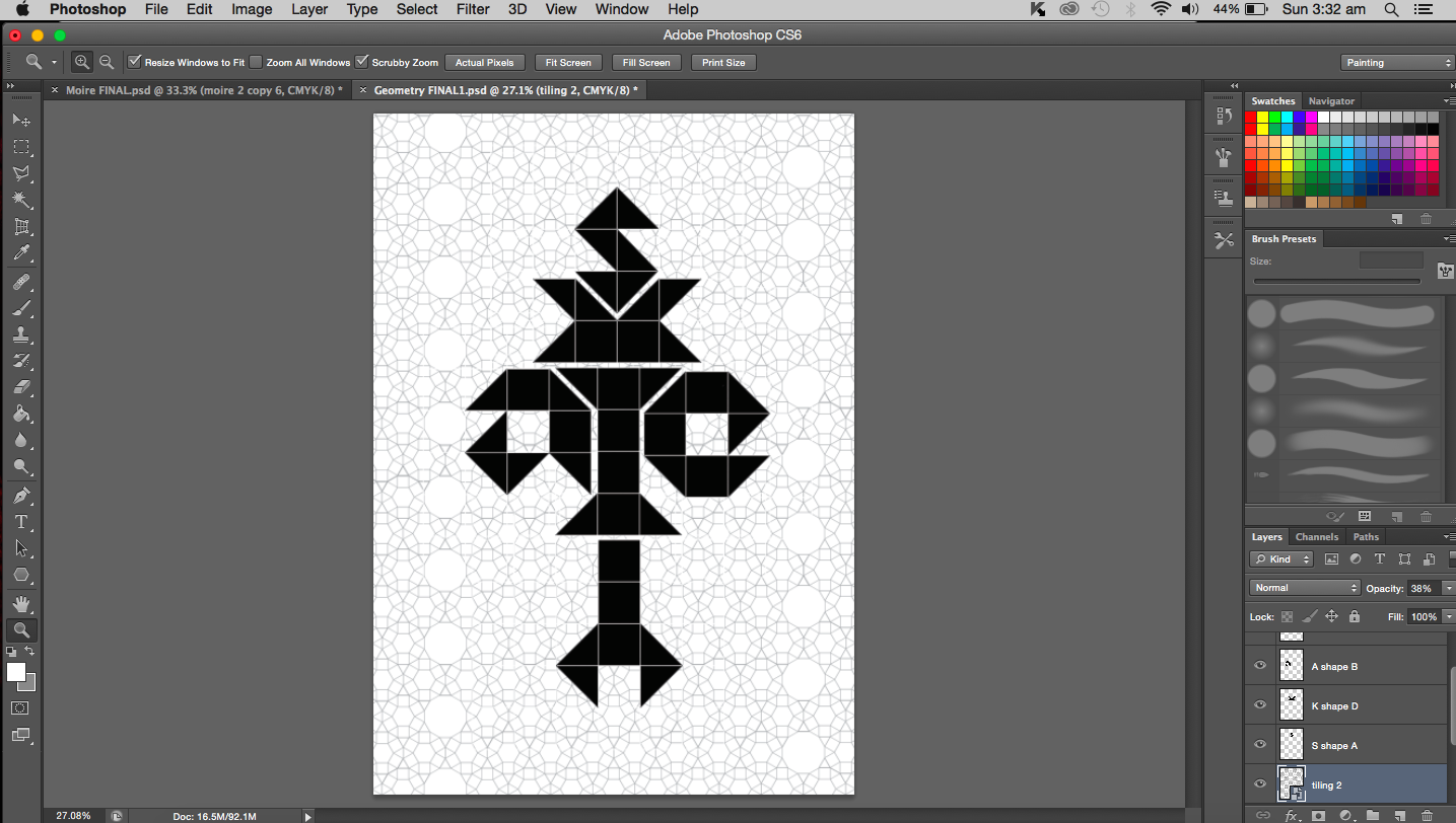
Update on the geometric work. After playing around with the arrangements of the letters I have decided to settle with something fairly symmetrical because I do like symmetry. Things that are symmetrical always seem to make more sense and are easier on the eyes. It also reminds me of mathematics because we usually aim to equate and balance. Think the equal sign, something is the equivalent of something else, they are then of equal weightage. Similarly in my work, I aim for the same thing. If you divide the image in half lengthwise and count the number of triangles (taking each square as two triangles) on each half, they are the same. Or you could see it as the total surface area covered by the shapes on each side is the same. Both sides are balanced and equal.
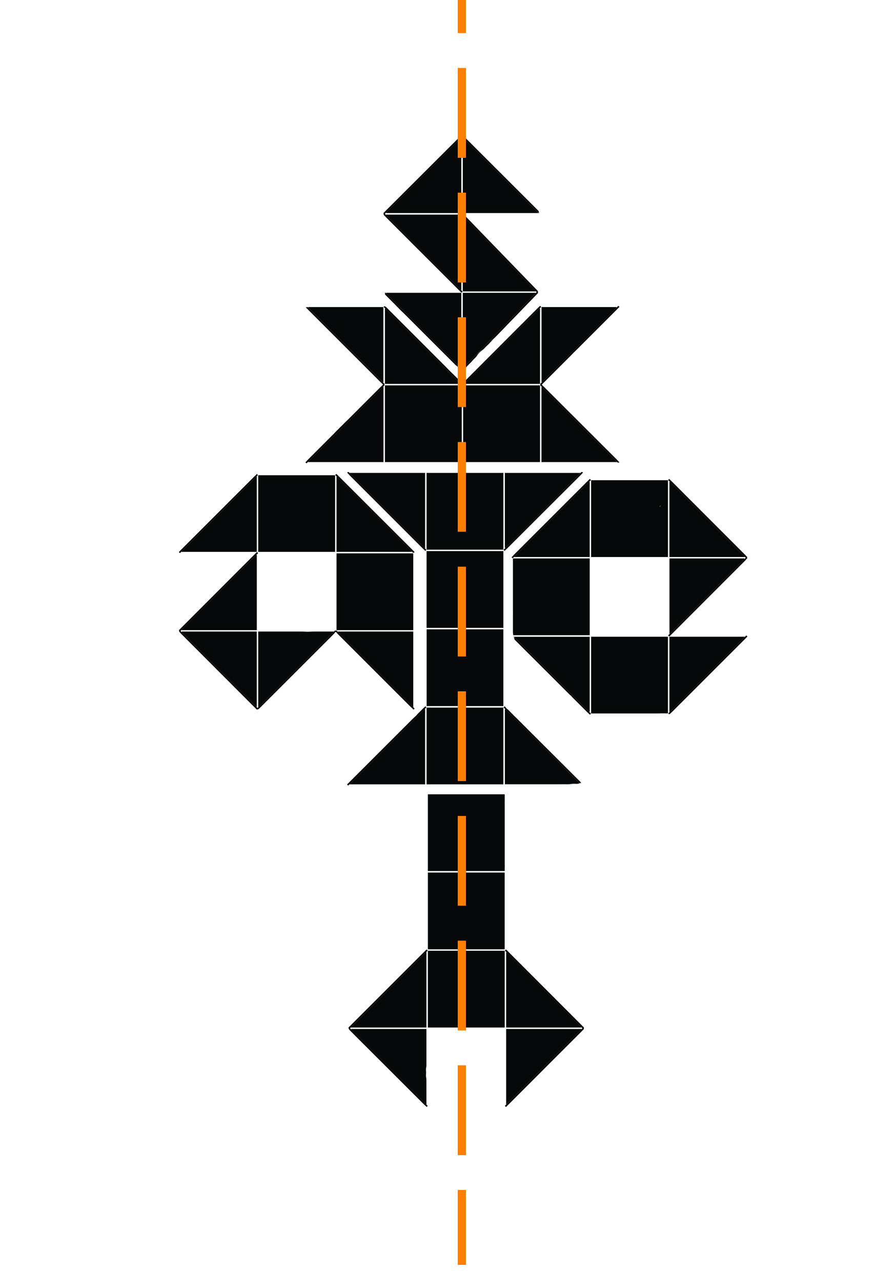
Here’s where each letter is positioned:


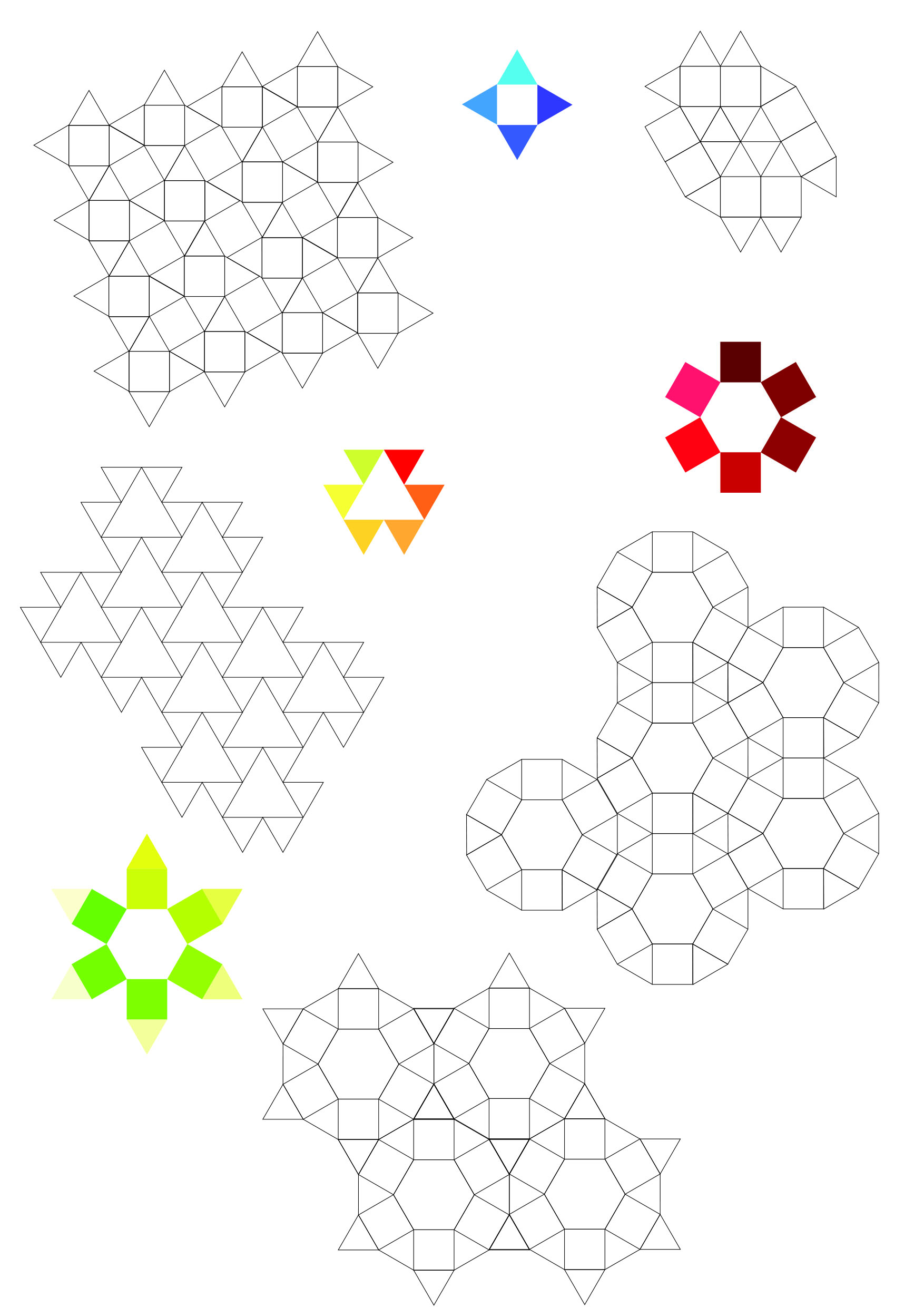
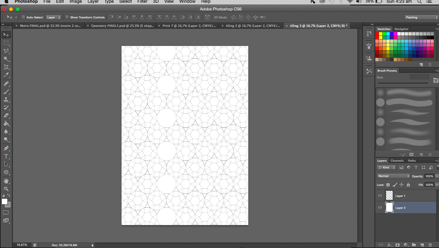
The whole idea of geometry and symmetry got me thinking about truncated hexagonal tiling and basically Euclidean tiling. I did feel that my work was lacking something and maybe this is it. A background that involves tiling that supports the main work.
Moving on to other things…
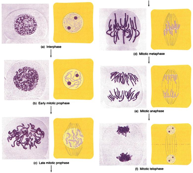
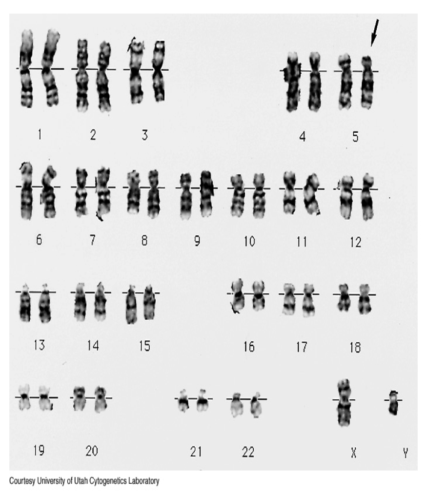
It is now time I talked about the work focused around biology. I turned to all of my old notes that I have accumulated over the years for inspiration. I think the most obvious object associated with biology would be DNA so I turned my focus to just that. My initial thought was to analyze the DNA molecules’ structure and then deconstruct it. I really hope I don’t get too technical with this; I’ll try to reduce jargon as much as possible. Sticking to the theme of genetics, I looked into chromosomes as well (the condensed form of DNA during replication). From replication, I thought of meiosis and mitosis (division of nucleus in somatic cells) paying special attention to the anaphase and metaphase. Metaphase and anaphase are phases in the division process where the chromosomes are aligned and pulled apart respectively. You may choose to refer to image I found here:
So DNA, the condensed form is known as chromosome or chromatin (depending on which part of the structure you are referring). Chromosomes come in pairs (one from each parent). I might actually work with this and create each letter from a pair of chromosomes.
Other Ideas
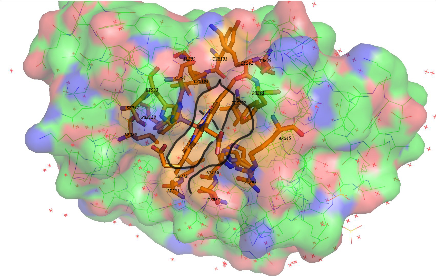
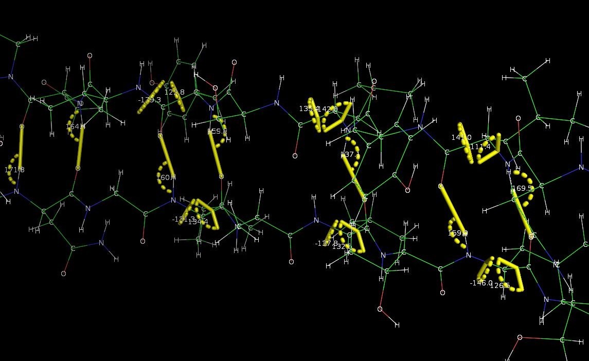
Besides DNA, I also thought about proteins and molecular sturcutres. When I was studying biological sciences a year ago, we used a software called PyMOL that enabled us to visualize molecules in its three dimensional form. I think I might use this software to create my letters if possible. To give a better understanding of how good and amazing this software is, I have dug up some of my old screenshots from my dry lab sessions. (This probably doesn’t excite the everyday art student as much as it does to me.)