Work-in-progress
Brainstorming
The most obvious route to take with chemistry would be to work with structural formulae and skeletal structural formulae of molecules. However, that has already been done, see K-mistry Typeface by Ranmalee Jayaratne, where the skeletal structure of molecules are used as letters.
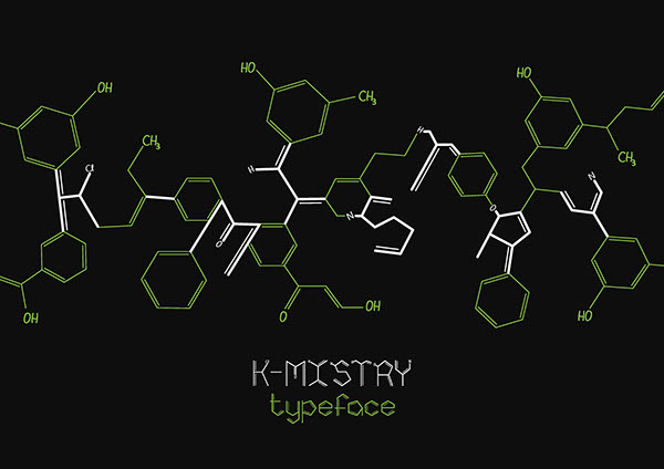
Website: http://betype.co/post/102095978657/k-mistry-typeface-by-ranmalee-jayaratne
I think the idea is a brilliant one, the letters look clean and simple but scream out chemistry. Straightforward and to the point, which is what I like about it.
I tried my hand at it nonetheless but took my own take on things.
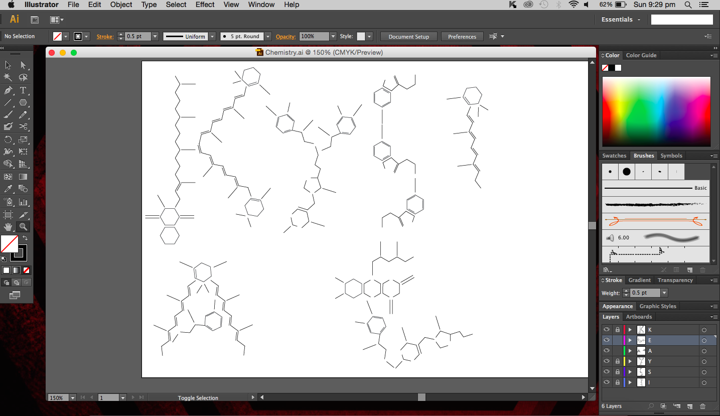
I used the real skeletal structures of certain chemicals found in the body or needed by the body. They include vitamin K (and its variants), vitamin B and its subsets, vitamin E, vitamin A, adrenaline and serotonin. Instinctively, the letter K was made up of vitamin K and the letter A was made up of vitamin A. The letter S made of Serotonin.
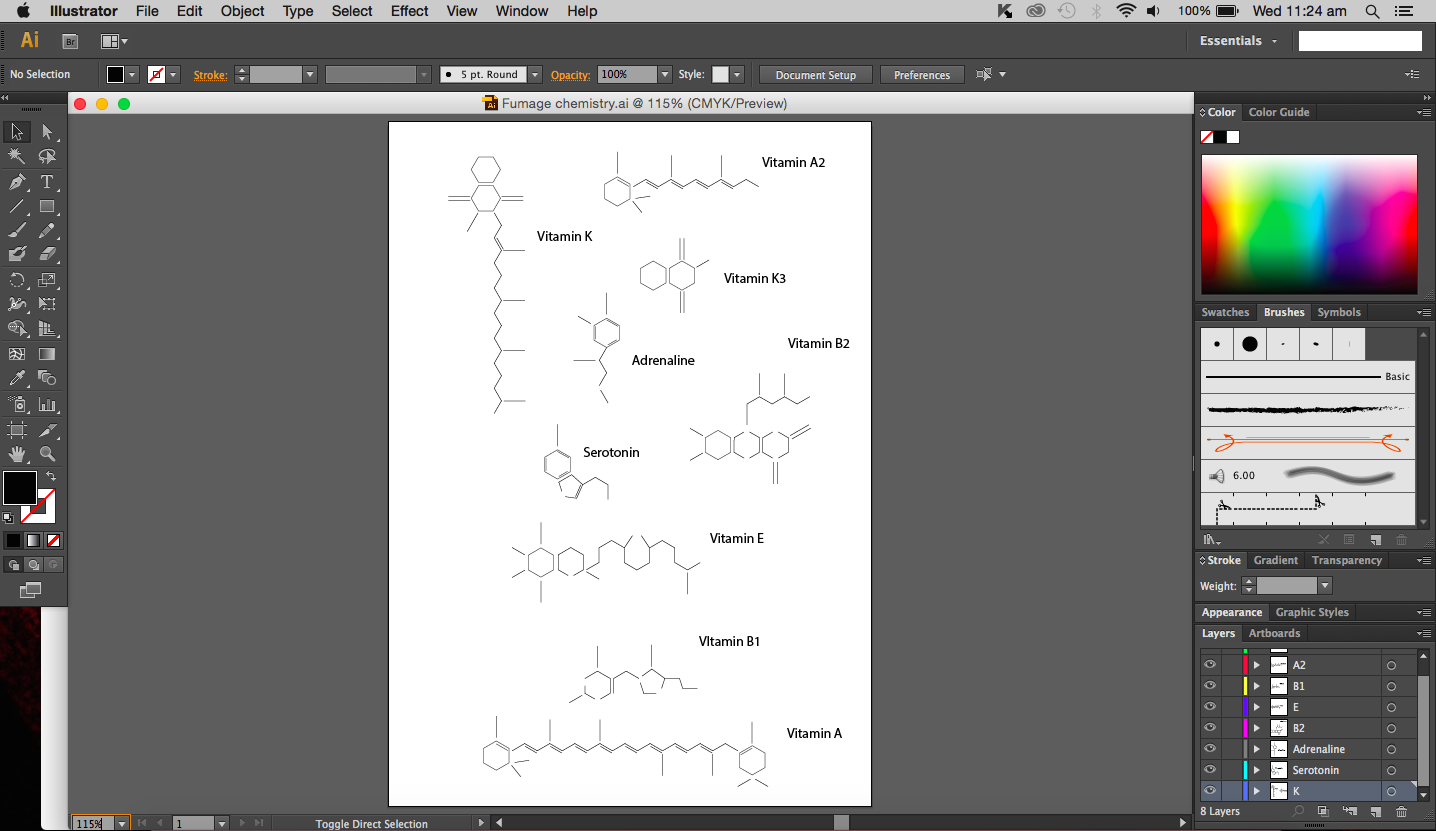

Above are images of structures that I have created using illustrator of real structures. However, I have removed any letters (meaning the ‘O’, ‘N’ or ‘CH3’ for oxygen, nitrogen and methyl groups respectively) which is why you will see gaps in some of the structures. Take for example the image below of Vitamin K3 in its full form and compare it with the structure above.

I didn’t want to add them in as I thought they were too distracting and would have deviated from the simple clean look I was going for.
So what are we then left with, the periodic table? I find that equally common. I could do something related to organic chemistry that includes benzene (hexagon in shape). Similar to the Hexagonetica mentioned in an earlier post, I could create a three dimensional shape (not a cube though) and derive the letters from resulting shape.
Other ideas of mine included paper chromatography, which is really fun to do. Chromatography in this case basically separates ink into its different component (every ink colour usually made up of several other colours) with a solvent (e.g. alcohol). Each colour ‘travels’ at a different speed on the paper so the result is a gradient of colours, which is really quite beautiful if the right amount of solvent is used.
Chemistry reminds me of copper(II) sulfate crystals, maybe its because the blue crystals we actual got to create years ago just looked really beautiful and I will always remember what they looked like. So, crystals, many compounds can form crystals and I feel that that is one of the reasons that makes chemistry so cool. Your starting solution (aqueous) is slowly evaporated and a shiny jiggered edge crystal is formed, almost like magic. I could create a crystal typeface. But the issue I’m having now is that the typeface may not give people the impression of it being of chemical origins.
After much thought and reminding myself that I should keep designs clean and simple without excess details, I have decided to use fumage, which I believe is part of automatism. I didn’t really do much of fumage art in semester one simply because I was terrified of burning the paper and setting fire to everything else (the paper did actually catch fire). But you know what, risk-taking, that’s what it’ll show (done more carefully this time though). And indeed, risk-taking is important in the realm of science. If you are willing to take that risk to experiment, you could discover great things. I guess that’s an attribute that I would be portraying with this chemistry themed piece of work. The attribute would be portrayed more strongly in the process of the work rather than in the final.
Furthermore, the use of fire is quite common in chemistry. Bunsen burners should ring a bell for most students. They were a staple in lab sessions. I think it is only appropriate to use something we have frequently used in the lab in my work, just makes it more relevant.
Process
So to begin this piece of work, I have decided to create a design that I would follow to burn. I choose a hexagonal shape because it is rather iconic in organic chemistry (benzene rings). Initially I tried to use nuts to create the image of hexagons however, it was not too successful since the nut itself is not fully flat so it is not in full contact with the paper.
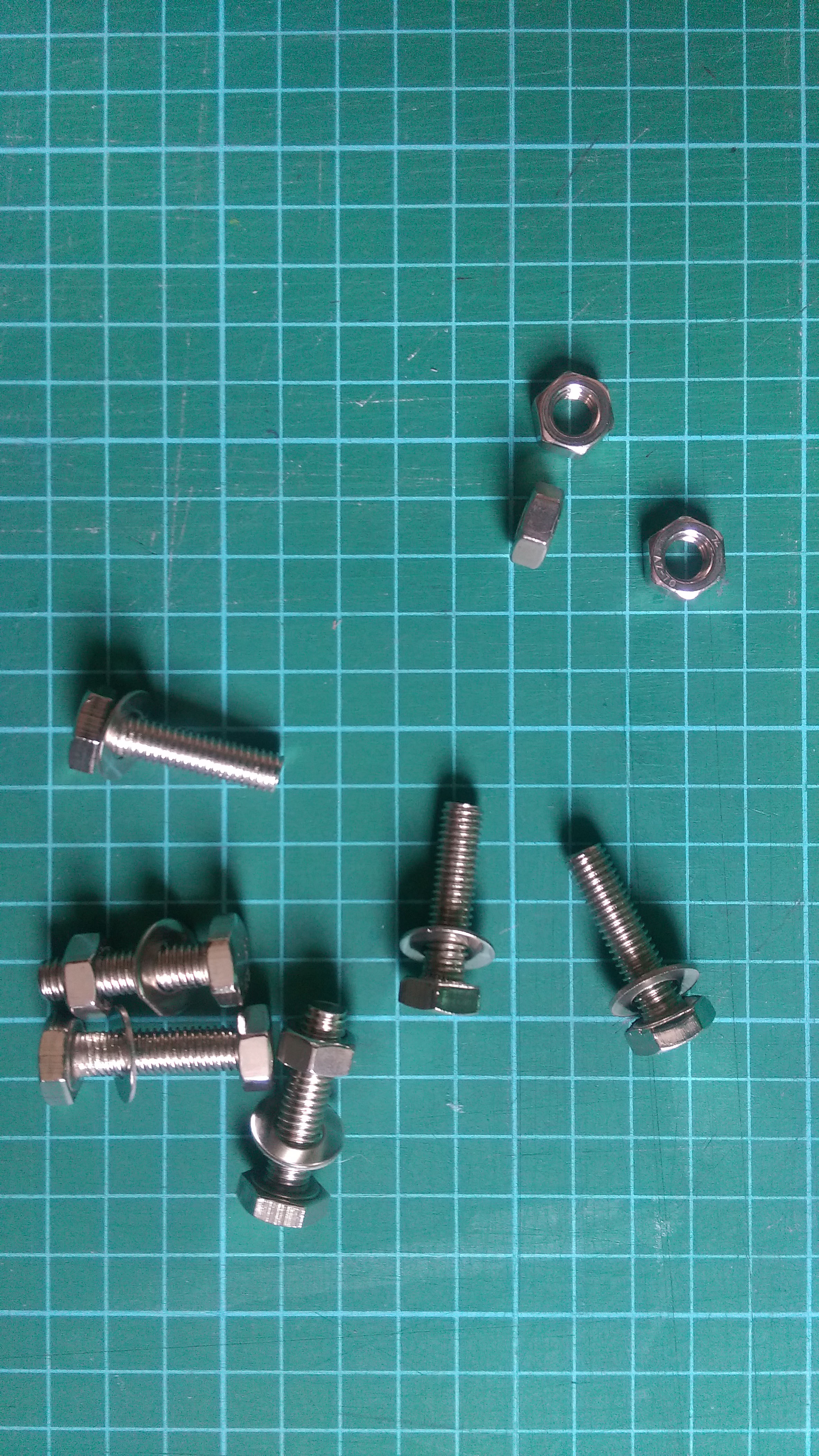
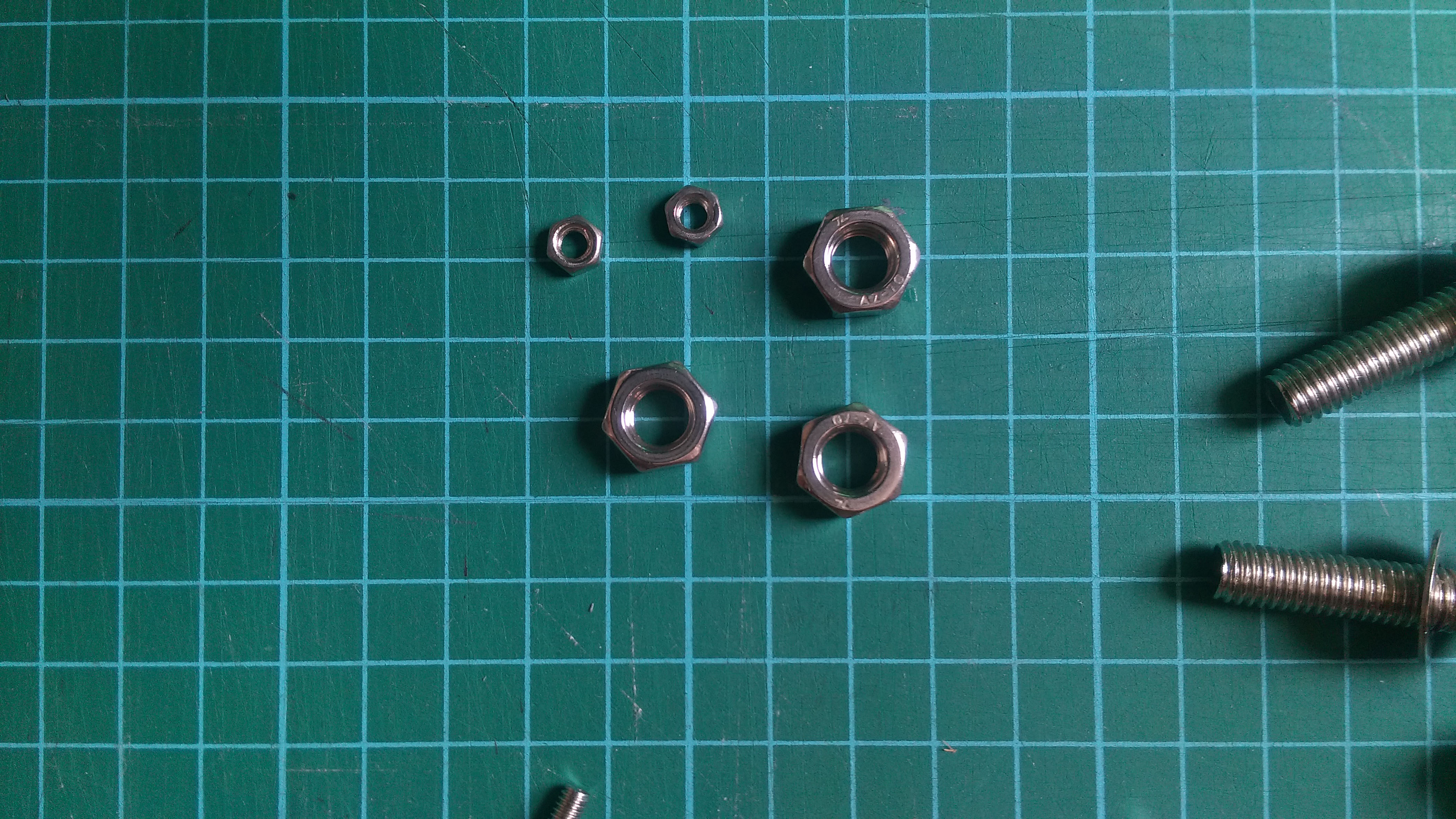
I experimented with two different sizes with the same result. The area around the nut turns brown and burns because the heat is absorbed by the metal (good conductor of heat) and the place where the nut was remains white. It is almost like drawing in the negative. Now because the full hexagonal shape of the nuts were not in full contact with the paper, only circles were formed.
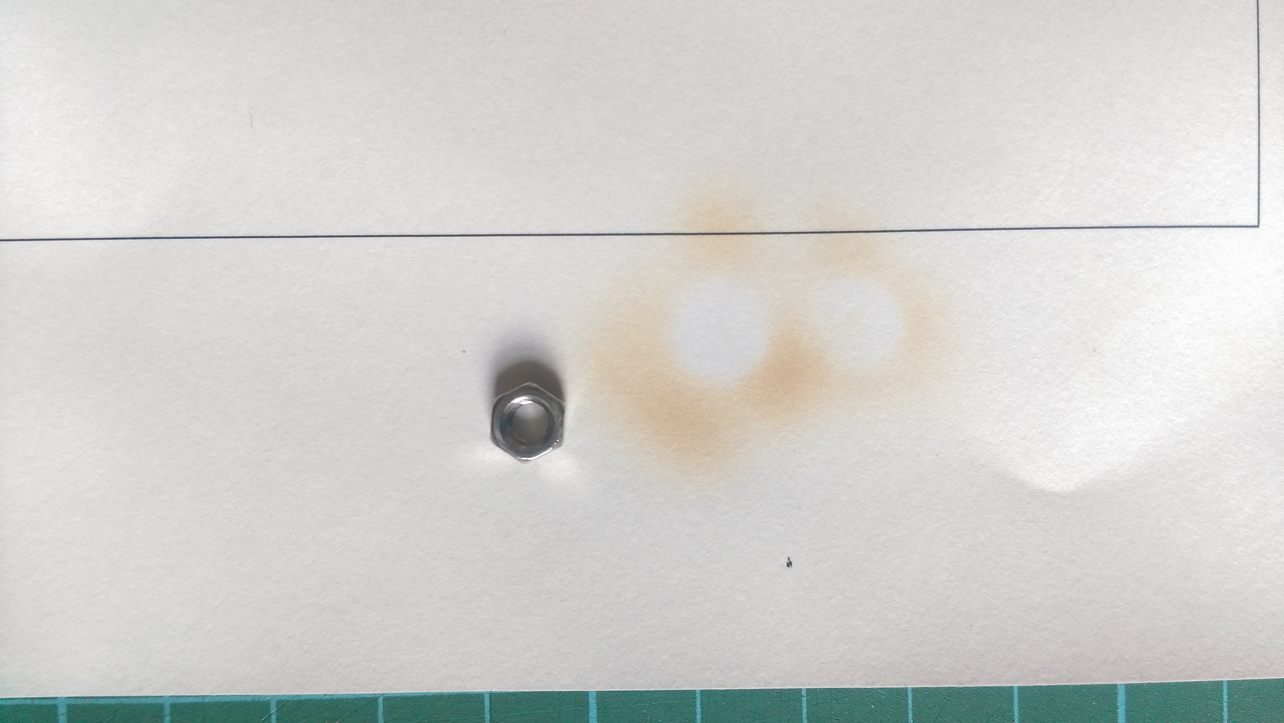
That aside, the way I went about this was to place the nut on the paper and hover the paper above a lit candle until the paper turned brown, almost black. The tricky thing about this is that I had to decide when to lift the paper off the heat. From experience, leaving the paper on for too long will cause the paper to burn a lot quicker and uncontrollably (and there is a lot of smoke and ash that comes with it). So there is a fine line between getting the paper brown just nicely and burning it. Besides the time taken to burn the paper, another factor would be the distance from the flame, the closer to the flame, the faster it burns. It is a double edged sword because on one hand, it is faster to have it closer and I can actually have a more direct flame at a specific spot, which is brilliant, but on the other hand, I risk burning a larger hole in the paper than expected.
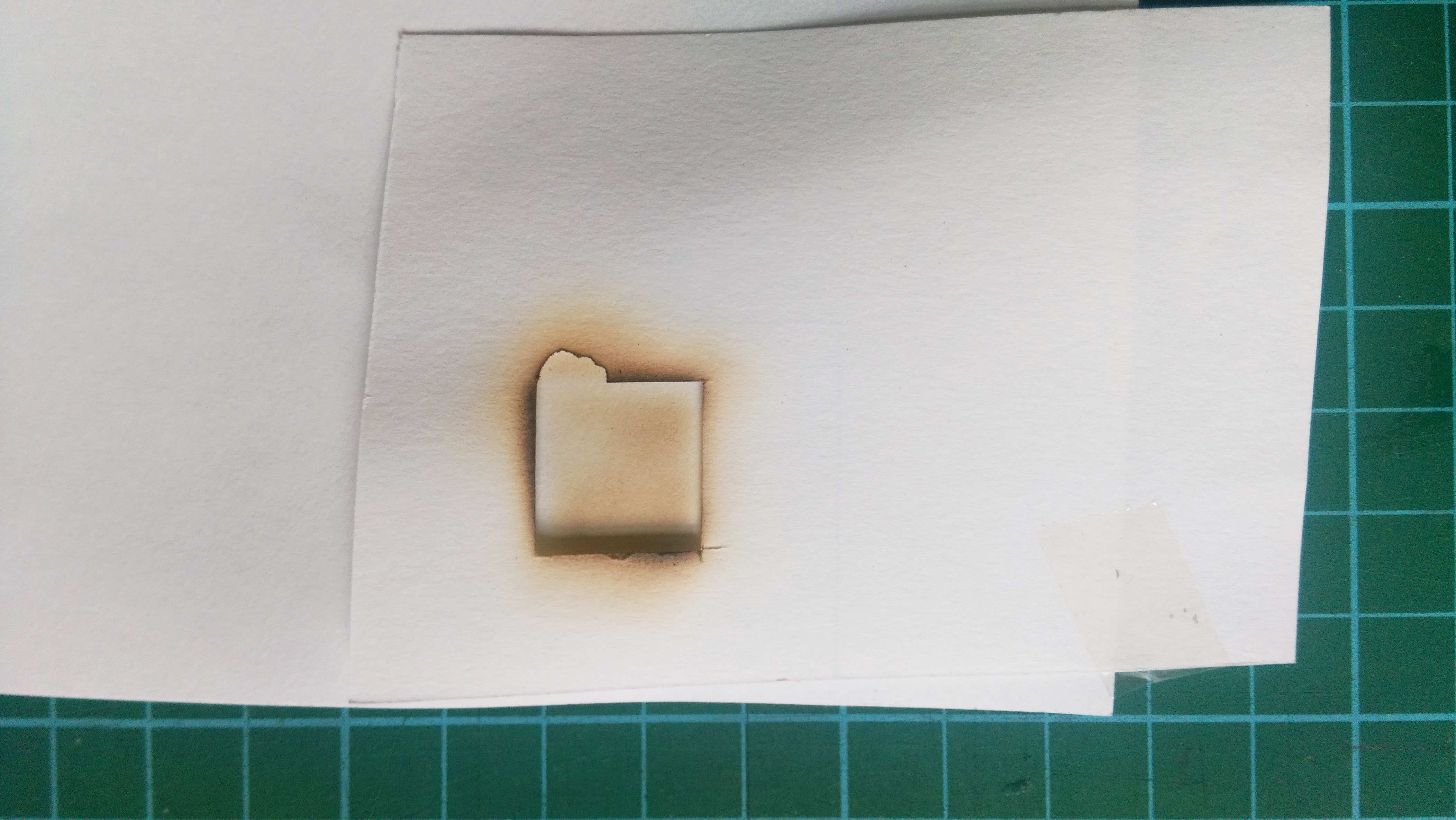
I decided to use a stencil instead of the nuts to see if I could get a clear hexagonal shape. I cut out a square using an exactoknife just to test things out. I placed the stencil below the paper I wanted to burn and placed it over the flame (so stencil is nearest to flame).

The results I got were better than expected, not because the image that came out was good but because the stencil itself looked really interesting and good. The edges of the stencil were burnt well; the edges had a hint of black, which gave it an interesting texture.
So I decided to cut out hexagonal shapes and burn the edges instead. I created a design using the polygon. It may look rather rigid (no curves or bents), the polygons are arranged in straight lines but that is exactly what I’m looking for.
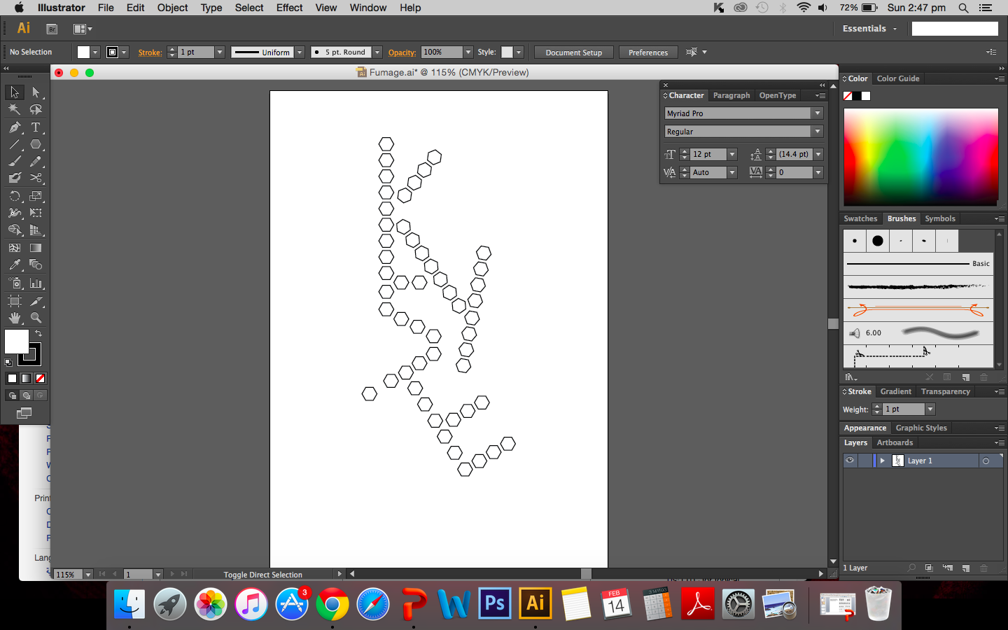


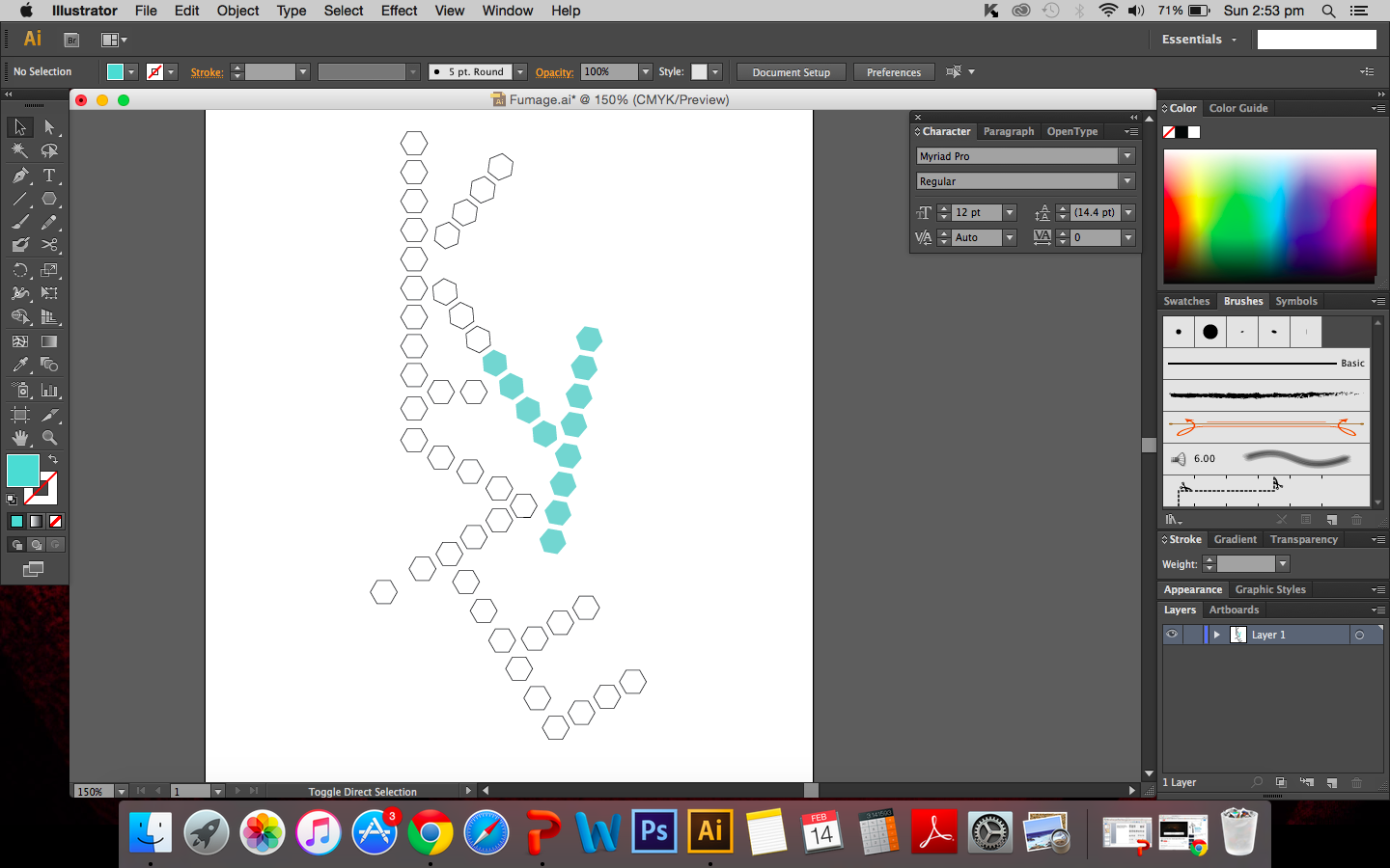
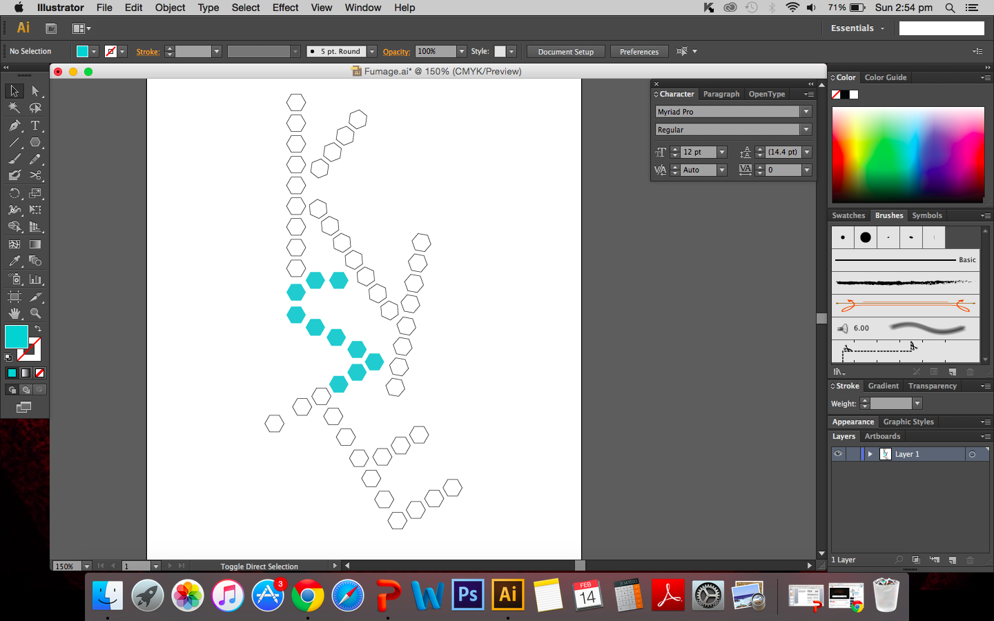
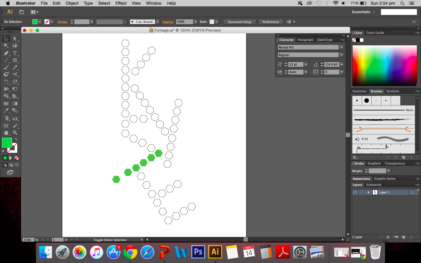
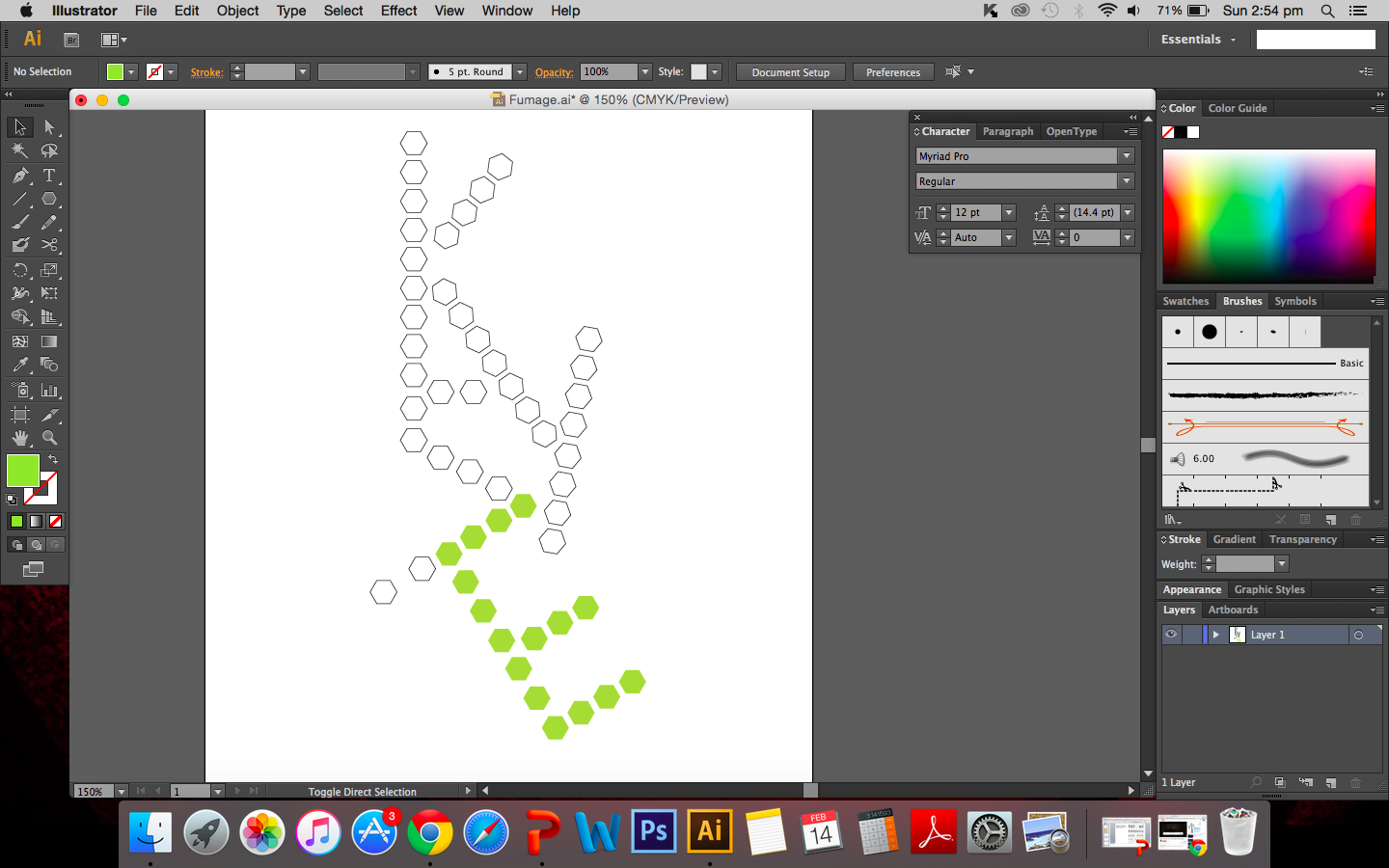
In a way, the rigid arrangement is similar to how structures are drawn and presented in chemistry and since it is chemistry based I thought it would be apt to leave components of chemistry in the work. It also reminds me of the structure of amylopectin and amylose.
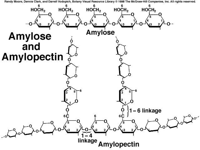
Image:http://www.mhhe.com/biosci/pae/botany/uno/graphics/uno01pob/vrl/images/0026.gif
I cut out the individual hexagons on drawing A5 paper and began to burn the edges of each shape. How appropriate it is that I am calling this a risk taking attribute because my fear of excessively burning the paper definitely came true. I had failed my first attempt.
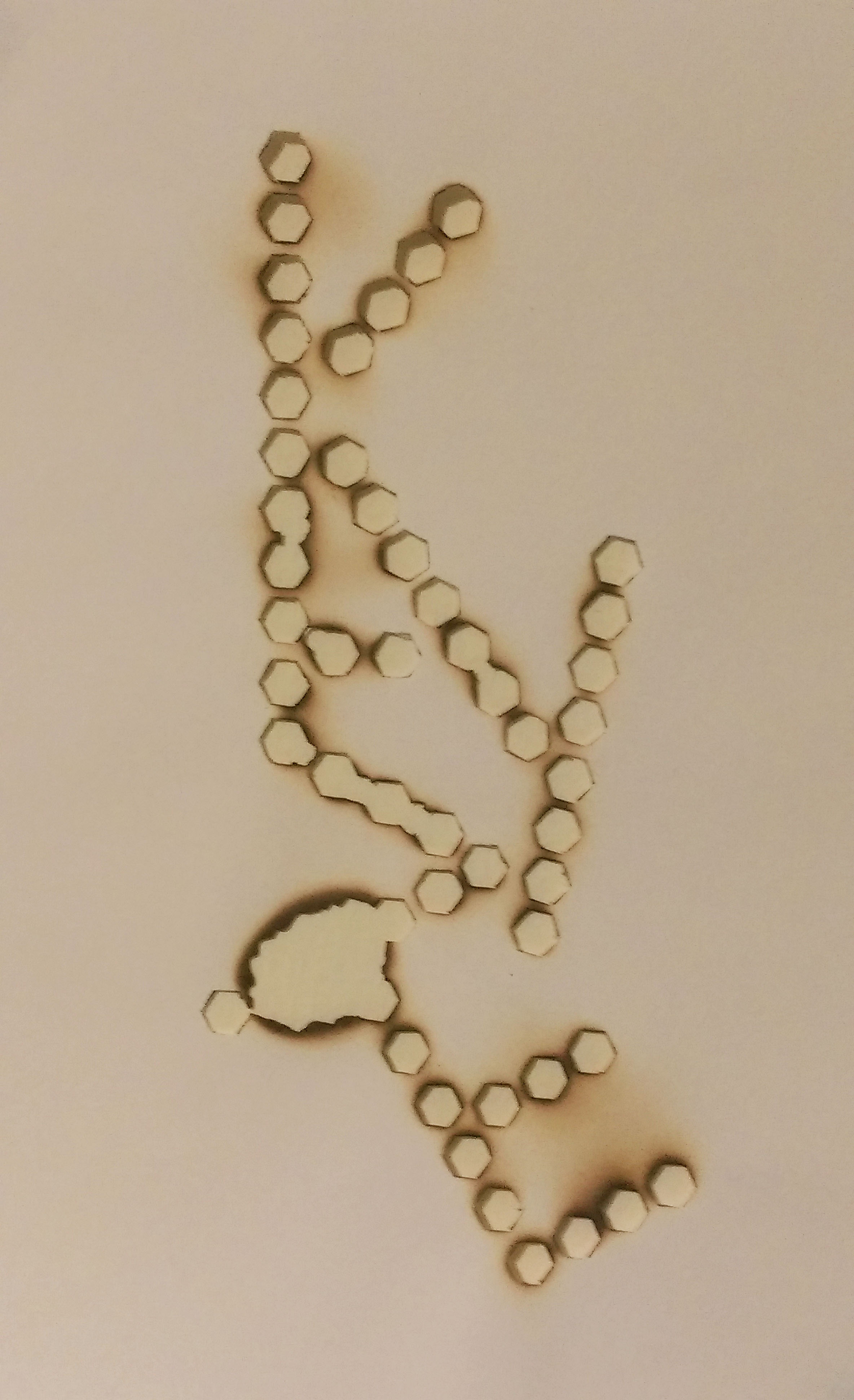
Maybe it wouldn’t be fair to call it a downright failure but I certainly did not intend for there to be quite so large a hole between the letters I and E. I think I was getting a little impatient and went too close to the flame. But the whole point of this is that I was willing to take that risk and risk the whole piece. I guess it was a learning curve for me. I have since decided to redo piece.
Additional
Some extra information about fumage. According to Oxford art online, it was created by Wolfgang Paalen.[1] The smoke of the flame is used to create images on paper or canvas.
The special thing about fumage is that you are never really fully in control, the flame burns the way it wants to and external environment plays a part in the process as well. Wind and drafts causes the flame to shift and move away from the area I want to burn and I realised how important it is to work with the flame rather than to control the candle. The outcome of the burning is soft brown marks on the paper that contrasts with the black rough edges of burnt paper.
[1] Celia Rabinovitch, “Paalen, Wolfgang.” Grove Art Online, Oxford Art Online. Oxford University Press, accessed February 17, 2016,http://www.oxfordartonline.com.ezlibproxy1.ntu.edu.sg/subscriber/article/grove/art/T064397.