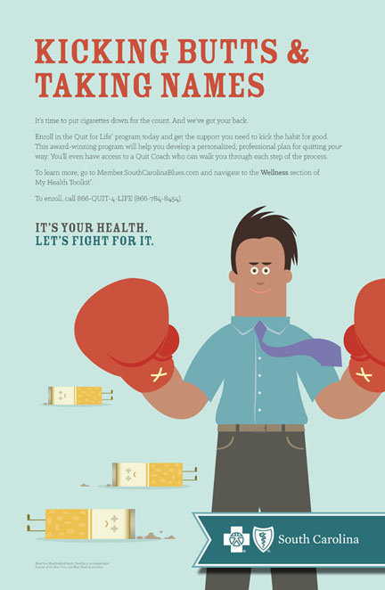
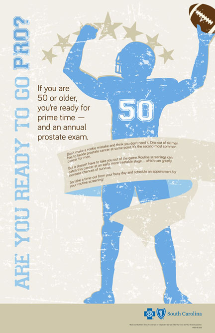
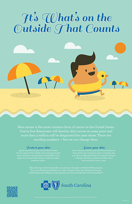
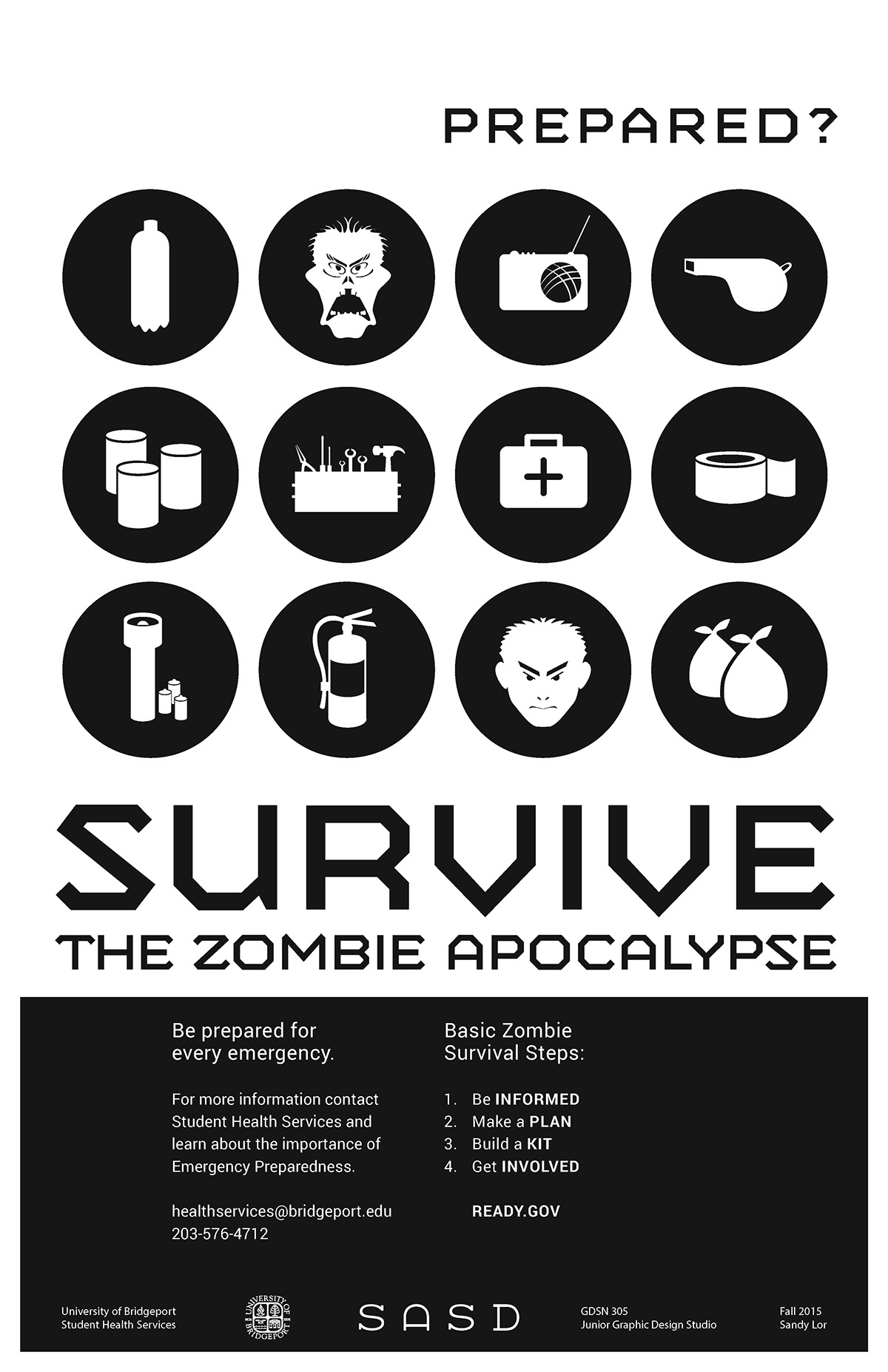
Poster by Kristin Gissendanner (noteworthy slogan)Poster by Kristin Gissendanner (noteworthy slogan)Poster by Kristin Gissendanner (noteworthy slogan)Poster by Sandy LorPoster by Sandy LorPoster by Sandy LorPoster by Dan ZhouPoster by Christine Rivera (noteworthy slogan)
Analysis
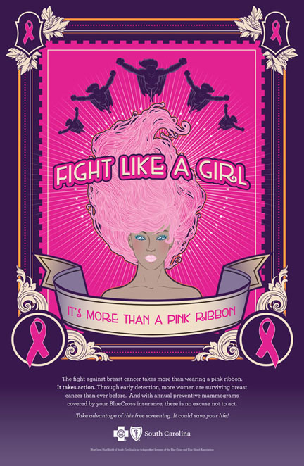
Poster by Kristin Gissendanner. https://www.behance.net/krisgiss
This poster really sets itself apart from others. It in itself does not look like a conventional poster but resembles a tarot card with a psychedelic feel to it.
Visual interest was created by the use of colours, shades of pink, purple gradient, orange and hints of white, and detailed ornamental borders. There are a myriad of textures and different types of lines and line variation. The poster is filled with many elements, the most prominent figure would be the woman in the middle where attention is then drawn to the center of the page. Radial lines radiating from the middle then draws the eye up to the superhero figures on the top. The use of only women and superheroes does evoke a sense of empowerment which is apt since this poster is targeted towards women.
Information here is easy to locate with a symmetrical poster. The amount of text increases gradually from top to bottom with the bulk of information at the bottom 1/3. Main information has high readability, white on purple without any additional elements surrounding it. Slogans are of bigger point sizes and seen first, main information in smaller point sizes, followed by the hospital name.
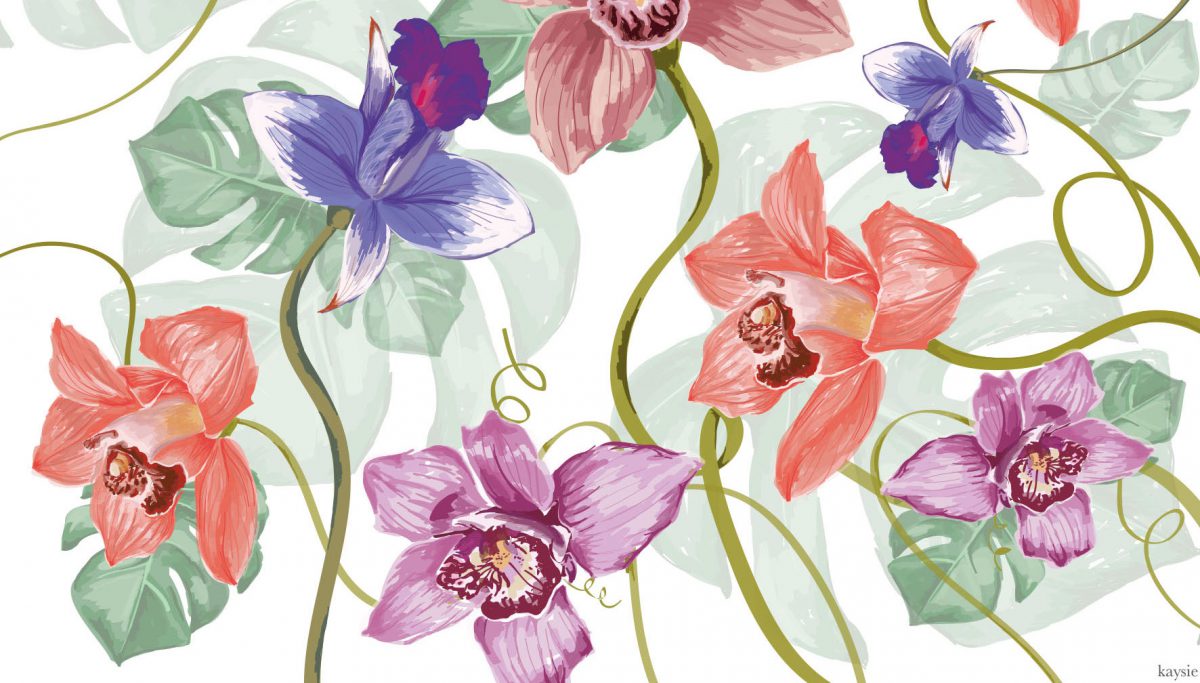
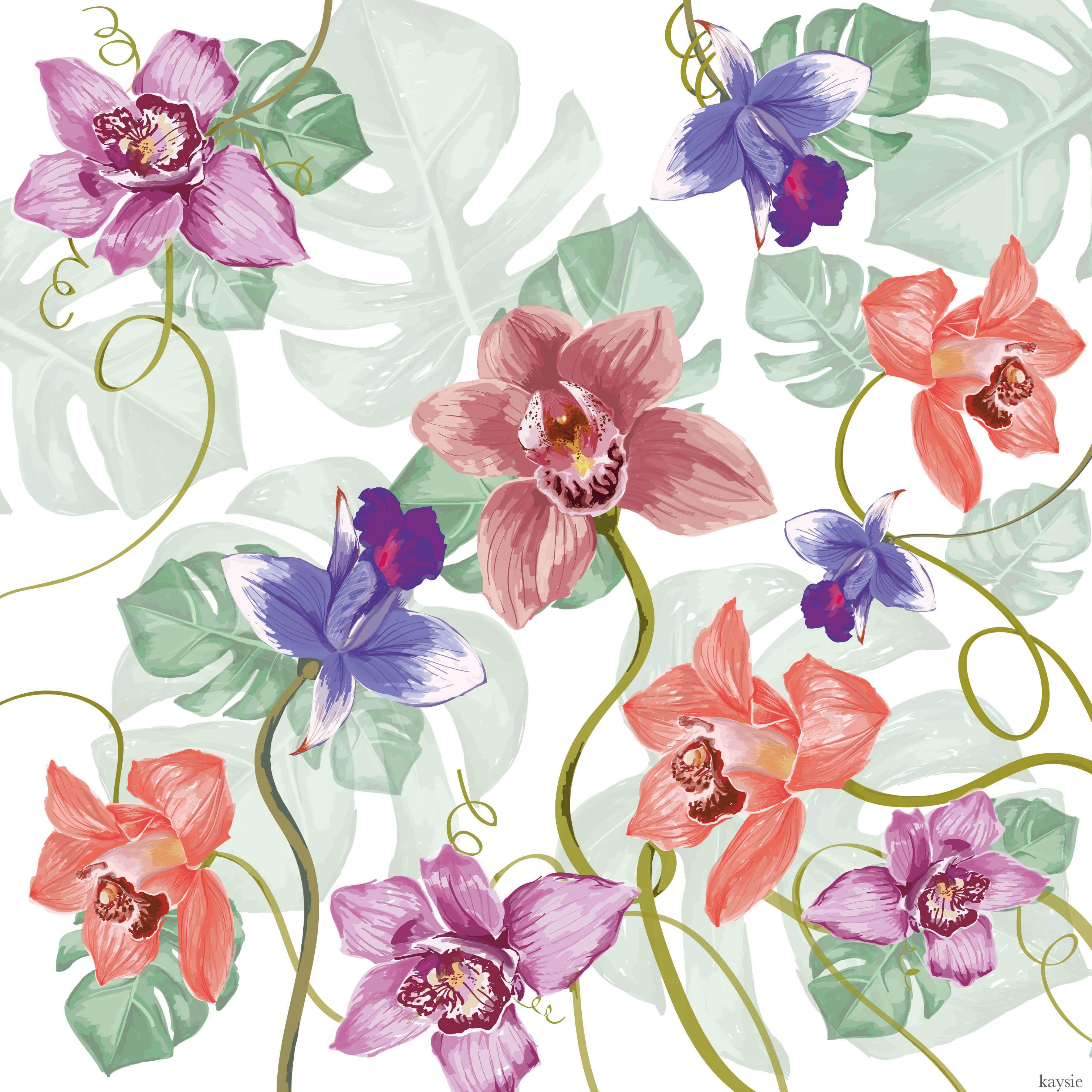
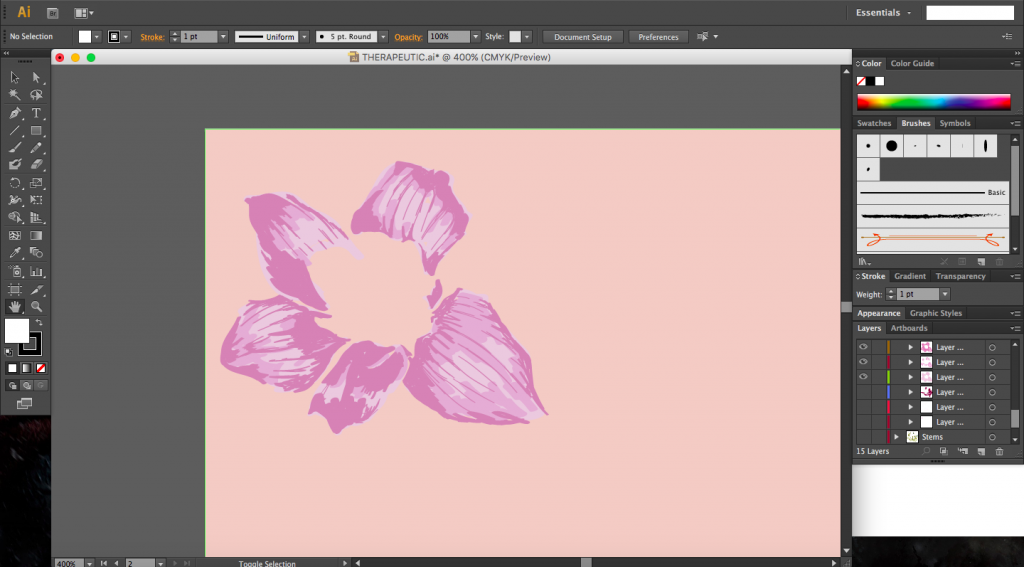
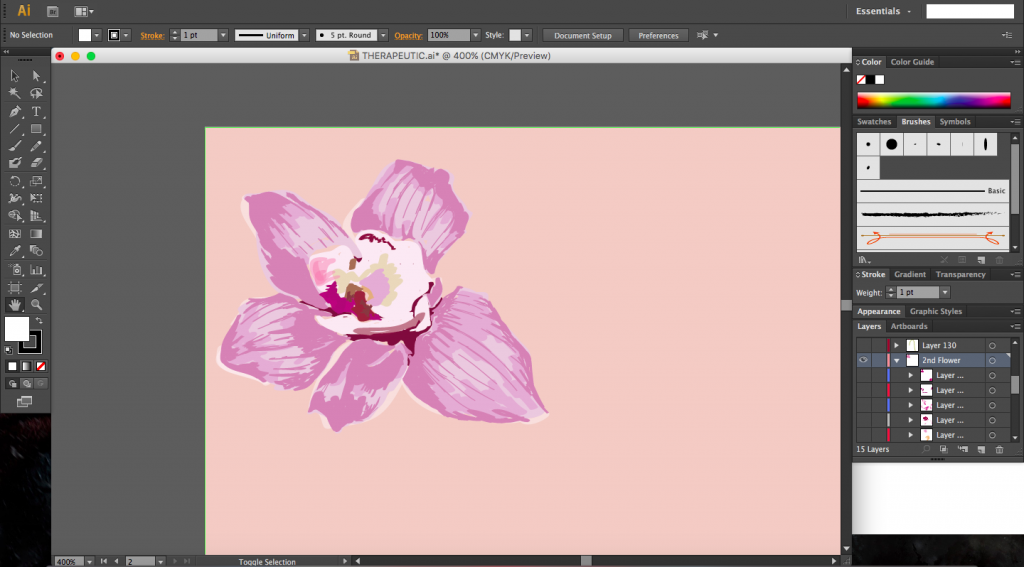
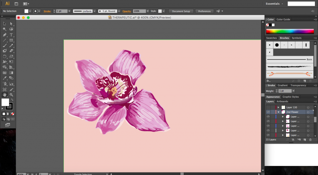
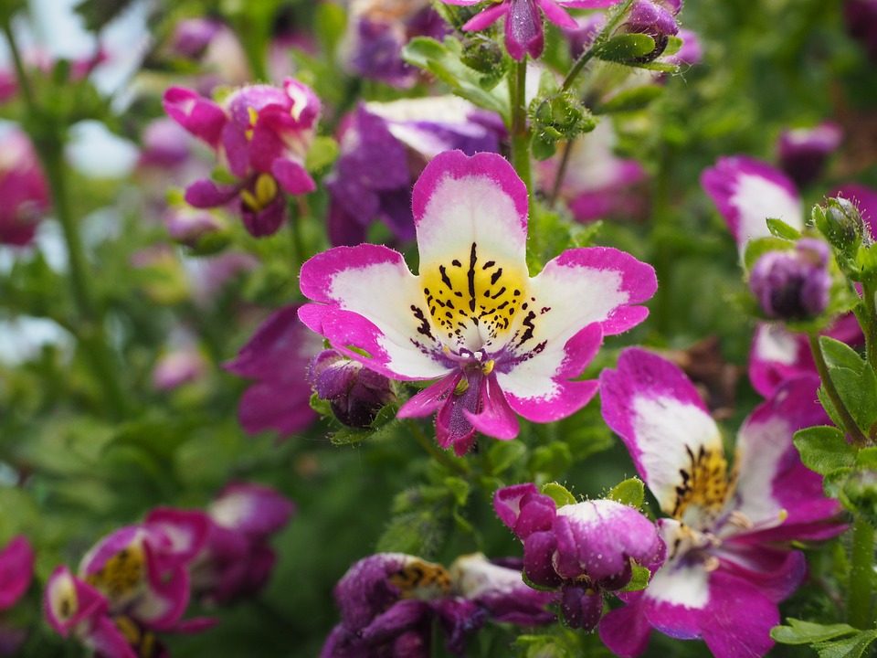
My concept surrounds the theme of nature, which has been proven to be very therapeutic. I chose our national flower, the orchid, which people would recognize, as my main element. I wanted to bring a sense of familiarity into the space though something that people could interpret easily regardless of age or background. The sense of familiarity would hopefully bring comfort in a foreign (for some) environment especially for the elderly who were my main target audience.
Final Work
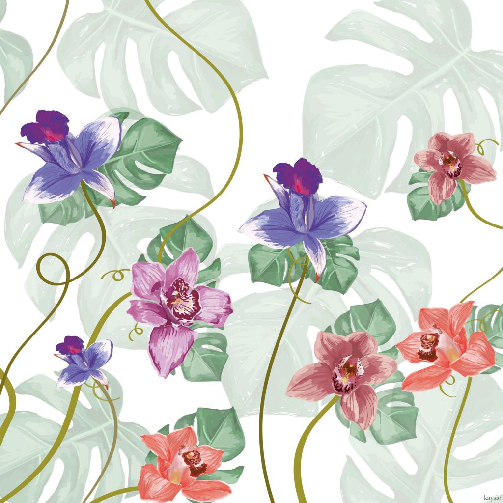
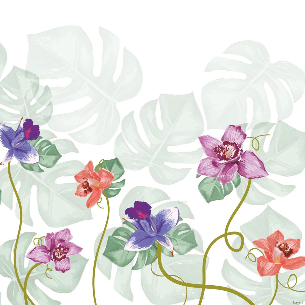
Final Work Extended- Panel 2Final Work Extended- Panel 3Final work- Extended full three panels
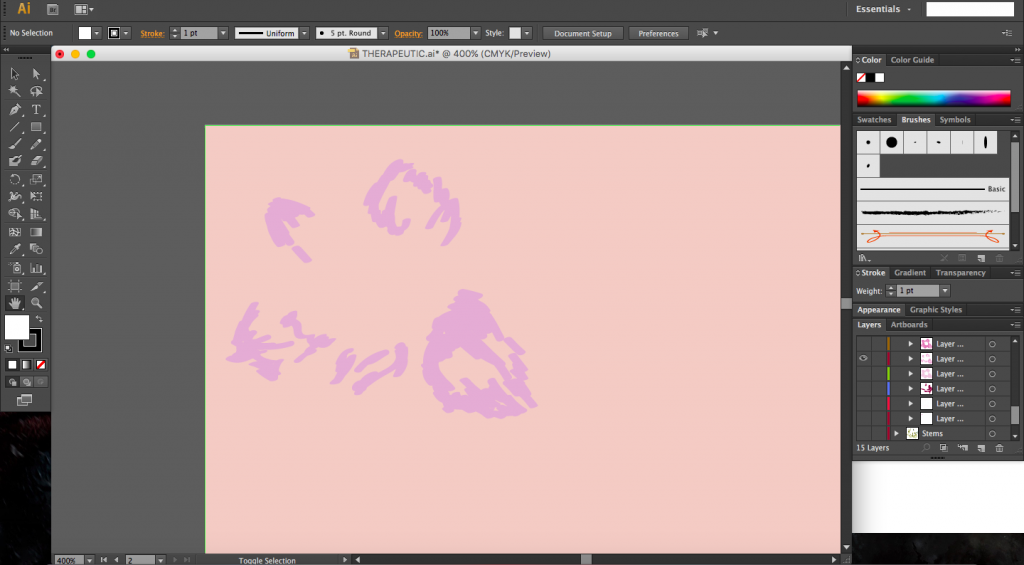
Process
I decided to create my work digitally, painting using only Illustrator and a Wacom tablet. By slowly layering the colours from the medium shade to the lightest and then adding in the darkest shade, and changing the opacity of the shades, I was able to create a subtler look and depth. To create the full composition, I replicated the elements and varying their scale and orientation, as well as playing with the opacity.
Work Process 1Work Process 2Work Process 3Work Process 4
I’ll be adding any additional material (in this post) that I’ve found pertaining to art in hospitals, therapeutic graphics as well as various artist references that have helped me to shape my ideas.
Art in Hospitals
The three artworks above make use of bright and vibrant colours in the design. The shapes used are simple and can be easily interpreted by all. All three share the similar theme of nature.
Work by Morag Myerscough
[Work above] By far the most detailed work out of all that I have seen. Colours used are just as vibrant as the rest. The design consists of repeated shapes and patterns. Each shapes is fairly simple but together they form an extremely complicated and elaborate design.
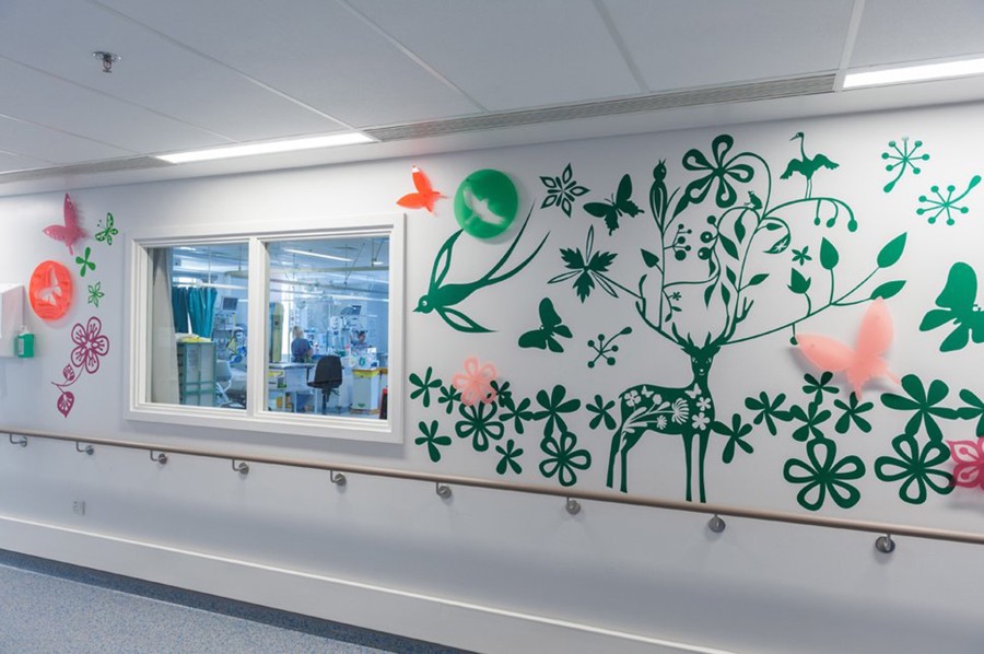
Work by Tord BoontjeWork by Tord Boontje
[Two works above] Designs that use silhouettes of flowers, deer and stems. I’m really quite fond of these two, I feel it would somehow appeal to both young and old. Not too overcomplicated. The silhouettes are easily recognised as well.
Royal Florilegium by Jacques Nimlki
[Work above] The work stood out the most to me., from the use of colours to the arrangement of elements, everything works. The use of various colours and shades are easy on the eyes and create depth. The nature theme is also seen here as with all the other works.
Artist References
Sofia Perina Miller
Colours of Autumn by Sofia Perina MillerRoses by Sofia Perina MillerAutumn Roses by Sofia Perina Miller
http://www.sofiaperinamiller.com/index.html
The interesting thing about Miller’s work is that, they are colourful, a large quantity of reds and pinks are used but the colours work and don’t clash. The vibrancy gives the works life. The medium of watercolour also gives a nice soft finish, giving the flowers a delicate feel.
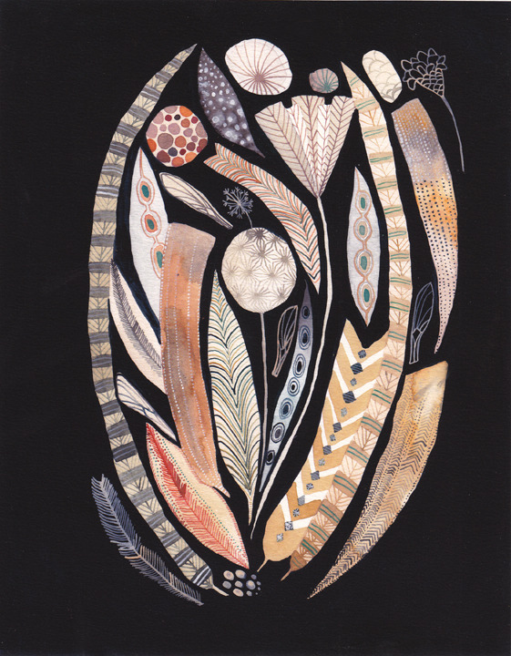
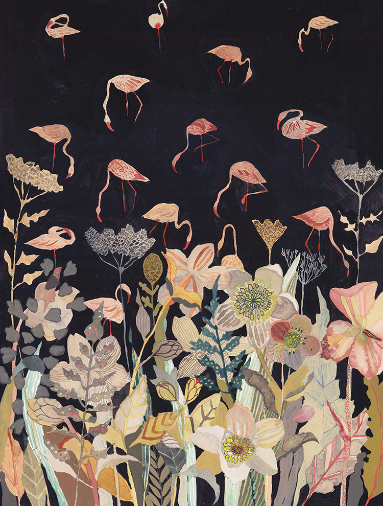
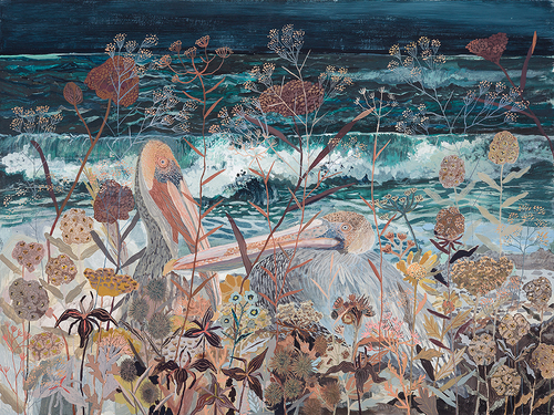
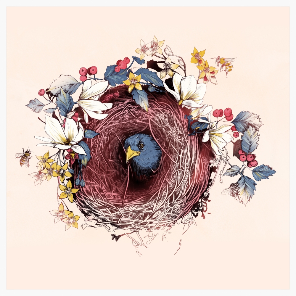
Michelle Morin
Feathers, Pods ,and Wings by Michelle MorinBird Sanctuary At Night by Michelle MillerNesting by Michelle MorinGilded nests by Michelle Morin
http://www.michellemorinart.com/
Morin uses layering of simple shapes to form various birds and plants. I really like her use of colours, as much as she uses many colours, none of them scream out for attention, in fact they compliment each other. Her works are extremely elaborate and detailed which I really do fancy. But colour, colour usage here is really lovely and stands out to me.
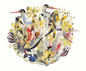
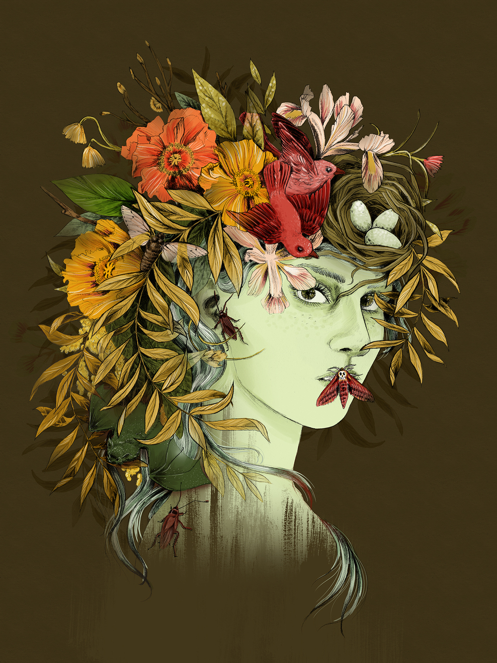
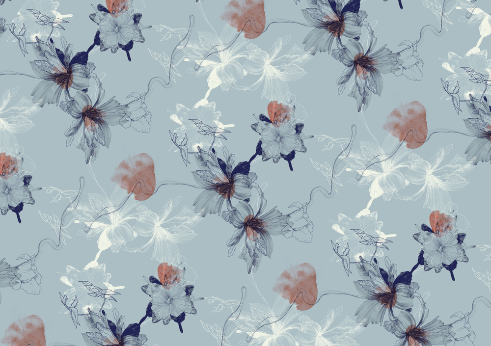
La Scarlatte
Nesting by La ScarlattePortrait of Persephone, goddess of spring by La ScarlatteBlue Hues Pattern by La Scarlatte10 Feet Summer 2016 Fashion Pattern by La Scarlatte
http://lascarlatte.com/
Floral prints-I stumbled upon this site by accident and I am really glad I did. I really love her art style and use of colours. All her works (especially the pattern series) really capture the essence of flowers and plants. Her works are used for not only for magazines and print but on fabric as well. Every image just flows really well. Words can’t describe how much I adore her work.
Other sources of inspiration
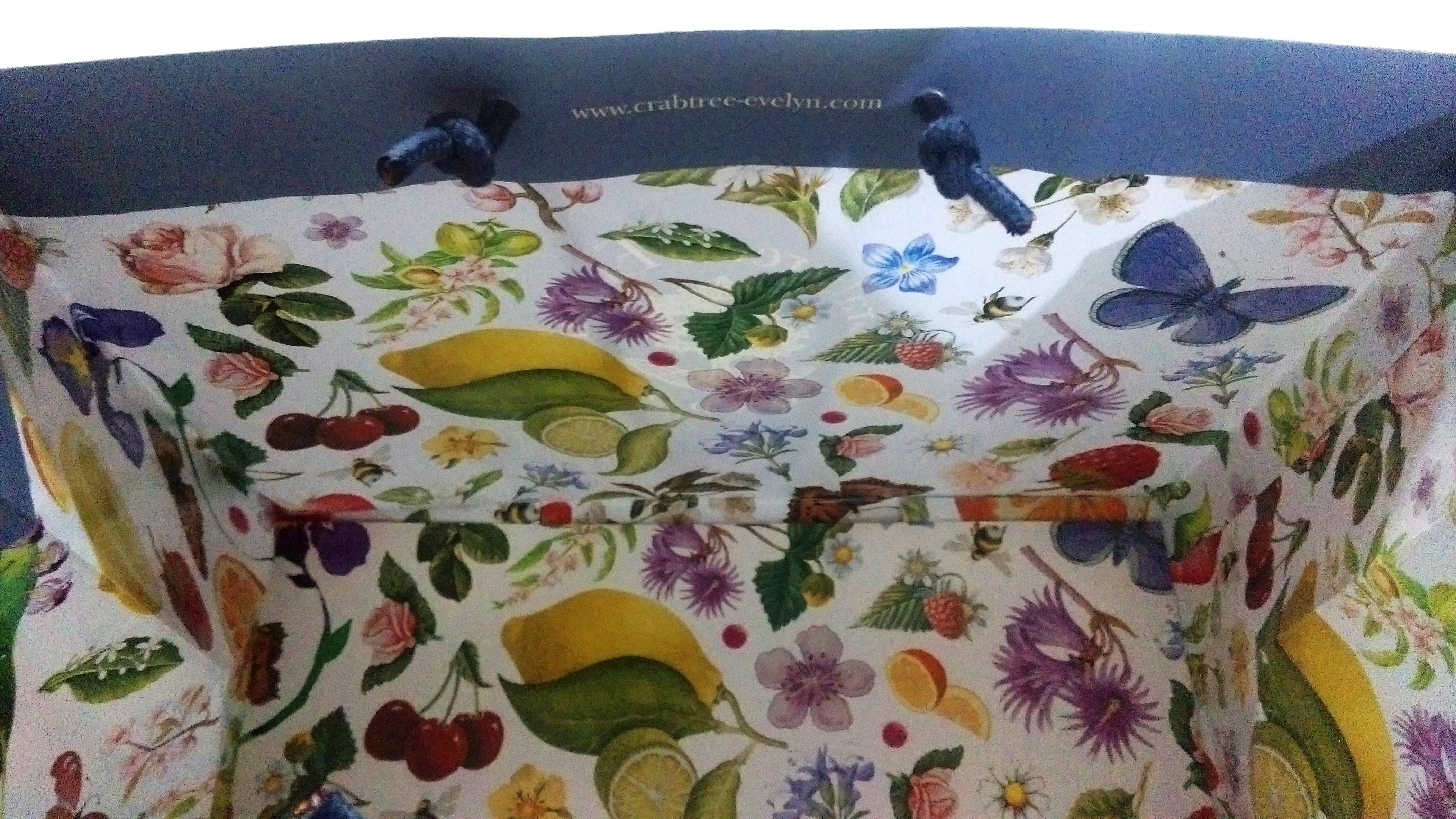
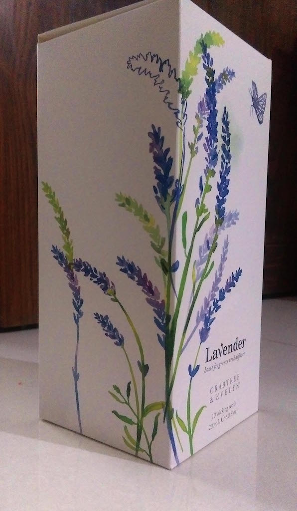
These are just other objects that I had seen other time that I thought were interesting. The packaging for Crabtree&Evelyn products have always been a favourite for me and they usually focus on nature as a theme as well which makes it very appropriate for the project.
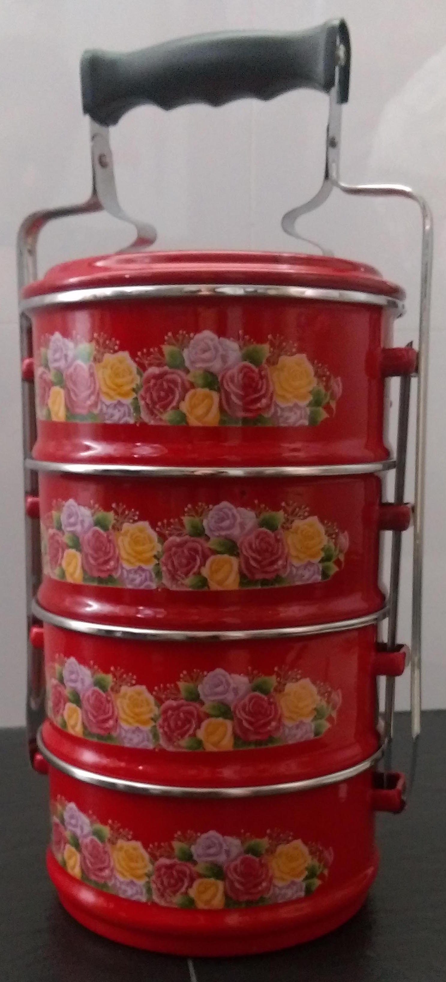
As for the the tingkat, that just happened to be in my house and I really like the use of floral prints and colours in some of the tingkats.
Crabtree & Evelyn
Inside of a Crabtree&Evelyn bag (side 1)Inside of a Crabtree&Evelyn bag (side 2)Crabtree&Evelyn box from their Lavender lineA Tingkat