Chosen Theme: Nature (Flora)
I’ll be adding any additional material (in this post) that I’ve found pertaining to art in hospitals, therapeutic graphics as well as various artist references that have helped me to shape my ideas.
Art in Hospitals


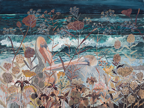
The three artworks above make use of bright and vibrant colours in the design. The shapes used are simple and can be easily interpreted by all. All three share the similar theme of nature.

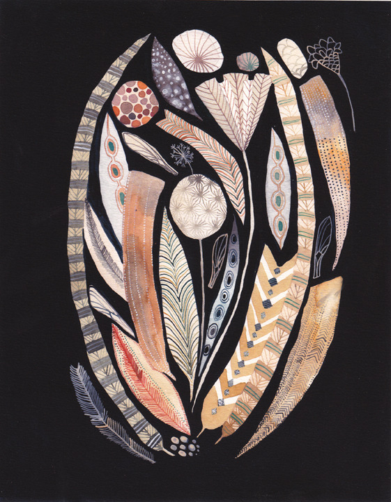
[Work above] By far the most detailed work out of all that I have seen. Colours used are just as vibrant as the rest. The design consists of repeated shapes and patterns. Each shapes is fairly simple but together they form an extremely complicated and elaborate design.

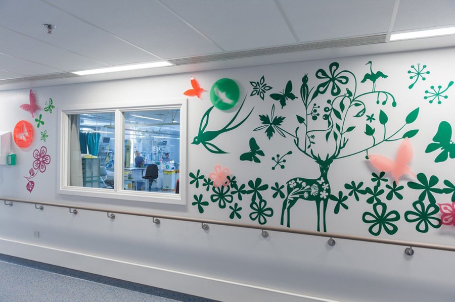
[Two works above] Designs that use silhouettes of flowers, deer and stems. I’m really quite fond of these two, I feel it would somehow appeal to both young and old. Not too overcomplicated. The silhouettes are easily recognised as well.

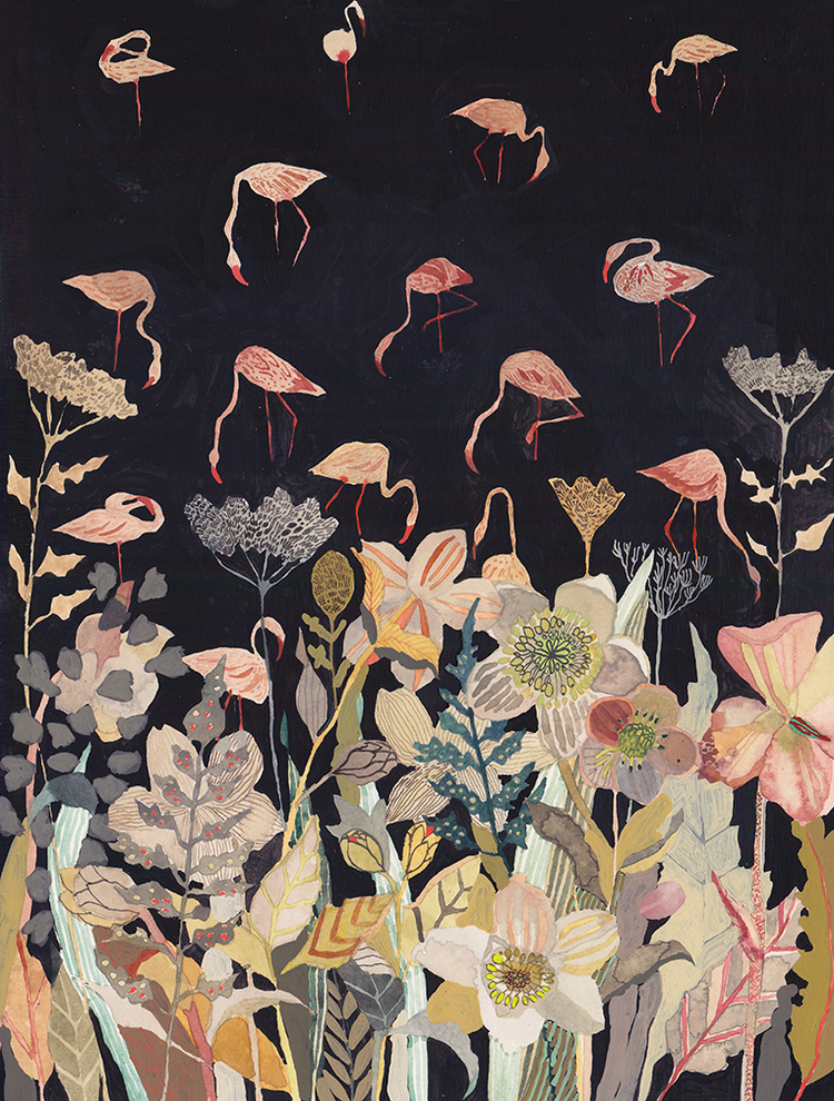
[Work above] The work stood out the most to me., from the use of colours to the arrangement of elements, everything works. The use of various colours and shades are easy on the eyes and create depth. The nature theme is also seen here as with all the other works.
Artist References
Sofia Perina Miller


http://www.sofiaperinamiller.com/index.html
The interesting thing about Miller’s work is that, they are colourful, a large quantity of reds and pinks are used but the colours work and don’t clash. The vibrancy gives the works life. The medium of watercolour also gives a nice soft finish, giving the flowers a delicate feel.
Michelle Morin
http://www.michellemorinart.com/
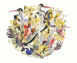
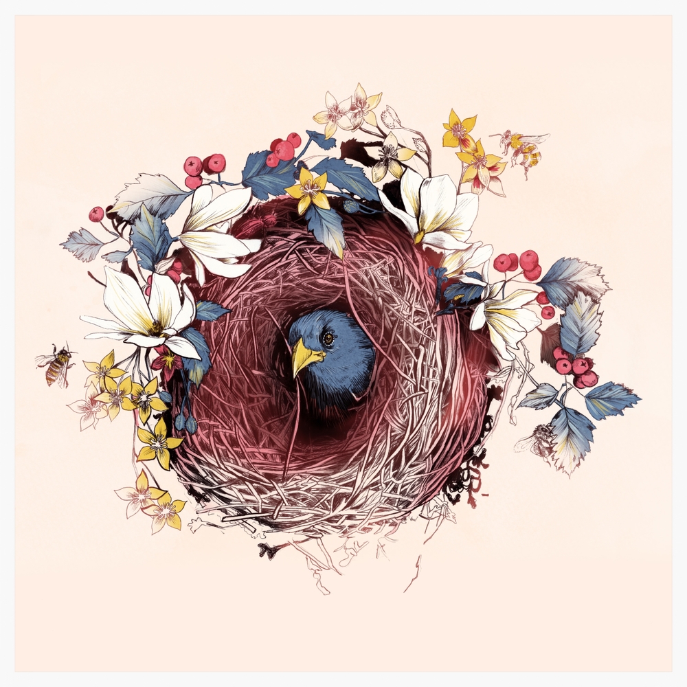
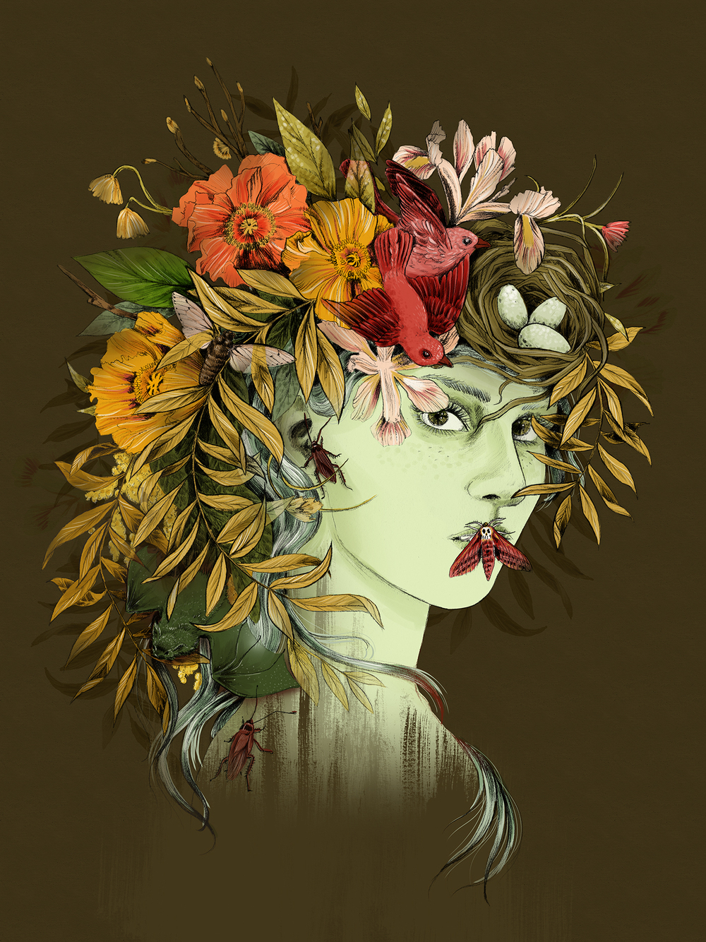
Morin uses layering of simple shapes to form various birds and plants. I really like her use of colours, as much as she uses many colours, none of them scream out for attention, in fact they compliment each other. Her works are extremely elaborate and detailed which I really do fancy. But colour, colour usage here is really lovely and stands out to me.
La Scarlatte
http://lascarlatte.com/
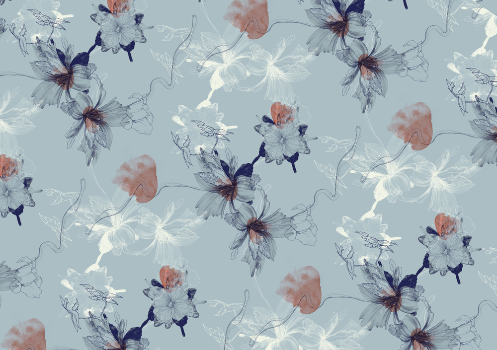
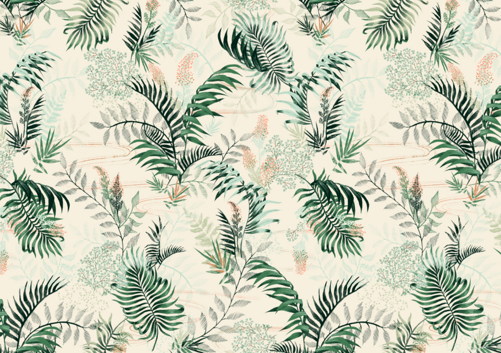
Floral prints-I stumbled upon this site by accident and I am really glad I did. I really love her art style and use of colours. All her works (especially the pattern series) really capture the essence of flowers and plants. Her works are used for not only for magazines and print but on fabric as well. Every image just flows really well. Words can’t describe how much I adore her work.
Other sources of inspiration
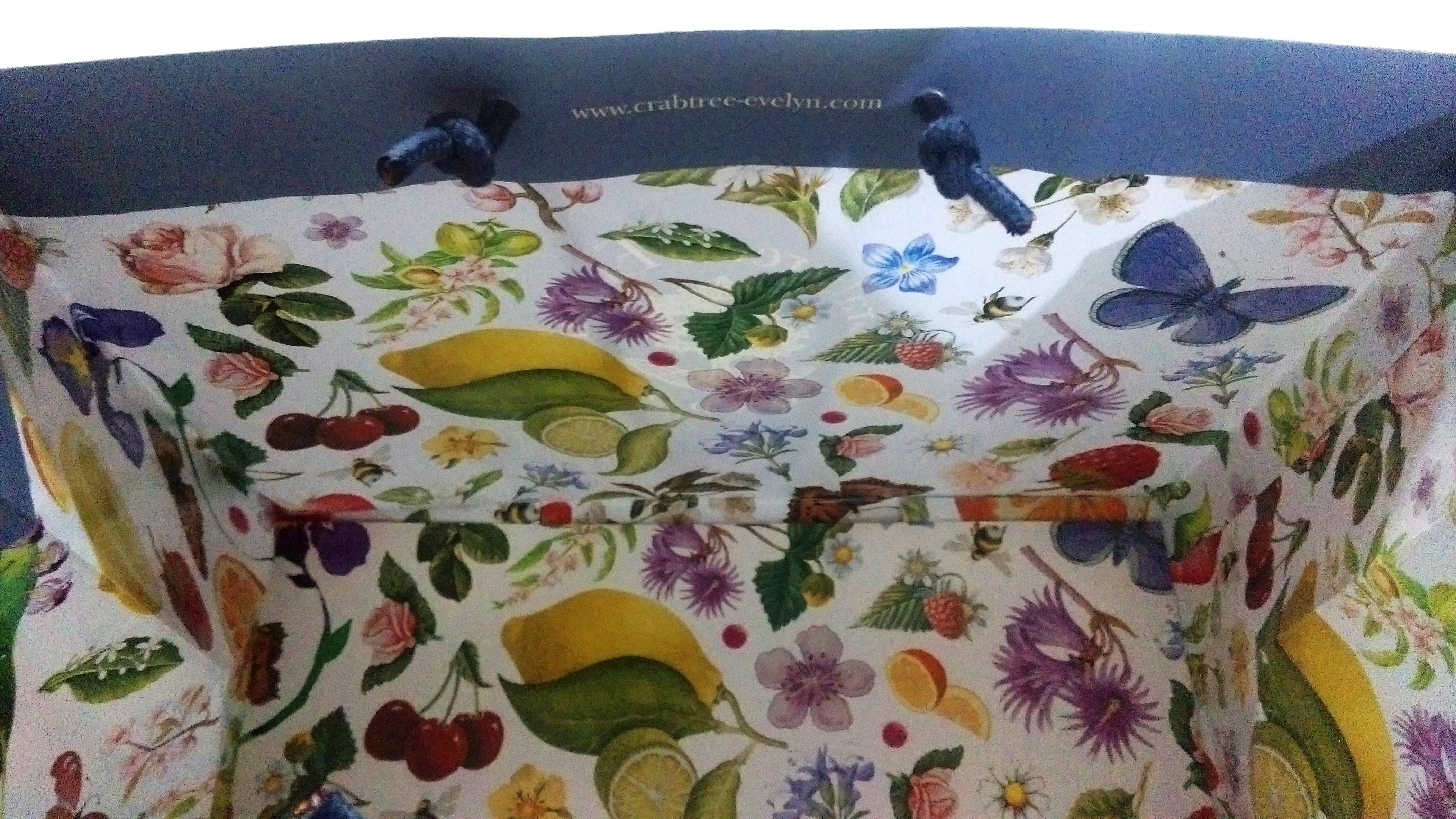
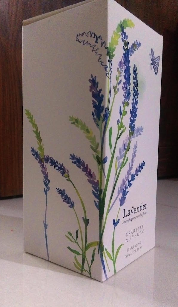
These are just other objects that I had seen other time that I thought were interesting. The packaging for Crabtree&Evelyn products have always been a favourite for me and they usually focus on nature as a theme as well which makes it very appropriate for the project.
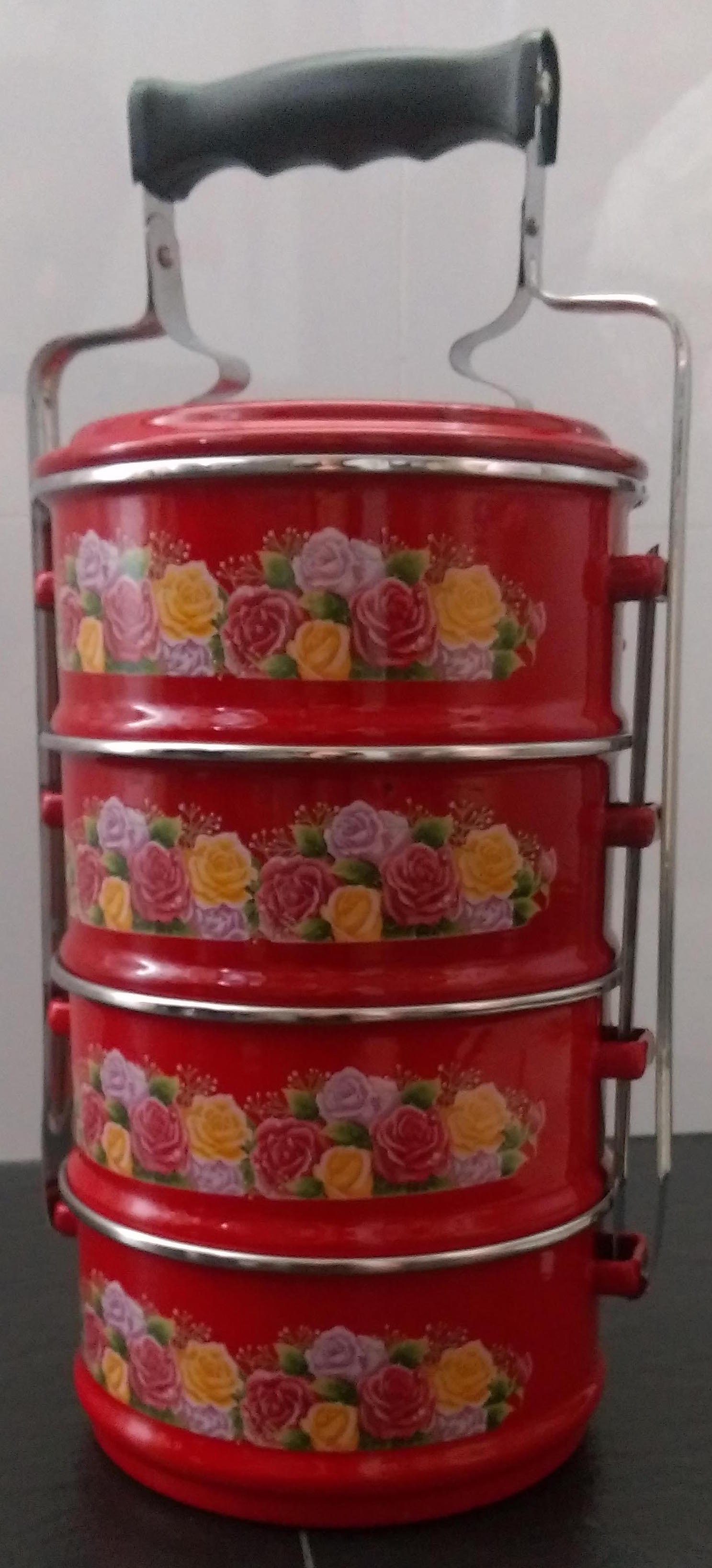
As for the the tingkat, that just happened to be in my house and I really like the use of floral prints and colours in some of the tingkats.
Crabtree & Evelyn