
Health Communication Posters
Various Examples


Posters of a more graphical style


Analysis
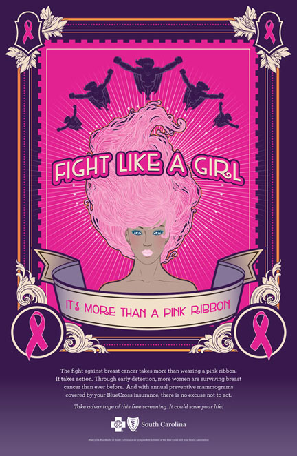
This poster really sets itself apart from others. It in itself does not look like a conventional poster but resembles a tarot card with a psychedelic feel to it.
Visual interest was created by the use of colours, shades of pink, purple gradient, orange and hints of white, and detailed ornamental borders. There are a myriad of textures and different types of lines and line variation. The poster is filled with many elements, the most prominent figure would be the woman in the middle where attention is then drawn to the center of the page. Radial lines radiating from the middle then draws the eye up to the superhero figures on the top. The use of only women and superheroes does evoke a sense of empowerment which is apt since this poster is targeted towards women.
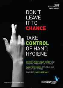
Information here is easy to locate with a symmetrical poster. The amount of text increases gradually from top to bottom with the bulk of information at the bottom 1/3. Main information has high readability, white on purple without any additional elements surrounding it. Slogans are of bigger point sizes and seen first, main information in smaller point sizes, followed by the hospital name.