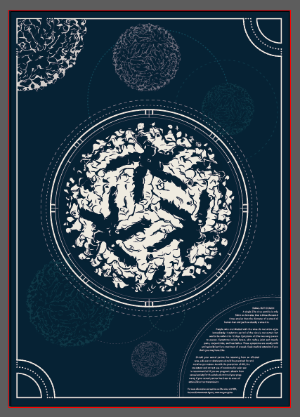
The Tarot Card
Before I started creating my poster I looked at images of vintage posters as well as of tarot cards for inspiration on layout and colour. I chose to use more than just tarot cards as inspiration. The posters of moons caught my attention as with the virus structure, it too is round.


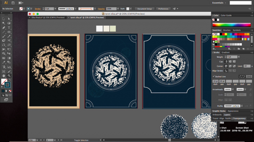
The screenshots below were taken whilst creating the poster. I started with a layout that was symmetrical but slowly branched out to create a poster that was asymmetrical but still balanced.
I was quite interested in the vintage posters and maps of constellations and the moon. There was a particular poster where there were coordinates around the circumference of the central image and I really liked it (image just below). I tired to incorporate that into my poster as well as I felt it was similar to mapping out the radius of the virus structure, giving it a vintage yet scientific feel.


I decided to go ahead with a border for the poster as with a tarot card (image below). The task now was to make sure the border had a purpose and was not just a simple line border.


I tried to repeat and resonate the circular form throughout the poster using lines of various opacities, weights and colours. The different opacities would hopefully create depth and create hierarchy by not stealing the attention away from the main virus structure itself.