The Strongman
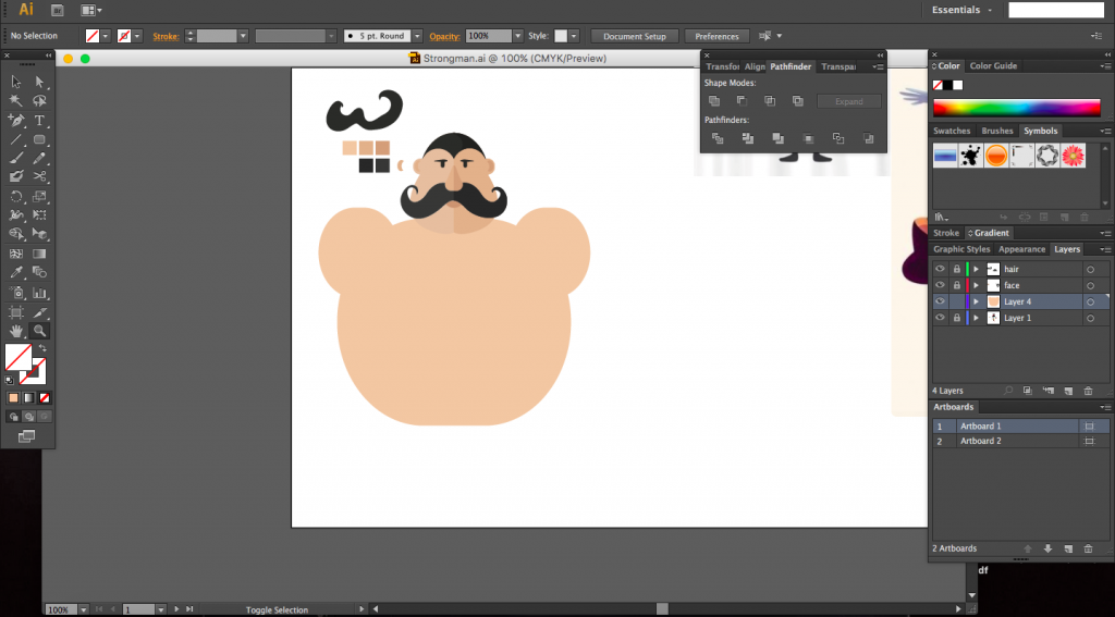
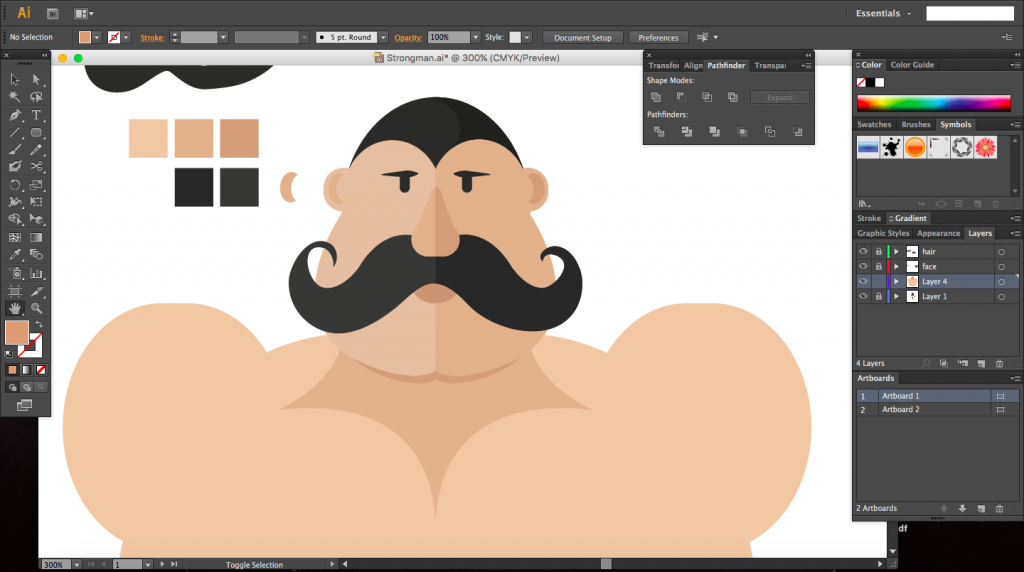
A documention of the creation of the strongman. Created using Illustrator.
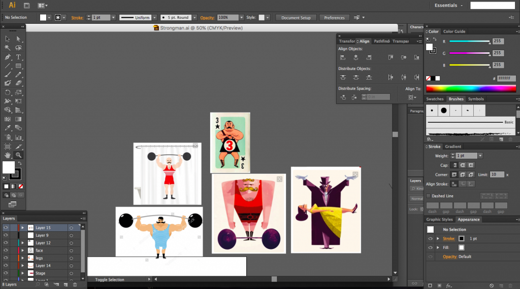
I started off once again by looking for reference images of strongmen and placed by my artboard for inspiration.




Card size and fold
I initially decided on a much better card but felt there would not be ample content to fill the space, it would thus have been uneconomical to make such a big card.
The fold of the card is inspired from the invitation card by Renee Griffin which I mentioned in a previous post. The card folds at two places, one just under the caption and another across the rock. Only when the card is opened is the rock revealed. The inital top fold was after the full caption, however it was suggested to increase the factor of surprise and so I split the caption between folds which would hide the word ‘rock’ within the fold.

Card size and colour
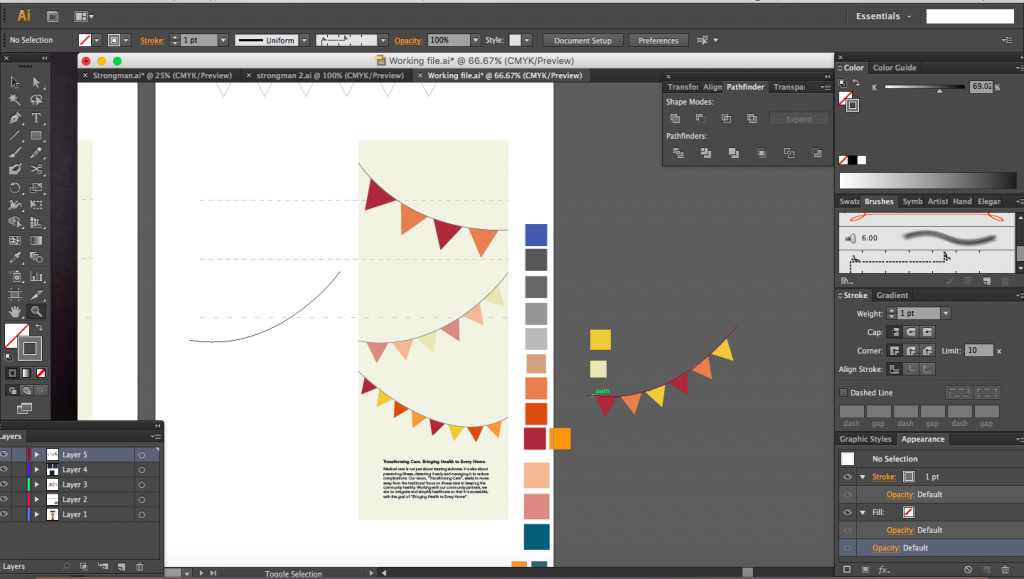
I had reduced the width of the card by half to a size that was much more comforatble. I then proceded to create circus bunting on the back of the card. I first experimented with diagonally hanging bunting but found it too messy and complicated. I settled with something more simple.
I used the same colours that were used in the front for the strongman, for the bunting, keeping colour palette small with bright warm colours. I knew I needed a cool colour of somesort and settled with a teal which I used for the flag just to create contrast.


Typefaces
Choosing typefaces. I had three typefaces that I was looking at for the caption in the front page, the first was CabbagetownStd, the second was Ewert and the third (which I eventually used) was Carnivalee Freakshow. All three typefaces were circs themed and Carnivalee Freakshow was the best to me as it was bold enough and not too complicated. It also had small details like lines running through, giving a vintage feel to it.

I placed the wishing at the back of the card and used the typeface called League Gothic, although I initially wanted to use a typeface called Press Style.
Two images below: Press Style
Image below: League Gothic
As for the corporate text, I stuck to Avenir, playing with different weights, using Avenir Light and Avenir Heavy.

Borders
I wanted to add borders into the composition but scrapped the idea as it made the card too congested.


