Developement
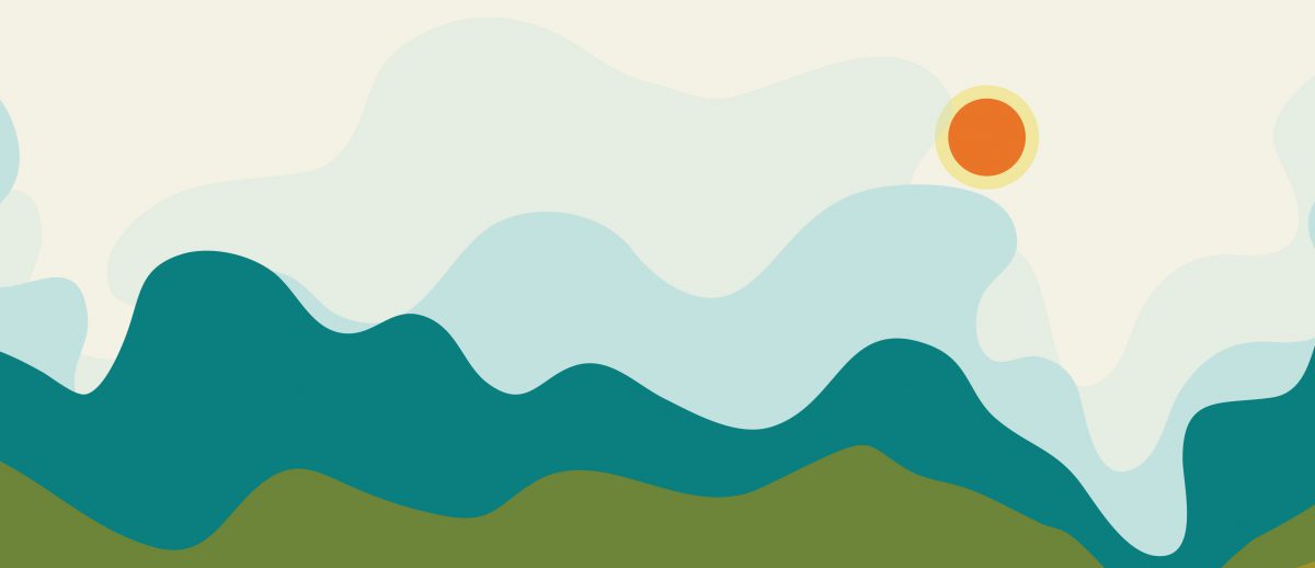
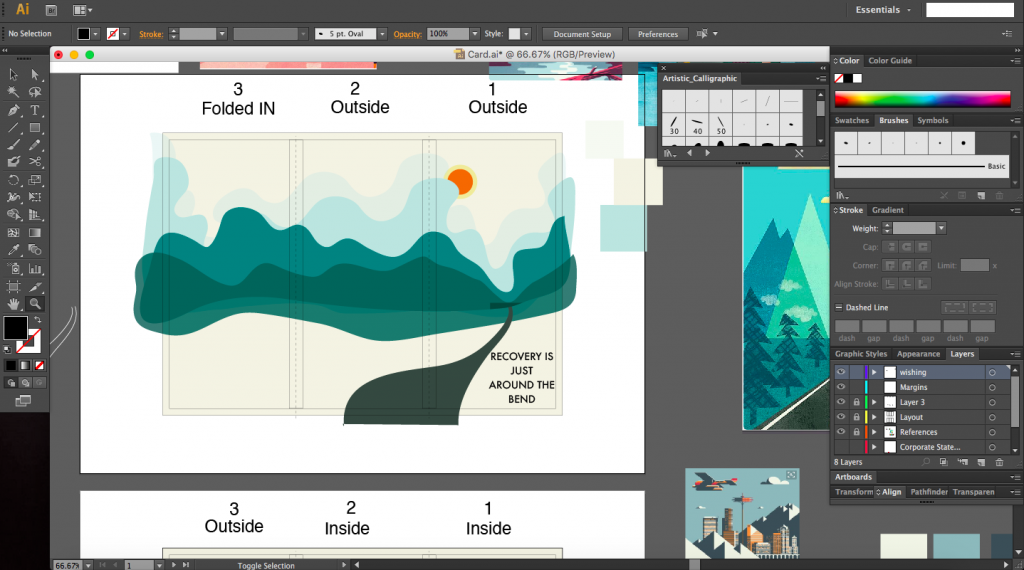
I had initially settled on an accordion fold for my card with graphics centred around the caption ‘Recovery is just around the corner’ which would be a play on the use of folds for this project. Another caption that I was thinking about was ‘On the road to recovery’ which would play in quite well with an accordion fold of an extending, winding road towards HDB estate symbolising home.
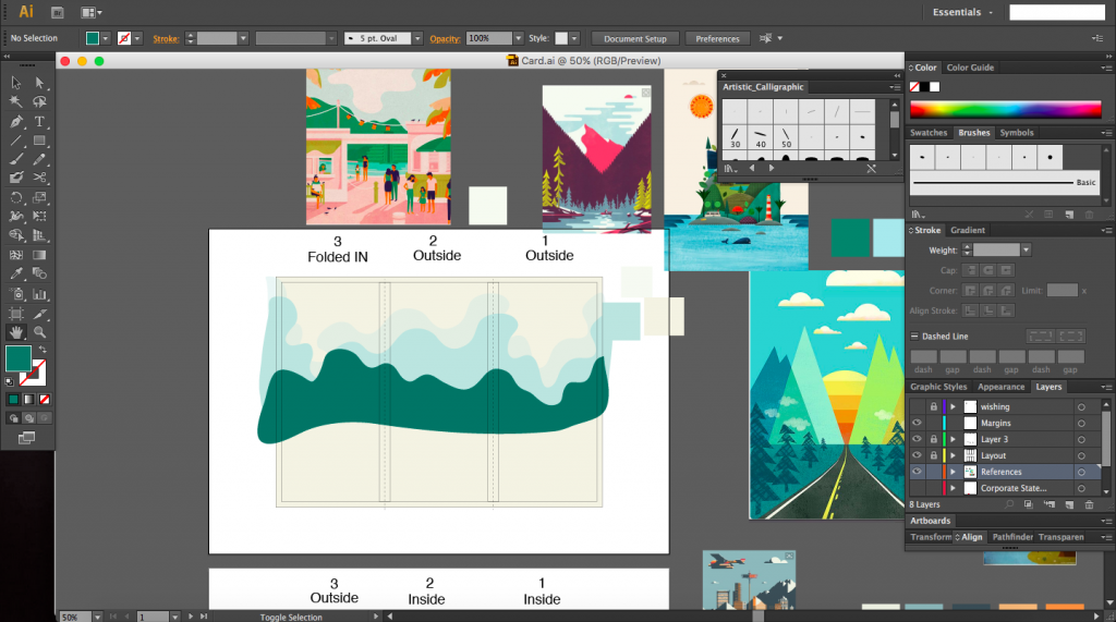
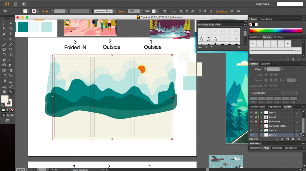
Below are some screenshots of my work in progress. The images surrounding the artboards are just some images I found that I liked and decided to use as inspiration one of which is from the game called Firewatch by Campo Santo. Most of my inspirations were landscaped based, so images like mountains, roads into a vanishing point.
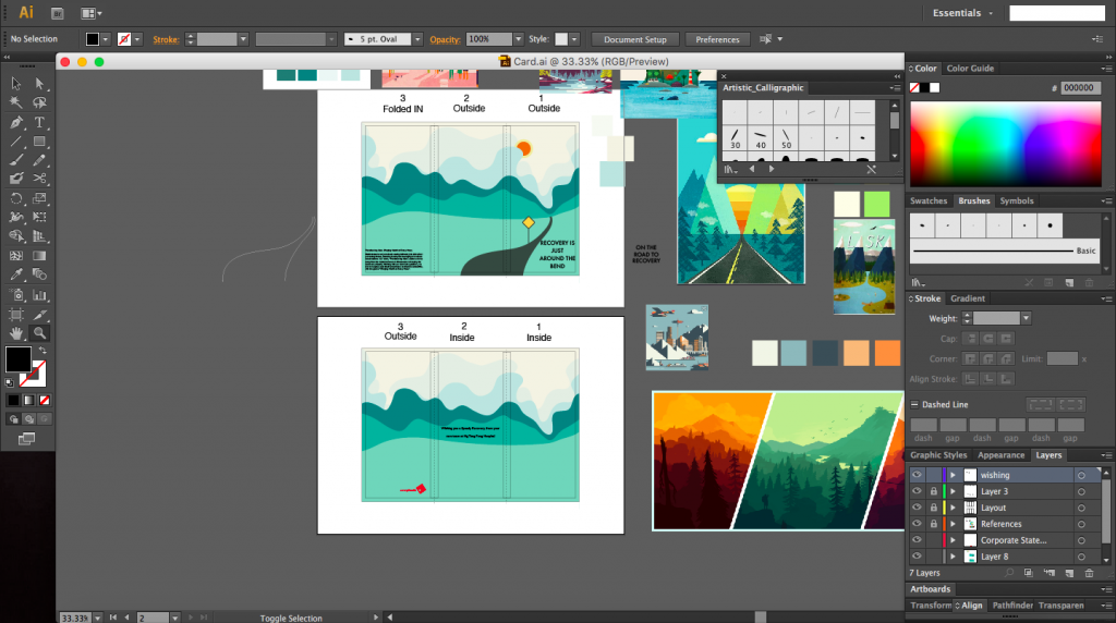
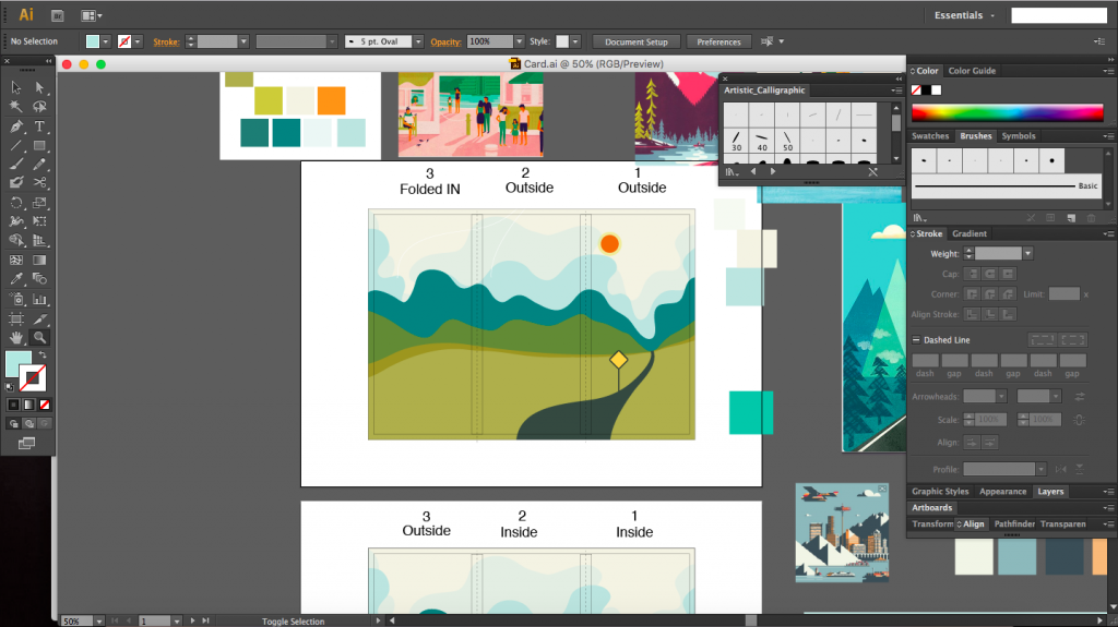
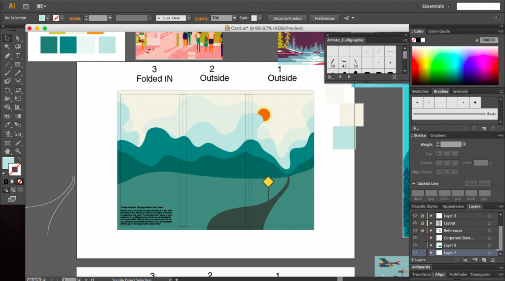
After the class sharing, I decided to scrap this idea and do something else. The relationship between the graphics and fold was not strong enough. I also didn’t feel for the graphics enough. I was not quite sure how to make the landscape amply interesting. The main comment I received for this design was that that it was too lonely, which I definitely agree with. An accordion fold might not have been the best fold as well as this. Overall I didn’t like the direction my design was taking.
Design Inspiration
Whilst looking for more material and inspiration, I happen to chance upon this design for an invitation card on Pinterest. The fold of the card and the graphics go hand in hand and compliment each other. Griffin has very cleverly chosen a fold that works for an object such as a grill. The card invites people to lift open the fold and the lid of the grill thereby revealing the contents in the grill as well as extra information on the event.
There is an element of surprise and fun with this invite since the user does not know what is inside and it’s a pleasant surprise of simple and yet elegant graphics of food arranged in an orderly manner that fit the overall composition.
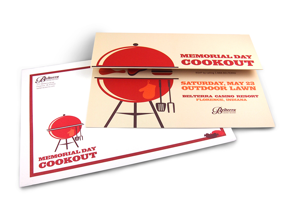


The colour palette here is simple with warm colours used, yet it does not seem like nothing is lacking. I think a colour scheme as such is just perfect and does not over complicate the design.
With this design in mind and knowing now how important the interaction between graphics and the fold is, I knew that this was the direction I wanted to take with my new idea.